Review & reflect/ personal study topic

1. Describe which themes (Nostalgia, Anthropocene, Home, Feminity/ Masculinity/ Identity etc,) medium (photography, film), approaches (documentary, tableaux, conceptual), artists (incl contextual references to art history, movements and isms) and photographic skills, processes, techniques and methods (incl learning new software) inspired you the most and why.

2. Include examples of both previous and current experiments and imagery to illustrate your thinking.

Anthropocene

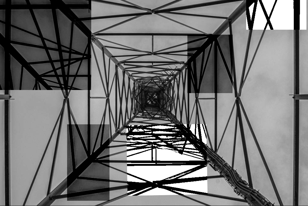
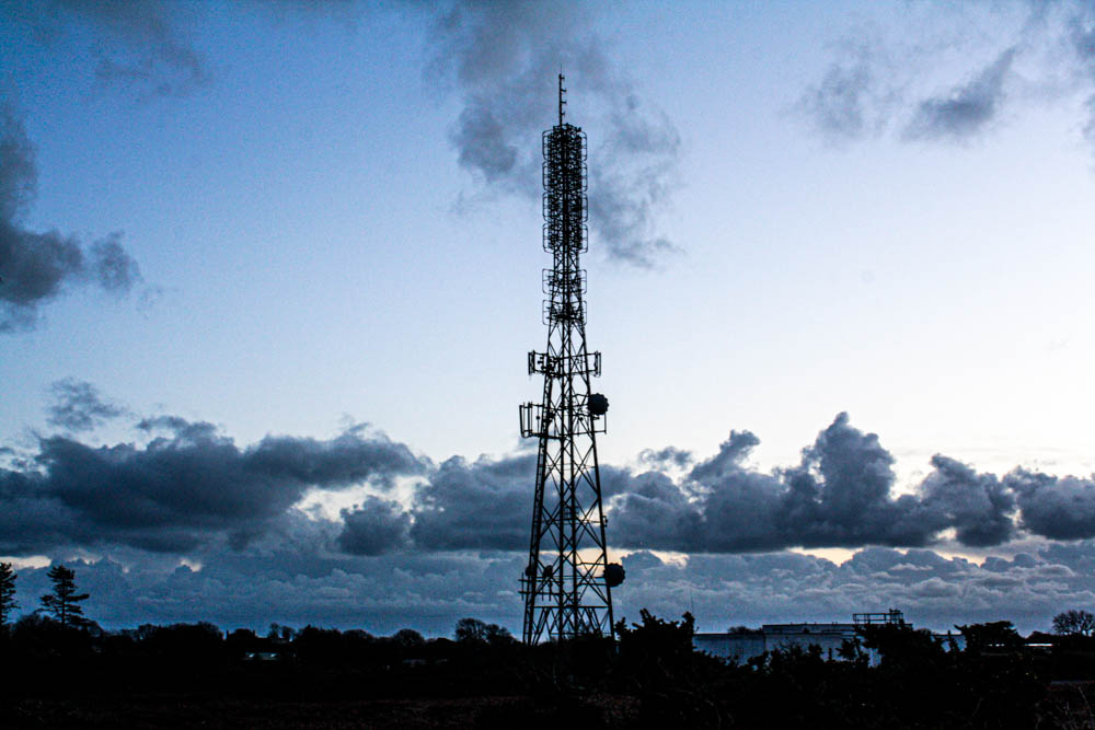
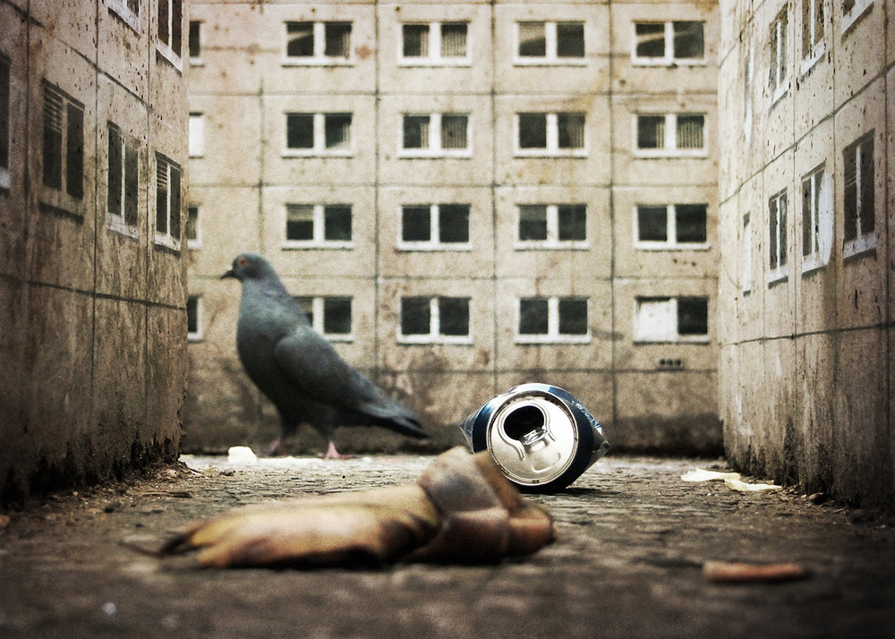
The Anthropocene Epoch is an unofficial unit of geologic time, used to describe the most recent period in Earth’s history when human activity started to have a significant impact on the planet’s climate and ecosystems. I enjoyed learning about this topic as you could interpret it differently, for example, doing photoshoots of trees that have fallen down, electric towers, erosion. It meant I could experiment and had a wide choice of subjects I could photograph. I was able to demonstrate my skills using photoshop where I edited an electric tower, compared to the simple landscapes that I produced from these photoshoots. Axel Braun ( artist reference) collects case studies on contentious infrastructure projects in order to trace humanity’s development as a geological force. His studies focus on human-altered landscapes as by-products of discourses and processes that describe the techno sphere as it brings forth the Anthropocene. My response:

Overall I liked this topic as I was able to experiment a lot and capture the same (theme/idea) but completely different pictures. However, I wouldn’t continue to develop this particular topic as its quite simple and not as challenging as I wanted.

Femininity/Masculinity/Identity

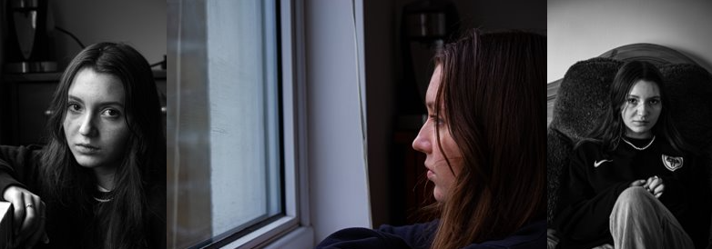
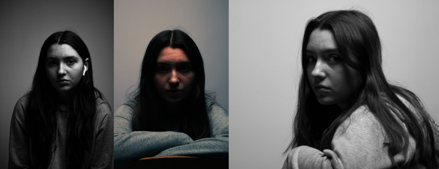
Out of everything I have studied and responded to throughout this photography course this topic is the one I’m very passionate about and will continue to develop/expand my knowledge around this theme which will then allow me to interpret it in a creative way which I can then reflect that creativity into a photobook which ill design as my final project. When studying this theme in year 12 the aim was to find an artist that presented femininity as ‘innocent, young, caring, healthy’, Justine Kurland had produced some really good images which demonstrated those ideologies. However, to now develop this I will be producing images which will portray the opposite of those stereotypes, it will show how as girls specifically change (being older, meeting new people, understanding themselves, temporary happiness over long term happiness) focusing on all the problems/phases most teenage girls face. My photobook will have a nostalgic yet deep emotional feeling to it as it will show femininity in the past and what girls used to do when they were younger (nostalgic) and then compare that to how lifestyles change and how femininity is now interpreted for me personally and how things have changed (good and bad).

review and reflect: past projects

Over the course of year 12 and 13 we have worked on many different projects. I have chosen three of mine to review and reflect before I begin my personal study.

My Jersey:

One of my very first projects was called ‘My Jersey’. Within the project I explored the life of my grandad who was a farmer on the island for the majority of his life/ until he was no longer able to. I chose to do this for my project as I felt that it linked well not only to Jersey but also to myself making it easier for me as I had a better understanding and could relate to the images. I have taken images of the farm, some of the tractors that are still there and of my grandad as well as using old images of him that my grandparents had. I think that this explores the theme of ‘nostalgia’ and ‘home’ very well within my photography, as it is my families history with the Jersey farming industry and how my parents, grandparents and so on grew up with the farm as their main part of life. To present my images I used the artist Noemie Goudal. She is an artist who takes images and print them out to them place them in front of another background images to take her final image. I was inspired my by her however, I took my own approach on it and instead used photoshop to place my images over the top of one another with different opacity’s and sizes to see the back image more or less. I liked this project because it allowed me to reflect on how my family’s way of life was back then and how different it is to how we live now. It was also interesting to see how my parent grew up living on the farm and, how many children grow up these days without that factor with the world modifying over the years. Overall I like how this project turned out and think the final outcomes are a more engaging way to present my project allowing viewers for their own interpretation as well.

my outcomes:

rural and urban:

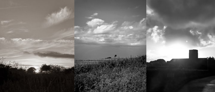
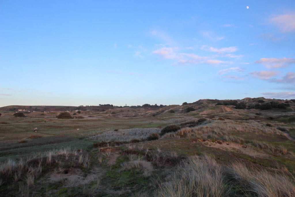
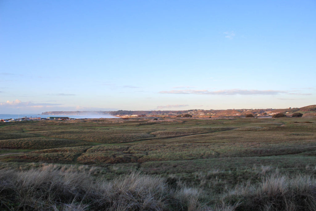
My second project that I have chosen to reflect on is the ‘rural and urban’ project. Whilst these were two separate projects I have decided to reflect on them together as I think they go hand in hand in some ways. For this projects I focused on landscape images and architecture which is one of my favourite areas to photograph. This helped during my project as it allowed me to create better images as I was more interested in it. To take my rural images I walked through some lanes in St Clements and Grouville, photographing the fields that were around me as well as the beach and some houses that I felt fit the theme. For some of these photos I was inspired by Adam Burton who is a British landscape photographer. I liked how his images were focused on nature and captured the same thing that I was trying to capture. Once I had collected a large amount of images I edited them by, making some black and white to show the contrast in the images with the different tones, I adjusted the brightness of some images as well as the tone of colours that they captured to make them feel more rural etc. For the urban images I walked through town and bellozane to create more architecture images and construction. With my images I then edited them as well as make some final pieces with with them from editing them on photoshop. Overall I like how both of these projects turned out and think that I may do something inspired by these for my personal study linking to architecture.

some of my outcomes:

the sublime:

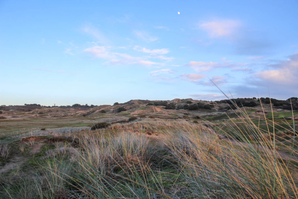
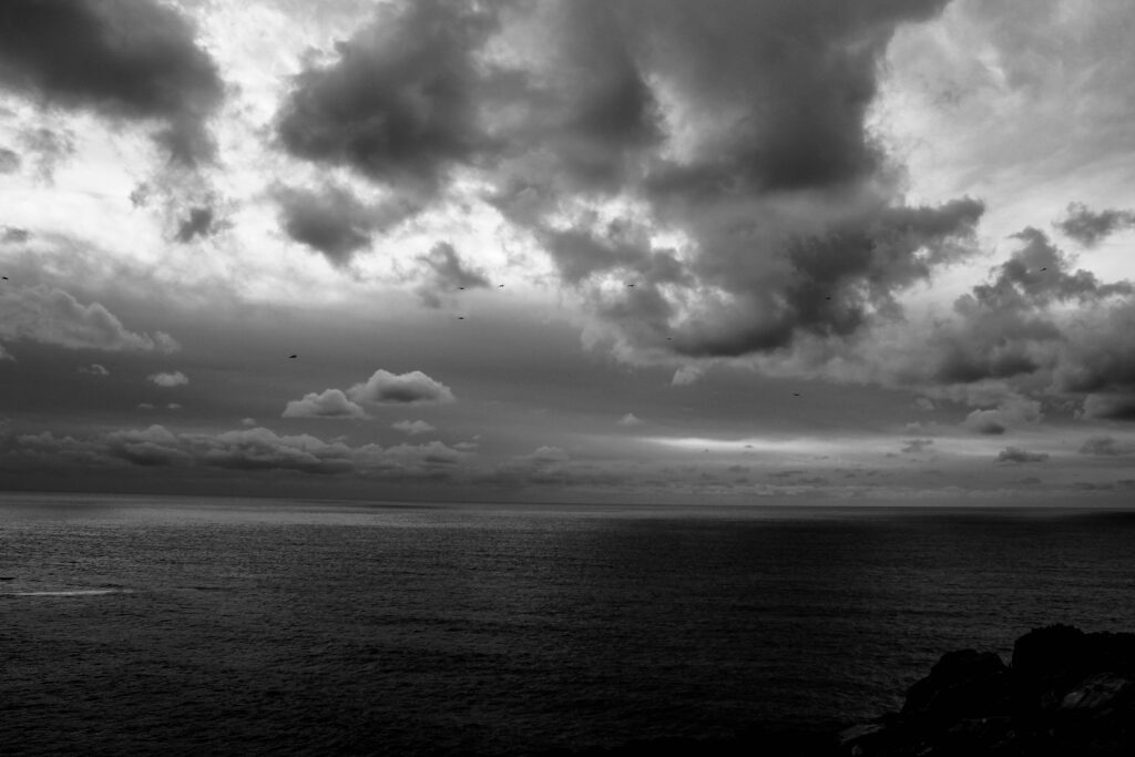
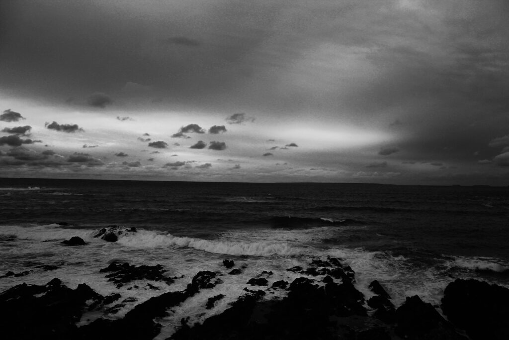
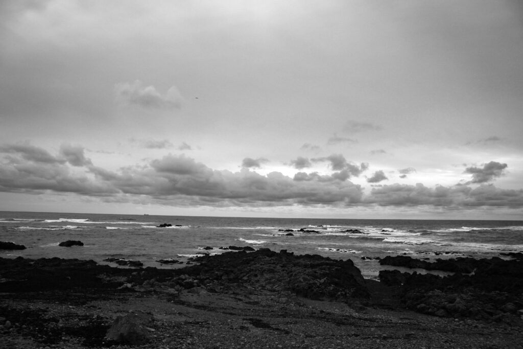
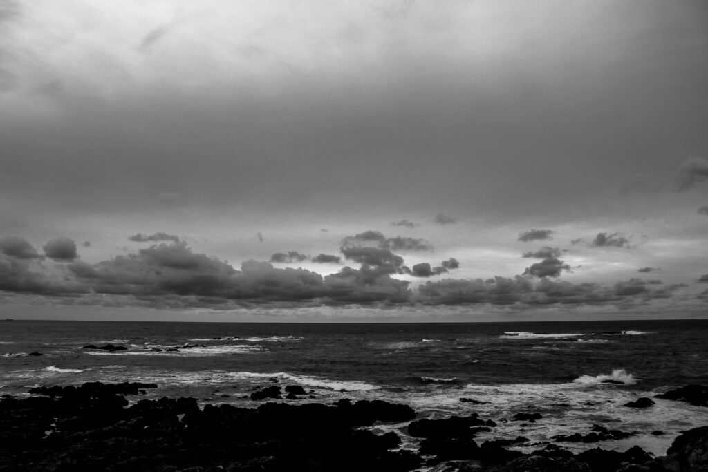
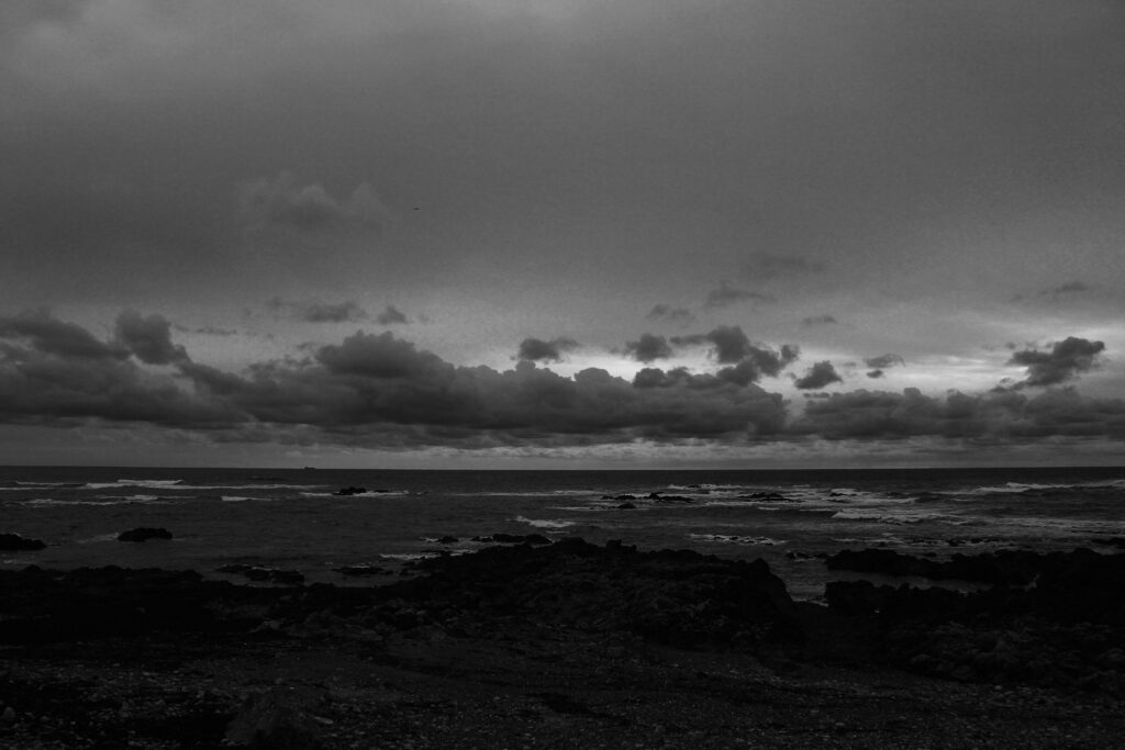
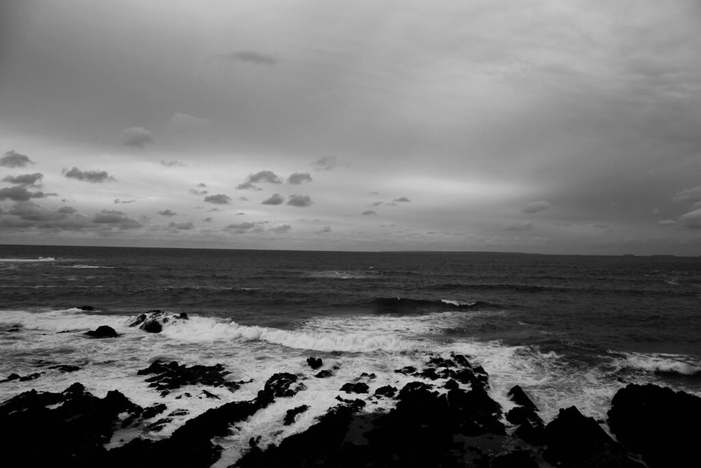
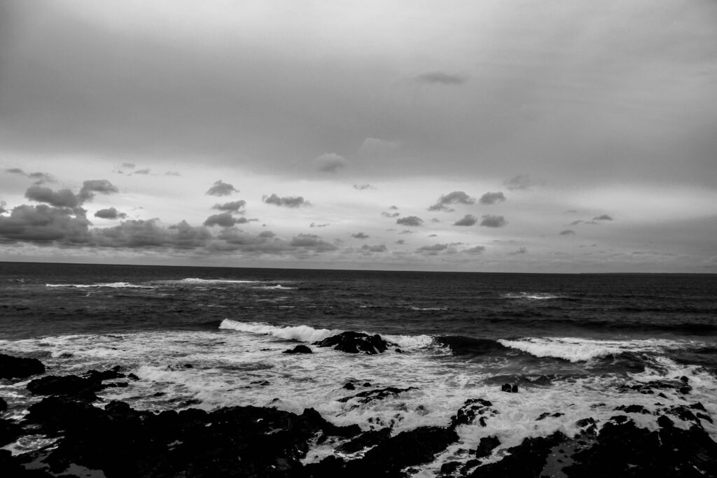
The last of my projects that I am going to reflect on is ‘the sublime’. Again, I liked this project as it allowed me to photograph more landscape images, focusing on the coast with the weather and sea being a main part. Whilst taking these images I used different shutter speeds determined by what I wanted my images to turn out like. For some of them with waves I had a longer shutter speed to make them flow better, whilst some of the other had a shorter shutter speed to make them sharper. I like these images as I think they show of Jersey well and link to the theme nostalgia from growing up hear especially as I live on the coast as well. For this photoshoot I chose to use the artist Ansel Adams who was an American landscape photographer. I think that some of my images are a good interpretation of his but from a Jersey point of view especially with it being an island. Once I had taken my images I opened them up on Lightroom and made some of them black and white to show the detail, different tones and to make the images feel for gloomy as it is on the coast in the winter. Overall I like how all of these image turned out. I think that they all hold lots of depth and detail with the different tones in the black and white images. I like some of the areal shots as they capture Jersey almost as if I am a visitor who sees Jersey very differently to how I do which adds a variety to my work. I think that I could link my personal study to this project in some way to do with the island landscape or beaches.

some of my outcomes:

Review and reflect

This is my review of the topics I have completed throughout the year, including what I currently believe to be my best work from it. These themes have allowed me to gain experience with specific techniques that will help me when completing my personal study.

Themes

Still life

Still life photography is a genre of photography used for the depiction of inanimate subject matter, typically a small group of objects. Similar to still life painting, it is the application of photography to the still life artistic style.

Example photos:

My photos:

Romanticism

Romanticism is the artistic movement of the eighteenth and nineteenth centuries which was concerned with the expression of the individual’s feelings and emotions. Romanticism is attitudes, ideals, and feelings which are romantic rather than realistic.

Example photos:

My photos:

Urban

Urban means belonging to, or relating to, a town or city. Most of the population is an urban population. In photography, it usually relates to images of multiple buildings clustered together.

Urbanization began in ancient Mesopotamia in the Uruk Period (4300-3100 BCE). It is thought that a particularly prosperous and efficient village attracted the attention of other, less prosperous, tribes who then attached themselves to the successful settlement, thus creating an urban environment.

Example photos:

My photos:

Anthropocene

The Anthropocene Project is a multidisciplinary body of work combining fine art photography, film, virtual reality, augmented reality, and scientific research to investigate human influence on the state, dynamic, and future of the Earth.

The group was created in 2016, however, the effects of Anthropocene on the world had been going on long before that, some suspecting as early as 1610 with an unusual drop in atmospheric carbon dioxide.

Example photos:

My photos:

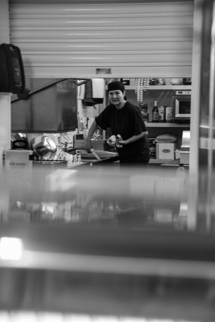
Environmental Portraits

Portrait photography is a very well-known and popular style of photography. The style is all about trying to capture the personality, identity, soul, and emotions of a person by utilizing the background atmosphere, poses, and lighting.

There are many types of portrait styles such as; constructionist, candid, environmental, and creative. Looking more into the environmental portrait style, it usually depicts people in their working environments or environments they are typically found in giving insight to said persons life and surroundings.

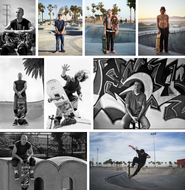
Example photos:

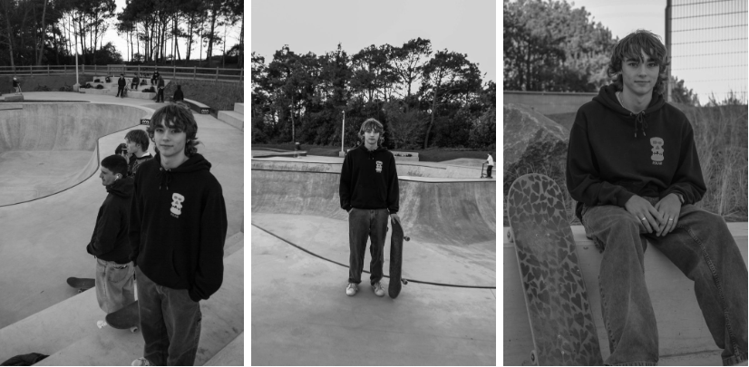
My photos:

Femininity vs Masculinity

Photos which aim to show femininity often do so by incorporating nature, youth or innocence while photos aiming to depict masculinity typically show a more rough, assertive side to them. Majority of femininity and masculinity ideals in photography, like nature, become the way they are due to the stereotypes they are bound to in society. For example, women are typically seen as weaker and more emotional while men are shown to be strong and somewhat apathetic.

Example photos:

My photos:

Street photography

Street photography is photography conducted for art or inquiry that features unmediated chance encounters and random incidents within public places, usually with the aim of capturing images at a decisive or poignant moment by careful framing and timing. 

Example photos:

My photos:

Artists

Mary Ellen Bartley

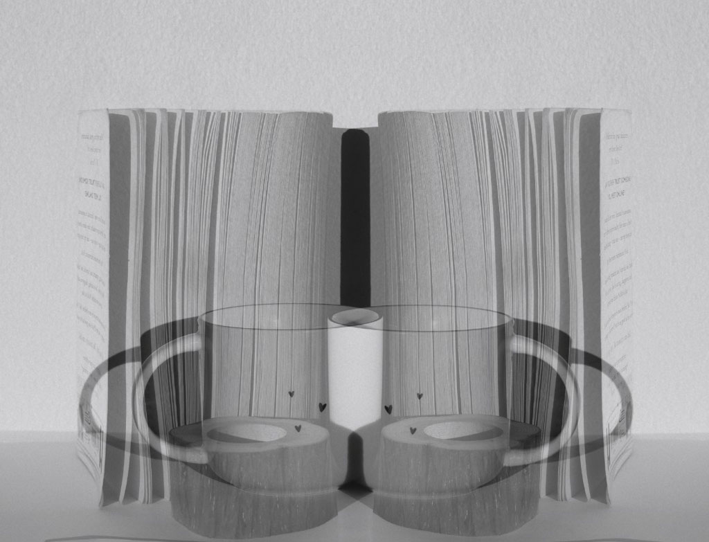
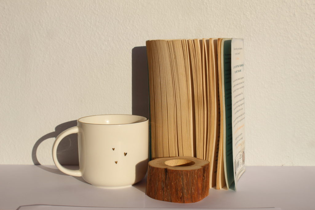
Mary Ellen Bartley is a New York based contemporary still life photographer. Often choosing books as her subject in majority of he work, Bartley is capable of capturing varied textures and colors in her pieces.

Her photos:

My photos:

Ansel Adams

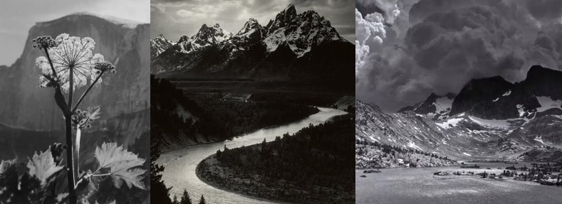
Ansel Easton Adams was an American landscape photographer and environmentalist known for his black-and-white images of the American West. He helped found Group f/64, an association of photographers advocating “pure” photography which favored sharp focus and the use of the full tonal range of a photograph.

His photos:

My photos:

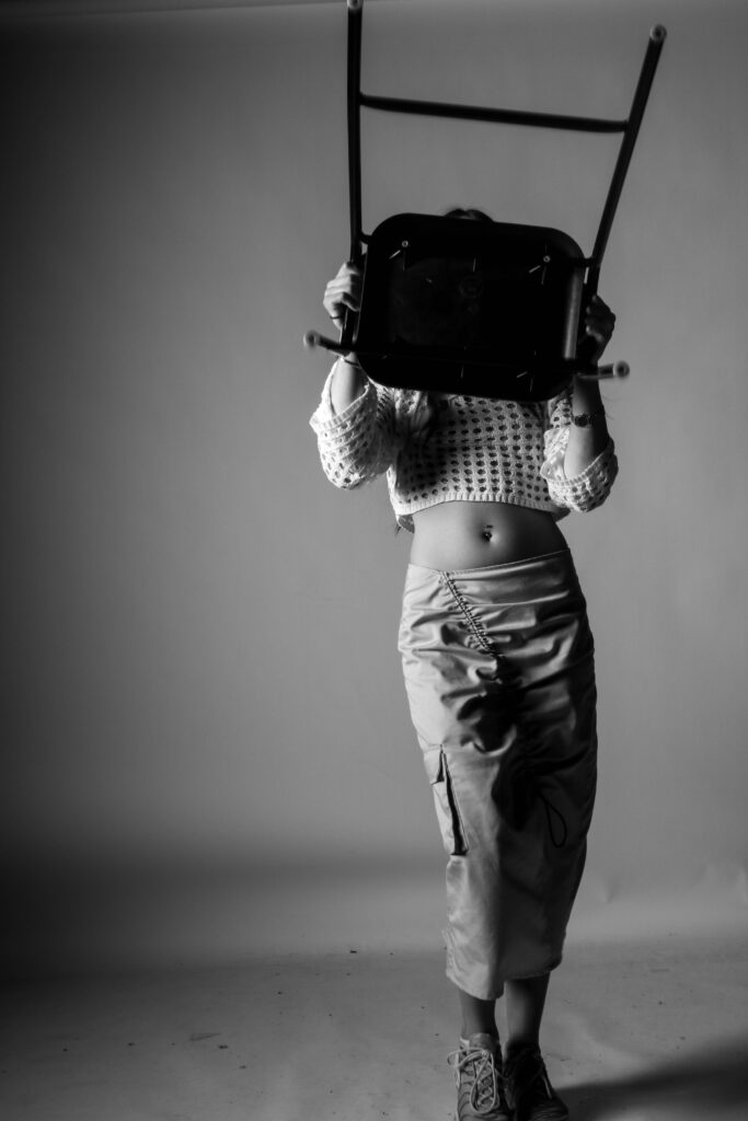
Shannon O’Donnell

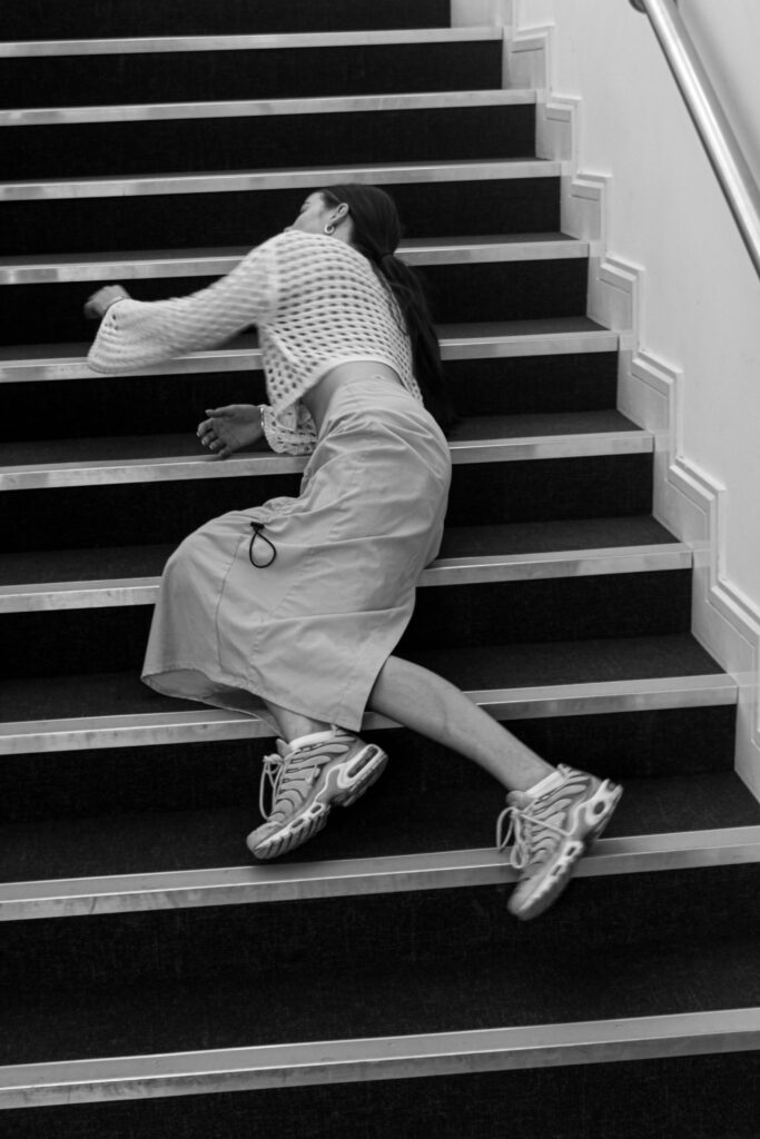
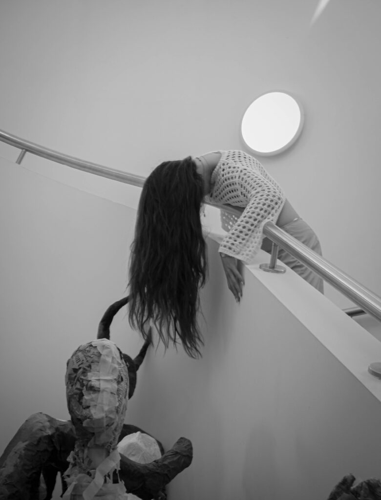
O’Donnell is a Jersey born photographer who’s work often consists of showing the way femininity is stereotyped and i tried to replicate this in my image.

Their photos:

My photos:

Photographic Skills

Aperture

Aperture affects the lighting in your picture. The large we make the hole in the lens, the brighter the image will be and vise versa. We can also effect the depth of field using aperture, allowing us to choose the focus point of the image.

My photos:

Lighting Portraits

Rembrandt lighting is a lighting technique used for portrait photography. It is named after Rembrandt Harmenszoon van Rijn, the great Dutch painter and refers to a way of lighting a face so that an upside-down light triangle appears under the eyes of the subject.

Butterfly lighting is a type of portrait lighting technique used primarily in a studio setting. Its name comes from the butterfly-shaped shadow that forms under the nose because the light comes from above the camera. You may also hear it called ‘paramount lighting’ or ‘glamour lighting’.

Chiaroscuro is defined as a bold contrast between light and dark. A certain amount of chiaroscuro is the effect of light modelling in painting where 3-dimensional volume is suggested by highlights and shadows. It first appeared in 15th century painting in Italy and Flanders (Holland), but true chiaroscuro developed during the 16th century, in Mannerism and in Baroque art. Dark subjects were dramatically lighted by a shaft of light from a single constricted and often unseen source was a compositional device seen in the paintings of old masters such as Caravaggio and Rembrandt.

Example photos:

My photos:

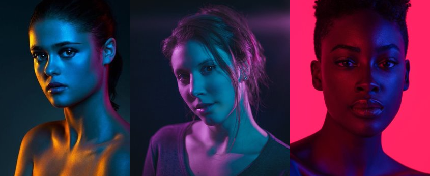
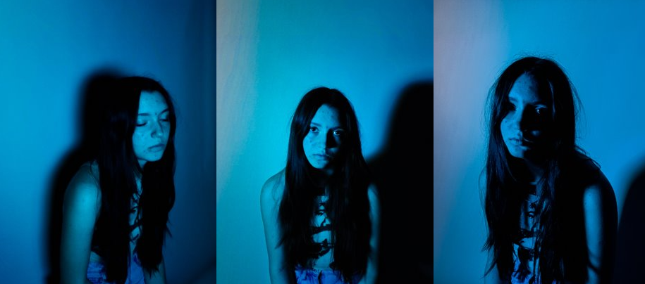
Colour lighting

I experimented with colour by using tinted sheets over my light source, causing the light to change it’s hue.

Example photos:

My photos:

review and reflect; past projects

Over the course we have looked at many different artists and photographic techniques which helped me gain a greater understanding of the camera and my preferred style of photography.

These are some of my favourite projects I have done and work I created:

Environmental portraits:
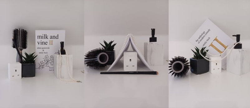
For this project I got to explore people in their natural surroundings and delve into aspects such as their careers and hobbies whilst also photographing people in a casual setting.

This enabled me to capture people in a comfortable setting and using the image to tell a story about the subject.

Clare Rae inspired shoot:
This shoot enabled me to step outside of my comfort zone and experiment with a more quirky and unique aesthetic which in my opinion was worthwhile as I made many successful outcomes.

Girl pictures:
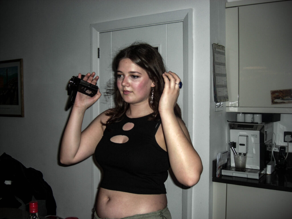
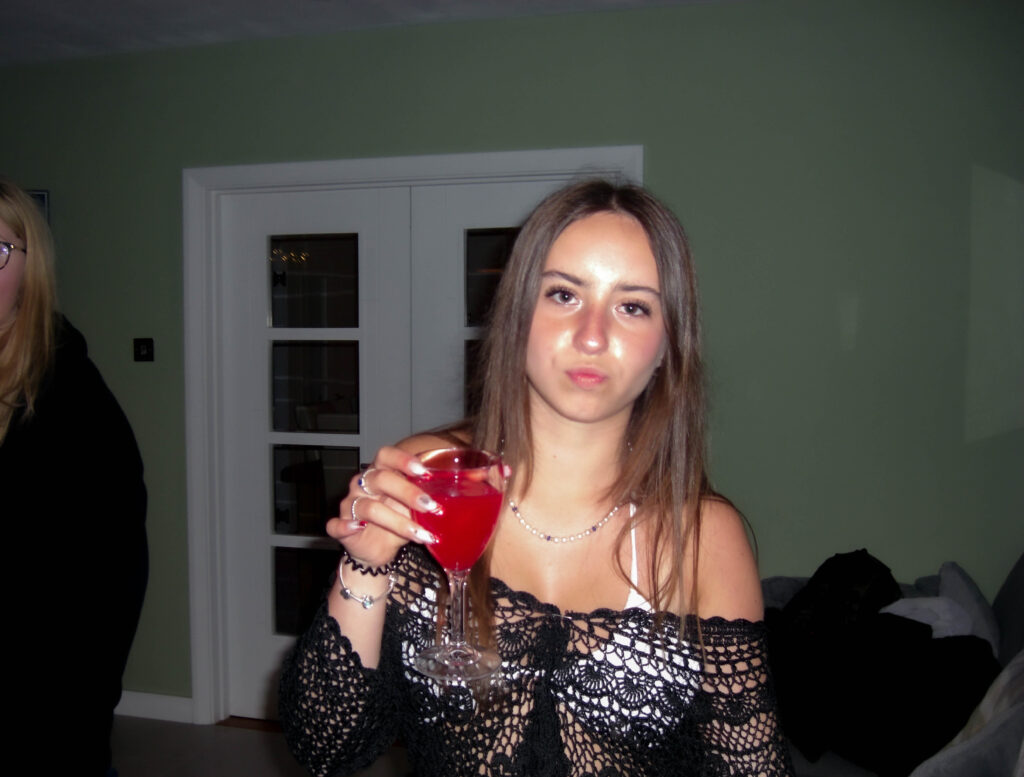
This project was inspired by Justine Kurland’s book ‘Girl Pictures’ and I used a similar style and concept to create my own images. I really enjoyed this project as i found it was quite nostalgic to take pictures of my friends and document their lives and what they get up to. I also think during this project I created lots of successful outcomes and allowed me to experiment in shooting documentary style images which I have now realised is one of my preferred styles of photography.

Review & Reflect: Past Projects
Anthropocene:

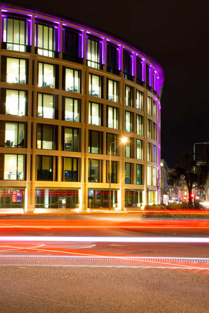
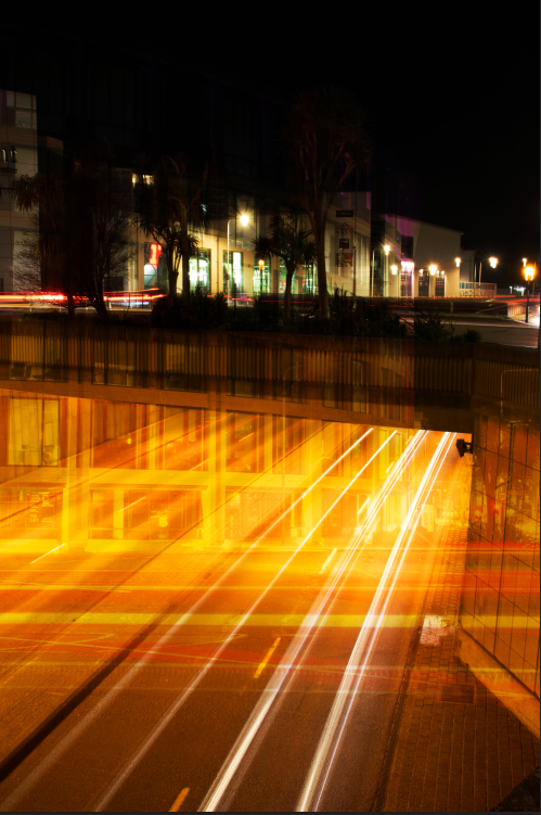
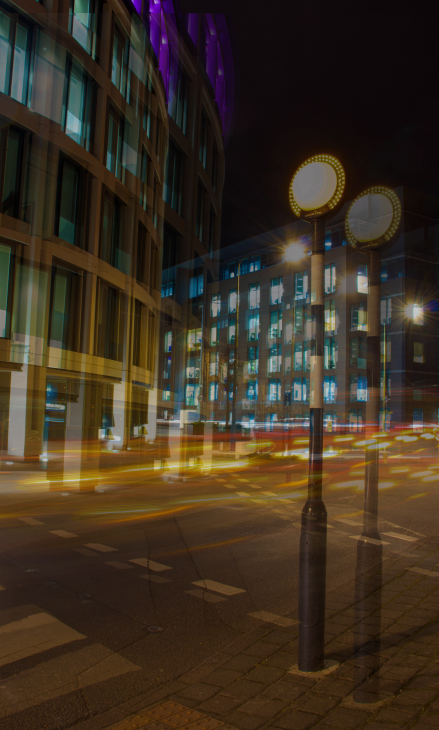
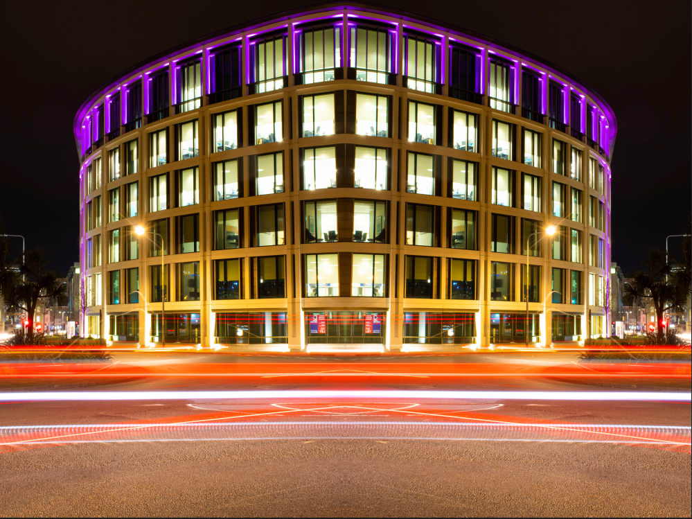
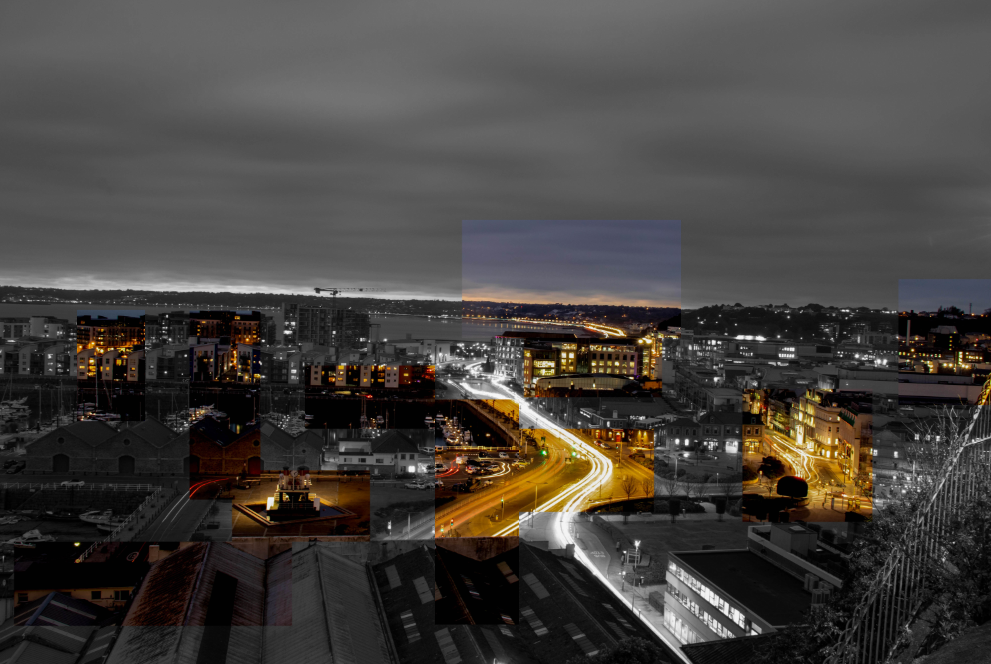
One of my favourite topics that I have shot during this course has been Anthropocene. I decided to focus my shoot on car light pollution. I thought this would fit the theme of Anthropocene well, as it focuses on how the world has been altered through human impact. Due to the vast amount of people who drive cars, toxic fumes are released into the air impacting on wild life and the environment. I decided to do this photo shoot during rush hour in the week in order to get images with the most amount of cars in. I also had to wait for the sun to set for around 5:30pm to gain the highest quality images for the lights. To create a light trail, i kept my IOS as low as possible, changed my shutter speed to around 60 seconds long, and finally, i changed my aperture to around F/16.

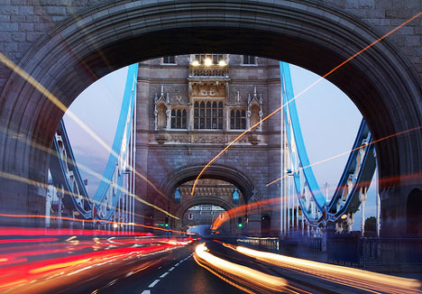
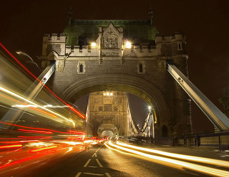
For this photoshoot I took inspiration from a British photographer MSH*. MSH* captures the hectic moments of rush hour in London by using slow shutter speeds/ long exposures which creates light trails. Although there is not a lot of information on this photographer I took inspiration from his images. The photos I have created are quite calm images however, the light trails create a sense of urgency and rush.

Below are some inspiration images that I based my project on:

Femininity:

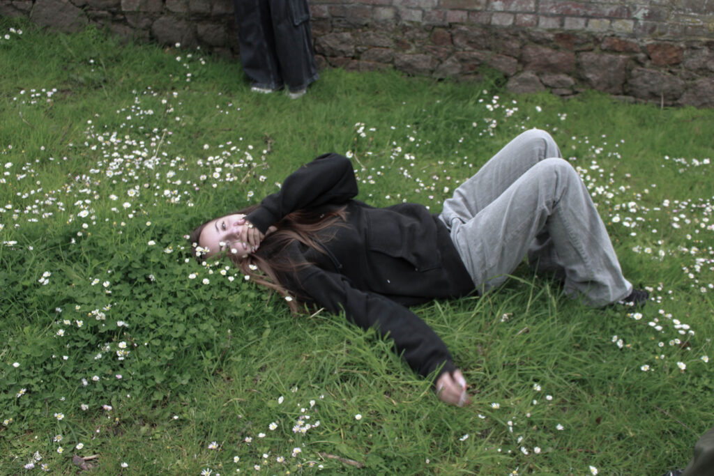
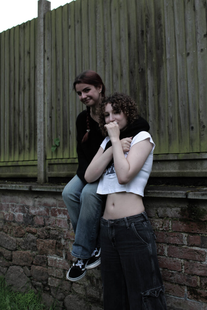
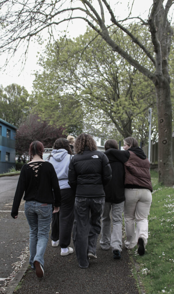
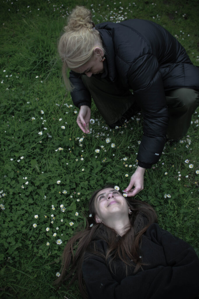
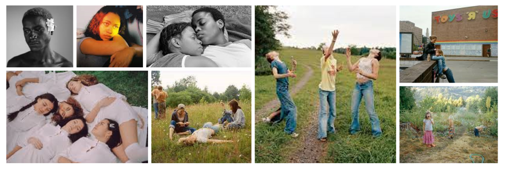
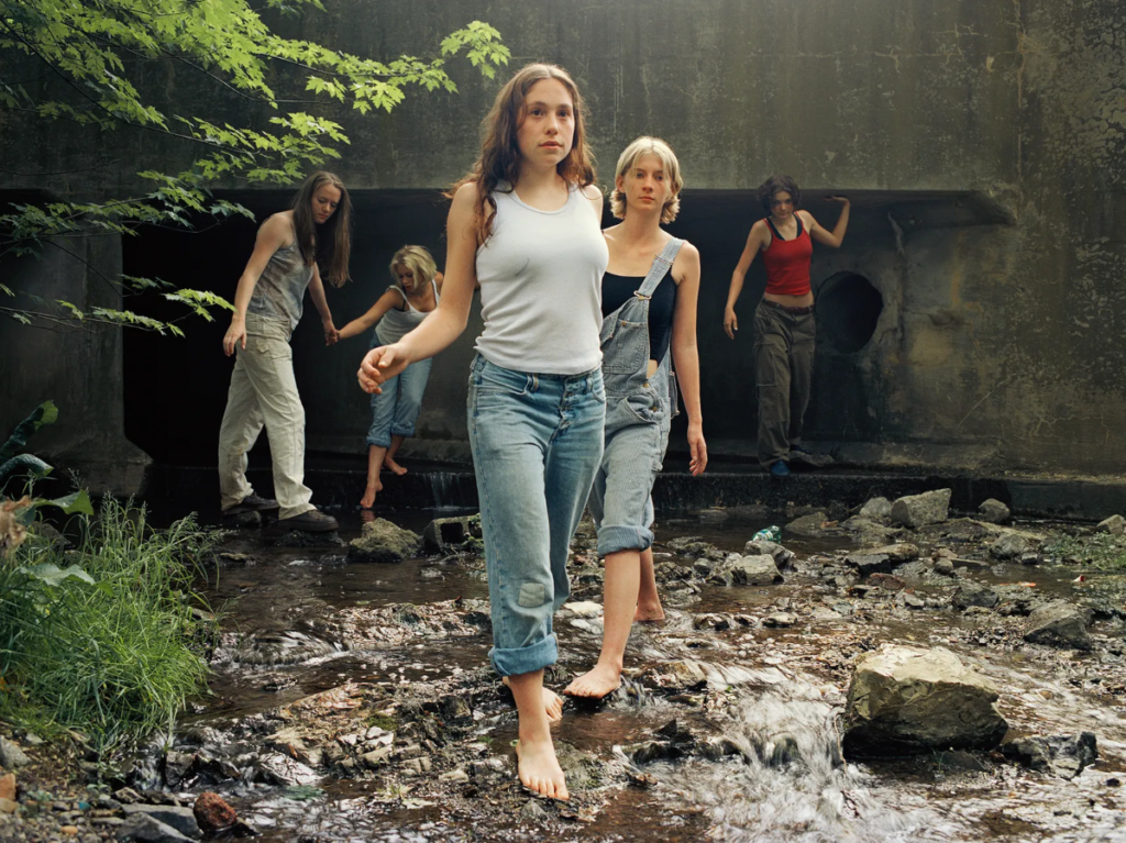
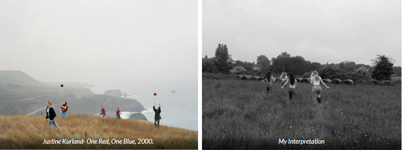
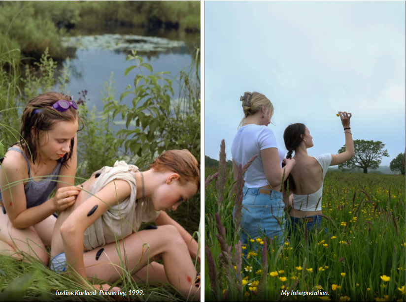
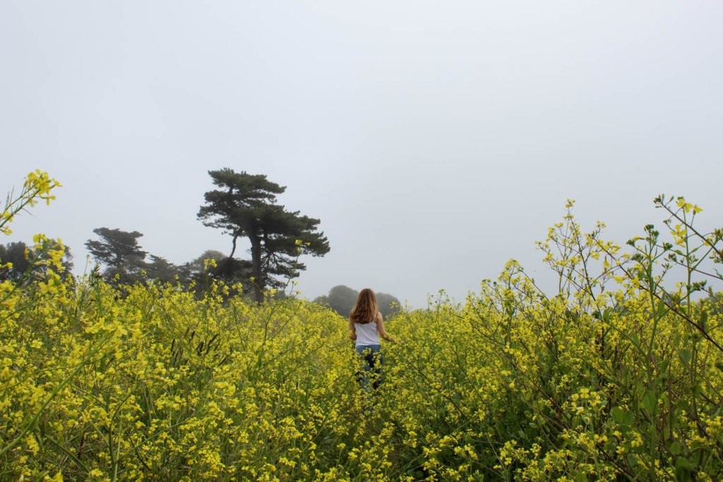
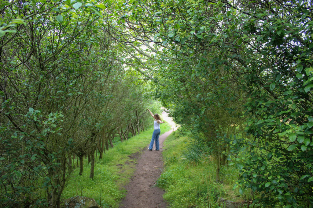
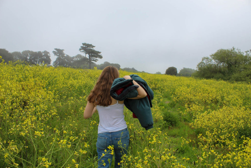
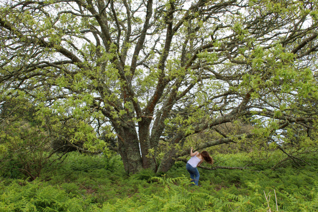
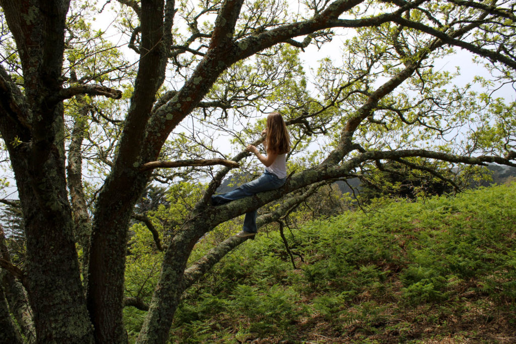
Another theme that I thoroughly enjoyed the process to was Femininity. My main inspiration for this photoshoot was Justine Kurland’s ‘Girl Pictures’ book. I believe that this book defines feminism very well due to every photo being very unique and capturing different types of people.

Justine Kurland’s Girl pictures bring a sense of nostalgia. Every girl in each photo have their own story however come together to live a similar lifestyle. They live without a care in the world, and are truly living their teenage years. Therefore many of the images in Girl Pictures were taken outside in locations that feel desolate or easy to overlook. They are often staged under bridges or beyond fences or on the sides of highways; places that feel synonymous with warnings. The privacy of the overpass is also potent with all the stories we’ve heard of women getting hurt in such places.

This was my mood board for the photo shoot:

Justine Kurland – the wall 2000
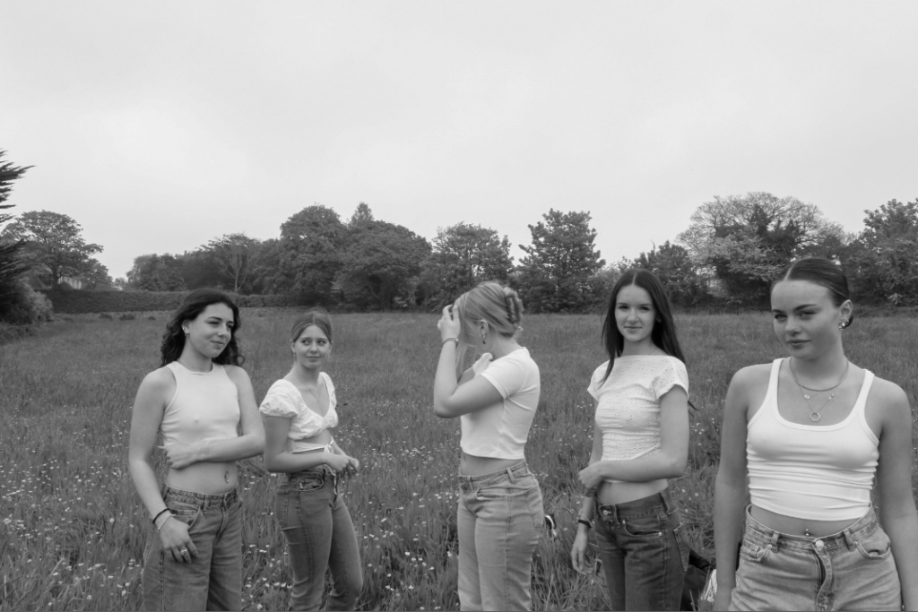
My interpretation

Justine Kurland’s ‘the wall 2000’ was my reference image for this comparison as it has some similarities but also many differences. one of the similarities being how two subjects are looking into the camera and the other three subjects, further away from the camera aren’t looking towards it. However, a difference is the locations of the two images, although both images are clearly taken outdoors my interpretation has an open field behind it. Whereas in the reference photo, the wall creates a feeling that the girls are trapped and their expression and clothing suggest that they are lost.

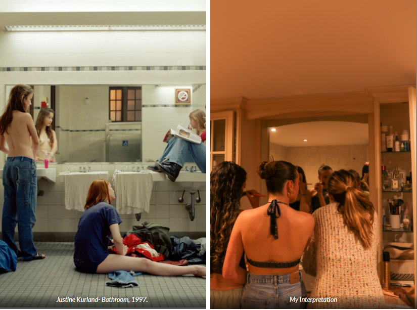
Overall, I think this was my favourite photoshoot I have done as I believe it is empowering. It shows femininity in a beautiful way where women are helping and comforting other women. In some ways Kurland’s images break the stereotype of women, in the sense of girls wondering around in the ‘wild’ away from the hustle and bustle of a city or town. However in other ways, her images feed into stereotypes. For example the image in the bathroom is almost ‘proving’ that women ‘take too long getting ready’.

Environmental Portraits:

Another topic in which I am wanting to take inspiration on in my personal study is Environmental Portraiture. I thoroughly enjoyed this theme as I believe that this type of photography can show a lot about someone and their background.

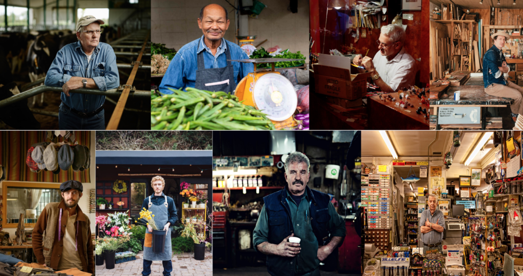
An environmental portrait is a photographed portrait that captures subjects in their natural surroundings instead of in a studio or other artificial setup. Rather than focusing on what the subject looks like, environmental portrait photographers use the background to portray a truth or convey an idea about who the subject is. Shooting environmental portraits can be a great way to create visual interest while also revealing something about your subject’s life and personality. Environmental portraits provide context, something that studio portrait headshots often lack.

Here was my mood board for my first shoot:

Outcome:

Shoot 2 mood board:

Outcome:

Review and Reflect: Past Projects

Home:

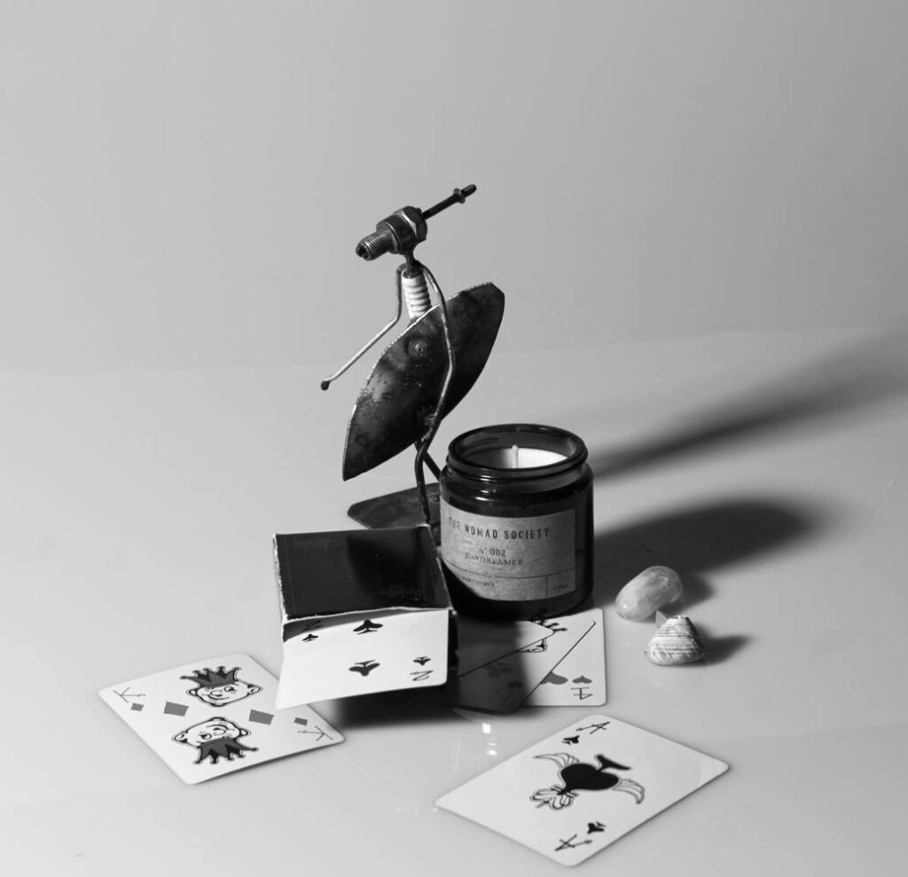
Overall, I don’t think this project was my best work, as I wasn’t very happy with the images that I produced as they didn’t demonstrate what I am capable of. Taking still life images was new to me which is why I think my images didn’t come out very strong. I did enjoy recreating the work of Mary Ellen Bartley which was later on in the project where I had a better understanding of how to arrange the objects to make them look appealing and draw the viewer in.

Romanticism:

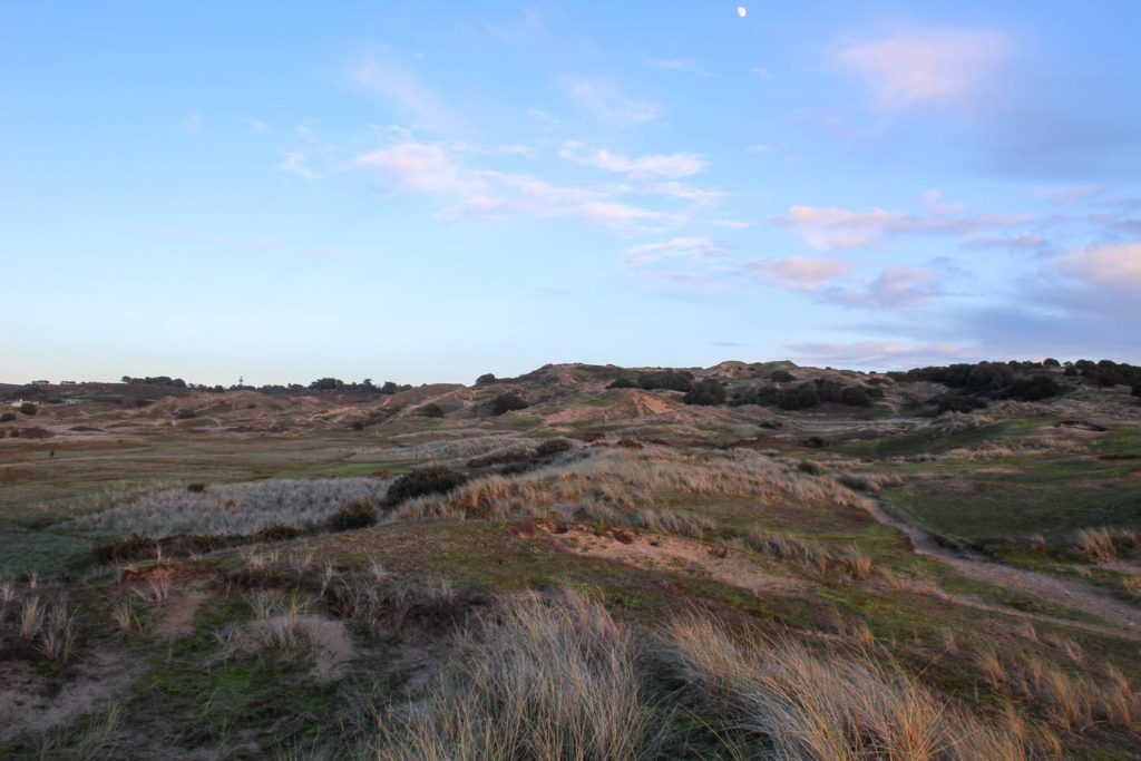
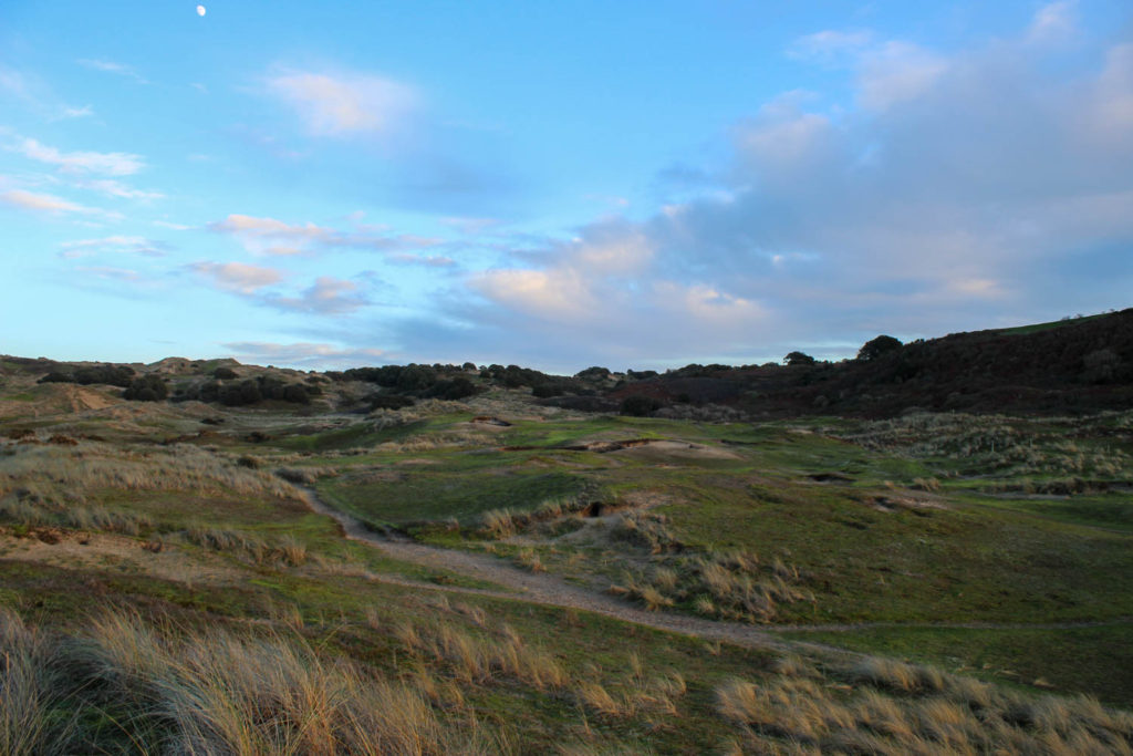
I feel my romanticism project had a one strong photoshoot that linked well to the theme of romanticism, on the other hand I had one weaker photoshoot which only had a few images linking back to romanticism. I enjoyed exploring the beauty in rural landscapes.

Anthropocene:

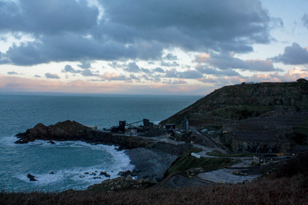
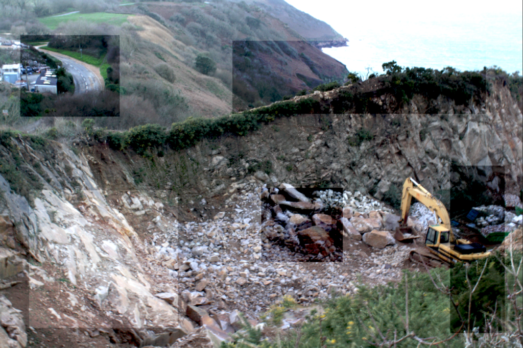
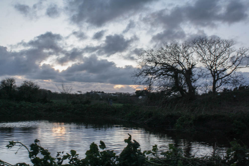
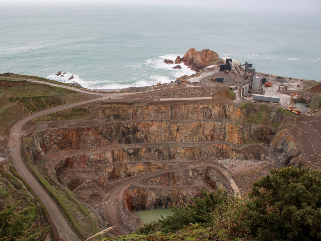
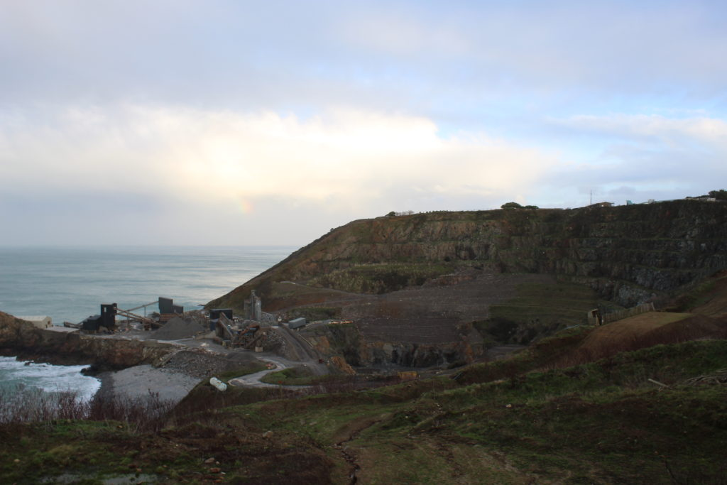
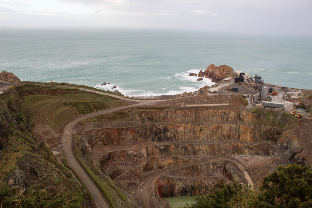
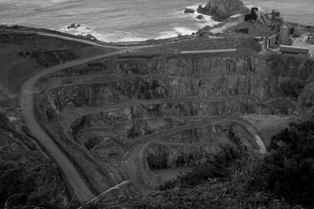
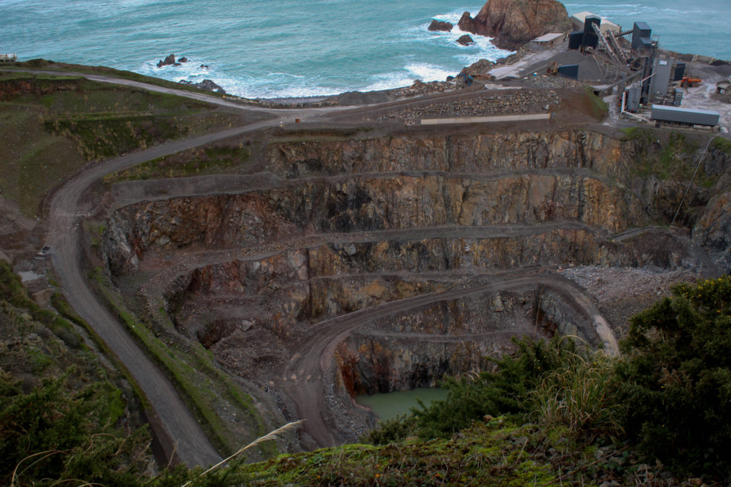
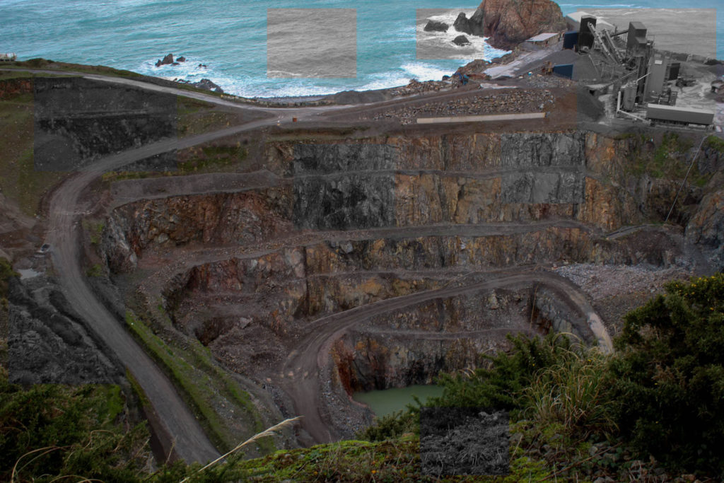
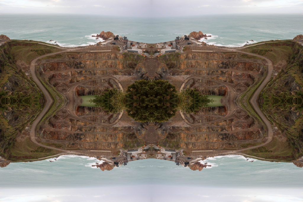
This is one of my favourite projects that I have completed. I took inspiration from David Maisel project ‘The Mining Project’ as I felt they best related to the theme of Anthropocene. I took my images of Ronez Quarry as it shows that the landscape has and still is being drastically changed. The images I took at Ronez are stronger than the ones I took at Sorel Point as you get a birds eye view of the quarry. However, it was quite frustrating that I wasn’t able to get the view of the quarry I wanted due to restrictions. If I had a drone, I would of been

able to get better shots of the quarry.

Femininity:

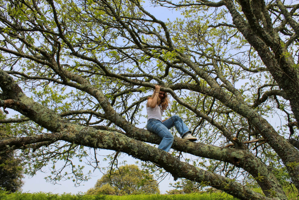
For my femininity shoot, I used Justine Kurland’s ‘Girl Book’ project as inspiration. I was happy with how my images came out as they linked strongly to Kurland’s project and the theme of femininity. However my final outcomes could of been better if I had more than one model in my images.

Review & Reflect

Environmental Portraits

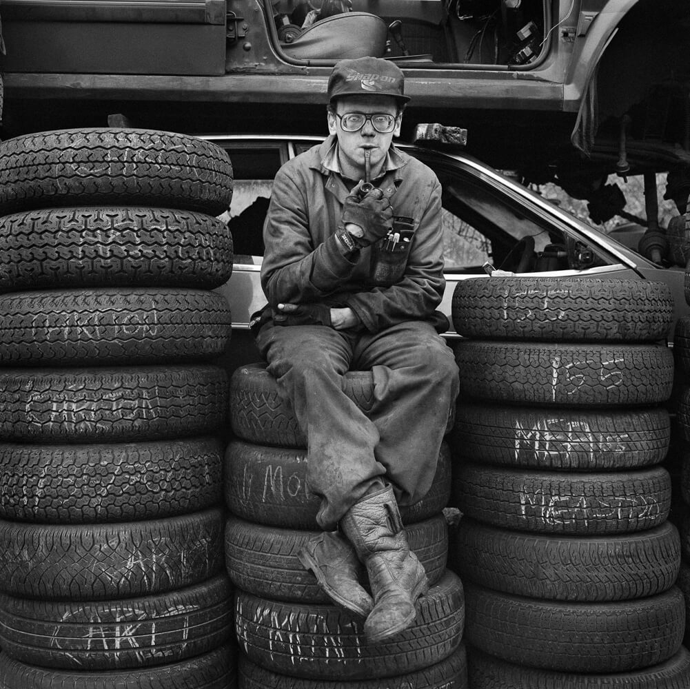
I mostly enjoyed creating the images of Environmental Portraits whilst learning photography because of the techniques that I had to use in order to create good images. Environmental portraits are images of someone in their environment, specifically a portrait of them with the context of what they are doing or where they work behind them. You can learn from doing a project like this because of how you have to frame your image for a better effective image, which will allow you to convey more of the environment’s context. The backgrounds used in environmental portraits are more to show the symbol of someone’s working environment, for example:

A mechanic in his environment of a workshop having a break which can show a lot about a person. Their lifestyle is put on display and depending on what is in the image and what the persons expressions are, it could symbolise a stressful lifestyle/environment or any context the image is trying to show.

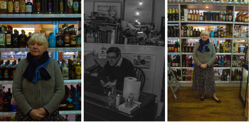
A couple images iv taken in this area I enjoyed creating because what is nice about this subject area is that it is all situational in where and when you take the image, you could be anywhere and be in a perfect position to take an environmental image for example one of my images:

Which I had taken with no intention to even use but turned out to be one of my best images in this area. It relates to nostalgia to me because of the times and situation the image was taken at and where the setting is, which to me was a time that I remember in a positive, enjoyable way.

Urban Photography

Urban photography can be created in different ways in photography, sometimes landscapes, close up any many other different ways, its very fluid to how you create your urban images.

Urban images are created in areas like cities or a village or places where there is a compacted and commercial area where people live or come visit. This could be for example New York, London, Jersey in town etc. Unlike Environmental portrait images which are mostly fond of the use of black and white images, Urban images like to be taken with a lot of vibrant colours with unique settings, and uses a lot of different shapes and lighting.

Urban photography is in its best element when there is a lot of movement going on and a people with a quick paste of life because it captures a scene and the context of what goes on in people lives living in urban areas in the cities. Whilst editing these images it is best when using a lot of contrast and vibrancy in the images. This area of photography is closely resembled to street photography because of its looks and methods of how it is made, it creates its own aesthetic. Although some of the images are created to look good and have a good feeling to them, some of the images in Urban photography are created to symbolise something, for example a run down abandoned building that sits in the area that no one uses but people know it is there.

It is close to nostalgia because of the feel that the images create which is very vibrant and the aesthetic makes you think about your “childhood” as a kid or even a teenager, which is how you might of been, running in the streets finding things to do and having fun with the resources of the urban area you live in.

Review and Reflect

As a whole, I would say that I’ve learned a lot about photography on this course so far, improving on my technical skills such as editing images and creating compositions, and my more practical skills, for example, using camera settings to my advantage and using lighting to establish tone and mood.

A lot of themes have been covered on this course, but the two that stick out to me the most as powerful and inspiring would have to be identity and nostalgia, as I feel they both link together, but they also provide plenty of personal experiences that make me who I am that I can reflect on and use in my work.

I’ve found myself more interested in the medium of film as a means of expressing my work, but I still prefer the idea of photography and feel that my skills in this area are more advanced and varied.

– Alex Hurst

Conceptual and documentary photography are the two approaches I’ve found to be the most intriguing as I believe there’s a lot more that I can do and explore with them, as opposed to tableaux photography, a genre that doesn’t really appeal to me all too much.

My favourite artists that I’ve looked at/studied are Henri Cartier-Bresson, Alec Soth, and Ansel Adams.

Henri Cartier-Bresson

I feel that Cartier-Bresson’s style had an incredibly large impact on my work, as it has completely changed my approach to street photography and improved how I put together a composition in the frame. His influence has also provided me with a lot of confidence toward shooting at ‘the decisive moment’ to capture an interesting and lively piece. This example above

Alec Soth

Alec Soth has inspired my work in the sense that I try to create compositions that focus on the person as a whole, so that their personality and aspirations are evident within my presentation of them, through their body language and even the use of props. His work has definitely made me more thoughtful about the message and implications of my own work.

– Ansel Adams

Ansel Adams was a very powerful artist to study when it came to landscape photography. It taught me different methods of adding drama and romanticism to my photographs, which gave them a stronger overall composition to make them stand out better.

Paris Photo 2023

Paris Photo is the largest international art fair dedicated to the photographic medium and is held each November in the heart of Paris. Since 1997, the Fair’s mission is to promote and nurture photographic creation and the galleries, publishers and artists at its source.

Paris Photo brings together up to 200 exhibitors from across the world, offering collectors and enthusiasts the most diverse and qualitative presentation of photography-driven projects today. Leading galleries showcase historical and contemporary artworks from modern masters to young talents. Specialized publishers and art book dealers present unique and rare editions, as well as book launches and signature sessions with many of today’s most renowned artists.

Paris Photo also provides visitors with first-hand insights and access to the art world. Programming includes curated exhibitions with renowned public and private institutions, awards, conversation cycles with curators, artists, collectors, and critics, and special events exploring the unique history of the medium; varying visions, practices and emerging trends. In addition, the Fair’s “In Paris during Paris Photo” programme reunites a dense network of cultural institutions throughout Paris comprising some of the most historically rich photographic collections in the world.’

I enjoyed looking at the work on display at Paris Photo, but the sheer range was honestly rather overwhelming. I found a few examples of work that I might wish to draw inspiration from for my personal study.

The above image is of a collection of Polaroid images of a TV screen taken by Tom Wilkins over 4 years (from 1978-1982) of various actresses, with individual captions. Sébastien Girard later buys this collection in an auction of Tom’s belongings following his disappearance and publishes it in a book in 2017. Girard describes this book on his website:

Tom is American.  He lives by himself. TV keeps him busy.  In 1978, he buys a polaroid camera and spends 4 years photographing the women who inhabit his TV screen.

Moreover, he carefully writes on each print a caption and the date. Over 4 years, Tom assembles an extraordinary diary, a silver harem of a thousand annotated polaroids arranged in albums, all titled My Tv girls.
Following the disappearance of its author, this lot was put up for sale on auctions together with other belongings.

Simultaneously interested by this story of appropriation and fascinated by Tom’s visual diary, I decide to buy this archive.
I then study them and recreate their incantatory dimension in a book, ten years later.’

This work is that of Horacio Coppola’s, an Argentine photographer of the cafes, side streets and neon-lit boulevards of Buenos Aires in the 1930s. He introduced avant-garde photography to Argentina. I particularly enjoyed the way in which he portrayed city nightlife and I find his images definitely inspire me to create similar ones to respond to the brief of nostalgia.

The above images are taken by Joel Meyerowitz, an American street, portrait, and landscape photographer. I like these because they also have a strong relation to the theme of nostalgia, and I think they have a particular style to them.

Los Angeles, Early Evening – 1986

I like the work of Larry Sultan also, the above image was the one displayed at the exhibition and I really like the way he has used the light to perfectly capture the essence of the evening air. I think this also relates to the theme of nostalgia because all of his images have this kind of faded and forgotten feeling to them. This series, Pictures from Home, is significant as it is Sultan’s memories of his parents from when he was a child. He uses the typical architecture of the American suburb to create imagery that can be relatable to many viewers.