artist study – Ezra Stoller

mind map:

about Stoller and why I have studied him:

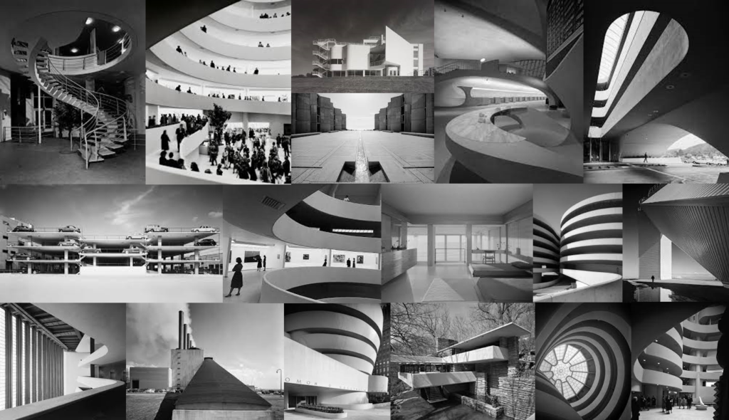
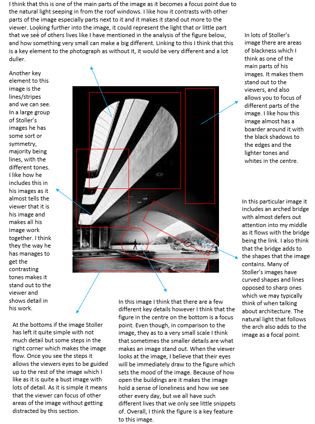
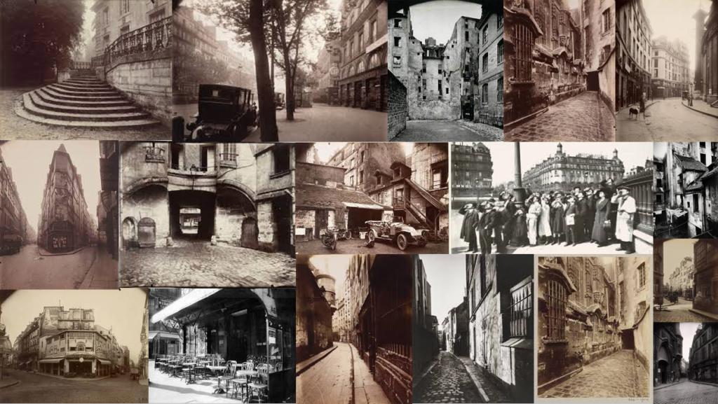
Ezra Stoller was an architecture student at NYC who was born in Chicago in 1915 and later moved to New York where he grew up. He graduated in 1938 with a BFA in industrial design and went on to take photographs in the Office of emergence Management. He then got drafted and became a photographer at the Army Signal Corps photo centre in 1942. After World War II he continued his career and passion for architectural photography and over the following forty years be became a well know photographer, famously know for his architectural images, and his use of lighting and perspective which allowed him to produce elegant images showing the beauty of architecture. Many of his images show the three dimensional structures that building hold and he was very focused on his vantage point as well as the lighting that his images would need to turn out the way he wished them to. From my mood board you can tell that lots of his image contain similar lines, shapes, tones, and textures. Stoller was able to uniquely visualise the inspiration that architecture gave off and chose to photograph it to keep it alive. Some of his images are what people recognise building from and he has become a photographer who captured social history and document incredible pieces of architecture. At the time, Stoller work with many of the top architects such as Frank Loyd Wright, Paul Rudolph, Marcel Breuer and many more. Sadly, Stoller passed away on the 29th of October in 2004 but his legacy will forever go on.

I have chosen to study Ezra Stoller as I think his work is very powerful and I hope to achieve some images inspired by his for my personal study. In his images he includes lots of symmetry which I think draws the viewer into the images making them engaged and they then see the detail that they hold. All of his images are of quite large open building which I think allows for a simple but effective image with room for the viewer to add their own story of interpretation. All of Stoller’s images are presented in black and white which in architecture photography leaves us with images with great detail and different tones. I also think that it means that the viewer can focus on the actual architecture and not get distracted by the colours of the images. Overall I really like Stoller’s work and am heavily inspired by his images and wish to make a successful response to them.

artist zoom-in:

bibliography:

https://aboutphotography.blog/photographer/ezra-stoller#:~:text=Stoller’s%20photographic%20style%20is%20characterized,beauty%20of%20each%20architectural%20subject.

https://aboutphotography.blog/photographer/ezra-stoller

https://en.wikipedia.org/wiki/Ezra_Stoller

Troy Paiva Case Study

Troy Paiva is an American Urban night explorer, who’s work takes place a lot of the time in the desert, where he captures abandoned, rotting, and broken down infrastructures that have been left behind. He is a light painter, by using different colours and types of lighting it creates a specific style of work which he presents in his images.

Troy explains he love taking images like these more for the aspect of his environment he works in, as he says, “I love the surreal feeling of wandering through an abandoned subdivision, alone, in the middle of nowhere, in the middle of the night. Your senses become heightened and you feel the weight of time”. With just this quote alone you can easily link his work to the “sublime” and “romanticism” as this is the whole aim of what his work expresses, abandoned areas with a brightly coloured image creates an array of emotion within the image. Troy’s belief and work relates a lot around his favourite statement of “Ozymandias”, which is a reference to an Egyptian pharaoh, who described in a poem, where his statue crumbles down, as a way to expose praise to the subject of art’s ability and preservation. So in Tory’s work he photographs abandoned, broken areas, and within his images he almost preserves it through his brightly coloured lighting.

Troy’s early life was a graphics designer, whilst still taking a couple photography classes, and even used to teach how to pain. As he grew up like many people at the time, he learned different skills in the artistic world, especially photography. By discovering light painting in photography he was hooked instantly and began to develop his work, which worked in favour of his environment, which was abandoned, mysterious areas.

Justine Kurland

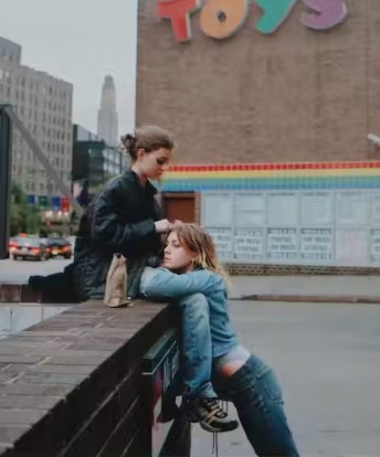
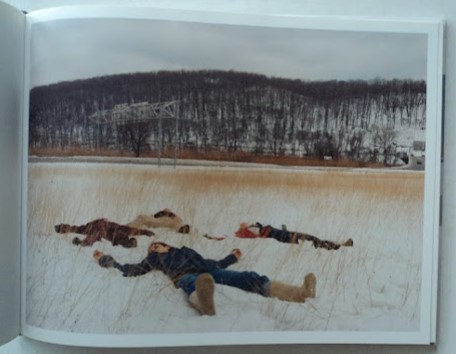
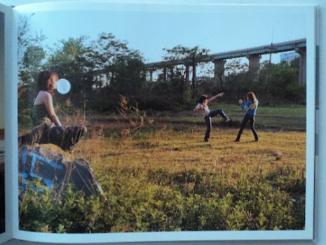
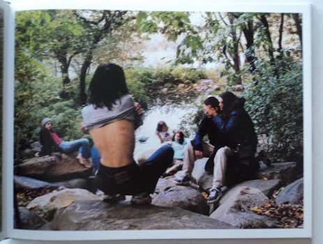
Justine Kurland is an American fine art photographer that first gained public notice with her work in Another Girl, Another Planet (1999). The show included her large c-print staged tableau pictures of neo-romantic landscapes inhabited by young adolescent girls. She also produced a series of images called ‘runaways’ inspired by her past experience with being a runaway when she was young which influenced her to find other young people in a similar situation and recruit them as models. In total, Kurland published 69 pictures of girls in her series “Girl Pictures.” The staged photos take place in urban and wilderness settings, with girls depicted as runaways, and show how they are hopeful and independent. Kurland has acknowledged the parallels she created in her work, specifically her competing desires to both escape and fight back; to document and allegorize; and to capture “vaporous abstractions” like the carefree freedom of her “runaway girls.”

She also published a book titled ‘SPIRIT WEST’ that is described as being neither reportage nor fantasy: rather a kind of disturbed normality. The beauty of the nature is overwhelming, but is regularly disturbed by an ugly viaduct or unsightly building.
“particular appeal of Ms. Kurland’s work is in its deadpan tension between the matter of fact and the mythic.” – Ken Johnson

Image analysis:

-Broadway (Joy) 2001

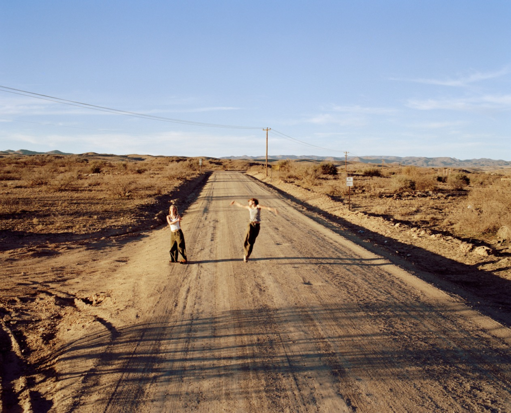
In Broadway (Joy) (2001), the camera is angled down on two girls as they dance on a desert road. The surrounding environment seems vast and endless with the only indication of society is the dusty road and the phonelines that stretch across the desolate landscape. Although they are surrounded by a barren and unpopulated area, which in comparison to they seem small, their energy fills the frame. One of the girls, on the right, is in mid air with her arms waving around, her blurred arms becoming like wings representing her found sense freedom. To create this effect, Kurland will have used a slower shutter-speed to capture that sense of that movement and create an accurate response of the emotions they are showing through their dancing. Despite their faces being unclear, we can tell that they are happy as their body language displays this and overall this image perpetuates joy.

Artist studies

Hans Van Der Meer:

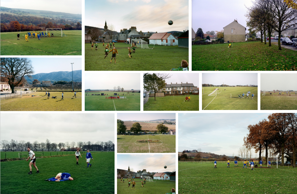
Hans Van Der Meer is a Dutch photographer who has created many projects. I am going to focus on his two projects about football ‘Dutch Fields’ and ‘European Fields’ for my personal study. Through out his projects ‘Dutch Fields’ and ‘European Fields’ Van Der Meer explored the relationship between the football and photography. These projects consist of images of various football pitches, which each tell a different story about the game. In an interview about his project ‘Dutch Fields’ Van Der Meer stated that “football and photography can be such a beautiful combination” as you never know hat happened before or after the moment captured which is why the subject of football was so appealing to him. He started of by taking images of by taking photos of the top armature matches before deciding to peruse taking images of lower league games. Van Der Meer tried to find pitches where the background also formed a part of the story and experimented with taking images from different angles such as high up angles from the stands. However, he found himself taking most of his images standing on the ground.

What intrigues me and draws me to Van Der Meer’s images is the way they have a cinematic feel to them. I also like how Van Der Meer allows the viewer to interpret the images how they want, creating their own story on what happened before or after the image was taken.

IMAGE ANALYSIS:

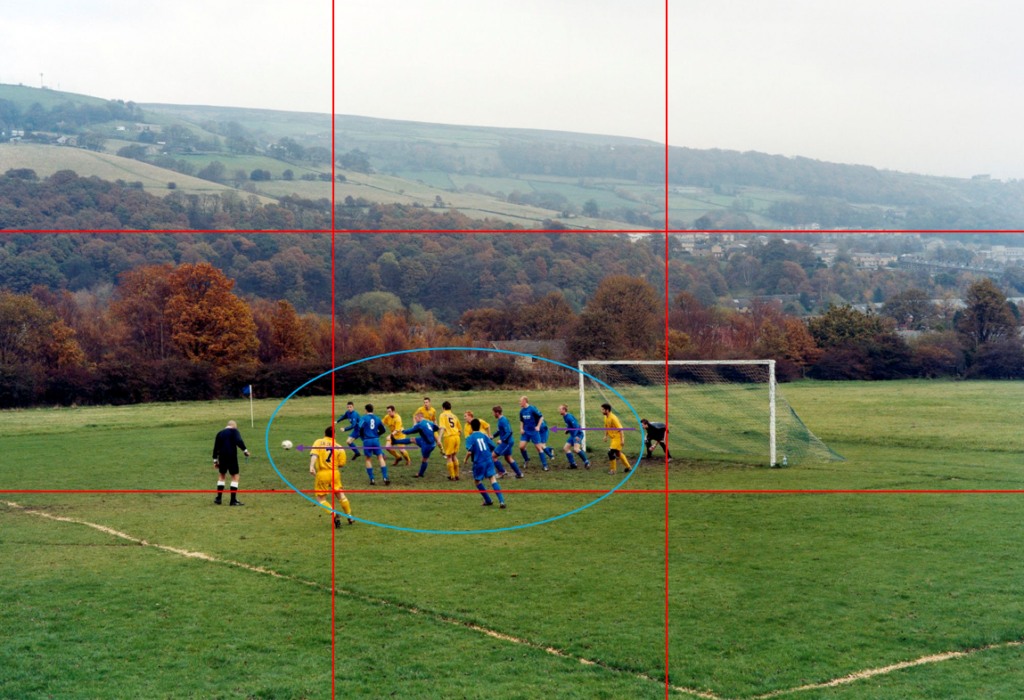
This is a digital image from Hans Van Der Meer’s project ‘European Fields.’ The mis-en-scene presents a football pitch with a scenic background of what looks like a village on an overcast day. It looks as if a corner has just been taken as everyone is crowded in the box. This photo has been taken from a high up angle, possibly from the stands as it looks like you are looking down on the players. The use of light is natural however, there isn’t a key direction in which the light source is coming from as the image was taken on an overcast day. The foreground of the image, what’s going on on the pitch, is in focus whereas the background is slightly out of focus. This suggests that the image was taken with an f-stop of f/5.6 as it has quite a shallow depth of field. The use of colours in the image vary from being dull such as the fields in the background, to quite vibrant. For example the yellow and blue kits and certain parts of the grass stand out more than the colours in the background of the image. The focus of the image is the players who are all trying to get hold of the ball. This image is a snapshot of what happened during the corner however, the viewers don’t know what happens after. It could be said that Hans Van Der Meer has used the rule of thirds and leading lines to draw the viewers to the ball.

I am going to use Van Der Meer’s images as a base inspiration for my photos. I am going to take images of different football pitches in Jersey however, I don’t plan on having people in my photos like Van Der Meer does.

Bernd and Hilla Becher:

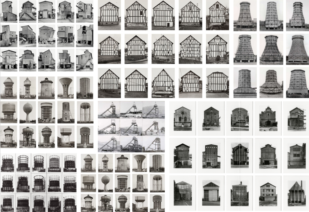
Bernd and Hilla Becher were a German couple who took images of the disappearing industrial architecture in Europe and North America. Bernd originally studied painting before typography. Their photography is different to other photographers as they document the history of German architecture such as water towers, factories, coal bunkers and other industrial structures. The way they presented their work as a typology, which is a system used to arranging various things in to groups based on how similar they look. Once they had taken a set of images of a structure, they would group their images together and present them in a grid formation; creating many typologies.

What stands out about Bernd and Hilla Becher’s work is that the sky is separated from the structure in the image. I also note that the sky is plain and overcast which gives it the distinct look that the sky is separated from the subject of the image. To get this affect, they would take their images of the same structure when it was an overcast day or they would have to take a series of images over multiple days to make sure the sky and lighting was correct.

Barbara Kruger:

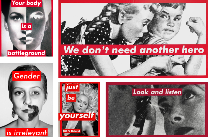
Barbra Kruger is a conceptual artist and collagist who is most famous for her black and white images which are overlaid with red and white captions displaying the power of identity. Kruger’s work is very powerful in my opinion and links to the theme of femininity and sexism which is a major issue in women’s football. Her work depicts how women can be independent and don’t need to follow the rules created by society.

I plan to edit some of my images in the style of Barbra Kruger’s work as I think I could create a powerful set of images and the caption I can create will link strongly with the theme of my personal study as there have been many challenges playing football as a young girl and still are now.

Statement of Intent

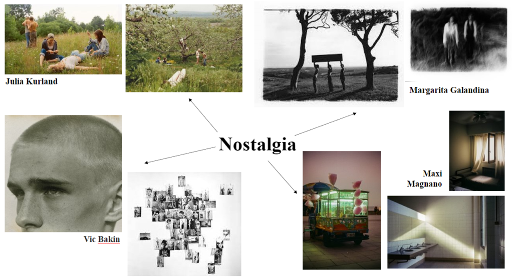
For my personal study, I think I want to explore nostalgia and childhood, growing up by the beach and other memories I am fond of. I want to look at archived photos of me as a child, and possibly recreate them in a nostalgic sense.

This idea matters to me because it is nice to reflect on the past, and the comforting sense nostalgia gives. In my childhood I spent a large amount of time at St Ouens beach and it would be exciting to return to my childhood memories through photographs. The nostalgic theme is also drawn into the process of taking the images, not only seeing the final product.

I will begin my project by finding archived images from the beach, and some other memories because I want to experiment with a few locations and memories to see which create the best story and composition. I might edit some of the images to look more archived, e.g. add film filters, grain, black and white, intensify the colours to make them look old. I will then visit the sites multiple times at different points in the day to get different lighting, areas and be inspired by new things each time.

My first thought is to produce a photobook, that tells a story in an ‘order’. I want to experiment with different layouts and opacities to create interesting compositions, rather than just the images presented on their own. I also would use the photobook to create a theme colour that ties in with the nostalgic sense e.g. pinks or golden yellows.

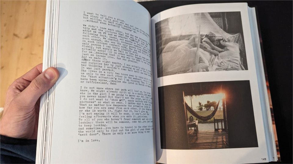
I am interpreting the theme of nostalgia by reflecting on my past and idealising it. Through my work I might try and portray the feelings of being a teenager living in society today, and show the pressures or body image, social media, and more. This could juxtapose with the ‘happier’ childhood archives. I am unsure if I will create a more negative look on teenage life, or if I will show a positive side. I will develop my ideas as I take the images and work out the best outcomes. Some artists that I have found and will take inspiration from are Rinko Kawauchi, William Eggleston, Maxi Magnano, Julia Kurland and Marco Kahold. I will shoot places and people as my main subjects and possibly some objects in the studio such as childhood bears or toys. I might take some photos of myself to show the change, but from a low perspective to emphasise my growth from childhood. Most of my images will be outside due to the fact that natural lighting will play a key role in my images, as I love the golden haze in the sky that winter sunsets create. My images will hold the aesthetic look, but some might be staged to create the Julia Kurland images. I would like to use some text in my book because I think it adds to the sense of nostalgia. I would probably use my handwriting and scan it, with the content being how I feel about the childhood, or writing that I did as a child. I could use a combination to show the change.

Kahold’s use of handwriting
example of Kaholds work with writing

For editing, I am going to use Lightroom Classic for my basic edits, then further my editing in Photoshop. This will make a difference because without further editing in Photoshop, I won’t be able to create the nostalgic hazy look, or add anything into the shot. I might experiment with AI or inserting other shapes to add a childish sense to the photos.

This week I am going to take some initial photos to help me start off my project, even if I don’t end up using them, it will help lead me toward better ideas.

Personal Study Ideas

Maxi Magnano

‘Seeing Maxi Magnano’s works is like going on a trip on your own to a place you have never been before — exploration on solitude and a reflection on how we inhabit spaces, how we make them ours. On today’s interview, he shares with us how he started, what motivates him and how he found his remarkable artist voice.’

https://www.lomography.com/magazine/345671-interview-with-maxi-magnano

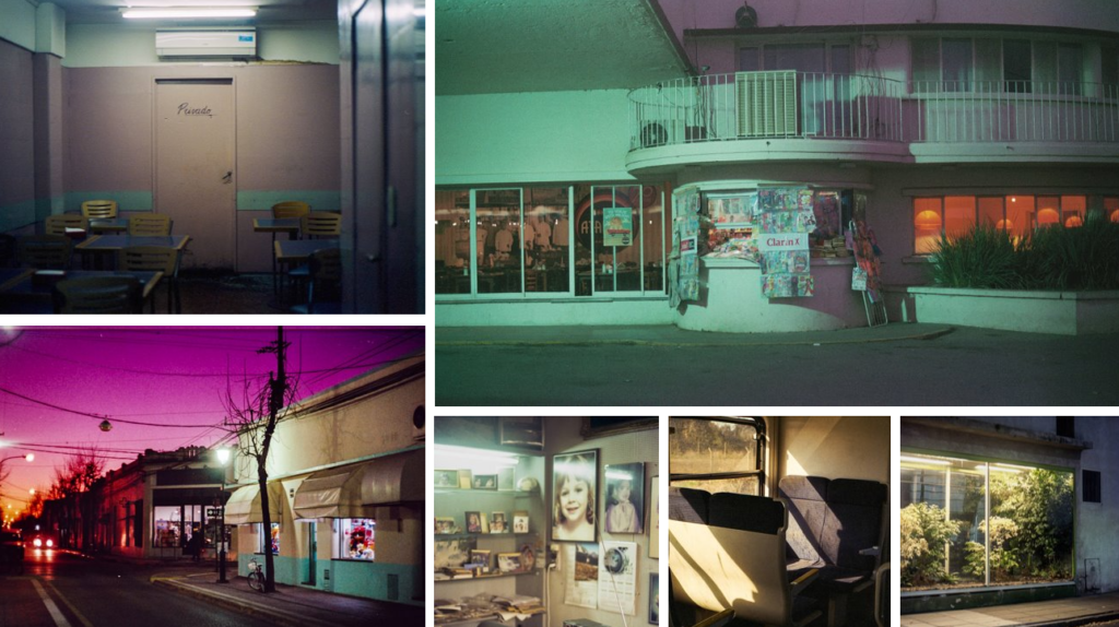
I have discovered the work of Magnano through research into nostalgic photographer online. He uses lighting and ambiance to create the nostalgic effect on his images, giving them a sense of warmth that links to the ‘good old days’ comfort nostalgia brings.

Maxi Magnano is an Argentinean photographer who took up photography at the age of 25. He began by shooting as a hobby using a digital camera, he developed a passion for it and began focusing on photography as a full-time career. Expanding his portfolio, Magnano wanted to capture feelings of melancholy and nostalgia. He typically avoids human subjects and focuses on everyday settings. This produces a sense of solitude and an ominous sense. He uses light and shadow as a key factor to attain the sense of life in the atmosphere.

Marco Kahold

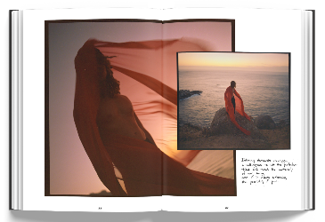
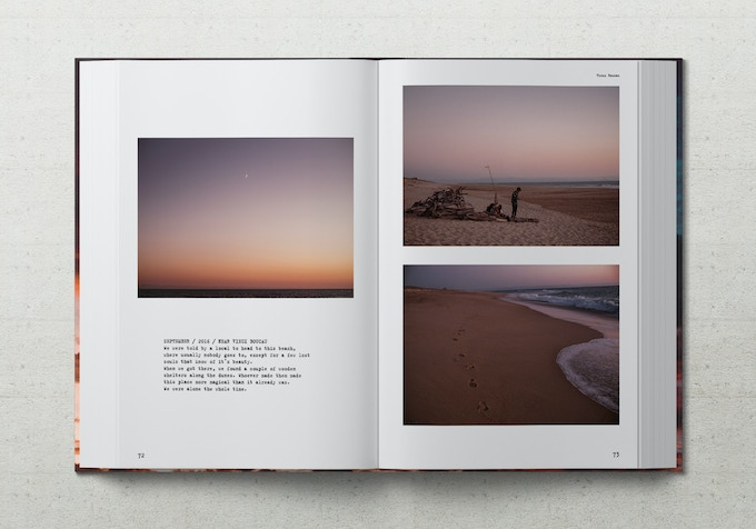
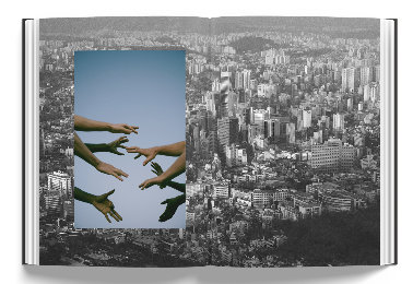
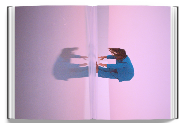
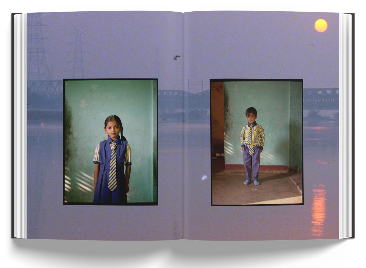
I have also discovered the photographer Marco Kahold, who has recently created a book named ‘The Theory Of Intimacy’. He is a German photographer who enjoys travelling the world and capturing the ’emotional Zeitgeist’, whilst growing his ideas and discovering new aesthetics.

I was drawn to his photography because his images hold the hazy and golden look that I want to re-create in my image.

Marco Kahold’s website:

https://www.marcokd.com/shop/theory-of-intimacy

Book Layout Ideas

Kahold’s Layouts:

statement of intent

I want to explore an area of street/urban night photography around jersey, which is perfect because we are separated into different parishes which each have their own village of houses and streets like their own little cities. I want to try and capture images of these area’s at night with illuminate lighting to create an aesthetic image with dim lighting but some with bright lighting and experiment with mixing and layering the images using photoshop and lightroom, whilst capturing a lot of people in the images and characters. Its more nostalgic than important to me because from the age of 11-15 I was always out on my bike with friends doing anything we could find that was fun or find interesting, for example trying new things like skating, finding abandoned areas around jersey because there isn’t much else you can do in jersey. But what connects this nostalgia to a night theme is that most of this would happen during winter which had shorter afternoons, and a majority of my fond memories are with fuzzy lamp lighting during the dark, and I think a lot of people can see the areas I’m going to photograph as nostalgic because most people would be out in these areas as a kid, finding what to do or having fun. And I want to represent that in a clearer way with higher quality but also contrast it with some images with docile areas to show the balance jersey has between the packed areas and more docile areas. I’m going to be mainly going to areas which have a good amount of lighting during the night but also areas which have people in to capture them in a moment or in motion. I’m going to present these images in a photobook as I like the layout it has. I’m going to have more of a wider perspective of my images through framing areas from a far away but not too close, and I’m going to be looking for a lot of shapes of street lights, apartment areas, people who present an aesthetic. These images will include a lot of architecture and well light, street areas during the night, with natural and artificial lighting. I don’t want to use too much forced lighting or and over use of lighting otherwise this wouldn’t look or feel like the aesthetic I’m aiming for.

statement of intent

I am going to explore childhood through ‘nostalgia‘ which is a positive, wistful, or longing sentiment that one experiences when they are reminded of something from the past , I’m doing this because I used to look at my parents photo album a lot during my childhood and loved seeing the connection between my parents and how close they were with their friends and family, I would also wonder if my life would be the same as theirs if I was their age. I wish to produce a photobook with both the photos of my parents opposite to the photos I have taken, I have already started taking photos on my disposable for 2 weeks however it wasn’t a lot so I will continue to take photos during the Christmas break. I’m going to develop my project by having my disposable and digital camera with me at all times.

How I wish to take the photographs is by taking snapshots I will be doing this by randomly taking photos, how I will make this happen is by sometimes giving the cameras to my friends or family, this is because the photos taken by my parents were snapshots and weren’t planned however I will also make some staged photos. The people that will be included in the photos are my friends, family and myself. The photos will be taken as a documentary in a familiar natural environment both inside and outside as my parents varied their photos from both, the style I’m going for is a vintage aesthetic. What I might include is one or two pictures of me when I was a child with my parents or siblings the reason for this is to compare the difference from there and now and how my parents and my life have evolved since then. Underneath each photo (both archive and recent photos) will have the dates so the viewers are aware of when the time period was.

Review and reflect: past projects

Femininity vs Masculinity

My intake on it

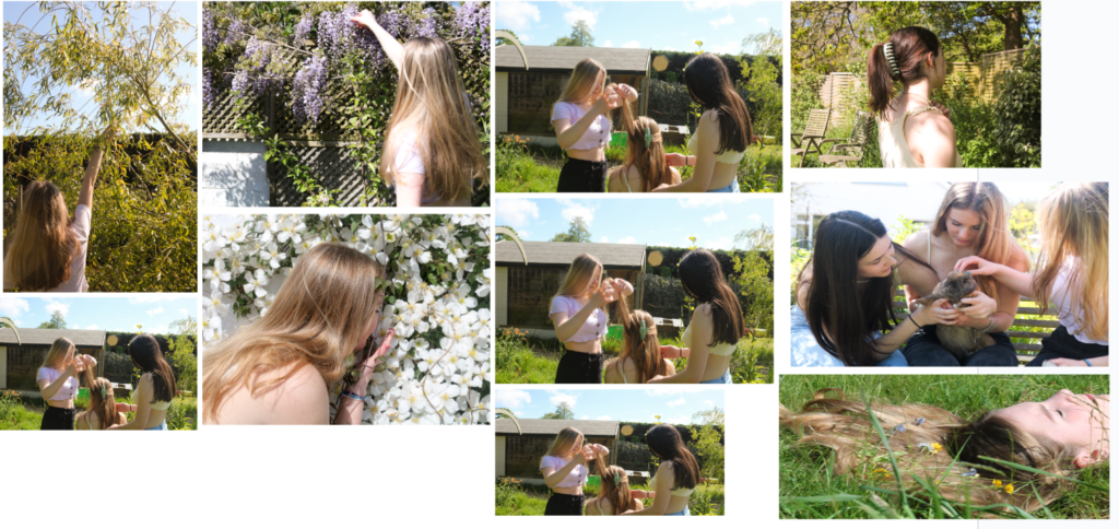
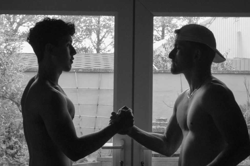
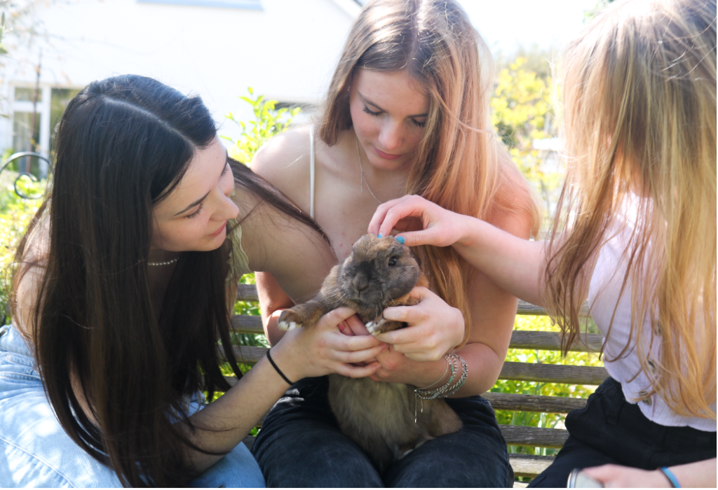
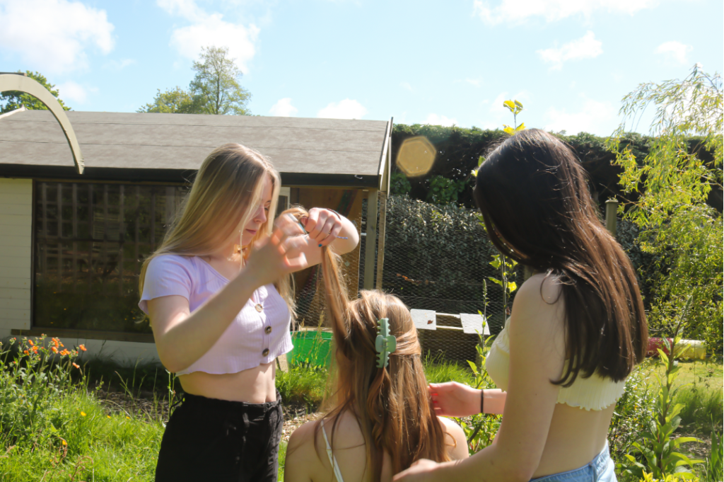
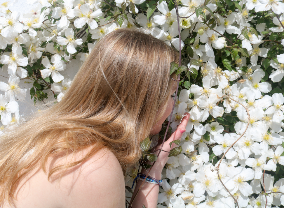
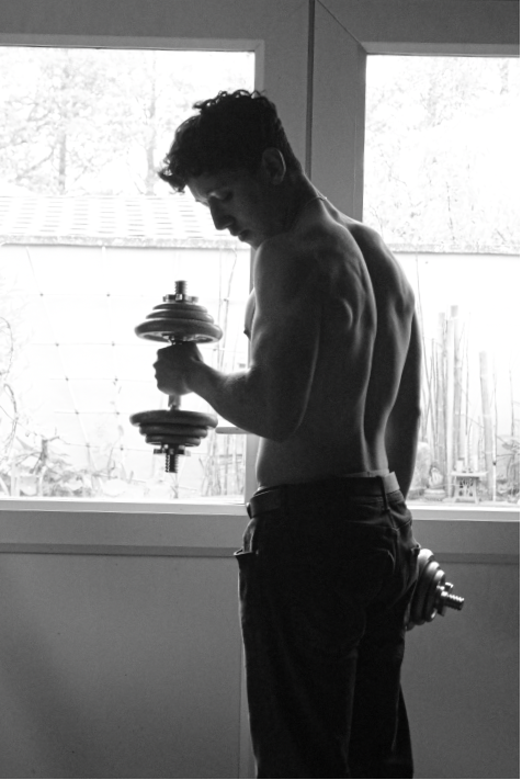
For this project I brought together some of my friends and took multiple pictures of them capturing their femininity in my garden with natural lighting in nature to express what my idea was to be feminine. I also took pictures of my brother and his friend in my garage with a combination of natural and artificial lighting with them doing “Masculine activities” and then edited them to be monotone.

Femininity is

Traits such as nurturance, sensitivity, sweetness, supportiveness, gentleness, warmth, passivity, cooperativeness, expressiveness, modesty, humility, empathy, affection, tenderness, and being emotional, kind, helpful, devoted, and understanding have been cited as stereotypically feminine.

Masculinity is

 qualities and attributes regarded as characteristic of men. When we talk about masculinity, we’re talking about a person’s gender. Gender is a social construct, and is one of many ways we as humans make meaning and create social structures.

The concept of femininity and masculinity have been shaped by cultural norms and beliefs throughout history. They are not fixed or universally defined, and can vary across different society’s. Society’s understanding of femininity and masculinity has evolved over time, and continues to evolve.

Examples

An alternative femininity: behind the enduring appeal of Audrey Hepburn
What Femininity Does To a Man ⋆ The Sublime Woman
Toxic Femininity: Definition, Examples, How to Address It

My response

Examples

Embracing Masculinity - What Is It And Why It Matters — The Invisible Man
Toxic masculinity' is not a useful description | Michael Kimmel » IAI TV
Toxic Masculinity: Definition and Examples

My response

Anthropocene

My intake on it

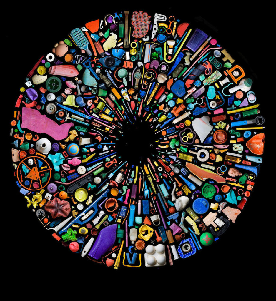
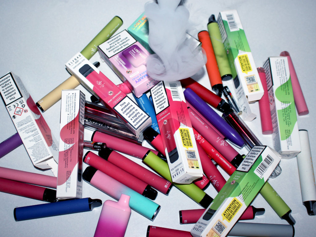
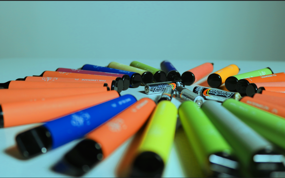
For this project I took inspiration from Mandy Barker and took my images of single use e-cigarettes due to the increase in popularity for them and the harmful impacts that they are having on our environment.

Definition

The Anthropocene Epoch is an unofficial unit of geologic time, used to describe the most recent period in Earth’s history when human activity started to have a significant impact on the planet’s climate and ecosystems.

Examples

Artful Swirls of Plastic Marine Debris Documented in Images by Photographer Mandy  Barker — Colossal

My response

Street photography

My intake on it

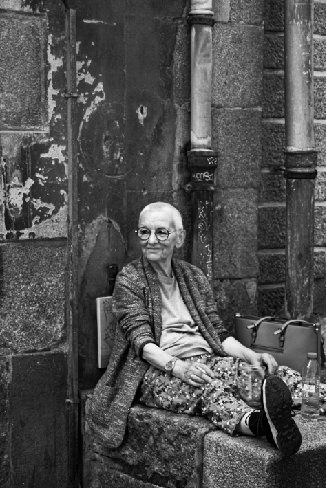
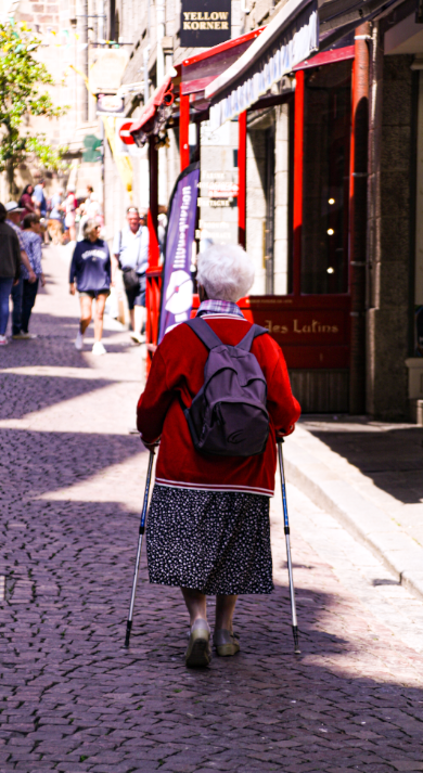
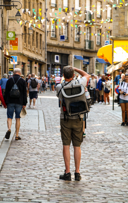
For this project we went on a day trip to St Malo while trying to capture people going about their everyday life.

Definition

Street photography is a photographic practice of shooting people in everyday life in everyday environments. These photographers commonly aim to capture spontaneous moments of people in a candid state.

Examples

Street Photography in the Urban Landscape
What Is Urban Photography?
Famous Street Photographers Working Today | Widewalls

Response

In conclusion I think that I am going to take most of my inspiration from my femininity shoot in my Femininity vs Masculinity project. This is because I feel that it would link to my idea the best about capturing my childhood and my relationship with my sister.

Nostalgia

Nostalgia is a word that comes from Greek and means a sentimental yearning for the past. It can evoke feelings of pleasure with occasional notes of sadness. Nostalgia often arises when something reminds us of a particular time in our lives. It can be triggered by a song, a photo, or even a familiar smell. It’s a way for us to connect with our memories and reflect on the passage of time. Nostalgia can be a powerful and comforting emotion.

Moodboard

Nostalgic of my childhood growing up in St Ouens