


About.
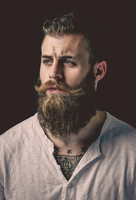
Nick Fancher is a photographer, author, and educator who specializes in creating in-camera effects, often employing the use of bold colours and dramatic lighting. He is particularly known for his efficient method of working, which is with the use of minimal gear and often in unconventional locations. Nick graduated from Ohio State University with a BFA in photography in 2005 and has authored several books on his techniques including Studio Anywhere 1 & 2 and Chroma. While he is especially known for his editorial portraiture and work in the music industry, his client work includes architectural photography, photojournalism, ecommerce (product, on-figure, and flat-lay), stock and food photography, corporate, lifestyle, fashion, and video. Nick Fancher is based in Columbus and Los Angeles and is available for photo commissions worldwide.
Why I chose him.

I chose Fancher as my first artist reference as I was inspired by his use of gel photography, which is when a transparent coloured material is used to modify lights by being placed over the light sources to create colourful effects. I think that colour is a very important way to show emotions without having expressions. In my study, I plan to recreate his gel lighting techniques as a way of showcasing emotions when photographing objects or people since it enhances the mood of the images.
Image analysis.

I really like the use of lights and colour displayed in this image. The singular line of colour makes the centre of the image eye catching while also leading the viewers eyes to where the model is facing due to our eyes being drawn to the brightest area of the image. The colours also contrast, perhaps depicting certain emotions through the image.
The models outfit is also important in my opinion as the white makes sure she stands out against the darker background and her necklace catches the light causing it to sparkle, drawing attention to the centre once again.
Lastly, the way that the model is standing puts her hands directly below the light perhaps symbolising that she’s close to achieving something. Her facial expression on the other hand creates a sad, almost longing feel to the photo as if she’s desperate to reach something but is being held back (hence her other hand pulling back)
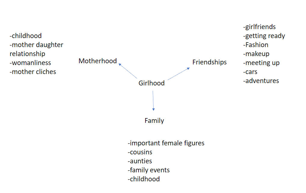
Our personal study project is based around the theme of nostalgia. For my personal study I want to explore identity, but more specifically femininity and what it means to be feminine. My interpretation of the theme nostalgia is going to be based on Girlhood and parts of my childhood that represent growing up as a girl. There’s a lot of women in my family who I’ve closely grew up around and my strong relationships with my friends and family are a big part of my life, which I appreciate a lot therefore I am creating my personal study around this.
I plan on photographing my friends and my family, my mum, sister, cousins, aunties and my grandma. I’m going to capture images of my friends in everyday situations when we meet up to create candid shots and to show real scenes of girlhood. As well as that, I plan on photographing my family at family events to create the same kind of images but with a different story.
Although I want to capture candid pictures that represent reality, I also want to do staged photoshoots. I am going to do research and study artists such as Justine Kurland, Sian Davey (developing my exam project from May of ‘Identity’) and Theo Gosselin. From then I will set up staged photoshoots in both rural and urban settings of my friends. For the exam project in May, me and my friends did a few photoshoots in rural environments, following the theme of ‘femininity’. These were inspired by Justine Kurland.
-Examples of Kurland, Davey and Gosselin’s work
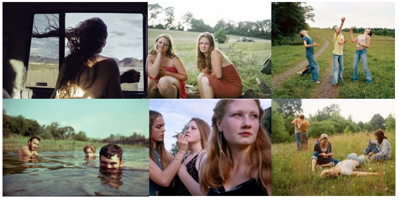
For my final images, I plan to present them in a photobook, I don’t plan on putting any text on/ with them at the moment, however this might change during the process of my project. I intend to start my project by taking photos of my friends in every day situations, for example, in the car, on walks, in town, later on in the evening/night when we meet up. This will give me a starting point to then decide if the outcomes are worth it and when, where and how to begin planning my staged photoshoots.
I plan on taking a variety of different images, in terms of composition, framing and lighting. However, I am mainly going to try and take photos in the rural environments with softer lighting to give the dusty, vintage kind of look. So around the time the sun is setting or rising, or on more overcast days so the lighting is dim. As well as that, the images I take in urban settings, town, I want darker lighting or on the other hand, bright lighting to create harsher shadows. Both types of photoshoots I want to use natural lighting, none in the studio. As well as documentary and tableaux for variety, also to represent the reality of girlhood. Additionally, if I feel it is necessary, after I have my final images from the different photoshoots, I will create some edits using photoshop and Lightroom. Nothing AI based or artificial as that isn’t where my project is going.
I want my final outcome of a photobook to tell a story of girlhood and what it’s like growing up as a teenage girl on this island. I aim for the images to be quite relatable but also exaggerate the meaning of femininity.
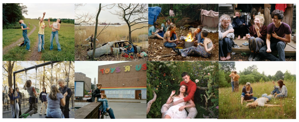
This mood board consists of images from Sian Davey, Justine Kurland.
I am going to base my personal study off these kind of photographers, who take photographs that represent femininity.
These are some ideas for my photoshoots:
For my personal study, my interpretation of nostalgia will be based around femininity and youth. I am going to take inspiration from a previous project that I have done based on femininity which was originally inspired from ‘Girl Pictures’ by Justine Kurland. I have also gained inspiration from the school photography trip when we visited the ‘ParisPhoto’ exhibition. When looking at different photographers work, I came across a certain photo named ‘Fashion’ by Paul Kookier which I think is really cool and has given me inspiration. Another photographer which I discovered was Rene Groebili, and his series of images ‘Dag Augé Liebe. I am intrigued by this sequence of images because it shows a more mature side of femininity when compared to Girl pictures by Justine Kurland.
I am wanting to do my project on Femininity and youth as I am very inspired by all the women around me and I believe that women have their own sense on nostalgia about them and its a very broad subject which can be interpreted in many different ways. I will be using some images from my previous shoot, however I intend to do a few more shoots in bathrooms and social settings with groups of girls. But base it on girl hood and how girls have close relationships with one and another.
I am wanting to present my study in a photo book form. Which means that I will a large amount of images taken to edit. And would roughly need a minimum of 30 final images. I intend to begin my study for this project as soon as possible to allow me the most amount of time possible to compete it. I don’t have any set specific locations in which I am wanting to shoot. However, a couple ideas are in bathrooms, in a garden and bedrooms.
I would want to explore belonging and nostalgia. as it will be personal to me and I will be passionate about it. I know that entering my past as well as my mother past will help me learn more about her life and mine.
I am planning to use old pictures of my mums childhood as well as teenage years, then shifting to my onw childhood and teenage life. I want to represent a link between us. I will include quotes, interview, and other word formats to incorporate in the book. I would love to present my study in a photobook so that it feels like I’m telling a story. a narrative of hers and mine life and how they link.
I will begin my study by diving into photo albums that include pictures of my mum, then selecting ones throughout different stages of her life, I will also do the same when it comes to mine pictures of my childhood. from then on I might think about montaging these photographs together, digitally and manually.
when it comes to photoshoots I will collect pictures of meaningful objects and having a part of the project focusing on still life. However I also wish to photograph natural setting that represent my life. this means photographing subjects in motion, in the moment scenarios, instead of pre planned studio photoshoots. meaning most of the pictures will be taken outside the studio, maybe within buildings, and outside. the images will be more documentary and observational, however I might have to stage a couple to get the desired look.
I will include many portraits of my friends as well as objects that respond to them specifically, for example meaning objects to me/them. I will make sure to be very experimental with the images I create, however I plan to not over do it, so that the images look too distorted.
In the photobook, I need to think deeply about the narrative I am trying to tell, meaning the layout will have to be specific in order for the story to flow. I might accompany text from books from my mothers childhood, old letters written to her or by her, or recipes. The text might flow over some images or be on the side as a form of narrative.
Some of the images might be taken by different mediums of photography, this being shot on film, digital camera, or polaroid’s, I love film photography so I will try to use it the most when possible, but when it might not be possible I can always achieve a similar effect through image altering in photoshop or Lightroom. depending on the format and how well the images compliment each other the sequence of them might change.
What might be useful id as well as other forms of montage and image altering, I use the help of AI to achieve a certain outcome.
Overall, the outcome I want to achieve is a story told by photograph or my mum and me. I want to represent my life through hers as a form of thank you, as she had to give up her early adult and late teenage years for me. I want to show the similarities we have between us and show the viewers that even when they think they are stuck in a hard situation, it will eventually work out.
Bellow is a Moodboard of things that are nostalgic to me. The images are taken of subjects that were a part of my childhood.
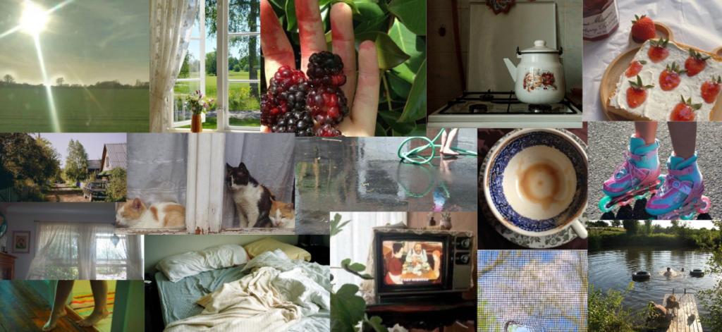
Most of the things that are nostalgic to me are of natural origins, like grass, plants, fruits, natural sights. I spent a big chunk of my childhood outside therefore places that include natural scenery are nostalgic to me.
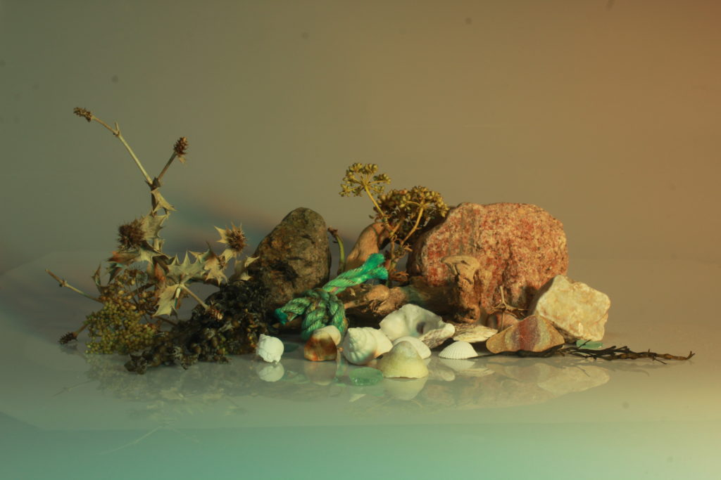
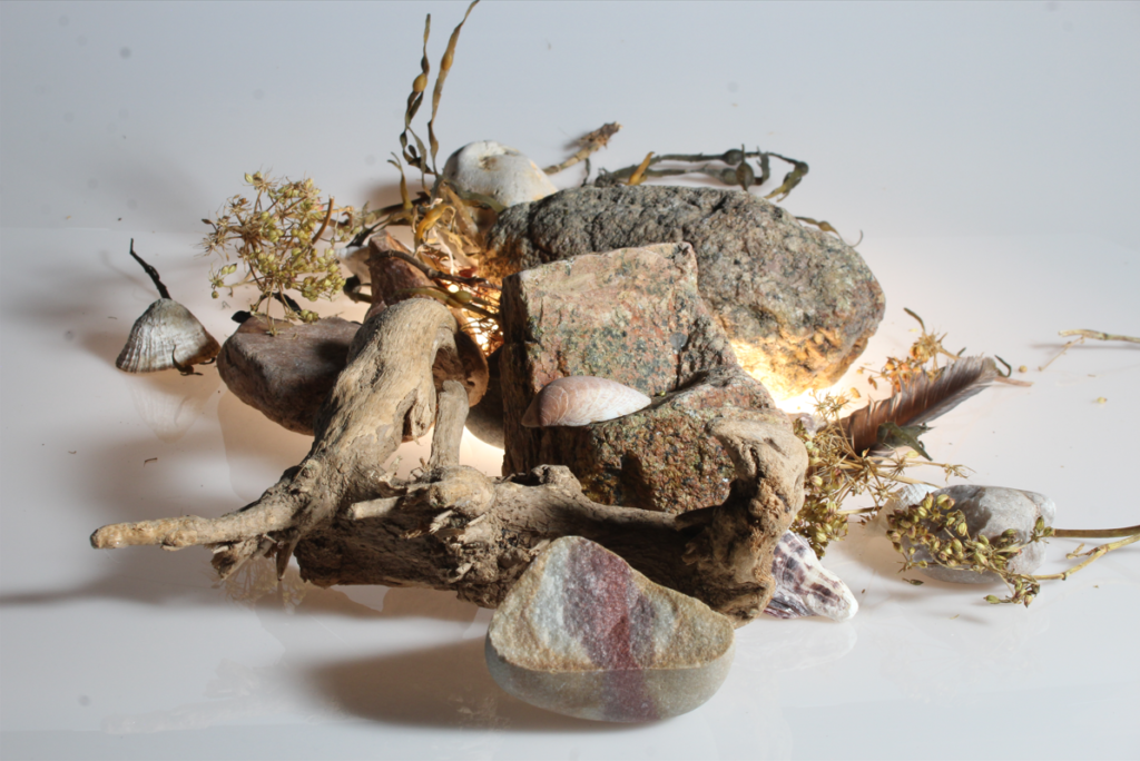
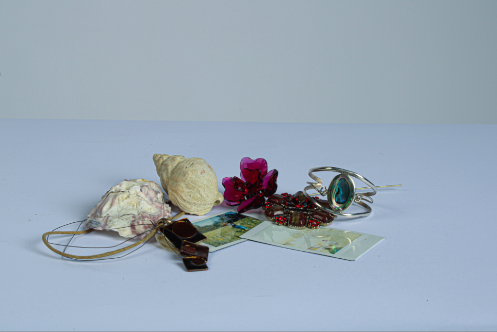
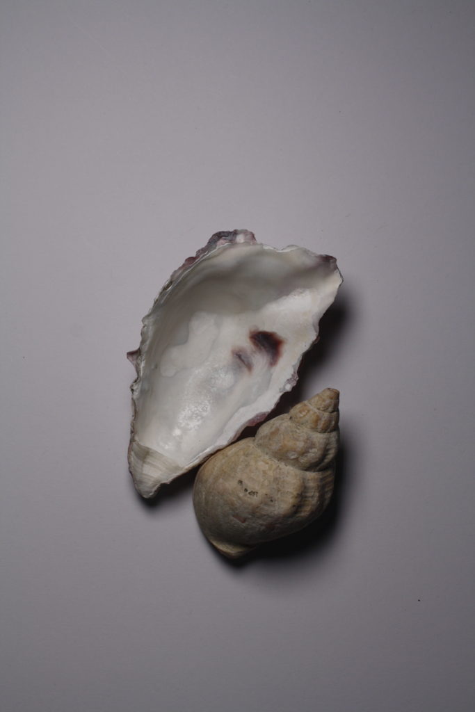
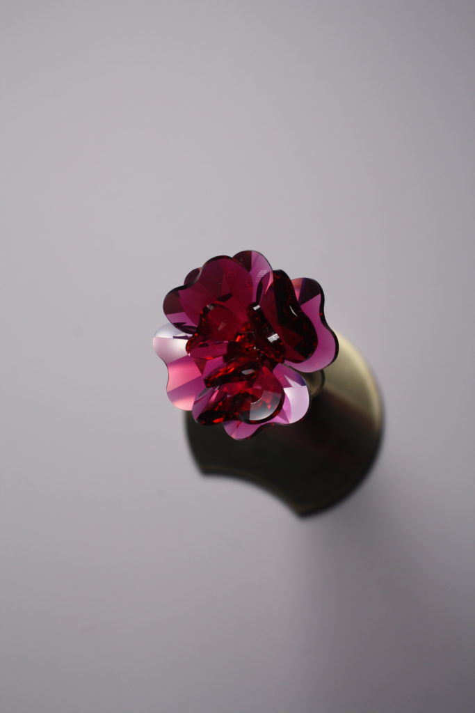
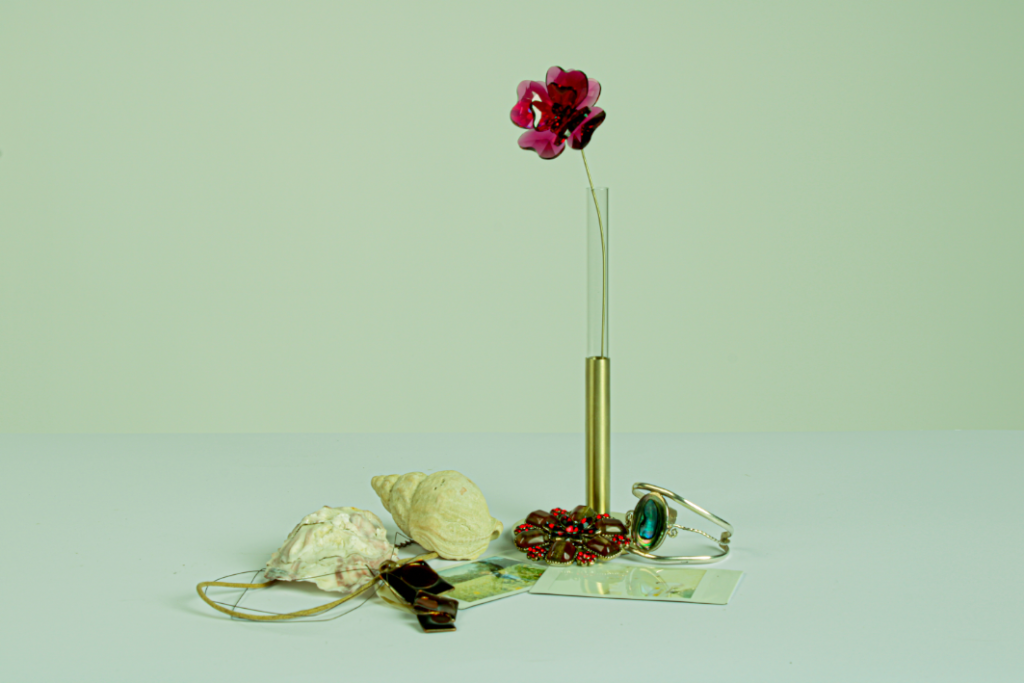
“My response to the still life photoshoot is that for my first ever photoshoot in the studio to editing the photographs and selecting my final ones, the images are to their best quality and I have demonstrated as well as enhanced the objects beauty, if its by highlights and shadows but as well as tones. the images when put together or next to each other could be grouped as colourful yet this is what in my opinion makes the photographs interesting. When shooting the pictures with the camera, I had fun rearranging the objects as I had to creatively think ahead of how they would look from a different angle. As well as with aperture and shutter speed, I have learned how changing certain settings affect the camera, which was useful not only when taking these images but in the future , when it comes to other photoshoots. This was one of my first times using Lightroom which also was a lesson for the future and getting used to the program in order to know how to make other photos in the future to their best state and how to know what to do to achieve the effect I want on them quicker.”
Looking back on this module what I would change are the objects I decided to photograph, I think I would have been more successful with a bigger range of sizes as most are quite small.
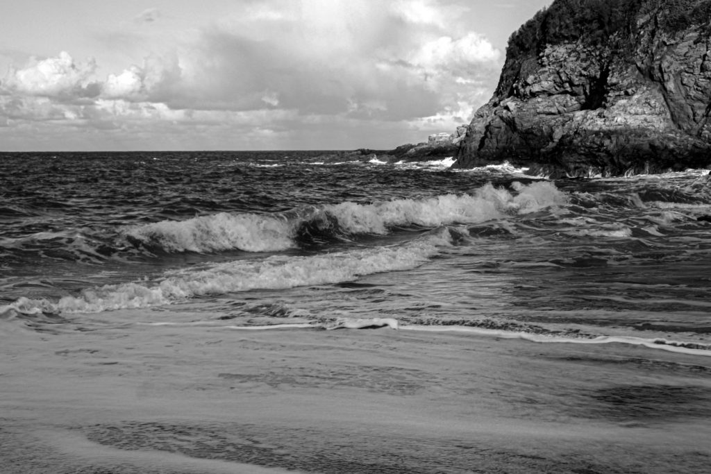
As we studies Ansel Adams, and the theme of romanticism which is an artistic movement marked by an emphasis on the imagination and emotions, in this module I have gone through one photoshoot responding to this.
“As a whole I have enjoyed exploring his style and although his landscape locations are much more fascinating and interesting then the ones I am capable of capturing right now, the style of his work like the enhancement of the shadows and dramatics of his images was very fun and different then what I’m used to edit. however what I should of payed more attention to was the colours that contrast each other, as with his work because of these opposite colours that are right next to each other, his photographs look so pronounced. 2 colours of completely different shaded being next to each other, quickly changing from one another, meaning they are not smooth or blended in, will make the image look sharp as a whole and this is why Ansel’s photographs look this conspicuous.”
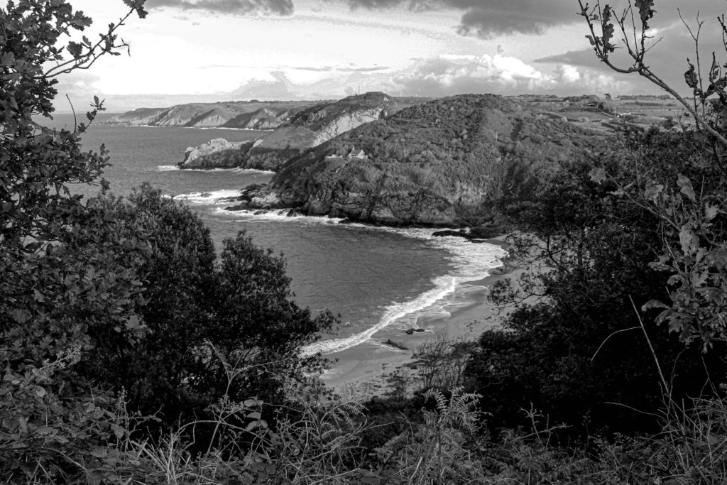
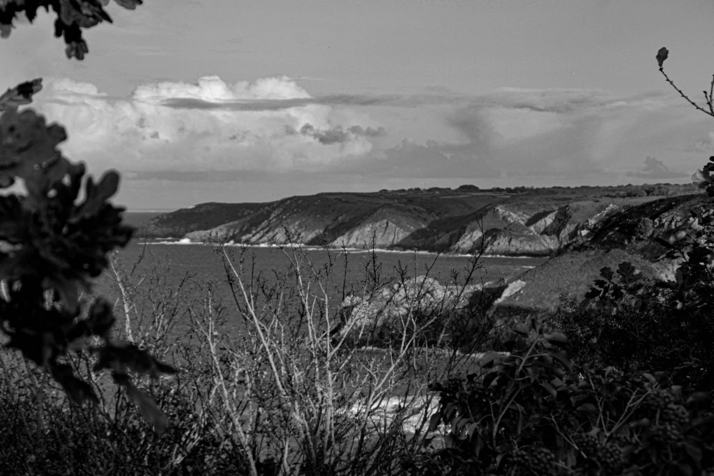
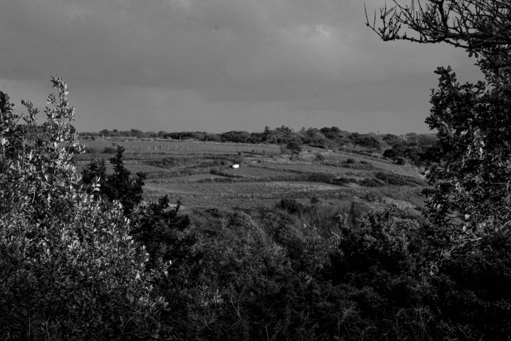
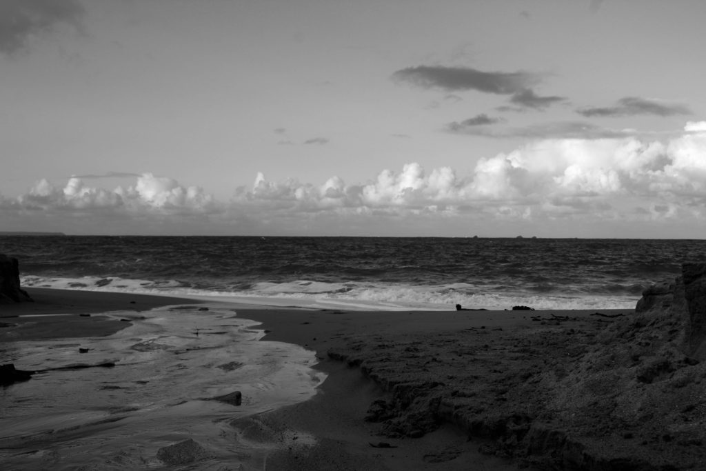
New topographics involved focusing on the Rural landscapes, within this time we went on a school trip to Havre Des Pas, where we were able to focus on the industrial architecture. while doing this module the format, like the layout and framing was very crucial to understand. The themes like man vs nature occur a lot. I enjoyed this module however I preferred photographing urban landscapes and focusing on the idea of romanticism and nature, as it didn’t involve geometrics other linear format, to me it was more enjoyable going o walks and being able to take in the landscape in the format of photographs.
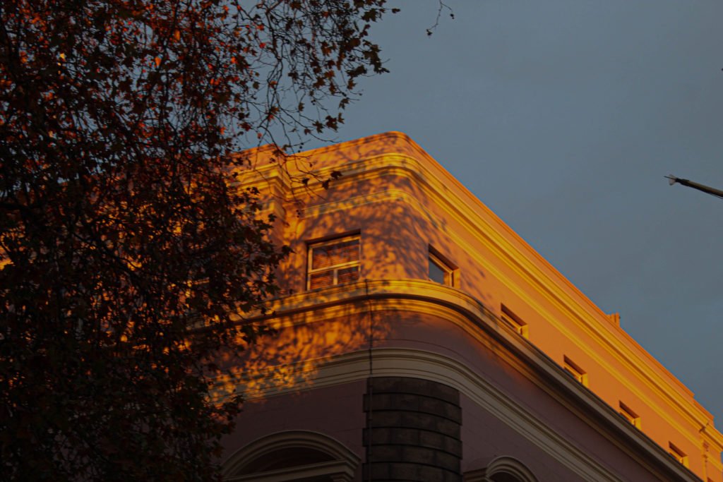
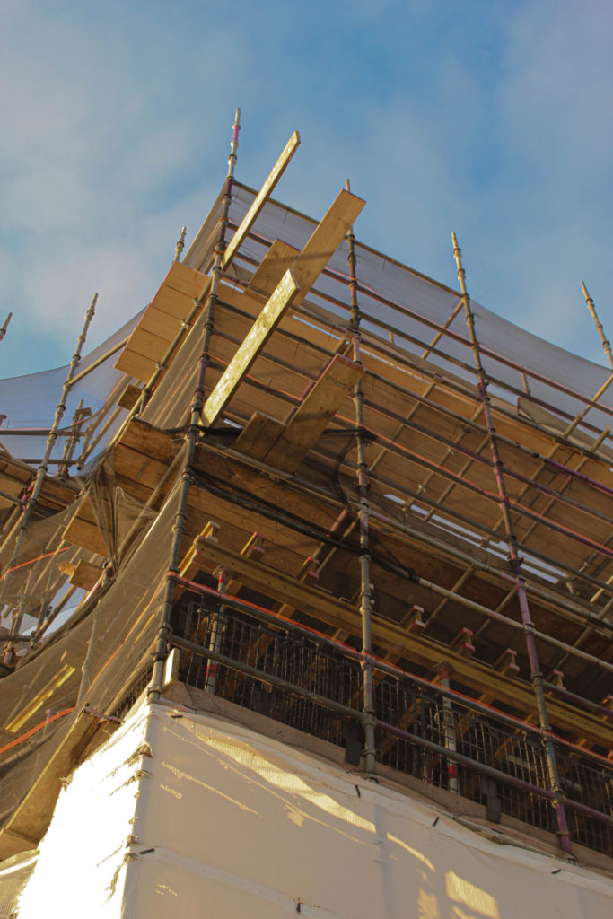
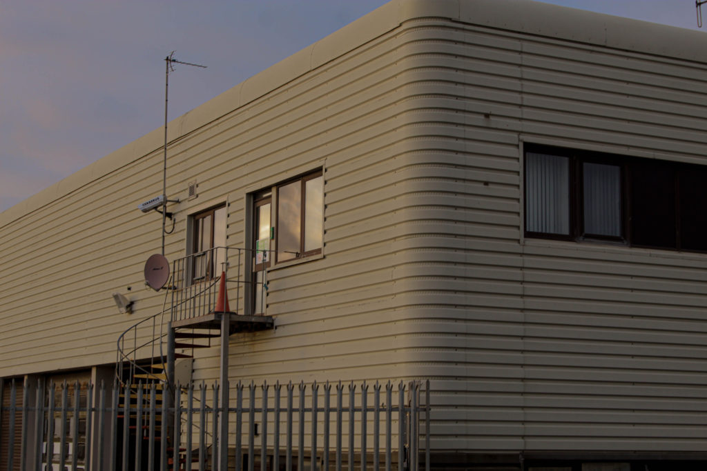
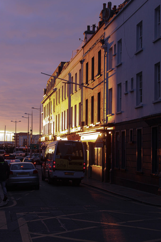
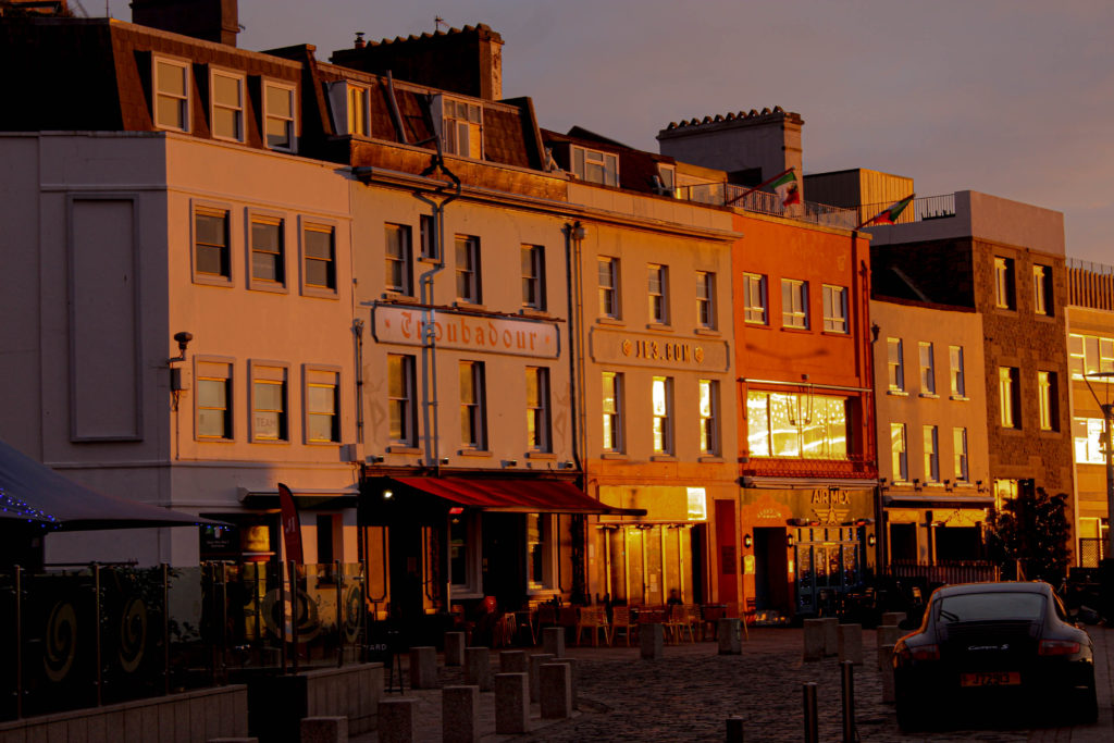
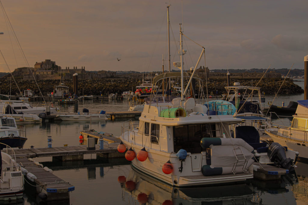
Doing this typology was very enjoyable as a photoshoot, as I was paying attention to ordinary objects, but spotting the beauty within them. I learned that an ordinary photograph can be enhanced by putting it into a sequence. If I were to do a typology in the future once again I would improve the format . This might be by drawing a certain shape on a camera screen. This is in order of all of the objects being photograph to be the same size when put next to each other. I spent a long time trying to adjust each one to the same format digitally, meaning if this was done when taking the photographs it would off sped up the process.
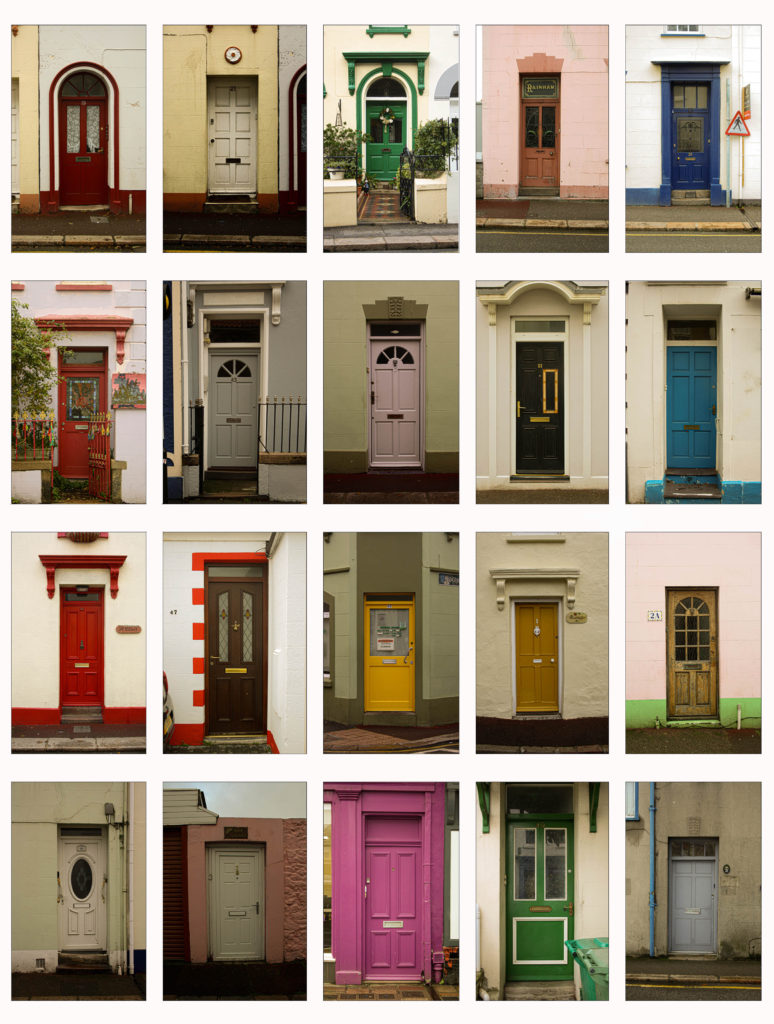
Constructed landscapes involved experimentation from a previous topic, New Topographics, by doing a few re-construction to the images I have show a different side to them. I think this enhanced the properties of the photograph and made it more interesting.
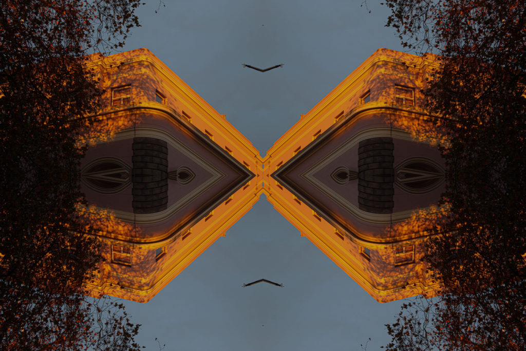
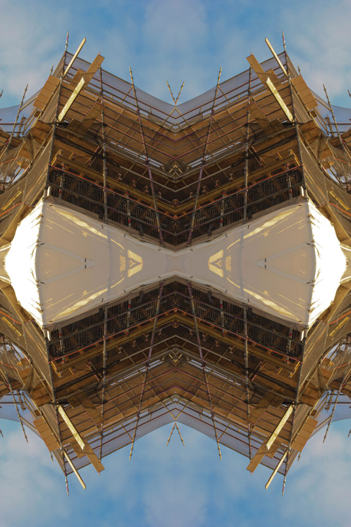
Anthropocene is all about showing the geological state and focusing on presenting the environmental side of the landscape which has been influenced by human activity. within this project I practiced many image alternating and manual & digital landscape constructions. what I have leaned is that I should carry on with image alteration as I enjoyed this process the most, enhancing the value of the photographs.
” This lead me to produce a variation of different outcomes, I have experimented a lot more with the images is well, trying out new things. many of my outcomes are abstract , and through my final photographs I show a big differentiation between each image. As the landscape project is divided into industrial and rural landscape I have enjoyed both equally, I felt like the landscape project has allowed me to be very free when it comes the areas and photographs I want to create, whereas the still life project was far less experimental on my behalf and more narrowed to the options I had.”
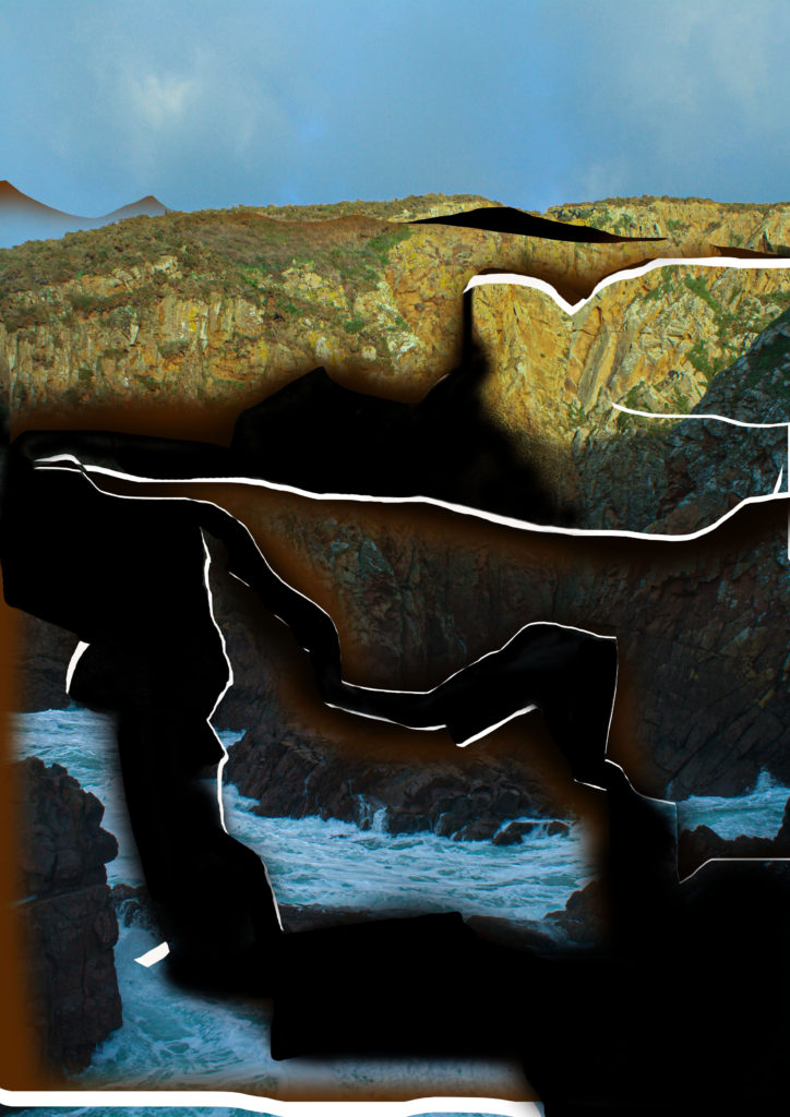
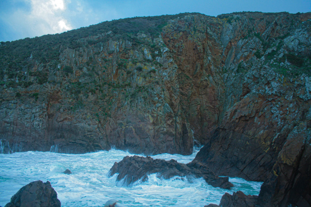
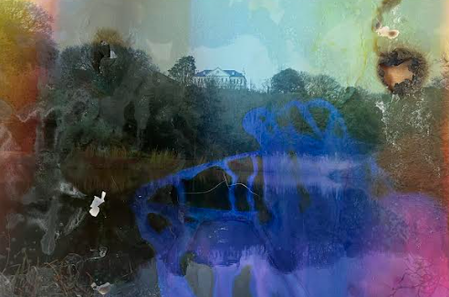
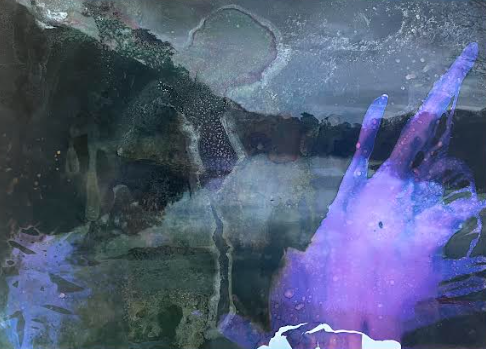
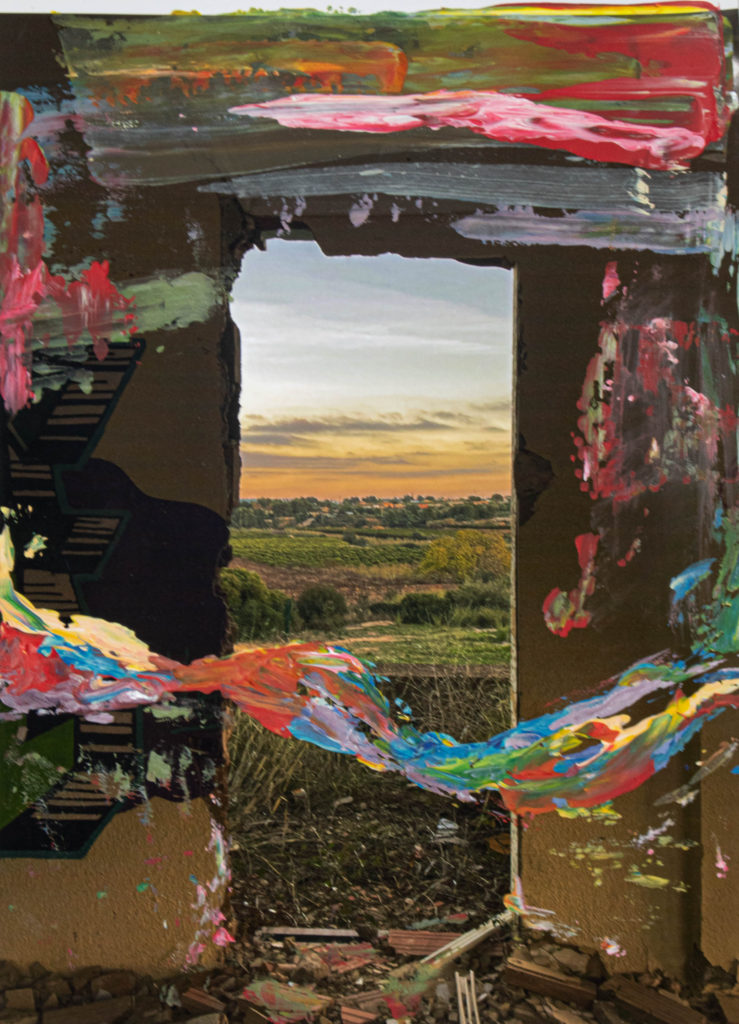
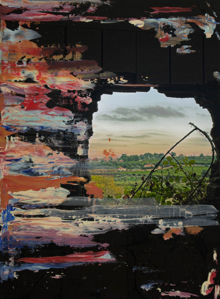
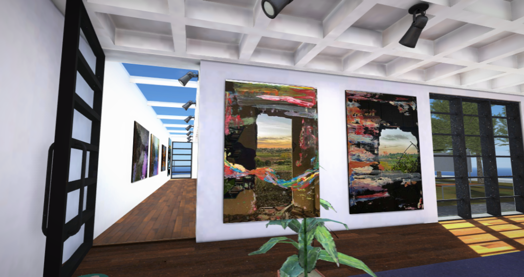
Environmental portraits were the beginning shift of module, where I have learned more about the correct framing and layout of the image. some technical aspects changed when shifting from landscape to portraiture. the basics of framing that I have learned stayed with me, and are now a standard practice when photographing people. I was quite happy with the outcomes as I had a big rage of outcomes between people.

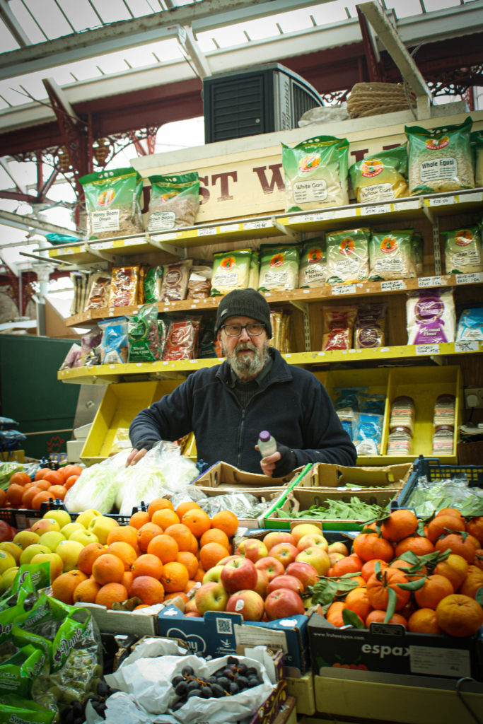
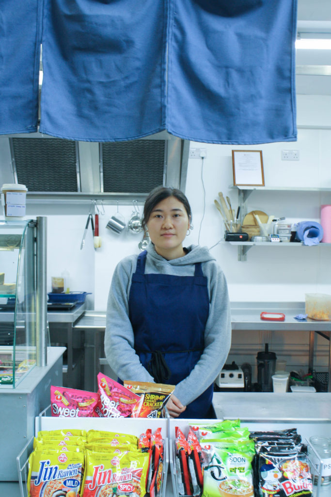
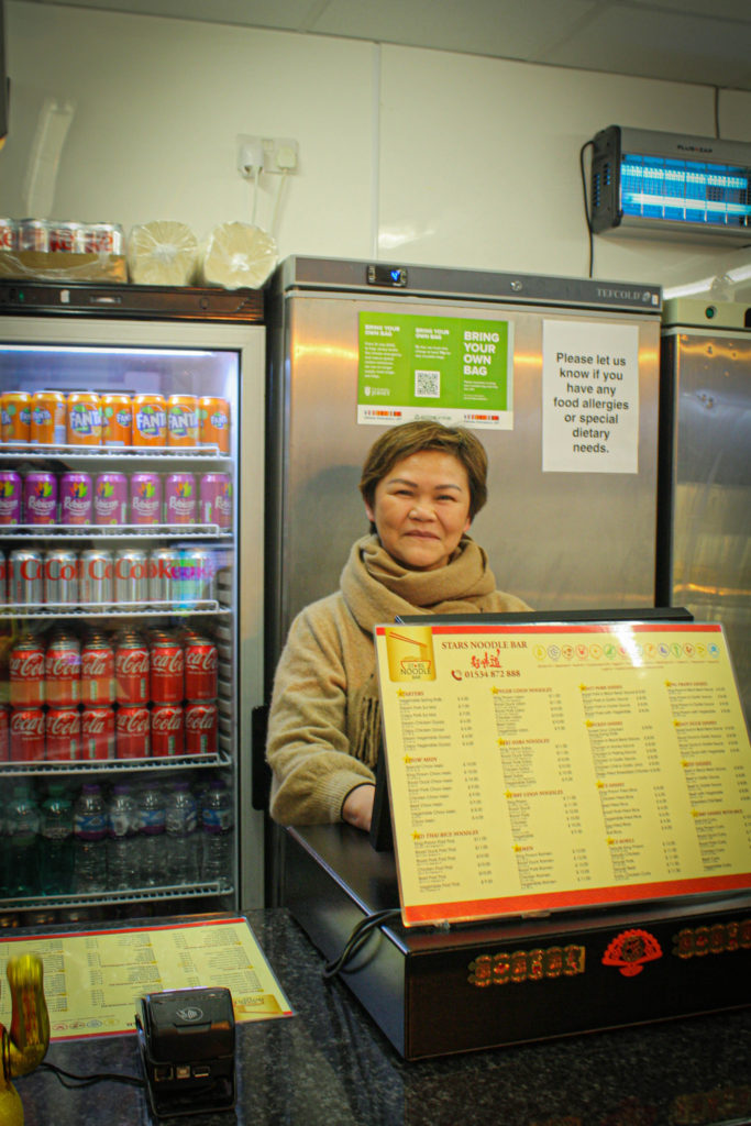
This was another module where I was able to learn about the fundamental technological aspect when it came to studio portrait. the lighting varied meaning the camera use also changed. As I covered different lighting and different setting and correct camera handling within this subject, these principles stayed with me and I became more aware of the importants of lighting.
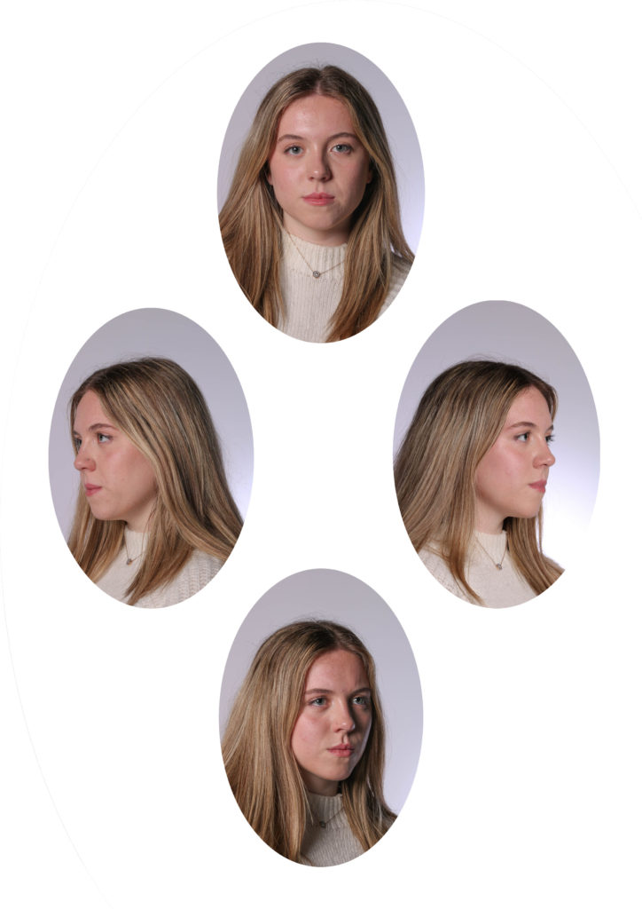
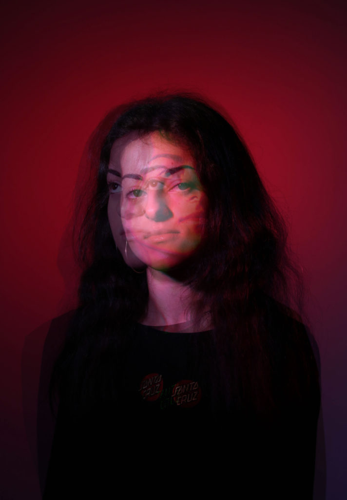
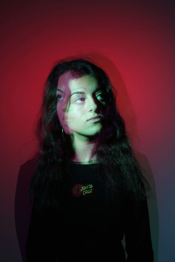
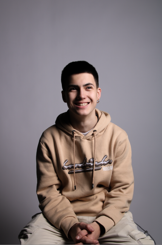
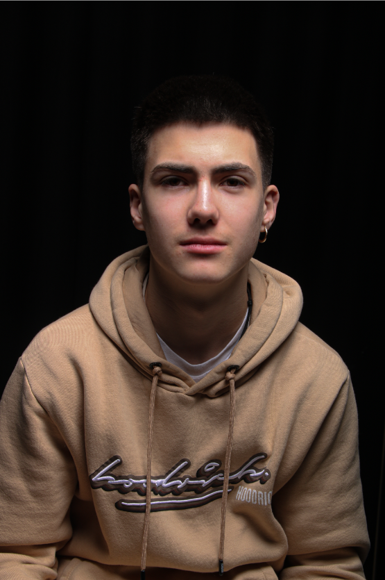
My responses to femininity were quite successful, and I was happy with the outcomes. As I think they show the qualities of femininity as a feeling. they also have a nostalgic feel to them, which makes it more relatable to the viewers. I fell in love with this nostalgic feeling, and this motivated me to continue adapting this aspect to the photographs I produce.
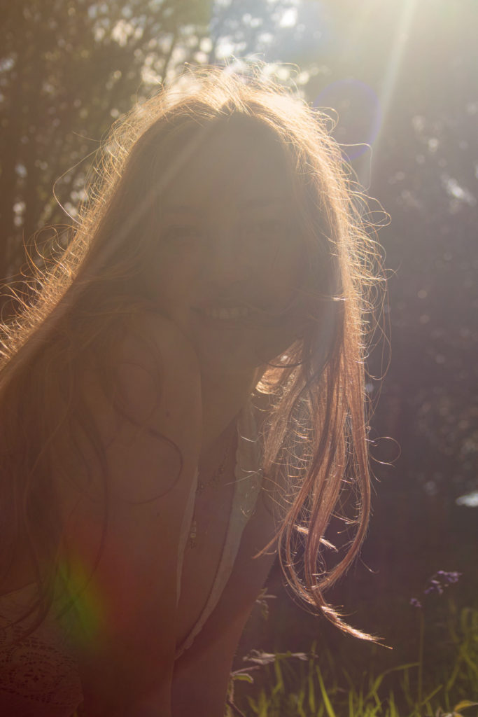
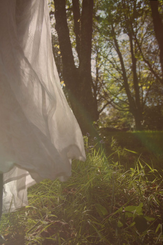
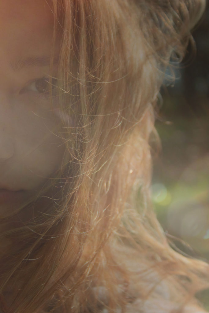
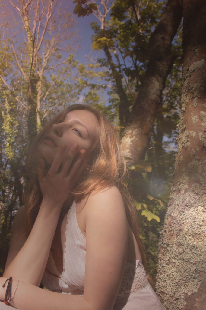
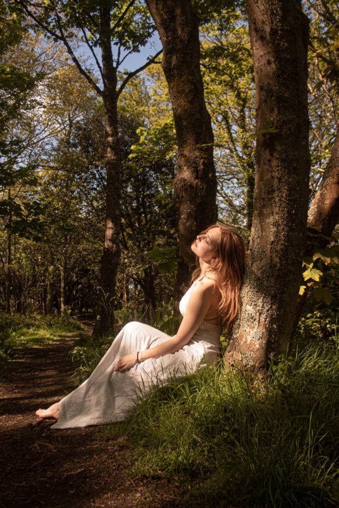
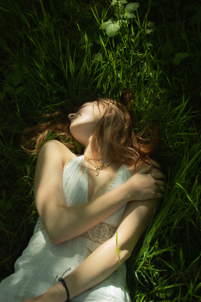
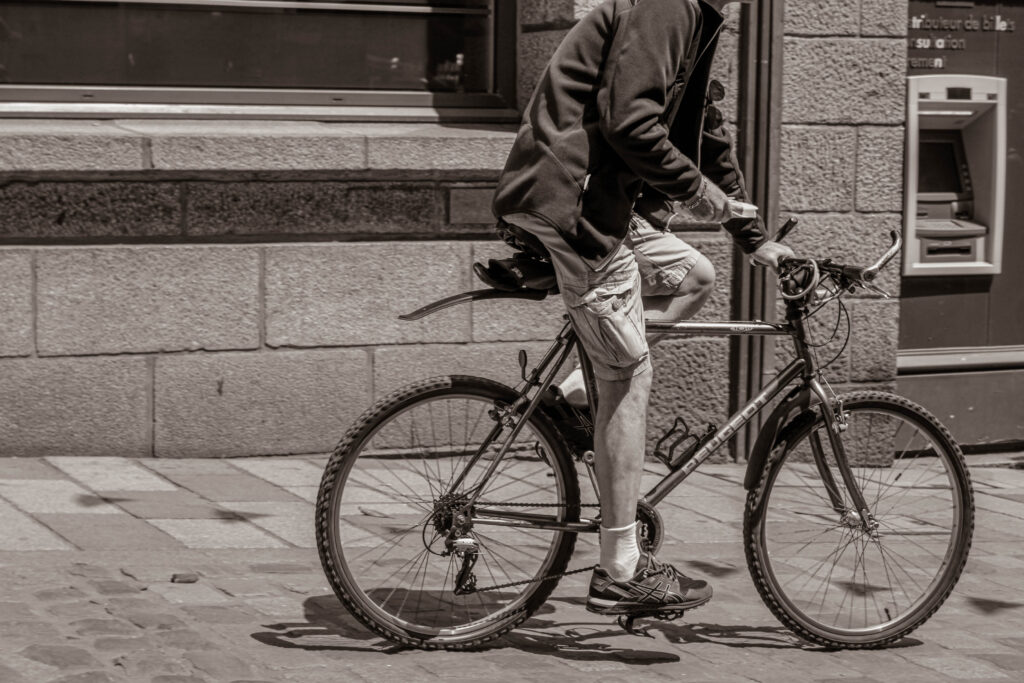
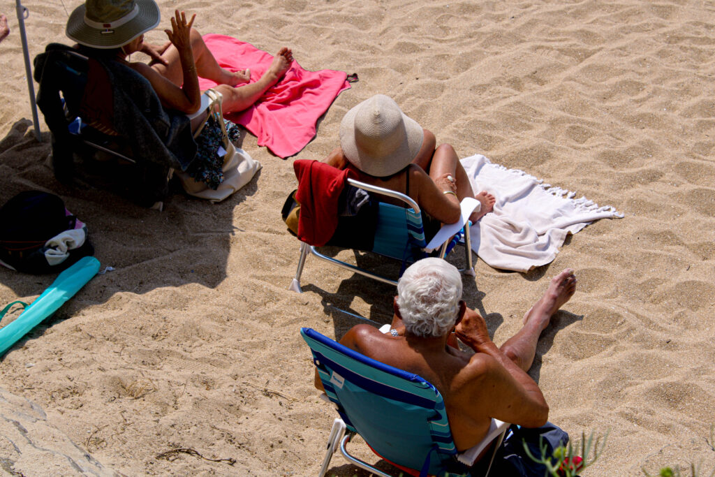
this photoshoot was mainly about the importance of movement, meaning capturing the moment quickly while its in motion. being introduced to street photography helped me understand further the the importance of correct shutter speed. I was happy with the outcome primarily because the subjects looked natural, without posing for the photographs. from these I have also experimented with AI and produced a zine.
Jim Goldberg is an American artist and photographer, whose work reflects the neglected, ignored, or otherwise outside-the-mainstream populations. He is best known for his photography books, multi-media exhibitions, and video installations, among them: Rich and Poor (1985), Nursing Home, Raised by Wolves (1995), Hospice, and Open See (2009).
Raised by wolves
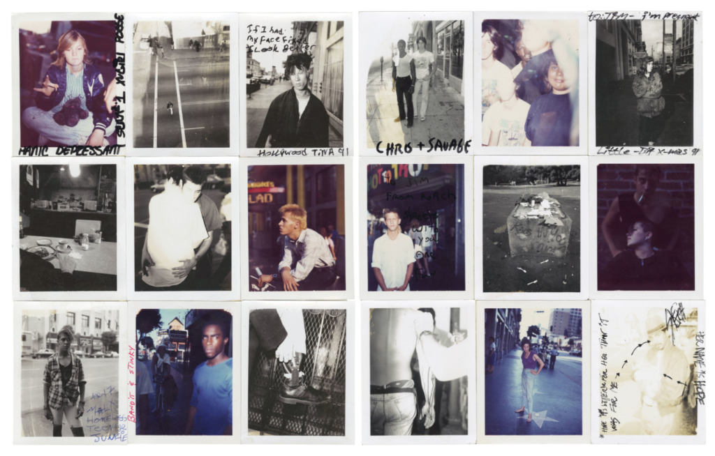
Jim Goldberg’s project, Raised by Wolves, saw him exploring the lives of a community of youths on the streets of California over ten years and follow as they live through addiction, abuse, and violence. He incorporates the subjects’ writings and illustrations alongside his images. Goldberg devoted much of his practice to honouring the people who fall into the latter category. His subjects are often troubled youths, who are otherwise treated as invisible by mainstream society and found inspiration when he bore witness to the chaotic reality of street life.
“I wanted to look at those people who were outsiders, like I was”
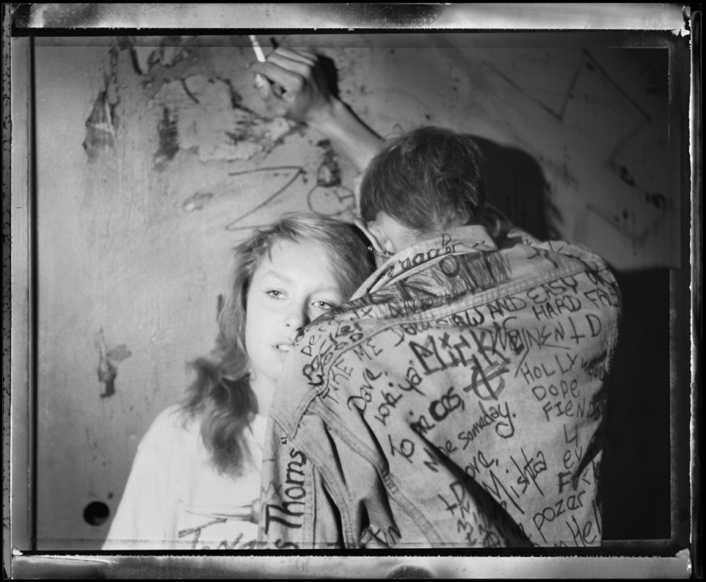
“When I thought of youth, I thought of my own teenagehood and childhood, and other people I knew who were often scapegoated, not appreciated, or not given a chance. The end result was trouble for them. I wanted to look at those people who were outsiders, like I felt I was.”
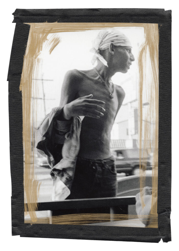
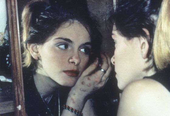
“It was done, mostly, on a Xerox machine. So, I duplicated that aesthetic. I added a few minor things, and decided some things could be in colour that weren’t in colour in the original edition, and sold it for a reasonable price.”

My interpretation:
Jim Goldberg looks at the lives of youths from a dark yet real perspective portraying the reality of these kids lives in a documentary form. The images are a representation of the people who have found themselves in these situations and have an overall grungy look.
This relates to the theme of nostalgia as its an overall reflection of what their lives have become and I’m going to follow a similar style when creating my own images by photographing a more urban lifestyle rather than a romanticized version of being a teenager.
Moodboard:
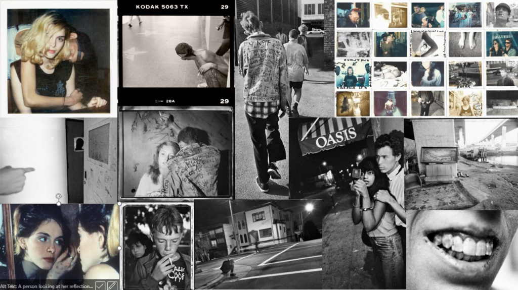
Photo analysis:
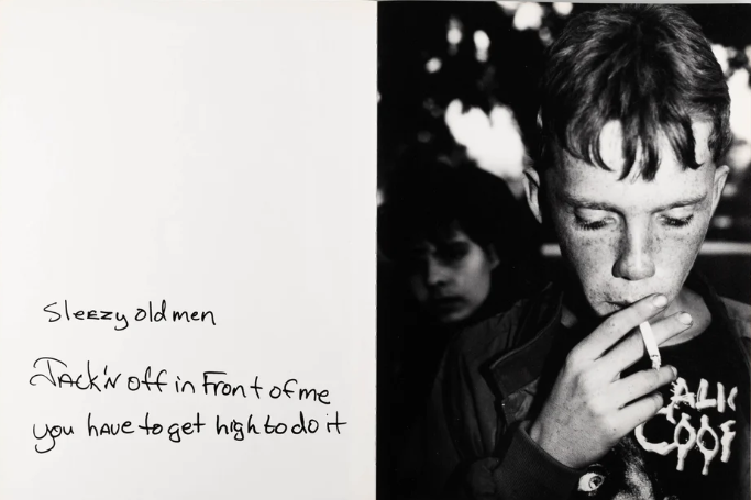
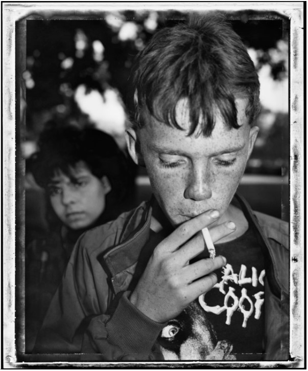
WEST HOLLYWOOD, Calif.—”Early Morning, Plummer Park,” 1989. Jim Goldberg took this image at a park where homeless outreach advocates give out free food, condoms, and services. This image captures a 14-year-old who had just come back from a bad trick with a Hollywood producer and is sore and bruised all over. He is having a smoke break before going out to turn another trick with the cigarette representing his loss of childhood and the sad reality he is facing. This photo is a close up of the subject with the background out of focus. The image is produced in monochrome representing the melancholy reality behind his loss of childhood as he has been forced to grow up too fast and fend for himself in ways no-one should have to resort to.

Justine Kurland is an American photographer who is famous for her book of ‘girl pictures’ which includes images of girls in rural landscapes, focusing on the theme of femininity. There is a sense of freedom throughout the images as the teenage girls are seen to be exploring nature with no care in the world, not worrying about judgement that would typically come from males. Kurland’s images were inspired by the after-school TV special. She also channelled her “raw, angry energy of girl bands”, into her photographs she took of teenage girls.
Justine Kurland stated by taking photos of a teenage girl called Alyssum, who was the daughter of a guy she was dating. Some could say that Alyssum was a rebellious child as she was known for skipping school and smoking pot, which is why Kurland decided she would start to take photos of her. They both came up with the idea that Alyssum would be the subject, know as the ‘teenage runaway.’

Kurland then decided to expand her cast, she added some collage freshmen and any teenage girls that genuinely wanted to collaborate with her. The teenage girls were known as the ‘runaways’, they built forts in forests, which can be seen in the images.
In my opinion, Justine Kurland’s work relates to the theme of felinity as her images show teenage girls that have been given freedom. I like how there is a sense of nostalgia and enjoyment through out all the images as the teenage girls are doing activities that some would consider more masculine, for example camping in the woods and getting muddy.
Image Analysis:
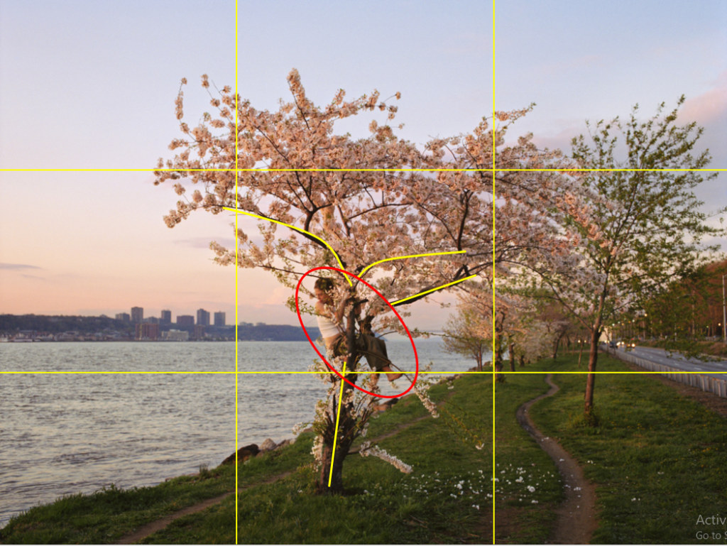
This is a digital image taken by Justine Kurland. The mise-en-scene presents Alyssum sitting in a blossom tree between Hudson river and a highway. This image has been taken on a straight on angle, and has a large depth of field using a f-stop of around f/11 or f/16. I know this because all/most of the image is in focus. Kurland has used the rule of thirds, and it can be argued that she has used leading lines to show the audience where the focal point is.