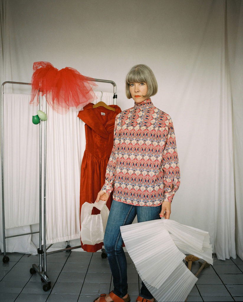
Jessa Fairbrother

Jessa Fairbrother is a British award winning artist with a practice focussed on feelings and the body, using photography, performance, and stitch. She enitially trained as an actor in 1990s and completing an MA (Photographic Studies, University of Westminster 2010) underpins her knowledge of how artwork and audience collide. She often incorporates elements of self-portraiture and explores themes related to identity, femininity, and the body.

Fairbrother gained attention for her series titled “Body of Work,” where she used her own body as a canvas for intricate embroidery and documented the process through photography. This series has been celebrated for its innovative approach to the intersection of traditional craft and contemporary art.
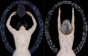
However the work that is her most popular, as well as the one that intrigued me the most was “Conversations with My Mother

she said that this specific photographic module explores the relationship she had with her mother. as she is unable to conceive she was cut of on shaping a material role that she was hoping to form.”Neither daughter nor mother”. It all started when her and her mother did a joint photographic work, where they would send back and forth a disposable camera in the post, recording both hers and her mums life from their own point of view. What changed this was that Jessa found out she was unable to conceive, and not long after that she found out her mum was dying of cancer. her mum was the second parent to get cancer and the only one still living, so Jessa decided to take the role of a “carer” and left behind her present life and joint her mum to be with her through the last moments of her life. The photographs she produced were portraits of her mother, as well as portraits of herself with her wig after her mums passing. another set of images are destroyed to represent she was destroyed inside.

Bellow is talk with Jessa, where she explains methods,processes, reasons and meaning behind the images as well as talking about the exhibition and the gallery they are stored in.

In this project she produced many outcomes with a variety of methods used. these processes enabeled the final effect of the images to not only be interesting to look at but also they show the inner meaning to why they are done is such a way.

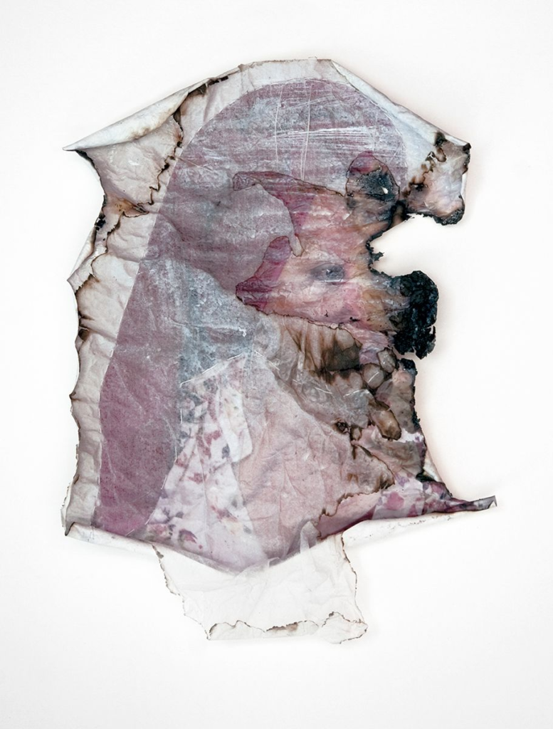
For example the bellow images are done by using tissue and layering it on the image and gently buring each layer. Overall to achive this all she needed was a lighter to burn the edges of the photographs. as thheres a build of of layers this elevated the photographs and makes it 3D. this effect makes the photograph more interesting to look at then if it was a plain photgraph, without the alternations done to it.

Another fascinating series are the 2 portraits, one of her mum and one of her, when put next to each other they hold a massive significance. these too have been altered in another way. She has stitched into them, following a similar swirly pattern, but changing the colours of them. this once again adds more meaning to the photographs themselves as they arise questions like; what does the colour of the thread symbolise?, what does the placing of the stitched pattern symbolise?, what does the pattern of it represent?

Within the Book the layout of the images varies, but it rakes a shift when it comes to the montaged page, which is a spread across 2 pages of a collage of 14 images. the theme of them are mainly of nature, which is her mums garden, but there are also other photographs which appear older and could be of her childhood or her mums, then the biggest image being a pregnancy test, all the pictures combined in such a way create a story, in this case everything has importance, if is’s not for the viewers it is definitely for her. The pregnancy test might symbolise her infertility, where as the other pictures might be moments of her life and her mothers.

this image is one that helped me find Jessa Fairbrother, the one that caught my attention the most. At first glance, there’s nothing unusual to notice, however, once you look deeper into the image, something feels odd, you become to realise that in the centre of the image, although the colours match the surroundings, they seem in an unusual place unlike the rest of the photograph that makes sense, but that specific area doesn’t. It appears as a circle, or a sphere made out of glass in the centre of the image, but then once that catches your attention, you realise what this sphere is made out of. They are tiny flower or star like patterns made out of thread, with colours matching the surrounding shades of green, yellow and white. This is why it sort of blends in to the rest of the image, but this area is a perfect circle. Inside, not every space is filled with this textured detail. However, within that sphere in the centre there is a forearm with a hand that has a yellow glove on this gives us a clue that the surrounding textured stars are semi covering a person. Doing the research on the photograph. I now know that that person is Fairbrother’s mother, doing her gardening. Why I liked this photograph more than the rest that I saw, is because of how simple yet thought out this picture is, the colours altogether have a great harmony within the image as well as technical skills like the depth of field that is by Jessa and her camera. The significance of The circle itself might be of many meanings, a circle, as a shape can represent wholeness as it represents new beginnings, and no end, making the shape infinite. Maybe this is how Jessa wanted to capture her mother. She is to her, all she knew, and all she will know until the end of her time. It shows how important her mum was to her, but again, it also separates her mum from the physical world. In the image, the ordered circle or bubble that her mum is within, could be a metaphor of her mum being like a ghost so slowly disconnecting from the real world. This may mean why she decided to picture her mum in whiter shades of the thread. like I said before from far away, this picture doesn’t look any different than ordinary landscape pictures or pictures representing a person gardening, but it is the fact she manipulated the image and alternated it taking time into sewing each star and also thinking in how to match the colours and what shape to create with them that make this image so breathtaking.

Links

https://www.lensculture.com/articles/jessa-fairbrother-conversations-with-my-mother

https://www.tate.org.uk/research/tate-papers/33/severance-jessa-fairbrother-conversations-my-mother

personal statement of intent

WEEK 11: 20-26 Nov
1. REVIEW & REFLECTION > overview of past projects

WEEK 12: 27 Nov-3 Dec
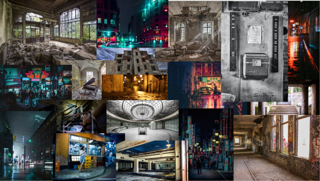
1. RESEARCH & EXPLORE > ‘NOSTALGIA’ – produce mindmap & moodboard
2STATEMENT OF INTENT (500 words)

WEEK 13: 4 – 10 Dec
1. ARTISTS REFERENCES > case-study 1
2. PLAN & RECORD > creative responses

Week 14: 11 – 17 Dec
1. ARTISTS REFERENCES > case-study 2
2. PLAN & RECORD > creative responses

Week 15: 18 – 19 Dec
1. LITERARY SOURCES > select 3-5 key texts for essay

  • What you want to explore? night photography and abandoned or rundown buildings and places
  • Why it matters to you? when I look at photo of this genre I get a feeling of nostalgia
  • How you wish to develop your project?
  • Which form you wish to present your study (photobook, film, prints etc). photobook
  • When and where you intend to begin your study? I believe I will try and find some other photographer and see what they have done and try and do something that’s different and what I consider better

Make sure you describe how you interpret the theme of ‘NOSTALGIA’ and any specific subject-matter, topic or issue that you wish to explore, including references to artists, art movement and any other inspiration. Revisit your mind-map and mood-board and hone in one or two ideas. For example, you may wish to consider:

  • How you wish to photograph places, people, objects – carefully selecting your point of view (framing), composition and lighting. places and objects I will try and get a sort of landscape photo
  • Will you be making images outside or inside, shooting on locations or use the studio. I will be shooting on different locations
  • Will your images be documentary (observational), or tableaux (staged) in your approach, style and aesthetic look? my photos aesthetic will be sort of adventurous, mysterious I don’t really know the them but something that I believe looks good
  • What will you include?
  • What will you leave out? I probably wont have people in my photos maybe a couple however I wont do it unless the photo needs it
  • How will you present these images to the viewer?
  • In a book, a film, or prints on the wall? book
  • With or without accompanying text? I probably write a bit why and where i took the photos however I don’t want to write much as its a photo book not something people pickup to read they want to look at good photos
  • In a grid, typology study or a linear sequence?
  • Will you be manipulating images using montage/ collage techniques or apply AI technology? i might consider ai however I wont set out to use it but I might play around with ai
  • Will you be using any specific photographic technique, process of software (Photoshop, Premiere, Audition, Blurb online book making) photoshop
  • What difference do these decisions make to the meaning of your images?

My initial thoughts are to photograph abandoned buildings and night life in jersey the reason for this is because it links to my youth when I was younger I always went and explored abandoned places and old German bunks and castles I believe this could shows my curiosity to explore the unknow and look at places that haven’t been looked at in long time I also want to give the person who is looking at my photos the feeling of nostalgia

I will also be trying to make the photos unique to me I don’t know how I will do this but I will try and do something for my final project I will be making a photo book.

PHOTOSHOOT TWO: SELECTING

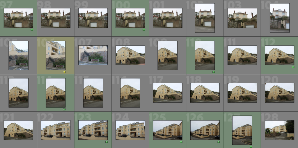
This photoshoot was to document all the house’s I’ve lived in, and then present them in the form of typologies. Here I was able to take picture’s of 10 house’s as I was unable to get through to the other ones. Some of the quality of the pictures turned out unfocused and dark, this was due to some of the weather changes. However, overall I believe this photoshoot was successful and I was able to create the images I needed. Some of the top images were from Christmas, were I was able to take some portraits of my family, however I believe the images were unsuccessful and felt more rushed and less organised. When editing and developing these images, I will edit them black and white, with similar adjustments to the previous photoshoot.

RED: BELOW AVERAGE

YELLOW: AVERAGE

GREEN: *BEST* IMAGES/ABOVE AVERAGE

PHOTOSHOOT TWO PLAN

MOODBOARD:

WHAT?

In this photoshoot I will take inspiration from the Bernd typology work. I will be taking pictures of all the houses I have lived in, 13, to show the lack of ‘home’ and sense of nostalgia in a childhood home. This will link with typologies, as in my photobook I intend to put these images in a grid format.

WHERE?

LOCATIONS FOR PHOTOSHOOT:

  • JERSEY
  • HOUSE AND FAMILY IN POLAND
  • HOUSES LIVED IN JERSEY (ST HELIER, ST MARTIN, ST SAVIOUR)

HOW?

I will be using a camera from school so I am able to create higher quality images. I will be taking a series of landscape and portrait images to see which fit best with the photobook and what layout will go best.

WHY?

This photoshoot is designed to show the lack of ‘childhood’ home and lack of nostalgia. Due to moving many times, you aren’t able to hold onto memories.

PHOTOSHOOT CONTACT SHEET:

Rinko Kawauchi

Moodboard of her work

Visceral – relating to deep inward feelings rather than to the intellect

Surrealism – Surrealism aims to revolutionise human experience. It is a style in art and literature in which ideas, images, and objects are combined in a strange way, like in a dream.

Who is she?

Born in Shinga, Japan, Kawauchi is a popular and admired photographer. She is most known for her ability to capture the moments in everyday life using a soft palette. She has studied photography and graphic design at the Seian University of Art and Design. After graduating in 1933, she spent a period of working as a freelance photographer in advertising and released three photobooks. These were released in 2001 and were called UTATANE, HANABI, and HANOKO. Her hard work resulted in gaining fame practically overnight, and since then she has created several photobooks with work that has been shown across the world.

https://lapispress.com/artists/40-rinko-kawauchi/biography/

Why have I chosen to study her?

I wanted to capture a visceral sense and emotion through my image, rather then showing nostalgia through objects or basic images. I want to draw an emotion through the photos in my book, not just a pretty photo to look at. The emotions I want to achieve is nostalgic love and happiness, transporting the viewer to a personal time in their life or childhood that is different for each person. However, I am going to focus on capturing photos that feel close to my childhood, and do this inspired by Kawauchi’s style.

Illuminance

Ten years after releasing her photobooks (Utatane, Hanabi, and Hanako) she published Illuminance which is the most recent volume of Kuwauchi’s work. This book is the first to be published outside of Japan, widening her audience and giving her work more of an opportunity to be appreciated.

This book is carefully constructed from design to the order of the photos. She has reversed the signatures in the binding of the book to create a folded page. At first it seems confusing, however it also lead me to think there was something hidden in the pages, also linking each photo to each other as if they are ‘attached’. She has also used swiss binding, which I find opens the book up more, possibly making the viewer feel like they are entering her world through the book.

The book has a theme of circles throughout, beginning with what looks like a solar eclipse, and ending with a photo from the same shoot later on. The sun is hidden in the first one, but showing in the last, and I feel like Kuwauchi could have created a hidden meaning that this book sheds light on her career or the viewer because they have been immersed into her creative life and skills. Each page links to the photo next to it, whether they both have circular shapes, hands, the same colour tones, the same textures, or link by being opposites. There is not an overall theme presented through her photography, but the images create a visceral sense, drawing emotions through her aesthetic. Her work also shows surrealism with these emotions because her images immerse you into a new world, creating new emotions and feelings.

Analysis of pages

Both of these images seem to juxtapose at a first glance, however taking a closer look you can see both images have a swirl in the centre thirds. They both are natural subjects, one created through its natural movement, whereas the other is flowers, but created in that shape through a man made shape. Kawauchi might have done this purposefully to present the beauty of the world whether natural or man made, or she could have just placed the two images together because they have similar leading lines and shapes. This is what I enjoy about her work, the fact that she has left the image to be interpreted by the viewer, with no writing to be influenced by.

It took me a while to understand the meaning behind these two images, but I came to understand that both images represent some sort of death. The image on the left presents prolonged death by choice, as cigarettes are used to satisfy its user, but is followed by consequences such as death. The image on the right also shows death, but not by choice. It is also a death generated by humans, with the intention to satisfy a user (the fish will be sold for enjoyment). I think Kawauchi was really clever placing these images together, each creating an idea of possible suffocation, maybe relating to how she feels as a photographer. I also took into consideration that this was her first book sold worldwide, and this could be her illustrating how she felt subject to Japan.

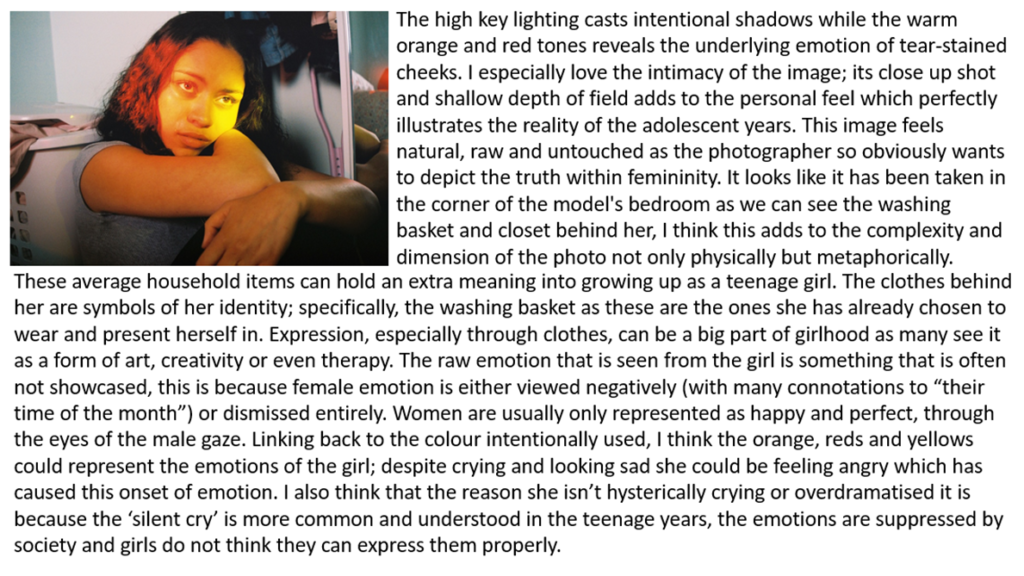
Image Analysis

artist reference – Petra Collins

PETRA COLLINS

“My goal is just to create images that generate a conversation about things that aren’t spoken about. I want to change the ways young girls look at themselves and the way women at large are looked at…. So, when I was 15, and started working, it was a time when I was going through puberty, and beginning to discover my sexuality and photography and film were a means of working that out.”

– Petra Collins with vogue

Petra Collins has been working since she was 17, and over the last 13 years she has explored many creative forms from shooting everyone under the sun to art shows to clothing lines to directing. A photographer, artist and model, Petra became known for her dreamy female lens shooting intimate moments of the teenage years in her home city of Toronto, going on to define a new generation of photographers. There are two of her projects that I want to explore: “the teenage gaze” and “24hr psycho”.

THE TEENAGE GAZE

In “the teenage gaze” by Petra Collins, she explores shared experiences of adolescences from their perspective rather than the stereotypical views, aiming for a ‘fly on the wall’ style. The intimate portraits shot from 2010-2015 takes advantage of the lighting, location, and props within the shots in order to create beautiful imagery.

Collins’ wanted to explore the juxtaposition of the early developmental stages of a girls life and her teenage years. The shift from what is labelled as period of innocence and purity, pretty dolls are shoved into her hands and tiaras placed upon her head transforms into a strange reality of catcalls and the fear that no matter how a girl decides to dress or act, she simply cannot win. If she wears makeup then she is giving into societal beauty standards and if she doesn’t, she simply won’t be pretty enough. “Pretty” is a word that girls learn to strive for before they can understand that they do not have to please anyone other than themselves in order to be beautiful.

24HR PSYCHO

“The constant battle within oneself, having to balance oppositional ideals of virgin, whore, mother. I was depressed at a very young age – mental illness runs in my family, especially on the female side… When we are angry, sad, depressed, or manic, we are immediately seen as unfeminine, or ugly, or weak”

– Petra Collins

For this project, Petra Collins wanted for women to take control of their emotions and to show that emotions should not be ladled as “negative”. It shows young women’s emotions in states of sadness and emotional suffering, moments of vulnerability then become acts of empowerment. Fragility and emotionality are emotions stereotypically associated with the female gender; Petra Collins wants to emphasize these characteristics and wants to show the world what it means to be a girl who lives adolescence today, constantly in contact with social media. These images, deeply intimate and private, face the complex question of a generation that does not know the world and people, if not through a screen.

ANALYSE

Photoshoot Plans

PHOTOSHOOT ONE

  • Tableaux style photoshoot consisting of my father and objects that symbolize my father’s relationship with the sea, such as his surfboard, wetsuit, or any personal items
  • To present my fathers connection to the ocean throughout his lifetime, use of first and most recent surfboard
  • By producing images in a location holding sentimental value to my father, use of close/mid shots, portraits
  • Late afternoon when light is soft
  • Along St Ouens Bay, favourite surf spot/other locations with meaning

Inspiration

PHOTOSHOOT TWO

  • Documentary Style photoshoot consisting of my father/unknown surfers/the landscape/waves, experimenting with long exposure
  • To present my fathers connection to the ocean throughout his lifetime/stills of the ocean and surf culture
  • Producing series of landscape/long exposure images documenting surf/surfers in action
  • Early morning – Colours
  • Along St Ouens Bay

Inspiration

Justin Kurland

Justine Kurland’s take on the classic American tale of the runaway takes us on a wild ride of freedom, memorializing the fleeting moments of adolescence and its fearless protagonists.

Kurland was born in Warsaw, New York. Her mother sold costumes at Renaissance fairs, so Kurland and her sister lived a somewhat nomadic lifestyle. At 15, Kurland ran away to Manhattan, moved in with a sympathetic aunt, and concentrated on becoming an artist.

She earned her M.F.A. from Yale University in 1998. The following year, Kurland exhibited in the group show Another Girl, Another Planet, which critics considered a preview of a new generation of talented and innovative female photographers.

Both Kurland’s childhood adventures and her current experiences influence her working style and subject matter. She now spends much of her time on the road, scouting locations for photographs and recruiting models.

While her earlier photographs of schoolgirls were inspired by her own experience as a runaway, the birth of her son Casper in 2004 shifted her focus to pregnant women and mothers. Kurland also attributes her more recent photographs of trains and train stowaways to Casper’s love of those vehicles.

This kind of ironic playfulness repeats itself over and over again in this book. Even the title, Girl Pictures, embossed onto the powder pink cover feels vaguely tongue-in-cheek. It sounds dirty or patronizing. Just one letter shy of girly pictures, the title of this book is akin to categories like “chick lit” or “chick flicks.” I can almost hear someone critiquing these photographs as just a bunch of “girl pictures.” It makes me think of that image with the girl’s hands over the boy’s eyes again. What if rather than removing his perspective, you just take it directly from him? The title feels this way to me, like something stolen back.

There’s something political about creating a world that you want to exist

Image analysis

In this image the light is dull and reminds me of autumn time. This is because of the colours of the leaves and clothing the people are wearing. The focal point of the image would be the woman circled she is about to get into the water. The image shows a group of friends about to get into the water. The layout of the people in the image creates layers and as if the woman getting into the water is the main girl in the group as people are looking up to her.

By taking inspiration from Kurland and further developing my past images I will try to create a story which people can understand and relate to.

photoshoot plan 1

I plan on doing my first photoshoot of candid and staged photos.

I want the environment of this photoshoot to be mainly of in and around my friends cars. I will create different photos from in and around the car from different point of views. This photoshoot will represent girlhood in the way of going out adventuring and feeling free.

I will take exterior shots from outside the car to juxtapose the interior shots from inside of the car of my friends.

I plan to take these images around the times of sunset, so before and during, this is because I want the natural, dim, strong lighting to create dreamy silhouettes and backlighting. I’m hoping the dramatic skies cause rich and intense colours in my images.

Theo Gosselin

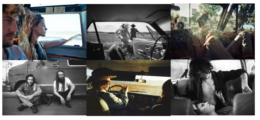
Theo Gosselin is a French photographer. He is mostly famous for his bohemian pictures taken during different road-trips around the world.  Deliberately cinematic, his photography reveals friends in the act of escaping from their regular lives into newly enticing and perilous modes of existence, ever in search of the persistent though elusive idea of freedom.

Theo Gosselin pictures, like Justine Kurland, are a true homage to freedom, captured like a snapshot. His favourite themes are life, love, his generation, his adventures, and large spaces; in definition a youth thirsted for freedom and an alternative living, where human values and harmony with nature dominate.

Passionate about drawing, music, and cinema, he chose a path through the art school, and graduated in 2012 as a graphic designer in Amiens. He started photography around 2007 and chose to pursue and develop this. He loves to capture the simple life, love, good and bad moments, his friends and his adventures. Gosselin is an eternal traveller and shares his way of life with the people he loves; because the truth is in wide open spaces and in the heart of the characters he meets along the way.

His work is simple but heart-breaking, pictures which speak the language of feelings and true emotions. Without artifices or lies, the young photographer captures the intimacy with tenderness and accompanies to adulthood.

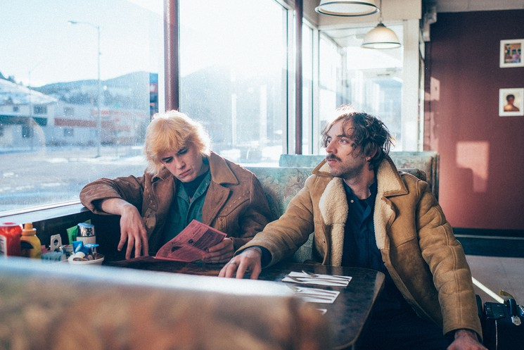
This image is a good example of photos I want to be taking. The focal point of this image is the two people, however the viewers eyes are drawn to their surroundings. It looks like they are in a service area restaurant and it makes you wonder what their story is, are they runaways? Are they on their own adventure? Are they lost? I want my images to create this kind of atmosphere.