using lightroom

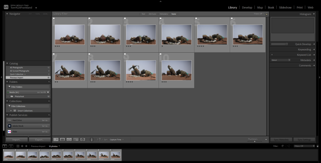
Imported photos from past students.

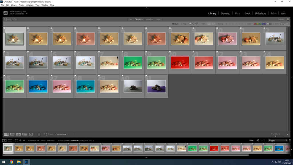
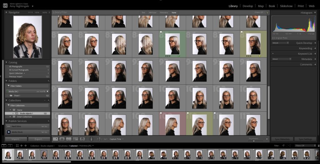
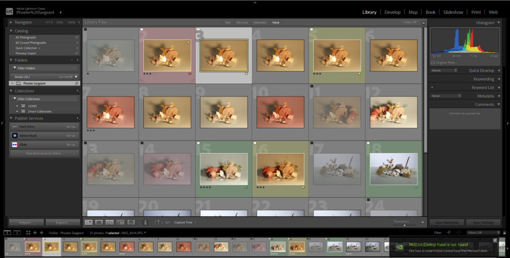
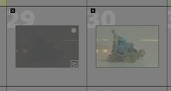
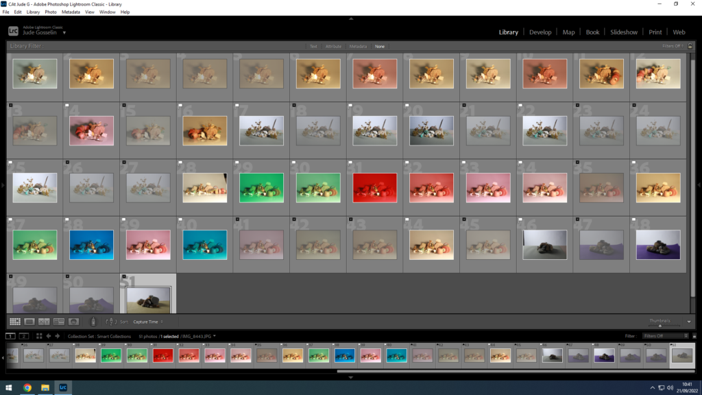
First I learnt how to select and discard different photos, by selecting the photo and either clicking P to select or X to discard the photo. Discarding the photo doesn’t actually delete it but shows that you don’t want to use it.

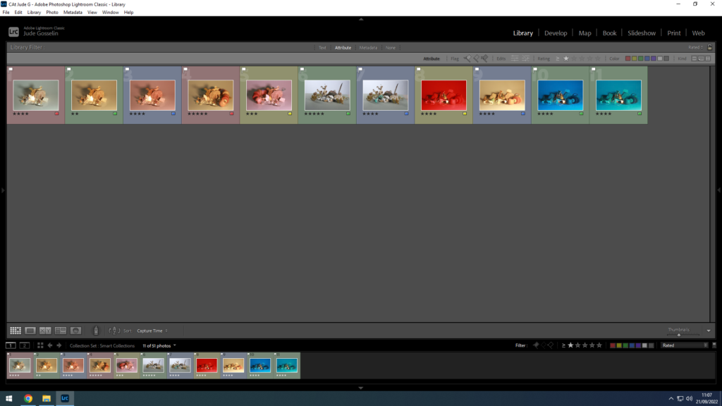
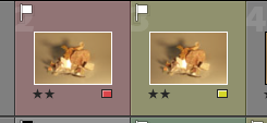
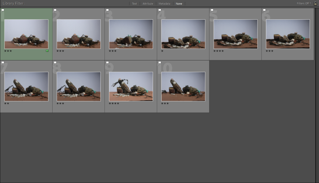
Starred and colour codded photos.

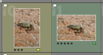
Next I learnt how to rate the photos using the stars underneath the photos. Also how to colour code the photos using the flag at the bottom right of the photo to show whether the photo is going to be used, might be used or isn’t going to be used.

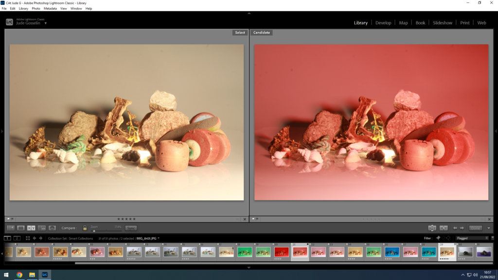
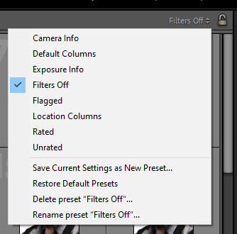
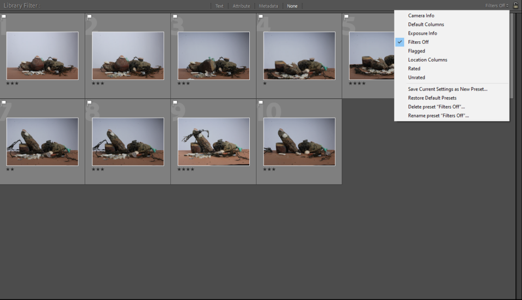
How to select only flagged images.

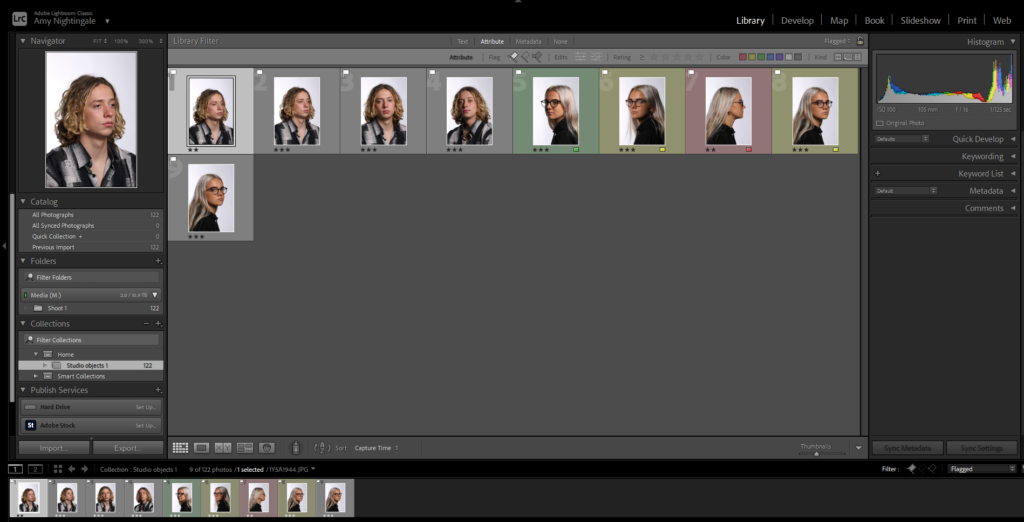
Then I learnt how to select only the photos that I had flagged/selected. By clicking on the top right button which says filters off and selecting flagged. This got rid of every other photo apart from the ones that had been flagged.

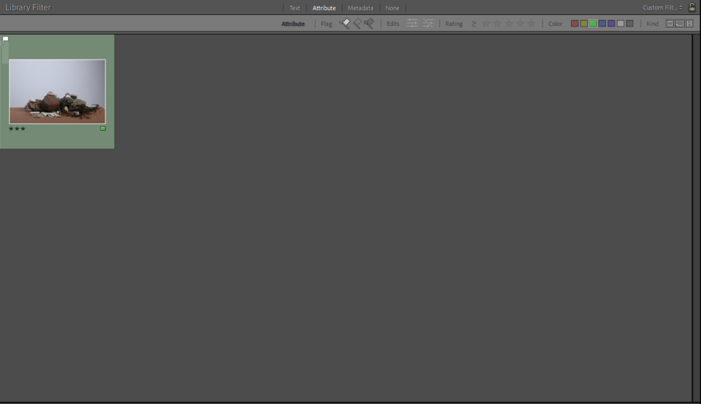
Only flagged images are shown.
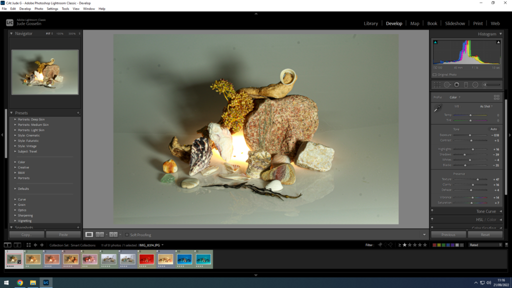
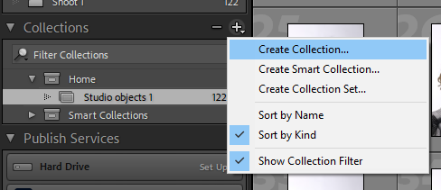
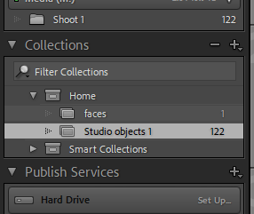
How to create a new collection folder.

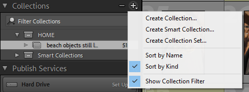
Then I next learnt how to create a new collection folder. This is by clicking on the plus symbol next to collection and then clicking create collection.

New folder with the photos.

I then dragged certain photos into a new collection folder which were of a specific person. To do this you just click the photo, then drag it and hold it over the folder you want to put it into.

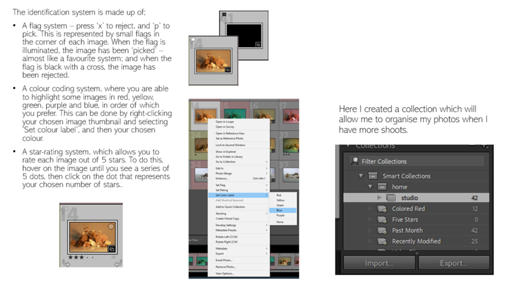
LIght room classic- fliltering system.

In Lightroom Classic it gives you the opportunity to filter through, rate and colour code you imported photos.

Lightroom uses Previews of your photos not the actual photo file its self.

The filing system makes light room less cluttered and easier to find your work.

The photos I like I have flagged them by selecting the photo and pressing p.

To discard the photos I don’t like so I know not to use them I have put black crossed flag on them and it comes up as grey

To colour code my photos i selected the photos in a simple traffic light code in order of photos i like, find okay and photos I don’t mind i did this by selecting the photo then pressing the square on the bottom right hand side and selecting the colour.

I also rate my photos by how much I like them so I know what photos to use.

You are also able to make a folder in collections which you are able to put all the photos of one project into a file so you arent habing to look through thousands of photos to find one project.

you do this by pressing the plus button on the left hand sign of the screen, you then drag the photos into the file.

Adobe Lightroom

Filtering

Lightroom classic is an software that allows you to import your images and filter them through multiple methods, such as:

This block allows you to colour code you images. For example if you really like a certain image you could colour it as green, meanwhile if you dislike a image you could code it as red.

The flag allows you to pick out certain images by adding this little white flag to the top of the image. It makes it easier to filter which images you need to find.

The stars allow you to say how much you like this image. This is useful for when your trying to choose which images to select.

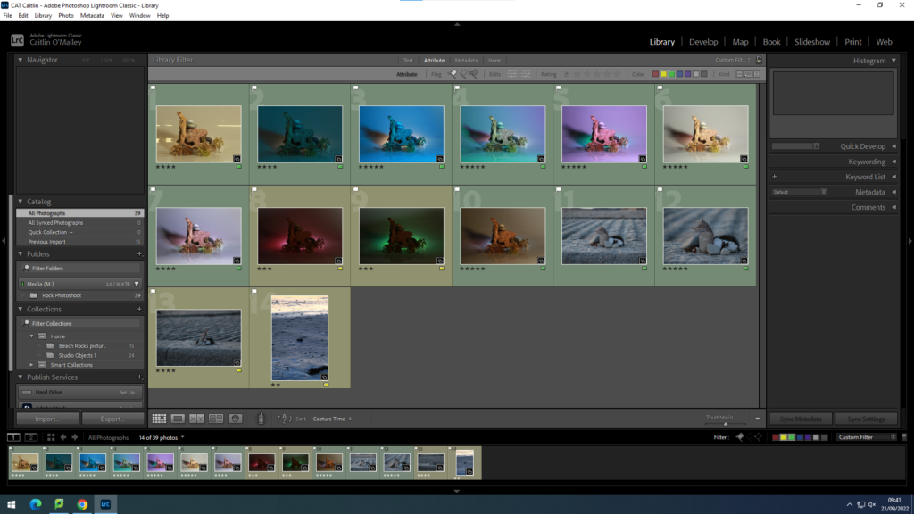
The images should look like this once you have filtered them. As you can see, the green and yellow colours separate how much you like each image as well as the stars rating out of 5 showing which ones you prefer.

Creating a collection

Your also able to organise your picture through collections. This makes it easier for you to find specific pieces of work instead of searching through all of your images.

Your able to create a collection by clicking on the small plus in the corner.

adobe photoshop lightroom

I have learnt how to import my own pictures and then to flag which pictures I like the most, and also flag the ones I don’t need/like. Ive then learnt to colour code them red, yellow or green.

The four things are:

  • Flagging my favourite pictures with a white flag by selecting it and pressing (P)
  • And then using the stars to rate how much i like the picture 1-5.
  • If I don’t like a picture I select it and press (x) and it becomes de-selected.
  • I can also colour code my pictures either green (favourite) yellow (okay) red (don’t like as much).

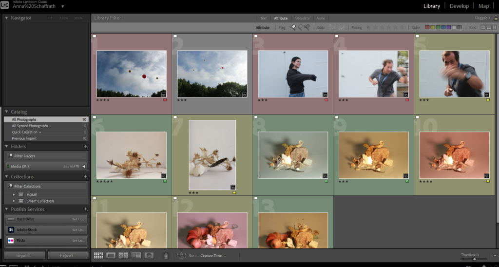
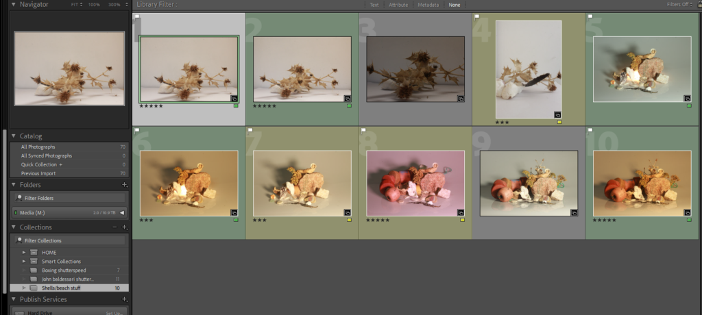
This shows my flagged pictures which I’ve colour coded and rated.

This is going to help me organise my photoshoots and make initial selections.

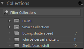
Creating collections

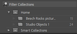
To sort my photos properly I’ve learnt to create collections for different categories of photos so its easier to access:

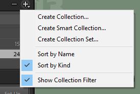
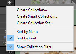
The plus sign in the top right corner gives the option to add another collection:

By clicking the top one (create collection) you can then have a different folder which you can name to whatever category the photos you decide to put in it falls in. For example this is what one of my collections look like:

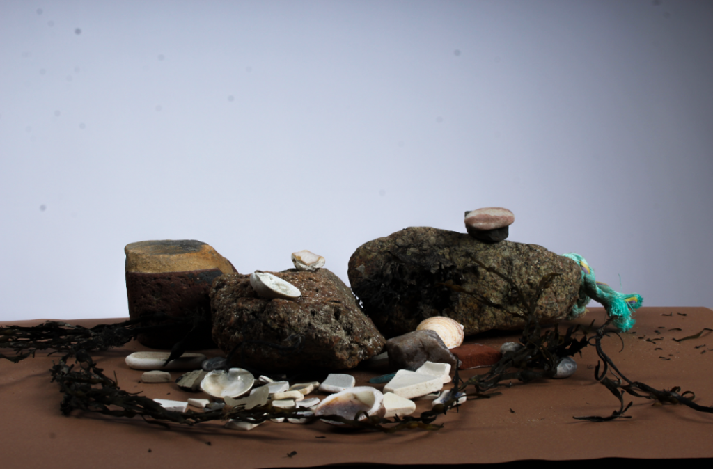
This is my shells/ beach stuff collection.

Using lighroom classic

Creating Collections and Filtering in Lightroom:

All of my pictures in a collection.

I started by importing all my pictures from a certain photoshoot into Lightroom, creating a collection set and then a collection to put them into.

Some of my rejected images.

I went through my photos and rejected some of them by clicking the letter ‘x’ on my keyboard. This helps me sort out my images as Lightroom now knows that these aren’t images I will be using.

Some of my pinned photos.

I also pinned some of my images, the ones I thought were the best, as well as them filtering them by giving them a rating and colour. I used green for the ones I will definitely want to use for editing, yellow for the ones I might use and red for ones I most likely won’t use. I used the star rating to show how much I like the image (1 being the lowest rating and 5 the highest).

stars
colour
Making a collection.
Naming the folder.

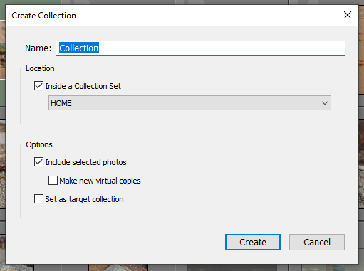
To make a collection, you go on the collections section and go on create collection. You would then label it with a suitable name and the collection will be created. this is used to create subfolders, placing photos that belong together in one place, making everything more organised.

LightRoom

You can flag the images that you like by selecting them and pressing “p” and “x” if you don’t like it.

You can give each image a star rating from 1-5 depending on how much you like them.

You can colour code each image on depending on what you need for example: green for the ones you will use.

You can also filter to only show certain images.

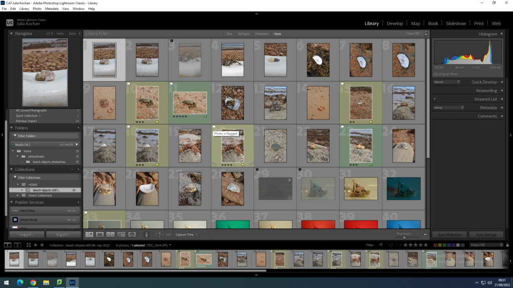
In this image I’ve filtered so it only shows green images.

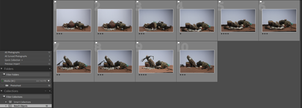
You can create a new folder to store certain images in them for example like I’ve done with the beach objects.

Creating a collection is good to keep your photos organized.

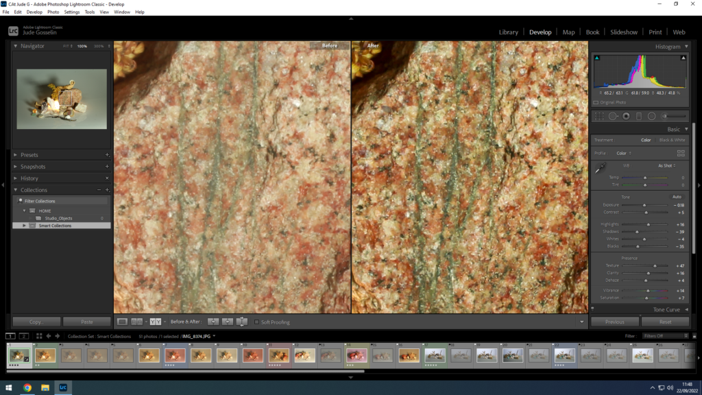
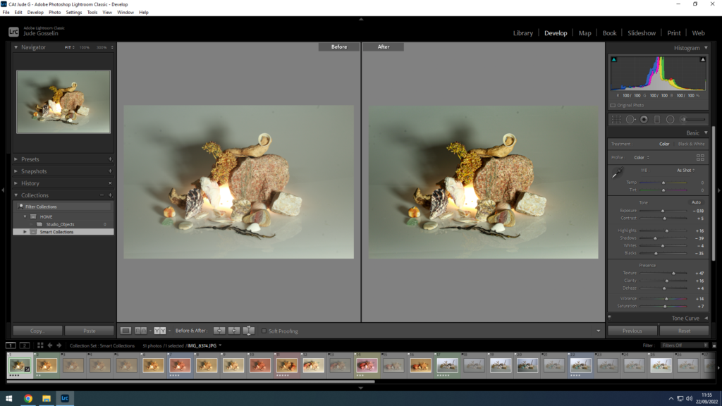
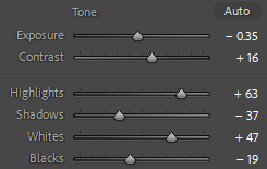
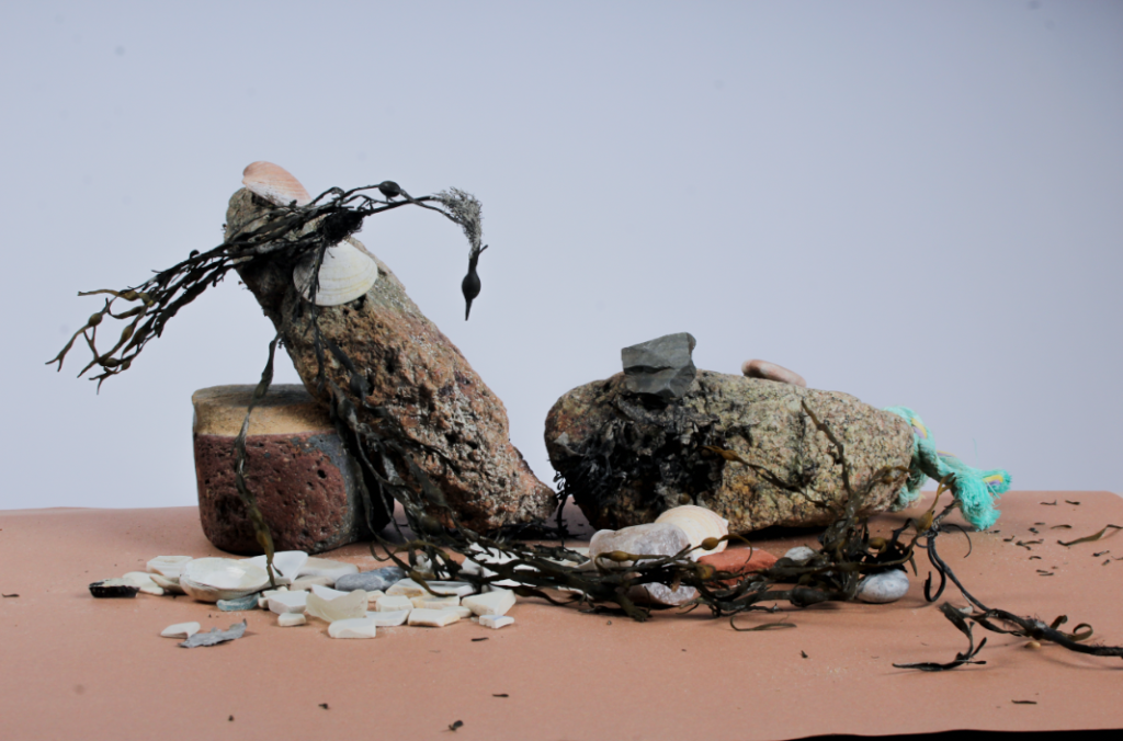
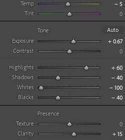
I edited these 2 images slightly

Shutter speed

What is shutter speed?

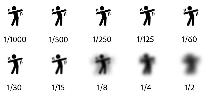
It’s the speed at which the shutter of the camera closes. A fast shutter speed creates a shorter exposure (the amount of light the camera takes in), a slow shutter speed gives the photographer a longer exposure.

A chart showing different levels of blur for a moving stick figure, based on the shutter speed

A faster shutter speed allows less light to pass into the camera sensor. Inversely, a lower/slower shutter speed allows more light to pass into your camera.

What is shutter speed in photography? A Useful Illustrated Guide.

Photo games

These images were produced with a slow shutter speed (1/15) creating a blurred effect.

These images were taken with a fast shutter speed (1/250) creating a sharper image.

John Baldessari

John Baldessari | Throwing Three Balls in the Air to Get a Straight Line  (Best of Thirty-Six Attempts) (1973) | Artsy

John Anthony Baldessari (June 17, 1931 – January 2, 2020) was an American conceptual artist known for his work featuring found photography and appropriated images. He lived and worked in Santa Monica and Venice, California.

Initially a painter, Baldessari began to incorporate texts and photography into his canvases in the mid-1960s. In 1970 he began working in printmaking, film, video, installation, sculpture and photography.
My Jersey

Bruce Gilden

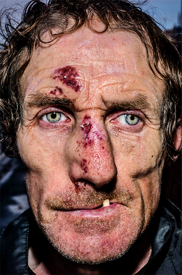
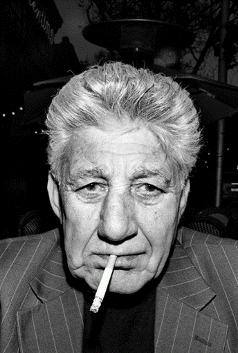
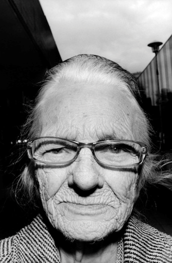
Bruce Gilden (born 1946) is an American street photographer. He is best known for his candid close-up photographs of people on the streets of New York City, using a flashgun.
Whilst Gilden studied sociology at Penn State, he watched Michelangelo Antonioni’s film in 1968. Influenced by this film, he purchased his first camera and began taking classes in photography at the School of Visual Arts of New York. Captivated with people on the street and the idea of visual spontaneity, Gilden turned to a career in photography.

Gilden has worked on commissions for Louis Vuitton, The Climate Group, and Mission Photographique Transmanche as well as publications including Wallpaper, New York Times Magazine.

“I’m known for taking pictures very close, And the older I get, the closer I get.”

John Stezaker

John Stezaker is a contemporary British Conceptual artist best known for his collages of found images taken from postcards, film stills, and commercial photographs.

Stezaker attended the Slade School of Art in London in his early teens, he graduated with a Higher Diploma in Fine Art in 1973. His works have been featured at The Museum of Modern Art in New York, the Tate Modern in London, and the Tel Aviv Museum of Art, among others. Stezaker lives and works in London, United Kingdom.

“My ideal is to do very little to the images, maybe just one cut: the smallest change or the most minimal mutilation, what I do is destructive, but also an act of deliberate passivity.”

My Jersey

For my summer task I have decided to focus on my mum.

My mum has been living in jersey for over 20 years, in St Ouens bay. I am going to be showcasing my mums connection to the bay with multiple images taken on a recent family walk.

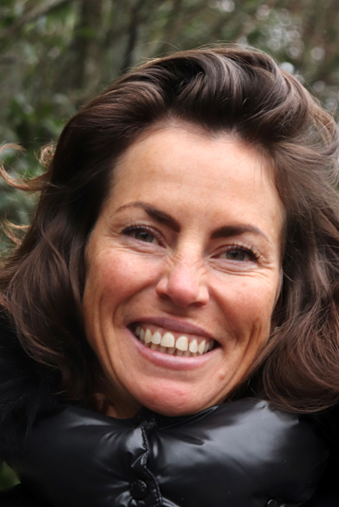
The images consist of a portrait of my mum inspired by Bruce Gilden, along with a Landscape of St Ouens bay. Through the influence of John Stezaker I have overlapped these two images, With the use of Blend Editor on my Iphone.

I have selected these images because having lived in St Ouens for some time my mum and family have had a significant connection to the bay as seen through this portrait.

The Portrait

The Landscape

The Final Image

summer task

My Jersey

The person I chose for this task is my dad. Together with my mum we have lived on the island for just under a month. Having moved from the Scottish Borders we do not have deep roots in Jersey, so I decided to focus this task on my dads new found life on the island following his job.

My dad Alan Gamble was born in Northern Ireland on 14th January 1973. Farming has always been an interest and a job that he he has followed having worked and managed on many farms. The opportunity to move to Jersey following my dads work was one that he nor us could pass up.

Ideas

My main ideas going into this project were to capture my dads daily life in an entirely new place. Straight of the bat I knew I wanted photos of him working as people aren’t normally used to seeing cows in this setting- how milking actually works or the insides of this line of work.

I had a fair few concerns going into this project as photography isn’t something I’ve done before at the end of the day this project allowed me to pick up some new skills that can be expanded on.

Research

Laura Letinsky

Laura Letinsky is an artist born in 1962 in Canada. Her photography work focuses on challenging the norms of domesticity, gender and unsustainable consumption.

“We live in a world where photographs demand more photographs. They generate a need for desire. My understanding of desire is from a psychoanalytical point of view. Desire involves something being just out of reach—close enough that we know it is there, but not close enough, that we can have it.” Lentinsky talks about the constant demand for photos that people can live through and the expectation from Capitalism the photographer should constantly produce “perfection” that they can consume and then get bored of and demand more. Many of her 2010 Photography projects such as ” albeit” and ” ill form and void full” are an attempt to find a new way to view photography without the burden of capitalism and desire and to illustrate how it is often seen by consumers. Laura Letinskys photography focuses on breaking the social norms of photography and much outside of it.

See the source image
Untitled 7, Albeit Series, 2010

She uses Light backgrounds and overexposure adding a whimsical and calm feeling to her work. She uses soft pastel palettes in backgrounds and subject. She tends to avoid harsh light. Though when severer lights and colours are used in her photography she uses them to create a striking contrast between them and her usual pastel subjects.

What I find interesting in her work is her use of subject matter. I have decided to focus on her 2006 series “Hardly More than Ever” which depicts half eaten and mashed fruits with cutlery and other dinning items seemingly abandoned at tables. I think the photos make you think as you question what has happened to leave the items in this state.

Stephen Shore

Stephen Shore is an American photographer born in 1947. He is known for his use of colour in art photography. During the 1970s Shore set of on a trip round America capturing the mundane in a colourful new way and forcing people to look at what they walk past everyday closer and see the beauty in it “discovering America”.

His work uses saturated colours and everyday subjects expressing parts of boring life in great colour. I particularly like his work “uncommon places” as it captures small snippets of landscape and life in a happy colourful way which is what I am hoping to achieve with my photographs for place.

Luke Fowler

Luke fowler born in 1978 is Artist and film maker based in Glasgow. His photography is know for his use of juxtaposition having used old film cameras for his work.

However I am interested in his portrait work as it captures people being people which is my goal for the portrait shoot. I think Luke fowler work is interesting as it expresses many of his subjects just doing their job, or at a party or even just walking and creates an insight into their everyday life.

I am also fond of Fowler’s heavier use of exposure creating a darker more under exposed photo.

The Object

Planning

inspired by Letinskys “Hardly more than ever” my idea for the object photo shoot I chose a pair of my dads boots as our time in jersey has been about travel and discovery and shoes although not often brought to mind come with us everywhere. They are what we take our steps in through change and the mundane of everyday life.

I wanted to emulate the plain and light backgrounds of laura Letinskys work to focus purely on the boots and their story of travel. The first photos I wanted to use an infinity curve to get the completely plain back ground so I figured my bath tub would work well. The second shoot I took them to the beach to get a plain light background but not completely bare to try and replicate Letinskys simple but effective backgrounds and the beach has been a frequented spot by me and my dad recently as it was a rarity to visit in Scotland.

Raw Photos

I took a total of 80 photos of the boots. I started by taking pictures of them first in my bath tub in an attempted to create an infinity curve so all focus would be on the boots. I used the natural light of the bathroom window and my phone torch to try and light it. A few photos I attempted to emulate having a gel by wrapping my phone torch in a blue plastic bag and waiting for a less harsh natural light from the window to get the effect of the under statured blue light often used by Letinsky. The effects of this I was rather pleased with this and can be seen in the last 3 of the first cut.

Makeshift lighting set up

First cut- Unedited

Object – Final Photos

I started by cropping the images to center and align the composition better. I then went on to adjust the exposure to wash out and achieve the more over exposed look of my inspiration that was Letinskys work.

I like the darker more desaturated look of this as it adds contrast to the lighter works .
I think the lighting on this one adds interest however as a result it is more grainy.

The Place

I could not chose one place when Jersey to my dad is still being discovered so instead I took photos of things he would walk past and see every day that have a sense of familiarity in this new place. My goal was to document things as my dad would see then as he went to and from work.

Planning

Inspired by shore’s trip around America I decided to do a much less epic trip and walk to the farm on the route my dad takes every morning and capture things on my way and at the farm. I tired to take bright saturated pictures to emulate Stephen Shores work. Of course a big part of the place was cows and in my dads line of work it would be criminal for me not to include them.

Raw Photos

Blanc Pignon Farm

First Cut

Place – Final Photos

I cropped the photos to cut unwanted parts then focused on the contrast and exposure to make the photos brighter and more colourful.

Although this photo is grainy the colours are what drew me to it more as it is brighter.

The Portrait

For my dads portrait I did multiple shoots, one like passport photos and focusing on his face and another focusing on him working.

Planning-first shoot

The first shoot I focused less on candid photos and more on my dads face and getting a “passport photo” I then went on to experiment with using a shallow depth of field outside in the garden to attempted to get only his face in focus to frame it.

Raw Photos

Shoot 1 – First cut

Portrait shoot 2

I went with my dad to work on two different occasions to take photos of him working. getting him to focus on what he was doing and not paying attention to the camera. This is what I was hoping this project would lead up to- taking pictures of my dad in his new job the thing that brought us to jersey in the first place.

First cut

Many of the photographs taken in the shed and parlor are grainy as a result of the light I made the decision to not use flash as to keep the depth and to not spook the cows.

Portrait-Final photos

Experimentation

I started looking at photo stacking to see if it would suit my photos. I specifically looked at the work of John Stazaker and tried to emulate the way he would stack objects over the face of his portraits obscuring their face.

Photo Stacking

I thought this one was effective as it uses darker tones and the unequally size of the squares is pleasing to look at.

Merging

Juxtapositions

Looking again at the work of Luke Fowler and his use of juxtaposition the create contrast between images i attemped to create my own.

Collage

I started looking at the work of Pariwat Anantachina and his used of photo mashing and merging to create collage like photos which I really liked however I decided to use lower opacity images to achieve less jarring lines between images.

I liked this photo so far but I decided that it lacked colour and contrast so I took more yellow from the photo of the bracelets and added them in.

I really liked the more crowded look of this photo and I think the primary colours scattered throughout due to the other images lead your eye round the photo well.

Final Images

Thoughts

I am over all pleased with what I’ve produced as photography is entirely new to me, however there are many things I would now do different and have learned from. I think for the future I will try and take more interestingly angled photos as I feel many of mine were very linear and lacked compositional interest. I have also learned a lot about camera handling and how to achieve what I want especially when balancing aperture and shutter speed. I ran into a lot of issues with photoshop on my laptop when editing the photos so I had to use other ways to edit them how I wanted which I wasn’t pleased with as I was hoping this project would allow me to explore photoshop more. I have spent a lot of time on this and whilst there is much room for improvement I’m am proud of what I’ve done.