Photobook Deconstruction

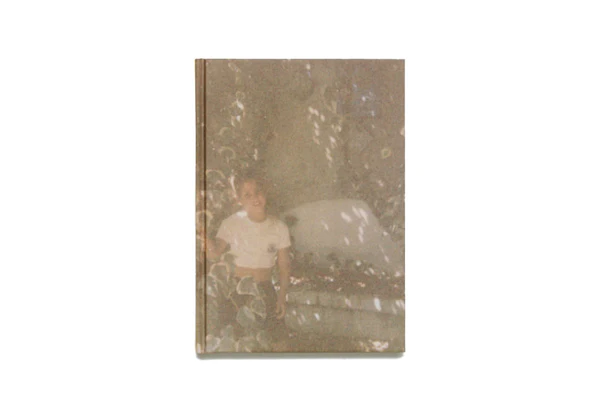
Rita Puig- Serra Costa , Where Mimosa Bloom
NARRATIVE, EDITING, SEQUENCINGDESIGN, FORM,

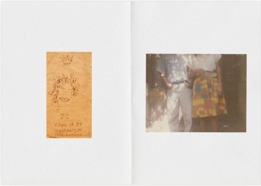
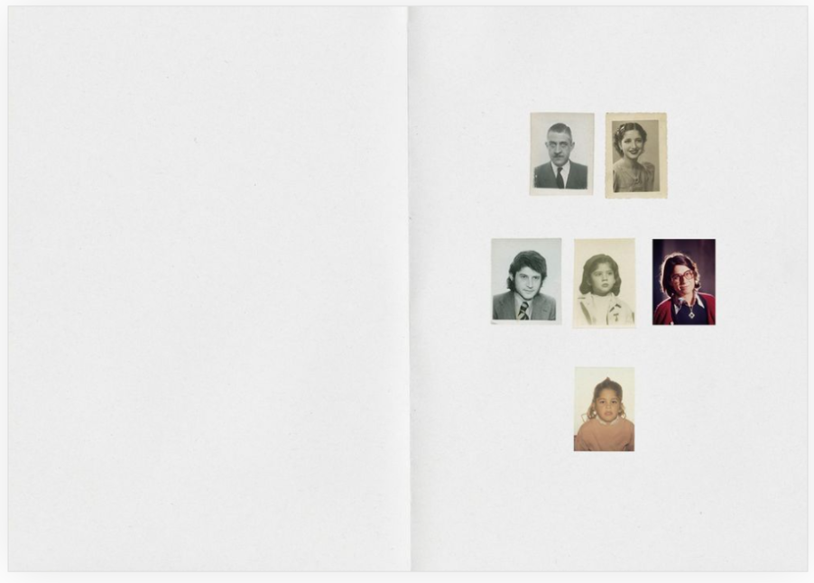
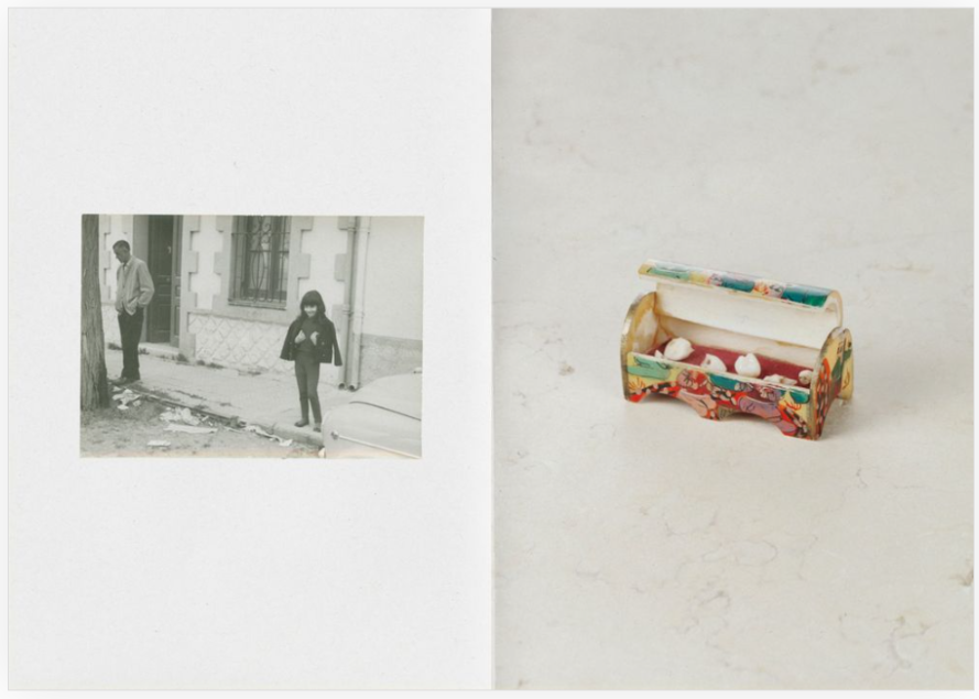
The narrative of the story is following the front papers with a hue reminiscent of mimosa, there are miniature portraits portraying her maternal family lineage, creatively framed by cut-out windows. These snapshots encompass grandparents, an aunt, her parents, and Puig-Serra Costa herself. The visual narrative unfolds further with a collection of diverse images sourced from family albums, featuring snapshots from her childhood and collaborative works with Spanish photographer Dani Pujalte during the years 2012 and 2013. Additionally, the compilation includes reproductions from her exclusive inheritance as the sole child, ranging from an entry in her mother’s initial diary to doodles, cards, and even a recipe for chicken broth. This amalgamation of various media, formats, and genres not only hints at the protagonists’ identities but also serves as a compelling testament to their profound bond. She has images exploring this through portraits, landscapes, still-life. Following different genres within those too, where within portraiture she explores; self portraits, studio portraits, environmental portraits and many more.Within landscapes she explores different settings but which revolve around natural landscapes.

EDITING

why i love the images within this book is because of the variety of the outcomes. which are also achieved through the editing process, which also, with every image varies. However throughout the book there’s a theme reoccurring, where there are many light colours and cool tones withing the images. this gives a certain feel to the overall book, for this instance this is calm and relaxed due to the colour pallet. Some images are also edited to appear more older then they are to match the other archival images.

SEQUENCING & LAYOUT

The book follows a great storyline, where it starts of with the beginnings of her life, or, before it even started, by showing her family tree. She showed this though a specific layout, where each person is cut out separately, so with each page turned, a new family member appears. other then that interesting opening to the book, the rest of the pages are of pictures printed on them. the book itself is a little bit bigger than an A5 paper.

Questions to answer:

  • Book in hand: how does it feel? the texture of the paper is slippy and shiny, the pages being smooth and sleek to touch.
  • Paper and ink: The ink used for the photographs is colourful. nearly all of the pictures within this book are in colour, with B&W photographs only used for older images.
  • Cover: The book has a hard cover with a printed image on the cover. And the only writing of the title and by who it is is written on the books stem.
  • Title: the title is both literal and poetic, “Where Mimosa Bloom” is referring to where her family tree grew quite literally and figuratively. she associates this tree with her family, especially her mother, therefore she is showing where her mum grew as well as the family tree.
  • Design and layout: the sizes of the images vary through the book, with one double page spread in the middle of the book, and most with one full bleed page and the other of just the item. the pattern and alignment of these images is irregular, however some do repeat.
  • Editing and sequencing: The editing of the images seem to follow a certain theme, where the images are edited to fit the same aesthetic, which are soft and warm colours. The editing process is quite natural and calm with soft tones.

Personal Study- Photoshoot 3- Edits

For these edits, I made the temperature of the photo warmer, as a representation of happy memories that my grandad has of his home and surrounding area in Poland. I also adjusted the contrast and exposure, making the images darker and having a suitable exposure. These photos were taken during the summer, and I wanted the photos to be a mix of portraits and landscapes. The yellow hue and the grain I added causes the photos to have a retro look, a portrayal of the ‘good times’.

an example of the editing

Edits

Personal Study- Photoshoot 2- Edits

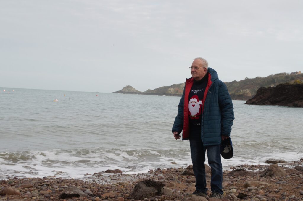
For these edits, I made the temperature of the photo cooler, since I wanted a blue hue within each picture. I think since the pictures are landscapes and micro photos, it adds a sense of loneliness and sadness. I also added a bit of vignette, since it guides our eyes to the middle. I also adjusted the contrast and exposure, making the images darker and having a suitable exposure. I also added a slight haze, exaggerating the blurriness of the photos. I think the blurriness was very effective, since it adds a feeling of timelessness to the photos. I picked these pictures out for editing since they act as a representation of my grandad now, as well as linking with my grandparent’s connection to nature.

an example of my editing

Edits

Photobook Deconstruction

Family Business – Mitch Epstein

Story of the book: Mitch Epstein went back to his home in Holyoke, Massachusetts to study his father’s failing real estate and retail furniture store businesses after a group of bored teenagers set fire to a building in 1999, the book was published in 2003.

Genre: This book’s genre is Photojournalism, presenting the demise of his father’s business through portraiture, landscapes and still life images.

Who is the photographer? Mitchell Epstein (born 1952) is an American photographer. He has created many books throughout his career, his first being published in 1997 and his most recent in 2021. By the mid-1970s, Epstein had abandoned his academic studies and begun to travel, embarking on a photographic exploration of the United States. Ten of the photographs he made during this period were in a 1977 group exhibition at Light Gallery in New York.

The book:

Book in hand: Quite a heavy book, paper’s quite smooth, smells like a book.
Paper and ink: All of the images are printed on matte photo paper, no black and white images, all printed in paper .
Format, size and orientation: The images are a mixture of landscape and portrait orientation, there are 295 pages, including the ones with written work.
Cover: The cover is a plain fabric cover with an image wrap dust jacket which shows products that his father sells in his company
Title: The book is about his father’s business, making the title Family Business literal.
Narrative: He builds his narrative using a mixture of landscapes, still-life images, portraits and stills from interview footage with his dad, mum and staff members of the business. Design and layout: There are no images that go over both pages of the book, most images have a border around them, highlighting them more.
Editing and sequencing: Very often, Epstein places an image of somewhere unclean next to an image of his father or another staff member, highlighting how put together the people of the business are.
Images and text: Most images have text to describe them, and the stills of interview footage have text saying what was said during the interviews.

Photoshoot 1

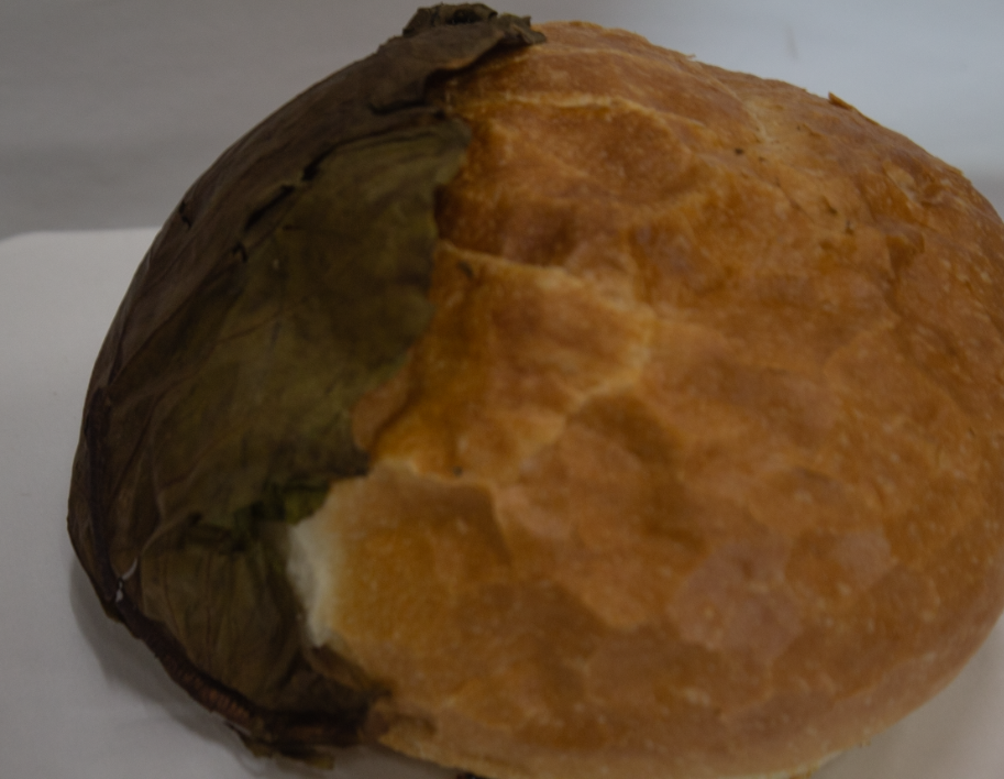
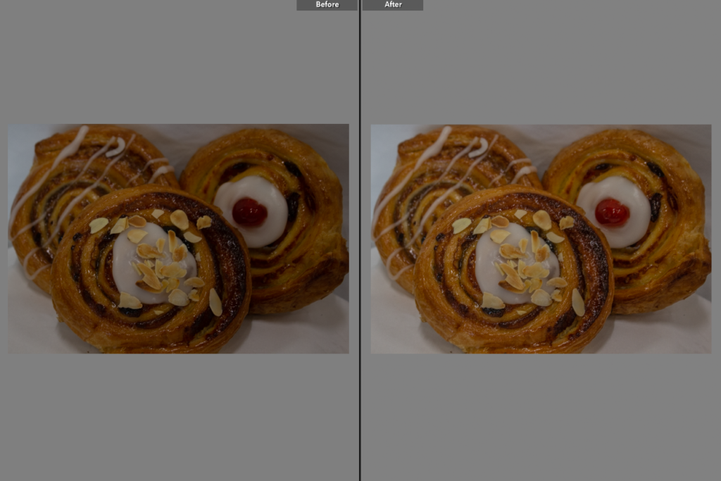
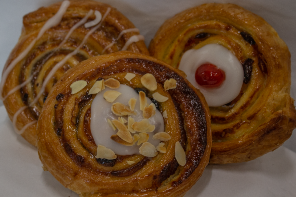
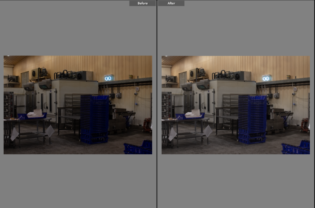
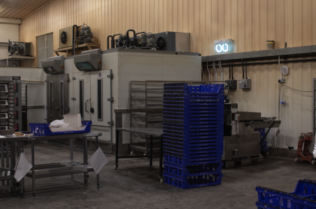
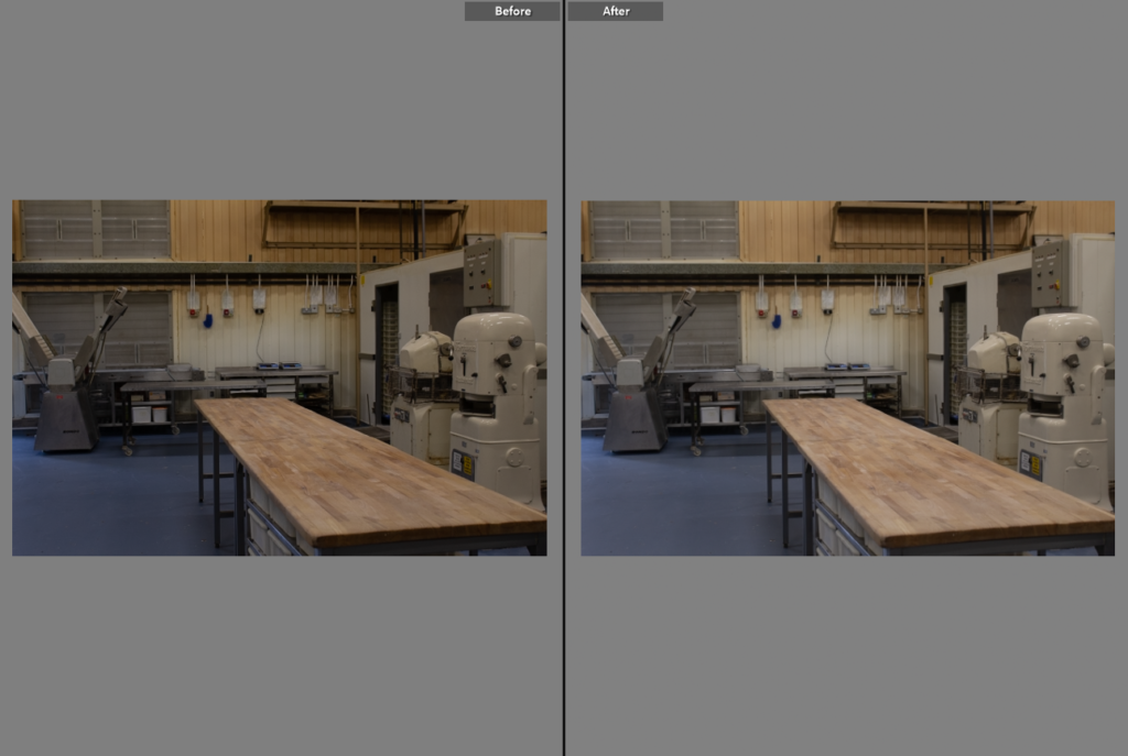
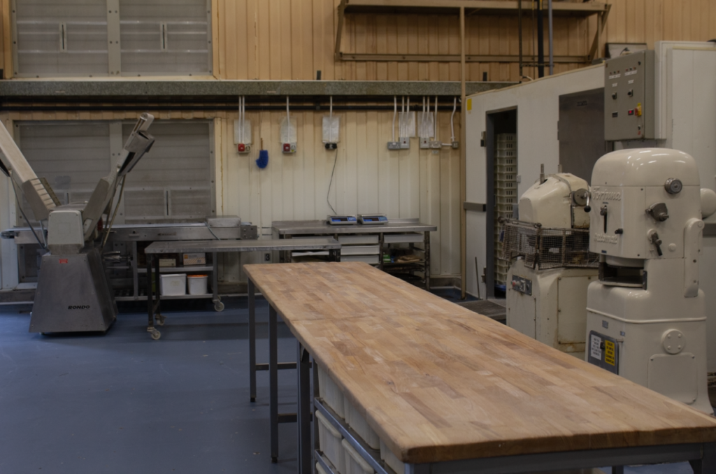
After photographing different products and the bakery, I had around 100 images, I, however, narrowed that down to 50 before importing them to Lightroom.

By the time I had narrowed them down again, there were around 16 that I liked and would like to use in my photobook.

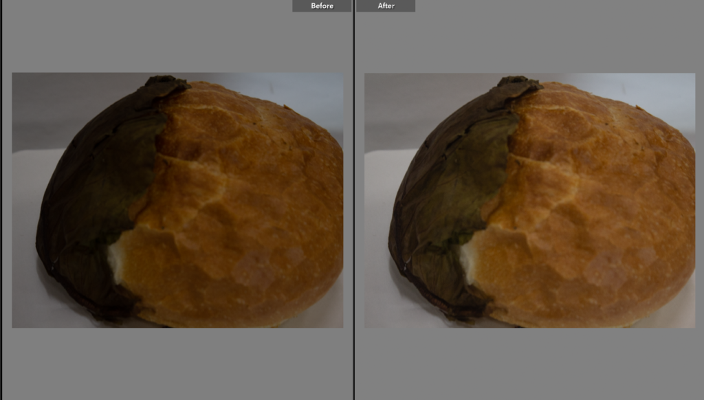
Editing process; most of the images were slightly under exposed but that was easily fixed, apart from that, not much had to be done to the images.

Photoshoot 2

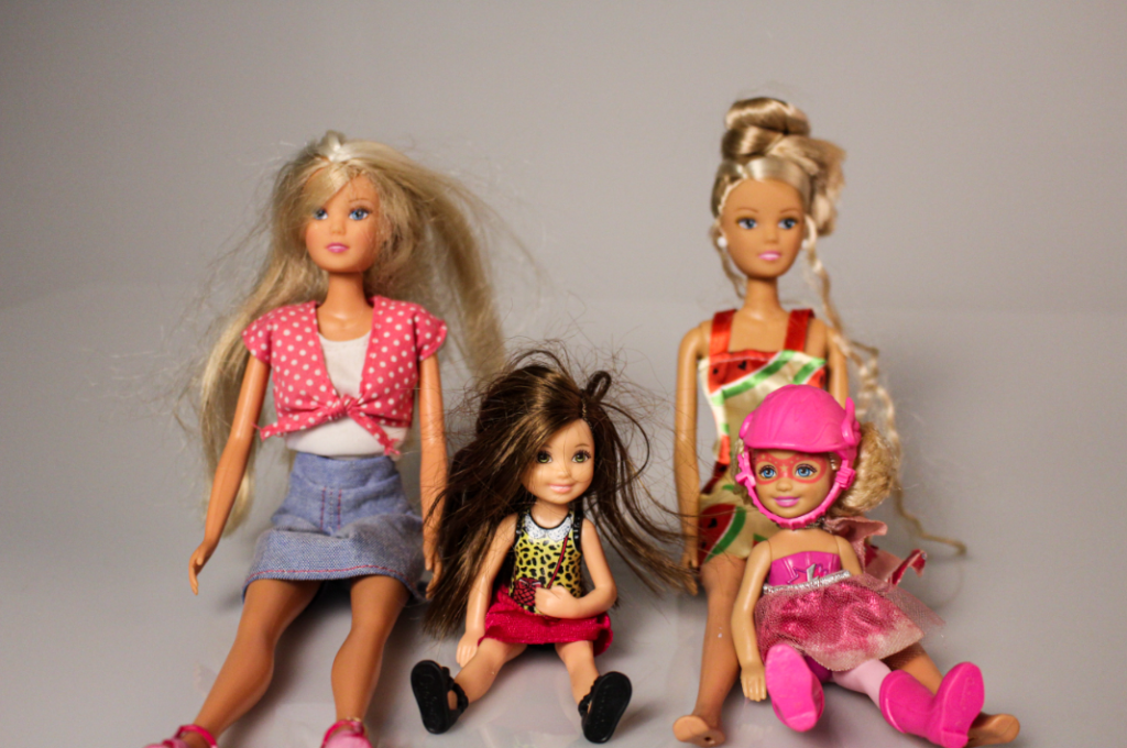
The aim of this photoshoot was to produce images of how mine and my sisters identity got confused when we where younger. I did this by taking pictures in the studio of her and some old images of us together when we where children and her pointing to herself or looking away when it was a single image of me. I edited these pictures in Lightroom as well while trying to give them a warmer and softer look.

Overall I am not as happy with this photoshoot as I feel that the lighting set up wasn’t ideal. Some of the pictures came out a lot warmer than others and I feel that they don’t represent the story that I wanted to tell. Next time I will spend more time trying to set up the perfect lighting which complements the features of her face.

photoshoot three

For my third shoot I also decided to focus on more modern buildings. I went out to Gorey as they are many along the coast that I wish to photograph for my project. Whilst I focused on modern buildings, I also photographed Mont Orgueil Castle (Gorey Castle), as I thought it would fit in perfectly with some of my older architecture images. Once I had made my selection I wasn’t left with very many images as I wanted them all to be perfectly how I had imagined it.

contacts sheets:

final images:

Overall, I think that I made some good images in the shoot, however, I think I could have tried to make a few more as I only ended up selecting a small amount as I wasn’t happy with all of them.

Photoshoot 1

For my first photoshoot I decided to take pictures of still-life objects such as toys, clothes and cards. I choses to do this photoshoot as these objects have sentimental value to me and remind me of my childhood with my sister. I took them in the studio placed on the white infinity curve with a direct studio light above them. When I was editing these pictures I wanted them to have a more yellow temperature to show the oldness of the items and how they have aged and soiled overtime.

Overall I am happy with the way that these images have turned out and I feel like they have a nostalgic feel to them as they capture my youth. One thing that I would change is next time I would take comparison pictures of toy cars and barbies as i was describing in my plan, but due to how long its been since we played with toys, my resources where limited.

Personal Study- Photoshoot 1- Edits

For these edits, I made the temperature of the photo warmer, causing the photo to have a more retro look. Although these are the modern photographs, I want the photos to have a timeless look. I also think making the yellow hue stronger was effective since it brings out my grandad more- otherwise he slightly blends in with the background. I also added a bit of vignette, since it guides our eyes to the middle. I also adjusted the contrast and exposure, making the images darker and having a suitable exposure.

an example of my editing

Edits

Personal Study- Comparison: Then and Now

In my photobook, I want to include some comparisons between then and now, including old snapshots of my grandad (and one of my mum and grandma) and newly created photographs with a similar composition and pose. I want my project to be an exploration of how much changes in time, using these photos as a juxtaposition- showing how age doesn’t necessily completely change anything. I think I produced some effective recreations which will look interesting when compared to each other side by side in my photobook. The recreated versions have not yet been edited and not all may appear in my photobook.

I attempted to have a similar composition in each photo (except the last comparison since it is more of a representational comparison) and I think I did this quite well. The process was an interesting one, and it helped me to gain more insight on how to make my project more meaningful, by portraying both time and timelessness through my photos.