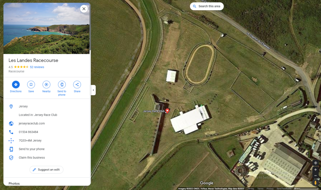
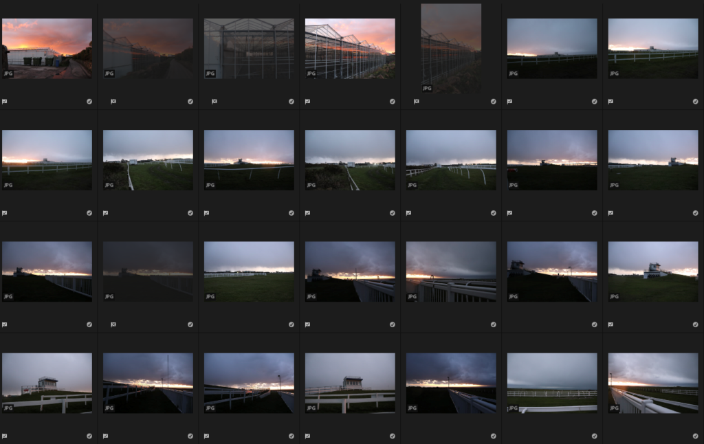
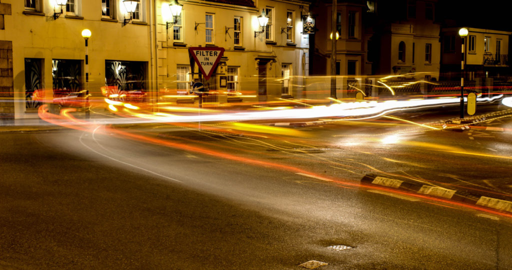
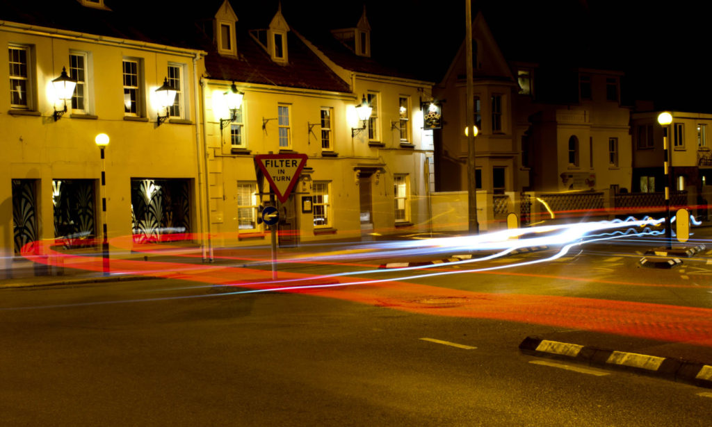
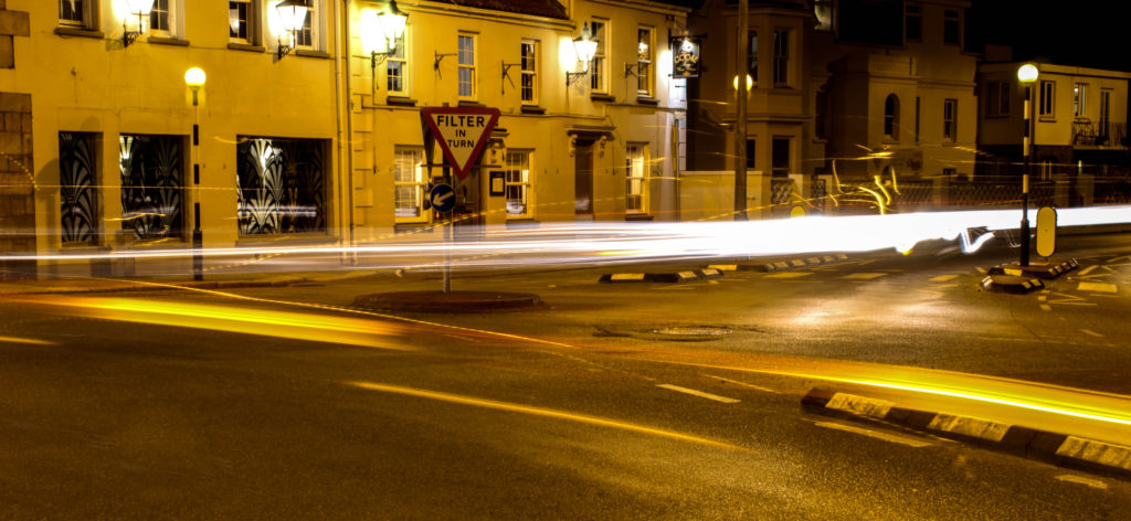
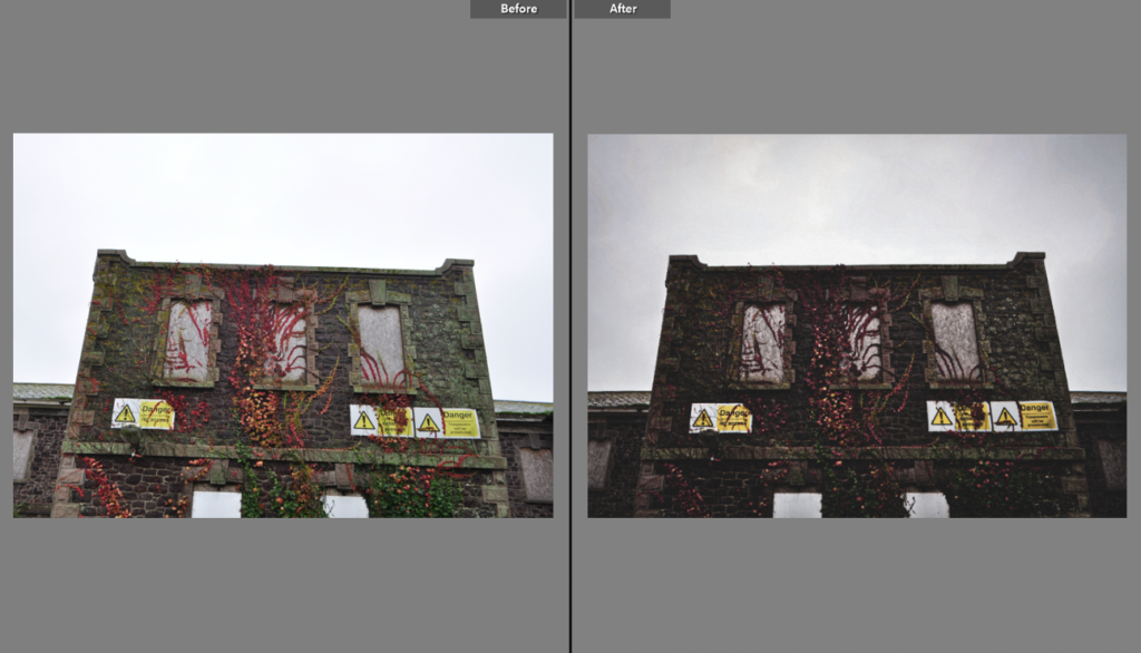
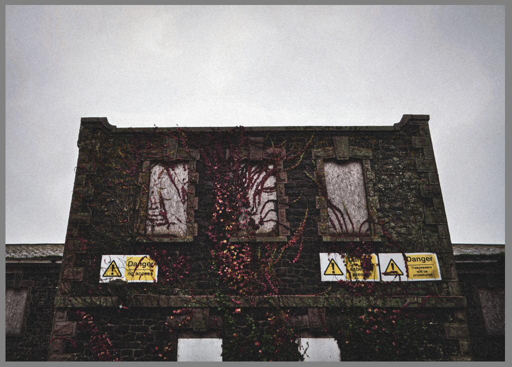
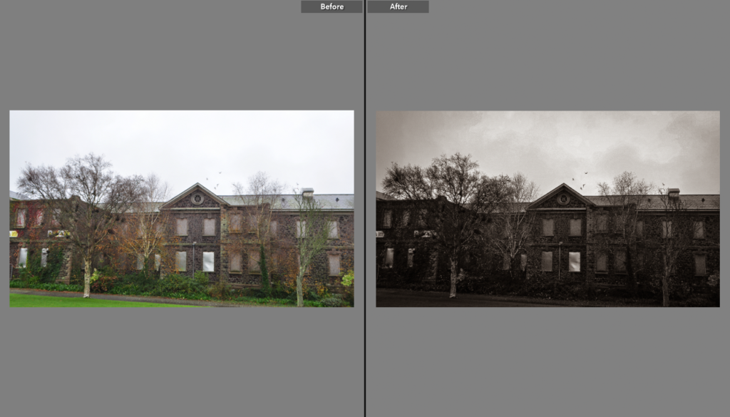
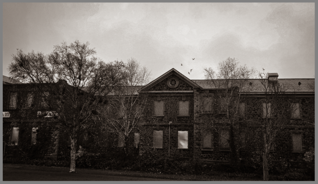
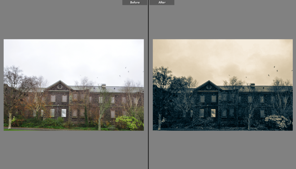
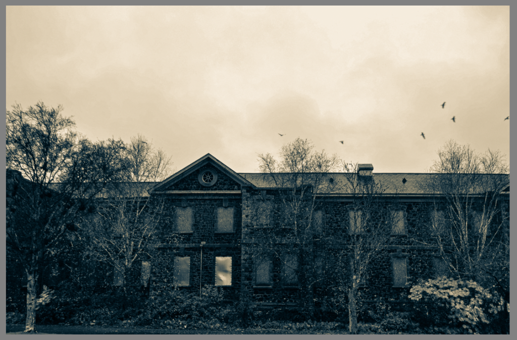
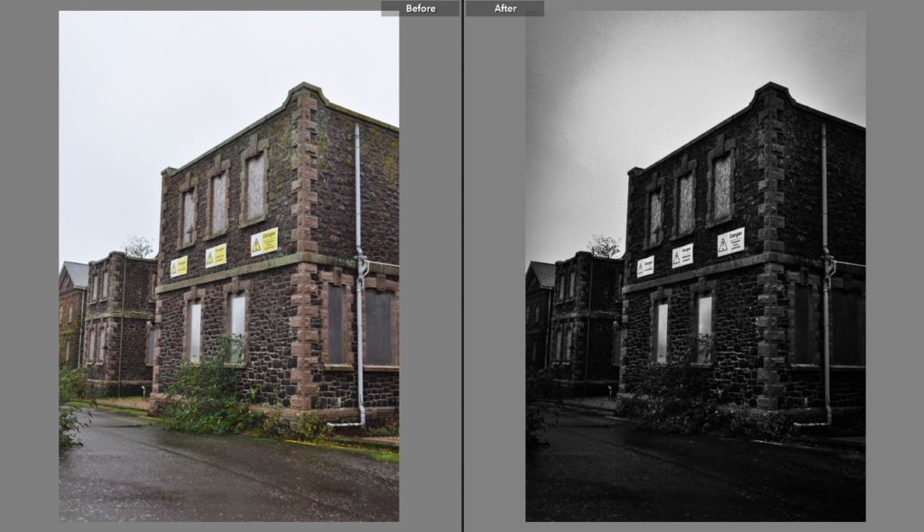
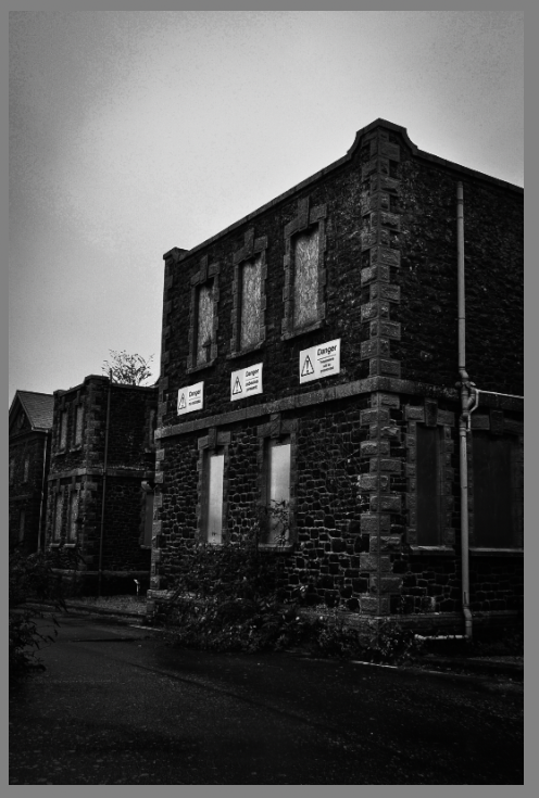
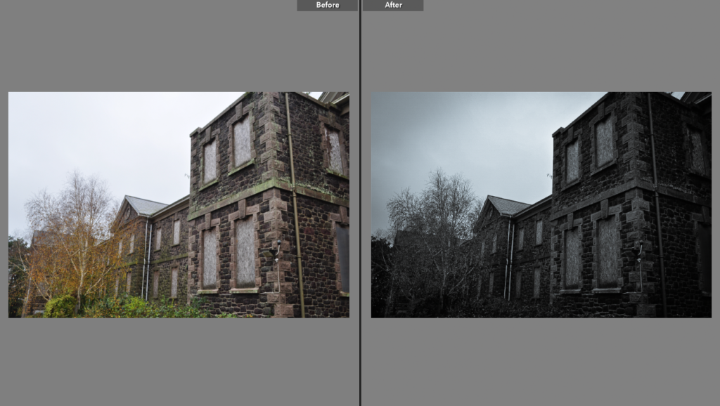
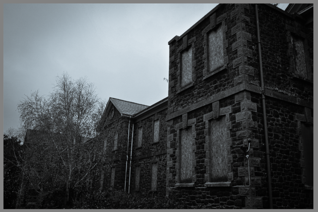
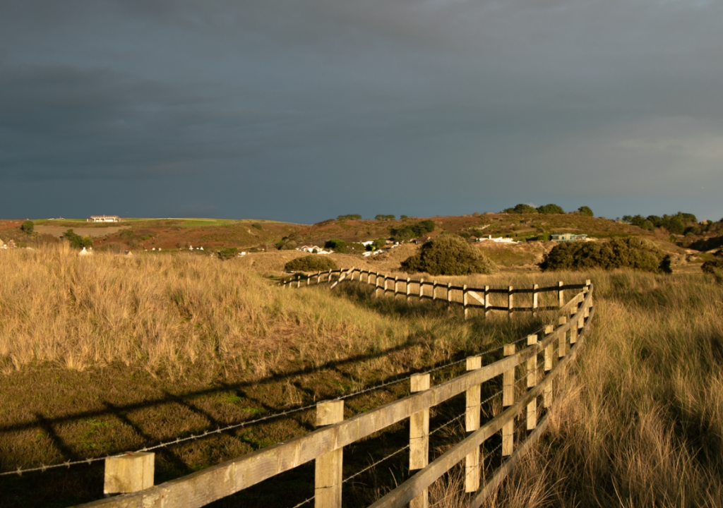
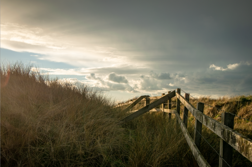
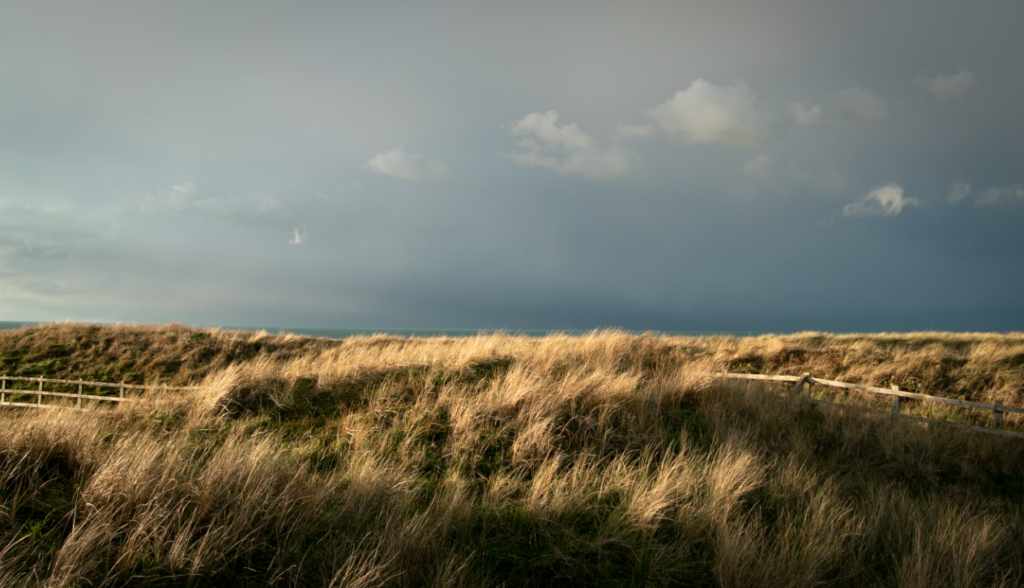
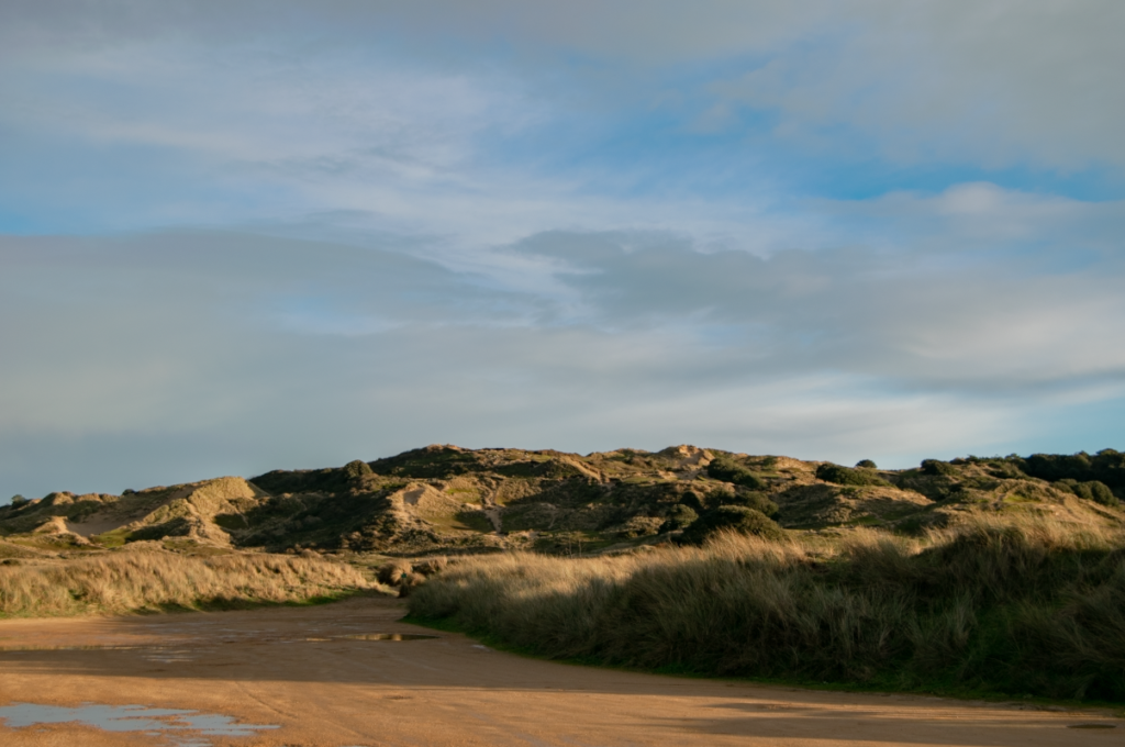
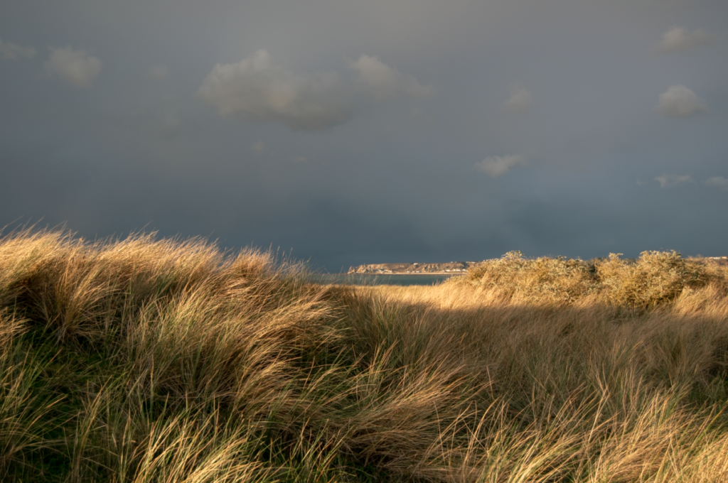
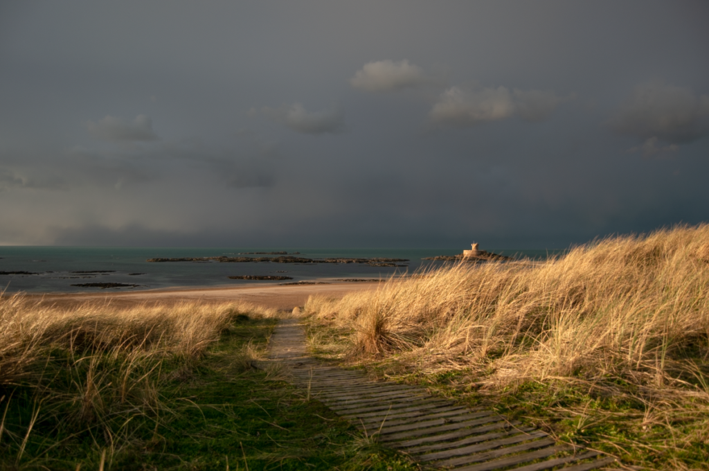
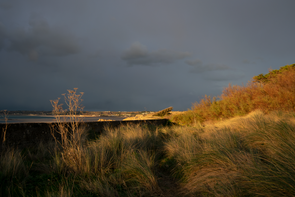
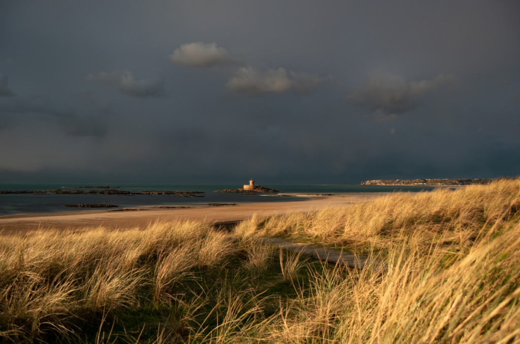
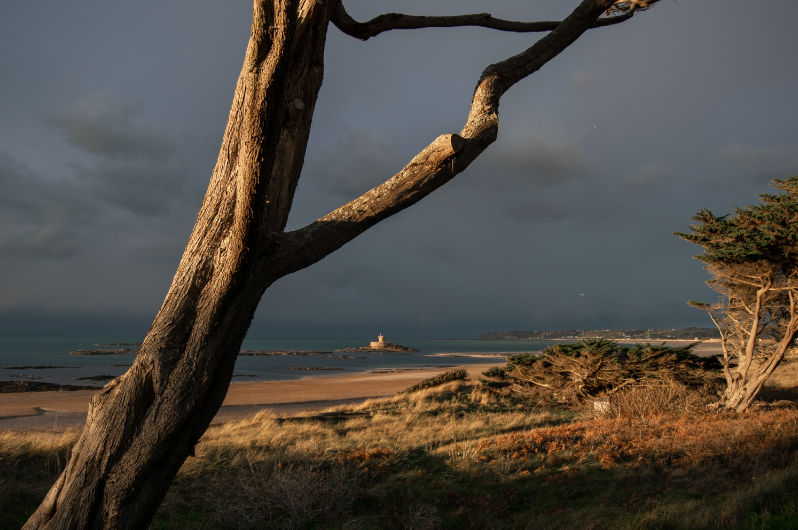
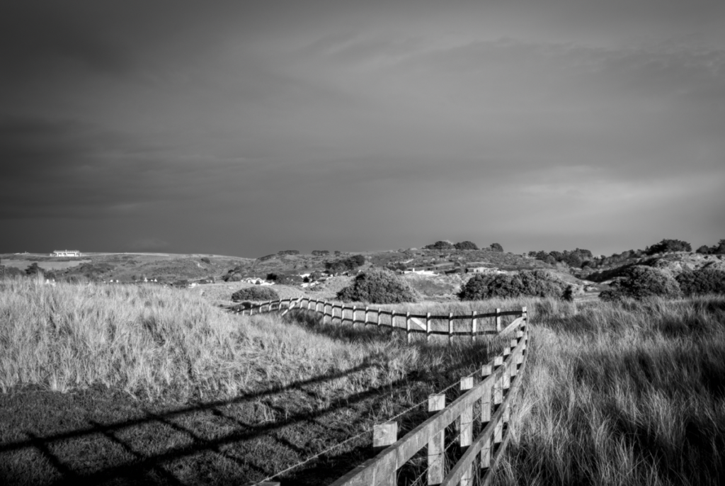
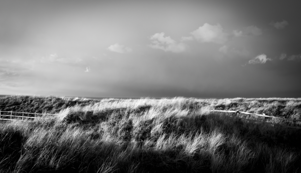
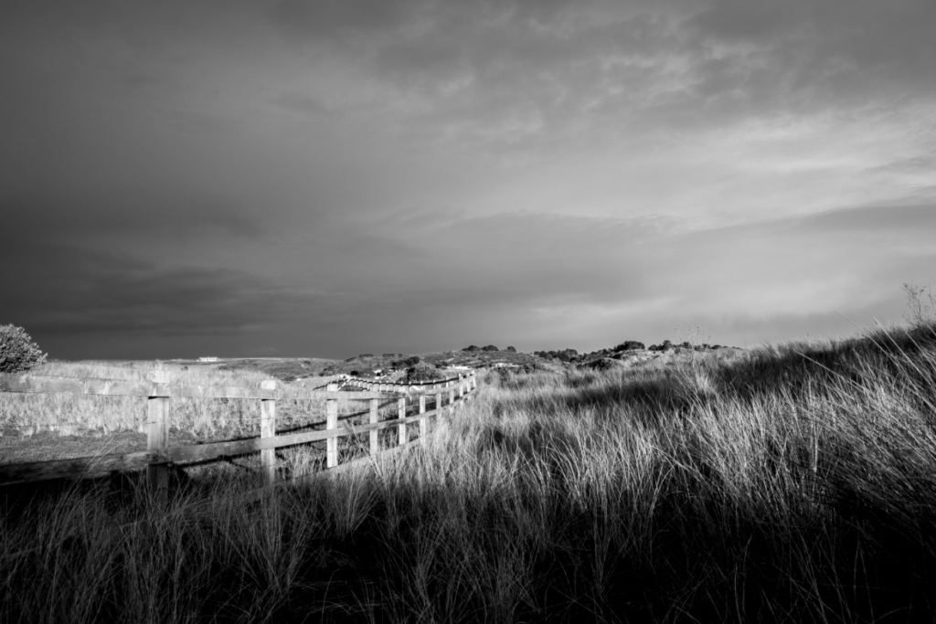
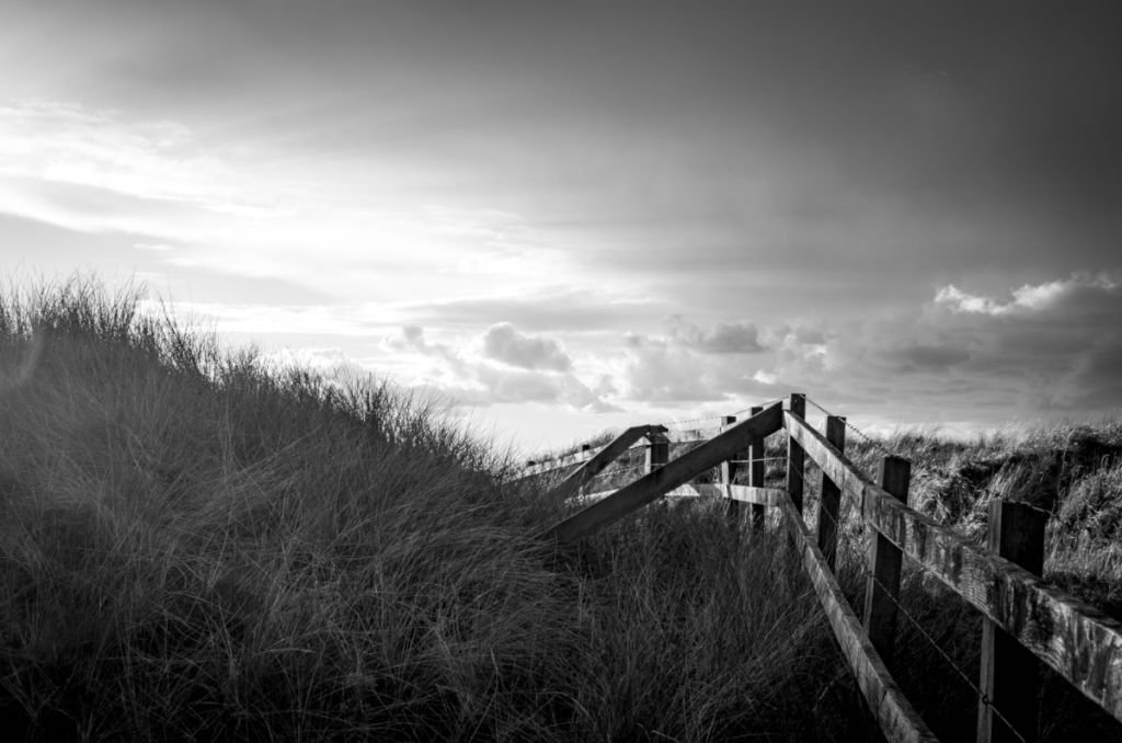
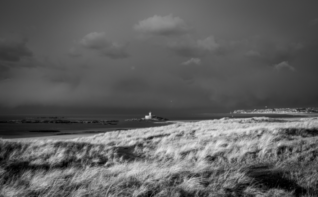
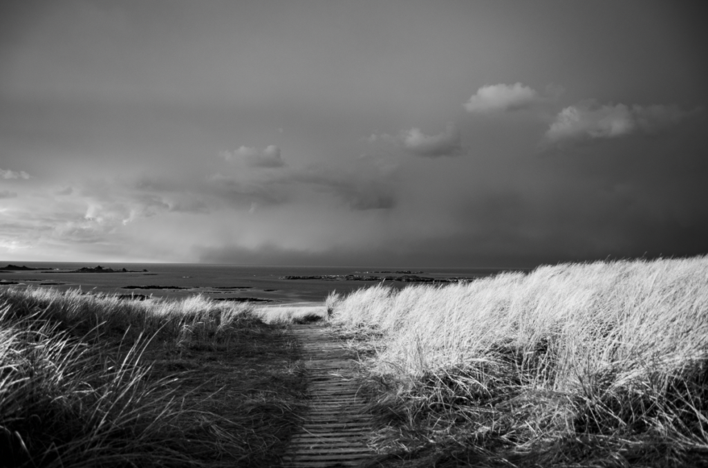
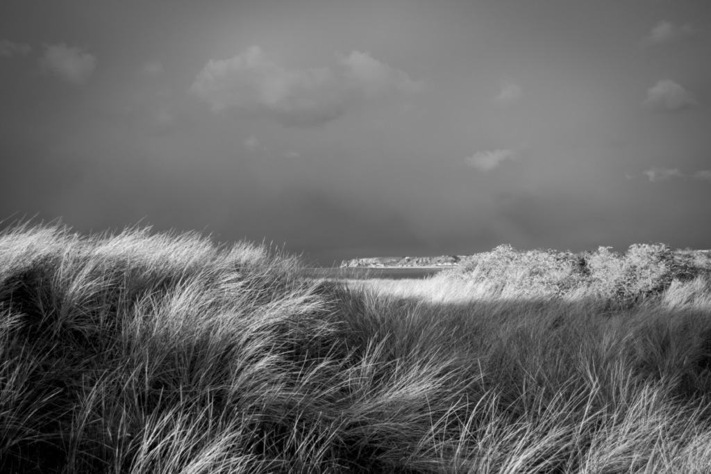
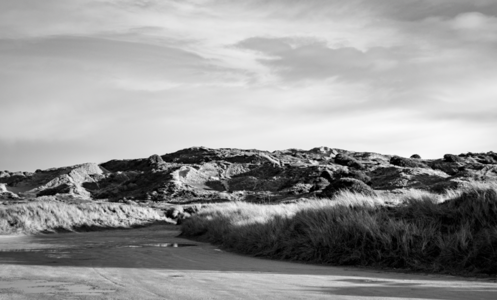
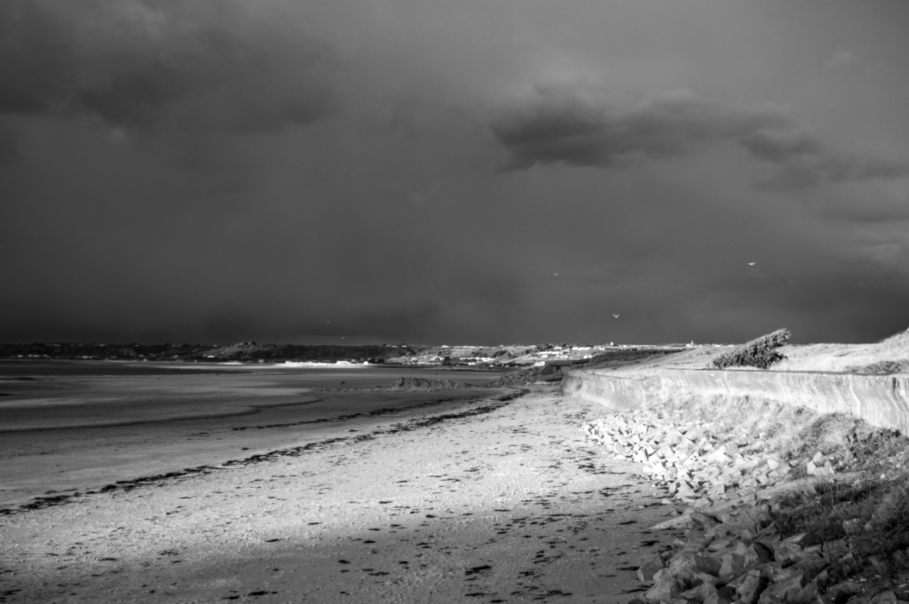
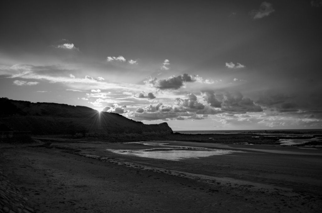
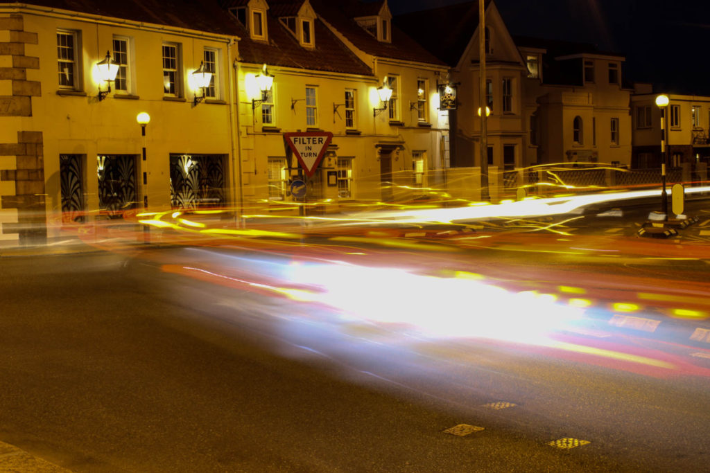
Here are the outcomes from my New Topographics photoshoot. I decided to go to the Les Landes racecourse to take these images because I thought that it would have the right kind of empty/abandoned feeling. I think that this was achieved in my photographs.
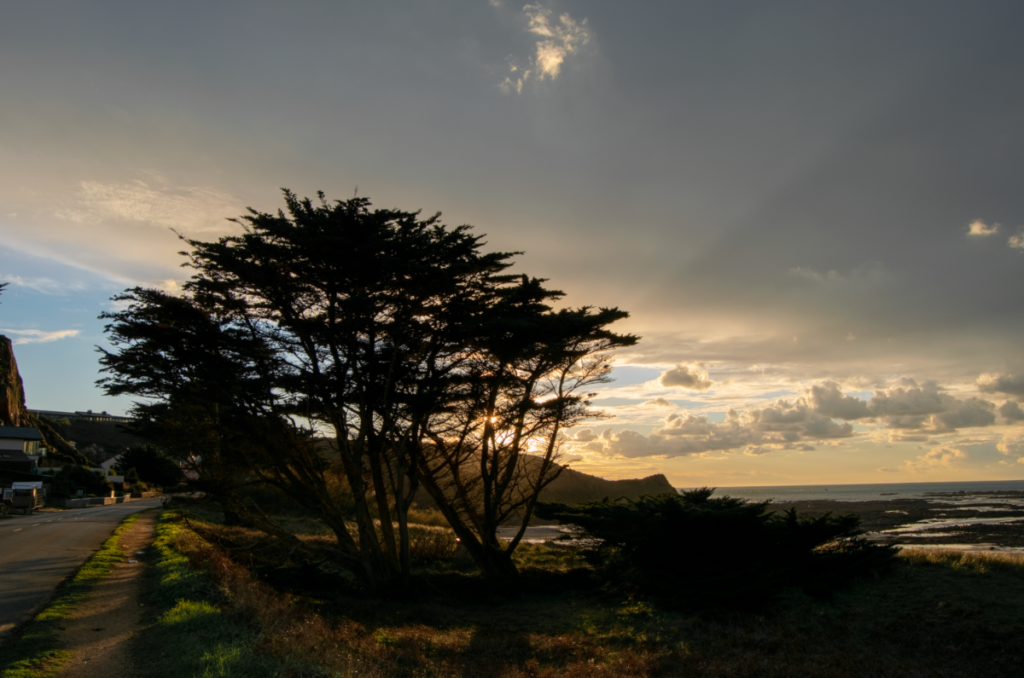
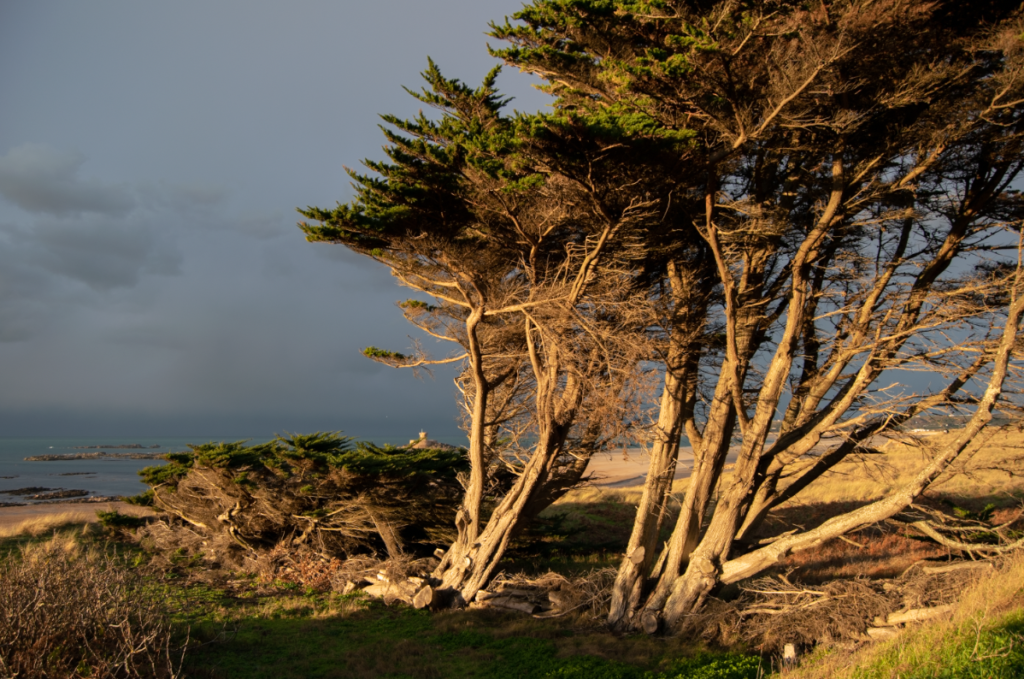
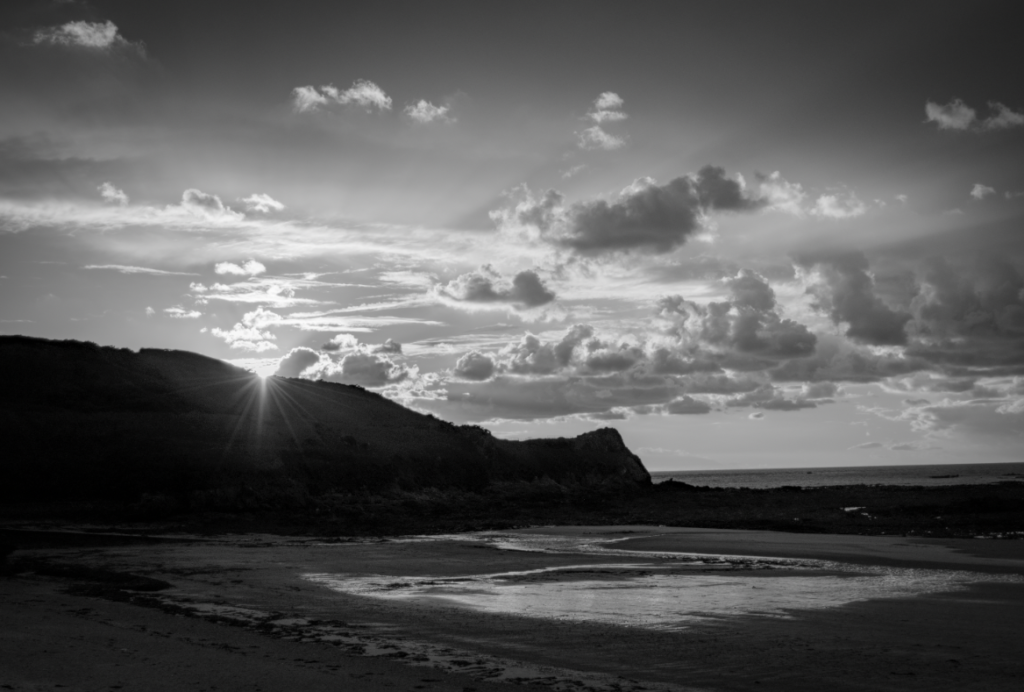
Additionally, the weather at the time was a heavy sheet of rain covered by a thick cloud shelf which created a colourful and dramatic sunset, which I think really added to my photos.
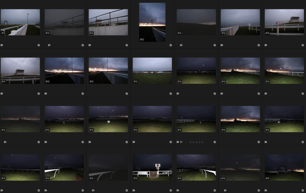
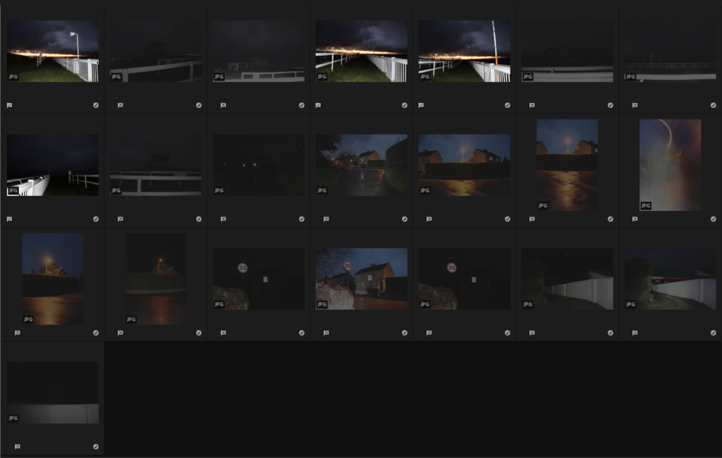
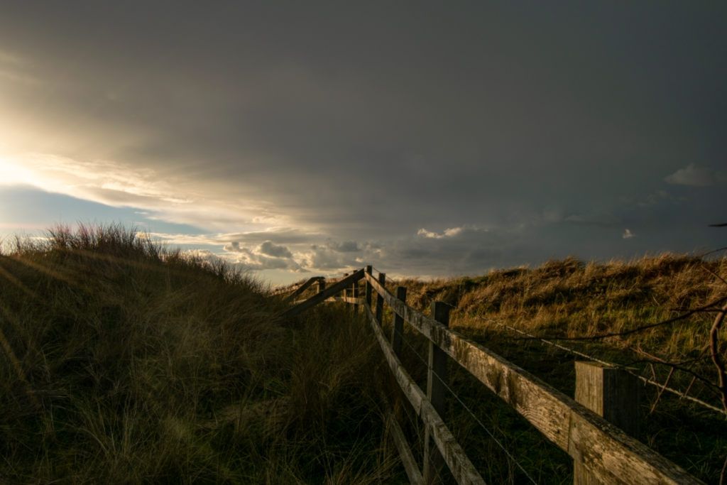
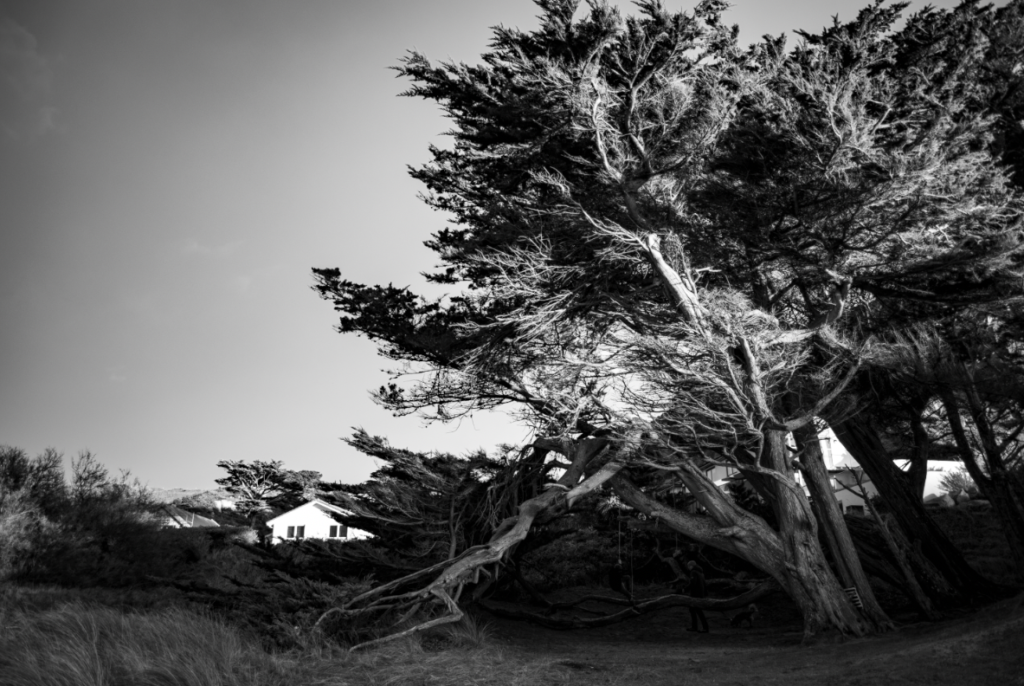
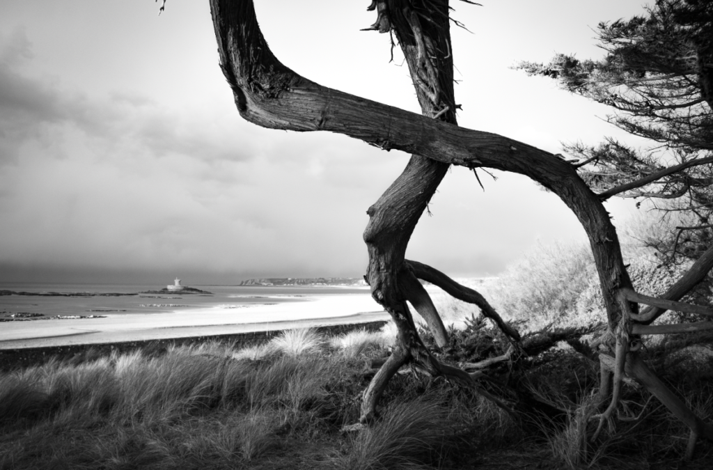
As it was getting dark towards the end of my shoot I decided to start using my flash to take some photos with a more accentuated effect of eeriness and abandonment and I really like these. I often like to use my flash and I think I have taken some of my favourite photos with the flash equipped, so I think this shows a little more of my own style in these images.
Ansel Adams was an American photographer born in 1902 known for his black and white photos of American landscape. Adams most prevalent work comes from his focus on capturing the untouched wilderness of the American west.
Adams helped found the photography group f/64 which was a society founded in the 20th century made up of photographers advocating for ” pure” photography favouring detailed and sharp, focused images that used the full tonal range of the camera. The name f/64 refers to the smallest aperture of a large formatting camera.
Ansel Adams commonly practised a technique he called visualisation the action of interpreting and fully looking at a scene with your eyes before taking the photo. it is a form of visual assessment of what you are seeing then choosing the most significant places within the image to frame and recognising the tonal values and highlighting them.
“We must explore what lies before our eyes for its significance, substance, shape, texture, and the relationship of tonal values. We must teach our eyes to become more perceptive.” – Adams’ description of visualisation.
Adams created the zone system was created to represent and ensure the tonal range found within a black and white print was used and as a way of working to achieve proper exposure, with 0 being pure black with no detail and 10 being white with no detail.
yellow filterred filter
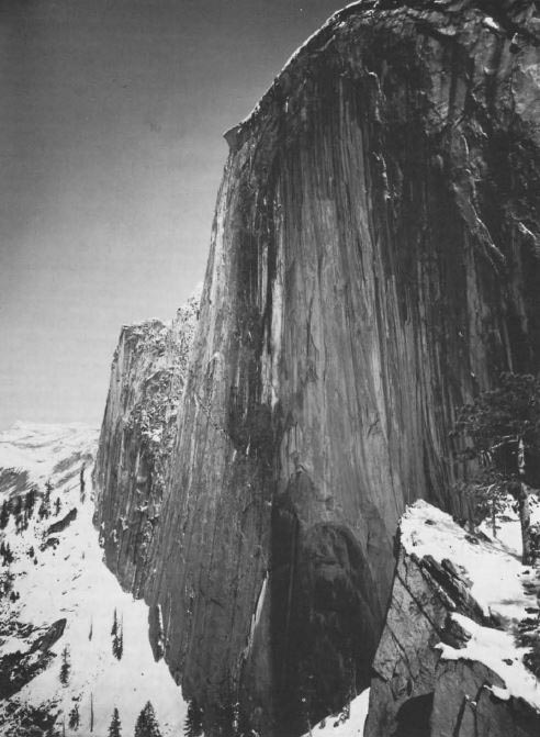
Monolith, The Face of Half Dome, 1927
On April 10th, 1927, Ansel Adams set of along the Yosemite’s LeConte Gully to create a picture of the iconic half dome in the Yosemite National Park. Adams originally used a Korona View camera fitted with a yellow filter exposure but swapped it for a red filter which darkened the sky and created deeper shadows with lighter highlights.
Adams commonly practiced the rule of thirds the idea of balancing a image compositionally by splitting it into thirds both diagonaly and horizontally.
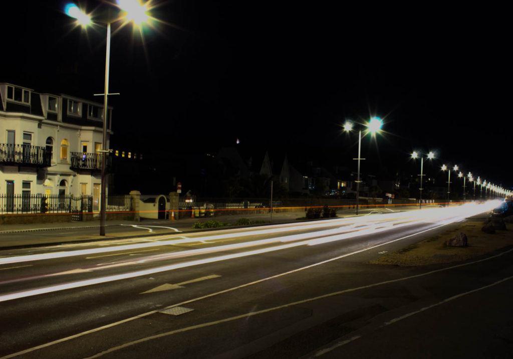
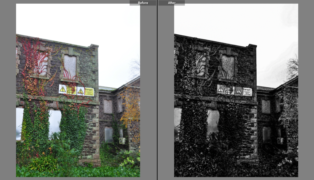
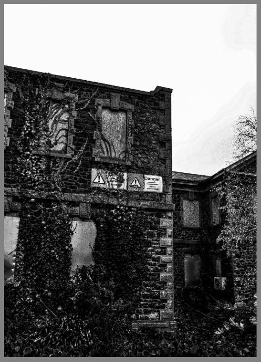
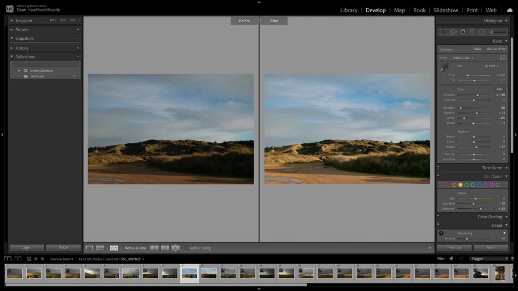
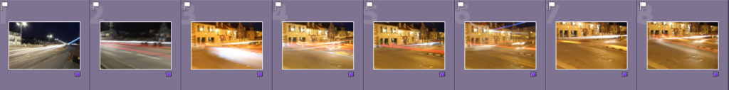
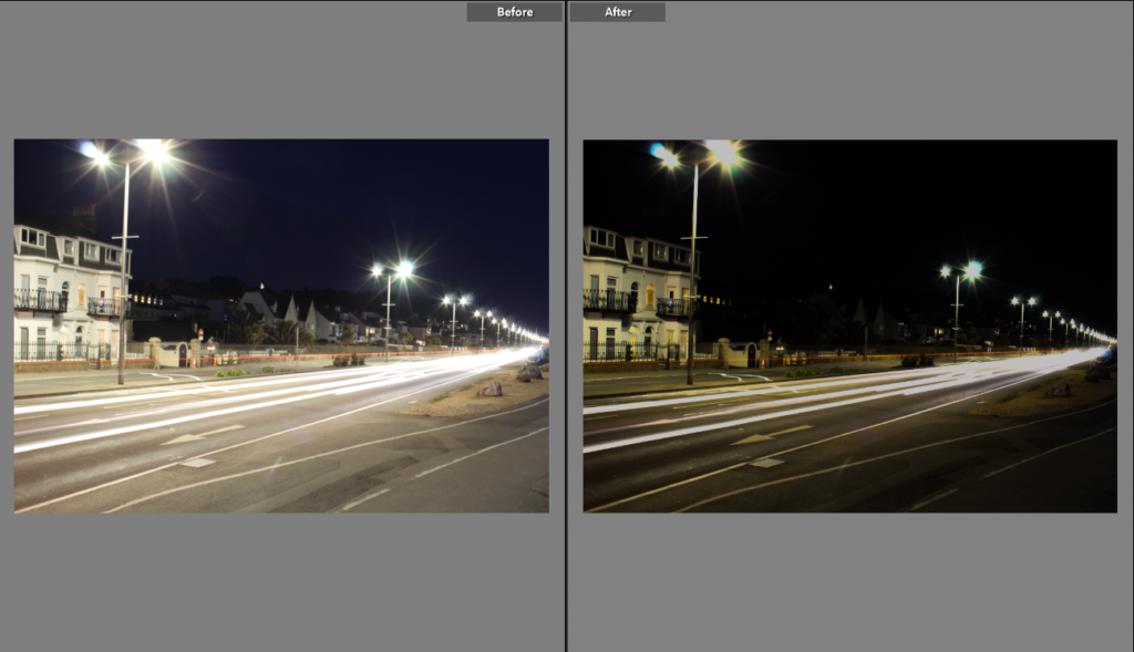
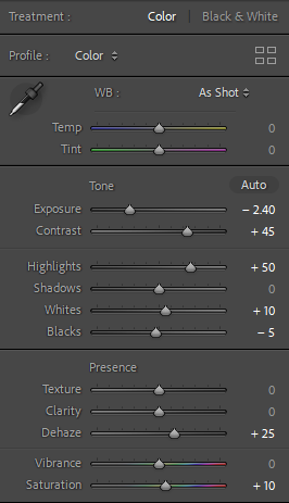
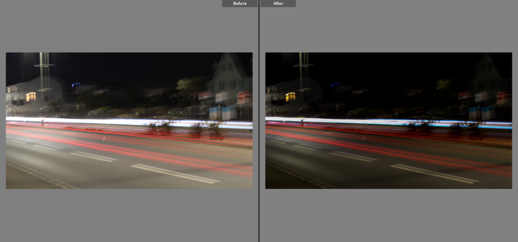
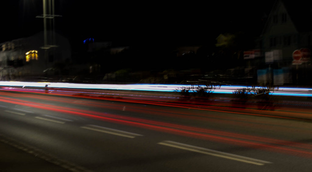
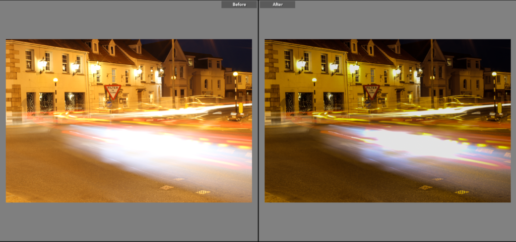
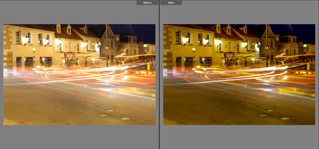
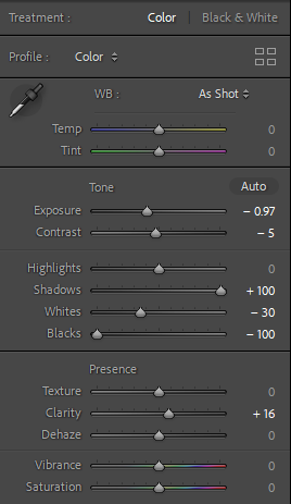
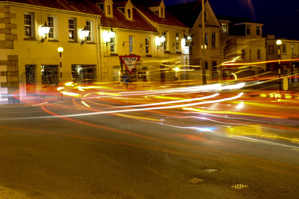
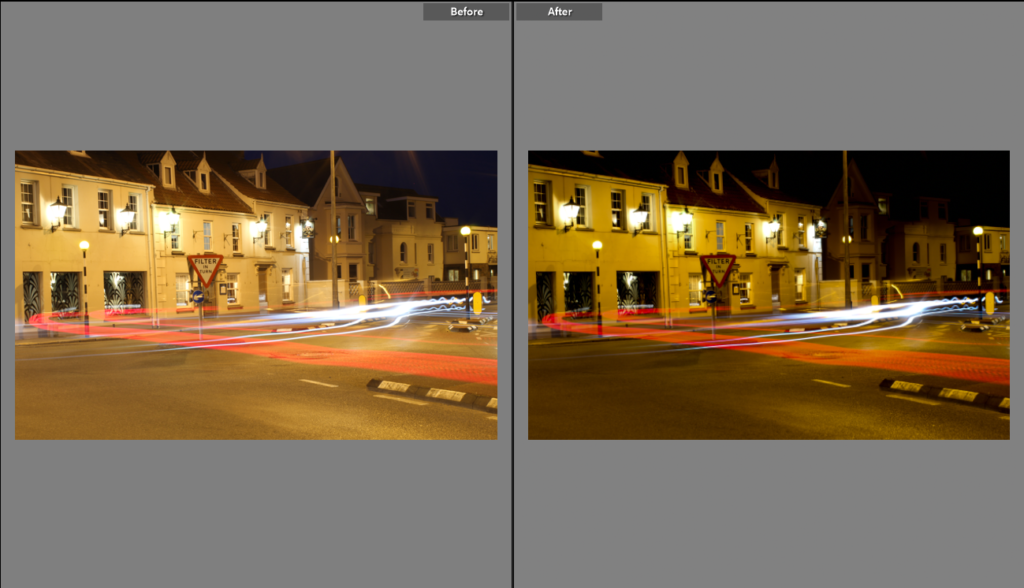
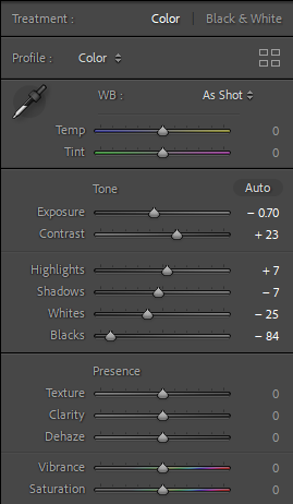
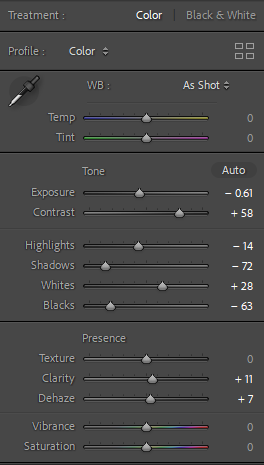
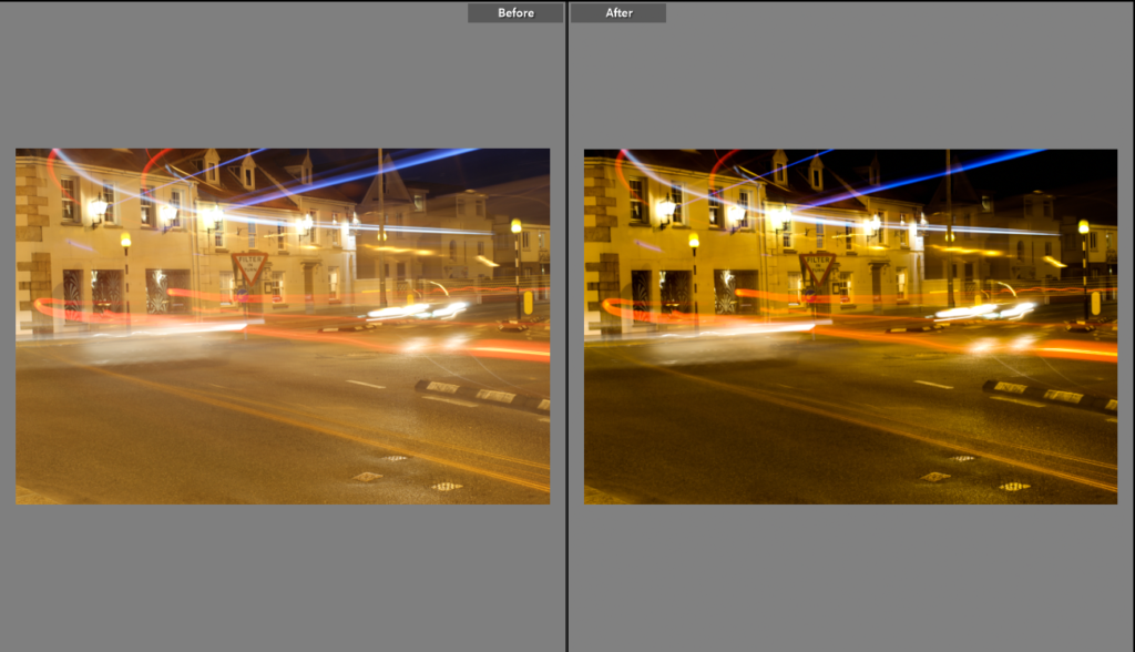
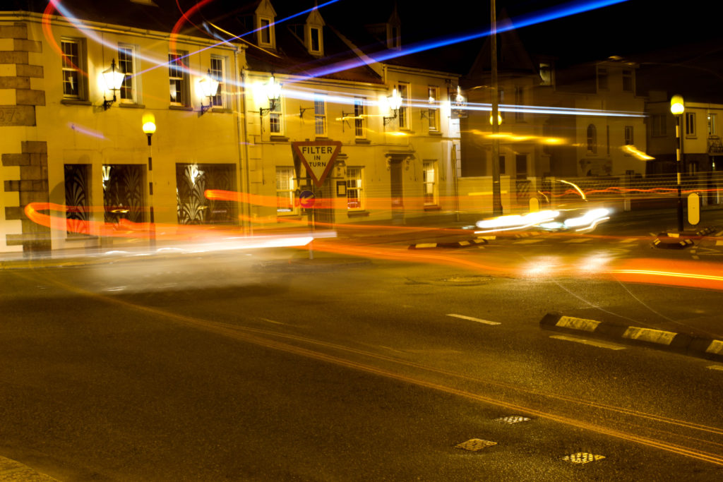
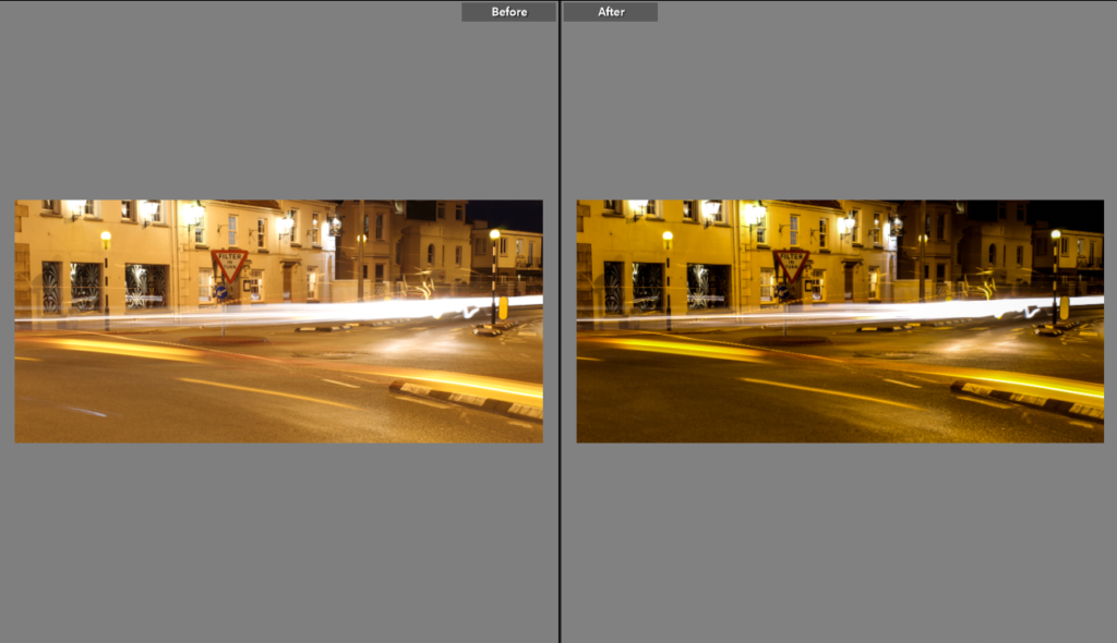
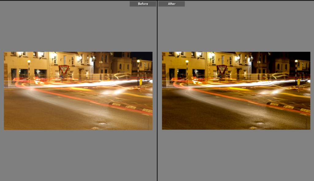
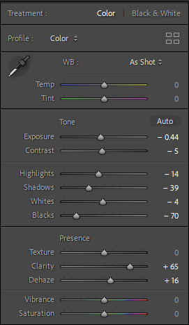
For this image, I wanted to utilise the settings to make sure the light trails were sharp and in focus, but this was a challenge as I also wanted to stop the image from having too much noise. Therefore, I increased the Noise Reduction and reduced the Clarity to ensure that there was little to no remaining noise. I also reduced the Highlights as the light was concentrated in the distance and I wanted it to be less bright. Here I reduced the Highlights (for the same reason as the above image) and turned up the Shadows for the darker parts of the image. I also used the Grain tool to emulate the effect of it being a film photo (something I have done for most of these edits).For this image, I thought that if I did use black and white settings like the other photos that I would lose the depth in the sky’s colour, so I instead only adapted the image’s Temperature by cooling it, which I think almost gives the same nostalgic effect. I also increased the Grain again.With this image, I wanted to exploit the urban composition to create a more dark, street style photo and I did this with the use of the Vignette and Clarity tools. Additionally, I added Grain and reduced the Highlights to decrease the concentration of light in the streetlamp. Here I increased Contrast and Highlights to create a more dramatic juxtaposition between light and shadow. I turned this image black and white but I did actually like the coloured version equally so I made a copy, shown below. I also liked the way the length of the room is demonstrated as the camera leads the eye to the back, so to enhance this further I increased the Vignette. This image I edited essentially in the same way but by increasing instead of decreasing Saturation.Here I increased Contrast, Grain and Vignette. I really like the reflection of the building on the car’s roof and also the effect of the wide lens warping the building on the left of the image. I think every aspect of this photo constructs a very strong composition. I duplicated this image as I liked it both in colour and in black and white. I decreased the Whites as there was quite a lot of sun reflection on the building and I wanted to limit that. In this coloured one I also increased the Saturation a little to make use of the colours in the building. Here I did the same but in black and white. This was another image I had to duplicate as I liked both versions. In this one I decreased the Whites as it was again too bright. I also added a Vignette. Alternatively in this one I chose not to decrease the Whites as I liked the haziness when the image is coloured. I only slightly adjusted the Contrast as I wanted to define the rocks’ texture. This image already had quite an autumnal tone but I wanted to enhance this effect by increasing the Temperature. I also needed to increase the Shadows because it was originally quite an underexposed photoIn this image, I wanted to accentuate the cracks in the walls of the building and so I increased the Texture as well as the Contrast. I felt that this created quite a moody picture and so I added a Vignette to amplify it.
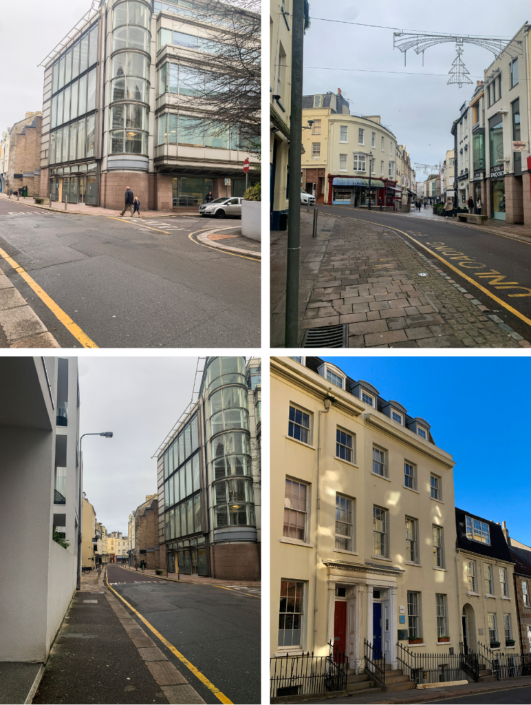
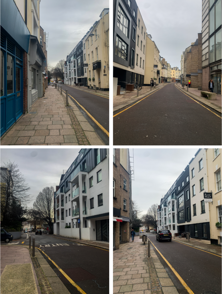
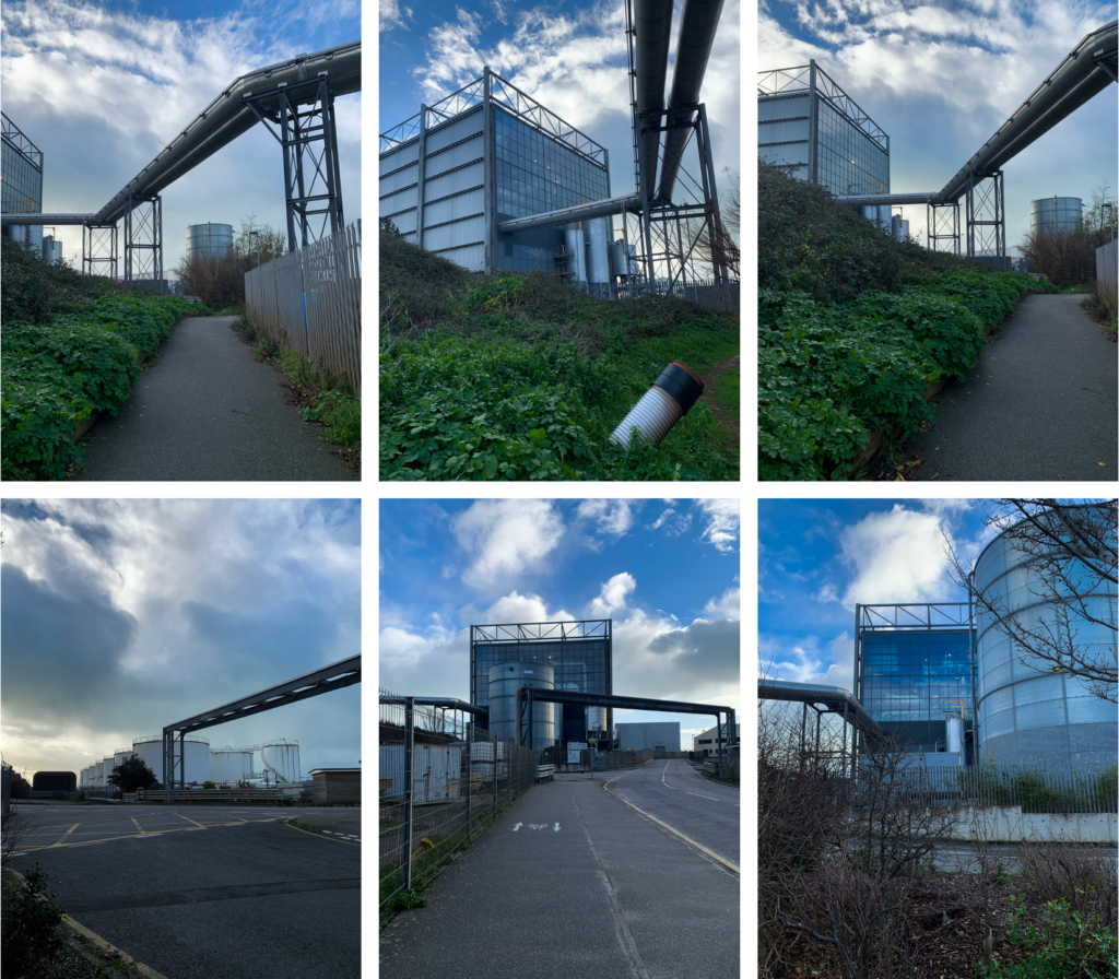
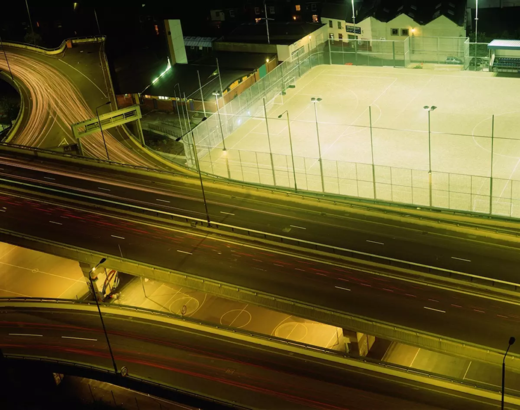
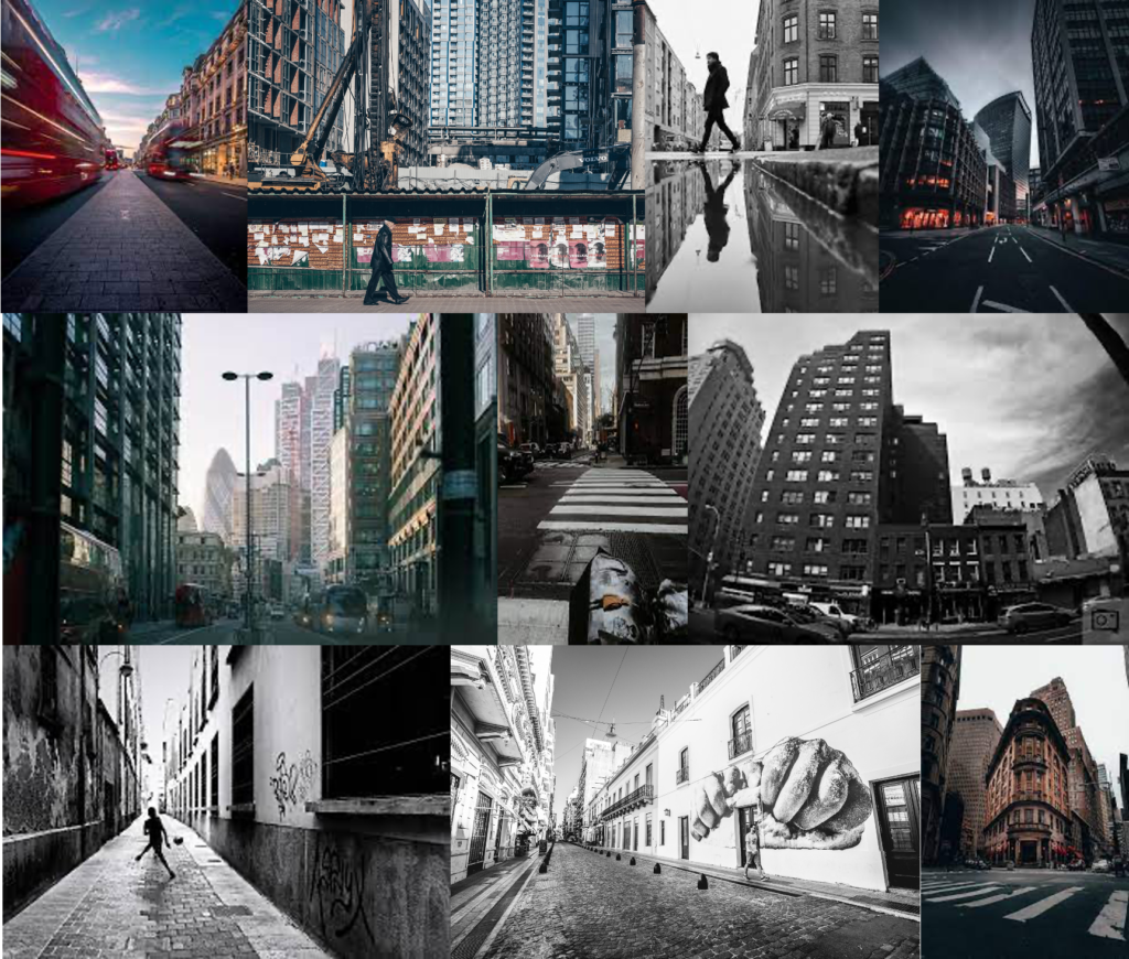
For the images above and below I tried to capture the ‘urban’ style. I used roads surrounded with buildings making the viewer feel like they are actually there. I then used Lightroom to edit my images enhancing their exposure etc. I like how these image turned out as they almost capture the life of the buildings, they also close in giving the image a path for you to focus on. For these images I wanted them to feel more industrial. I used the La Collette area and photographed the buildings and tanks etc. I think these images came out very effective as the area is so big it allows for a lot to be in one image. I like how the different parts of the buildings draw the attention of viewers into the centre of the images and have great depth.
Rut blees luxemburg is a German born British photographer. Her photography focuses on night photography. I was inspired by the image below so did a shoot to try and replicate the image in my own way.
Urban photography is where all elements are included such as landscape, architecture as well as photojournalism. It focuses on buildings and the rustic style. For this photoshoot I am going to use La Collette as it is a very industrial area, as well as central town which is full of buildings.
mood board:
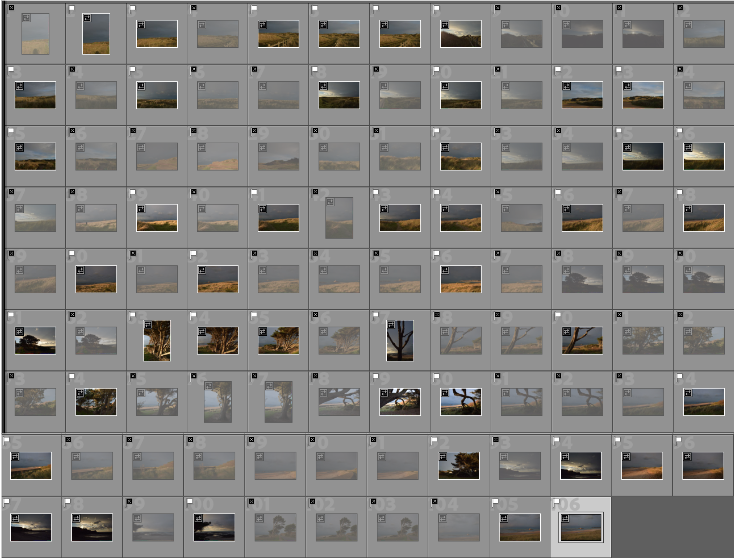
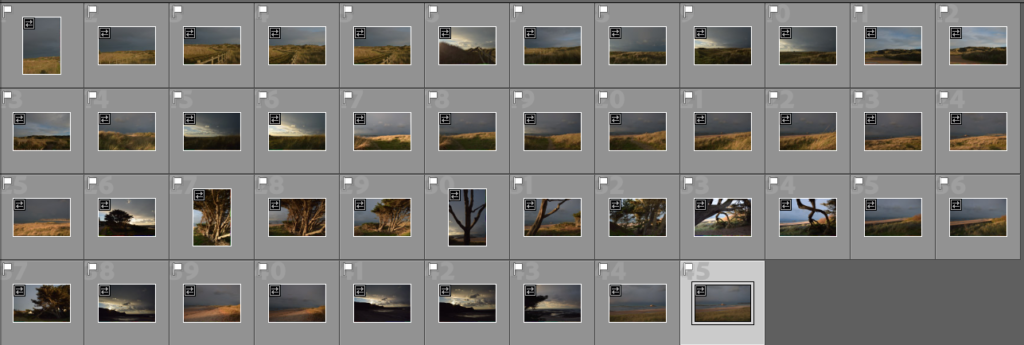
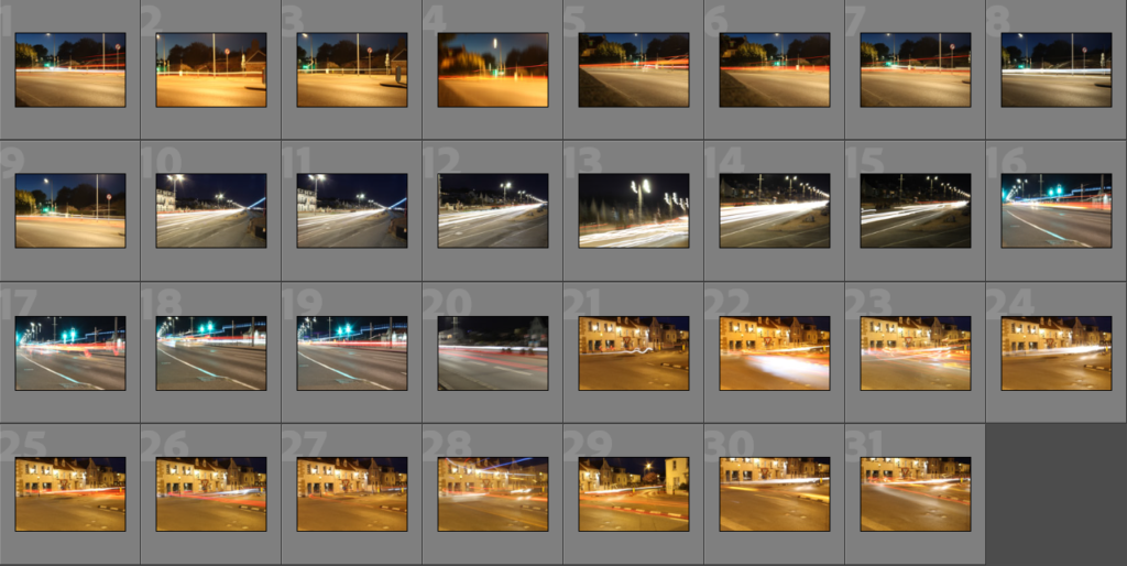
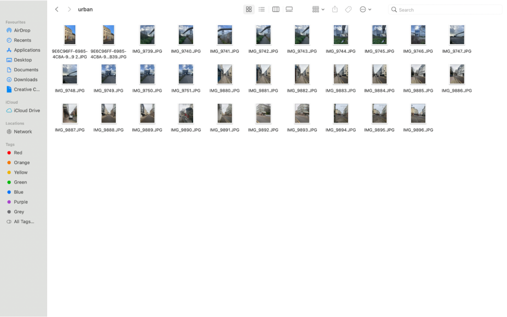
contact sheet:
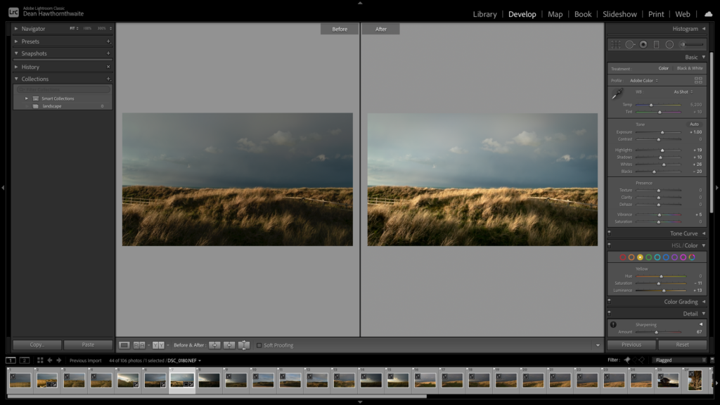
I selected the image that I wished to use based on their quality and whether they followed the ‘urban’ theme. I then used Lightroom classic to edit my image slightly to improve their exposure and contrast.
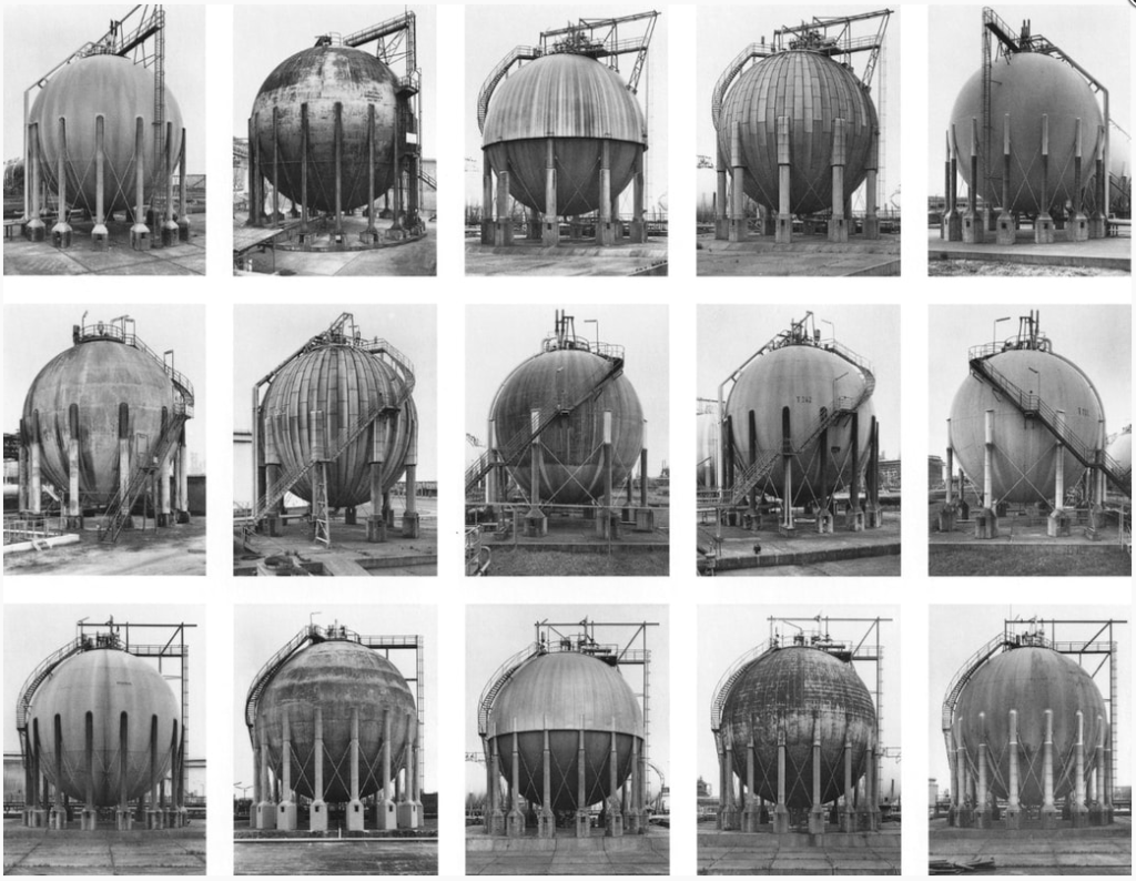
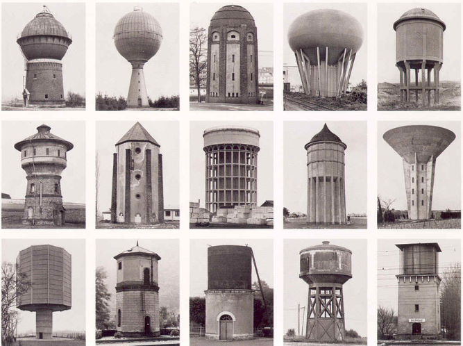
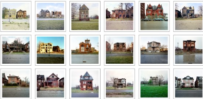
The term ‘Typology’ was first used to describe a style of photography when Bernd and Hilla Becher began documenting dilapidated German industrial architecture in 1959. The couple described their subjects as ‘buildings where anonymity is accepted to be the style’.
A photographic typology is a single photograph or more commonly a body of photographic work, that shares a high level of consistency. This consistency is usually found within the subjects, environment, photographic process, and presentation or direction of the subject.
Stoic and detached, each photograph was taken from the same angle, at approximately the same distance from the buildings. Their aim was to capture a record of a landscape they saw changing and disappearing before their eyes so once again, Typologies not only recorded a moment in time, they prompted the viewer to consider the subject’s place in the world.
Areas to take pictures
Front doors on the street where you live
Cracks in the pavement
Fences and walls
The colours of all the cars in the supermarket car park
Telegraph poles viewed from below
TV aerials silhouetted against the sky
The German artists Bernd and Hilla Becher, who began working together in 1959 and married in 1961, are best known for their “typologies”—grids of black-and-white photographs of variant examples of a single type of industrial structure. To create these works, the artists travelled to large mines and steel mills, and systematically photographed the major structures, such as the winding towers that haul coal and iron ore to the surface and the blast furnaces that transform the ore into metal. The rigorous frontality of the individual images gives them the simplicity of diagrams, while their density of detail offers encyclopaedic richness.