SELECTION PROCESS
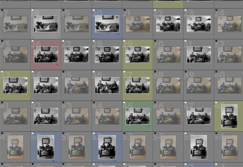
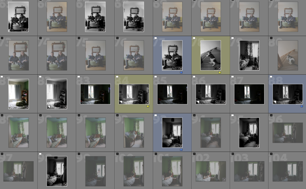
RATING CODE:
RED – Bad quality images
YELLOW – Average images
GREEN – Good images
BLUE – Best outcomes which I can use for the photobook
EDITING PROCESS
PHOTOSHOOT OUTCOMES
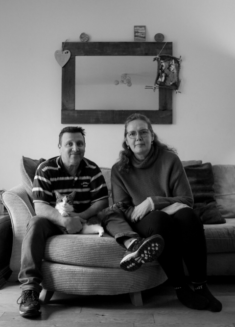
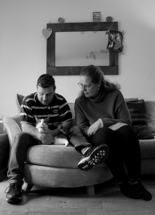
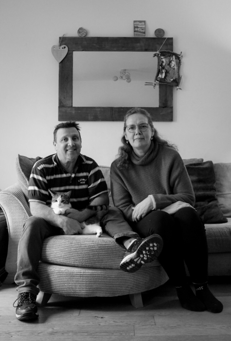
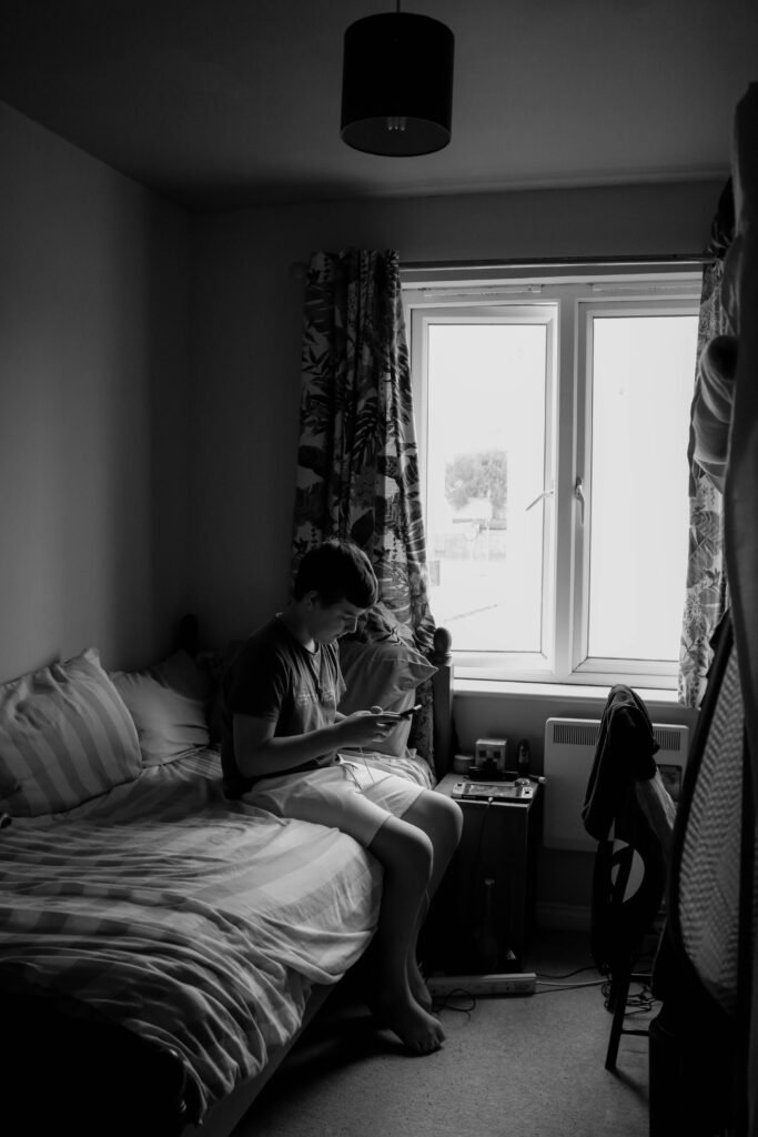
SELECTION PROCESS
RATING CODE:
RED – Bad quality images
YELLOW – Average images
GREEN – Good images
BLUE – Best outcomes which I can use for the photobook


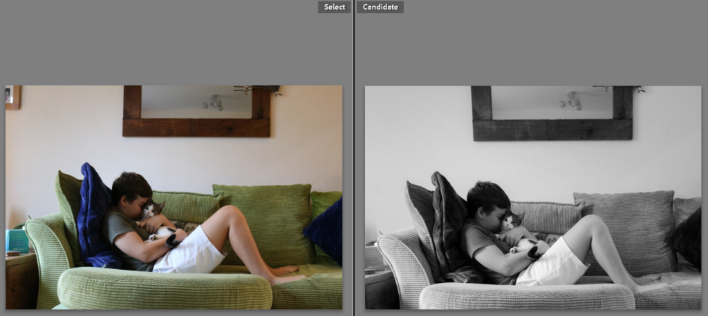
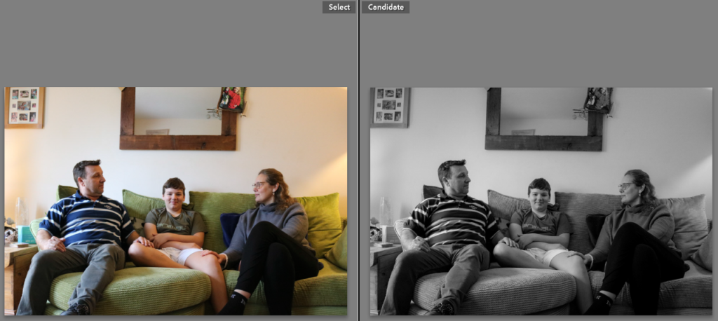
EDITING PROCESS


PHOTOSHOOT OUTCOMES


Essay Plan
Make a plan that lists what you are going to write about in each paragraph – essay structure
The area of study I want to explore is physical collaging and altering of the images, therefore I will look at Jessa Fairbrother’s work as she does all these manual image alterations, as well as has a similar subject and context to the images as me. her work, especially the project “conversations with my mother” where she produced images that relate to the relationship between her and her mother. This links to what I am doing as I too will be exploring the relationship with my mother.
the main themes and genres that Jessa explores in her work are mainly: pictorialism, surrealism, and symbolism. on top of that all the above “isms” relate to what I want to explore myself, therefore researching them will help me understanding how they can be in cooperated into the photographs.
As I want to focus on just exploring Jessas’ work, due to how relevant it is to me I will write more about her and her work, and will be able to analyse it in more depth.
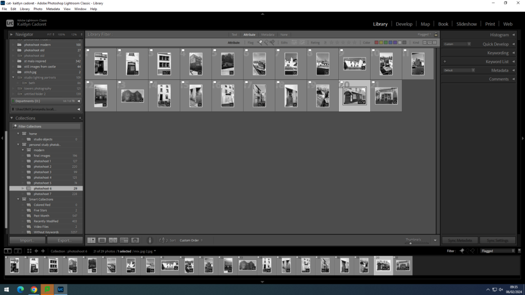
For the sixth shoot that I did, I decided to go back to St Helier around the Jersey Museum and Art gallery as in one of my pervious shoots many of my images came out blurry. However, I really liked the architecture that was there and wanted to try and photograph it again. This time my images came out much better. Whilst editing these images, I chose to make them black and white as I think it defines the detail and adds to the old effect of the picture. This shoot was much more successful and I selected a larger amount of final images.
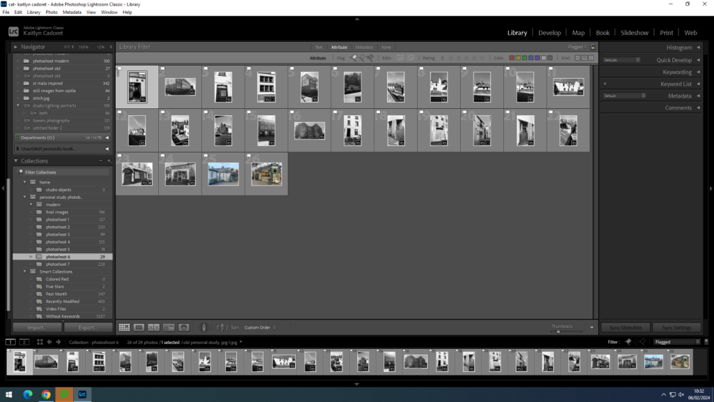
final selection:
1. Write a book specification and describe in detail what your book will be about in terms of narrative, concept and design with reference to the same elements of bookmaking as above.
Narrative: What is your story?
Describe in:
Design: Consider the following
I want it to have a glossy finish and be smooth to touch, as well as having links to the images, there should be a theme that carries on, this being a nostalgic atmosphere.
The paper to be of not too shiny but not matt finisich and mainly colourful ink to be used as there are not many black and white photographs I will be using.
I don’t want to produce a large scale photobook as the images I have would look better in a smaller format, and I believe a smaller book holds a bigger personal value.
Not too sure about the binding but I know for the cover I would like to have an image which is a full bleed image so that for front and back cover the image stretches.
the title needs to be relevant to the book, however I always liked simple titles therefore I wouldn’t want to name the book in more than 3 words.
I don’t want follow a specific layout which repeats itself, however I want it to all link together so the images are not placed randomly.
the editing will have to be similar across all images, when it comes to layering them, the ones that look similar, so of the same colour values or shape should be next to or near each other.
I am not planning on adding a lot of text as I want the viewer to piece it together by themselves through the photographs. however I want to use text as an additional hint to what the story is about, therefor I might have short phrases on only a few pages.
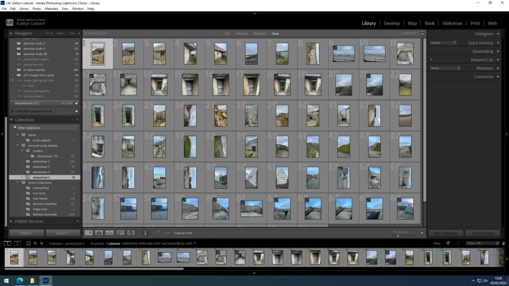
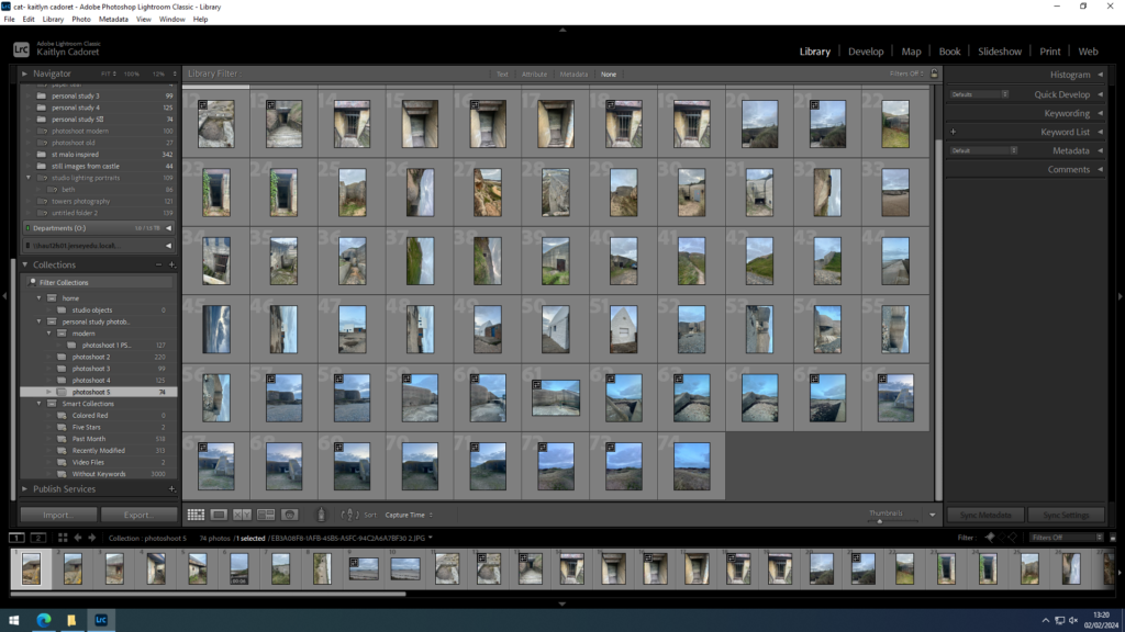
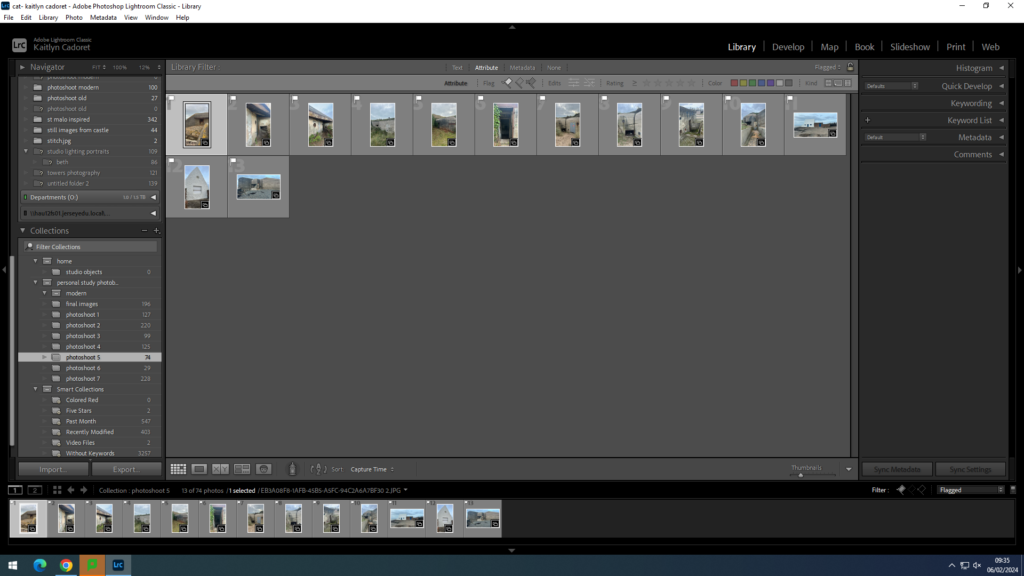
As many of my other shoots were based on modern buildings, I decided that for my fifth shoot I was going to photograph some of the bunkers around Jersey. For most of them I went down to St Ouen’s and walked around the sand dunes and the coast. I am happy with a few of my images that I made and I think that the architecture fits well with the heritage of Jersey.
contact sheets:
final images:
1. Research a photo-book and describe the story it is communicating with reference to subject-matter, genre and approach to image-making.
The book I am looking at is Raised by wolves by Jim Goldberg which explores the subject of kids living on the streets of California and the lives they live. He shot images in a documentary style as he followed them through their struggles with addiction, mental health issues and the difficult choices they have to make to survive in this environment. The images are grungy and dark to accurately portray their lifestyles and capture their unique personalities through the lense.
2. Who is the photographer? Why did he/she make it? (intentions/ reasons) Who is it for? (audience) How was it received? (any press, reviews, awards, legacy etc.)
Jim Goldberg made this photobook to highlight people that are neglected, ignored and invisible to the mainstream population. He believed these people deserved a voice so decided to not only take their photos but also include their writing and drawings in the book.

He stated that:
“Feeling like an outsider enabled me to evoke stories from the people I worked with because I could relate to them. I always aimed to get to a point where empathy and trust were created… Having people write directly on photos was a way to access their thoughts”
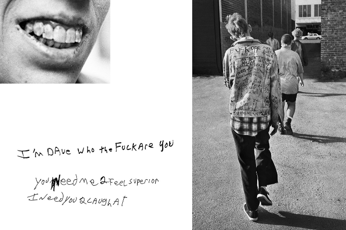
His work was so well received that he collected various awards such as a Guggenheim Fellowship (1985), two National Endowment for the Arts Fellowships (1989, 1990), the Mother Jones Documentary Photography Award (1989), and many more.
3. Deconstruct the narrative, concept and design of the book and apply theory above when considering:
Narrative – Jim Goldberg follows kids living on the streets of California and specifically focuses on two characters, Tweeky Dave and Echo. They are two charismatic but deeply troubled youths whose lives became intertwined as they lived as runaways.
Concept – His subjects are often people existing on the fringes, who are otherwise treated as invisible by mainstream society, or flattened into caricature.
Design – This book has a mixture of images that are mostly documentary style and drawings/writing from the subjects.
Who is Peter Bialobrzeski?
Peter Bialobrzeski is a German photographer, who’s work has dipped into street and urban photography. A topic I am intending on featuring in my mock exam and essay. His city photos are what mainly peak my interest.

Career
His city photos, in contrast to Luxemburg, are mostly captured during daylight hours instead of night time. His photos feature lots of run down, demolished and abandoned buildings.


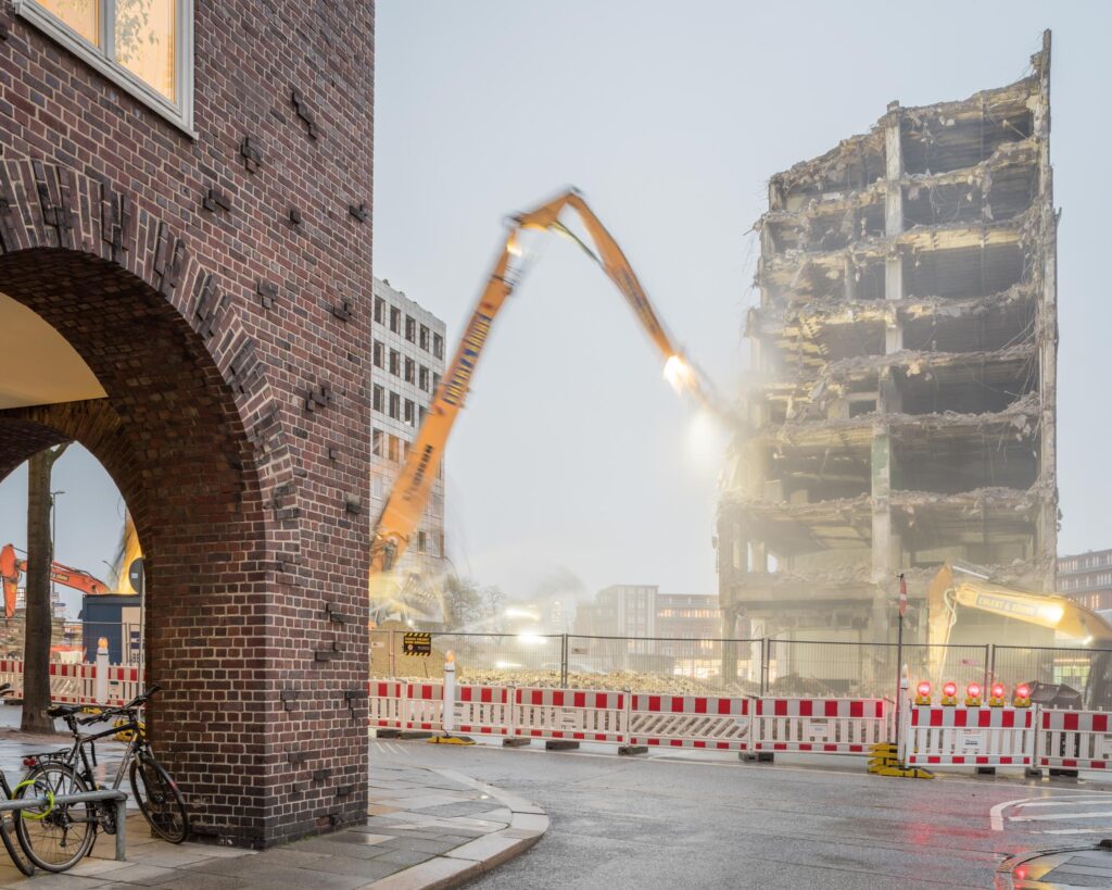
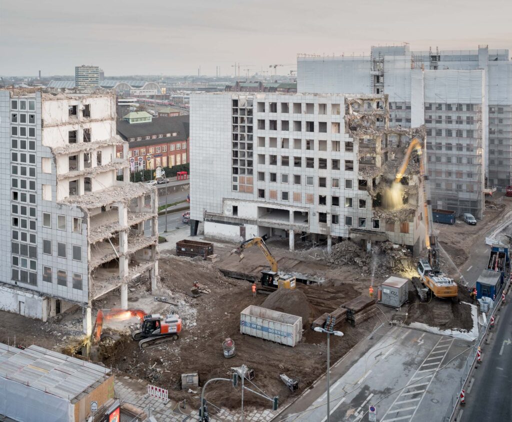

Visual
Each of these photos have buildings which have been abandoned and left to decay over time, which looks to be a very long time given the lack of care seen on the buildings. Also due to the fact that newer buildings in the backgrounds of some can be seen, which implies that these abandoned ones have been neglected and ignored. The destruction and crumbling to the buildings walls, ceilings and floors creates many rigid and fluctuated lines, perhaps to show they are not perfect. Being in the day, the images are of course very bright, some of the abandoned buildings however appear to be in slightly darker areas, possibly being overshadowed by the newer and taller buildings. The buildings due to lack of care are all cracked and chipped all over, creating a sort of rough texture. I like how in a handful of photos there is machinery but blurry, obviously because the low shutter speed that was likely used captured the constant movement of the machines, which contrasts with the stillness of the buildings, being inanimate. There is a certain amount of spacing between the newer buildings and the ruined ones, almost to imply that the newer buildings are better and higher up so shouldn’t be anywhere near the old ones.
Conceptual
The idea and meaning behind these images doesn’t seem very clear, if there even is one. The first thing I’d think of is to show the difference between the old and the past and the new and the future, and that the past will always be overrun and sometimes forgotten. The images could have something to do with “Topographical” imagery given the almost deadpan look and the fact the main subjects are dissociated and abandoned things.
Response
Jersey is home to many abandoned buildings, which are often very close to still occupied buildings. I could take advantage of this by going out and positioning my camera to have the abandoned one and still used ones in the framing. In town, it can also provide good landscape backgrounds. I do want to try having the shutter speed set to low and have things within the frame moving while the buildings stay perectly still.
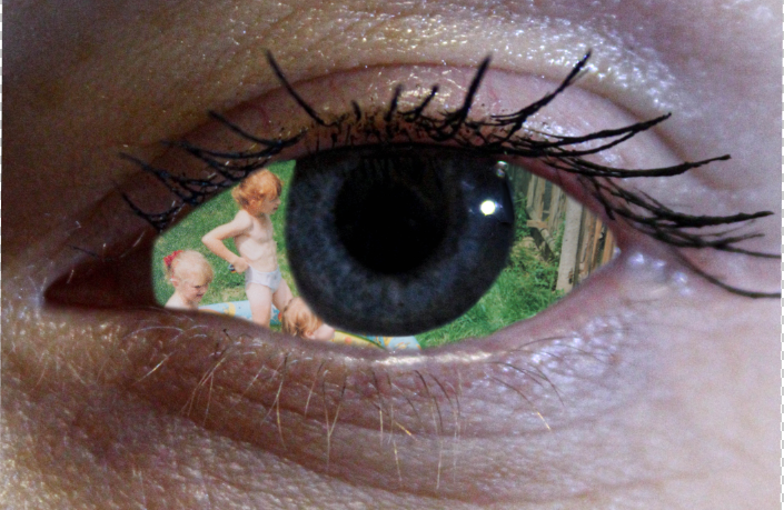
Using photoshop I have used the magnetic lasso tool to outlie what I wanted to cut out, then inverted the image so that the are that was outlines was removed, then using the eraser tool I have taken of the imperfect edges. I have open another photograph to form as a background for the eye. This was to create an impression that the eyeball of the eye acted as a window to the past. Because it was an image of my mums eye and her past, its like you can see that that past never left her.
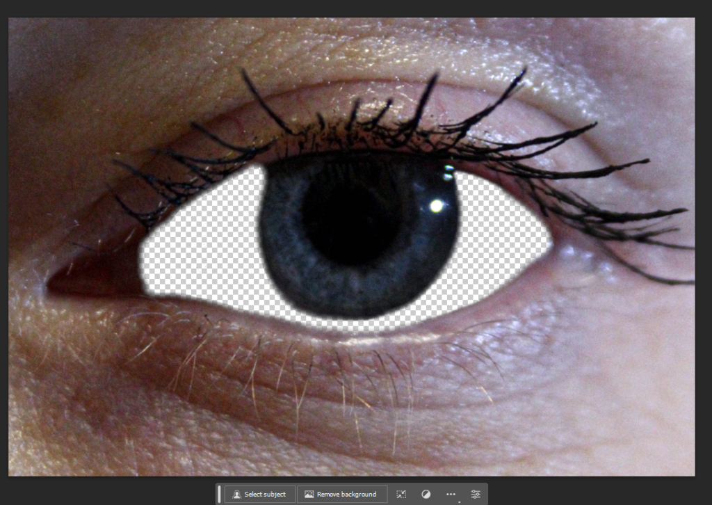
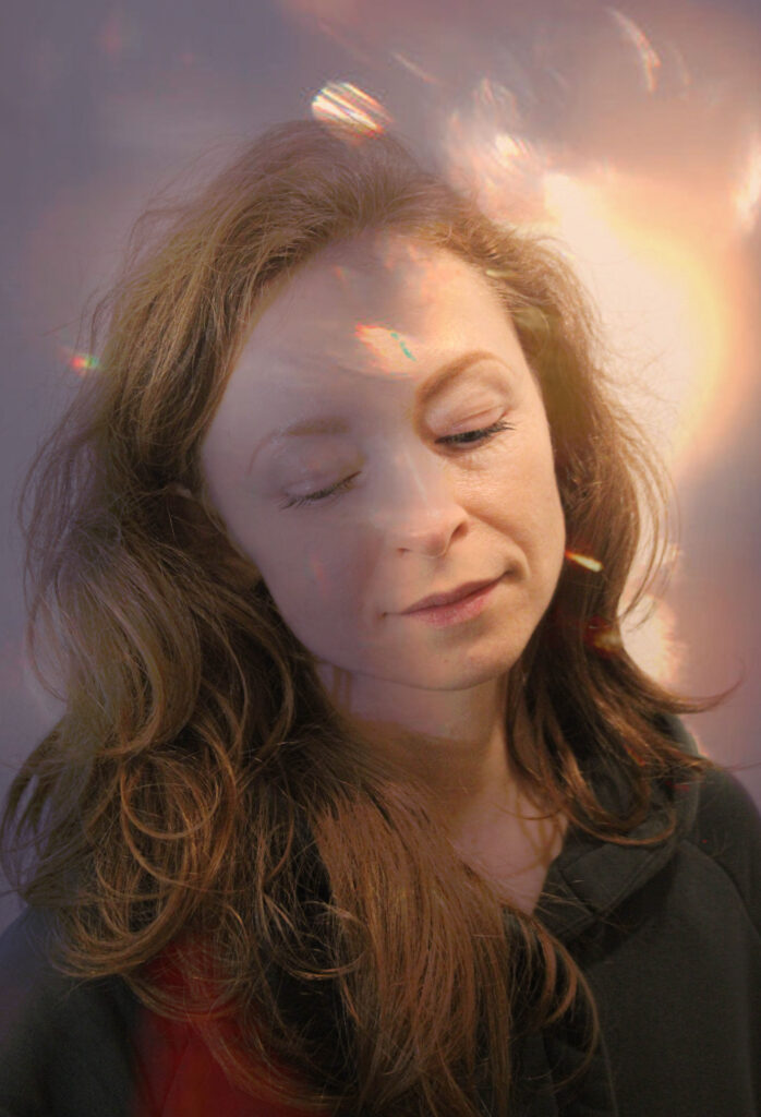
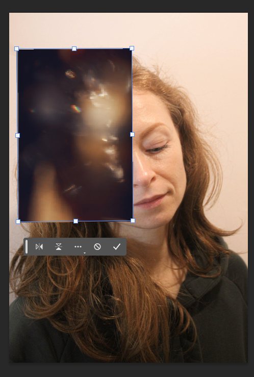
Another form of digital alterations that I did was layering a filter/pre-set on top of a portrait. As I wanted to include this portrait however I wasn’t happy with the original, and I knew there had to be some sort of alteration done to it. As I have previously in another project used these pre-sets, I have re-used them.
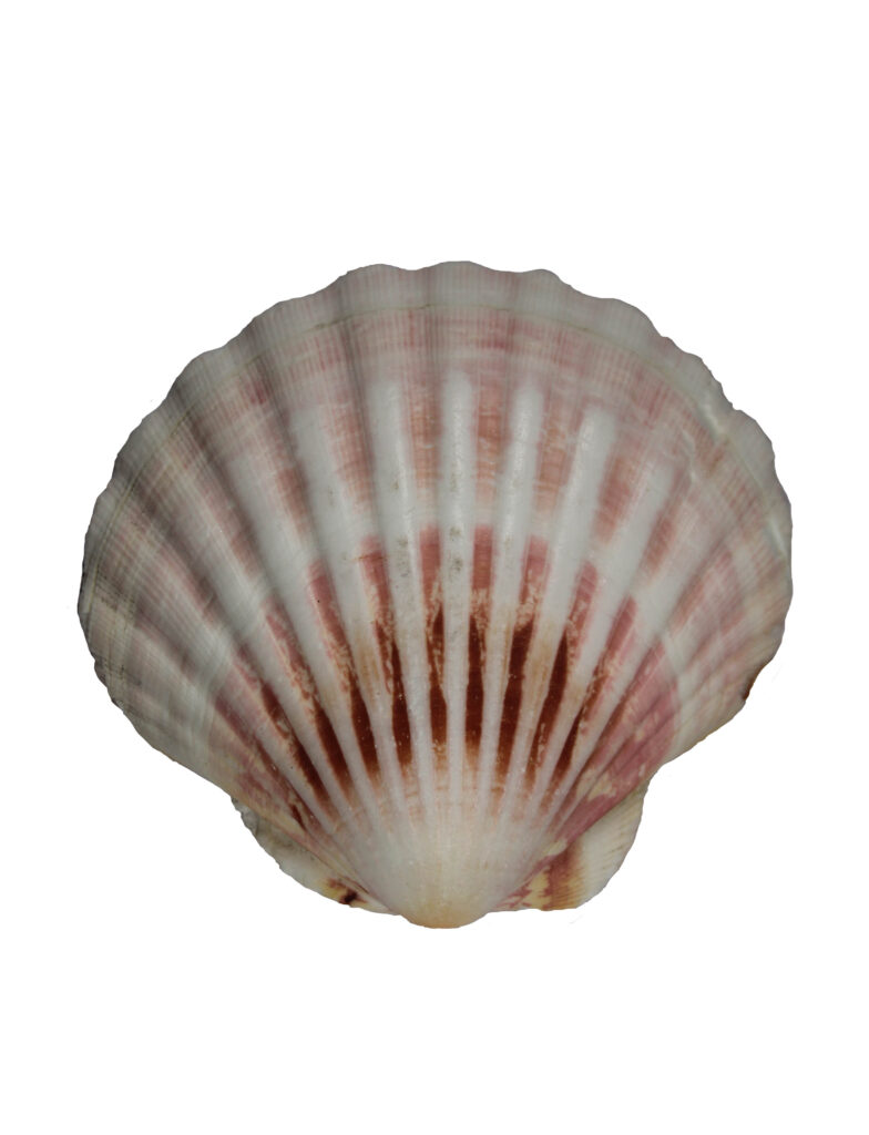
When it comes to still life, I wanted to include the most meaningful objects, however I didn’t like the background for some, therefore I opened 3 of the images in photoshop and wanted to trace around them.
To do this I have once again used the same techniques as the first image alteration, using magic lasso tool and eraser.
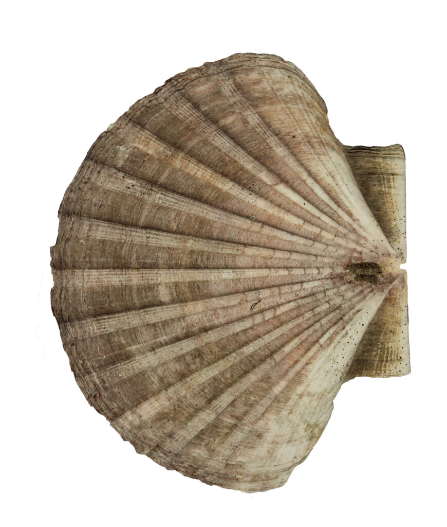

These were the best images from photoshoot 5 before editing. I took these photos down at St Ouen’s Bay whilst my dad went surfing. The lens I used to take them is obviously not meant for this kind of long-distance photography which is why a lot of this shoot wasn’t usable and there were only 14 relatively successful pictures. There was also a lack of light at this time as the sun was setting and there was also a thick layer of cloud and this caused the resolution to suffer a bit. I want to go back out soon to take better pictures in the light.

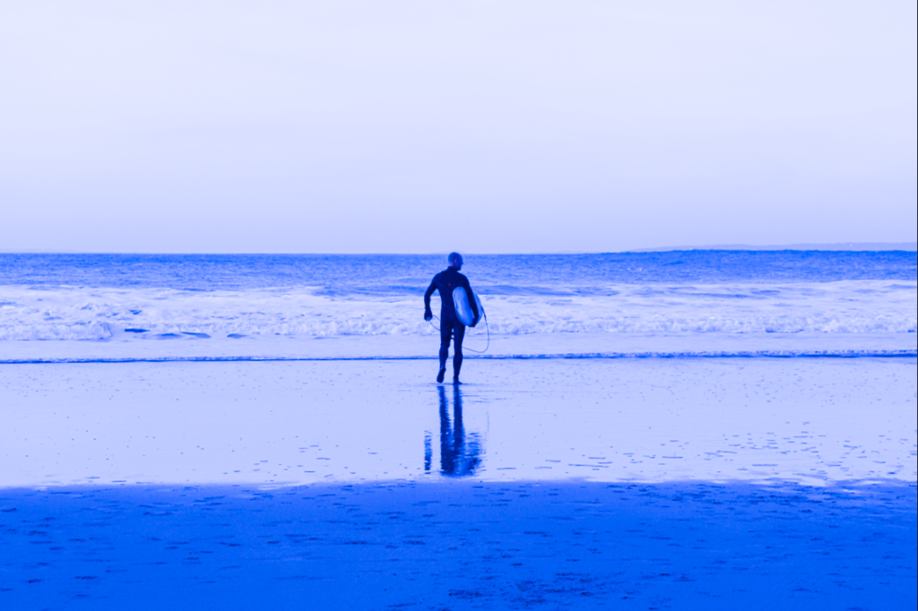
For this shoot, I needed to use a combination of techniques to ensure that the blandness of the weather and light was either masked or amplified to create a more dramatic image. Therefore, I explored this technique of decreasing the temperature and exposure to make the bright blue graphic effect.


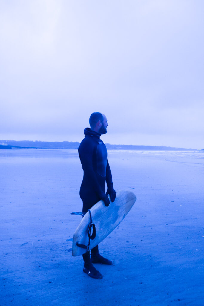
I also made some black and white, but made sure not to always do this because it can become boring if the images are all relatively repetitive. I then increased contrast and exposure.


I then began to explore a more natural lowering of the temperature, which created a nostalgic blue tinge that, when combined with a slight vignette and increased texture, appears film-like.


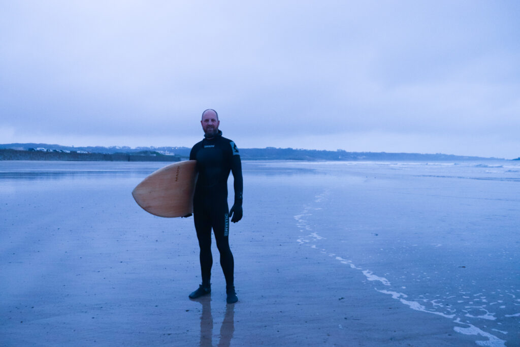
I edited the below portrait to be more natural and documentary style so that it would appear like an environmental portrait. I increased the exposure slightly as the original was very dark. I also increased contrast to show definition.

Here, I experimented with the opposite technique as before, where I increased temperature instead of decreasing it. I like the effect this has as it also seems quite nostalgic as it is reminiscent of sepia, but with a slightly more vivid tone.

Photoshoot 6, however, was a lot more successful as the light was better, the colours were brighter, and the visibility was clearer. This means that I have a lot more images from this shoot and I am generally very happy with these. Below are the photos I selected to edit.

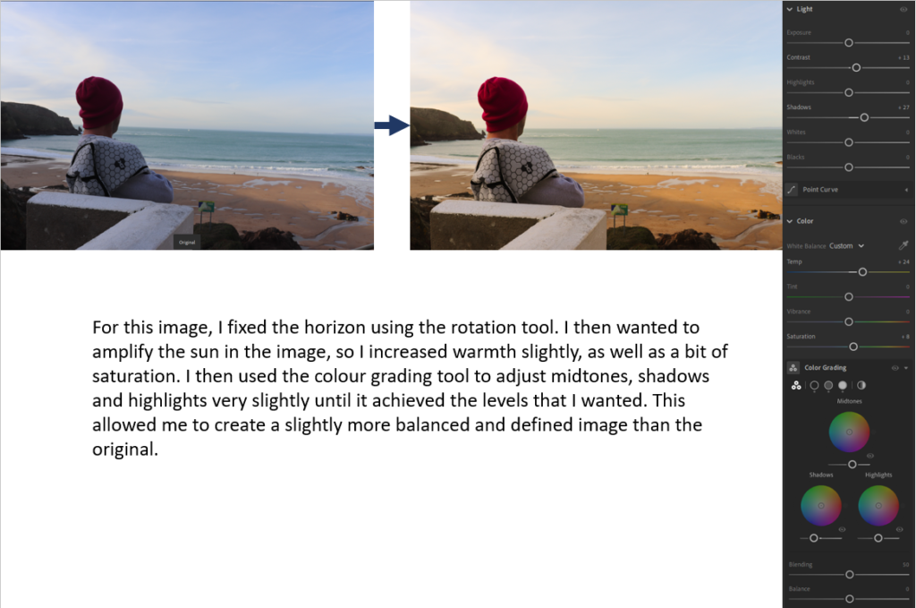


I copied and pasted these edits on to this photo too.




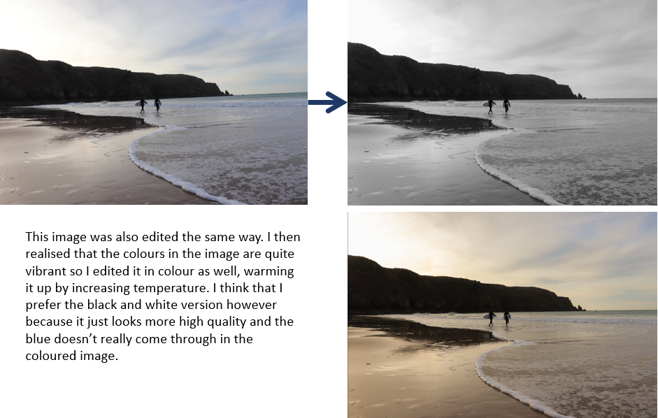
with a few of the photos that i am choosing in my final project i have edited them to make them appealing to the audience and to make them clearer and more vibrant.


