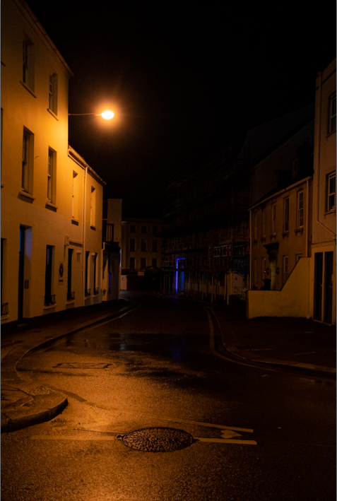
https://www.artsteps.com/curate/65c35d280657aae9de2edaa5/1
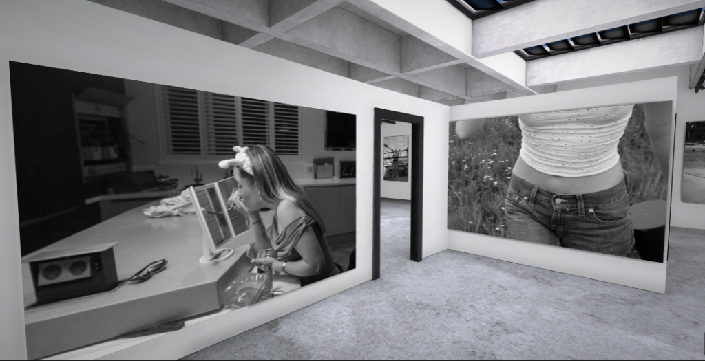
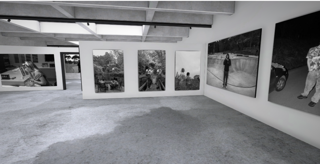
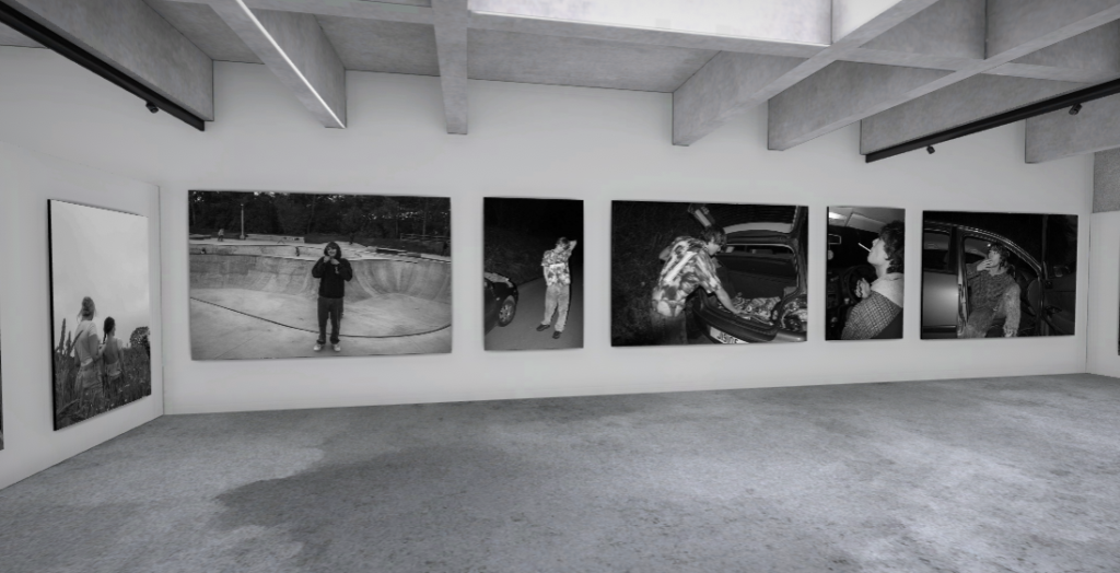
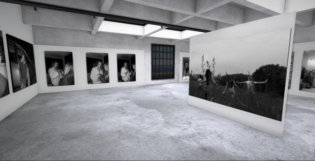
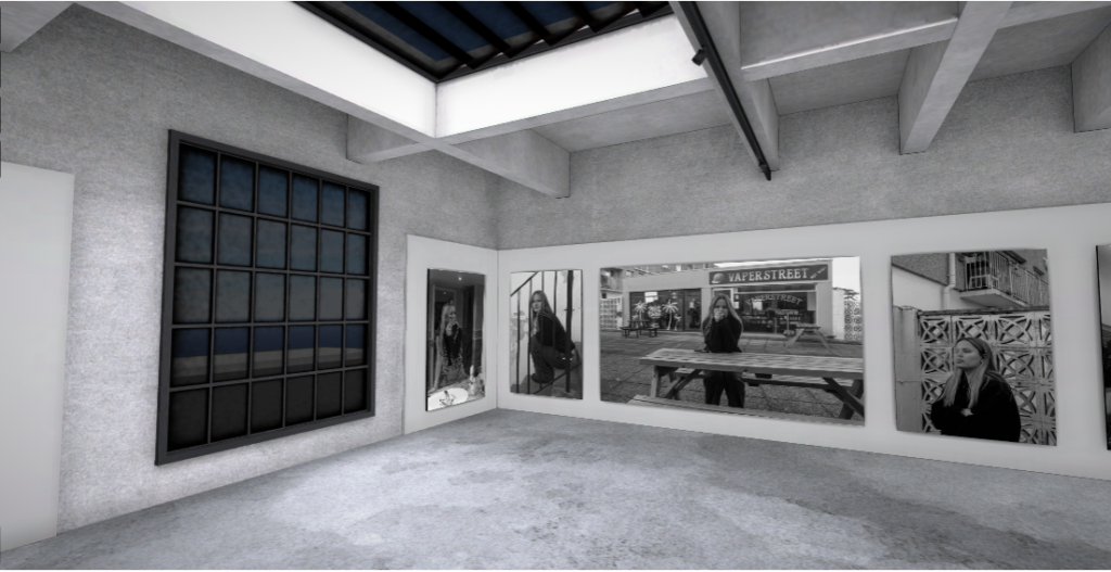
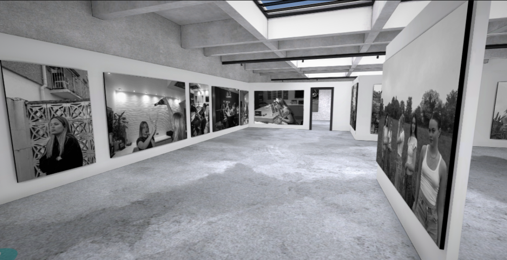
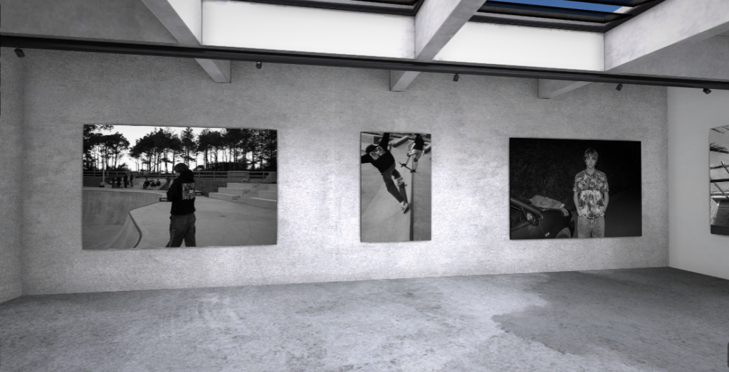
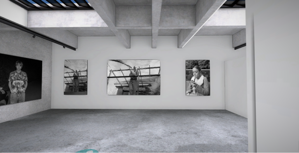


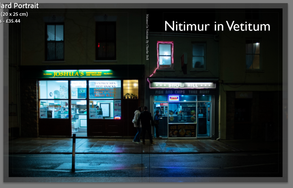
Here is the link to my final book: Viennoiserie
Out of all the projects that we’ve done so far, this was one of my favourite, I was able to explore something that is a massive part of my life in a creative sense in way that will be remembered for a very long time in Vienna Bakery.

I loved especially being able to see the processes of making different products like the danishes, the croissants and the pain au chocolats. It was nice to witness how stuff I’ve been eating for all of my life is made and how much hard work is put into them.

I enjoyed being able to create a photobook whilst having the freedom to pick the images that I had produced to put into it.
The theme of Nostalgia is very extensive and it gave us the chance to do what we wanted with the theme we were given. The creative freedom that came with this project is definitely why it is one of my favourites that I’ve done so far. The way I was able to think up my own concept and produce the images that I wanted for the photobook in my own style was very freeing. I think the reason why I wanted to do this project on Vienna Bakery was because I had always wanted to find out more about the processes that the bakery uses, especially since I’ve grown up around the bakery.
In this project, my main influence was Mitch Epstein’s book Family Business, this documentary photography style of working when documenting something you are closely related to really inspired me on this project. Using the same point of view as Mitch Epstein, I used my insider access to my advantage as I know a lot of the workers because I live near the bakery, meaning I grew up around a lot of the workers. and work within the bakery. I, however, think that I also had a slight outsider’s perspective as well, I haven’t spent a lot of time with or interacted a lot with some of the staff that work on the production line, meaning I didn’t feel fully confident asking to do a photoshoot with them.
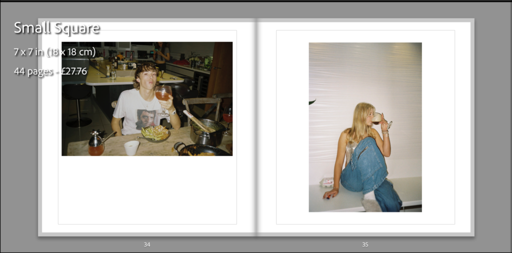
This is the final outcome of my photo book and how I have laid it out, I have done it in a simplistic way which I think is more affective, I have placed some images higher and lower than the others to break it apart from it being a consecutive symmetrical line as I think it keeps the audience attention more. All the photographs have a white boarder around them as it doesn’t cut any of the image out and gives it a simplistic look which works well as the photos aren’t overwhelming and doesn’t over power the accompanying image if they were to be full bleed. I have placed the photographs on matte paper to reflect well on the graininess from the film and have chosen to make the book as a hardback as I believe is gives more structure and a better look to it as in my opinion the soft copy books have a cheaper look and feel to them which I believe wouldn’t reflect well on the type of images I have in my book. The name of my book is called Salad Days which connotes youth in our prime days.
Here is a link to my photo book: Salad Days




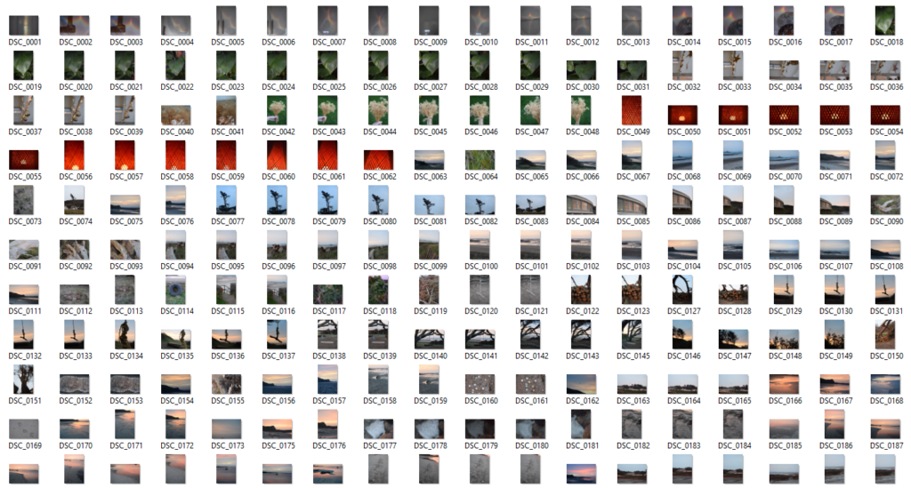

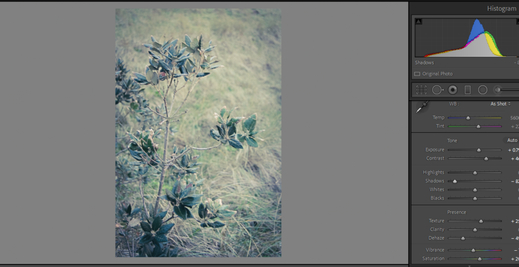
Selecting – I flagged all the images I wanted to choose to edit using ‘X’ and ‘P’
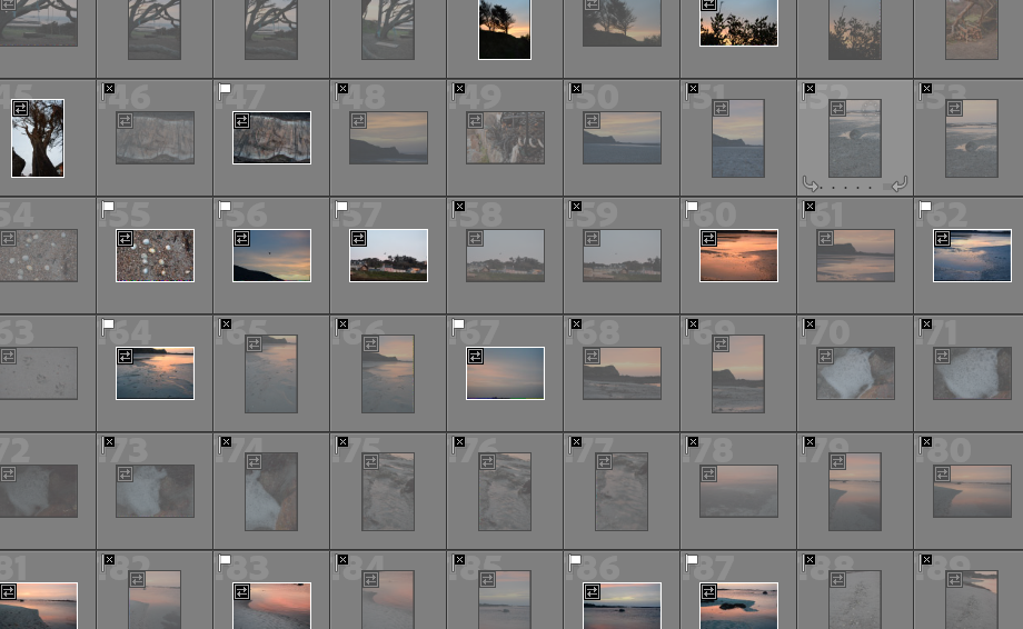
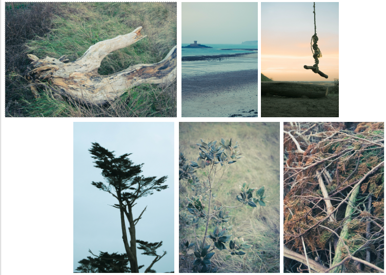
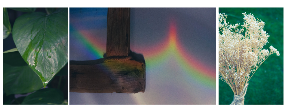
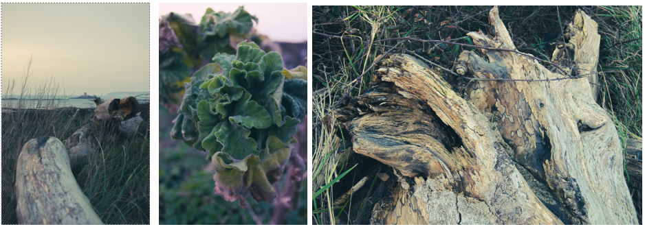
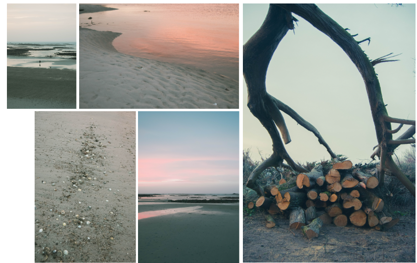
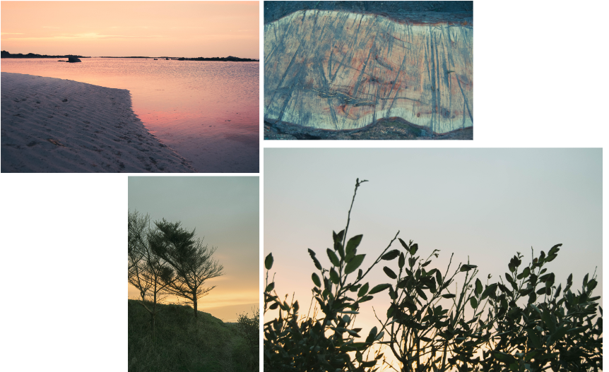
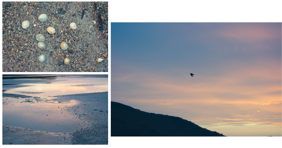
These are the photos I am going to edit from shoot 3:
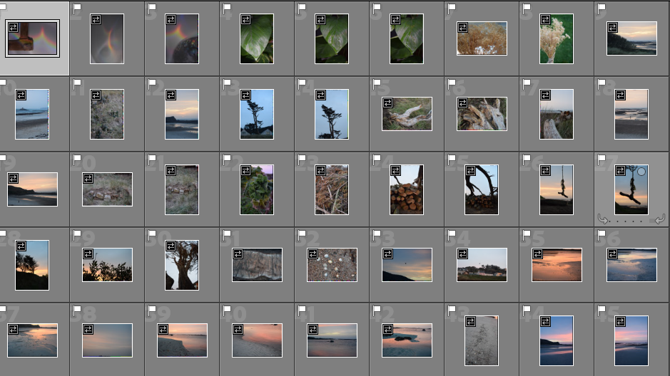
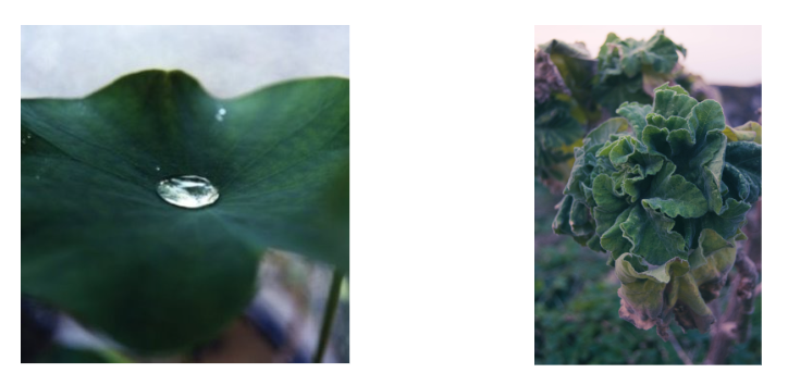
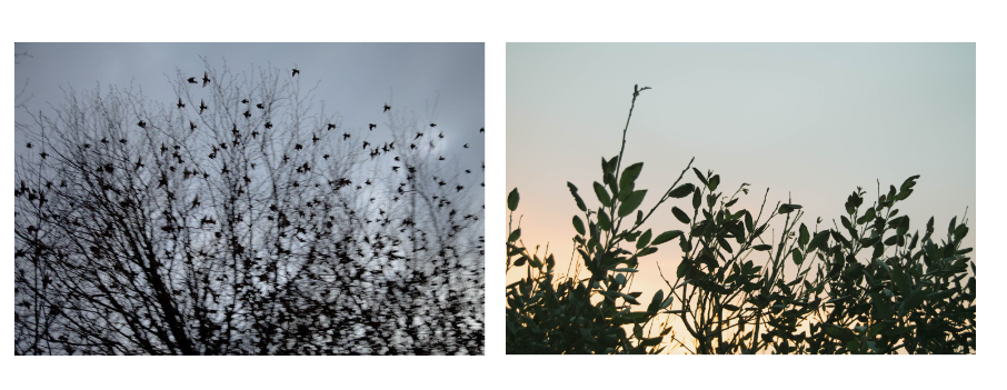
Again, I am trying to show my childhood experiences in places I have grown up at. I will edit these similarly to the rest, keeping the dreamy editing technique.
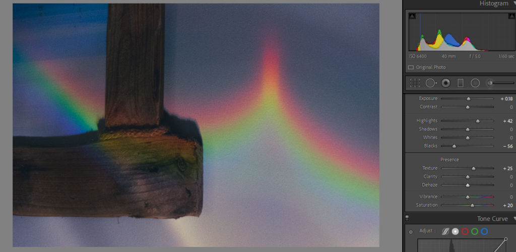
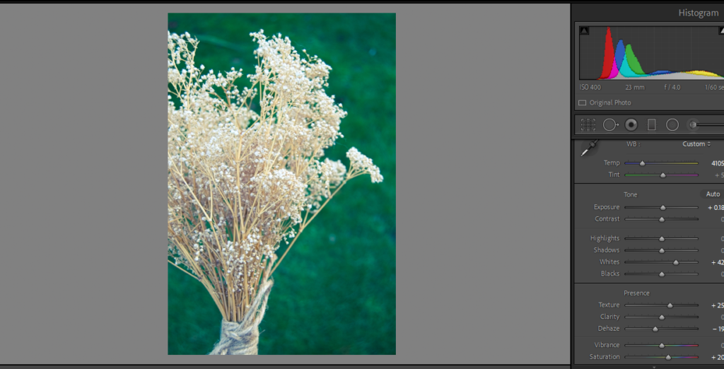
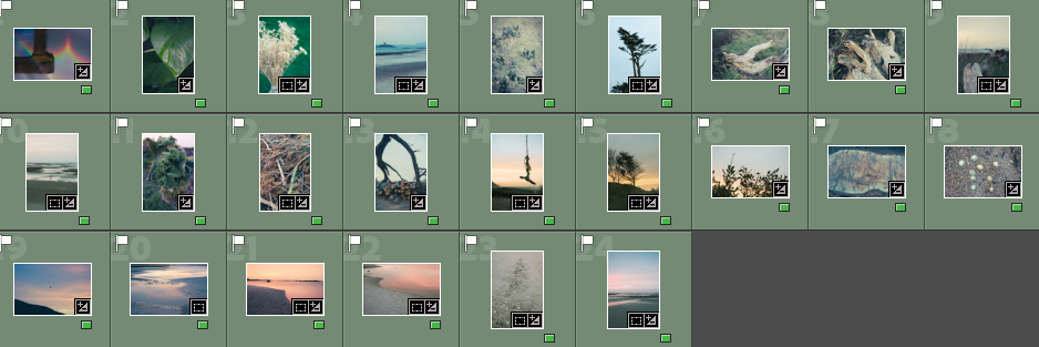
I rated the images from this shoot with red, yellow and green so I can choose which images are the best.
Red Images (unedited or images I won’t use)

Yellow Images (ones that I might use but I don’t think are the best)

Green Images (photos that I will use in my photobook)
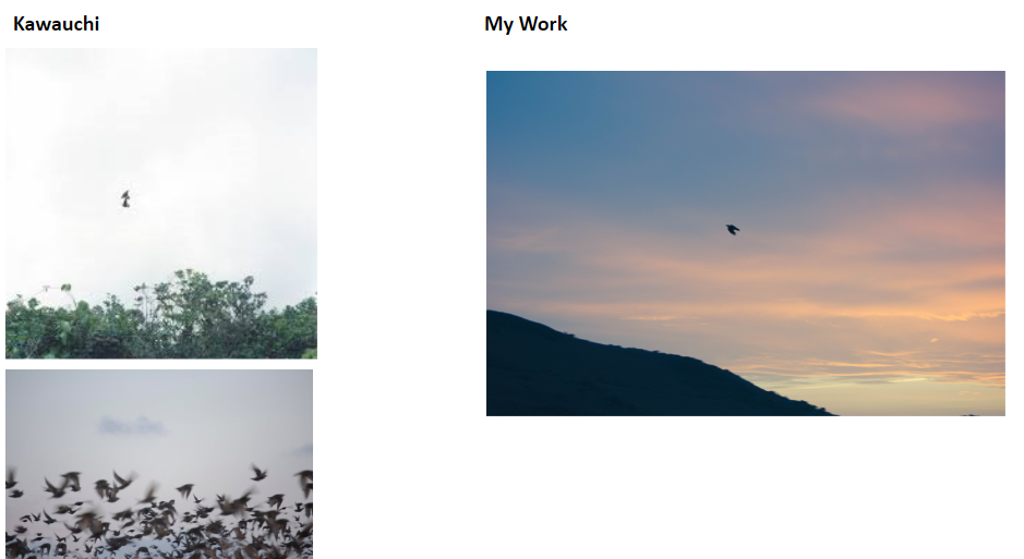


When making this first edit I originally only wanted a single red bird but found that it was too little and hard to spot in the busier image – so I added two others only with outline making them slightly more subtle.


I chose solid colour for the rabbits as it stood out better on the background – I found the more detailed versions took away from the base image. I originally created a version with a single rabbit but found I prefer the 3 together.

Experimentation over archive photograph- Decided it was too busy and tried to idea physically with thread.


Lettering around eye

Carolle Benitah’s Photo Souvenirs – used as inspiration


Used two images and adjusted opacity to overlay – hoping to replicate Carole Benitah’s Style.


Further experimentation


Lettering on Tide picture – unsure of including this image in final book.

Overlaid archive photograph with old letter to cut out figure.

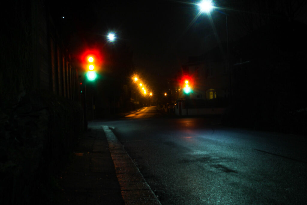


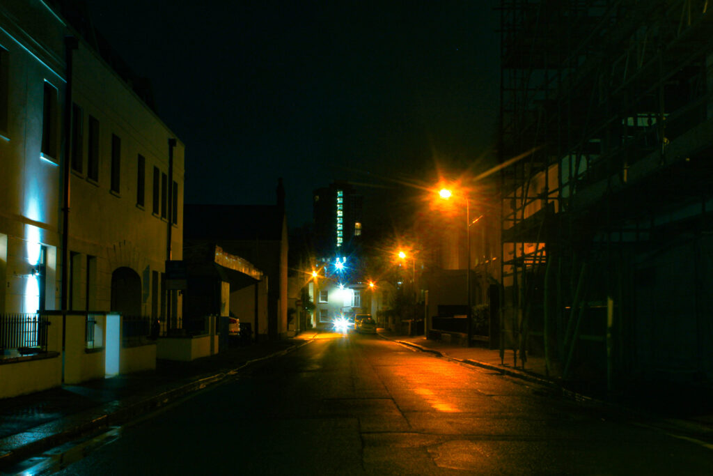


During my last photo shoot I started to understand how to adapt my camera to the context of where I was and what I was taking a picture of. By using higher ‘F’ with 100 ISO and longer exposures it created a less grainy image with better intensity of lighting. What I like about these images is that it suits well with what I’m aiming for with wet, and slippery type of images.
Bibliography:
Eugene Smith, W. (1993), W. Eugene Smith: His Photographs and Notes. New York: Aperture Foundation
How does W. Eugene Smith, express the notion of family history and relationships in his work?
“Family is not an important thing, it’s everything.” – Once said by W. Eugene smith
The works of W. Eugene Smith beautifully express the notion of family history and relationships. One of his well-known series is called “The Country Doctor,” whereby he documented the life of a small-town doctor and his interactions with patients and their families. Along with “Minamata,” which shed light on the devastating effects of mercury poisoning on a Japanese fishing community and how it impacted their families. Smith’s photographs in these series capture the intimate moments, struggles, and resilience of individuals and their families, showcasing the deep connections that exist within these relationships. As a response to Eugene’s work I could produce a series of images capturing the relationships and emotions within my family, more specifically the relationship between me and my father, stemming from a shared interest, surfing. Showcasing the bond between me and my father whilst engaging in surfing can similarly reflect the love, joy and connections that Smith’s photographs evoke. For my personal study, I am exploring the theme of nostalgia in relation to my father and his connection to the ocean. Having grown up an avid swimmer, competing for England’s youth team and working full time as a beach lifeguard on the southeast coast. My father moved to jersey in 1996 taking up surfing and further developing his love for the ocean. This subject is important to me as it takes up a large part of my childhood incorporating a sense of nostalgia through the connection me and my father developed through surfing. I have sourced my images from a series of old photobooks produced throughout my fathers lifetime along with newer images that I have produced with the aid of JEP photographer Dave Ferguson. The archive images acted as a base on which I expanded and compared to present day images expressing his past and current connection to the ocean.

Historically, Smith was an active photographer throughout the the mid-20th century, a period consisting of significant changes in society and traditional family structures, seeing the rise of the nuclear family as the ideal. Smith’s photographs captured these shifts and explored the intracity of family life. Theoretically, Smith’s work explored the depths of family dynamics, analysing themes of love, intimacy, conflict and resilience. Smith captured the essence of these relationships by immersing himself in the lives of his subjects. Humanist photography is an art movement that emerged in the mid-20th century. It aimed to capture the essence of the human condition and shed light on social issues through powerful images. Photographers like Eugene Smith played a significant role in this movement. Humanist photographers believed in the power of photography to create empathy and understanding. They focused on capturing the everyday lives of ordinary people, often in marginalized communities, to bring attention to their struggles and triumphs. Smith’s most famous work, “Country Doctor,” is an example of humanist photography. It documented the life of a small-town doctor, Dr. Ernest Ceriani, and his patients in rural Colorado. Through his photographs, Smith captured the challenges, joys, and sacrifices of Dr. Ceriani and the community he served. This series highlighted the importance of accessible healthcare in underserved areas.

The Photo Essay
“W. Eugene Smith perhaps the single most important American photographer in the development of the editorial photo essay.”
“A photo essay is a form of visual storytelling that develops a narrative across a series of photographs. It originated during the late 1920s in German illustrated journals, initially presenting stories in the objective, distanced tone of news reporting. The photo essay gained wide popularity with the growth of photographically illustrated magazines such as VU, LIFE and Picture Post. It is associated especially closely with LIFE, where the photo essay became a platform not only for informing readers, but for influencing their opinions. Through the middle decades of the 20th century, this visual format would be used to familiarize audiences with the transformations of a modernizing world, entertain them with slice-of-life stories, and introduce them to unfamiliar members of their society.” – MoMA
”The Country Doctor, now recognised as one of the landmarks of 20th century photojournalism, ‘Country Doctor’ was a pivotal moment in the development of the extended photo essay. It signalled the beginning of a golden age of editorial photojournalism that would peak in the 1960s and 70s, when such essays by the likes of Don McCullin, Gilles Peress and Eve Arnold brought dramatically affecting images of conflict, protest and political struggle into millions of living rooms.” – Words by Sean O’Hagan, The Guardian


W. Eugene Smith’s photo essays have been a huge inspiration to many photographers, including Larry Clark, an American photographer and filmmaker. Smith’s ability to tell powerful stories through his photographs, his focus on capturing raw and authentic moments, and his dedication to immersing himself in the lives of his subjects have all influenced photographers like Larry Clark. Larry Clark, known for his documentary-style photography and his exploration of youth culture, has cited W. Eugene Smith as one of his influences. Clark’s work often delves into the gritty realities of life, much like Smith’s photo essays did. Both photographers have a knack for capturing the rawness and honesty of their subjects, whether it’s in the context of family relationships or youth culture.

W. Eugene Smith used various methods and techniques to express the depth of family history and relationships in his work. One of the key techniques he employed was his ability to capture candid and authentic moments. Instead of staged photographs, Smith focused on capturing the genuine interactions and emotions within families. Smith also paid attention to composition and storytelling within his photographs. Through careful framing, use of light and shadow, and attention to detail, he created powerful visual narratives that conveyed the essence of family relationships. Whether it was a close-up of a tender embrace or a wider shot that captured the dynamics between family members, Smith’s compositions were thoughtfully crafted to evoke emotions and tell stories.
When it comes to the ethics of documentary storytelling, W. Eugene Smith had a strong viewpoint. He believed in the power of photography to shed light on important social issues and bring about positive change. Smith saw his role as a ‘documentarian’ as a responsibility to truthfully depict the realities of the world, even if it meant capturing difficult or uncomfortable moments. Smith was known for his immersive approach, spending extended periods of time with his subjects to truly understand their lives. He believed that building trust and establishing a deep connection with the people he photographed was crucial in order to tell their stories authentically. By being present and observant, Smith was able to document the everyday moments that make up a family’s history. In terms of ethics, Smith was committed to portraying his subjects with dignity and respect. He aimed to give a voice to those who were often marginalized or overlooked, shining a light on their struggles and triumphs. Smith’s photographs were not meant to exploit or sensationalize, but rather to create empathy and understanding. Smith’s work also raised important ethical questions about the role of the photographer as an observer and storyteller. He believed in the power of photography to bring about social change and advocated for the use of his images in publications and exhibitions to reach a wider audience. However, he also recognized the responsibility that comes with that power, ensuring that his subjects’ stories were accurately represented and that their consent was obtained.
Smith often used sequencing and storytelling techniques in his photo essays. By presenting a series of photographs in a specific order, he could create a narrative arc that explored the complexities of family history and relationships. This allowed viewers to engage with the photographs on a deeper level and understand the broader context of the subjects’ lives. Many viewers appreciate Smith’s ability to capture the raw emotions and realities of the people he photographed. They admire his dedication to spending extended periods of time with his subjects, immersing himself in their lives to truly understand and represent their experiences. This approach allowed him to create intimate and authentic images that resonate deeply with viewers. However, as with any artist, there may be differing opinions on specific aspects of Smith’s work. Some viewers may critique his approach as being too subjective or biased, while others may question the ethical considerations of his immersive style of storytelling. These discussions contribute to the ongoing dialogue surrounding documentary photography and its role in society.
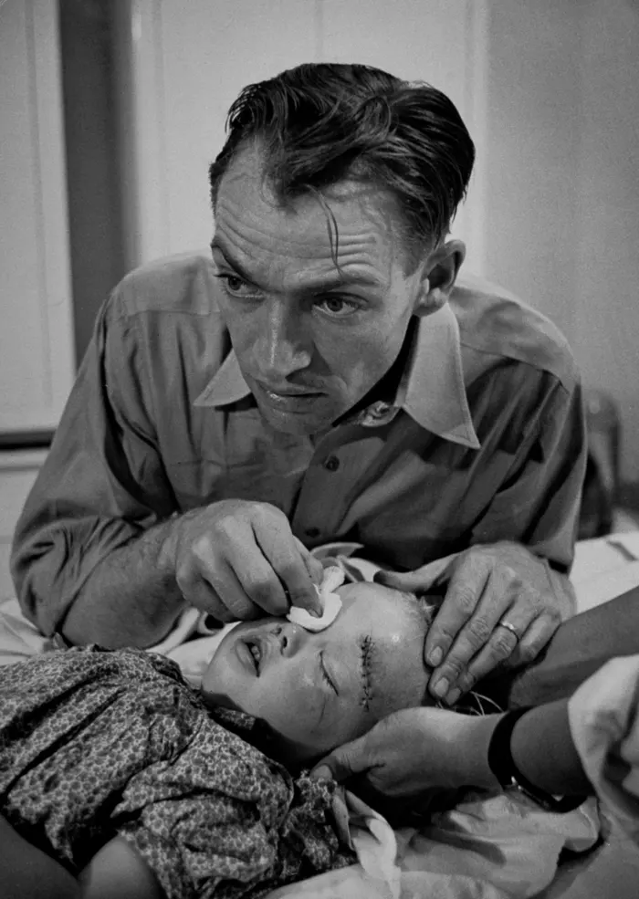
In this image, we see the immediate aftermath of a tragic incident. The composition draws our attention to the injured girl lying on the ground, surrounded by concerned onlookers. The girl’s body language and the expressions on the faces of those around her convey a sense of shock and concern. The framing of the image, with the girl placed in the center, emphasizes her vulnerability and the impact of the accident. The black and white tones add a sense of gravity and timelessness to the scene, enhancing the emotional impact. We can also observe the depth of field in the image. The foreground, where the injured girl lies, is in sharp focus, while the background is slightly blurred. This technique directs our attention to the main subject and adds a sense of immediacy and intimacy. The emotional impact of this image is crucial. The photographer captures a moment of vulnerability, pain, and concern. The expressions on the faces of the individuals surrounding the girl convey a range of emotions, adding depth and complexity to the image.
In conclusion, Smith’s work expresses notions of family history and relationships through a range of methods and techniques when it comes to storytelling, proving my theory on Smith’s attachment to a sense of family within his work. Although family relationships are potentially not the main focal point of his work, Smith heavily adopts this notion in his outcomes. His main focus being the providing of a voice to those who are often marginalized and overlooked. His beliefs being in the power of photography and the opportunity to shed light on important social issues, bringing about positive change. Smith saw his role as a documentary photographer as a responsibility to truthfully depict the realities of the world. Many ‘documentary photographers’ often stage photographs. Whereas Smith truthfully focused on capturing genuine interactions and events. Steve McCurry, an American news photographer, saw his secrets of his ‘staged/faked’ photography uncovered. McCurry famously shot the image of a girl an Afghan Girl that featured on the front cover of National Geographic, the image depicts then-17-year-old Sharbat Gula, who McCurry encountered in a refugee camp in Afghanistan in 1984 during the Soviet Union’s invasion of the country. ”Easily the most recognizable image to have ever run on the cover of National Geographic.” McCurry’s troubles began at a gallery show in Italy. An Italian photographer in attendance, Paolo Viglione, noticed something odd in an image McCurry shot in Cuba, sparking a debate on photo ethics.

Photography is an illusion because it creates an image that appears to be a direct representation of reality, but in fact, it is a highly mediated and selective version of reality. The camera lens, lighting, composition, and other factors all influence the way that a photograph looks, and the photographer’s choices about what to include or exclude from the frame can shape the viewer’s perception of the subject. Additionally, photographs can be manipulated through editing software or other means to create images that are completely different from the original scene. Therefore, while photography can capture real moments and events, it is always an interpretation of reality rather than a pure and objective representation. This being said, the truthfulness and reality of Eugene’s images can be argued against, leaving the unanswered question on whether Eugene’s work is genuine.
This exploration into the notion of family history and relationships in Eugene’s work has seen me make numerous links made across differing topics such as photo ethics, audience perceptions of imagery and viewpoints of photographers. Influencing me to second guess the reality, message and backstory of certain imagery.
Links
https://www.moma.org/collection/terms/photo-essay
https://www.businessinsider.com/steve-mccurry-photo-editing-scandal-2016-5
This photoshoot out of all of them was I think the worst however I did get one or two photos I can use in my photobook I did take a lot of photographs however there are only a couple I can really use I believe this is because my cameras settings where awful


I believe this is the was the best photoshoot out of all of the photoshoot I did just because I knew the setting of the camera and had good locations to get good photographs, most of the photographs in my photobook are from this photoshoot and they are some of my favourite photos and I really enjoyed going out and making these images.


