




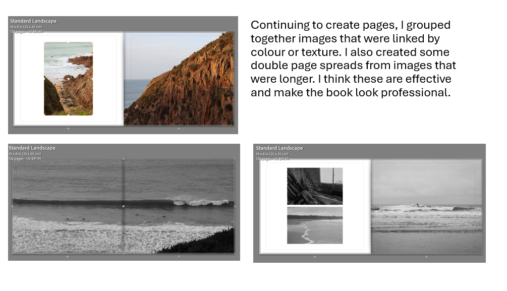

Here was my final layout:
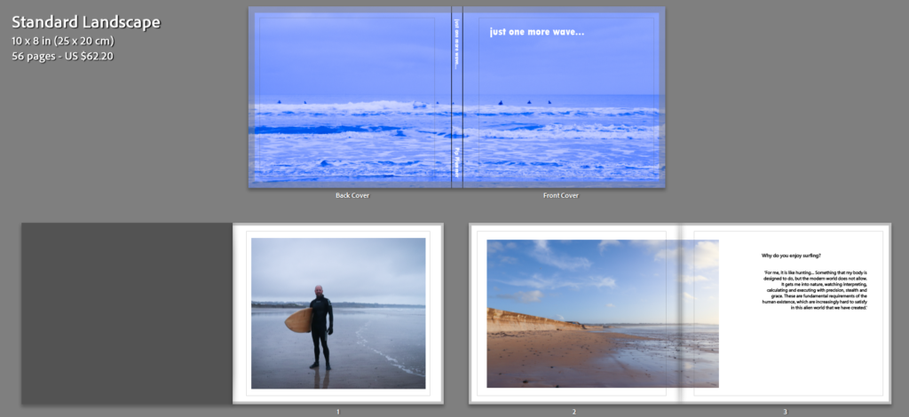


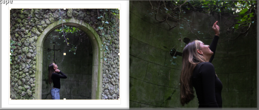
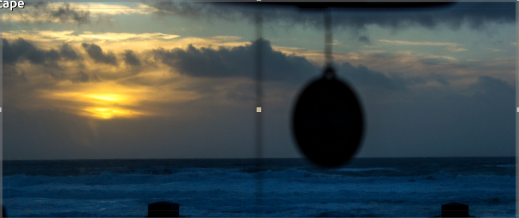
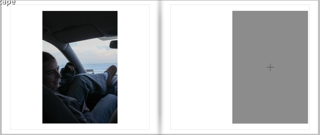
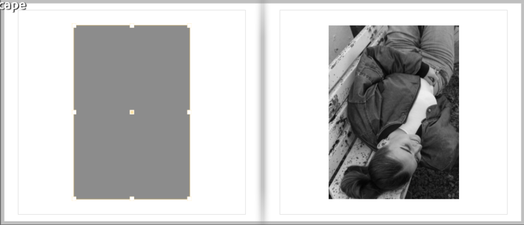
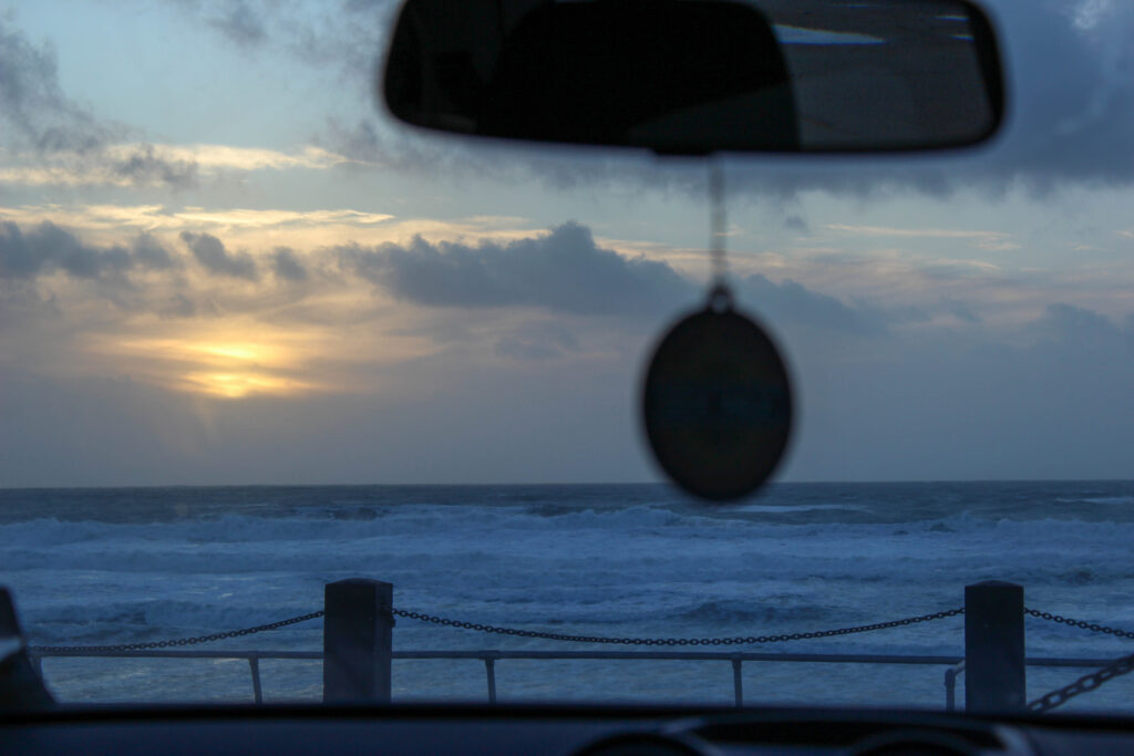
This layout includes a variation of double page spreads, full pages, and bordered images. I think this works effectively as an entire piece because it is minimal but also interesting. I chose to put the sunset and walking away image as the final spread because I think these work well as closing images for the piece. I think the use of colour and texture has been well observed and incorporated. If I could change something about this, I would possibly have tried to create a larger range of imagery, as I feel as thought sometimes it becomes a little repetitive. However, I think I have managed to balance it well.
My final title was ‘just one more wave…’ because it is exactly what my dad says if asked how much longer he will be in the water.
You can view my final book here.

when choosing my final photographs I had to go through all my photos that I had taken through out all the night time photoshoot that I have been on there about 1000 photos that I had taken and I found about 100 that I thought would be okay for my photo book then I edited them and took away the ones that I didn’t like and I was left with 36 photo that I will be using in my photo I know the photos I picked are good and I think I really captured the night photography feel I enjoyed editing and making these photographs.


all these photographs are my favourite photo out of all my photo that I have edited for my photobook I will be printing these ones out and displaying them


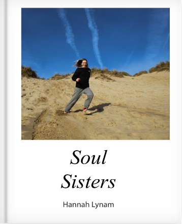


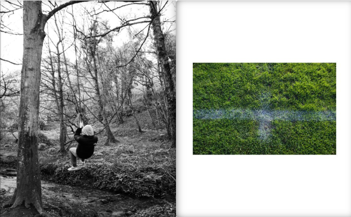


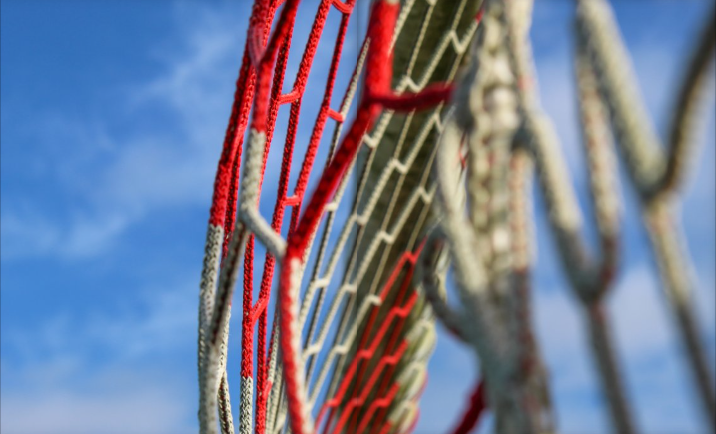


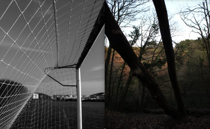


I decided to name my book ‘Soul Sisters’ as it automatically tells the reader what the book is about and gives a background and meaning to the images. I chose the front cover to be my sister running down the sand dune because it is almost like she is running down the page which corresponds with the final image in the book where it is like she is running off the page to demonstrate that it is the end of the book.
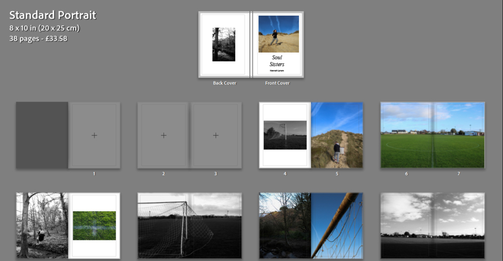
I used a variety of layouts within my book to ensure the book had some character to it. I decided to have a double page spread for every other page as I wanted the book to flow and have some sort of consistency. I also, experimented with placing different images next to each other, creating juxtapositions.
I decided not to include my essay within my book as I didn’t think it fit the theme of the images well enough.


For the back cover, I chose a black and white image of an old rope swing because it links to the idea that it is a memory from mine and my sisters childhood. The rope swing on it’s own demonstrates how we have left these times behind us but the rope is still there which is most likely used by other children making memories like me and my sister did.
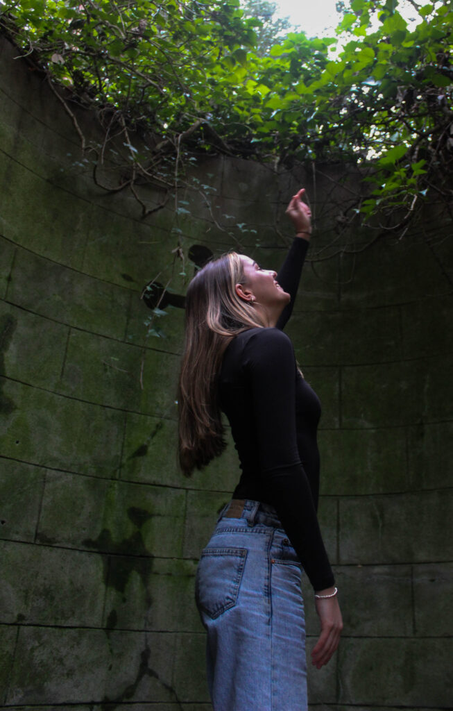
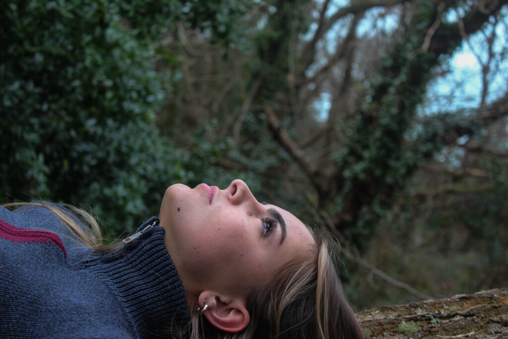
Overall, I am pleased with the outcome of my book as I think it displays the theme of nostalgia, femininity and childhood which links back to the work of Justine Kurland. My work linked back to Kurland’s work in a way as it explored the themes of childhood and feminist in what could be argued as rural landscapes. In my opinion, the images within the book clearly demonstrates my childhood memories that I have created with my sister, telling the reader a story. When taking the images and going back to the places that were once second homes to me and my sister, I felt a sense of nostalgia as everything was almost the same as when we used to go there. One thing that I would have changed would have been getting more portraits during the football pitch shoots. I also would include more childhood friends in the shoots which would show a real comparison to Kurland’s work.
Here is a link to my photobook: The Girls
Final Selected Images

By having my final images selected it makes it easy for me to place and move the images around the book. I choose to use the standard landscape layout as I have a mixture of landscape and portrait images. By having it landscape I can create a two page spread, as some of my best images are landscape meaning that I can display them bigger than some of my other images. I have also chosen to not have the same layout all the way through, this helps to create an ecliptic look with no uniform as some pages have a full bleed whereas others have a boarder around them. The way in which I have chosen to order the images almost as if it is telling a story, trying to match similar images and colours on the page. The way images are laid out helps to create different kinds of moods and feeling throughout the book. The image I have chosen for my front cover allows for me to have space for a title and my name.





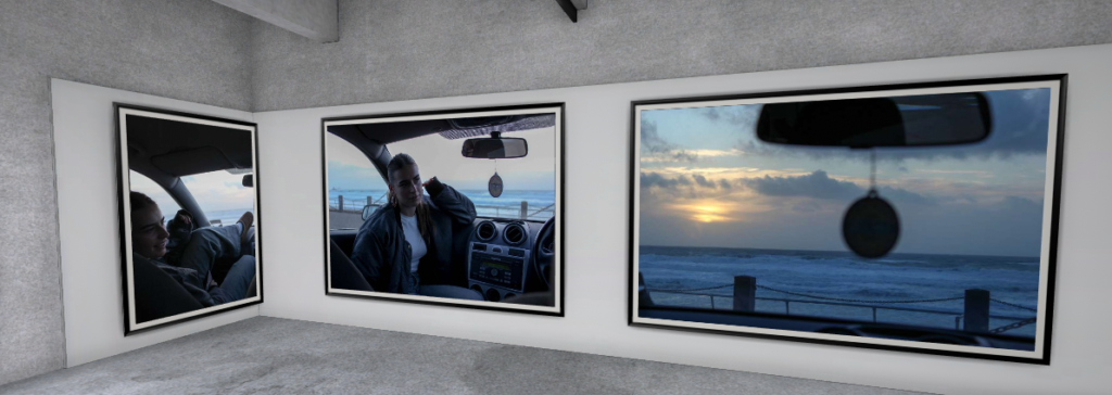
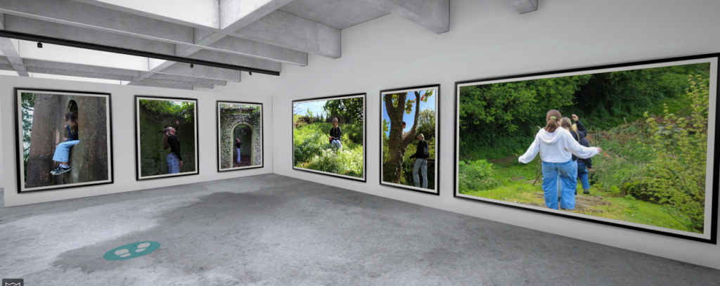
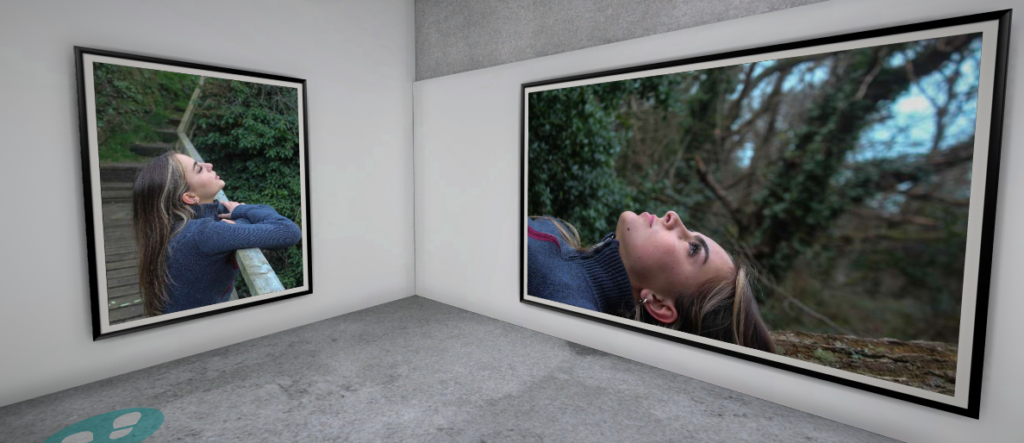
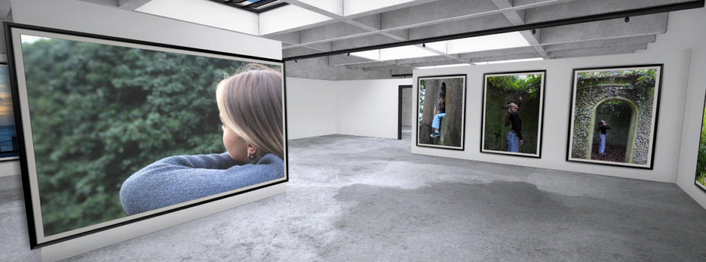
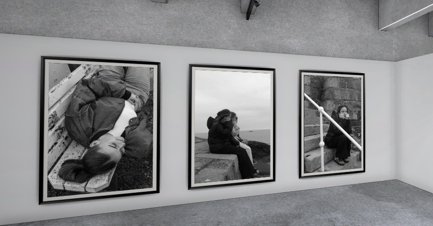







Photobook Gallery


Link to gallery: https://www.artsteps.com/view/65c3433b5223fce69ac21c6e
Archive Gallery

Object Gallery

Landscape Gallery

Contact Sheet

Image selection

From this shoot I only got a few images which I could use for my final images. The light didn’t go to plan as it was very dull lighting, so I changed them into black and white. This also helped tie the images in with my other shoots with black and white images. As a set I think these images work nicely together.
Editing


