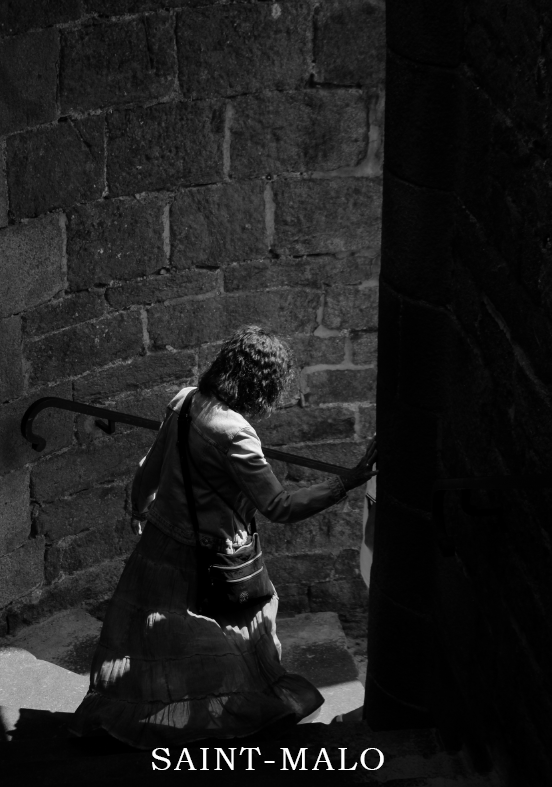
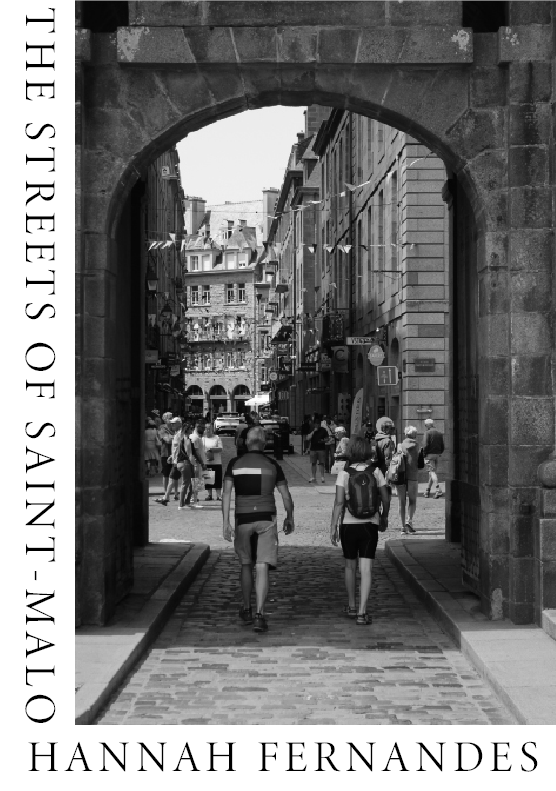
This is the layout I have chosen for the images in my 16 page zine. I have relatively split them into 5 vague groups based on content (e.g. beach, street views, colour photos). I have chosen to edit most of them in black and white and with a few adjustments to contrast and shadows as is typical with black and white imagery. I chose the cover image as I think it will frame a title well and also represents what the reader can expect from the rest of the zine. I chose the back cover image as the subject is walking away from the camera as if to close the ‘story’.
Textual elements
I have chosen to add some textual elements in the form of a few small blocks of text that describe my experiences in the moment which I took them. I also titled the zine with the French title ‘Souvenirs de Saint-Malo‘, translating to ‘memories of Saint-Malo’. I chose this because I think it reflects the main objective of the piece, which is to convey the concept of nostalgia through imagery and text. The typography settings I have chosen throughout (for everything except the cover) are shown below.
I chose these settings because I found they created the right kind of effect and that they fitted best with the nostalgic concept I wanted.
A photo zine is a self-made, printed issue built of photos and captions. The term comes from the word “magazine”, as zines follow the style of magazines with headings, text, and illustrations put on a grid. An important feature of a photo zine is visual storytelling.
Inspiration
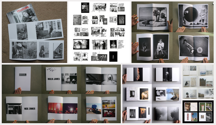
The inspiration I incorporated for my zine was taken from the photo above. I liked how the images looked with the boarder around them and replicated this in my own zine. I was also keen on the way they arranged their images, having their strongest image as the biggest and their most eye catching image as a smaller one since this distributes the viewers gaze.
In my zine, I would like to include these elements as well as adding my own personal touches such as increasing and decreasing the image sizes while rearranging them to get the best outcome.
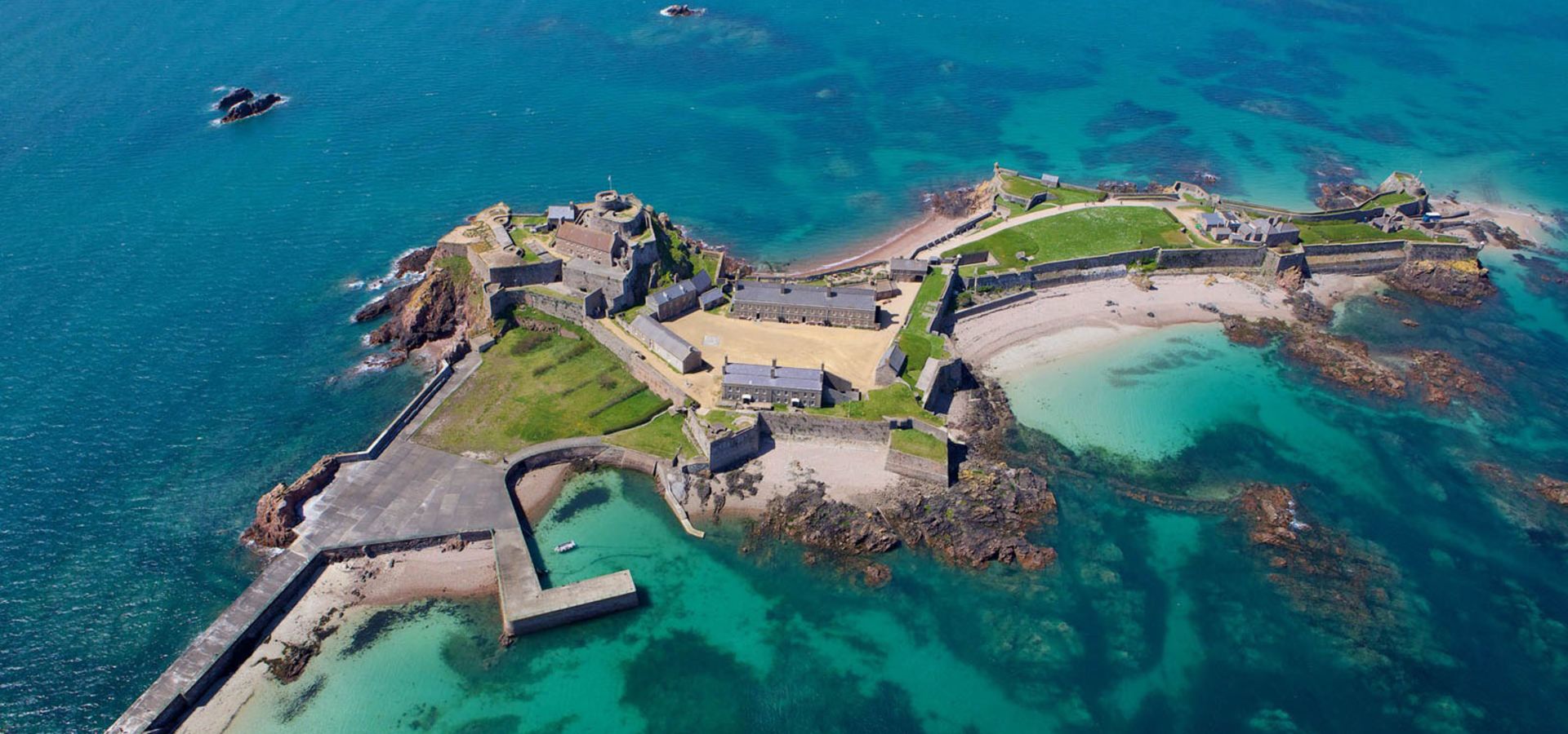
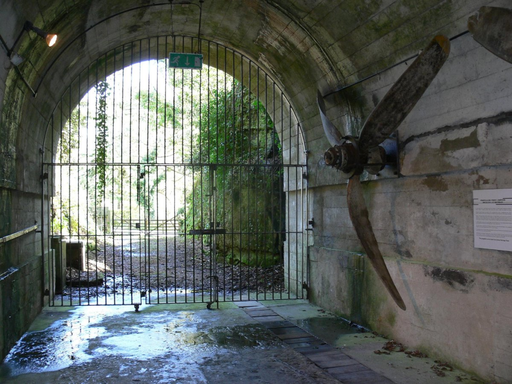
We plan to centre our film around the Nazi Occupation of Jersey in WWII, travelling to different historical sites around the island, including the War Tunnels, various important bunkers and larger fortifications such as Mont Orgueil Castle in Gorey.
Jersey War Tunnels
I want to use this task as an opportunity to improve my skills in techniques such as hyperlapses, which is a form of timelapse shot used to capture motion. We also hope to use Charlie’s drone if we can get it to work, as it would work really well for establishing shots of the castle. As I already take film studies as an extra subject, I think I have leeway when it comes to experimenting with these harder techniques, another one I want to try is the slow-motion feature on my phone’s camera, which has so far given me some smooth, high quality shots when messing around with it.
When we actually go to Elizabeth Castle, we’ll need to bring a tripod, a camera (phone camera should be enough but we might be better off using a proper one), and the drone (if it works). Otherwise, when we do our extra shooting, we should be alright with the same or even maybe less equipment.
For the audio on our short film, we need to bring a sound recorder and maybe make use of the boom arm if we’re shooting at the same time. We need ambient sounds of seagulls, the shore, and we might need to record some footsteps on gravel and stone. If we can’t get these on the day, we can make some sound effects with foley sound.
I am going to be making a zine from my images I took in St Malo, including some of the AI images I have generated from that shoot.
Narrative: a spoken or written account of connected events, a story. A narrative can also be told through a series of images which can tell a story. When creating a narrative through images the way they are presented have to be carefully thought about, for example: what order are the images in?, do the images have a caption?
What is my story?
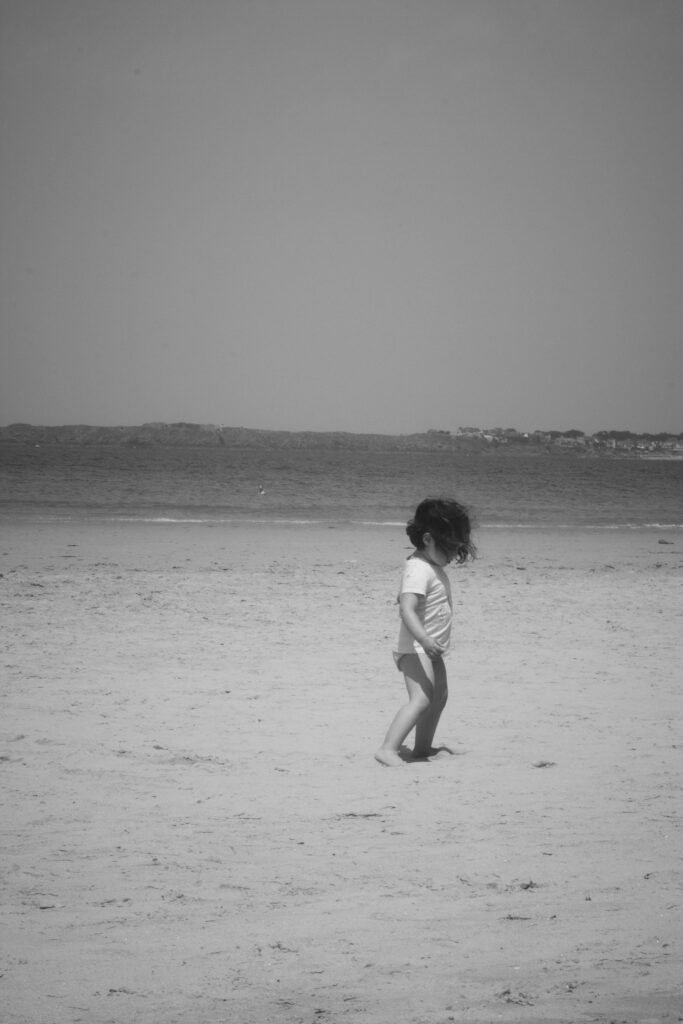
All my images contain a subject which each have their own individual story. I am going to let the viewers create there own story when they look at the images as I think that some of the images can be interpreted in many different ways
How will I tell my story?
I’m going to tell my story by presenting my images from St Malo in a certain order in the zine, with each page representing one piece of the story. I’m going to vary how I present the images. For example, I may chose to put a single image on one page and on the next have multiple images.
I may also to have a look at some archived images of St Malo and add them in to the zine, to create a sense of nostalgia.
As I didn’t go on the St Malo trip, I decided to base my project on my brother who competed at the 2023 Guernsey Island Games. I chose to photography him during his events as well as the preparations he made and after the events to give the viewer a whole story. I used many different angles when shooting to make my images feel more engaging and to fully capture the image that I wanted to achieve. I think that many of my image turned out how I wanted them too which allowed me to create a zine with images that successfully show how his events went and what he achieved. One thing that I like about my images is the lighting. As they were both quite sunny days I think that that helped me to achieve the final results in the images which is what I was hoping for. I also thing that the colours in my images contrast nicely especially the red with the blue sky making for an eye catching image. Overall, I am happy with this project and think that with out context a viewer would be able to understand my project.
The photo on the right is one of my inspiration photos I found during my research and planning process. On the left is one of my own replications of this design for my zine cover. The following are other examples of this with other final images from my St. Malo collection.
Inspiration
I wanted to experiment with my zine cover and try out different designs before deciding on a final design. Above is another of the inspiration photos I liked during the planning process, as well as my own responses below.
Response
I only managed to create a few possible designs for my cover as the creation process moved quite quickly.
This is the final image I used as inspiration for my zine’s cover. My responses are below, I believe these are my best and favourite designs I have created. The design allows me to incorporate the name of the zine as well as my name, without covering and blocking the image in any way.
Experimentation of zine pages
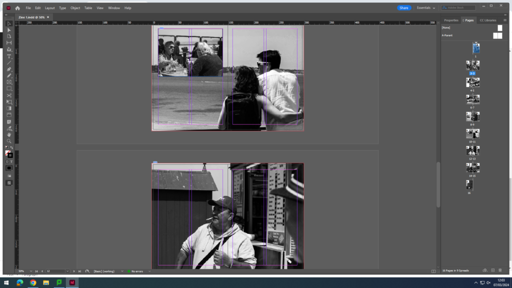
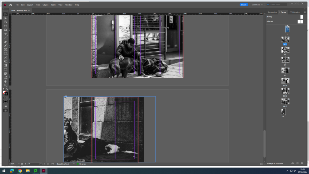
This is a spread where I played around with using different photographs. The top spread is the before, and the bottom spread is the final design. I realised the image in the top spread contained colours and therefore didn’t fit with the black & white theme I was trying to create. I also realised that the photo I chose to replace it with added to the story more than the previous. The final design contains images which I believe show and communicate the subjects’ lives and storylines, overall looking more personal and intimate.
This is more of my photo selection process for the spreads and experimenting with what I think looks best on the page.
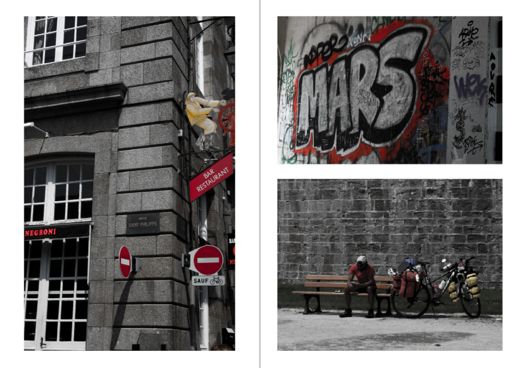
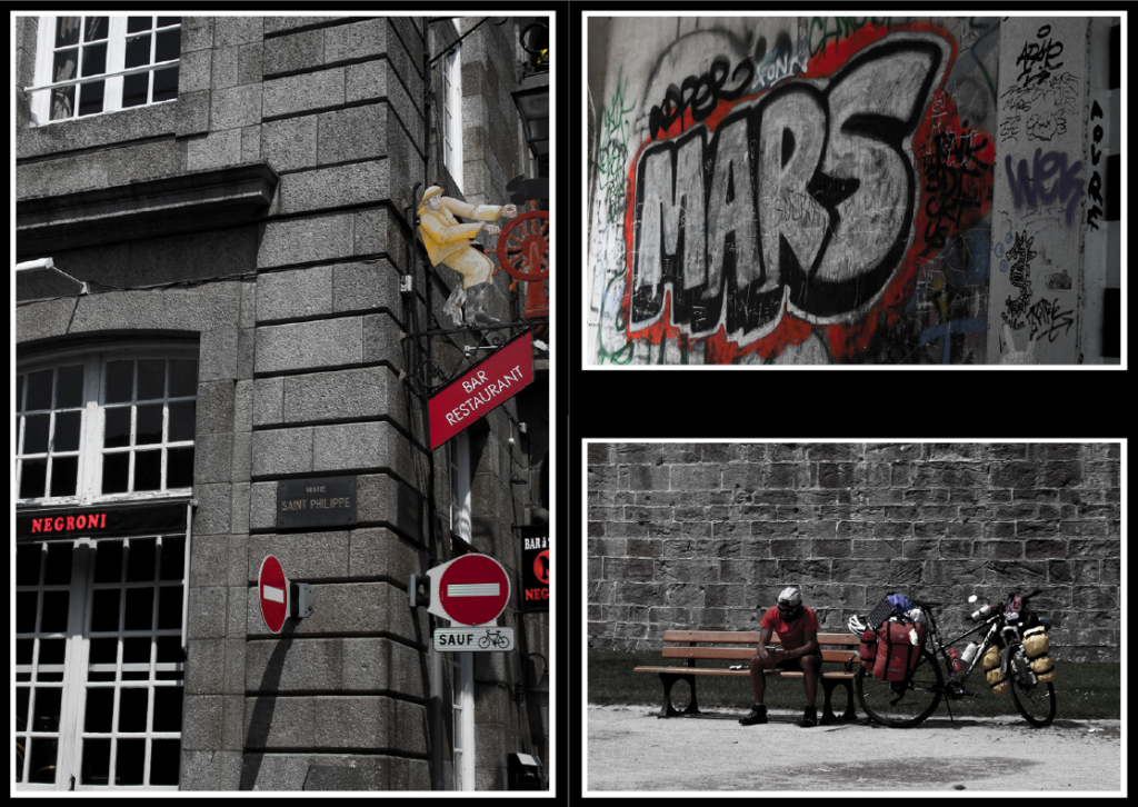
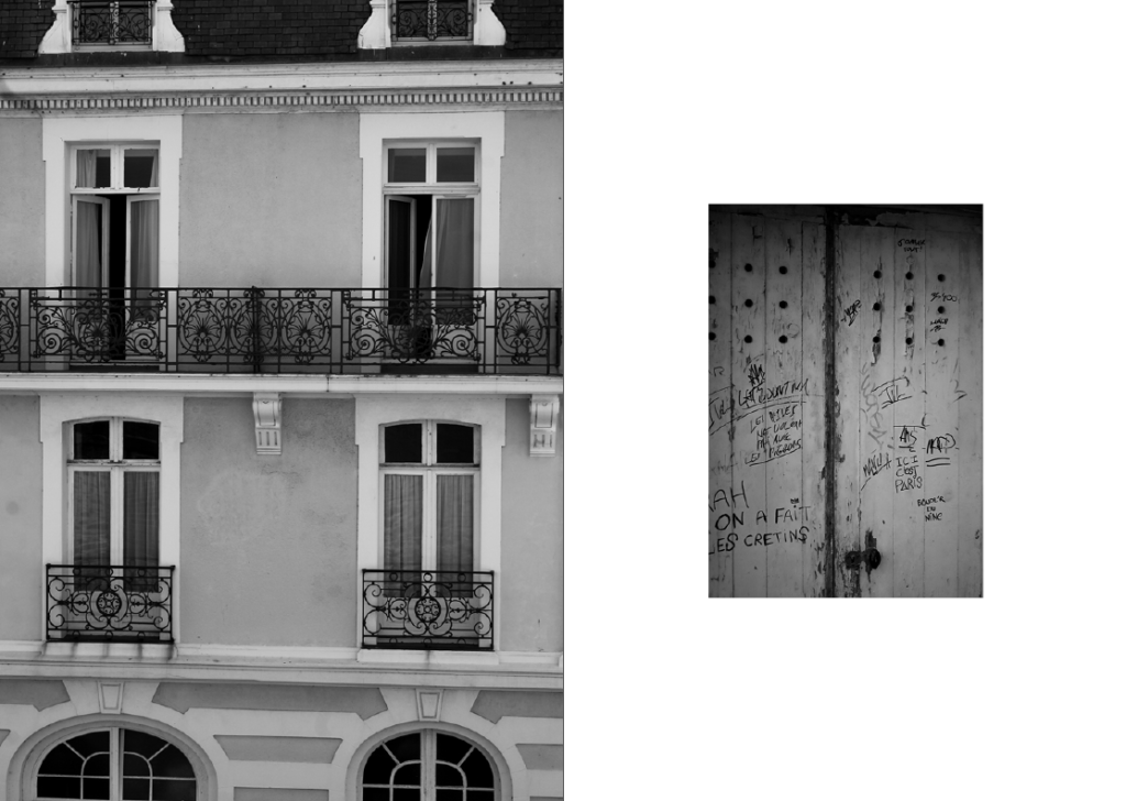
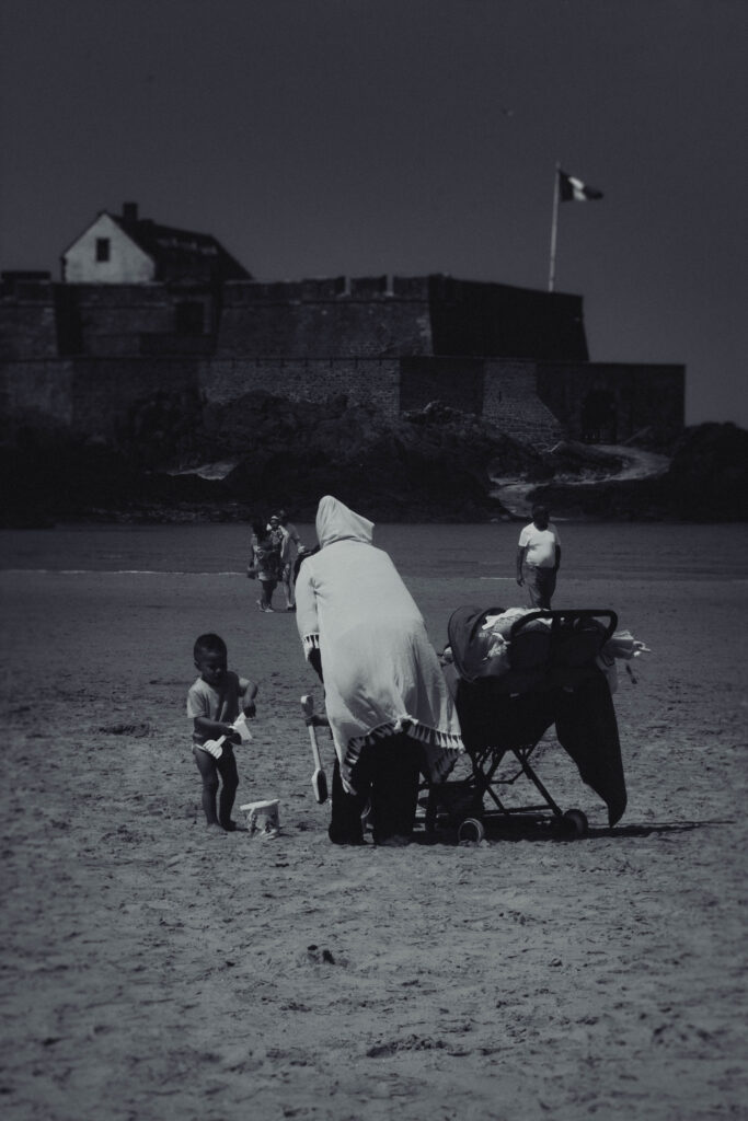
These images are a few of my St. Malo outcomes I edited by turning down the vibrance and turning up the saturation. This presents them as black and white but allows a pop of colour. Specifically I tried to incorporate images with red, white and blue elements (the colours of the French flag). I have chosen these images for the centre page as they don’t fit the black and white them of my zine, allowing some differentiation to the rest.
During my research into zines, I looked for inspiration for my zine covers but also my zine pages. This was an example of experimentation with double borders which I wanted to try.
Although I haven’t layered the images in real life like in the inspiration photo, I have used InDesign to create this double border effect. By bordering the images with white and then black, it creates a sense of contrast and draws more attention to the photos and their colours. This differs from the typical layout and theme for my zine, but I think it is acceptable because it is the centre page.
Final pages
Front page
Spread 1
Spread 2
Spread 3
Centre spread
Spread 5
Spread 6
Spread 7
Spread 8
Back page
I believe my zine creation process has been overall successful and that I have created a zine which is well-made and enticing to look at. I have varied my page designs as much as possible to make it more entertaining and exciting. I chose a black and white theme for my zine, with pop of colour and a differentiation in design for the centre spread to make it more fun.
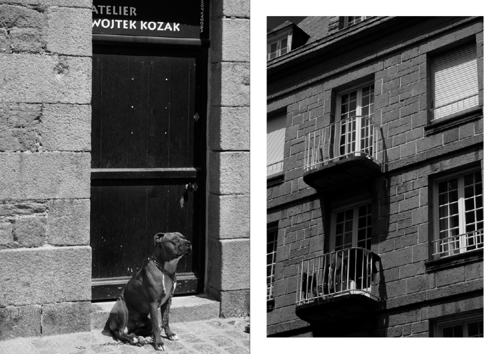
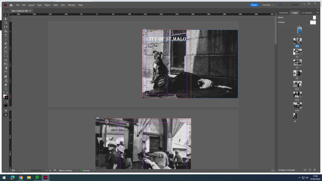
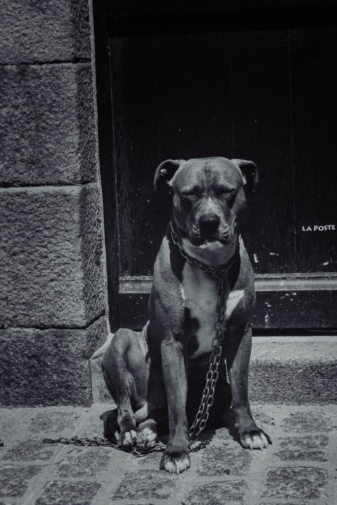
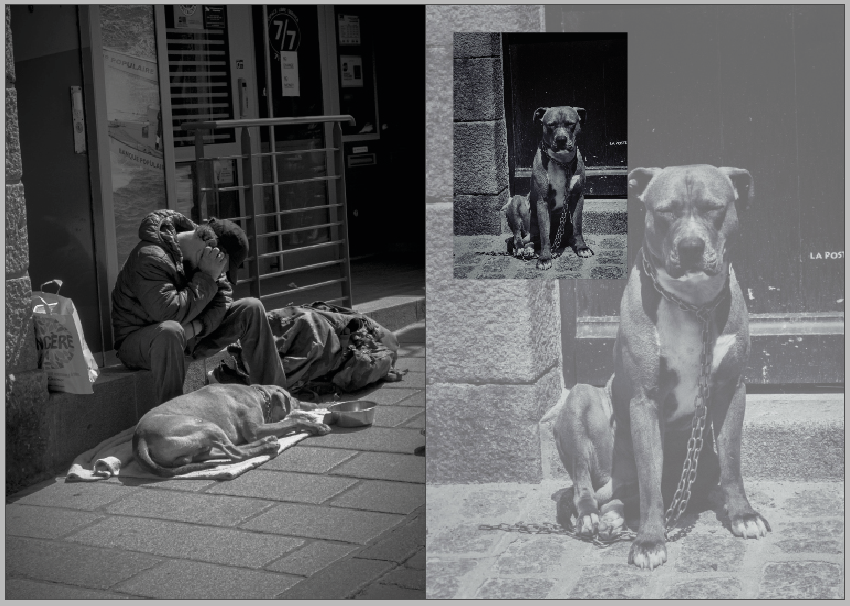
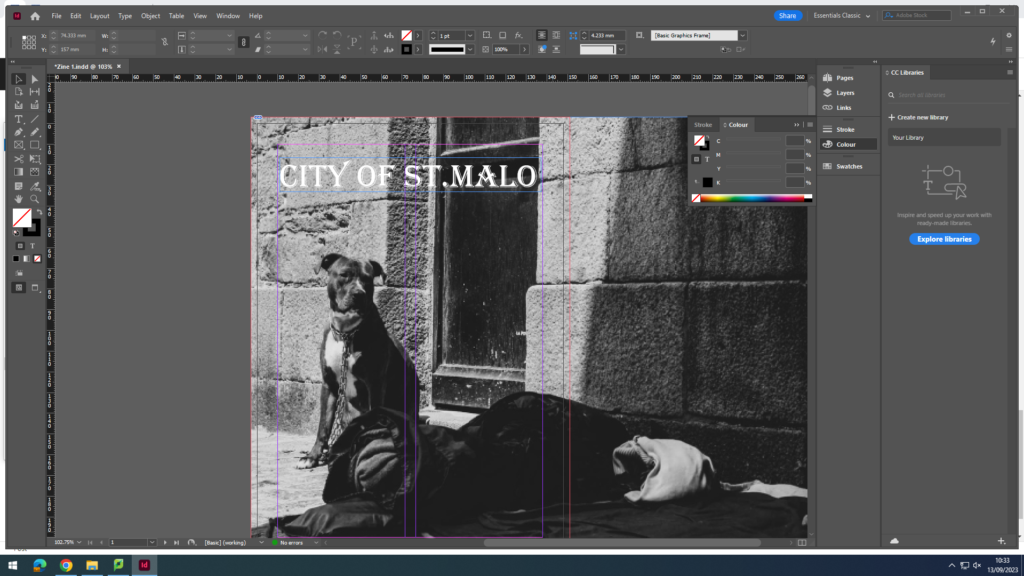
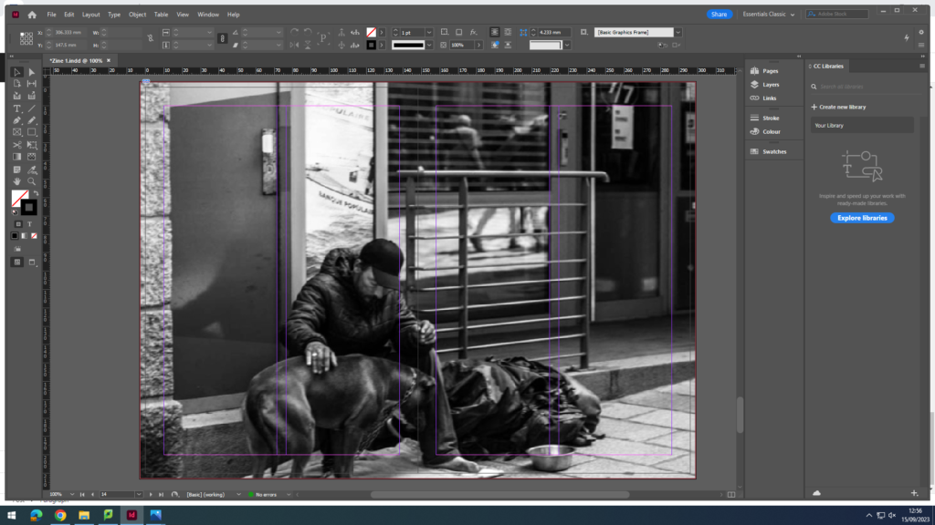
The front cover I wanted to include the a homeless mans dog, who was almost looking at where his owner sleeps but he isn’t there, which would attract the reader, but also how the image is strong with contrast and has subject.
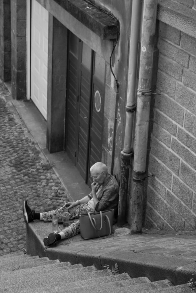
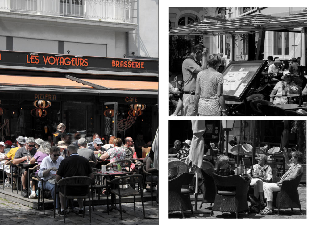
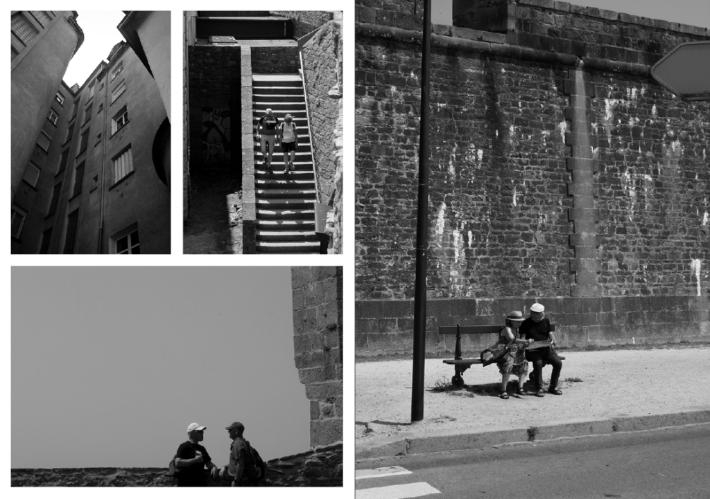
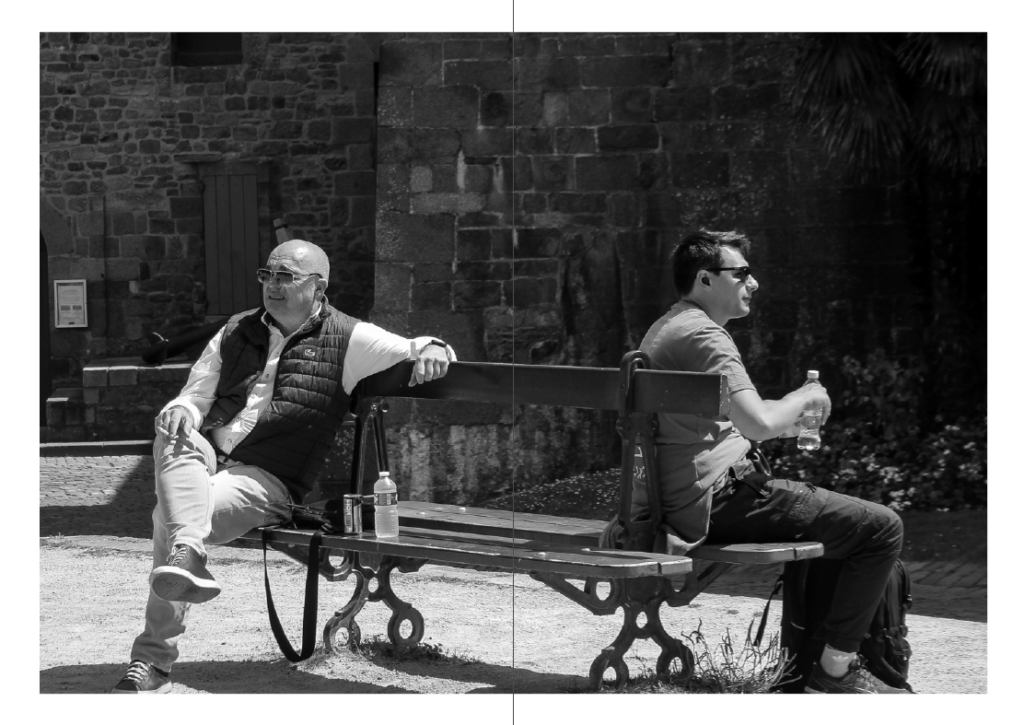
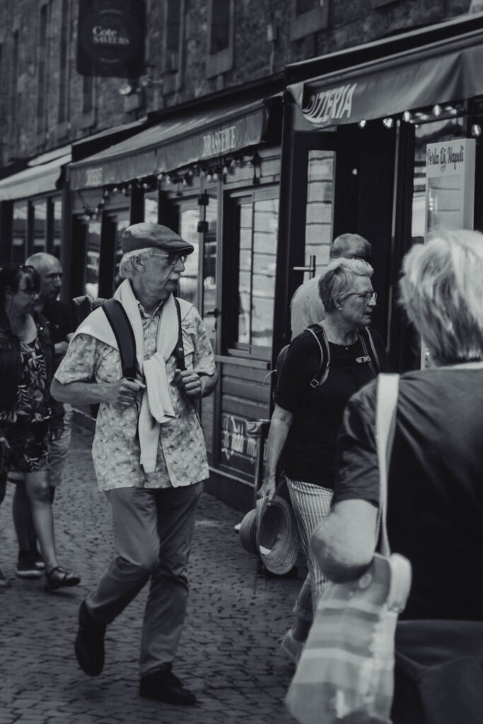
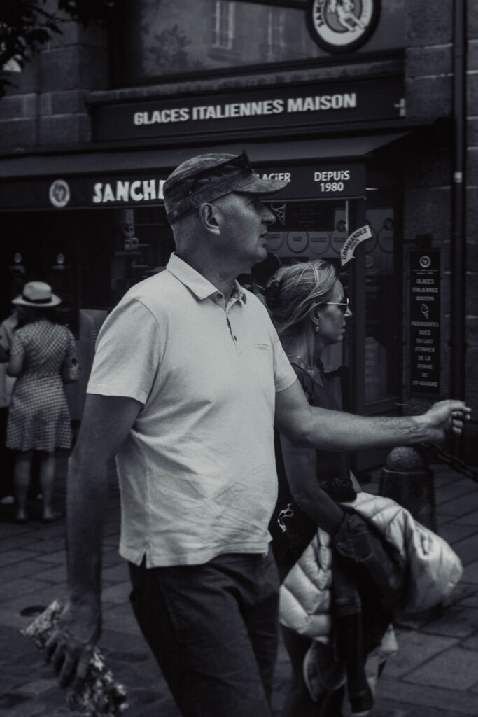
here I used a double page spread to show the publicity of some of the local areas, and how it shows many tourists. Even in the second one There where locals and Travelers, with some smoking and relaxing in the sun, and tourists walking around and eating enjoying their time.
I used the same here because of the angles I got from getting these photographs, but also the contrast of action and relaxation.
These images included a lot of character in the way where it uses couples enjoying themselves and a man smoking with some expression.
And lastly I used the homeless man and his dog lastly to also show the poverty in St.Malo.
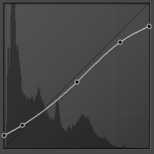
These are the photos from the St. Malo trip that I wish to use for my zine. I want to follow a vintage monochrome aesthetic, and to make the images appear this way using editing techniques in Lightroom Classic.
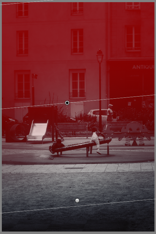
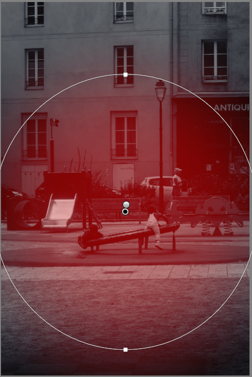
One of these techniques includes using the tone curve, to heighten and lower specific tones, and maintaining this similar curve in all of my final images to achieve the same effect.
I’ve recently started experimenting with using the radial and gradient editing features to use exposure and sharpness settings to subtly bring more focus to the subjects of my image, and it’s something I practiced heavily with my photos for my zine. I’m impressed with how they look and can barely notice the editing, but I’ve also noticed that I’m significantly more absorbed into these images and I believe this is a fantastic technique.
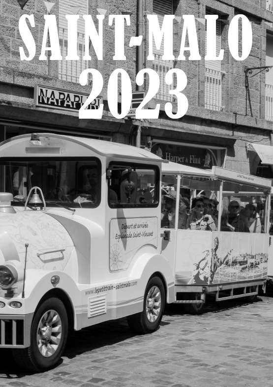
For my front cover, I wanted to establish the minimalistic style with the placement and font of the title of my zine – ‘malo.’ – in the bottom left corner. I decided to use only lowercase for the title as I thought it would bring more attention to the cover image instead, as I find uppercase to be more attention-grabbing and bold. I also find the photograph that I used to be quite appealing, as there isn’t much going on, but it’s still attractive to the eye and has a mixture of both hard and soft tones.
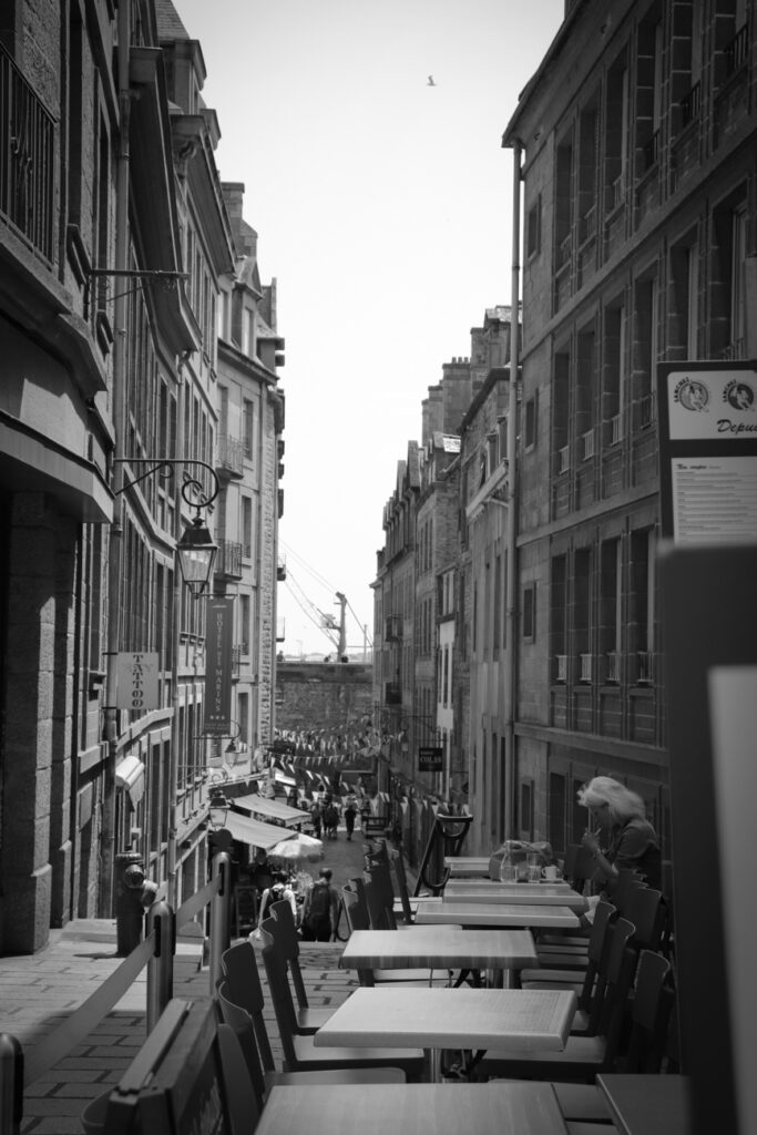
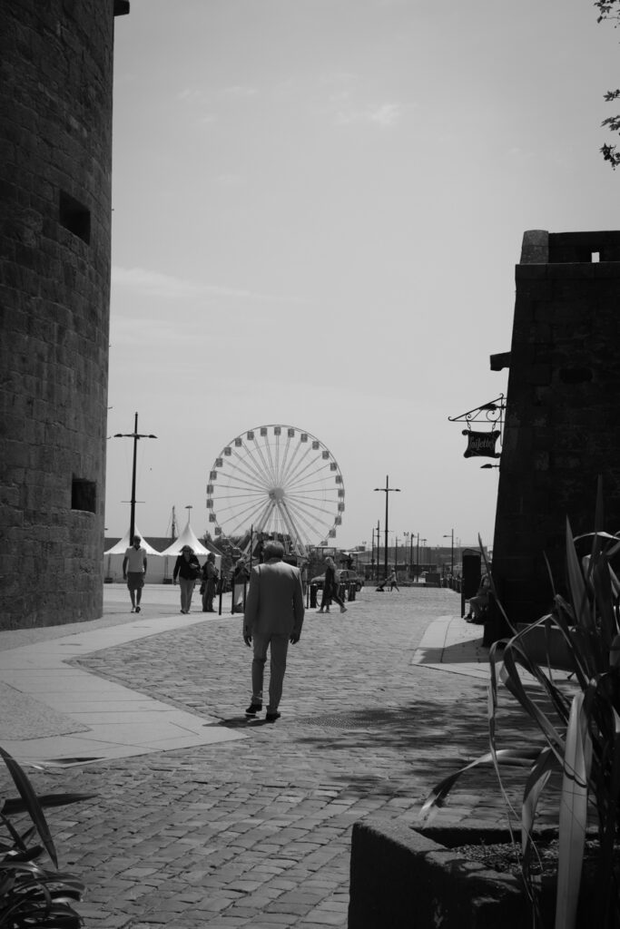
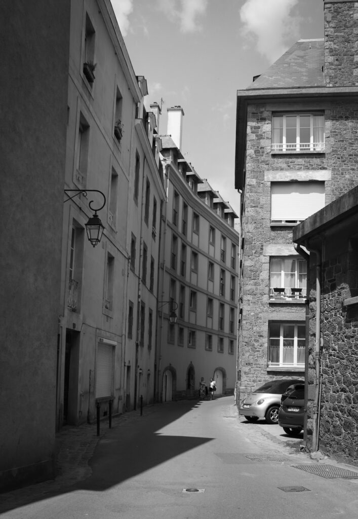
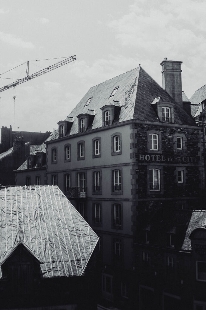
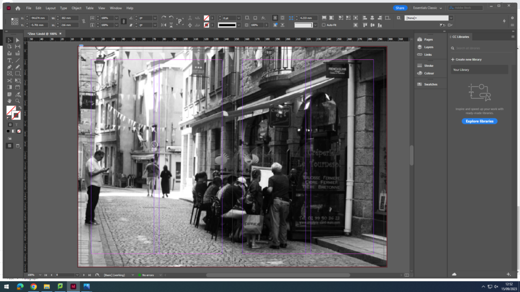
For my first pages, I want to introduce the reader to St. Malo, and to subtly display the town’s rich heritage and it’s popularity, which I plan to expand on in the text I want to add on the right-hand page, discussing the fortifications and the links the place has to WWII.
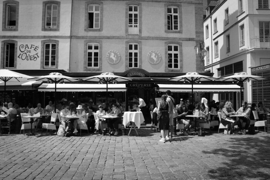
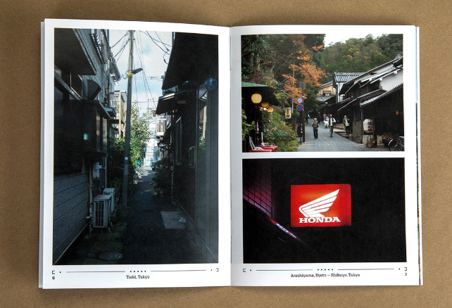
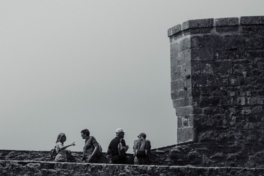
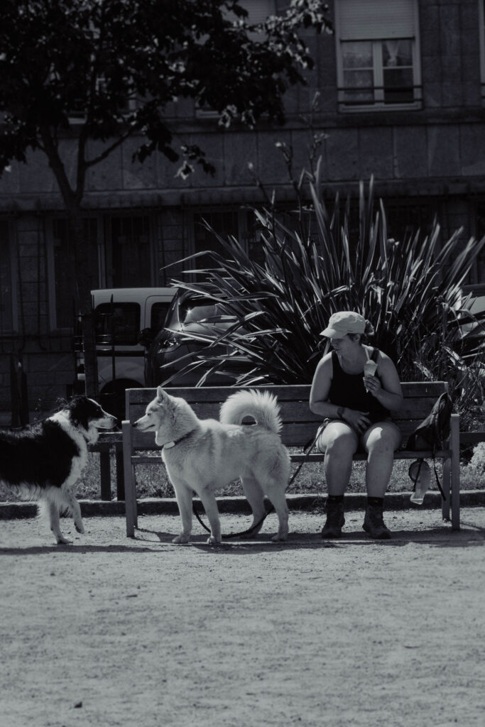
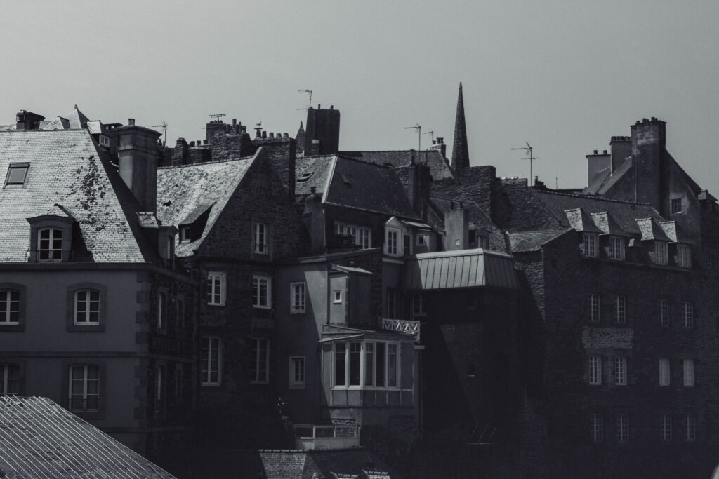
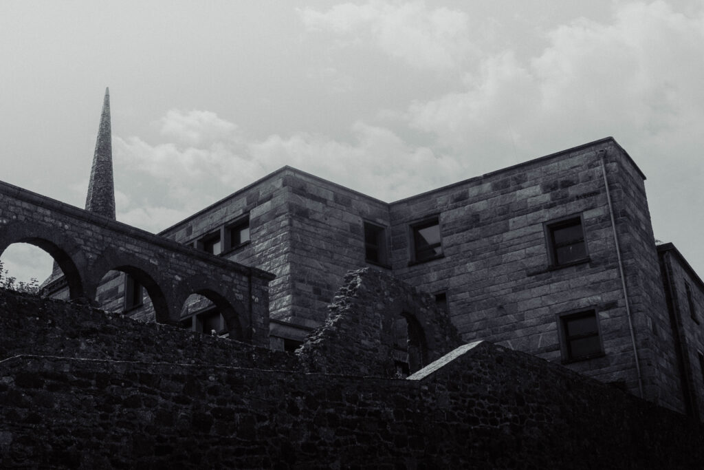
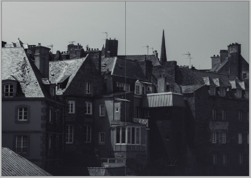
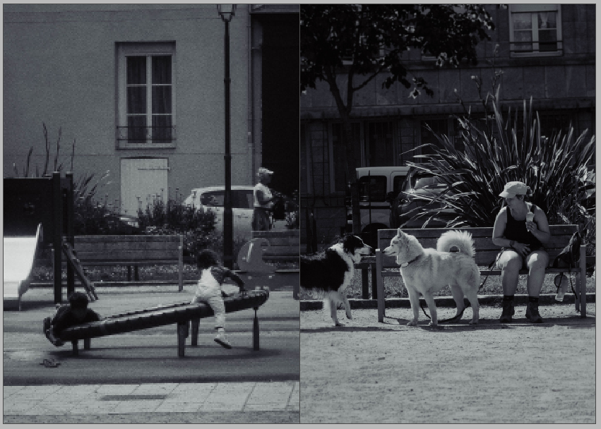
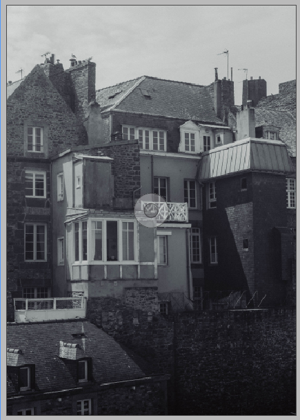
The next four pages are double-page spreads, featuring a landscape of the architecture and two scenes in one of the children’s parks. I think the buildings illustrate the history of St Malo and place it within a specific time period, opposing modern architecture and its placement within bustling cities, meanwhile the shots in the park display activity in the town today, showing St Malo’s adaptation to both the modern world and the rise of tourism; still remaining an interesting and beautiful place.
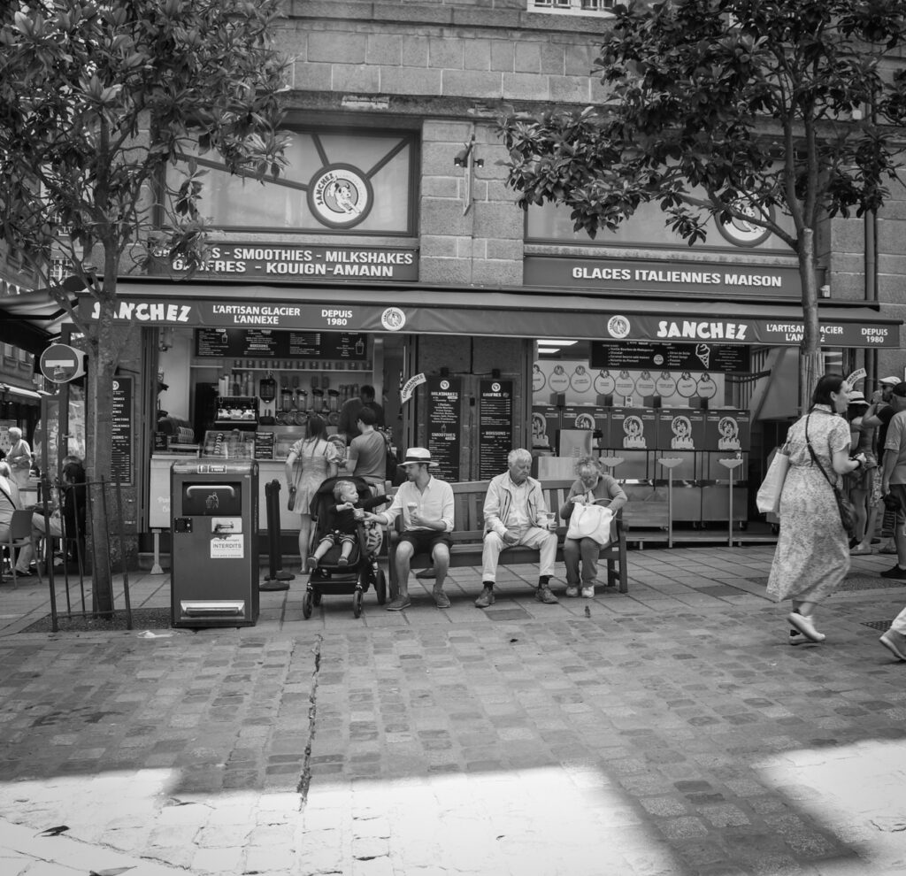
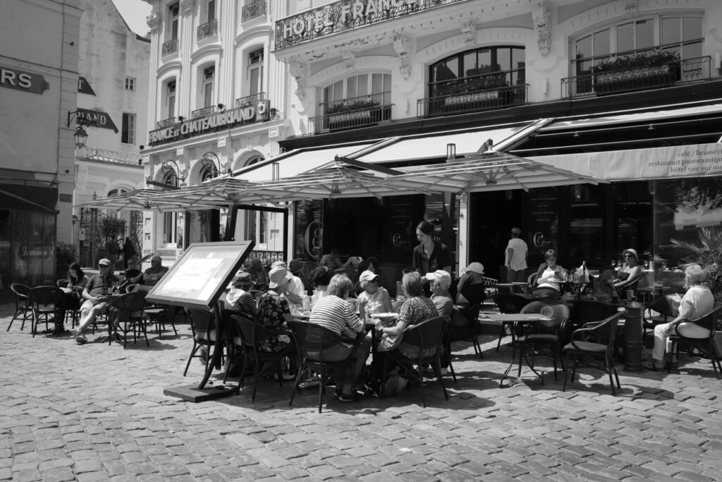
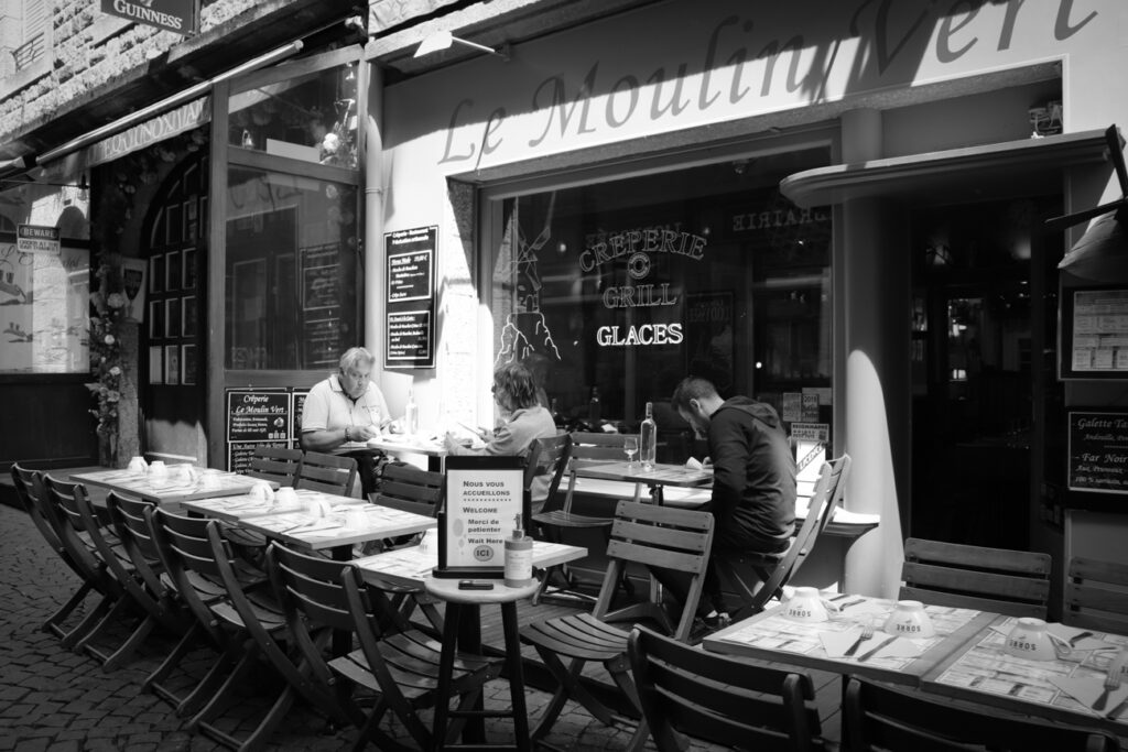
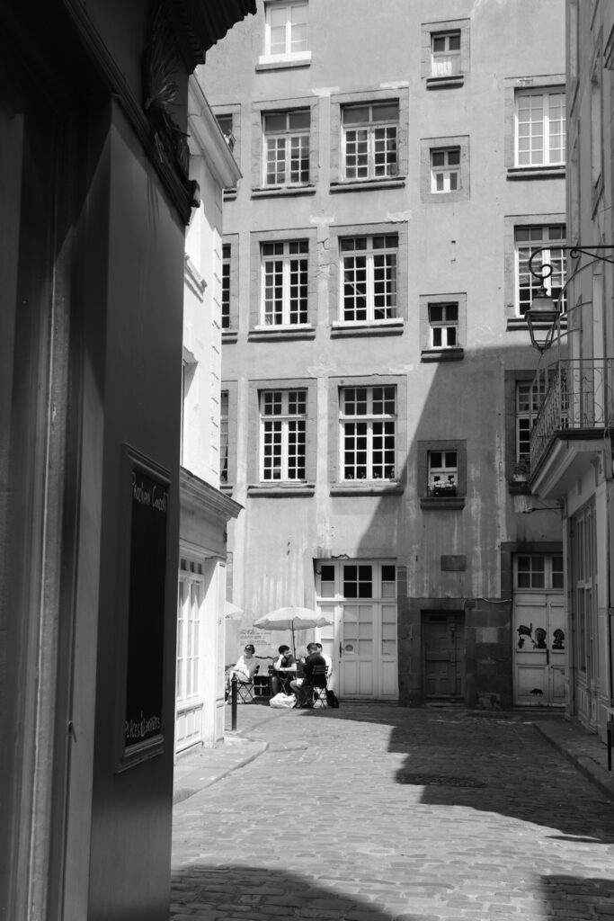
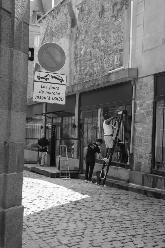
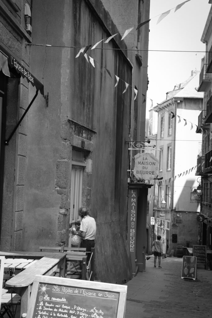
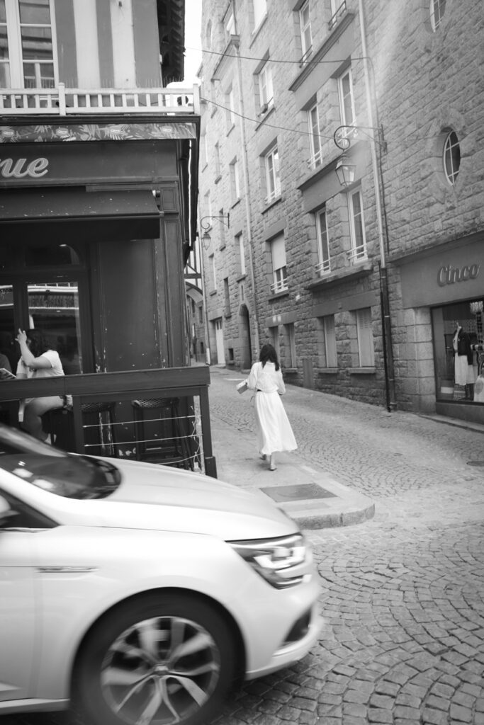
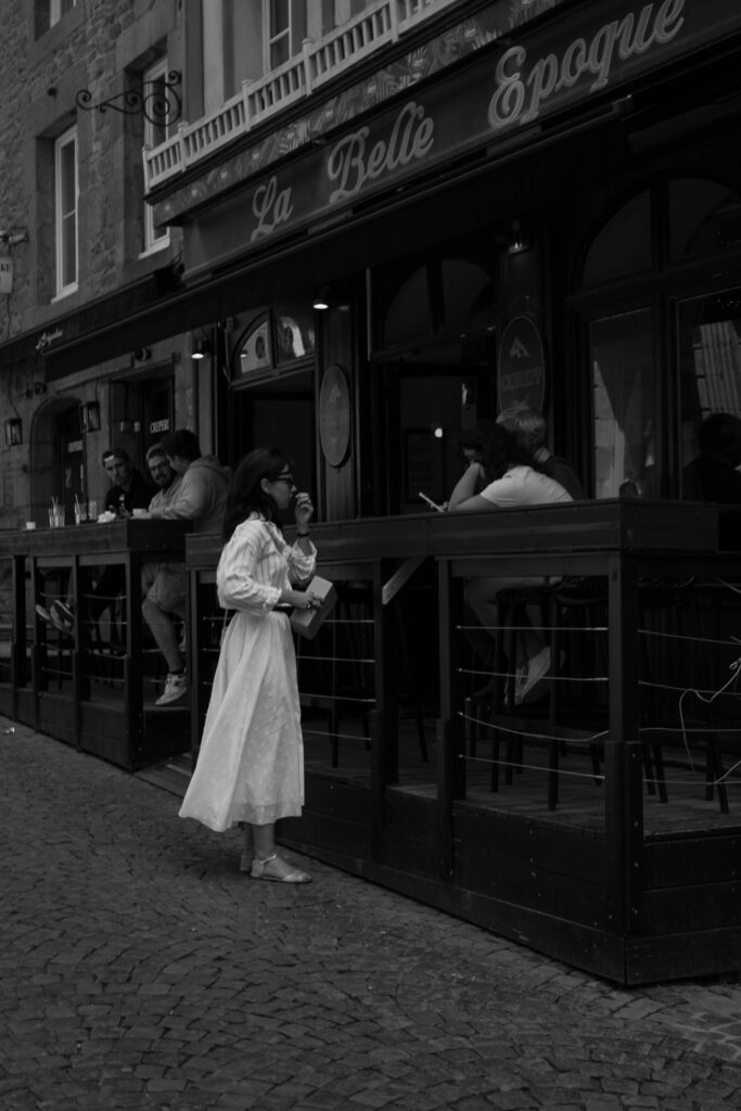
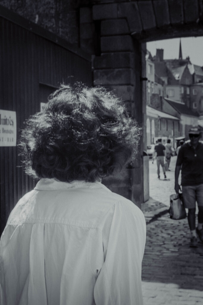
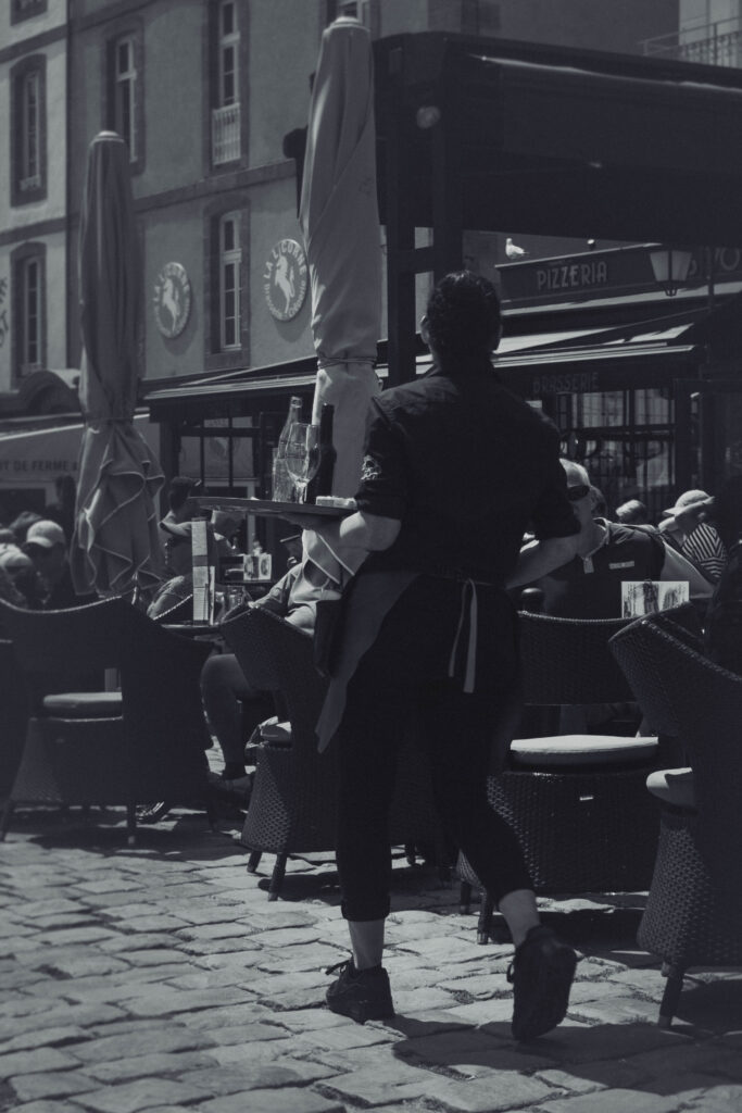
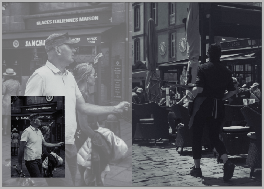
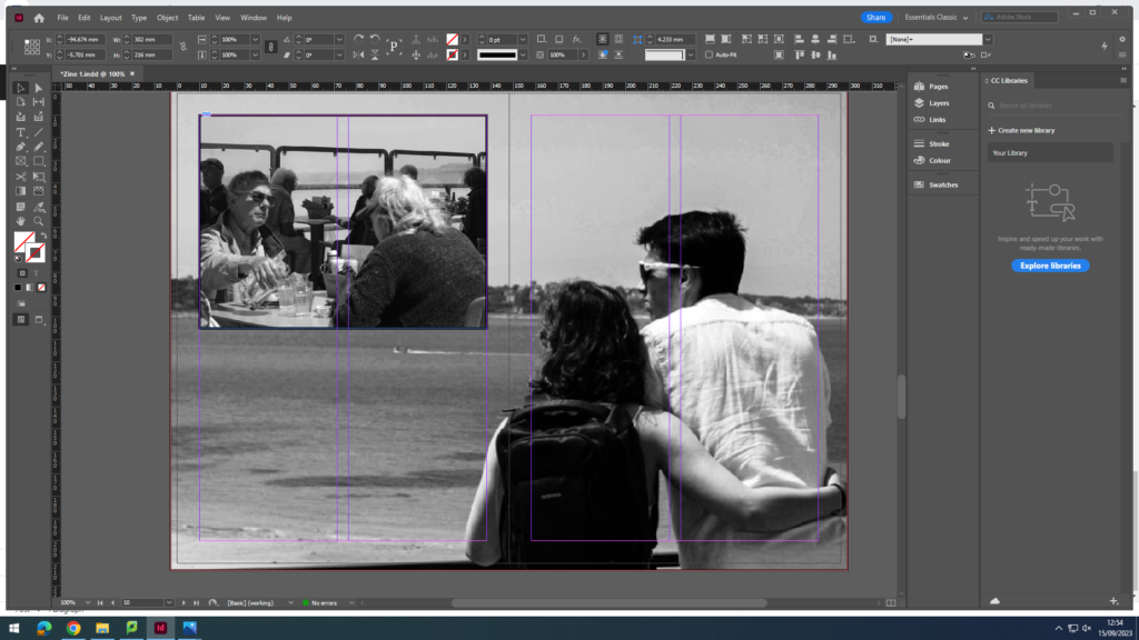
On these pages, I plan to discuss the small resident population within the castle walls and how St Malo is a transitional space for tourists to explore and eat, not really as a space for long stays or to live in, much like it has been throughout its history. I used two photos of a server in a restaurant and a couple looking for somewhere to eat to reinforce this subject into the reader’s mind.
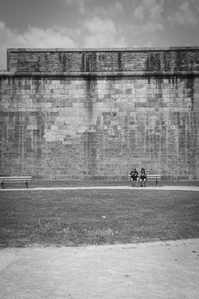
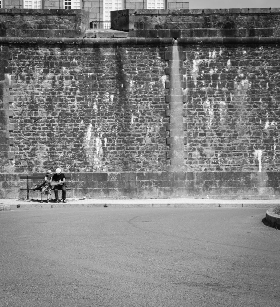
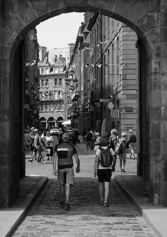
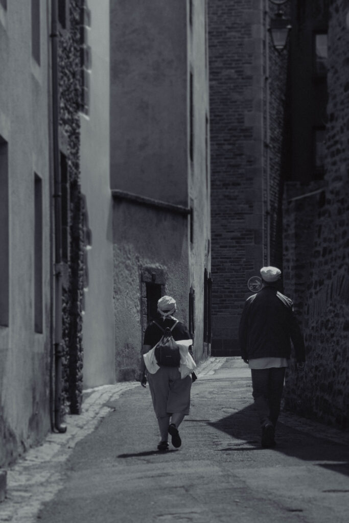
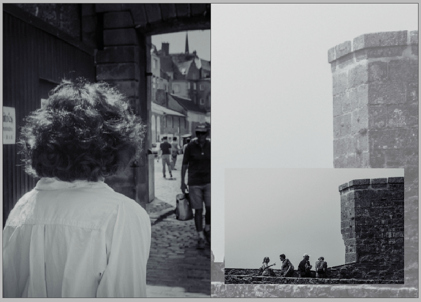
This double-page spread features an image that I think clearly demonstrates Cartier-Bresson’s style – focusing heavily on the sharp angles and geometry featured in his work at St. Malo, which I’m very proud of.
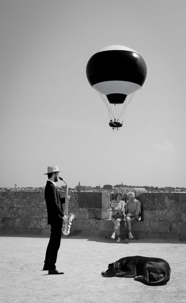
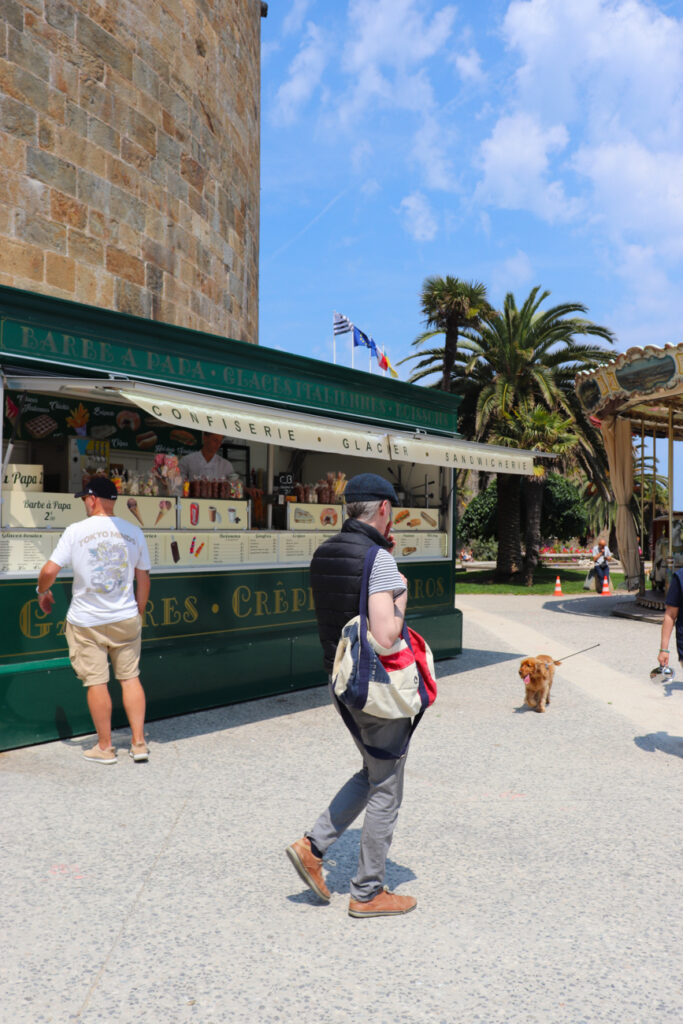
On these pages, I want to discuss St Malo as a “human environment,” by which I mean that despite the town’s idealised reputation as a gorgeous tourist destination, and as a place to ‘escape’ to if you’d like, the residents and tourists still face their own difficulties here, much like anywhere else in the world, such as purse-snatchers, people who have to beg to survive, and witnessing animals tied up with chains and abandoned, similar to the photos on these pages, or how it appeared to me as I walked past.
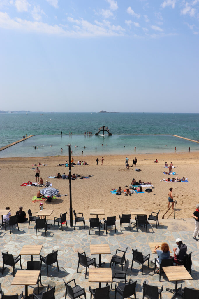
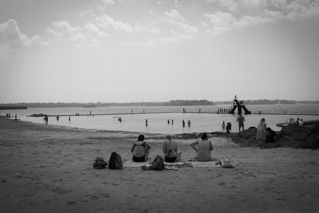
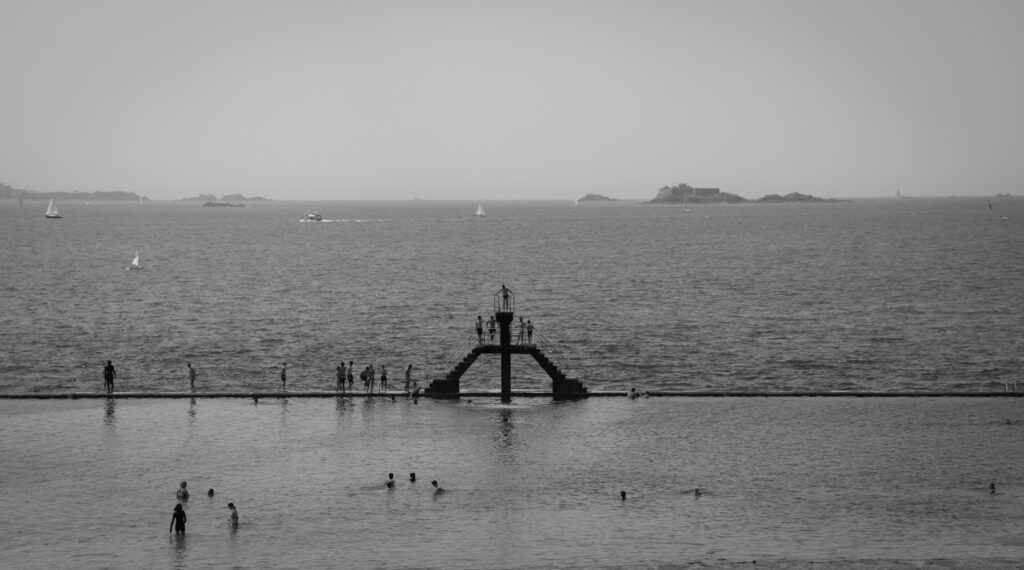
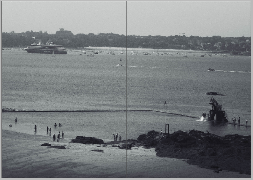
I used another double page spread to end the zine on a more positive note, showing people enjoying their time on one of the pools on the beach queued up to use the diving board.
For the back page, I just placed a similar landscape of the town’s architecture to mirror the front cover of the zine.
Zines are self-made, printed set of images used to tell a story. The word comes from the word “magazine” as it follows the same style, and sometimes layout.
Some of the most famous photography zines:
Chloe Sevigny — No Time For Love.
Daniel Arnold — Photos.
Hamburger Eyes — Celly Brain.
Ari Marcopolous — Directory.
This is my zine mood board:
My zine will be 5.8”x 8.2” and have 16 pages but zines can be any shape and size.
Homeless dog without its owner as the front (and back) cover to attract attention with a title of “City Of St.Malo”.
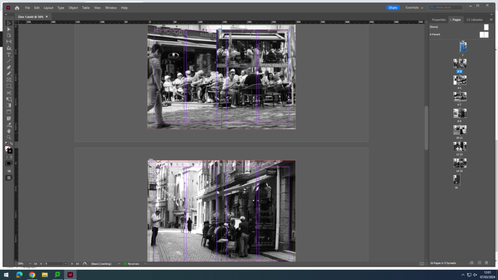
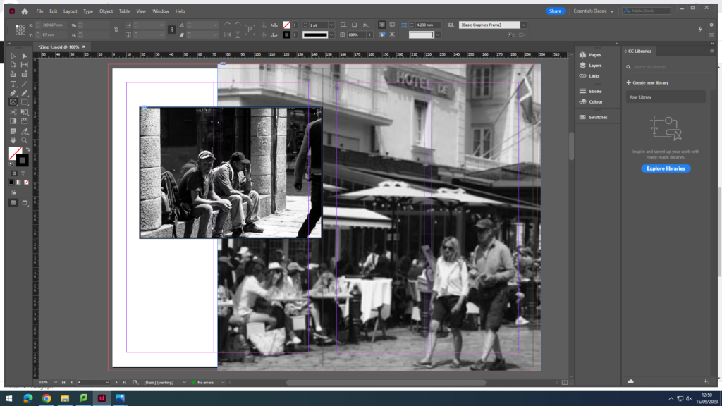
Double spread of tourists and locals getting food from what looks to be a small business.
2 images. One being foreign tourists who looks to be trying figure out where they are and cool down from the sun. The other image consists of people eating at a restaurant with a couple passing by. I chose this layout because I thought it looked good, unique.
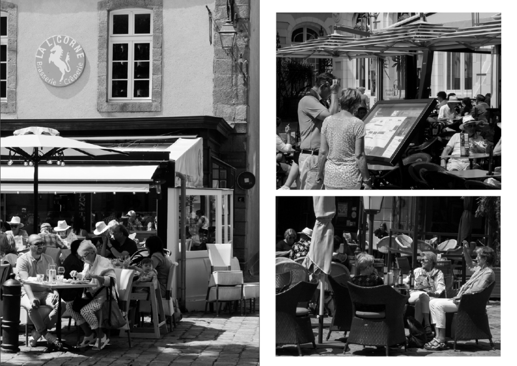
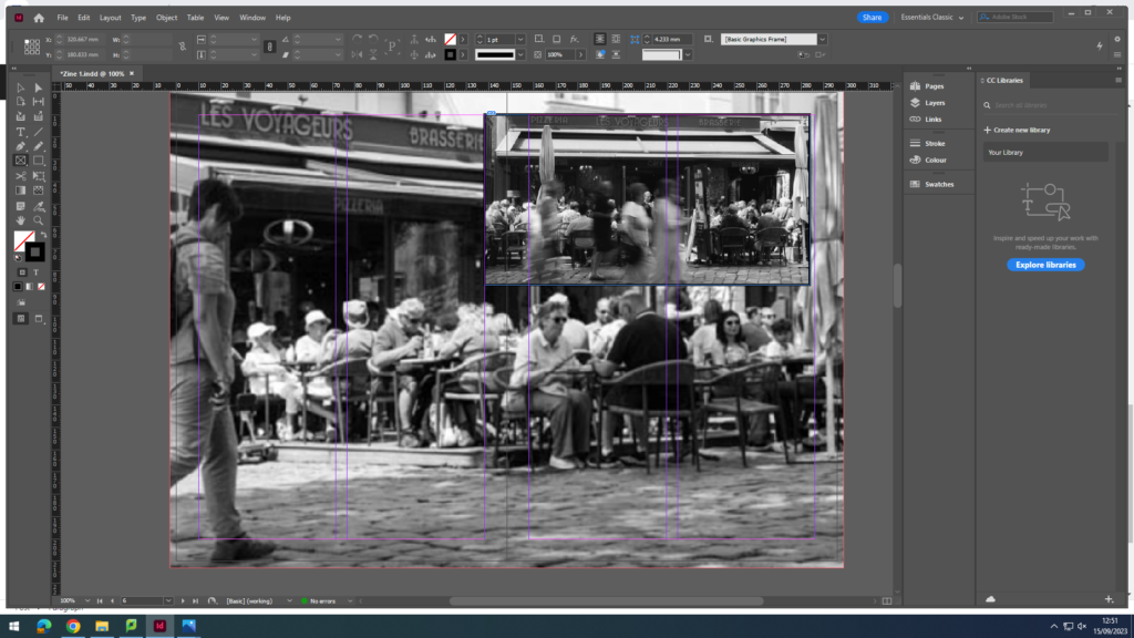
These images are similar as it is of the same restaurant, but I wanted to capture people eating from a low angle and the activity of the restaurant, but also wanted to capture an image of people walking by and making the exposure time longer to create a blurry effect, whilst the people sitting down look normal.
Normal double page spread of an image of a small restaurant with passing people, and added a boarder to make the whole zine look even.
I liked this layout because it involves two couples young and old, gives a good contrast in the images, and shows them enjoying their time at St.Malo.
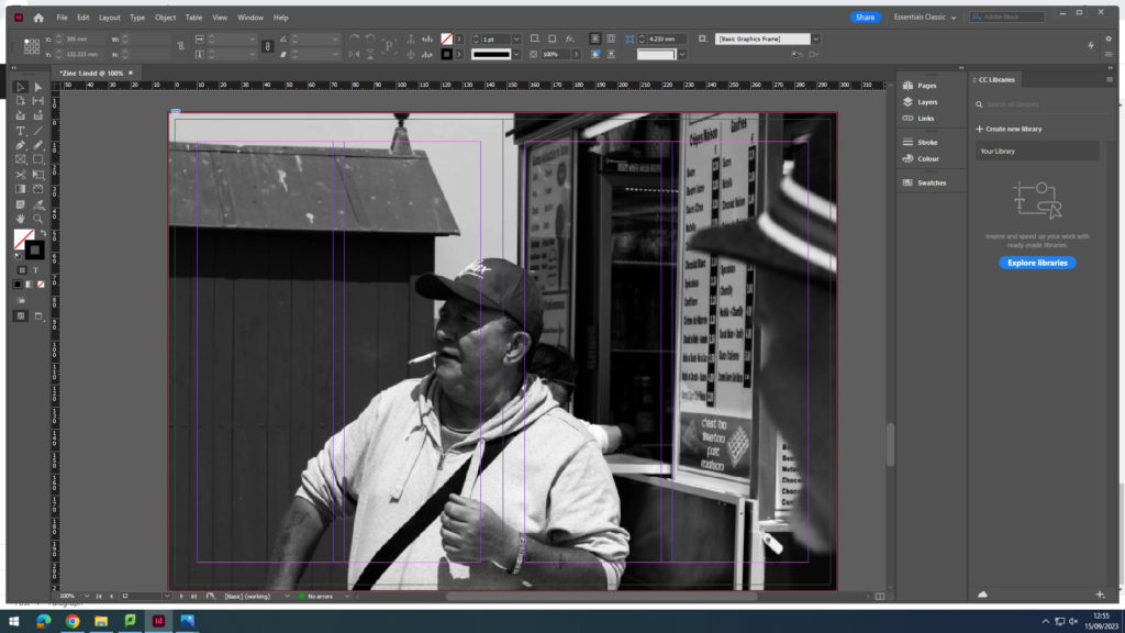
I wanted this image to be double page spread just because of how funny and cool this guy looks, and it shows the variety of people who visit or even live in St.Malo.
I chose this for the last image to also show the poverty that lives in St.Malo, and how its not all good, there are always areas in places which have this. And there is a dog.