Category Archives: Uncategorized

Filters

Author:
Category:

Narrative & Story for Zine

Focusing on the people standing out that are silent or focused amongst the speed of the world passing by them. Also showing their style and their place/purpose in Camden.

My Images

In my zine I am going to lay these out in an order that shows my journey to Camden and the different kinds of people I saw on the way.

Archived Images

Images that will influence my text, layout and style

Zine planning

My main images that I think have the best composition and meaning:

I’ve chosen these three images because they all have a main and obvious focal point for the viewer, which causes them to stand out unlike some of my other images where the focus is hidden amongst a crowd. They also give the viewer a chance to focus on the individual in the image and consider their story. I might use these images for full page images.

I’ve edited this image to have movement around the subject so that the focus is more obvious. I also like how the main subject is still, unlike everyone else.

These images are my second favourites, and I may use them as full page instead because there is a lot in the composition and could cause the page to become confusing, or I will place them next to a more simple image like the ones above.

Front Page

I attempted multiple designs to see which image and design was the most effective.

I decided to choose this image and text as my front page because I felt it was the most effective/ dramatic. I like the movement I created in photoshop as it creates more of a focus point on the main subject.

For the rest of the pages I just placed them in, cropping some and leaving some original. I put them in an order so a basic story could be told of going round Camden and seeing the different types of people.

For the back cover I reused one of my other images and added a transparent rectangle over it. I felt like ending with the beginning photo was a good idea as its revisiting the start.

NAZI OCCUPATION – ELIZABETH CASTLE RESEARCH

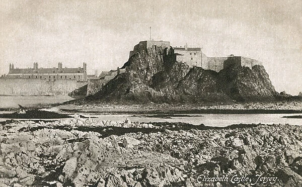
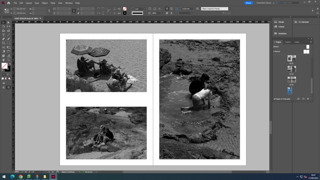
Elizabeth castle is located in St Helier, Jersey. The castle was built in 1601, making it 422 years old and for 400 years this contained a priory, and for the last 350 years a castle. It is accessible only on low tide by foot, if the tide is high, you have to get a boat over. Construction of the castle began in 1594, and continued in the first years of the 17th century under the then governor of Jersey, Sir Walter Raleigh, who named it “Fort Isabella Bellissima” (the most beautiful Elizabeth) after Elizabeth 1st.

Today, the castle is administered by the Jersey Heritage Trust as a museum site: among the historical displays are the Jersey Royal Militia Museum holding several centuries of military memorabilia. Every Sunday through the season when the castle is open, a team of historical interpreters recreate the garrison of 1781, at the time of the battle of Jersey. Displays are given of musket firing, cannon firing and civilian life.
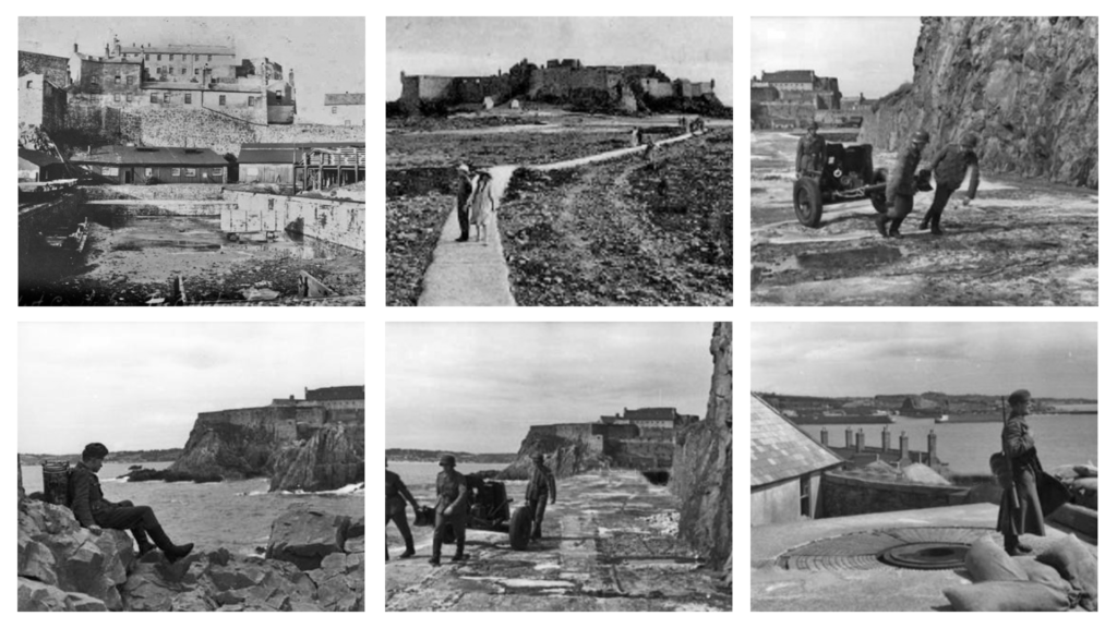
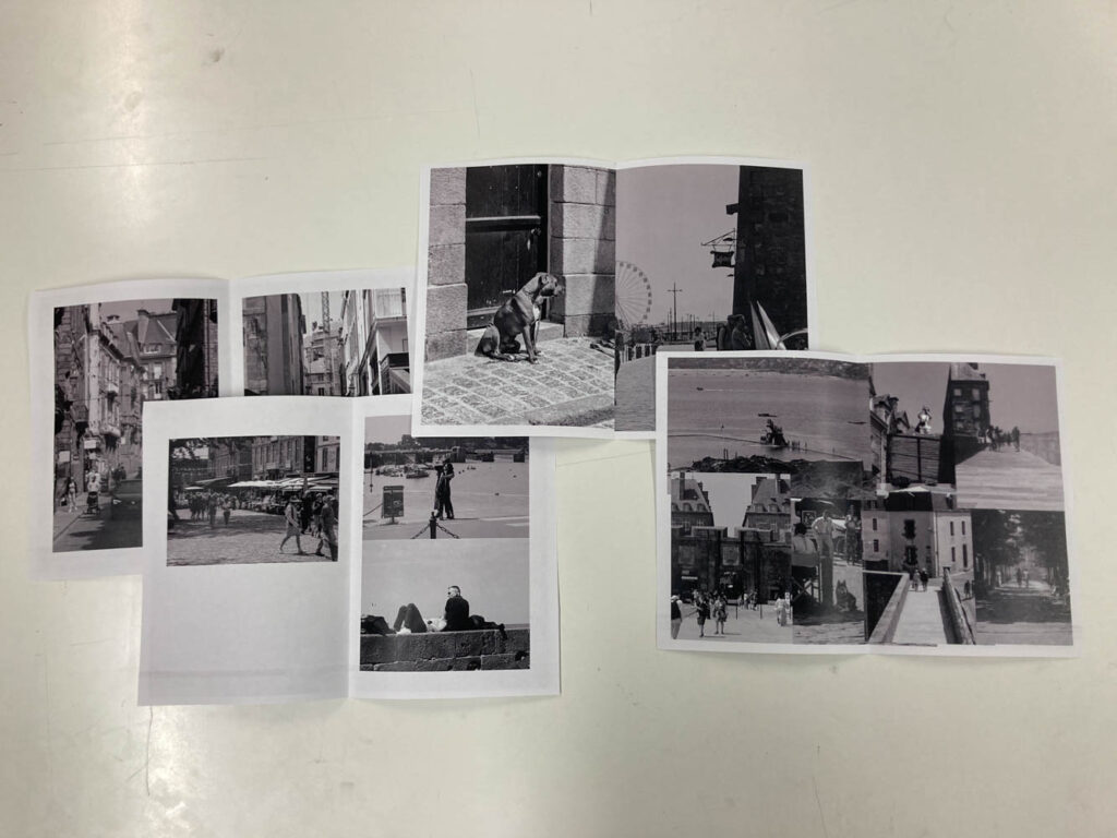
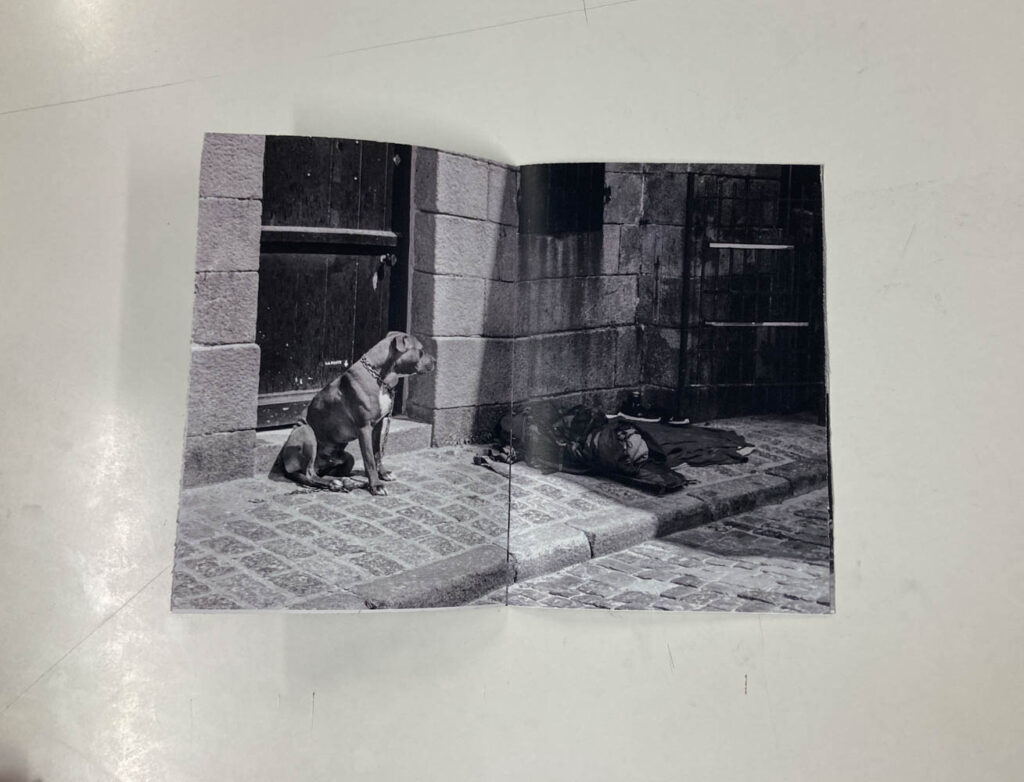
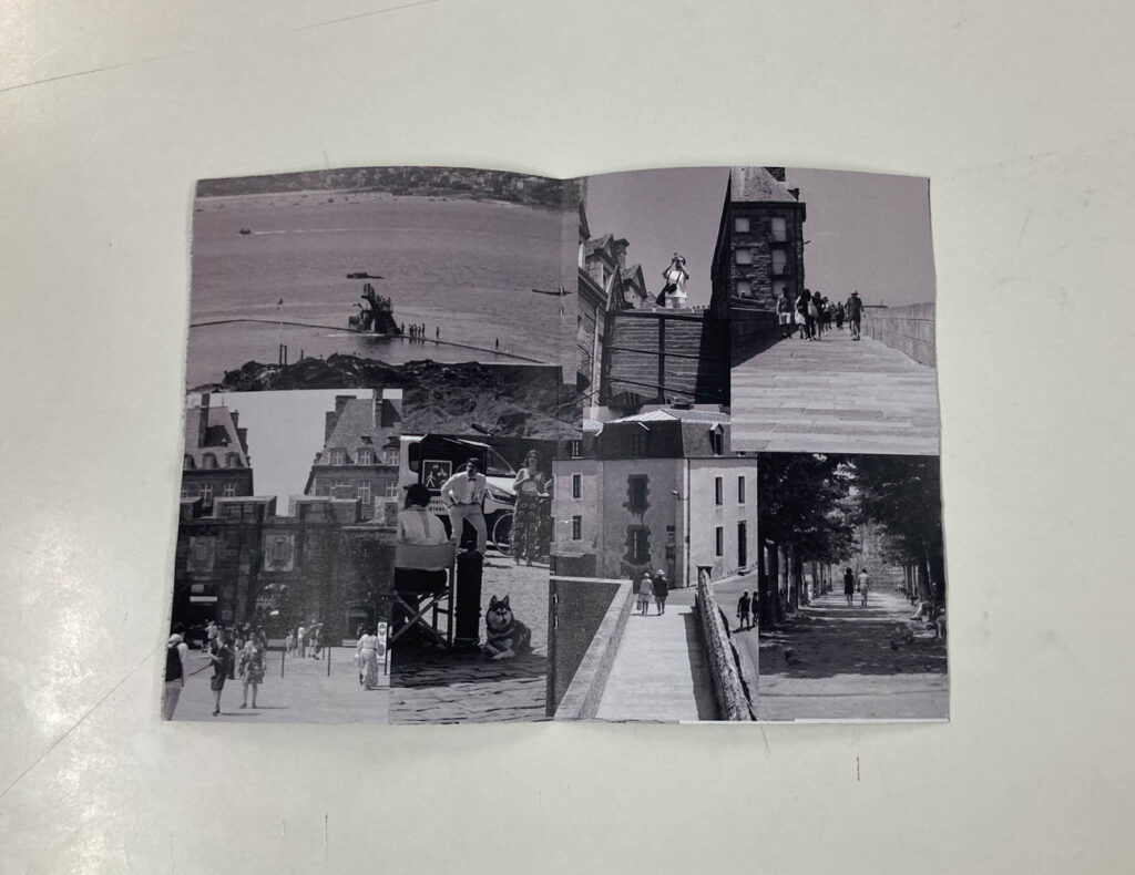
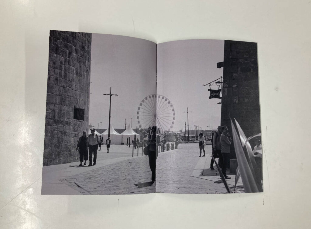
Photo archive

Occupation

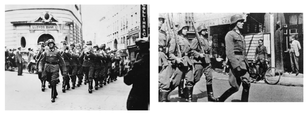
The Occupation of Jersey by German Forces during the Second World War commenced on the 1 July 1940. The Occupation was to last for nearly five years and eventually ended on the 9 May 1945 – Liberation Day.

Following the defeat of France, Winston Churchill reluctantly made the decision that British troops be withdrawn from the Channel Islands and redeployed. This left the five islands completely demilitarised. Around 25,000 occupants were evacuated to Britain. Almost all of Alderney’s residents were evacuated, along with around half the population of Guernsey and a fifth of the people from Jersey. The United Kingdom government provided ships to evacuate women, children and men who wished to join the forces when it seemed that Occupation was inevitable.

Britain suppressed the news that the islands had been demilitarised, so when Germany attacked it did so with bombings, killing 44 islanders on Jersey and Guernsey. The Nazis occupied four islands – Jersey, Guernsey, Alderney and Sark. It was the only British territory to be occupied. They would remain there until the end of the War in Europe in May 1945.

Hitler believed the Channel Islands might be a ‘stepping stone’ from which to invade Britain. They were also a useful propaganda tool – to show that the Nazis occupied British land.

German Military

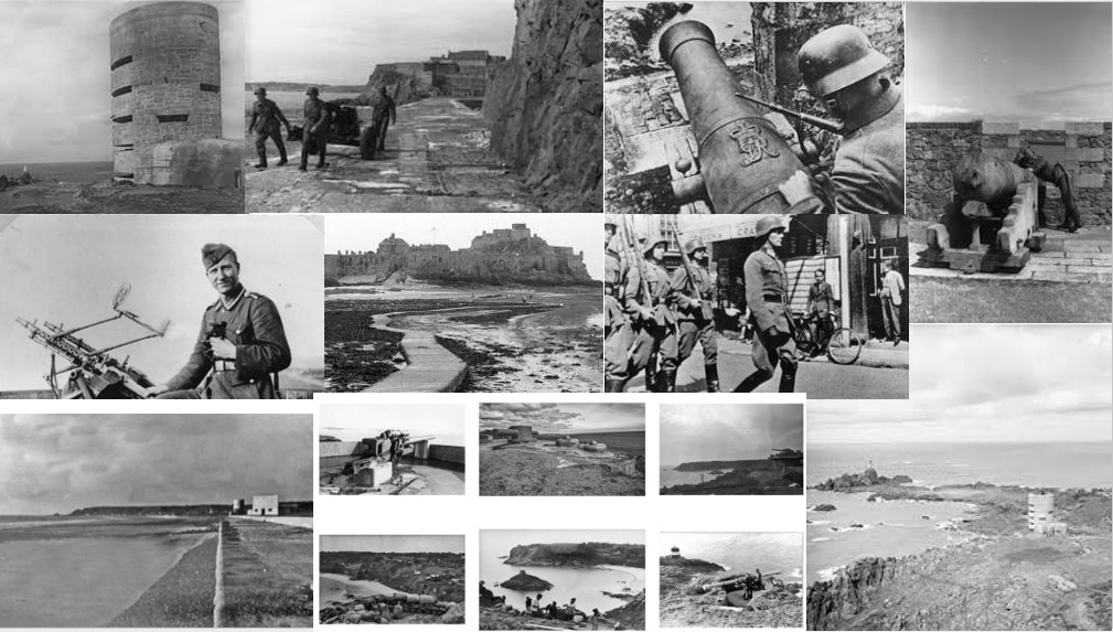
The military consisted of varying numbers of troops, around 25,000 in October 1944, with an additional 15,000 Organisation Todt (OT) workers once fortification of the islands began in October 1941.
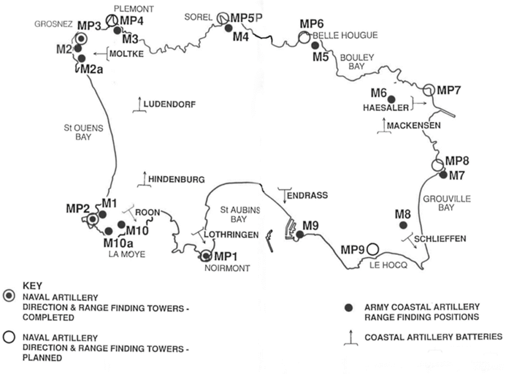
Gun Emplacements

To counter any attempted Allied assault, beaches were mined in vulnerable landing spots, anti-tank
walls of steel and concrete were built, large clifftop guns put in place, camouflaged gun emplacements installed, the walls of Elizabeth and Gorey castles reinforced, steel spikes planted in
fields where aircraft might land and a radar station established at Les Landes. In order to ferry the
vast amounts of concrete needed, a railway network was created to link with the Ronez quarries on
the north coast.

Synopsis

This short film will consist of images produced at various artillery sites around the island. A voiceover of an elderly man, discussing his experience of the war, will accompany the still images, starting at Elizabeth Castle and expanding to multiple heritage sites. Images sourced from the Jersey Archive will be compared to newer images photographed by us. The new images will consist of differing angles of the heritage sites/artillery emplacements (aerial views filmed by drone).

Mood Board

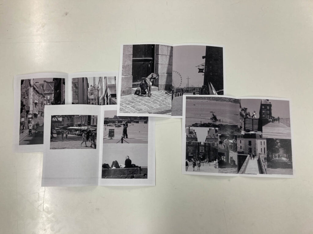
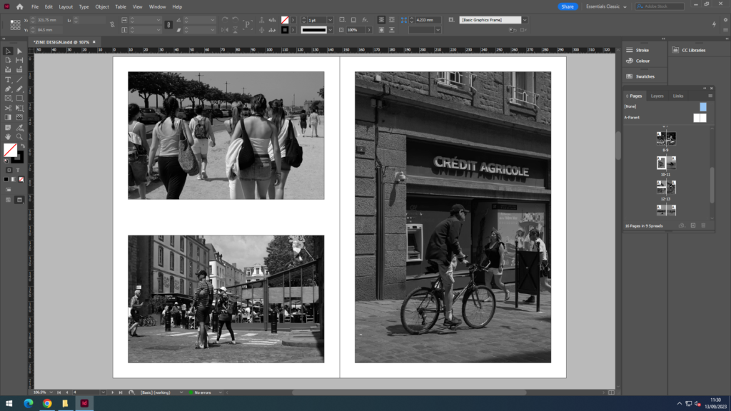
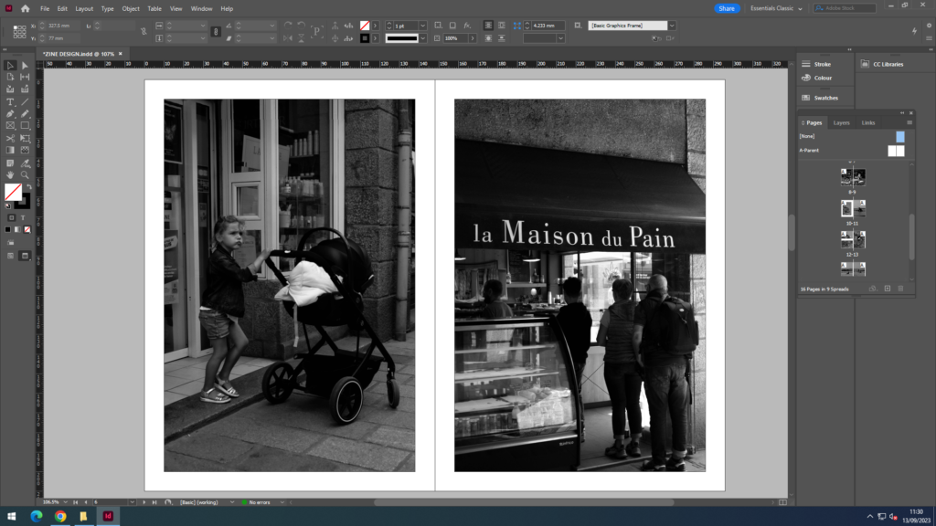
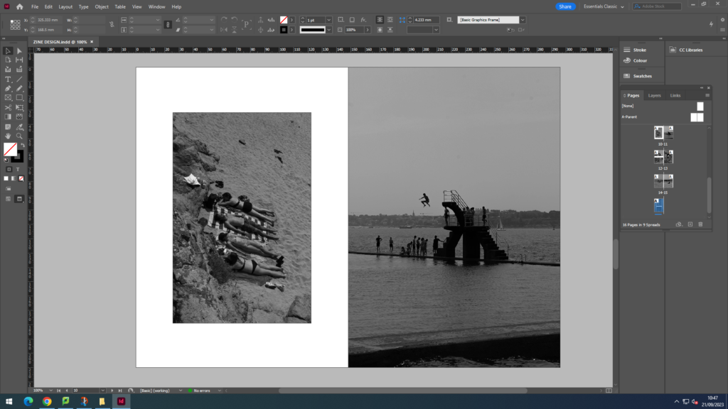
This mood board shows my inspiration for our short film and what we want the final outcome to look like.

zine evaluation

Overall, I am happy with how my zine turned out and think that it shows the viewer a good story timeline. I think that my images work well together and the colours in them contrast nicely making the images bold. I think all of my images are very clear and have a main focus point on the cyclist. This helps the viewer put the story together and understand it.

Page Spreads

Mind map of inspiration for my picture story from sites like the Guardian and newspapers. The use of large writing to present the story in the title is prominent in newspapers, and I will use this in some of my examples. They also tell the story with wording around the best images that present it, I will try different layouts for this.

Overall, I think that this is my best outcome. I like the simplicity of the layout, with two main images on the side, and two smaller images that complete the story. I chose to add automated text because it separates the images and includes more to look at.

I originally didn’t have a title, however adding one gave it more of a backstory, explaining what’s going on and where it’s set.

I also experimented with changing the opacity of images and using them as backdrops.

This was my most basic edit, which I liked, however I thought it was too simple and boring. I added an image with low opacity behind it to make it more interesting, but still didn’t think it was my best.

Zine – layout and design

Zine layout

Front cover

For my front cover design, I chose to make the title tinted so you would still be able to view the stained glass window behind.

Page 1

For this page, I chose to have my strongest image on the right and increase the size in order to make it more pronounced to the viewer.

Page 2

In this page I decided to have the image take over two pages as this way it would let you notice the finer details of the image such as the reflections in the car and windows.

Page 3

Here I decided to have my two colourful images contrasting the monochrome one by pairing them up against it but making them both smaller.

Page 4
Page 5
Page 6
Page 7
Back cover

For the back cover, I decided to link it back to the front cover by using a photo with vibrant colours as well as copying the label that I used for the title.

Printed & Bound

Pages of my zine printed out and stapled together.

I like this little photo zine, it features all my best photos I took in St. Malo and displays them very neatly and tidy. They are all black and white to match that of a newspaper about St. Malo. The book overall uses A5 pages stapled together. The size makes me think its like a pamphlet sold to tourists in St. Malo.

DESIGN AND LAYOUT

DESIGN AND LAYOUT OF MY ZINE:

DESCRIPTION:

For my front and back page I wanted a simple image, to keep it a minimalistic aesthetic. The statue worked as my front image because the angle of the image made it seem like he was looking at the audience and pointing at the views in St. Malo perhaps making them more excited to open the zine. Furthermore I think my title ‘Bonjour St. Malo’ worked with my image of the statue as it suggested that he was greeting them into further reading the magazine and welcoming them on looking at the attractions in St. Malo. The back page was an image of a cartoon character that was stuck on a wall is a random street, however I think it worked well as my back page as it was simple yet added a little comedy with the yelling female cartoon character. The start of the zine are the street and attractions in the little town of St. Malo. Images included restaurants, tourist stands, and people walking along the street. This was broken by a landscape image of a set up that a restaurant created with some teddy bears. This is so the middle broke up the two halves of the zine. On the second half of my zine I included images from the coast (little beach found in St. Malo). As the weather was nice many people were at the beach with resulted many successful images. Images that I included in the blog included, people jumping from the driving board, groups of people tanning, and kids making sand castle and playing in the water. Overall with my zine design I tried to create a minimalistic and clean zine which didn’t look to overcrowded with image, and looking at the final product I believe I achieved this