
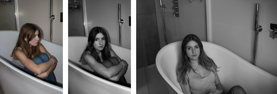


Response:


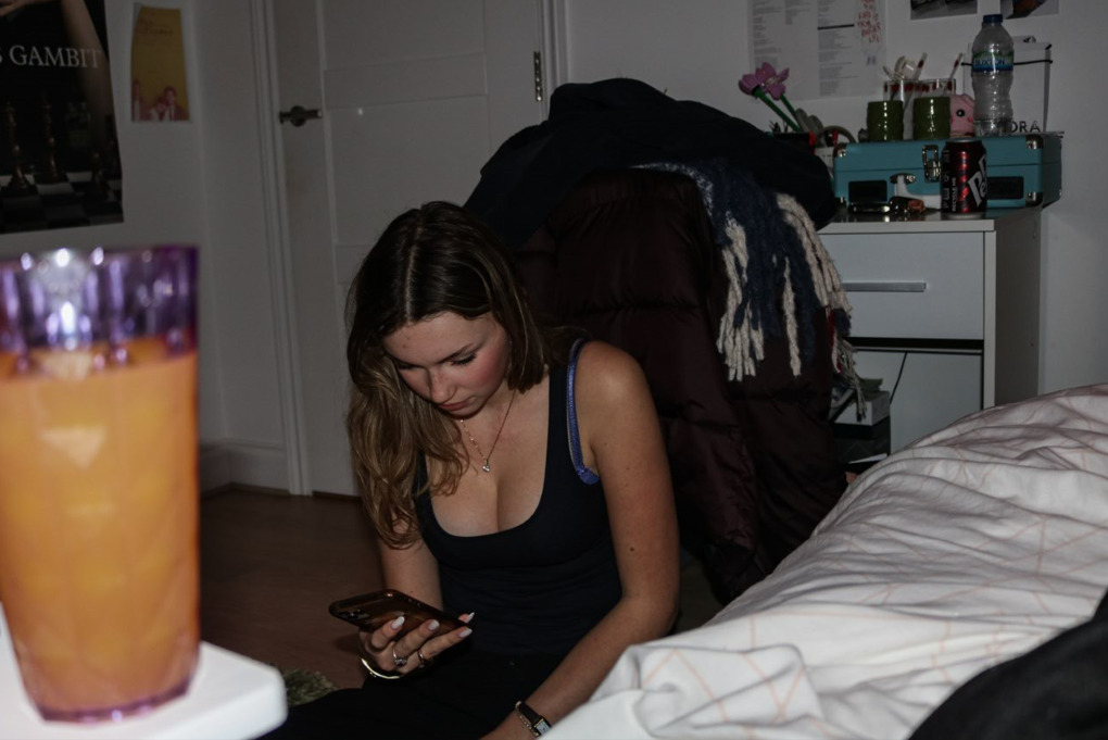


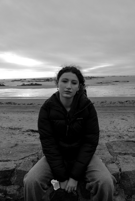


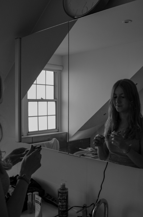


Image comparison:

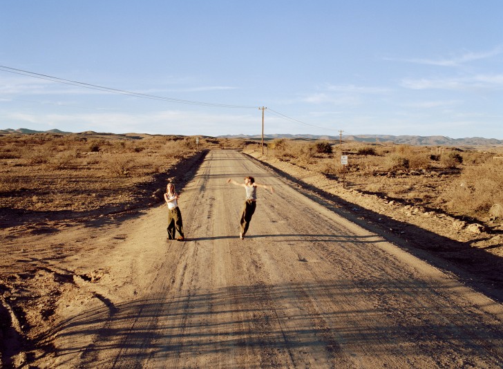
Both images show a long road in an empty and desolate area and show a girl or girls having fun. The image on the right shows two girls dancing and, my image, on the left shows a girl running across the road. They both have the feeling of fun and freedom as the girls are small compared to their surrounding environment which represents their lack of responsibility and how they aren’t tied down. In both images the girls are positioned in the middle so that, although the background is the biggest element, the girls are the focus of the image.
Final images:


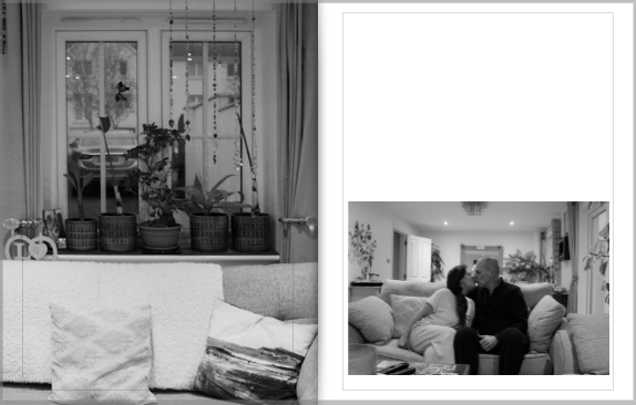
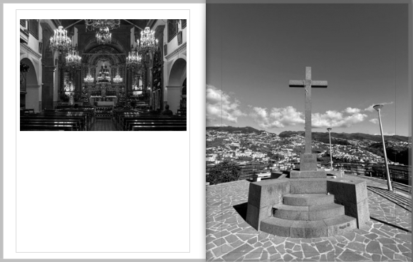
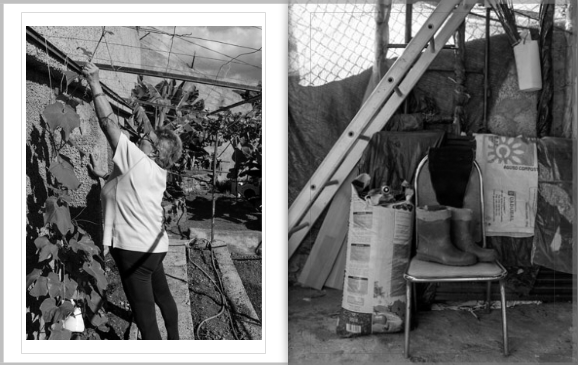
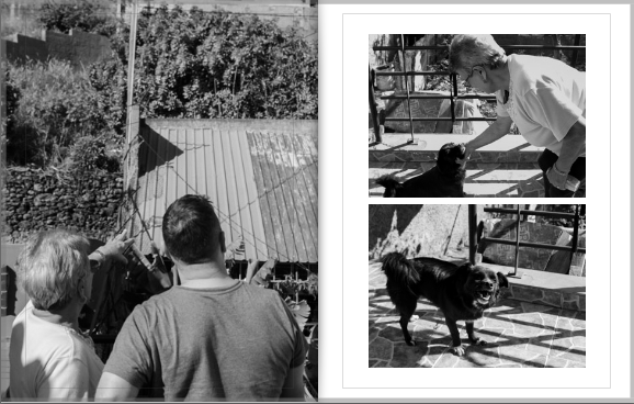
Merging two photoshoots I created my photobook.


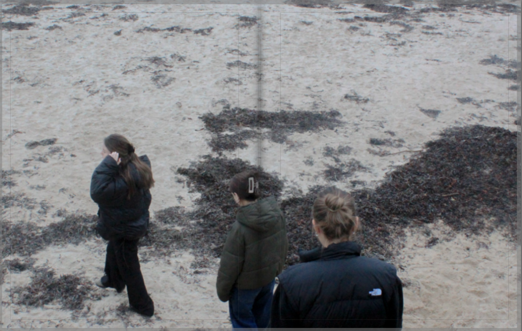


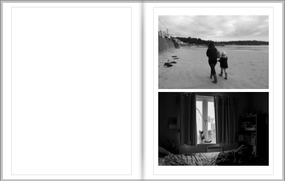
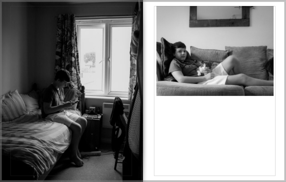









EVALUATION
The process of making a photobook was a new concept to me, as I had never created one before. However I found it to overall be quite straightforward, as there are templates to aid you in formatting choices. Once I had edited all my images, I selected my favourite outcomes and created a new collection set named ‘Photobook’ which allowed me to organise my images.

This template function offers numerous formats for each page. Allowing me to carefully align all the images evenly on every page. The process of making the photobook was also aided by guidance from teachers who already had previous experience with this software. They offered advice on formatting choices which allowed me to establish storyline across the entirety of the book.
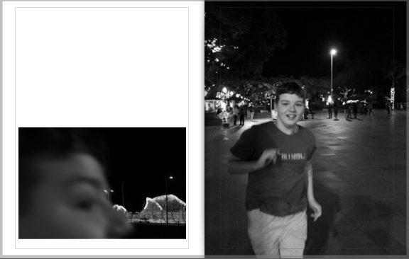
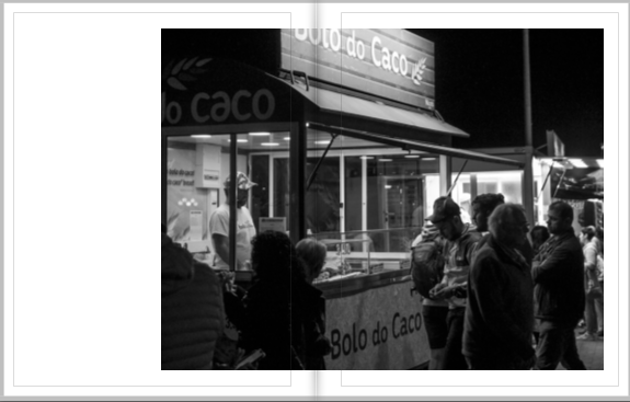
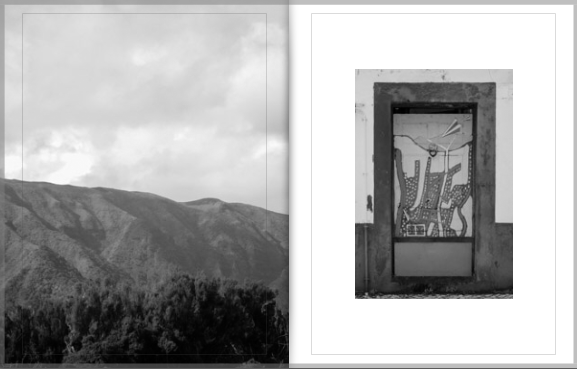
Overall, I think my project has been successful in portraying my interpretation of the theme ‘Nostalgia’. I’ve created a storyline across the book. Starting with a family tree to establish the message of the book is focused on family and heritage, as well as the incorporation of archived images from my childhood. I’ve created documentation of my family across both Jersey and Madeira, creating mostly black and white images of people and landscapes as I planned. I believe the seperation between Jersey images and Madeira images has been successful in representing the divide between the dual parts of my heritage, and those seperate aspects of my identity. What could have used improvement is the amount of portraits I took of family, as that was the main focus of the project.
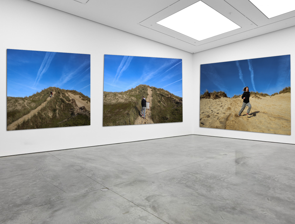
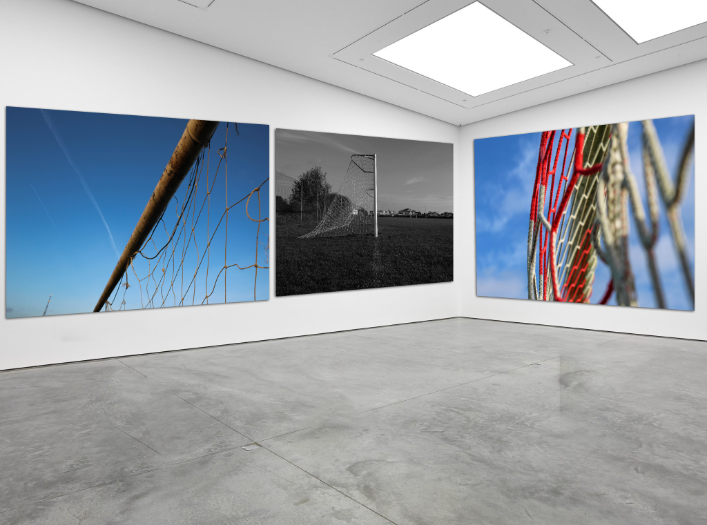

Once I had picked out my final images that I wanted to use in my book, I placed them on the pages in the order that I wished and thought worked best not only with how the images were presented but also how they worked well for the viewer. Once I was happy with the layout of the photos, I added in my essay to the back of the book to give some context of what I had been looking at in my personal study. I also pick out ‘Building our Future’ as my title of the book as ‘building’ fits in with it being based around architecture and ‘future’ shows how I looked into the evolution of architecture and how it has changed so much over the past couple decades and isn’t slowing down. Seeing what some housed look like now, I can only imagine what some may look like in the future. overall, I am very pleased with my final layout and think it projects my personal study well.
Here is a link to my online book: Building our Future


For the cover I wanted to show what the book is going to be about. Therefore I needed to take into consideration the colour of the book, what images I wanted to add, the title and font. I settled down for having red as a background colour to represent love, passion as well as being as symbolising both mine and my mothers descent, being Polish. I included a photograph I have not done any manipulations to, to not give away what the book is about, however I wanted to include a picture of her as a younger child to show the purity behind her, the innocent girl that later shaped into who she is today. I decided to call it “echo” is I think of myself as a mirrored version of my mum, and I think she too thinks of a child her echoing in a woman she is. I like to think she echo’s in me, that I mimic her. the back cover photo is edited in a way to match the colours of the first image, but also to show that I create a responses to photographs of her.

The book opens to show the beginning of her story, a photograph of her that is showing the youngest version of herself ever taken. It represents a beginning of her story, to show that it is about her.

From then it follows a theme showing her life from youngest to oldest, therefore I included an image where she’s in her early teens, showing the camera that the photograph was taken with next to it.

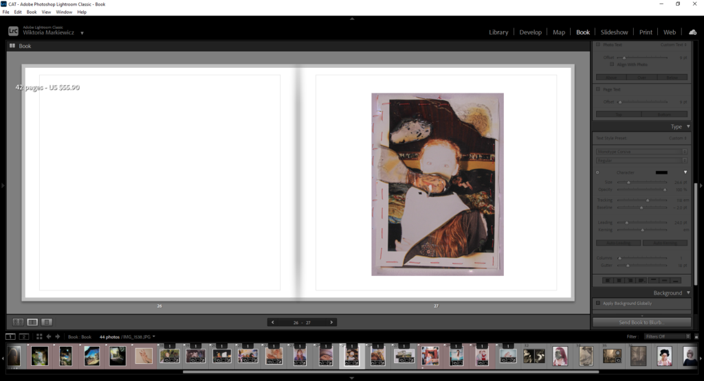
Then there’s another photograph from her mid teens which I have tampered with. How I achieved this is by peeling the ink from the other print, which was a portrait of my mum that i took recently. this shows a faint link from the past to the future, giving an impression she is looking at herself in the past, or looing into her future self from the past.

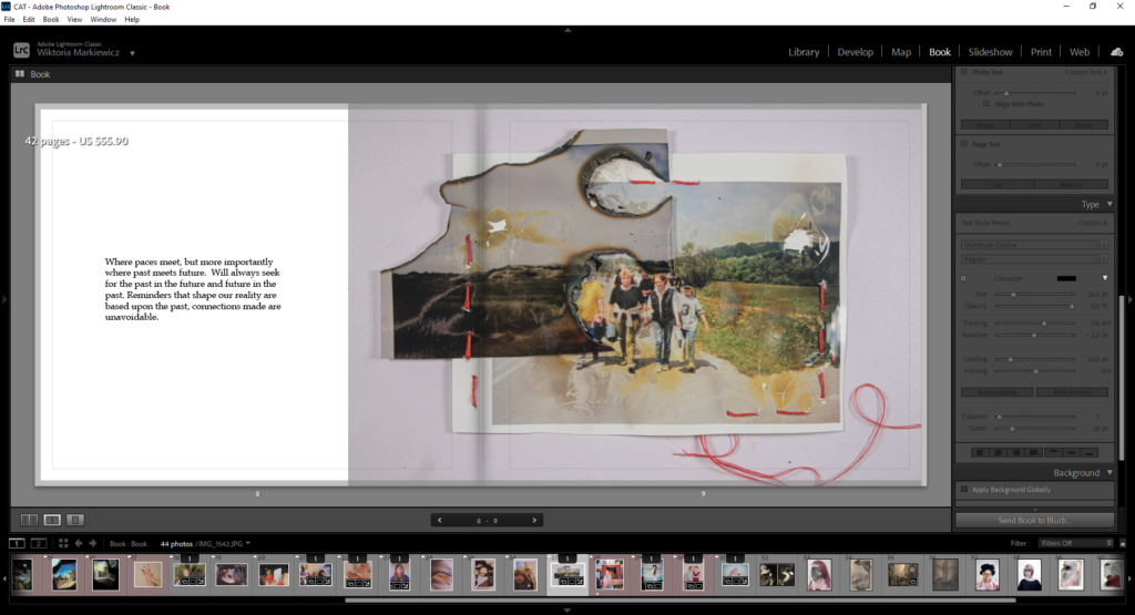
This image is one of my favourites as I wasn’t expecting the images to work out so well together. what this represents is a tie of 2 places and a link between 2 timelines. The below image is of Poland and my mum and her parents, then the landscape on top is an image of jersey which matches so well with the mountains in the background of 1stimage. As well as the burnt hole, it shifts the focus onto the most important subjects. Them walking also represents this time change, from past to future. I used red string to tie them together and to highlight this fact. to make the viewers understand what this image represents I included a text that talks about the importance of time, past and future.
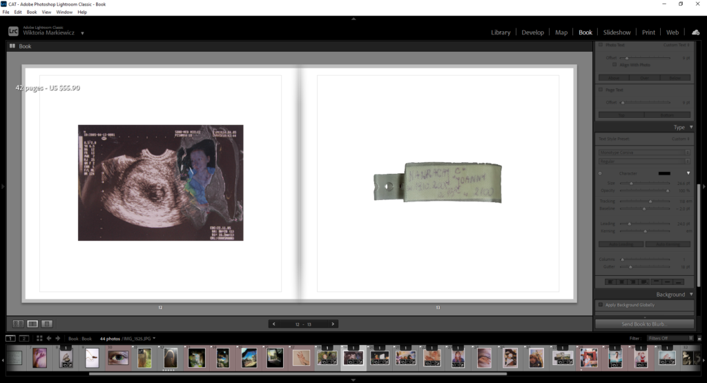
Next I included images where she was in her late teens and a photograph where she was pregnant with me, from the first image I have cut her out and stuck onto the first ultrasound of me, to show the very first link that I carried a part of her in me. the cut out shows that she lost herself for me, that she had to give a part of herself to shape me. contrasting to that there’s an image of her younger self to symbolise that she never truly lost that girl.

The next pair of image link together to show the beginnings of me, this is a shift in a book where I was born, however I am only a part of her, I didn’t want to make the story about me,, therefore I carried on showing both her and me for thee rest of the book, to make the viewers understand that the photographs are showing a connection between us.
The text is in polish and it is of a song I was born to, following a quote on the next page “every new beginging comes from onother begininsgs end” in this case it wwas my mum, representing how her life metaphorically ended for me.

I wanted to show thee hardships she had to go through for me, in this case I added an image of her eye, which represents her looking back at her past. How hard it must of been for her to leave that behind and that till this day it will never leave her. the shells shape fits the eye as its round shape is similar to the eye. Throughout the book there are a couple shells that not only are significant to my mum, but also represent home, what one was a home.

This is another alteration I did to show my mothers past through her, that it is still stuck with er, and it shaped her to who she is, it is of her present self contrasting with an image of her younger self.

These images go very well together when it comes to the same tones and colours, with soft blues and purples. it is another photograph of her eye where my hands are coming out of it to show that as much as she is a part of me I am a part of her.

Then there is a contrast between her and me between 2 pages, where 1st image is showing her hand and the 2nd is of mine. i have burnt the first one to show that her hands and herself had to go through much more than me, and go through so much for me, this is implied through the hand gesture she does, opening her hands as if she is giving something, to me it is her love, then to that my hands are completely different, clean and elegant, especially the position of my hands shows me receiving this love she gave me as my hands are folded as if I was gently grabbing her love.

There is another photograph showing the connection between me and her, where the fist image is of my mum my age, then secondly in the background is a portrait of me, both are sowed into each other to show this strength.
The book then shift focus as the theme completely changes, from soft and calm tones to more vibrant and dark ones . this is to match the photographs where I represent the background from where my mum and I have been raided. the first image is of a place where both her and I lived, her longer than me, then the rest a photographs from her and mine hometown which I have presented on my body using a projector. These are not only showing how significant they are to me but also to her, them being on my body implies they area part of me, where I come from.


For these images I also made sure the tones matched each other, as one being of my mums hand and the other a portrait of me. This is the only full portrait of me in the book, which is of a similar theme as the one of my mum on a few pages back. The design and layout of the images is quite repetitive as the one colour page also follows a previous layout.
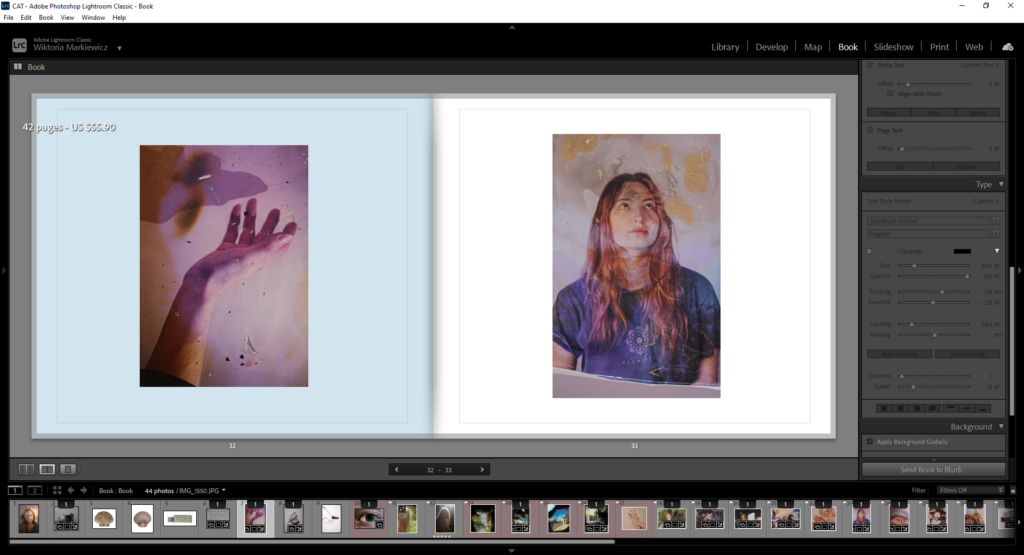
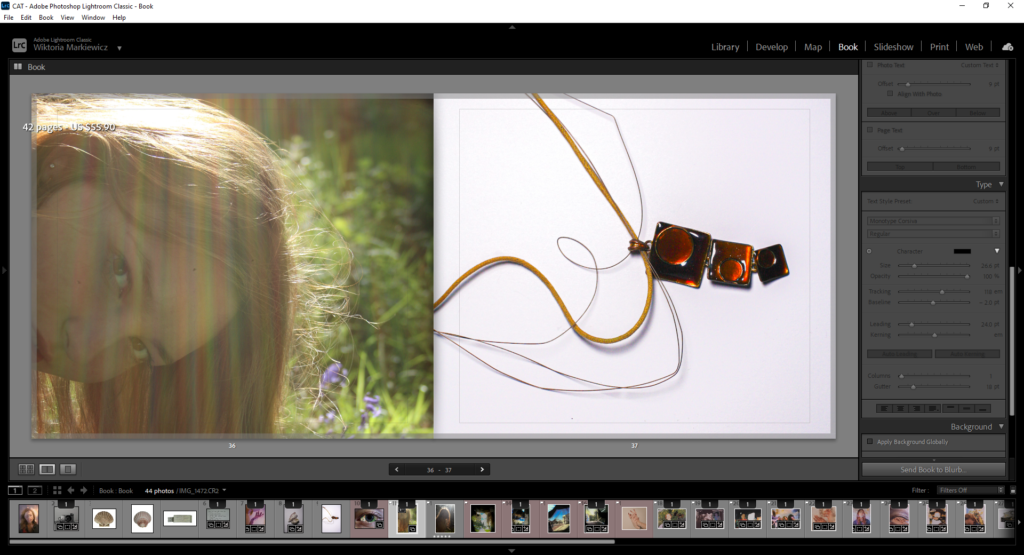
Finally I wanted to include photographs from past projects, however ones that suit the theme of the book. I went back to still life images produced in year 12, where I found a necklace that was really meaningful to me, and shells which fit well to the previous one . The photograph of me fits with the previous image of my mum in the woods, at the beginning of the book.
on the last page I added a phrase which shows how much respect and love I have for my mum , it is a thank you for her giving me this life.

How do Justine Kurland and Jim Goldberg portray childhood differently through their work?
‘Photographs really are the experience captured, and the camera is the ideal arm of consciousness in its acquisitive mood.‘ Susan Sontag (1971), On photography.
The definition of nostalgia, according to the Oxford Dictionary, is ‘a feeling of sadness mixed with pleasure and affection when you think of happy times in the past’. I correlate the feeling of nostalgia with my childhood memories and teenage life/coming of age. My images which, although there’s joy, have a more serious and downcast feel to them which is a representation of the way in which the naivety of childhood, that allows us to live freely and happily, has worn off and as we grow older the reality of life has began to kick in. Two photographers that inspired me are Justine Kurland and Jim Goldberg as I resonate with their portrayals of being a teenager, all though not to the same extremes, the overall aesthetic features of their work somewhat resembles my idea of being a teenager and both artists’ work corresponds with the theme of nostalgia.
Justine Kurland is an American photographer known for her pictures of people in the American wilderness, specifically young girls as she said they had a perpetual state of becoming. This includes her work on Runaways and her best selling book Girl Pictures which has a running representation of childhood and particularly girlhood and growing up as a female.
Kurland would find her girls while touring the US and recruit them as her models for her shoots.
‘I could find girls wherever I stopped, but they went home after we made photographs, while I kept driving’ – Justine Kurland
Kurland further explains how the girls were very cooperative to be in the photos and even helped her stage the images.
‘the girls were enthralled just by being together and making pictures’ – Justine Kurland
Her book presents childhood as wild and exciting through her various images of runaways portraying their freedom, while the images also exhibit an infectious sense of nostalgia. Kurland was inspired by the girl’s stories of adventure and captured their different narratives. Personally, I feel a connection to this book as I see myself and my friends represented through her portrayal of girlhood and the adventures/experiences that follow growing up as a girl.

Her work is a mixture of documentary and staged documentary style images enabling her to portray girlhood accurately and also have to ability to exaggerate it to whatever extent she pleases. In my opinion her images are more of a fantasy portrayal of teenage life/girlhood as she captures the good more than the bad representing the runaways lives as exiting and happy almost as if they were living in a utopian world.
However, Jim Goldberg’s work follows youths on the streets of California portraying the more dark and disturbing ways in which people have to live. As a outsider himself, Goldberg empathised with their situation and searched for an understanding of what he had witnessed during that time. Goldberg witnessed the chaos and carnage of street life which ultimately became the source of inspiration for him to create his book ‘Raised By Wolves’. The book consists of photographs, sections of conversations, drawings and handwritten notes which present the true characters he captured more transparently, giving anyone who looks at his work a sense of familiarity as if they knew them on a personal level.
‘I wanted to look at those people who were outsiders, like I was’ – Jim Goldberg
He delves into topics such as the class system, power and poverty in America but coming from the perspective of the poor and powerless which was a new viewpoint and unusual to see. He showed the side of life that was ignored and gave these teenagers the voice that he lacked during that period of his life. He focused specifically on two main characters, Tweaky Dave and Echo. Although these kids were extremely troubled, their personalities proved too large for Goldberg to ignore. Goldberg created a close relationship to the teens allowing him to follow them whilst documenting their lives and experiences. This meant the book became a mixture of documentary and narrative style fiction that illustrated the close up reality of their situations. His aim was to uncover and discuss issues such as neglect and abuse that lead to these teens living on the streets. Regardless of the negative themes discussed, there is also an ongoing theme of love, friendship and chosen family as these kids care for one another and have joined together to create their own kind of family set up.
Although his approach may seem exploitive, he created genuine relationships with the kids and they offered their assistance with things such as writing the handwritten notes and doing the drawings. He approached this project delicately with sensitivity and a sense of empathy, provided from similar personal experiences, and was careful not to overstep boundaries. However, once the relationships began to form the kids became so comfortable to the point that they would give him advice on what to capture which goes to show they were just as engulfed in the project as him. The project became a collaboration between photographer and subject as they gained respect for each other in the process. He also gave all of his subjects a copy of their pictures allowing them to see what they were helping him with as he was aware they weren’t likely to have any other ways of accessing their work.

Although both projects focus on the subjects of teen runaways and homelessness, the work and stories behind them are completely different. Overall, Justine Kurland’s work is more of a idealistic perspective of being a runaway and she portrays their lives as joyful and exciting by exaggerating the idea and stereotypes of girlhood through her staged images. Whereas Jim Goldberg’s work delves into the dark and disturbing realities and highlights the struggles those teens face as he follows them, documenting their reality. In comparison to Justine Kurland, his images show the rougher side of life and portrays childhood/growing up as more of a day to day conflict for the homeless teenagers. Although both groups of people are runaways, Jim Goldberg’s work shows a much more sinister and emotive depiction of these people. I also discovered that both sets of images have a sense of ‘truth’ but in different ways. Despite the fact that I think Justine Kurland’s images are an exaggerated portrayal of girlhood, they do serve to present the emotions accurate to that time of our lives. She presents the girls as powerful and fearless but also sensitive and fun and there is an overall sense of unity and togetherness which is a feeling I think is very relatable to girlhood. On the other hand, Raised By Wolves shows ‘truth’ through documenting the lives of the kids and including the good and the bad while allowing them to take control over the project to ensure they are accurately depicted. This ensured that the book was an honest and real demonstration of their lives.
Bibliography:
Justine Kurland, Light Work, 2018, https://www.lightwork.org/archive/justine-kurland/#:~:text=Justine%20Kurland%20is%20known%20for,nature%20of%20the%20American%20dream.
Justine Kurland: Girl Pictures, Aperture, https://aperture.org/books/justine-kurland-girl-pictures/
A Completely True Work of Fiction: Jim Goldberg’s Raised By Wolves, Magnum photos, https://www.magnumphotos.com/arts-culture/art/jim-goldberg-raised-by-wolves/
Raised By Wolves, JimGoldberg, https://jimgoldberg.com/about
Another Look at Justine Kurland’s Girl Pictures, Vanity Fair, 2020, https://www.vanityfair.com/style/2020/05/justine-kurland-new-book-girl-pictures
Girl Pictures, Lens Culture, https://www.lensculture.com/articles/justine-kurland-girl-picture
Tracing The Roots Of Jim Golderg’s Epic “Raised By Wolves”, Blind, 2021, https://www.blind-magazine.com/news/tracing-the-roots-of-jim-goldbergs-epic-raised-by-wolves/
Justine Kurland on the Girl Picture Problem, Frieze, 2023, https://www.frieze.com/article/justine-kurland-girl-picture-problem