My photobook is based on the evolution of architecture in Jersey and how it is slowly changing over time.
A paragraph
Within my book I want to achieve educating other about how much architecture has changed over time from different materials and techniques to different styles and demands/trends. I think that in Jersey there is a great variety of architecture from old historical building to more newer modern ones. There are many pieces in Jersey to me that are very hidden whether its the area/location or how they are designed to be deceiving, because of this I wanted to try and find architecture that many haven’t seen or noticed before to show the vast amount that the island contains. I think that whilst much of Jersey’s architecture is astonishing, modernisation is slowly taking over. I believe that architecture is becoming more and more about pleasing the human eye as opposed to it’s practicality and may be losing some of its value it once held. Whilst it may not be at the same rate as some other countries I think that we may slowly be losing architecture that holds great value and even memories for some. I do agree that with time changing architecture has to as well for many reasons, however, I also believe that keeping hold of Jersey’s historical and valuable architecture is also very important. I hope that throughout my book the evolution of architecture is portrayed and people may see what I do in terms of it changing.
Design: Consider the following
How you want your book to look and feel
Paper and ink
Format, size and orientation
Binding and cover
Title
Structure and architecture
Design and layout
Editing and sequencing
Images and text
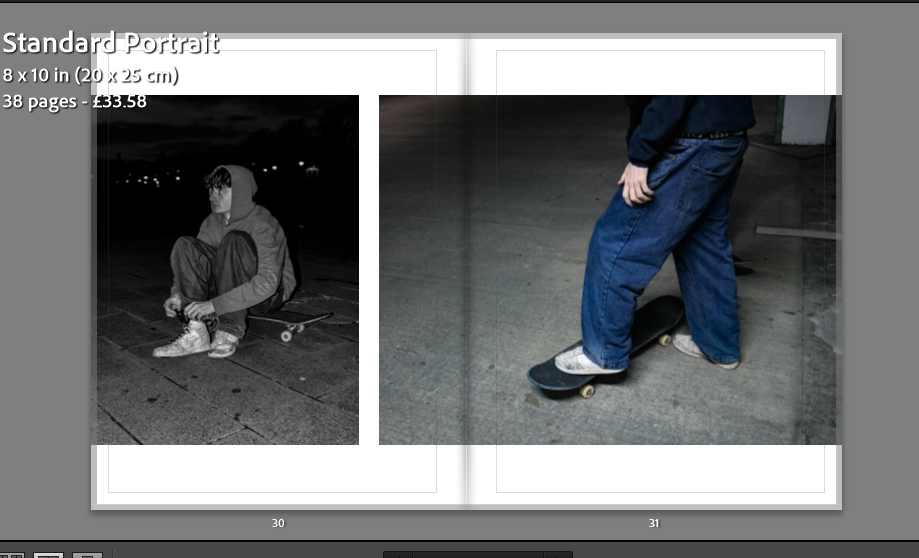
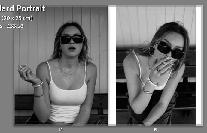
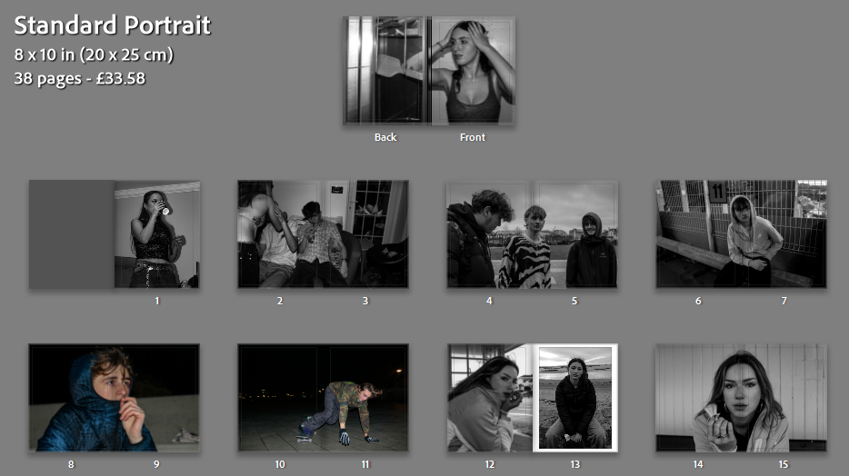
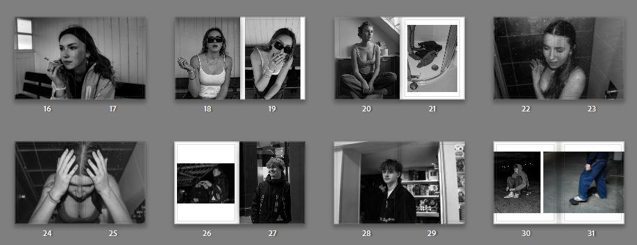
In terms of my books design, I want it to have a matte finish on the cover not only for how it looks but also how it feels, however, I want to have the pages glossy to add to the overall look of my images and make them very bold. I am going to pick the size ‘standard landscape’ as most of my images were taken in landscape and I want my images to be the main focus. With the book being landscape it means I can make my images a little bit bigger and allow for the detail to be seen. For my tile I have picked ‘Building our future’ as my book shows how much architecture (buildings) have changed over such a short amount of time meaning they will only develop even more in the future and become something to be appealed to as opposed to practical and meaningful. When it comes to my images I haven’t edited them much as I want viewers to focus on the main architecture piece itself in its raw form. I have adjusted them slightly to make the images straight and enhance the detail slightly so that the viewer can take it in fully. I chose to put my images in randomly in terms or old and modern so that viewers can compare them more easily, however I did place them precisely to make them contrast each other. In my book I am not going to have any text with the images as they are the priority, but I am going to add my essay ‘What are the differences between Eugène Atget and Ezra Stoller within architecture photography?’ to the back of the book to show where I got some of my inspiration from.
WHY CHOOSE THE SUBJECT ‘DOCUMENTARY’ FOR THE NOSTALGIA PROJECT (PERSONAL STUDY)?
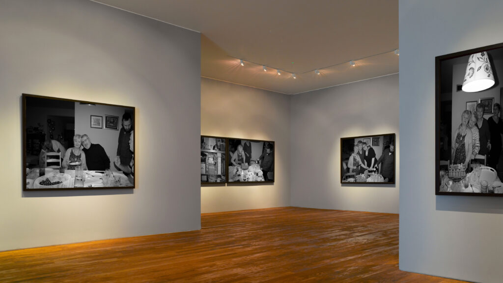
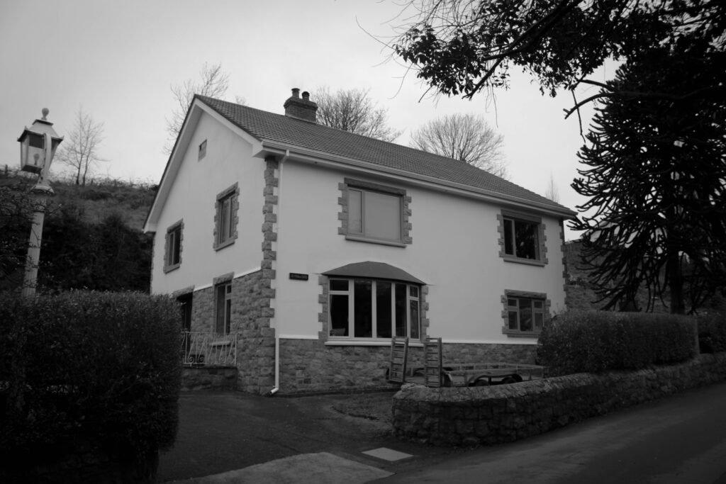
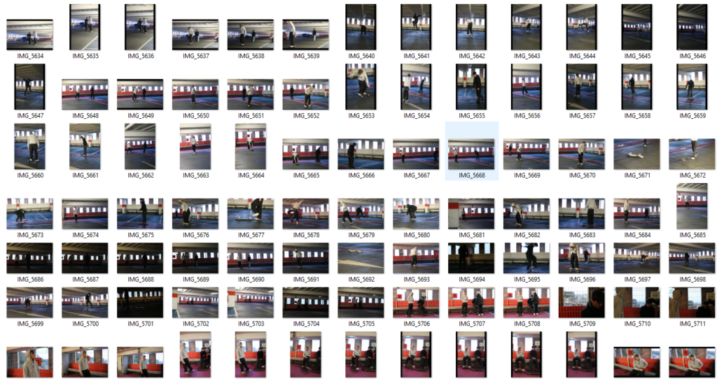
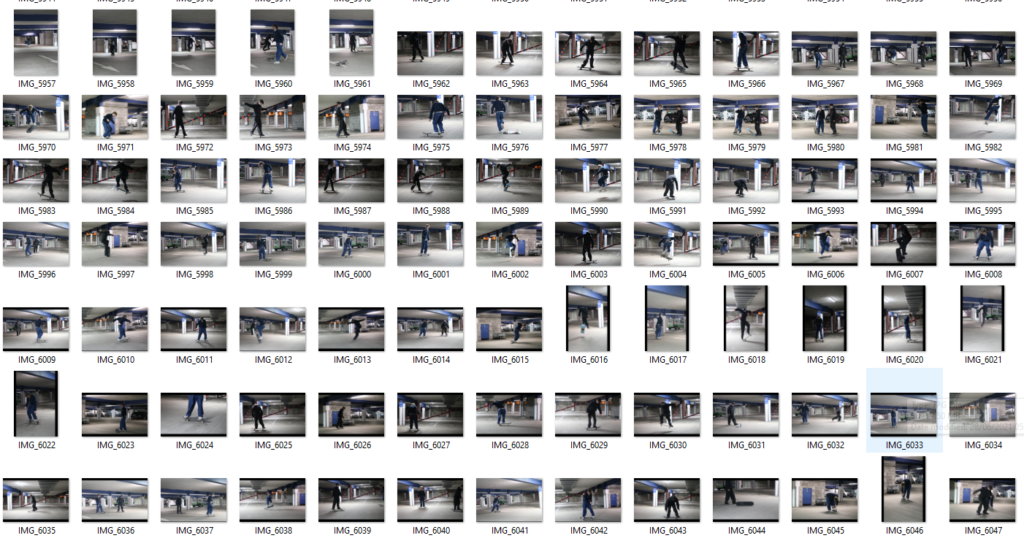
I chose to take my final pictures inspired by the Becher’s typologies as it was a way to express my nostalgia though the houses I lived in. Nostalgia is defined as ‘a sentimentality for the past, typically for a period or place with happy personal associations’ which can be reinforced with the memories a family has in each home. Each house that I photographed represents a period of my life, which reinforces this sense of nostalgia and memories. My intention was to use ‘documentary’ photography to reinforce this idea of documenting periods of my life in houses, and presents them in a grid layout out to show the timeline.
HOW DID I PLAN THIS PROJECT?
To be able to do the photoshoot (2) with the houses I needed to make sure that the weather and lighting looked similar in all the images, therefore this photoshoot lasted me for over 2 days. In order to get the best lighting I could I did my photoshoot between 12:00-13:00 (mid-day). However when taking the family portraits in order to create this documentary style aesthetic I tried to capture authentic moments then staging my family members.
PHOTOSHOOT AND EDITING:
I took photoshoot (1) during my weekend away in Poland for a family event, in this photoshoot I managed to take images during the family dinner and around the town centre. Due to the photoshoot being during Christmas season I was able to take some pictures of Christmas Markets and how the Polish celebrate. However, due to photoshoot (2) being after Christmas there were so festive images that contrasted with Poland, however the my intention was to focus my images on the houses. During my editing process in Lightroom Classic I adjusted the images into black and white and slightly turned down the exposure to create this sharp detailed image, furthermore all the images had the same adjustment settings, as my intention was to create a photobook with visibly similar aesthetic.
WHAT WENT WRONG IN THIS PROJECT?
During this project it was difficult for me to find a topic to focus on and photograph. Once finally figuring out the photoshoots were disorganised and rushed. Planning my photoshoots was difficult as some picture were off island, therefore not much plan could go towards the photoshoot planning.
I put together a large collection of over 400 images from the last few years on my travels, along with some from recent photoshoots I’d done in preparation.
As I was dealing with quite literally hundreds of images, and still a good 150 after selecting which ones I could use for my photobook, I wanted to set out a baseline aesthetic for each image; prioritising a warmer colour palette and low contrast, which I achieved through colour grading and changing the input level of blacks to roughly 23 on the tone curve. These settings were then synced and adjusted accordingly on each image.
Afterward, I sorted through which of the remaining images I wanted to keep, and were actually usable for the narrative I wanted to portray in my photobook. I was left with roughly 40 images that I then put into an order, starting briefly with my parents house and my room there, showing an image of a friend walking through a street in Jersey on a double page spread. The idea of being stuck in Jersey is a reoccurring motif throughout the book, after each collection of images from a trip away, either to Spain where my grandfather lives, or to the UK where I’m seeing friends, I still end up back in Jersey. The imagery from Spain reflects on my relationship with my grandfather and my time spent living there, and how it differs from Jersey, whilst the imagery from the UK reflects on the people I meet and my perception of them. Whilst I wanted the book to capture a sense of nostalgia, I also break this on the occasion and take a focus on the loss of different people I’ve met, whether they’ve passed away or we’ve lost contact through one way or another, which I feel grounds the narrative more in reality.
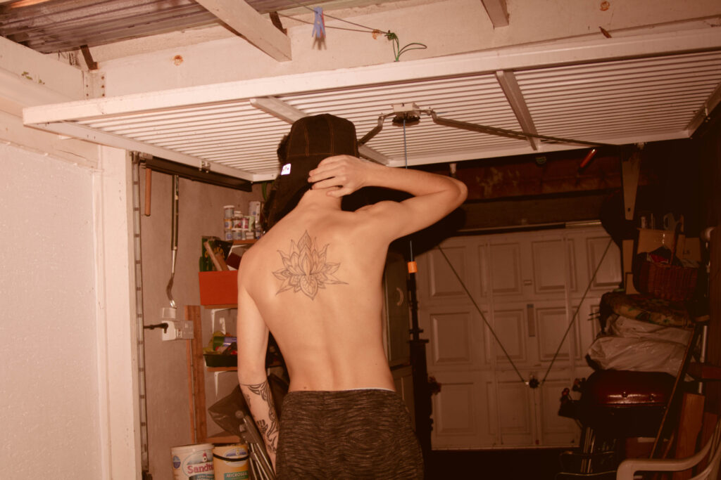
I drew up a rough version of the tattoo on my back – a lotus flower- to put on the cover. I experimented with different ways of doing the cover; using handwritten text on a white background, down the spine etc., but it didn’t fit the aesthetic of the rest of the book.
I came up with the title finding home, as the book surrounds concepts of self-searching and freedom, and finding a place to call home has always been a personal struggle of mine. I put the drawing of the lotus flower over the cover as a graphic, lowering the transparency, and finding a nice caramel colour that emulated the warmth and nostalgia from the images in the book itself. I also experimenting with using handwritten text from paper that was scanned in, but ultimately it became too big a job, and it would look more authentic to write it on the copy that I order.
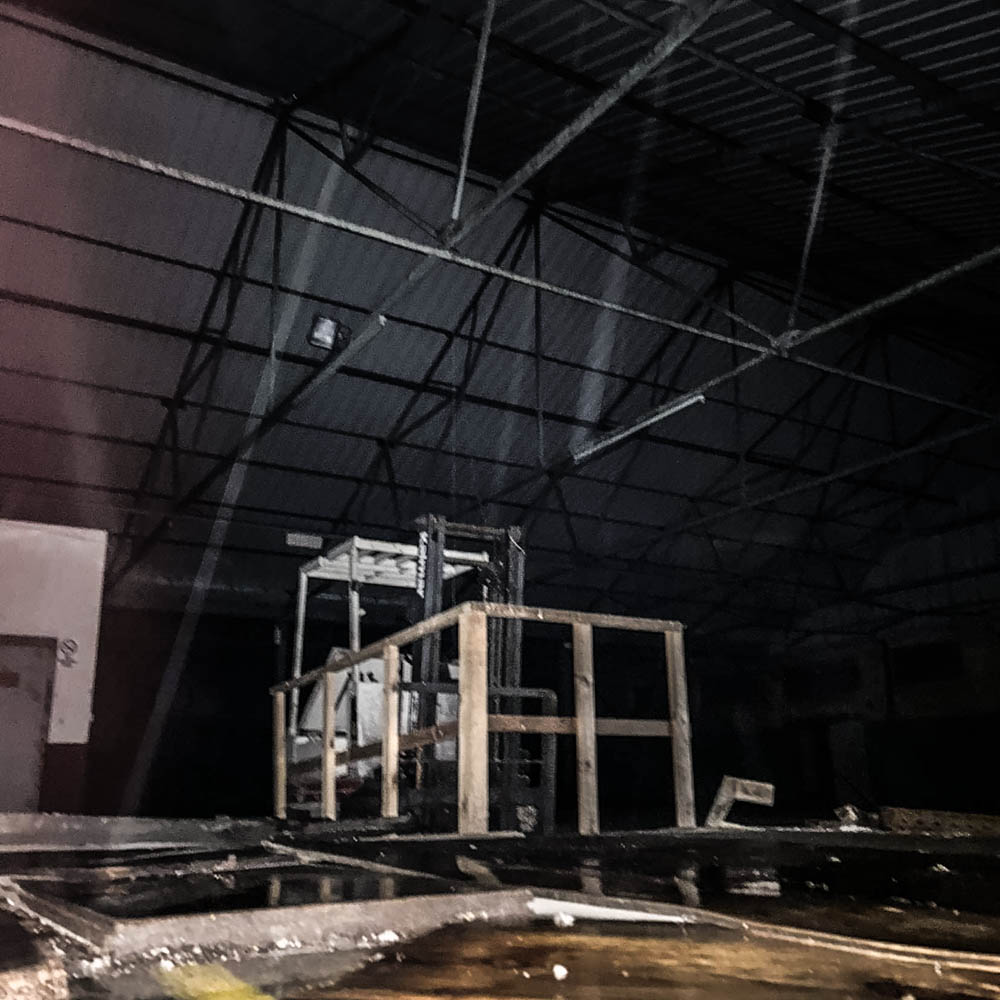
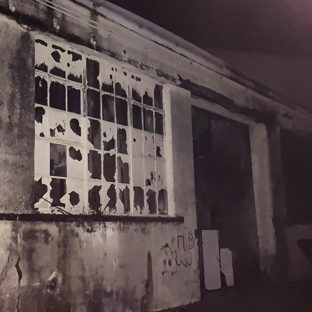
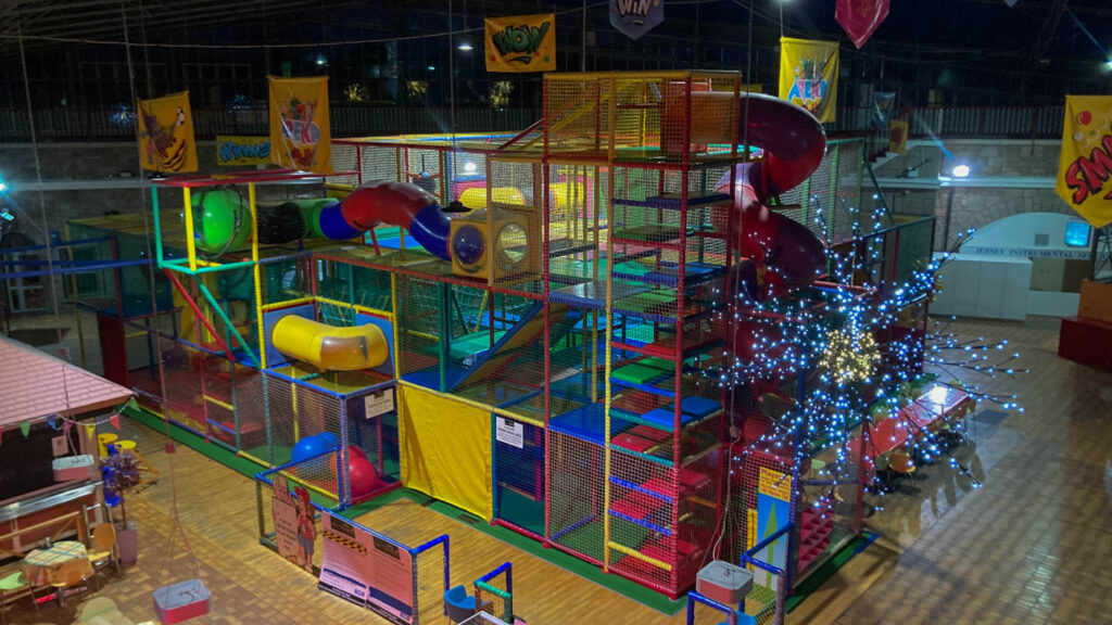
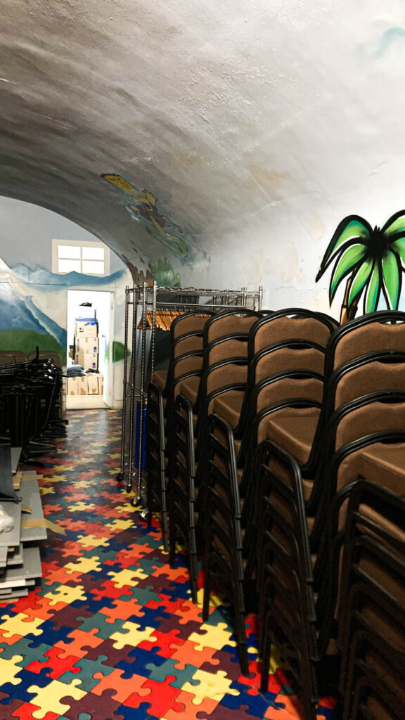
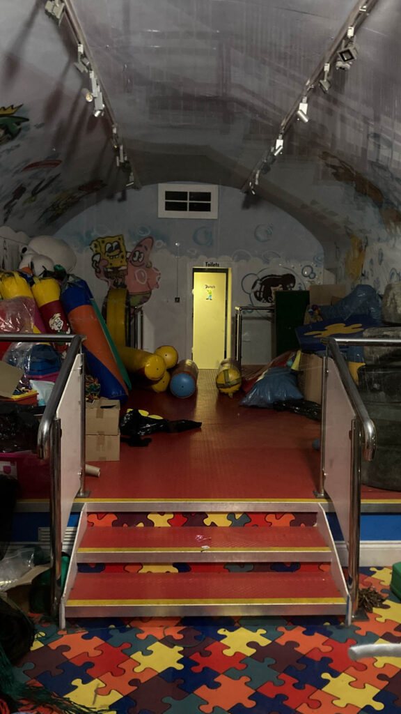
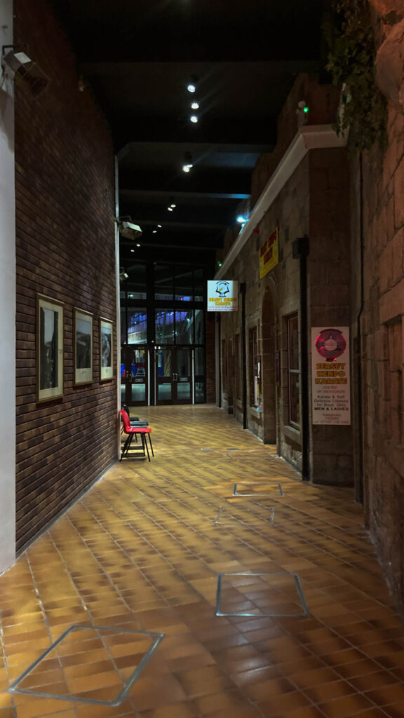
I wanted to capture the overall gloominess and decay of these buildings, I think I did an excellent job on portraying that. The photos, however, didn’t come out as good as I wanted them too. Lots didn’t have great clarity or quality, but that’s mostly because those ones I took on my iPhone. Next time I will strictly use my camera.
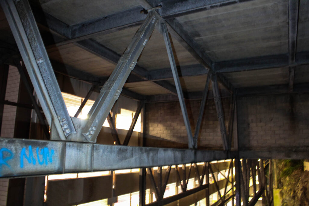
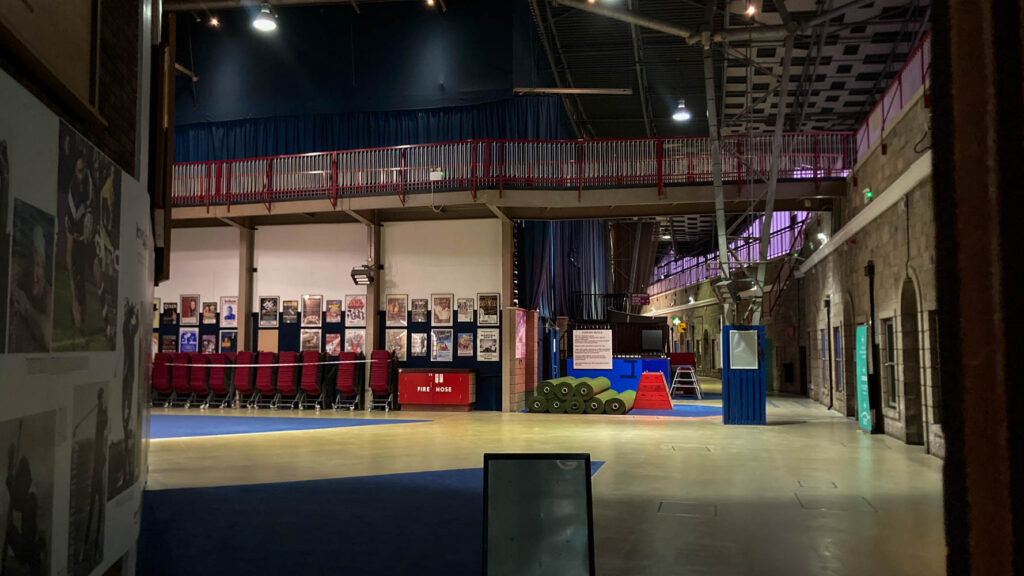
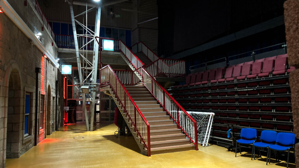
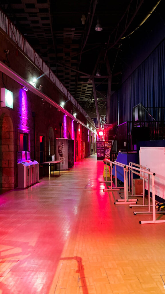
Fort Regent –
I like the luminous, spacious and overall empty and quiet these images appear to be. Something I made sure to feature in these images, to reflect how the fort really is these days. I like the lighting, angles and rule of thirds I used when taking photos of the empty corridors.
Overall I think I did an okay job. I wasn’t too satisfied with my final outcome because I never even started on the other photoshoots I said I would do. The main reason was because I was never really engaged or interested in these things, which is a terrible starting mindset, especially for me. As said earlier, most photos were taken on my phone because I just couldn’t work with my camera and get it to work the way I wanted it too. Next time I will have a fresh minded approach and stick to one device for taking photos, as it makes it much easier to do and produces much higher quality photos.
How could we consider typology to be an extension of documentary photography.
‘Technology is above requiring an interpretation; it interprets itself. You merely need to select the right objects and place them precisely in the picture; then they tell the story of their own accord’
– Hilla Becher
Typologies is defined as organized systems of types; typologies can be described as an extension of documentary photography. Photographers Bernd and Hilla Becher explore this idea of typologies in their work, creating images that document industrial structures including water towers, coal bunkers, gas tanks and factories. Their work can be described as documentary photography with the use of typologies as an extension, as they documented the evolution of industrial buildings and presenting them in the form of grids. In this essay I intend to explore how typologies can be an extension to documentary photography. The quote above by Hilla Becher is a perfect portrayal how the Becher’s typologies is an extension of documentary photography, as documentary photography tells stories through the precise detailed photographs. Hilla Becher was a German photographer born in 1931, in which later she found her photography partner Bernd Becher which later became her husband. They began collaborating in 1959 after meeting at the Kunstakademie Düsseldorf in 1957. The Becher’s photographed industrial buildings which could be argued as documenting the industrial revolution and the changes within the industrial world, which reinforces this idea that typologies can be an extention of documentary photography. Their work is rigorously objective in its aims, but in its exacting presentation stimulates consideration of the ways in which people organize and receive information about their own environments and the wider world.
My project focuses on the contrast of my duel nationality, Polish and Jersey family. I intend to take picture of my Polish family when I go away to vist them, in Susan Sontags book ‘On Photography’ she says that ‘camera goes with family life’ which reinforces this idea of family documentation through photography. Furthermore, in order to explore my Jersey lifestyle I intend to create a typology of the houses I’ve lived in, and then presenting them in a grid, drawing inspiration from the Bechers typology work.
Hilla and Bernd Becher; Typologies
The term ‘documentary’ was founded by an English philosopher Jeremy Bentham in the early 19th century. He referenced documentary to the visual culture, which led to some of the early 19th century photographs to be regarded as documents. However now in the present day the term documentary is recognised as aiming to show, informally, everyday lives of ordinary people. When we think about the term ‘documentary’ the main objectives that structure our defintions would be style, tradition, genre, form, practice, and most importantly movement. The ‘birth’ of documentray photography was between 1920 and 1930, which motivated the movement of photojournalism due to the extensive use of photographs to tell stories and illustrating photo magazines such as Life Magazine in the USA and Picture Post in Britain. These magazines which were based on the extensive use of photographs to tell stories to the needs of a newly literate urban population. The first camera’s were made in France and England in the early 1840’s, as these countries were able to create these cameras due to having investors and buffs to opertae them, and these countries were financially stable therefore being able to afford it. Sontag states that ‘even when photographers are most concerned with mirroring reality, they are still haunted by tacit imperatives of taste and conscience’ this therefore creates the debate on how true are photographs and whether they are reliable.
In my own work, during my trip away to Poland when taking documentary portraits of my family and the event, I will try to keep the photographs as true as possible, however when taking portraits there is some level of staging to ensure you get the right angle and lighting to create the best possible image. This therefore also contradicts the idea of documentary photography since the stereotype is that documentary photography is supposed to be truthful. In the image below, was one I took during my photoshoot, you can view an example of what would be descibed as a documentary photograph, however you can clearly see its been staged. In this image you can see my grans sister and her nephew in which the camera settings and later in the editing process by changing it to black and white, would descibe the image as documentary, but you can clearly see that both people are posing in the image.
My Image – Polish Family
A photographic typology is a study of “types”. That is, a photographic series that prioritizes “collecting” rather than stand-alone images. It’s a powerful method of photography that can be used to reshape the way we perceive the world around us. The German artists Bernd and Hilla Becher, invented New typologies, as they began working together in 1959 and went on and married in 1961, they are best known for their “typologies”—grids of black-and-white photographs of variant examples of a single type of industrial structure. Karl Blossfeldt, Albert Renger-Patzsc, and August Sander all influenced the Becher’s in their typology work. Karl Blossfeldt inspired them to create a photoshoot and laying out the images in the style of a triptik; Albert Renger-Patzsch gave them the idea that you can create a new style of photography with any pictures; and Albert Renger-Patzsch created a series of photography of taking pictures of plants. August Sander was part of the new objectivity movement which inspired a lot of photographers including Hilla and Bernd Becher to take their own movement and create their own style of photography.
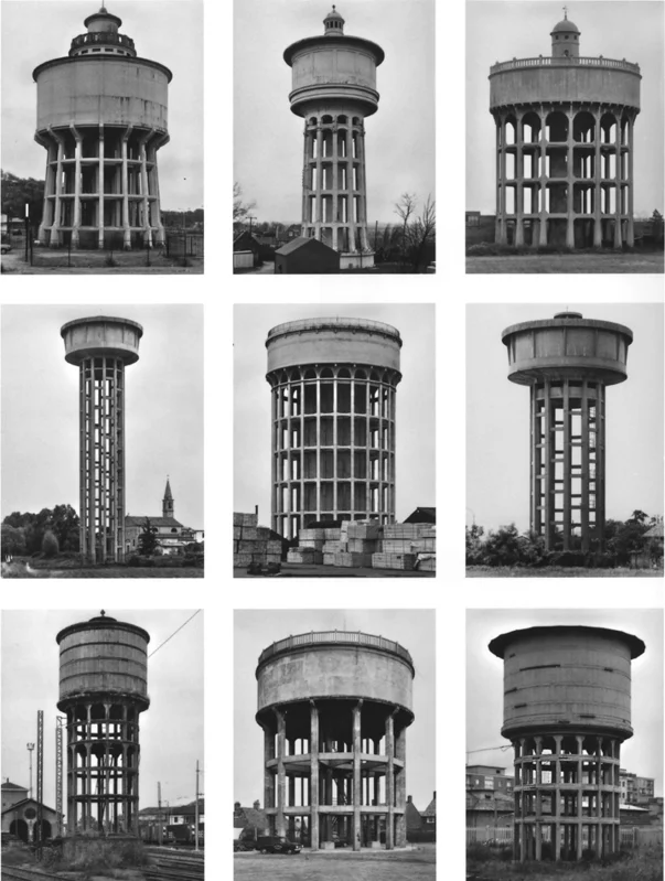
In this typology grid, you are able to see nine images of industral buildings. The buildings are positioned in the middle of each individual image which creates a well structured grid, and organised visual of the images. By placing the images in a grid you are able to see the different structures of industrial buildings and can see the difference in construction. By using the form of the grid the Bernd’s were able to emphasise the repetition, which can suggests that the industrialisation was becoming repetitive. “we want to change nothing about the objects we photograph.. namely strip the individual object of context, in other words to position them such that they fit the frame” this quote by the Bernd’s show they photographed industrial buildings without context, just to view them as an overall form. The composition of the grid shows tall buildings in a secluded background. By having a secluded background it draws the focus on the buildings. By editing the images in black and white it creates an old documentary aesthetic. In my own study of buildings, I am intending to take pictures in all the houses ive lived in during my 17 years of life. The total houses ive lived in is 13, therefore I will go to each house/apartment ive resided in and put them in a typology grid taking inspiration from the Bechers. By doing this project for my personal study I am including the idea of typologies as an extension of documentray photography.
Images of house which I later created into a typology grid.
1. Research a photo-book and describe the story it is communicating with reference to subject-matter, genre and approach to image-making.
The book I am deconstructing is ‘Girl Pictures’ by Justine Kurland which explores the subject of teenage run away delinquents. Throughout the book it captures moments of girls supporting other girls through times of difficulties, but also while enjoying some of the best moments of their life’s. The genre of this book is staged however has elements of documentary, this is due to Justine Kurland using real people from the surrounding areas of where the shoots are taken place however, due to the composition and set up of each image it makes this photo book be perceived more staged than documentary.
2. Who is the photographer? Why did he/she make it? (intentions/ reasons) Who is it for? (audience) How was it received? (any press, reviews, awards, legacy etc.)
Justine Kurland’s main inspiration was from her, at the time partners daughter which used to skip school creating a stronger bond with one and another due to the vast amount of time spent together and a TV show, which she then decided to focus on the ‘tales of teenage delinquency’ and glamorize it to go against a ‘male protagonist’
3. Deconstruct the narrative, concept and design of the book and apply theory above when considering:
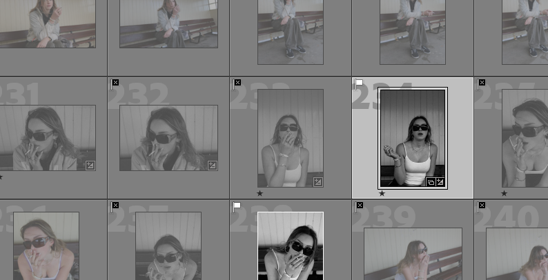
On Lightroom I imported all of my images from my shoots and began the process of sifting through the photos and selecting which images I wanted to continue working on and filtered out the images that were less successful. I did this using the flag system. I then began to edit the images I was left with.
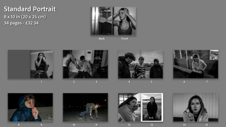
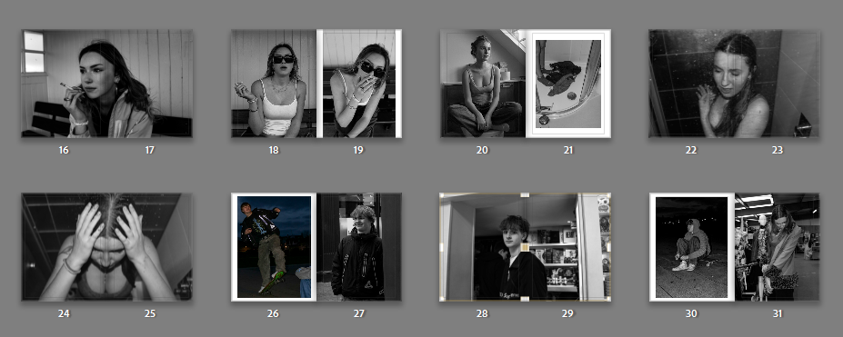
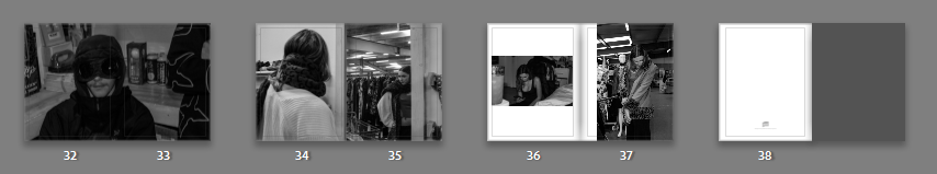
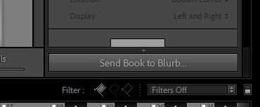
Once all my images were edited I did my final selection and clicked on the ‘BOOK’ label at the top.
This took me to an area that allowed me to begin the layout of the images in my photobook and enabled me to play around with different styles of pages, compositions and positioning of the images.
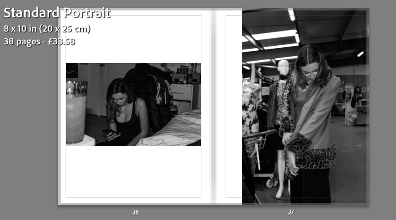
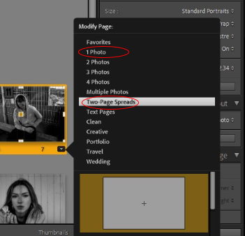
Here’s how I made a two page spread:
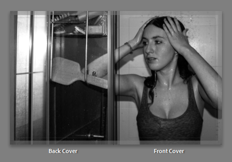
I decided a name for my book and added the text onto the back cover as I didn’t want it to impose on my cover image.
Once i was happy with my final book I exported it to the website Blurb and ordered a physical copy.