In what way have Latoya Ruby Frazier and Alessandra Sanguinetti explored the notion of family history and childhood memories as a method of understanding identity and self-expression?
“Photographed images do not seem to be statements about the world so much as pieces of it, miniatures of reality that anyone can make or acquire.”
Sontag, S (1977), On Photography. London: Penguin Books
Photographs are a way of documenting and capturing moments in time to preserve them. This quote by Susan Sontag highlights, how although this definition is true, photographs cannot always capture the whole truth. Capturing special moments with photography to look back on allows us to gift ourselves a nostalgic feeling. So, in my project, when revisiting elements of my childhood and family, I will thus be creating a nostalgic feeling for myself. Although I cannot recreate these special memories, I can show aspects of what my childhood was like as well as expressing certain emotions through my work. My project is focussing on my childhood and upbringing, while also acknowledging my heritage. I want to do this as I believe this will communicate a sense of self. By taking inspiration from previous projects (home, identity, etc) I will be taking portraits of family and photographs of significant objects, as well as occasional landscapes. My personal study will explore my dual nationality, portraying both my English and Madeiran heritage from each of my parents.
I will be comparing the works of artists Latoya Ruby Frazier and Alessandra Sanguinetti. During my research, I found that I liked their styles of photography. They both capture inspiring photographs of their family, creating a combination of both classic and environmental portraits. Latoya Ruby Frazier’s work is typically in black and white which I arguably find more incising and meaningful. By stripping a photograph of its colour, it allows the viewer to gaze more deeply into it and its potential meanings and story being presented. She also captures occasional objects and landscapes in her work which are significant to her and her story. Whereas Alessandra Sanguinetti’s work is predominantly in colour, expressing life and emotion through her photographs. Both artists create a mixture of both documentary and staged images. I wish to compare these artists throughout this essay while addressing themes of identity and self-expression. By studying these artists, I can explore how childhood memories influence these themes and allow myself to explore this throughout my personal study project.
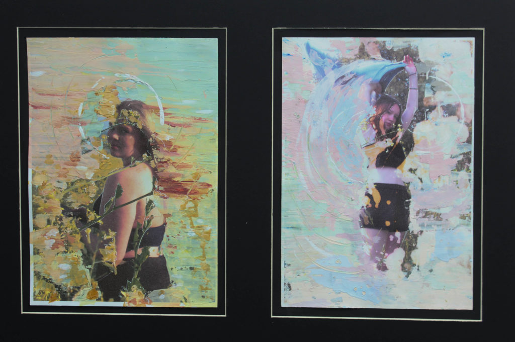
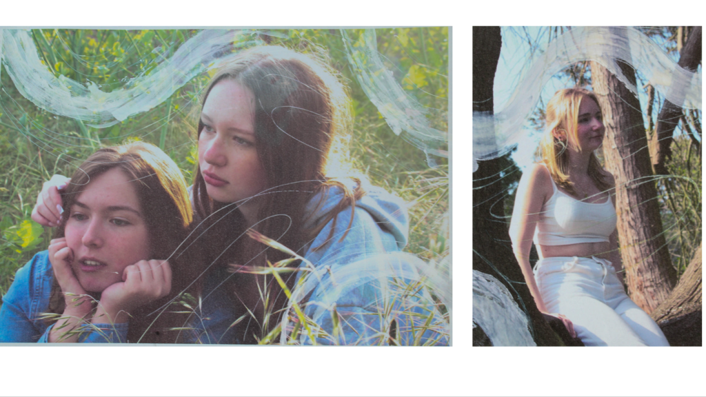
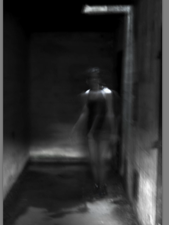
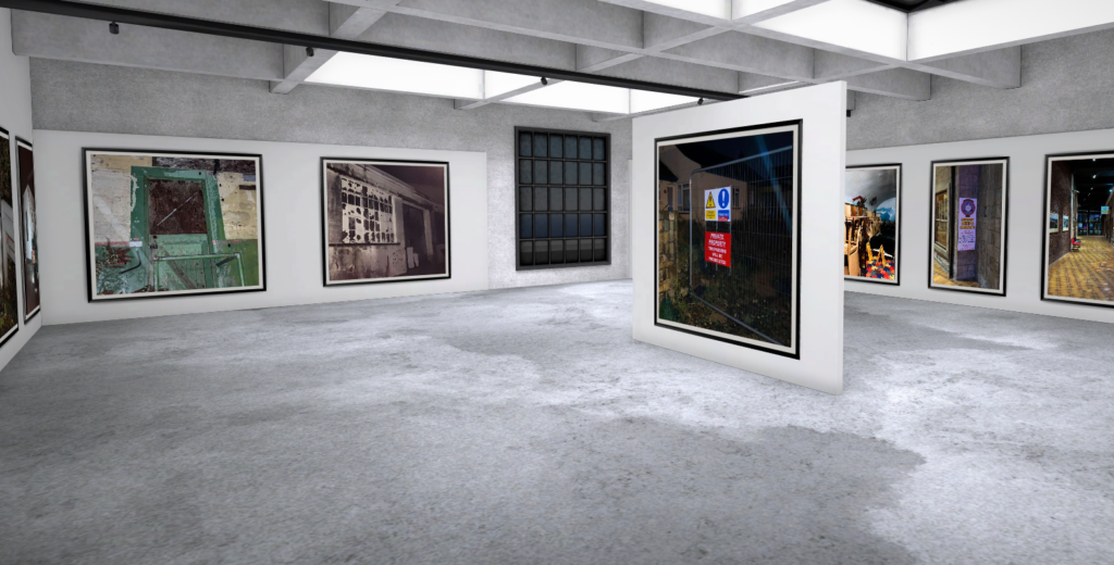
I created a collection of photographs while in Madeira over the Christmas holidays, capturing familiar landscapes from trips when I was younger, like family homes for example. I also captured few pictures of family, street photography, environmental portraits, etc in a documentary-type style. Originating in the 19th century, documentary photography is said to “show, in an informal way, the everyday lives of ordinary people and the photographer’s goal was to bring the attention of an audience to the subject of his or her work”. This is an effective method of photographing this part of my life, in Câmara de Lobos. This is because it communicates to the viewer that I am documenting part of my family heritage as an attempt at self-expression and to explore my childhood memories of being with family in Madeira. I conducted some more photoshoots upon returning to Jersey; trying to capture the family I have on island. However, although some images were documentary, I captured these portraits in a tableaux style. Tableaux photography offers a “much more oblique and open-ended description of something that we know is significant because of the way it is set up in the photograph”. This was important to me because while I care for my family in Madeira, I do not see them as often as my family in Jersey. Therefore, through tableaux style photography, I captured photographs of my family to portray how significant they are to me and how they have shaped me as a person. It was also to show that I have an element of control over my life currently and can shape future memories but cannot manipulate past childhood memories. By creating a photobook for my project, it allows me to establish a storyline throughout the series of images and show the progression of my life between these two places significant to me. I have divided the images with occasional double page spreads which add a pop of colour to my photobook. One significant photograph is one of the natural pools in Porto Moniz, which I used to signify me travelling across from Jersey to Madeira which demonstrates the separate aspects of my life. I have also incorporated other themes like religion, which is especially important to my grandparents. This will create the story of my identity, showing my family, to capture the essence of having my dual heritage.
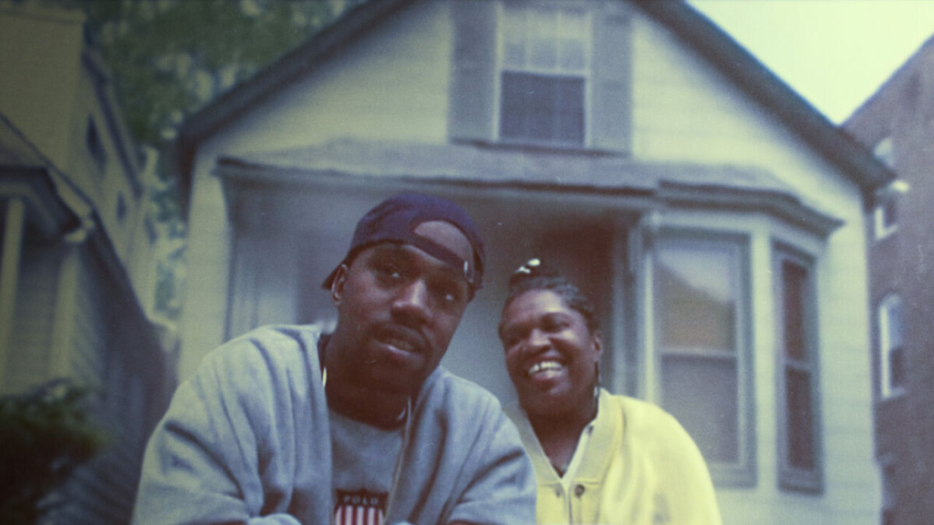
Latoya Ruby Frazier uses her work as a vice to preserve ideas of labour, gender, and race in aspects of industrialism. Her first publication ‘The Notion Of Family’ aimed to portray how she, as well as her mother and grandmother, survived environmental racism in her hometown of Braddock, Pennsylvania. By focussing on her hometown, Frazier addresses childhood memories through her work. She reflects upon her life through these images to share a personal and potentially sensitive aspect of her life. This communicates an aspect of her identity to viewers as well as an element of self-expression through her work. She took inspiration from Gordon Park’s idea of using a camera as a “weapon” against racism, showing how her use of documentary and tableaux photography methods have created a collection of influential images. Frazier offers an insider’s perspective into her chosen topics of race, industrialism, and more. Opposed to an outsider’s perspective which arguably holds elements of depthlessness, anonymity, banality, and mechanical reproducibility. An insider’s perspective allows the photographer to deeply connect to their work and to create better outcomes altogether. In addition, because her own family was part of her project ‘The Notion Of Family’ and it was a reflection of herself, it allowed her to give her photographs a deeper meaning and understanding. The process of image making is also a lot more effortless as the subjects become comfortable in front of the lens when having a close, trusted family member creating the images.


Alessandra Sanguinetti aims to capture the essence of youth, and therefore nostalgia in her work. This is portrayed through her project ‘The Adventures of Guille and Belinda and The Enigmatic Meaning of Their Dreams’ which follows the cousins Guille and Belinda through the countryside of Buenos Aires. This project was created through an organic process, meeting Guillermina and Belinda’s grandmother through her family’s farm and in their surrounding area. Sanguinetti knew the pair of cousins since they were around 4 years old. Her initial intention was to focus the subject matter upon animals on the farm, however this shifted in 1988 when she decided to include the girls in her image making upon discovery of a story within them. Though they are not family, this relationship of knowing someone for many years creates a sense of comfort. This allows Sanguinetti to capture these portraits naturally among the farm, which is their natural born home. She did not predict the nature of the project, not expecting it to develop into a series through time, emphasising the natural and organic nature of her work. Through reflection of her project, Sanguinetti realised the importance of having a larger perspective and being able to view the whole story. In my own project I took some inspiration from her approach, naturally capturing images through documentation of Madeira. My lack of plan for the landscape photography aspect of my photographs allowed me freedom to capture anything eye-catching or mundane within the streets of Câmara de Lobos. Like Sanguinetti, by exploring this Portuguese aspect of my identity it allowed me to create documentation of Madeira, creating a series of images which reflect my identity as a whole. These photoshoots I conducted allowed me to produce successful outcomes to make a photobook which creates a story. Sanguinetti talked of how if you look at something very closely, you will see a lot of points which don’t make sense. This project has allowed me to create a photobook which evidently shows a part of me and my life through my establishment of timeline and self-exploration.
In Conclusion, this project has allowed me to create a personal exploration of my childhood, family, and heritage. Through the lens of both documentary and tableaux photography styles, I sought to capture important memories and emotions tied to my upbringing, ultimately expressing my identity. Similar to Frazier’s focus on identity and Sanguinetti’s emphasis on nostalgia, I aimed to create an outcome which reflects the duality of my English and Madeiran heritage. The process of creating this project has allowed me to not only document my family’s history and significant moments but also to explore how these memories have shaped my sense of self. Incorporating elements of both black and white and colour photography, I aimed to reflect an emotional response like in these artists’ works. Similarly to Frazier and Sanguinetti, I have explored my own experiences and successfully created visual representation of my own heritage, presenting a story that demonstrates the importance of preserving our memories.
BIBLIOGRAPHY
Döblin, A (2003), August Sander: Face of Our Time. Munich: Schirmer Art Books.
Sontag, S (1977), On Photography. London: Penguin Books
https://latoyarubyfrazier.com/
https://archive.nytimes.com/lens.blogs.nytimes.com/2014/10/14/latoya-ruby-fraziers-notion-of-family/
https://www.photopedagogy.com/uploads/5/0/0/9/50097419/week_5_abigail_solomon-godeau_inside_out.pdf
https://www.newyorker.com/culture/photo-booth/off-the-shelf-the-adventures-of-guille-and-belinda

