First I chose my background

Next I had to open the image I used as my first layer

Then I used the ‘rectangular marquee’
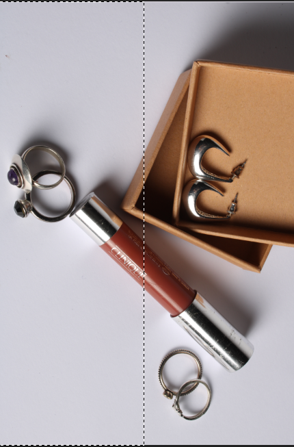
I ‘cleared’ the half I didn’t want in the image

First I chose my background

Next I had to open the image I used as my first layer

Then I used the ‘rectangular marquee’

I ‘cleared’ the half I didn’t want in the image

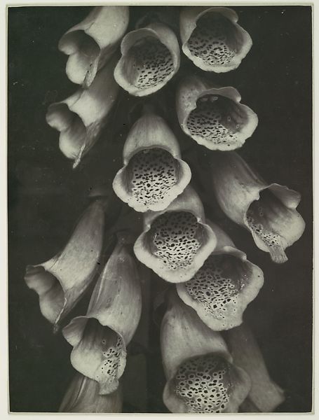
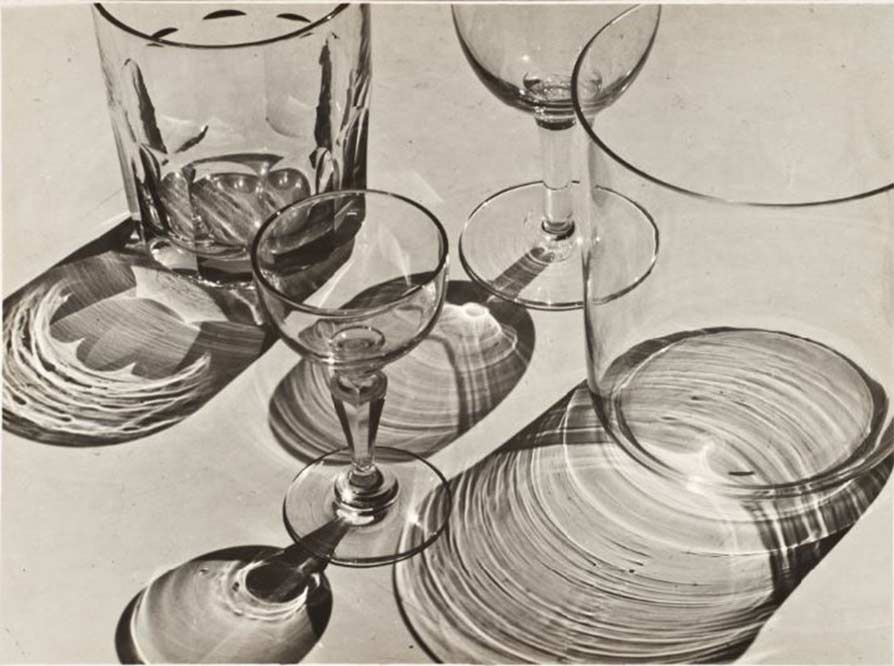
it was a movement in German art that began in the 1920s to oppose expressionism. Its rejects self-involvement and romantic idealism. This is shown through modern photographers such as Karl Blossfeldt and Albert Renger-Patzsch. Their photography simply photographs objects or plants without any context or interesting backgrounds added. This removes the idealized aspect from their work, like they did with new objectivity back in the 1920s.
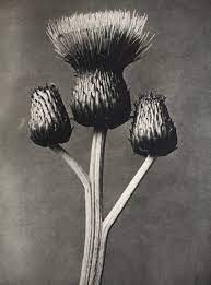
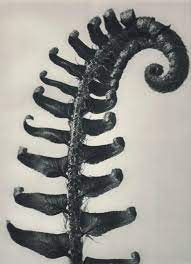
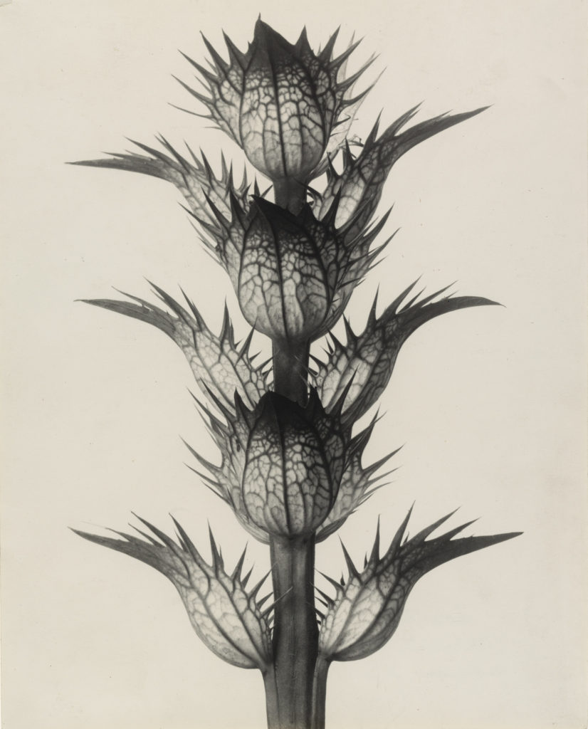







What is New Objectivity?
The New Objectivity was a movement in German art that arose during the 1920s as a reaction against expressionism. As its name suggests, it offered a return to unsentimental reality and a focus on the objective world, as opposed to the more abstract, romantic, or idealistic tendencies of Expressionism.
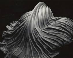


Formalist photography is when the photographer becomes the visual designer whenever the a frame is captured. It also, shows the most important aspect of photography is form, the way you see the image, and its visual aspects
Visual language in photography implies a pictorial communication media in telling a story or a particular event. Visual elements are the information that we see within an image.
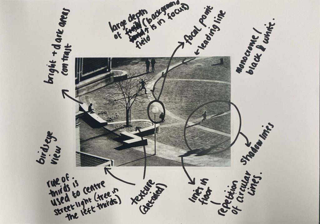
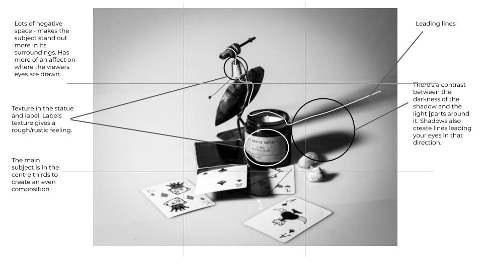
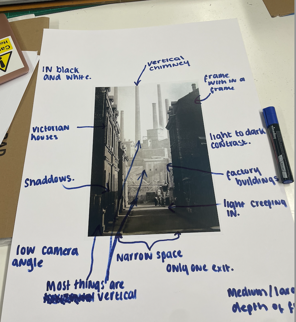
Here is an annotation I did on an image using ‘photo literacy.’ When annotating I looked at the lines, light, texture, colour/tone, the focal point and the rule of thirds.


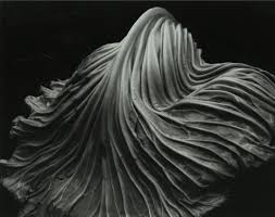
The images mainly have no colour and are in black and white. You can see that there are toned areas on both of these images which show a contrast. There is a clear use of leading lines in the second image as the lines draw you to the subject of the image. The first image does have a lot of lines however, they don’t lead anywhere they just add to the texture of the image. In both images there’s pattern and repetition used. In my opinion the second image has only used the rule of thirds because the first image doesn’t really have a subject or focal point in it’s image.

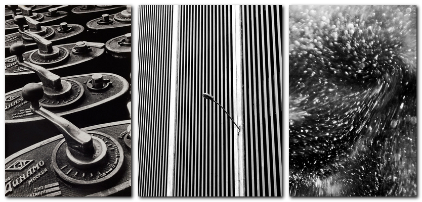
Both these images have a strong use of lines and light as you can see the contrast in tone. The line can be a variety of strong harsh straight lines or softer curved lines.


You can see in the images above that there is clear repetition used whether it be how the bottles are aligned or the spiral lines. Repetition van be shown clearly or hidden in formalism photography which can be seen in these two images. These images both have show how texture can vary. In the first image the texture looks very hard and harsh. It also looks as if the shapes are made out of metal. However, the texture in the second image is distinctively different as it looks smooth and thinner than the metal shapes shown in the first image.
Formalism describes the critical position that the most important aspect of a work of art is its form. the way it is made and its purely visual aspects – rather than its narrative content or its relationship to the visible world.

Peter Fraser created this image in 2002
Fraser travelled to many countries in the world in the early 1990s photographing different machines in scientific research establishments. In 2002 Fraser brought multiple different images
made from the department of Applied Physics at Strathclyde University. He did this with other photographers making sureall images of dirt and litter, to propose a democratic notion of the
importance of all material and to minimise waste which he demonstrates across all of his work,
‘everything might be worthy of the utmost attention’.
Line & Shape: There are number of repetitive circles within this piece which are complemented by the different curves of the main object which is the main vocal point
Space: The space in the image appears quite shallow and constrained. There is a mainly black background which what looks like metal as well.
Texture: The objects in the image appear smooth and almost wet as you can see the glaze from the light reflecting off of it.
Value/Tone: The image contains a range of tones from very dark to very light. There are deep shadows but also some mid tones.

What to look at when describing images
Light: Which areas of the photograph are brightest? Are there any shadows? Does the photograph allow you to guess the time of day? Is the light natural or artificial? Harsh or soft? Reflected or direct? How does light fall across the objects in the photograph?
Repetition/Shape: Are there any objects, shapes or lines which repeat and create a rhythm or pattern? Do you see echoes or reflections within the image?
Space: Is there depth to the photograph or does it seem shallow? What creates this appearance? What is placed in the foreground, middle ground and background? Are there important negative (empty) spaces in addition to positive (solid) spaces?
Texture/ value tones: If you could touch the surface of the photograph how would it feel? How do the objects in the picture look like they would feel?
Colour: What kind of colours can you see e.g. saturated, muted, complementary, primary? Is there a dominant colour? How would this image be different if it was in black and white? Does the use of colour help us understand the subject or does it work independently?
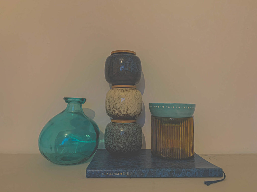
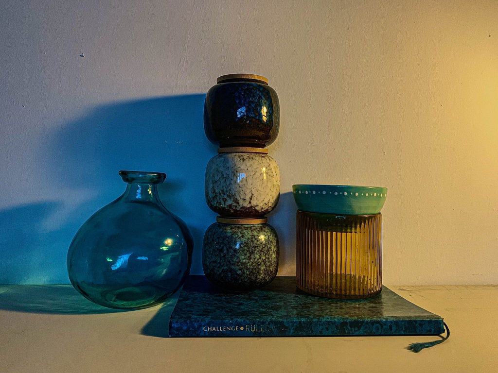
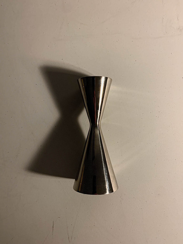
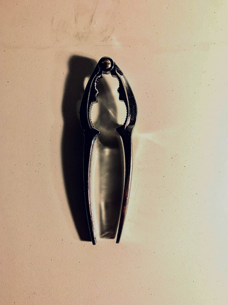
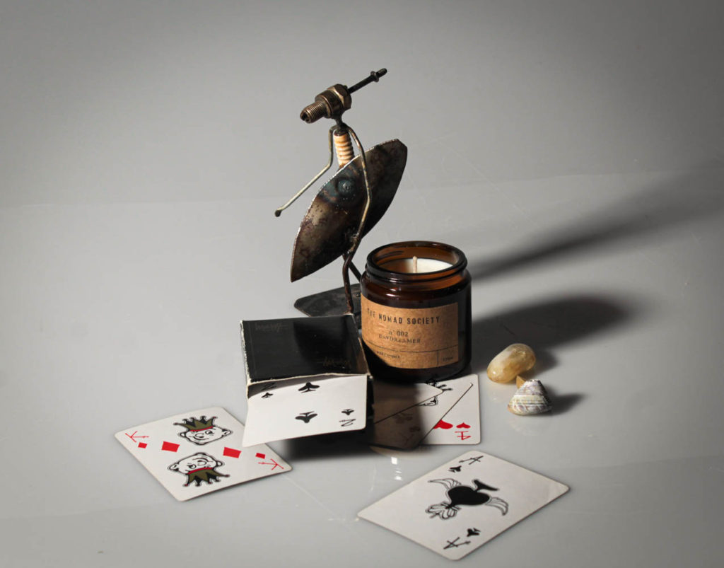
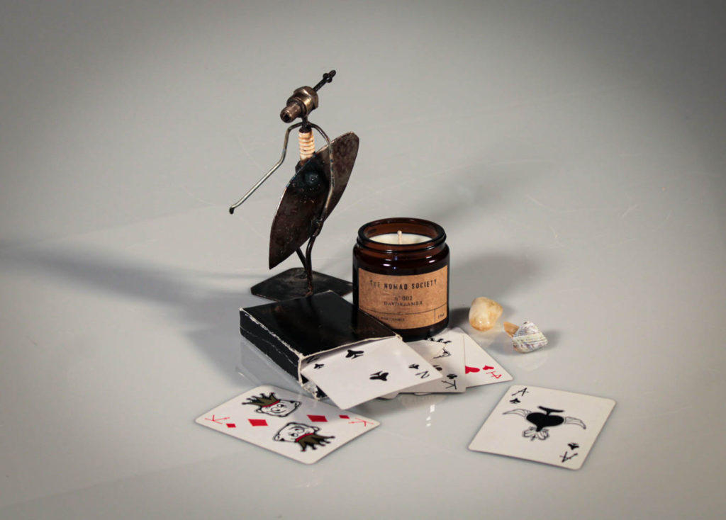
Out of all of the still life shoots we have shot so far, I’ve taken and edited several photos, and these are some of the best I’ve come up with:



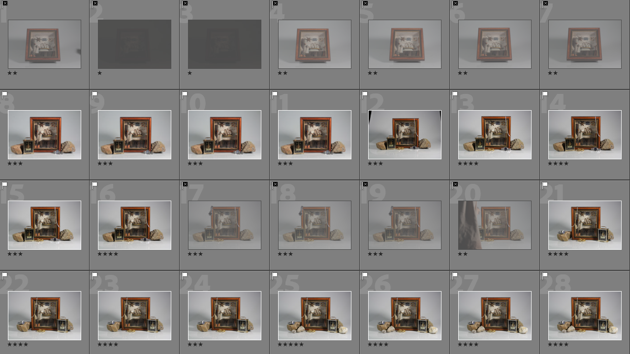
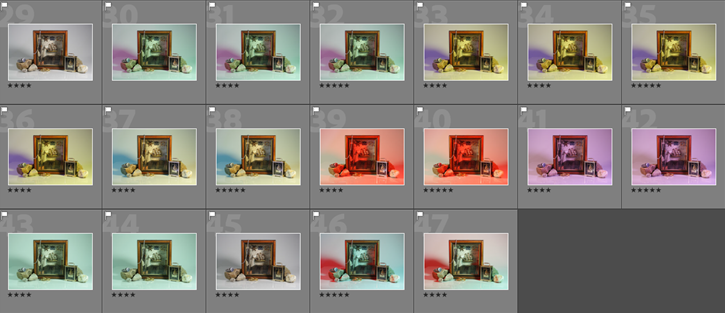

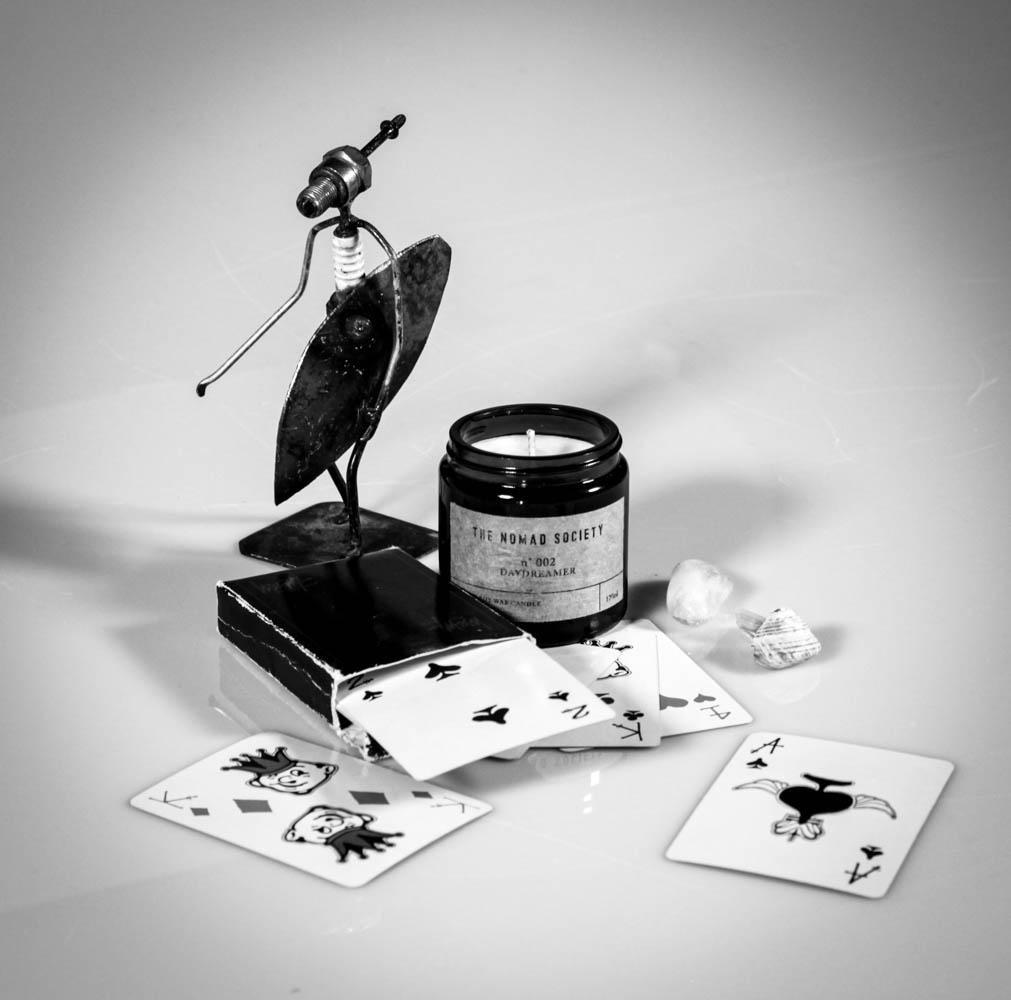
After, I edited most of the photos I marked as green, and came up with these as the results:






Formalism describes the critical position that the most important aspect of a work of art is its form – the way it is made and its purely visual aspects – rather than its narrative content or its relationship to the visible world.

This photo is an example of formalism, it has a large, focused depth of field, the photo is taken in natural light as the photo has then been edited into black and white it highlights the light parts and shadows making them stand out more. The tone of the photo goes from dark to light which implies that the photo would have been taken around late morning or early evening i can gather this information because of the angle of the shadows, the buildings on either side of the photo adds the element of a frame within a frame as the centre of the photo has no buildings in the centre. The top of the buildings is what draws the audience to the photograph as it is the lightest part of the photograph.
Visual language
Visual language in photography is a photograph which tells a story. The visual language shown on a photography work implies a pictorial communication media in telling a story or a particular event. The presence of a sequence of portraits seri is sometimes important to explain the things happening.
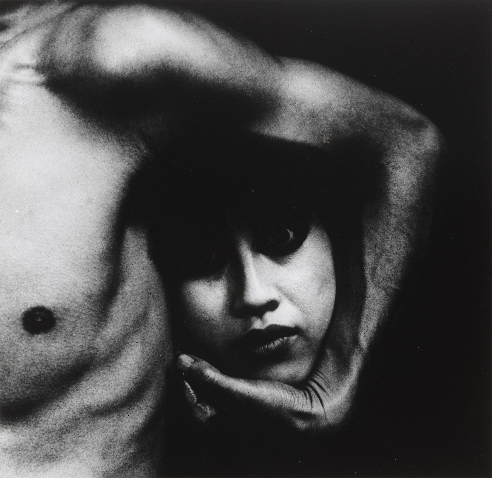
This photograph is a visual language photo as when the consumer of the photo looks at it they begin to think of a story behind it and question the intentions behind the photo and why it was taken, the lightest points on the photo draws you in as they are the high points on the photo, the girls facial expression in my opinion implies a lot about the photo. The photo shows the texture of the body as you see the veins on the arm and the texture of the rough looking skin. The lighting highlights certain aspects of the photo such as the ribcage and the creases on the hand.

Walker Evans began to photograph in the late 1920s, making snapshots during a European trip. Upon his return to New York, he published his first images in 1930. During the Great Depression, Evans began to photograph for the Resettlement Administration, later known as the Farm Security Administration (FSA), documenting workers and architecture in the Southeastern states.

Harvey-Regan was known for entwining image and object together, his work was inspired by Walker Evans as he montaged together Walkers tools before recreating the objects, he bought the tools and deconstructed them and then reconstructing them.
Harvey-Regan’s work is eye catching because at the first glance you can see it as a normal tool but when you look at it in depth you can see the reconstructed tool and how the two tools seamlessly, he has also eliminated all shadows making the photo look sharp and well put together.
There are seven basic elements of photographic art: line, shape, form, texture, colour, size, and depth.
Formalism is the Design, Composition and Lighting are dominant over Subject Matter. The photographer becomes a visual designer whenever a frame is captured.
Whenever people look at an image, our eyes are naturally drawn to the lines present within it. We instinctively follow these lines to see where they go—these lines are leading our gaze towards a particular subject.

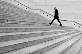

Leading lines in photography are existing lines within the frame of a photograph which the photographer has deliberately aligned/arranged (prior to taking the photo) by adjusting their composition either shifting their body or camera. It should result in lines which “lead” to the subject, increasing the focus of the viewer, allowing for a more enjoyable viewing experience.
Shape is generally considered two-dimensional, while Form is three-dimensional. In photography, how we light an object can determine whether it’s perceived as a shape (if the lighting is flat or silhouetted) or a form (if the lighting has accentuated shadows & highlights to create depth).
A shape is two-dimensional. Yes, a photograph itself is two-dimensional. But a shape in a photograph doesn’t have any depth.
You can use lighting or perspective to give a two-dimensional shape depth. But once a sense of depth has been applied, a shape becomes a three-dimensional form.
For instance, if you look at an image of a ball, you’ll find its shape as a circle. Likewise, if you look at a picture of a cube-shaped suitcase, you’ll find its shape like a square.
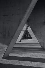
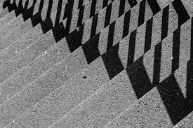

Objects with the appearance of depth are three-dimensional forms rather than shapes. So, despite being part of a two-dimensional image, the viewer can detect depth beyond the object’s front surface.
Light and shadows give forms their depth. Or a change of perspective reveals the form’s angles and edges, rather than having a head-on view.


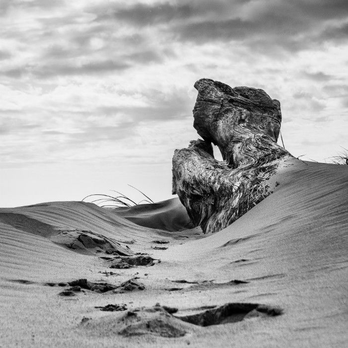
Texture creates a sense of depth in a two-dimensional image. Texture in photography can also be accentuated by light and shadow.
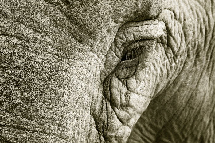
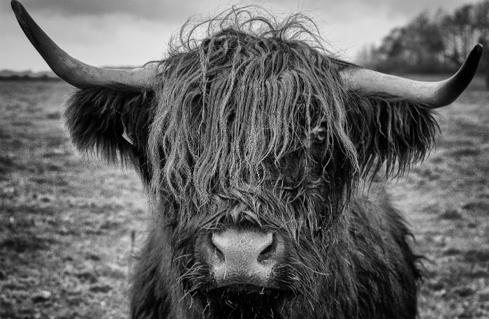
In black and white photography, texture add interest to your photos by providing tonal variance and detail densely concentrated in certain areas of the frame.
Having an emphasis on texture in your photos can help you make the overall photo stronger. Being able to see surface details enables the viewer to get a better feel for your subject and location.
It adds character and atmosphere to your composition. Texture evokes the viewer’s tactile sense.

This photo is of a street in America, in black and white, with dark tones. the image also includes a ‘frame within a frame’ due to the dark buildings acting as a frame for the lighter building, this can also be seen as a tunnel looking photo too, due to the lines from windows, pavements street poles, and floor painting.
This image also gives a 3D affect as the road also looks as it it is getting more narrow the further away it is.
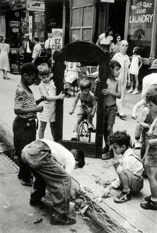
This is a urban photo of children playing in the street, there is no colour in this photo which further suggests hat they are in a urban city. there is a trashed floor that the children seem to be playing with that implies that they are in a poor area. within the photo there is two boys holding something which looks like a photo or door frame which creates a ‘frame within a frame’ image. this also draws the attention of the viewers eye straight to the boy on the bike.