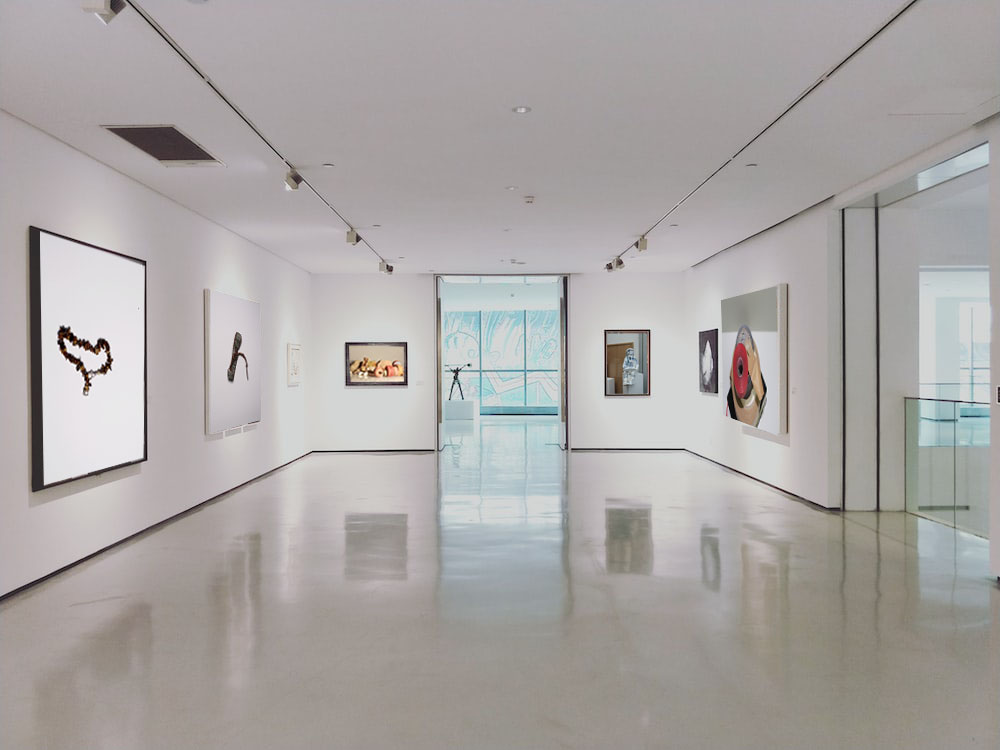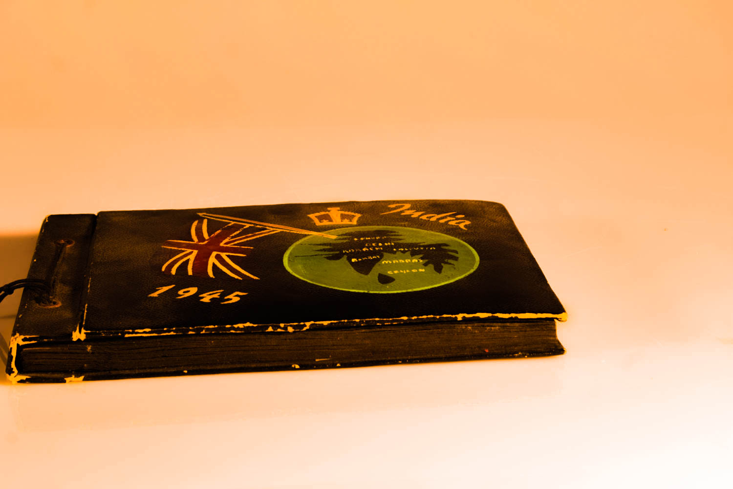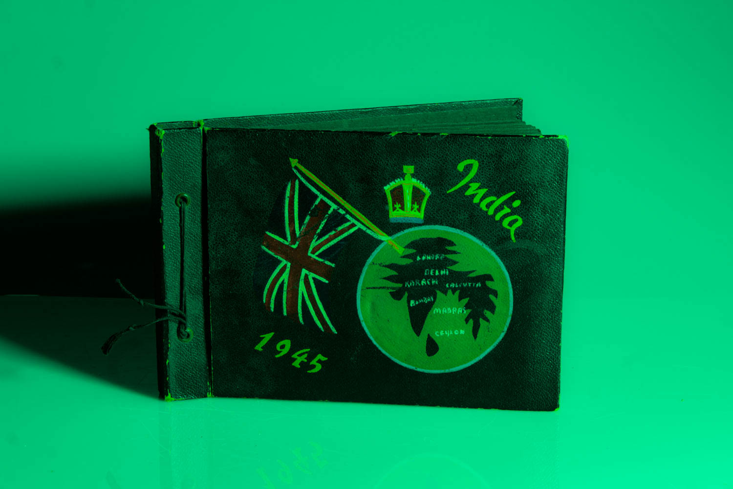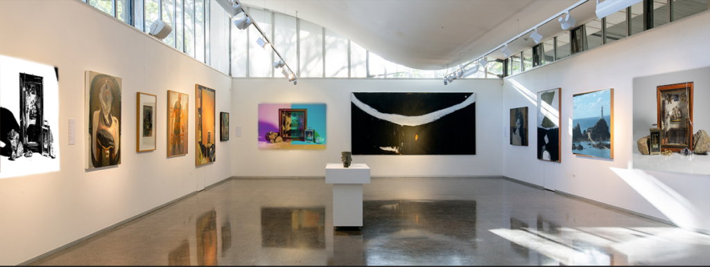
for this I got a photo online of a art gallery then I took a screenshot of the photo and put it in photoshop then I got my edited photos and put them on top of the photo on the gallery photo.

for this I got a photo online of a art gallery then I took a screenshot of the photo and put it in photoshop then I got my edited photos and put them on top of the photo on the gallery photo.
In conclusion, I think that I completed this project well, making sure I created detailed blog posts about everything I made and learnt. I think one of the strongest areas of my project was the number of photos I took, as I believe I photographed quite a large number of objects for each section of the photographing process. This enabled me to have a wide variety of photos that I could later print and edit. However, I think I could’ve produced a greater amount of experiments so that I could choose the best images from a bigger variety of edits as well as try out more photo montage techniques. On the other hand, I believed I applied the knowledge I gained about different aspects of photography (such as aperture and shutter speed- but also topics such as still-life) in my work well, making sure each photoshoot linked in well with the topic/ skill. Another area of my project that I think was successful was linking my work in with the different artists and photo montage techniques we studied. For example, the photoshoot I did in the style of Mary Ellen Bartley resulted in a good selection of images that closely linked in with her work.
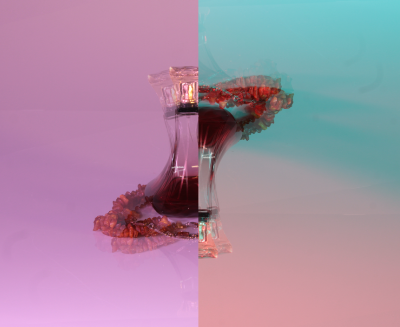
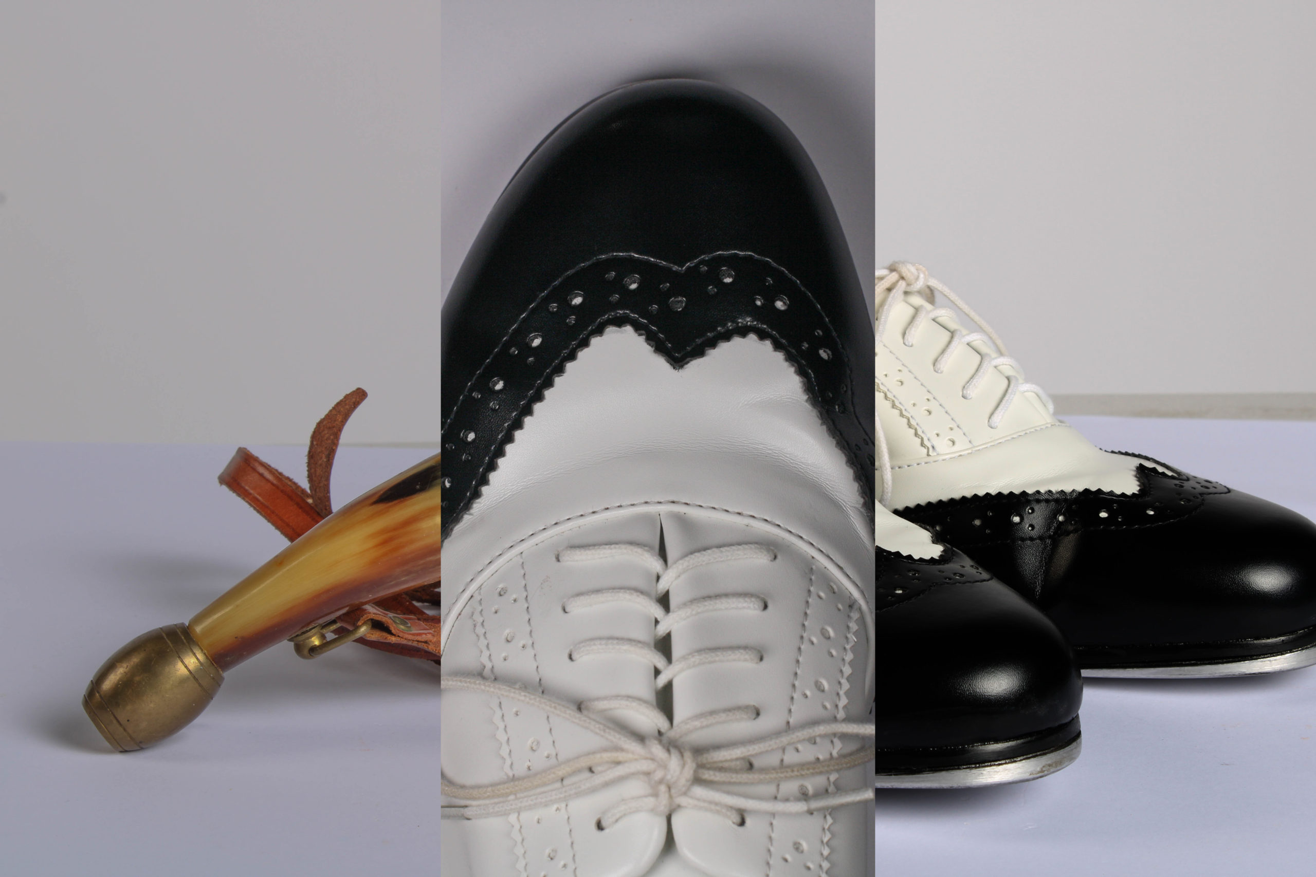
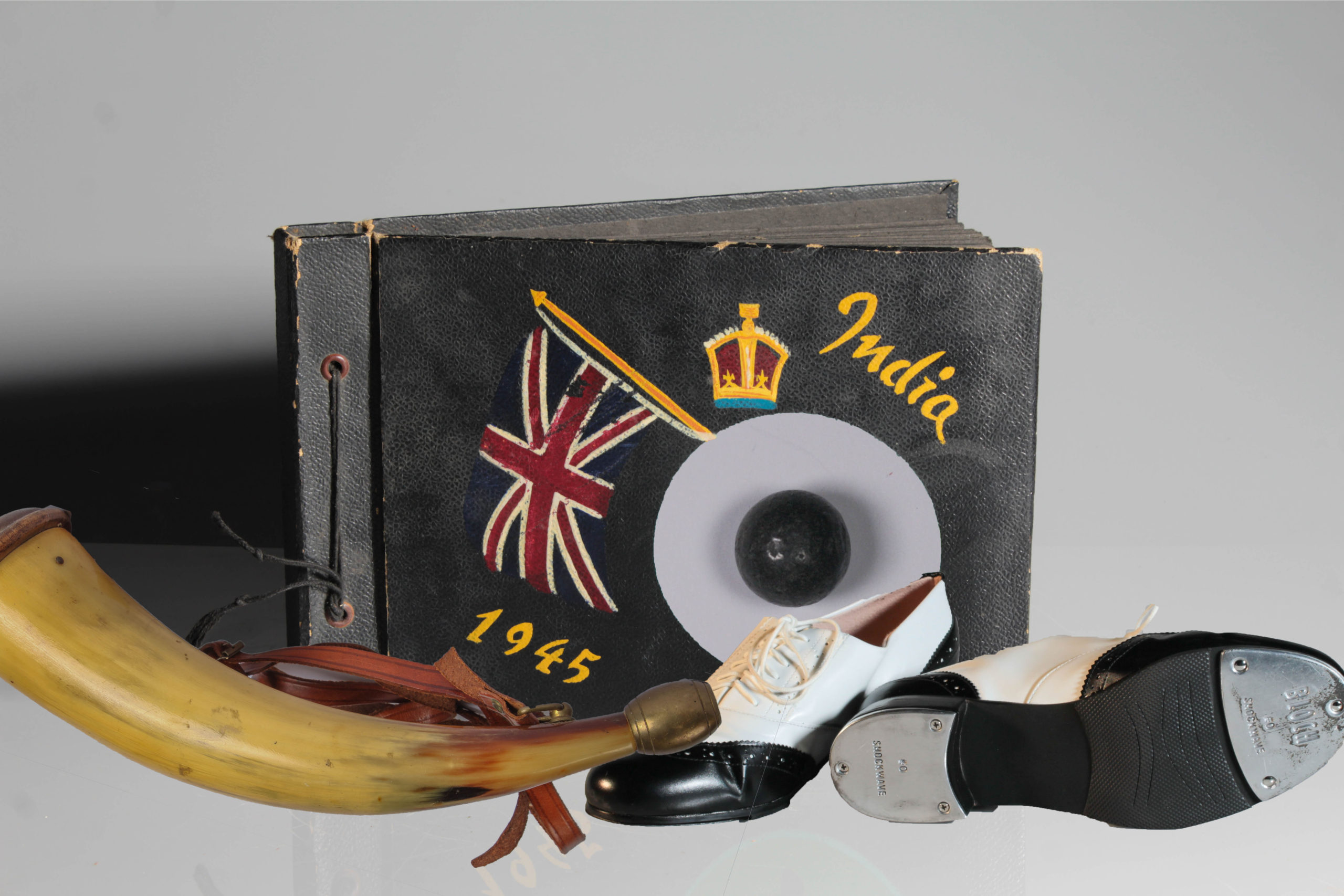
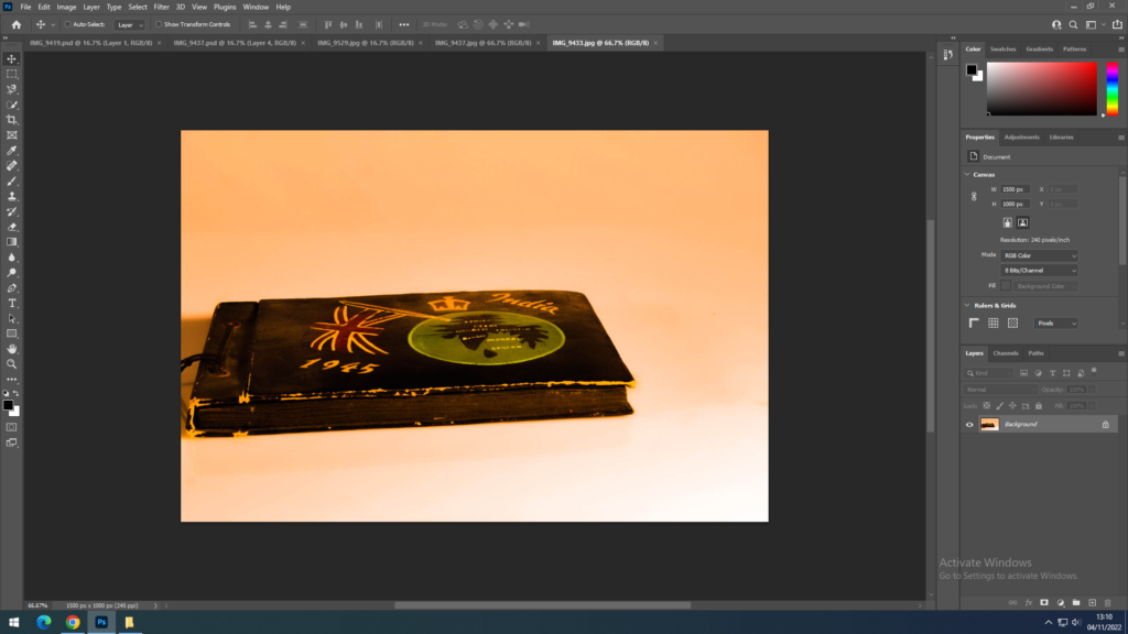
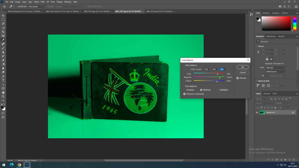
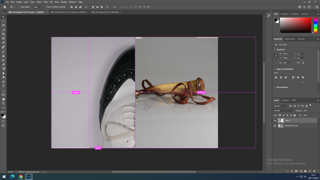
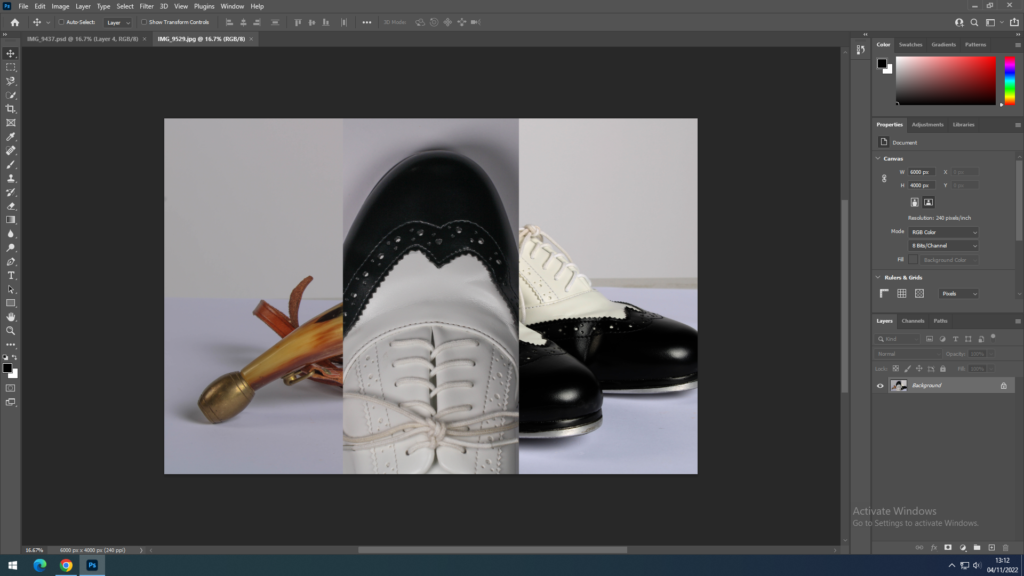
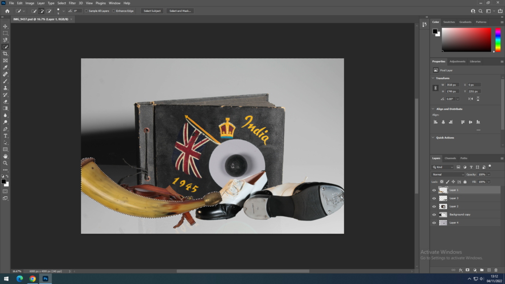
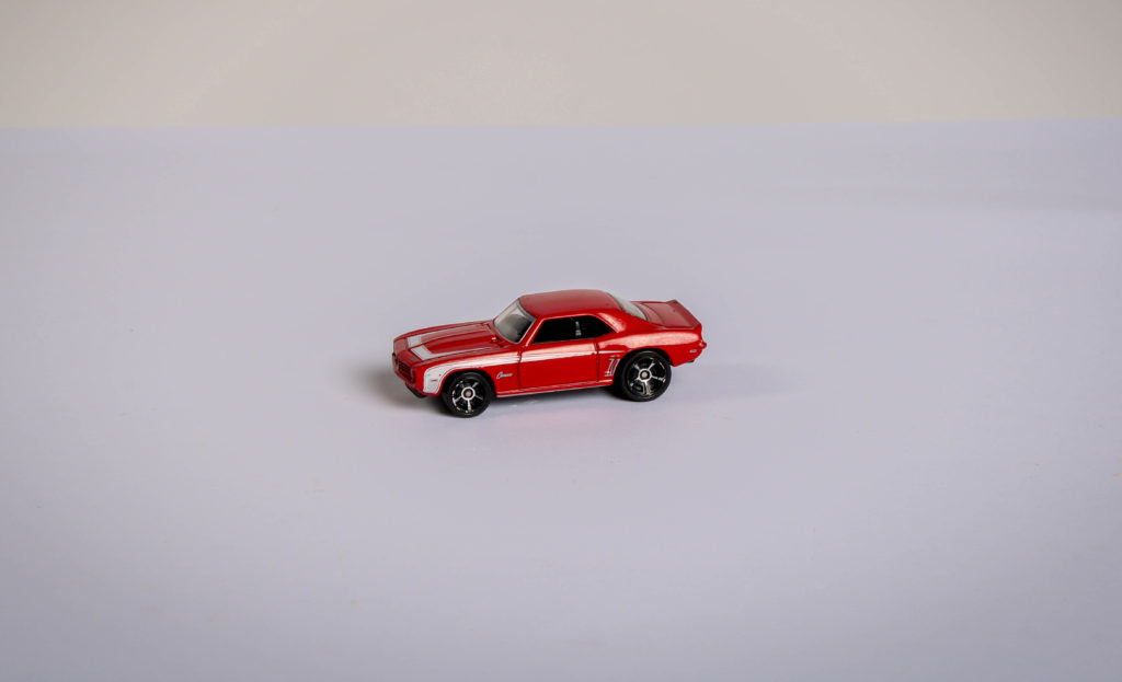
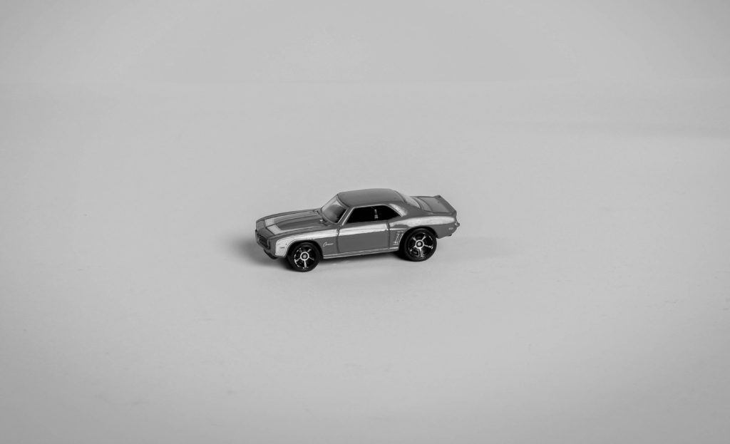
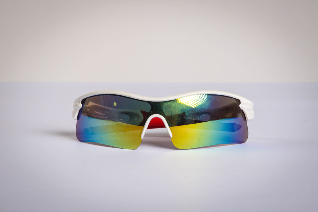
Firstly, I think the unedited photos I used were already quite strong photos, including two personal objects to create a simple still-life image. Furthermore, both images included continuous, coloured lighting- which immediately made the picture more interesting. I like how the two images put together created not only a interesting photo montage edit (since one of the halves was flipped upside down to create the unsymmetrical look), but also contrast between the background colours in both photos. Furthermore, I was inspired by Idris Khan and decided to duplicate the photos, slightly rotating them and reducing the opacity to create a sense of motion in the edit, resulting in this cool, merged effect. Overall, I think this edit is very effective since it clearly resembles a photo montage as well as linking in with an artist.
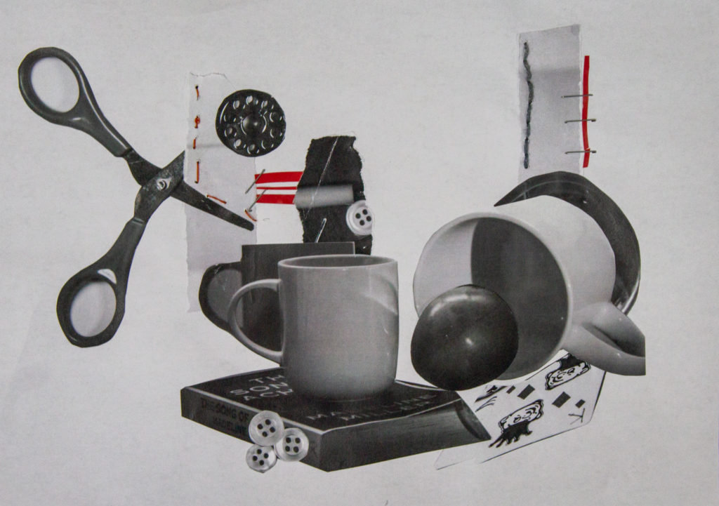
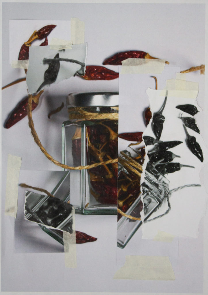
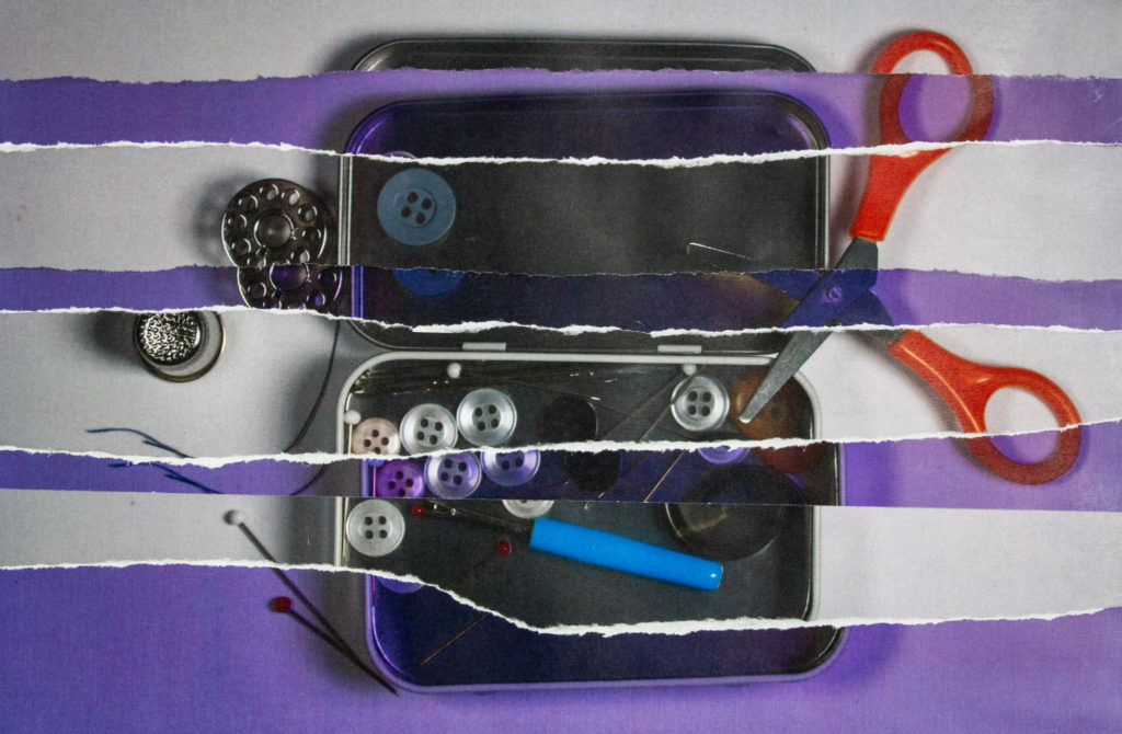
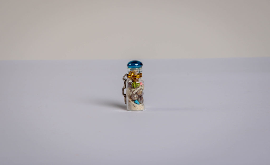
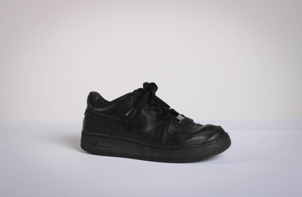
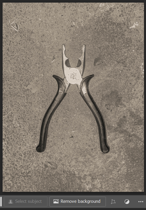
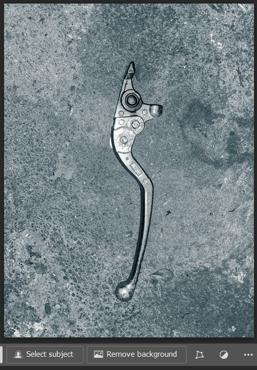
I moved all of my edited images into photoshop, and experimented with combining two images in the same way as Harvey-Reagan.
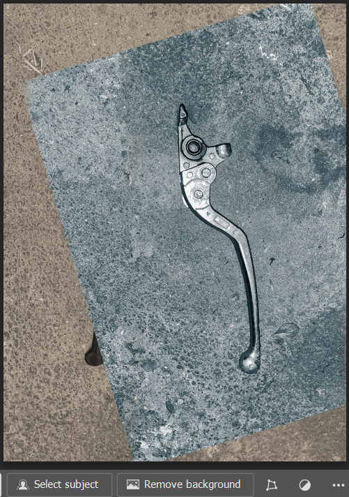
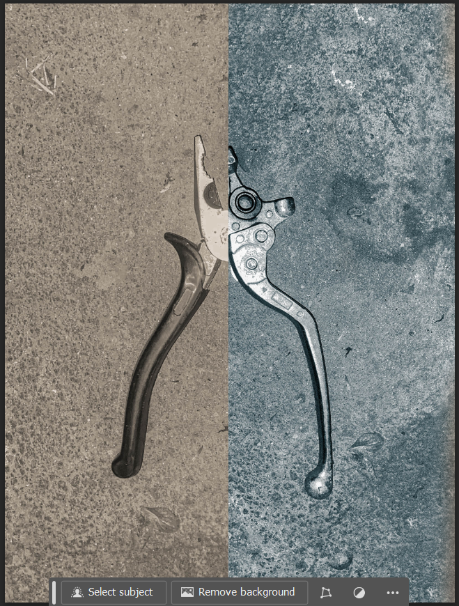
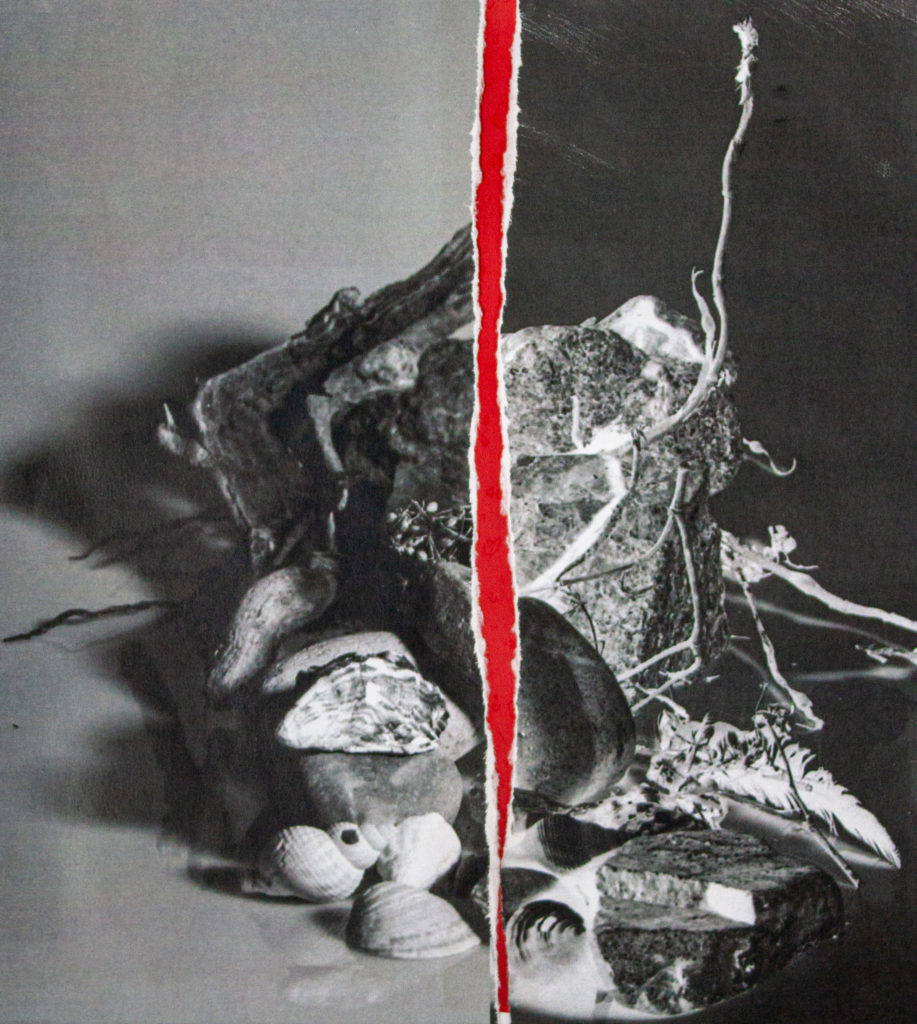
I wanted to combine the pliers and clutch lever together as I feel they have a very similar shape, so I position the image of the clutch lever to line up to one side of the pliers, and used the clone stamp tool to cover the rest of the canvas, before cutting off half of the canvas with a selection tool. I liked how this had turned out, but I wanted the two images to have a similar colour palette so they would blend together a lot better.
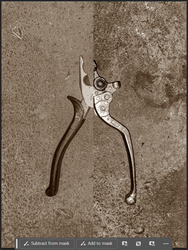
Using the available adjustments presets that were on photoshop, I played around with different ones until I was left with a composition I wanted to keep, the image on the left being the result.
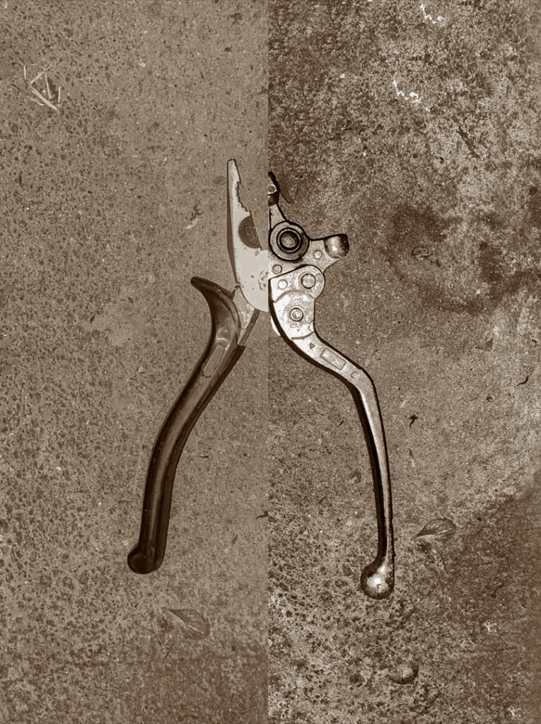
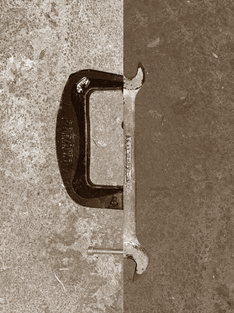
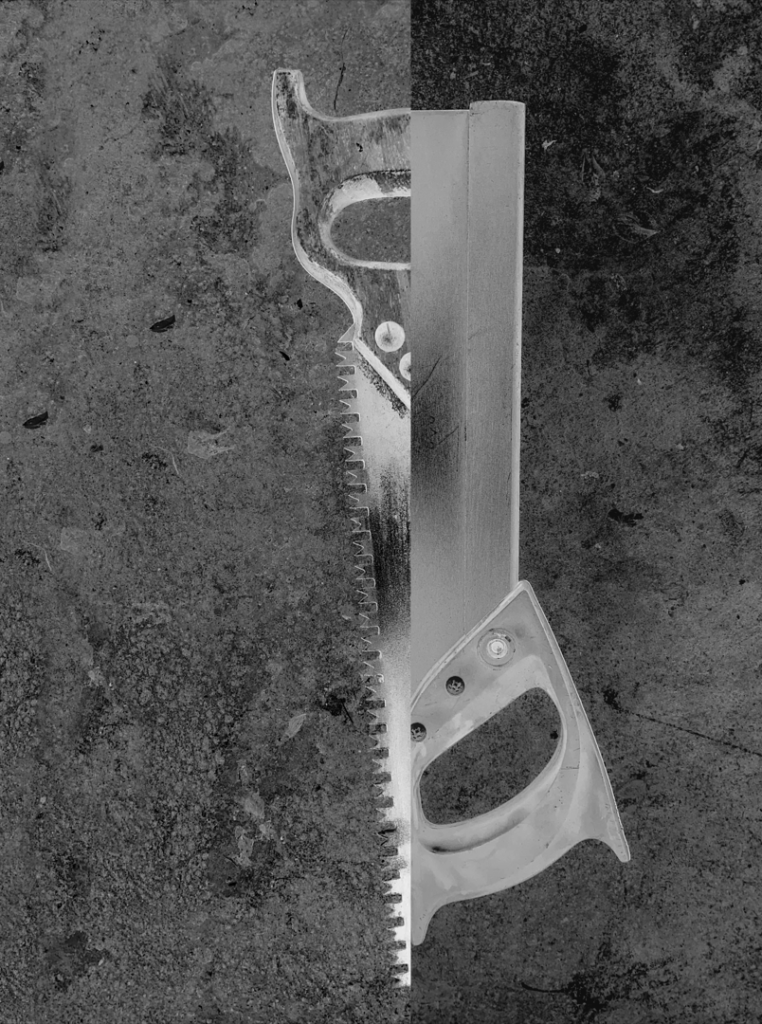
These three compositions are what I came up with using Harvey-Reagan as inspiration. I do think they capture his work quite well, but I also feel that I’ve put my own spin on it by keeping the backgrounds of the images and using objects such as the vice and clutch lever. This photoshoot was enjoyable, but I’m not too sure if this will be something I use again in my own work other than the photomontage element of this.

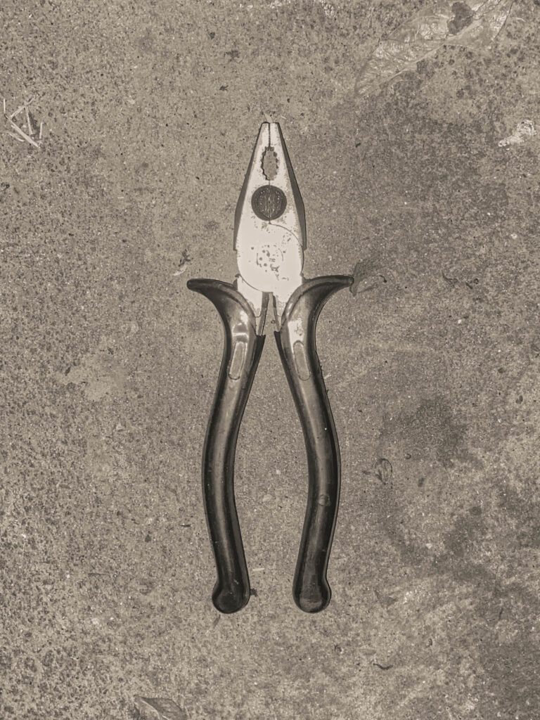
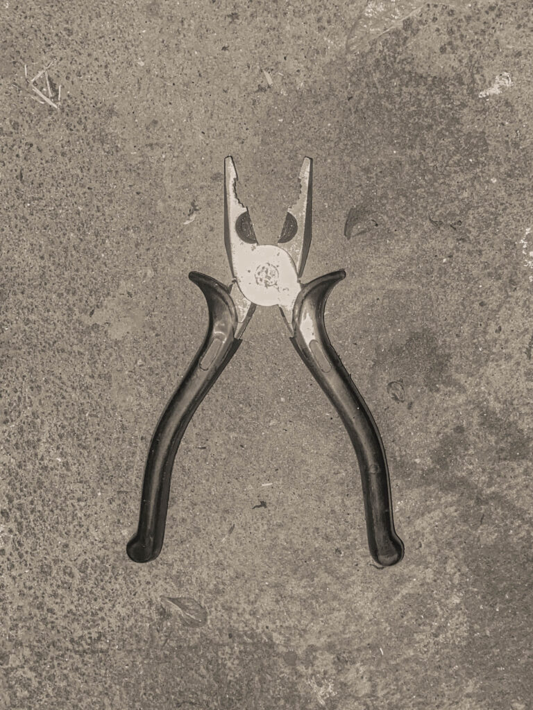
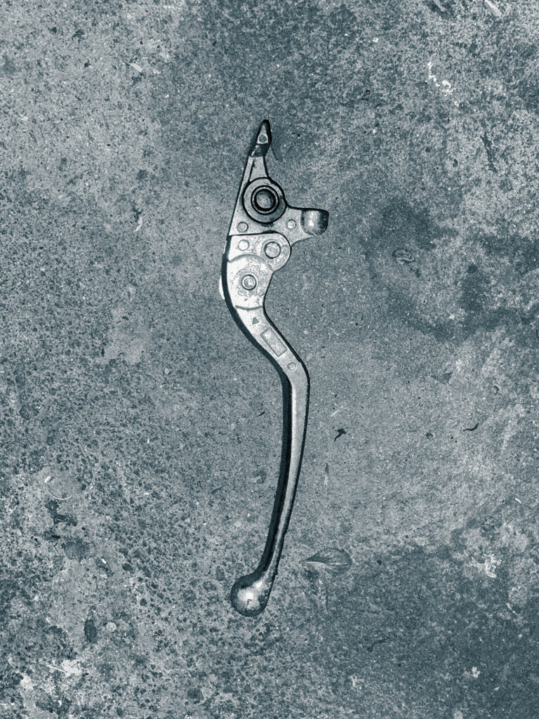

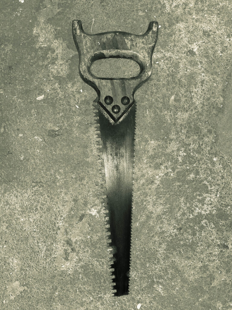
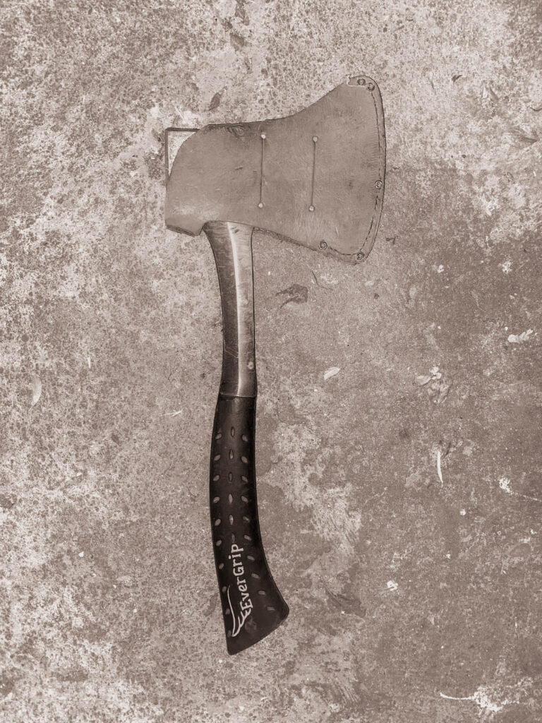
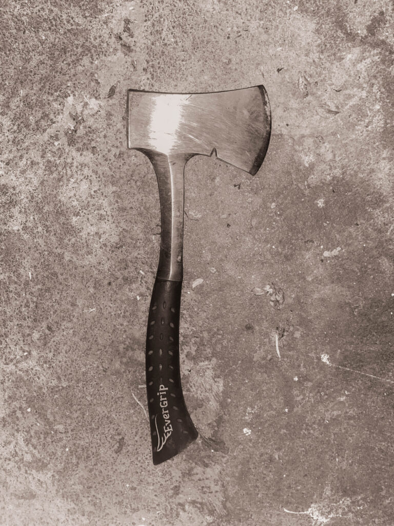
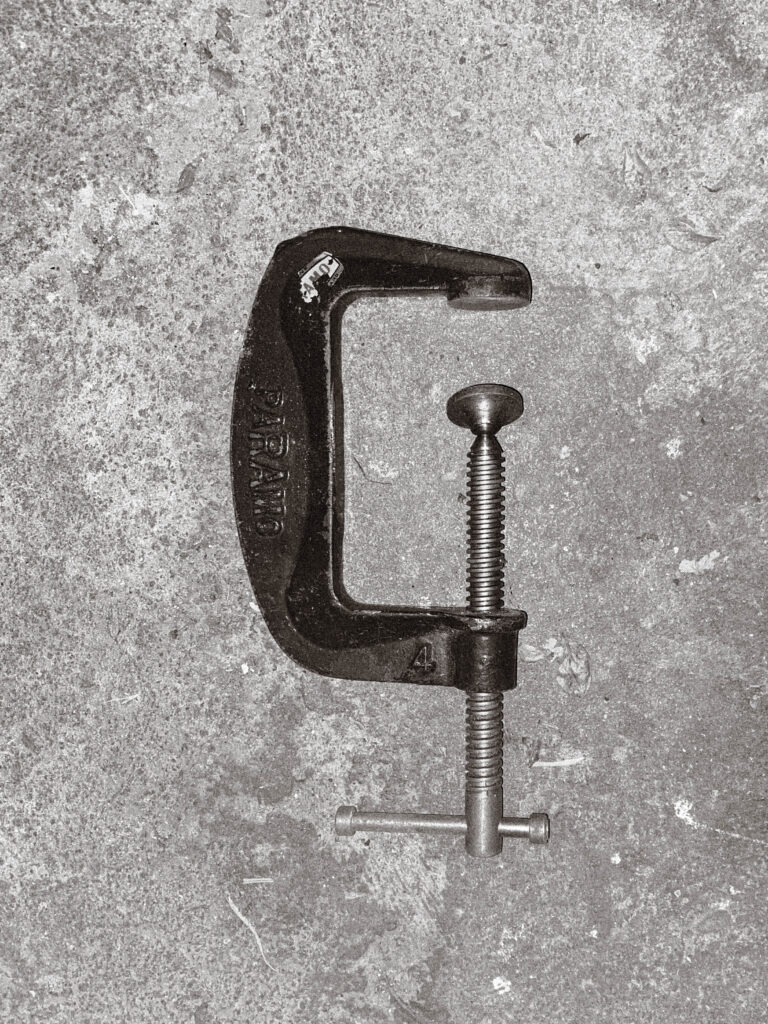
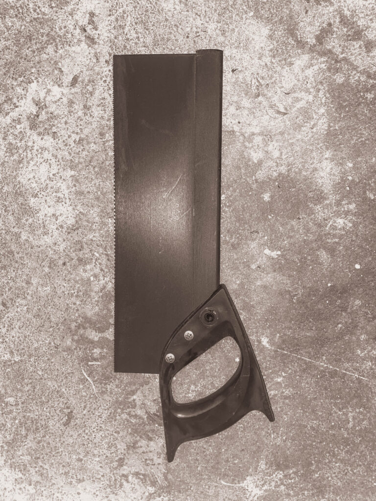
These are my final images for my Walker Evans shoot. I plan to further develop these using similar editing techniques to Darren Harvey-Reagan.
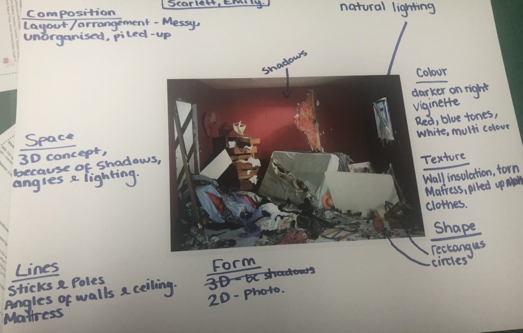
There are 8 visual elements of photographic art: line, shape, form, texture, colour, tone, pattern, space.
line
Lines are either straight, curved, or a combination of the two. They can be solid, dashed or interrupted, implied, or psychological and even go in all different directions.
Straight lines often appear in manmade objects such as buildings and windows. Curved lines can be manmade but are often in nature.
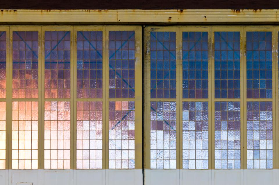
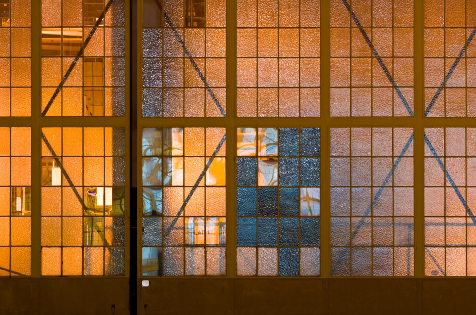
Solid lines are usually seen in scenes and interrupted lines can be easily drawn but are not as common in the real world.
The type of, and general direction of the lines in an image, convey meaning inside the photograph. Vertical or horizontal lines can convey a sense of stability or a static feel to an image. Horizontal lines can indicate distance and vertical lines can indicate/show height, balance, strength. Diagonal lines convey a more dynamic scene.
shape
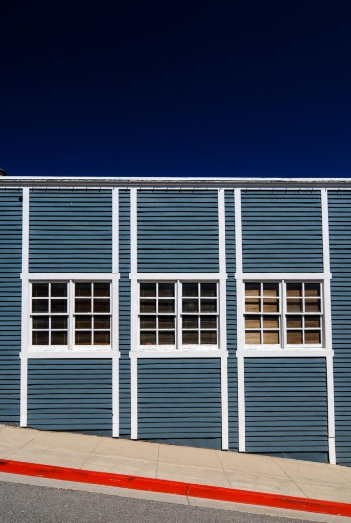
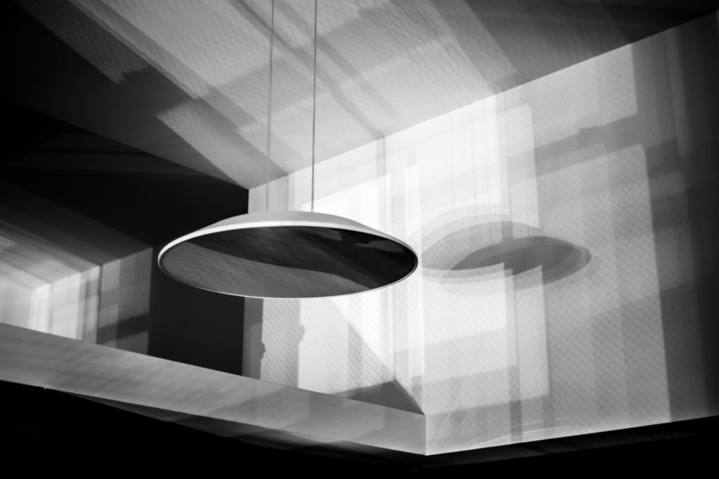
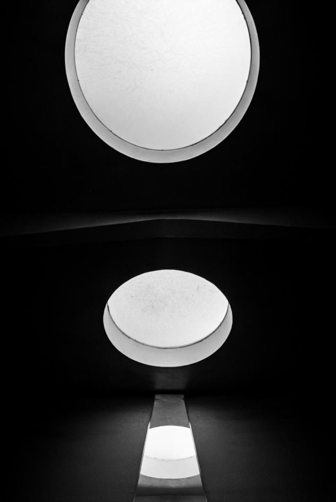
Shape is the two-dimensional appearance of objects as a camera captures them. For example, if you look at an image of a ball, you’ll find its shape as a circle. Likewise, if you look at a picture of a cube-shaped box, you’ll find its shaped like a square.
When different shapes overlap they can create a new shape as well as surrounding an area to create another shape.
In a photograph, a silhouette is the purest form of a shape as there is no form, texture, or colour. Its stark contrast with its surroundings make a silhouette the most visually obvious.
form
Form is three-dimensional. Overall form is height, width, and depth. There are two types of form:
-geometric/regular
-organic
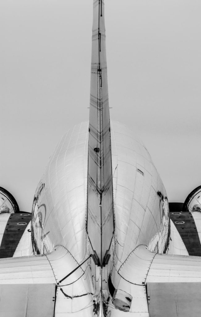
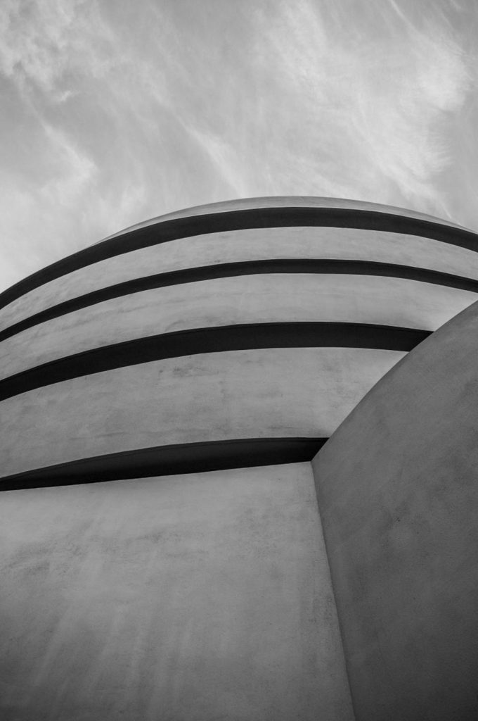
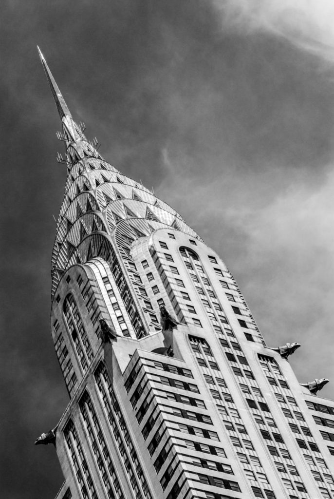
Geometric forms are familiar for example, a sphere, cube, cone, cylinder etc. Organic forms are the objects that surround us in our three-dimensional world.
texture
Texture in real life is smooth or rough however there’s other descriptors that include: slimy, wet, hard, soft, bumpy, shiny, etc.
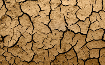
Texture in the photograph is similar to form in that it is revealed by variations in tonality and presented in two dimensions.
In a photograph, smooth objects might have reflections or specular highlights. Rough objects might have aggressive areas of light and shadow without reflections.

Of course, in a photograph, we cannot experience the tactile surface characteristics, but we can “feel” them through the mind’s eye—implied texture; an association with the familiar—assuming that it is familiar. Someone who has never touched sand will not be able to “feel” this texture when looking at a photograph of a beach, but when a beach bum sees a photograph of the beach, they can make the mental connection to the image and “feel” the sand between their toes.
Visually, a pattern might indicate texture—like the scales of a fish or ripples on a pond.
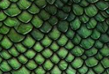
Of course, the physical print has its own texture—glossy versus matte, or even canvas-textured printing papers, for example—which may or may not be aligned with the texture of the objects in the photograph.
colour
We live in a world full of colour. The light from the sun, and artificial sources, gets absorbed and then reflected by different objects, this reflected light is what we see as colours.
Light itself has no perceived color. But, send light through a prism or a drop of water and we can see that it is comprised of a literal rainbow of colors.
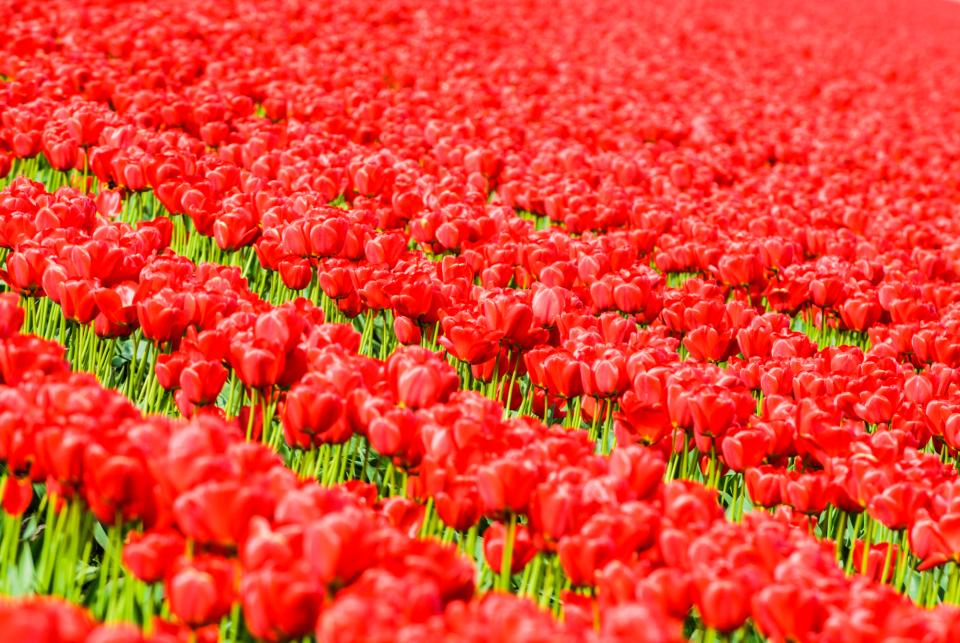
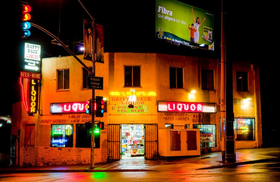

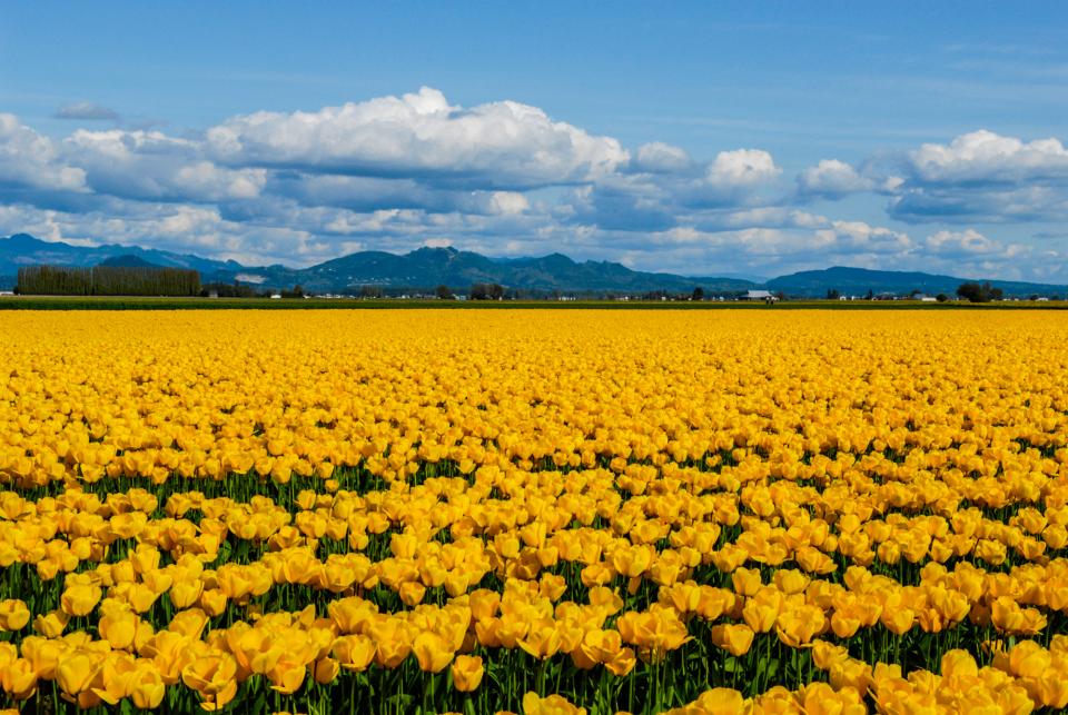
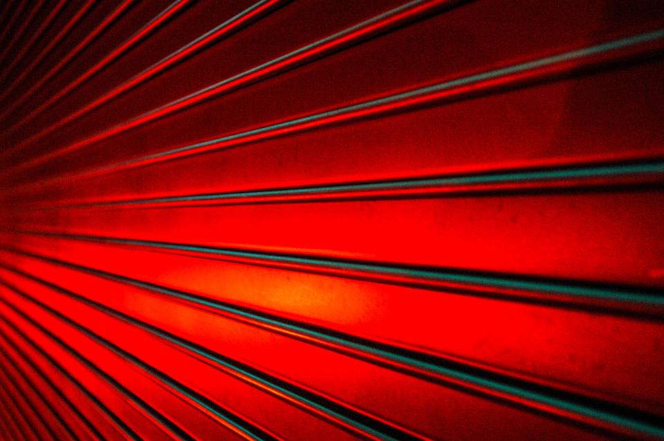
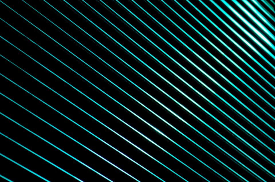
Colour has three properties: hue, value, and saturation;
Hue – is simply the description of the colour
Value – is the relative brightness or darkness of a colour.
Saturation – is the intensity or purity of a colour.
Different colours can cause a different emotional response. Studies show this is sometimes based on peoples individual genetic response or even to do with cultural upbringing.
Common connotations Red can mean danger, blue symbolizes calm or sad, yellow is happy, black is mournful, white is innocent, and purple can symbolize wealth. Bold and bright colours are known for grabbing our eye those bold and bright colours can take the focus from your subject. Muted/dull colours might elicit indifference or even melancholic feelings and these scenes often make for powerful photographs as the photographer has created a similar feeling for the viewer.
tone
Tone refers to the levels of brightness in the photograph, from solid black to pure white. Shadows are dark tones; highlights are bright tones. The majority of photographs of nature show a range of tones.
pattern
Pattern in Photography is a regularity within a scene. It’s elements of the scene that repeat themselves in a predictable way. Pattern can be found everywhere and is commonly seen within shapes, colours or textures. Using patterns is a great way to draw a viewer’s eye into your picture and generally, it will be the pattern within the photograph that will become the most prominent part of it.


space
The rule of space in photography is simply the act of adding visual space in front of the direction that an object is moving, looking or pointing to imply motion and direction and to lead the eye of the viewer.
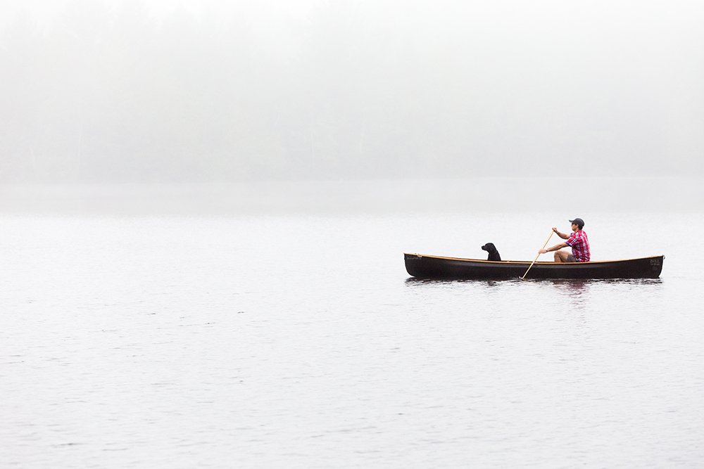
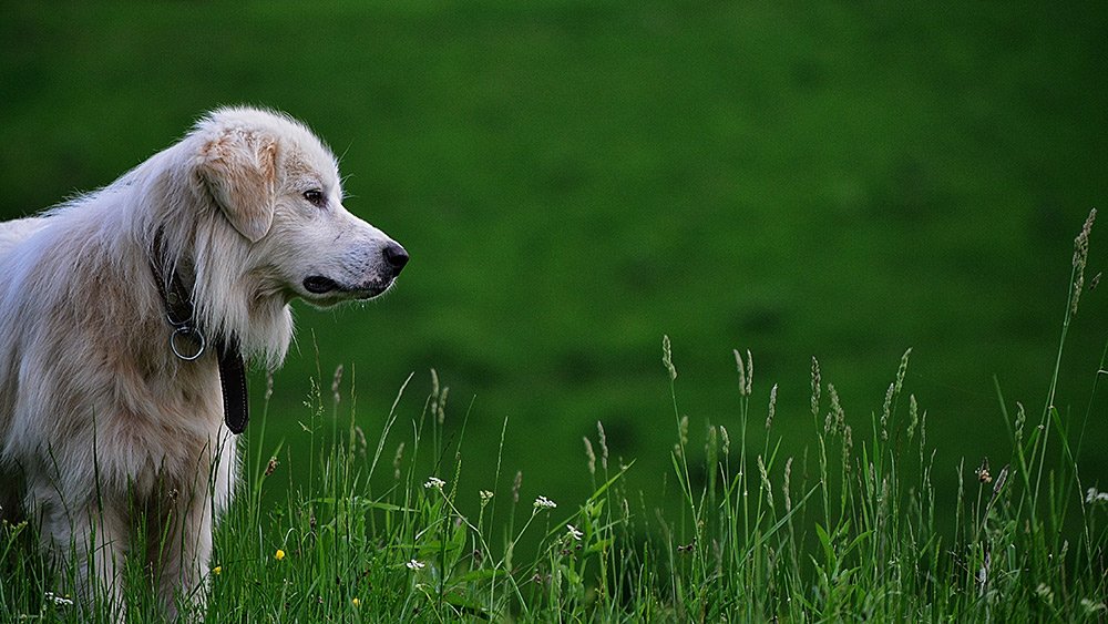
The rule of space is important because it can be used to help portray to the story of a photograph. It also aids a photographer in creating and displaying the energy of a photograph whilst it guides the viewer’s eye by sculpting key visual events and giving the subject more room.
formalism
In formalism, the photographer becomes a visual designer whenever a frame is captured and uses camera cropping to concentrate on the desired subject while eliminating everything else.
Placement in the frame, point of view, selective focus, lighting and perspective area are some of the tools the photographer can use. Formalist photography can contain recognizable subject matter and can also become so abstract that the subject matter is a mystery. The Design, Composition and Lighting are dominant over Subject Matter.

analysing
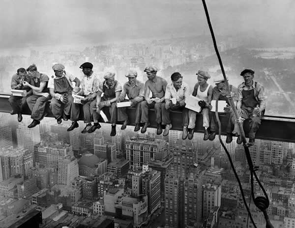
This image contains the 11 men sat on the skyscraper and the photographer has composed them as the focal point creating a widerspan image and creating a sense of family or team between the group rather than singling out one person.
The monochrome intensifies the old fashioned look to the image which works accordingly with the context of the image which is that it was shot during the great depression 1932 illustrating these men’s hardship as this was a terrible economic crisis which will have greatly effected them. The colour choice also adds a sense of sadness and a melancholy tone to the image portraying great depression and the terrible time they were living through.
This image will have been taken to realistically document what the time period is like and preserve a period of history that could otherwise be lost
