Category Archives: Uncategorized

Filters

Author:
Category:

PHOTOSHOOT 6:

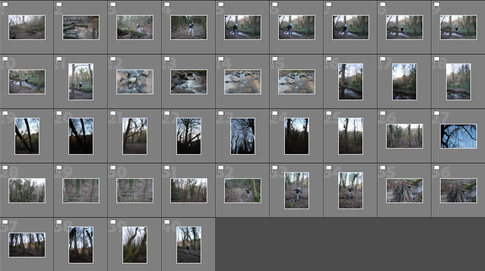
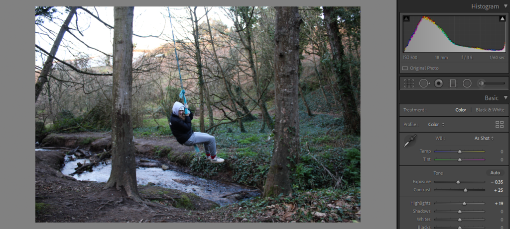
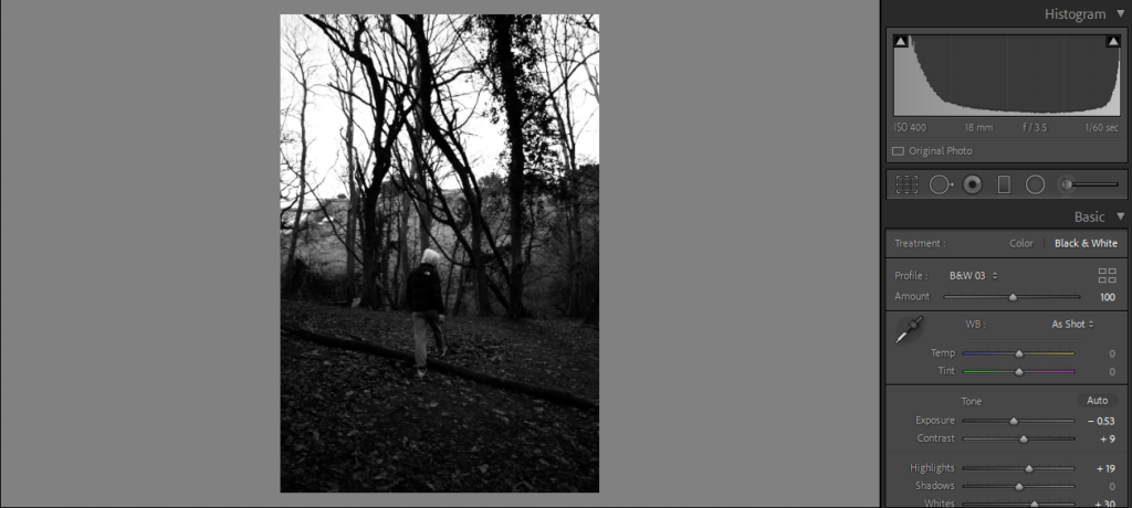
I took these images at Greve De Lecq woods as we frequently went there when we were younger.

CONTACT SHEET

Image selection- I flagged all the images that I wanted to edit by using ‘P’ and ‘X’

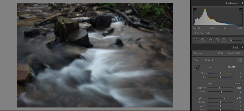
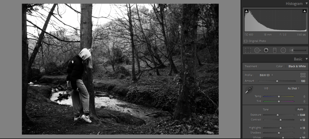
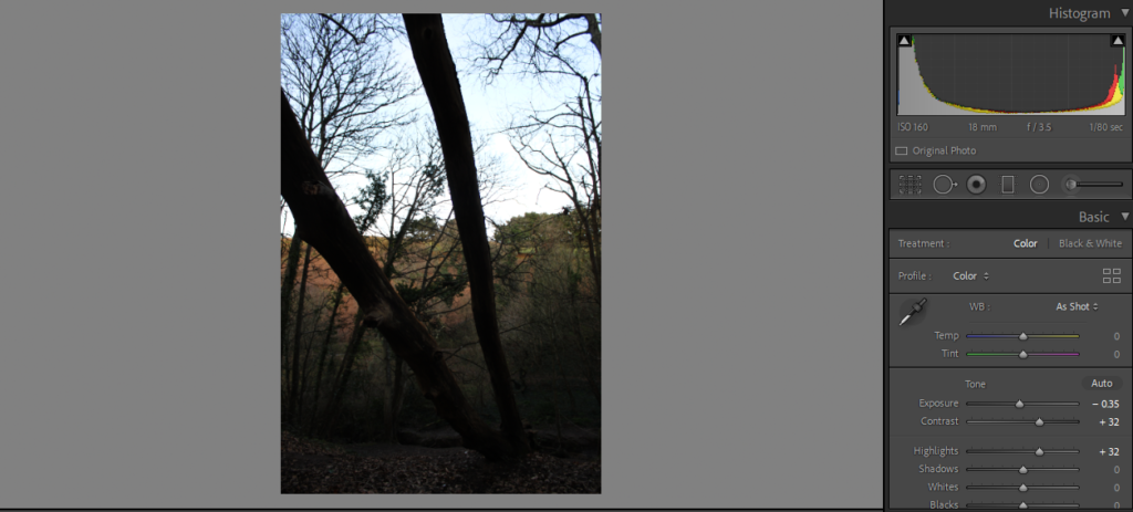
Basic Edits

YELLOW

GREEN

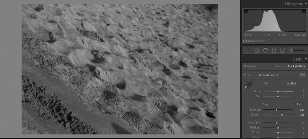
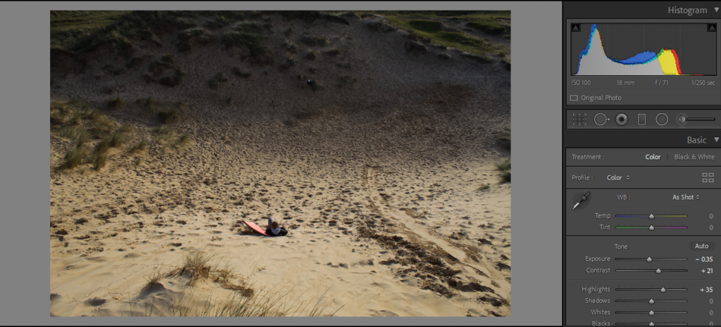
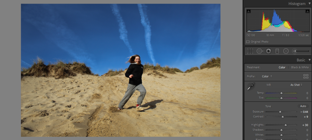
PHOTOSHOOT 5:

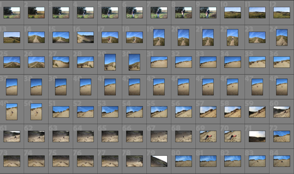
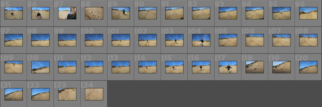
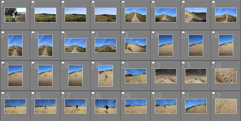
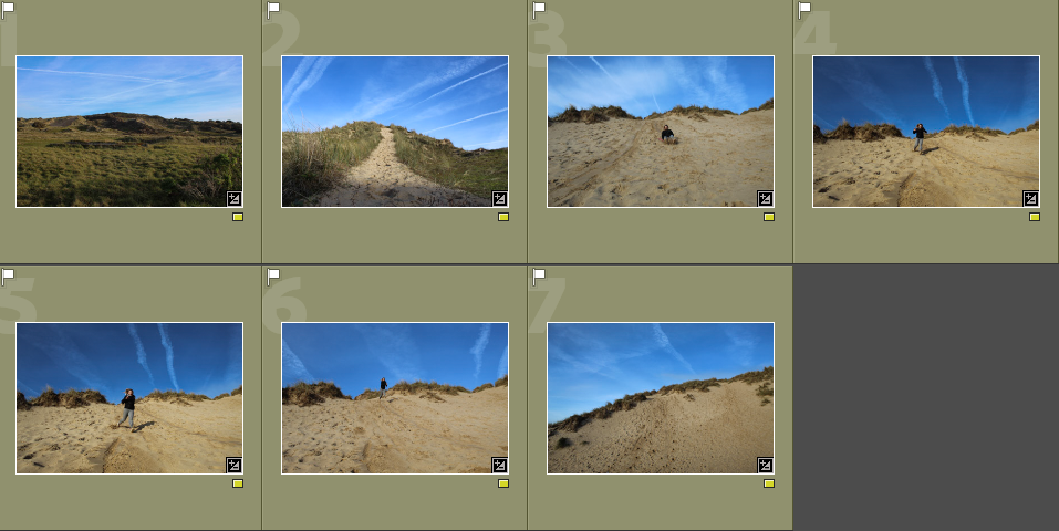
I took these images at the sand dunes as me and my sister used to go there a lot when we were younger.

CONTACT SHEET

Image selection- I narrowed down my images to the ones I wanted to edit and that had potential to be in my photobook by using ‘P’ and ‘X’

YELLOW

GREEN

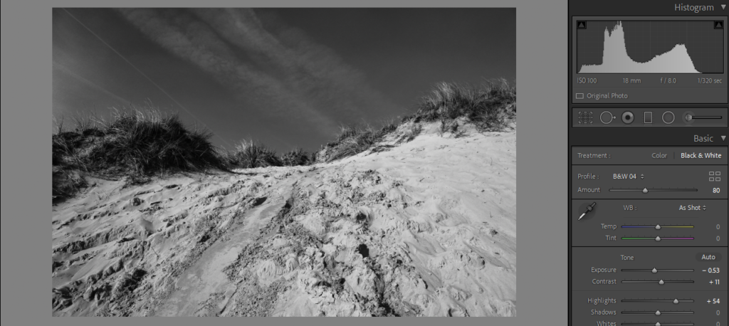
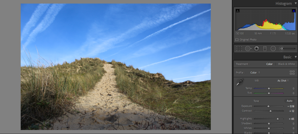
Basic Edits

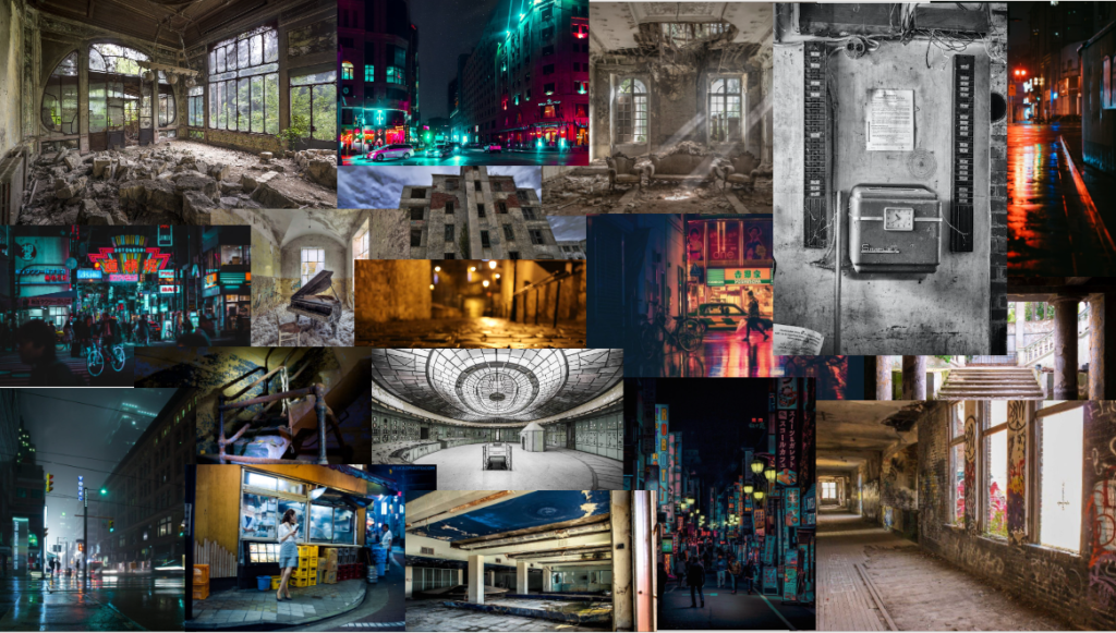
mind map and mood board

My initial thoughts are to photograph abandoned buildings and night life in jersey the reason for this is because it links to my youth when I was younger I always went and explored abandoned places and old German bunks and castles I believe this could shows my curiosity to explore the unknow and look at places that haven’t been looked at in long time I also want to give the person who is looking at my photos the feeling of nostalgia.

photobook

narrative and design

Narrative: What is your story?
Describe in:

  • 3 words Night, Abandoned, Forgotten
  • A sentence photobook will be about forgotten things and places
  • A paragraph the photobook that I will be making is suppose to be out forgotten places and things that have just been left behind its also about exploration and finding new things it relates to my childhood as I explored abandoned things in my childhood.

Design: Consider the following

  • How you want your book to look and feel I would like it to be a hard cover with glossy pages, most likely a rectangular book
  • Paper and ink for writing I will probably be using black and paper as I said glossy
  • Format, size and orientation I haven’t decided this yet
  • Binding and cover hard cover and normal binding
  • Title exploring lost places
  • Structure and architecture
  • Design and layout mostly pictures and not to much writing I want the person looking at the book to focuses more on the photos
  • Editing and sequencing I might try and use Ai generating to alter the image
  • Images and text as I said mostly images and not a lot of writing

photobook deconstruction (Night Vision The Art Of Urban Exploration)

The subject of the book is abandoned night photography Paiva went to California, Navada, Arizona, Utah and finally Texas to take all the photos in the photobook. I would say the genera of the book is documentary and the way the photos are taken is in a style documentary however Troy Paiva “paints with light” in his photo making them unique to him

Photobook research: Mother by Matthew Finn

Mother by Matthew Finn was published in 2017. Finn created this series of images over thirty years, photographing his mother at random times, with no intention of creating an archive of images. He tells us in the introduction of the book why it was created. Him and his mother were very close because his father was very absent during his childhood.
‘My father never lived with us and many times he would make promises that he never kept. My mother would wait to be picked up for a night out with him. I can remember her standing there dressed in her fawn, mohair coat, and he wouldn’t turn up. Eventually, she would retreat upstairs to take off her make up and going-out clothes and then return to the TV. This seemed to happen a lot.’

Finn recounts that it was discovered, after his death, that Finn’s father had multiple families across Leeds. He discovered a plethora of half brothers and sisters who had been fathered by the same man. This brought him and his mother even closer.

‘The more I knew about my father, the more I felt a need to protect my mum, to wrap her up in cotton wool, to be the supportive man in her life, someone who would not let her down.’

He explains that his mother began to direct the photography, enjoying the feeling of being wanted or needed for something. His mother was diagnosed with mixed dementia in 2013 and this ended their collaboration – she no longer recognised herself or her son. This book acts as a testament to their life together and therefore holds a lot of sentimental value to the photographer.

Finn won the Jerwood/ Photoworks Awards in 2015 for this publication.

This Guardian interview with Finn explores a more detailed explanation of the work.

photoshoot one

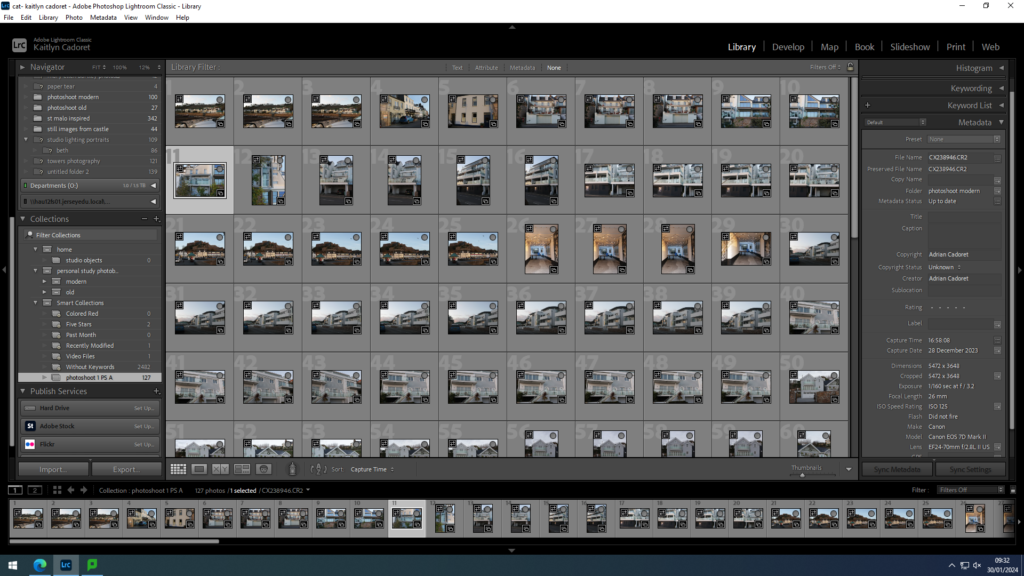
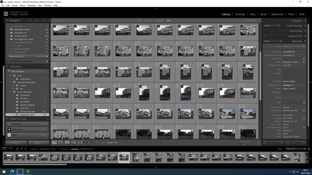
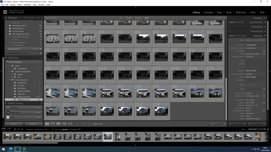
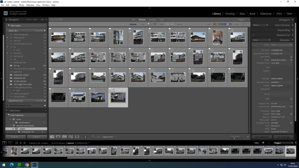
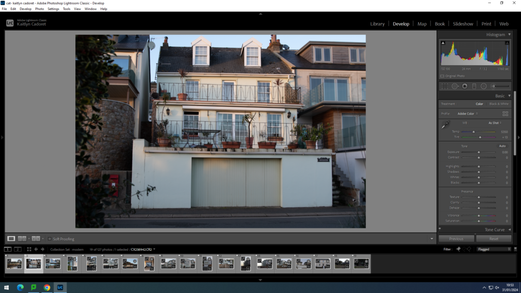
For my first shoot I decided to focus on more modern buildings and an odd couple old ones that I found. All of these images are out east between Gorey and and Fauvic. I have imported them into Lightroom Classis and I am going to make a selection of my best ones and adjust them to get the perfect lighting and make sure they are all straight. Once I have done that I am going to begin to think about the layout for my photobook. and start placing images where I want them.

contact sheets:

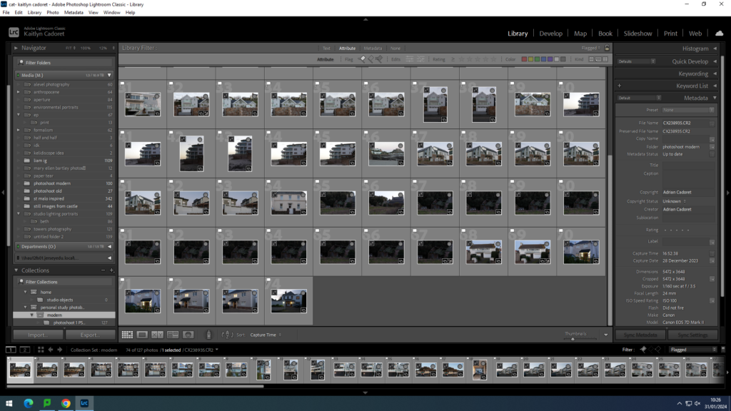
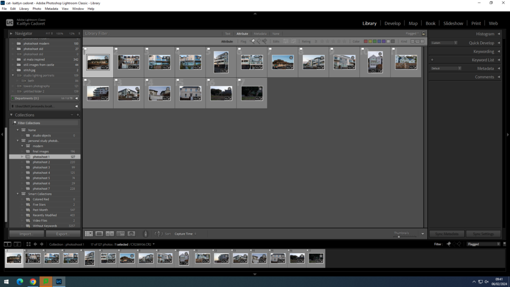
I then made my first selection using X and P to pick or reject my image that I liked or thought that were my best ones as I had lots of similar images to ensure I made the perfect one.

second selection

final selection:

I then began to adjust my images that I selected until I was happy with them
finally I began having a look at what layout I might put the images in, however, I do have multiple other shoots to adjust and add in too.

CREATING THE PHOTOBOOK

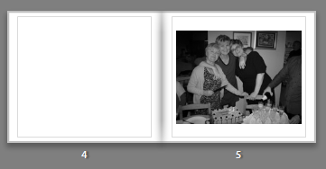
  • In this page you can see a blank page with a portrait image, in this portrait image you can see me auntie and grandad cooking in the kitchen, which sets the scene in the photobook. The kitchen holds many memories so this image at the start of the book can be described as an establishing shot for the photobook. Having these images in black and white further reinforces this idea of nostalgia and memories, furthermore having people from an older generation in this image works with the images of black and white since most of their images during that time would be in black and white.
  • In this image you can see the pattern of alternating portraits and landscapes, since this is the next image in the photobook sequence. In this image you are able to see two sisters and one of her daughters (the middle and the right) which also shows this idea of two generations in one photo. This image has a good composition with girls in the middle and all smiling, even though this photograph was staged it gives a really authentic emotion to the image. All of the girls smiling shows the happy atmosphere during the party which connotes the idea that family can bring happiness during a big family celebration.
  • In this image further in the boom starts to show the second topic in the photobook, typologies with houses. This typology are photos of all the house I’ve lived in, total of 13, which later in the book will be shown in a typology grid. This singular black and white images hold lots of memories, and houses hold many memories for lots of people. You are able to feel the sense of nostalgia when looking at these images as you reminisce over the memories you hold in that particular house.
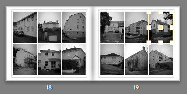
  • In this double page you can see a typology grid, presenting houses. These pages can be found in the middle of the book which highlights core memories. These pages are possibly the most important images within the photobook as it shows my life through houses. The placement of the images is also important as it shows a timeline of houses in the order I lived in them.

PLANNING PHOTOBOOK

Narrative: What is your story?
Describe in:

  • 3 words

Documenting through typologies.

  • A sentence

Documenting my duel-nationality, in the form of typologies.

  • A paragraph

The documentation of my duel-nationality through the juxtaposition of my family in Poland and Jersey. By documenting my personal emotion of nostalgia through my memories of landscape’s I will present my images in the form of typologies. Furthermore, by taking images of my family members, I can express my identity through the portraitures of my family and how it influences my sense of nostalgia.

Design: Consider the following

  • How you want your book to look and feel
  • Paper and ink
  • Format, size and orientation
  • Binding and cover
  • Title 
  • Structure and architecture
  • Design and layout
  • Editing and sequencing
  • Images and text

DESIGN OF PHOTOBOOK:

I want my book to look organised and have a calm aesthetic. I will achieve this by editing all my images in black and white with the same adjustments. In order of the layout I will leave the left page blank and right page with an image, this will keep the photobook well structed and less chaotic with a number of images. However in the middle of my book I will create a typology grid, inspired by the Becher’s, with images of houses. The structure of this images will be the same with it either being a straight mid shot, or a slight angle shot of the houses, this is so that in the grid the sequence works. For the title of my book I will name it ‘Untitled’ this is so it can challenge the stereotypical idea of naming a book something clichĂ©, however it also suggests the photobook can be interpreted however the reader might understand it which gives this sense of ambiguity. The cover of my book will not be an image included in the book, it will be a simple oat coloured material that binds it together, this will further create mystery while also keeping the aesthetic of the book. Since most of my images are landscape the orientation of the book will be landscape however to add some shape into the book, I will be alternating between landscape and portrait images.
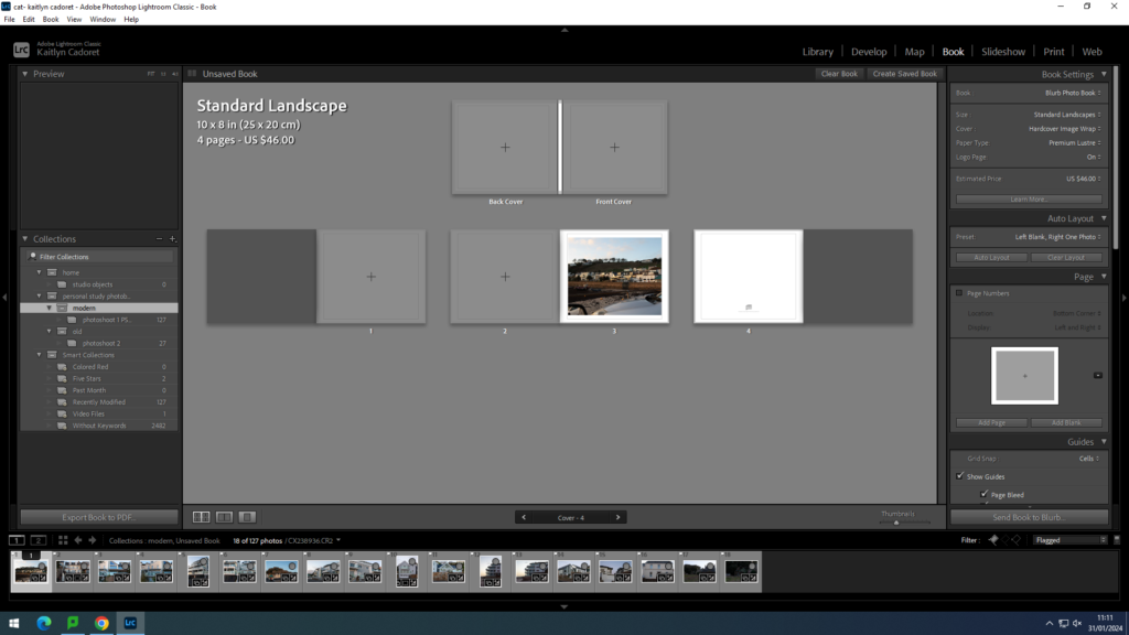
SCREENGRABS OF A FEW PAGES OF PHOTOBOOK; UNFINISHED:

  • Colour of book..
  • Alternating pictures..
  • Typology grid..

Photobook – Plan

Narrative

3 words – Displacement, maturing, self-exploration

Sentence – Following my personal growth as I search for a place and people that I can call home, whilst figuring out my own place in the world.

Paragraph – A narrated account of my own search for a place to call home and the people that I met whilst doing so. It’s a documentation of my own travels contrasted with the dullness of being stuck living in one very small place, and my desire to be anywhere else.

Design

– Photobook Press

For the book itself I want to use a hardcover with some kind of imagery that’s used as a motif. I want the book to feel more like a personal album than anything else, although it might be difficult to replicate that.

I’m not too sure on the type of paper or ink that I want to use, but I think a matte finish on the pages would suit it better as opposed to something glossier.

I don’t want the book to be too big either, but I want it to be more landscape-oriented as I will then have room to place some double page spreads with landscape images and space for a few diptychs or triptychs with portrait images, and maybe some negative space to write around or even on the photographs.

For my book’s title, I have a few ideas, but it’s something I’ll have to decide as the book develops. The first title I thought of is “Days Gone By“, as it reflects the nostalgic element of the book and the growing struggles within my own life. Secondly, my other title idea is “Finding Home“, as I feel that that is my goal within the self-searching and displacement within the book, and it feels more topical.

– Jim Goldberg, Raised by Wolves

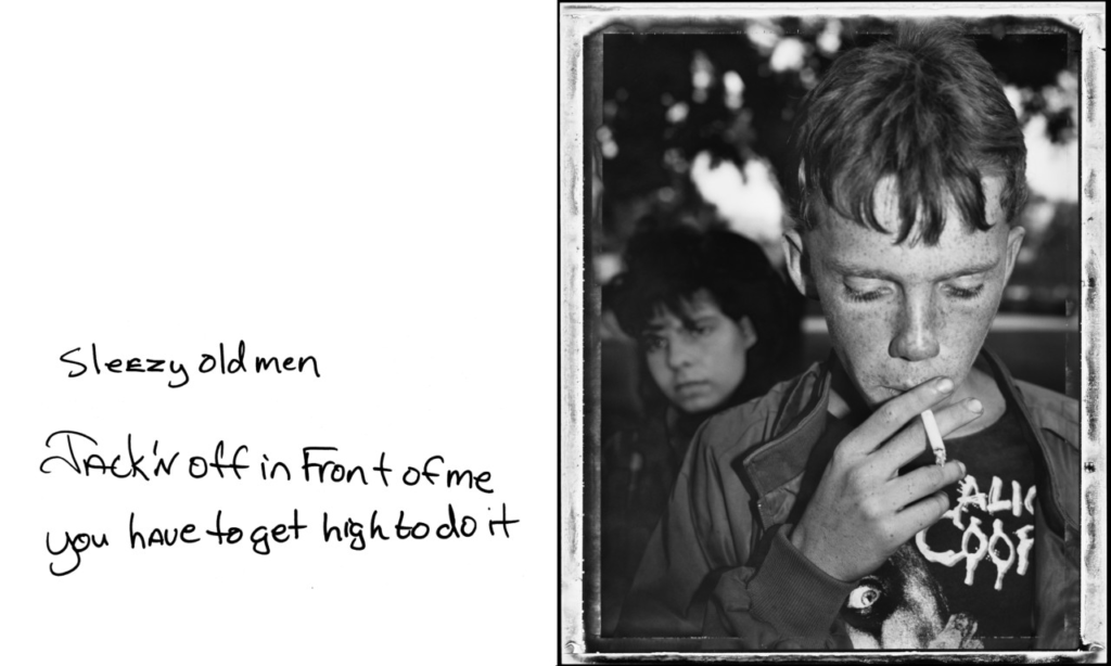
I want the editing of my photos to follow a more linear narrative, presenting my movements back and forth from place to place, as I also feel it might show more development in my technical skills within each image, as some date back to as early as 2021. Additionally, like Jim Goldberg’s “Raised by Wolves“, I want to insert handwritten text onto most of the pages and imagery, that provides context to push the narrative forward, without giving every detail. To do this, I want to write in an extremely blunt manner, using only lowercase letters and relatively short sentences.
PHOTOSHOOT 2

This is a second photoshoot I did in Madeira. This was loosely planned as I just intended on capturing photographs of whatever caught my eye/I thought was significant, opposed to having a set idea of what to photograph. I took pictures of the area around my grandparents’ house on walks, the town nearby, also some touristy spots like the pools of Porto Moniz.

RATING CODE:

RED – Bad quality images

YELLOW – Average images

GREEN – Good images

BLUE – Best outcomes which I can use for the photobook