Category Archives: Uncategorized

Filters

Author:
Category:

Anthropocene – Photoshoots Plans and Ideas

PHOTOSHOOT MOODBOARD

The idea of Anthropocene first led me to think about Jersey’s geological heritage and how that has changed and been effected by the human race. However, after researching artists like Mandy Barker and Dafna Talmor, I decided to think more along the path of humanity’s effect on the earth in general. I thought about the pollution added by the small island that we live on, and how much that devastates the way that we live and how Jersey has changed from a beautiful rural landscape, to a tourism and financial urban landscape.

INSPIRATION

Taking together the works of Mandy Barker and Dafna Talmor, there seems to be zero connections between any of the images; however, the plastic that Barker has collected from all of her photographic expeditions has been taken from beaches. The images produced by Talmor are of clear seascapes that she has then dismantled and reconfigured. This sparked my idea of combining the themes of these to photographers to show how plastic and pollution has physically changed the world we live in. Therefore, with my photoshoots I want to capture a range of images that can then be put together to show the different ways that humans are the single most damaging aspect to the serenity of our home. Using photoshop, I want to use images of plastic debris collected from beaches around the island and combine them with beautiful seascapes (perhaps including elements of the sublime).

ACTION PLAN – Photoshoot 1 (Pollution)

On Saturday 14th January, I will move around the island to different beaches, collecting plastic found and litter that will only ruin the earth. I will then photograph them where I found them and then bring them back to the studio where I will imitate some of the images created by Mandy Barker with a jet black background that allows the different plastics to stand out in some kind of collage or shape that resembles the ocean.

Anthropocene – Artist Research

Dafna Talmor

“…where late Cubist works attempted to remove all references to three-dimensional space, Talmor plays with our predisposition to see such space where it doesn’t necessarily exist, creating environments that appear familiar at first glance, but that become increasingly alien and strange the closer you look.”

Dafna Talmor’s work consists of “collaged and montaged colour negatives shot across different locations, merged and transformed through the act of slicing and splicing”.* The resulting photographs are ‘real’ yet virtual and imaginary. This conflation aims to transform a specific place into a space of greater universality. ‘Constructed Landscapes’ references early Pictorialist processes of combination printing as well as Modernist experiments with film. The work also engages with contemporary discourses on manipulation, the analogue/digital divide and the effects these have on photography’s status. Through this work, Talmor creates a space that defies the specifics, and metaphorically blurs place, memory and time.

* Talmor’s creative process involves deconstructing her own landscape photographs, cutting up and recombining multiple negatives to create new hybrid compositions.

Talmor’s constructed landscapes show an interesting side to how we view seascapes. With each image being completely unique, it allows us to see multiple seascapes at the same time. I personally feel that the image provides me to see the perfect beach, an impossible feat as no beach is perfect. But to me that is what makes a seascape amazing, the imperfections are what make it perfect and lovely to see. It provides the chaos and tranquillity displayed in the average person’s life.

Dafna Talmor, Untitled (LO -TH – 18181818181818-1, 2019,
​C-type handprint made from 7 negatives Edition 1/5 + 1 AP
24.2” × 30” (61.5 × 76.2 cm)

This image shows a range of exposures and colours, primarily different shades of blues and greens. The images used to put together this piece show different scenes in a strangely formed puzzle – either completely connected or with an empty black space between them, perhaps to show any connections there might be between some of the photographs. The lines separating them are smooth and abstract with different widths and lengths, perhaps to indicate the chaotic waves that aren’t clearly shown within the picture. The way each photo has been cut up and pieced together with other images creates a rough texture that almost turn the 2D seascapes into 3D displays, whilst remaining in the flat format of a typical photograph. The image is made up of 7 different C-type negatives each cut and repositioned to form a montage of seascapes that reflect Talmor’s life experiences. To me, it seems that the image tells its own story of how the sea is never what we think it is, it always changing and moving, we will never sea the exact same body of water again.

“I was always disappointed with the images – they weren’t really doing anything very interesting in themselves. But I kept taking pictures.” – Dafna Talmor

MANDY BARKER

“The aim of my work is to engage with and stimulate an emotional response in the viewer by combining a contradiction between initial aesthetic attraction along with the subsequent message of awareness.” – Mandy Barker

Mandy Barker is an international award-winning photographic artist whose work has received global recognition for the horrors it shows – the plastic pollution of the world. Her pieces have been published in over 50 different countries, including: The Guardian, Smithsonian, UNESCO, and VOGUE. She states that “the research process is a vital part of my development as the images I make are based on scientific fact, essential to the integrity of my work.” All here final works show some kind of effect that the human race has had on the world, mostly the plastic pollution of exotic islands the different oceans across the globe.

Teardrop – Mandy Barker

This morbid and striking image of a Flesh-Footed Shearwater found at Lord Howe Island in the Pacific Ocean, was taken by Mandy Barker in 2019. The image shows the shearwater in the form of a teardrop (inverted); representing water, the very place where shearwaters need to be in order to survive. TEARDROP – noun – a single tear. “Shaped of a thin liquid with a ‘globe’ like shape at the bottom, tapering to a point at the top.” – Mandy Barker’s sketchbook. The ‘globe’ metaphor resembles the world; and the point at the top sparks the question, ‘What is the point?’ In the image, it is simply where the birds feet and wings join together, but what about the point of destroying our home? What is the point of ruining the lives of other species, when we can just live alongside them? The teardrop in the image is inverted, perhaps showing an upside-down world where man craves consumption over nature; and where the material of the world is caught up in material values. “A tear roles down my face.”

The above images are taken from Barker’s exhibition, ‘Hong Kong Soup: 1826’. Hong Kong over 1,826 tonnes of municipal plastic waste goes into landfills every day. The images show a selection of child’s toys and lighters arranged as if they were in a universe of their own. To me, it feels like they are showing that the damages to them resemble that of the world today. From these images, I came up with the idea that different battered and ruined plastic objects are no use to people and ultimately damage and ruin the environment we live in.

“I hope your work does its job in raising an awareness of the cause we both care so much about.
With renewed wonder and best wishes”
– Sir David Attenborough

Anthropocene

What is the Anthropocene?

The dictionary describes ‘Anthropocene‘ as:

  1. relating to or denoting the current geological age, viewed as the period during which human activity has been the dominant influence on climate and the environment
  2. the current geological age, viewed as the period during which human activity has been the dominant influence on climate and the environment.

Artists that I would like to review:

The sublime – photoshoot action plan

For this shoot, I could take many different routes in achieving a sublime landscape photo – I could take a page from Ansel Adams’ book and shoot in the style of his work, maybe going to the cliffs on the edge of the island and around devil’s hole.

I could take similar images of the rock formations around the bays across the island that I’m more familiar with, such as St Brelade. I think that I could achieve a close copy to the large photograph above from certain angles around devil’s hole, maybe with the use of drone shots if I could borrow a friend’s drone.

I would need to place more focus into creating a dramatic moody piece, which would be very dependent on the weather. Lightroom Classic would probably be a better tool to use to help me achieve this effect, as I can play with different levels of exposure and increase the darkness in certain hues.

best Romanticism landscape outcomes

Final Edits

Comparison

This photo was inspired by the photographer Fey Godwin, who took many pictures of different forest landscapes, capturing different lighting in her photos. Her photo includes a clearing with sun rays shining through the trees, the light illuminating a patch of grass in the middle of the photo. I found this composition very effective and decided to try something similar when taking my own photos. I ended up with this image, a small stream flowing through a dense forest. I made sure to capture the sun glowing through the trees from the top corner, reaching the water below. I think the composition of both photos are quite similar, as well as the tonal range present throughout the images. Despite Godwin’s photo being in black and white, the same dark tones in the tree are seen in my coloured image. The sun casts a similar effect, brightening the middle area of the image, and creating an area of focus due to the lighter tones, similar to the artist’s photograph. On the other hand, one of the ways I edited the image was by increasing the contrast of the image, this contrasting with the artist photos as her image appears more hazed, the grass not standing out as much. Moreover, her image consists of a clearer foreground and background, the trees further back appearing lighter and adding depth to the image. In contrast, my photograph captures the curved line of water surrounded in lush woodland, creating a curved leading line running through the image, guiding our eyes through to the back of the image and causing there to be depth in the image. The stream disappearing round a corner also creates a sense of mystery and adventure, adding to the mood of the photo. Godwin’s image creates the impression that she wanted to capture the true beauty and wildness of the forest, using the trees in the background to capture the depth of the forest. I tried to recreate this effect and capture the wild yet beautiful side of the forest.

The inspiration for this paragraph was Ansel Adams, a landscape photographer who sometimes includes abandoned architecture in his photographs, comparing them with the rural landscape around them. He creates this idea of the sublime- how man made buildings break down over time but the nature around them is everlasting. His photo includes a broken down structure with a young tree growing in front of it, a contrast being created between the old, destroyed building and the new life of the tree. I found this concept very effective and perfectly capturing the essence of the sublime, so I decided to photograph an abandoned structure in the middle of a wild, rural landscape- the woodland slowly growing onto the architecture itself. Adams’ also photographed the scene in black and white, something I wanted to recreate in Lightroom. However, instead of black and white, I edited the photo so that it was in blue and yellow shades, since I believed it looked more effective and unique this way. Adams also focused on applying a wide tonal range in his work, which was something I considered when photographing and later editing my image. I wanted my image to have lots of contrasting tones, especially in the trees. Furthermore, I applied the rule of thirds in this photo, composing the photo so that the building appear in one of the thirds so that the other two thirds could be simply wildlife- capturing the idea of there being a lot of healthy, green nature around the decaying building.

Best image analysis and artist compatison

5 best images

This image has an empty alt attribute; its file name is image-716.png
This image has an empty alt attribute; its file name is image-820.png
This image has an empty alt attribute; its file name is image-625.png
This image has an empty alt attribute; its file name is image-790.png
This image has an empty alt attribute; its file name is image-705.png

Best Image and why

This image has an empty alt attribute; its file name is image-625.png

I like this image because of the dramatic clouds and singular tree in the centre. I believe that the low exposure adds depth to the photo and creates a contrast between the two sides. I also like the flat horizon line as well as how you are able to create meanings behind the image such as ‘the calm before the storm’.

If I were to change anything about the image, I would try to make the field at the bottom of the picture less textured and maybe smooth it out a bit as I feel like the current texture makes it look grainy.

Artist Comparison

With this image I tried to somewhat style after Ansel Adams. I did this by changing my image to black and white, in order to try to match his style. I also focused in on a flower, however, I thought that a silhouette style would of better suited this photo.

In Ansel’s image he focuses on the flower and has, what seems to be, a mountain in the background. The black and white in the image also helps to bring out the tones, highlights and shadows within it. I also like the angel he chose to use as it allows us to see the whole of the flower and top of the mountain.

I really like the sky in my image as I think it highlights all the tones and vibrancy of the picture. I also like how the silhouette makes the rest of the image stand out. If I were to try this again, I would most likely try to use Ansel’s work as an inspiration more since I followed his idea but still created a very different image to his in the end.

Romanticism Edits

Edits

In this image, I lowered the exposure and the shadows, while increasing he saturation, highlights and contrast to make the image more vibrant and lively.

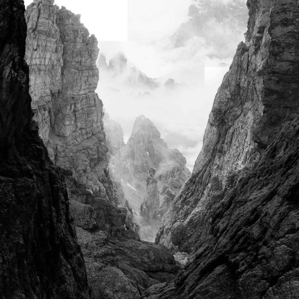
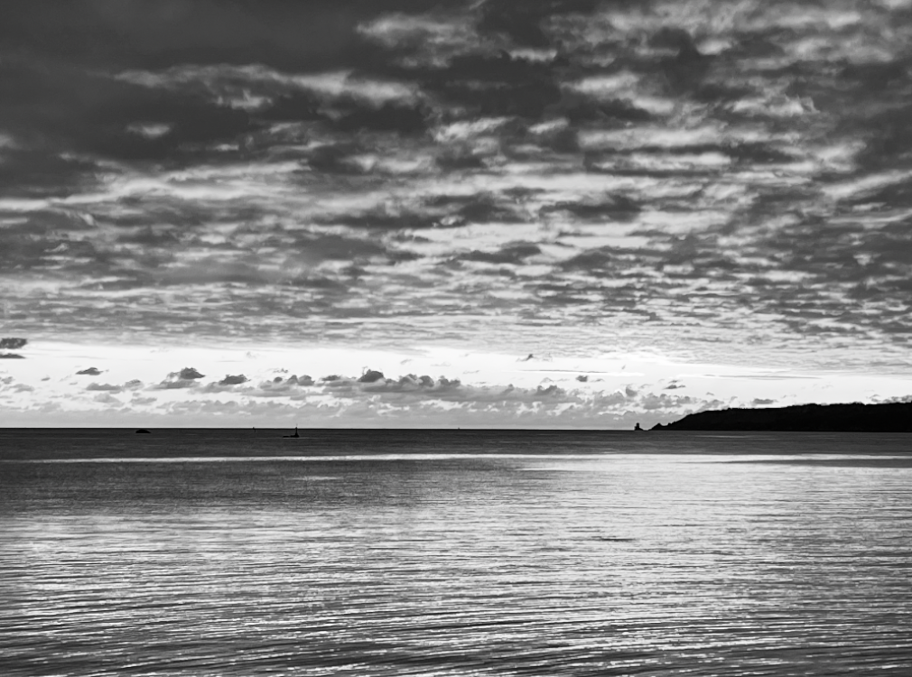
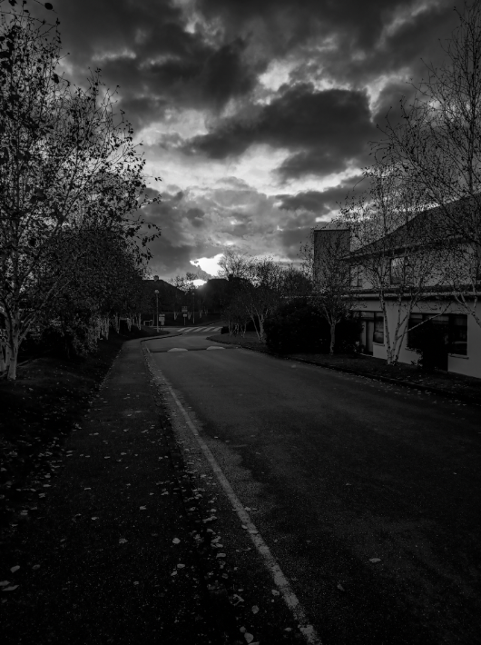
For this picture , I changed the colour to be in black and white by lowering the saturation. This gave the clouds a more dramatic look. I also increased the contrast and lowered the exposure to make the lighter parts of the image stand out.

In this edit, the vibrancy was increased while decreasing the white and black tones of the picture, giving off a more dramatic mood to the image.

Here I aimed to give the photo a lighter and more up beat mood. I did this by increasing the saturation and contrast as well as the white tones and highlights. To make the greenery stand out more I also darkened the shadows and black tones.

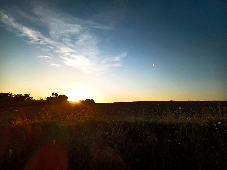
In this edit, I liked the original picture but wanted it to stand out more. To do this I improved the clarity and vibrancy of the image while only slightly raising the contrast.

To make this image lighter than the original, I increased the saturation and decreased the white and black tones while also adding some grain to image.

I increased the vibrancy and saturation while decreasing the black tones in the picture to make the sky look brighter and give off a more eye catching effect.

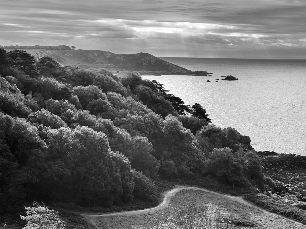
Here, I decreased the saturation to make the image black and white to make the tones more noticeable. While I did like the orange in the original image I preferer the more dramatic appearance of the black and white.

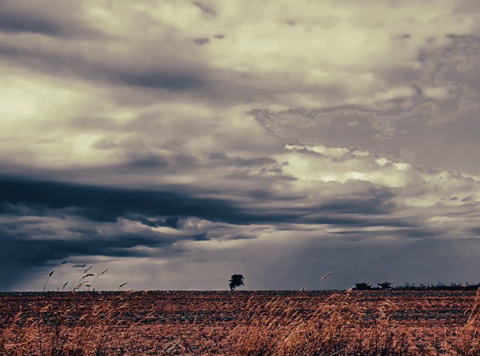
For this photo, I increased the contrast, highlights, white tones, clarity, vibrancy and saturation to make the sky more vibrant and blended, while decreasing exposure, shadows, black tones, texture and dehaze to make the greenery into a silhouette.

In this image, I increased the contrast, highlights, clarity and white tones of the image to make the lighter tones more prominent, all while lowering the exposure, shadows and black tones to give the photo more depth.

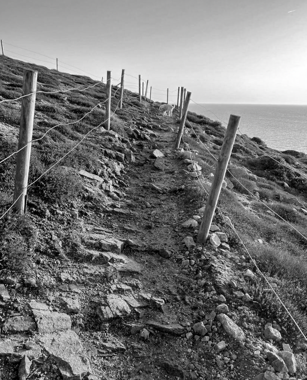
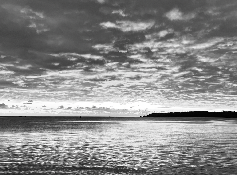
This image was turned to black and white and had the exposure lowered. The texture was also decreased making it seem more smooth and blended.

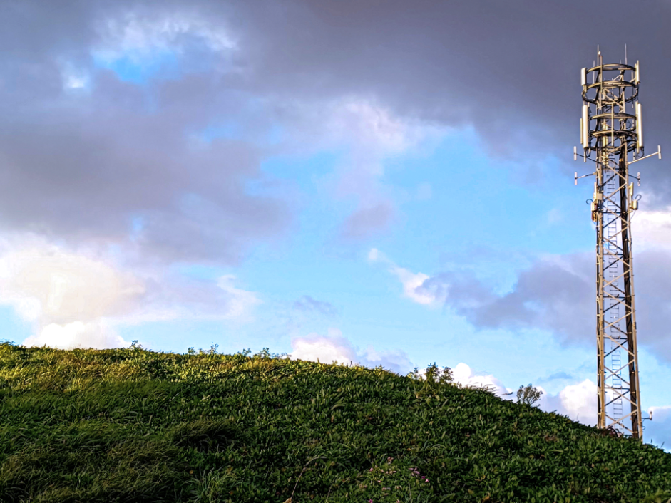
For this edit, I added a purple tint to the picture to make the clouds stand out more against the blue sky. I also decreased the exposure while raising the texture making the grass appear more prominent.

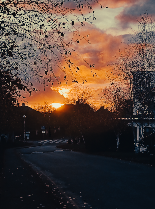
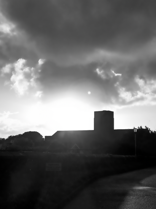
With this image, I wanted to make the sun stand out more, to do this I lowered the exposure and increased the contrast and clarity. This made the building more shadowed and gave the photo more warmth.

To this image I changed it to be black and white to make the shades of the photo stand out. I also cropped the photograph to make it more focused and central. Additionally, I rose the contrast and clarity to make the clouds stand out.

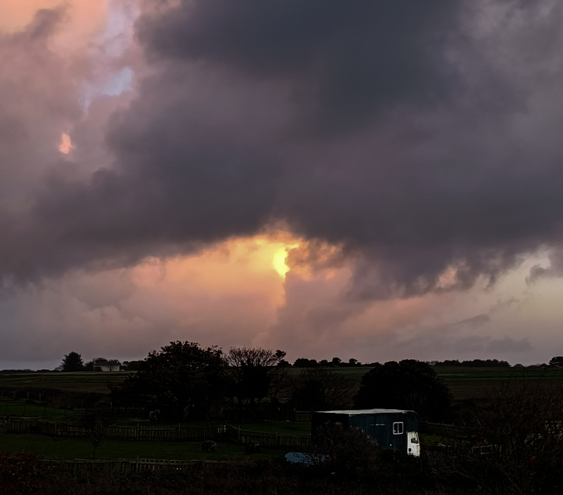
With this image, I lowered the exposure and increase the contrast and vibrancy to make the sun the main focus of the picture. I also made the caravan more exposed to make it stand out against the dark background.

In this picture I decreased the exposure and increased the contrast and clarity to make the light from the sun stand out more.

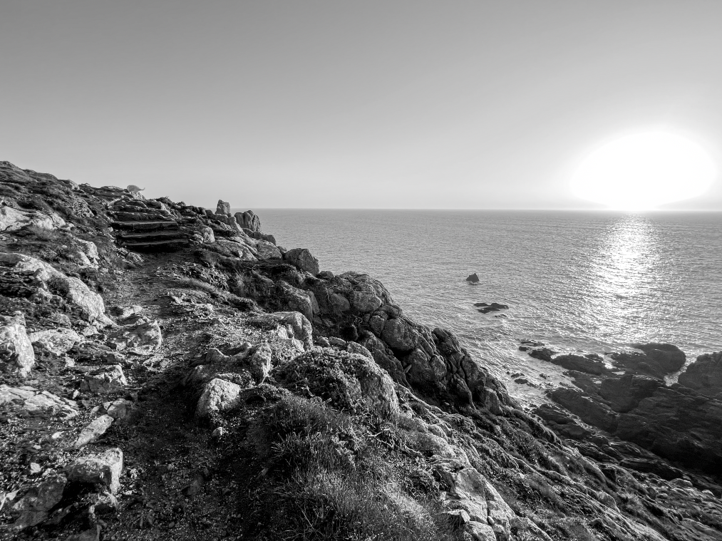
In this edit, I turned the picture into black and white to make the picture more dramatic while also decreasing the exposure and white tones in it and increased the clarity to make the clouds the main view point of the image.

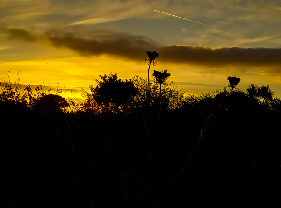
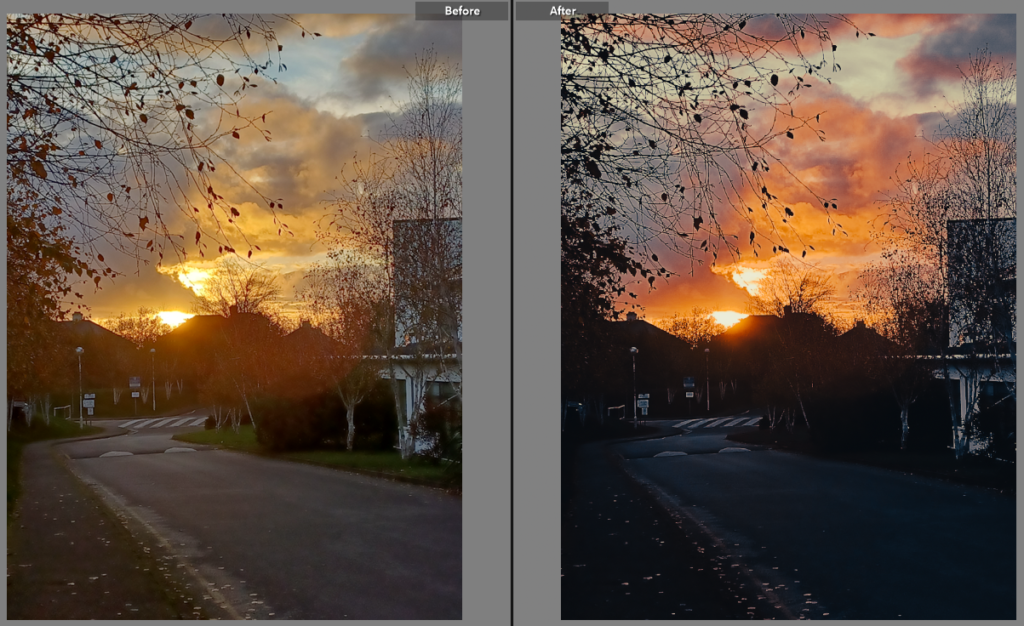
Here, I lowered the exposure while increasing the contrast to the colour of the orange pop out more. I also increased the vibrancy and saturation of the image to make it a deeper colour than the original.

In this picture I wanted to make the clouds stand out more. To do this I decreased the exposure and white tones of the image and increased the highlights and saturation.

In this photo, I wanted to try and gain a more autumn vibe than the original, to accomplish this I changed the tint of the image to a more orange one and lowered the exposure while increasing the contrast. This made the shade of the photo to be much darker while also increasing the darkness of the shadows.

exposure bracketing

What is Exposure Bracketing?

Exposure bracketing is a technique where, instead of taking a single photo, you take three (or more) that are all exposed slightly differently; normally one is correctly exposed, one slightly underexposed, and one slightly overexposed. 

When should you use Exposure Bracketing?

Anytime you feel the scene is a challenging one (too much highlights or shadows) as far as lighting is concerned, e.g. sunsets are usually better taken slightly under-exposed so use exposure bracketing there

canon
Canon Knowledge Base - Changing the Exposure Level Automatically / Auto  Exposure Bracketing (AEB Shooting) (EOS M6)

exposure bracketing

Bracketing is a technique where a photographer takes shots of the same image using different camera settings. This gives the photographer multiple variations of the same image to choose from or combine to ensure that they get the perfect shot.

When should you use exposure bracketing?

The purpose of this is to cover more of the dynamic range. Bracketed photos are used later to create an HDR (high dynamic range) photo. Some other bracketing techniques include white balance bracketing or focus bracketing.

We experimented with the exposure bracketing inside the school, testing the different settings on the camera. Trying light and dark images by playing with the exposure, but changing the numbers on the ‘M’ setting. Changing the numbers lower e.g -2 the darker the image will be, if the image was +2 it would make the image over exposed.

This controls the exposure compensation, as well as the bracketed shots