New topography-
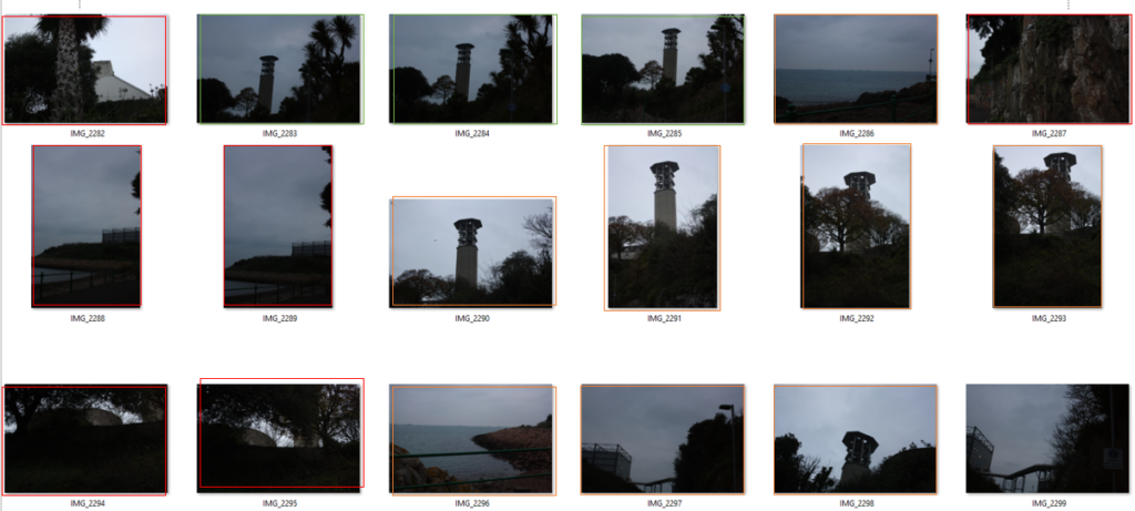
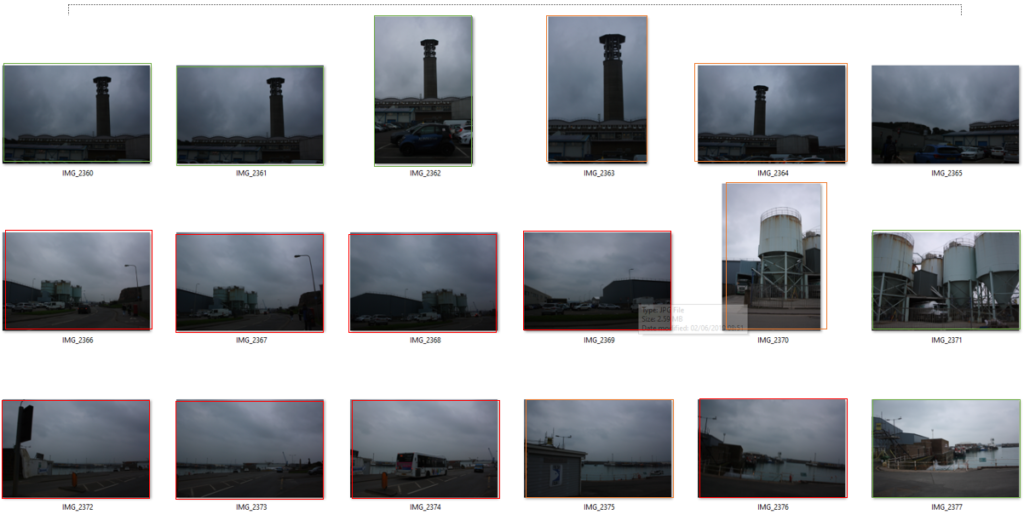
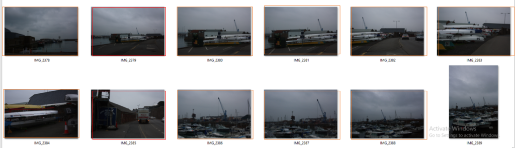
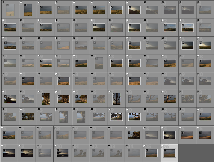
Contact Sheet:
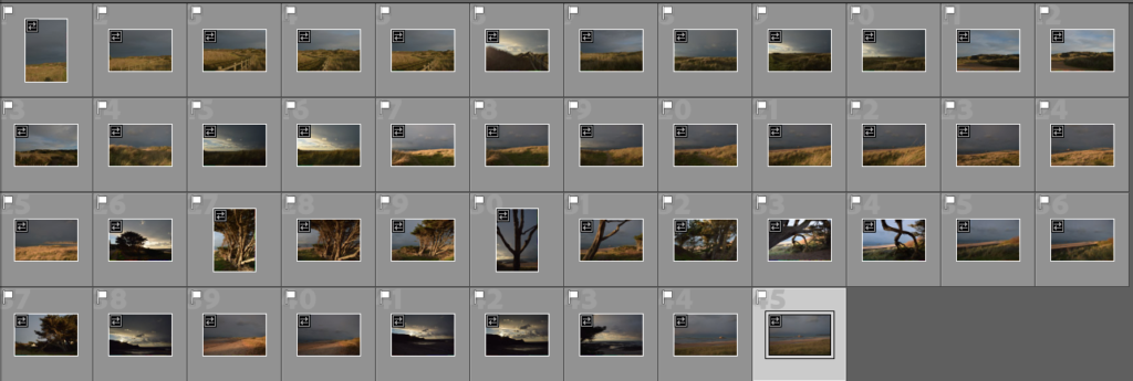
Edits

New topography-
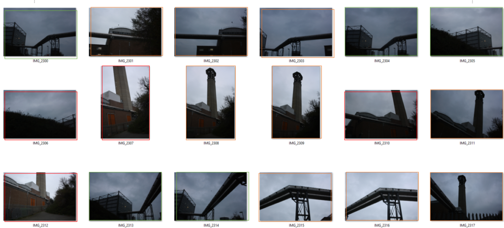
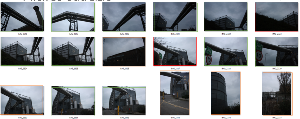
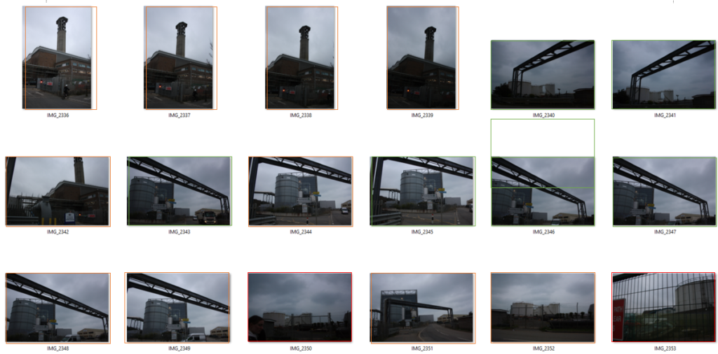
Contact Sheet:
Edits
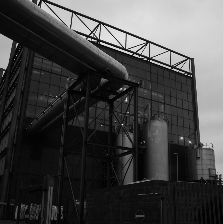
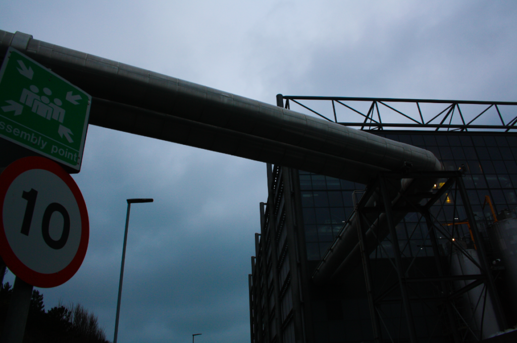
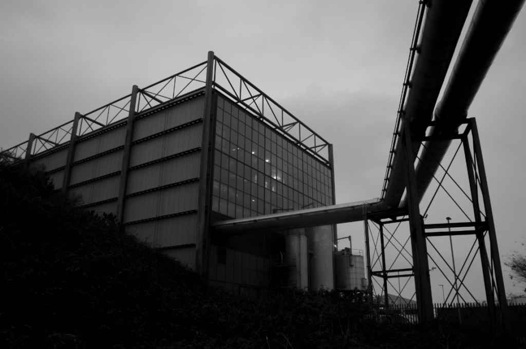
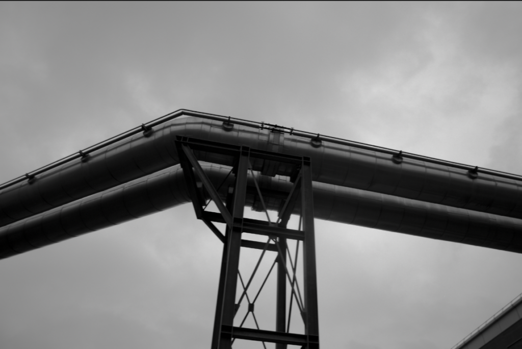
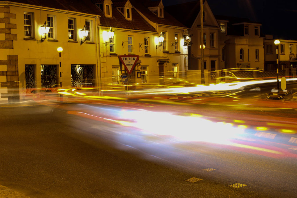
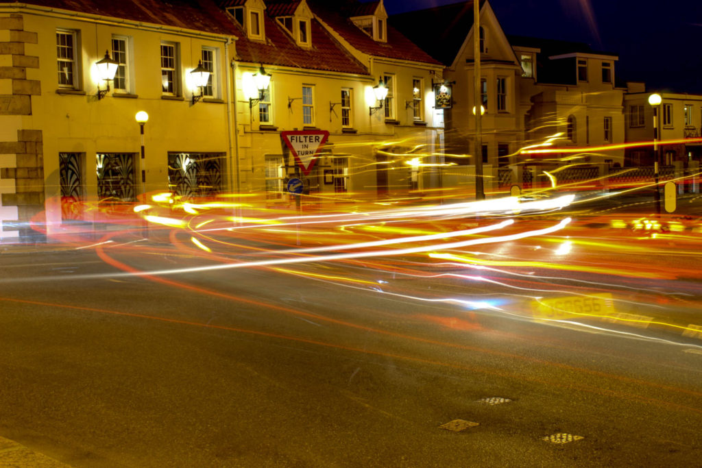
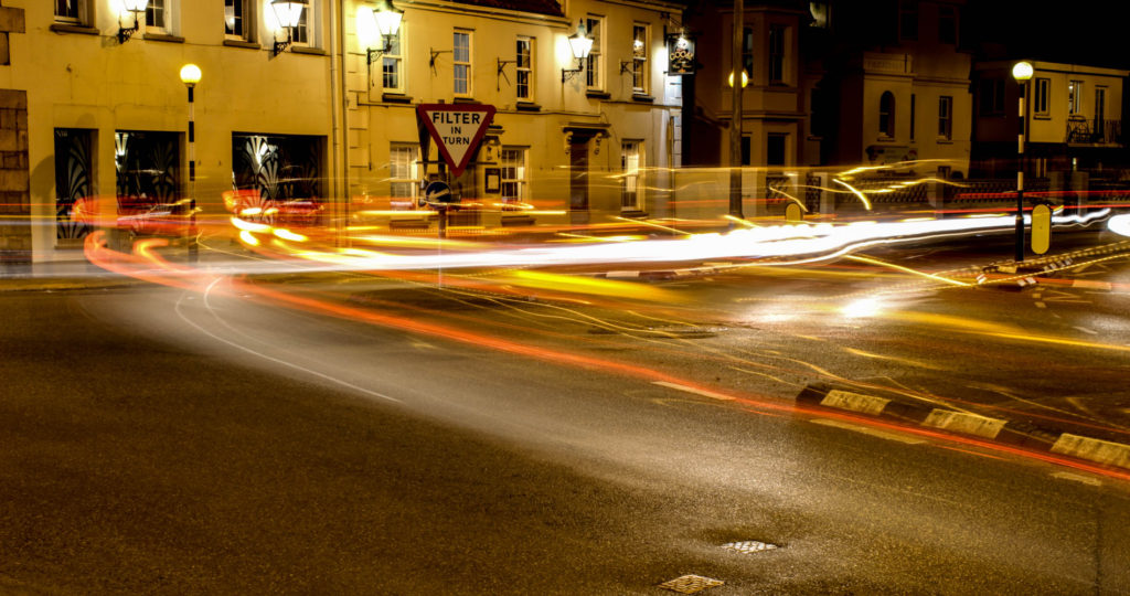
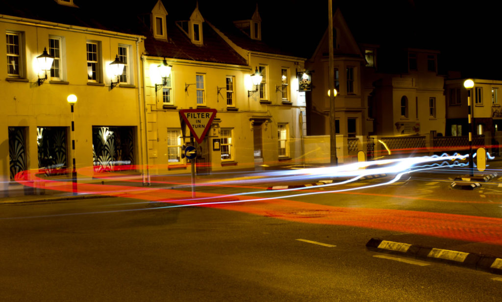
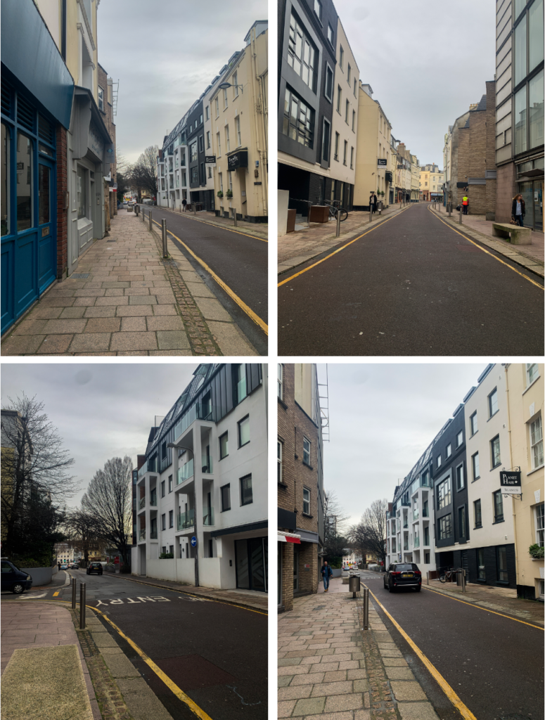
Urban landscapes are capable of creating both beautiful and unsettling photographs. While urban landscapes include some type of building, the lighting that surrounds the image it what makes the piece come together.
Who?- for this photoshoot, I plan to try to photograph some old or industrial looking buildings. This is to make the pictures look more urban to fit with the theme of the photoshoot.
What?- I would like to include overgrown aspects to the image such as vines or trees. This will help to create a different mood to the images.
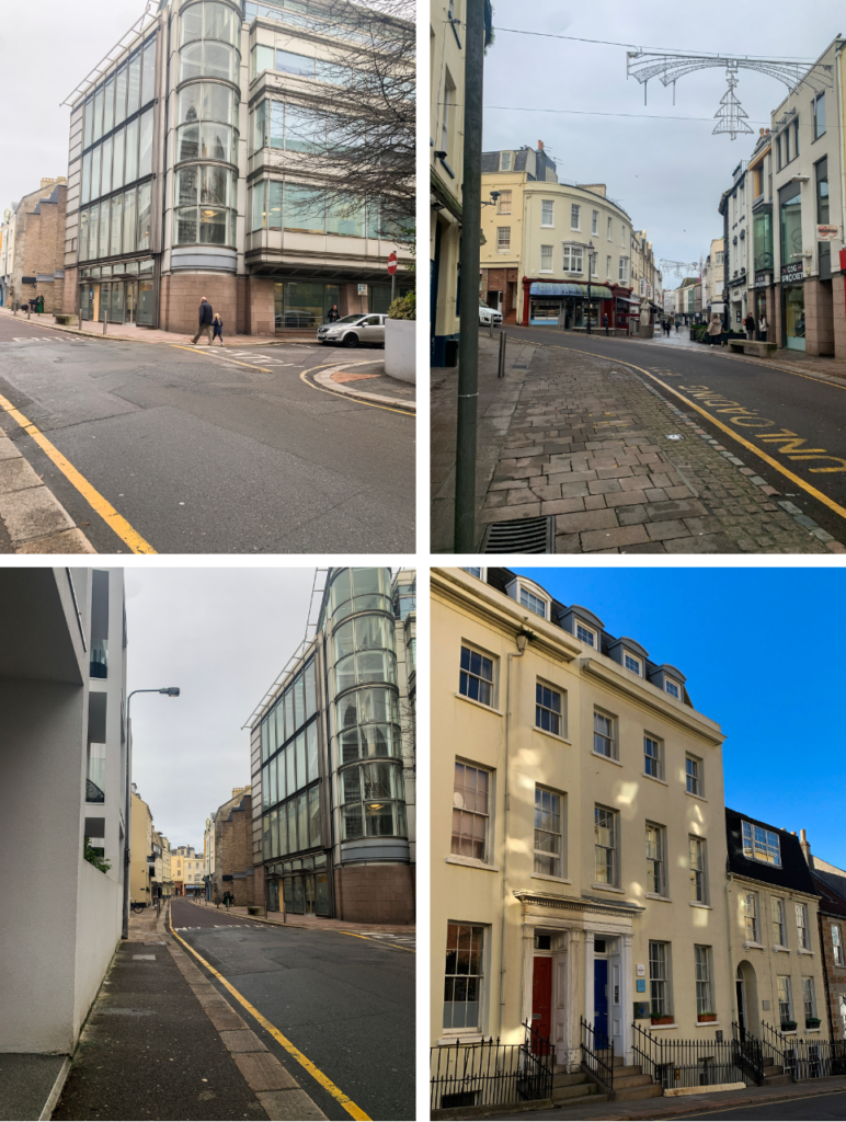
Where?- I think I’m going to try to find some areas in St. Ouens due to the fact that there are a lot of olden style buildings there.
When?- I think I’m going to take the pictures over the Christmas holiday as the winter weather and scenery will add to the urban look.
Why?- I think that these pictures will open up a new view to Jersey as we are only really shown the up to date side of the island, rather than the urban areas.
How?- I think I will take the pictures using my camera rather than my phone camera as this way I will be able to adjust the settings easier.
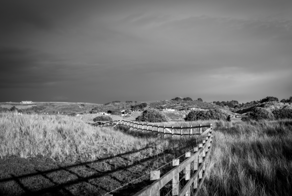
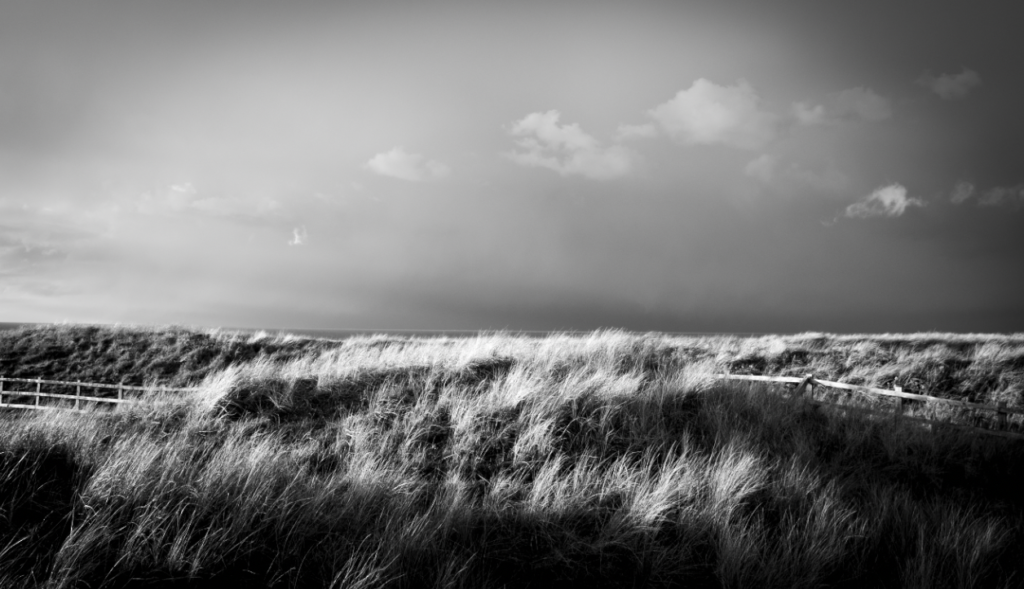
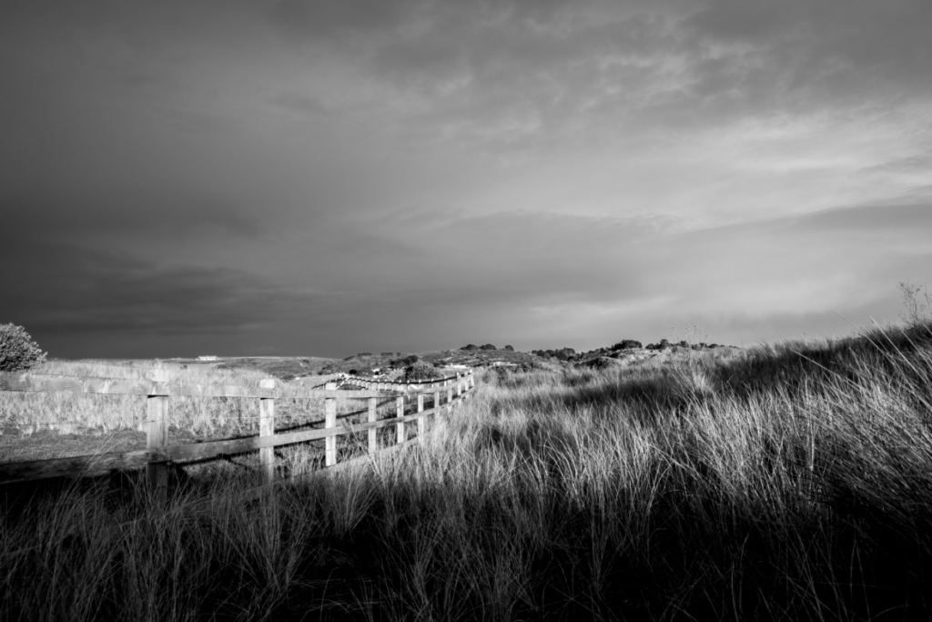
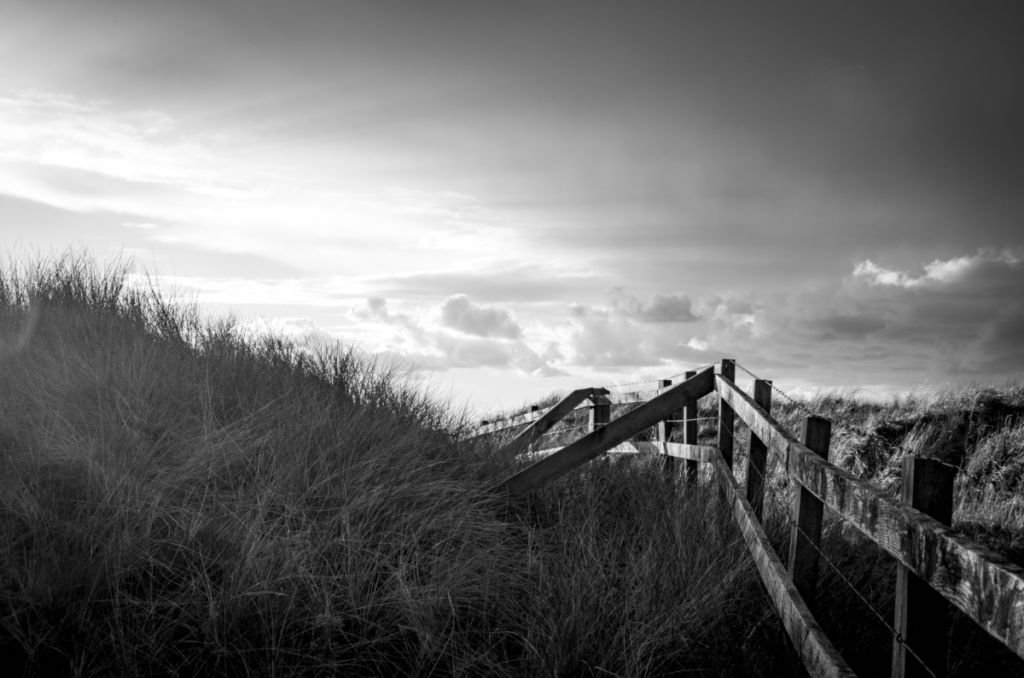
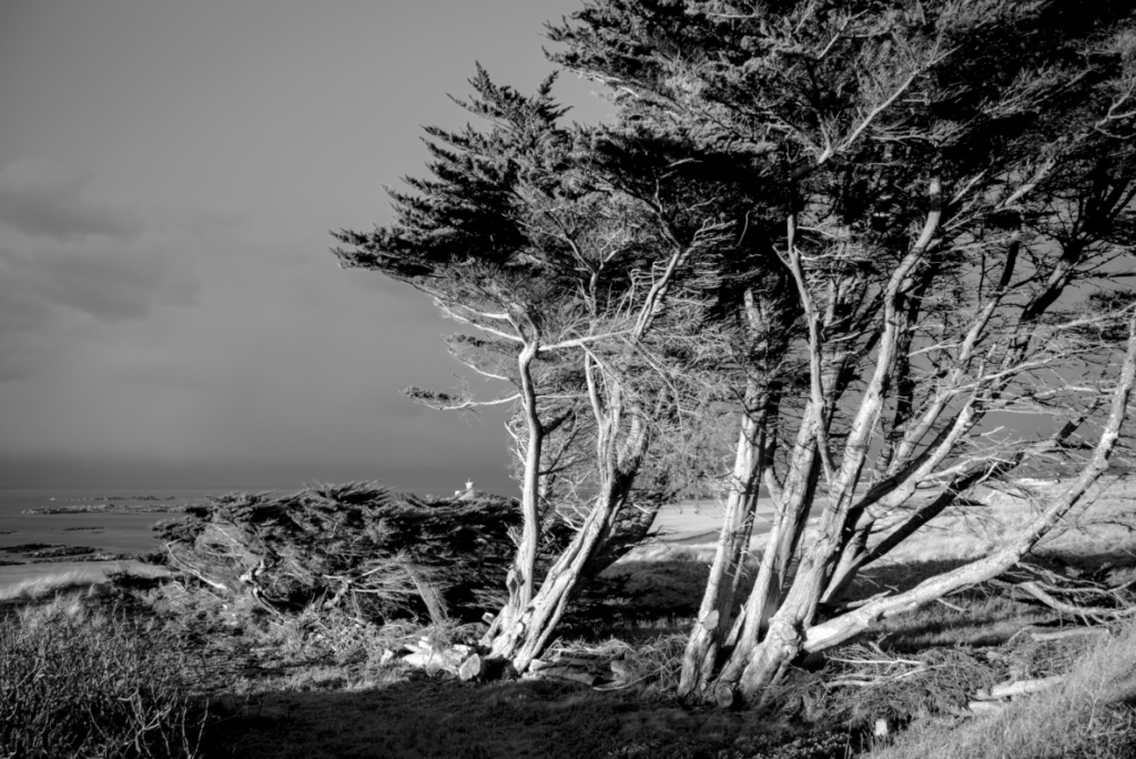
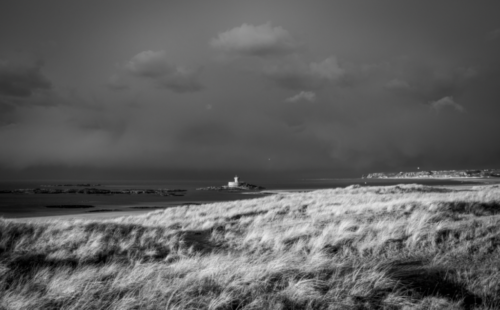
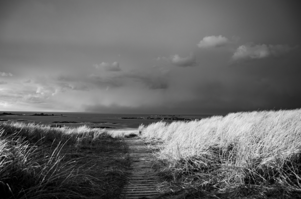
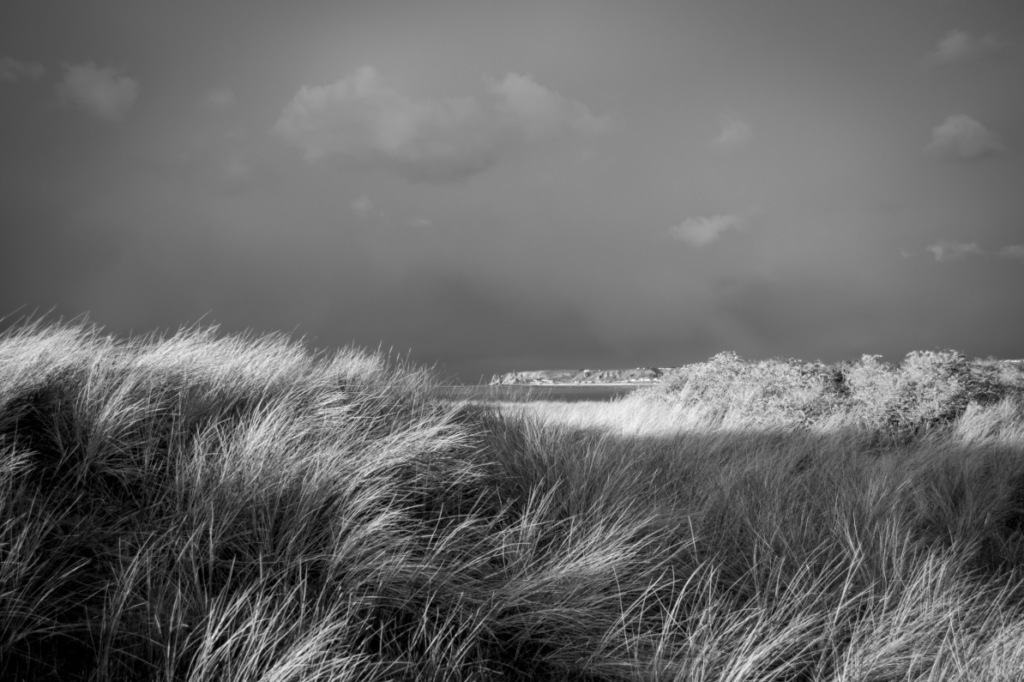
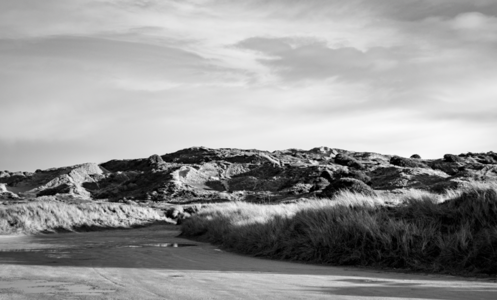
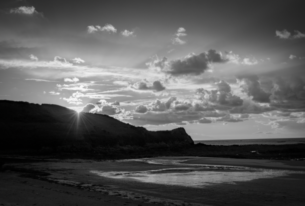
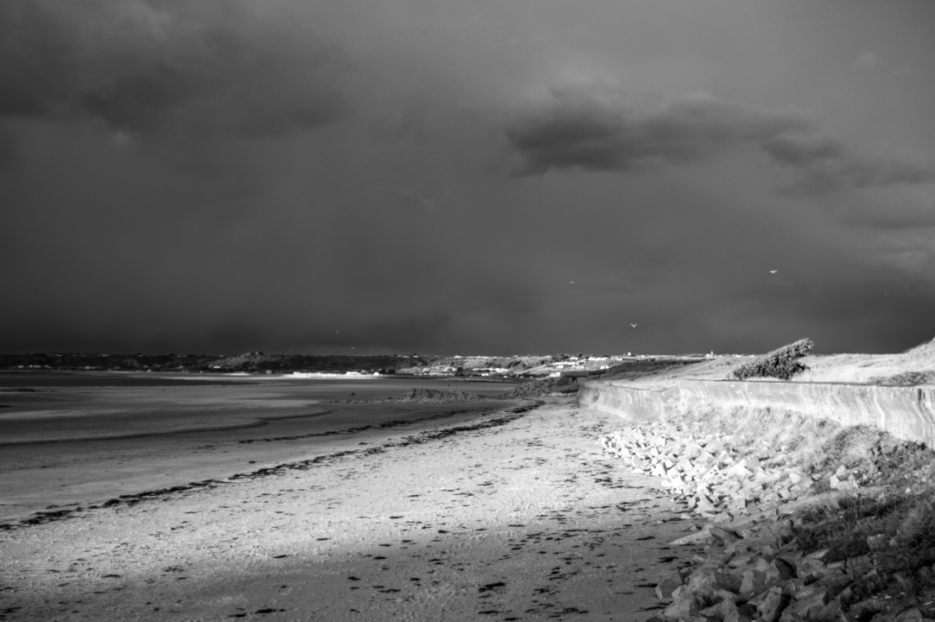
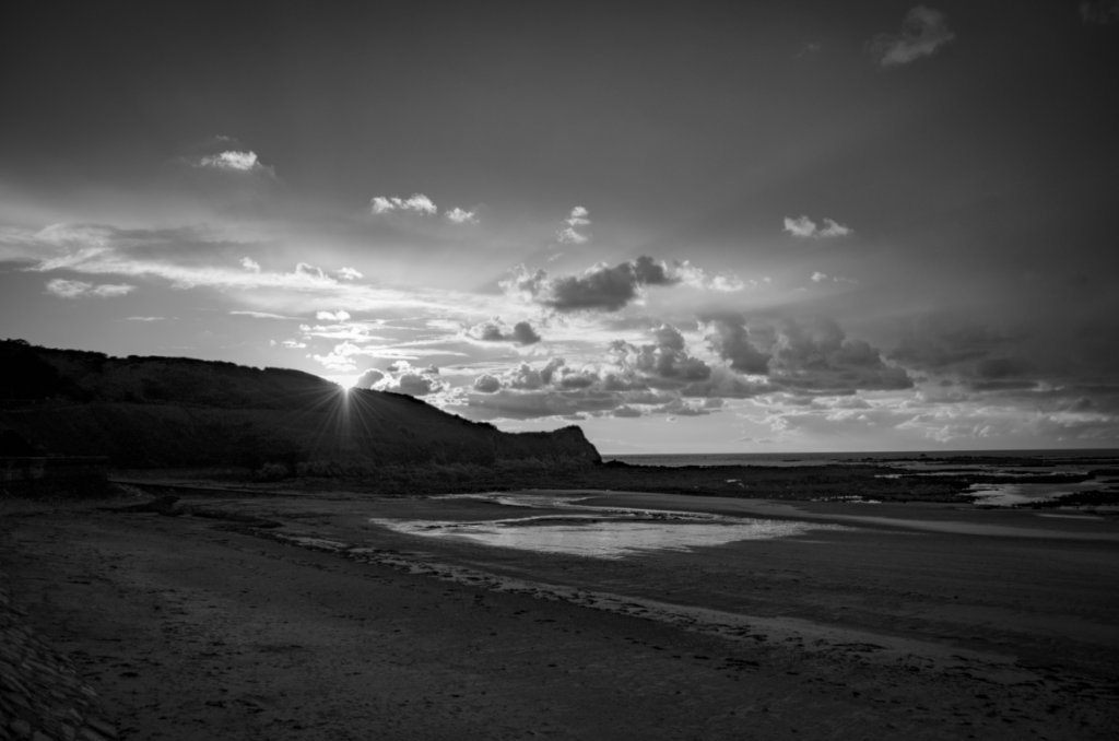
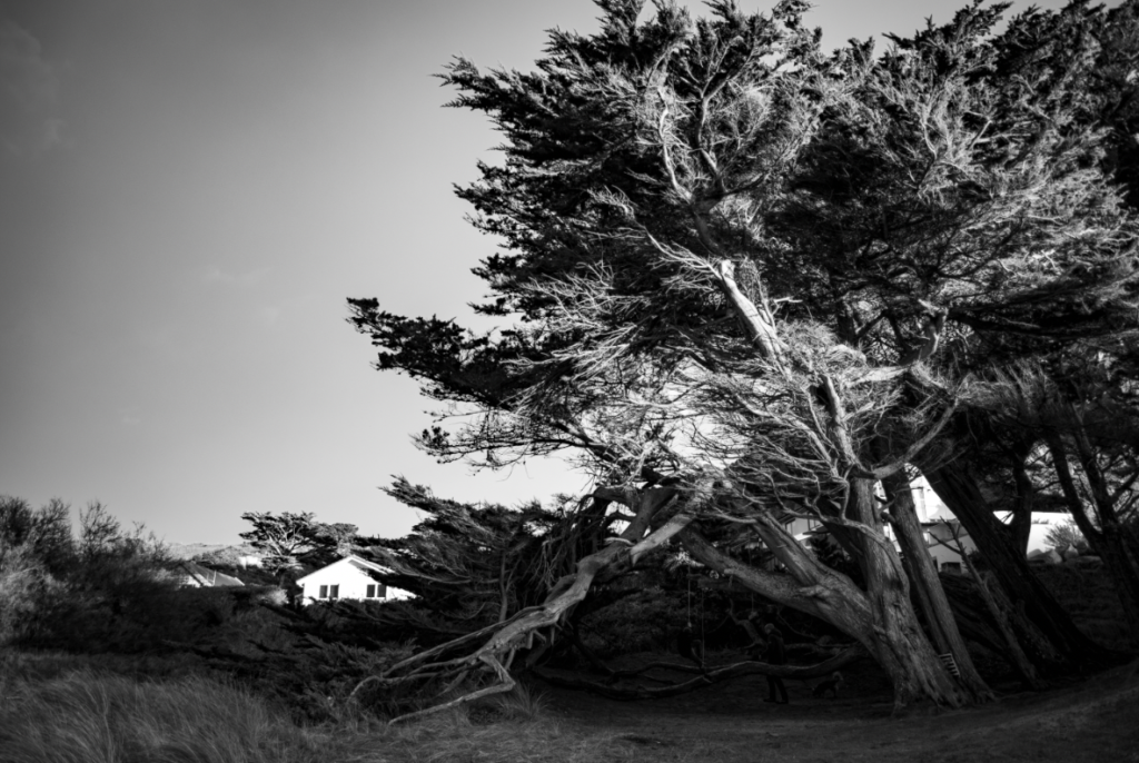
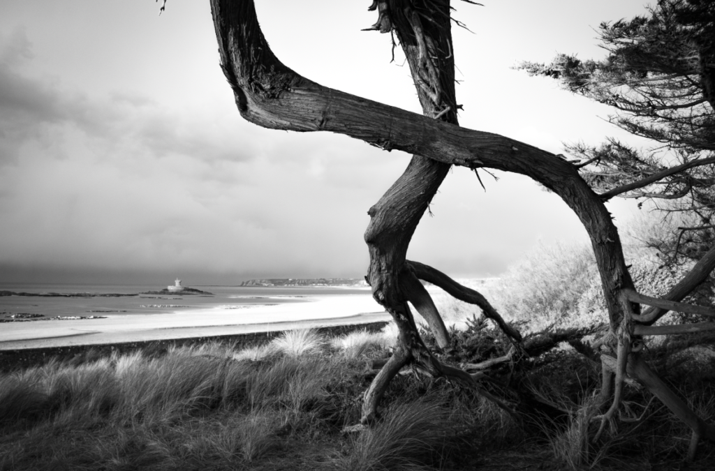
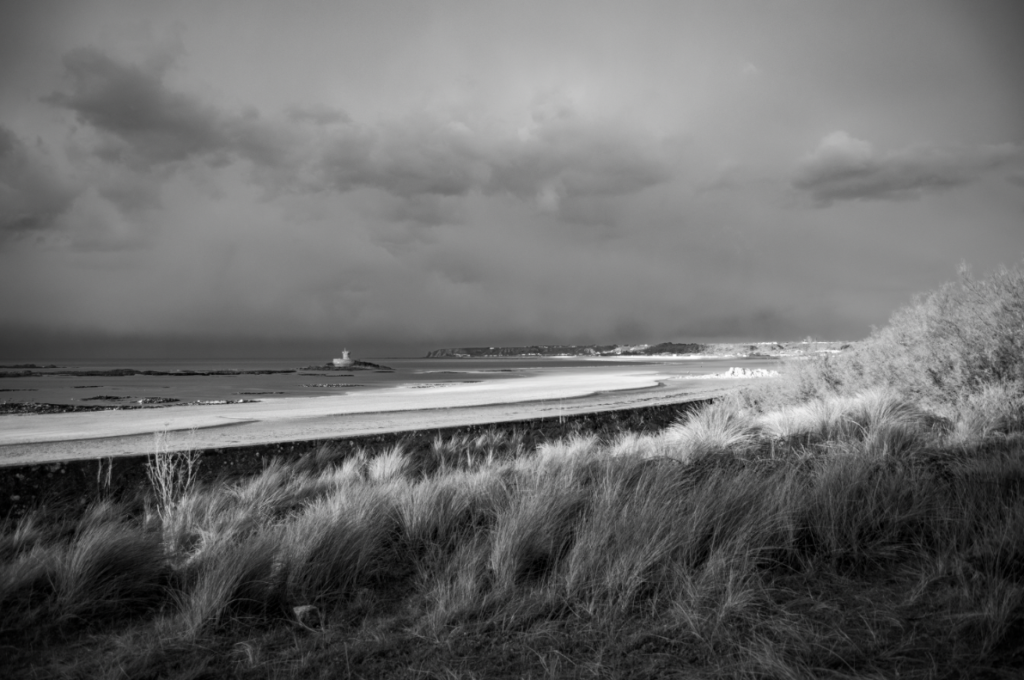
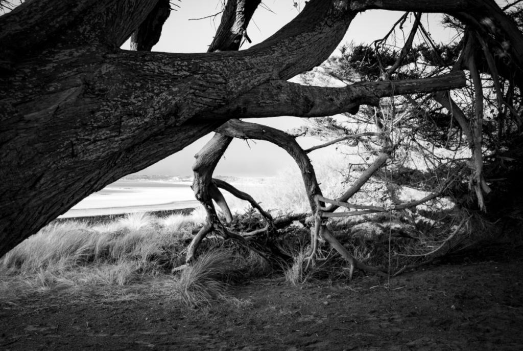
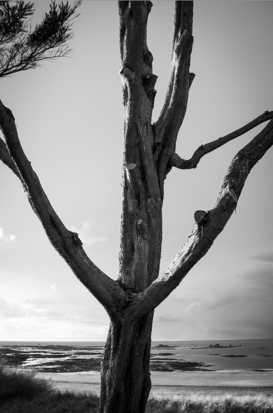
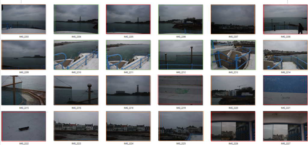
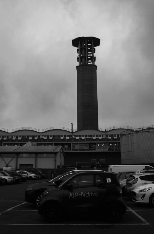
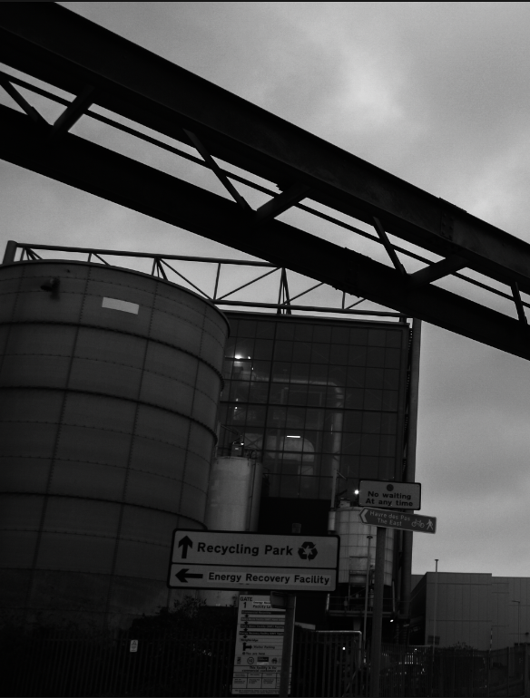
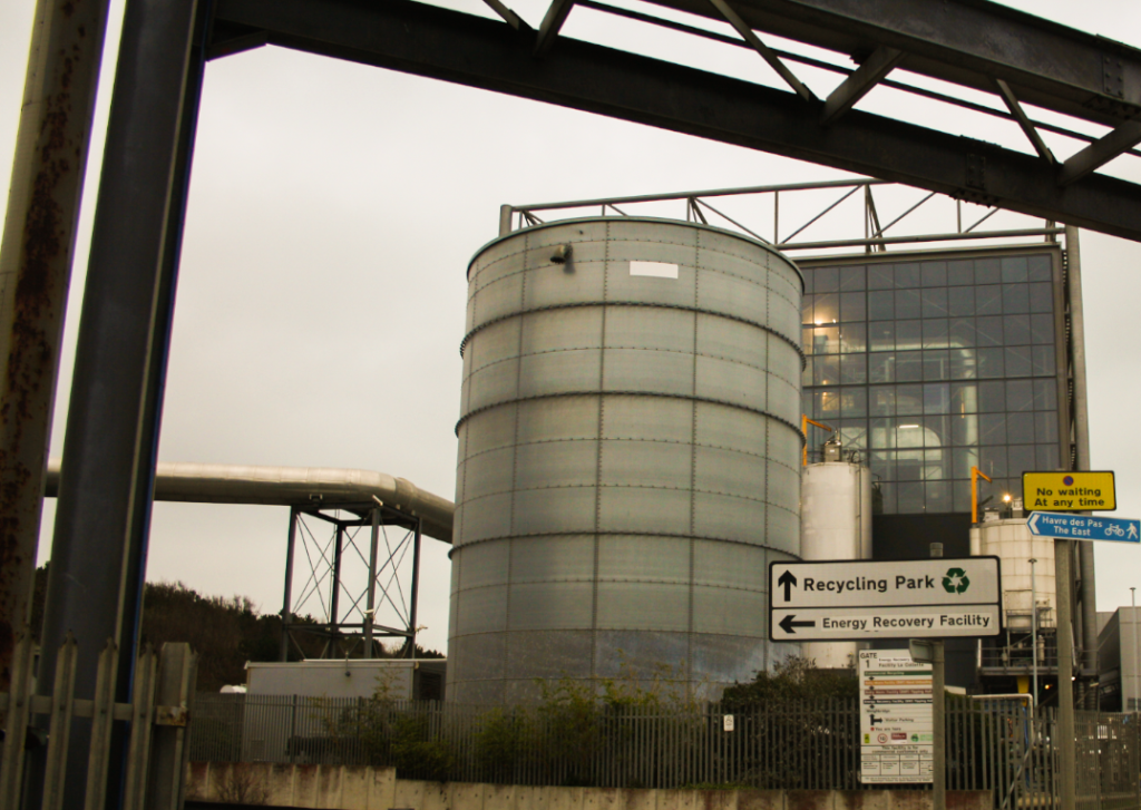
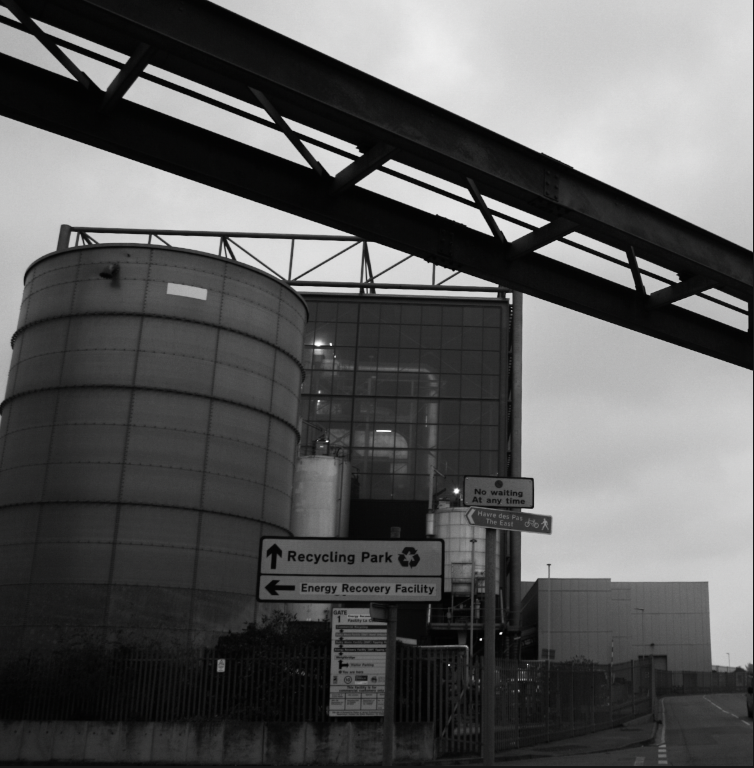
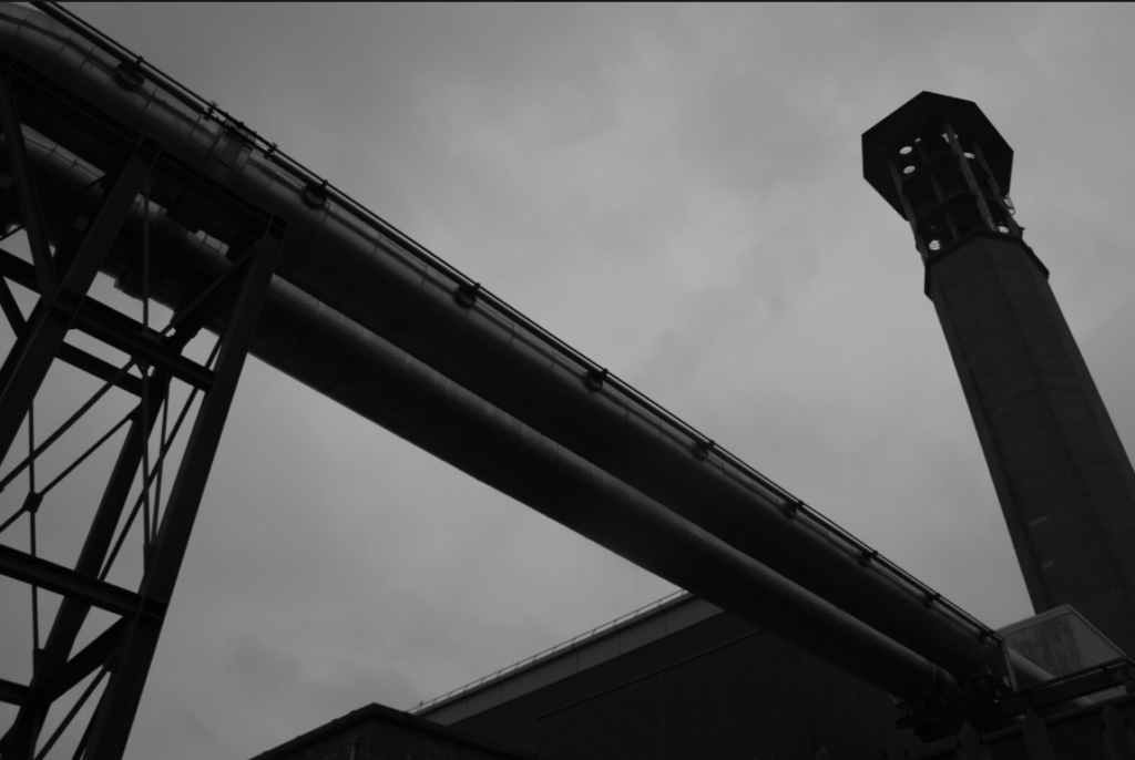
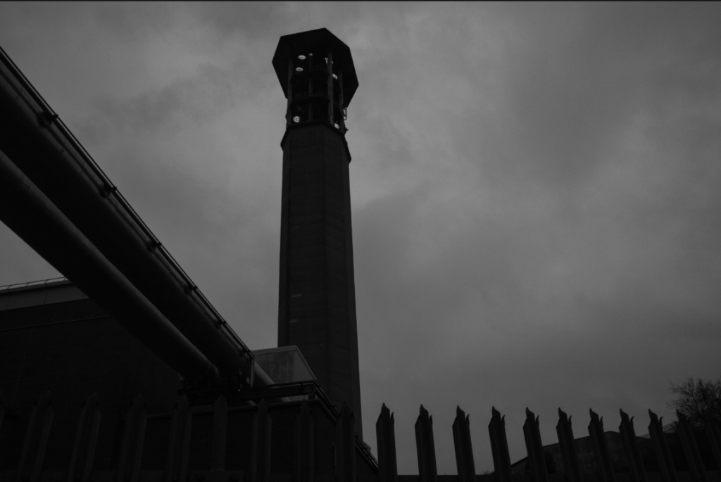
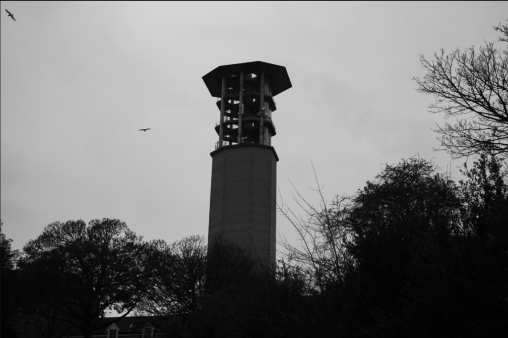
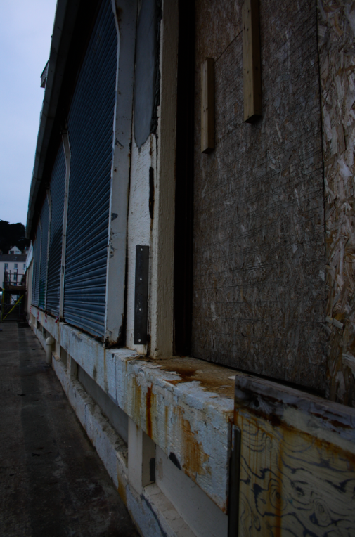
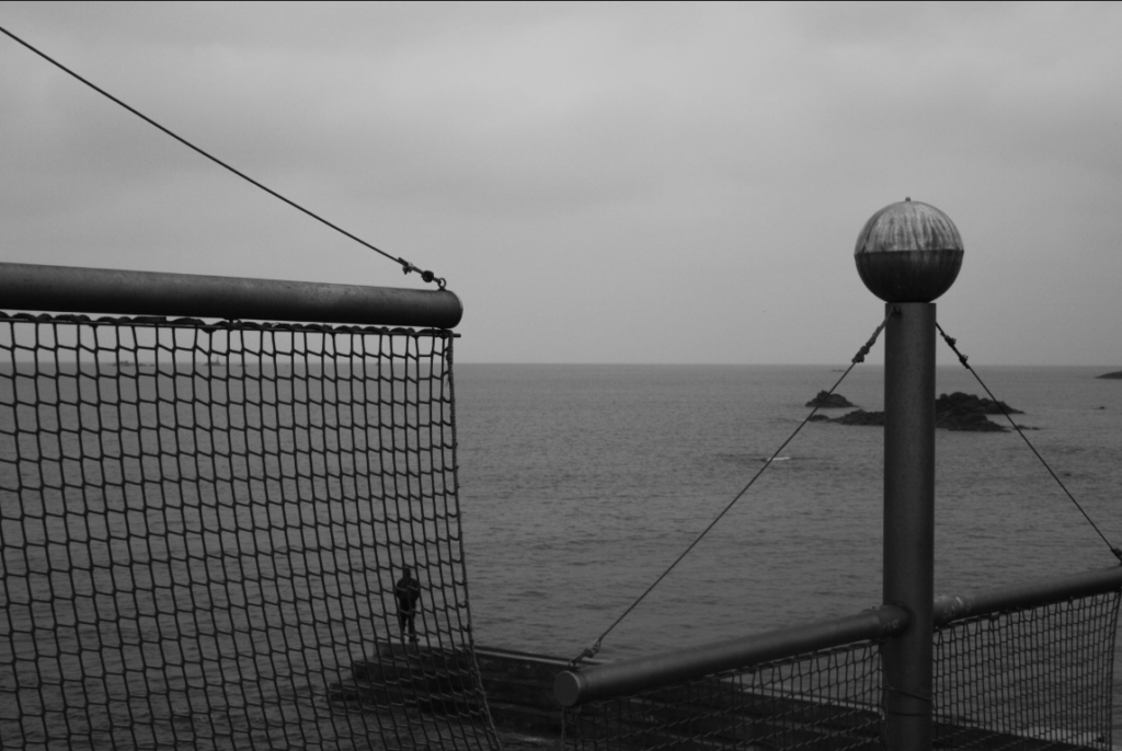
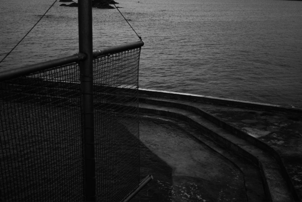
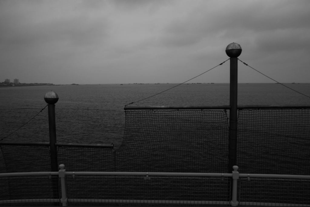
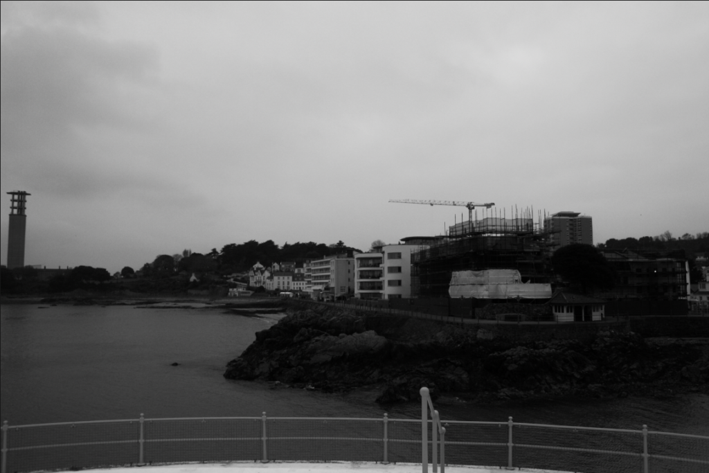
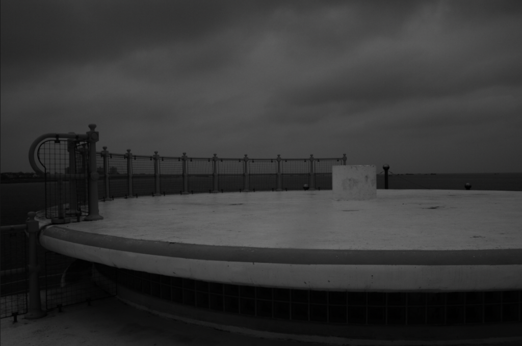
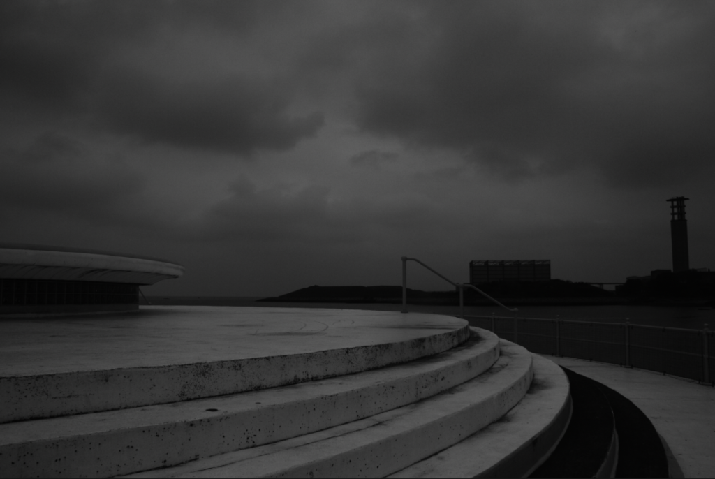
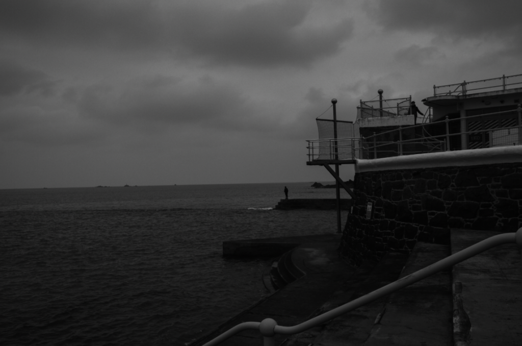
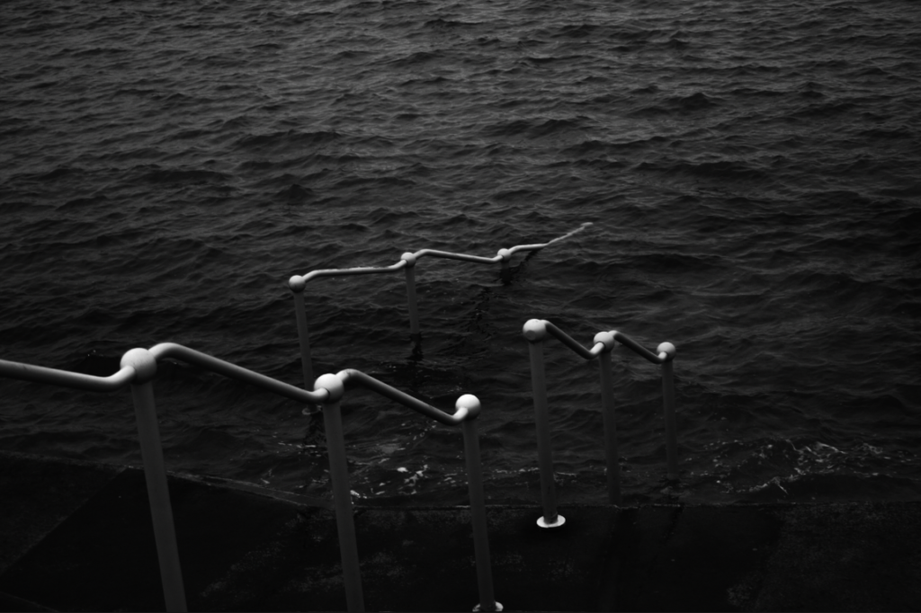
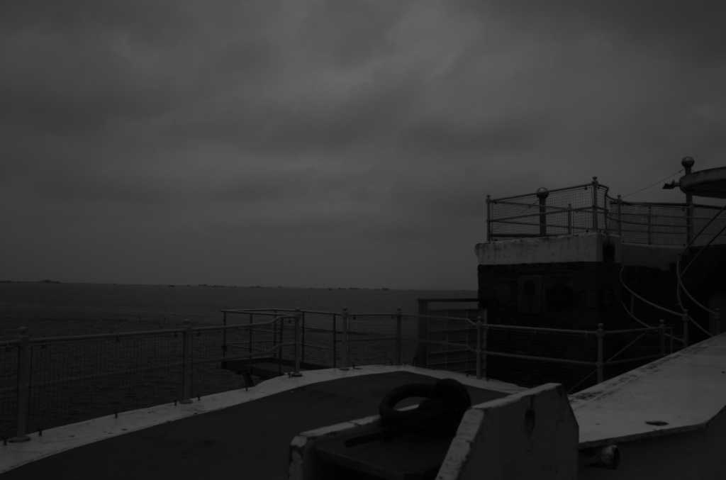
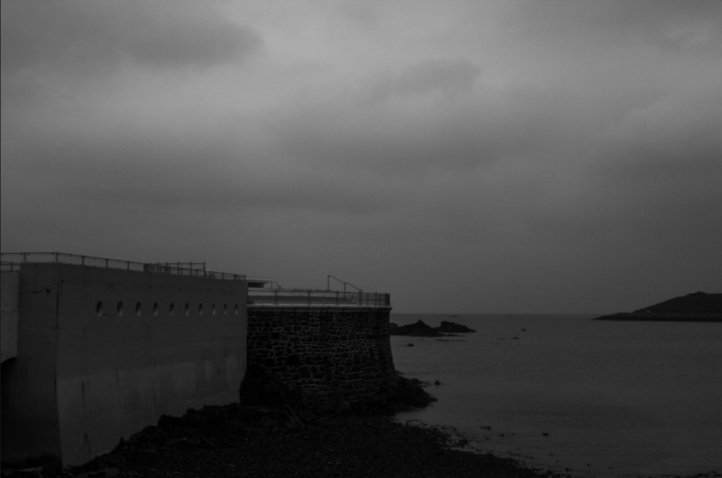
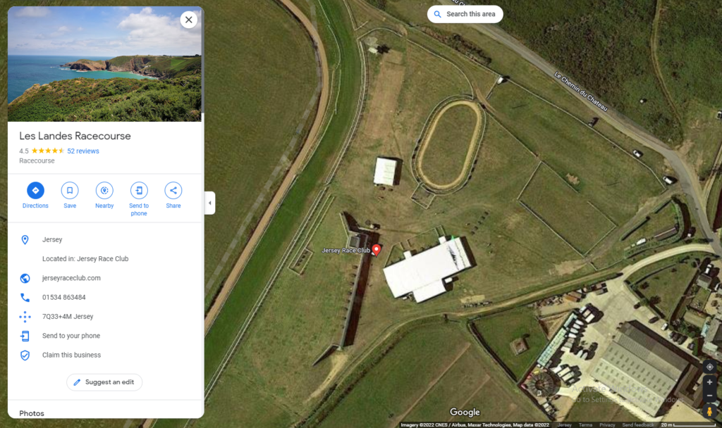
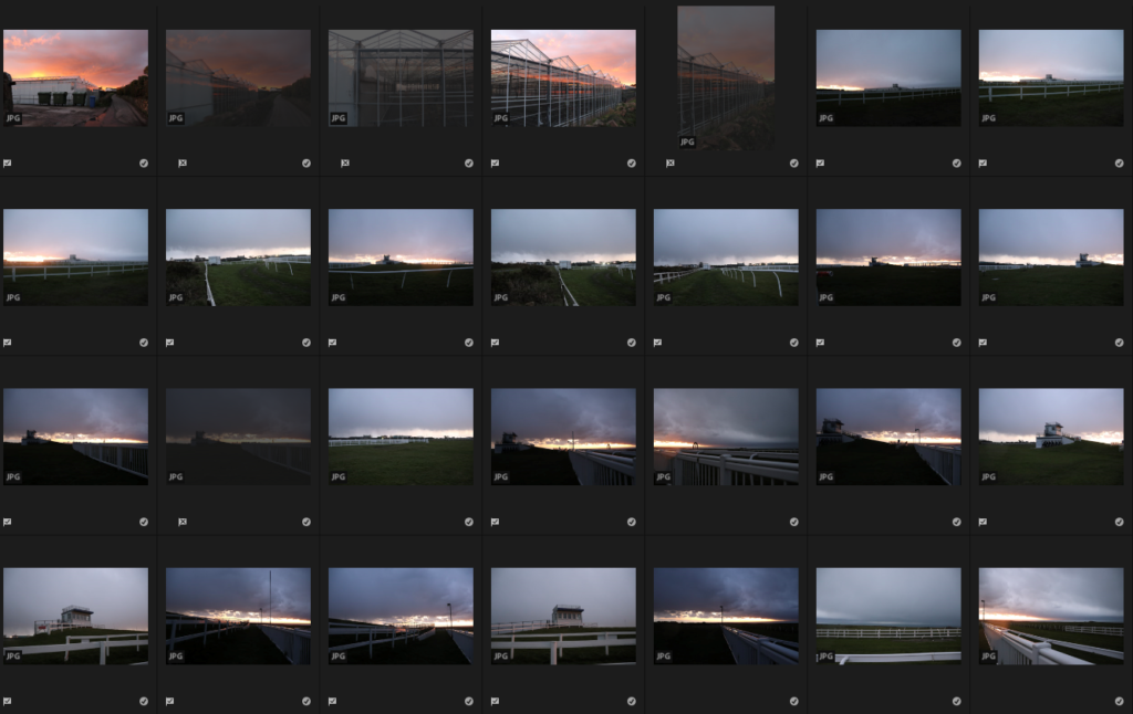
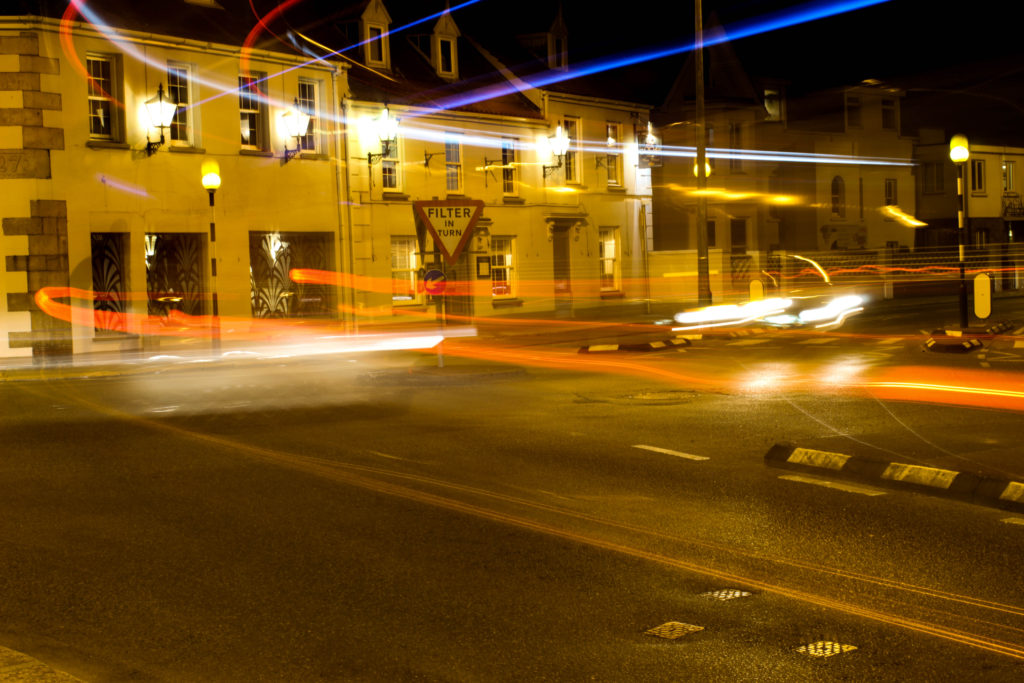
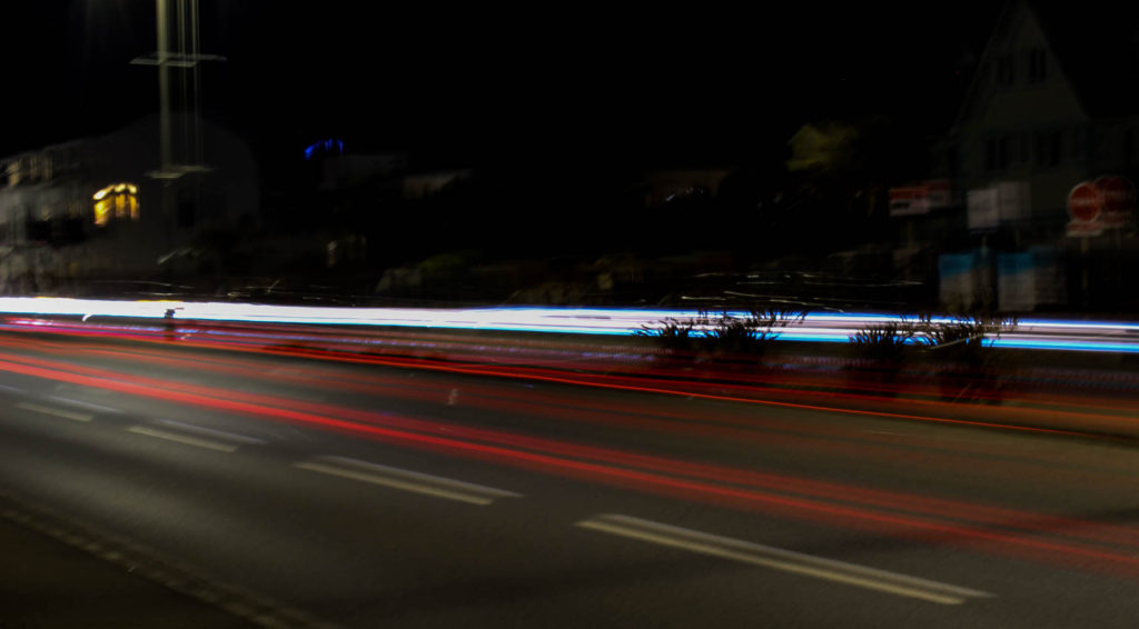
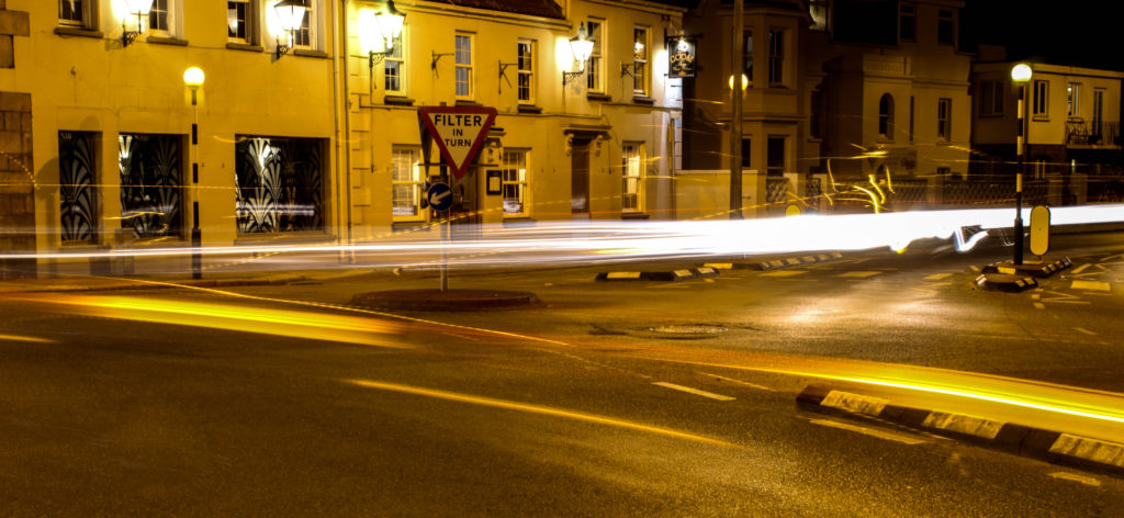
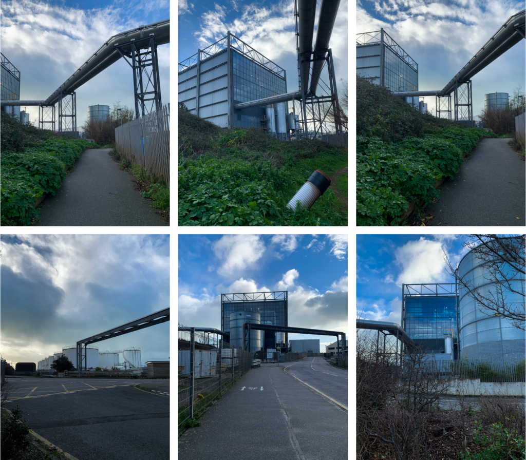
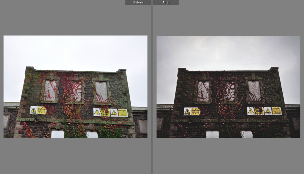
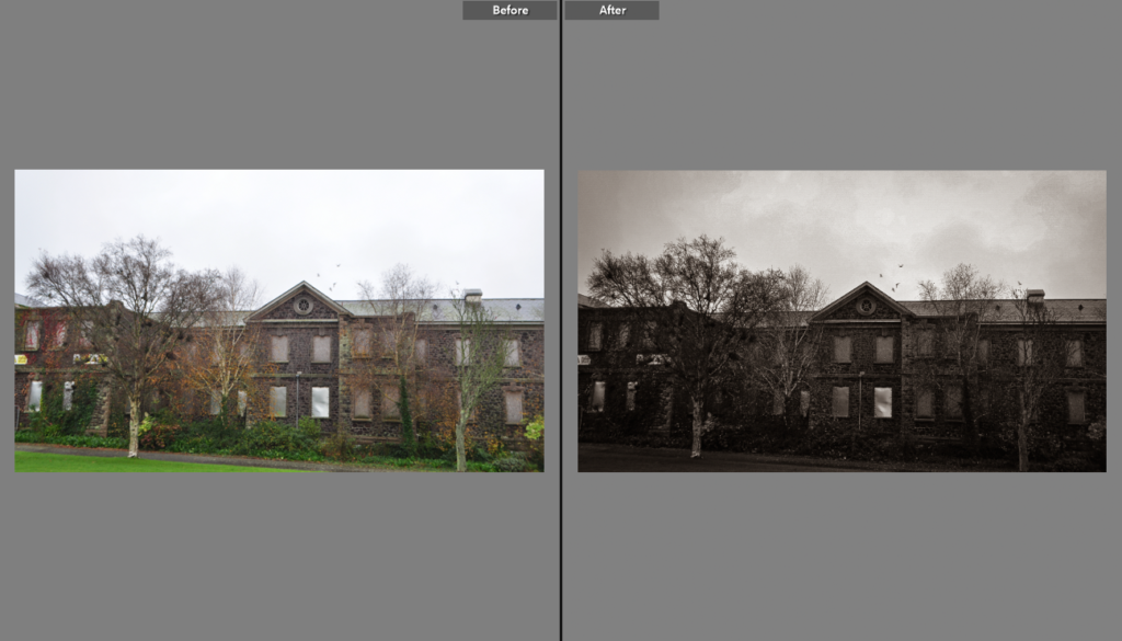
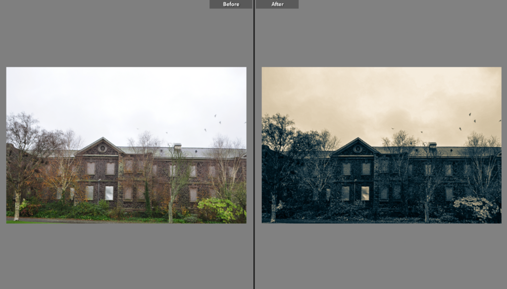
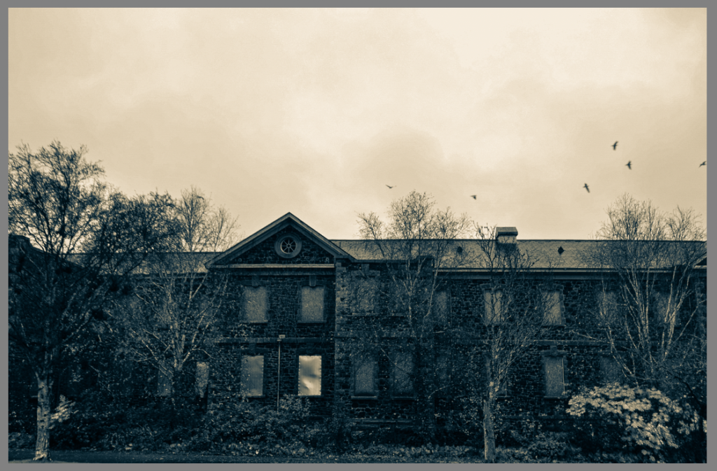
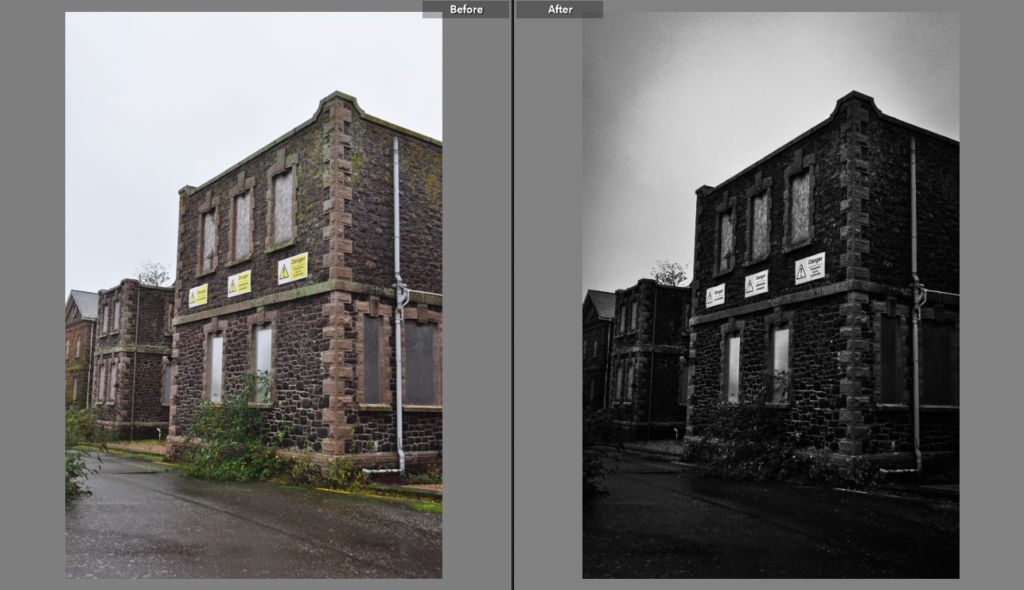
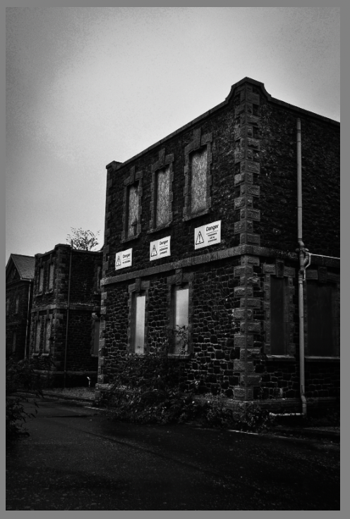
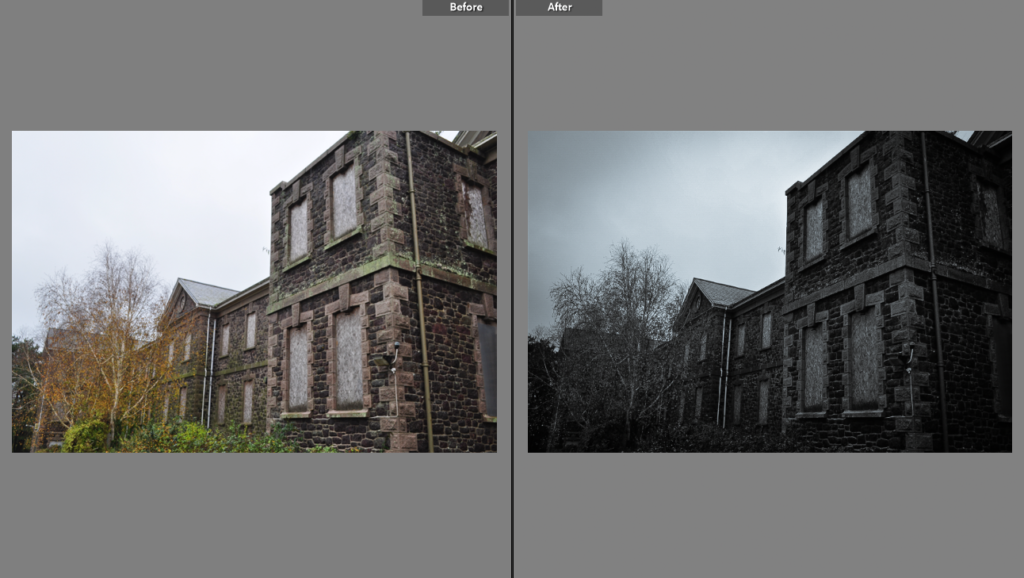
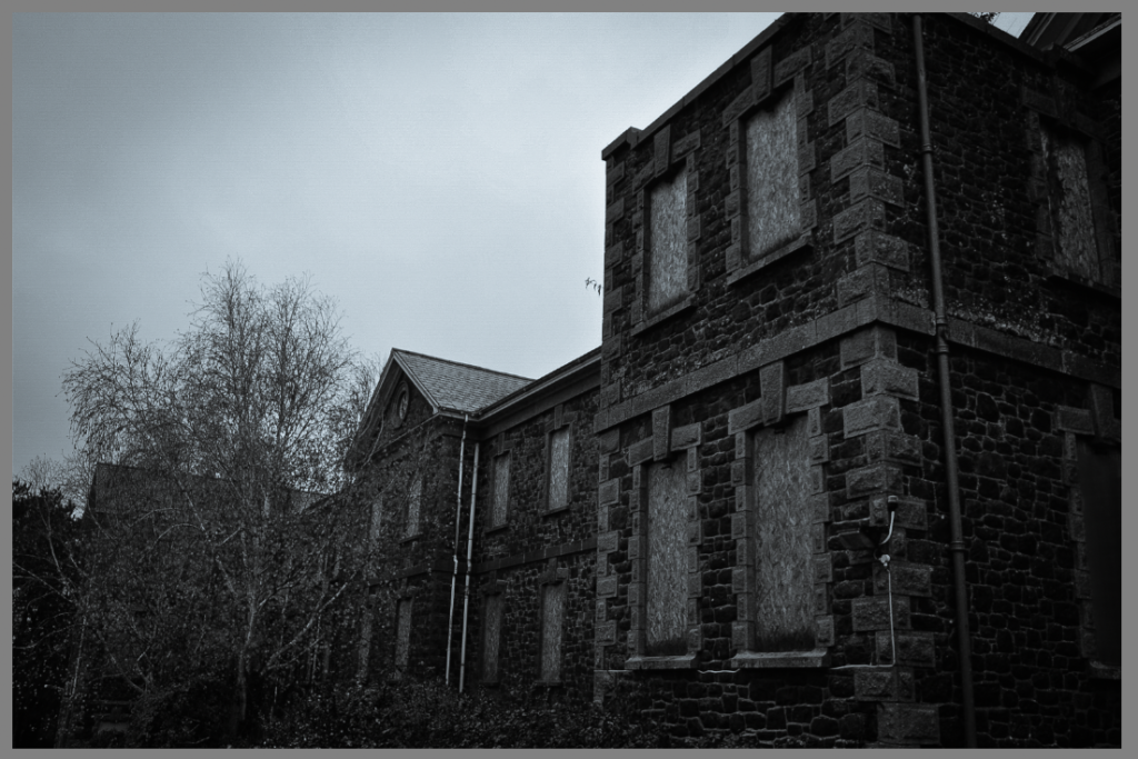
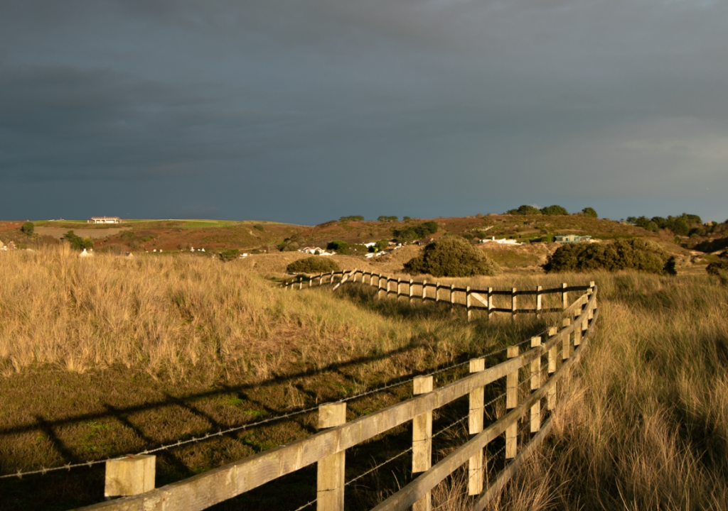
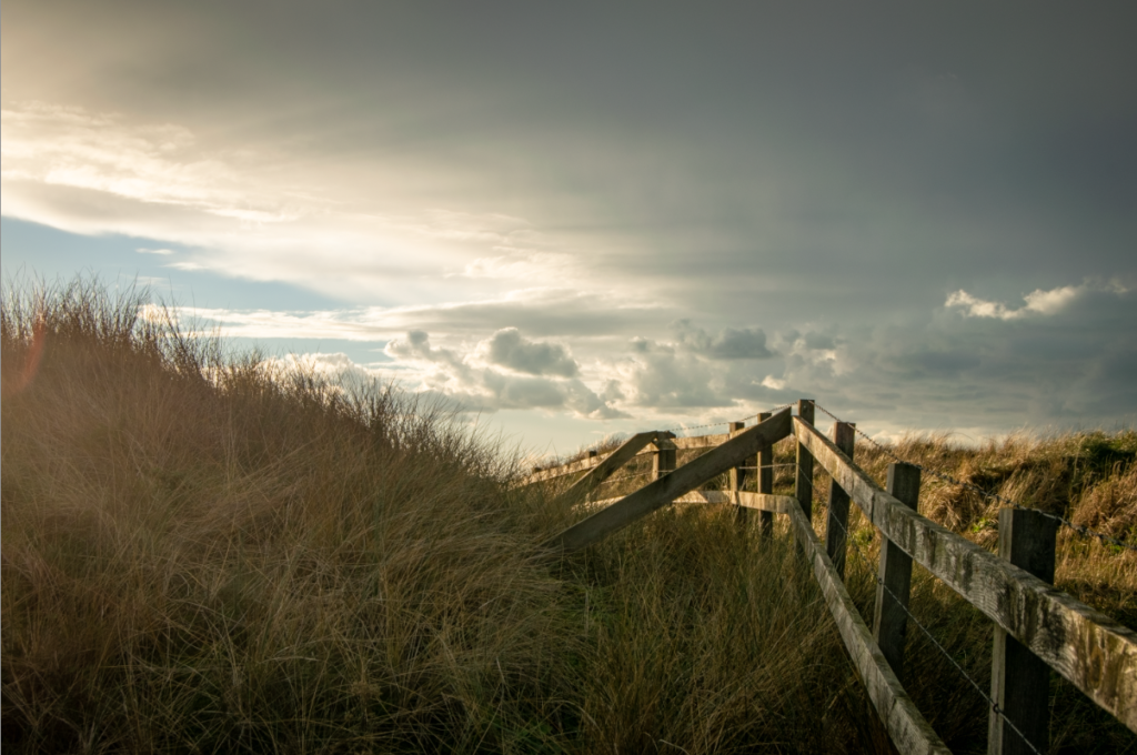
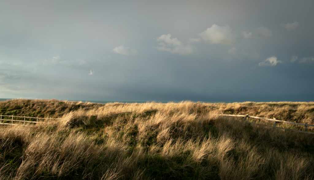
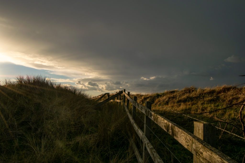
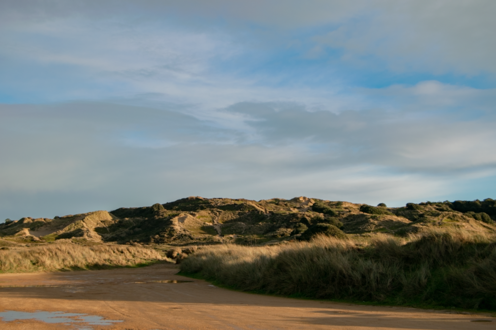
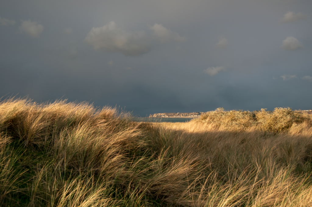
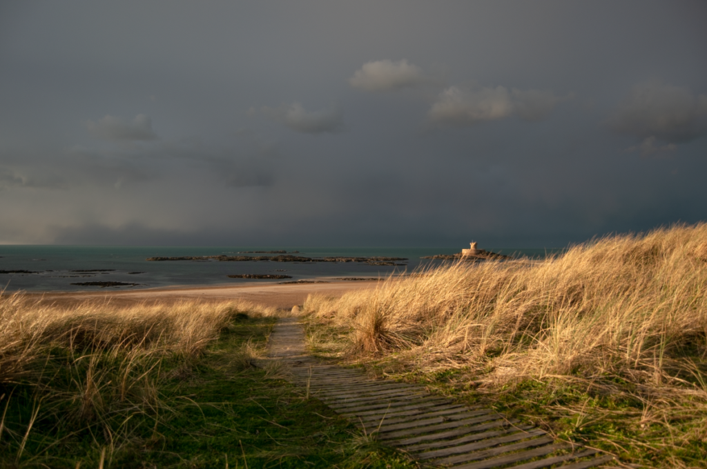
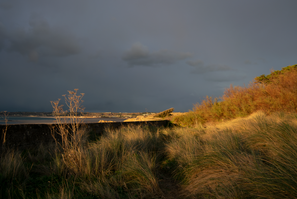
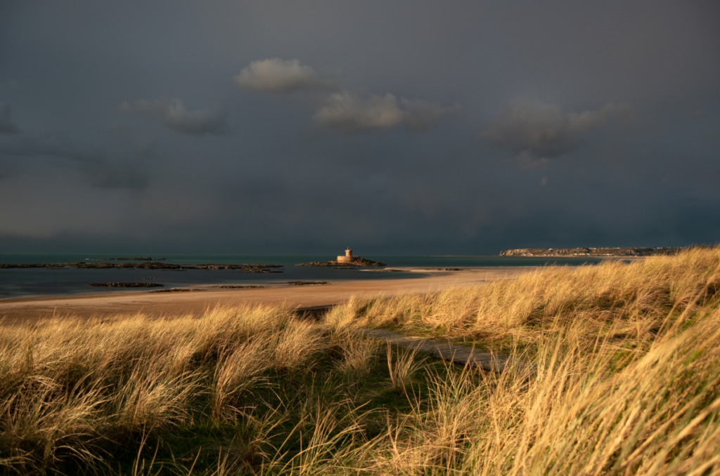
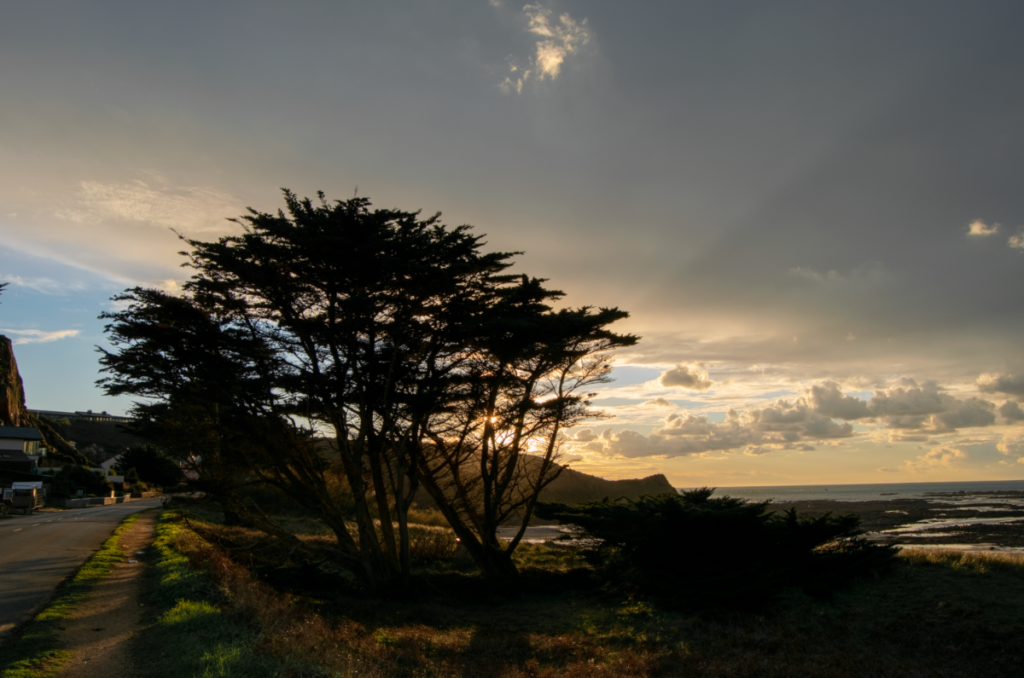
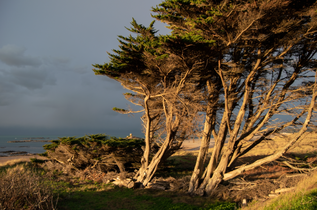
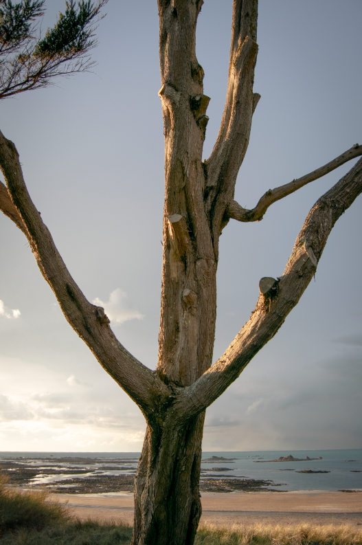
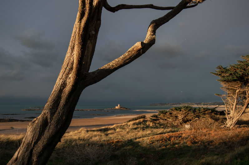
Here are the outcomes from my New Topographics photoshoot. I decided to go to the Les Landes racecourse to take these images because I thought that it would have the right kind of empty/abandoned feeling. I think that this was achieved in my photographs.
Additionally, the weather at the time was a heavy sheet of rain covered by a thick cloud shelf which created a colourful and dramatic sunset, which I think really added to my photos.
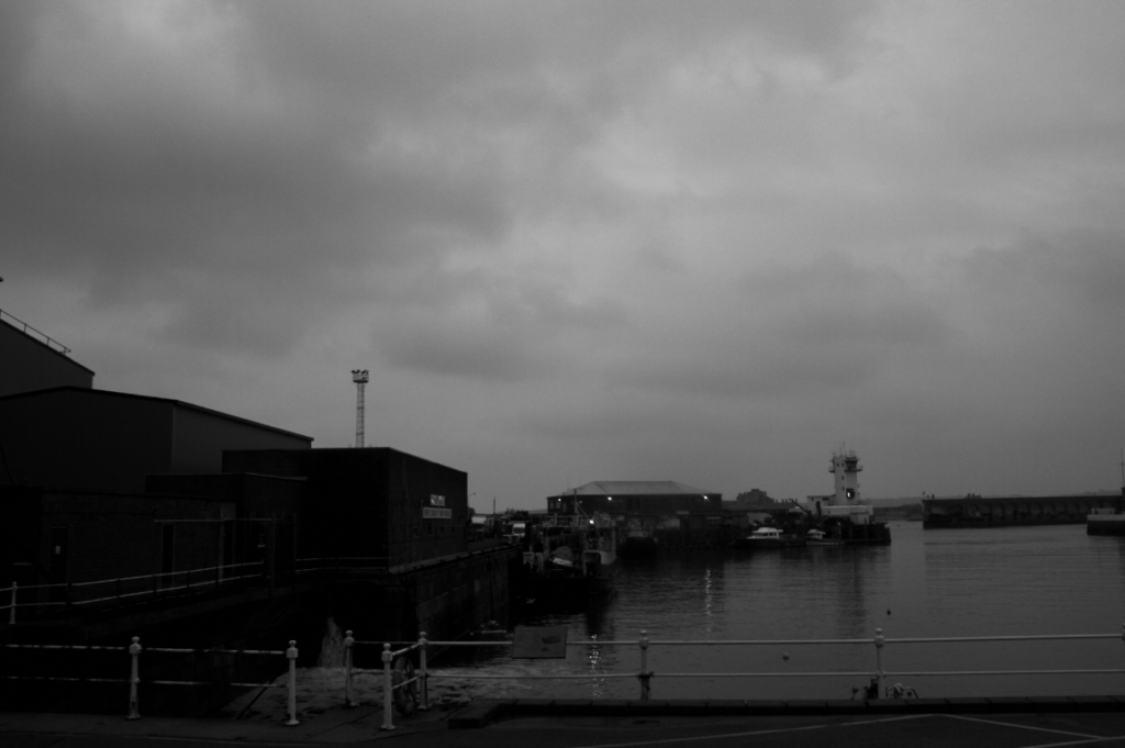
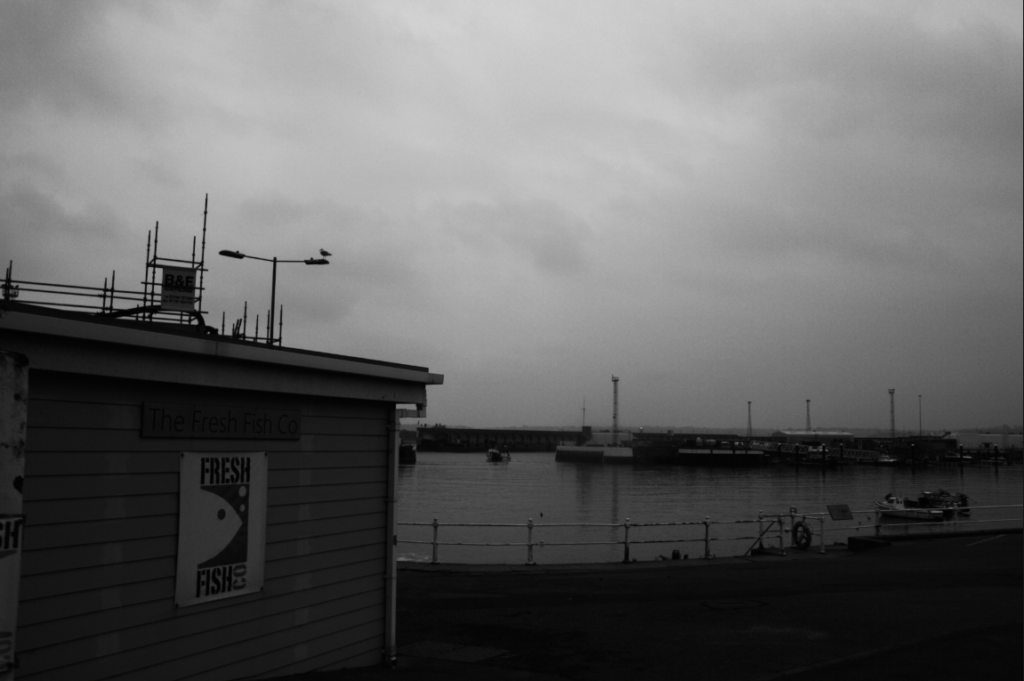
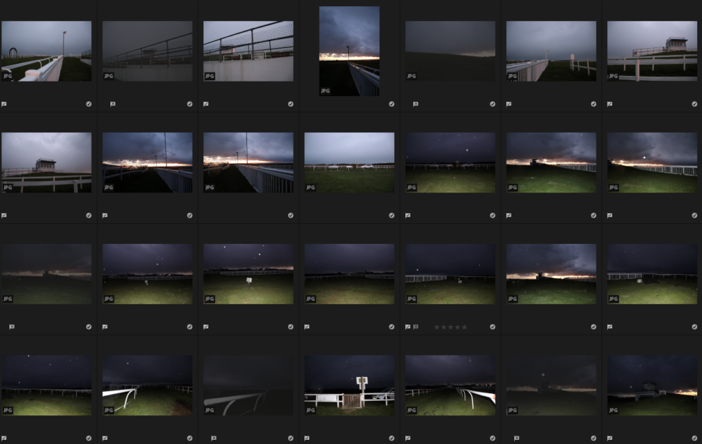
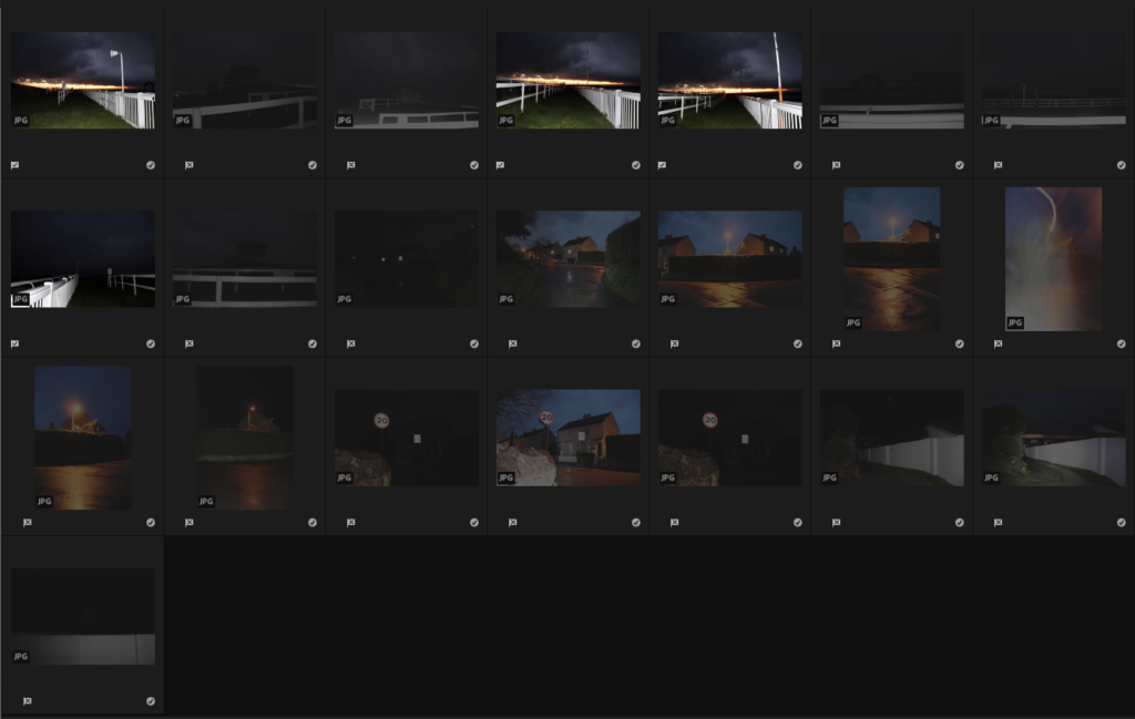
As it was getting dark towards the end of my shoot I decided to start using my flash to take some photos with a more accentuated effect of eeriness and abandonment and I really like these. I often like to use my flash and I think I have taken some of my favourite photos with the flash equipped, so I think this shows a little more of my own style in these images.

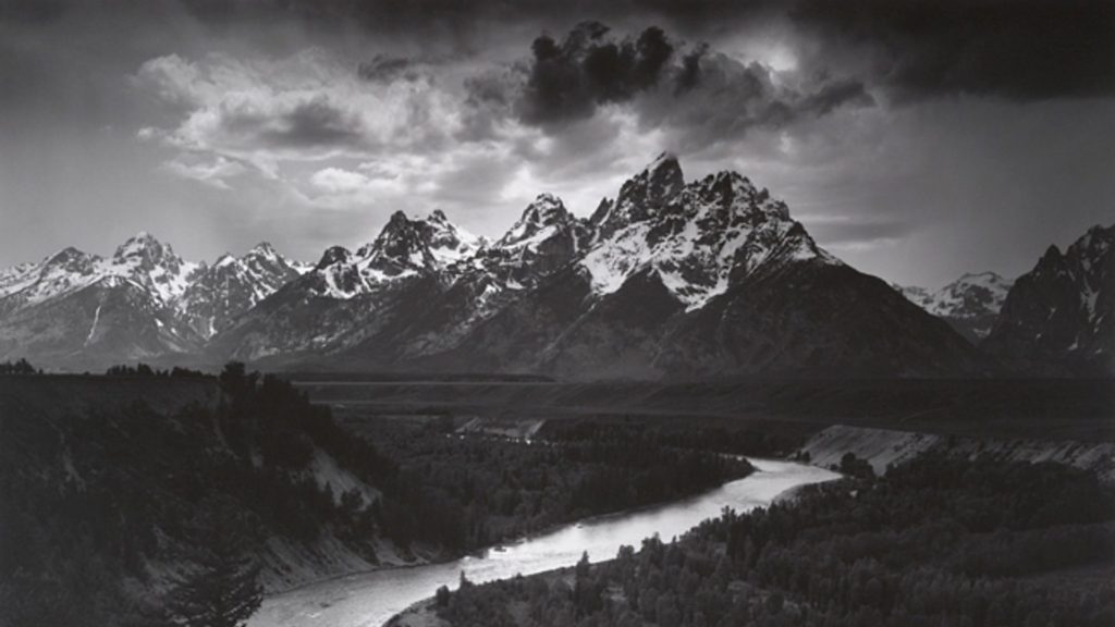
Ansel Adams was an American photographer born in 1902 known for his black and white photos of American landscape. Adams most prevalent work comes from his focus on capturing the untouched wilderness of the American west.
Adams helped found the photography group f/64 which was a society founded in the 20th century made up of photographers advocating for ” pure” photography favouring detailed and sharp, focused images that used the full tonal range of the camera. The name f/64 refers to the smallest aperture of a large formatting camera.
Ansel Adams commonly practised a technique he called visualisation the action of interpreting and fully looking at a scene with your eyes before taking the photo. it is a form of visual assessment of what you are seeing then choosing the most significant places within the image to frame and recognising the tonal values and highlighting them.
“We must explore what lies before our eyes for its significance, substance, shape, texture, and the relationship of tonal values. We must teach our eyes to become more perceptive.” – Adams’ description of visualisation.

Adams created the zone system was created to represent and ensure the tonal range found within a black and white print was used and as a way of working to achieve proper exposure, with 0 being pure black with no detail and 10 being white with no detail.
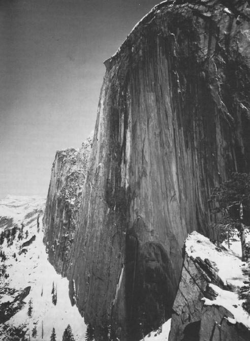

Monolith, The Face of Half Dome, 1927
On April 10th, 1927, Ansel Adams set of along the Yosemite’s LeConte Gully to create a picture of the iconic half dome in the Yosemite National Park. Adams originally used a Korona View camera fitted with a yellow filter exposure but swapped it for a red filter which darkened the sky and created deeper shadows with lighter highlights.
Adams commonly practiced the rule of thirds the idea of balancing a image compositionally by splitting it into thirds both diagonaly and horizontally.


.


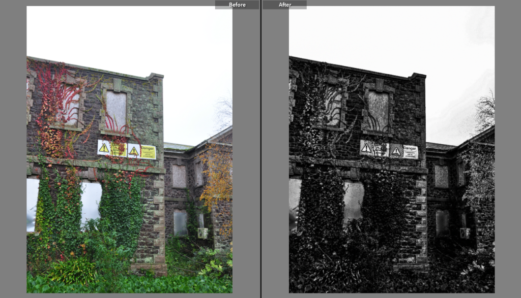
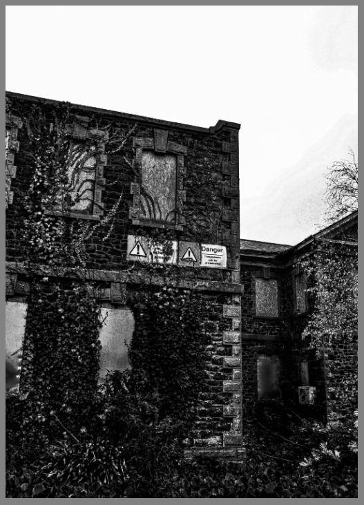
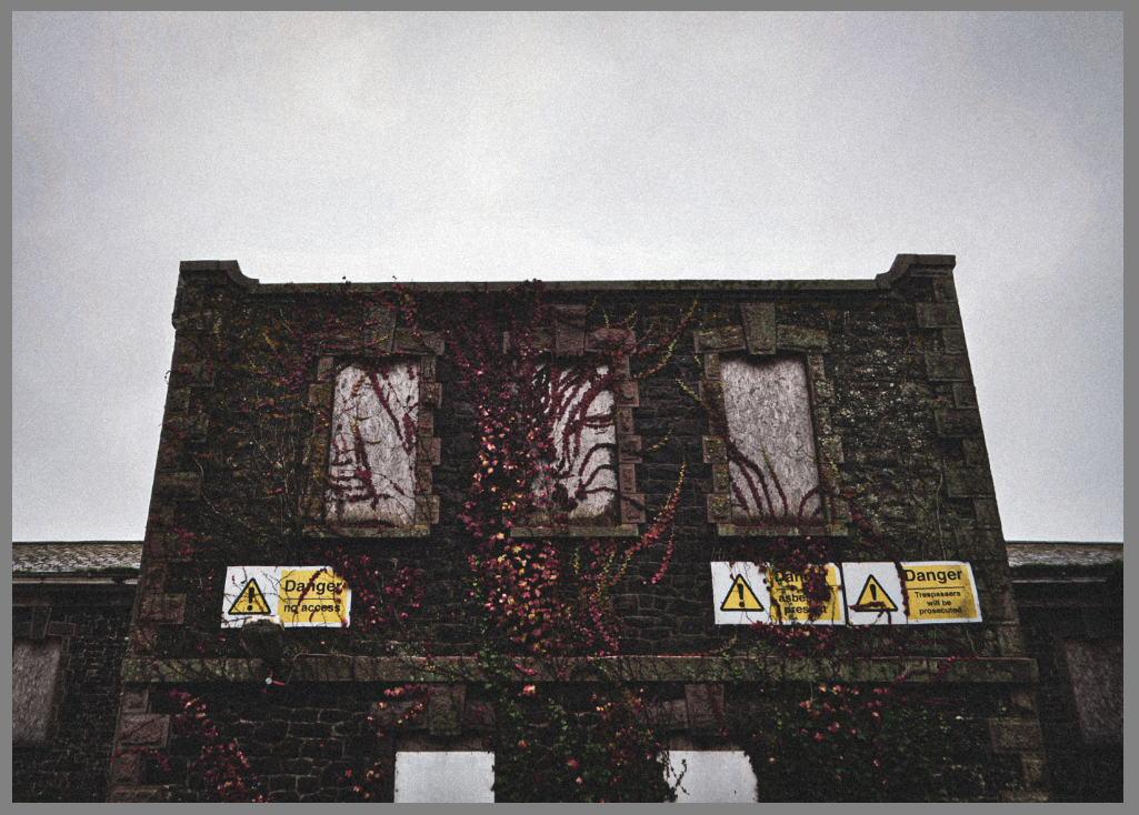
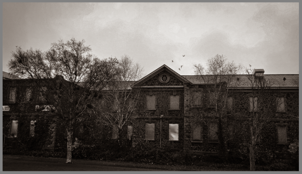
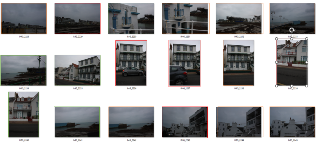
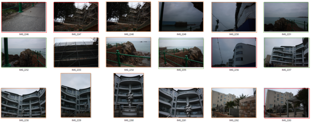
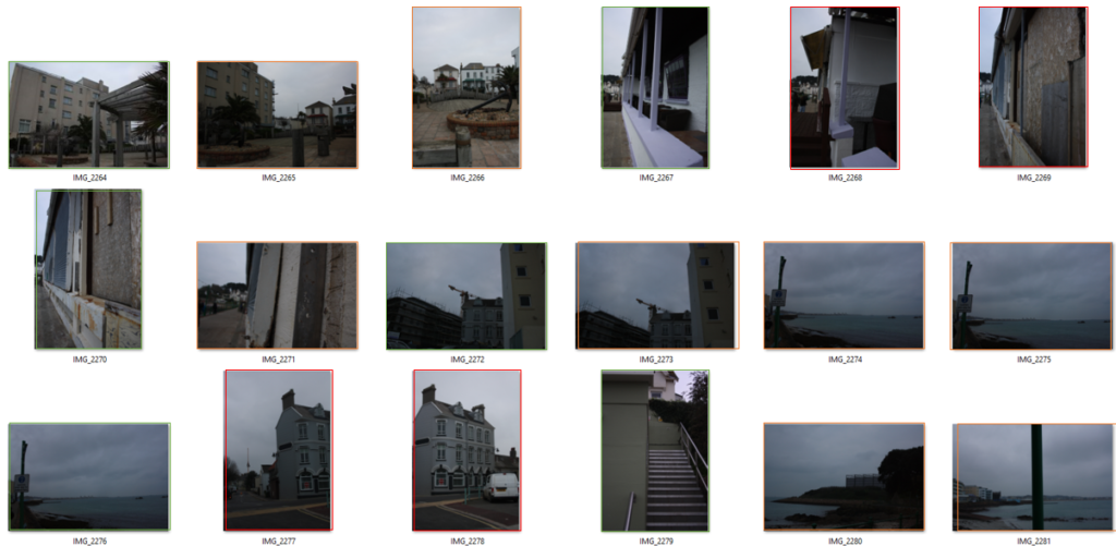
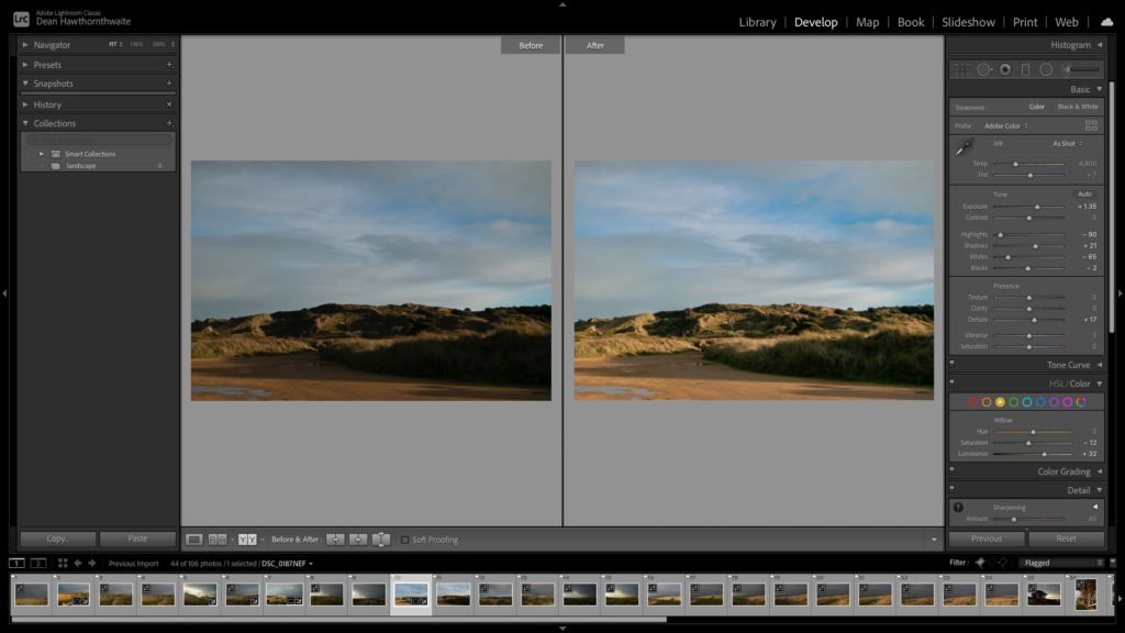
I created these edits in Lightroom, using a range of different editing techniques as well as applying different filters for different effects.
Contact sheet
Flagged photos I chose to edit
Photos in colour
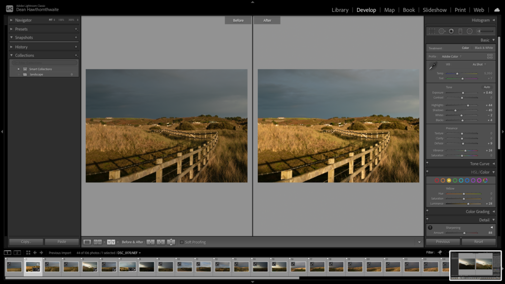
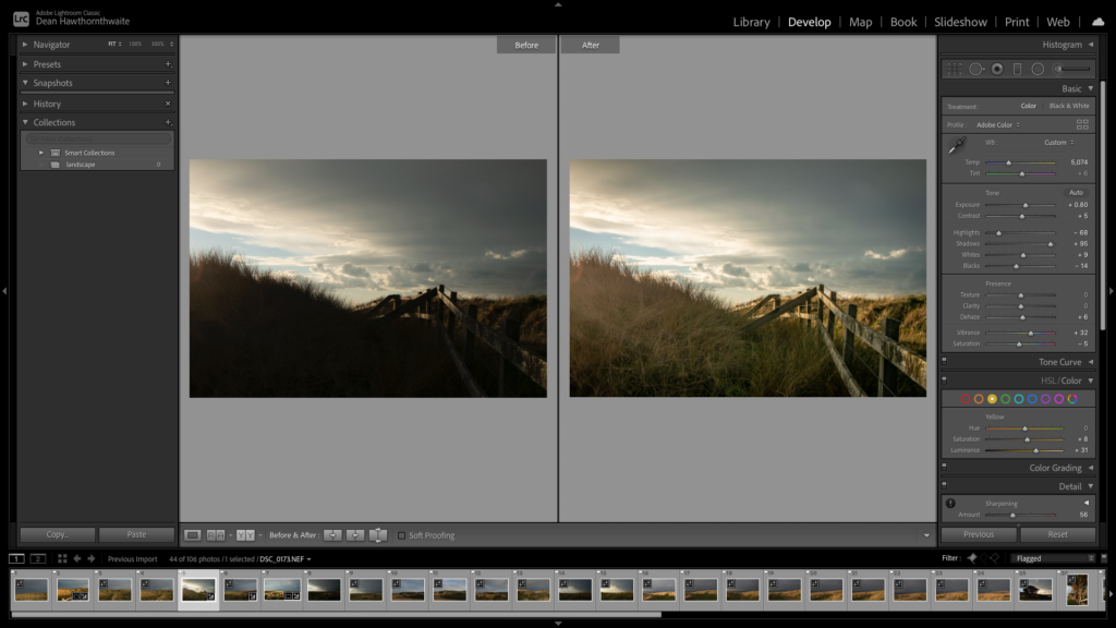
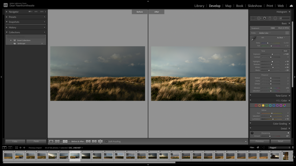
Black and White