All posts by Wiktoria Markiewicz

Filters

Author:
Category:

Final images from Landscape + Evaluation

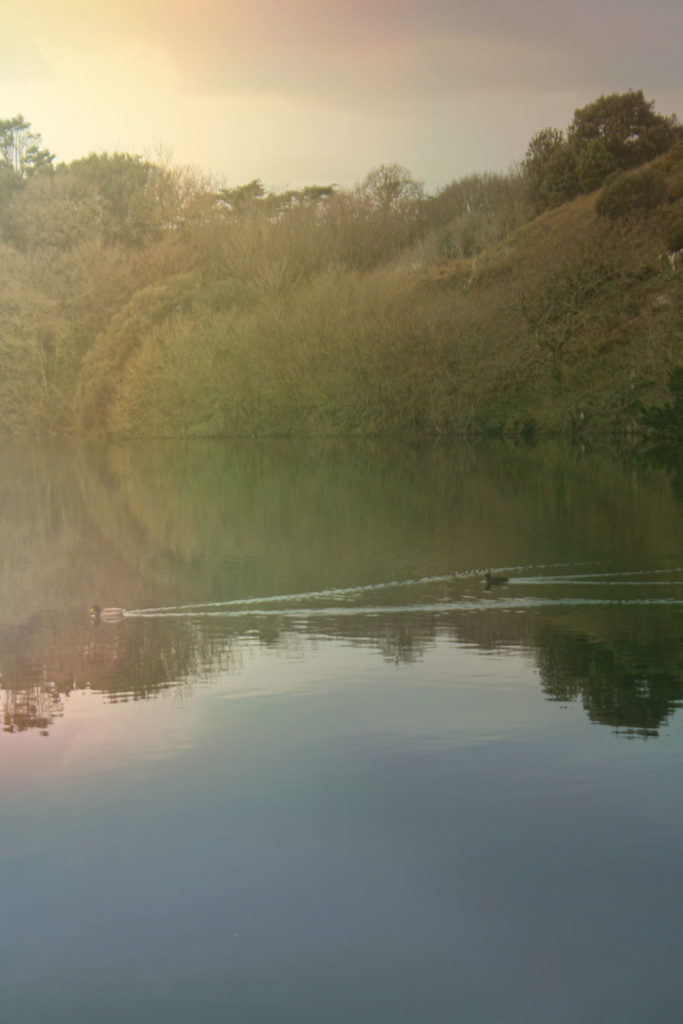
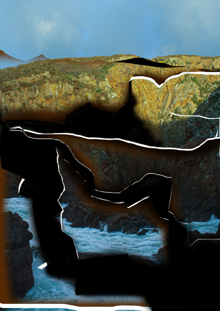
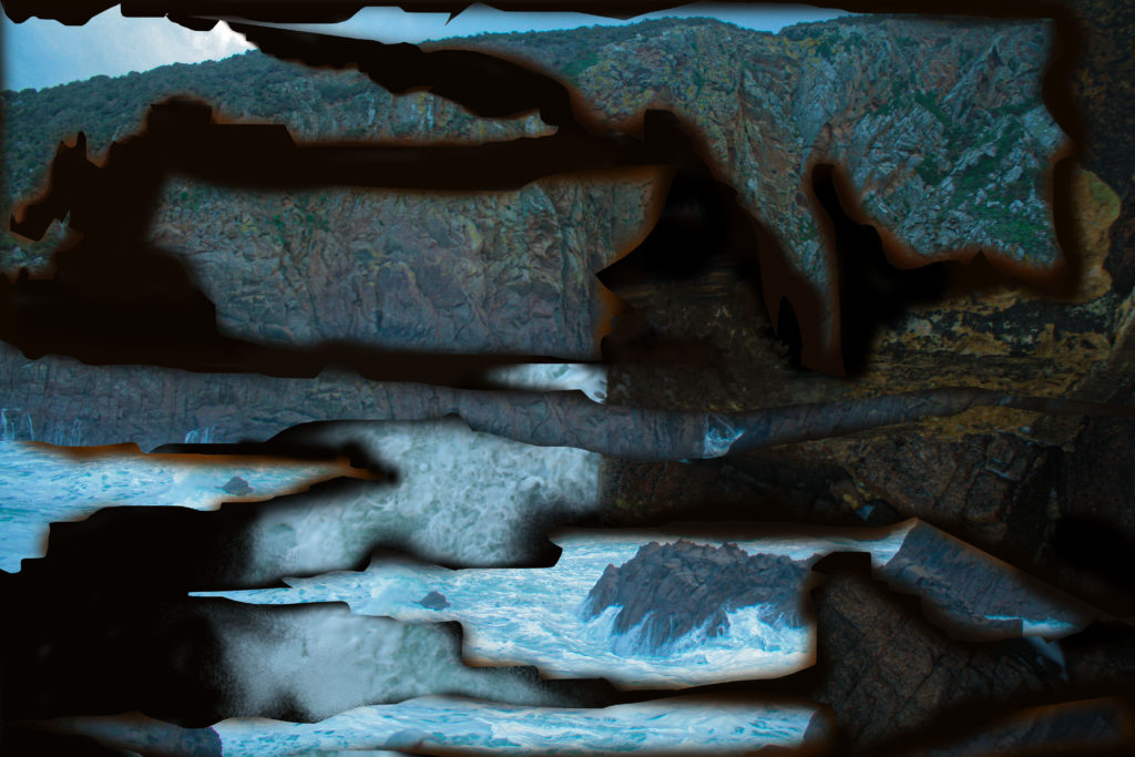
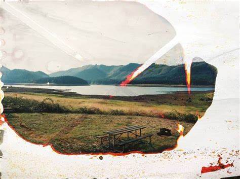
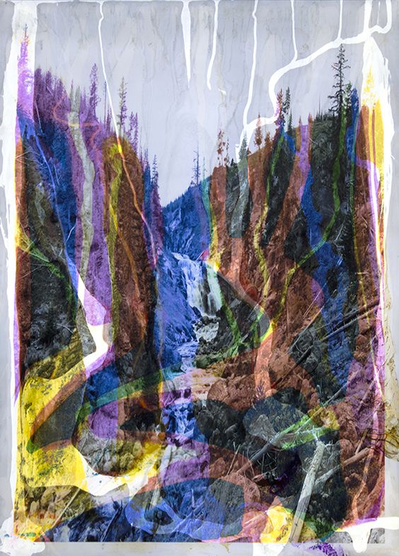
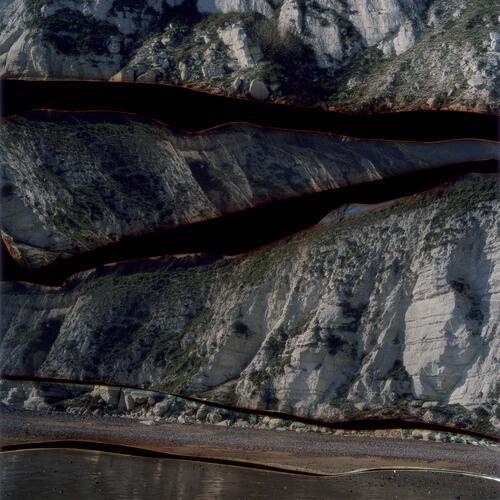
This image was taken at Plemont Beach and had a relation to Dafna Talmor’s work. I tried to replicate her style digitally, therefore I have went to locations she chooses, which are mainly coastal areas. then in Photoshop I had then experimented with the lasso tool and paintbrush tool, to create segments out of the image, representing Dafna’s ones. out of all the final outcomes this photo shoot as well as editing took the longest amount of time and was quite tricky as I wasn’t too experienced using Photoshop. But I am happy with the outcome as it turned out quite similar to the artists work , despite the fact that these were done digitally whereas hers are not.
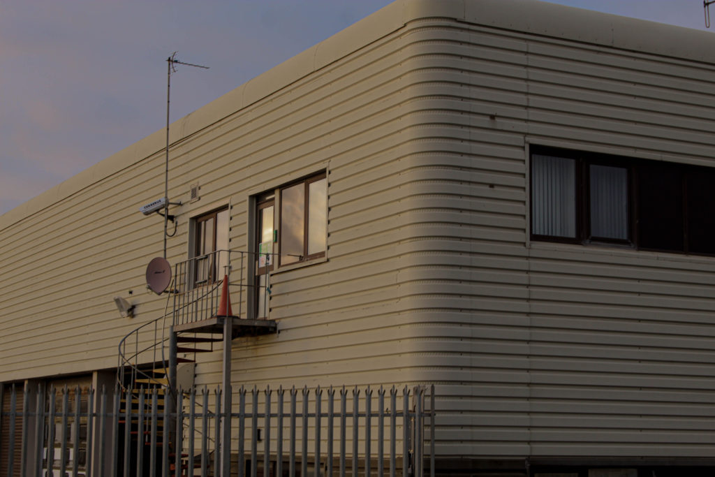
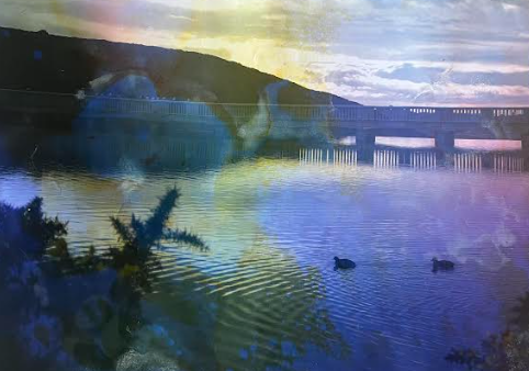
This image was done during the rural landscape trip, I have picked this one as a final image from this photoshoot because of its simple but calming atmosphere. I really like the quality of the image as even sharpness of the clouds can be seen in the reflection of the windows. I like the contrast that it creates to all of my final images, I am not a big fan of rural landscapes outcomes I have come out with, perhaps it is because of the sharpness that the objects show, with many edges and corners as well as straight lines. this is why I like this specific image the most because of the smoothness achieved by the building itself but also because of the image editing that creates a dreamy effect.
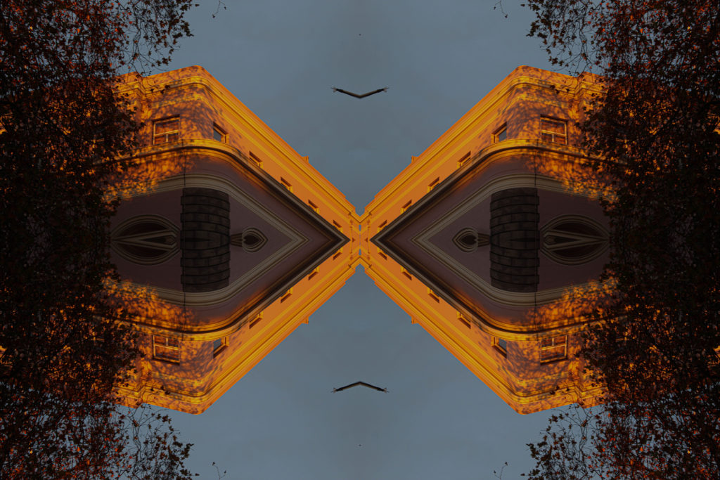
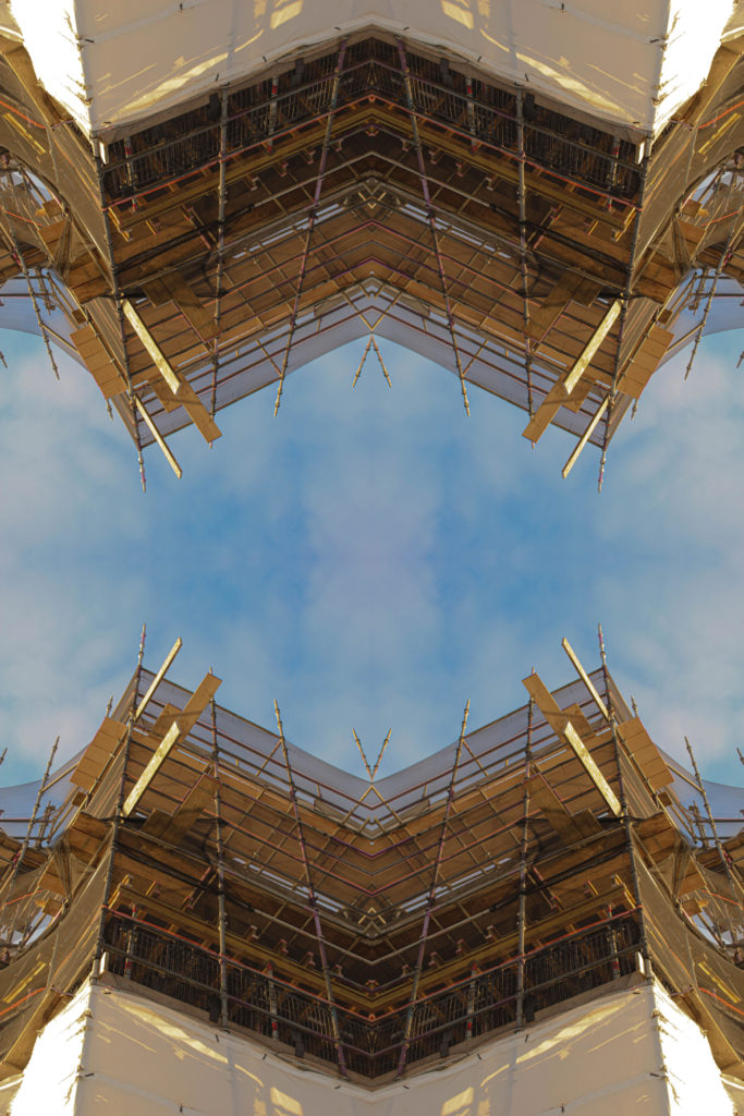
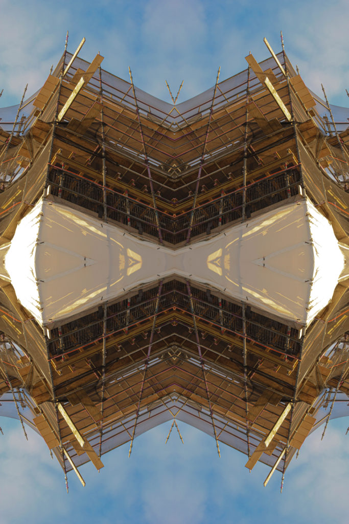
This image was created by experimenting with kaleidoscope imagery effect. this was a form of photo montaging done digitally. As this was my first time using this method to create this image I am surprised with the effect this created. I have took a zoomed in image of a building, done on the industrial photoshoot, then with selected image I have produced this final photograph. I like how the shapes represent the look of eyes and how abstract the image looks.
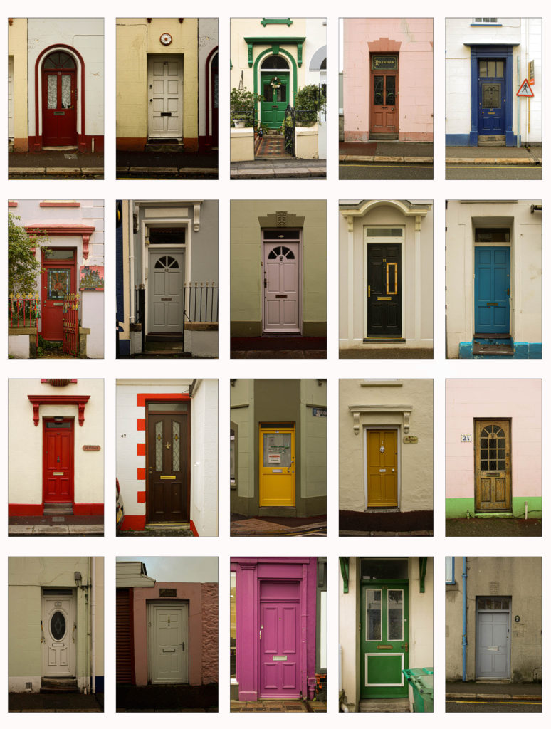
this was a typology done for experimentation of creating one. my main subject were doors, out of the couple of images I have produced I have put them in a grid creating a typology. this experimental process made my pick the outcome as a final photograph as it shows a different range of images I am capable to produce.
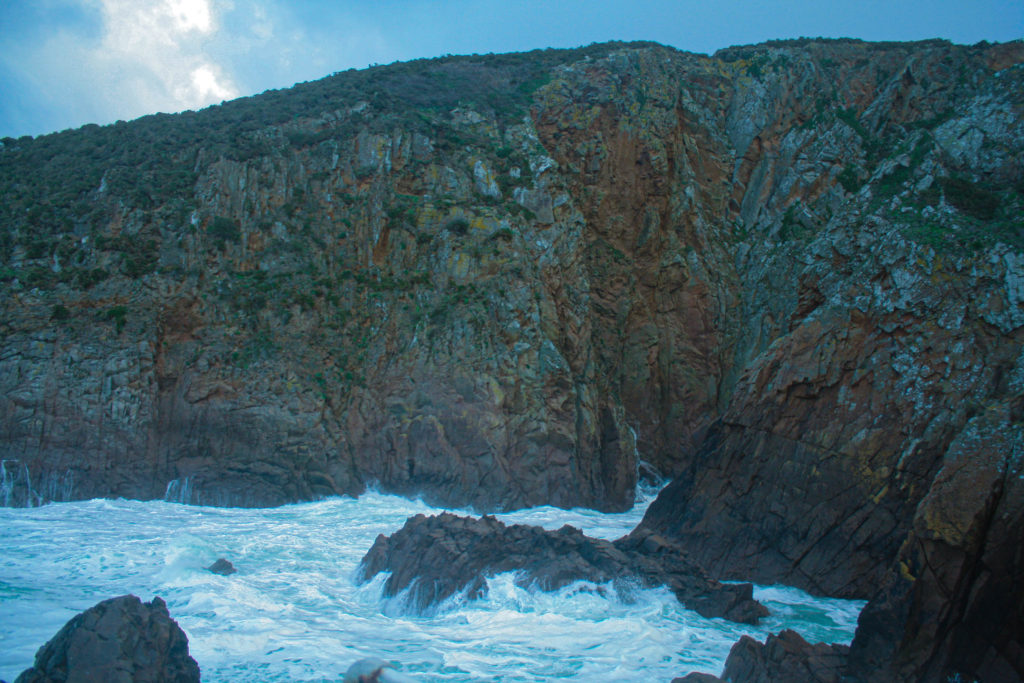
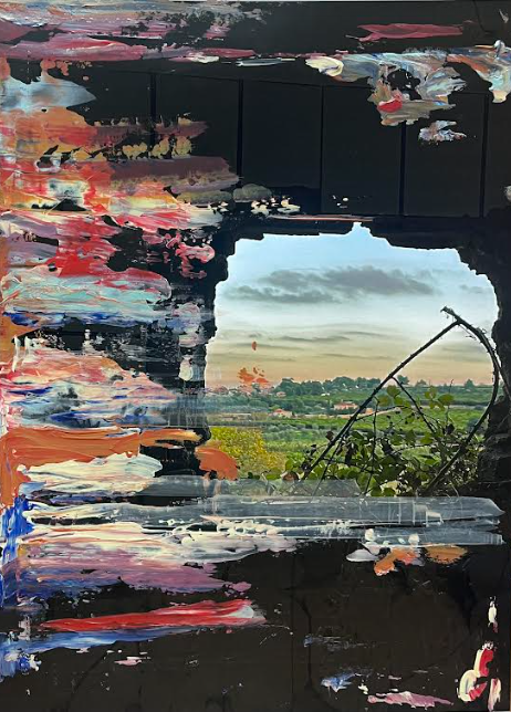
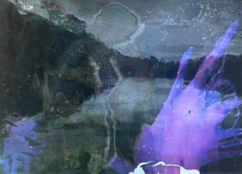
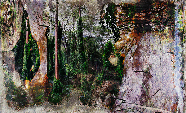
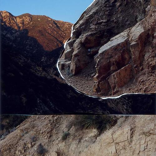
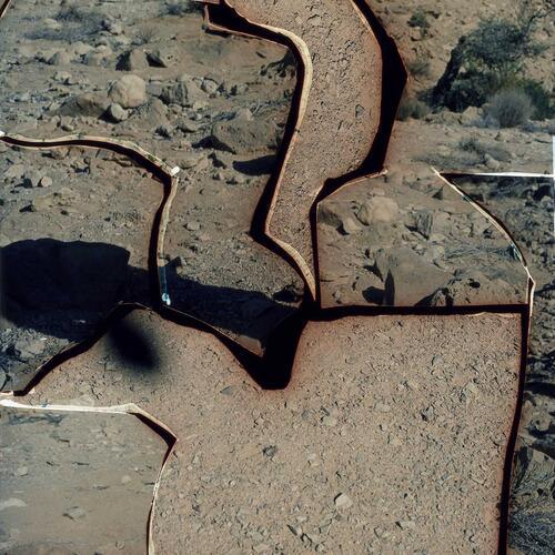
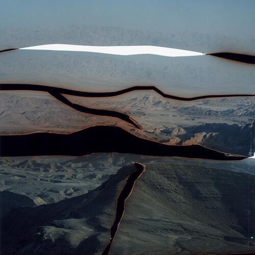
This image was originally converted digitally to show the process of Dafna Talmors images. and to respond to her work. I have the result of this uploaded however I really liked how the image looked by itself and that’s what I decided to go with. the image is unsettling and ominous, that’s why because of this mystery I wanted it as part of my final landscapes outcome.

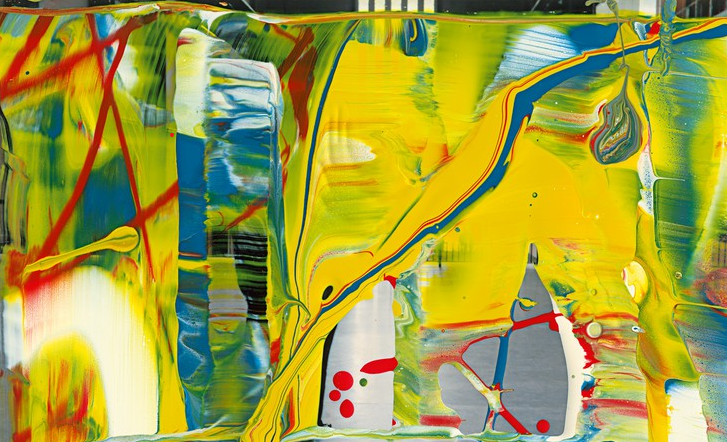
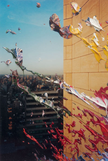
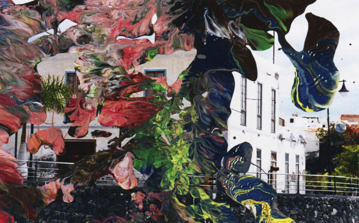
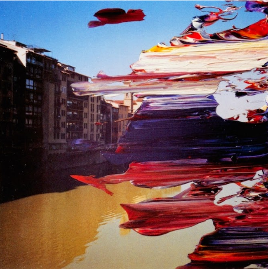
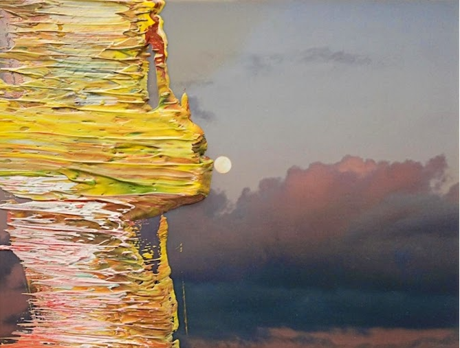
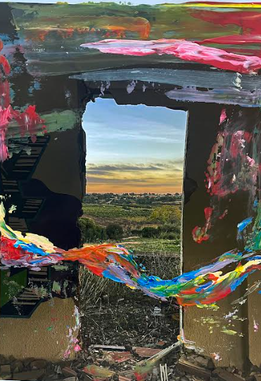
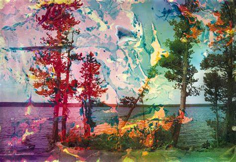
The bellow photographs are both part of Gerhard Richter’s response. Where I was influenced by his work to create the images. On printed photographs I have combined them with paint which was applied with a palette knife. I loved how these turned out because of the richness of colour, therefore I wanted to include both and only outcomes of that response.
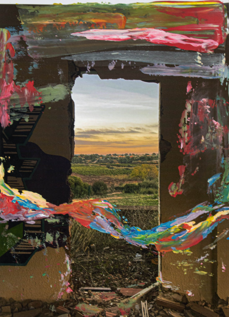
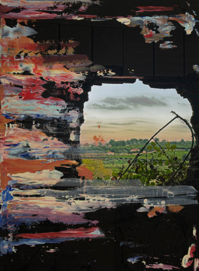

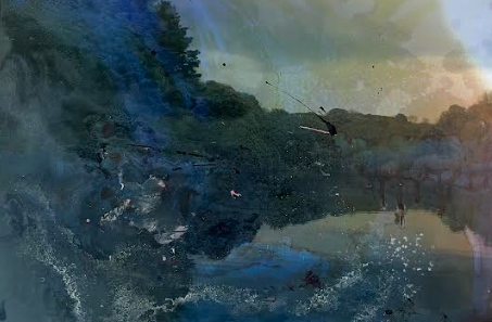
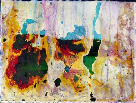
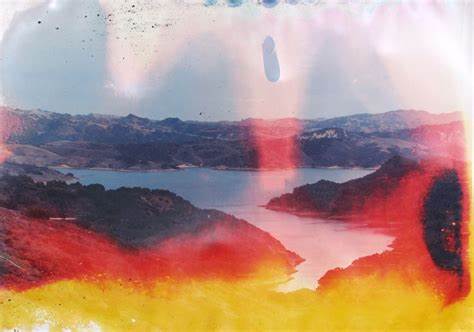
The bellow images are responses to Matthew Brandt’s way of working and a response to Anthropocene project. I loved these photographs because of the texture, colour, and experimentation which lead to unique , abstract images.
Compared to the other topic of objects, and still life, I have enjoyed this one more and have succeeded more in the landscape project. This lead me to produce a variation of different outcomes, I have experimented a lot more with the images is well, trying out new things. many of my outcomes are abstract , and through my final photographs I show a big differentiation between each image. As the landscape project is divided into industrial and rural landscape I have enjoyed both equally, however when it comes to photoshoots I have came up with more rural landscape outcomes, simply because I enjoyed spending time in these areas more. I felt like the landscape project has allowed me to be very free when it comes the areas and photographs I want to create, whereas the still life project was far less experimental on my behalf and more narrowed to the options I had.

Final images from Anthropocene + Evaluation

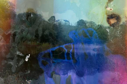
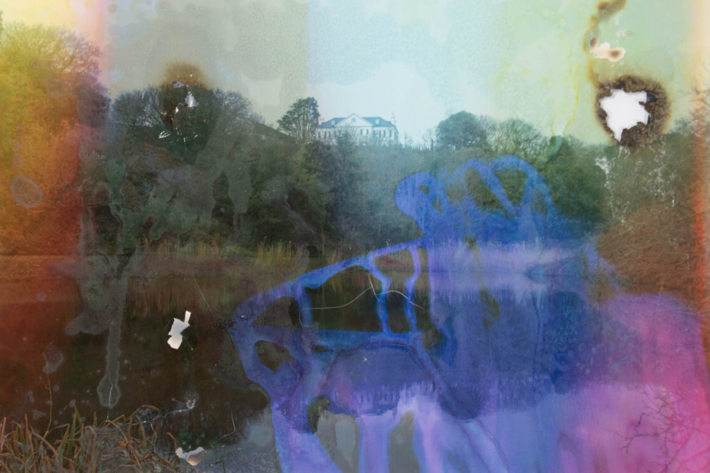
The below images are from a Photo-shoot I based of the photographer; Matthew Brandt. The process that I went through was very entertaining and experimental. To join together the artist as well as the topic of Anthropocene I had an idea of joining a landscape of a natural form with substances used by humans that destroy these landscapes. on the other hand I was very intrigued by abstract photographs. I have combined all of these to produce the images bellow:

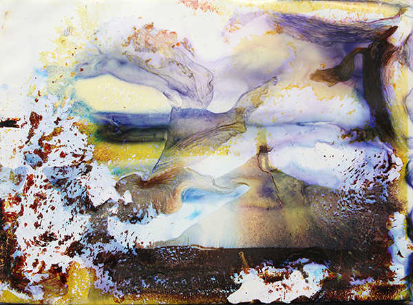
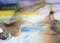
The above image was created with many chemicals and substances. the bluer/purple looking stains are created by bleach that was poured staring onto a printed photograph. I have added a mixture of baking soda and salt onto the photograph and then poured nail polish remover on top of them in certain areas, this came out more as a clearer stain, with some distorted colours, but overall looked clear with more of a visible stain. some other stains were from a combination of the substances I used before. I have left them for a bit in water and then left them to dry. Originally what Matthew would do to his own photograph is soak it in the water collected from the reservoir. He would include the environment in his photographs, taking it as far as creating his own substances. in 2014 he did a project on lakes and reservoirs, this is also one of the locations that I chose to photograph for a response to Anthropocene . the reason why I decided to change Matthews way of working is because I wanted to experiment with something different as well as having a go at manually altering the photographs to know if this is something I am interested in developing.

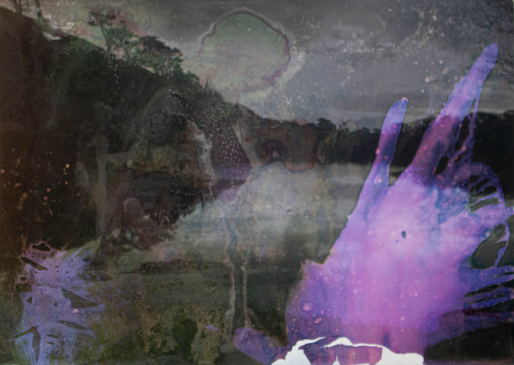
I am very pleased with the results of this photo shoot, because this was a new medium to explore and due to the uncertainty of the liquids, it was unpredictable how the end result would turn out. I have tried to control them to my best ability however because of this unpredictability, it shows how pollution is getting out of hand. I like how the photographs are very vague and dark, almost only showing the silhouette of the landscape, where not much detail can be seen. this, especially the first image (one with a house in the middle ) gives a ghostly effect and this unwelcoming which can be interpreted differently by many, to me this uncertainty has a link to the uncomfortable landscape that would be the effect of pollution caused by humans. Another thing that I like is how these images are abstract however the landscape photographed is still visible, although the colours are distorted the shadows still show in their place.
What was difficult was to maintain the direction or effect a substance had on an image, but this was also what created this abstract image, which was an effect I was looking for. what I have learned for another time I attempt to alter images manually is to give myself time and especially when using liquids, leaving a designated area and time for them to dry. Another thing that I had to be cautious of was to be safe when using the chemicals, this meant I had to make sure the image was dry if I were to burn them, and to use cloves to not get the chemicals onto me. What I think could of went better and what disappointed me was the lack of colour as I expected the print to come out more colourful, with a wider variety of colour. this might of happened if I let more chemicals and more time react with the image. I had a much more limited time the Matthew gives for his images therefore I knew the effect won’t be exactly the same.

With the above image I have used the same chemicals as discussed earlier, this time I have tried to use fire and heat to see how the image would react with that. this creates a bigger burn onto the right side of the image, but also when using fire onto the middle of the photograph I have realized that the ink cracked and separated from the background print, these are the little white lines in the middle of the image.

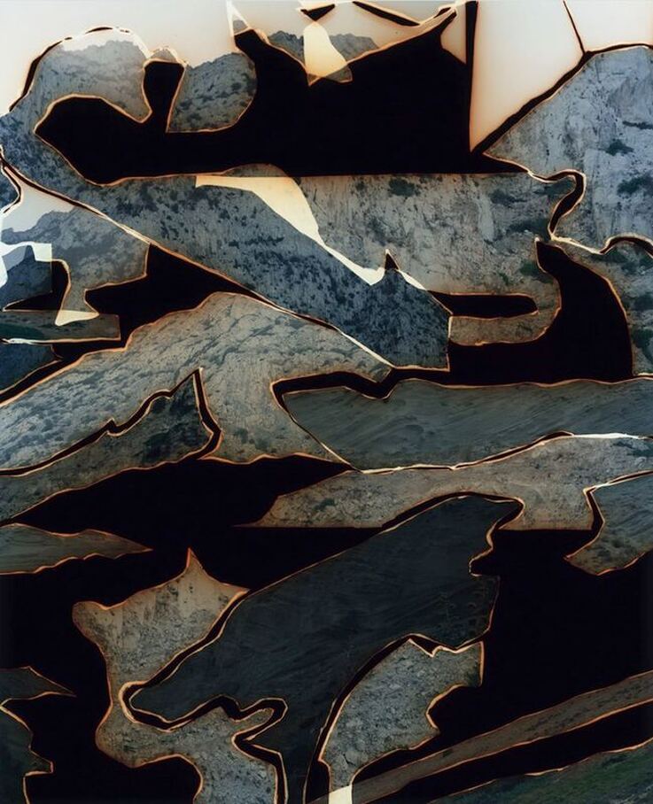
As I had another photo shoot planed to respond to Anthropocene. this was more based on the artist which also to me could link to this topic. Dafna Talmor creates a burning effect on her images while altering the landscapes when a print from a film camera is developing, she uses negatives to achieve this effect of ink coming off from the print in different segments. She does this manually, photographing the seascape . I have stuck to capturing the landscapes she was interested in, however what I have changed is to create a similar effect digitally. due to a lack of a film camera I have used Photoshop to experiment with replicating her images with my own.

I liked the freedom editing these images gave me, as in comparison with Matthew response photographs, this time I could manipulate which parts I want to keep, the shapes of them and arrangement. I was able to be very creative with these images and imaginative on how the end result of these would look. Having small experience with Photoshop it took me some time figure out a plan on how I could get started. However because now I have finished it I know for the future which tools I could use and how to use them. I have made a couple mistakes with this, which have made it more difficult to edit the pictures. this for example was not creating each layer for every segment selected, but because of this I am aware for the future.

How I wanted to link this with Anthropocene was through the representation of natural, abstract and physical distraction of the photographs to create a representation of a natural landscape being destroyed by humans. when I saw Dafna Talmor’s work, I immediately thought of the photographs being burned because of how they were distorted. Similarly to Matthews work I wanted to create a link of the physically altered landscapes and Anthropocene, through abstract results. What would be beneficial for me is to try both digital and manual image altering this is why I have picked to alter these images digitally.

Judging all the final outcomes, responding to Dafna’s and Matthews work, I am pleased with the photographs. the outcomes were unpredictable and hard to tell how the end result would turn out, most of the time it was pure experimentation and improvising at the spot. there was a general idea of what I would want to achieve but no guarantee it would look like that. altering the images digitally I had a bigger control over the images and manipulation, however the lack of knowledge when it comes to Photoshop made it harder. I much more enjoyed altering the images by hand in comparison to digital altering as it came naturally to me. I’m happy that out of this project I was able to be creative as well as responding to a topic which bothers all. Anthropocene is a very interesting topic as there are many branches that I could of taken to create responses on it, I am glad I was able to mix abstract with realism and the contrast of natural landscape with the opposite to show the impact pollution has on the world. I like to believe that within my images I have created a surreal, imaginary landscape that makes people question how pollution is taking over the environment.

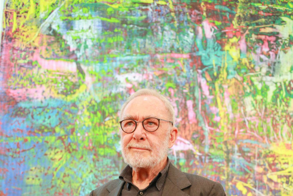
Gerhard Richter

Gerhard Richter is a photographer as well as painter. He is an artist that joins 2 mediums together to produce fascinating images.

He is widely regarded as one of the most important contemporary German artists. He is mainly known for his paintings, however he has also produced in his life a set of photographs , which are exotic in their style. He has produced a book on those images titled “Overpainted Photographs”. These included precious photographs which were unique because of the altered affects given to them.

I find his creativity absorbing. All his images would have been perfectly fine on it’s own, without any paint added onto them, however he doesn’t stop there and has a need to create a contrast between the two mediums.

His choice of colour is almost always a contrast to the photograph, where he would choose an opposite paint colour to the print. The paint appears unplanned and the technique of creating it is unexpected. the texture of the paint is another contrast of it to the print, as it is rough and all over the place, whereas the printed photograph is smooth, glossy and polished. he creates this disturbance with paint, which also shifts the photograph to a more powerful, thrilling one.

I have wanted to experiment with this process, using images I have already taken weeks prior. These images were from my phone when I was on holiday in Spain. This is why I didn’t go through the process of planning a specific photoshoot, as I was very pleased with the ones I had already collected. I also didn’t have a great quantity of them, so I only printed out 2 different photographs. However this was just a little experimentation with this specific artistic/photographic style so I only needed a couple images to try it out.

What inspired me was the work produced by another artist Chen Po-I. :

His work are mainly landscape photographs that have been taken inside a window or building that creates a frame for the landscape. This reminded me that I have similar photographs of landscape taken inside a building, framing them. That is why I decided to mis these two artists work together by taking a photograph that looks similar to Chen Po-I’s work, but with experimentation of paint done by Gerhard Richter.

These are the photographs I have produced:

On both the photographs I have used acrylic paint which is different to Gerhard Richter as he uses oil paint for his work, I was unable to use oil paint as due to its slow drying process and limited time, I had to find a medium that will hold onto the photograph and dry fast.

I have used a palette knife and simply dragged the paint on it across the photograph. With the first image I have also painted a swirl-like line across the photograph. This was influenced by photographs by Gerhard Richter, that I have looked at before applying paint to understand how his paint application works.

Reservoir Photo shoot

To respond to Anthropocene through the study of Matthew Brandt I have decided to photograph reservoirs. as I have previously done a case study of his work, I know one of the subjects he decided to dedicate a project to were reservoirs and lakes. this fit perfectly with my plan as what I planed to do, from the beginning. his way of working is very abstract and because I have never previously produced prints in such a way.

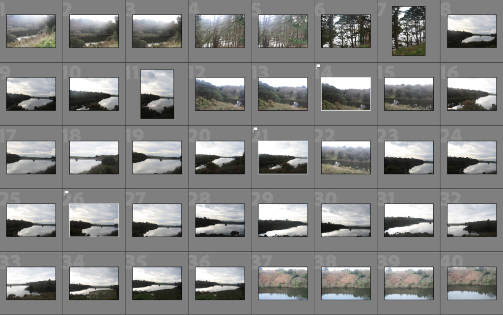
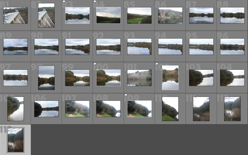
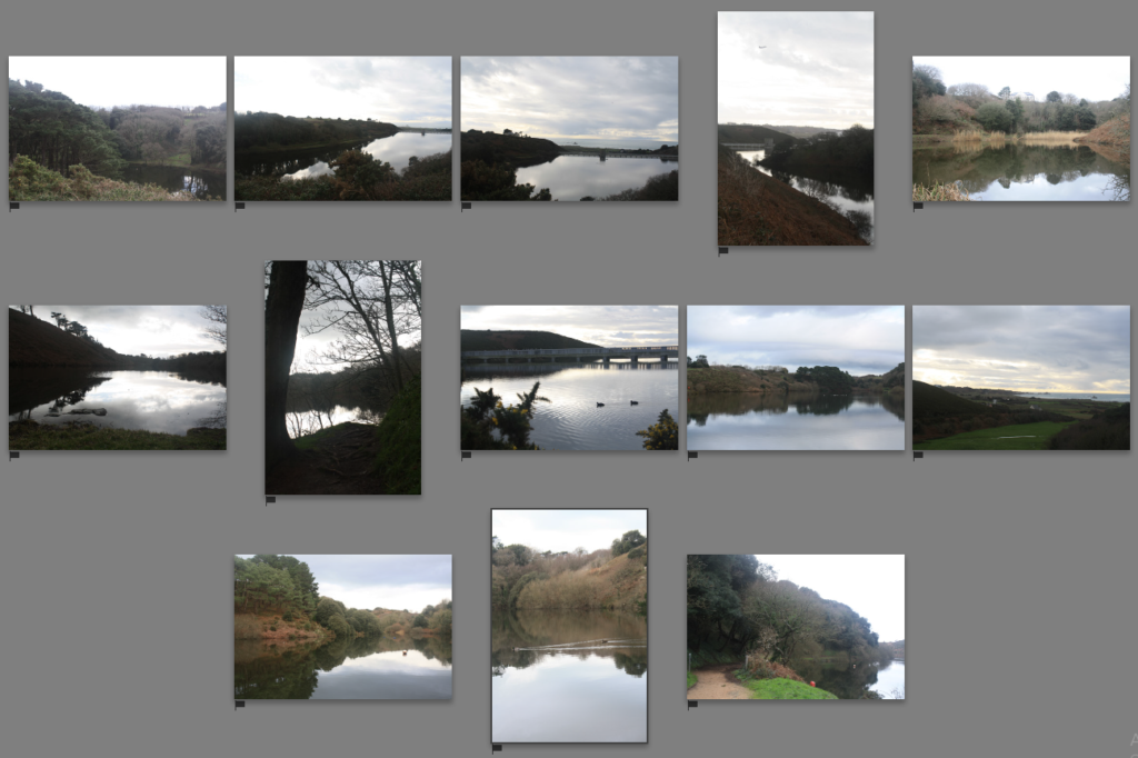
I went to Val De La Mare during midday and these are the photographs I have produced:

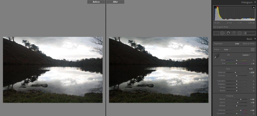
What I found the most challenging was to photograph against the light, as I liked that area a lot , however it was tricky to find a balance between the sky and the land as one always turned out overexposed/underexposed.

Sub-Selection

These images were mainly selected based on the exposure, as there was a significant difference between overexposed photographs, I tried picking ones that looked presentable, but I knew that after having a go at editing them I would have a much more narrowed down choices for my final image selection, as not many that I picked, I was able to “rescue” from being overexposed.

Editing

As Matthew takes his photographs by a film camera, I wanted to replicate that effect of a film camera on my own images.

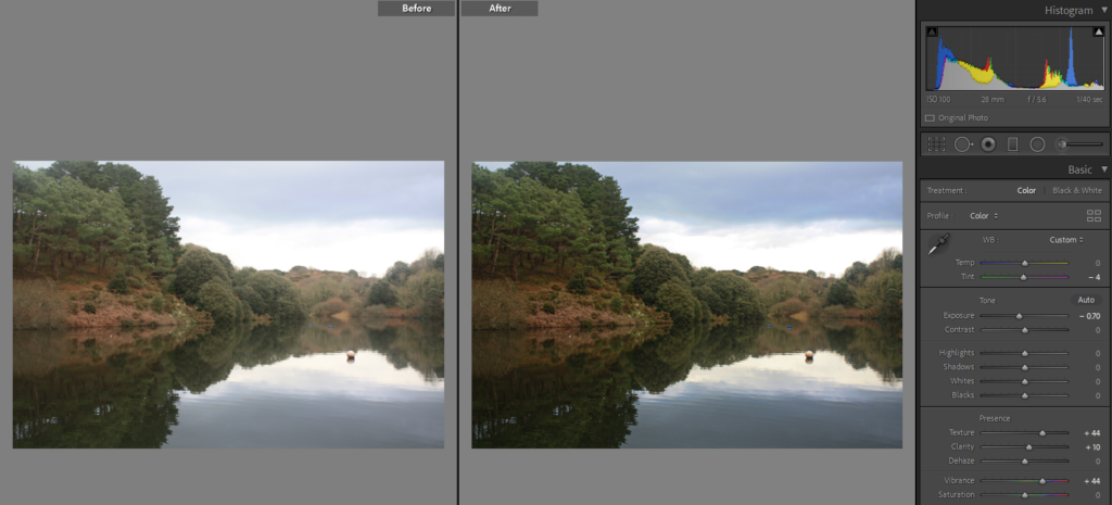
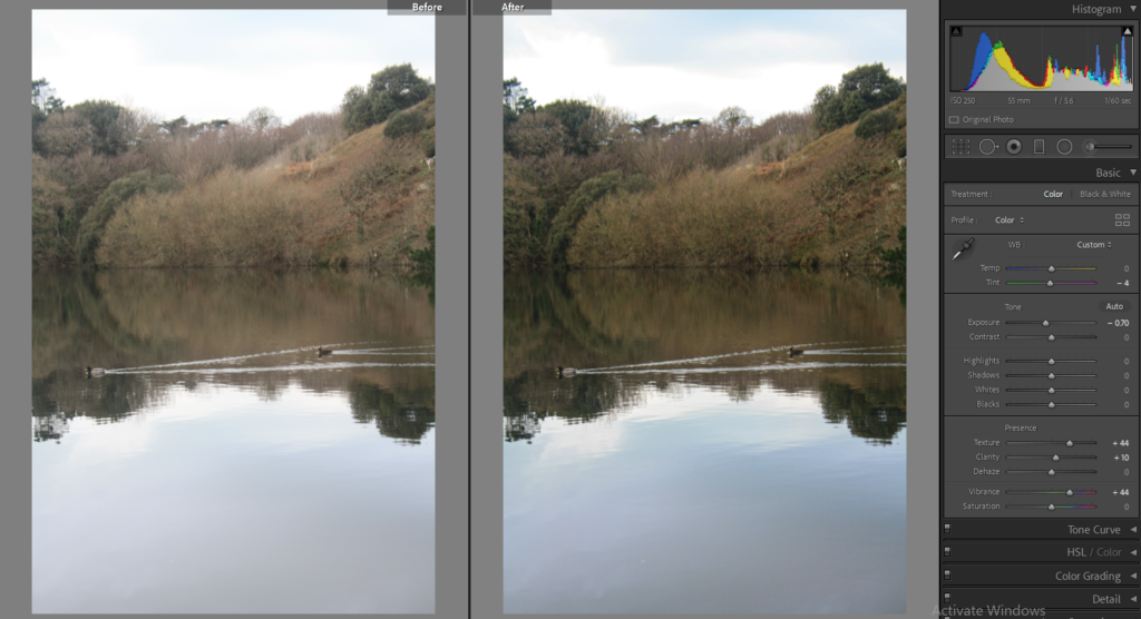
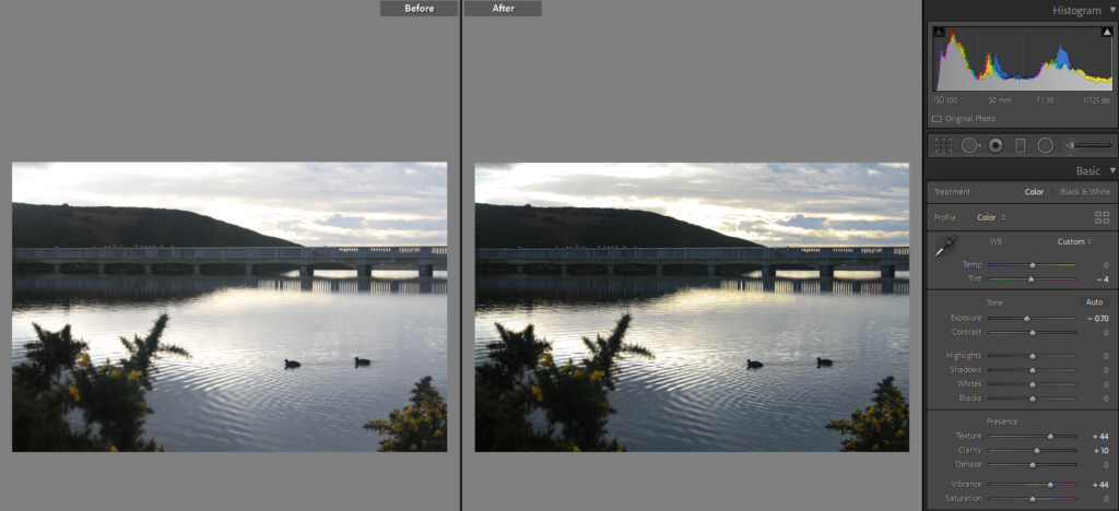
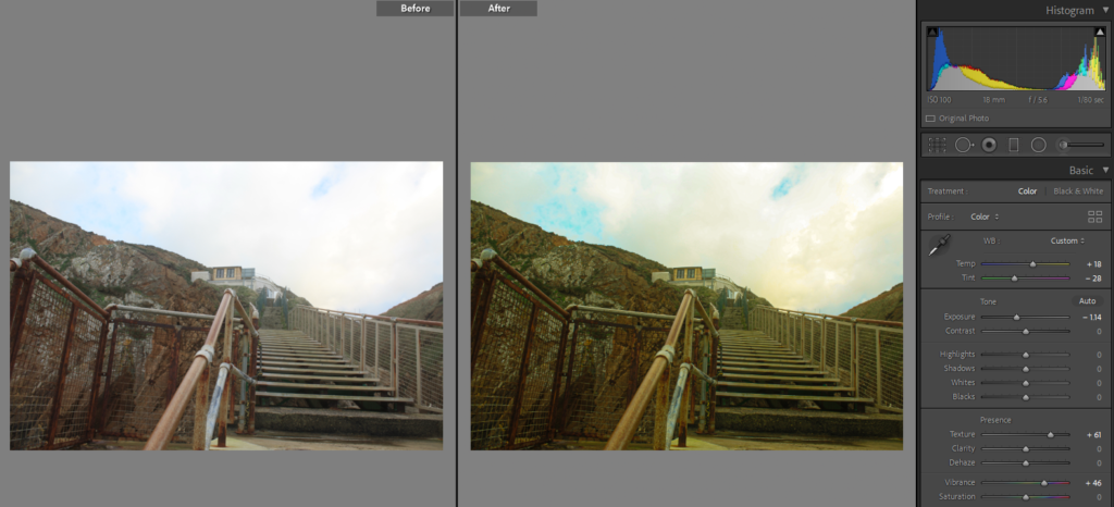
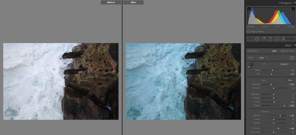
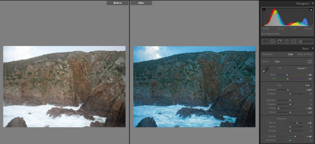
Firstly what I did was to try to get a film look on my images in Lightroom. I slightly tinted these greener and have darkened them, I didn’t want them to be overexposed as then there would be a huge area of just white.

After slight changes I had a plan to put a few substances on them, this is why I needed to find a colourful effect, representing film, however it also meant when the images are soaked in water or other liquids the colours of a overlaid image will show through and create a more of a colourful effect.

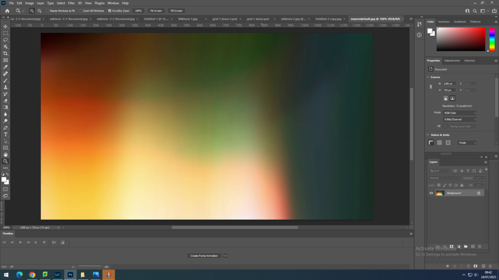
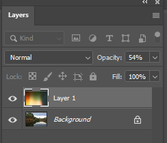
I have found an image which acted as overlay of film on my own image. This was a colourful overlay with different combination of colours blended together softly.

I have then opened this image up in Photoshop and using Ctrl+A and Ctrl+C I copied it .

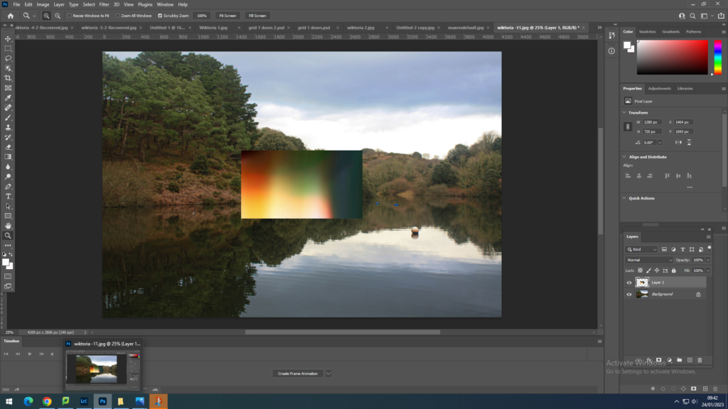
I have also opened my previously edited image from Lightroom into photoshop. Using the copied image done before, I pasted it on top of my own image, by using Ctrl+V.

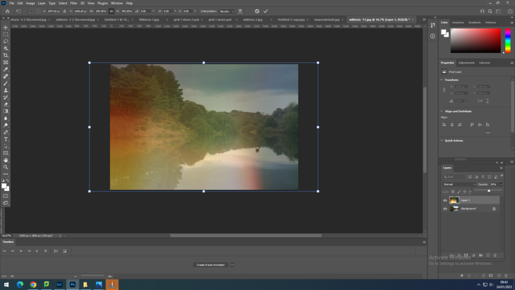
By pressing Ctrl+T I was able to transform the overlay on top of my own image .

On the right of the screen, in the Layers box, I changed the Opacity of the overlay. In this case I change it to 54%, but with other images I have stayed in the range of 40-60% opacity.

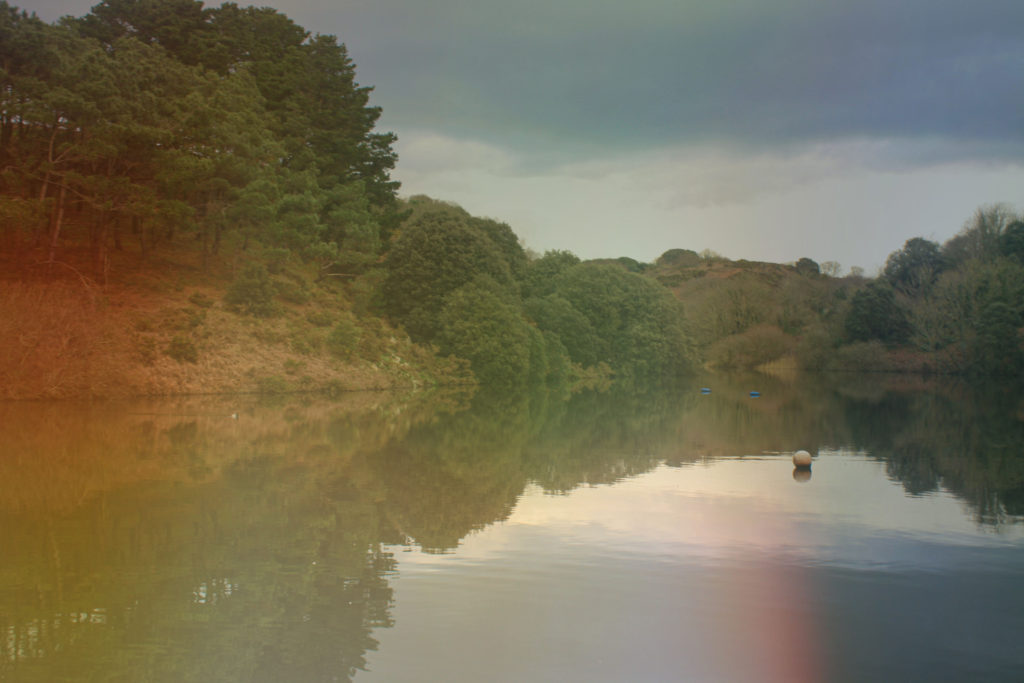
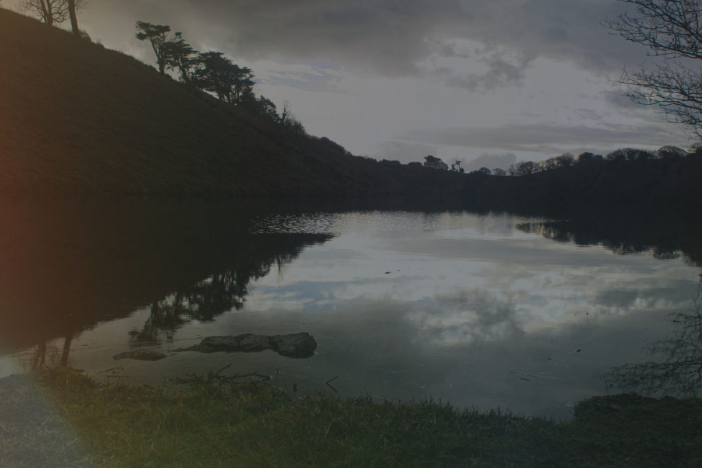
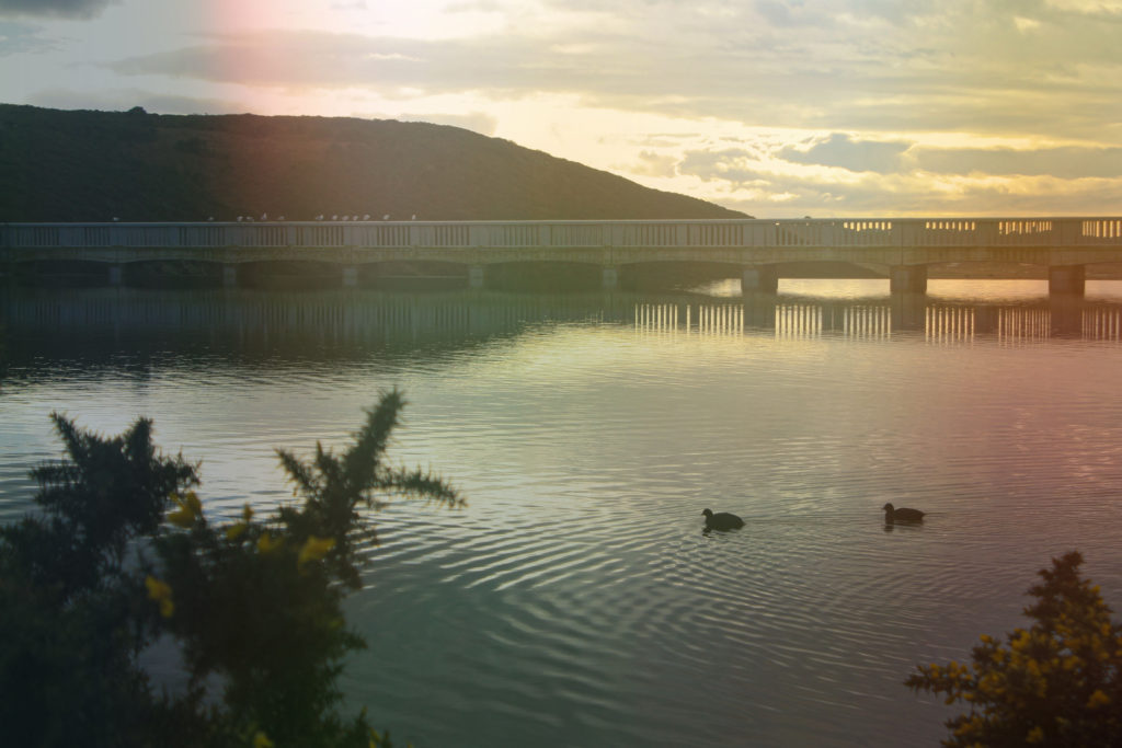
These were my final results after changing the desired photographs in Photoshop.

The differences in the process on the other images apart from the one I explained were that I experimented with different overlays, opacities and have sometimes rotated the overlay if I wanted a specific colour to show in a designated area.

After I was happy with how the photographs looked in Photoshop I have printed them out to experiment on them.

At home I have used many chemicals this including, bleach which created the vibrant blue/violet mark on the photographs, nail polish remover which created more of clear stains as well as some purple ones in some photographs, I have also melted baking soda and salt for texture. after cleaning the photographs, so that when I burn them the fumes wouldn’t be as toxic, I have used a lighter to burn some holes in one of the photograph, but also what I noticed is when I tried to do that with another photograph it has caused the print to crack and the colour layer to split.

The print bellow has a very visible mark in the middle of it, because of the lighter outline around it. this outline was created because of the baking soda that I have put on before.

The lighter, more white-looking stains are because of the liquids applied after baking soda and salt was already on them, but the stains with a redder outline are caused by the nail polish remover, which reacted in a different way to bleach as this time it picked up redder tones in the print rather than bluer that were done with bleach.

This photoshoot was to respond to the topic of Anthropocene while exploring the methods and style of Matthew Brandt. I liked how physical and creative Matthew gets when producing his photographs, this is why I have developed that idea, however using completely different substances. He involves the environment in his photographs, like collecting the water from reservoirs he photographs, I had an opportunity to this however I chose not to because I wanted to relate this photoshoot with Anthropocene. To do that I have used toxic substances that are really harmful for a human as well as the planet. These substances usually end up in our environment and even in reservoirs. So through these photographs that I created I wanted to show how harmful these chemicals are and how much they are destroying our environment, because of human use.

Dafna Talmor response Photoshoot

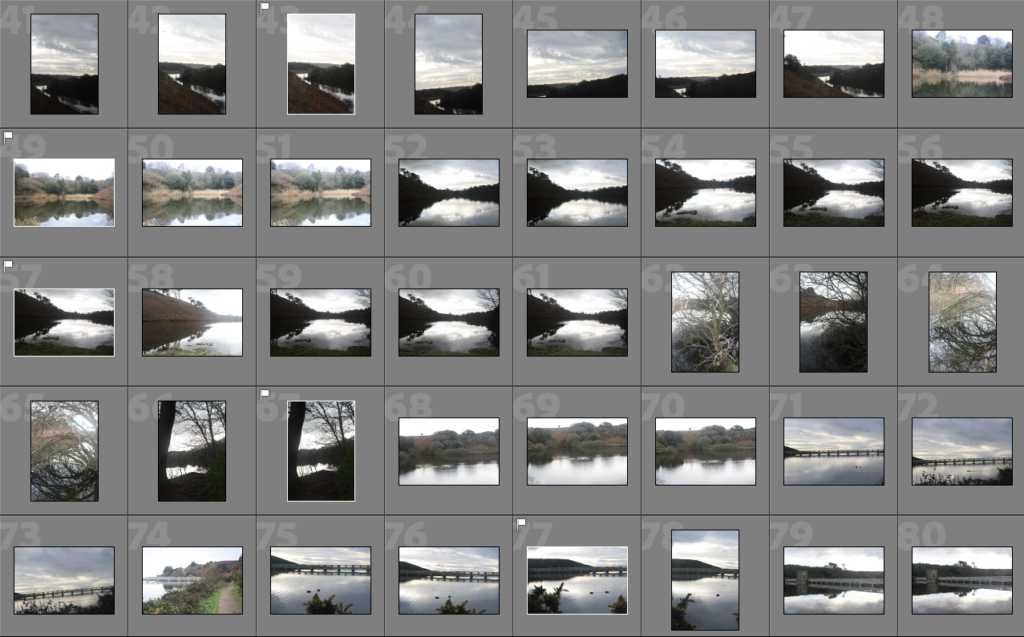
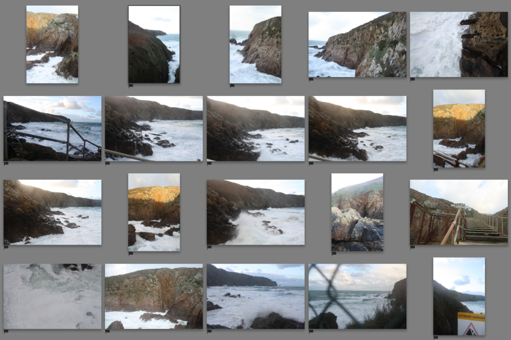
I wanted to go to the a place which included water but wasn’t a reservoir to base a photo shoot on that responded to Dafna Talmor’s work. The landscape work she produces is usually based around the coast, focusing on the cliffs by the seaside and the ocean.

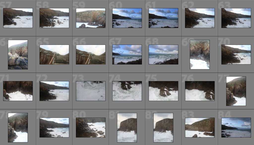
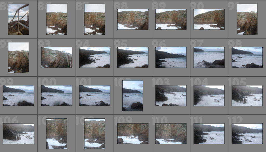
The day I decided to go on this photo shoot, I went when the tide was quite high, this is why I wasn’t able to go to the beach that was covered by the water. However I was quite pleased with the weather, it was very difficult to get the shots I wanted as it was very windy and the waves were extremely violent, this was a positive in terms of the photographs I’ve got, as this caused them to be fascinating as they came out quite dramatized and terrifying as the rough sea crashed onto the rocks.

Sub-Selection

The reason why I chose these images was because to me these were the best quality. However I also payed attention to the shadows as well as highlights and trying to find a balance between blacks & whites. I was aware that I can edit the pictures slightly when it comes to over exposed images but I preferred to choose these which didn’t require much adjusting to the exposure.

Editing

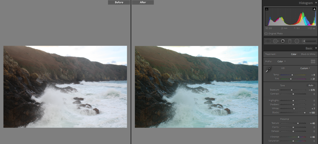
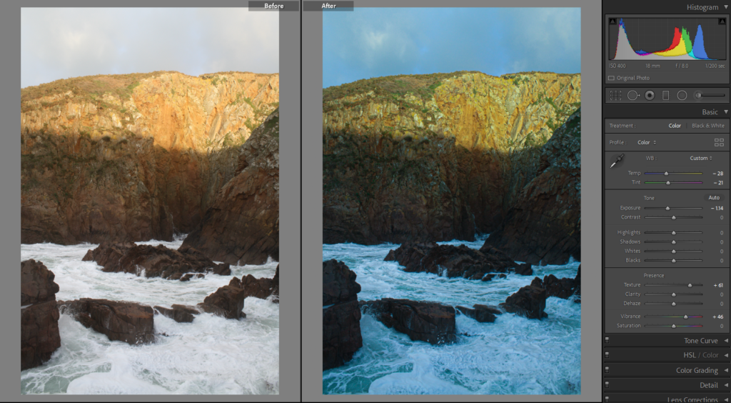
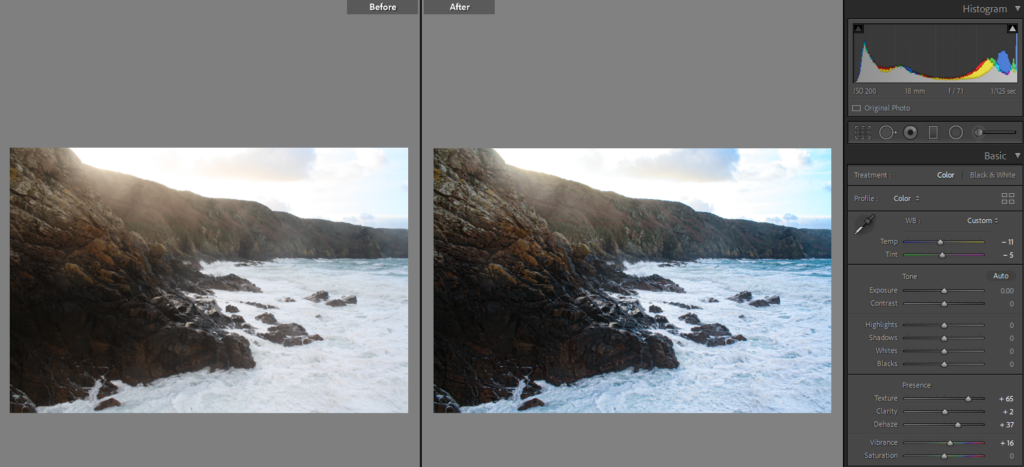
For most of the images, they were edited to show more vibrancy in them as well as making them look a bit older to give the effect that they were taken from a film camera. For most of them the main difference is that they appear more blue as I decreased the temperature of the image making it look cooler, which hopefully gives the images more of a eerie feeling as much as the sea does. I wanted to edit them in the way the surroundings made me feel when I was taking these images.

Having done previous research on her, I was aware she usually shoots in film, then works with negatives to produce her images. However because I did not have the materials for that, like the camera or a dark room to get the picture developed, I have decided to replicate her ideas digitally.

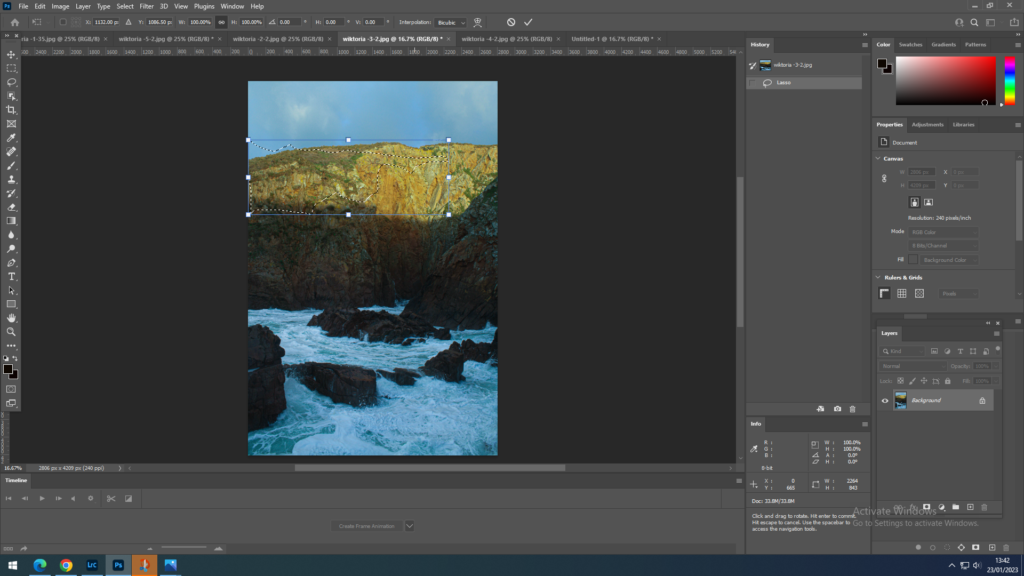
1.The chosen image, which was transferred from Lightroom to Photoshop, was already edited so that no further image adjustments needed to be done in Photoshop.

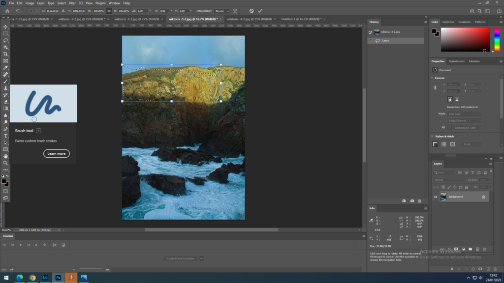
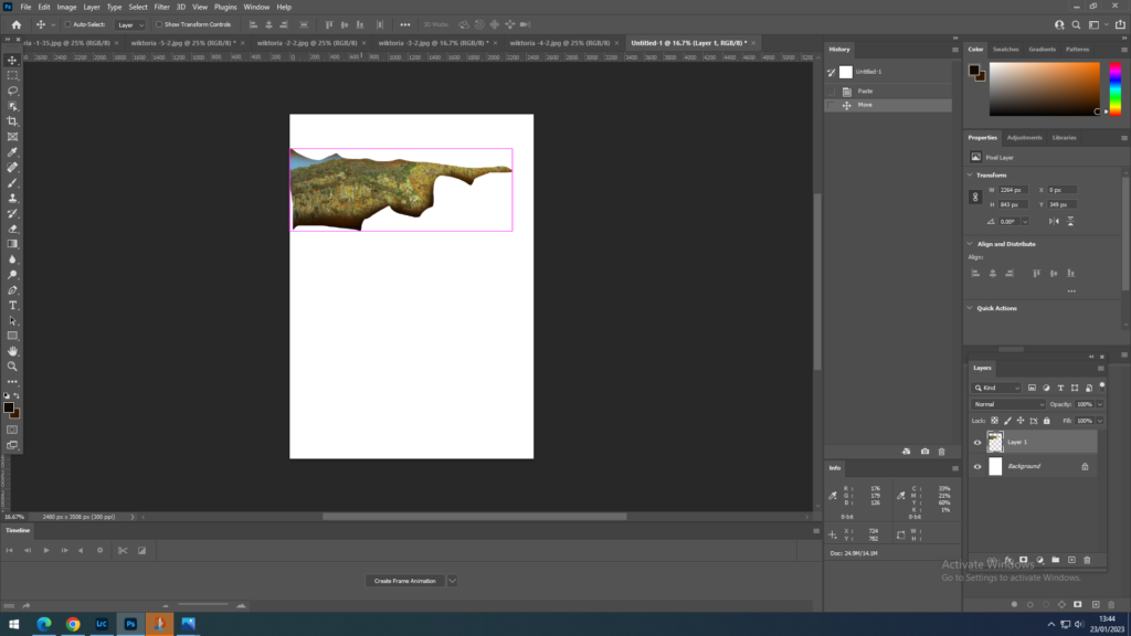
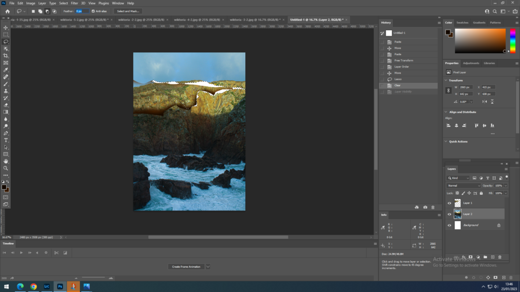
2.Then using the Lasso Tool, found on the left tool bar of the screen, 3rd one down, I have drawn out an area that I wanted to cut out .

3. using the keys ctrl+T I was able to work on just that cut out area.

4. Using the brush tool, found on the left tool bar, I have looked at a reference photograph and then decided which colours I would need to create a burning effect, digitally. I have noticed that in her photographs the main colours the image consists of is a very dark orange as well as black, that’s why I selected the lowest softness of the brush I could find, and I have painted onto the edges of the area first with orange and then with black.

5. I have placed the area that I just worked on onto a white background layer as well as pasting the whole image. A mistake that I have done during this process is that I should have pasted each area I worked on onto the background, so that I would have separate layers for each pasted piece, however because I haven’t done that I ended up working on a single layer which made things difficult when trying to isolate the parts from each other.

6. Repeat the process done with the first selected area a couple more times.

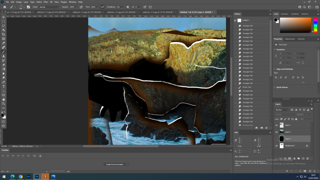
7. This bit was more difficult as everything was on the same layer, however I have colored in some areas in black, again using the paintbrush tool. As I wanted some of the white background layer to show through, representing cracks in the print, I had to make sure I didn’t colour them.

8. Some of the areas coloured in black I have blended in to the same segment selected. This was also with the brush tool however with a different texture that I could choose from the settings of the brush.

The final results:

The last image was more of a experiment of her methods as well as a mix of my own experimentation. I have learnt from my mistakes and have pasted all the different segments onto another image, that is how I was able to alter 2 different landscapes. From 2 different images I have created one through the joining methods that I learnt when experimenting with getting the effect of Dafna’s work.

Anthropocene plan

To tackle this task I plan to visit area that would have a natural landscape , however they are also polluted or likely to be polluted.

I chose to focus on reservoirs as the water is heavily polluted, however this contrast with the environment around the water. that’s why I will chose a reservoir on jersey to photograph. However I would like to focus on landscapes with water as these interest me the most. regarding Anthropocene, I plan to show it through altered landscape, by montaging and experimenting with altering the image manually as well as digitally.

Mood board

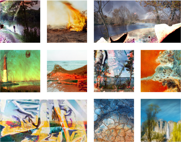
what interests me the most are colourful altered or constructed landscapes, that have been manually altered. I can use that to my advantage to represent Anthropocene through the manufactured and “ruined” photograph of a natural landscape. The images that I have used for my mood board are abstract and unique as well as full of colour, that’s what I will inspire to achieve with my final images.

What-reservoir banks, gates, trees, houses etc. a mix of both the natural and rural landscape, since my main focus is going to be the reservoir the pictures would include most of these items, mainly consist of water, sky and a tiny amount of land with trees.

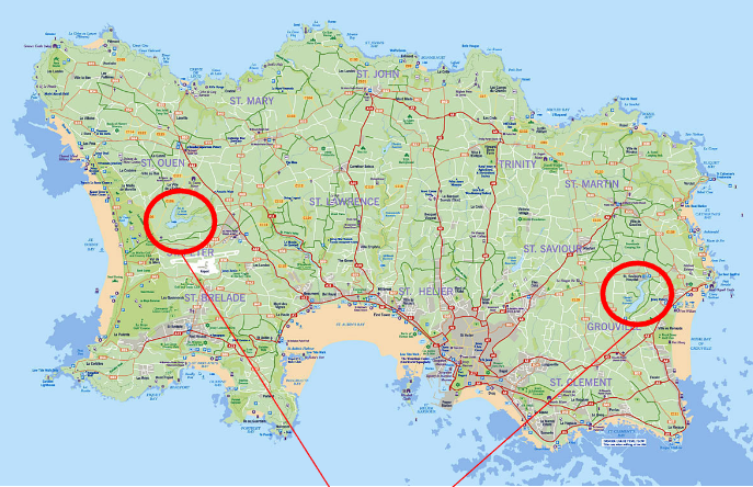
Where- Reservoirs in jersey, which is more likely to be Val de la Mare reservoir, which is in St. Peter/ St. Ouen area. However to have a wider choice of images, I might visit some of the coastal areas, like plemont.

When- During daytime or before sunset, around this time of the year this would usually be between the hours of 12.00pm-17.00pm.

How- I will try to photograph the pictures to include elements of water as well as land. i will try to show all the angles of the scenery and try to use different settings on the camera .

Why- The final images should respond to the topic of Anthropocene. the images should represent a landscape that is polluted, this could be by altering the pictures or picking out a polluted, degraded scenery that has been ruined by humans.

Kaleidoscopic image altering

It is a simple method that uses duplication, mirroring, and rotation to create a geometric pattern. A kaleidoscope pattern has a hypnotising quality to it. The pattern draws you into the centre of the image. This can be done with a repetition and rotation of the image over and over again to create more of a circular effect or could be done with just 2 rotations. i have decided to do it 4 times.

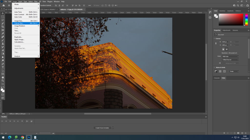
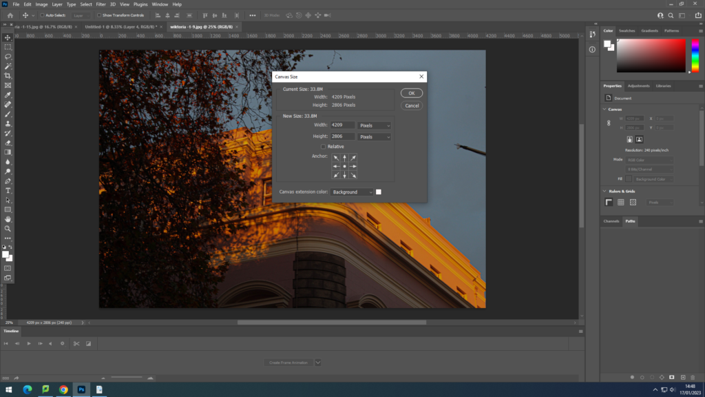
  1. Change the canvas size. to do that I have gone to image-canvas size- and made a note of the number of pixels.

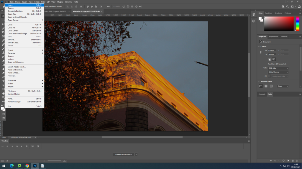
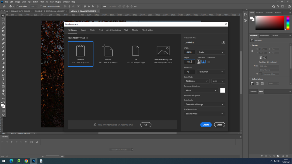
2. File-New and change the pixel number

The number that needs to be changes is the width and height. by doubling the number of pixels of the image. then putting in the doubled width into the width pixel column and height in height one.

3.After opening the background and the picture, Using Ctrl+A and Ctrl+C I copied and pasted the same image onto the background area.

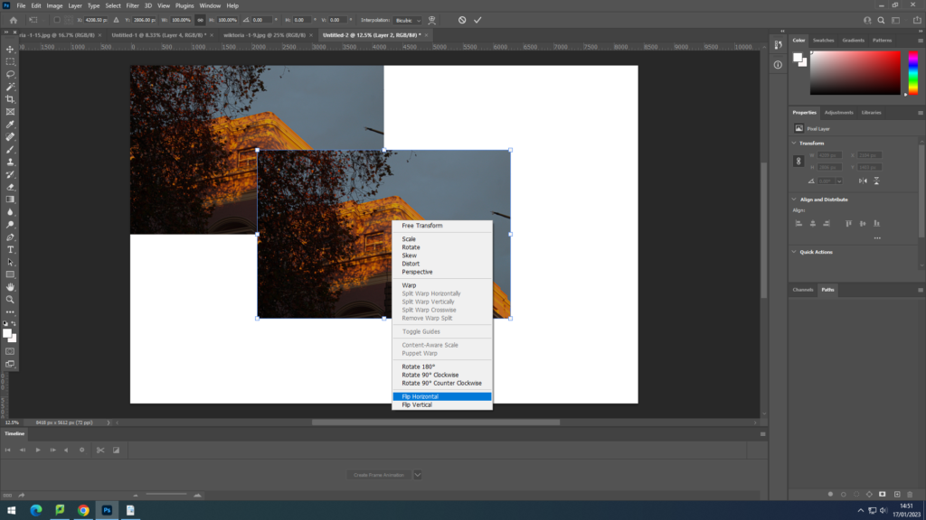
4.On that image using Ctrl+T I right clicked a chose : flip horizontal, this image because it was flipped horizontally I put it onto the right of the first image.

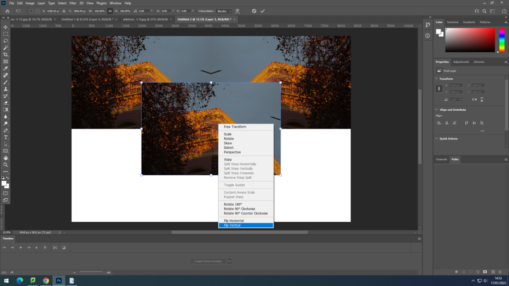
5. Using Ctrl+V I pasted the same image as before but this time selecting : flip vertically. This image I have put bellow the original one .

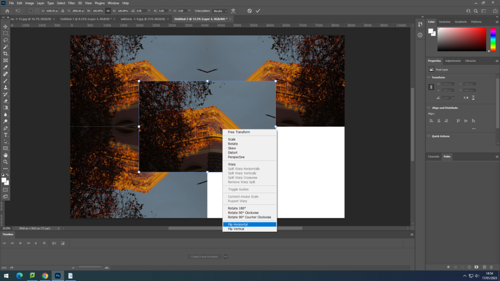
6. Having the same image pasted again, i have flipped it horizontally.

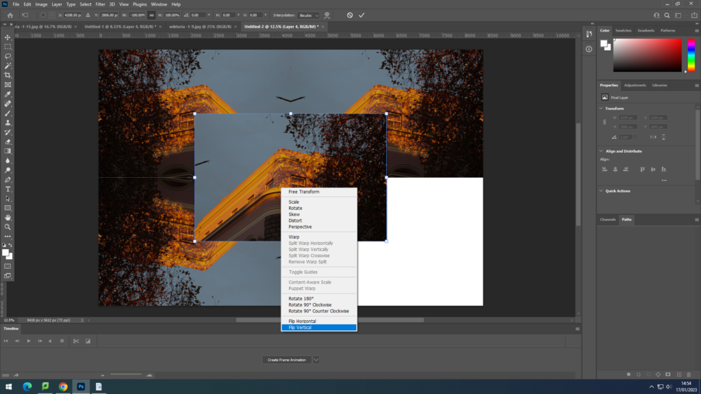
7.Then I have flipped it vertically, and have aligned it in the bottom right corner.

Final Image:

I have experimented with that technique on another image, as well as rearranging the images alignment, swapping them vertically.

Matthew Brandt

Matthew Brandt grew up surrounded by photography, with his dad, David Allan Brandt, being successful commercial photographer. he was a highly influenced by him, and this gave a birth to many ups and downs down his pathway, towards discovering his own way of working and making his visions a reality. He has later became inspired by other photographers he studied at Cooper Union or UCLA, where he earned his master’s degree.

Other than photographers what also inspired him was his passion for traveling, he stated “Travel definitely helps,”.“It allows me to come back and see things with fresh eyes, and suddenly the familiar becomes strange. There are also day-to-day things that I do, such as watering the plants and watching things grow and develop in our garden. Even just going into a store and finding neon crayons sparks new ideas.” which to me means that as long as someone is influenced by new ideas and is going through new experiences, this will allow them to be creative and find inspiration through anything they are going through, especially is they are fresh for the mind.

For Brandt, the finished print is rarely, if ever, the finished product. “Essentially what I’m doing with this process is letting the subject influence its own image and print size,” he said depending on what he is photographing, it influences the print size . Brandt also makes a lot of his own negatives, on an Epson 11880 inkjet printer.

Charles1

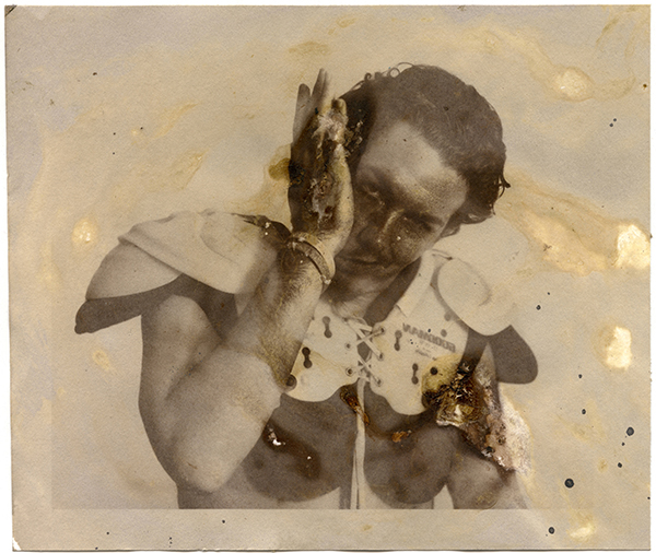
He has included many different and strange range of materials to include in his photographs, with this one for instance was the subject’s mucus, in place of a salt solution, when forming the light-sensitive emulsion. This image is from the “Portraits” series.

“I sometimes make normal inkjet prints, but I feel as if I can’t make a picture without considering the material in relation to the subject, and vice versa. For example, inkjet prints I’ve made capturing stacks of inkjet cartridges. I put the same sheet of paper through the inkjet printer over and over again, printing on top of itself. And the ink builds up and eventually thickens.” 

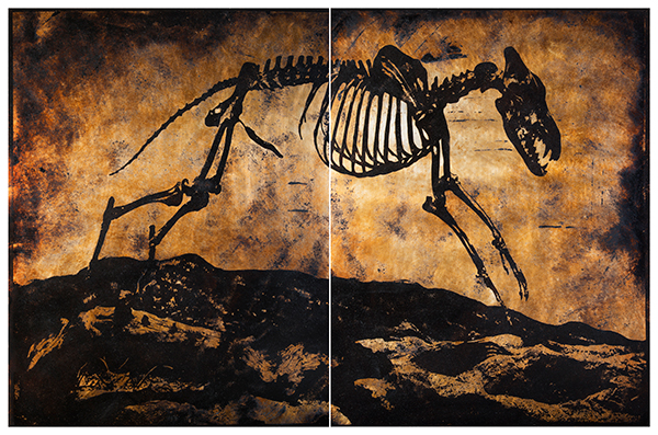
La Brea D2AB4

These are two mounted prints joined to form a diptych. “I used a heliograph,” the first photomechanical reproduction process invented by Niépce, which ultimately led to the daguerreotype.” He used bitumen of Judea (a form of asphalt) on a pewter plate. He made an exposure and washed what wasn’t hardened with UV and lavender oil. He used tar collected from the La Brea Tar Pits, in Los Angeles. The subject is a prehistoric animal skeleton that was unearthed from this tar. He photographed the skeleton in the adjacent George C. Page Museum.” This image is from the “La Brea” series.

Wai’anae

From a series where he photographed tropical forest, he had took an image and then buried the C-prints in the ground in Wai’anae, he said he rolls the prints up before putting them in the ground, so they develop this layered effect, and could add burlap or other fabric as he rolls the paper so that the fabric patterns imprint on the surface of the print. This image is from the “Wai’anae” series

“I’ve even hand-made my own substrates, for example, from a tree. I’ve also made charcoal for use as pigment from the same tree, to make a picture of the tree out of the tree. The substrates that I made from a tree were used in silkscreens.”

“In certain situations, for instance when I buried prints in the ground or soaked them in lake water, you can’t really control that, other than for how long you allow the process to continue. You can’t be sure what your results will be, although you do have a sense of the direction it will take after doing it a few times. And you do know, for instance, that if you leave a print in the ground for six months, versus one month, the print will become increasingly degraded the longer it stays buried.”

 “Every print is always different and I’m capitalizing on that, and it’s part of the fun. I grew up learning about silver gelatin processes and wet chemical photography. Then digital came in and it offered a shift in terms of thinking about photography and image-making. I think I may be holding on to some of that tangibility. Working with ones and zeros is a very different relationship than thinking about making prints and light transmission. It’s no longer chemistry. It’s more like programming.”

I have watched a video https://youtu.be/PVOqkkxksWE where he shows his studio as well as explains the sense behind choosing his medium. he explains the interest of c-print process and wet chemical photography, as Cibachrome printing is a wet photography, it made sense to use that as something that represents bodies of water, e.g. lakes and reservoirs. This is because they are both submerged in water in order to get the final result.

But what interested me and is the most relevant to the topic of landscape work is his interest in reservoirs, on which he did a project on in 2014, titled Lakes and Reservoirs. these are some of the pictures from the project :

Shasta Lake CA 7

This is a C-print, shot on 4×5 color negative film. this effect was achieved by soaking that print in lake water taken from the location the picture was taken at, Shasta Lake water. All the color craziness comes from the water interacting with the C-print and breaking down the inherent color layers in the paper. This image is from the “Lakes and Reservoirs” series.

What draws me to his work is is this uniqueness of it, how he considers the environment around him while taking a photograph and includes this. This makes the photograph feel real as the nature has it’s input on the photograph. I like how determined he is and almost always will figure how to include the subject being photographed into the photograph. Like going as far as creating his own substances. I am really interested in the above photograph as the photograph gives a feeling of the place, as he photographs reservoirs and the water in them, he takes a sample to his studio and then leaves the image in the water. the image appears liquid as the water has degraded it to become in this form. this gives the impression of the colour escaping away from the print.

what I also like about this photograph is how in every area you look at, every part is different. for example on the right the colour has collected in tiny areas and a lot of white from underneath is exposed,

but then in the middle there are many unpredictable swirls, full of colour. The ink has been picked up and carried by the water where it would want it .

I really like the abstract effects the water creates as then not only it makes the original colours more interesting, it creates a completely feel to the photograph, this method can take an ordinary photograph to something eccentric and intimidating.

I am looking forward to create my own images through his methods as I can never be sure how an image would turn out and I have limited control of it apart from taking the photograph.

Overall I love how much freedom the photograph shows to a person, where they can interpret it on their own and it is up to them to think what the image is representing, without knowing the context of it. On top of that because I am aware that this effect was caused by the water taken from the location, this created a higher value to me as then I am aware that the photograph meant a lot to the photographer as more effort is shown, more creativity and thought that creates a deeper meaning. I like to think that because the substance is from the location, the photograph doesn’t only have one artist behind it, but the environment as well, which works together with Matthew and he works together with the environment, having this connection with it, represented in his photography.

Constructed Landscapes

Constructed Landscapes are ones that are created with the imagery that the artist has in their mind with existing items/landscapes etc. This could be done by slicing or splitting two images which were taken of the same landscape but with different negatives. This method could also be used for 2 or more completely different landscapes that were combined together in order to make a new photograph.

A Constructed Landscape is a reflection of the artist mind therefore its negotiable to if the landscape is ‘real’ as it is of an existing landscape however it isn’t taken in a single photograph but by having adjustments done to it.

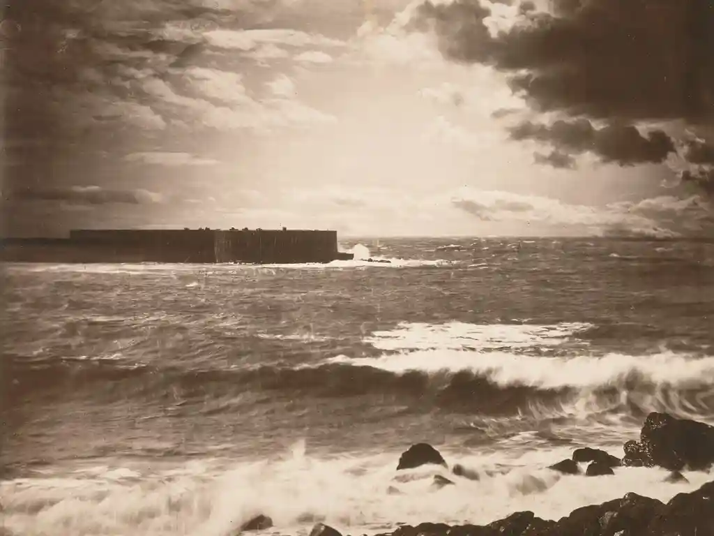
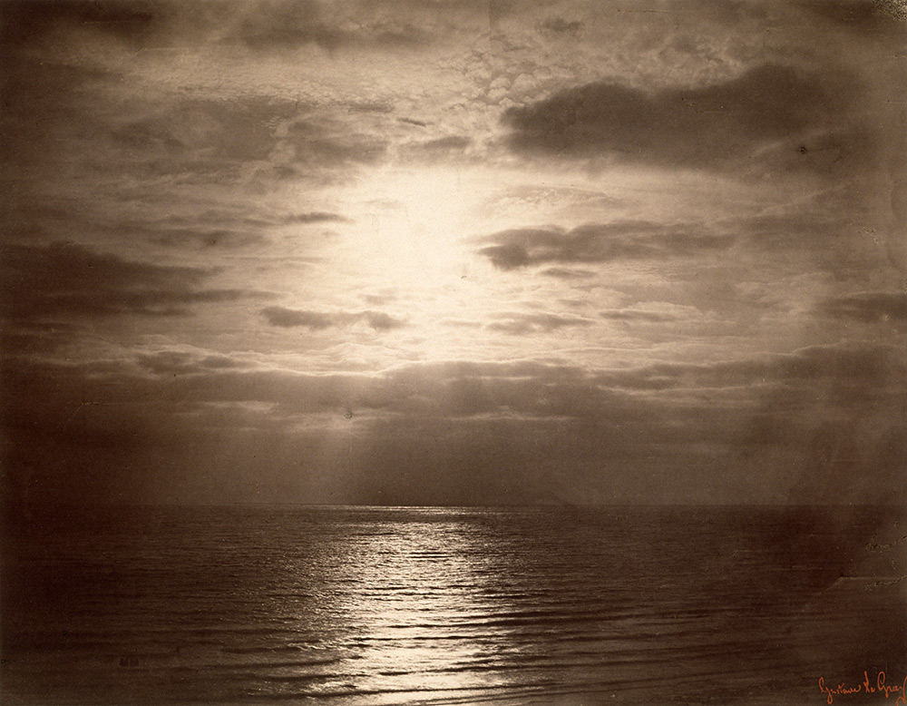
On the other hand in photography sometimes what a person sees is not always how a camera captures it. For example the image below is of the same landscape however back then it was hard to achieve what one saw through photography, mainly because of the exposure effecting different elements of the image.

The Great Wave … sunlight breaks through the clouds above the waves at Sète, France, 1856–59
Illustration: Gustave le Gray

What Gustave Le Gray did was take 2 pictures of the landscape but making the exposure correct to the area being photographed, so that he was left with both the sky and the sea to be as detailed and equal to each other. their values regarding brightness and darkness are balanced, this would be impossible to do then with a camera as the exposure when focused on a certain area would make the other overexposed or underexposed. This is why the start of a constructed landscape was revolutionary as then a photographer was able to create an image as close to the one they could see in real life.

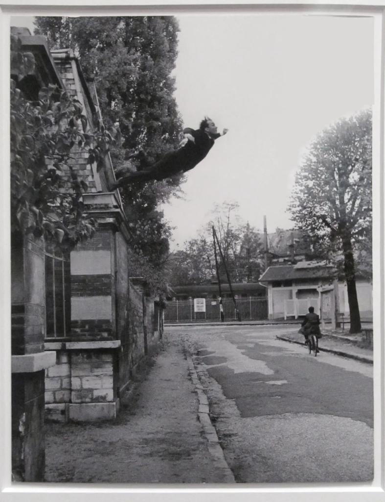
This method was later used by many photographers, one of many was Yves Klein who created “leap into the void”, although it wasn’t exactly landscape based it was a very popular image in France. It was the early stage of photo montaging is well.

Yves Klein – Leap Into the Void, 1960, gelatin silver print, installation view

Another Photographer creating constructed landcaped, but in modern period is Dafna Talmor.

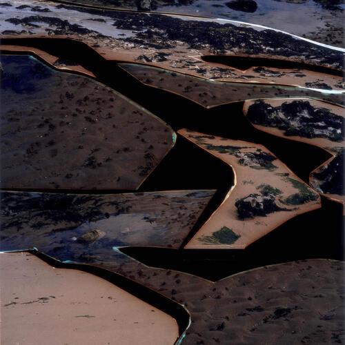
Dafna Talmor’s work is very interesting to me because of the abstract effect it has, she mixed two opposing categories together; realism and abstract, through photography. I find her work fascinating and definitely would like to experiment with her style of  collaging and montaging colour negatives. I will consider to base my final outcomes on her work and study her style and photographs in more depth.

Her work consists of staged landscapes made of collaged and montaged colour negatives shot across different locations, then merged and transformed through the act of slicing and splicing. The resulting photographs are a conflation, ‘real’ yet virtual and imaginary.

  1. Both could be described as landscape pictures. What kinds of landscapes do they describe? To me both images are landscapes and classify as them. This is because they both include elements of landscapes. they may not be a straight photograph, meaning the photograph is not the same as the one the came took, but has been altered. This however doesn’t impact the category the photograph lands in to be different as the camera was pointed at a landscape and those images are a result of that. because they are altered, especially with Dafna Talmors work they would fall into more abstract landscapes as she uses different mediums to achieve her work.
  2. What similarities do you notice about these two pictures? Both images contain areas of landscapes, where one is a pure landscape where the only thing noticeable is what the camera already captured, “The Great wave”. the pictures both represent seascape in their own way and both are constructed, meaning it isn’t a straight print but a mix of 2 or more, regarding both of the photographs. They also both created their constructed landscapes by manipulated coloured negatives.
  3. What differences do you notice? The main difference is that Dafna’s work is more abstract and gives the intention of it being made up by her but Gustave’s is more realistic and not many would notice it’s an constructed landscape as the image makes sense on it’s own and doesn’t look changed.
  4. What words/phrases best describe each of these landscapes? To describe Defna’s landscapes I wold use the world mythical, as her images look more like how she sees the world, like they live in her head rather than in the real world, the almost feel like a tale or a nightmare, and her photographs encourage the viewer to feel them and intrigue them to look, luring them into the details of each of her photographs. To describe Gustave le Gray’s work is curious, I think this because of the fact his curiosity led him to discovering a new technique, which was quite revolutionary. due to this his landscapes are imposing and a little alarming. this is because of the dramatized tones and contrast between darks and whites.
  5. In which of these landscapes would you prefer to live? I would prefer to live in Dafna’s landscapes simply because they look more fascinating, whereas Gustave’s work is more frightening to me because of the colour enhancement. Dafna’s choice of colour is more calming to me and if I were to live in her landscapes I would feel more adventurous and eager to explore.

Anthropocene

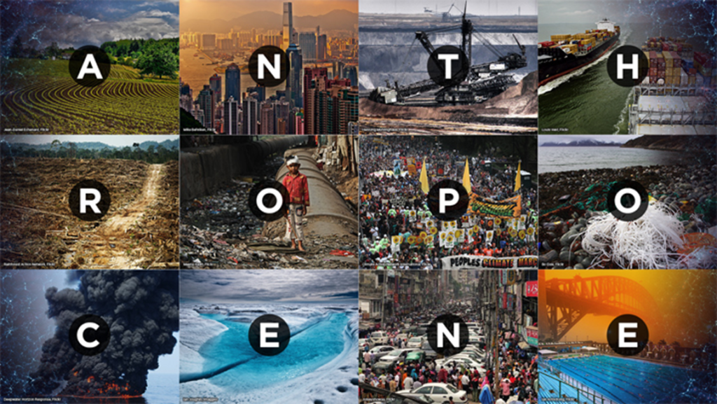
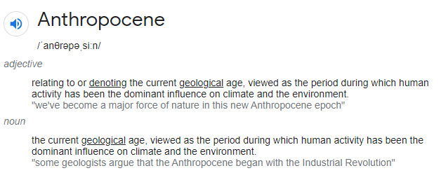
My understanding is that Anthropocene is a recent period of time where human activity has significantly impacted the ecosystem.

The word combines the root “anthropo”, meaning “human” with the root “-cene”, the standard suffix for “epoch” in geologic time.

Examples of Anthropocene through photographs:

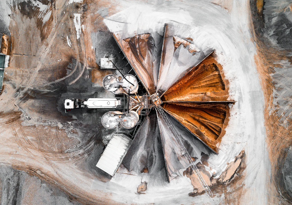
Credit: Tom Hegen
Quarry in the state of Bavaria in Germany. In describing this photograph, Hegen has said that a huge amount of raw materials are required to construct growing cities.

The birds eye view image above is from the website: https://www.scientificamerican.com/article/dramatic-scope-of-the-anthropocene-can-be-seen-from-above/ This website has many more images taken by Tom Hagan, where he explores the natural landscaped altered by humans , using drones and helicopters to show the area from above. “I photograph landscapes that have been heavily transformed by human intervention and show places where nature is channeled, regulated and controlled,” He says. Through his photographs he want to inspire people to get closer to the responsibility of the impact humans have on the invironment.

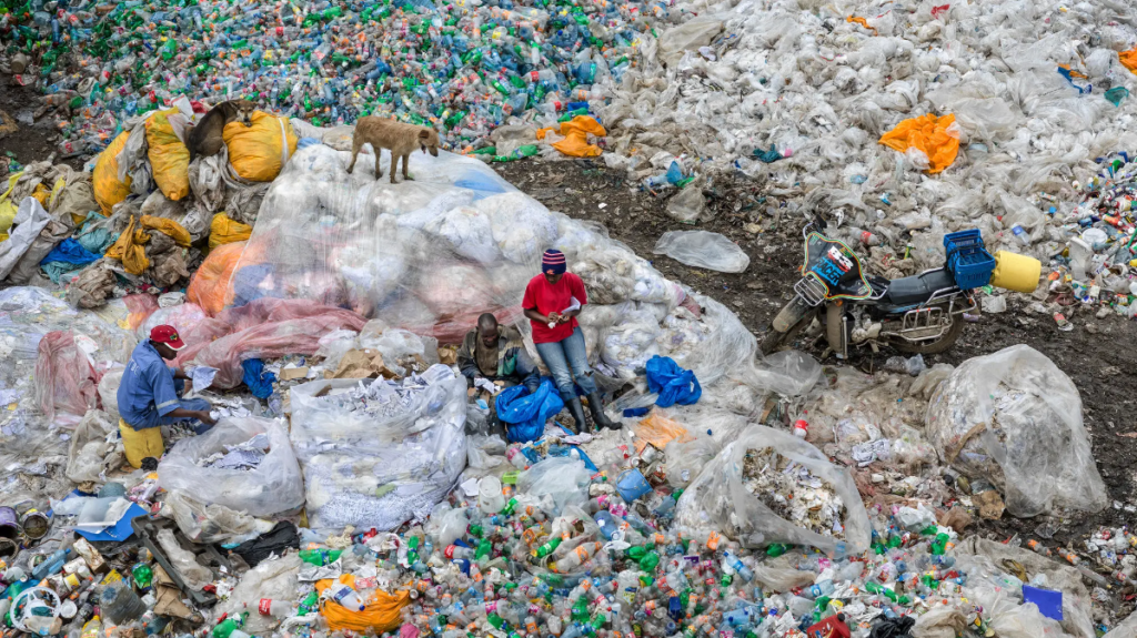
An image of a landfill in the documentary “Anthropocene: The Human Epoch.”Credit…Edward Burtynsky/Kino Lorber

‘Anthropocene: The Human Epoch’ is a documentary which i found information about on the website https://www.nytimes.com/2019/09/24/movies/anthropocene-the-human-epoch-review.html which is a review of the documentary and the movement, meaning and reason behind it.

Behind the documentary which explains and shows how humans effected the world, there are directors: Nicholas de PencierJennifer BaichwalEdward Burtynsky, They have worked together as film makers of the documentary to show the realistic world and its problems. They are the most important figures when it comes to the link of Anthropocene and photography/filmmaking. These are some of the photographs they have produced.

Greenhouses #2, El Ejido, Southern Spain, 2010