All posts by Wiktoria Markiewicz

Filters

Author:
Category:

digital photomontage

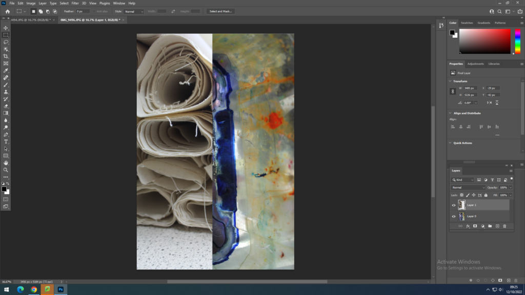
using photoshop I was able to experiment with different tools it has to offer to create an interesting image. With the first image I have layers another image on top of another and cut it in half so that I have 2 images joined in one image. i have done this by opening 2 separate images in photoshop, then using Ctrl+A, which selects the whole image and pressed Ctrl+C to copy the single image, then in a different window where the other image is opened in i have used Ctrl+V to paste the image on top of the other which also creates another layer. These layers can be seen on the right side of the screen. these layers can also be joined together by dragging one on top of the other, or a layer can also be moved depending where on the plan of the image it is supposed to go, next to the layer if the eye icon is pressed that controls if the layer is visible or not , this helps to work on a single layer only if the others are not visible. to work on a specific layer it has to be selected first , where it will be a lighter grey then the others. by using the crop tool on the left hand side I have cropped the top layer of one image.
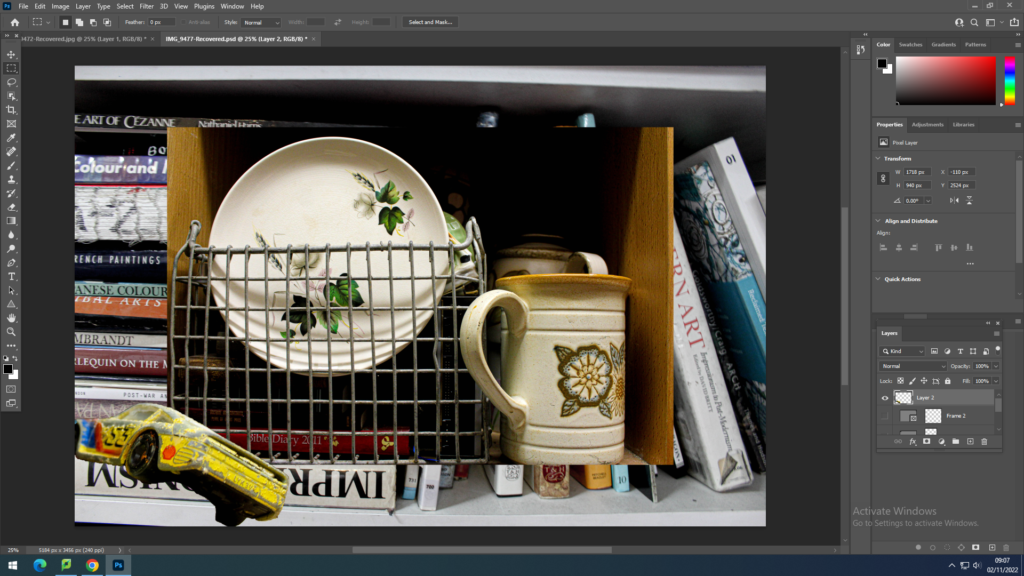
By using similar skills as above, repeating the layering process I have layered one image on top of the other without cropping it like I did with the image above, instead I used Ctrl+T which transforms the image and allows me to shrink it and change its size , this also allows to change the perspective of it and has other options when it comes to transforming the image size, angle etc. These options are shown when I right click with the mouse on the image after using Ctrl+T. I didn’t use these options when creating this image however I am now aware of the options and know how to use them, and where to find them in the future. another new thing I did with this image is having another one opened and in its window using the lasso tool, found on the left hand side of the screen, to create a circle around the car and this selected it where I was able to copy it directly to the overall image.
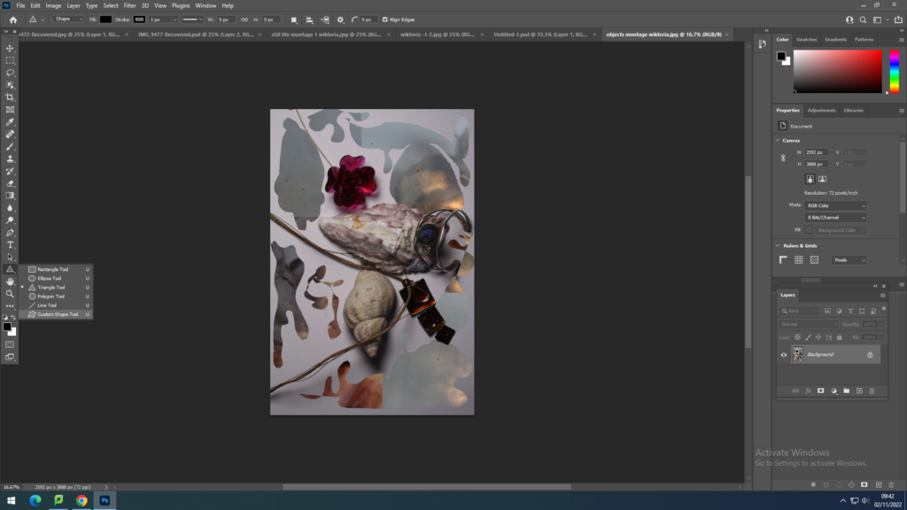
For this image I used 3 different images which I have worked on one by one and because the images were layered with rectangular marquee tool or rectangle tool found on the bottom left, I was able to select a shape, which were rectangles, and to draw then on different parts of the screen which when I pressed enter created a “hole” in the image but the layer from underneath was visible, which was the same image however in a different colour. on top of it I layered a final image which I have also cut out rectangles in however because this layer was on top of the previous 2 , this meant both of then showed through.
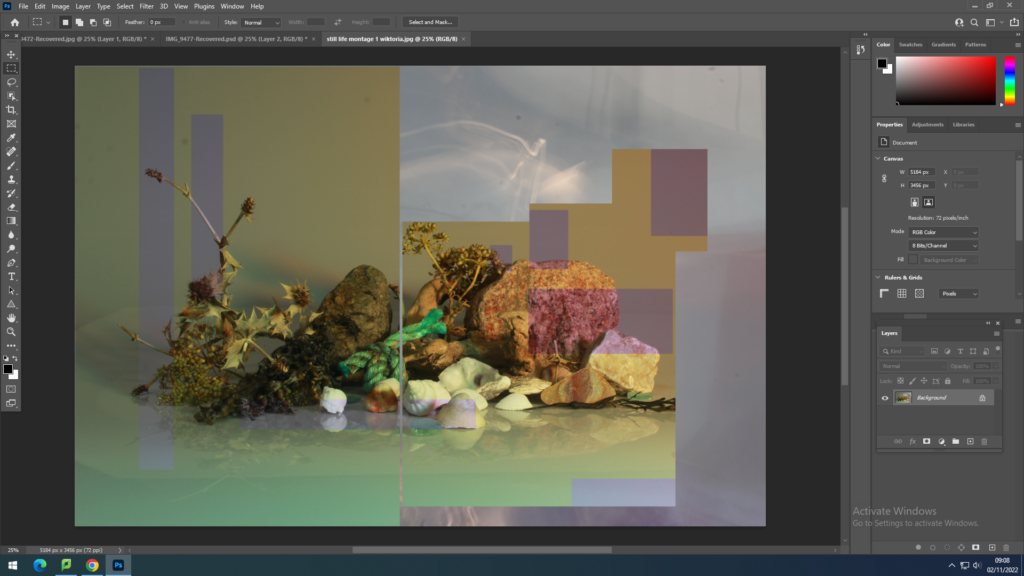
When it came the last image I have used all the techniques that i have mentioned when it came to layering an image on top of another , using cutting and rectangle tool to create a background and on the top layer I have use a custom pattern tool which was an option when I clicked on the rectangle tool I was using previously , then I drew shapes in the image , this process is relatively the same as the above one except I have customised the shapes I was drawing.
Studio lighting

Different studio lighting is used to enhance the subjects being photographer by the photographer indoors. photographers will use different forms on lighting , as a certain type of lighting, to create different sets of photographs. for example one objects can be photographed but the type of lighting that is used in the process will change the image as a whole , this object will then have different shadows, brightness, tone and exposure.

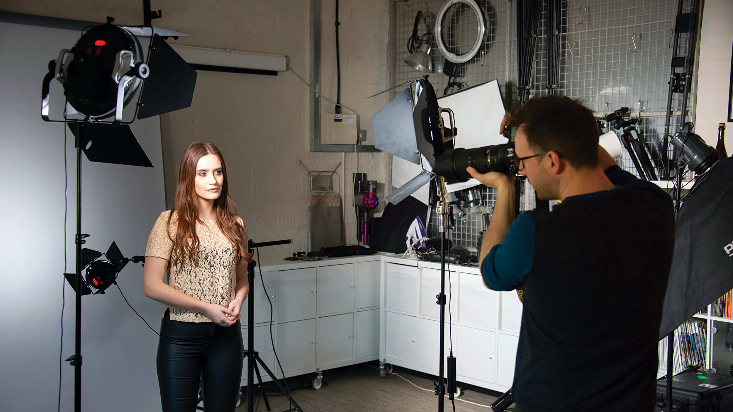
Continuous lights are any light source that is constantly illuminating your scene, this is the type of lighting photographers use in a studio. There are three types of continuous lighting in photography: fluorescent, LED and tungsten.

The three types of lights are key light, fill light, and backlight.

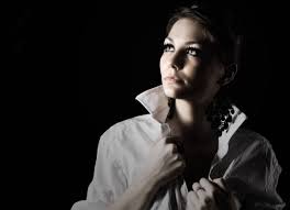
  1.  Key light. This is the primary and brightest light source in the three-point lighting setup. It gives a scene its overall exposure. Cinematographers typically position this main light slightly off to the side of the camera and the front of the subject, on a light stand at a 45-degree angle to the camera, which creates shadows on the opposite side of the subject’s face, giving it dimension and depth. The primary light creates the mood of a scene. Depending upon its position and the supplemental lights used in the overall lighting, it can create a high-key image (evenly, softly lit and atmospherically upbeat) or a low-key image (high contrasts, deep shadows, and very moody).
How to use key lighting and fill lighting in portrait photography | Digital  Camera World
High Key vs Low Key Lighting in Photography: A Complete Guide
  1.  Fill light: Mirroring the key light on the opposite side of the camera, the fill light literally fills in the shadows that the key light creates on a subject, bringing out details in the darkness. Typically, this secondary light is less bright than the key, and cinematographers control the overall feel of their shots based on how much they dim or lighten the fill light. A dim fill light, where the fill ration is high, creates a high-contrast, film-noir type of shadow, while a brighter light with a lower, more balanced ratio gives the subject a more even look. The second light isn’t always a light: it can be a reflector, a bounce card, a wall, or anything that bounces back some light onto the subject to fill in the shadows. Together with the key light, the fill light determines the mood of a scene.
Fill Light Photography: Your Essential Guide
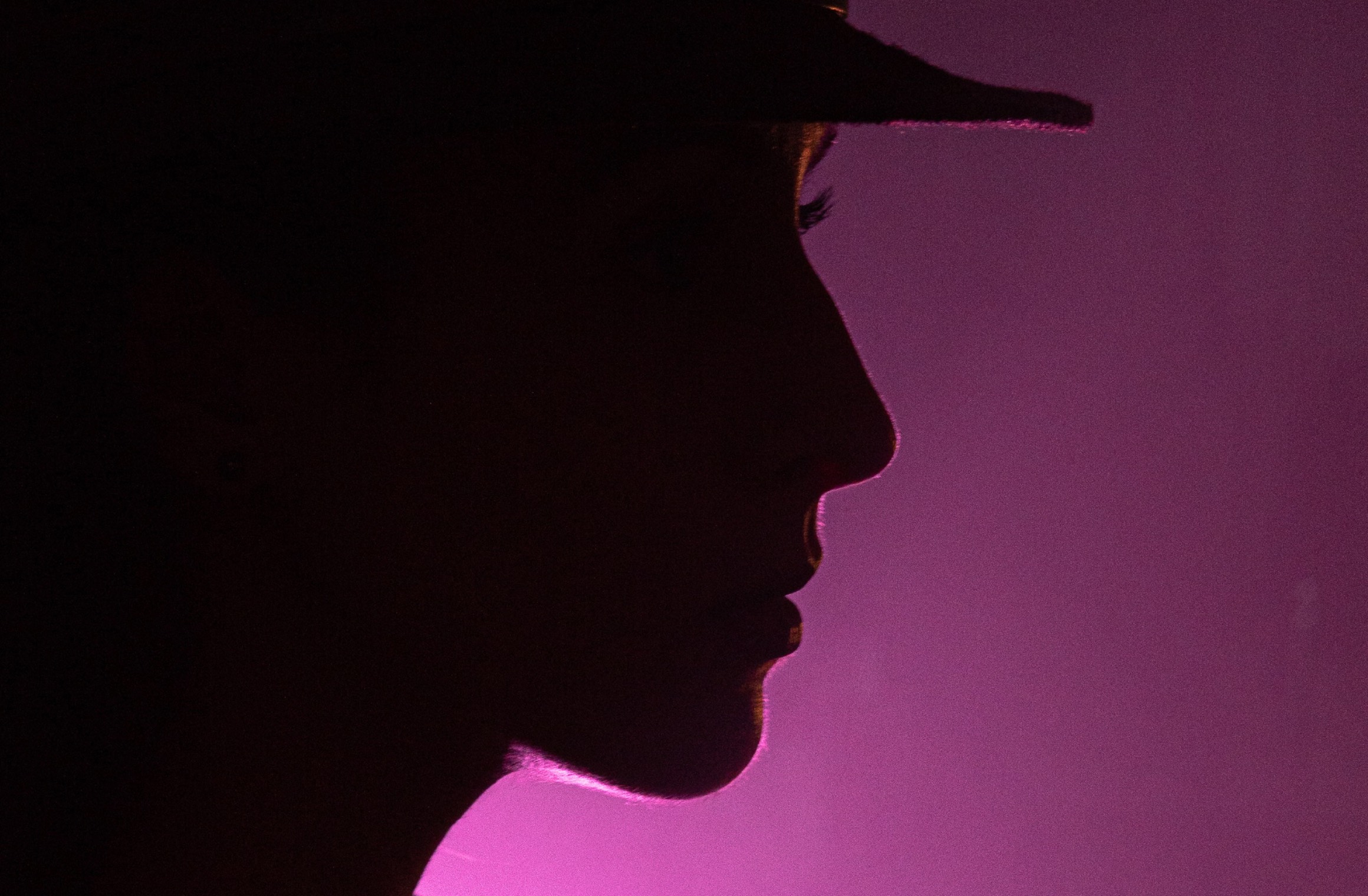
  1.  Backlight: The third source in this lighting technique, the backlight (also known as the “rim light” or “hair light”) shines on a subject from behind, completing the light setup. This creates a rim of light or outline around their head that pushes the subject away from the background and gives a sense of depth. Typically, cinematographers position the backlight directly behind the subject or high enough to be out of frame, opposite the key light, and pointing at the back of the subject’s neck.
What is backlight in photography? Backlighting tips for radiant photos

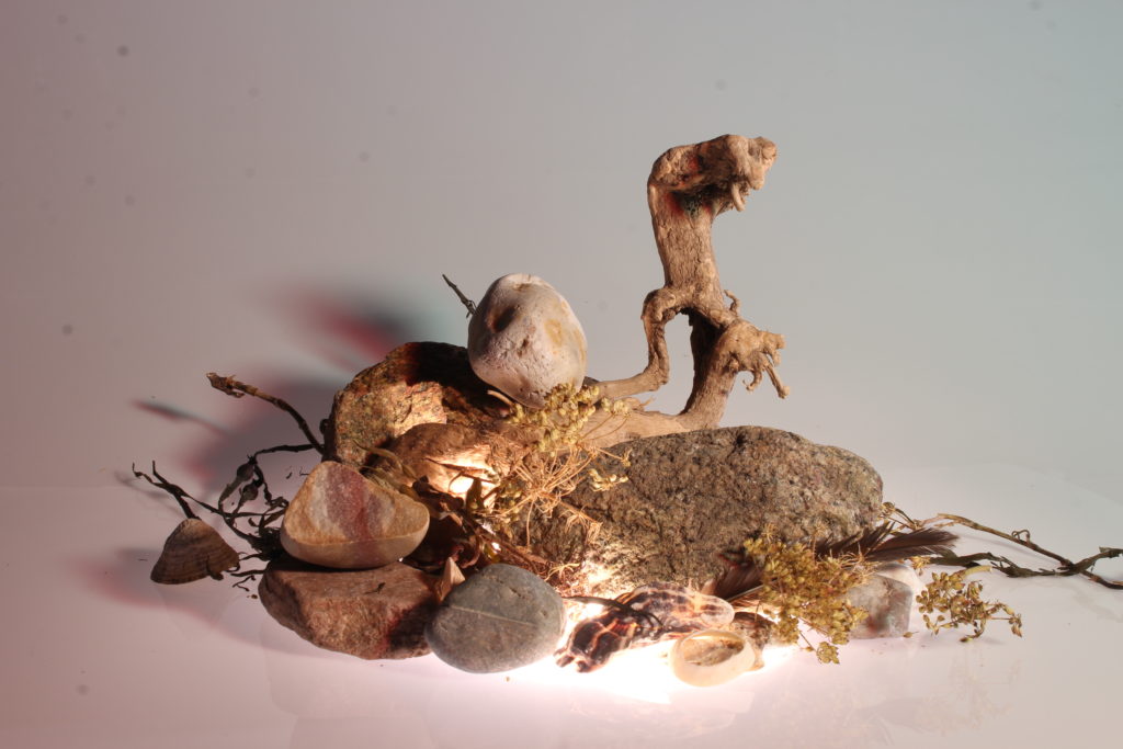
Experimenting with different forms of lighting allowed me to create different sets of images. I have also used different cameras which were set up differently. with each camera came a certain light which was purposely and specifically set up for the camera.

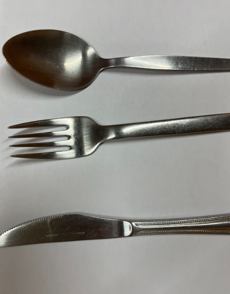
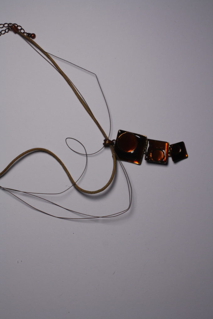
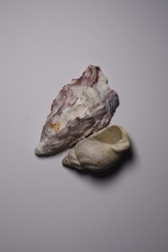
I have shot pictures of objects from a camera which was set up using a stand which held it directly above the objects, this camera also had a light that came with it which was set up on the right of camera , in order to create shadows which appear on the left of the objects . this is to manipulate the shadows and if the light was to be placed above the camera the camera itself would create shadows and not allowing enough light to shine on the objects.

PhotoMontage

  • photomontage is a collage constructed from photographs.
  • Historically, the technique has been used to make political statements and gained popularity in the early 20th century (World War 1-World War 2)
  • Artists such as Raoul Haussman , Hannah Hoch, John Heartfield employed cut-n-paste techniques as a form of propaganda…as did Soviet artists like Aleksander Rodchenko and El Lissitsky
  • Photomontage has its roots in Dadaism…which is closely related to Surrrealism
What Is Photomontage - The Definition and History | Widewalls
Hannah Hoch
image by Ben Goossens.
Waldemar Strempler
https://jimstokesdesign.com/portfolio/political-pieces/

New objectivity

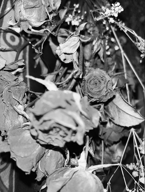
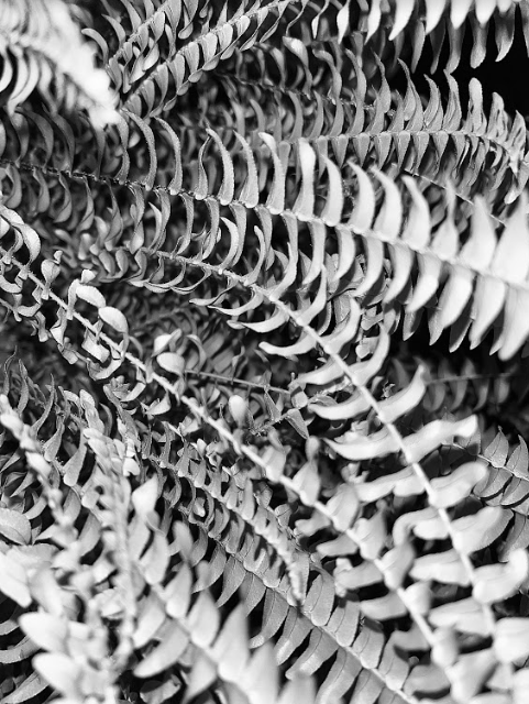
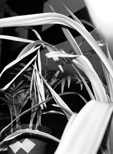
What is new objectivity:After War World I, a sharp and objective style of photography emerged in Germany called New Objectivity. New Objectivity is a veristic art style, which encompasses painting, drawing, and photography, it was a movement in German art that began in the 1920s to oppose expressionism. Its rejects self-involvement and romantic idealism. This is shown through modern photographers such as Karl Blossfeldt and Albert Renger-Patzsch. Their way of working is very interesting as they focus on photographing simple objects like plants or house items that most people would have in their home, but just because the objects they photograph are not exiting does mean their work isn’t exiting , ,they have a way of capturing beauty of any item through the camera. as they photograph these objects this causes the idealized aspect of most photographs to be removed, like they did with new objectivity back in the 1920s.

These close-ups were used to aid Karl Blossfeldt teaching in the late 19th century and early 20th century about the natural beauty of nature, something which is evident in all his photographs.

Formalism

formalism is marked attention to arrangement, style, or artistic means usually with corresponding de-emphasis of content, meaning it is excessive adherence and analysis of a specific photograph.

a video explaining formalism in art, linking it with photography and understanding how to analyse artwork regarding if its painting or photographs.

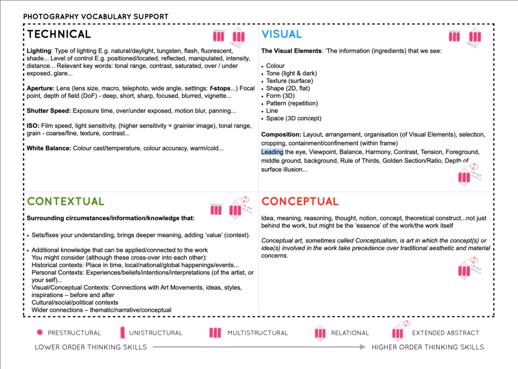
there are key aspects when analysing a photograph Technical, Contextual, Conceptual and Visual. , within those aspects there are a few key ones, with visual elements there a groups which make analysing easier e.g. colour, tone, texture, shape, pattern, line, space, with technical there is lighting, aperture, shutter speed, ISO, white balance. for contextual the aspects are going to be additional information that brings a deeper meaning adding more value to the photo, like historical context and personal context. conceptual aspects are ideas, meaning, reasoning, thought , theoretical construct, its art in which the concepts involved in the work take precedence over traditional aesthetic and material concerns.

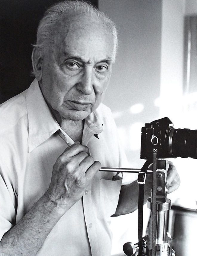
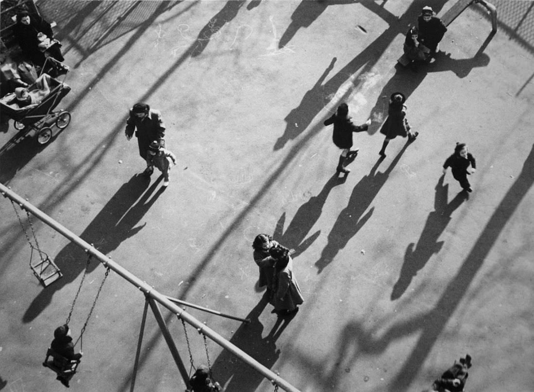
to explore and practice all the above aspects of evaluating an image, in a group we have looked at the visual aspects of the photo created by Andre Kertesz. The main aspects we looked at are the visual aspects of the photograph, which are :

Light: Which areas of the photograph are brightest? Are there any shadows? Does the photograph allow you to guess the time of day? Is the light natural or artificial? Harsh or soft? Reflected or direct? How does light fall across the objects in the photograph?

Repetition/Shape: Are there any objects, shapes or lines which repeat and create a rhythm or pattern? Do you see echoes or reflections within the image?


Space: Is there depth to the photograph or does it seem shallow? What creates this appearance? What is placed in the foreground, middle ground and background? Are there important negative (empty) spaces in addition to positive (solid) spaces? 


Texture/ value tones: If you could touch the surface of the photograph how would it feel? How do the objects in the picture look like they would feel?


Colour: What kind of colours can you see e.g. saturated, muted, complementary, primary? Is there a dominant colour? How would this image be different if it was in black and white? Does the use of colour help us understand the subject or does it work independently?

André Kertész | International Photography Hall of Fame
André Kertész: Walking in the Picture - Exibart Street

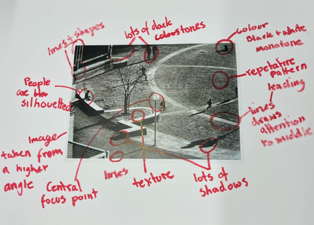
I have found a similar image to the previous one we were analyzing in class also by Andre Kertesz. Taken from a birds eye view/ from a higher point, showing people walking on the street. His work is in black and white as he worked in early 1900. This is his signature style of work and many photographs include variety of ordinary camera angles , especially at significant times of day , golden hour when the sunlight is very sharp and creates longer and more shadows then at any other time of the day.

When it comes to analyzing this picture by using the key main features and a help sheet which help focus on different aspect of the photograph, focusing for now on the visual aspects, the photograph is in black and white and because of this this can relate to contextual part of the photograph as during the times it was taken, a coloured photograph wasn’t available or produced yet , the tone , lighting , texture is what may fall int o the technical categories as well as visual because depending on the camera or its setting how much lighting is in the photo is effected by aperture, shutter speed , white balance etc. regarding this photograph it seems bright as the highlights are very defined but the spaces between people are also filled in with lots of light, the darks are also very visible on people which contrasts which the background. the shadows of people on the floor is very smooth resulting is a blended in texture of the image. when looking at line, pattern, space within the image i can say there isn’t a regular pattern of most things except little accents of grid like fence on the right corner or children’s playground equipment,e.g swing on the bottom left. the lines and shapes in the image is what shows the viewer more of what the image is off , allowing them to make sense in their mind of what is photographed this as a whole analysis correlates to conceptual aspects of the image, to why the image is how it is , what the photographer meant and what he planed to teach, show, mean about the image. this is to everyone to interpret in their own way. but looking and analyzing this image to me the light and the fact it is of children being in the playground links together a lot . because you can see more children leaving or leading towards the exit of the playground when it is a later time of day may mean that everything good has to end however it may also mean control and restriction that children have the lack of freedom , as everyday at certain times their parent may tell them to do a certain task or not to do it, like here they may tell them to leave the park, restricting children freedom. this may also be a metaphor for life in general as through children we are thought exactly that, restrictions like having to end your fun at the end of the day.

help sheet for analyzing photohraphs

Still life

Still life is a painting or drawing of an arrangement of objects, typically including fruit and flowers and objects contrasting with these in texture, such as bowls and glassware.

In the 17th century lots of paintings representing objects or “still life” began being well-known, usually made for the rich in Europe. These types of paintings were hyper realistic. They included objects which were carefully places and usually told a story, with a hidden meaning behind them, these are called vanitas. They often contained symbols of death and originated as a Dutch genre. this is called memento mori and it means an artistic or symbolic trope acting as a reminder of the inevitability of death. This could be by including skulls or objects that will eventually lose their purpose or “die”, e.g. flowers.

Pieter Claesz, Still Life with a Skull and a Writing Quill, 1628.  Courtesy of the Metropolitan Museum of Art.
Pieter Claesz, Still Life with a Skull and a Writing Quill, 1628. Courtesy of the Metropolitan Museum of Art.

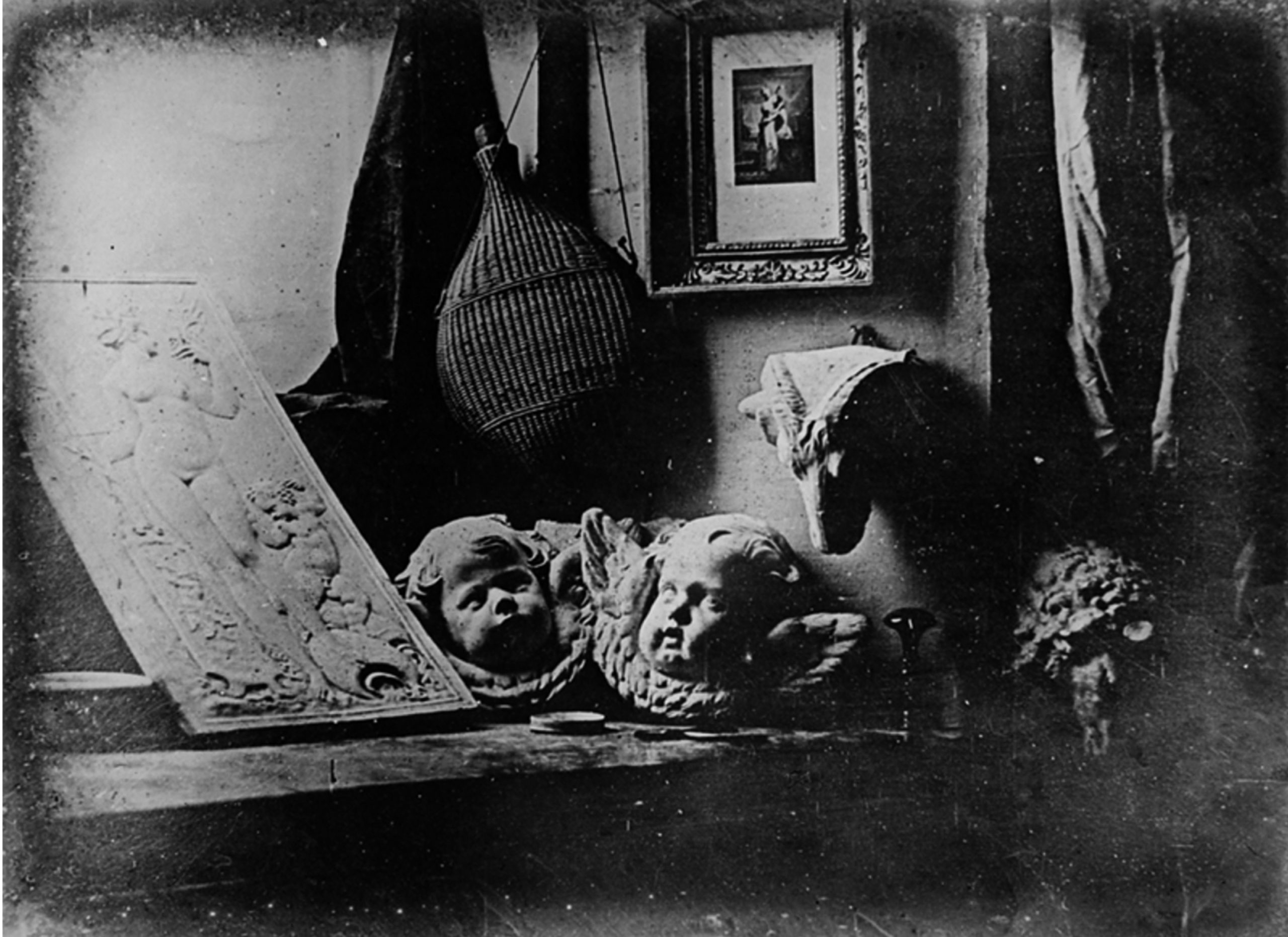
Still life featured prominently in the experiments of photography inventors Jacques-Louis-Mandé Daguerre and William Henry Fox Talbot. They did this in part, as the exceptionally long exposure times of their processes precluded the use of living models.

Louis-Jacques-Mandé Daguerre, The Artist’s Studio / Still Life with Plaster Casts, 1837, daguerreotype (photography), 6.5 inches by 8.5 inches (public domain)
Louis-Jacques-Mandé Daguerre, The Artist’s Studio / Still Life with Plaster Casts, 1837, daguerreotype (photography), 6.5 inches by 8.5 inches (public domain)

there are many photographers who challenge the idea of still life and take on the idea of photographing objects, or foods but adding a slight hint of modernism to their pictures.

Laura Letinsky

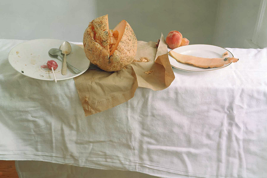
Laura focuses on photographing food, or the consumption of food. Her vanitas are much more modern but follow the original style of still life. originally vanitas were photographed in order to tell a story but be attractive. She does the exact same thing, as she places the food/objects carefully in order to create an order of the food that has been eaten. at first glance the photographs don’t seem extraordinary as it is simply a photograph of some foods, but the background, the specific foods, their order and placement, everything challenges the idea of memento mori, where the foods resemble death, the end of the fruits life. These photographs specifically represent beauty in the everyday foods and challenges the viewer to cherish everyday objects especially food as its so crucial to them, to be grateful for it but also to notice or pay attention to tasks like eating, as within minutes a human causes chaos to the food, how a single person can have so much control and how much change they can change when it comes to the food form. She specifically photographs food that has already been consumed to show that the foods beauty is not destroyed it is just in a different shape and form. maybe she aims to do this so the viewer doesn’t feel as bad for eating or maybe she means the opposite, either way what she aims is to portray food in a different form but still make it beautiful.

What I found interesting about her work from others is the pastel like colours and the calmness she aims to capture with her photographs, contrasting with the things she is photographing, almost as if she is trying to say the chaos of the foods is not a chaos at all, all depending how you look at it. Her images are quite bright but not over exposed. She uses light diffused window lighting, where it is usually greyish/white, creating a few light shadows. The whole composition of the photograph is relaxing and pleasing to look at, like I said before, the way she captures the foods is beautiful and calm in contrast with what is going on in the photo. This is because often when photographers photograph disturbed scenery they would edit the picture in the way where it would dramatize this effect, making it dark or saturated, where it would create similar feelings as the object being photographed, however her photographs confuse as they are not edited that way at all .

still life Photoshoot, edits and final images

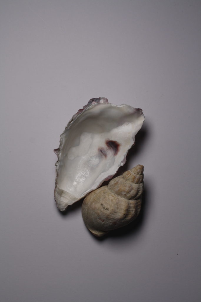
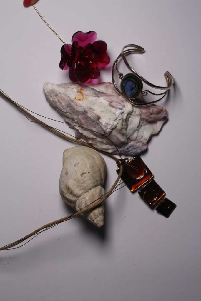
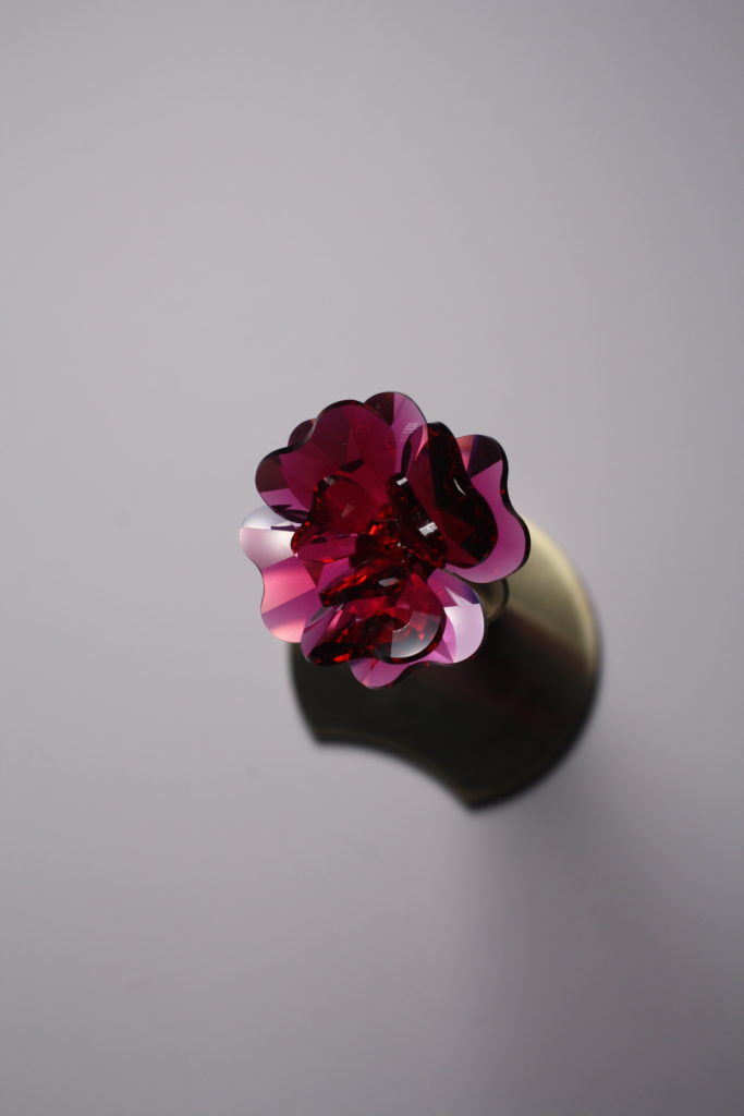
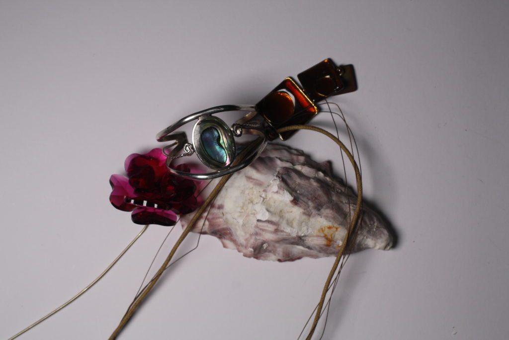
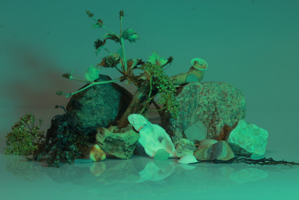
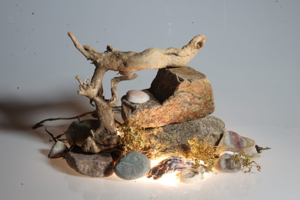
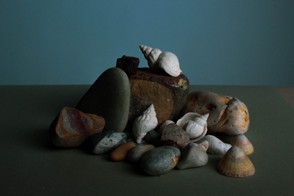
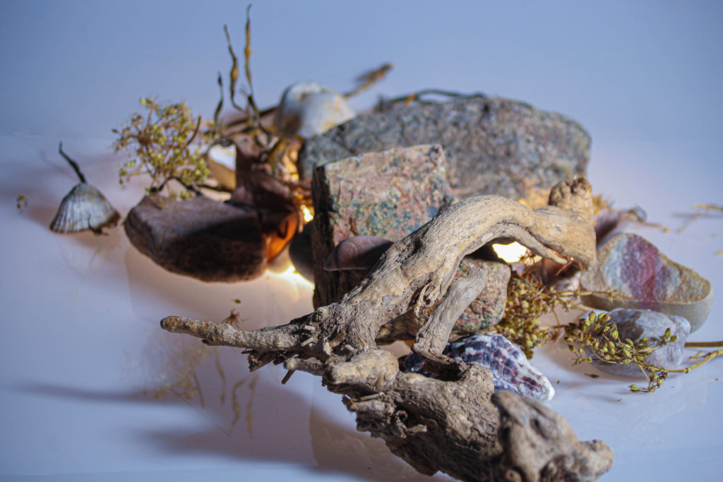
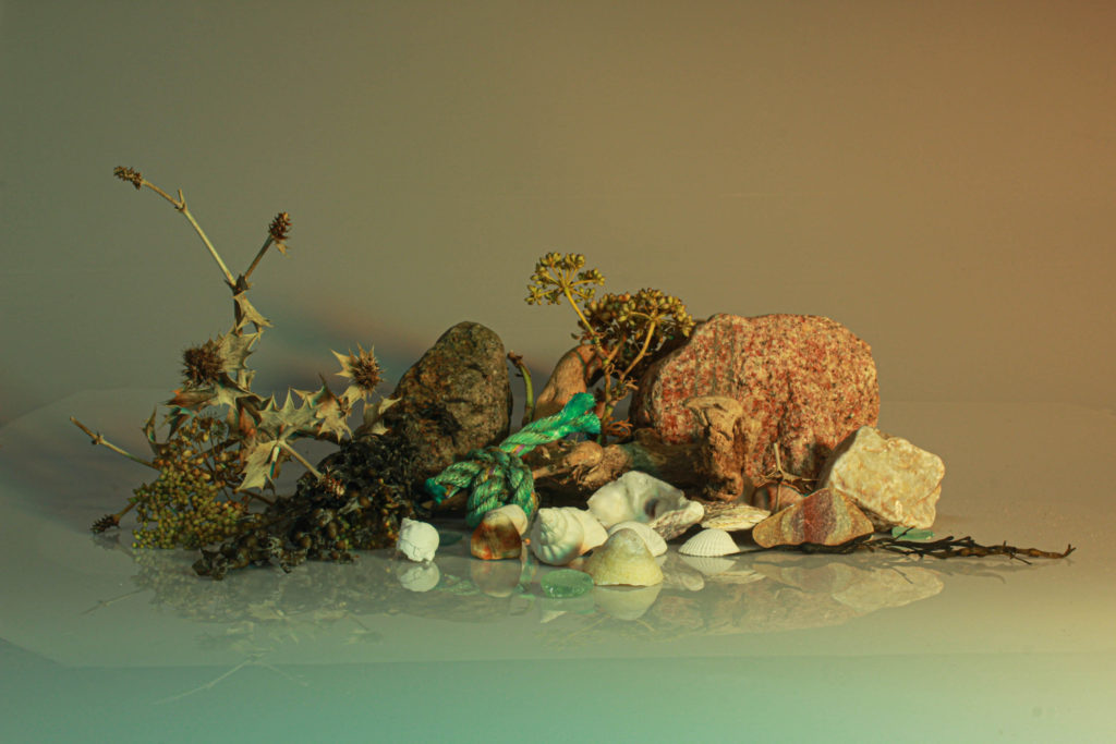
Except from adjusting the aperture after getting the camera setting right for the objects and lighting I have also rearranged some objects and used different coloured papers to put over the light so the images would also have interesting tones to them, this was so I could produce different photographs.

In a different blog post I have explained how through the photoshoot I have also experimented with different aperture and shutter speed.

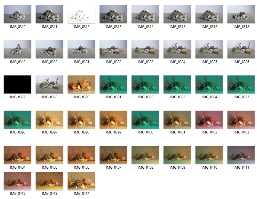
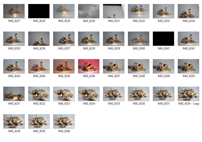
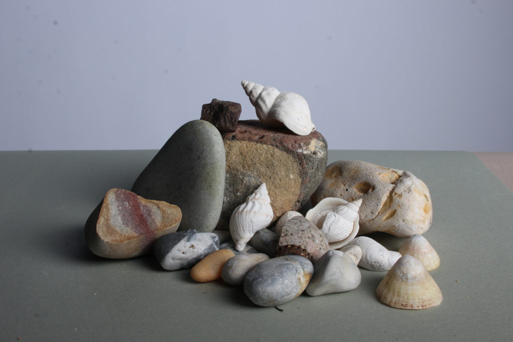
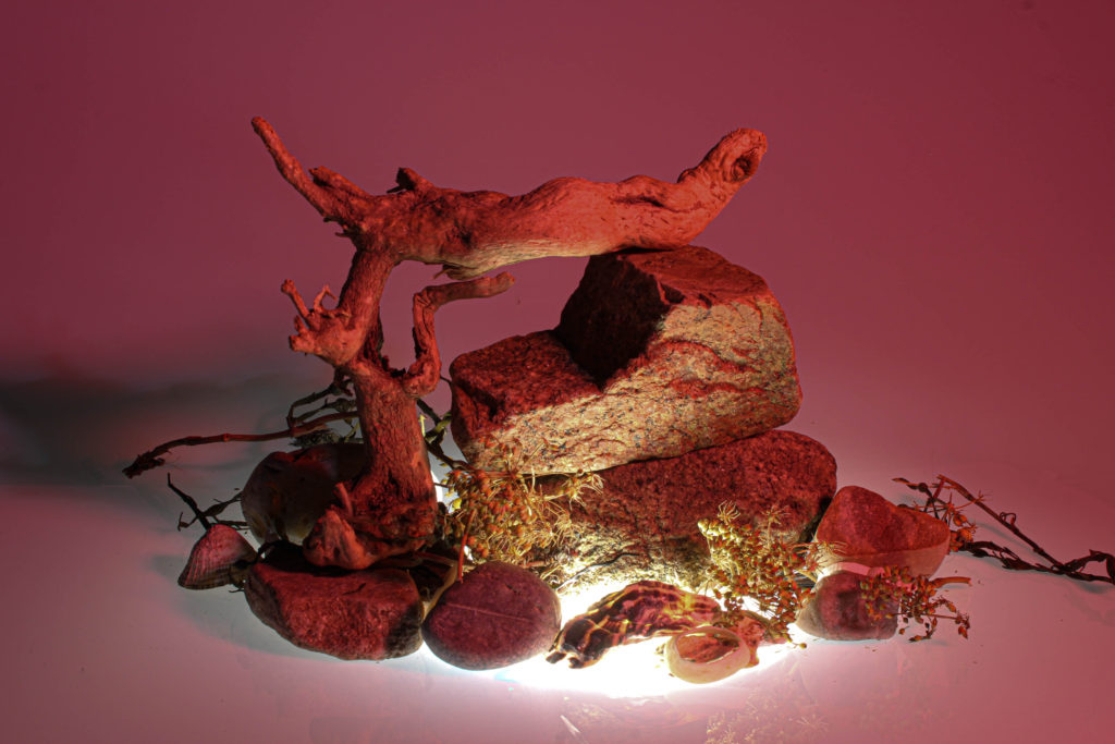
My favourite images from the photoshoots :

The images I have selected are “raw” images, meaning these photographs are not yet edited and are images of what the camera has seen them as.

Still Life Edits

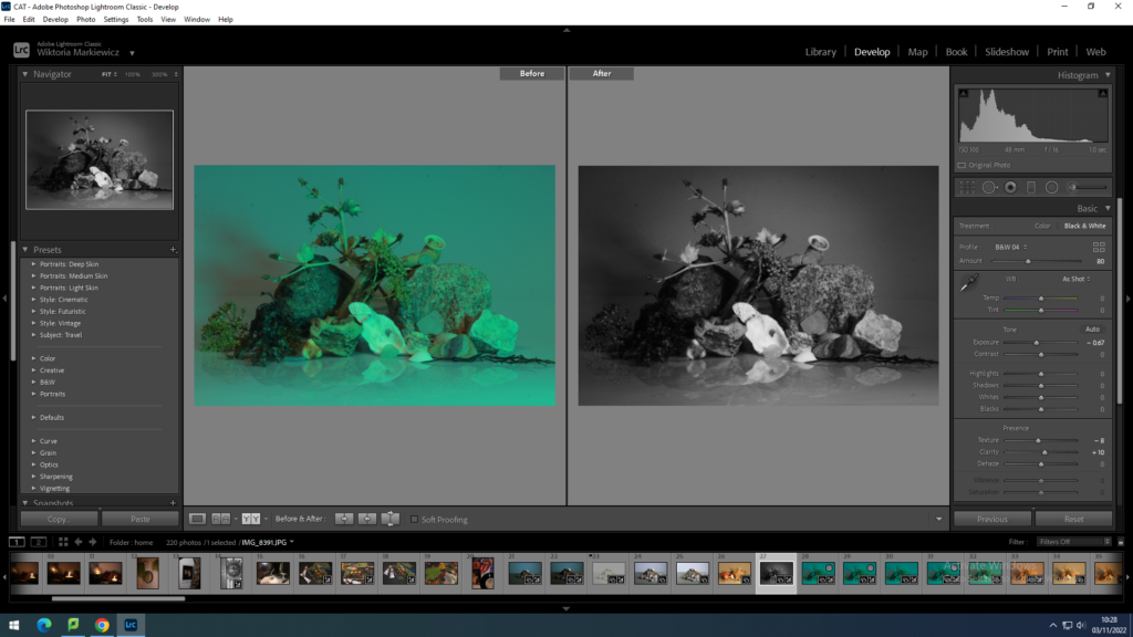
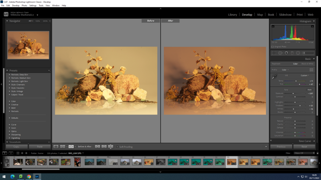
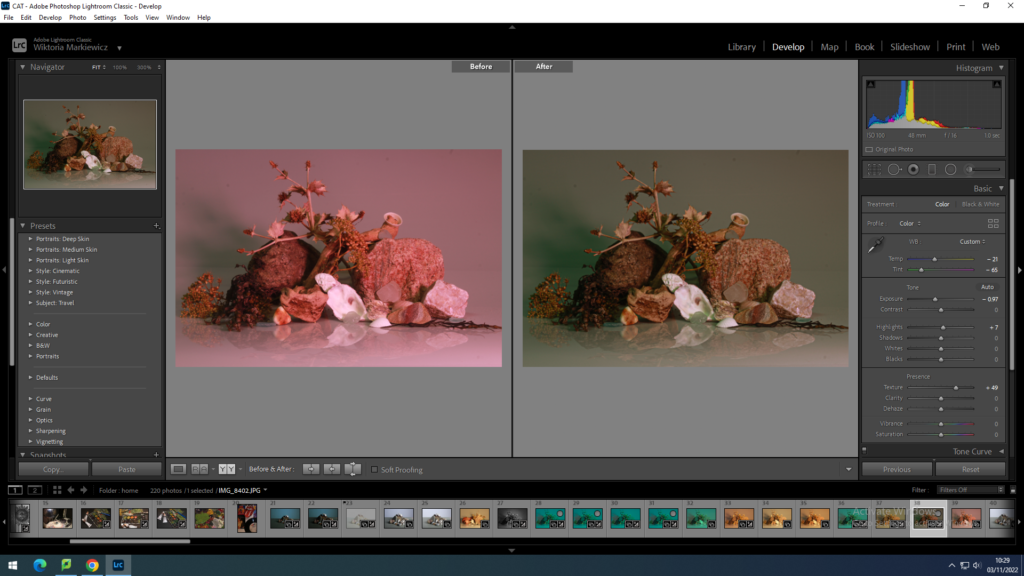
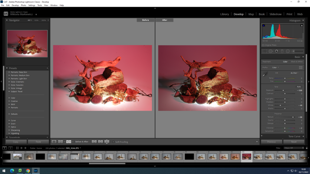
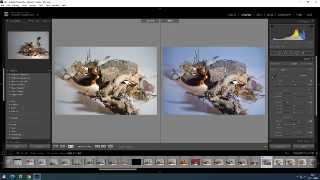
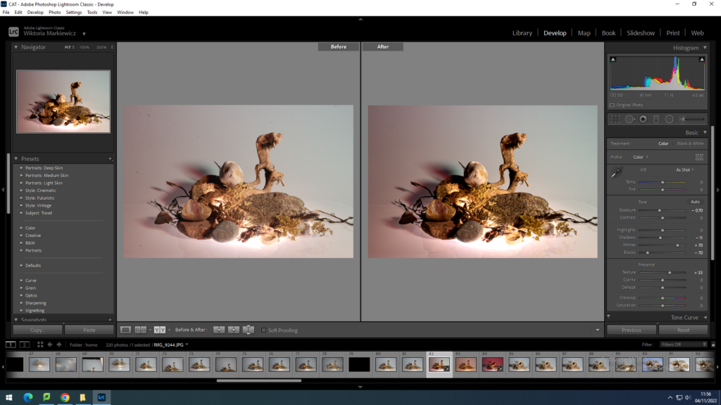
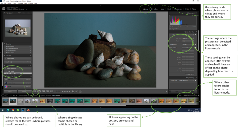
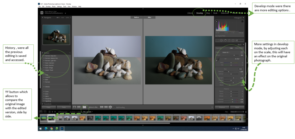
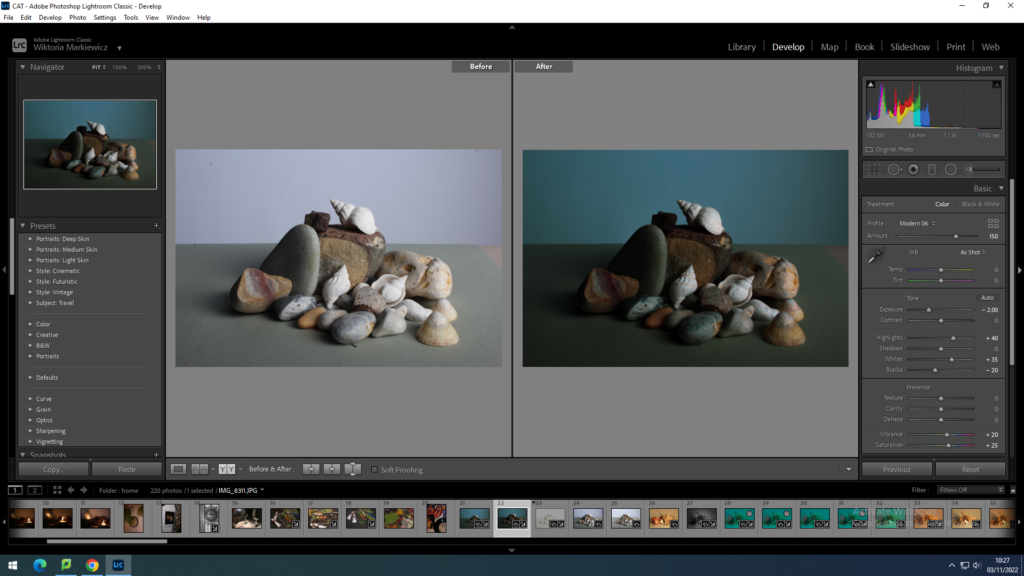
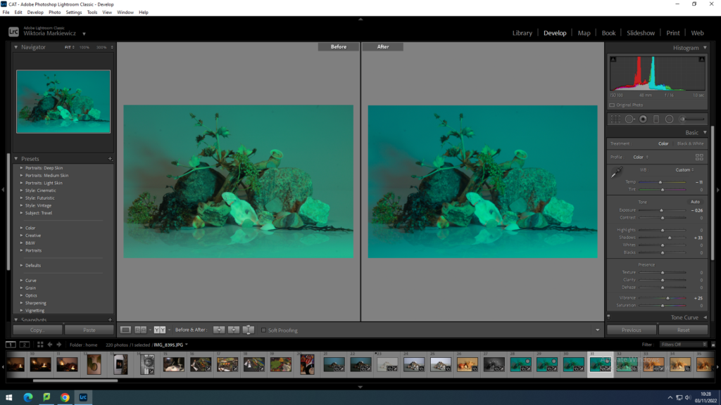
Once I was able to select my favourite images I could then edit these in adobe Lightroom. I have mainly edited them in the develop mode as then I was able to play around with the tones, exposure, lights and darks and texture. for most of my edits I have increased the texture to make the photographs more sharp and show more detail. I have also in come cases increased the saturation or tones and to make the pictures darker, decreased the exposure. Depending on the picture and how much exposed it is , I have individually increased lights and darks, but this was depending on a specific photograph.

with other photographs I changed them to black and white and adjusted them from there, usually playing with how light and dark I would want the objects in the photograph to appear.

Apart from making them black&white, in the library mode I selected for some photographs a filter which then similarly to black and white images, I played with how strong I would want the filter to be visible on the objects.

What was very useful was to copy what I have done to one image and paste it onto another , meaning the edits that I did to one would be the same on another. I was able to do this in develop mode where I would press copy in the left bottom corner and selecting a different image and pressing paste which is found in the same place as copy.

With copying the edit setting for one image and layering them onto another , I could see how the same setting would effect a completely different image. which made the process of editing a couple of the images quicker and easier. However this doesn’t mean I didn’t focus on the image by itself long enough, as I would check how the settings compliment the objects and on top of that what else I may add to make the photograph it’s best quality.

with this and a couple more images I had to use the circle erase tool, found in the top right corner, below the histogram, in the develop mode. this tool was very useful to erase all the dots that were on the camera lens, usually little bits of dirt. however by using that tool and selecting the flaws in the photograph I quickly got rid of them, making the photograph look more clean.

Still Life best images

After having a great amount of images that look to their best quality, with the help of Lightroom to meat them to this standard I could do final checks and look more for the faults in the image , like dirt or unwanted bits. After this if I was satisfied with the images I put them in a separate folder which would make them easier to find later if its needed to print them.

My response to the still life photoshoot is that for my first ever photoshoot in the studio to editing the photographs and selecting my final ones, the images are to their best quality and I have demonstrated as well as enhanced the objects beauty, if its by highlights and shadows but as well as tones. the images when put together or next to each other could be grouped as colourful yet this is what in my opinion makes the photographs interesting. When shooting the pictures with the camera, I had fun rearranging the objects as I had to creatively think ahead of how they would look from a different angle. As well as with aperture and shutter speed, I have learned how changing certain settings affect the camera, which was useful not only when taking these images but in the future , when it comes to other photoshoots. This was one of my first times using Lightroom which also was a lesson for the future and getting used to the program in order to know how to make other photos in the future to their best state and how to know what to do to achieve the effect I want on them quicker.
What is photography ?

Photography has been changing and developing meaning it’s original purpose was mutated and photography started to be used for many different purposes. Photographs are art and can be interpreted in many different ways, for some they will carry a meaning which would be personal for each individual, the meaning behind them would not be straight forward.

thomas heaton best landscape photos
Ted Gore
Location: USA

There are said to be two types of the way photography is shared, through conventions and through words, words in magazines or books, where a photo is convenient in order to help the readers imagination. Personally I believe there is one type of photography used for art purposes, where it is unique and does not follow a specific format and is limitless, But also there is another form of photography where photographs are used for more convenient purposes where the mind simply cannot remember information, or cant share it in any other ways to others.

Newspaper front pages during the 1986 People Power Revolution
CHRONICLES. Events throughout the People Power Revolution in 1986 grace the front page of newspapers. PHOTO FROM THE BOOK BAYAN KO!

What i believe is very important about photography is that no matter how it is used or the meaning behind it or its real purpose, photographs capture a specific moment in an individuals life and are amazing storytellers. What is fascinating is how a single moment can be captured through one photograph, however that specific moment can not be relived again and all that is left of it is the photograph. This is why photography is so important to people. As not only people can embrace the creativity, on top of that, photography can connect people.

A single image can be shared with others infinite amounts of times, through photography people can communicate, almost giving photography its own language. Millions of different people can be looking at one image and understand it, no matter where they are from or what language they speak, that one image will carry a message but each individual is going to have their own meaning of the photograph. I found a quote suggesting this “the reader/viewer was free to make her own connections”.

“Photographs confuse as much as fascinate, conceal as much as reveal, distract as much as compel. They are unpredictable communicators.” “confuse as much as fascinate” I think what this means is the a photograph can be interpreted as a piece that boggles the mind and can move a person emotionally. A photograph can also be secretive but still signify an open book, where any photograph could uncover a specific meaning it is hiding or revealing. This also means the meaning of it can be easy to spot but not always and not for everyone. The meaning of “distract as much as compel” to me means that in the photograph, depending on what is being photographed or the scenery “distract” in the photo can be serene but turbulent, this again means a photograph can really affect a persons feelings.
Stanley Forman’s famous photo Woman Falling From Fire Escape |1975
Artistic action by Yves Klein | Leap into the Void | The Metropolitan  Museum of Art
Harry Shunk and Janos Kender, Yves Klein leap into the void 1960

Leap into the void , was taken in 1960 of a performance by Yves Klein, which gained popularity over the interesting act Klein did. because of the times it was taken , it was so fascinating as photomontages or photo editing existed. this image was taken in 2 parts. where one was taken of Klein jumping off the roof and others catching him when he falls, and another of the scenery with the bicycle in the background, then these 2 pictures have been put together to form a shocking photograph.

Yves Klein's “Leap into the void”, 1960 - - FGIdeas.org

The statement said above and my interpretation of it: “Photographs confuse as much as fascinate, conceal as much as reveal, distract as much as compel. They are unpredictable communicators.” can be interpreted to this specific photograph. this image is very fascinating yet confusing as an act of jumping of a roof for artistic purpose can be confusing to some but can fascinate others as it shows he is willing to do this for art and is passionate for the story he is trying to tell. Regarding my point earlier, this image will have a different meaning to each individual and peoples views and opinions of the photograph will differ based on their culture, religion, place of living, gender etc. What the photo means to me is that the title ” leap into the void” suggests some suffering, almost giving up, to the point you are so helpless you are willing to jump into nothing, or empty space, which he demonstrates by not only jumping passionately, showing he wants this, also by choosing the location which is almost an empty street. By having no cars or no people in the picture except one cyclist may suggest he has nobody that cares about him, extending that idea, the cyclist ,cycling away from him may mean this carelessness from the public. This means he isn’t trying to gain attention, he is taking this “leap” because he wants to, maybe to find a meaning of something or find a solution specific to him.