All posts by Scarlett Sargeant

Filters

Author:
Category:

Image Analysis

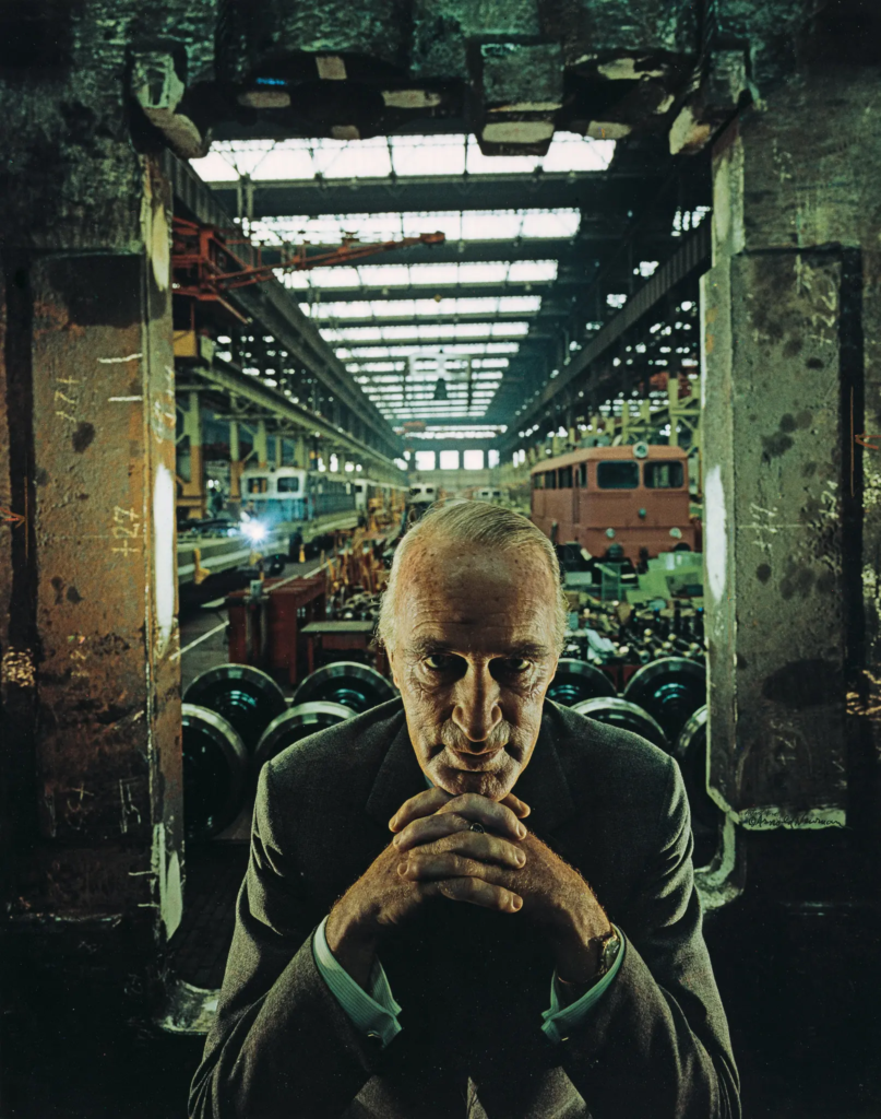
Alfred Krupp, industrialist. Essen, Germany, 1963 by Arnold Newman

How does this image make me feel?

At first look, this image makes me feel intimidated, as the man is looking straight down the camera lens with a dark industrial room behind him. The man in the image also looks quite sinister with how his fingers are interlocked while he is resting his chin on them.

How was this image taken technically?

This photo was taken with a wide view lens, this is shown by the ceiling light and how it starts to get more narrow towards the back of the room, and how there is space either side of the man.

As well as the lights from the ceiling, i believe that there was some artificial lights being used too coming down from the top corners of the image due to both sides of his face being illuminated creating a shadow in the centre of his face around his eyes.

What can I see in the image?

The image seems to be taken in an industrial building, possibly being used to fix trains or store them, as in the background appears to be some stationary trains. Furthermore, there are think rows of sky lights allowing in natural light into the building with what seems to be wheel like cogs behind the subject of the photo.

The subject of the photo is directly looking into the camera while clasping his fingers together underneath his chin creating a pyramid shape with his hands which could imply strength as it typically is a strong structure.

Why was the photo taken?

I believe that the photo was taken to show how the subject of the photo is powerful and it shows his dominance. Someone could also perceive this image as its intensions to prove and show people how the man is evil.

What is the story behind this image?

Alfred Krupp, the man in the photo was a German industrialist figure and was convicted and later pardoned war criminal. his family were responsible for using 100,000 Jewish people from concentration camps for slave labour. Despite his dislike for Jewish people, he was fascinated by the photography work of Arnold Newman who was Jewish, and decided to hire him to take photos of him. However, Arnold decided to make him look sinister and evil as a type of revenge.

ENVIRONMENTAL PORTRAITS INFO AND MOOD BOARD

“An environmental portrait is a portrait executed in the subject’s usual environment, such as in their home or workplace, and typically illuminates the subject’s life and surroundings. The term is most frequently used of a genre of photography”

An environmental portrait is a photographed portrait that captures subjects in their natural surroundings instead of in a studio or other artificial setup. Rather than focusing on what the subject looks like, environmental portrait photographers use the background to portray a truth or convey an idea about who the subject is. Shooting environmental portraits can be a great way to create visual interest while also revealing something about your subject’s life and personality. Environmental portraits provide context, something that studio portrait headshots often lack.

I believe that environmental portraits are an effective method of photography that shows someones story and can be interpreted in many ways, not just one.

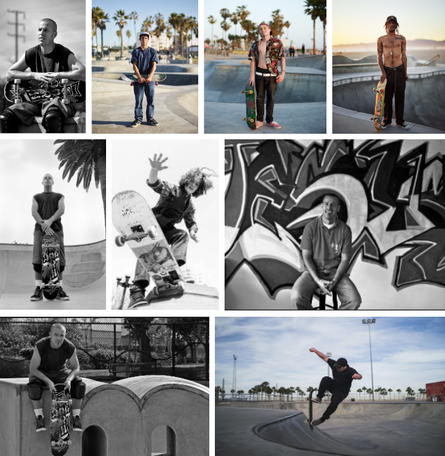
Mood Board One:

This first mood board is inspired by the new skateboard park that has recently opened on the island. I believe this would be an effective photoshoot as many people have waited a very long time for this to open and it was up for debate for ages as to wether or not it should have been built.

I would be focusing on skaters face on portraits with the skate park in the background.

Who?

skaters.

What?

get head shots and full body photos, and also some photos of the actually skating.

When?

during they day or dusk so the lighting is good and not too bight.

Where?

Les Quennevais Skate Park

How?

1/200 f4.5 iso:100

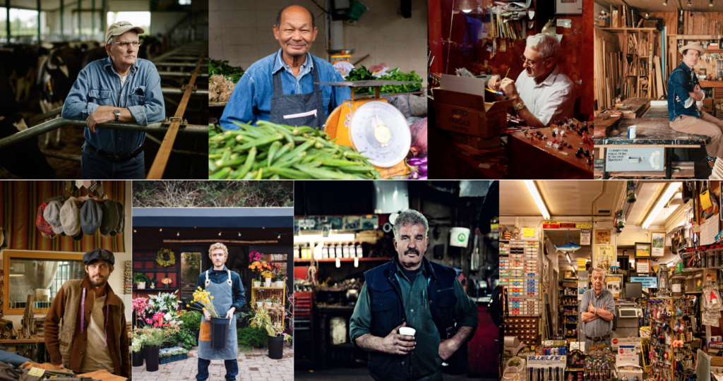
Mood Board Two:

Who?

people who work in small local business.

What?

head shots of people with their business in the background or/and action shots of them doing their job

When?

during the day

Where?

the town food and fish market, around town

How?

portrait and manual mode on camera.

Evaluation and Critique

Why did I chose car light pollution for Anthropocene?

I chose to do car light pollution for this topic as most if not every person on the island uses a car, and by humans using cars we are damaging the environment we live in. I also thought this is quite a broad topic to focus, therefore, I wouldn’t be less limited as to what I could photograph. i became inspired by a British, London based photographer MSH* and Sebastien Coell. They take photos using long exposures, waiting for all the cars and tubes rush by with their lights on creating light trails all around London.

How did I plan?

Initially, when I planned to do this photo shoot I was going to plastics which were found in the sea which was causing pollution and impacting the world. However, I chose against that idea as i became quite limited to what I could photograph due to the low levels of plastic found on Jersey beaches.

I chose to go out to do my photoshoot on a fairly cloudy evening at peak rush hour to get the best results possible for the images to show car lights. I went with another photography student to take photos as we had the same idea and could help each other out. We waited until the sun was fully set and created the images shown in the other blog posts.

Photoshoot-

As mentioned above, I went with another student as we found it difficult at times to get the tripods set up straight on a very slanted wall. By taking the photos at night, i managed to broaden my knowledge of what settings should be used to create the images I want.

The process was very much trial and error, as I had to time the photos perfectly to work with the cars moving due to traffic lights. and many times my shutter speed was too fast or the camera was nocked whilst taking a long exposure image meaning the outcome was blurry.

Even better if…

I believe my photoshoot could’ve been better if I was able to take more photos so when it came to editing them I had more choices to pick from, however that is partly due to the fact the camera didn’t have enough battery. therefore, I would make sure my camera was fully charged. I also think that I should try stick to my original plan a bit more. Even though I have very happy how this project has come out I could have saved myself a lot of stress if I had stuck to my original idea.

Overall evaluation of Anthropocene-

In conclusion, I really enjoyed this project as I got to go outside of my comfort zone and experiment with the camera. I am very pleased about my final out come images. However I should have gone out a couple more times to take more photos and maybe have tried to take some images in different lighting.

Virtual Gallery:

Final Images and Analysis

Analysis:

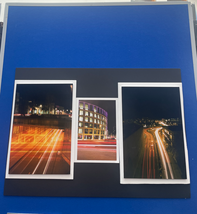
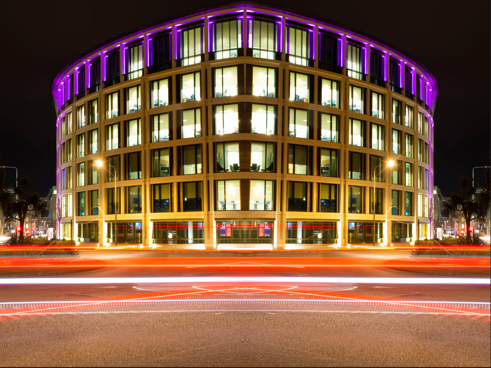
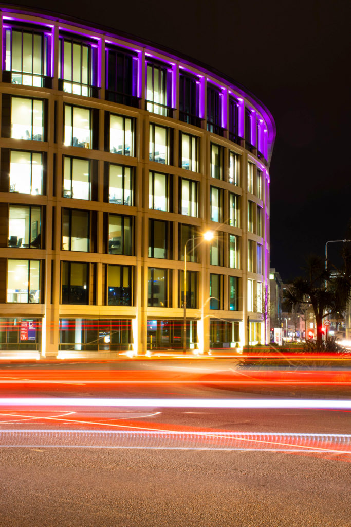
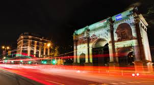
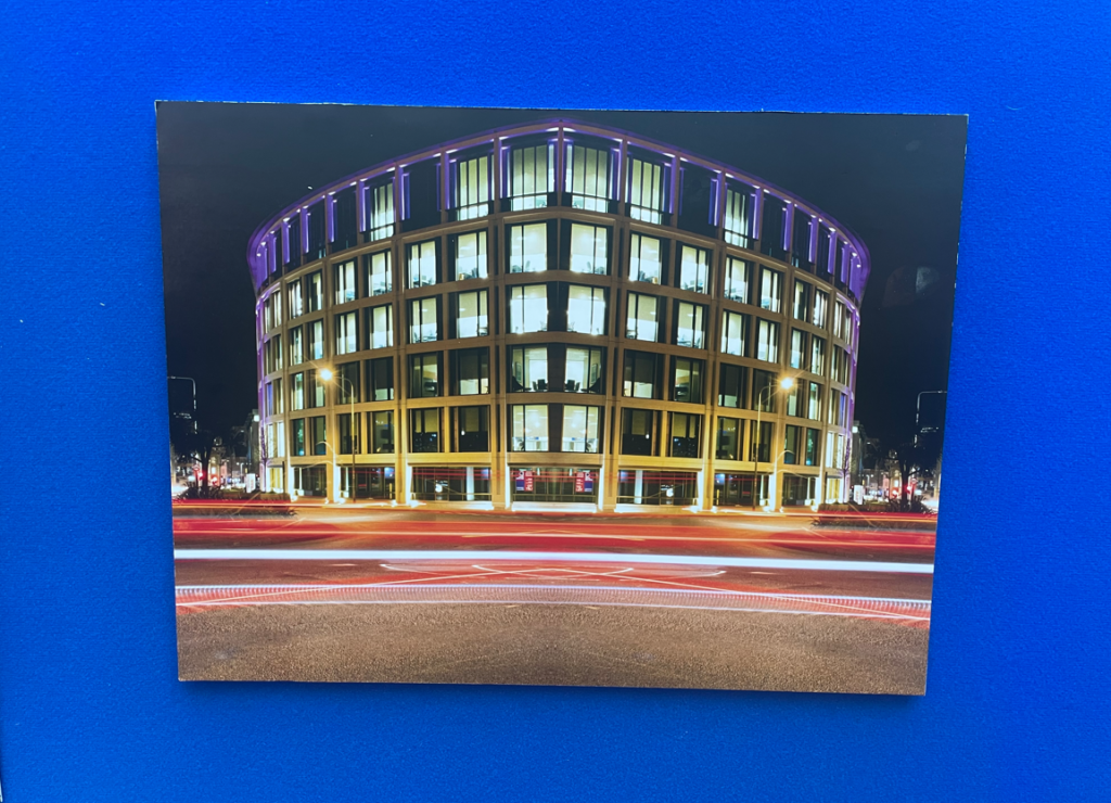
I think this image is very effective as it captures the light trail from the passing cars going around the round about, and the lights shining from an urban finance building in the background. The photo was taken with an aperture of around f/16, a long shutter speed and a low IOS setting.

The image links to the theme of Anthropocene as it shows how humans have industrialized this area with brand new large modern buildings.

The main focal point is the lit up finance building. However, your eyes are drawn to the bright red , blurred light trail created by the cars creating a sense or rush.

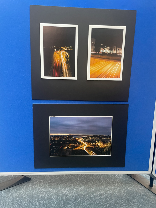
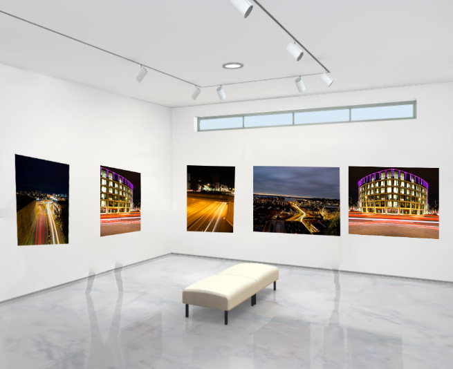
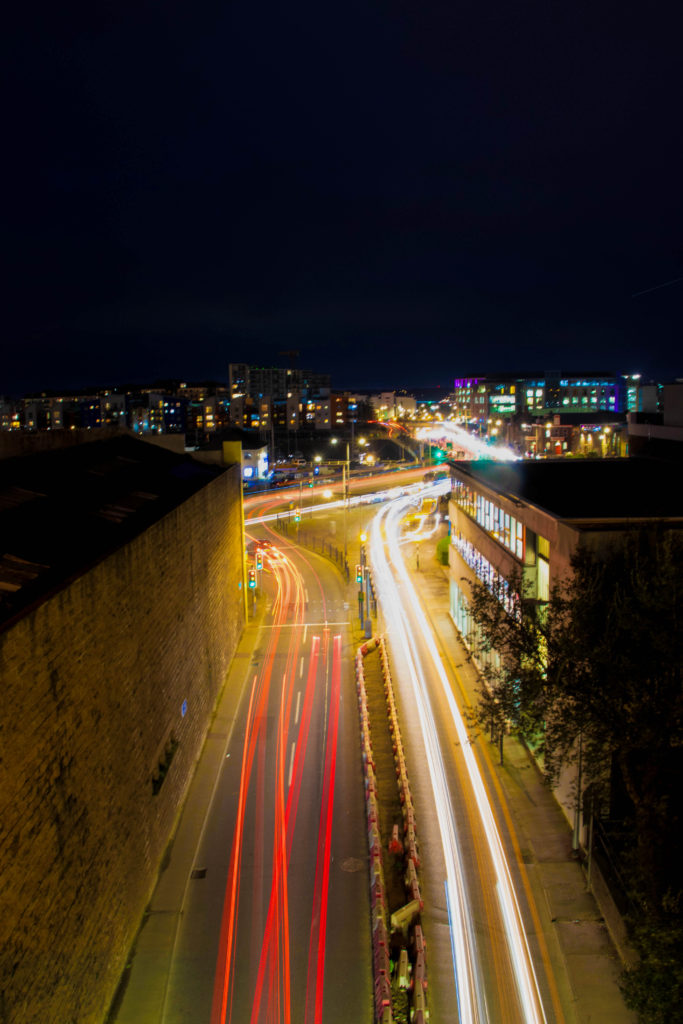
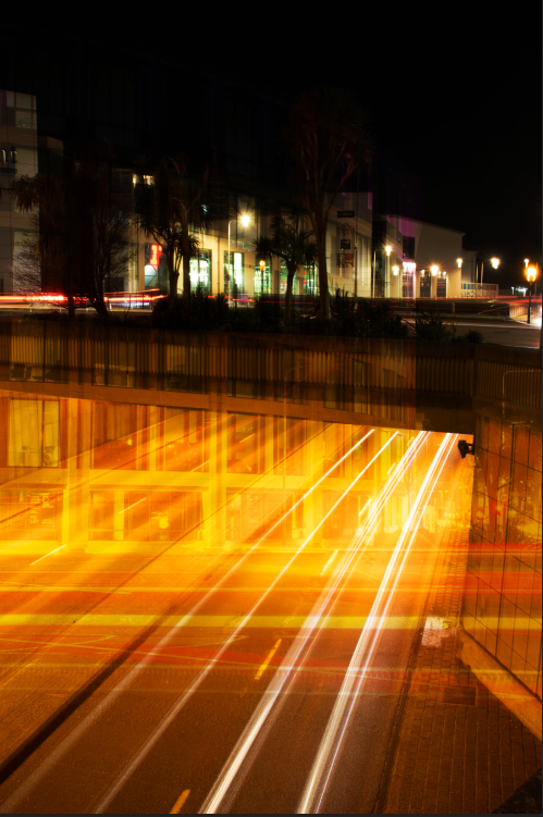
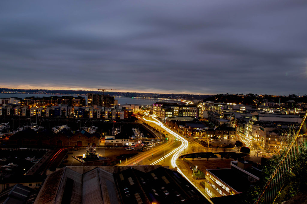
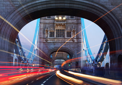
The image above shows two different directions of traffic at the peak of rush hour in the evening, leaving a light trail of cars exiting and entering the tunnel on Pier Road.

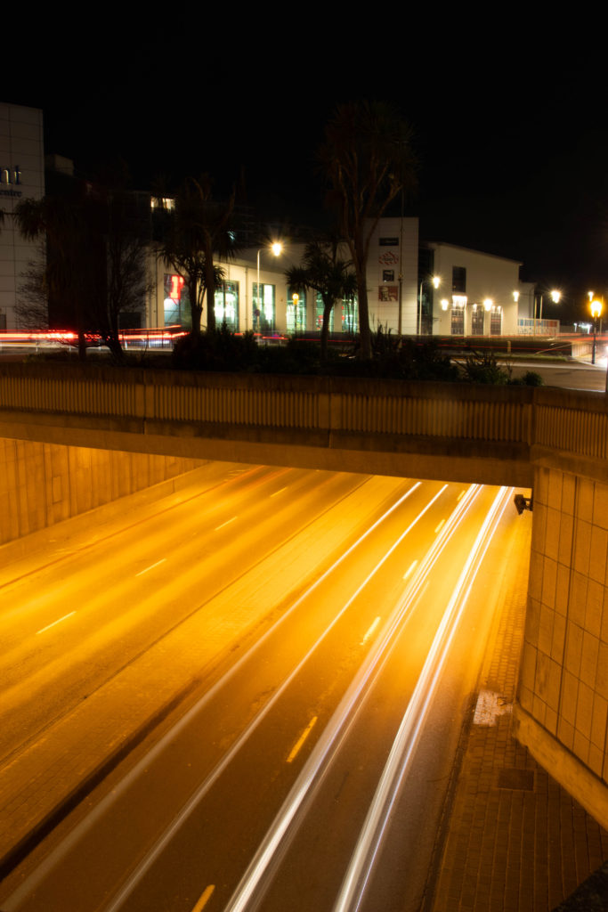
The photo is taken from a high angle, looking down at the cars using the same camera settings of an aperture around f/16, a long shutter speed and a low IOS setting.

I think the image above is quite dramatic as there are two contrasting colours against each other. One of the colours being the orange lights from part of the tunnel shining down onto the road below in the foreground of this image, which is contrasted against the deep black of the night sky in the background, linking it to the theme of Anthropocene as is is another industrialized area for humans own benefit.

I also believe this image is highly effective as the top third pf the image captures the sky which could be described as moody or angry due the the dark grey/ blue tones. which is the contrasted by the bright orange lights coming from the on coming cars.

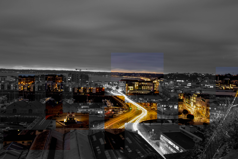
in this edit, i merged two images together. I believe this is an effective image as there are two different light trails going in two directions. Furthermore, the red light trail adds more warmth to the photo too.

anthropocene photoshop edits

the process of how i created these images are on a previous blog post

the process:

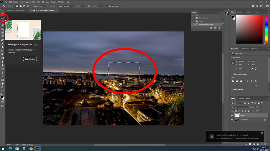
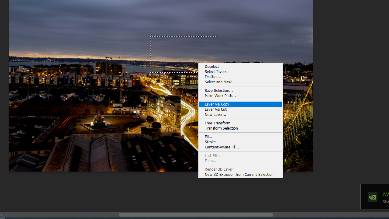
i used the rectangular marquee tool to select part of the image that i want
i then right clicked the section i have selected, and press ‘layer via copy’

i then drag the selected section onto the black and white image and align it up

anthropocene editing

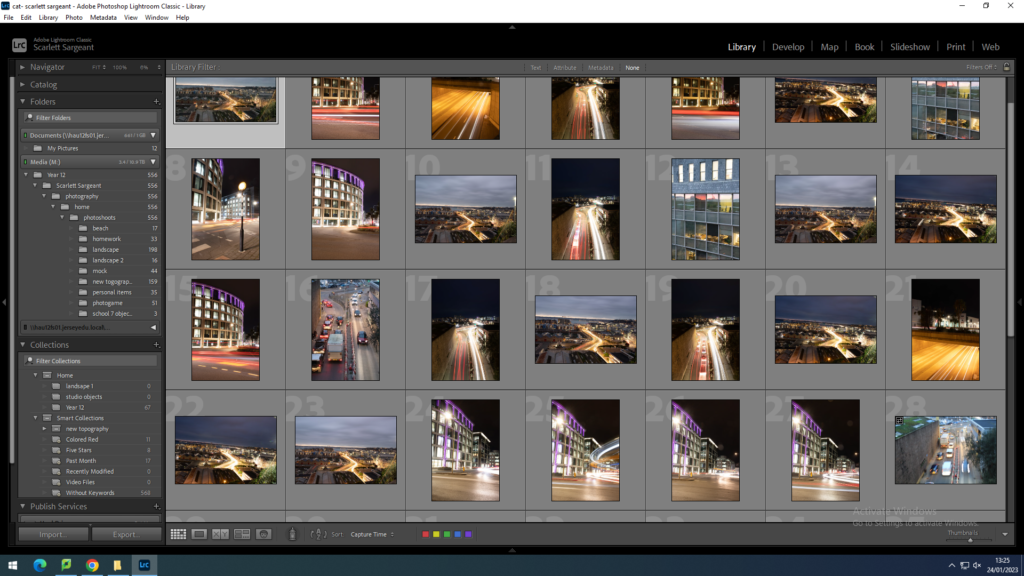
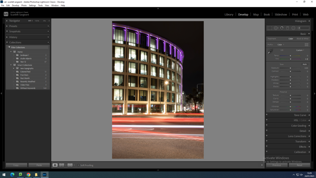
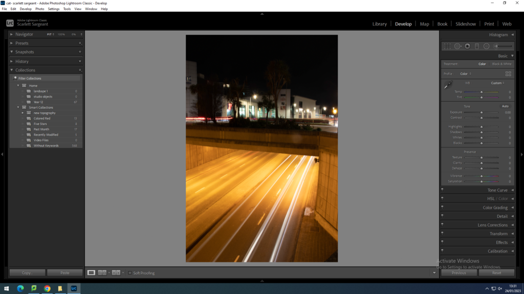
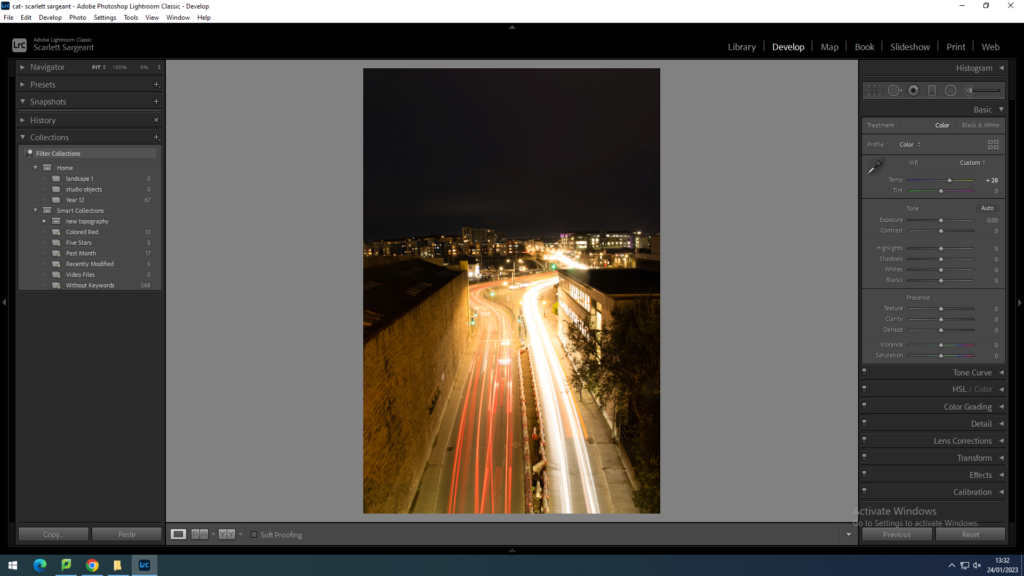
images before editing in light room:

photo shoot one:

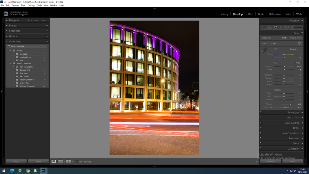
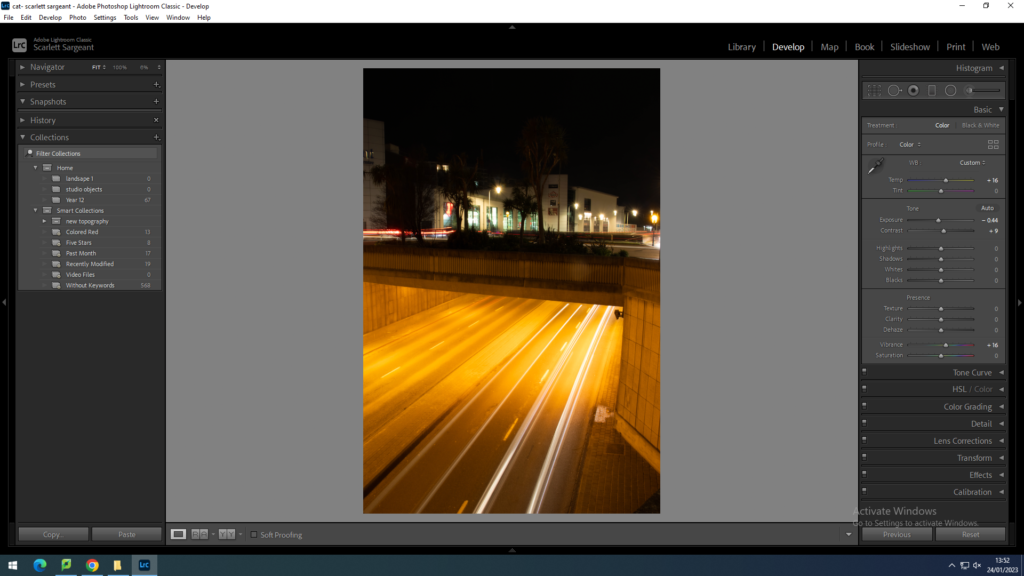
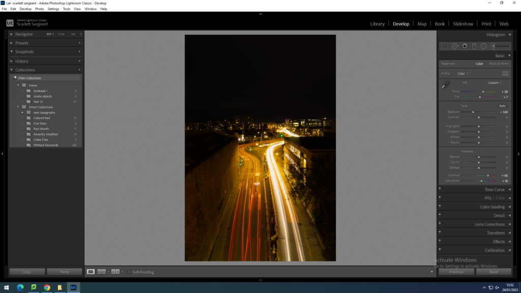
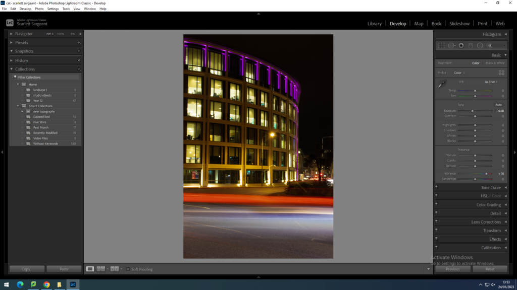
in all of the images below, i enhanced all of them by using light room.

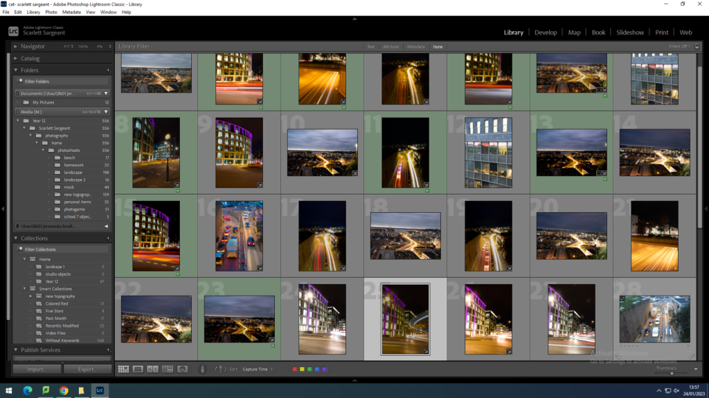
contact sheet

after editing:

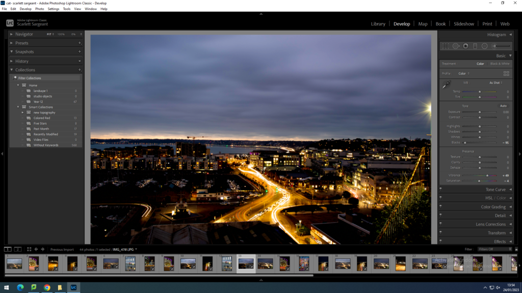
in this image, I didn’t change too much of anything. However, I turned the vibrance up quite a lot to enhance the colours of the image as it was quite dull before and I believe it has made the image more effective.
In the photo above, I turned the exposure down in order to make the sky darker. I chose to do this as it made the sky darker. Therefore making the open part of the tunnel the main focus point.
In this image, I turned the temperature up to make the white lights from the on coming cars more soft and less harsh. I also turned the vibrance up which made the red lights from the cars moving away from the camera more bright.
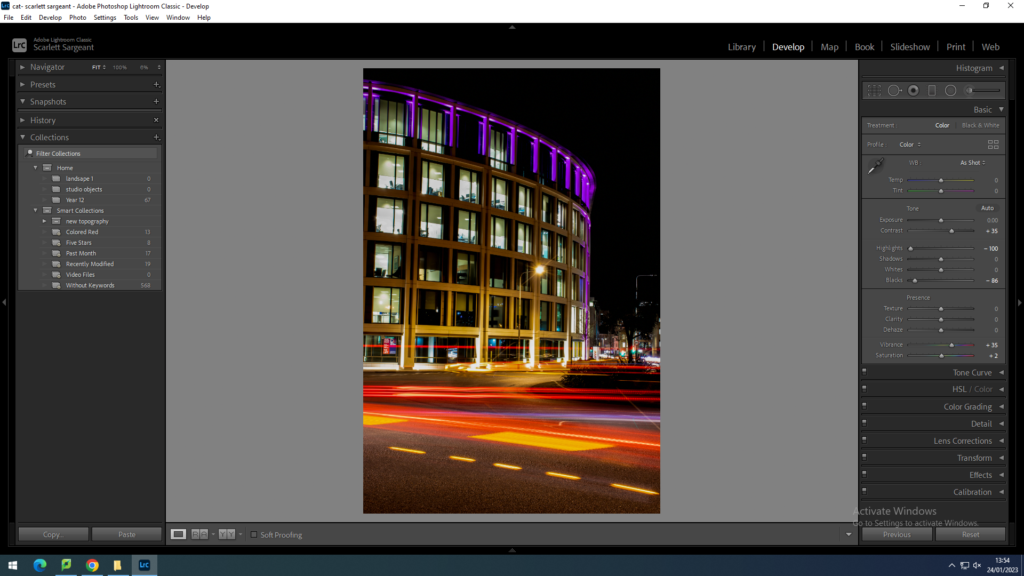
In this image, I turned the blacks all the way down as to eliminate any unnecesary light to make sure that they weren’t taking away from the main focal point of the image, that being the light trail.
In this image, I turned the blacks all the way down as to eliminate any unnecesary light to make sure that they weren’t taking away from the main focal point of the image, that being the light trail. I also turned the highlights down which hugely toned down the harsh, distracting white lights coming from the office building.

selecting images for photoshop:

I coloured ladled the images to make the images I have selected easily noticeable

photo shoot two:

my second photo shoot didn’t come out well and I am not happy with the results therefore, I am not posting them.

Anthropocene photoshoot plan:

WHERE? Fort Regent Hill, and the Roundabout by the Finance buildings on Pier Road.

WHAT? I decided to base this project on light/ car pollution.


WHEN? we decided to do this photo shoot during rush hour in the week in order to get images with the most amount of cars in. We also had to wait for the sun to set for around 5:30pm to gain the highest quality images for the lights.


HOW? To create a light trail, i kept my IOS as low as possible, changed my shutter speed to around 60 seconds long, and finally, i changed my aperture to around F/16.

anthropoce inspiration/ artist refrence

Since this first mind map and mood board, I have decided to change my ideas. I was originally going to photograph plastic pollution, however, decided to go against that idea and do a photoshoot on car light pollution. I thought this would fit the theme of Anthropocene well as it focuses on how the world has been altered through human impact. and due to the vast amount of people who drive cars enabling toxic fumes to be released into the air impacting on wild life i thought i would be able to capture this.

MSH*

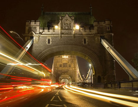
The work of a British photographer known only as MSH* manages to capture the frenetic energy of London, he uses a slow shutter speed to create photos from a low down view point to make you feel like you are apart of he image.

here are a few of his images that he has created using slow shutter speed/ long exposure.

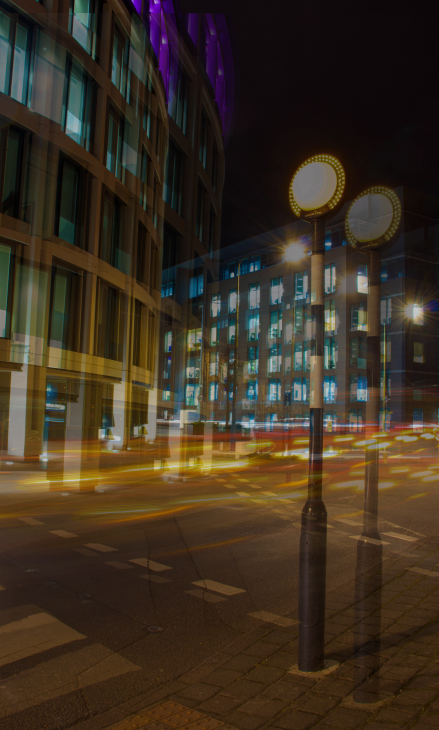
comparison of MSH*’s photos and mine:

on the left are the photos that i have taken, and on the right is an images that MSH* has taken

Jersey’s Finance Industry:

Jersey has been a leading international finance centre (IFC) for more than six decades. This might be because it is a tax free environment, therefore lots of people decide to move here to become part of the financial industry.

The jersey finance website claims they have over £131.4 billion in deposits. But due to the huge and growing tax-free financial industry, are they putting any of this money forward to help the environment?

Instead they are putting in money to expand the industry by building more offices in different locations, taking away from the environment and industrializing more areas.

Below is a time line posted on their website of their expansion:

2001: Jersey Finance was founded to promote Jersey as an international finance centre globally.

2009: Jersey Finance opened an office in Hong Kong and Jersey companies became able to list on the Hong Kong Stock Exchange.

2018 : Jersey Finance became the first international finance centre to set up an office in the Dubai International Finance Centre.

https://www.jerseyfinance.je/jersey-the-finance-centre/

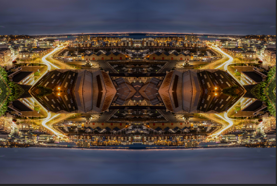
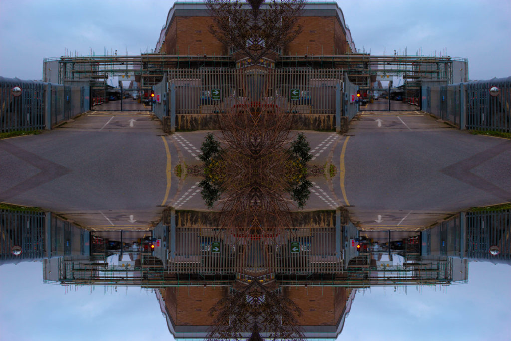
photoshop kaleidoscope experiment

I created these Kaleidoscopes by firstly increasing the canvas size in image.
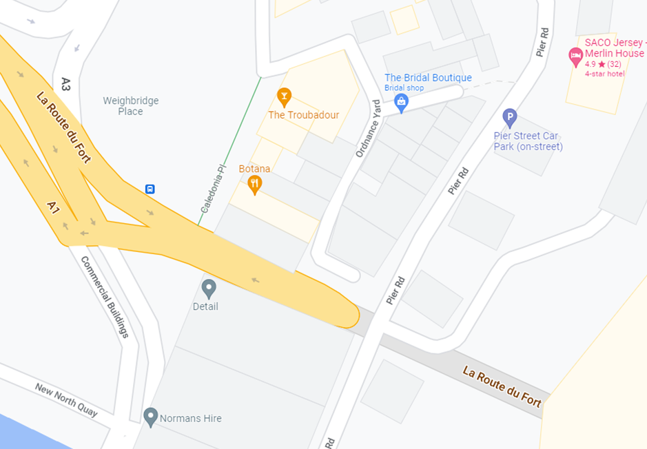
I then converted the measurements to centimetres, and doubled one of the lengths of the original numbers.
which left me with this.
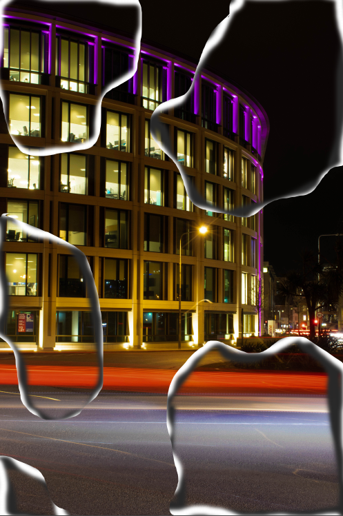
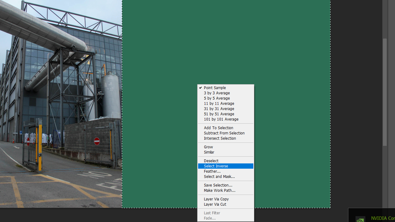
next, i selected the magic want tool and pressed on the green section and right clicked and pressed select inverse which will then select the image.
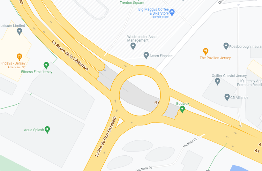
then select layer via copy.
i then flipped horizontally