All posts by Scarlett Sargeant

Filters

Author:
Category:

Review of ‘PLAYTIME’ by Will Lakeman

This exhibition was based on Will Lakeman’s memories and dreams of how he remembers Fort Regent from his childhood. In the 1990’s fort regent was nothing like how it was today, there was an aquarium, funfair, mini golf, concerts and many more.
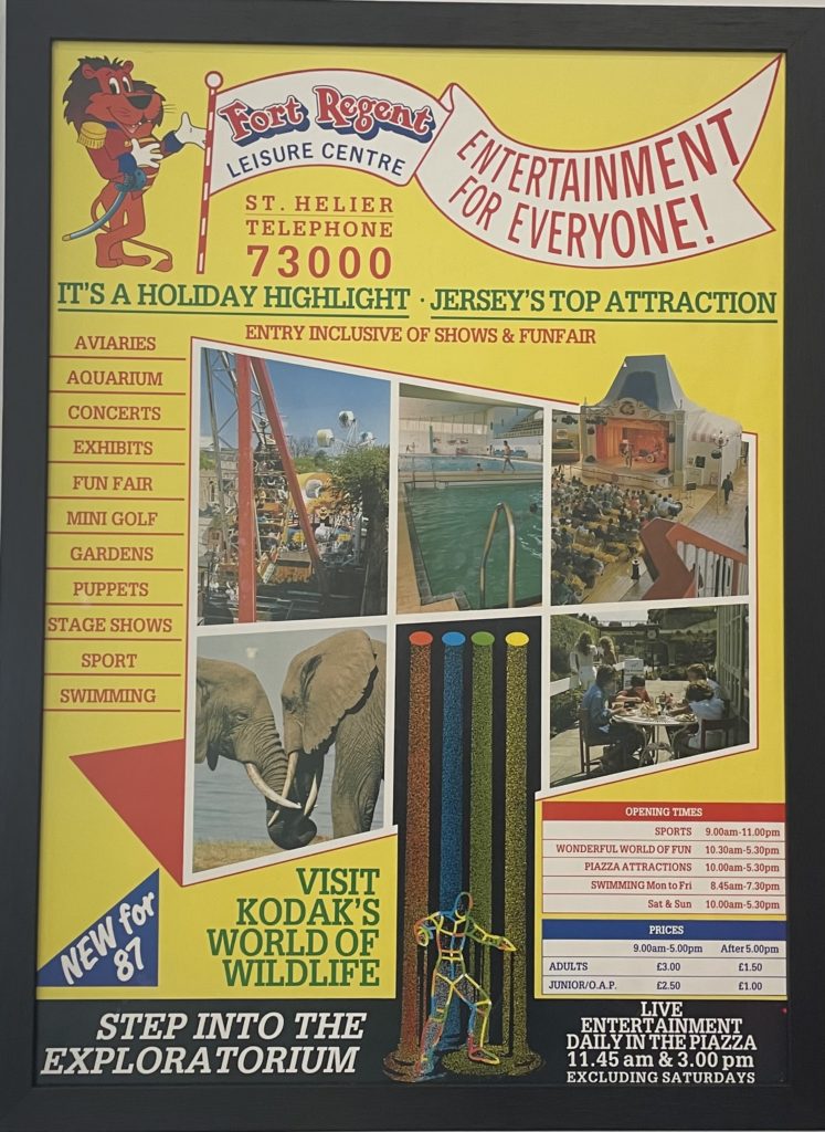
During the exhibition, Will was very open and honest about his Autism and how many people who are autistic become fixated with things like birds or trains, however, he has an intense attachment to Fort Regent and although he hates crowds and unexpected noises, he loves swimming pools, funfairs and leisure centres.

Lakeman further played on nostalgia by placing different scents throughout the gallery. With one end of the exhibition having a outdoor woodland diffuser to re create the smell of the outdoor gardens and the other with a chlorine like smell to recreate the smell of the swimming pool. I believe this is a creative way to add onto nostalgia as many scents hold memories.

Throughout the exhibition, the photos show not just what the fort was like, it captures how Will remembers it in his dreams and hallucinations. Due to his synaesthesia, which is when one sense triggers another sense for example, associating different sounds with colours, or someone may see/ picture colours more vibrant than they actually are.
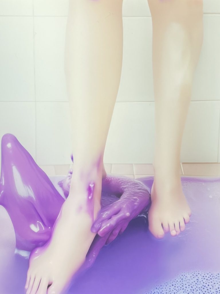
Veruca Dip 2022- Will Lakeman

The image above was created using AI (artificial intelligence), however is based on a memory of fort regents swimming pool, as you had to walk in a foot bath before entering the pool and he remembers it as a vivid purple colour however, it was far from that. Not every image that is put into AI comes out perfect which makes unique, for example, one of the feet above has seven toes.

By using Artificial Intelligence Will has managed to turn a regular photo of how many people may see it and ‘recreate it to the way my mind jumbles things together to create memories’.

Before going to this exhibition, I wasn’t too sure on how AI could be used in photography as it is automatically programmed. However, hearing how Will uses it to adapt and enhance his images made me think differently. When I first initially viewed the exhibition I didn’t particularly like how AI was used as i thought it took away from the reality and truth behind each image. However, after reading and hearing about Will’s reasoning behind using artificial intelligence and how it is personalised to himself and how he remembers Fort Regent made me shift my opinion.

Overall, I really enjoyed the exhibition as I have never seen anything like it and i enjoyed how every image had its own memory and story behind it. I also thought it was very interesting to learn about the history of fort regent as it is a place where almost everyone on the island has been to however, it is no where near as exciting as it was back in the 90’s.

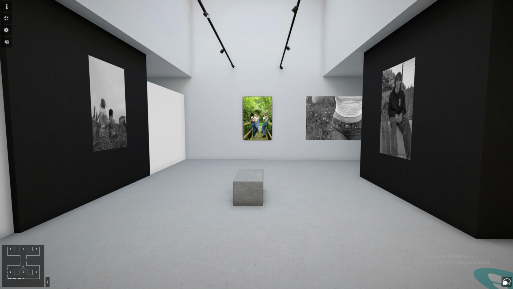
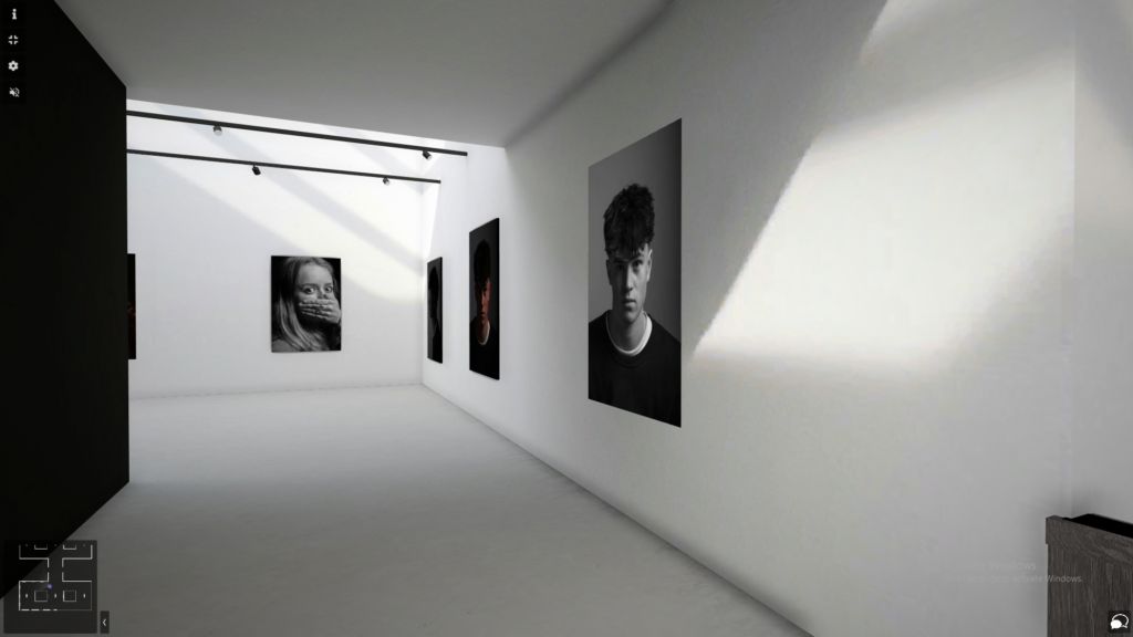
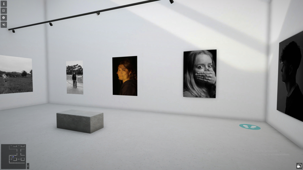
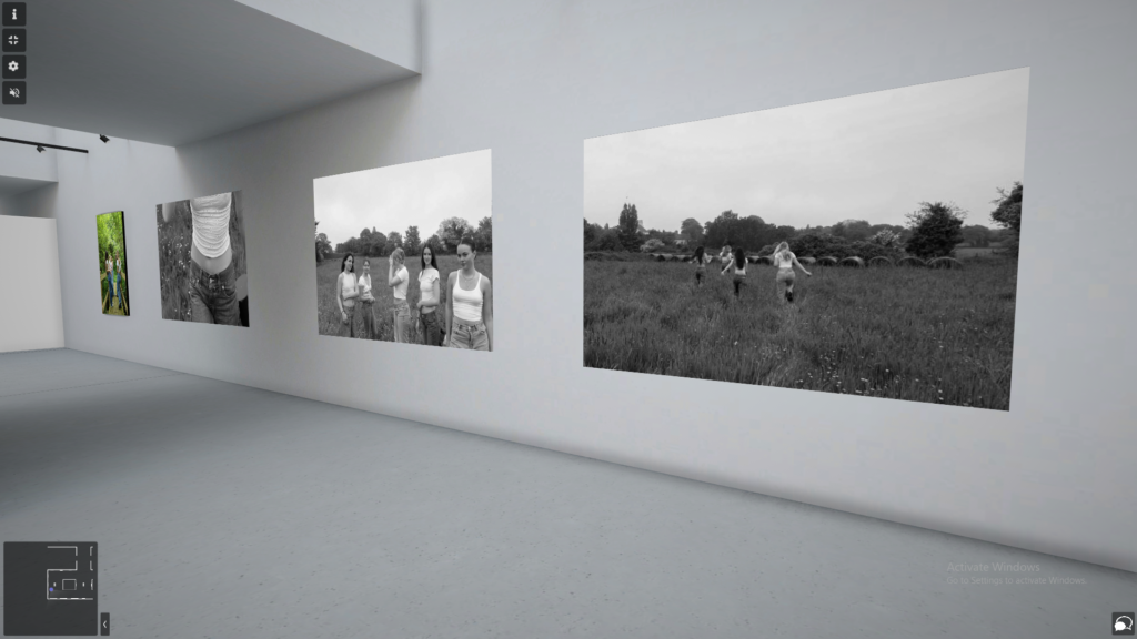
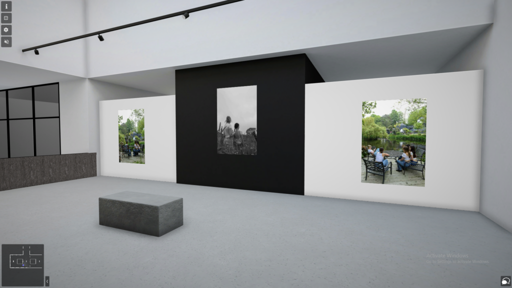
virtual gallery

Link:

https://www.artsteps.com/view/646f148534f82661d6a1d2fc/?currentUser

Virtual Gallery outcome:

I have created a virtual gallery with some of my favourite images, covering all three topics of; femininity, studio lighting and environmental portraits. I have made this gallery by using art steps, in which I designed and created the gallery and then added my own images in and chose where to place them. By creating my own gallery made it a lot easier than trying to edit each photo to make it fit onto the wall in photoshop like I have done in previous projects.
Evaluation:

Why did I chose femininity for this project?

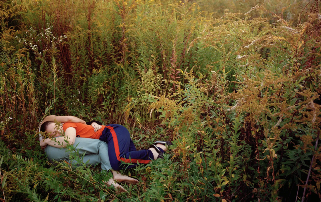
I chose to do this project based off of Justine Kurland’s ‘Girl Pictures’ as most of the photos within the book go against the stereotypes of femininity. And although in today society it is not uncommon to break stereotypes, back when these photos were taken (1997 – 2002) it was quite rare to see, and Kurland manages to capture this perfectly with the perfect balance of empowering women and also belittling men at the same time. However with my final photoshoot, I decided to feed into the typical stereotype of femininity.

How did I plan this shoot?

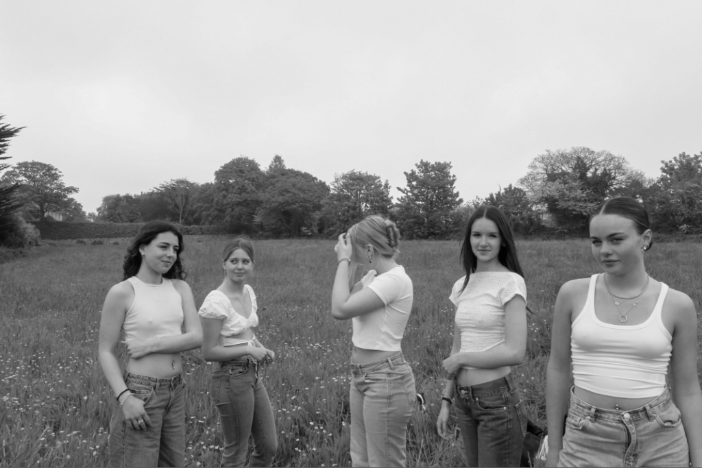
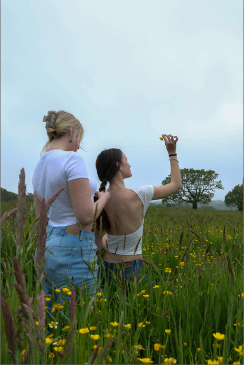
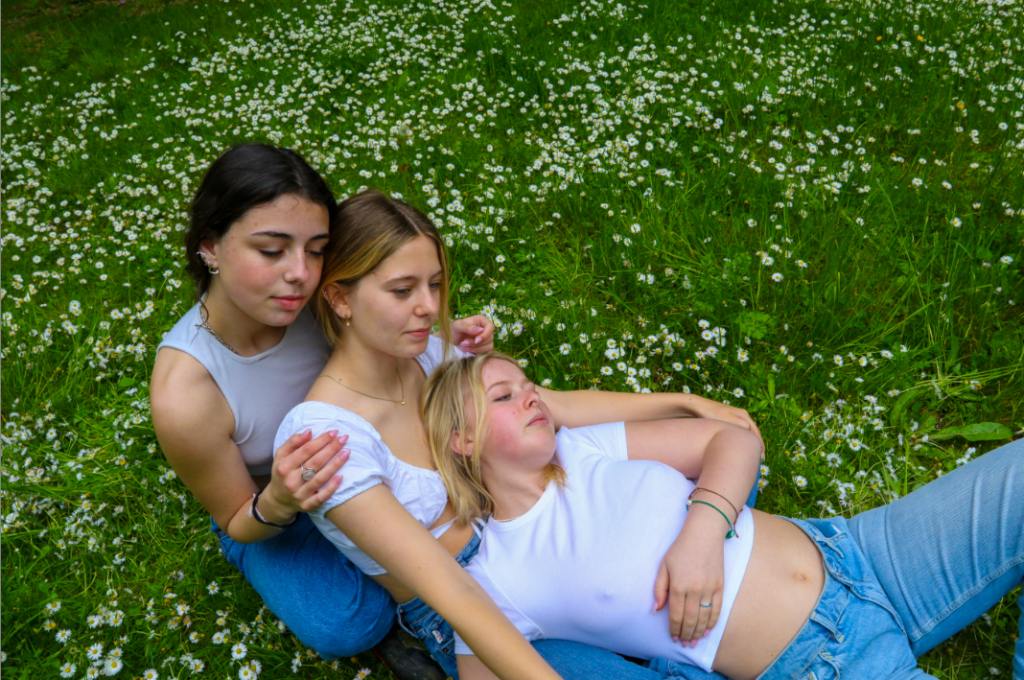
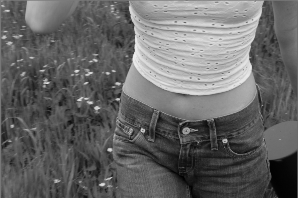
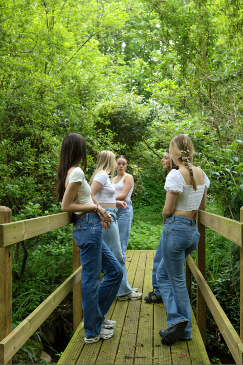
In order to get the best possible outcomes for this photoshoot, I planned to do this shoot on a day where the weather was good with a couple clouds, by having clouds in the sky i believe it adds more texture. When taking photos for this project I got the girls featured in the shoot to wear similar outfits (white top & blue jeans) as white symbols purity and i was wanting to feed into the ideology of teenage girls.

Photoshoot & Editing:

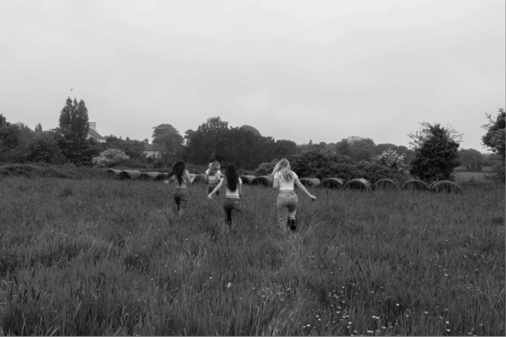
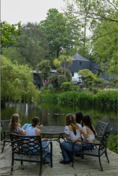
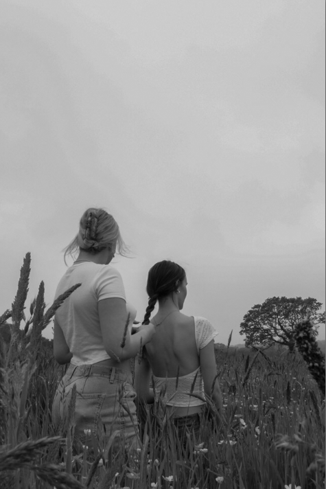
The photoshoot was taken in a field and a lake in St Saviours. I decided upon this field as it had long grass and no buildings in the background which could suggest it is in a secluded area like Kurland’s images. The lake was a perfect place to take some of these images as a number of Kurland’s photos were taken near water.

Evaluation of the whole project:

I believe I have done well in this project, and my skills and knowledge with cameras have improved a lot as I now how to navigate myself around the different camera settings. I am very happy with the outcomes of my images and think I have managed to keep roughly on theme for each shoot. However I do need to work on sticking to my artist references a bit more and need to improve my blog posts by adding more context and information to each one.

Doing studio lighting portraiture was interesting for me as there were many things to do and I enjoyed figuring out the different ways lighting can affect your face. I believe that this was quite a simple shoot to do as the studio within school is very accessible therefore i was able to go down most studios and try to improve my skills.

I really enjoyed doing environmental portraiture as it is very social and each image holds a photo. When doing this shoot, I walked into other peoples environments and every photo was able to show someone’s character, lifestyle and personality. However, not all of my outcomes for this project came out as well as I hoped and I believe this is due to me not experimenting with lighting outside of a studio.

Image mounting:

Display One:

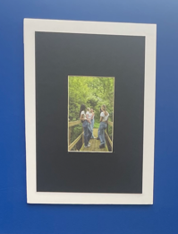
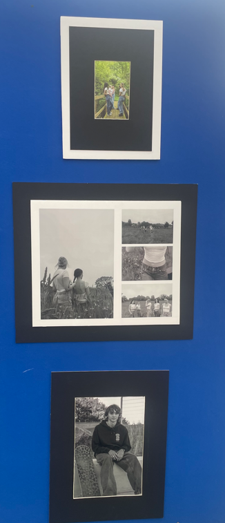
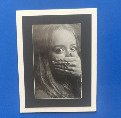
for this image i framed it by creating a window mount, and then stuck the window mount on a piece of white foam board.

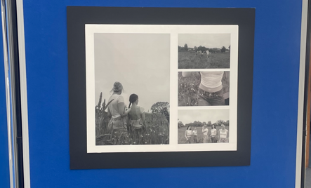
With this collection of images, I aligned one A3 portrait image along side three A5 landscape images onto a piece of foam board with black card behind it.

window mount.

Display Two:

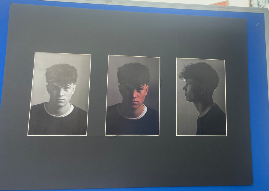
For the image above, I created a triple window mount as all three images are similar however by placing them together it highlights its differences too.

Display Three

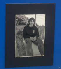
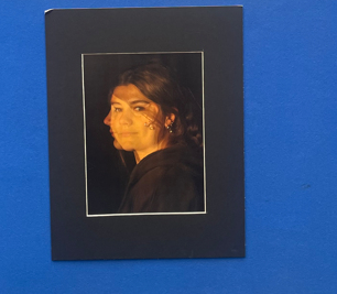
window mount on white foam board
window mount

Display Four:

image stuck onto white foam board.

Image comparison and Analysis:

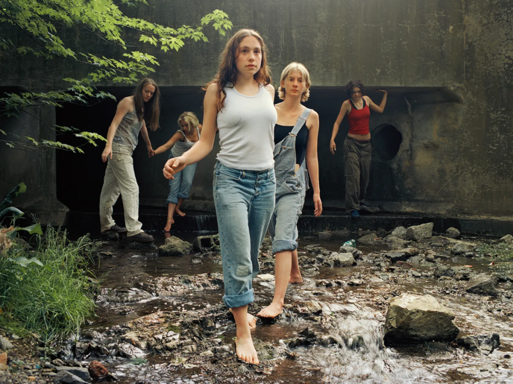
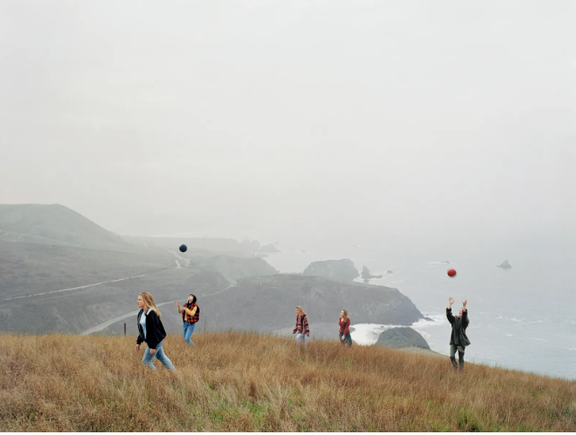
Justine Kurland’s ‘the wall 2000’ was my reference image for this comparison as it has some similarities but also many differences. one of the similarities being how two subjects are looking into the camera and the other three subjects, further away from the camera aren’t looking towards it. However, a difference is the locations of the two images, although both images are clearly taken outdoors my interpretation has an open field behind it. Whereas in the reference photo, the wall creates a feeling that the girls are trapped and their expression and clothing suggest that they are lost.

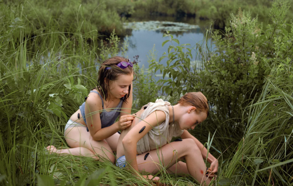
I believe these two images are quite similar as they both involve two girls and one is doing something to another’s exposed back. However, my interpretation is taken from a lower angle without water in the background.

Main image analysis:

emotional response:

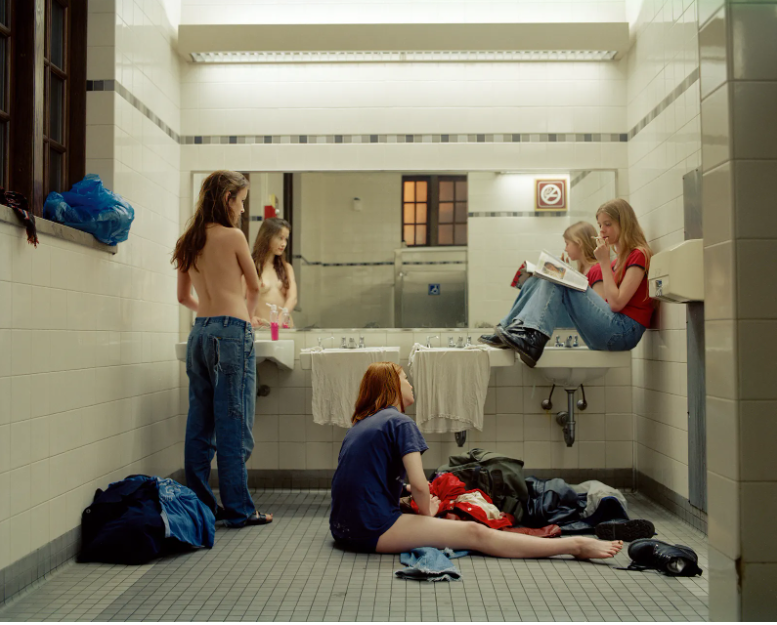
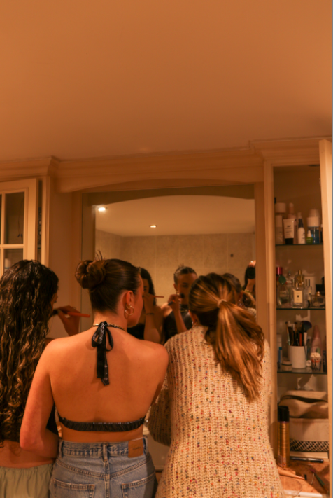
I believe that both images above show and highlight femininity in a beautiful way. In both images there are three girls in a bathroom which seem to be getting ready for something. Which has stereotypical links to femininity as it is known for a group of girls to go to the bathroom together.

Visual & Contextual:

In Justine Kurland’s image, Femininity is shown throughout by a topless girl standing in front of the mirror. This is a defining aspect of the image as it is something that all girls have however, many people could see this as a young girl being vulnerable in front of a camera. Whereas Justine Kurland views this as empowering, as the subject has confidence within her own body to show it off. Another aspect within this image is the bright pink hand soap on the top of the sink counter top which is accompanied by a girl sat near it with a glossy pink magazine which she is reading. Femininity is shown further through the girl sat on the bathroom floor next to a bag which is spewing out with clothes, who looks like she is having trouble picking out her outfit. the image seems to have been taken at dusk due to the orange light shining through the window of the bathroom. However, the bathroom is light up very bright from the lights in the ceiling and above the mirror.

When comparing my interpretation of ‘Bathroom 1997’ to Kurland’s it shows a more stereotypical idea of femininity which is less rebellious, the main focal point of the image is three girls doing their make-up. There is no natural light visible in the image, making the only light source available being the lights in the ceiling which aren’t very bright, creating a orange tint across the whole image. Towards the right of the image, you can see all of the products aligned in the shelfing which further adds into the stereotype of females.

‘Girl Pictures’ photoshoot

Contact Sheet:

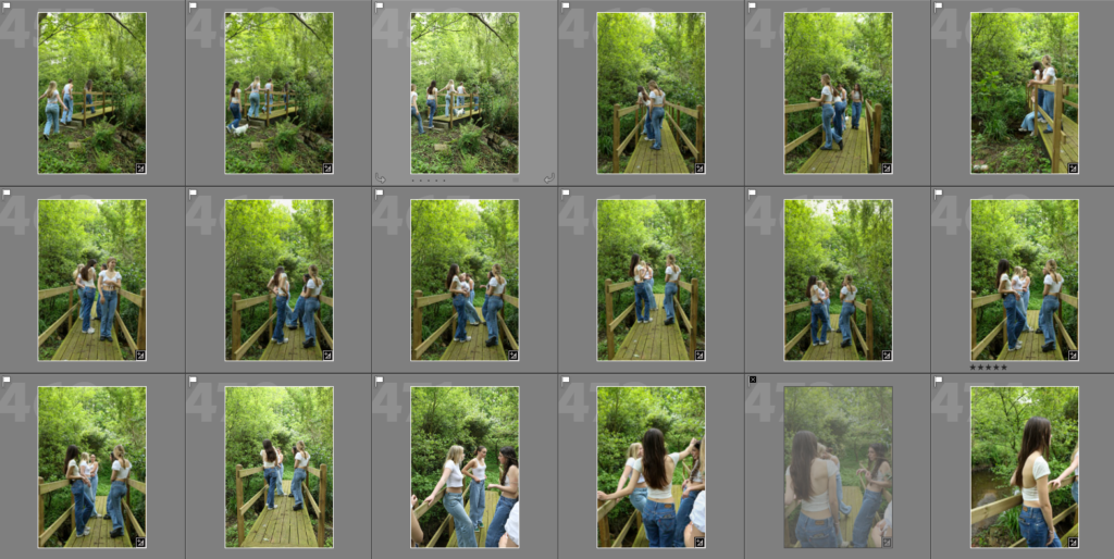
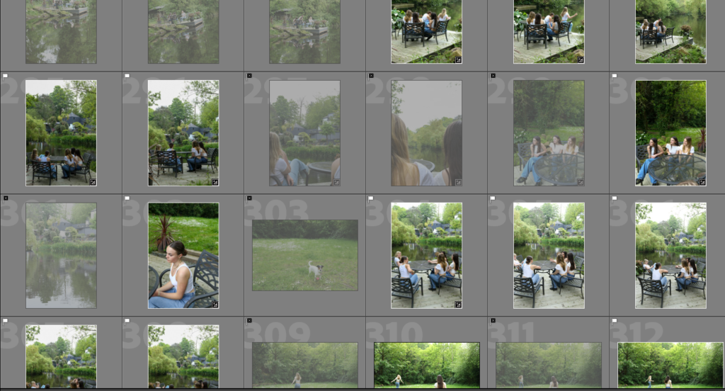
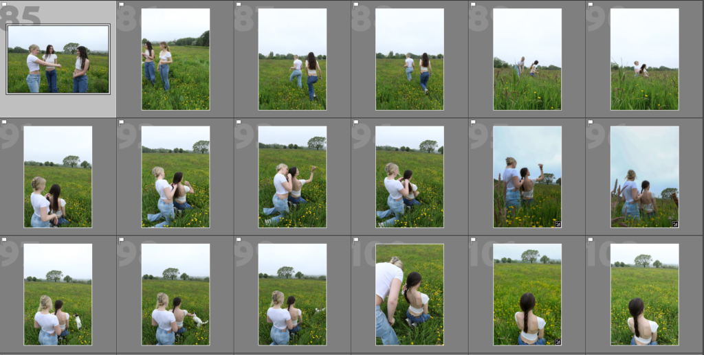
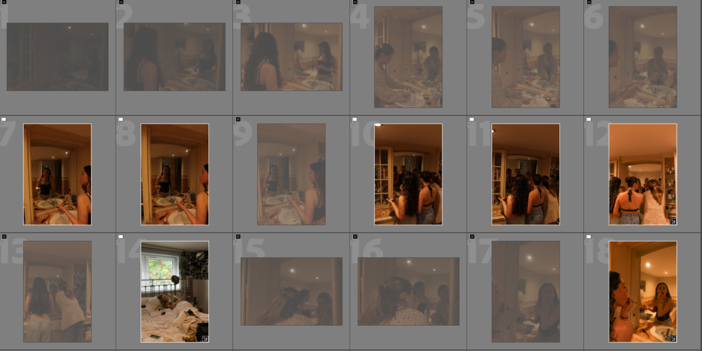
For this photoshoot I took over 450 photos and selected all of the images that I wanted to use for editing by using the flagging tool in light room.

Edits Vs Originals:

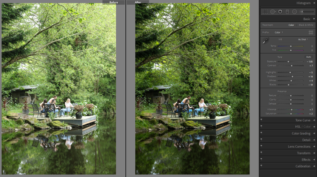
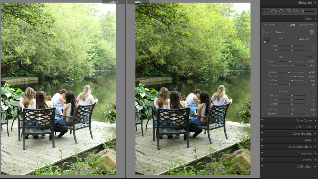
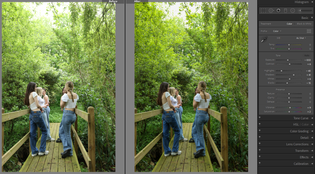
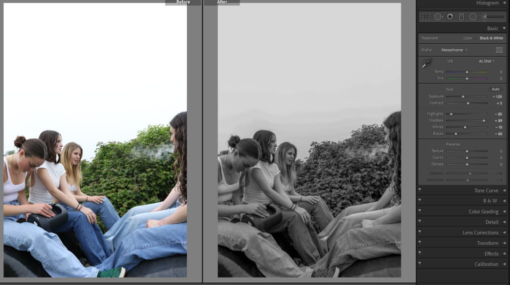
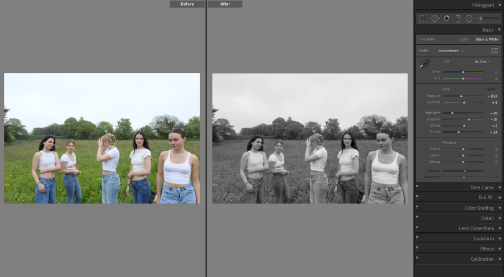
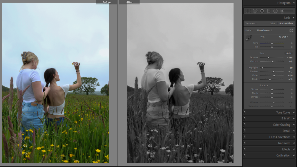
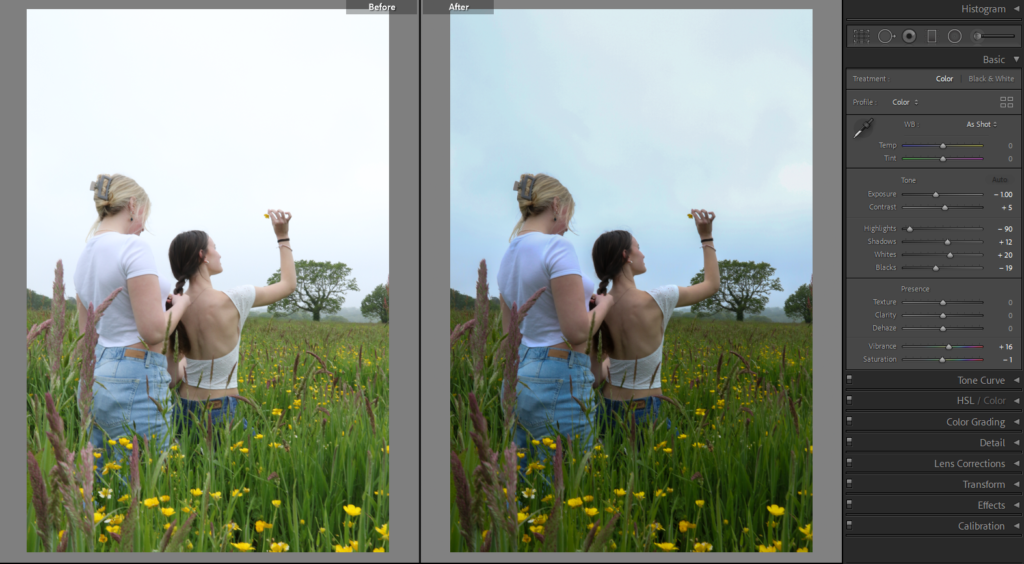
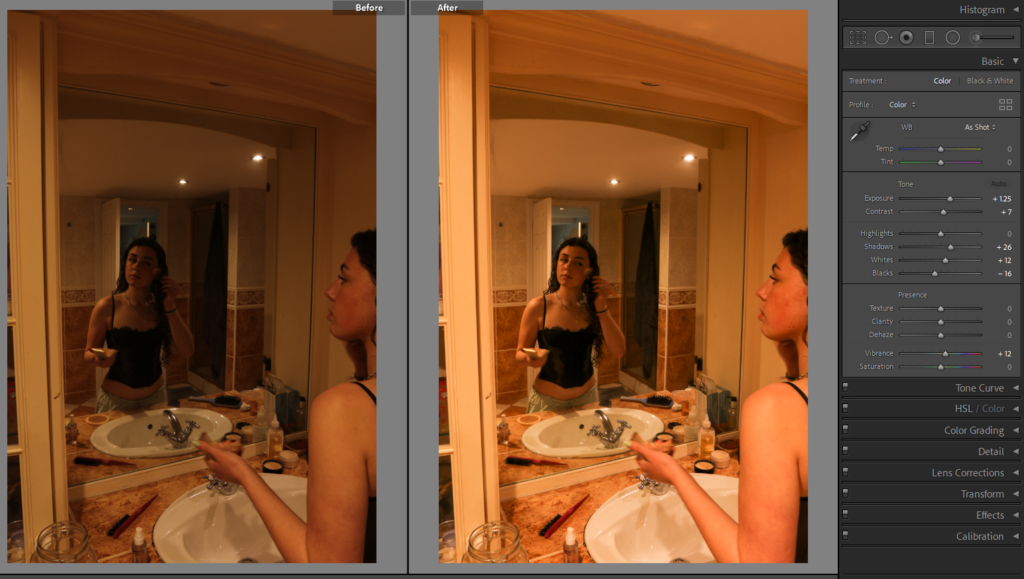
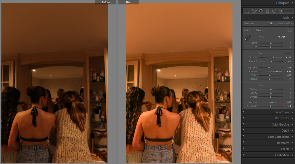
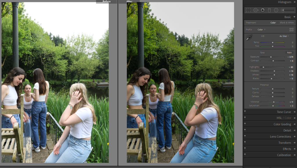
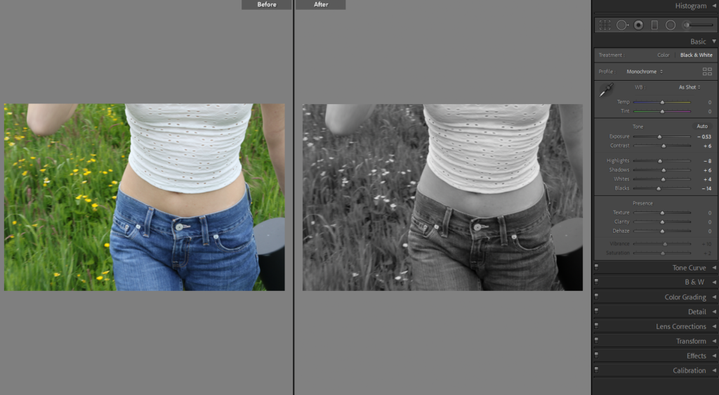
I have edited both of the images above very similar, however in one image the saturation is a lot lower in order for the image to be in black and white. I also turned the highlights all the day down to -90 in both images which again takes away from the harshness to the sky and adds more detail into it. In the black and white image, I lowered the ‘blacks’ as it creates more shadow into the image.

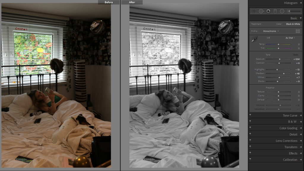
I edited the image above by increasing the exposure up +1.32, by doing this it brightens up the whole image making it more clear and less gloomy. I also increased the shadows up to +65, this helped to highlight the centre of the image doe to the cupboards around the mirror and where the lights are placed.

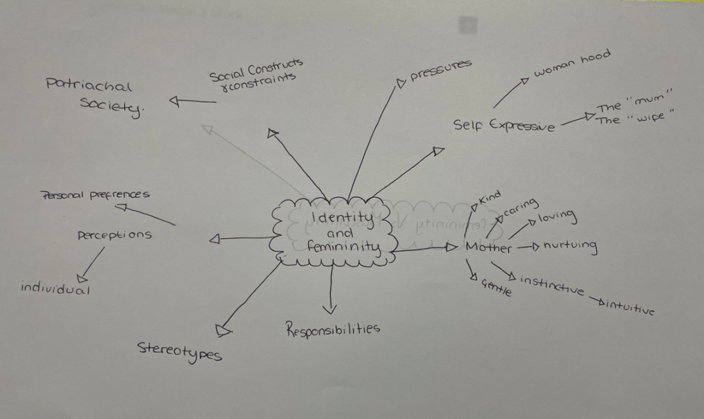
mind map and mood board JUSTINE KURLAND ARTIST REFERENCE

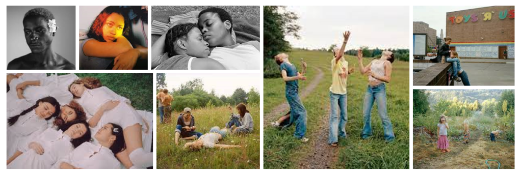
Justine Kurland- Girl Pictures

My main inspiration for this photoshoot is Justine Kurland’s ‘Girl Pictures’ book. i believe that this book defines feminism very well due to every photo being very unique and capturing different types of people.

Justine Kurland’s main inspiration for this book was from a young girl in which Justine used to date her father. The girl was sent to live with her father after her mother kicked her out for skipping school and doing drugs. Justine then formed the idea of a photoshoot based on ‘alyssum as a teenage runaway’. where she scouted for models outside various high schools. She also gained inspiration from a TV show about the tales of teenage delinquency.

Justine Kurland’s Girl pictures bring a sense or nostalgia. Every girl in each photo have their own story however come together to live a similar lifestyle. They live without a care in the world, and are truly living their teenage years. Therefore many of the images in Girl Pictures were taken outside in locations that feel desolate or easy to overlook. They are often staged under bridges or beyond fences or on the sides of highways; places that feel synonymous with warnings. The privacy of the overpass is also potent with all the stories we’ve heard of women getting hurt in such places.

Image Analysis:

Bathroom, 1997.

In Justine Kurland’s image, Femininity is shown throughout by a topless girl standing in front of the mirror. This is a defining aspect of the image as it is something that all girls have however, many people could see this as a young girl being vulnerable in front of a camera. Whereas Justine Kurland views this as empowering, as the subject has confidence within her own body to show it off. Another aspect within this image is the bright pink hand soap on the top of the sink counter top which is accompanied by a girl sat near it with a glossy pink magazine which she is reading. Femininity is shown further through the girl sat on the bathroom floor next to a bag which is spewing out with clothes, who looks like she is having trouble picking out her outfit. the image seems to have been taken at dusk due to the orange light shining through the window of the bathroom. However, the bathroom is light up very bright from the lights in the ceiling and above the mirror.

Where?

Fields (st saviour, st martins)

Woods (st catherines)

Streets/ housing estate (st helier)

Bathrooms

Bedroom

Sand dunes

Beach (st ouens)

When?

Afternoon/ mid-day so the lighting is good.

Who?

I will be getting a friendship group of girls to model for this shoot as it would refer to Justine Kurland’s girl pictures.

Image analysis:

Justine Kurland ‘like teen spirit’

This is a interesting image in my opinion as it is set in a rural area with five young girls in school uniform, which makes the viewer curious as to how they got there, and what they are doing there by themselves. The photo has been taken with natural lighting, at a level height with the main focal point being the two girls on someone else’s back, they look tired and warn out which feeds into Justine’s main inspiration of teenage delinquency and the idea of ‘runaway girls’.

Clare Rae

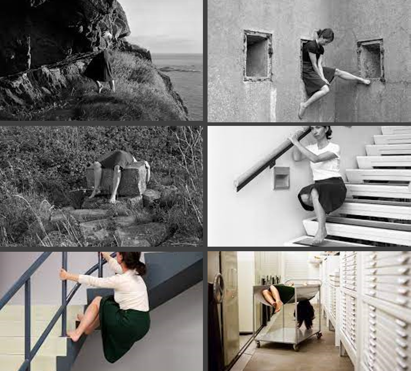
Clare Rae is an Australian photographer who is inspired by feminist theory’s and aims to show and represent woman’s body’s and in some cases her own. She also aims to ‘subvert the dominant ways we depict women’s subjectivity.’ by show casing women in photoshoots by them in certain positions.

I am intrigued by this photoshoot as it is abstract and I haven’t really seen anything like this with the different positions and poses the subjects in the photos are doing. she uses the female body to create messages about who women present themselves.

Clare Rae is also inspired by the architecture behind and in every photograph. The series was captured in and around the RMIT University (life drawing studio, court room, design archive). She also had personal connections to the university as this is where her late father studied architecture.

Emotional response:

Every image that Clare Rae takes is abstract and unusual however very creative and shows how women can be delecate and fragile.

Visual:

Clare Rae’s images show women being careless while being in dangerous positions, which connotes the rebelliousness of them however, at the same time many of the women are seen holding onto something which shows they aren’t as carless as they are making out.

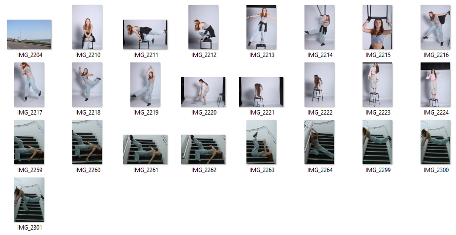
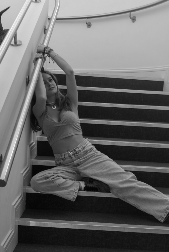
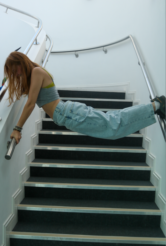
My Own Interpretation Of Clare Rae:

FEMININITY Vs MASCULINITY

Masculinity describes the degree to which society focus on assertiveness and achievement. When in contrary, femininity describes the focus of society to quality-of-life issues, such as caring for others, group solidarity and helping the less fortunate are valued. In other words, society still recognizes a gap between male and female values. This dimension is frequently viewed as taboo in highly masculine societies.

DEFINITION:

Femininity– The qualities or attributes regarded as characteristic of women or girls, Or the quality or nature of the female sex the quality, state, or degree of being feminine or womanly.

Masculinity– The social expectations of being a man. The term ‘masculinity’ refers to the roles, behaviours and attributes that are considered appropriate for boys and men in a given society. Masculinity is constructed and defined socially, historically and politically, rather than being biologically driven.

 HOW IDENTITY CAN BE INFLUENCED:

Identity formation and evolution are impacted by a variety of internal and external factors like society, family, loved ones, ethnicity, race, culture, location, opportunities, media, interests, appearance, self-expression and life experiences.

An example of how identity can be influenced is Andy Warhol’s image of Marilyn Monroe. The image shows how the media and public viewed her and her actual personal life was. The central image on a gold background evokes a religious tradition of painted icons.