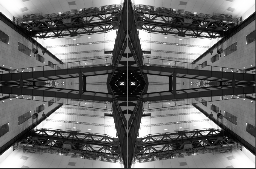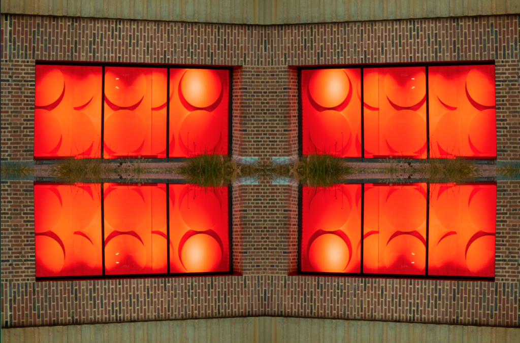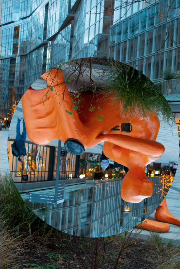




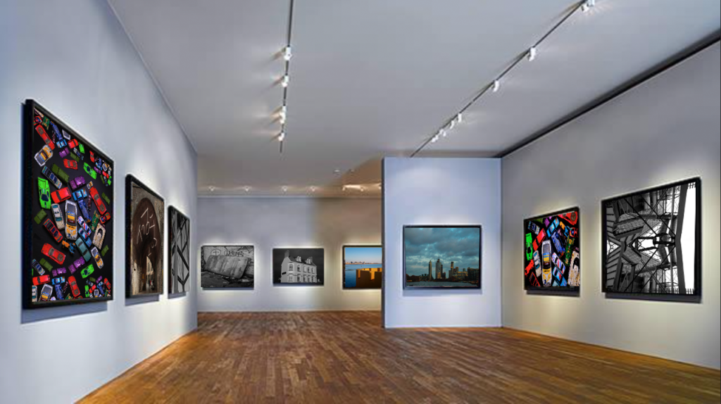
I have created this Gallery in photoshop, i selected 9 of my best images and put them into photoshop i then used the skew selection tool to place them so they look like they and part of the photo.
In this project i believe i have done well in it, i have enjoyed taking and creating photos and developing my photography skills, there are still areas i need to improve on but i believe that will come over time and practice.
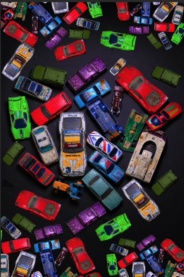
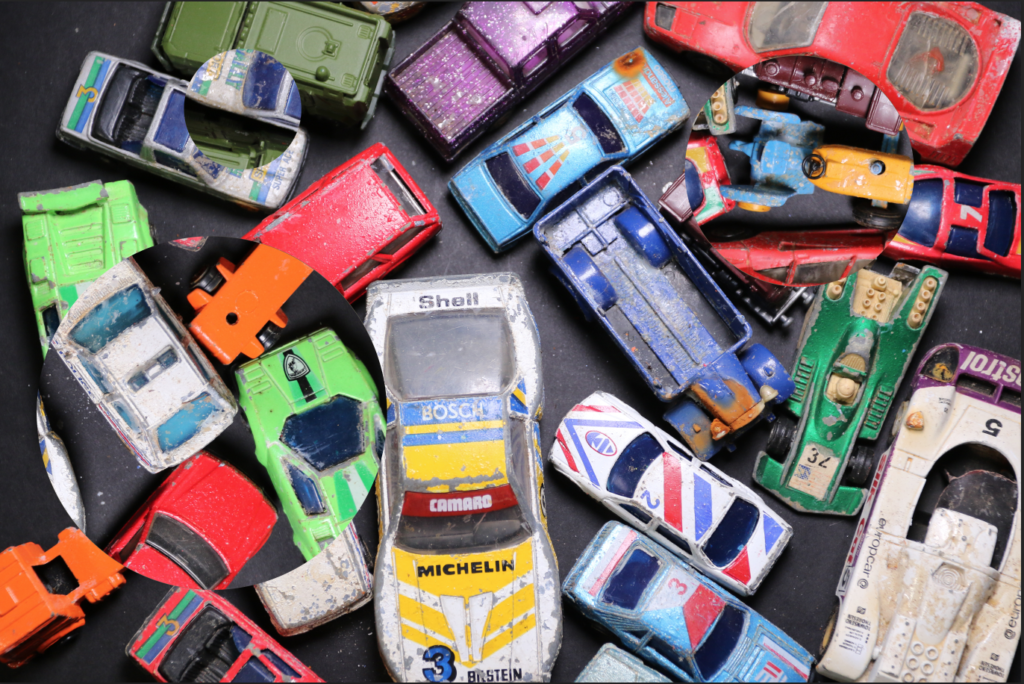
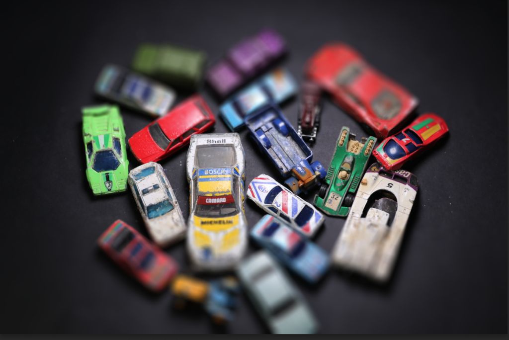
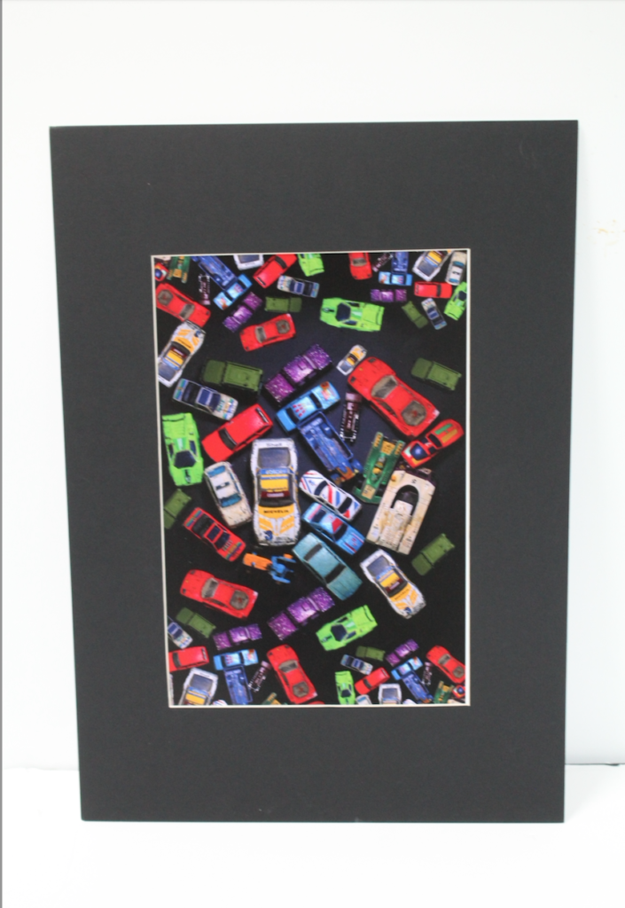
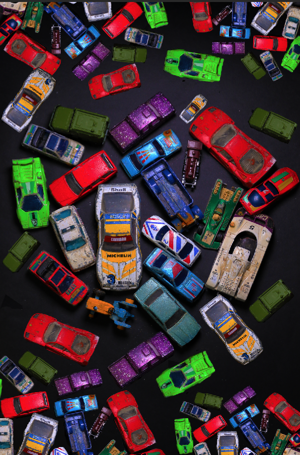
My favourite piece which i enjoyed making from this project is the cars inspired by Mandy Barker I liked developing my skills on photoshop and cutting out the cars to edit them to create the idea that there were more than the original photo.
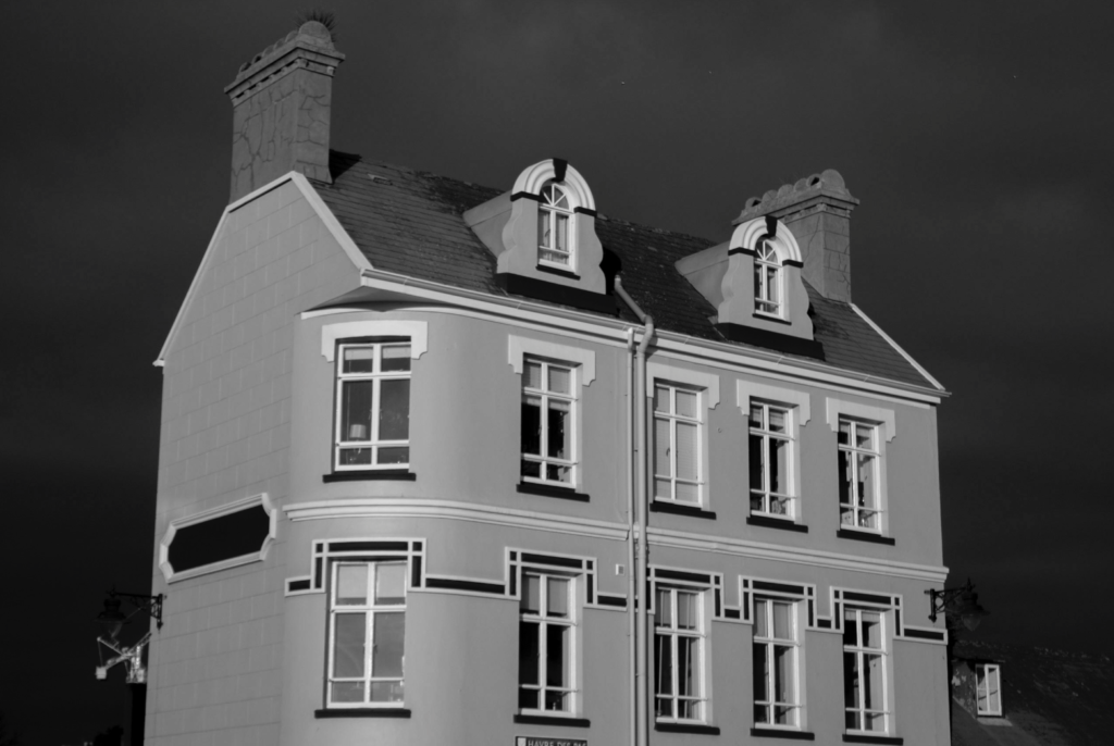
The photo which i find the most eye catching is the photo of the house i find it eye catching due to the darkness of the sky against the light shade of the house i make the photo in black and white to accentuate the look even more. Due to the photo being taken on a cloudy day the camera didn’t pick up on the glare on the windows from the sun as much.
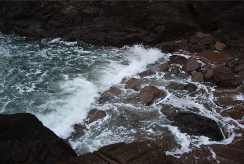
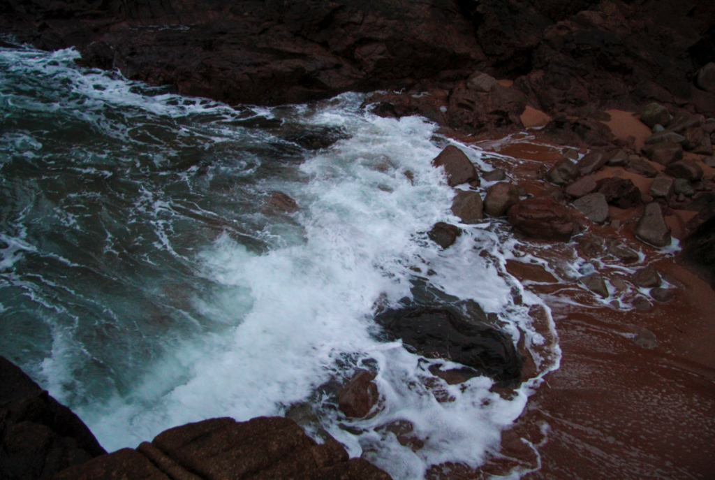
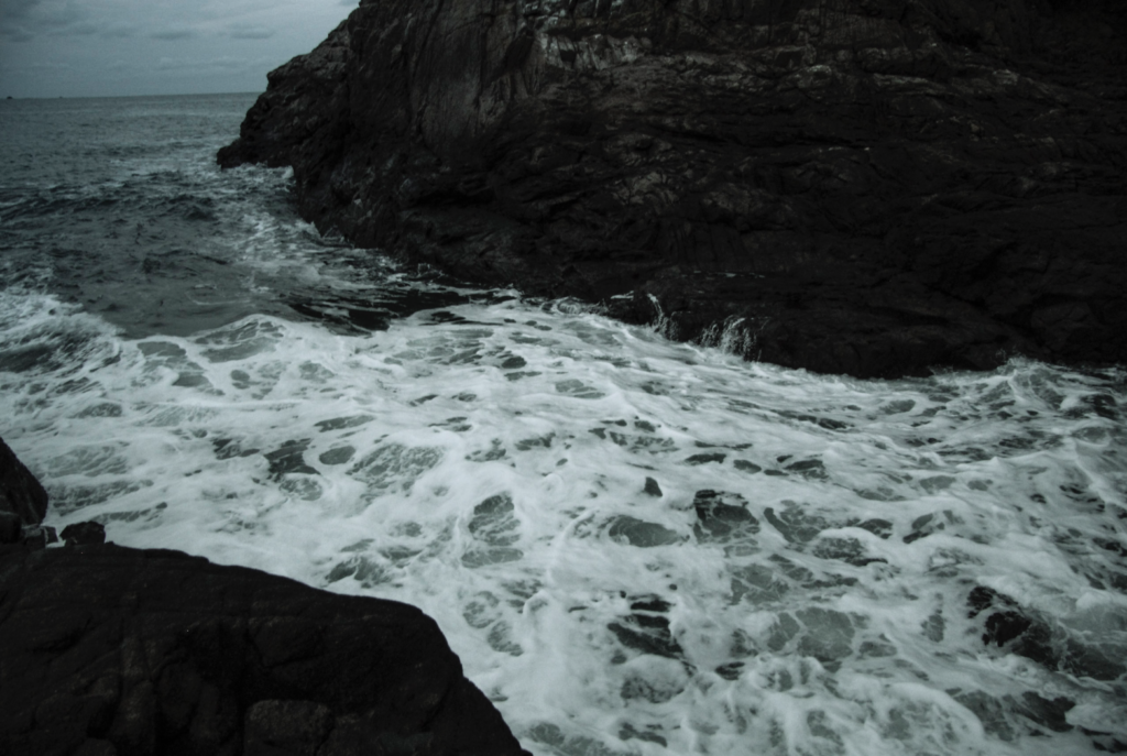
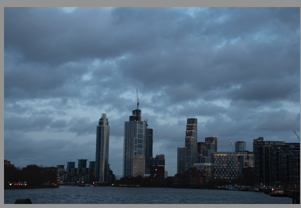
The part of the project which i struggled with was taking photos of the sea i struggled with getting the settings right on the camera and as i did not have a tripod with me i found it hard trying to get the camera into focus without it looking blurry, the lighting in the photos wasn’t good either i went out too late, due to me going out in the evening the sky was staring to get dark and there wasn’t much sun light making the photos have a blue tint.
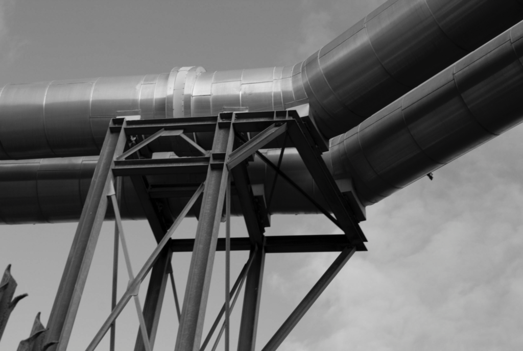
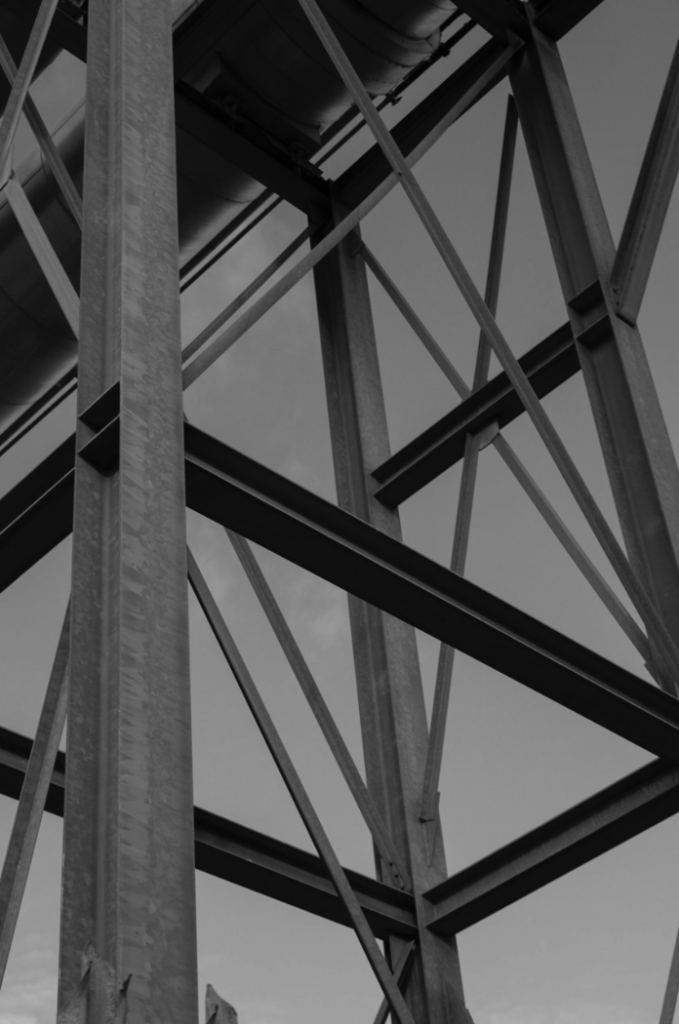
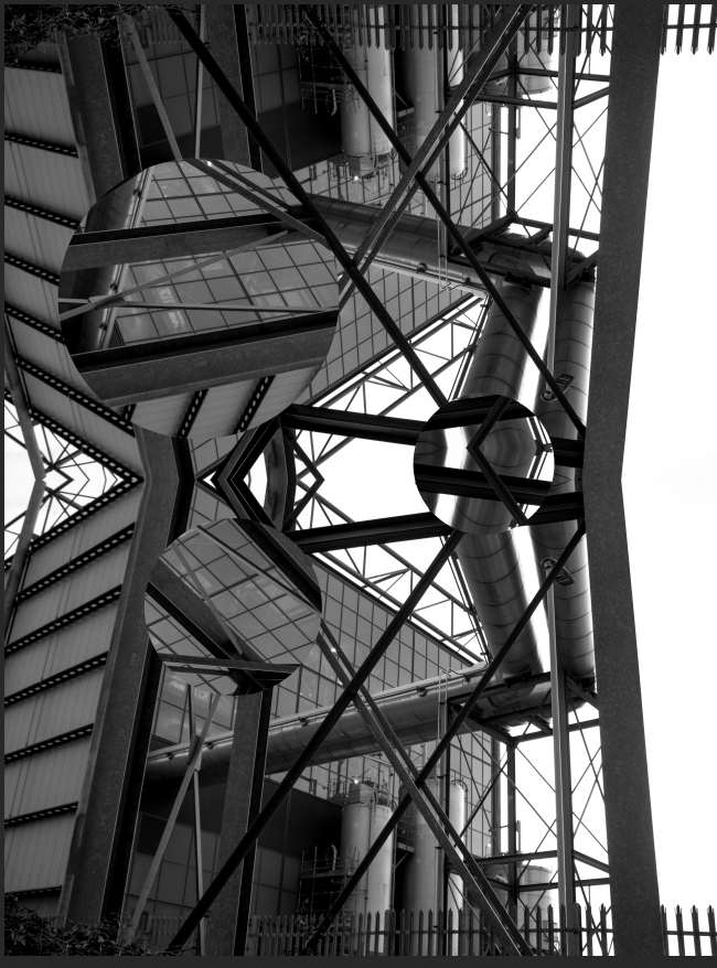
The image below is also one of my favourite photographs i took, i have the simplicity of it and the different shades shown within the image. I took this photo in the afternoon on a light cloudy day, which helped the camera to pick up on the light and make the image clear without making the photo over exposed. I believe that this represents urban landscape well due to the industrial metal framing with the contrast of the clouds which gives it the aspect of a landscape.
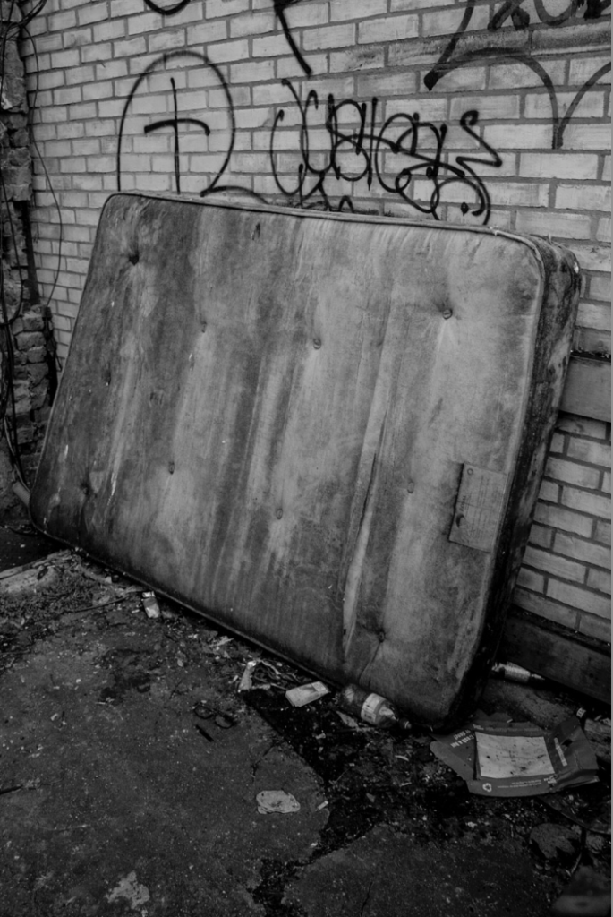
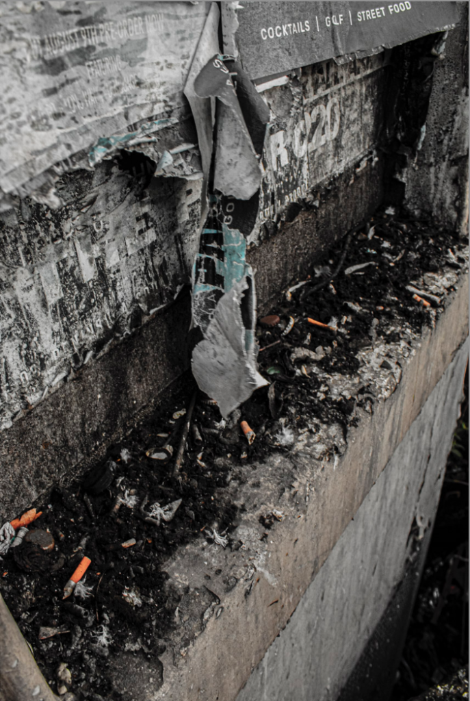
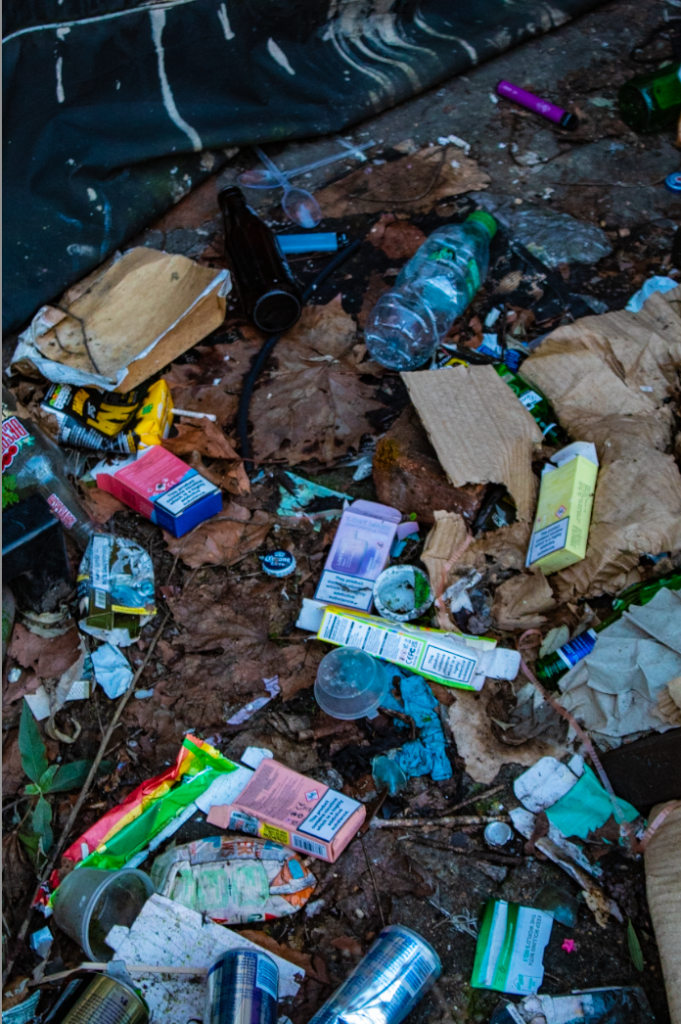
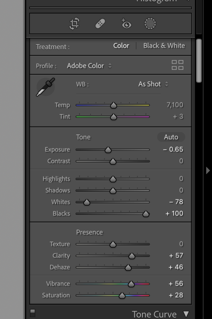
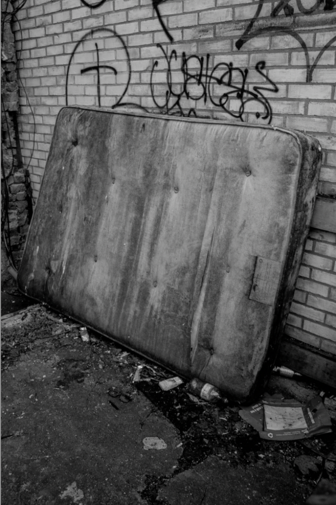
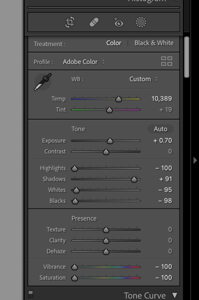
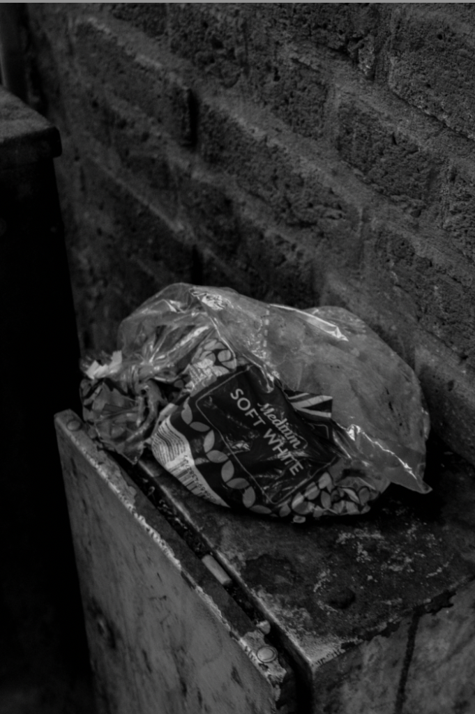
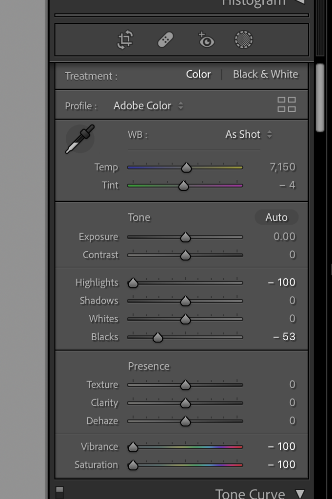
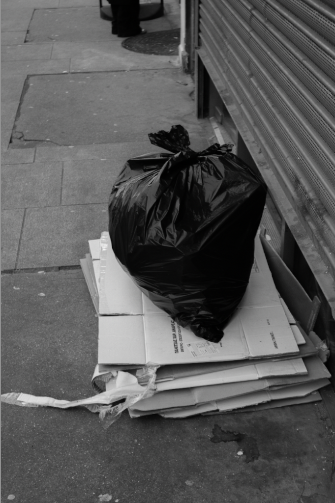
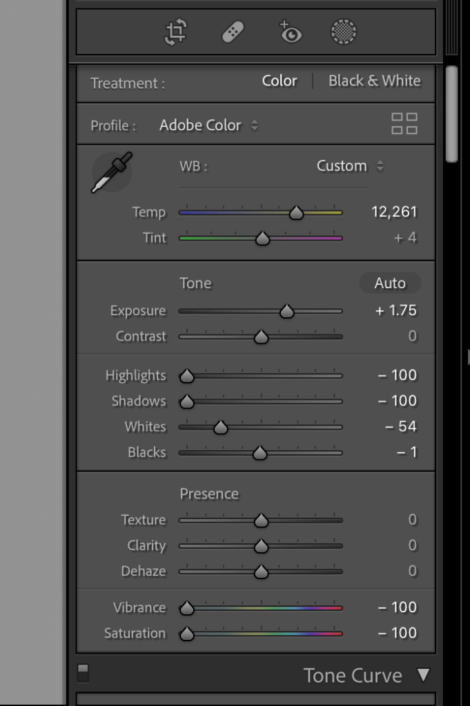
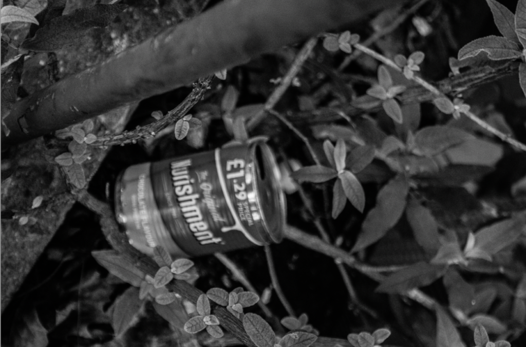
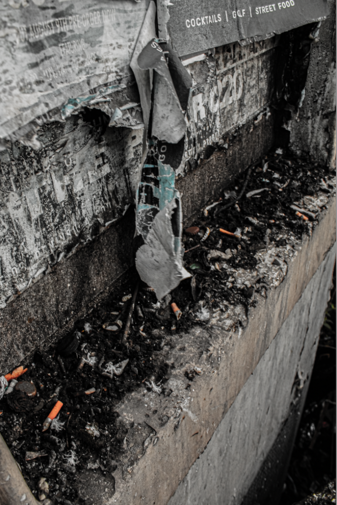
The two photos below are my interpretation of Edward Burtynsky he photographs rubbish on a much larger scale, however i photographed rubbish on a much smaller scale. I am pleased with these two outcomes of this topic due to i feel like they show off the damage we are create on the planet we live on and to our body’s, i decided to leave the cigaret buds in the first photo in colour to make them stand out and to show how they damage our planet by just being left and thrown on the ground and if they are damaging the planet how they are also damaging us as humans and our health.



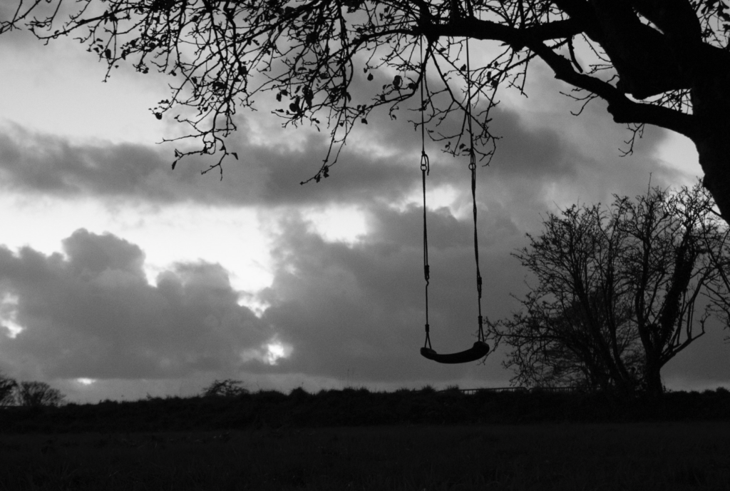
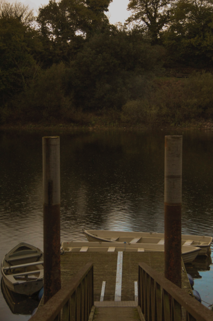

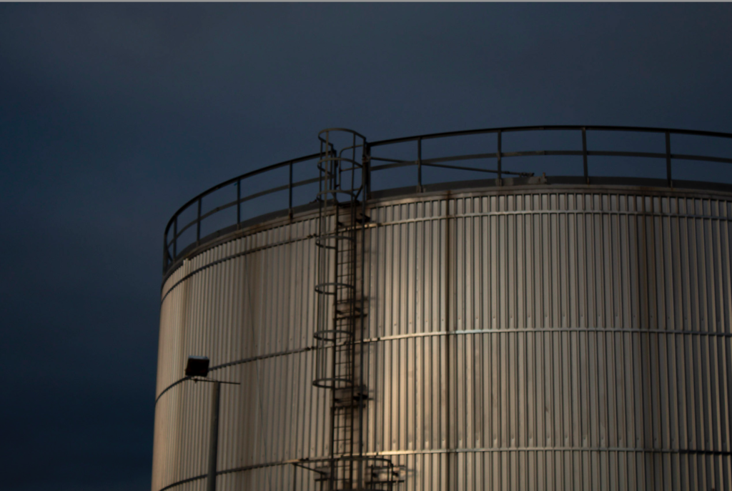



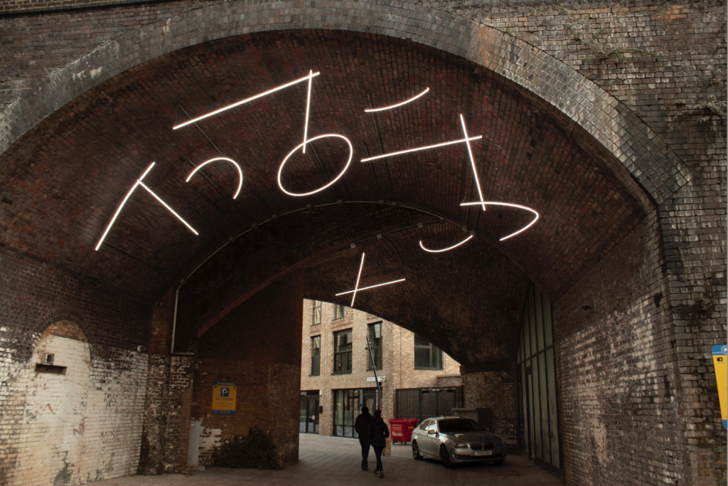
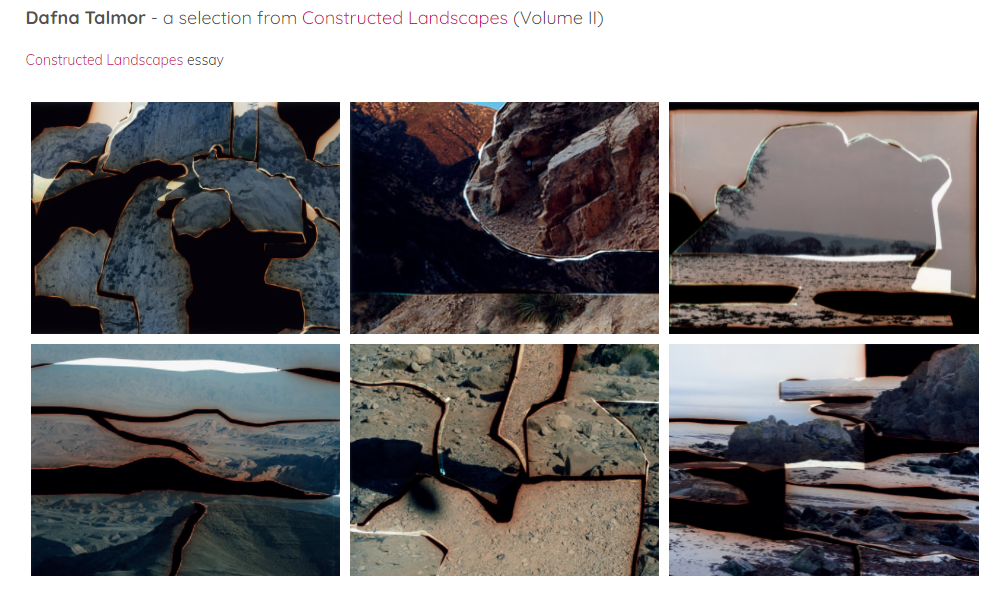
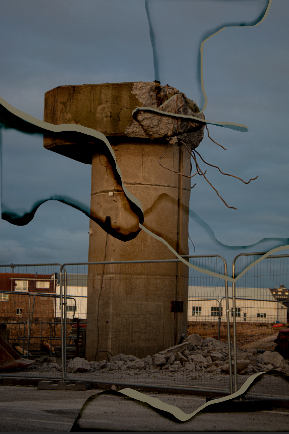
Talmor is a London based photographer who practices encompasses photography, spatial interventions, curation and collaborations.
She creates her work by using two different negatives and cutting them up with a scalpel to merge the photos together when developing them. Talmor combines colour negatives of landscapes that she has been collecting for years and transforms them into visually striking compositions that are devoid of man made structures.
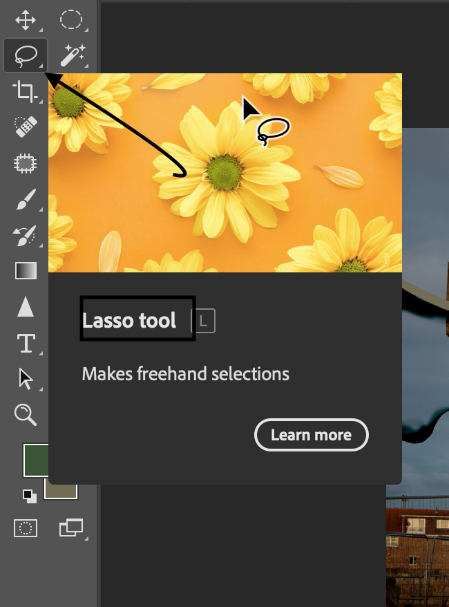
I attempted to create a image inspired by Talmor on photoshop, i believe with more practice and time i would. be able to make the image look a lot better and cleaner to create this i used the Lasso tool on photoshop to select the part of the image i wanted to use.
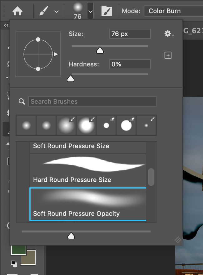
I then used the paintbrush to create the darker parts which Talmor would have used bleach to create it, i turned the hardness of the brush down, made the brush size smaller and turned the opacity down and proceeded to go over the outline on the parts i cut out.

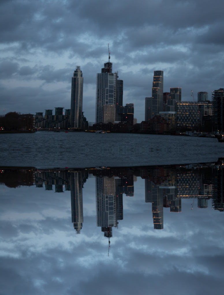
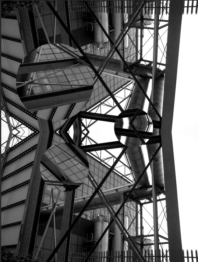
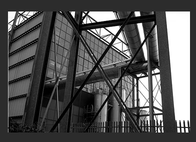
This photo was edited on Light Room then edited on photoshop, i doubled the photo and flipped it so it would line up and then cut circles up and turned them so they sit distraught on the photograph i am happy with the final outcome on this photo due to the alinement of the two photos and how it gives off a clean look
These photos represent how us humans are destroying the planet with rubbish which people leave laying about killing marine life and other animals and which will and now impacting humans and how we live our lives.
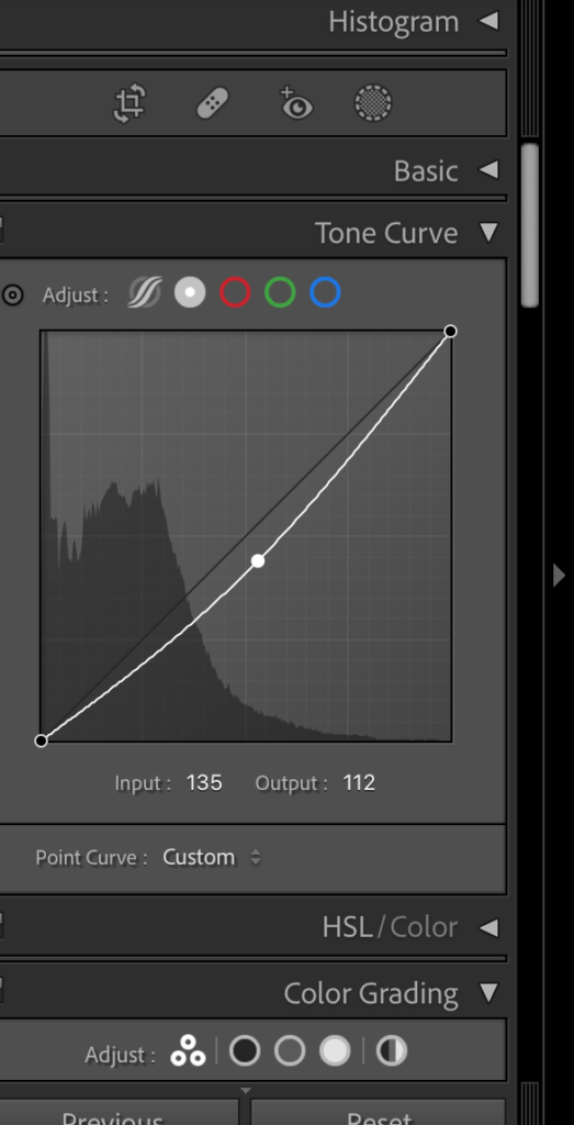
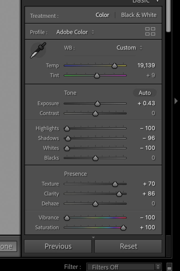
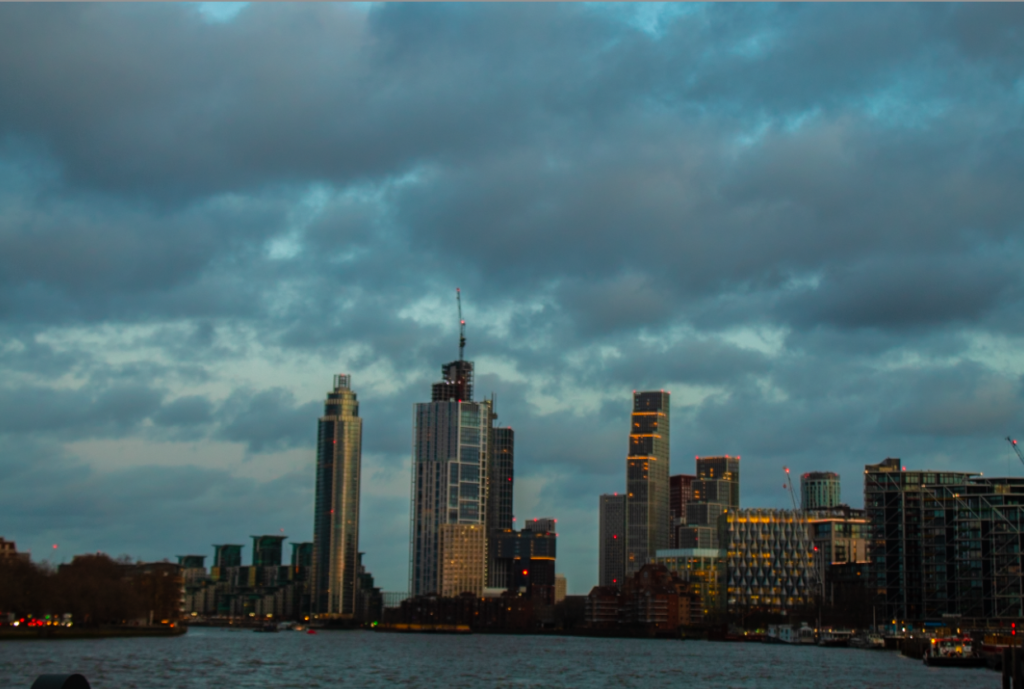
This photo was taken in London and i believe that it represents Anthropocene well as you see how humans have impacted the structure of the River Themes which would have once been Grass and land has now been changes into a concrete jungle, filled with office complexes and apartments.
Unedited:
Edited:
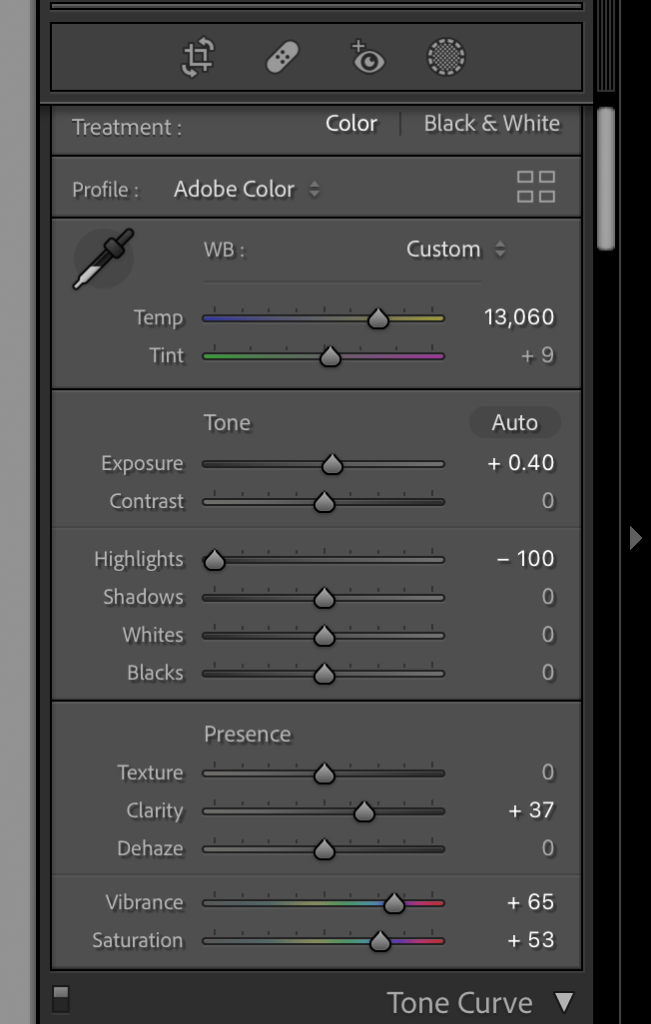
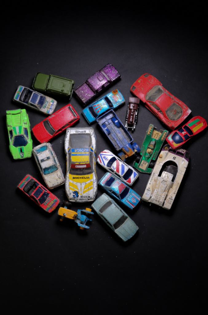
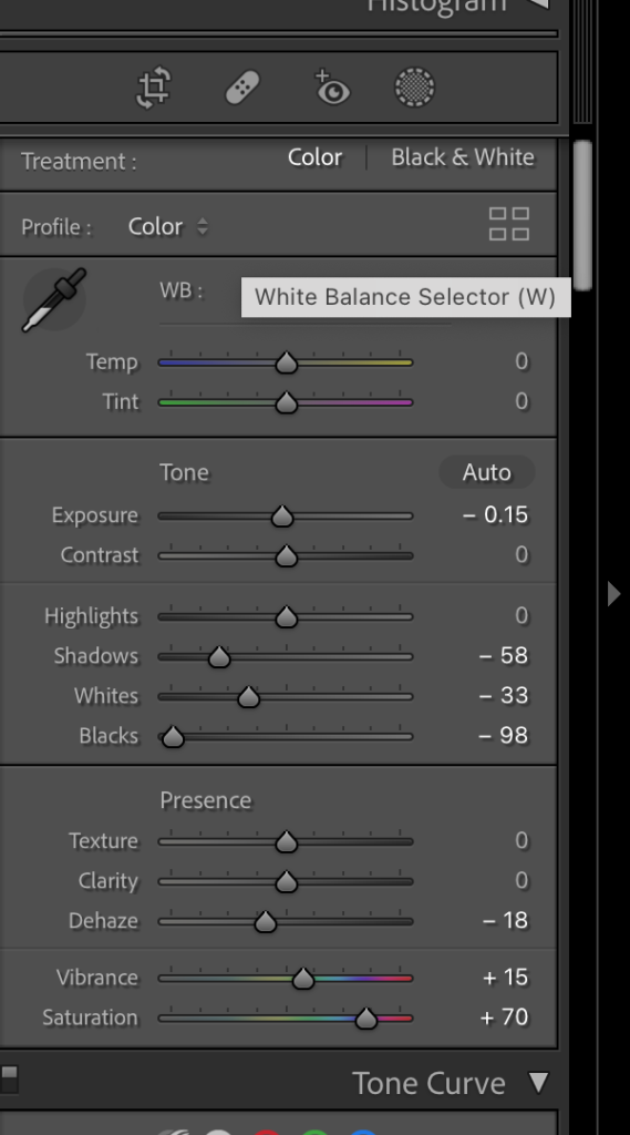
I used Light room classic to edit this image, i edited it to make the colours of the cars more vibrant, to make them standout against the black background.
Unedited:
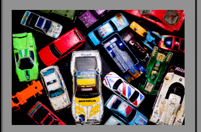
Edited:
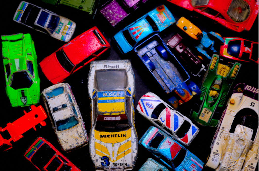
This image is one i took and edited myself which was been inspired by Mandy Barker, and her use of things she finds on beaches which are destroying our world. I was inspired by her work due to the sharpness of colours which are shown in her photography and
