


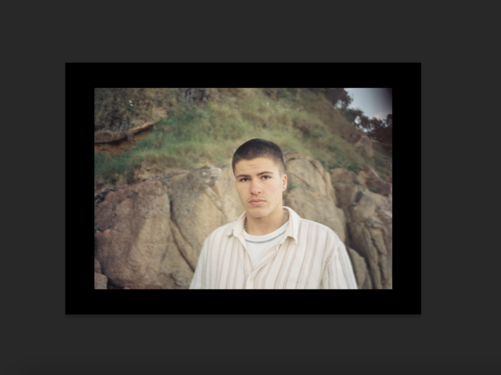


This is the final outcome of my photo book and how I have laid it out, I have done it in a simplistic way which I think is more affective, I have placed some images higher and lower than the others to break it apart from it being a consecutive symmetrical line as I think it keeps the audience attention more. All the photographs have a white boarder around them as it doesn’t cut any of the image out and gives it a simplistic look which works well as the photos aren’t overwhelming and doesn’t over power the accompanying image if they were to be full bleed. I have placed the photographs on matte paper to reflect well on the graininess from the film and have chosen to make the book as a hardback as I believe is gives more structure and a better look to it as in my opinion the soft copy books have a cheaper look and feel to them which I believe wouldn’t reflect well on the type of images I have in my book. The name of my book is called Salad Days which connotes youth in our prime days.
Here is a link to my photo book: Salad Days




Raised By Wolves is about probes the gap between dreams and reality in the lives of teenage runaways living on the streets of San Francisco and Los Angeles, and bout a neglected community which people don’t think about, and the youth which are getting lost in addiction and substance abuse, this project let the people be heard and seen when they hadn’t been before. Jim Goldbergs work always shows a divide in society predominantly focusing on the side which most people don’t see and making people see it this aspect of his work is truly moving n the sense he gives people voices and allows them to tell their story’s when no one else would listen.
His work is documentary, made to make people think twice about how other people live and to not take things for granted.

Jim Goldberg is an American photographer who likes to focus a lot of his work on the neglected and ignored populations he takes time on these projects collecting thousands of photographs to make sure that the photos he choses represents his thoughts and views on the subject/ mater he is trying to get across, Goldberg uses film and digital cameras to create his book Raised By Wolves which shows a neglected and hurt population, his work is moving to his audiences as his work has been personalised by the people who he has included in it from people writing notes, drawings and dialog, this shows he is a photographer who wants to make an impact on people and wants to get people to speak up about where and who they come from.
Many awards and grants received by Goldberg for Raised By Wolves are a Guggenheim Fellowship (1985), two National Endowment for the Arts Fellowships (1989, 1990), the Mother Jones Documentary Photography Award (1989), and the Ernst Haas Award for Photography Book of the Year (1995).
Raised By Wolves is constructed by fitting images, drawings and writing that has been scanned in and placed in the photo, there are polaroids and film negatives used in the photo-book, the use of multiple different photography elements gives the book depth and a more interesting approach.
The book itself is printed on thick printing paper, this a card front cover making it a soft copy, which is glossy, the images are mainly taken in black and white, in a high resolution, and the images which are in colour are typically vibrant, the sizing of the book is slightly larger than a A4 piece of paper with 315 pages, some of the images being full bleed across both pages and sometimes one page with may not taking up the full page and being accompanied with handwriting.
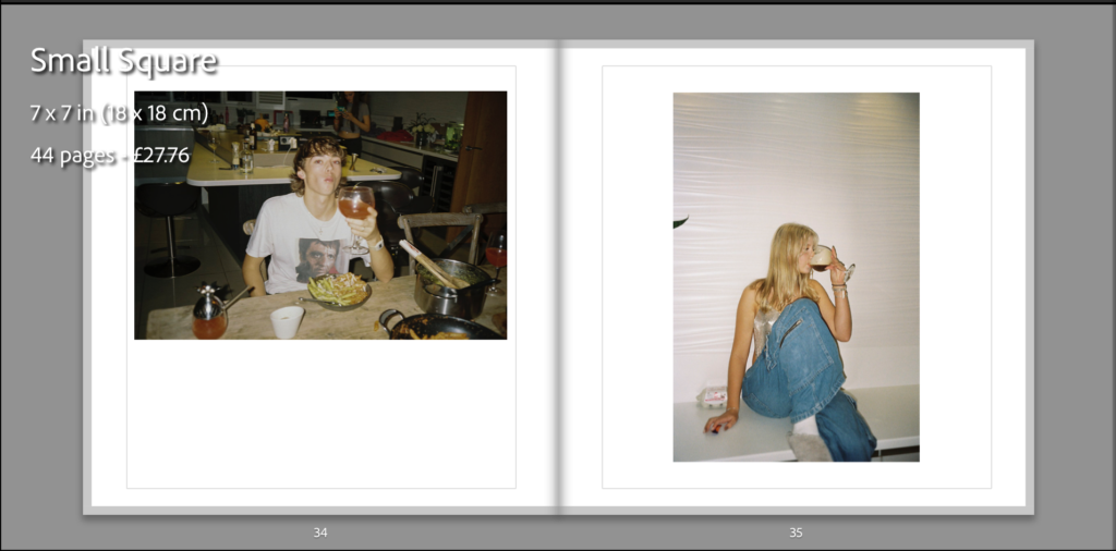
To create the photo book we have used blurb which links to Lightroom Classic allowing us to work in Lightroom and do all editing and placement on one program, I have selected a small square book with a hardcover back and matte paper which I think will reflect well on the images I have taken due to them being taken on film.


To get the framing up you need to press the black box with the arrow on it which will allow you to pick the bleed and placement of the image you are placing, you are able to adjust it to wherever you want it to be but by using the suggested placement this allows the image to be well centered and have equal white space and measurements.
I have placed my photographs in a sequence that i believe fit well due to them being taken at different times of the year, I have tried to make the photographs all flow together.
I have put some photographs on two pages to try to break up the sequence making the book more eye-catching, they are all going to have a white border around except for the ones which have are on a double page spread the reasoning behind this is due to the sizing of the photobook i don’t want to cut out any part of the photographs and by having them in that way with the white border it doesn’t cut anything and i think it gives them a slick look.

I have placed these two photographs together on a double page spread as the pole in both photos flows together making both photos look like one.
I have picked some of my top images from this project and placed them into a virtual gallery to this I used artsteps, I picked the layout of the gallery and decided where they should go, the photos I picked are the ones I have enjoyed taking and I love the outcome of them as they were all taken on film with the development process it was a bit hit and miss with the outcomes as I only had a certain amount of photos available on the film negative which limited me on the amount I could take meaning I have to take the photographs carefully.


I am happy with the outcome of this project and the shoots I have completed, all the photographs I have used are personal to me as they focus on my friendships and us having fun, whilst I was taking the photographs my intention was to capture people having fun, in places where we all enjoy which hold memories for the individuals, I have made links to the photographer Theo Gosselin as he captured people in their surrounds having fun in a beautiful almost calm setting which I have done to the best of my ability and like Gosselin I have used a film camera for this project which I think gives it a more authentic touch to it as the slight graininess to the photos suggests the photos haven’t been hyper-edited and have a natural feel to them. Within this exam I have enjoyed making the photo book as it is something I haven’t done before and I enjoyed the process of selecting and designing the look and presentation of the book however, if I was to do this project again I would try to get the resolution of the images higher so that I would have the ability to make them larger because due to the medium resolution of the photographs it limited my ability of how large I could make the images on the phonebook as it impacted how they would print.


with a few of the photos that i am choosing in my final project i have edited them to make them appealing to the audience and to make them clearer and more vibrant.


Many of my photos in this project is from my film collection which I started in 2021, I started taking photos of my friends when ever we went out, i focus on portraiture, and capturing moments of us in our youth which will allow me and my friends to look back on our past and reminisce the memories.


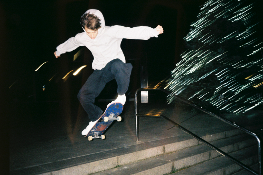
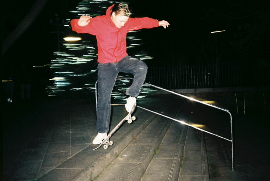
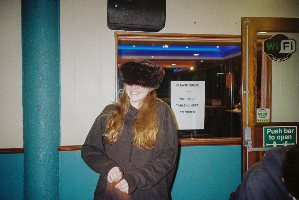
This first shoot focuses on the things my friends like to do like skating and playing pool, i have captured action shots of the boys skating i liked photographing this as due to the nature of film i did not know what the outcome was going to be and i was only able to get one shot as a time which made it more challenging to capture them in the air.





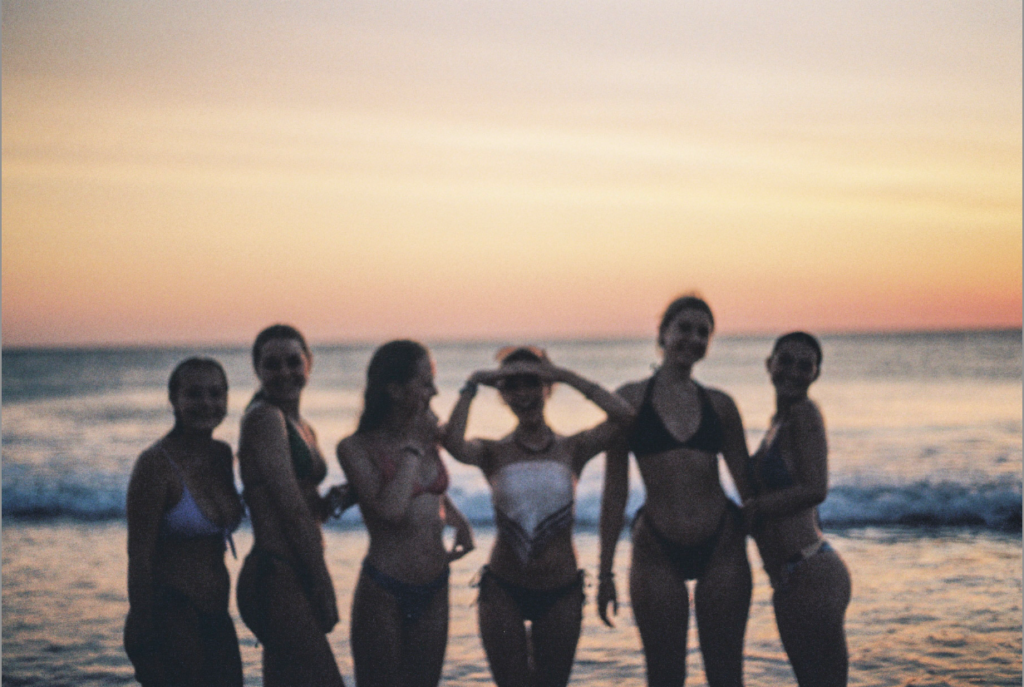
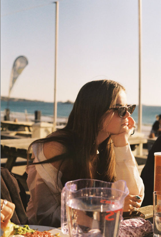
This second shoot was taken in summer it shows summer on jersey and the freedom that youth feel when its summer exploring the island that we live on.






MON: Academic Sources
Bibliography
List all the sources that you have identified above as literary sources. Where there are two or more works by one author in the same year distinguish them as 1988a, 1988b etc. Arrange literature in alphabetical order by author, or where no author is named, by the name of the museum or other organisation which produced the text. Apart from listing literature you must also list all other sources in alphabetical order e.g. websites/online sources, Youtube/ DVD/TV.
Quotation and Referencing:
Why should you reference?
What should you reference?
How should you reference?
Use Harvard System of Referencing…see Powerpoint: harvard system of referencing for further details on how to use it.
Bibliography
Cruz, A. (1997). ‘Movies, Monstrosities and Masks; 20 years of Cindy Sherman’ in Retrospective. New York; Thames & Hudson Inc.
how is youth shown in photography? How truthfully is youth depicted in the work of Jim Goldberg and Theo Gosselin?

The focus on my essay is going to be Youth In Photography and the question is, How truthfully is youth depicted in the work of Jim Goldberg and Theo Gosselin?
I am going to be creating a critical analysis on two artists Theo Gosselin and Jim Goldberg, i am going to make it on powerpoint, talking about each photographer their background information their work and information about their work, i am going to include an analysis on an image and show where they audience gets drawn to within that image. I am going to include a slide on the history of truth in photography talking about background information behind it, followed up with how I believe the truth in photography can be questioned by the two photographers and their morals behind their work.


Jim Goldberg is an American photographer who likes to focus a lot of his work on the neglected and ignored populations he takes time on these projects collecting thousands of photographs to make sure that the photos he choses represents his thoughts and views on the subject/ mater he is trying to get across, Goldberg uses film and digital cameras to create his book Raised By Wolves which shows a neglected and hurt population, his work is moving to his audiences as his work has been personalised by the people who he has included in it from people writing notes, drawings and dialog, this shows he is a photographer who wants to make an impact on people and wants to get people to speak up about where and who they come from.
Jim Shows his photos in many ways from scanning film and including the film negatives, peculiar layouts to full bleeds he includes multiple ways to show a story behind his work. Raised By Wolves is classed by some people as a novel with pictures whilst others see it as photographs which tell a story accompanied by text. For me personally I see it as both what you see tells you a story which you interpret and the righting tells you another story.


Jim Goldberg has inspired me in they way he layouts his images and presents them, they way he does it has meaning behind they stories they tell they are eye-catching and appealing o the audience, i also love the way Goldberg includes hand writing from the people he photographs i see it as a really good way to personalise work and create a mood around the work.
Raised By Wolves is about probes the gap between dreams and reality in the lives of teenage runaways living on the streets of San Francisco and Los Angeles, and bout a neglected community which people don’t think about, and the youth which are getting lost in addiction and substance abuse, this project let the people be heard and seen when they hadn’t been before. Jim Goldbergs work always shows a divide in society predominantly focusing on the side which most people don’t see and making people see it this aspect of his work is truly moving n the sense he gives people voices and allows them to tell their story’s when no one else would listen.