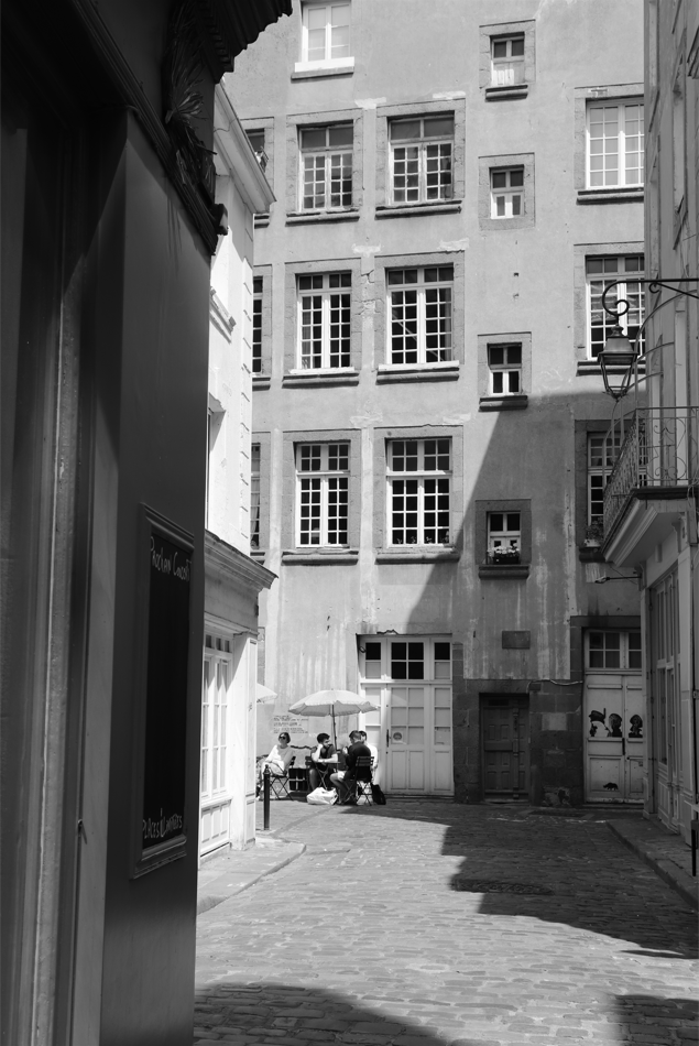
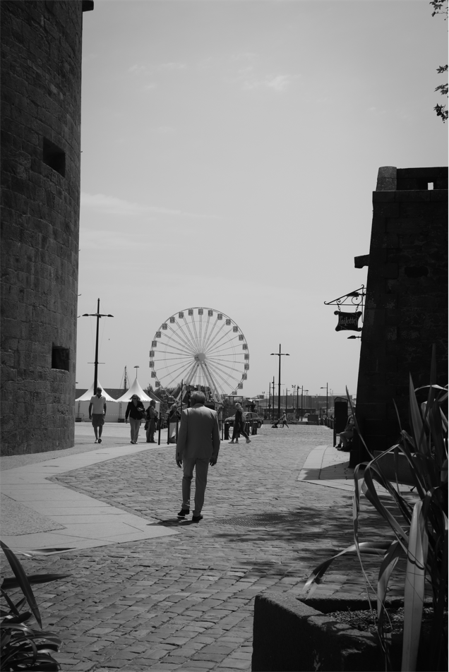
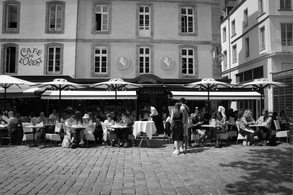
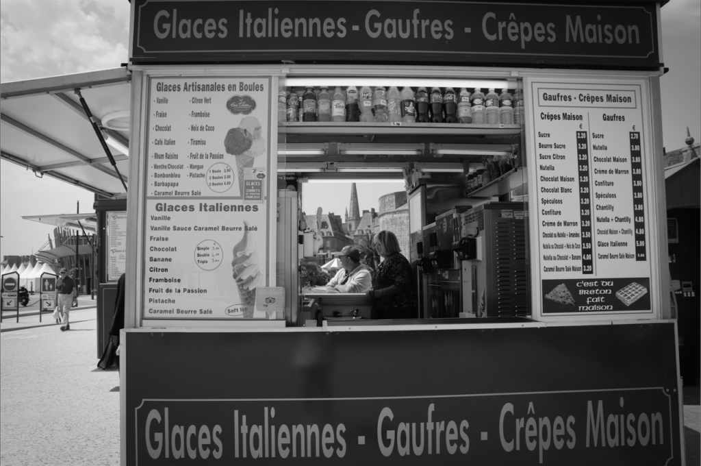
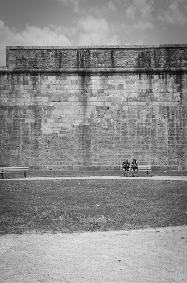
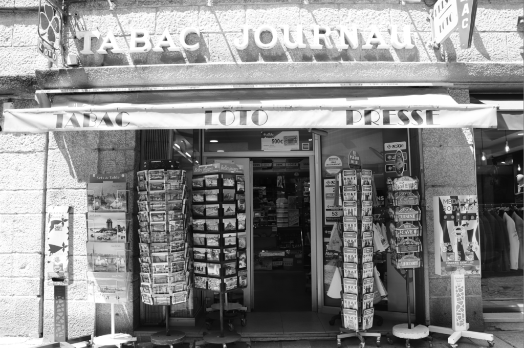
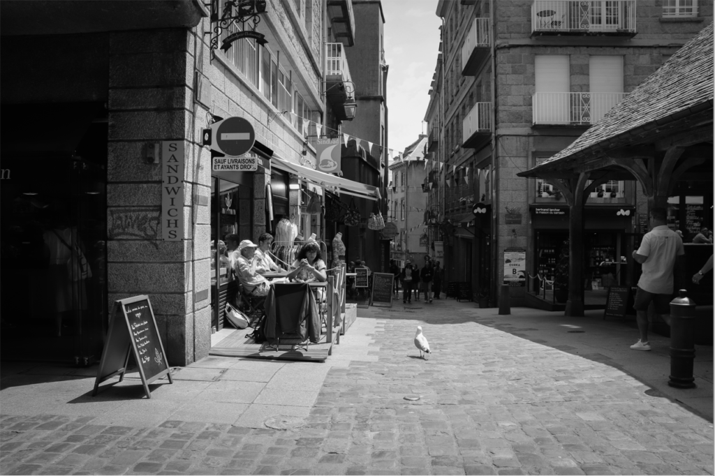
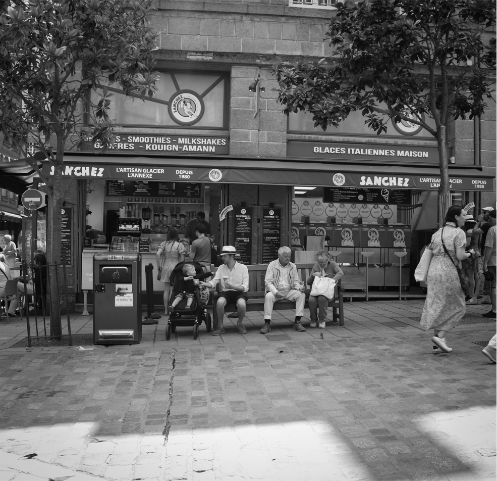
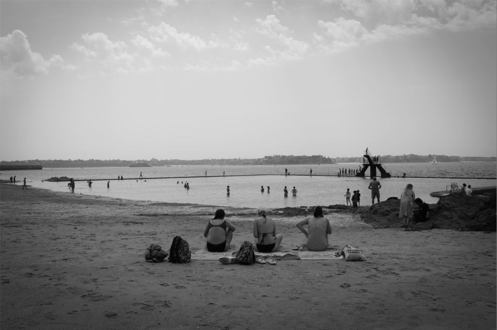
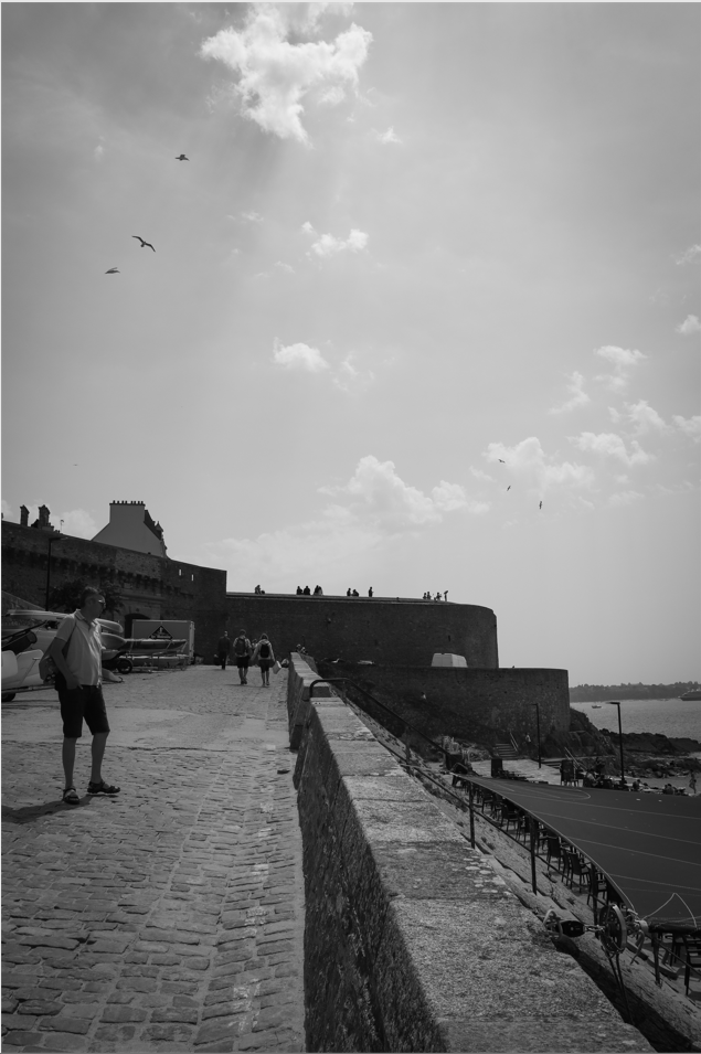
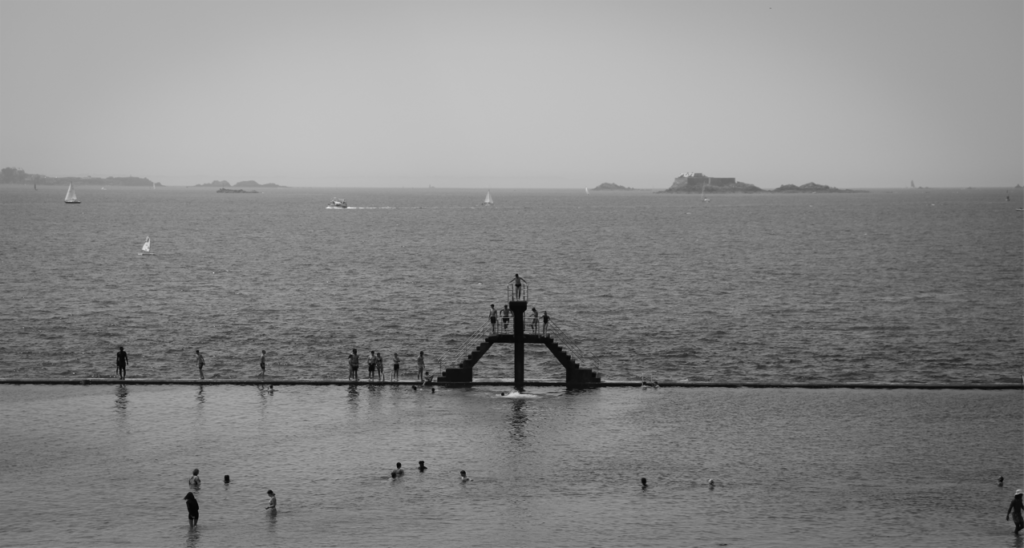
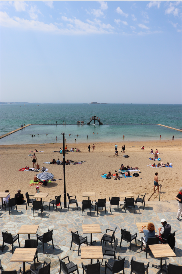
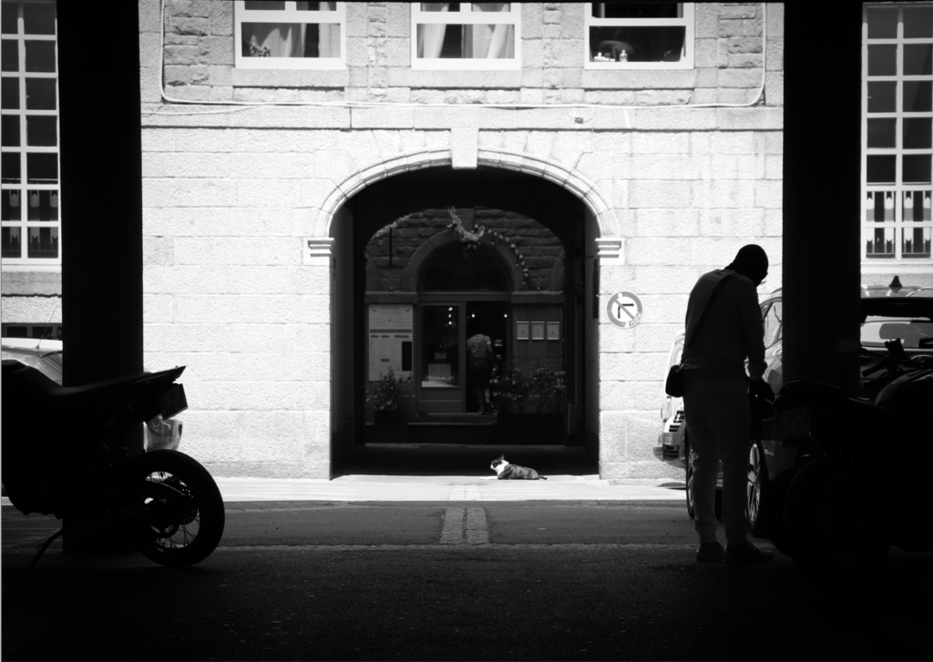
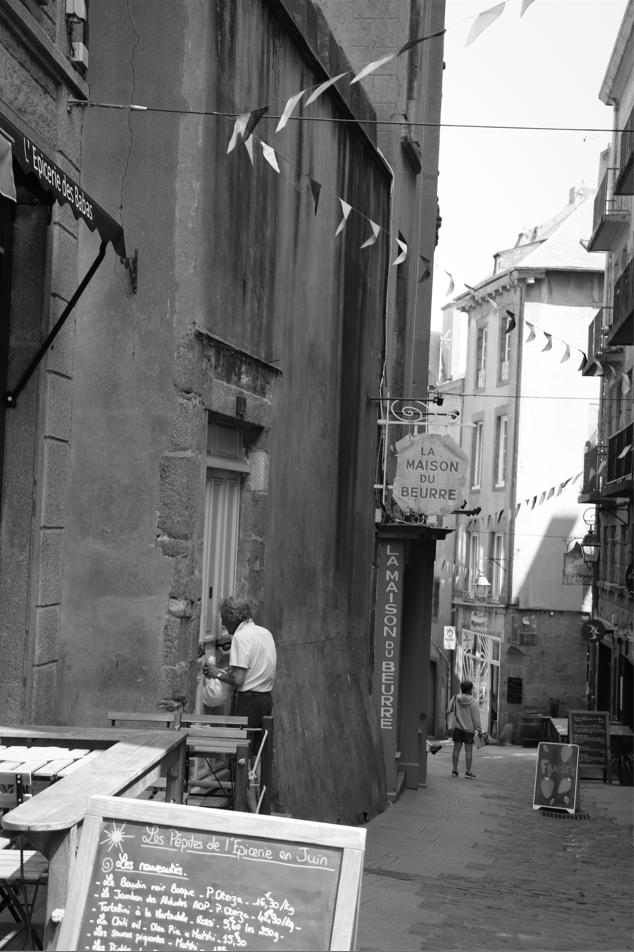
I think these are my best images because they are all focused well and edited to truly enhance the best features of light in each. I think they are all interesting and cinematographic in their own ways and I like that they seem to tell a story.


I think these are my best images because they are all focused well and edited to truly enhance the best features of light in each. I think they are all interesting and cinematographic in their own ways and I like that they seem to tell a story.
Faced with the question; ‘can a photograph lie?’, one may be inclined to think immediately of photography as an art form, without considering the importance of the medium as a documentary tool. In the media that we consume every day of our lives, photography has always – since its first press use in the beginning of the 20th century – and will always be used as a tool of conveying news and information. We are programmed to take every image that we see at face value, disregarding a need to obtain proof of what is before us – because, after all, isn’t a photograph proof in itself? This is evidenced in courts of law across the world, where imagery of crime scenes and suspects are used as firm corroboration of what took place during the alleged crime. Furthermore, it reinforces the importance of visualisation to the human brain – we process images 60,000 times faster than text – and this is perhaps why we, as a human race, are susceptible to the possibility of fake imagery and its negative consequences. Bright asks the question ‘what does a ‘real photograph’ even look like; is it something you can hold? Is it something you can see on a screen and alter?’ (Bright, 2019), and this may draw one to consider the validity of what we, as a society, view as indisputable proof.
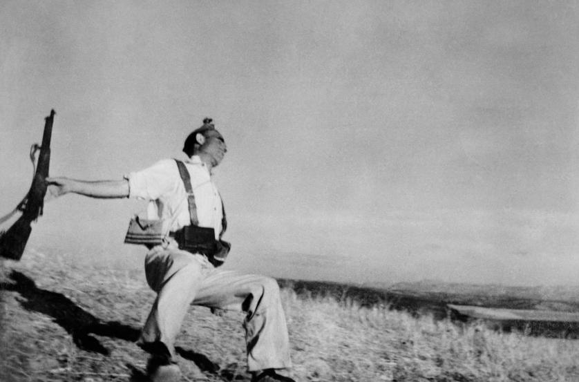
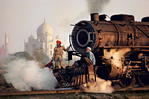
To aid this investigation, I will be looking at two case studies, one historical and one contemporary. I plan to study Robert Capa’s 1936 Death of a Loyalist Soldier, as I believe that the weight it holds in an investigation into truth in photography is substantial, and the story behind it is truly interesting. Furthermore, I will look at Steve McCurry’s 1983 Taj Mahal and Train in Agra, on account of its controversial staging method and question of stereotypical portrayal.
Even prior to the invention of digital image manipulation, there were methods of concealing or altering elements of images in a darkroom, and hence this is not a new or modern phenomenon. My historical case study does not concern manipulation specifically within the image, although its circumstances are certainly hard to untangle. Allegedly taken in 1936 on the battlefields of the Spanish Civil War, the photograph originally appears to be of a man dying dramatically, presumably of a gunshot wound that is not visible to the viewer. For years, research was done into the casualty records from September 5th, at the Battle of Cerro Muriano, in hopes of obtaining details about the man in the image. However, it later transpired that Capa’s image was staged and did not in fact capture the moment of death.
Capa and fellow photographer Gerda Taro had travelled away from the brutality of the village of Córdoba and instead, dissatisfied with the images they had collated, toward the farming village of Espejo. Just outside of Espejo, they came across a group of Nationalist milicianos who were happy to pose for photographs, putting on a show of battle, death, and bravado. The final image was created when the subject fell to the ground dramatically, his rifle slipping from his fingers. Hence, it is clear that even in the most serious of circumstances and assignments, it is still possible that imagery can be staged for the benefit of the photographer and the image’s commercial value.
There is a multitude of hypotheses regarding the truth behind this image and its authenticity, with various photographers, historians, and journalists often speculating on the subject and backstory. Alex Kershaw’s book Blood and Champions discusses footage taken at the time of creating the photograph, taking the stance that the image was in fact staged. Another argument suggests that Capa’s general silence on the circumstances of the image could imply a feeling of guilt; perhaps, whilst the subject was posing for the staged image, he was shot and killed. Capa will have felt a sense of responsibility for the man’s death for the rest of his life, acting as an explanation for his speaking very minimally and reluctantly regarding the image’s context.
Overall, the inconsistencies in differing views on Capa’s image demonstrate the lengths that photographers may go to in order to conceal the reality of their work, and perhaps the importance of context in the value of an image. It is clear that whichever stance a viewer takes on the circumstances of the subject and his subsequent death, it will affect how the image is viewed and used and hence it reinforces the idea that photographs are not always as they first appear.
Steve McCurry’s 1983 image, Taj Mahal and Train in Agra, illustrates, in my opinion, the importance of considering the manner of presentation of one’s subject. Teju Cole, in an article for The New York Times Magazine, states his opinion on McCurry’s work, describing it as ‘astonishingly boring’ on account of ‘The pictures are staged or shot to look as if they were.’ (Cole, 2016). This, Cole argues, is McCurry’s means of perpetuating Western stereotypes of India and maintaining the age-old view that India and its South Asian counterparts are serially outdated and in need of modernisation. Cole’s antithesis suggests that McCurry could innocently be choosing to only present the romantically timeless India that is most aesthetically pleasing to the Western eye. However, it is not without consciousness that one chooses to portray a subject in one consistent manner, with the same stereotypes recurring in almost every piece, and so McCurry’s work could be harmful to any progression of Western views toward India.
In my case study, the foreground contains an old-fashioned steam train with two men, one crouching, in typically Indian dress (who Cole describes as having been ‘chosen for how well they work as types’ (Cole, 2016)). The background portrays that most famous of symbols; the Taj Mahal, slightly obscured by the clouds of smoke that bloom around the base of the train. Therefore, it is fair to say that the stereotypical nature of McCurry’s portrayal certainly extends to the image I have looked at, and this artist demonstrates the importance of reviewing one’s portrayals. By taking time to establish that we are not creating imagery that is harmful to a people, place or culture’s image, we are able to not only maintain a professional and modern outlook, but the standard and variety of our work will also flourish beyond what some may consider a repetitive and unadventurous lack of experimentation.
In conclusion, I think that these images both portray the importance of context and external factors in the viewing of photography, yet they also differ in their methods of concealment of the truth. The two case studies have allowed me to consider the importance of representation and portrayal, as well as considering what may be outside of the frame – we as viewers are only ever given the opportunity to see what the photographer chooses to let us see, and this is important because it can bring us to draw conclusions that may not be fully informed. Therefore, the idea that a photograph can ‘lie’ is just as justified by the existence of manipulation methods as it is by a lie of omission – what we don’t see may just be the key to an image’s reality.
Bright, S., 2019. Photography Decoded. 1st ed. Lewes: Ilex Press.
Cole, T., 2016. A Too-Perfect Picture. The New York Times Magazine, 30 March.
1207 words
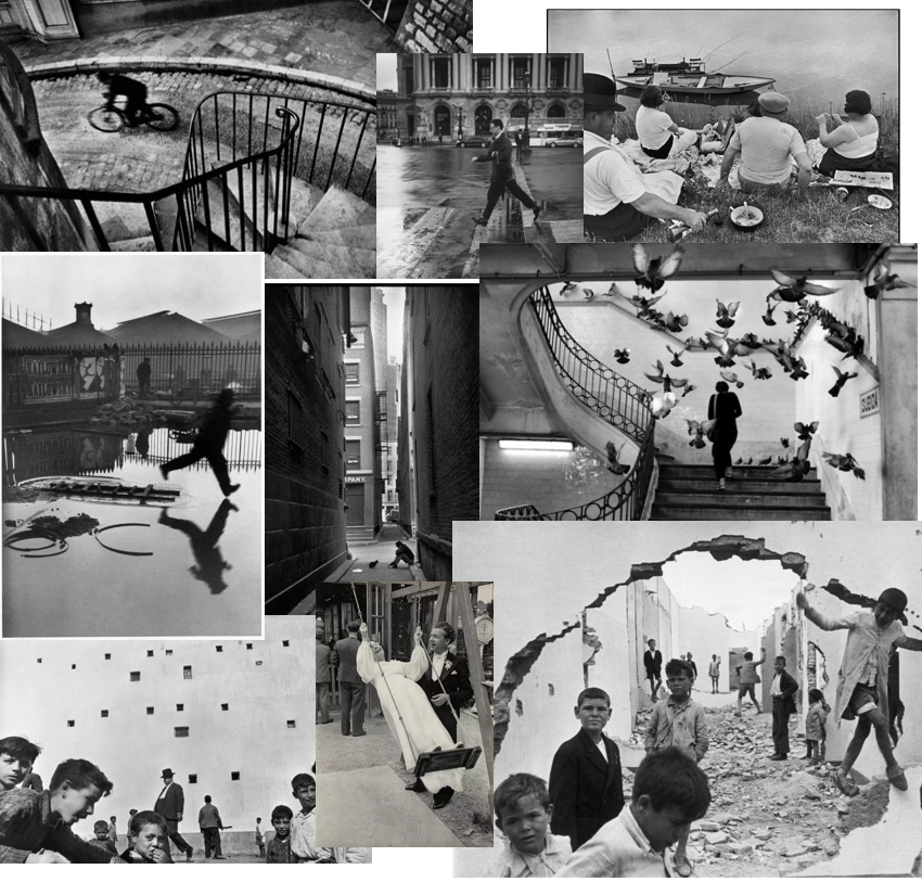
Henri Cartier-Bresson, born August 22nd, 1908 in North-western France, is considered to be one of the most influential photographers of all time, with his distinctive and inquisitive style of portraiture. His photobook, ‘The Decisive Moment‘, is one of the most famous of its kind and explored his mastery of candid street photography.
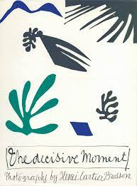
The book essentially works to express Cartier-Bresson’s belief that there is a ‘decisive moment’ in every scene laid before a photographer. It is based on an innate intuition and key knowledge of both composition and aesthetic value that Cartier-Bresson feels is integral to the skill set of a photographer.
Cartier-Bresson’s career turned towards the documentary sector of photography when he co-founded the Magnum photojournalist agency in Paris in 1947, an association that focused on the important job of documenting the world’s biggest events through the accumulation of press prints from its members. He found himself photographing the liberation of Paris in 1944, the Maoist revolution in China in 1948, the funeral of Mahatma Gandhi in 1948, and both the building of and the fall of the Berlin Wall, in 1961 and 1989 respectively.
His interest in the composition of a scene clearly demonstrates his personal enthusiasm for Surrealism and cinematography, evidenced by his first job as second assistant director to French director Jean Renoir.
I plan to use the work of Cartier-Bresson as inspiration for my upcoming photography trip to St Malo.
Photography is a way of living. To me, my camera is an extension of my eye.
Henri Cartier-Bresson
American street photographer Gary Winogrand famously said, ‘I photograph things to see what they look like photographed.’
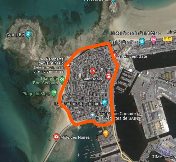
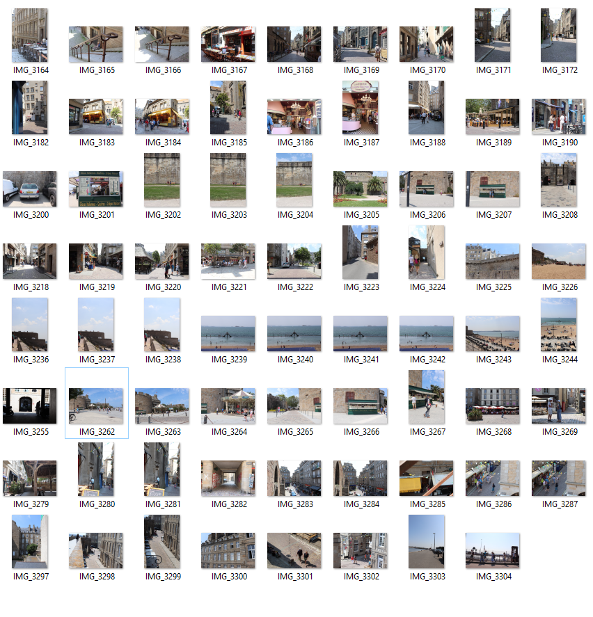
On the 14th of June, we went to St Malo, France for a day trip to take images for our module on Nostalgia and in the style of Henri Cartier-Bresson. We stayed within the walled area, as shown below, but otherwise we were free to wander to find image opportunities.
The brief we were given included the below considerations
SUBJECT MATTER/ CAPTURING A MOMENT > people and humanity, theatre of everyday life, poetics of streets, comic absurdities and humour, small acts of kindness, scenes of unexpected beauty, ordinary moments, visual pun and humour, gestures and poses, faces and crowds.
LOCATIONS & PLACES > inside the walls and on the ramparts, back alleys and sidewalks, beaches and coastal promenades, parks and public spaces, cafes and shops, street corners and intersections, signs and advertising, facades and architecture.
POINTS OF VIEW > low/ high/ canted angles, deadpan approach, light and shadows, intensity of colour, reflections in shop windows, shoot through glass, frame within a frame, focusing and un-focusing, up-close and details, shallow depth of field, artful and funny juxtapositions, geometry and space, lines and form, textures and patterns, signs and shop windows, advertising and graphics, reflections and mirrors.
APPROACH > capturing decisive moments, candid portraits, informal snapshots, inobtrusive observations (Cartier-Bresson style), interactive and confrontational (William Klein approach), spontaneous and subconscious reactions, poetic possibilities, inquisitive mind and roaming eye, looking and prying, shoot from the hip, serendipity and good luck.
CAMERA HANDLING > Lenses (focal length): use wide (18-35mm) to standard lenses (50mm). Focusing: automatic or manual – whatever you prefer. Exposure mode: S or T mode – (shutter-speed priority). Shutter-speeds: experiment with fast (1/125-1/500) and slow shutter-speeds (1/15-1/60). ISO: 100 (sunny weather), 200-400 (overcast ), 800-3200 ISO (inside or evening/ night). White Balance: auto
Below are the images that I managed to capture.
What is nostalgia?
Nostalgia, as an abstract concept, can be defined almost as something different to each person, but the dictionary definition states that it is first a wistful or excessively sentimental yearning for return to or of some past period or irrecoverable condition and second the state of being homesick.
How can the meaning of nostalgia be subverted?
Alternatively, what seems a positive and warm feeling can be reflected on and reimagined as an opportunity to deceive or conceal. By recalling the past in an overly positive manner, one can be led to erase any parts that may not align with this perfect image they have created in their mind. Some call this the ‘rose-tinted’ view – a metaphor that describes nostalgia as the experience of wearing ‘rose-tinted spectacles’, which naturally filter out any colder colours and only focus on the warmth of a scene.
How can we explore the abstract feeling of nostalgia as artists?
Becoming inspired by an abstract brief gives the artist a chance to interpret it in their own way and take the meaning as figuratively or literally as they wish, and in terms of nostalgia, this can leave opportunity for a focus either on the positive side of the feeling or perhaps on the deceptive negative alternative. Additionally, one of the most interesting features of nostalgia to me is how it can be a multi-sensory experience. A smell, sound, sight, taste or texture can bring someone back to a specific time and place in an instant, and this is most interesting to me because I believe it opens more doors in terms of exhibiting methods. As seen in Playtime, artists are justified in incorporating elements of every sense and therefore are free to produce more well-rounded experiences for their viewers.

I recently visited the exhibition ‘Playtime’ by local photographer Will Lakeman at Capital House, St Helier to explore the theme of Nostalgia.
A little about the Exhibition
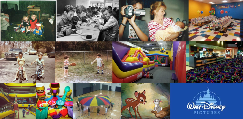
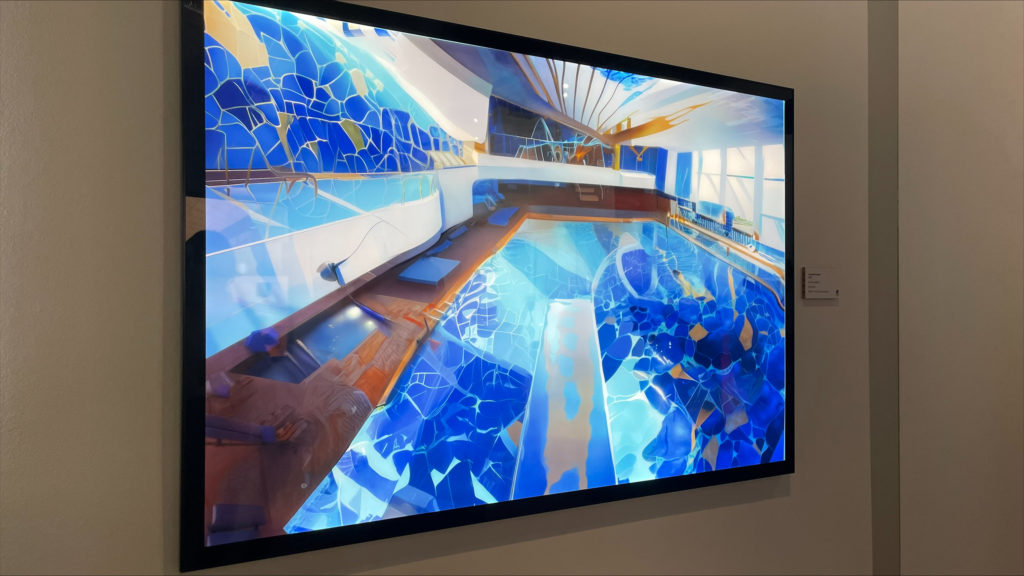
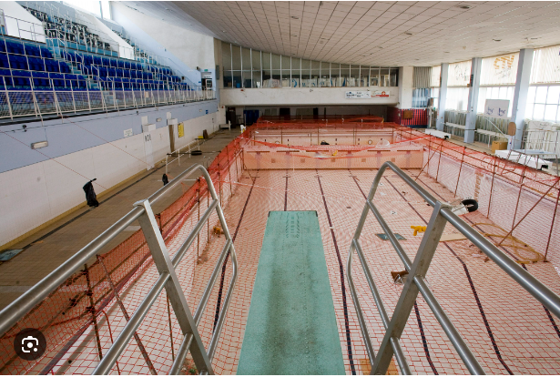
The exhibition focuses on Will’s personal fixation on Fort Regent, a now disused leisure and play centre in St Helier. During his childhood, Will visited the Fort, like most his age, almost daily alongside his brother Matthew (whose memory the exhibition is dedicated to). Since then, he often sees the old Fort in dreams and sometimes even in hallucinations, but never as it really was, due to the subverted nature of the brain’s subconscious. Therefore, the piece works to exaggerate and enhance the contrast between what he sees in memory and what was there in reality, and this is done through his combining of old archive photographs, his own images of the now abandoned site and the AI images he has made to recreate the subversion of his memory and dreams.
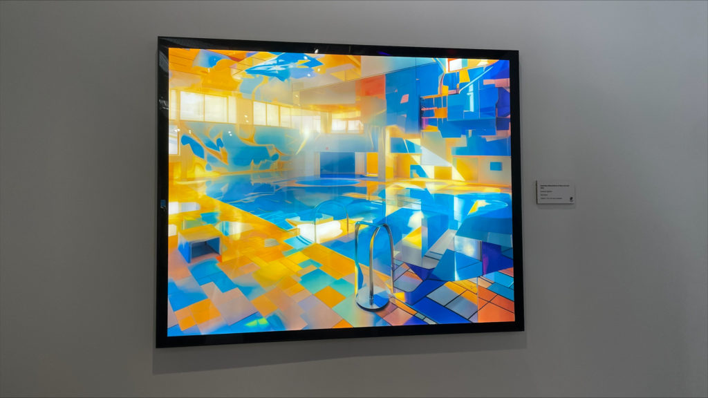
He has also incorporated aspects of sound and smell to the exhibition to attempt to evoke the universal memories in any visitor’s inner child; the sharp smell of chlorine that immediately invites rich memories of the warm haze that accompanied it, the sound of children screaming and laughing in delight, even the quintessentially comforting scent of buttered popcorn. As a very sensory-oriented person, Will feels that this was the best way to recreate his memories as an experience that could be relived by any visitor.
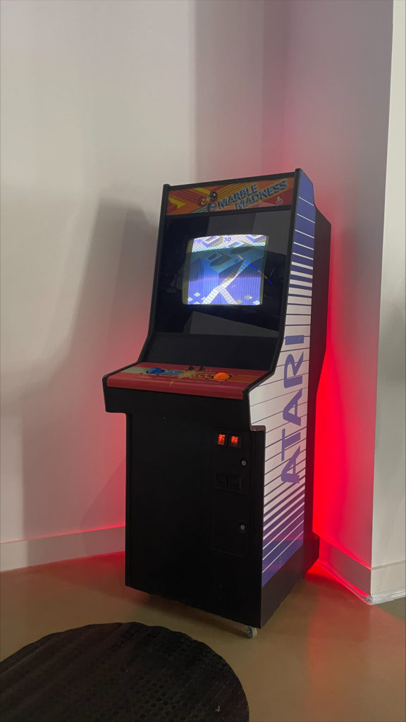
The reason that this exhibition relates to my project of Nostalgia is because it invites the question of whether things are really as we remember or, as the term suggests, whether we cut out any negative aspects of the memory in lieu of a more rosy recollection. Additionally, the fragmented and distorted nature of the AI pieces relates to the same imagery of our memories and dreams, where everything is displaced and misshapen.
My Opinions
I enjoyed the experience of visiting the exhibition because of its multi-dimensional nature and I found that the repurposing of spaces through AI to create a magical sort of parallel world really interested me as someone who visited Fort Regent a lot until it was shut down recently. It was so interesting to see the old and rather empty space be filled with impossibly magical landscapes and fantasy imaginings. I also enjoyed the incorporation of the multi-sensory experiences, and it was inspiring for me as it made me think about the wider possibilities of exhibiting because it can be a much more well-rounded experience than just a visual one. I think I would like to go back and experience it in a more calm and less rushed environment however as I felt that when visiting with school I did feel like I wasn’t there to really receive the art but just to find out information and take images.
” When you revisit an old memory it isn’t important for everything to make sense. Sometimes you just have to enjoy the ride. “
-Will Lakeman
How do I feel about my final outcomes?
Overall, I am happy with my outcomes for this project as I feel that I was able to access a range of techniques and styles to build up a portfolio that will reflect my various talents in different fields of portraiture. I enjoy the more documentary style imagery and I feel like I was able to explore this on a few occasions over the past few weeks. Additionally, I was able to experiment with studio photography which was fairly new to me and I have created outcomes that I am proud of. I think that there were certainly improvements that could have been made across this project, and sometimes my plans were not executed as I would have liked, however I can say that I have also created work that was really successful.
What areas were the strongest/weakest?
I think that my strongest work is from studio shoots (the best shown below) as well as my environmental photoshoot with Ryan Hervé.
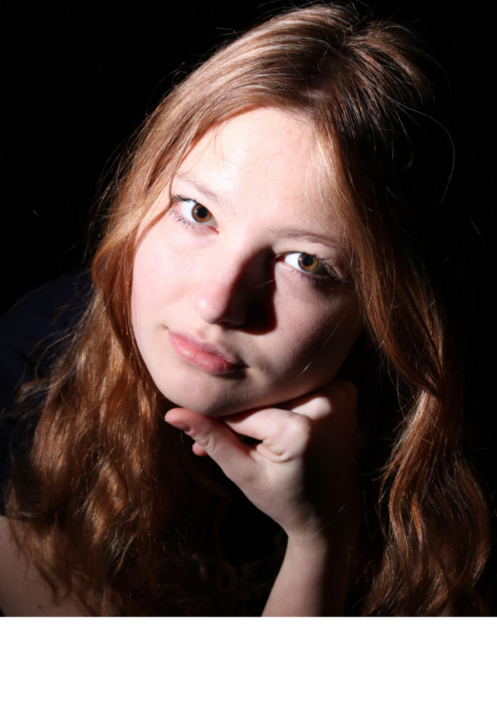
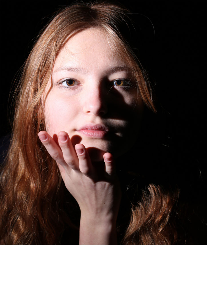
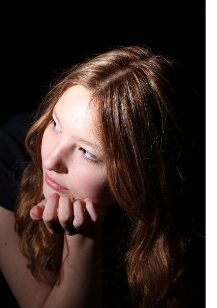
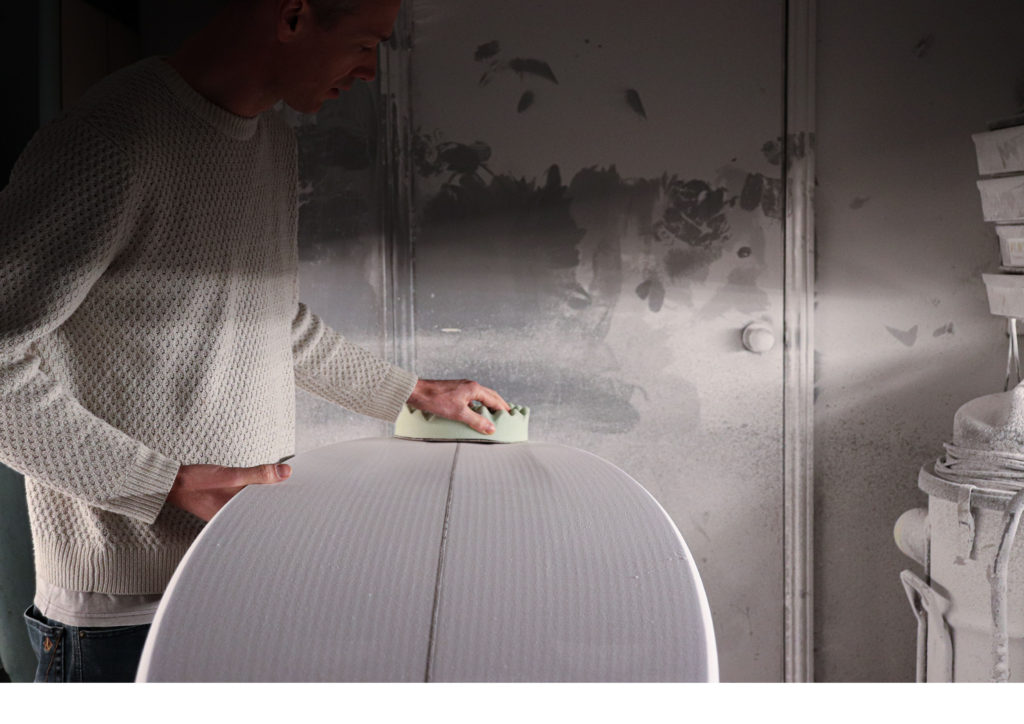
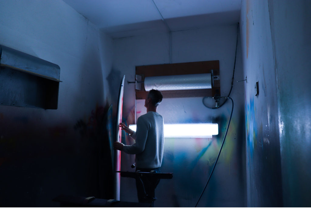
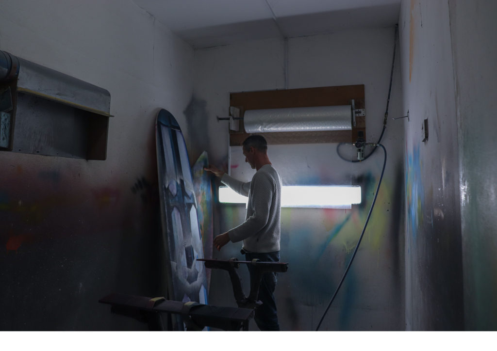
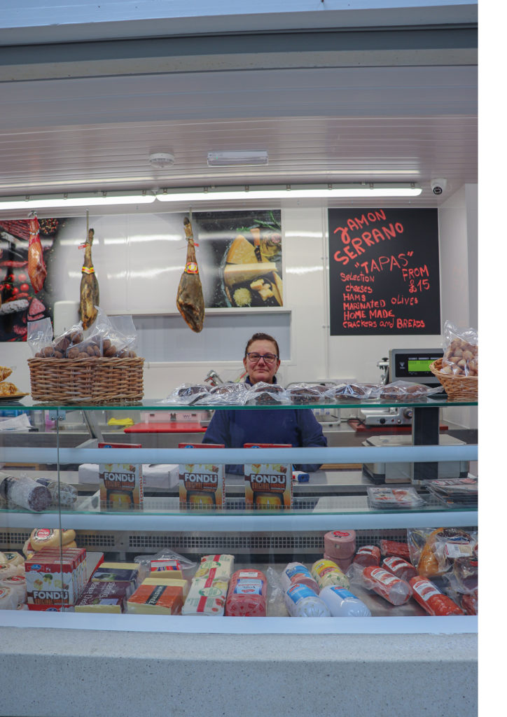
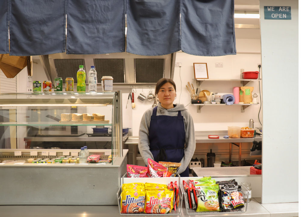
I am also really happy with my environmental portrait series from the Central Market in St Helier as it was my first experience of asking to photograph strangers and I think the outcomes were really worthwhile.

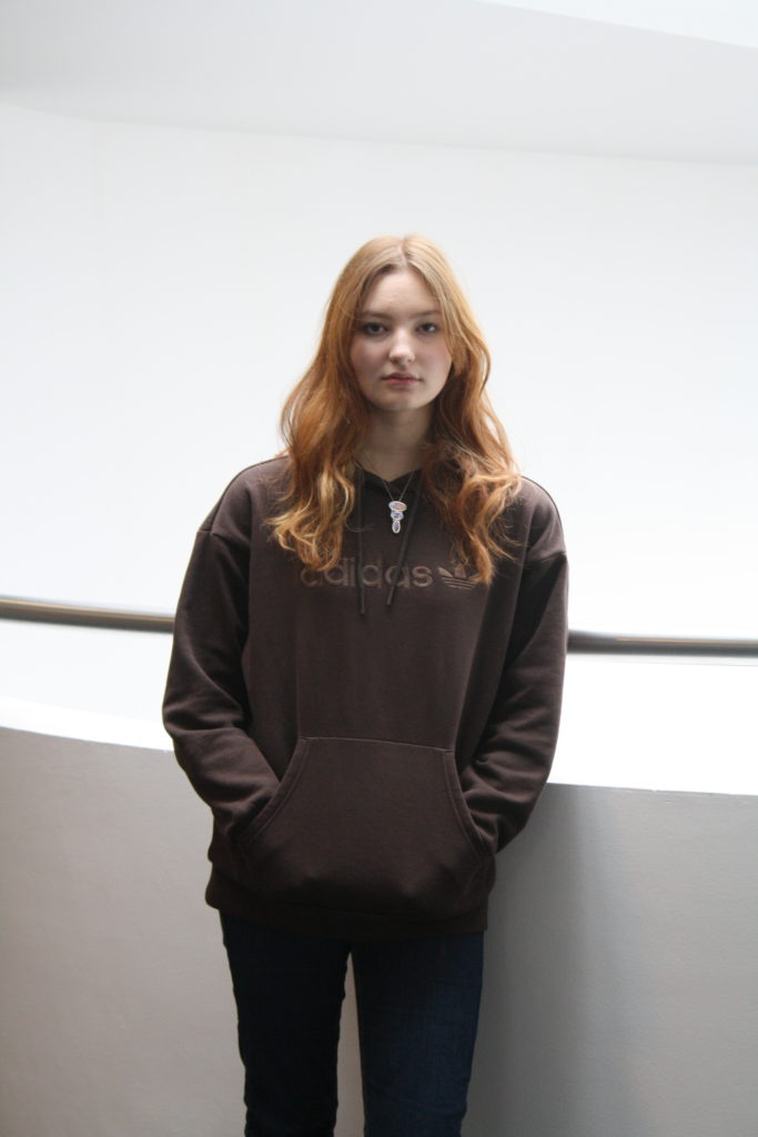
The weaker areas from this project I think are from my school photoshoot as they are not lit well and just not very successful technically.
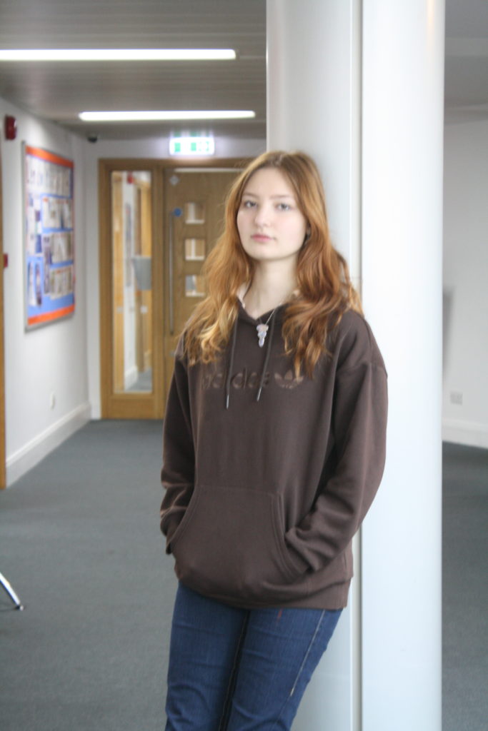
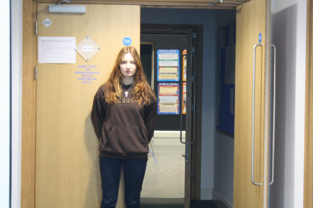
I also feel that there were a lot of photos taken in studio shoots that were mistakes or not successful because I was not fully knowledgeable on how to operate the equipment and lighting. I do however recognise that this was part of the learning process as I soon became much better at this.
Were my images successful in relation to my chosen artist references?
I think that, as I was unfortunately not able to work from every one of my artist references, I was not entirely successful in any endeavours to create work that is clearly inspired by my chosen artists’ work. The most successful photoshoots with regards to artist references were, in my opinion, my Sam Contis shoot, my self portrait shoot (inspired by Nilupa Yasmin), and my Justine Kurland inspired shoot (with this one there were images that could also be likened to the work of Michelle Sank/Doug Dubois). The reason I think that these were more successful than others is because I thought about my references and thought a little more about the meaning behind the artists’ work as I was taking my images. My artist comparisons can be found here. I definitely think I could have worked harder to produce images that were more similar to my artists’ work, through more thoughtful choices in either setting, costume, or lighting, and perhaps by taking more time to go out on multiple shoots.
Overall comments
On the whole, I am pleased with my outcomes but feel that I could have worked harder and been more confident in my choices. I think the reason my ideas were not executed as well as I had hoped was because I did not take the time to plan and review my artist references to a sufficient standard before taking my images. I took too long to come up with ideas in the beginning, perhaps due to a lack of personal inspiration, and I think this was my biggest error on the Identity project. However, I have managed to produce some work that I am really proud of, especially with regards to the idea of environmental portraiture.
How was this image taken technically?
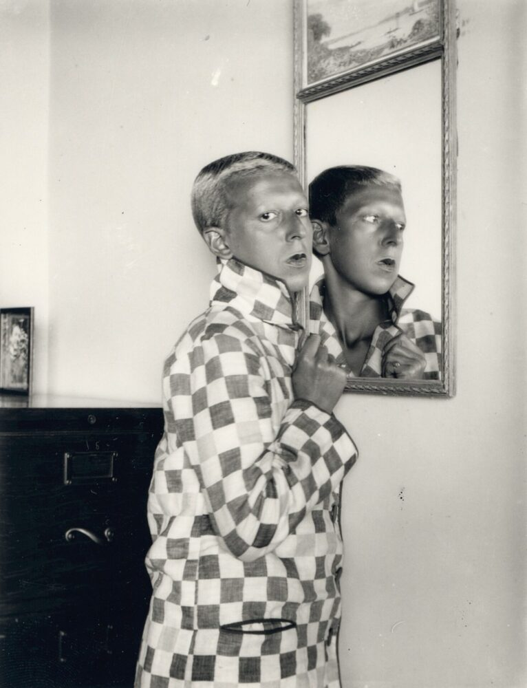
This is an analogue self-portrait of Claude Cahun, dressed and styled in her characteristically androgynous manner. She faces away from the mirror and stares directly into the lens. Natural light appears to be the main light source, presumably coming into the image from an unseen window or door. She hides her neck from view of the camera, thereby exposing it in her reflection.
Why was the photo taken like this?
It is possible that the image was taken in this way, as was Cahun’s trademark, as a direct comment on traditional femininity, as the playful use of reflection and the suggestive nature of the image both suggest an allusion to artifice and contradiction. Perhaps Cahun is criticising the vanity and falsity of feminine culture, and perhaps, as is typical of her work, she is using her own appearance to amplify this more modern and open-minded outlook. Furthermore, in classical art, mirrors are often used as symbolism for feminine beauty or narcissism but here Cahun subverts this meaning to reject these traditional views on gender.
Realities disguised as symbols are, for me, new realities that are immeasurably preferable.
Claude Cahun
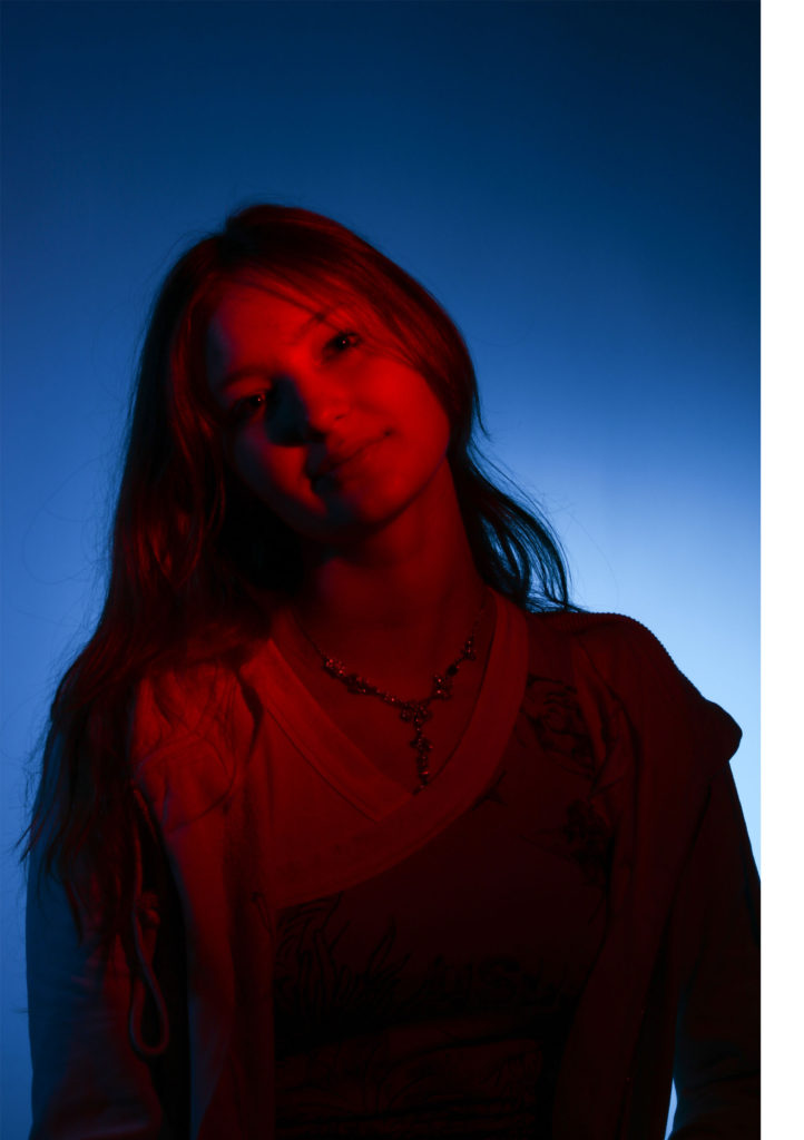
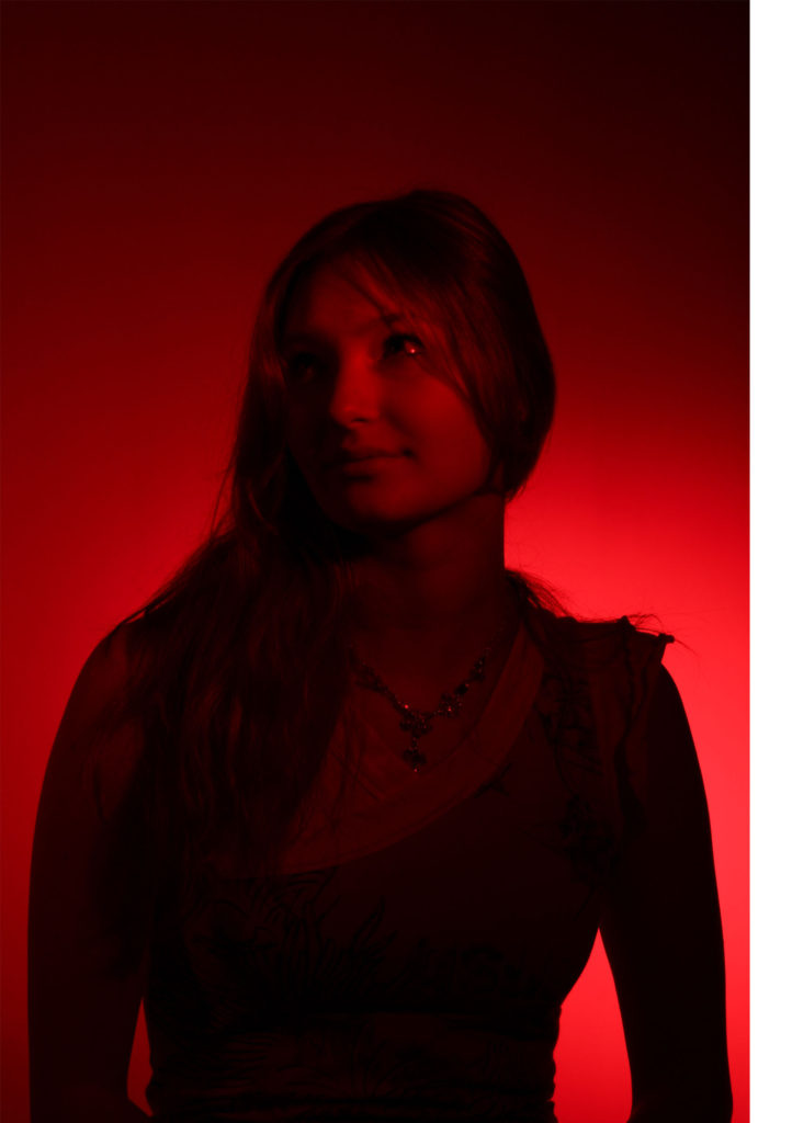
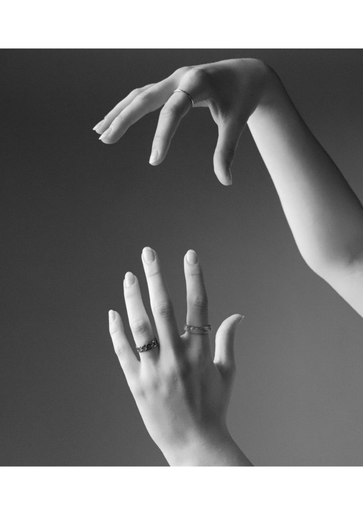
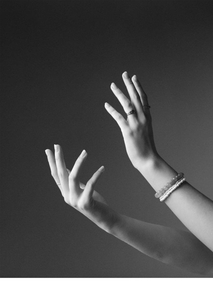
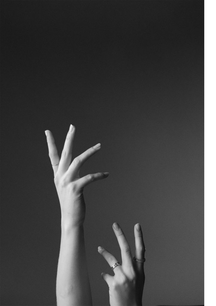
The above images will all be printed A5.
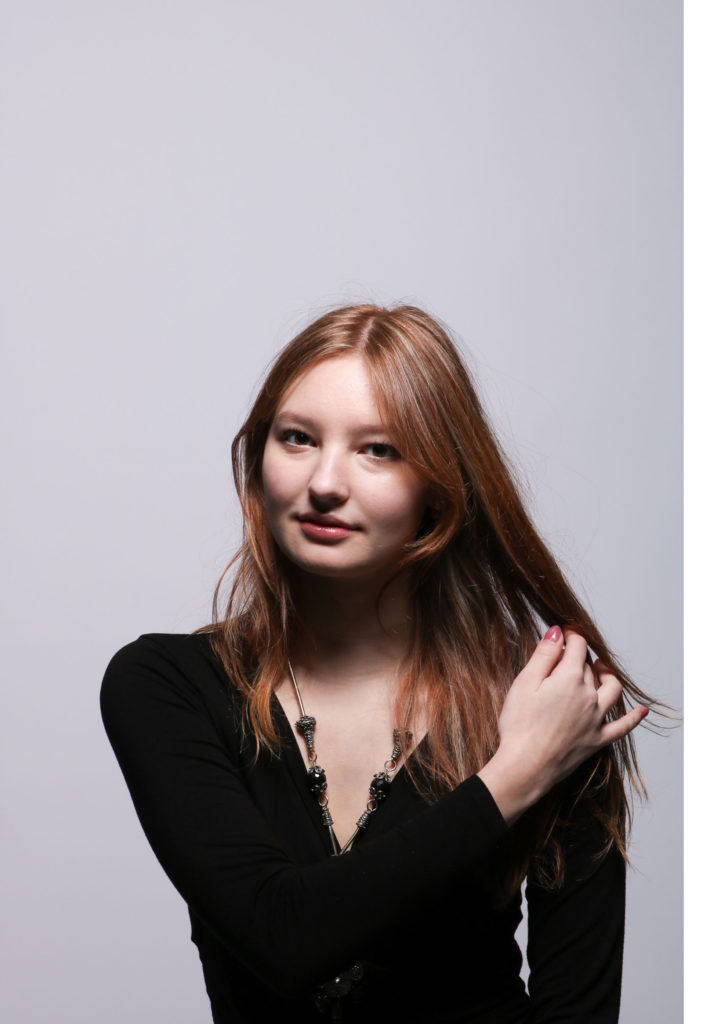
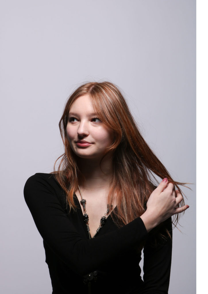
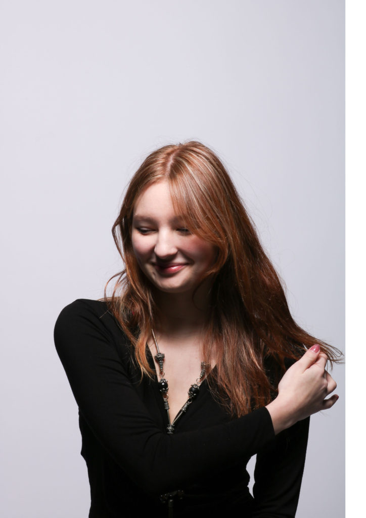
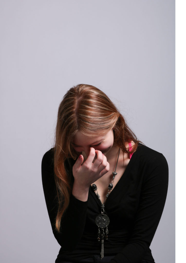
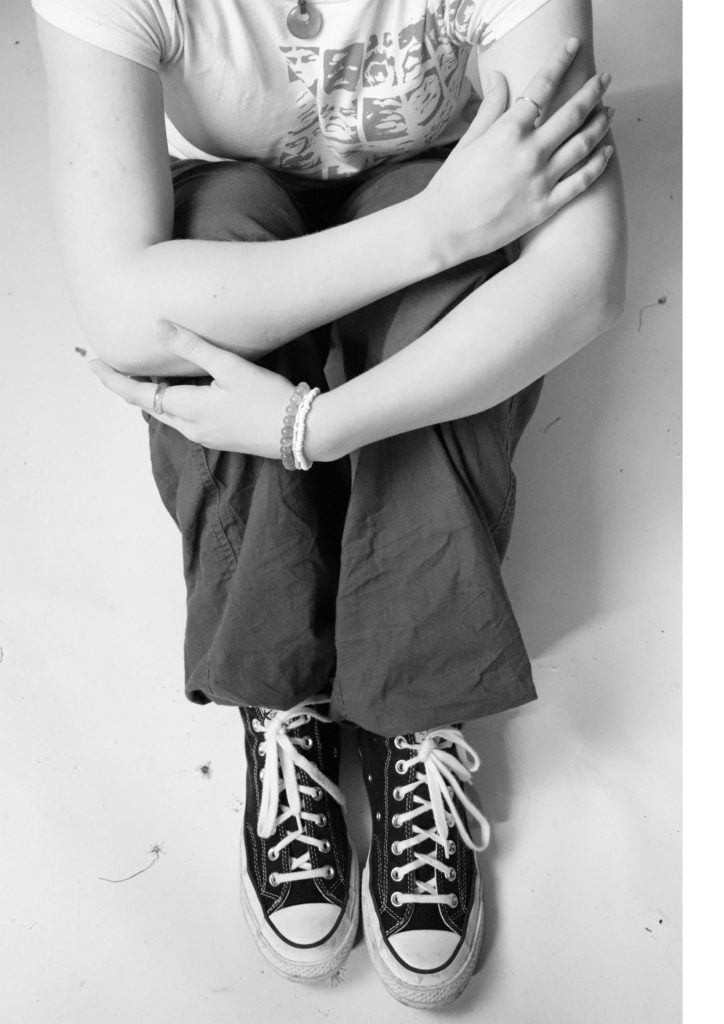
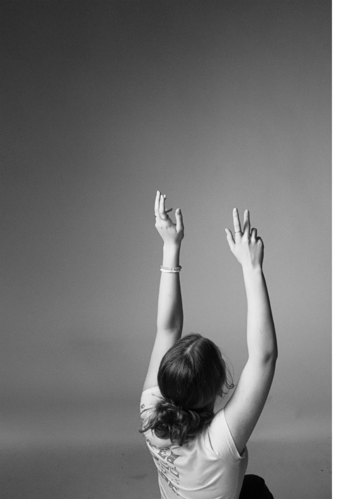


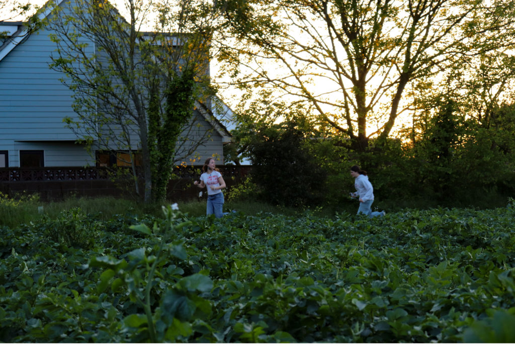
The above images will be printed A4.
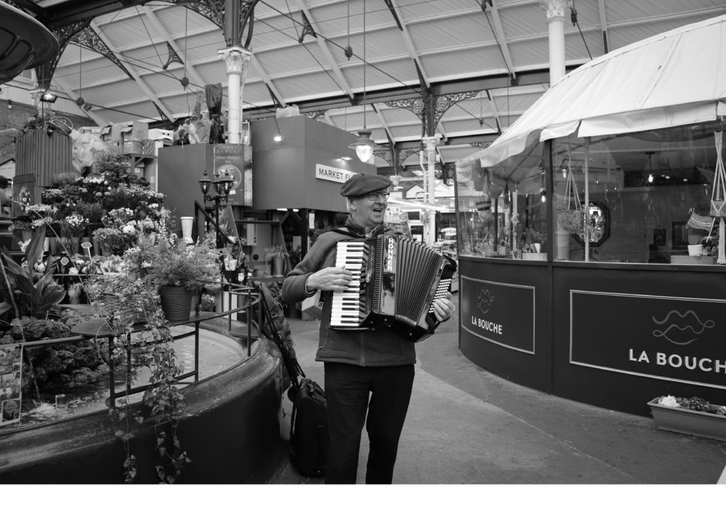


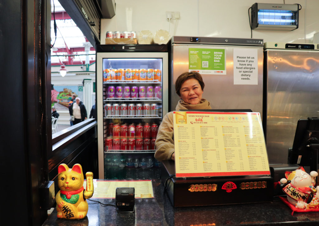

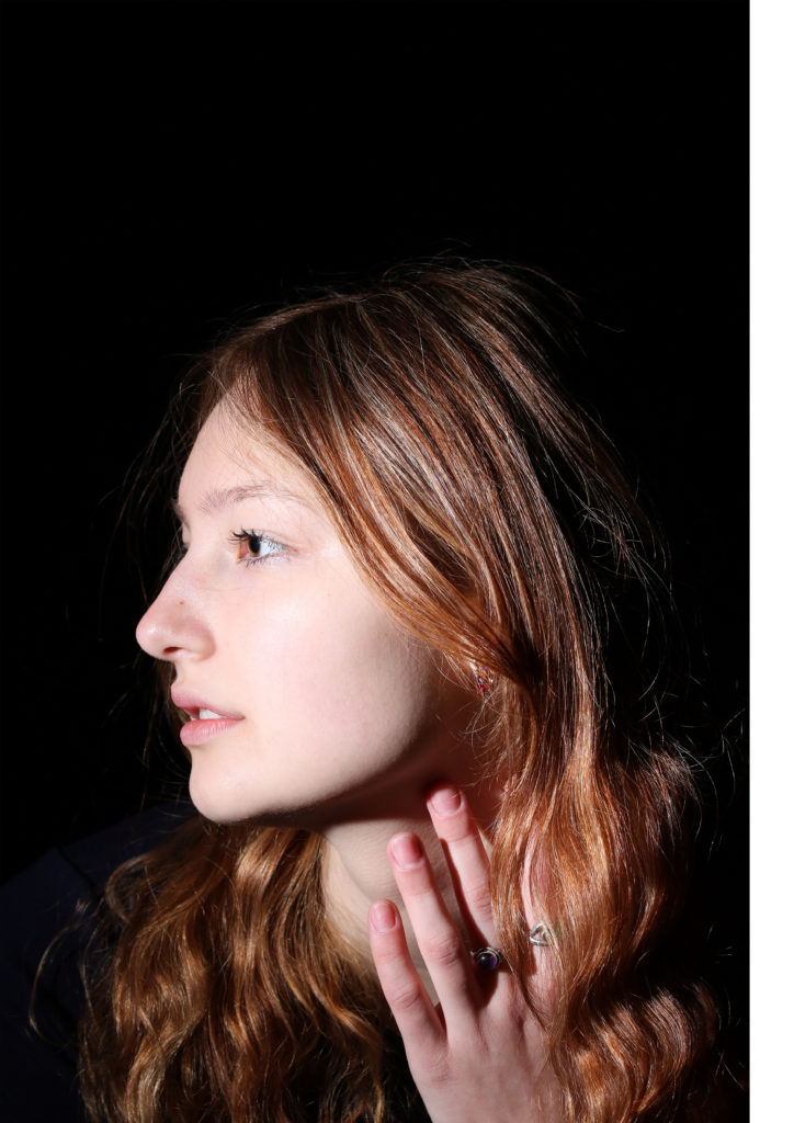


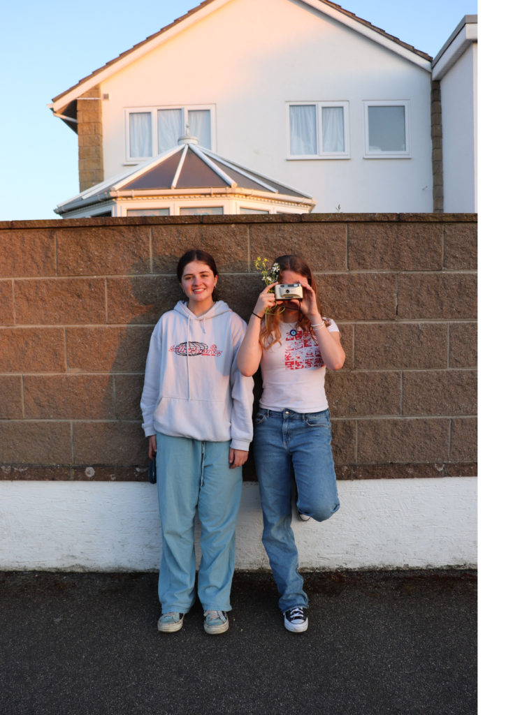
And these will be printed A3.
Throughout, I have tried to collect the images into series so that I can mount the similar images together to create diptychs/triptychs/quadriptychs.