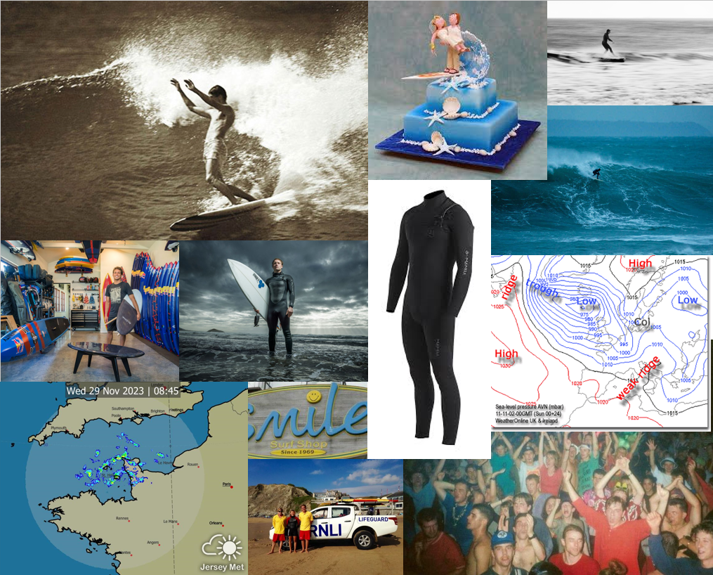
Personal Study Moodboard First Ideas


‘Paris Photo is the largest international art fair dedicated to the photographic medium and is held each November in the heart of Paris. Since 1997, the Fair’s mission is to promote and nurture photographic creation and the galleries, publishers and artists at its source.
Paris Photo brings together up to 200 exhibitors from across the world, offering collectors and enthusiasts the most diverse and qualitative presentation of photography-driven projects today. Leading galleries showcase historical and contemporary artworks from modern masters to young talents. Specialized publishers and art book dealers present unique and rare editions, as well as book launches and signature sessions with many of today’s most renowned artists.
Paris Photo also provides visitors with first-hand insights and access to the art world. Programming includes curated exhibitions with renowned public and private institutions, awards, conversation cycles with curators, artists, collectors, and critics, and special events exploring the unique history of the medium; varying visions, practices and emerging trends. In addition, the Fair’s “In Paris during Paris Photo” programme reunites a dense network of cultural institutions throughout Paris comprising some of the most historically rich photographic collections in the world.’
I enjoyed looking at the work on display at Paris Photo, but the sheer range was honestly rather overwhelming. I found a few examples of work that I might wish to draw inspiration from for my personal study.
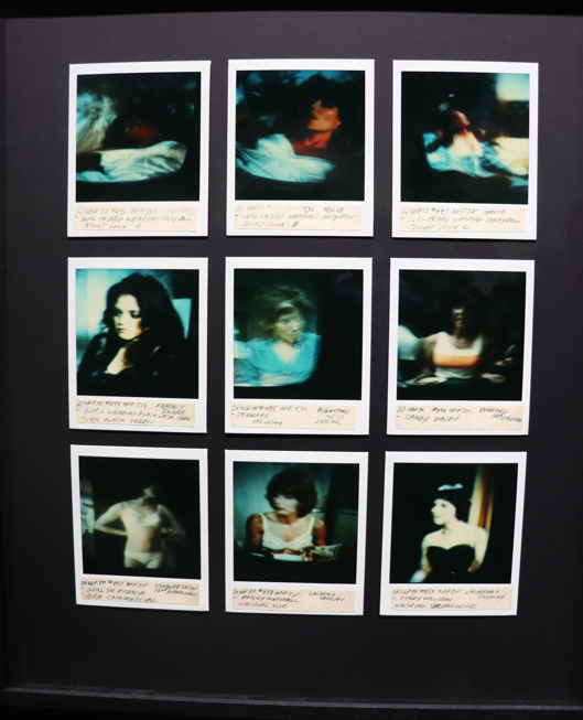
The above image is of a collection of Polaroid images of a TV screen taken by Tom Wilkins over 4 years (from 1978-1982) of various actresses, with individual captions. Sébastien Girard later buys this collection in an auction of Tom’s belongings following his disappearance and publishes it in a book in 2017. Girard describes this book on his website:
‘Tom is American. He lives by himself. TV keeps him busy. In 1978, he buys a polaroid camera and spends 4 years photographing the women who inhabit his TV screen.
Moreover, he carefully writes on each print a caption and the date. Over 4 years, Tom assembles an extraordinary diary, a silver harem of a thousand annotated polaroids arranged in albums, all titled My Tv girls.
Following the disappearance of its author, this lot was put up for sale on auctions together with other belongings.
Simultaneously interested by this story of appropriation and fascinated by Tom’s visual diary, I decide to buy this archive.
I then study them and recreate their incantatory dimension in a book, ten years later.’
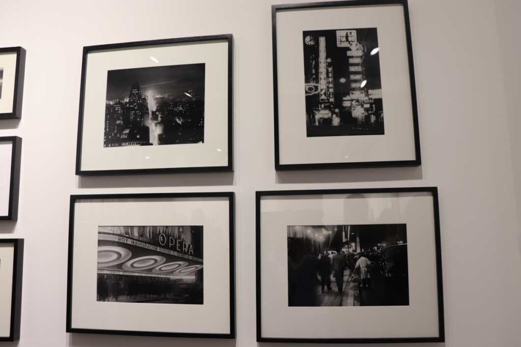
This work is that of Horacio Coppola’s, an Argentine photographer of the cafes, side streets and neon-lit boulevards of Buenos Aires in the 1930s. He introduced avant-garde photography to Argentina. I particularly enjoyed the way in which he portrayed city nightlife and I find his images definitely inspire me to create similar ones to respond to the brief of nostalgia.

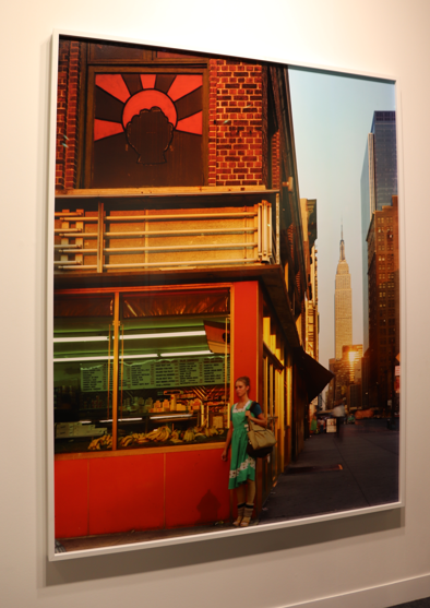
The above images are taken by Joel Meyerowitz, an American street, portrait, and landscape photographer. I like these because they also have a strong relation to the theme of nostalgia, and I think they have a particular style to them.
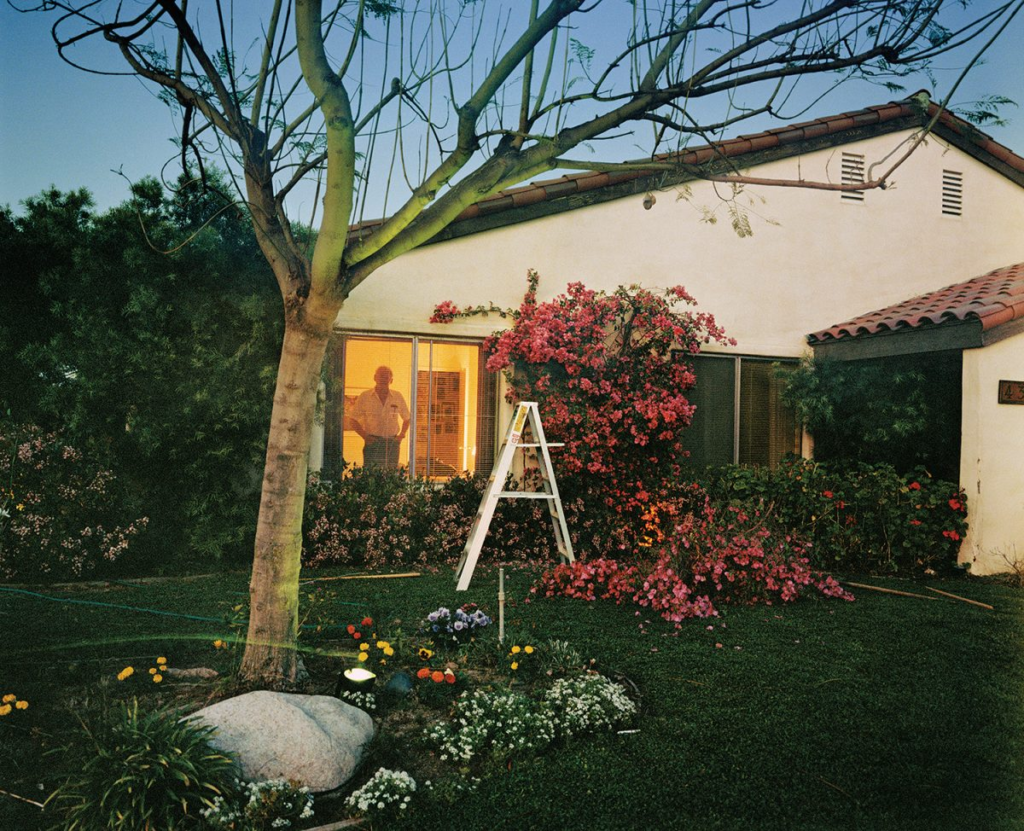
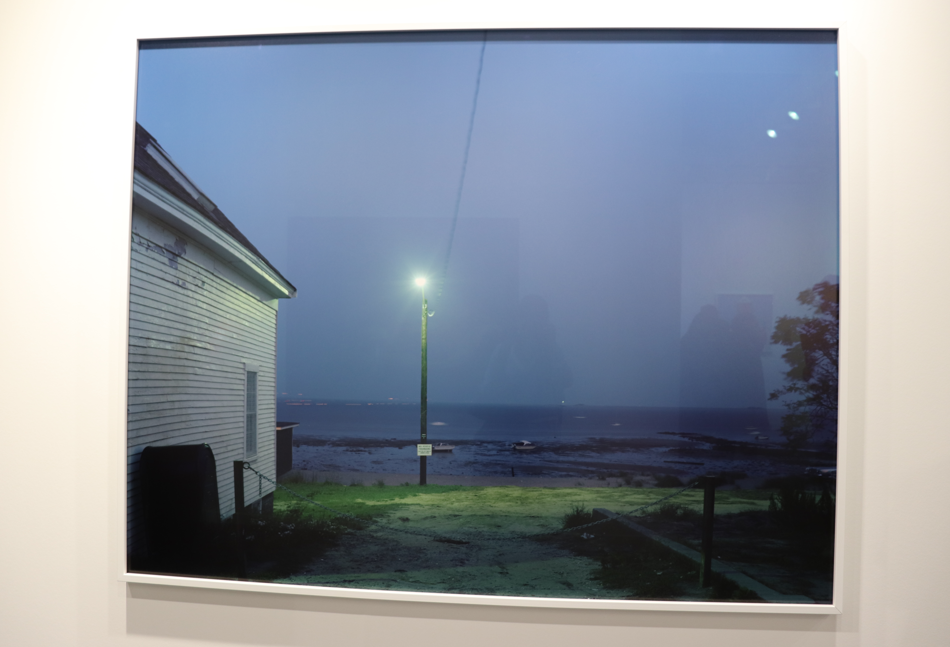
I like the work of Larry Sultan also, the above image was the one displayed at the exhibition and I really like the way he has used the light to perfectly capture the essence of the evening air. I think this also relates to the theme of nostalgia because all of his images have this kind of faded and forgotten feeling to them. This series, Pictures from Home, is significant as it is Sultan’s memories of his parents from when he was a child. He uses the typical architecture of the American suburb to create imagery that can be relatable to many viewers.
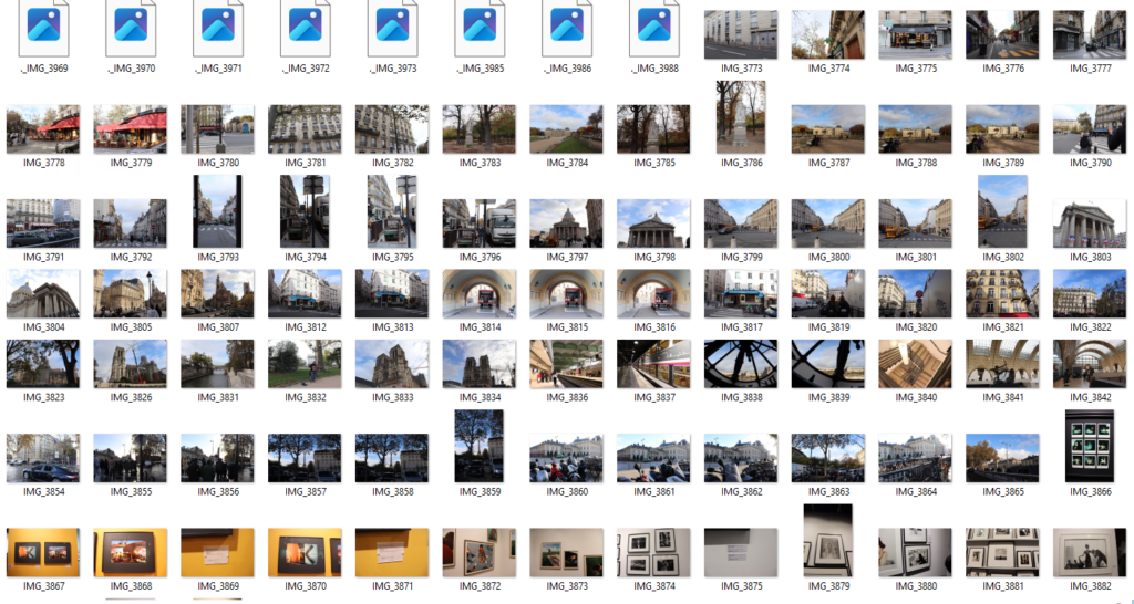
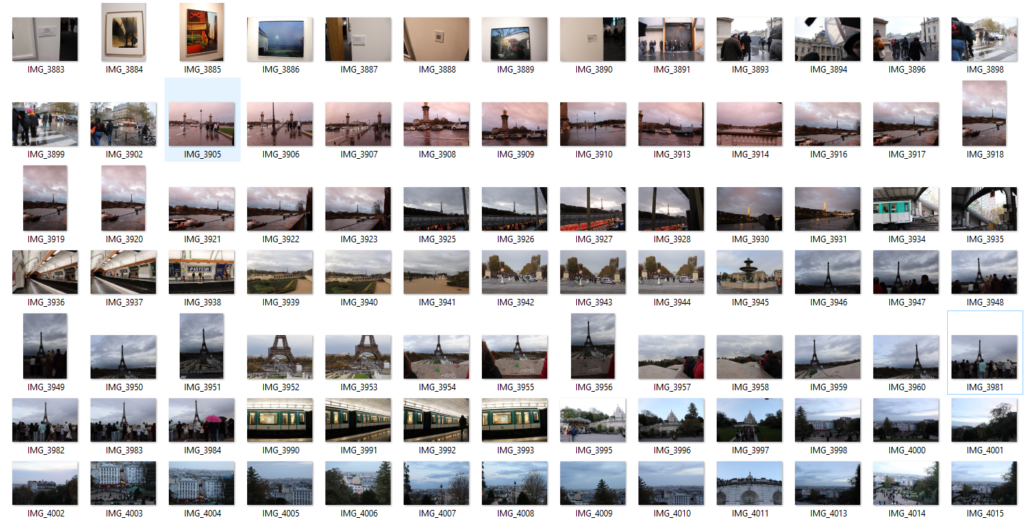

I didn’t get to take as many images as I would have liked, however I think I did manage to get a few strong ones.
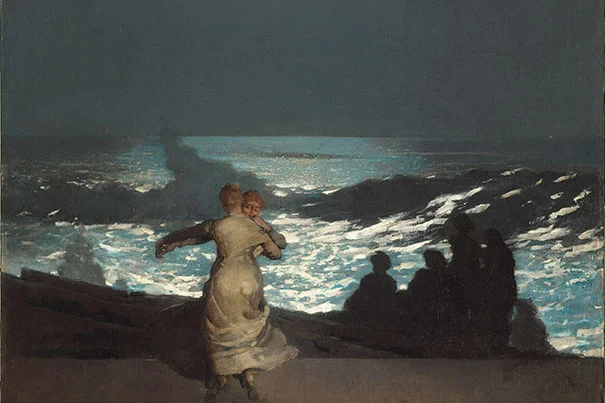
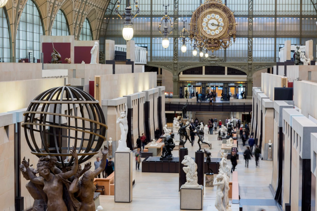
We visited the Musée d’Orsay to view the vast array of artwork that is displayed there, including the work of famous artists such as Vincent Van Gogh, Auguste Renoir and Claude Monet. I felt that the building’s architecture only emphasised the beauty of the work within, with its wonderful open space and translucent ceiling allowing natural light to permeate the main hall. In the smaller rooms, we found the different collections of classical art on display. I enjoyed the pastel work of multiple artists such as Millet, Degas, Manet and others. I also explored paintings by Winslow Homer, an American landscape artist, with my favourite being Summer Night (1890).
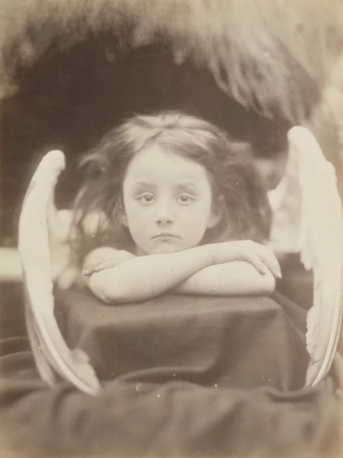
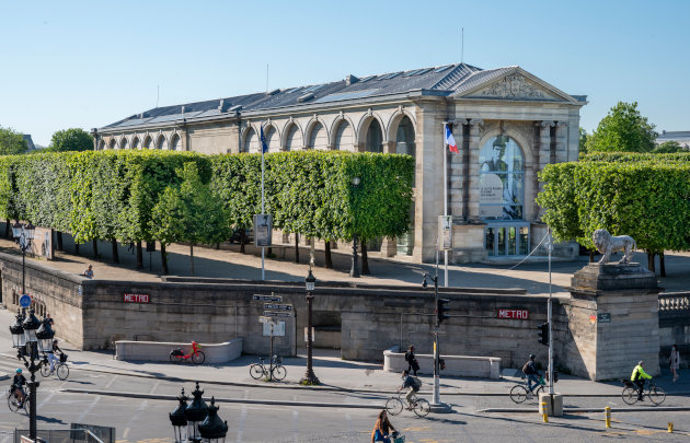
We visited the Jeu de Paume because they were holding a V&A exhibition of the work of revolutionary portrait photographer Julia Margaret Cameron. This is the first large-scale retrospective devoted to the artist in Paris, made up of some one hundred photographs. We studied her photographs earlier on in the portrait project because she was the first of her kind to truly explore aspects of theatre in photography. This was even more remarkable at the time because she was a woman. The exhibition also features exceptional loans from the Bibliothèque nationale de France, the Musée d’Orsay, and the Maison Victor Hugo.
The museum also happened to be holding an exhibition of the work of Victor Burgin, which I felt was my favourite showing I had seen. Victor Burgin is a conceptual artist and photographer whose work is composed of both images and words. I enjoyed the experience that his performative pieces represent, and I felt that the story told in Gradiva (1982) was truly captivating and cinematic.
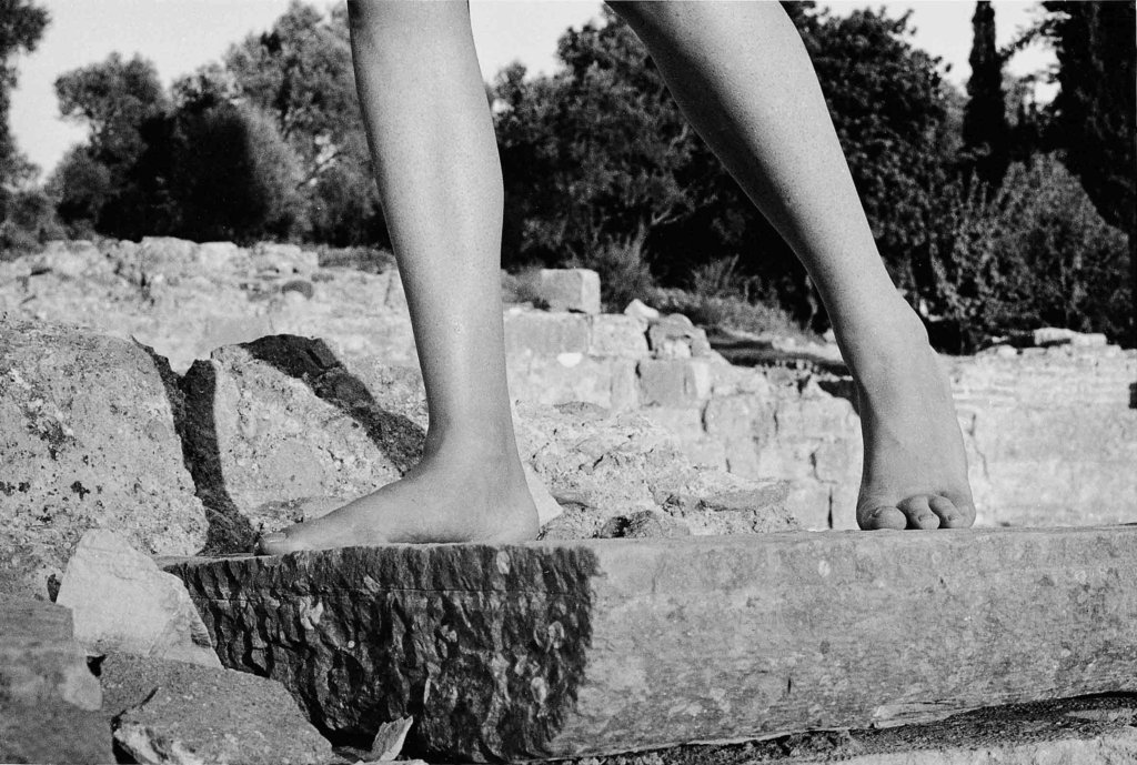
His US77 series was also extremely interesting to me because it explores ‘the construction of sexual difference in representations, of patriarchal power relations and the “masculine” identity that supports them’. They were originally exhibited under the title ‘Tales from Freud’, which indicates their topics of discussion.
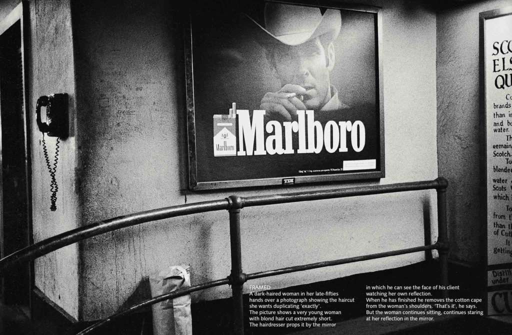
Nostalgia, Femininity/ Masculinity/ Identity
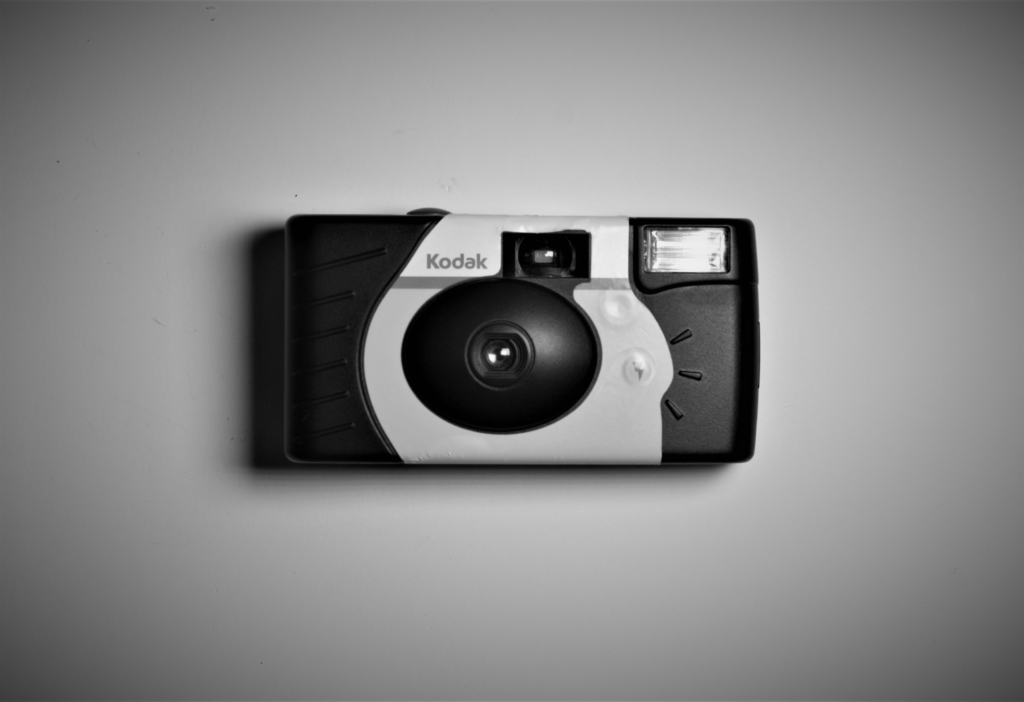
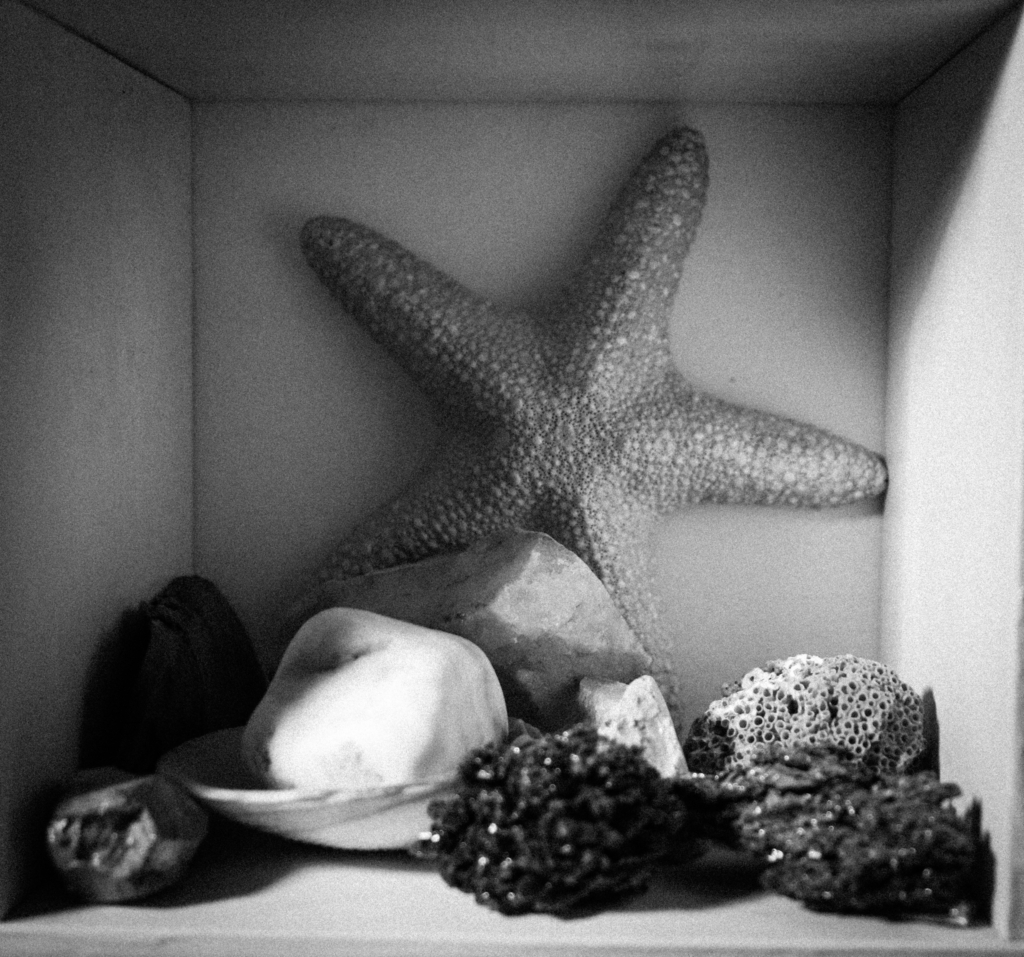
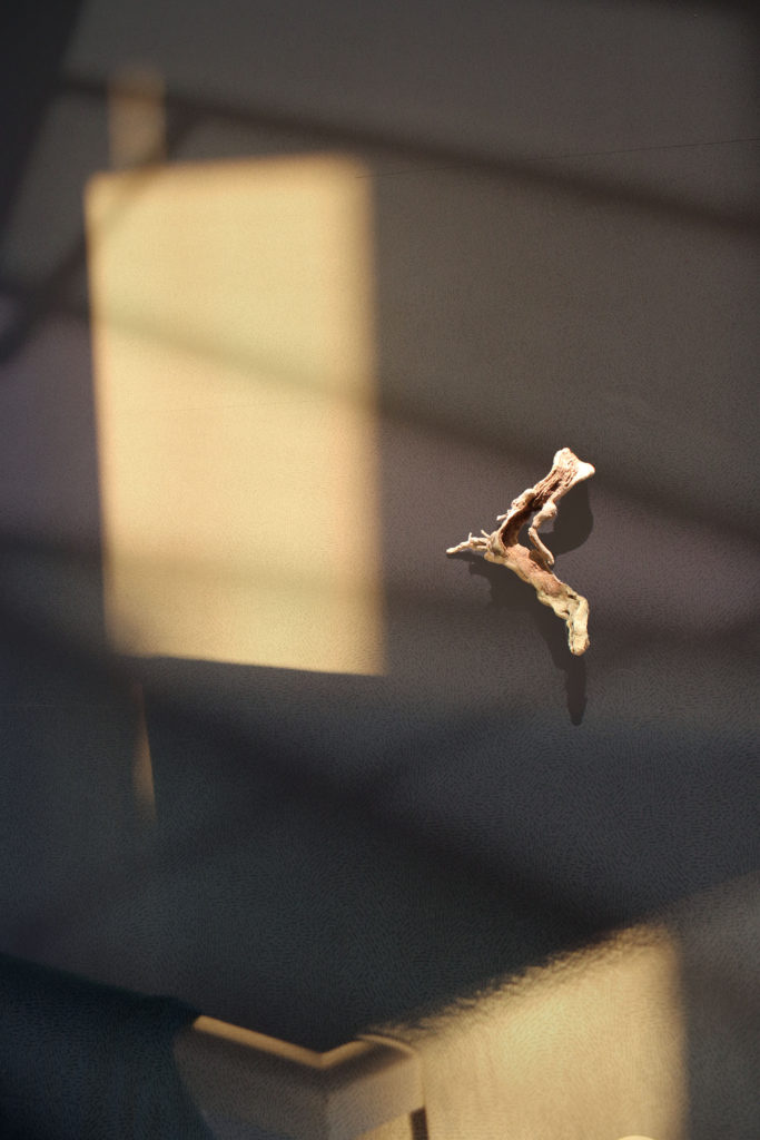
Home
‘Overall, this module was a new style to me and therefore quite challenging. I created a small number of images I am proud of but I don’t think that they are at all my best work as this was one of my first experiences with photographing objects, and often my intentions were not entirely clear to me when I set about taking and arranging my images. I am also aware that I did not really employ Photoshop to the best of my abilities as I was a bit out of touch with it and probably needed to use it a bit more often. I hoped that in my future projects I would be able to act with thorough forethought (in choice of objects, placing of objects, background, lighting etc.) and ensure that I took enough images on each photoshoot – as I think this was one of my biggest shortfalls in completing this project. I have included my favourite images in this Virtual Exhibition.’
The above is an adapted version of my final evaluation of the Home project – images that may inform my choices and inspire me in my personal study are below.


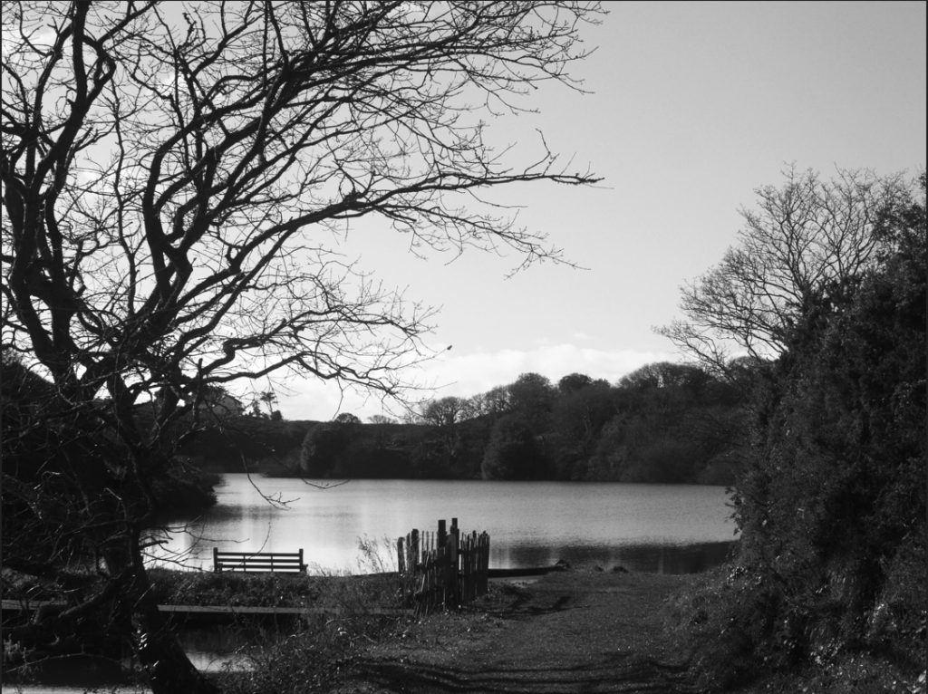
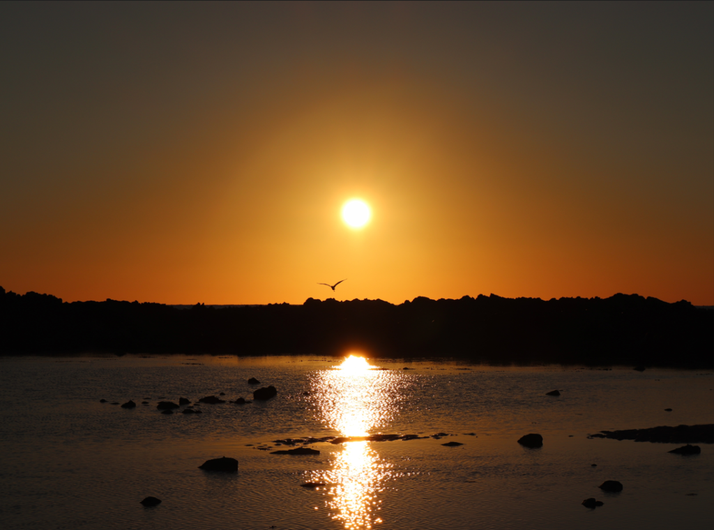
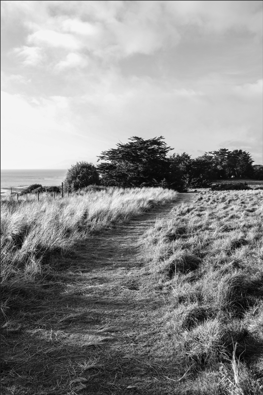
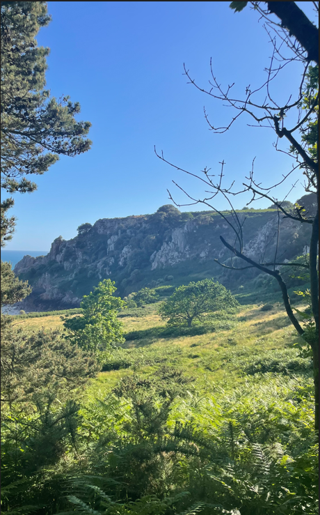
Romanticism
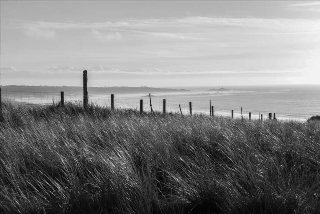
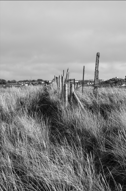
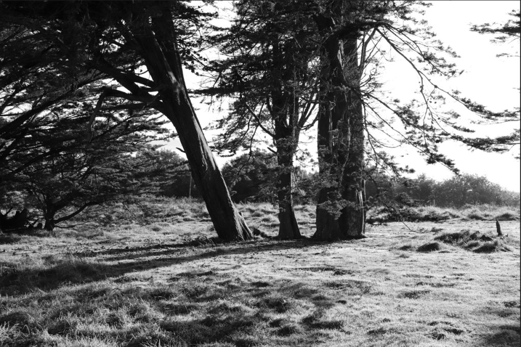
I enjoyed creating images for this project because I think that the beauty of the countryside and its emotional impact on us as people is something that can easily be emphasised through careful use of light and colour. I also really liked the work of the artists we looked at here. Images and artworks of the genre strike a certain chord in me as someone who grew up in the countryside and I think that the slightly sad, nostalgic effect of this is something shared by a lot of viewers, no matter their personal experiences. The work of Fay Godwin, Ansel Adams and Don McCullin was my favourite purely because their use of the camera as a tool through which to project and amplify the drama of the landscape is evident in each of their images respectively. I may well be inspired by my final outcomes to create a romantic element in my personal study, as I think my final results were very strong.


New Topographics
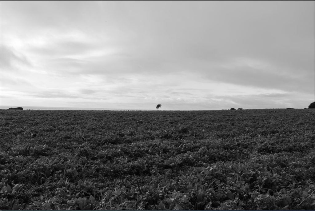
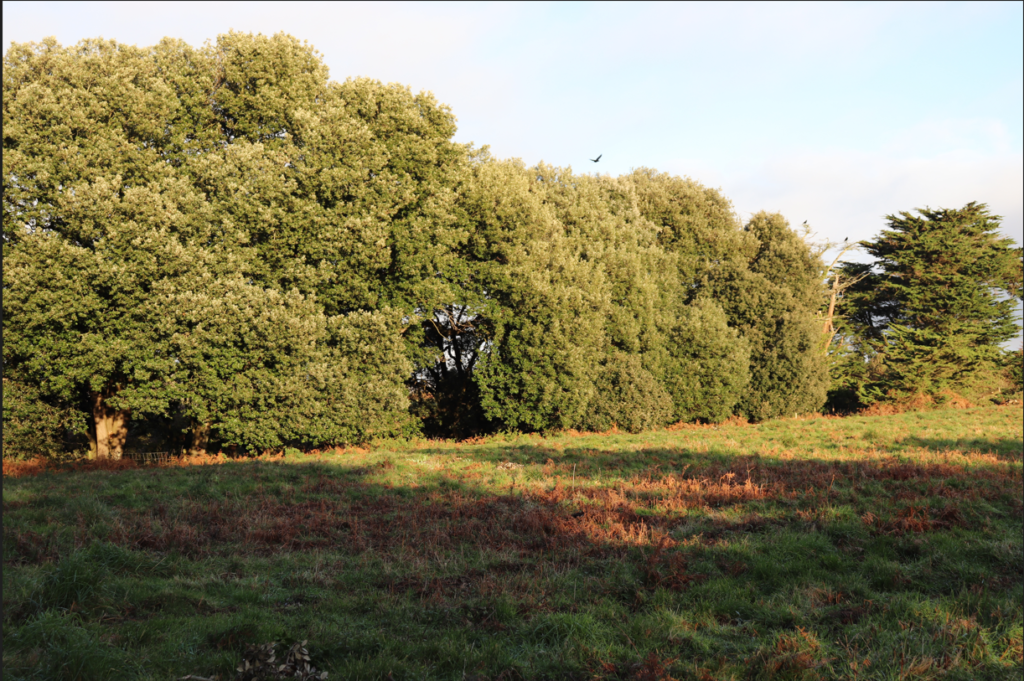
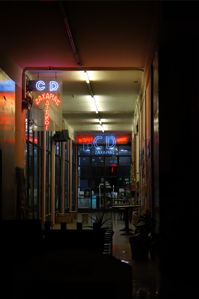
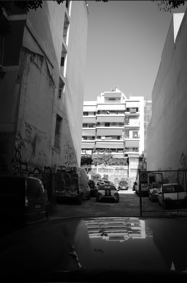
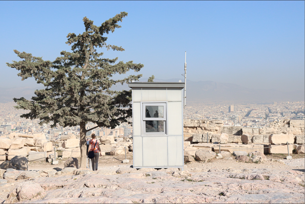
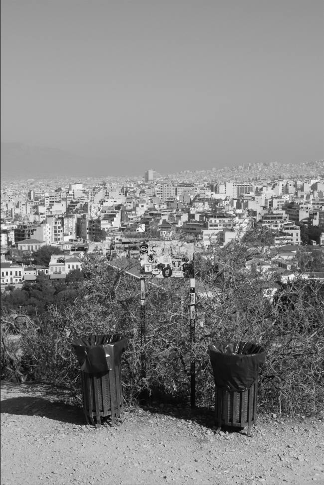
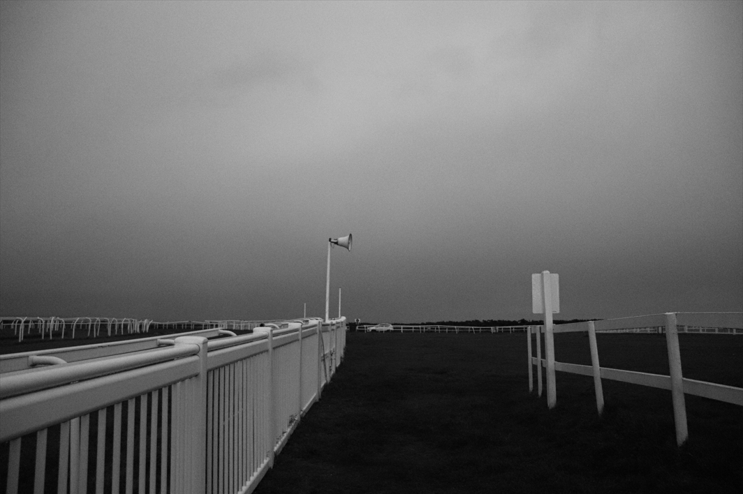
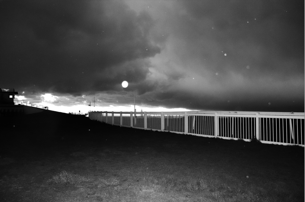
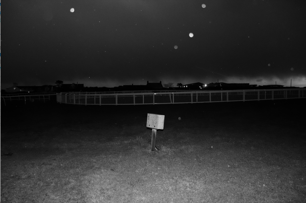
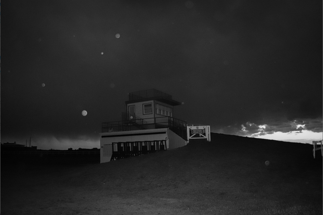
I like the images I took for this project because I think they all respond well to the brief of New Topographics because they all have a very muted and desolate tone. I also think that there is a lot of alignment between my images and those of the most famous artists of the movement. I was intrigued by their efforts to portray the damage inflicted on humans to the beauty of the landscape, and my interest was only heightened by the impact of context on my view of this work. The population boom of the 50s, and the consequent sprawl of suburbia across America, demonstrates exactly why artists like Robert Adams felt the need to document the endless array of buildings being repeated all over the country. My key and most inspiring images from this project are shown below.
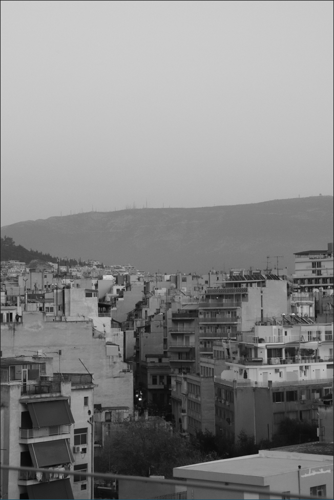
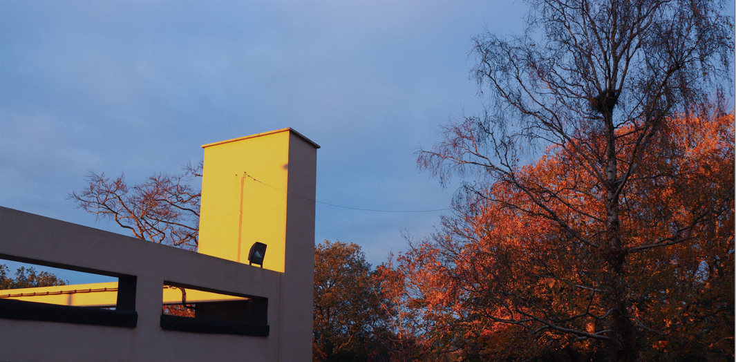
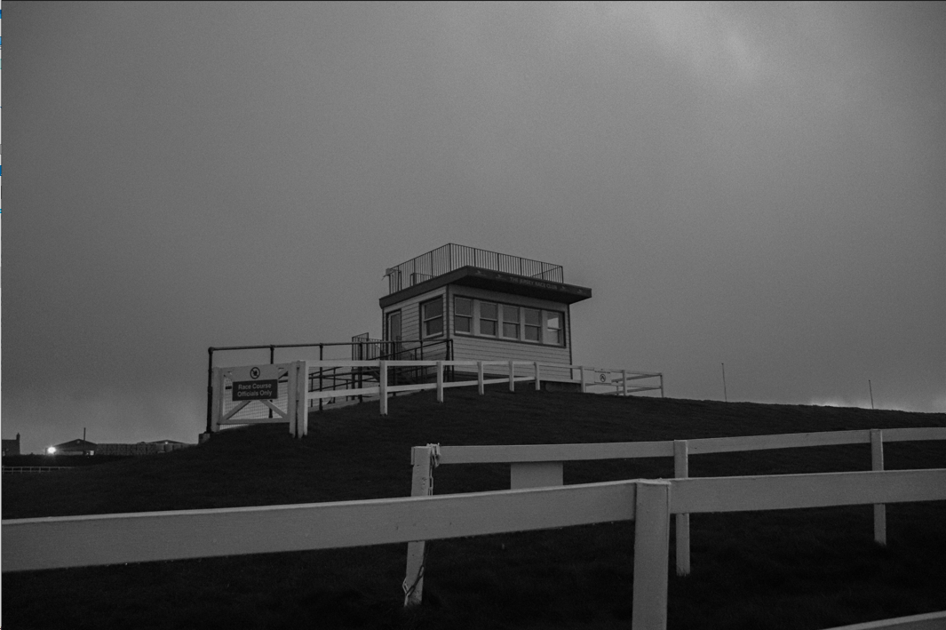
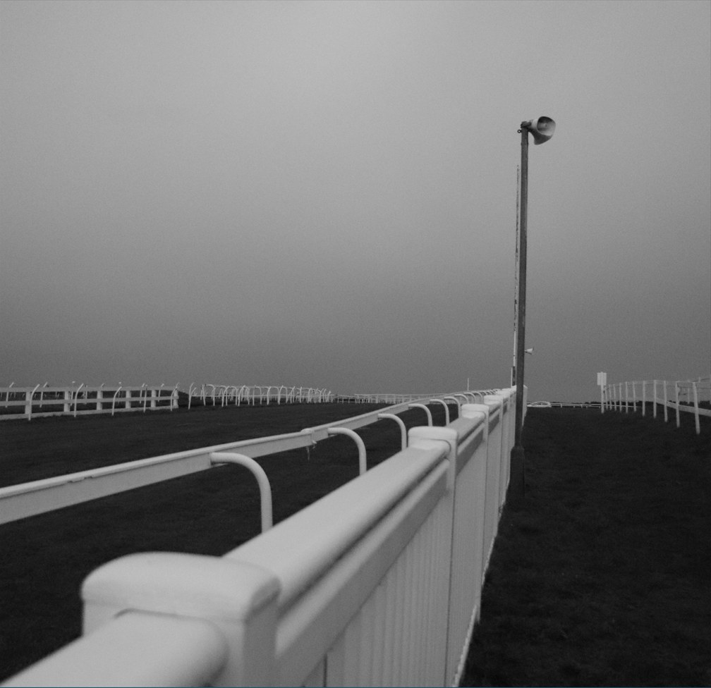

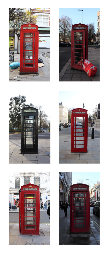
Typologies
I did not produce many typologies but I do like the one shown below and I feel that this technique could be explored further in my personal study.
Anthropocene
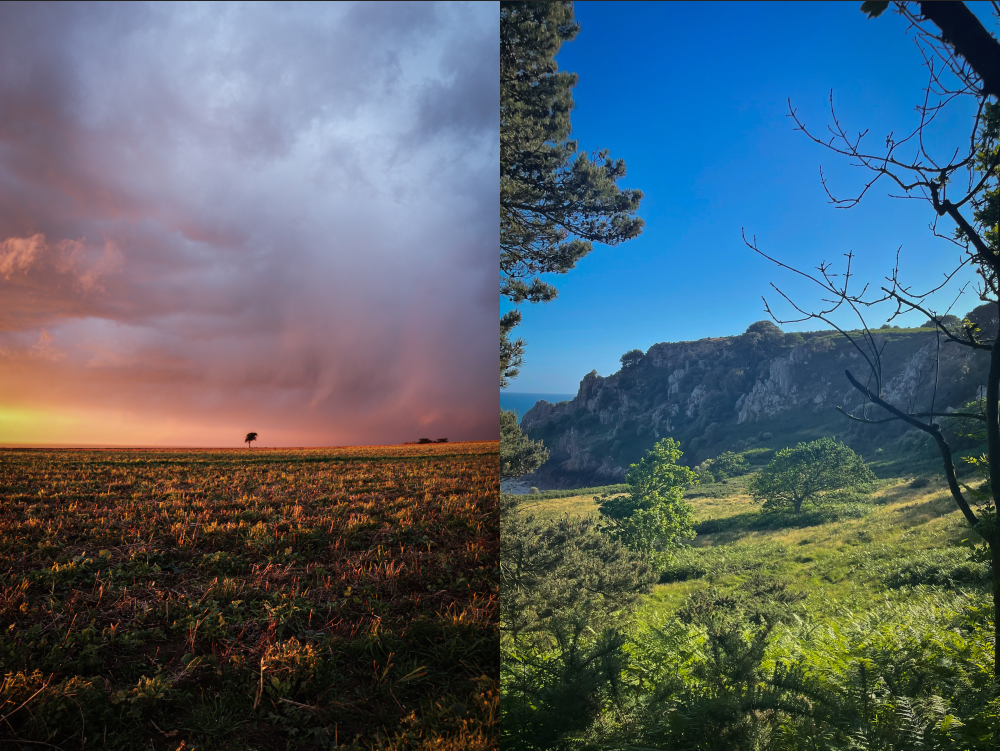
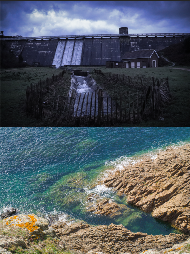
I enjoyed the Anthropocene project because it gave a lot of opportunity to explore different avenues and approaches to the brief. I think that my final outcomes were very obvious in the message they were aiming to portray and therefore work effectively. I chose to present my final images as diptychs and this hence amplified the contrast I was attempting to display. In my final critique, I said this: ‘I think that my images are all really strong and I am happy with my editing choices. I think that all of the images that I put together do compliment and contrast each other in a productive manner. However, it was quite frustrating to not have been able to take as many strong and varied images as I would have liked; and I think perhaps a more clear framework in my head would have made this a little easier. On the other hand, I do still feel that the weather made things quite difficult during the week and this did invalidate a lot of my images that I actually took for the project. I think I did use the camera to the best of my abilities, but there is definitely more I could learn and settings I could utilise to take more interesting images… In conclusion, I enjoyed this project. Taking the time to research the different aspects of Anthropocene and its effects was really interesting and I feel that I have learnt a lot through doing so. I am proud of my outcomes, despite feeling that my idea was not as strong as it could have been, and I am aware that there is room for improvement in all areas of this kind of task for my future reference.’

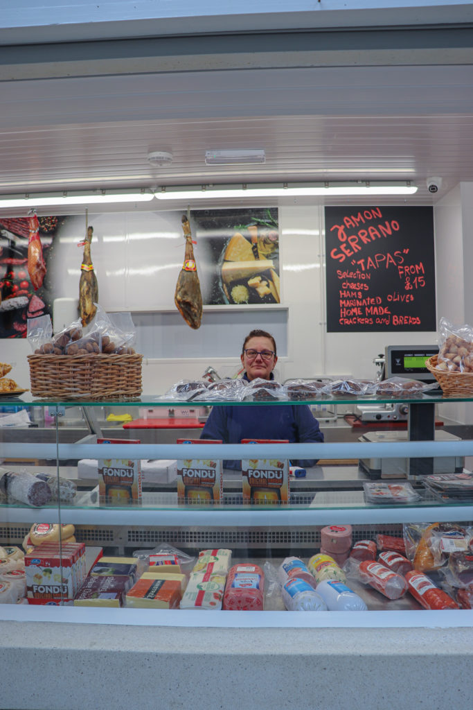
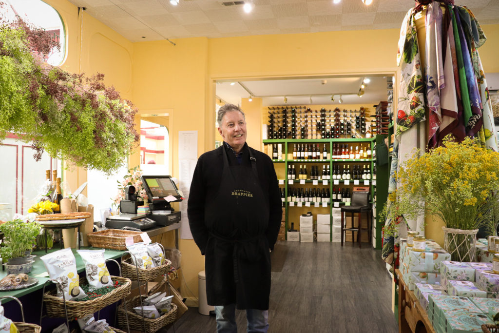
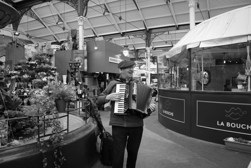
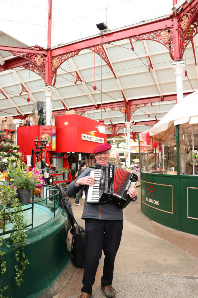
Environmental Portraiture
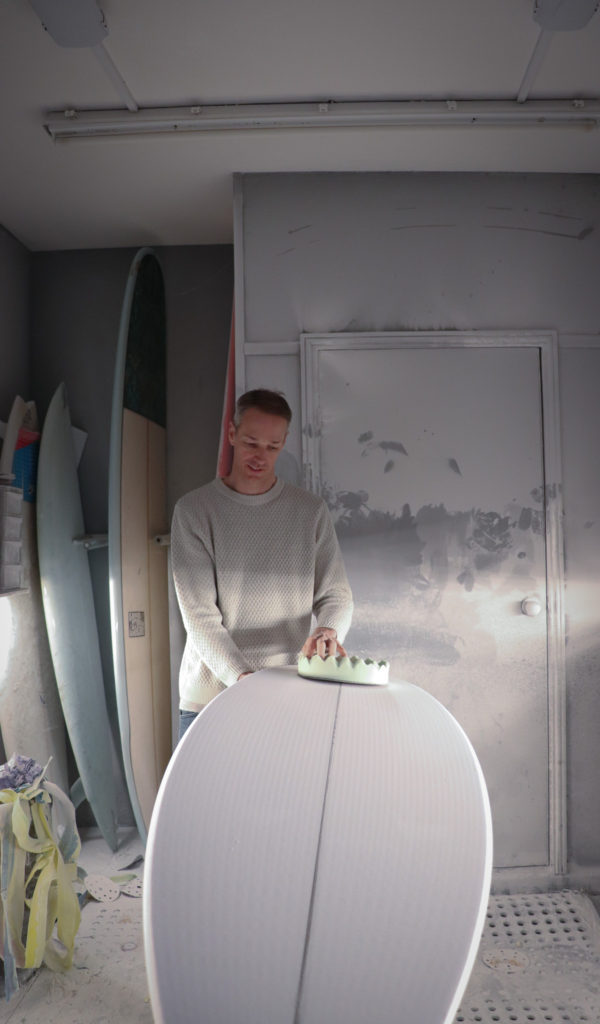
I really enjoyed creating images for this project because I think the concept of Environmental Portraiture can produce some very personal and interesting material, depending on how one chooses to approach it. I think that I will be inspired to use this technique in my personal study, as the images I have already produced have been some of my strongest.



Studio Portraiture
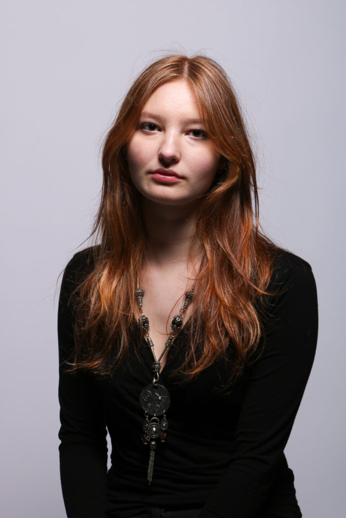
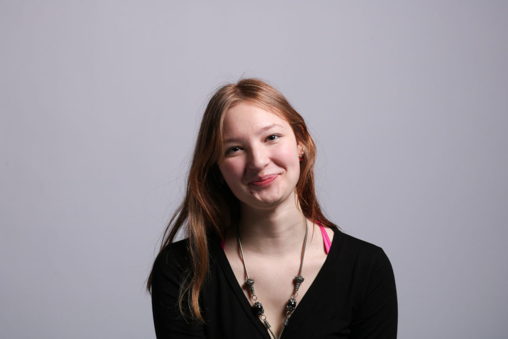
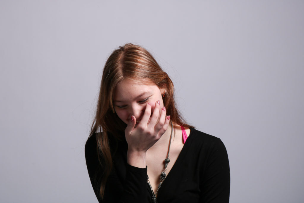
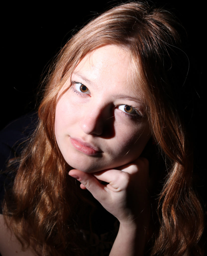
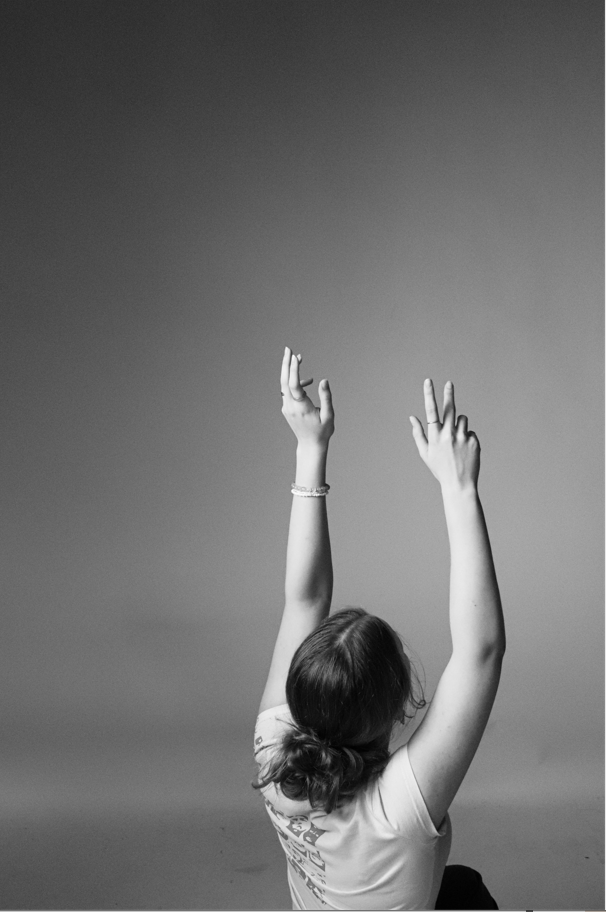
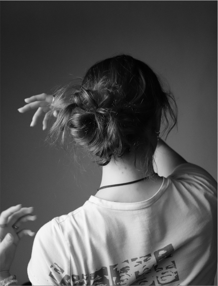
I think that I need more practice with photographing in studio as I sometimes struggle with camera/light settings, however I have created some very strong images in the past which I may hope to use as inspiration for my personal study.
My original critique said this; ‘Overall, I am happy with my outcomes for this project as I feel that I was able to access a range of techniques and styles to build up a portfolio that will reflect my various talents in different fields of portraiture. I enjoy the more documentary style imagery and I feel like I was able to explore this on a few occasions over the past few weeks. Additionally, I was able to experiment with studio photography which was fairly new to me and I have created outcomes that I am proud of. I think that there were certainly improvements that could have been made across this project, and sometimes my plans were not executed as I would have liked, however I can say that I have also created work that was really successful.’






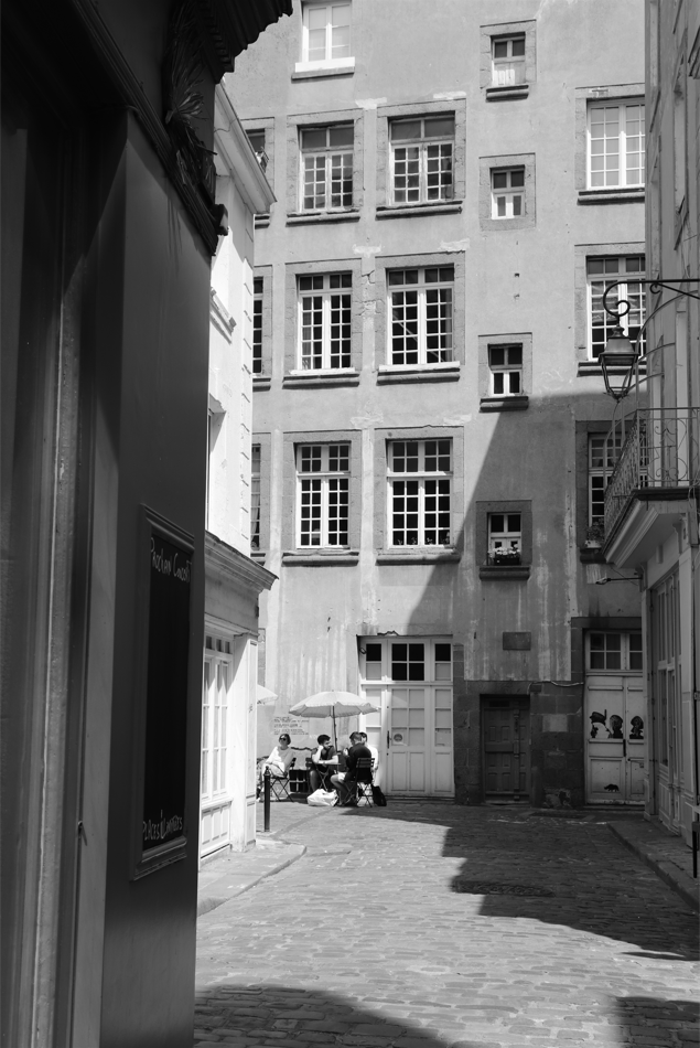
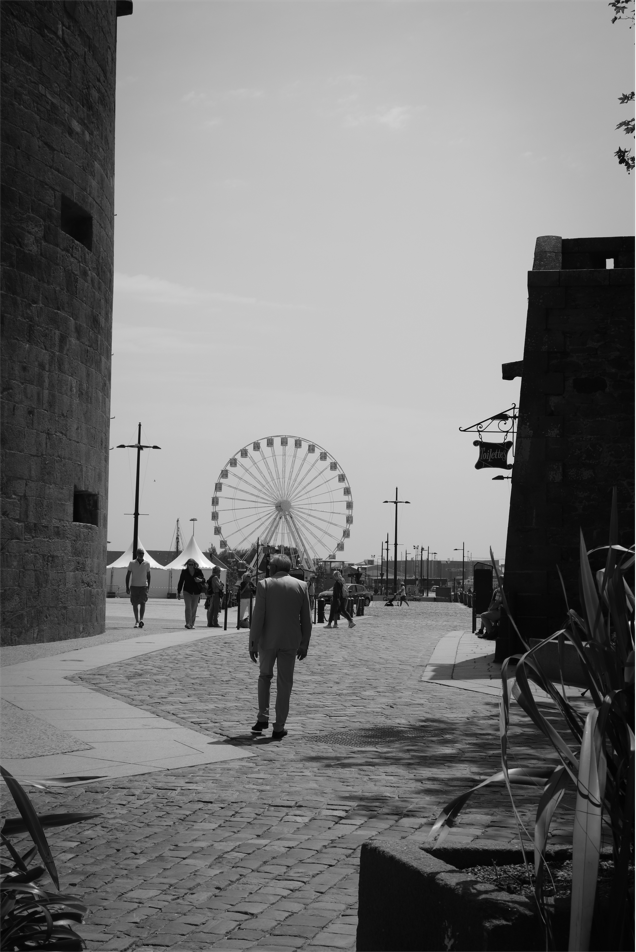
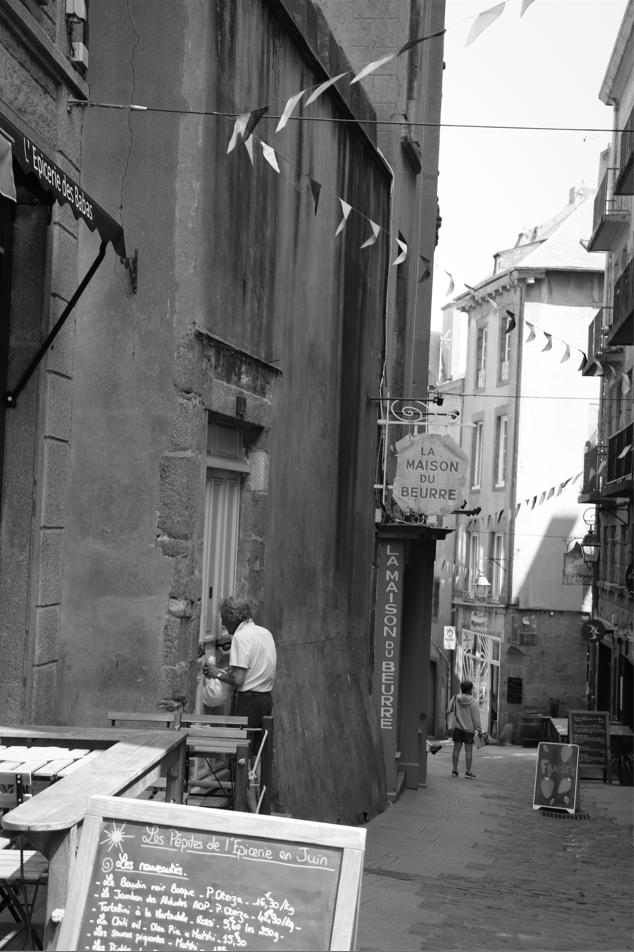
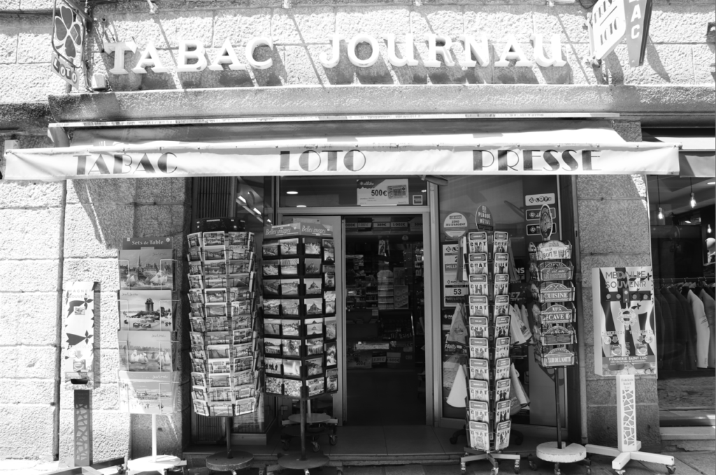
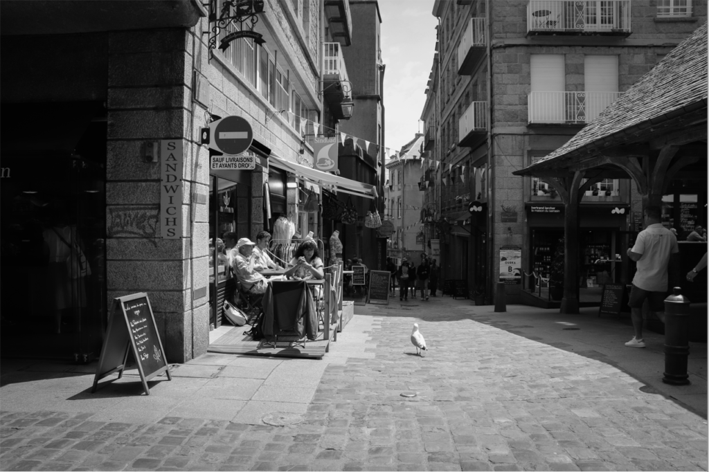
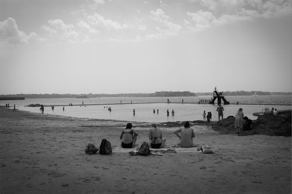
Saint Malo – Nostalgia
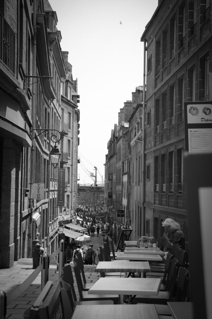
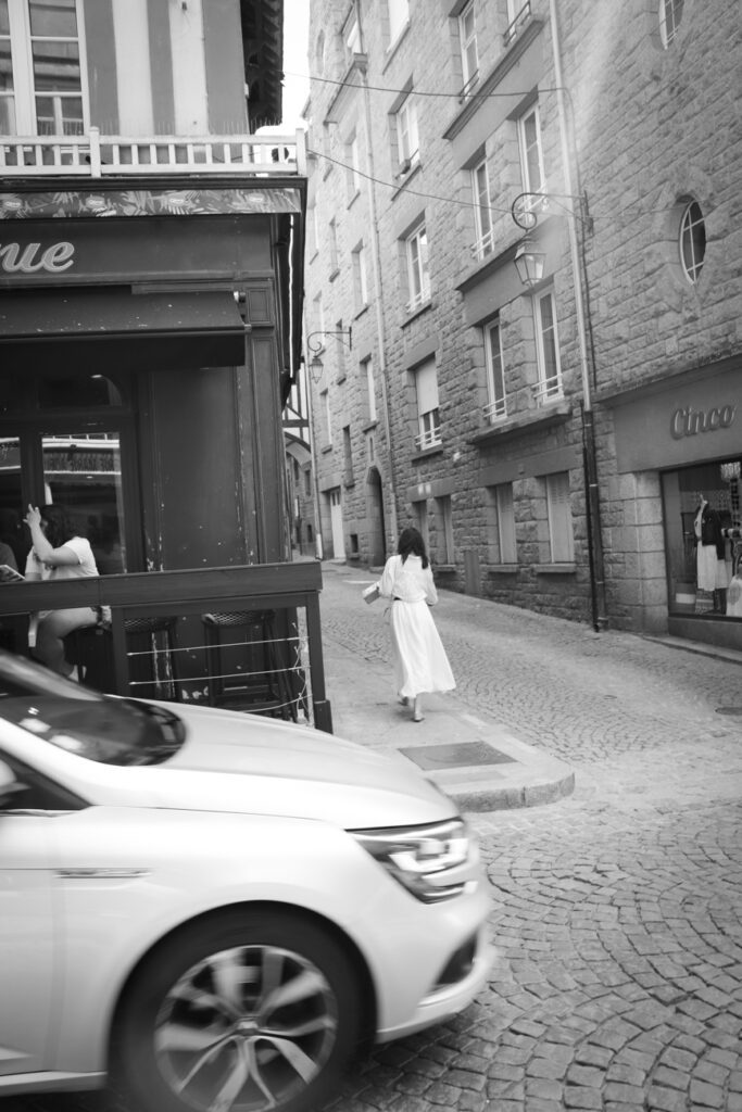
I think that the images I created in Saint Malo were strong and they certainly responded to the brief of Nostalgia, especially after editing to make them appear more reminiscent of older times. Thus, I think these images could provide inspiration for my personal study as this will also need to respond to the same brief.

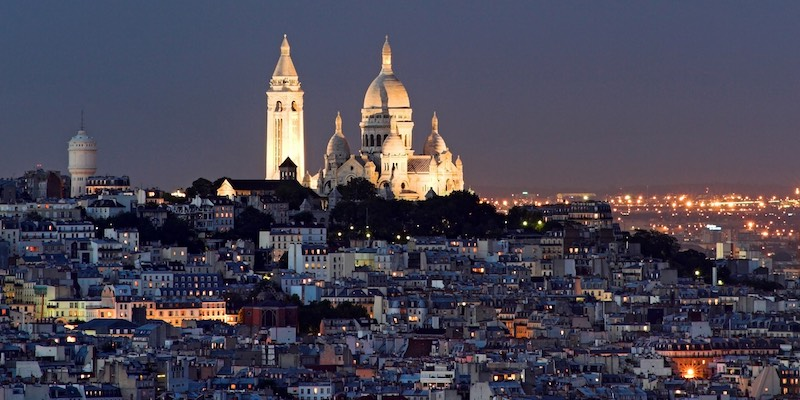
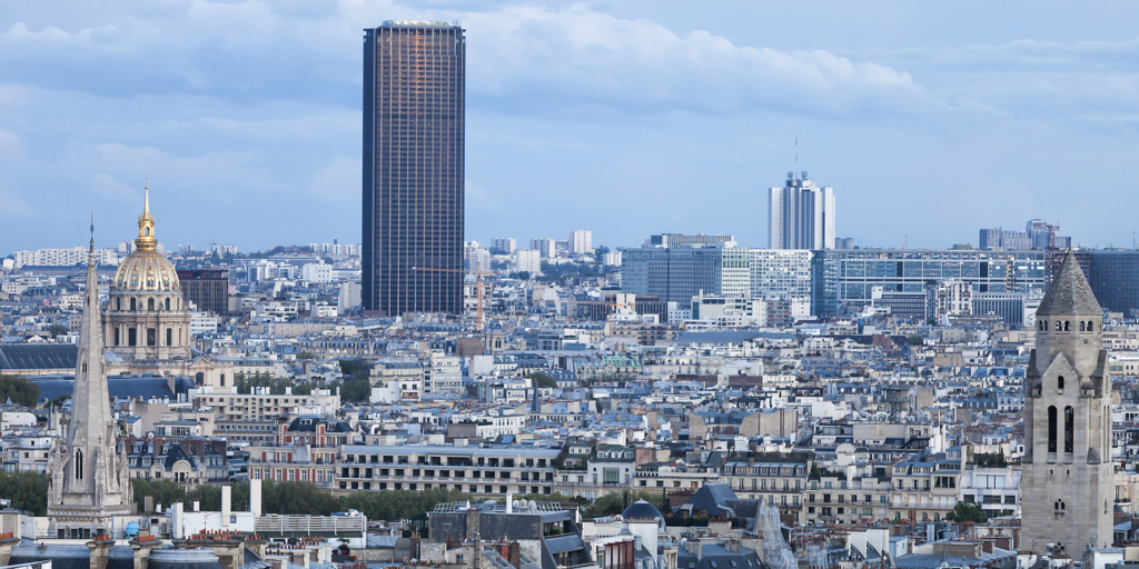
Me and 18 other A-Level Art and Photography students went on a trip to Paris to get inspiration for our coursework. We visited galleries, including Musée d’Orsay and Jeu de Paume, and an international photo exposition held annually, called Paris Photo. Besides this, and despite the bad weather, we were also lucky enough to do a number of things, including visiting the Sacre-Coeur, taking a night boat tour of the Seine, and going to the top of the Montparnasse Tower.

Wiktoria worked with Adobe Audition regarding the sound we would use in the film.

She used a mixture of the sounds we collected from the castle and also sounds that were collected by Sam, an audio producer we worked with. These were filed in the ‘Elizabeth Castle Sound library’.
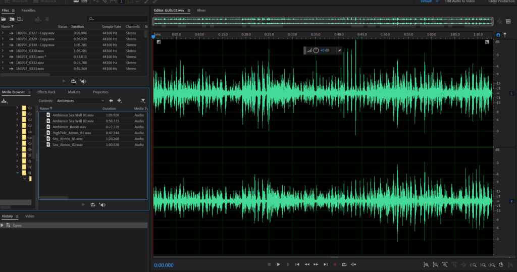
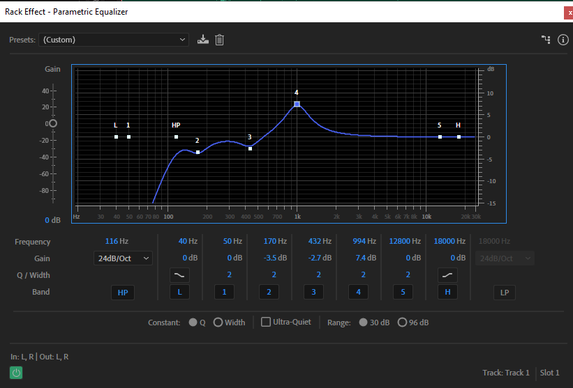
“What I had to do is filter each sound I wanted to use so it was “clean”; the background noises were eliminated as much as possible. I could quiet down each element of the sound to a desired level.”
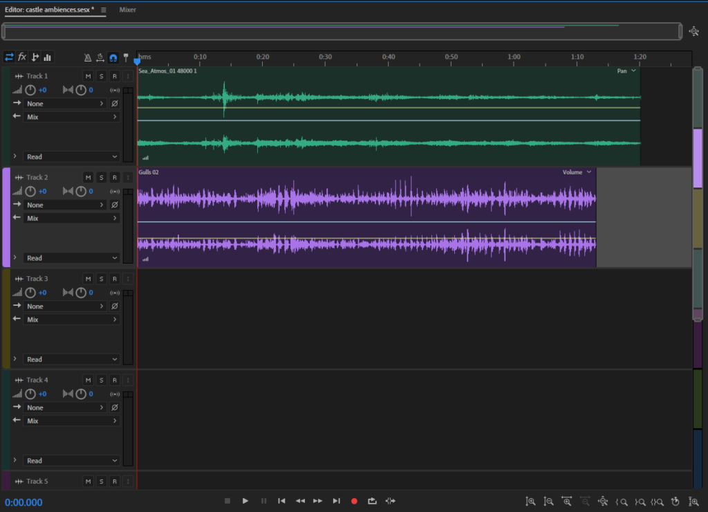
“In Adobe Audition I was able to combine different sounds together to create a sound scheme. I decided to create one consisting of seagulls and the sound of the sea. After cleaning and filtering the sounds, I inserted them and made sure to save them as a collection, so I know they are a combination of sounds joint together. This makes a great background track as a sound that is ongoing or primary sound that shapes the mood of the film. Another combination that would have worked well is maybe the sea and people talking in the distance.”
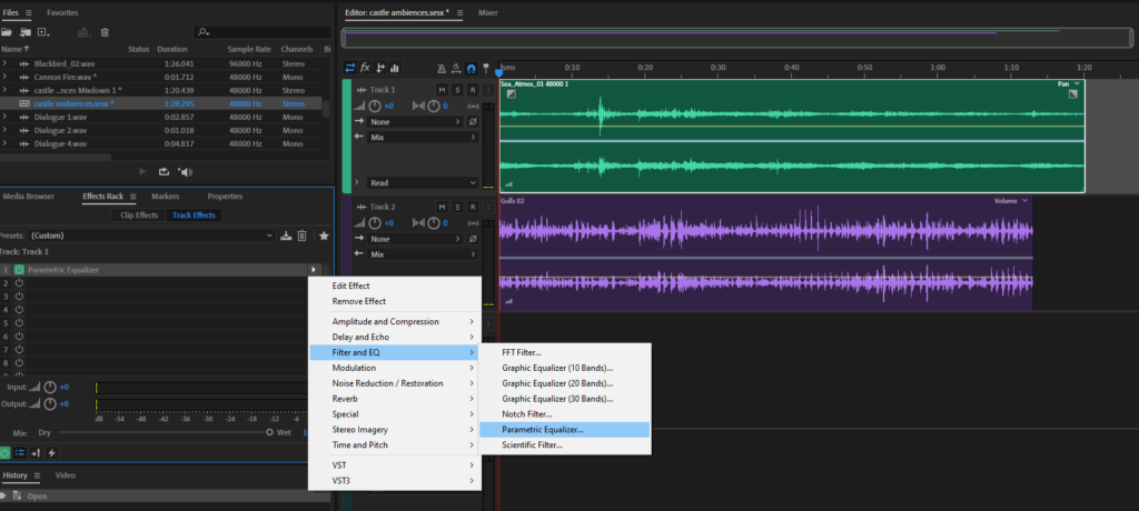
“Working with sound is very important when it comes to films – there are even specific jobs that revolve around people making sound effects on anything that is being filmed to produce the cleanest sound possible so that the quality of it increases the authenticity of the scene. One of the things that make a great movie is how well the viewer is engaged with it. The more interested they are in the movie the more successful it will be. Sound serves as a vital aspect of cinematography as it affects the mood, and heightens peoples emotions. For example, when the sound is calming but a sudden bang appears, combined with the image being displayed, a viewer is more likely to get scared due to an impulsive reaction based on what they are seeing and hearing.
This is why I would need to use sound that is relevant to what is being shown. Elizabeth Castle is segregated from the land and is surrounded by the sea. Therefore, sounds like the sea, wind, or seagulls are most appropriate. It is important that the sounds I use are not random and link to what is being shown.”
When editing the stills (which we weren’t sure if we were going to include or not) I made sure to edit them with standardisation and keep them similar in appearance. This was difficult when images differed in tone because of the balance of light or were darker because of cloud, but I tried to ensure that they all had the same feel despite the differences in light/colour in the original images. As a more general overview of changes made, I increased saturation and vibrancy to make the images a little less grey, whilst also bringing the contrast and sometimes the highlights down. I then adjusted exposure as necessary. I think I have achieved what I wanted to an extent, but the general greyness and lack of light in the original images made it hard to create images I was truly happy with. In terms of creating images that match the style of Wes Anderson’s work – which is characterised by bold colour palettes, wide lens shots and symmetrical framing – I think I have only truly achieved this on a few occasions, which I will show below.

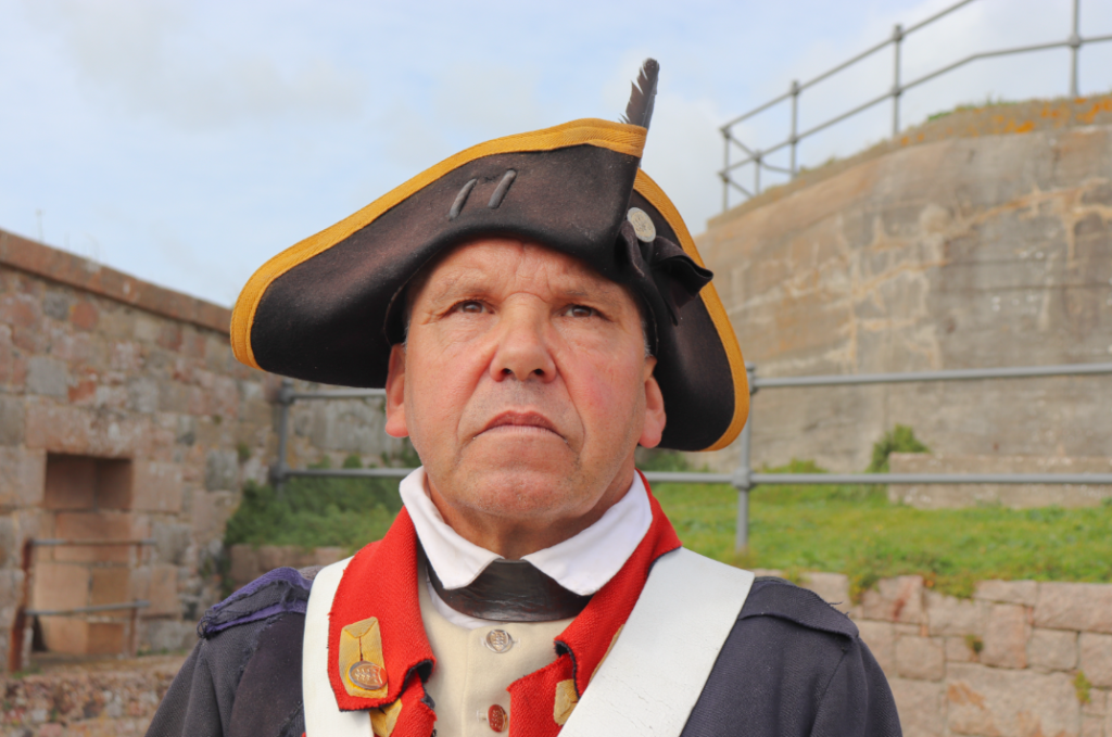

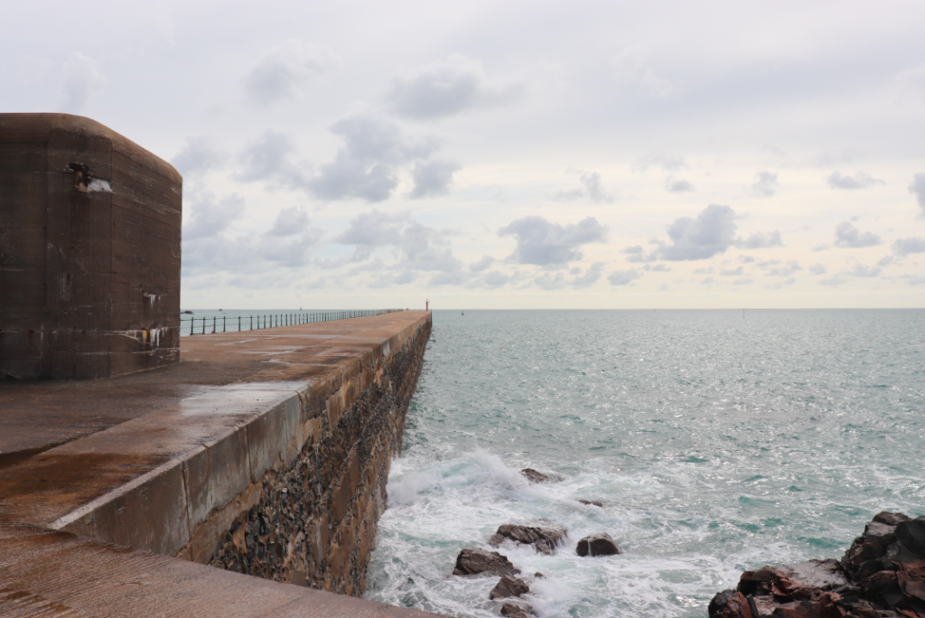
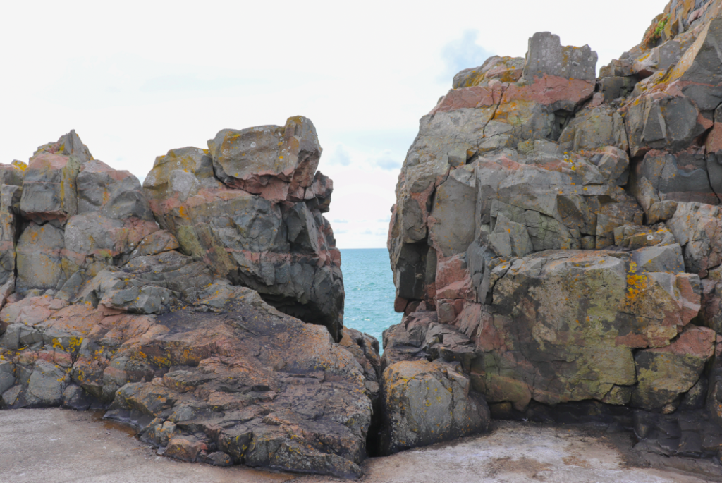

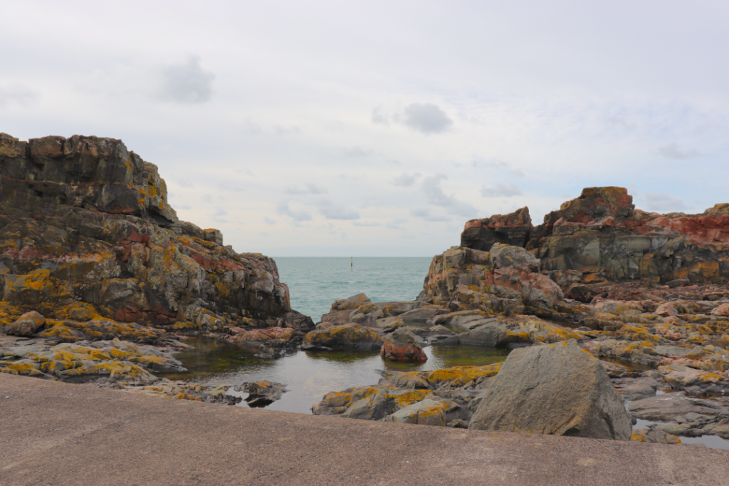

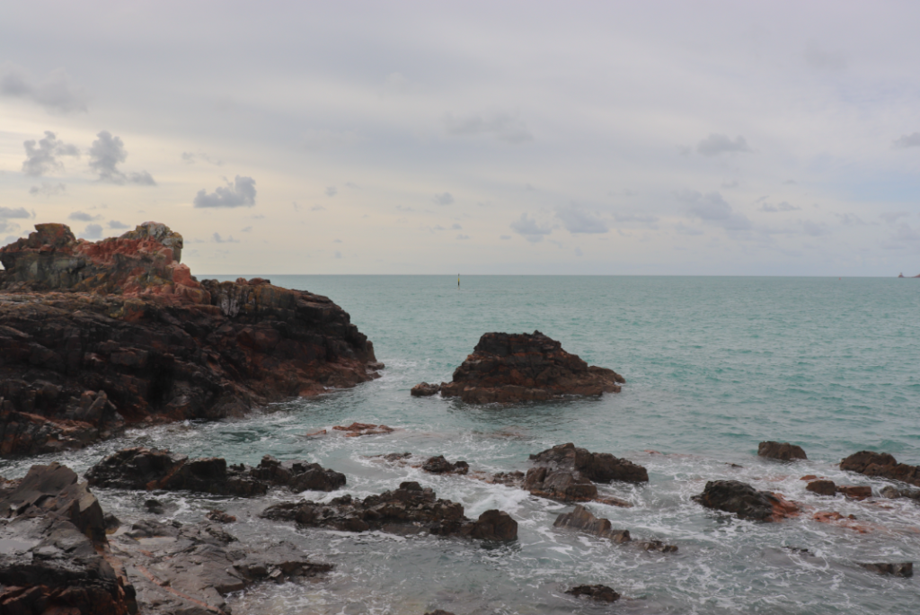
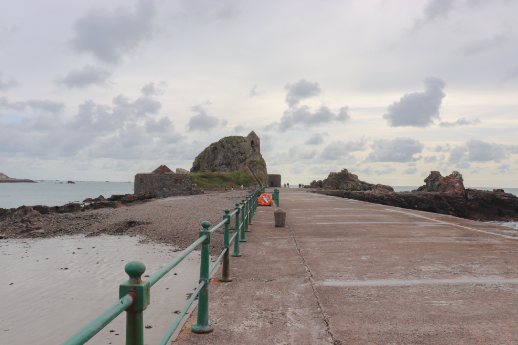
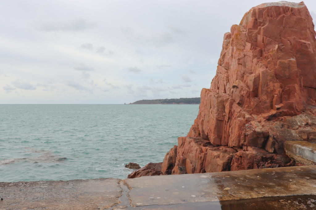

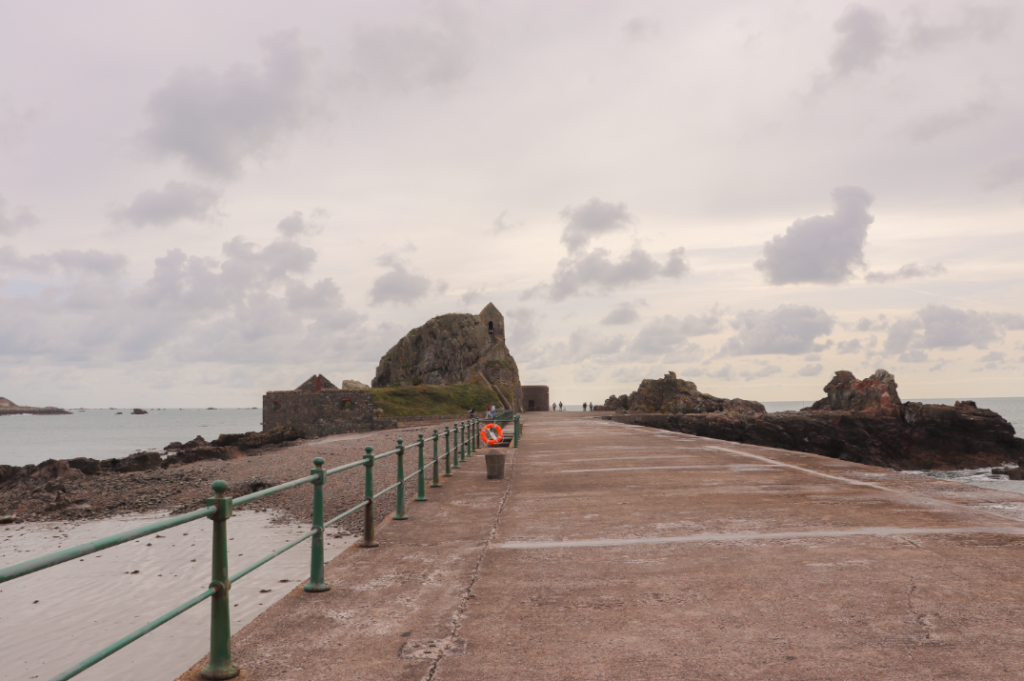
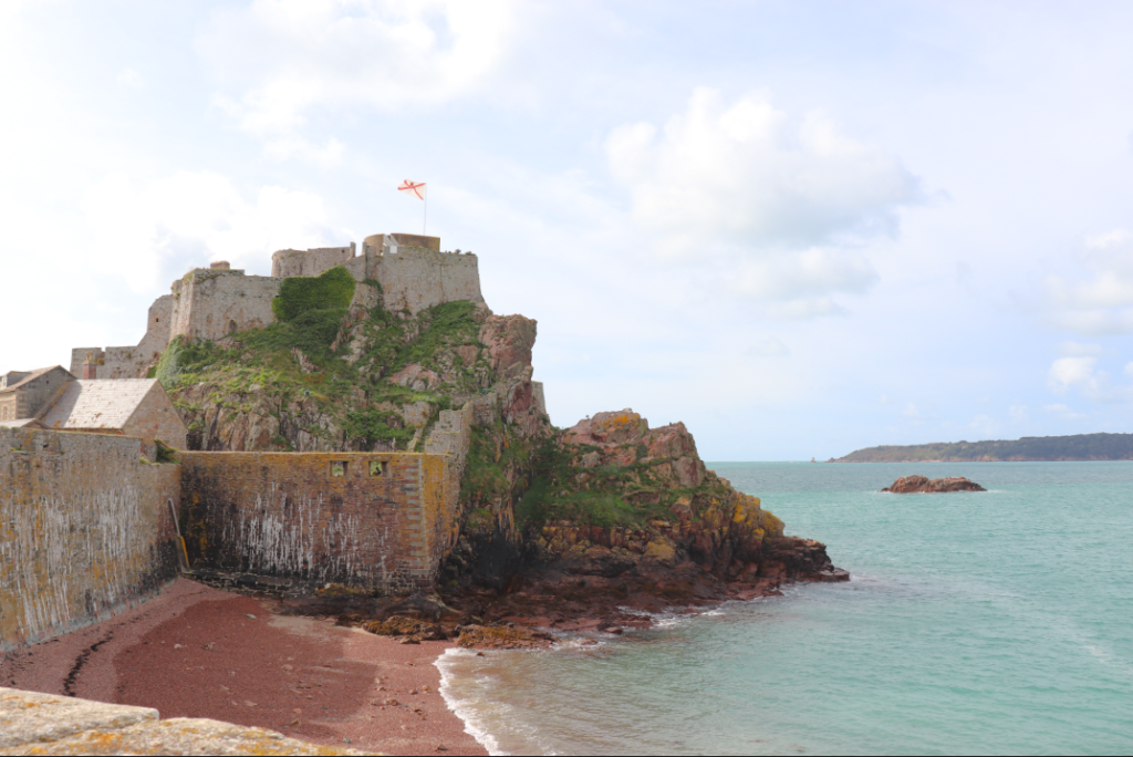
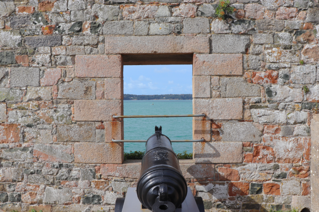
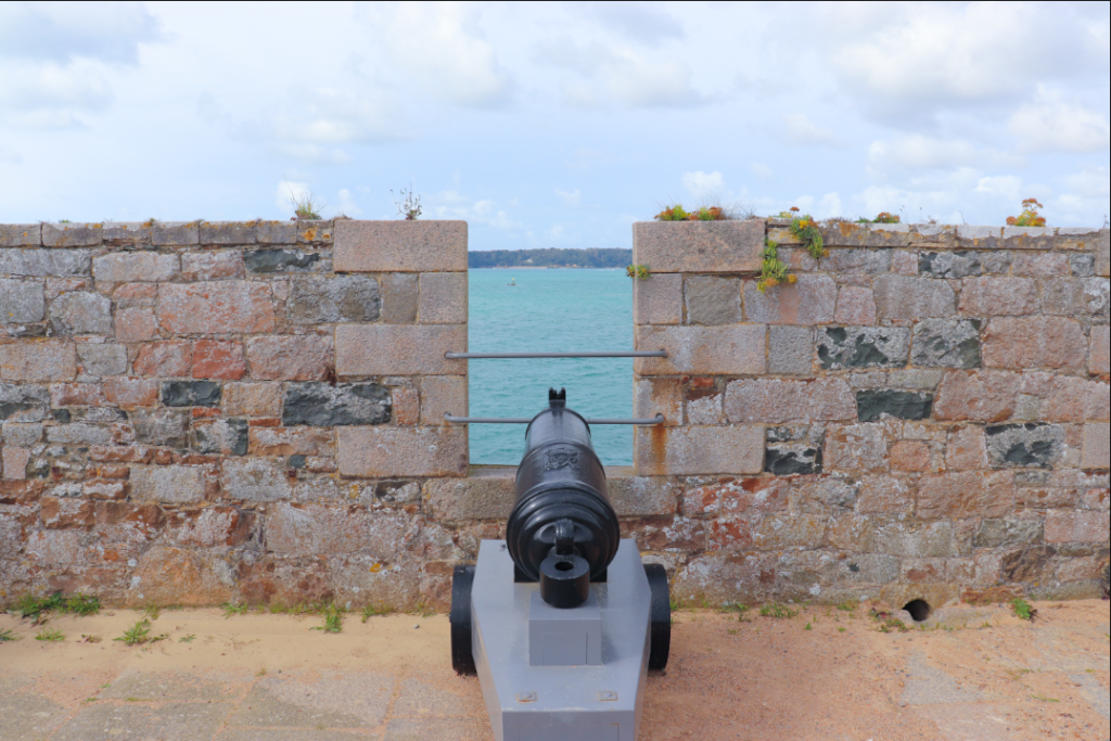


We are planning to create a film made up of a series of aesthetically based shots that focus on the individual components of the castle and its surroundings. Here are some short films that we may draw inspiration from.
We have also decided to draw inspiration from the work of multi-Oscar-winning director Wes Anderson. I think that the way he frames and arranges his shots is very thoroughly considered and this is a key characteristic of his films. He also adds pastel tints to the frames and this could be something we explore in post-production.