All posts by pjones13

Filters

Author:
Category:

What is photography

Photography is a visual art form invented by Louis Daguerre and Henry Fox Talbot in 1839. The word photography originates from Greek; with “phot” meaning light and “graph” meaning writing. Since then photography has been adapted and advanced by different artists. There are so many genres of photography genres. My favourite is abstract.

“Photographs confuse as much fascinate, conceal as much as reveal, distract as much as compel. They are unpredictable communicators”

This quote by David Campany. I believe he is trying to say how photos are subjective. The photo may not connote the same thing, feelings or memories to other people, as everyone is different and individual. The photo may not be received how the photographer wanted it to be.
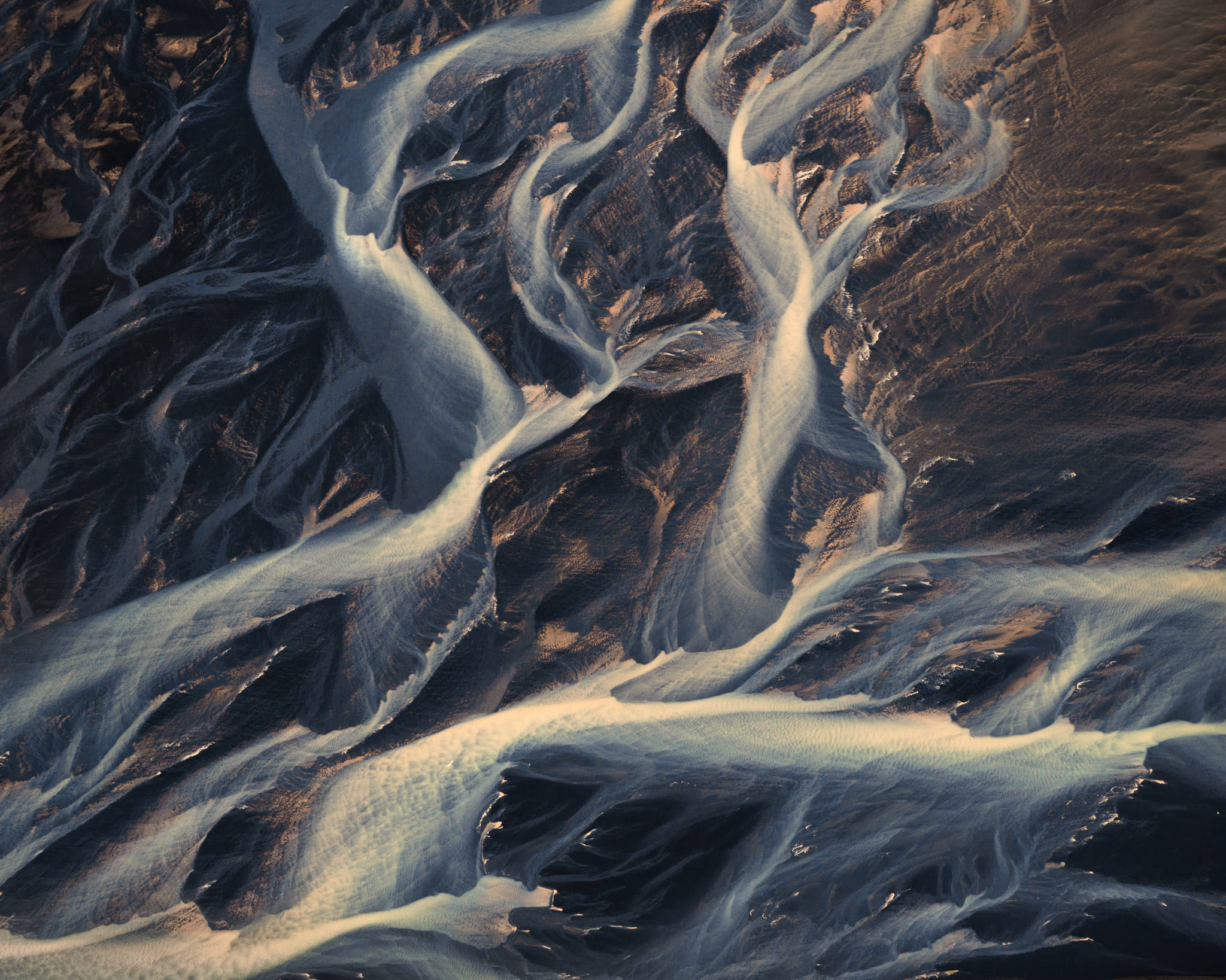
35 Abstract Photography Tips and Ideas

For example, this beautiful abstract image is ambiguous. It looks like veins or tree branches or roots of plant or waves. It allows your mind to explore the meanings, which I enjoy. This relates to Stuart Hall’s reception theory. His theory is about how the audience receive something. There is the dominant view which is the view that the photographer has attempted to create, then there is the negotiated view, in which the audience has partly received the view in which the photographer intended and the oppositional view which is completely different to which the photographer was trying to create. Some photos are ambiguous, which means that the audience of the image can make their own interpretation, as it can have many different meanings. This can be influenced by personal experiences or real world issues. This is very dominant in abstract photography.

This image has an empty alt attribute; its file name is main-image

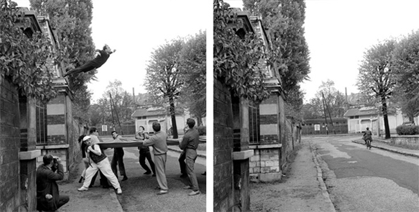
For example, this is a photo by Yves Klien in 1960 is of him jumping off a building. It is called ‘leap in to the void’. It became very popular as it was very difficult to take photos with special effects in the 60s. This stunt launched his career. Klien jump off the building, while below him men stood with a tarp to catch him.
Exhortations

The two photos were very carefully cut and lined up together to give the effect that he was jumping off a building. This inventive and daring photograph creates an a scared and in awe affect of the audience. In photography, it is not clear what is happening in the image sometimes and it is up to the audience to think of the ending. For example, why is he jumping?

Overall, photography has evolved and it continues to evolve. The different genres allow you to be creative and express your feelings, opinions and more.

Analysis of a still life image

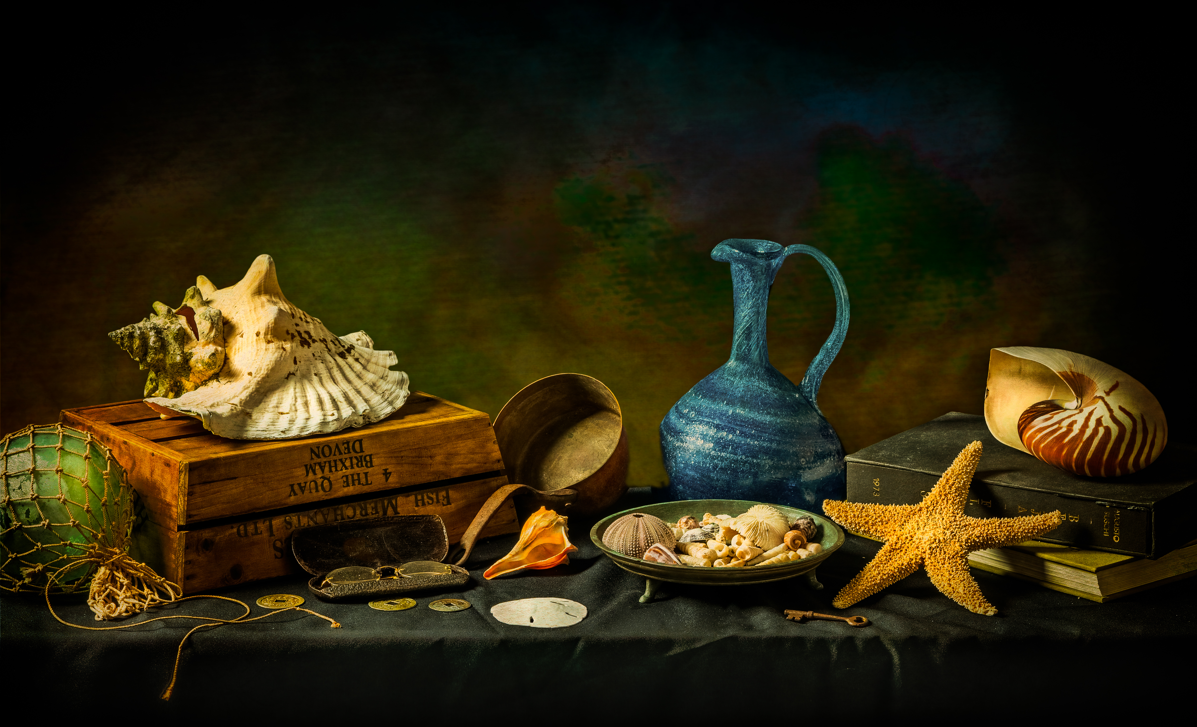
Shells" | Still Life Photography - Ron Mayhew

This is an photograph by Ron Mahew. The mise en scene presents a variety of sea related objects placed on top of a black table cloth. The colours of the image appear saturated and are a contrast to the dark background. The image has a high f stop of around f/16 this is because of the darker exposure and the wide depth of field. He has used a very quick shutter speed. The lighting appears to be unnatural studio lighting. Personally, I really like this image as the scattered objects all link together. The colours and positioning of everything is enticing. Ron Mahew states: “But “Shells” is more than just a collection of exoskeletons washed up upon a beach. It can also be thought of as an accumulation of the detritus of life. Those mundane objects: eyeglasses, a key, a pitcher, a few coins, a book, or two. All valued objects of a life well lived with miles of beaches still to explore.”

photomontage

Photo-Montage

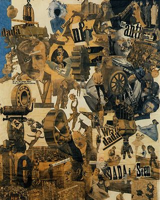
  1. photomontage is a collage constructed from photographs.
  2. Historically, the technique has been used to make political statements and gained popularity in the early 20th century (World War 1-World War 2)
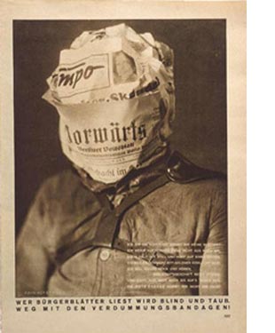
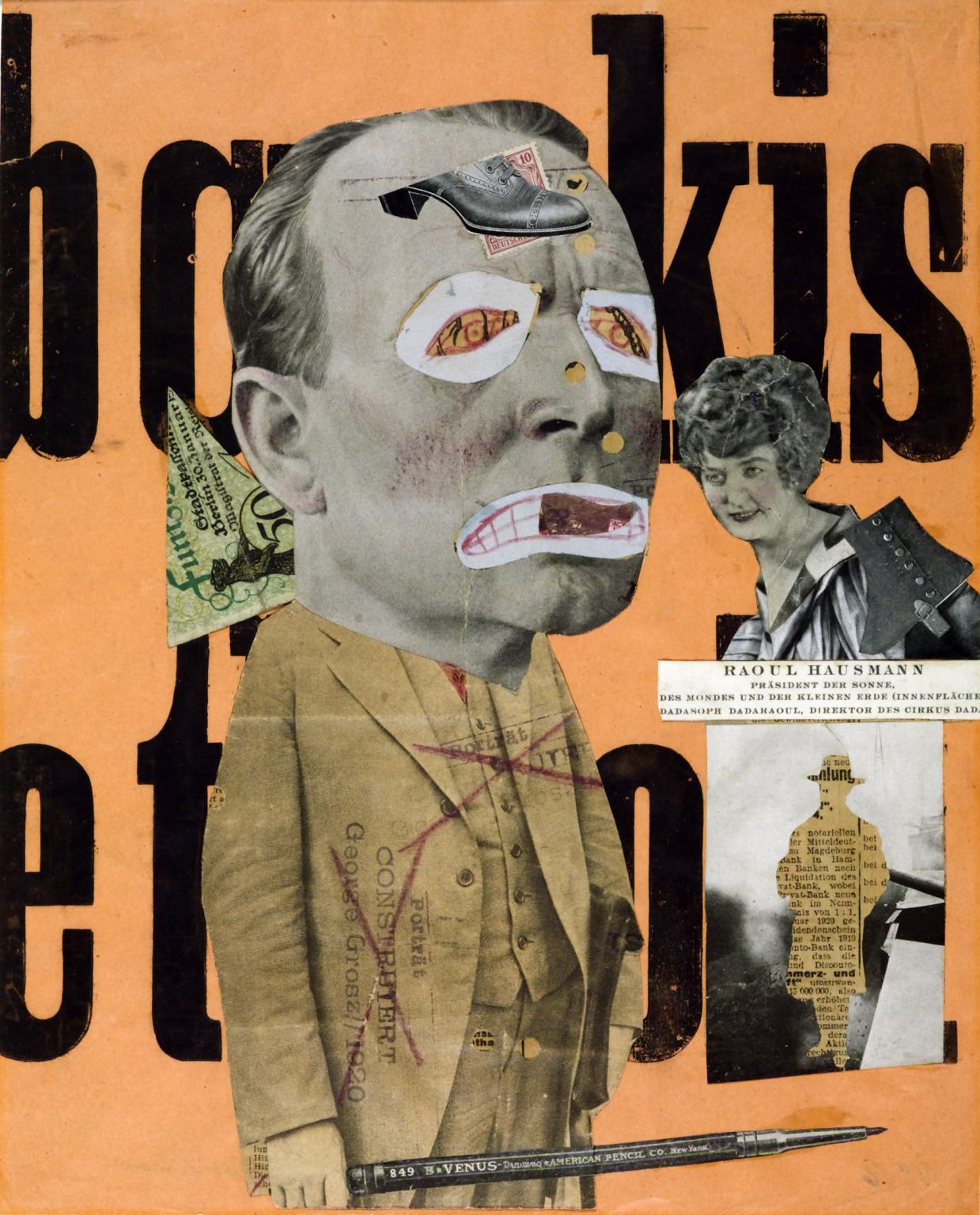
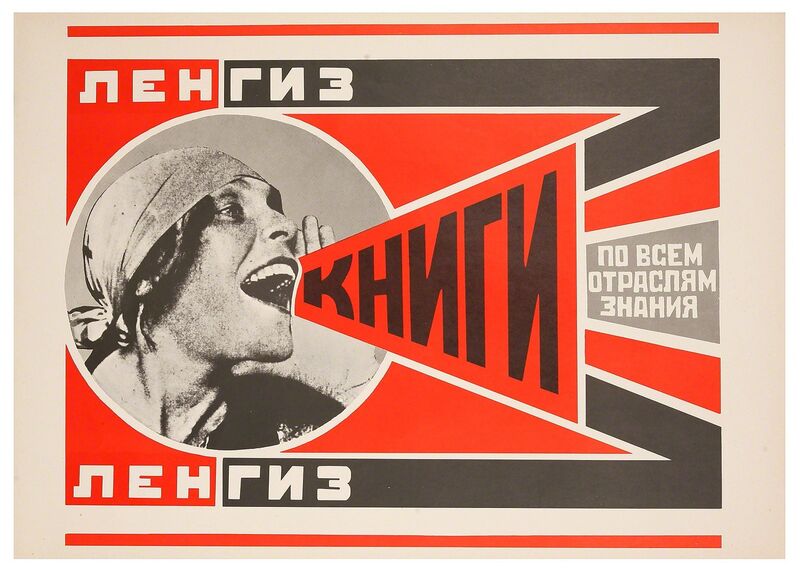
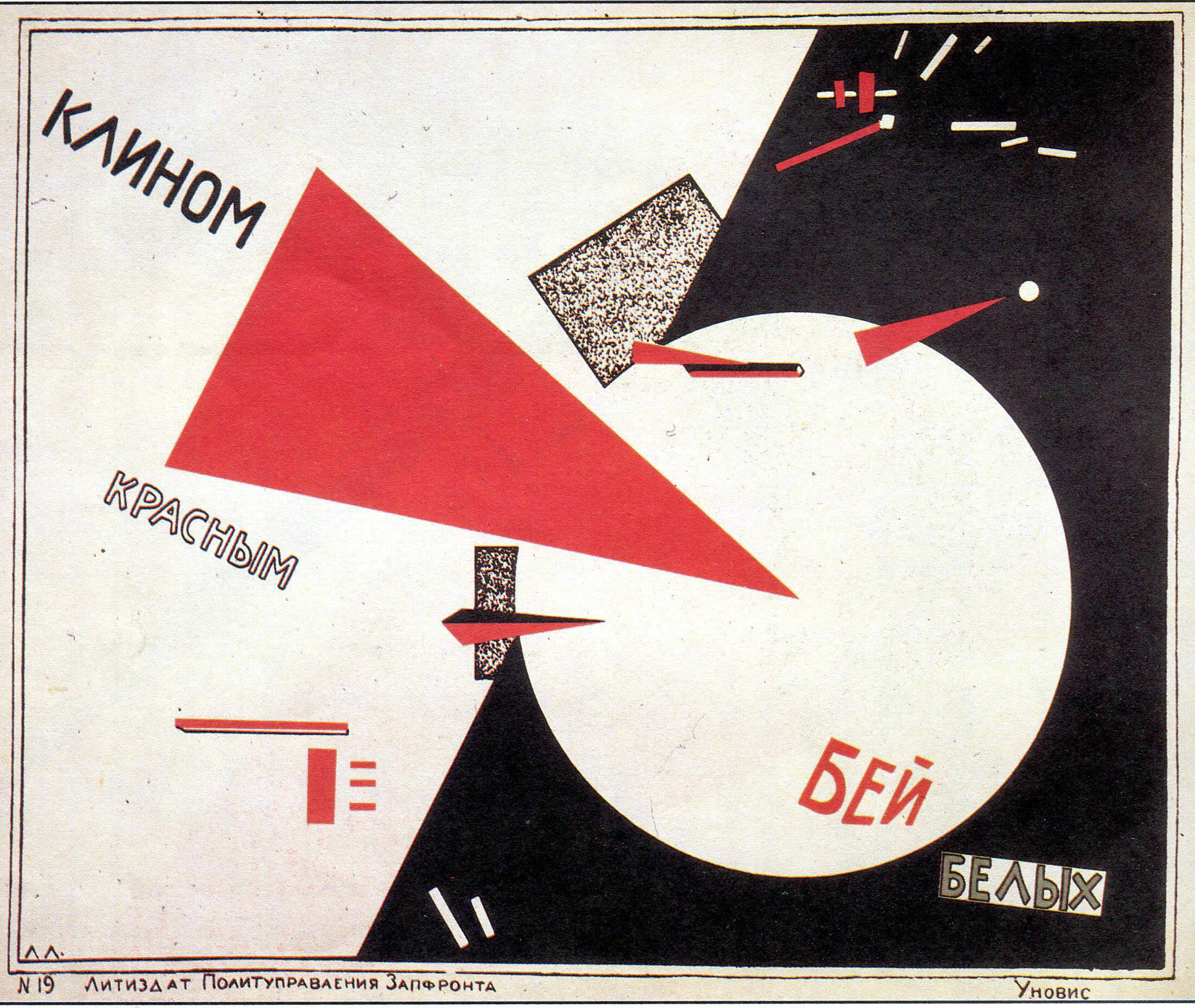
  3. Artists such as Raoul Haussman , Hannah Hoch, John Heartfield employed cut-n-paste techniques as a form of propaganda…as did Soviet artists like Aleksander Rodchenko and El Lissitsky
  4. Photomontage has its roots in Dadaism…which is closely related to Surrrealism
Photomontage - Modern Art Terms and Concepts | TheArtStory
Hannah Hoch

Raoul Haussman

Heartfield Political Photomontage "Blind and Deaf" by Turkish Art Critic  Meral BostanciJohn Heartfield Exhibition

John Heartfield

The Art Critic', Raoul Hausmann, 1919–20 | Tate
Raoul Haussman
Alexander Rodchenko | Books (Please)! In All Branches of Knowledge (1924) |  Artsy
Aleksander Rodchenko
Suprematism, Part II: El Lissitzky – Smarthistory
El Lissitsky

Mary ellen Bartley

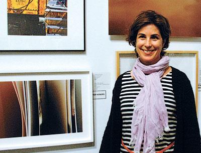
This is Mary Ellen Bartley.

And Guild Hall's Winners Are . . . | The East Hampton Star

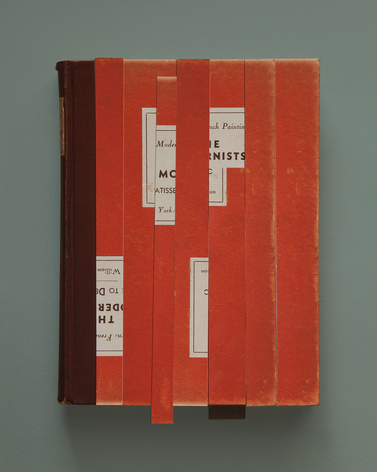
Mary Ellen Bartley is well known for her photography featuring books. She displays them in a simple but unique way. Her genre of photography is still life. Her work celebrates books, which is particularly important now as many have turned away from books and use online technology. Her simplistic style entices the viewer as it is perfect and pleasing to the eye. Here are some examples that I like:

Mary Ellen Bartley: New Photographs | Exhibitions | MutualArt
Focus On: Mary Ellen Bartley - PhotographJackson Pollock's Books — MARY ELLEN BARTLEY

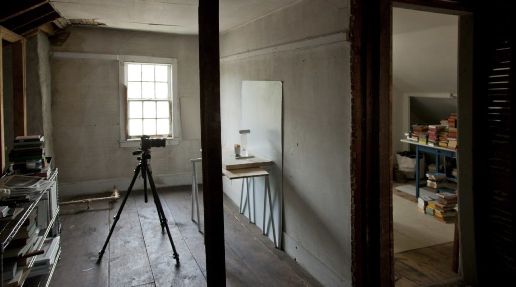
This is a photo of her setup when photographing her images:

THE INTERVIEW IN|DEEDS: Mary Ellen Bartley | DEEDS.WORLD

She is using a tripod. This stops her images from blurring and allows her to adjust the camera angle until it is perfect. She is using natural lighting from the window, it is not harsh and goes great with this image. She is also using a plain white background.

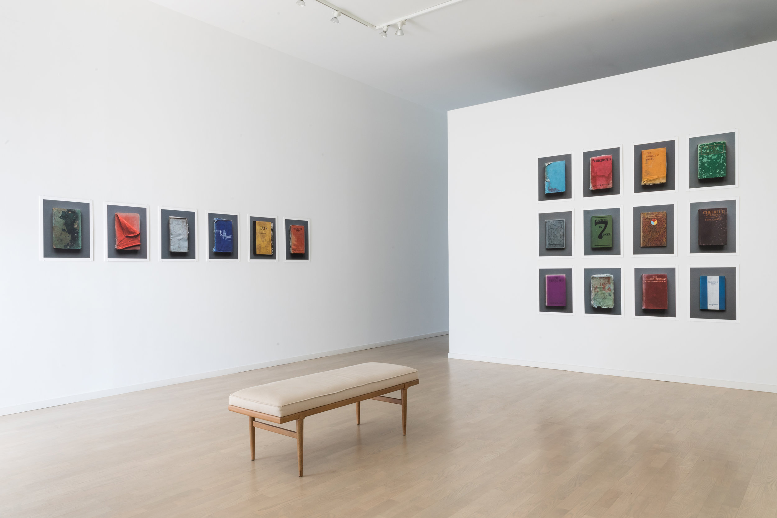
This is an exhibition by Mary Ellen Bartley. Personally, I really like it. The colours and perfectly framed pictures is very pleasing and calming. This also shows the variety and beauty of books, some old, some new.

Installations — MARY ELLEN BARTLEY

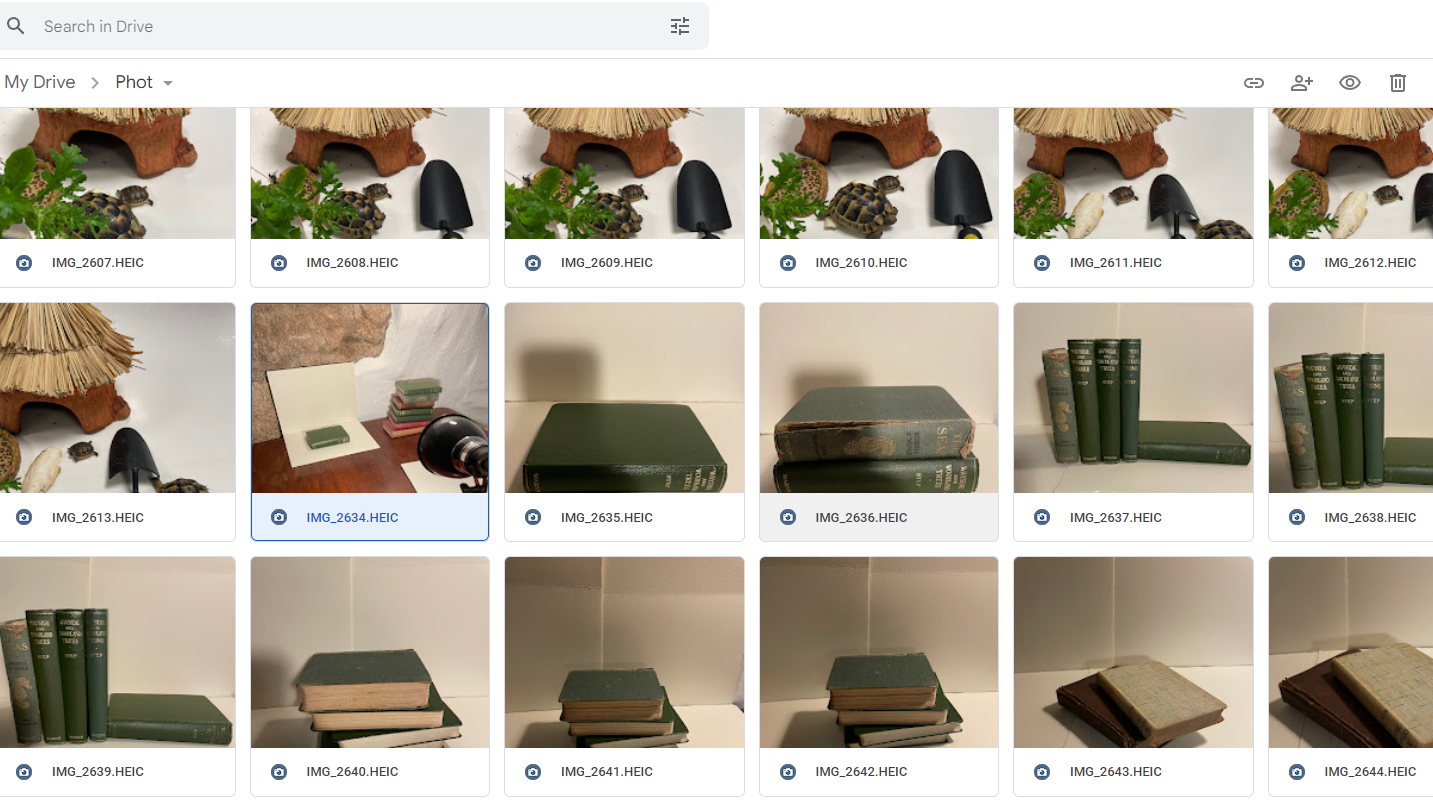
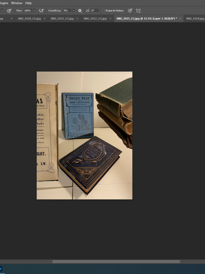
Photoshoot inspired by Mary Ellen Bartley

Edits

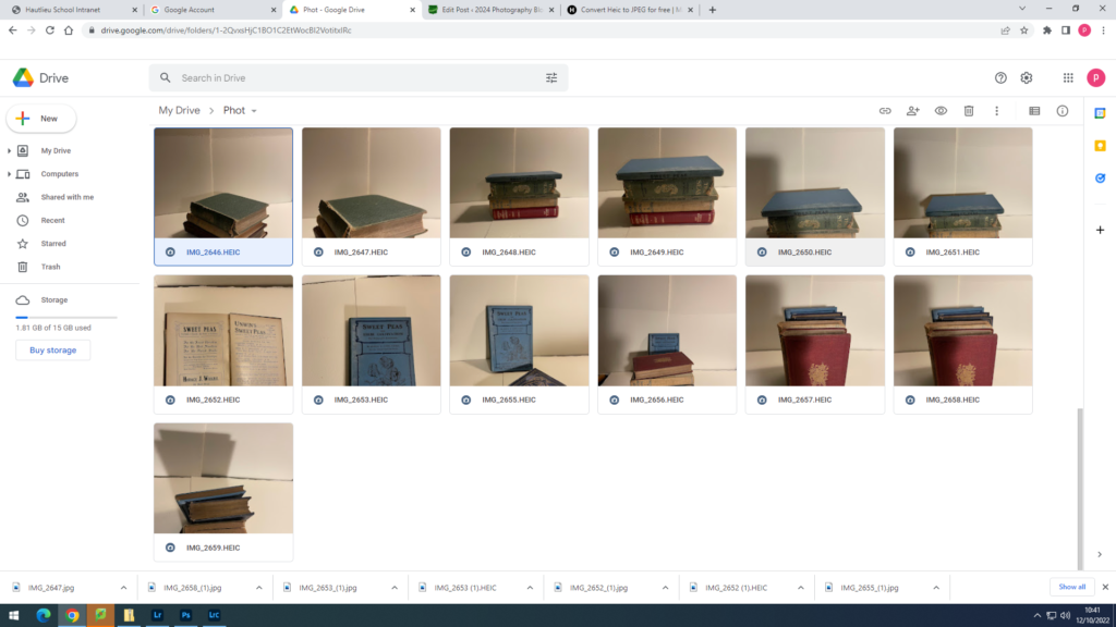
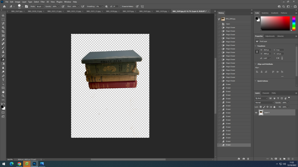
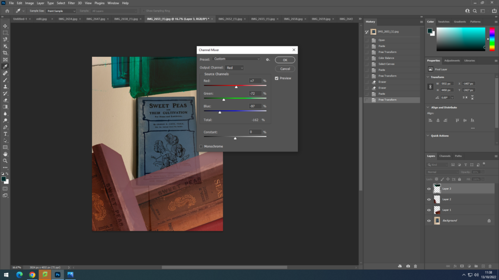
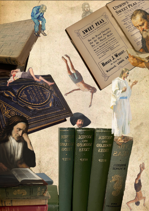
I have edited 3 images on photo shop and have merged them together.

v

Formalism

Photos have formal and visual aspects. For example, lines, shapes, colour, repetition and colour. In addition, photos have their own form of grammar. For example, frame, time, focus and flatness.

How different elements of formalism work

Light– The brightest/darkest area of the photo, shadows, natural or artificial, harsh or soft, time of day.

Finding And Working With Available Light

Time of day appears to be golden hour. Natural soft light. Brightest area at the top of the image.

Line– Objects in photo that act as lines, straight, wobbly, thin, thick, direction, can outline the image (frame within a frame).

Using Horizontal Lines in Photography (for Stunning Compositions)

Straight thick lines creating direction to the background. The vertical lines on the edge of the photo create a frame within a frame effect.

Repetition– Repeated objects, shapes, lines, reflections.

Lesson 1: Patterns and Repetition - WPW Photography (BURNS)

Repetition of triangular shapes separating all the colours of thread from all being mixed together. Repetition of the same object.

Shapes– Rectangles, circles, more.
Elements of a Photograph: Shape | B&H eXplora

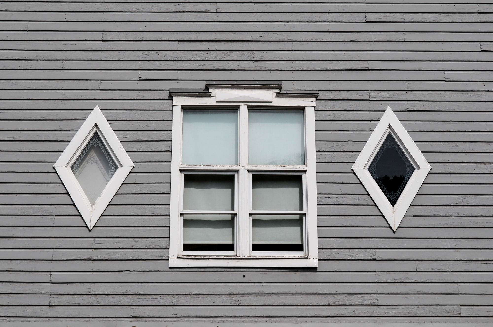
Repetition of rectangular shape, in the middle window and the wood. Either side of the rectangular window there are 2 diamond shaped window which creates contrast.

Space– The depth, empty or solid space, foreground, middle.

Using the Rule of Space in Photography | Photography Hero

This photo has a lot of space in all areas. The person on the boat which breaks the space almost seems insignificant and is surrounded by the almost empty space.

Texture– texture of materials in photo, eg bricks, glass, sand

Patterns: 7 Tips For Using Patterns For Photos With Amazing Impact

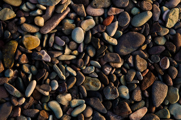
The texture of the image has deep layers. The rocks create a sharp texture and you immediately think of how it would feel to touch or stand on.

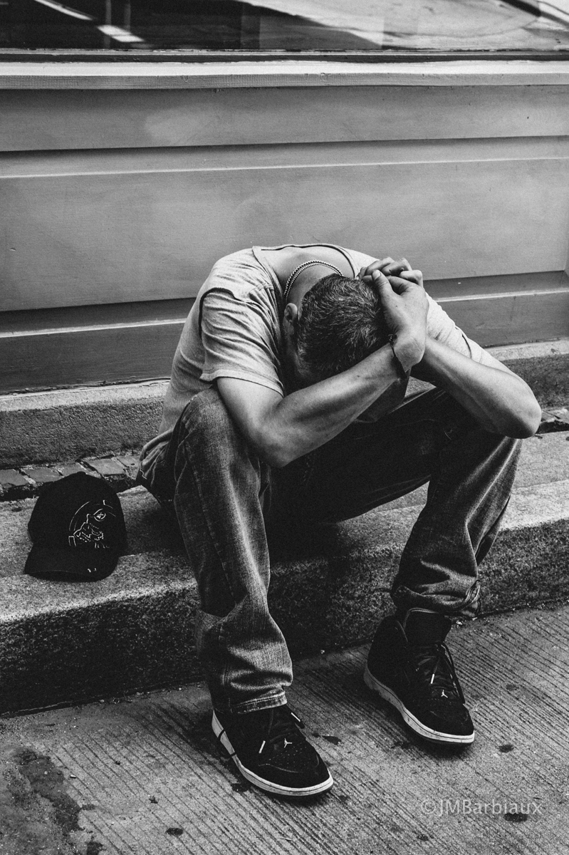
Tone– feeling, mood atmosphere of photo.

How To Capture Images That Portray A Mood – PhotolisticLife

The tone in this image is sad and dark. The monochrome colours further accentuates the sadness of the image. Also the models stance reflects that he is sad.

Colour– Balanced, saturated, muted, primary and secondary, dominant colours, monochrome.

Selective Colour Photography — Nico Goodden - Urban Photographer - Digital  Photography Learning

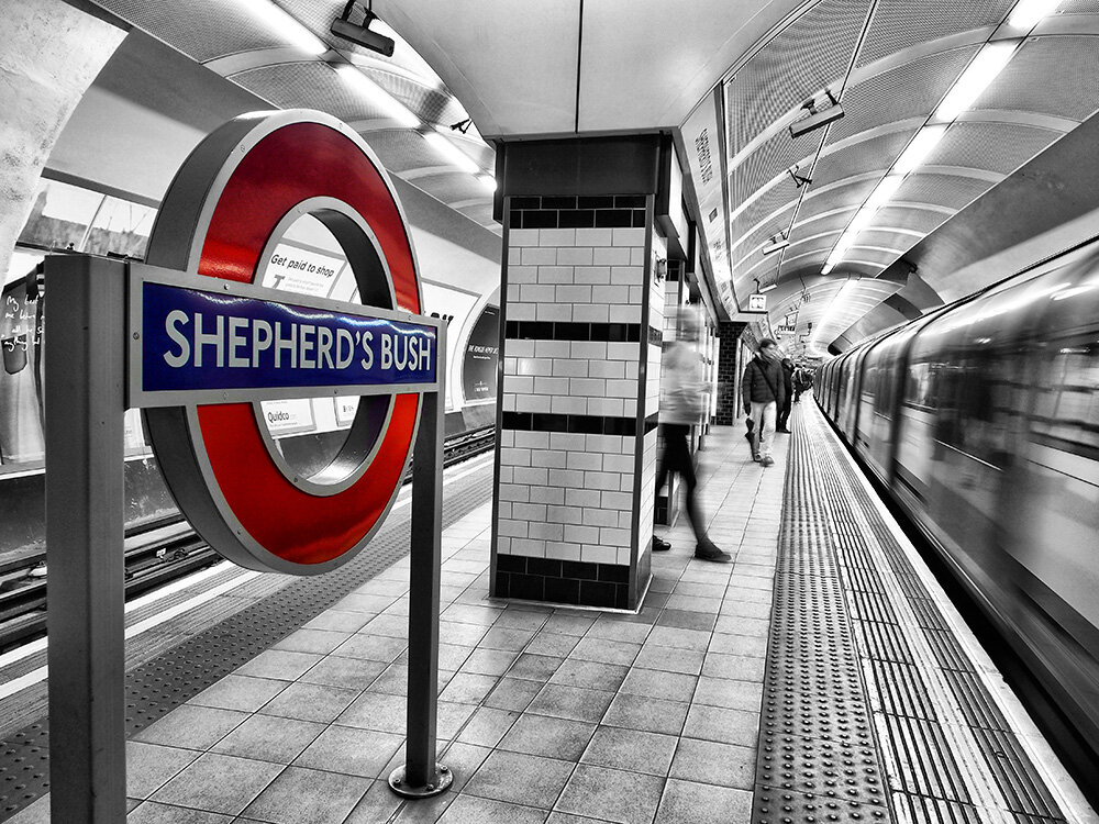
The selective colour of this image is saturated and primary. However, the background is muted and monochrome. It is unbalanced colour.

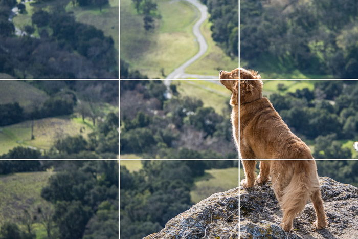
Composition– Arrangement, layering, balance, rule of thirds

What is the Rule of Thirds? (And How to Use it in Photos)

The dog is mostly in the right third. The dog is arranged at the top of the cliff to show he is important. The background is shown in the other two thirds

aperture

Aperture in Photography Defined | B&H eXplora

Aperture is how wide the camera lens is. A very large aperture, means the photo is very bright, almost nothing is in focus and there is a very small depth of field. This is usually an F-stop of 1.4. A large aperture, means the photo is bright, little in focus and there is a very small depth of field. This is usually an F-stop of 2.8. A medium aperture, means the photos has medium light, some in focus and there is a medium depth of field. This is usually and F-stop of 5.6. A small aperture, means the photo is dark, much of the photo is in focus and there is a large depth of field. This is usually an F-stop of 11. A very small aperture, means the photo is very dark, there is almost everything in focus, and there is a very large depth of field. This is usually an F-stop of 22.

My photoshoot using different apertures

In the studio, I used the different apertures setting. This allowed different parts of the image to be in focus. I arranged some of the beach objects in different formations to give us different effects.

My edits of my aperture experiment photos

adobe lightroom classic

Adobe Lightroom Classic is what I will be using to edit my photos now and in the future. Here is what I learnt about how to use it:
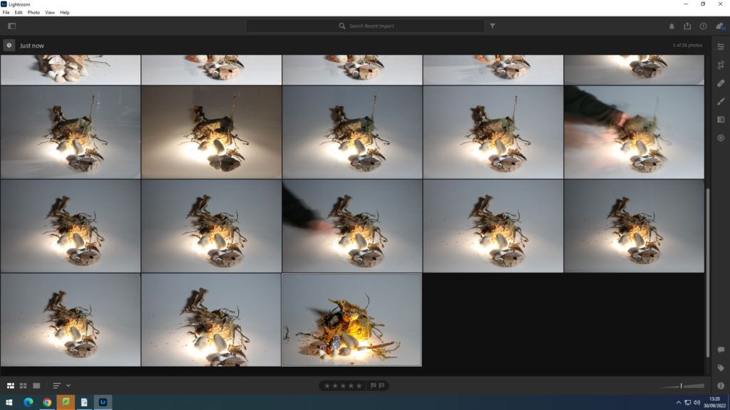
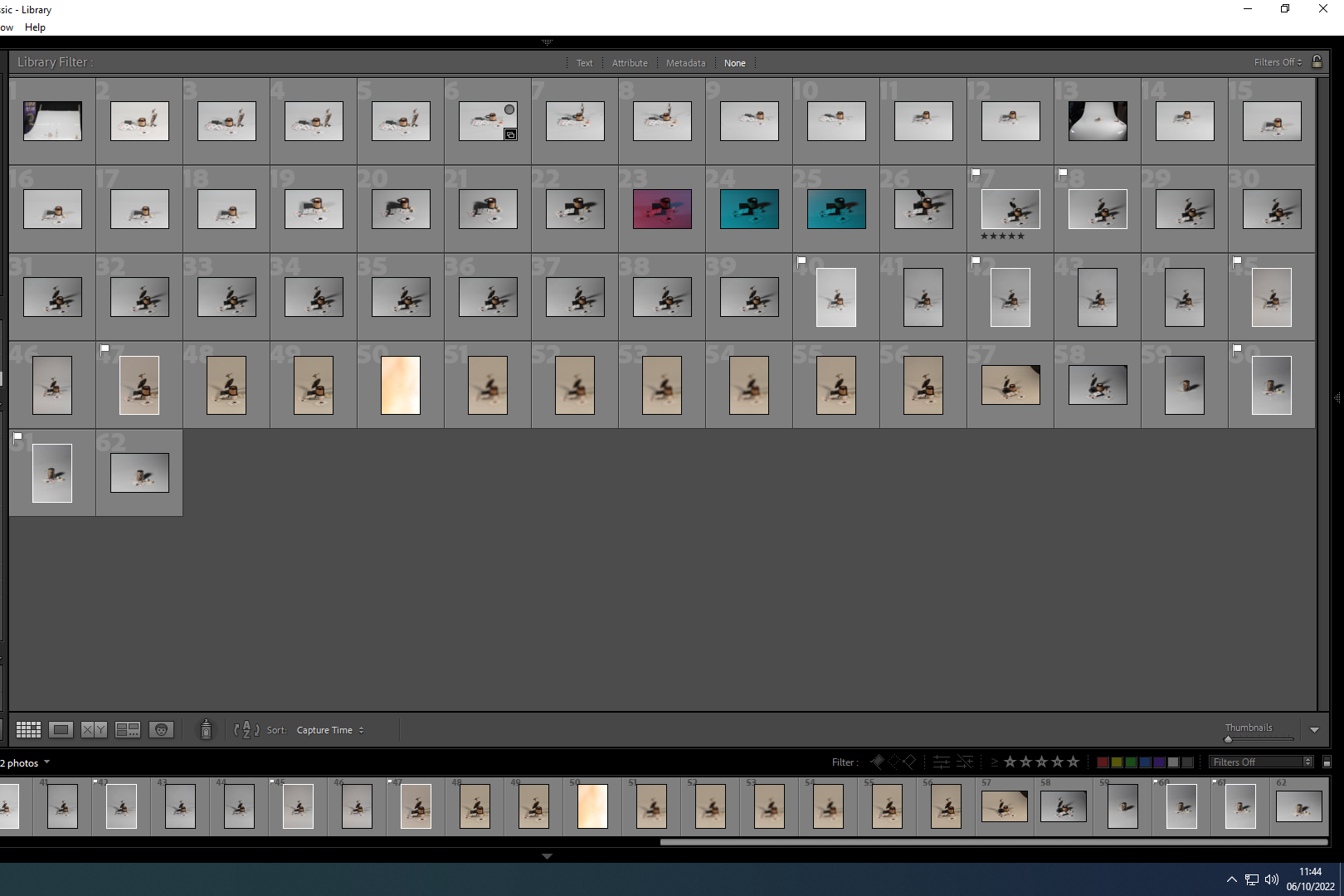
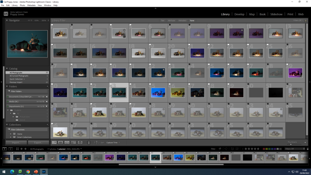
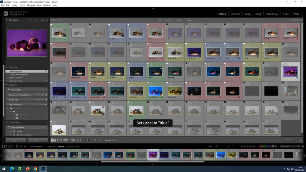
After a photoshoot you can go through your pictures and use either P or X to pick and reject which photographs you want to keep and edit in Lightroom. You can see which ones I have picked by the white flags on the top left on some of my photos and which ones I have rejected by the black flag with a cross through them which I have rejected.
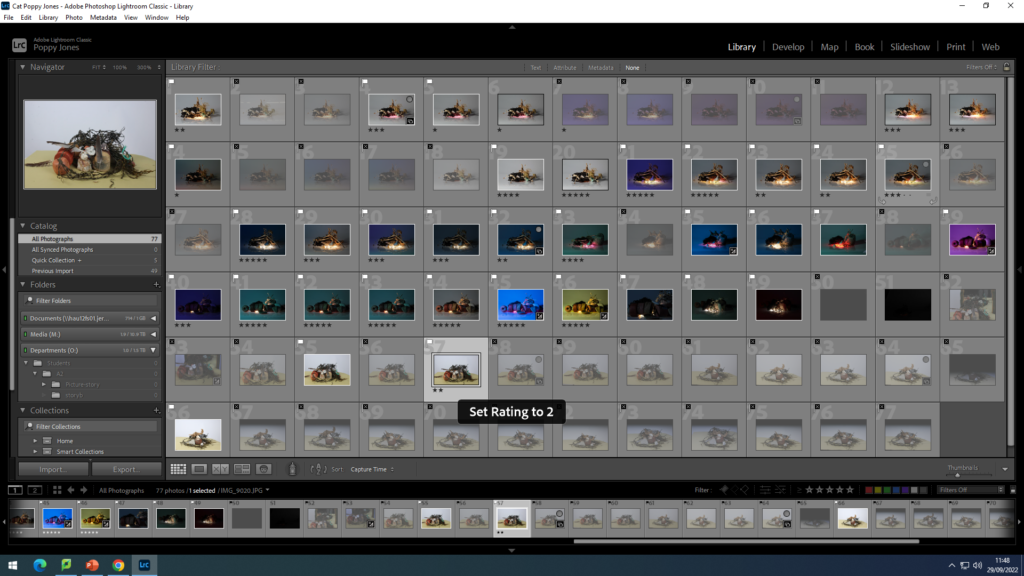
You can also add a star rating with the keys 0-5. This helps you with choosing the best quality photos to edit.
You can also add colours by keys 6-9. 6 being red, 7 being yellow, 8 being green, 9 being blue. This helps you sort your images into different groups, photoshoots or separate projects.
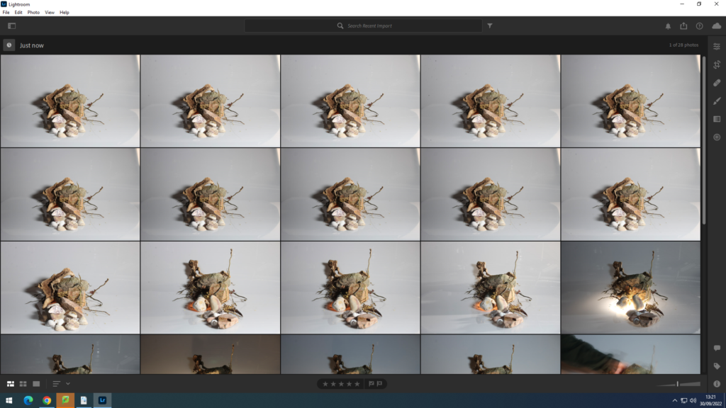
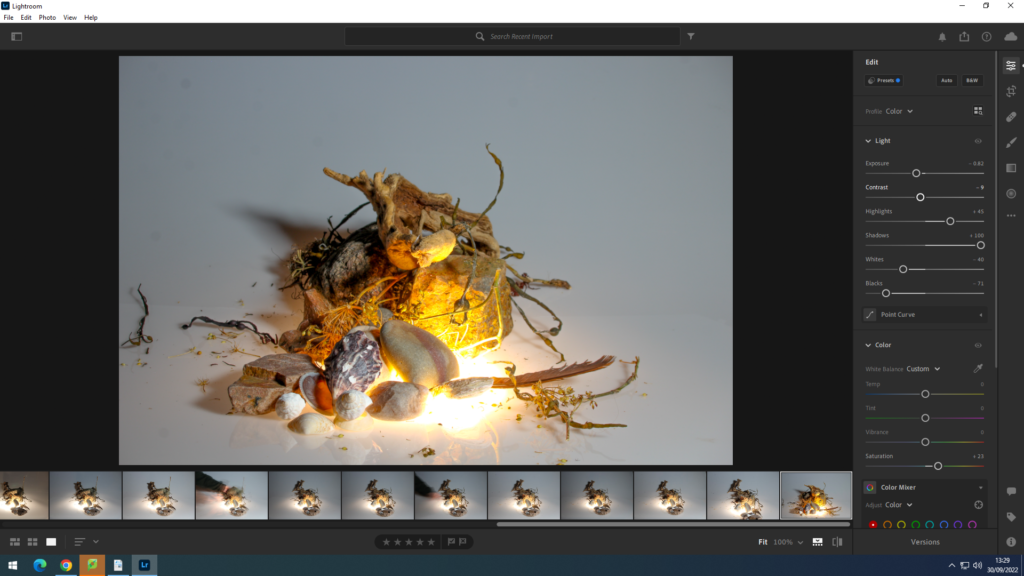
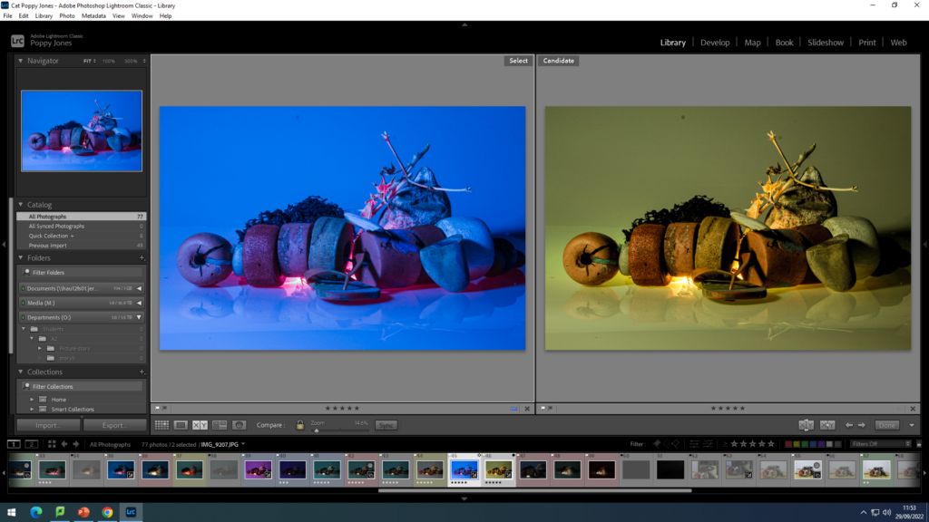
You can compare 2 images using compare view. This further helps you compare 2 images and see the similarities and differences between the 2. You can also use the magnification glass to zoom in.
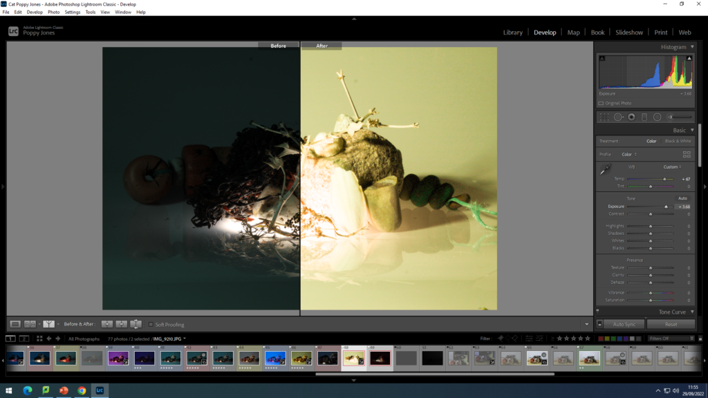
You can also use the before and after filter to see how the image changes and what looks good and what doesn’t.
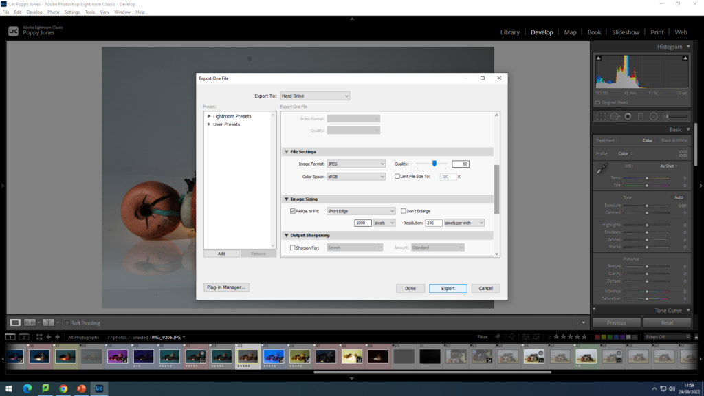
This is the settings to use when exporting your photos.

EDITING MY STILL LIFE PHOTOGRAPHS

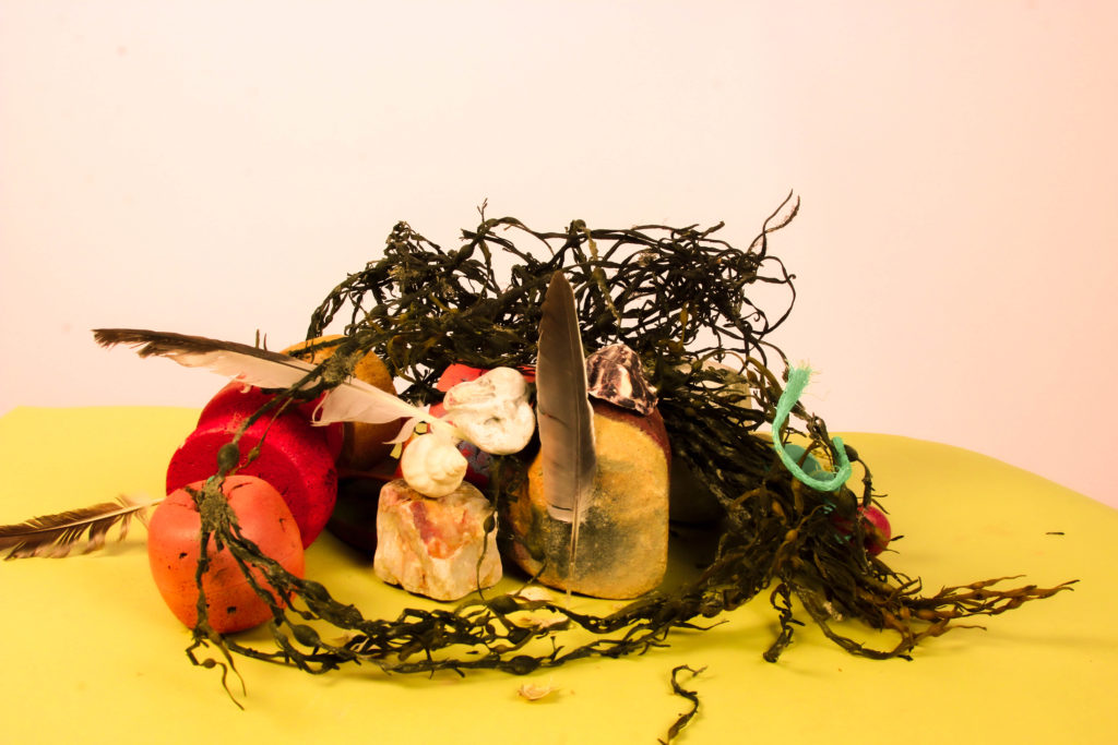
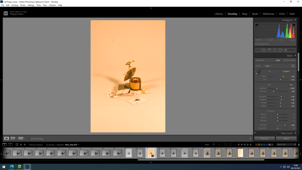
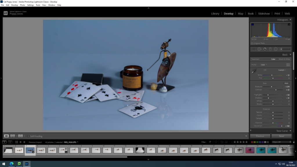
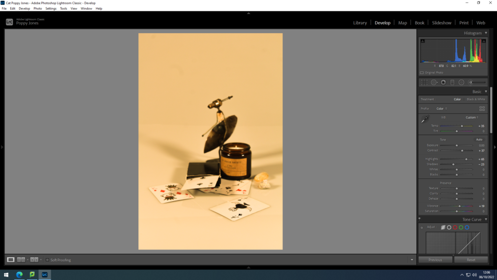
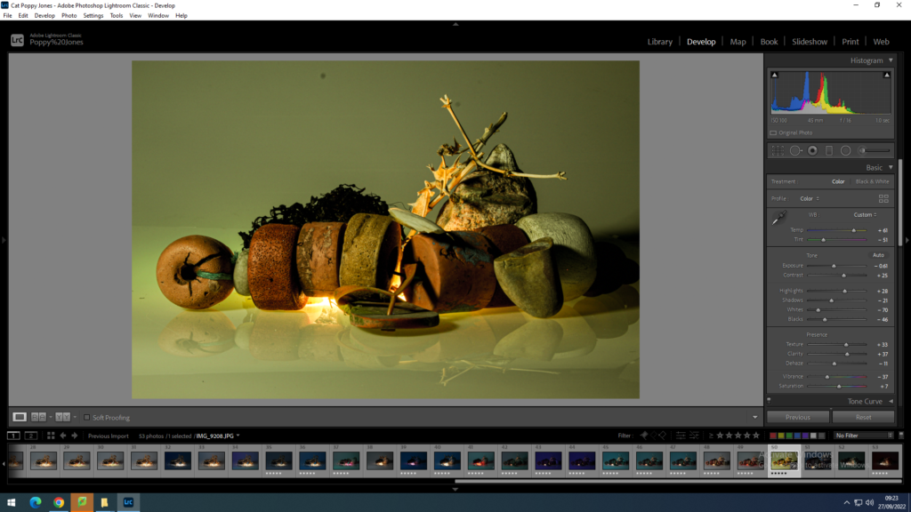
This is one of the still life photos I took in the studio. I really like how it has come out. I have used editing techniques on Lightroom to change the appearance of the photo and I really like it. The filters I used are shown in the right of the screen. This edit has subdued pale yellow colours, this really lets the objects I have used speak for themselves. The pale yellow links with the beach objects as it resembles sand.
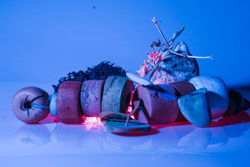
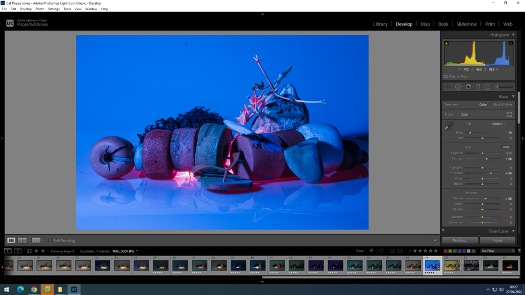
This is the same image, however, I have changed the temperature a lot. The dark blue colours give the image an ominous tone. On the other hand the luminous pink colours give the image a upbeat tone and it balances out the deep blue. I have accentuated the shadows and I am happy with how it has turned out.
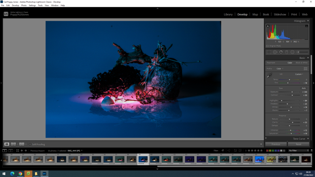
For this edit, I have gone for the same style as the last. But, I have turned up the vibrance and saturation which further accentuates the pink colour. I have also decreased the highlights and shadows which decreases the colours of the background which makes the pink light seem artificial and almost magical.
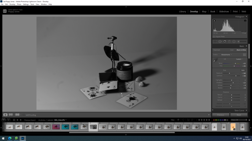
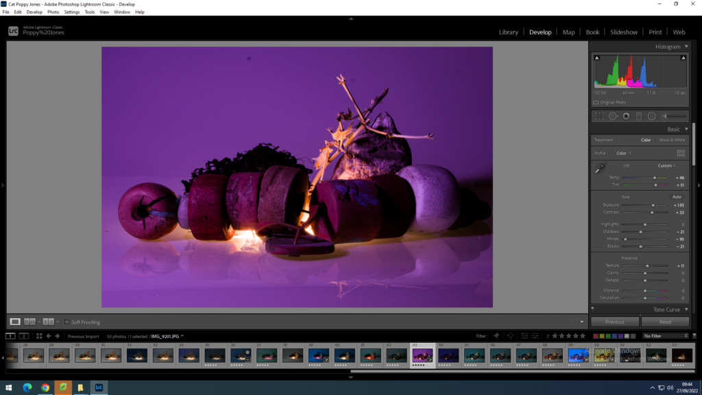
I really how this image has turned out. The light coming through the objects looks great. The purple background gives a great contrast. It also accentuates the reflection of the objects. I have got rid of the white background by increasing the temperature and tint and almost completely decreasing the whites.