All posts by Nic Rolland

Filters

Author:
Category:

Rural Landscape Photoshoot – Edits

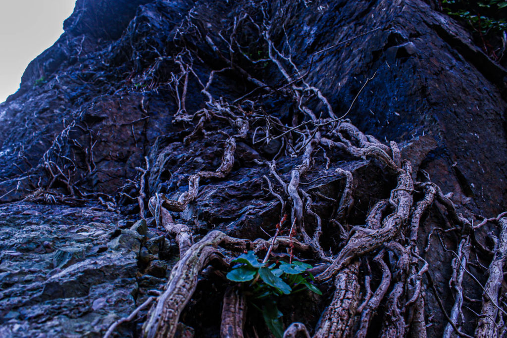
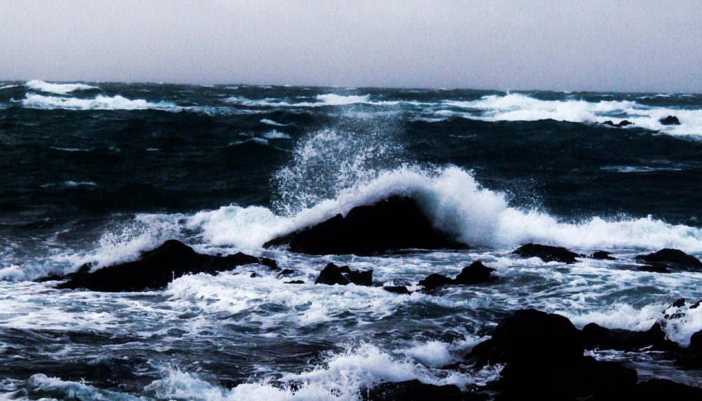
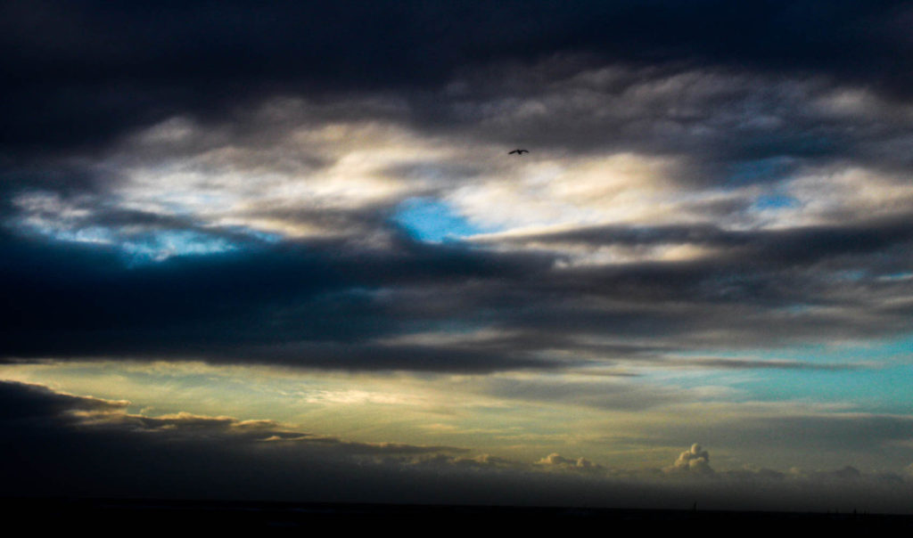
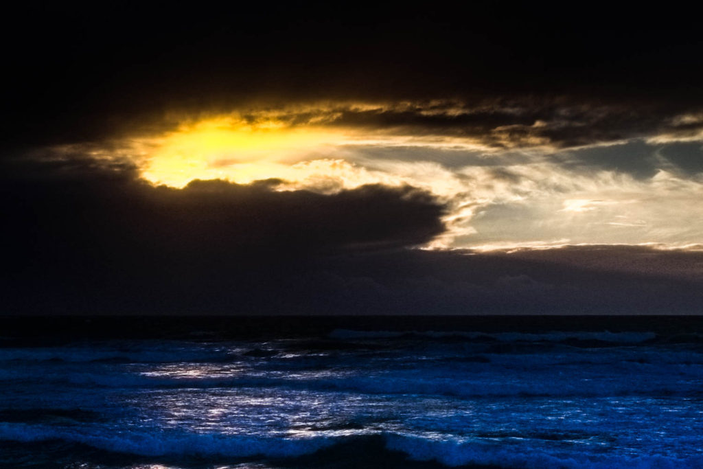
These are the best edits from my first Landscape Photoshoot focusing on the coastlines and and cliffs of Jersey
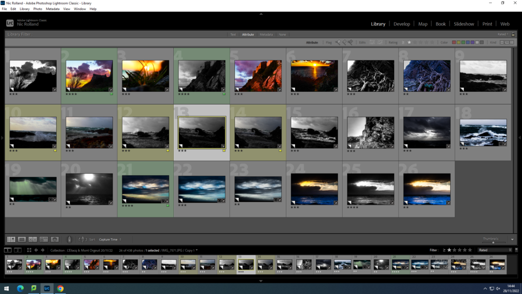
Contact sheet of edits
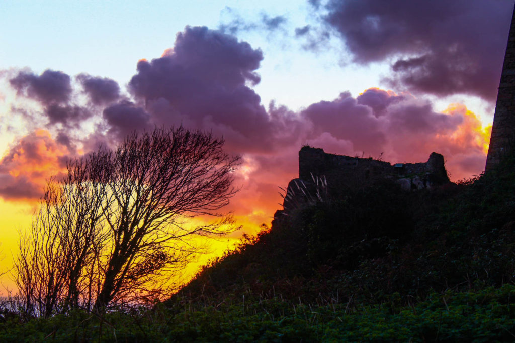
Sunrise at Jersey

My favourite image is “Sunrise at Jersey”, which uses a multitude of colours, an unperceived array of shades not usually associated with a sunrise. The photo contains the typical yellows and oranges, but then the large clouds in the background almost absorb those colours and make the blues and purples shown, creating this dark dramatic object stand out amongst the bright glow of the sun. The foreground breaks up the image a little bit by creating a slight silhouette closer to the bright, fiery aspects, but further away and closer to the ground, you can begin to see the greens and browns of the undergrowth. The lighting within the image is natural sunlight located behind Mont Orgeuil Castle. The light within the sky greatly contrasts that in the foreground and seems well exposed. However, the foreground of the bushes and castle ruins in the image is slightly under exposed and I could have used exposure bracketing to keep the sky the way it was but clearly show what my eye saw with the bushes and trees being well lit rather than seeming like a failed silhouette as shown in the image. I used a 55mm lens when taking the photograph with a wide aperture of f/5.6. The shutter speed was 1/50 sec, disallowing an overexposed sky compared to a well exposed foreground. The ISO was kept at ISO 100. The space of the image seems quite separated, the sky in the background visually looks very distant from the foreground however the foreground creates this very abstract, 2D shape with curved and natural lines. The composition of the image creates allows the viewer to see the beauty of a sunrise that most don’t tend to see. The brightness of the sun surrounded by the dark foreground and clouds in the sky draw the eye to the centre of the image creating a sense of awe from the great contrast of the framing surroundings. The image shows the ruins of part of Mont Orgueil castle, a site with a history spanning over 800 years. During this time, it has been subject to medieval conquests and sieges from the French, the Nazi occupation and the harsh weathers throughout the past 8 centuries. But the one thing that has never changed was the sunrise. This is what I wanted to capture when taking the image. The links between this great feat of human construction suffering to the punishment of time but still having that slight protection of plants and trees, almost strengthening its defences against the elements.

Rural Landscape Photoshoot

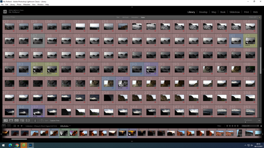
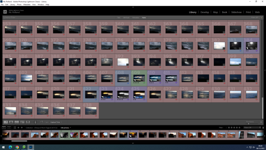
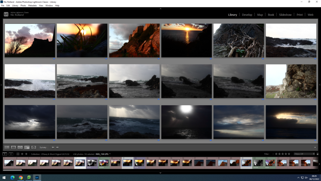
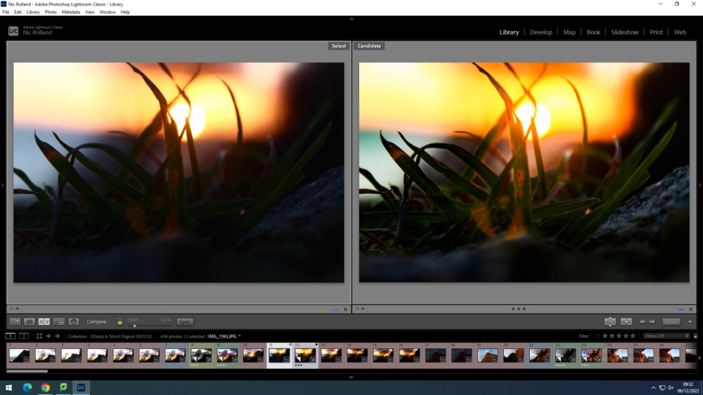
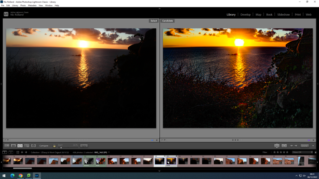
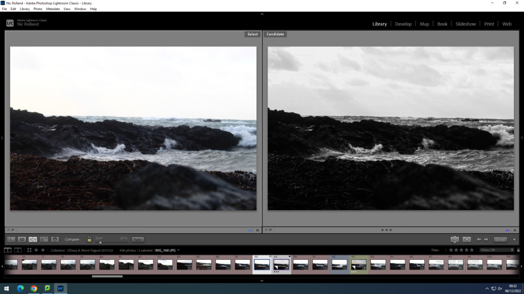
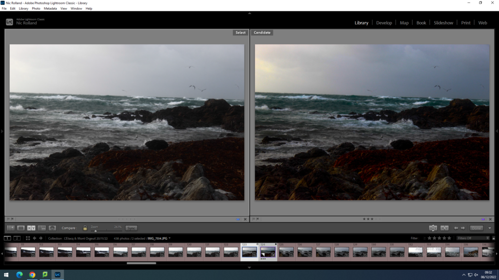
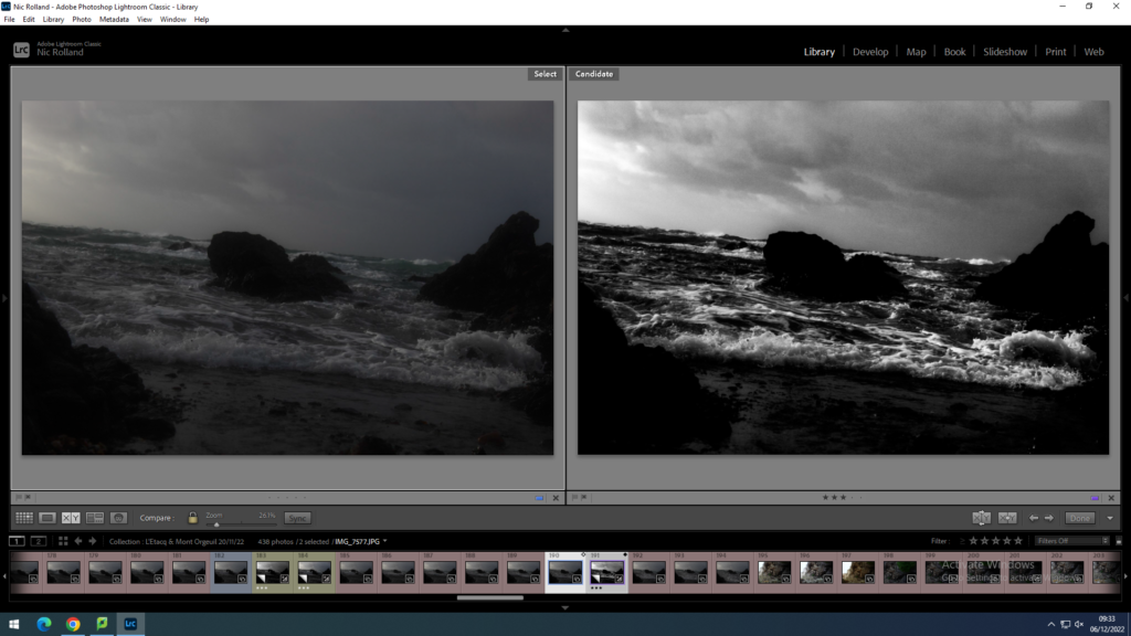
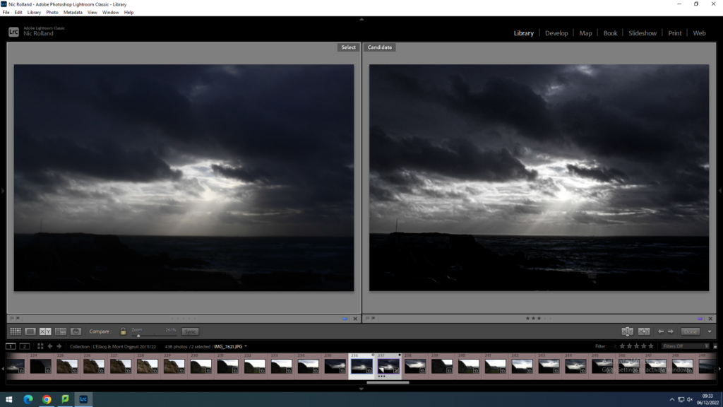
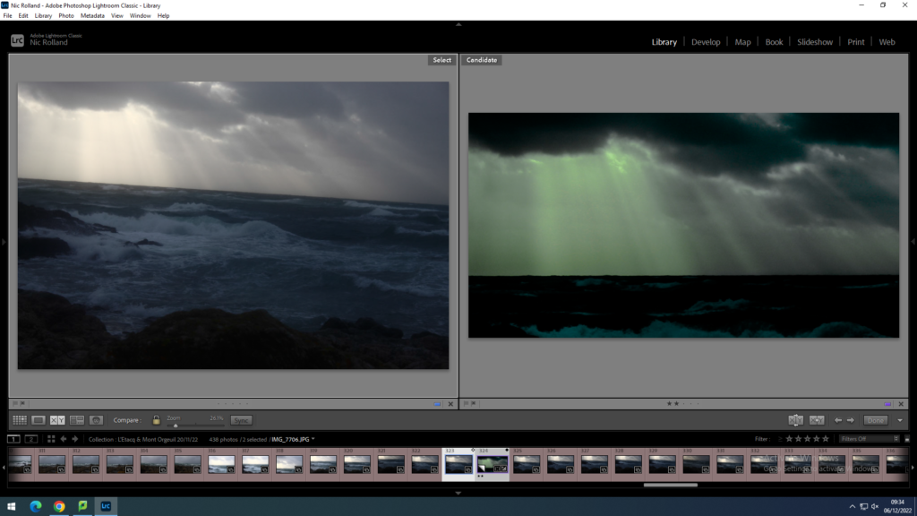
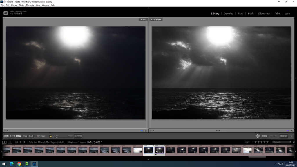
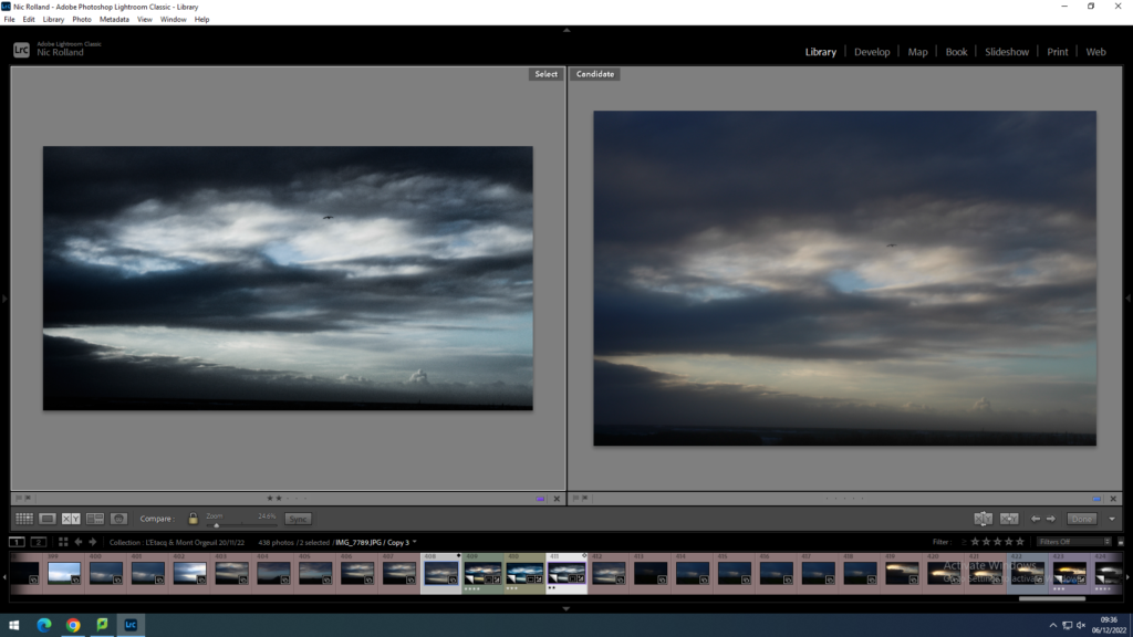
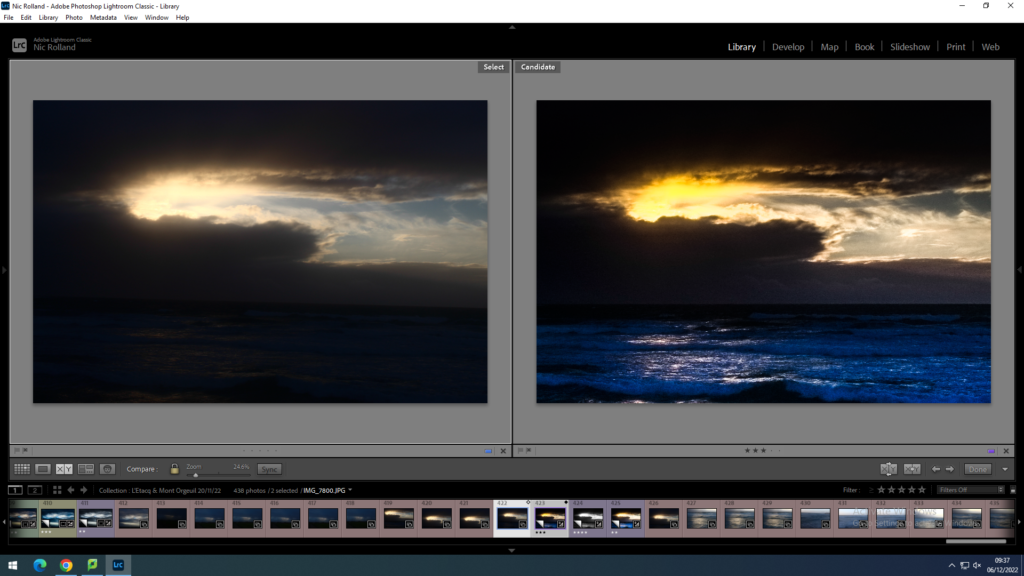
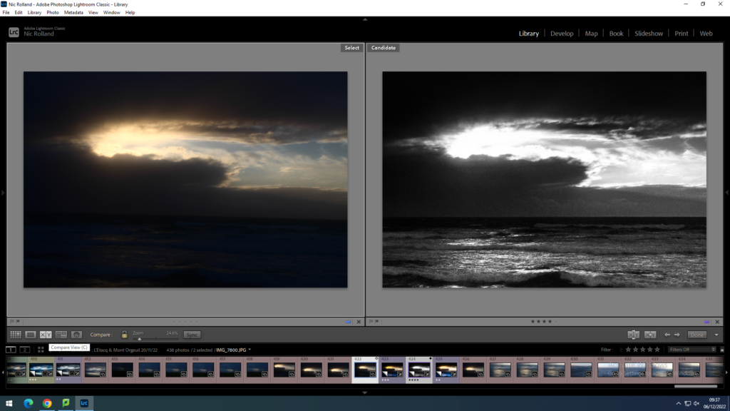
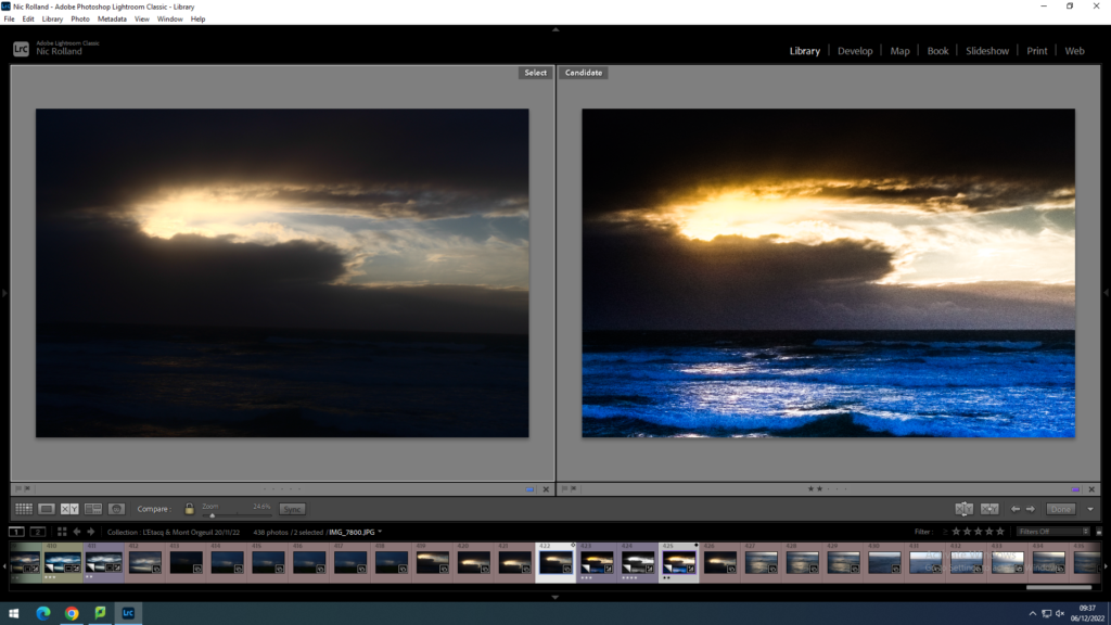
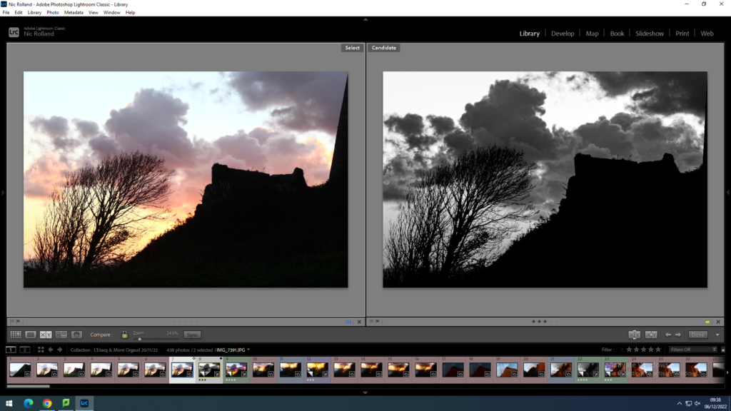
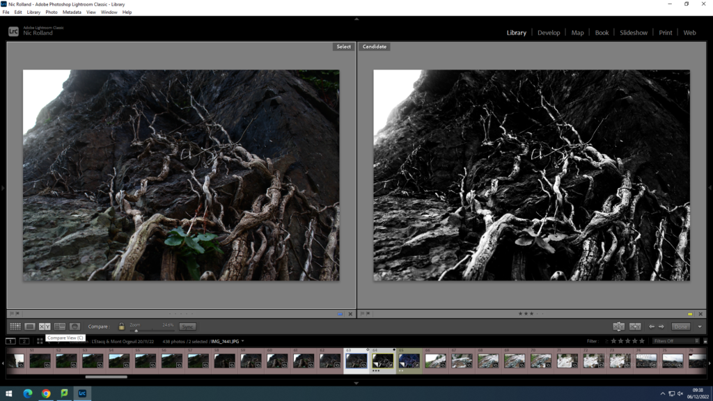
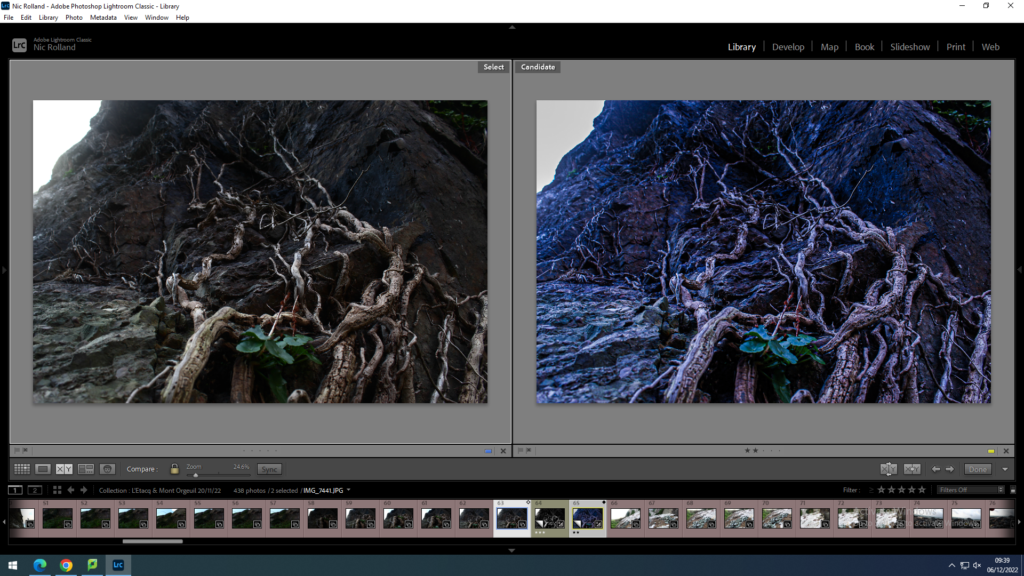
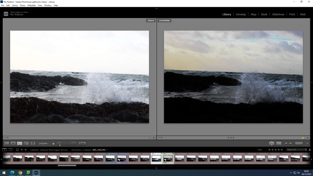
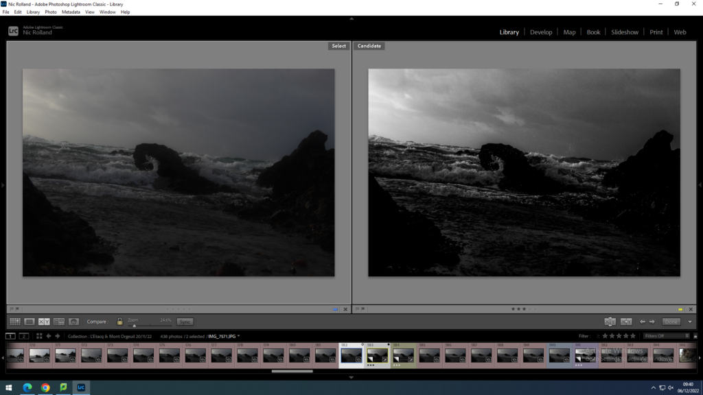
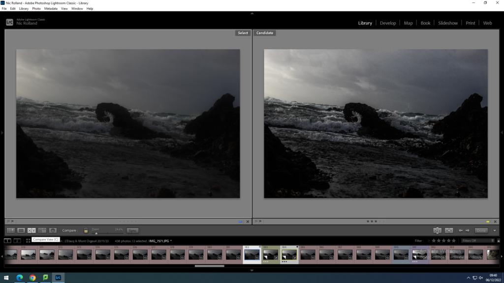
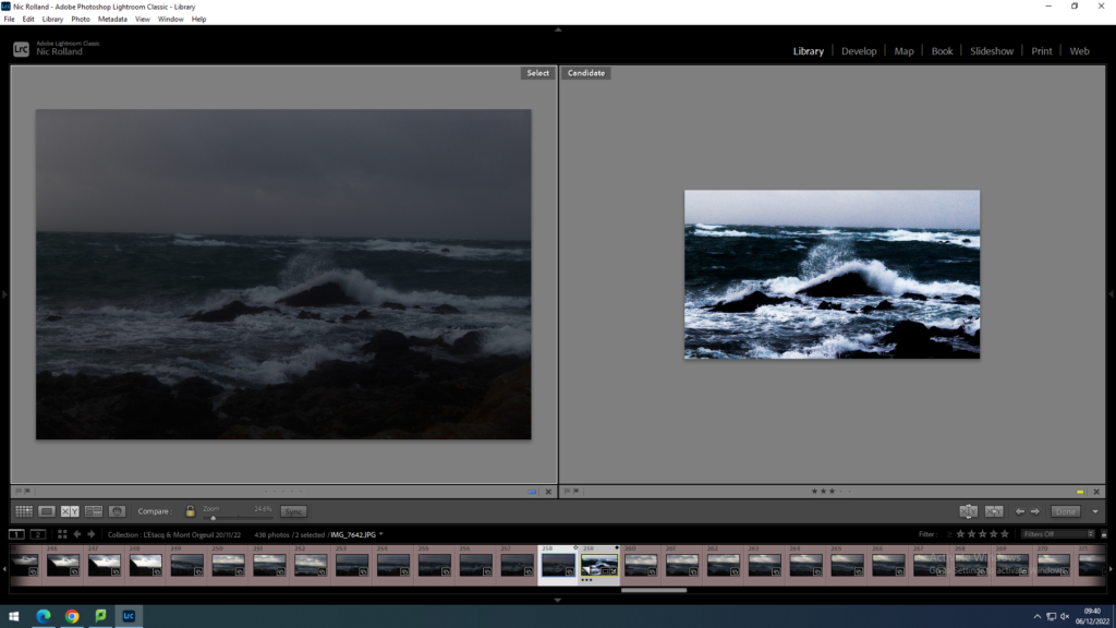
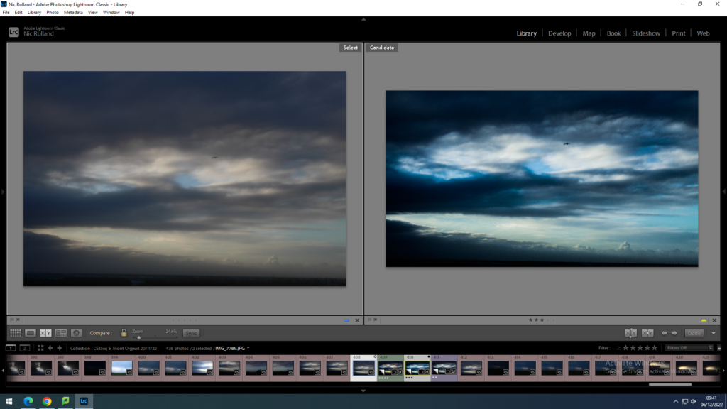
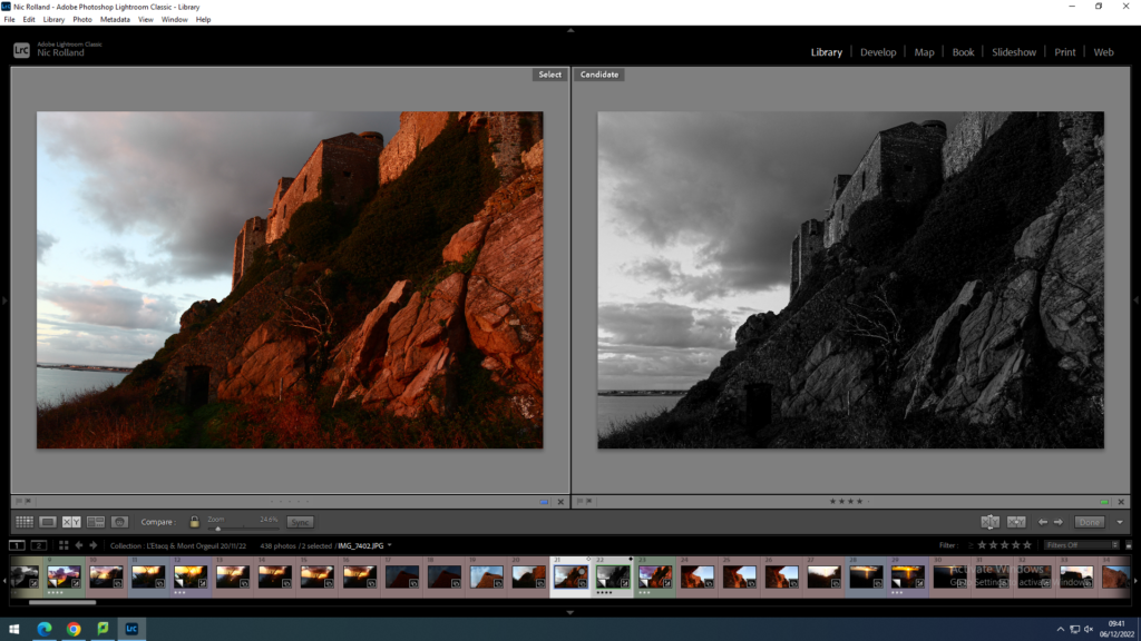
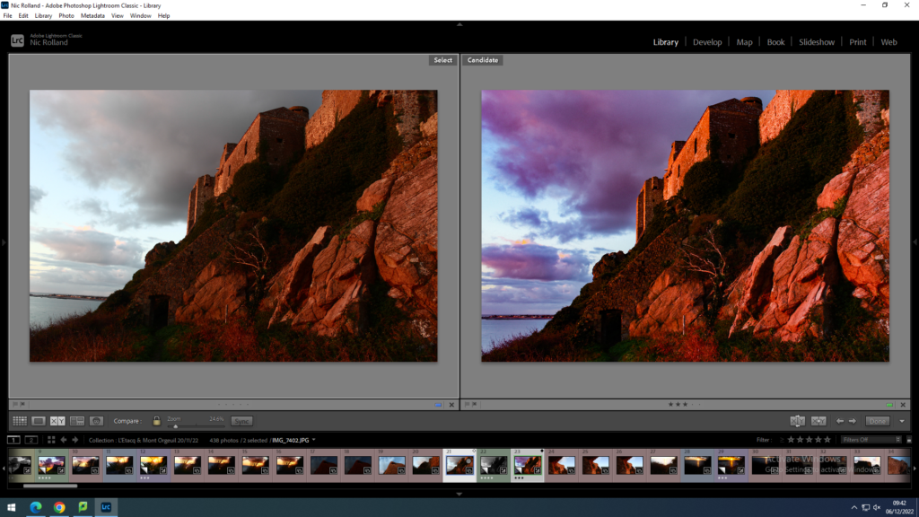
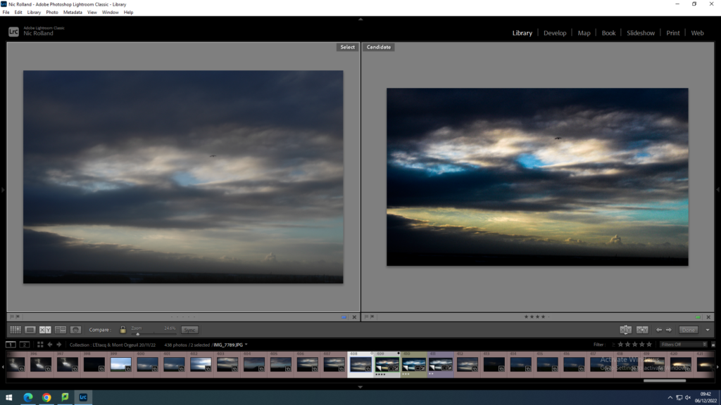
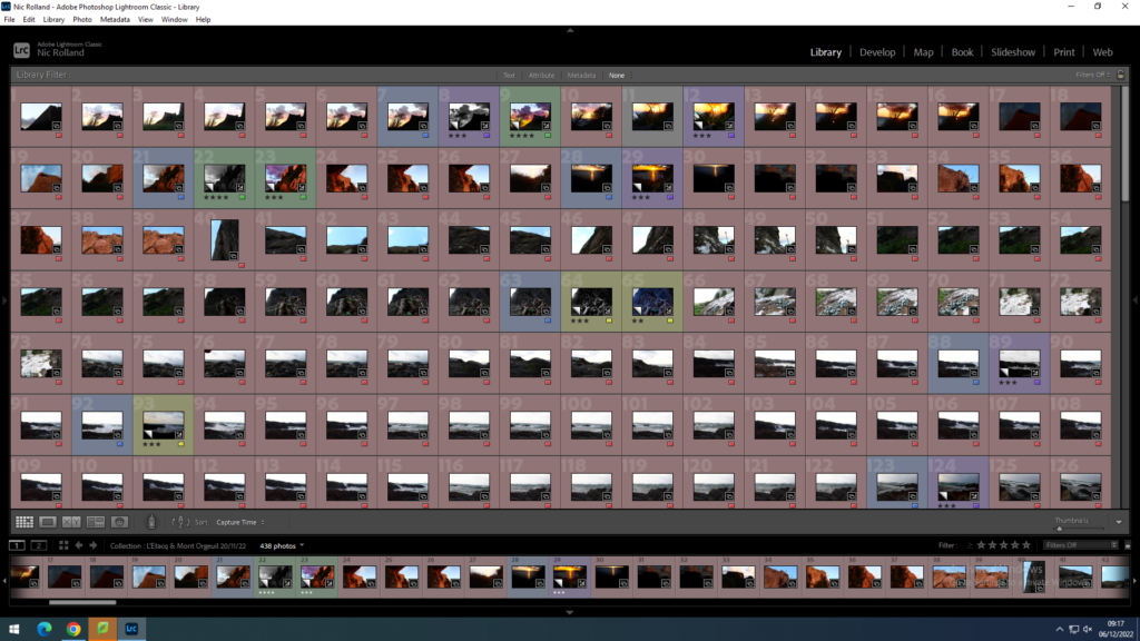
These contact sheets show my images taken at and around Mont Orgeuil Castle and L’Etacq. The images labelled RED are those that I didn’t like and didn’t want to use. Those labelled BLUE are what I wanted to edit and experiment with. Images labelled PURPLE are edits that I don’t like, YELLOW signifies image that I moderately liked, and GREEN are my favourite edits.

Within these photoshoots, I wanted to capture the romantic elements of nature as well as nature’s dramatic side, the sublime. When reviewing my images, I believe that I have succeeded in this task and allowed myself to enhance these aspects of landscape photography when editing and selecting final images.

15 images I wanted to edit

Purple (Worst) Edits

Yellow Edits

Green (Best) Edits

Ansel Adams

Ansel Adams (1902-1984) was an American landscape photographer and environmentalist known for his black-and-white images of the American West. He suffered a harsh childhood from family financial problem to fitting in at school school after an injury from when he was four years old that scarred him for life. However this resulted in his love for nature and the sublime. In 1932, he co-founded with ten other photographers Group f/64, an association advocating “pure” photography favouring sharp focus and the use of the full tonal range of a photograph. They even created a Zonal System , envisioning the values to appear in a black-and-white print and determining its exposure and development. Other members in Group f/64 included Alma Lavenson, Dorothea Lange, Imogen Cunningham among other female photographers who have been overlooked in the history of photography.

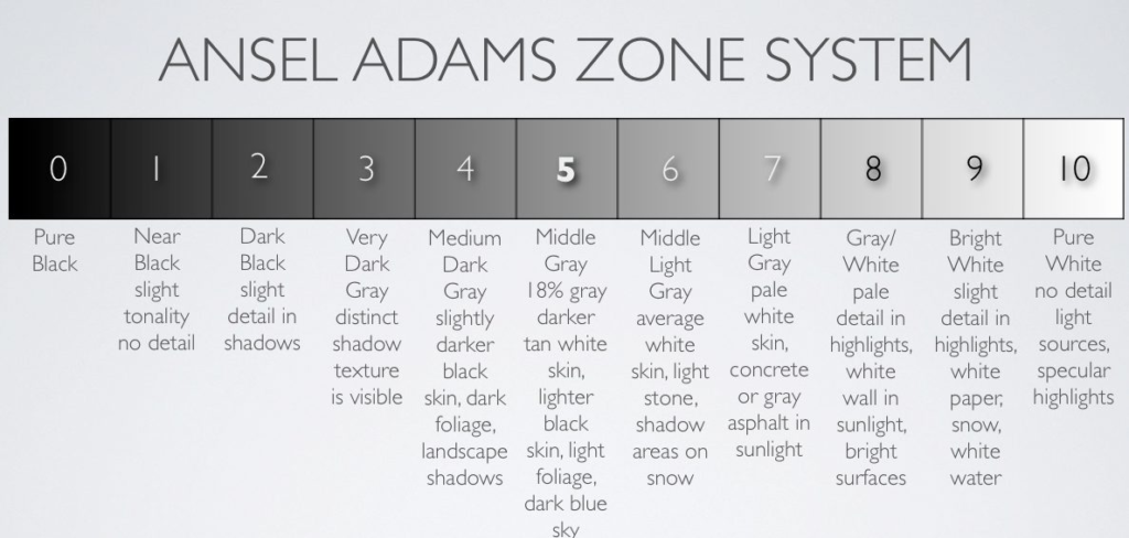
Zone System coined by Ansel Adams and used by many Group f/64 members

Group f/64

The group’s name derives from a small aperture setting on a large format camera, which secures great depth of field and renders a photograph evenly sharp from foreground to background. The group aimed to frequently show what they consider the best contemporary parts of the American West. They would also show the images of those who are not members of the group but their photos that show tendencies similar to the group’s aims, images that follow the ideas of “pure photography”. Pure photography to the group is the art form possessing no qualities of technique, composition or idea, derivative of any other art form. The members believe that photography develop along lines defined by the actualities and limitations of the photographic medium. They say it must always remain independant of ideological conventions of art or aesthetics that are reminiscent of a period antedating the growth of the medium itself.

The above was adapted from the Group f/64 Manifesto

“Our individual tendencies are encouraged; the Group Exhibits suggest distinctive individual view-points, technical and emotional, achieved without departure from the simplest aspects of straight photographic procedure.” – Ansel Adams speaking about the group as artistic photographers.

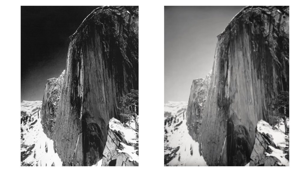
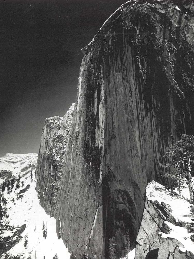
Monolith, The Face of Half Dome, 1927

This was the first image that Ansel Adams had made based upon his feelings (the concept he would later use to create the zone system). From this, Adams also coined the term ‘visualization’, a method in which a photographer knows what they want the photo to look like. Adams stated, “I began to think about how the print was to appear, and if it would transmit any of the feeling of the monumental shape before me in terms of its expressive-emotional quality. I realized that only a deep red filter would give me anything approaching the effect I felt emotionally.”

Monolith, The Face of Half Dome, 1927

This monochrome image shows a large tonal range from a 10 within the snow (labelled by Adams’ zone system) to a 1 in the shadows of the cliff face and the sky. The use of a dark red filter made the image sharper overall and darkened the sky to produce the final outcome. There is a lot of light reflecting off of the snow however this adds to the drama of the photograph greatly contrasting to the shadows cast by the cliff itself. The eye is obviously led to Monolith itself, but the contrast it shows compared to the snow and trees in the midground, creates this sense of harmony between two very different things, almost representing the way that nature works and how different species and ecosystems coincide to exist. The concepts within this piece are Adams’ use of his zonal system and how he visualised his final outcome to be the image that we now see. Both of these have been greatly effective and widely used by photographers today. The image was taken in 1927, the Roaring 20s of the USA, a time when culture and art thrived after the First World War. Therefore, Adams probably faced lots of competition to become known through his works; but with the support of his four friends, he was able to carry his heavy equipment up to this location looking over the Yosemite Valley in California.

The image on the left is Adams’ final outcome after adding a dark red filter onto the lens of his camera. The image on the right shows Adams’ usage of a yellow filter which lightened the sky and decreased the shadows within the image.
Pixelation of ‘Monolith, The Face of Half Dome‘ in Photoshop. This pixelation of Ansel Adams’ image clearly shows each section of his zonal system (refer to Zone .

My Response to Ansel Adams

This image was taken at L’Etacq – its is a Second World War bunker built by the Nazis that is now used as a fisheries.

This image shows all levels of Adams’ zonal system and almost mimics ‘Monolith’ with the dark, dramatic sky alongside the detailed subject of the picture. The pixelation below shows the large tonal range of this. All of the lines at the bottom of the image and in the background are natural, however the all of the buildings create conventional polygons like squares, rectangles and circles. This shows an obvious relationship between nature and humanity; the colourings may be similar but everything else is different. I personally feel this to be a comment on humanities effect on the earth. That as a race, we have taken a beautiful land and stuck large dull blocks of concrete and plastic that will never be used more than a couple of times, they are just left to disappear or stain the earth for eternity. The image contains very little of the bunkers surroundings and fills the frame with the subject. The eye is immediately led to the black lobster on the bunker, which contrasts the white washed walls used as its background.

Pixelation of the fisheries bunker shown above

Painting vs Photography

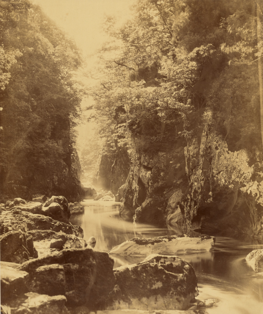
The natural beauty of a Welsh river valley inspired the painting of Samuel Palmer, a key figure in Britain’s Romanticist movement, as well as the first great war photographer, Roger Fenton.

SAMUEL PALMER

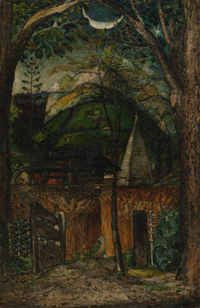
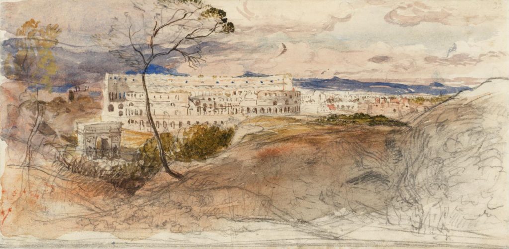
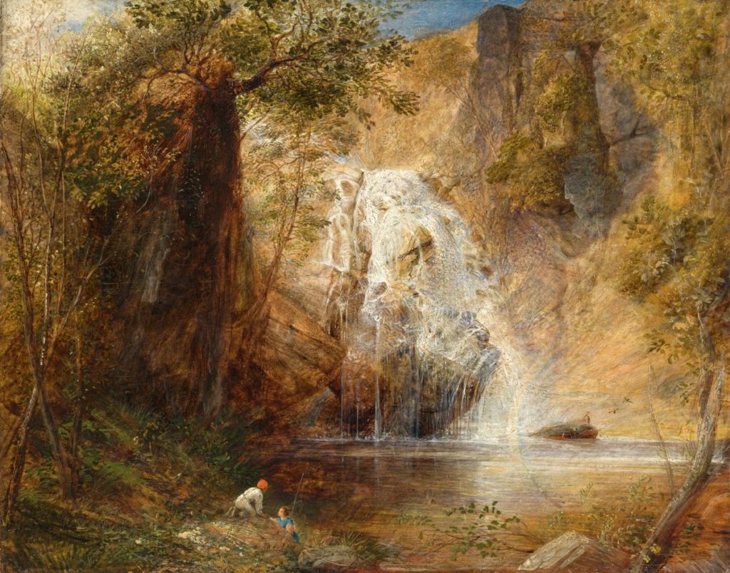
An English painter and etcher of visionary landscapes, Samuel Palmer created images like:

The third image is this exact Welsh river valley painted by Samuel Palmer, and then later photographed by Roger Fenton that I mentioned earlier. During the 1830s he took trips to Wales, where he saw ‘grand novelties & enlarged the materials of imagination’. He paid his first visit in 1835 with the animal painter Henry Walter. Palmer appears to have made a drawing on the spot of the Pistil Mawddach falls, which lie north of Dolgellau, and then to have worked up both a watercolour and oil painting. This image was reproduced by Roger Fenton almost 20 years later.

ROGER FENTON

Roger Fenton’s recreation (c.1952-62)

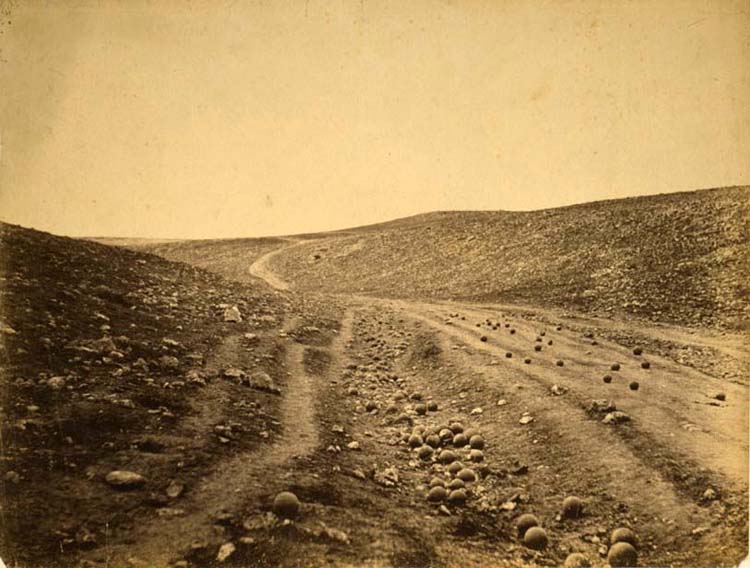
Roger Fenton is known as the first great war photographer thanks to his images from the Crimea. He stated that “If your photographs aren’t good enough, you’re not close enough.” So he documented this war up-close and personal, becoming the founding father of the genre. However, his images masked the truth drastically.

Roger Fenton, The valley of the shadow of death.

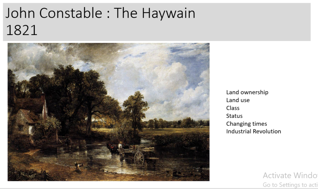
This image shows a road littered with cannon balls after a battle. But this road was miles away from the front lines and the cannon balls were in fact collected and arranged to produce this image. It shows that any truth can be hidden within an image, even with paintings. The most common misconception of photography compared to painting is that when a painting is created, it can be considered a lie; its designed to look the way it does not necessarily showing exactly what is there; for example, the image at the bottom of this blog post: “The Haywain” – John Constable (1821). Whereas, photographs are often considered to tell the whole truth as it can’t be changed. But the image prior to the shoot can be in fact altered; and especially with modern technology, images can now be configured however the artist wants them to be.

Romanticism and the Sublime

ROMANTICISM

Writers and artists rejected the notion of the Enlightenment (1700-1800ish), which had sucked emotion from writing, politics, art, etc. However writers and artists in the Romantic period (1800-1900ish) favoured depicting emotions such as trepidation, horror, and wild untamed nature.

The ideals of these two intellectual movements were very different from one another. The Enlightenment thinkers believed very strongly in rationality and science. But, the Romantics rejected the whole idea of reason and science. They felt that a scientific worldview was cold and sterile.

Romanticism itself could be seen as a rejection of the precepts of order, calm, harmony and rationality that typified Classicism in general and late 18th-century Neoclassicism in particular. Romanticism emphasized the individual, the subjective, the irrational, the imaginative, the personal, the spontaneous, the emotional, the visionary, and the transcendental. English Romantic landscape painting emerged in the works of J.M.W. Turner and John Constable. These artists emphasized transient and dramatic effects of light, atmosphere, and colour to portray a dynamic natural world capable of evoking awe and grandeur.

Review: 'The Critique of Reason' Revisits What Romantic Art Means - The New  York Times
George Stubbs’s 1762 monumental painting “A Lion Attacking a Horse.”
The Art of French and British Romanticism
“The Execution of Lady Jane Grey,” by Paul Delaroche, 1833

THE SUBLIME

Today the word is used for the most ordinary reasons, for a ‘sublime’ tennis shot or a ‘sublime’ evening. In the past however, it has a deeper meaning, pointing to the heights of something truly extraordinary, an ideal that artists have long pursued. Taking inspiration from the rediscovery of the work of the classical author the so-called ‘Pseudo-Longinus’ and from the writings of the philosopher Edmund Burke, British artists and writers on art have explored the problem of the sublime for over four hundred years.

Edmund Burke’s philosophical enquiry from 1757, saw connections of the sublime with this idea of romanticism; terror, awe and danger. He deduced that nature was the most sublime object and that it inflicted the most substantial feeling within people.

In modern society, photographers still use aspects of the sublime as a basis of landscape images, but are more compelled in responding to fears of increased industrialization, the threat of global destruction, and ecological disasters.

John Constable’s painting, ‘The Haywain’, shows different aspects of society during the Industrial Revolution. It shows a farmworker with a horse, trawling a haywain through a shallow river on a piece of farmland near a large house. However this raises questions like; “Does he own the land or is he working for someone? What is the surrounding area being used for? What is this farmworkers social class/status? What’s going on at the time?” In my opinions, this farmworker depicted in the painting works for someone who owns the land shown, or he is simply passing through someone else’s land on his way to market. But what I do, is that he does not own that house or land as during this era, people with enough money to own that much land would not be working it themselves. Therefore, I can assume that he is of quite a low status within British society. Then, there is the question of “What is the land being used for?” It simply looks like farmland or just an unused natural area of England, but the dark clouds in the top left of the image could suggest that further down-river, there could be a factory spewing fumes and pollution into the air and river, even though it isn’t shown in the image. This is most likely a correct assumption as 1821 is nearing the end of the British Industrial Revolution, and therefore factories were almost everywhere across the countryside and cities. The Industrial Revolution showed a drastic change to a new way of manufacturing consumer and trade goods on a massive scale. Therefore, perhaps Constable created this image as a way to capture what was left of the romantic settings before the modern age.

Landscape Photography

Landscape Photography is a broad genre where the landscape is the main subject of the image. Often, landscapes don’t have any people in them at all, although they are sometimes included to give the viewer a sense of scale. The sub-genres include urban landscape, long exposure, nature, astrophotography, and seascape photography.

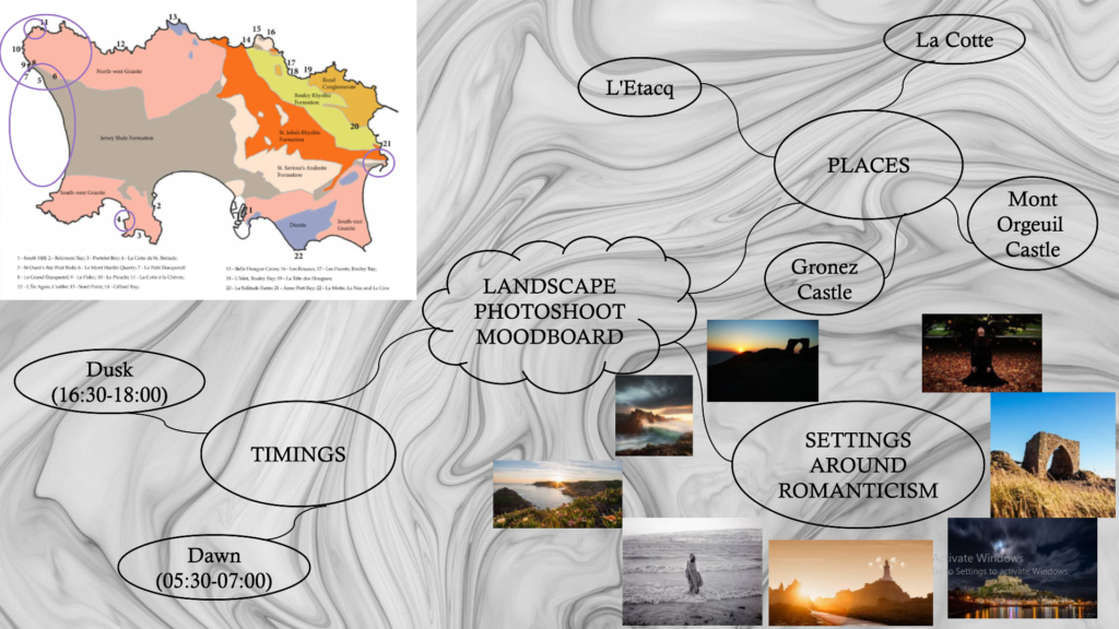
PHOTOSHOOT MOODBOARD 1 – COASTAL LANDSCAPES

PHOTOSHOOT PLAN

I plan to get to different sites of interest around Jersey CI to capture different elements of romanticism and the sublime in the modern day. These places include those encircled on the map above. Typical times to take photos are at dawn and dusk to attempt to get sunset and sunrise images, but I would also like to get images on Sunday 20 November at 15:39, high tide. With the weather forecasting winds at about Force 6, I should hopefully get images of harsh waves at St Ouen’s Bay and maybe alongside a dramatic background of dark and foreboding clouds. With sunrise being at 07:27, images out in the east of the island alongside a slightly cloudy sunset could produce mesmerising images. I would end the day in the west of Jersey at 17:00 after sunset as there wouldn’t be much light to capture photos at night. I would take a walk around each of these sites and simply get images whilst moving around. Each photograph will be taken at a different angle and with different settings, perhaps adapting the depth of field or brightness of the final outcomes. By doing so I will have hopefully been able to capture the sublime, whilst incorporating some aspects of the romanticist genre.

Final Edits Galleries

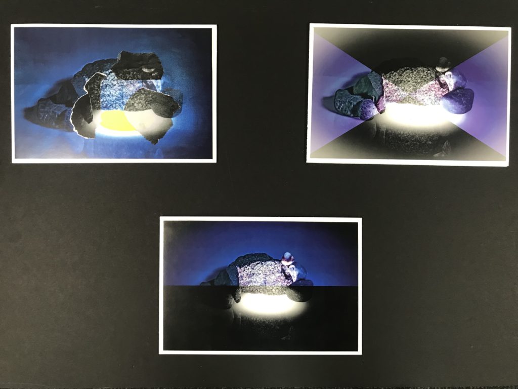
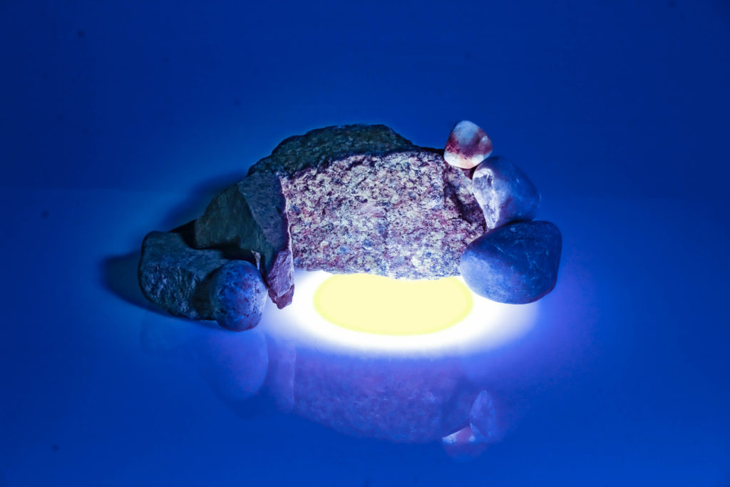
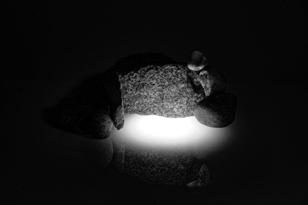
This topic has allowed me to trial different camera techniques to produce images like the ones shown above. From the start of the topic, I knew very little but can now easily say that understand the basics of photographing and editing still life and single object images. In future however, I would prefer to test more abstract ideas when taking photographs, to create a more artistic sense of individuality rather than simply saying that no one else took a photo of this as no two images are completely the same.

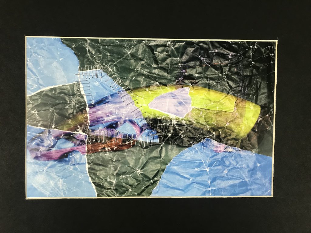
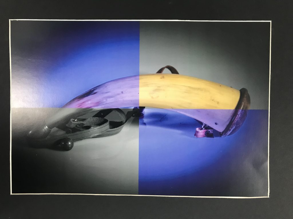
The images below show my final prints mounted into triptychs and single window mounts. Each of these presented a different challenge when creating them. For the pieces mounted onto foamboard, I struggled to ensure the straight lines and borders of the images, but then finding different ways to present each of the different triptychs as clear and individual presentations. The most difficult aspect of making the window mounts, was making sure the measurements were as accurate as possible and ensuring the lines were perfect when cutting. Neither were complete perfection, but I can proudly say that with practice, future window mounts will be easily created.
Mary Ellen Bartley

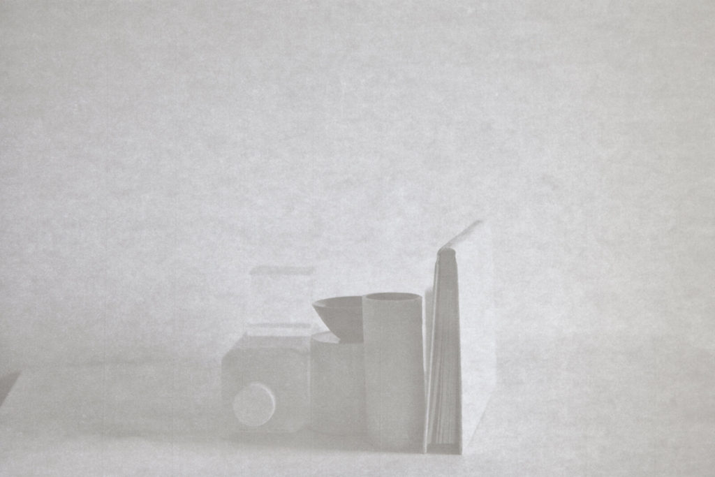
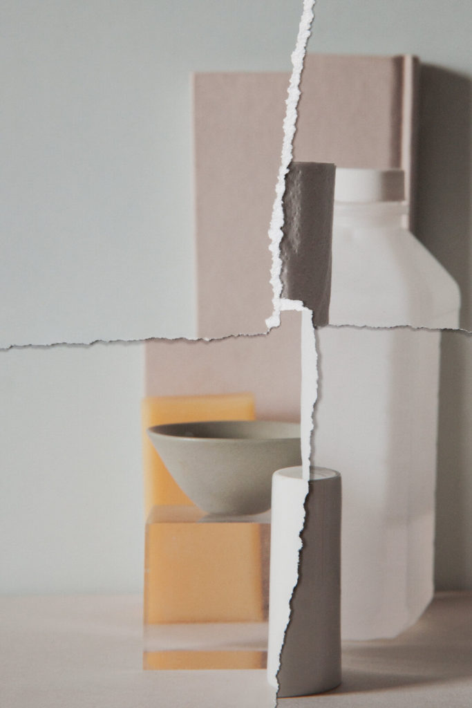
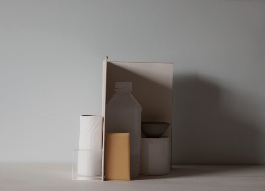
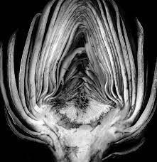
Mary Ellen Bartley is a photographer that was held at home and away from her photography studio over the period of lockdown due to the outbreak of COVID-19 in the UK. However she did not let this stop her. Each day for a month, she took random every day household objects and photographed them in natural light in different ways each day. The items included a book, sponge, mug, milk bottle, a glass cube and a small dish. From here she created these images showing how even the little things we see everyday can be manipulated to produce amazing images and artwork.

Artists Referances: Walker Evans & Darren Harvey-Regan

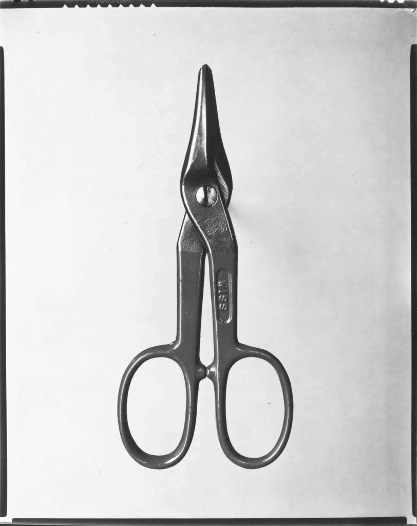
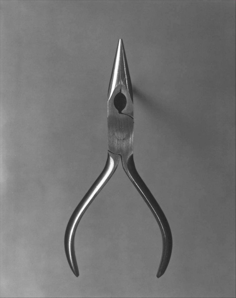
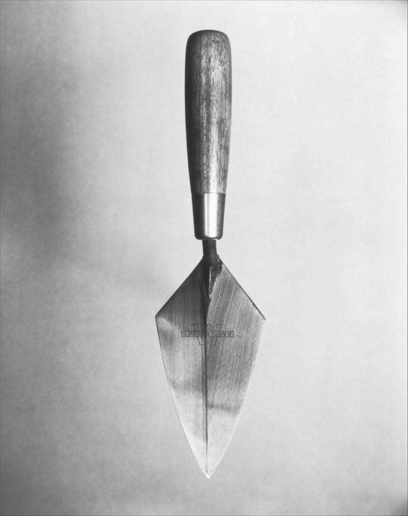
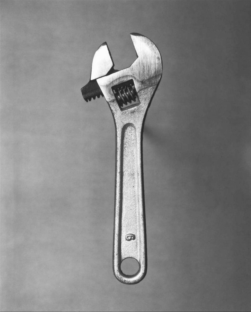
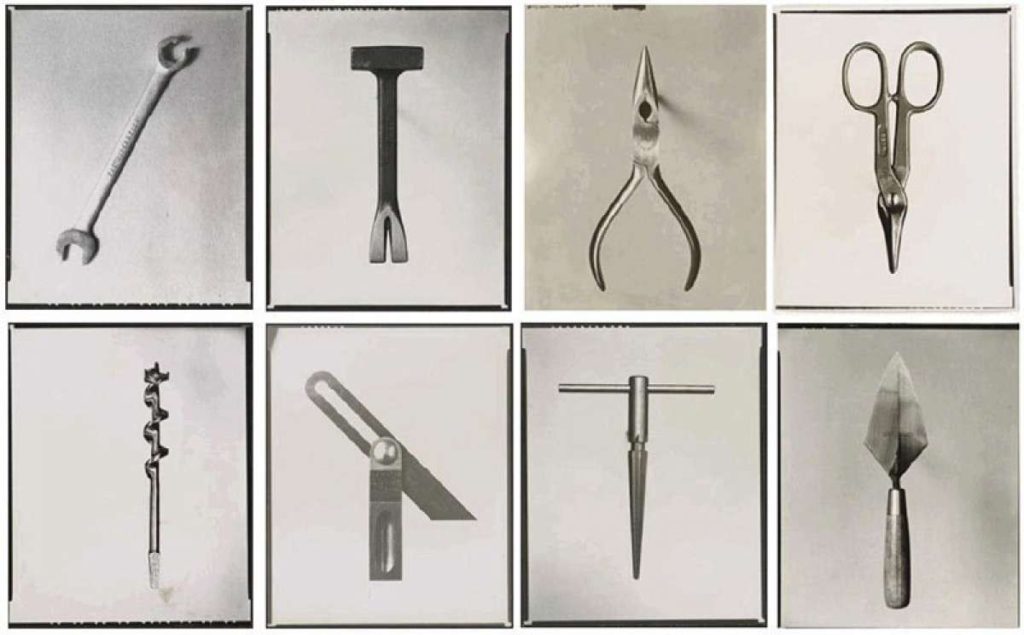
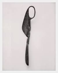
Walker Evans began his photographic career in the late 1920s, taking shots on his trip through Europe. Upon his return to the USA he published his first images in 1930 and went on to document workers and architecture in the Southeastern states. His portfolio, “Beauties of the Common Tool”, was published in 1955 by Fortune Magazine. This work showed the “offbeat museum show for the man who responds to good, clear ‘undesigned’ forms” that are the basic work tools including scissors, pliers, and trowels.

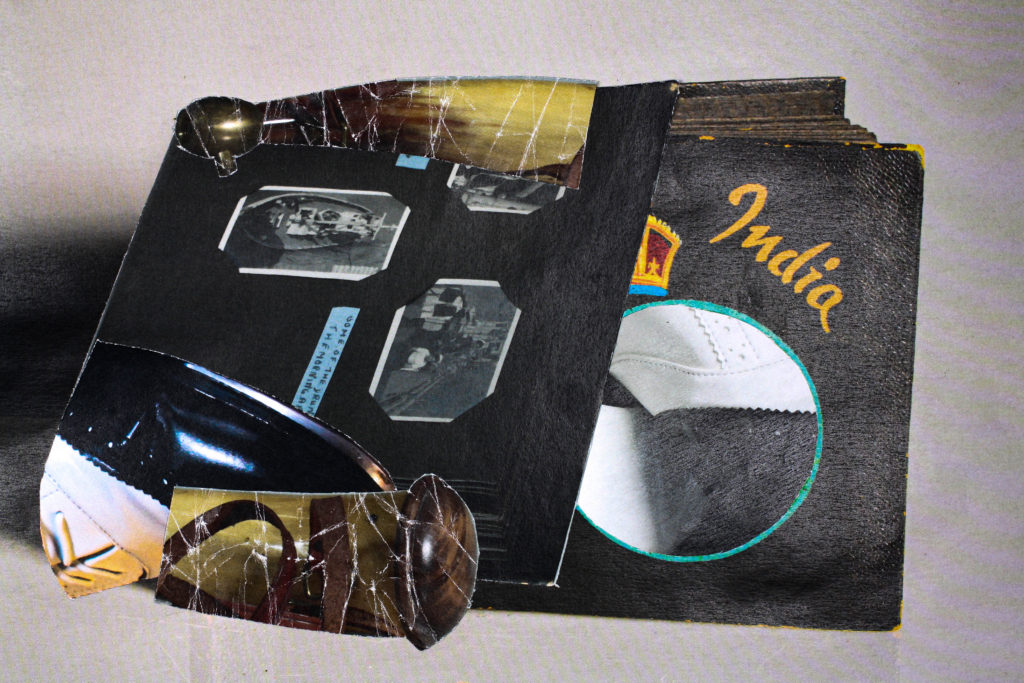
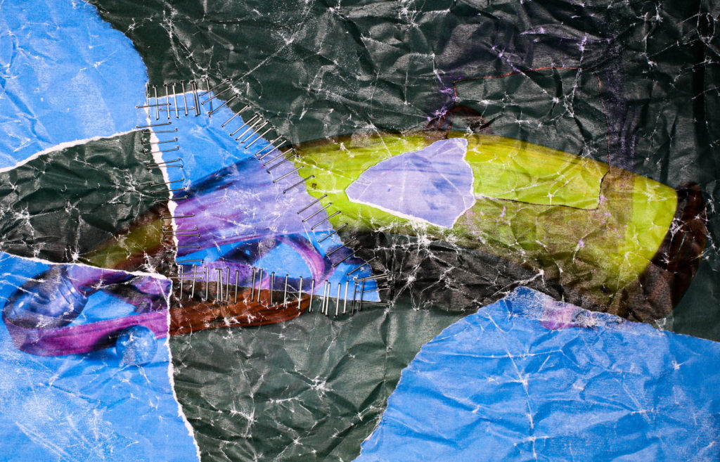
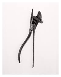
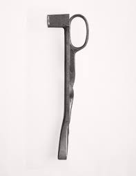
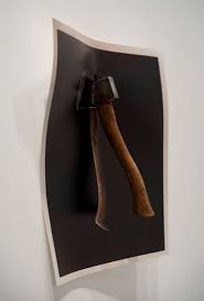
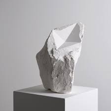
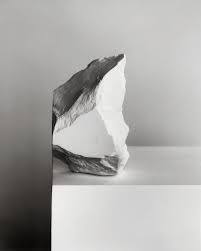
Darren Harvey-Regan believed that photographs do not exist just to show things, but are physical things that become objects themselves. He began 58 years after the publishing of Walker Evan’s portfolio shown above and used his images to create new and more abstract creations. He pulled Evans’ photos apart and cross matched them with each other to create unusual and interesting images.

His further works include “The Halt”, a photographed axe held to the wall by a real axe to create the illusion that it becomes part of the image; and “The Erratics”, a series of images that show differently shaped pieces of chalk with both organic and geometric lines and shapes carved within them or to match their surroundings.