All posts by Nic Rolland

Filters

Author:
Category:

Elizabeth Castle Research

Elizabeth Castle’s history spans across 1500 years from the death of St Helier in 555 AD to the Nazi Occupation of 1940-1945.

Mont Orgeuil (Gorey Castle) was now made obsolete with the invention of gunpowder warfare, especially as invading forces could easily position there guns on the Mont St Nicolas and easily destroy the castles walls. Building began in 1550 under Edward VI – the first Castle on the Mound.

Under Elizabeth I, construction was finished and the Castle was built larger than what it was planned to be after the threat of a second Spanish Armada after 1588. With a stronger castle, Elizabeth could launch ships from St Aubin’s Bay, one of the largest deep water bays in Europe, to stop the Spanish before they enter the English Channel. From then onwards, Elizabeth Castle became the primary defence centre for the island.

The queen initially named the fortress the ‘New Castle’ but with Sir Walter Raleigh as Governor of the island between 1600 and 1603, he renamed it as Elizabeth Castle to regain favour with the Queen, however, we do not know if this was intended to flatter Elizabeth I or his mistress of the time, her Lady in Waiting who was also named Elizabeth.

The strategic positioning of Elizabeth Castle meant that it could easily defend St Aubin’s Bay, one of the largest deep water bays in Europe as any cannon on the castle, being higher than sea level, could easily fire down on enemy ships. This not only gave the garrison a larger firing range but it also provided an easy defensive position as ships at sea level would find it very difficult to get close enough to even attempt a shot at the castle walls.

By the beginning of the Stuart era, The castle walls extended to where the Café is now with a monastery built in the parade ground. The Castle was one of the last Cavalier strongholds held against the Parliamentarian forces in the English Civil War. Jersey was loyal to the monarchy so when King Charles II was exiled (then the Prince of Wales) he was given sanctuary at Elizabeth Castle where he stayed in the Governor’s House with his brother in 1646. He later returned after the execution of his father with an entourage of 300 men in 1949 where he was proclaimed King for the first time by the people of Jersey. During his stay, Charles II pointed out the weakness of having an unprotected piece of land directly adjacent to the castle walls even with a natural sea moat, and he invested 3,000 pounds in the construction of the outer ward.

Once he had fled to France the Parliamentarian’s had taken the rest of the island with the help of Guernsey Militiamen and laid siege to the Castle. The Cavalier’s had enough supplies of food, fresh water and gunpowder to last for a further 18 months, but they made a fateful mistake. They stored all of the resources in the crypt of the Monastery that was where the Parade Ground is now. The Parliamentarian’s positioned siege mortars on South Hill (today Mount Bingham). Within their first bombardment of the castle, a mortar fell through the roof of the monastery, through the floors and into the garrison’s supply of gunpowder. The explosion that ensued destroyed all of the buildings of in the parade ground bar 1, the gate house which is now used the Castle’s café.

The Parade Ground was rebuilt during the Georgian era to how it is seen today with an Officer’s Barracks that housed 12 officers; an Infantry Barracks that housed 300 men with 6 wives of the Garrison staying the attic; a canteen at the North end; the Ordinance Store at the South; and the Gym, Library and Fire Station next to the Ordinance Store.

By the Battle of Jersey in 1781, the castle was armed with more 50 24lb Guns with a range that could easily cover the bay of St Aubin.

Storyline of the Battle of Jersey – 1781:

The French fleet under the command of the Baron de Ruellecourt, left the coast of France at 2300 hours on the 5th January arriving at La Roque at roughly 0500 hours on the morning of the 6th.

Their initial army included about 900 infantry plus 200 cavalry and 50 pieces of Artillery. With the help of Pierre Journeaux, a traitor that fled to France after being accused of murder, he guided the French shipping through the narrow channel in between the rocks at La Roque. The ships had to travel in single file and to avoid being spotted by Jersey Militiamen guarding the coast, they only had a single lantern lit behind each vessel. It is believed that one lantern must have been blown out and the following ships that contained all of the French artillery and cavalry strayed onto the rocks, 200 men drowned. Despite this, the French army continued to the Market Square (now the Royal Square) with 700 men arriving at about 0600 hours. They immediately secured the Court House.

Alerted by the noise of the French troops, people came to their doors to see what was happening. Jean De Ste Croix was bayoneted and struck on the head by a sword but managed to escape to a neighbour’s house. One of the sentries in the Piquet House near the Square in Church Street was killed but the other managed to escape and ran to the Hospital, which was being used as a barracks for the British troops of the 78th Regiment, and raised the alarm. By 7am, Lieutenant Governor Moyse Corbet, still in his nightshirt, was captured. Dressing hurriedly, he was escorted to the Court House where he was met by de Rullecourt, who demanded that Corbet sign articles of surrender. British regiments and the Jersey Militia began to gather across the Island in response to messages and alarm guns being fired. 

To ensure the success of his occupation, de Rullecourt needed to neutralise Elizabeth Castle and get the garrison there to surrender. He sent a demand for surrender which was pocketed by Captain Mulcaster. His attack on the Castle was repulsed by a single warning shot fired from the Gate Battery, killing two men and removing the leg of a French officer, forcing French forces to retreat.  A second party of French officers demanded the surrender of the Castle and again this was refused. By now it was 10.45am and the incoming tide was covering the causeway. With French forces at the opposite end, Mulcaster could only send a few troops across to aid the main contingent in the Battle, the rest were stranded at the castle.

Major Francis Peirson, the leader of the British forces, began positioning his troops on Gallows Hill (Westmount). He sent soldiers to South Hill so they could fire onto the Square from above and he gave the order to march on Town. 

French forces took three militia cannon from the Town Church and placed them in the entrances to the Square. The two placed by the Town Guard House were pointed straight down into La Grande Rue (Broad Street) in the direction of the advancing British troops. Inexperienced French gunners set them too high and when the first was fired at 40 metres, the shot sailed harmlessly over the advancing troops. Seeing this, the men tending the second cannon panicked and fled, abandoning both cannon. At the same time, the fire from troops on South Hill was so intense that many French troops took shelter in the houses surrounding the Square.

Meanwhile, Peirson led his men into the Square. Realising that they were in danger of being caught in the line of fire, he was motioning his men back when he was struck by a bullet. His men dragged him to the safety of Mrs Fiott’s house nearby (now a shop on the corner of the Square) where he died. He was only 24 years old.

Finding themselves attacked from all sides, the French began to waver. De Rullecourt emerged from the Court House with Lieutenant Governor Corbet at his side, possibly with the intention of surrendering, when he was struck by musket balls fired by the 78th Highlanders. Two balls passed through his thigh, a third went through his neck and a fourth shattered his jaw. The French invasion was over. Miraculously, Corbet, despite having his hat shot away, survived unscathed. De Rullecourt was carried over to Dr Lerrier’s House on the east side of the Square where he died six hours later. 

With Peirson dead, Corbet resumed command of the British forces in the Island as French prisoners were rounded up. The rank and file were held in the Town Church and the Officers were held in the Royal Court House. Corbet was later court-martialled and found guilty of surrendering.

The overall numbers included:

  • 71 English dead or wounded
  • 158 French dead or wounded
  • 600 French captured

After the battle it was decided to build Fort Regent and make that the Primary Defence centre of the island as Elizabeth Castle was proven to be useless if their was an attack from elsewhere in the island.

That was the last invasion until the Nazi Occupation during the Second World War. The fast moving War Machine of the Nazi’s meant that there was a steady supply of Russian and Polish slave workers being shipped into the islands wher they were put to work to fortify the Channel islands as part of Rommel’s Atlantic Wall. Two artillery bunkers were built on the EAst and West sides of the Castle with guns powerful enough to hit Gorey and Corbier on their respective sides. A Fire Control Tower was built at the very of the castle with multiple Anti-Aircraft positions situated around it to protect the castle. An Anti-Tank Gun is positioned at the gate Battery to protect from attack from the island and if needed could be used to hit the town. A searchlight on rail-tracks could be wheeled out of its protective bunker under the Georgian Hospital to a position that could patrol the harbour. 100 Nazi Soldiers lived out at the castle and nothing has been changed at the castle until today. The majority of the bunkers are open to the public, with the guns being the originals and were never removed from their positions.

Design and Layout

When creating my zine I must always keep this idea in the back of my head:

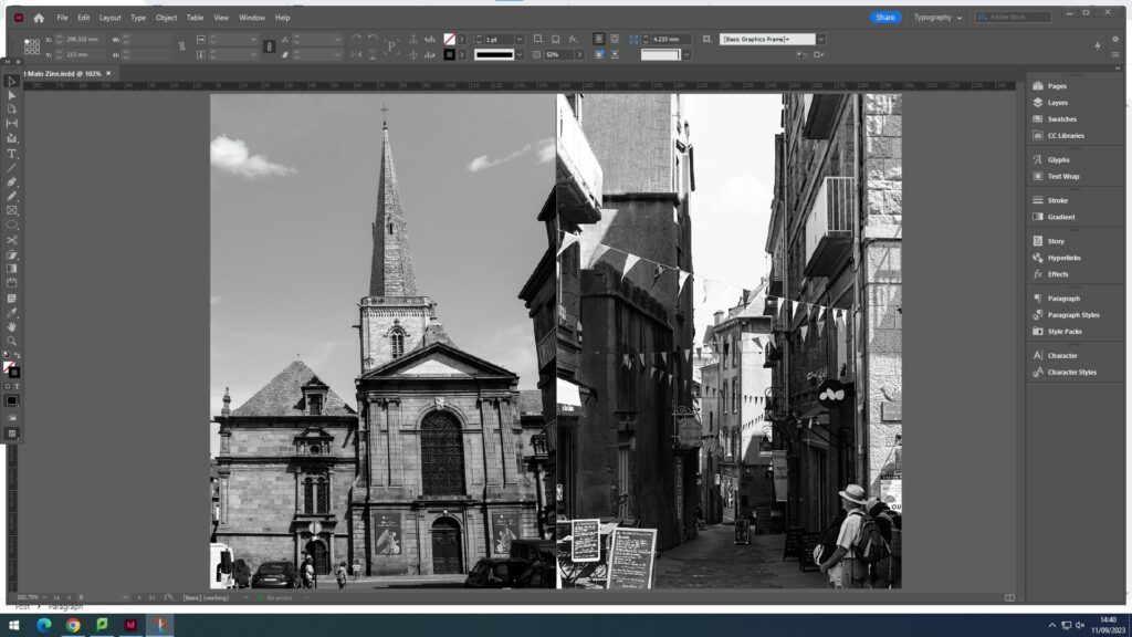
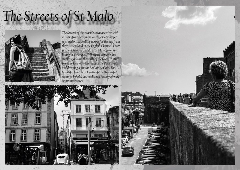
The story I want to express through my zine is spending a day relaxed in the town of St Malo. By crossing the English Channel from the island of Jersey on a short boat trip, you are able to explore the artistic and historic aspects of the town from graffiti on the walls to designated art galleries embedded in little bunkers built by the Germans or on cannon batteries built to defend against the British Navy. St Malo having such a rich historic background presents itself as a high profile tourist attraction where the towns footfall could reach up to 500,000 per annum, meaning the tranquil town can easily become very hectic and busy within a matter of minutes. I want to express the idea of exploring the town, finding something new around every corner.

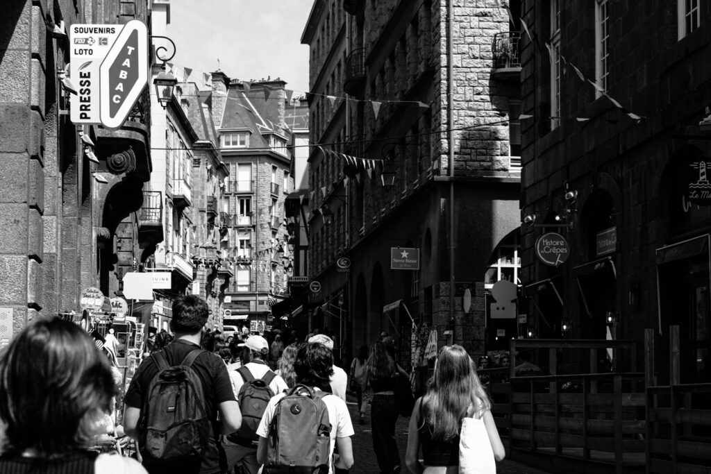
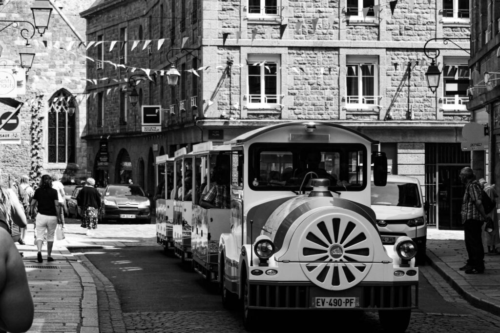
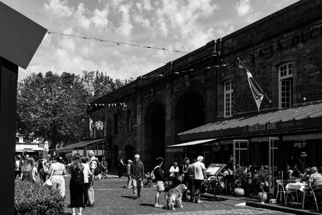
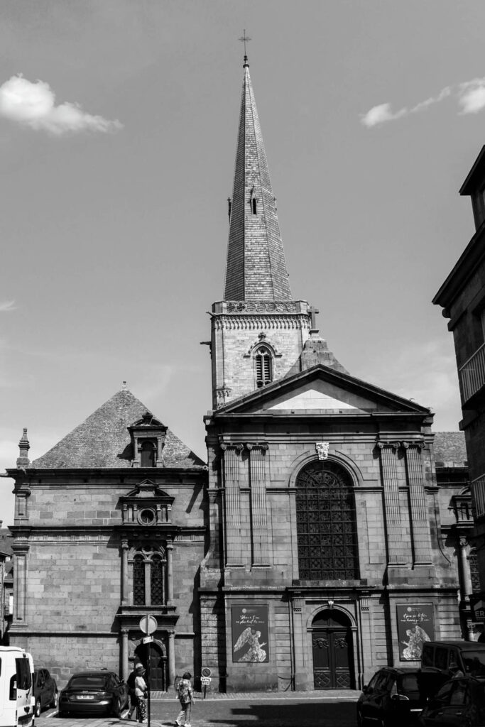
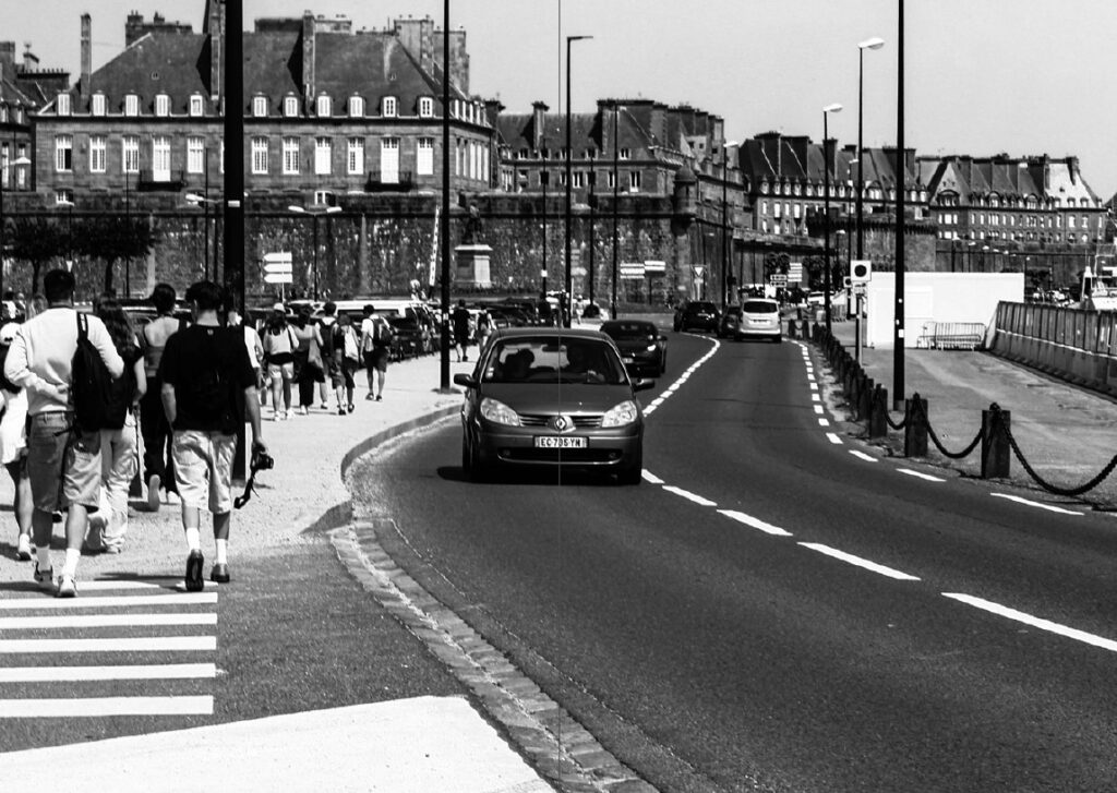
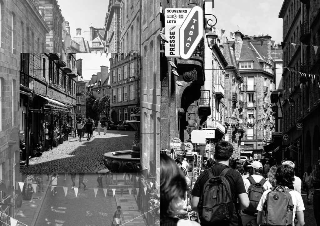
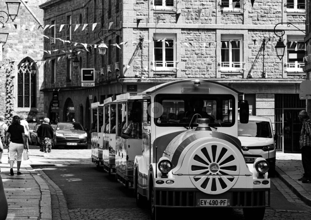
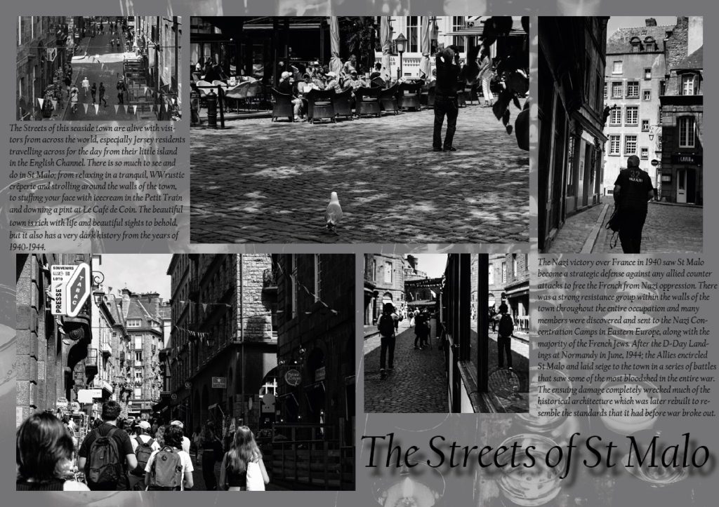
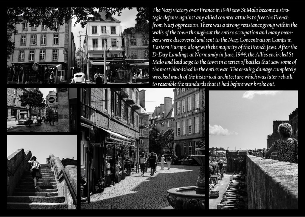
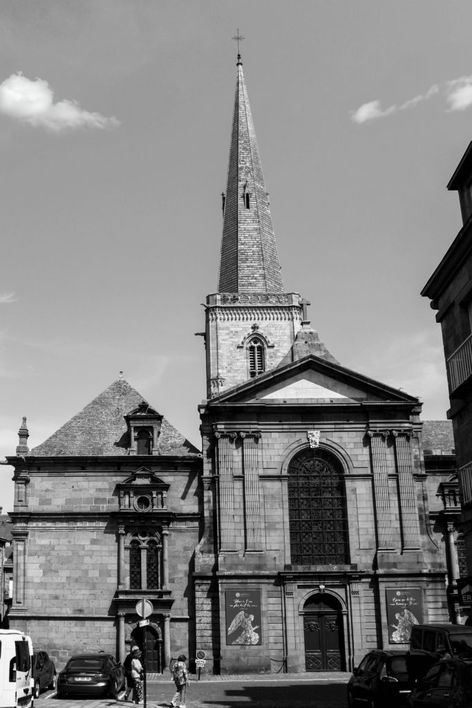
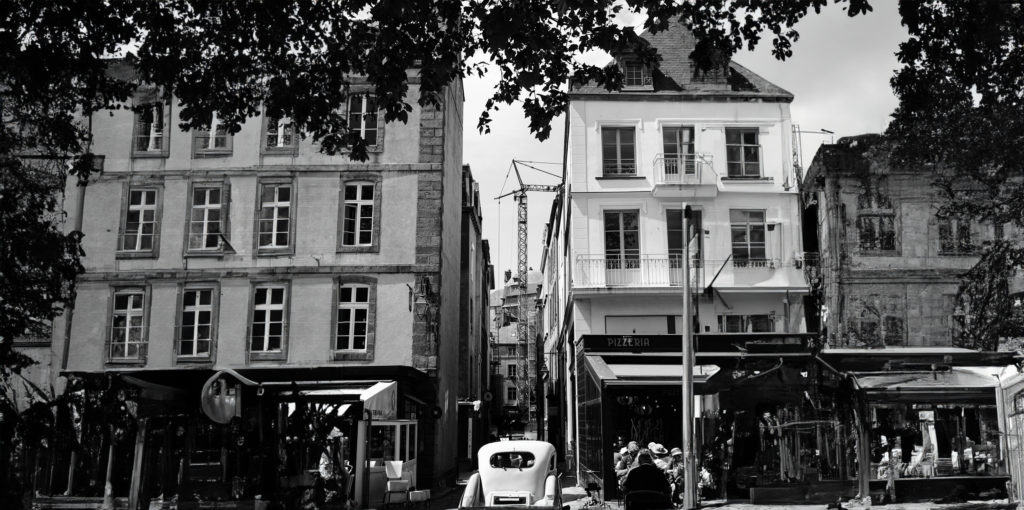
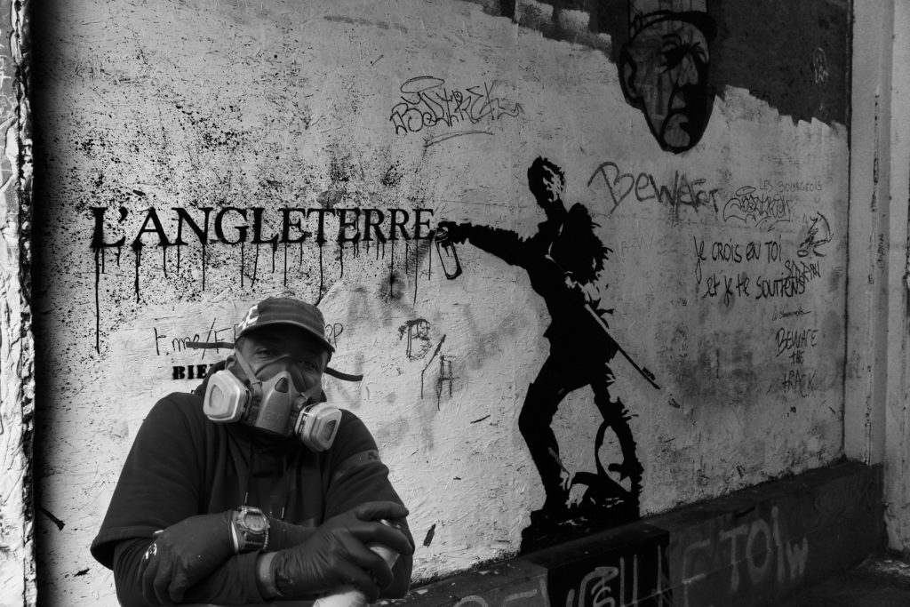
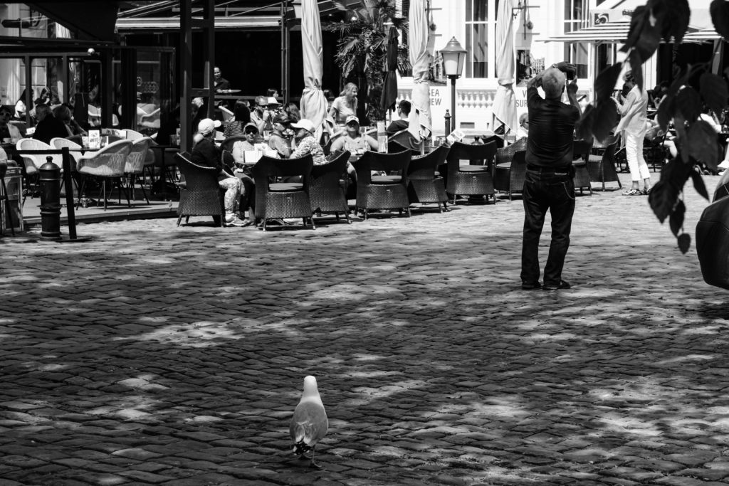
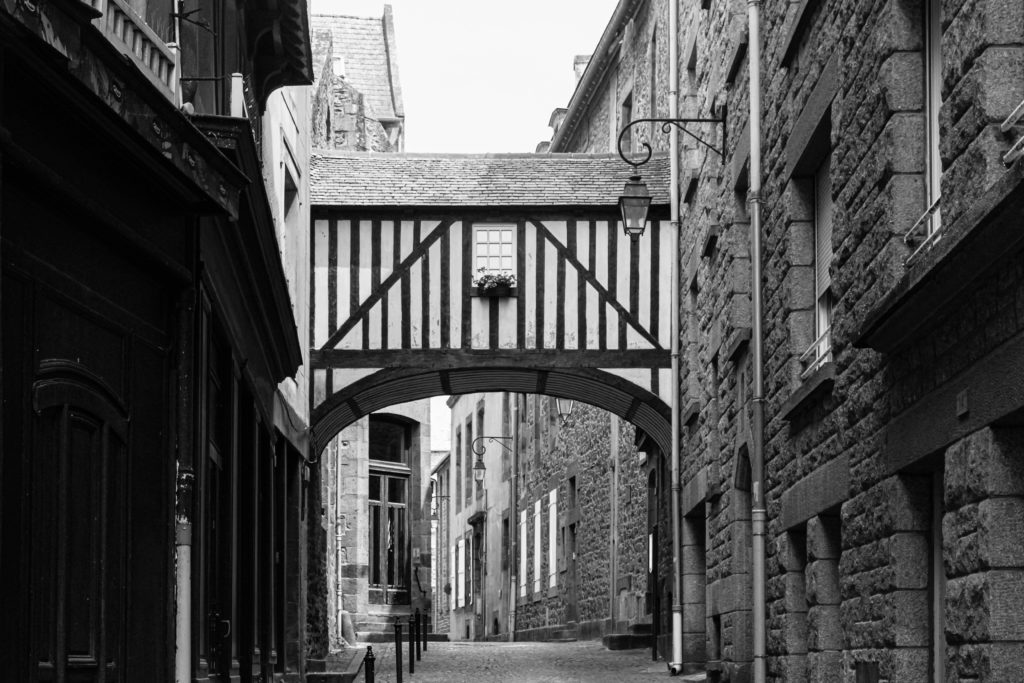
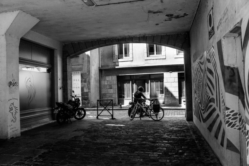
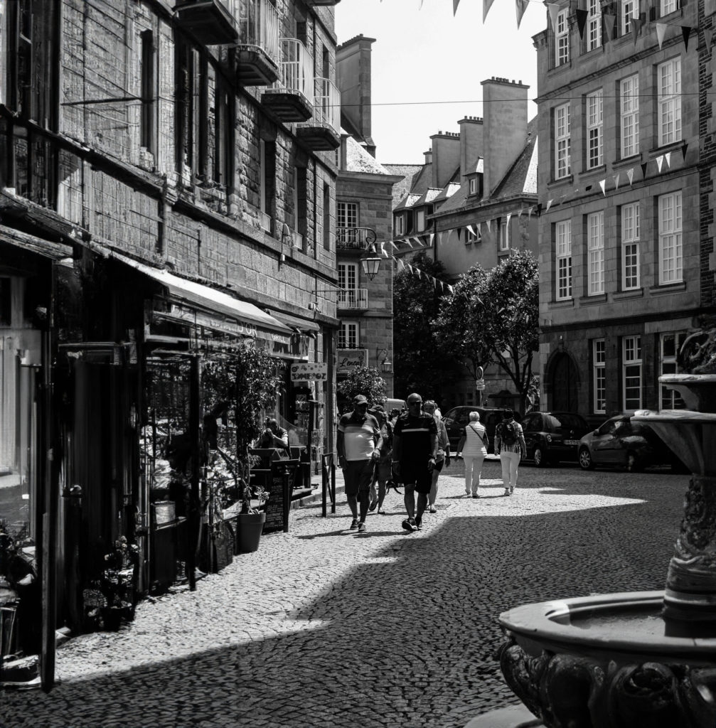
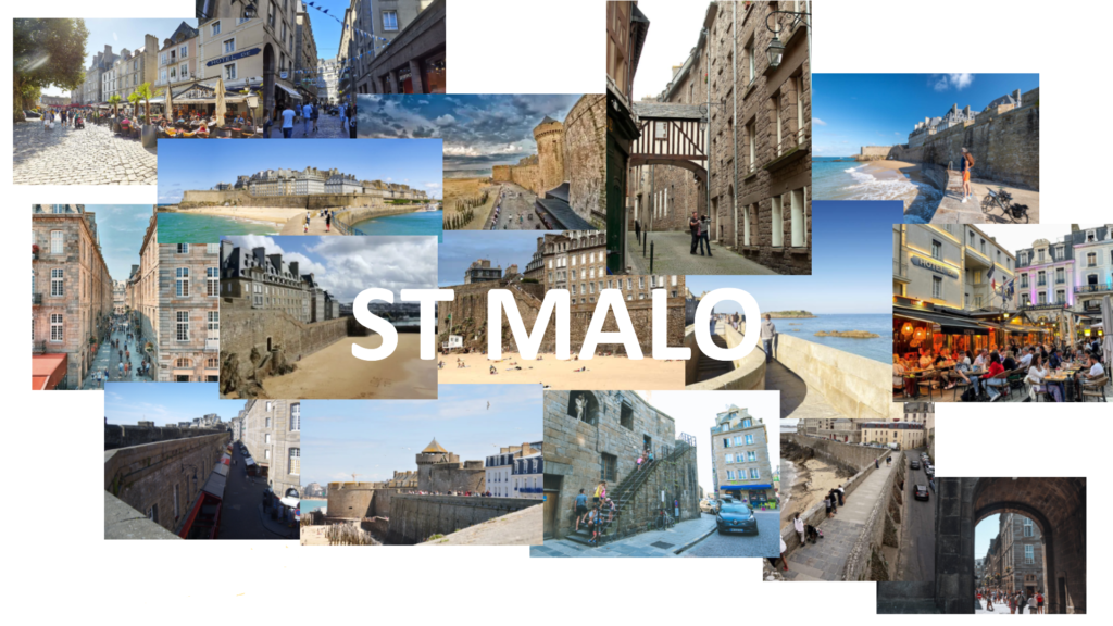
By using a range of images taken on a day trip to the town (shown below), most show exactly what was seen and some were enhanced by using AI software when editing.

The Title: ‘A DAY OF PIRACY’

I didn’t want to simply title the zine as ‘A Day in St Malo’ as it seems very boring and basic. Therefore I decided to think about the towns history and incorporating that into a title that still expresses that the images were taken in a single day. As a safe haven for pirates throughout the 17th and 18th Centuries and this being the largest point of the towns history I would believe this era to be the best option to weave into a title. The stereotypical swashbuckling sailors that made their livelihoods trading and partying in the town would be exciting. The adrenaline that they must feel when running from the likes of the Royal Navy and the East India Trading Company, attacking and raiding seaside towns and merchant shipping. It was a life of freedom and exploration. And this is exactly the story that I want to tell. A daytrip exploring the pirate town; ‘A Day of Piracy’

Designing the Layout

When looking at my images I notice initial groupings on the pages whereas some images simply don’t coincide with one another. But by maintaining this idea of an exploration, I feel that the more disjointed that the images seem, this idea would across more easily. Of course not everything would be randomly placed together because even an exploration has aspects of uniformity be it a certain type of flower in one area or a single street lined with crêperies.

These two images have nothing in common visually but are both sights to see in St Malo. Therefore, I would put them simply together in a very basic format to show that yes they are from the same place, but they have nothing in common except for being a different sight for tourists to see and explore.

With image like the one above that can easily fit across a double page spread on its own but have little or no relation with others, I believe could create a effective background for a group of images that can relate. The image looks very empty with the most prominent aspect being the lone seagull walking on the ground. I believe that by using this photo as a background but maintaining the seagull’s prominence within the spread the towns story could come across very clearly. A possible layout is shown below with a single portrait and two landscape images.

Possible layout for the page spread
Image 1 added
Image 2 added
Image 3 added
Final outcome for the page spread

I also wanted to change the final look of my zine, as it all seemed very flat. (Page-spread below)

Very flat initial page-spread

I experimented with both borders for the images and using drop shadows.

I decided to use the drop shadow effect as it creates a softer look around the images instead of the solid black border.

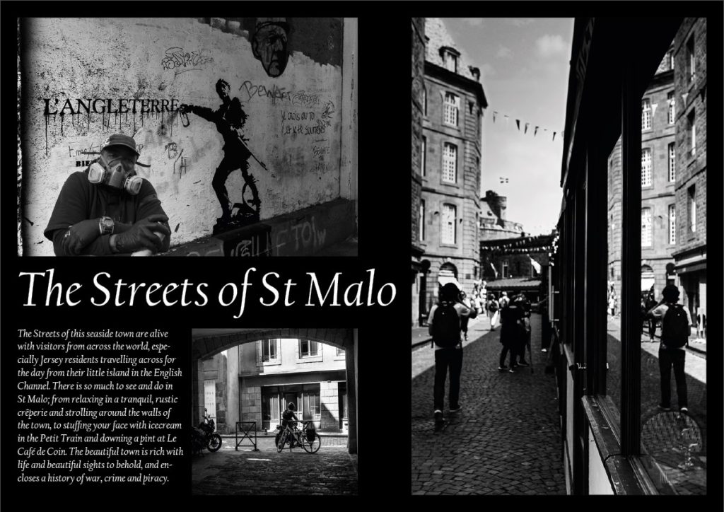
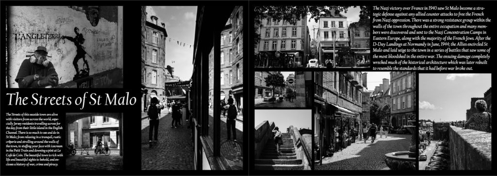
Below is the final layout for my zine across 16 pages starting with the front cover.

Research and Analysis

ZINE (n):

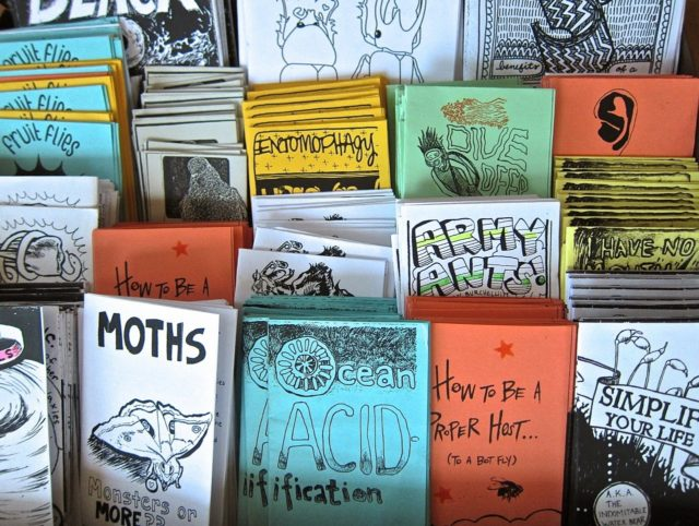
A zine is a self-published, non-commercial print-work that is typically produced in small, limited batches.  Zines are created and bound in many DIY ways, but traditionally editions are easily reproduced—often by crafting an original “master flat,” and then photocopying, folding, and stapling the pages into simple pamphlets.  Zines may also be sewn, taped, glued—or even exist in unbound and other non-folio formats.

Zines provide a safe, independent platform of expression for underrepresented and marginalized voices: Black, Indigenous & People of Color, young people, people with disabilities, the LGBTQ(+) community, persecuted religious groups, and people with limited economic resources.”

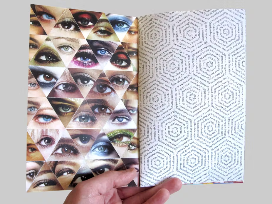
This zine (above) shows a typology of eyes compressed into one single page alongside lines from a book positioned on the adjacent page in a series of hexagons. Looking across two pages, this is an effective technique of separating typical photographic presentations with a page of text, while simultaneously showing a mix of colour and monochrome imagery. However, the overall page spread shares a motif through how each image is presented. Both typologies are arranged in intertwining triangles, the eyes creating a linear, uniform spread and the text forming hexagonal formations. The only critique that I would have for this approach is that it is unclear whether the designer wanted the text to be read as I have no idea if what is written in the text links to the ‘eye’ typology or not. However, if they didn’t want the text to be read then it is an extremely clever and creative approach that has an intriguing effect on the viewer. For me personally, the interlocking hexagonal formations remind of honeycomb and how natural patterns seem the most beautiful and most mesmerising to the human eye.

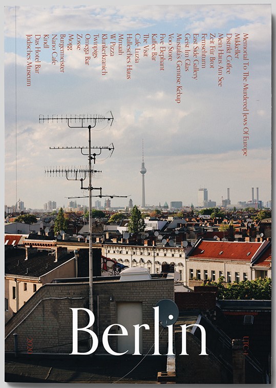
When looking through examples of zines that are focused around tourism, they all seemed to be have the same common approach – a single image of the are that they want to tell a viewer about. For instance the front cover above shows a typical landscape image of a high-rise that is very obviously of Berlin. It has a simple title so everyone knows exactly what this zine will be about. That is the typical front cover for any tourism based zine. However this differs from the status quo by having somewhat of a contents page of what there is to see in the city going across the top of the page, forcing the viewer to take a closer look in order to read it. This is a clever trick to grab someone’s interest, but for me personally I wouldn’t bother attempting to shift my head just to read a little bit of extra information. I also find the simple title of ‘Berlin’ quite boring as a viewer and therefore when designing my own zine would think of a clever way to present what is enclosed in a clever and submerged way that a viewer would have to look through the zine to get an understanding of what it is about.

The two page spreads above both show techniques that I would like to incorporate into my design. The image on the left shows on photograph spanning across a double page as an establishing shot for the section of the zine about ‘Mitte’. I believe that this is a good way to show off more important images of the St Malo that I have taken (i.e. the petit train that tours the town or a view of the walls from outside of the town as you approach from the ferry terminal). The spread on the right if you look closely shows an image of food and coffee layered on top of an establishing shot of a café. I want to use this technique as it is a stylised way to not only use more of my images but to also create an unusual background for that specific page spread.

Narrative & Story

WHAT IS MY STORY?

When creating a zine or photo book, you need to have story for your images to flow and make sense within it. A good and easy way to come up with your story line is to describe in 3 WORDS:

Relaxed, Artistic, Busy

A SENTENCE

In my zine, I want to tell the story of a relaxed, artistic and busy little town on the coast of France.

A PARAGRAPH

The story I want to express through my zine is spending a day relaxed in the town of St Malo. By crossing the English Channel from the island of Jersey on a short boat trip, you are able to explore the artistic and historic aspects of the town from graffiti on the walls to designated art galleries embedded in little bunkers built by the Germans or on cannon batteries built to defend against the British Navy. St Malo having such a rich historic background presents itself as a high profile tourist attraction where the towns footfall could reach up to 500,000 per annum, meaning the tranquil town can easily become very hectic and busy within a matter of minutes.
NARRATIVE: How will I tell my story?

I want to take the simple approach to my zine by telling the story through images with the main text being the title. In my opinion the zine should be more visual rather than textually based. The title should be enough text for someone to have some kind of understanding of the overall narrative in order to form their own opinions of the town.
The images should be grouped either by what they show or by where or how they were taken. For example the images below all show the towns most loved aspect, its food and creperies.

St Malo Page spread Experiments

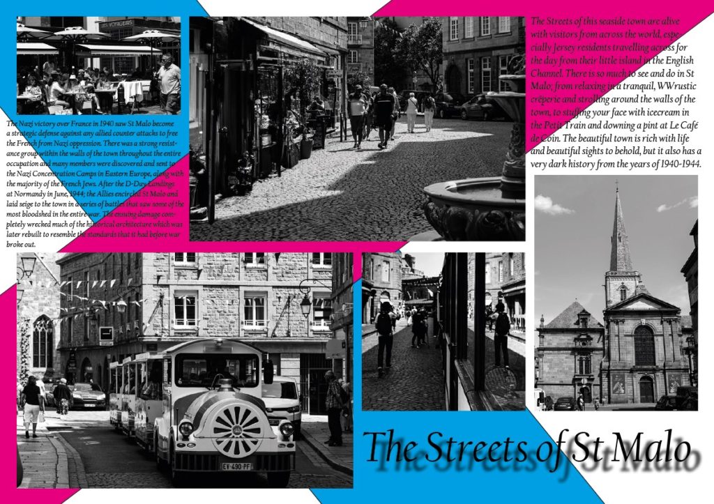
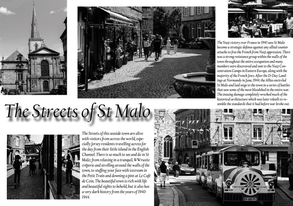
These 8 page spreads all began with a simple white background and by positioning different images in as man6y different positions as possible. From this simplicity i explored the Adobe In Design software and tried adding drop shadows, coloured backgrounds, text etc and created the outcomes above.
Double Page Spread

I found it difficult to squish text and a vast range of images onto a single page spread then decided to create two with the exact same background and design and share images and information across the two, finally presenting them together once printed.

Text Development

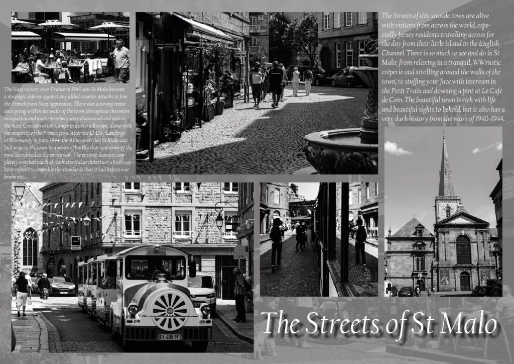
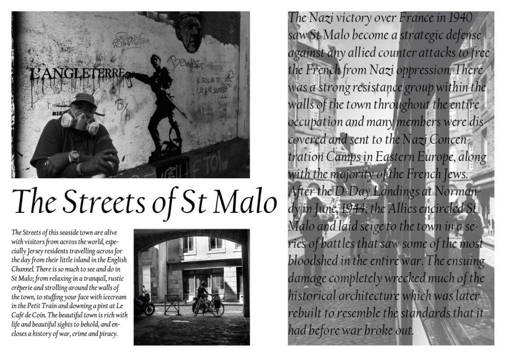
I also experimented with the backgrounds of the spreads by using my own images to create them. This created an amazing effect; however, disrupted the clarity of text making it difficult to read (example shown above). Therefore I added a simple layer of translucent grey which allowed the text to come across more distinctly and easier for people to read (shown below).

Favourite Outcomes

The outcomes below are those that I wish to print but before properly mounting them, I want to have them peer assessed to establish which layouts work the best, are the easiest to read and understand, and which are simply the most liked.

From the findings of the peer assessment, I will print and mount the favourite three or four outcomes.

St Malo Outcomes

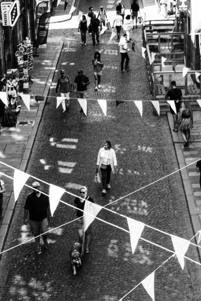
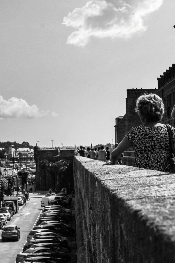
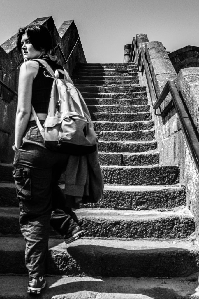
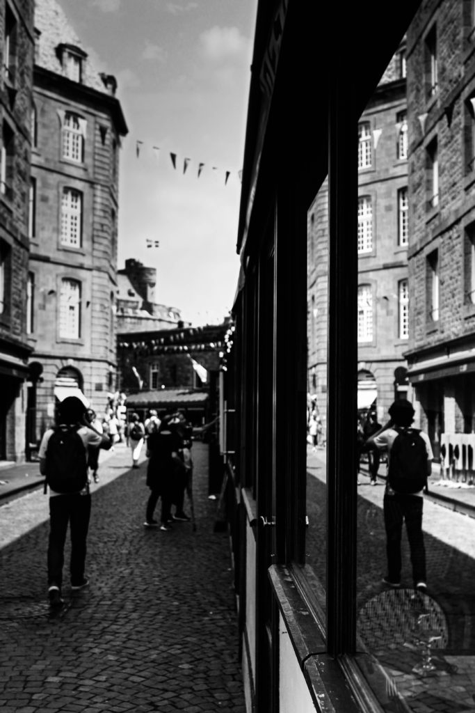
Here is a presentation of images taken from St Malo.

But they aren’t all completely telling the truth.

How many of these images would you say are generated through AI software?

St Malo – Photoshoot Plan

Street Photography

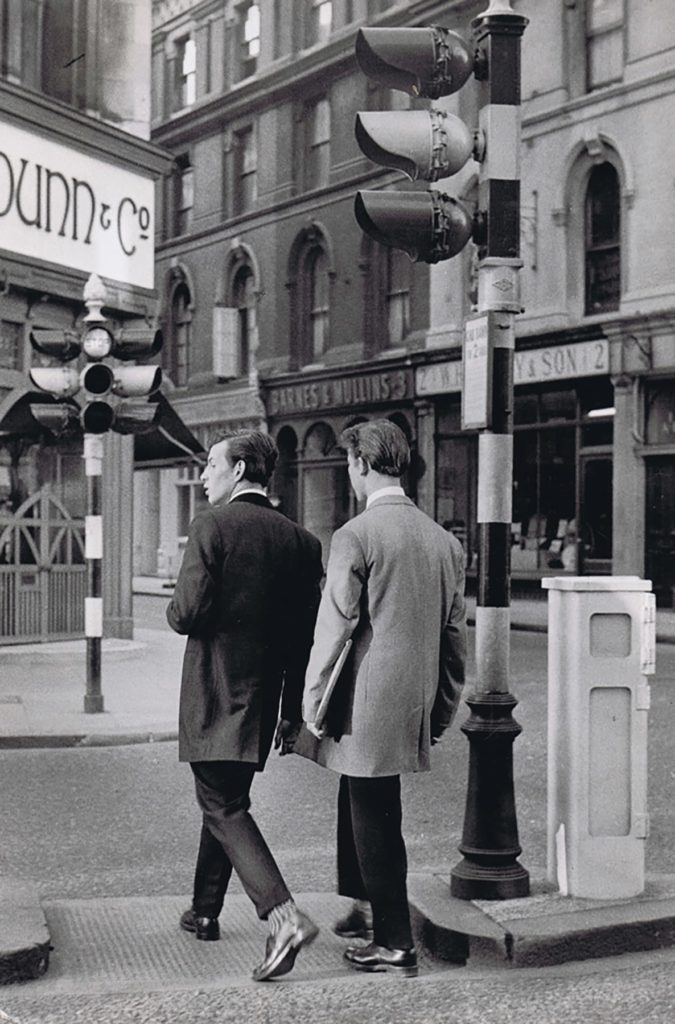
Street photography simply is photos taken on the street of the street, people on the street, things happening on the street. It is an easy way to show life and typical happenings in a society. It can comment on peoples’ livelihoods or be completely fabricated simply through the photographers approach. Cartier-Bresson took the hidden approach of taking photos without people knowing he’s there; whereas, William Klein actively goes up in people’s faces and talks to the people he photographs. Each approach produces completely different outcomes.

Photoshoot Plan

As quite a shy person, I want use Cartier-Bresson’s technique of taking photos at the ‘decisive moment’. By taking pictures without the models knowing, I personally feel less intrusive, but I also can get more natural images where the model won’t pose or change their personality for the camera. It also means that not a single photo would be the same as I would be constantly moving never staying in one place for longer30 seconds.

However this isn’t always the best plan and so I also want to find a well framed alley way and just sit their with my camera pointing at a busy street or in a shop window, waiting for something to happen in a very still setting, waiting for the ‘decisive moment’.

Seeing as St Malo isn’t accessible to me 24/7, I also wish to take some images as a tourist, taking photos of the beautiful side of the town, depicting a typical point of view of someone in a new place, creating memories. This would allow me to explore the theme for this project, nostalgia.

Henri Cartier-Bresson and the ‘Decisive Moment’

“life is once forever”

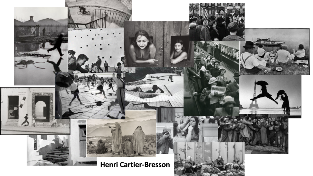
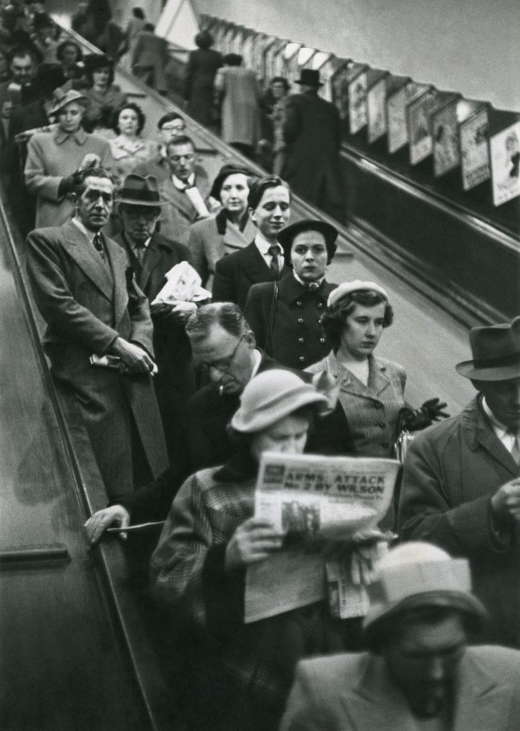
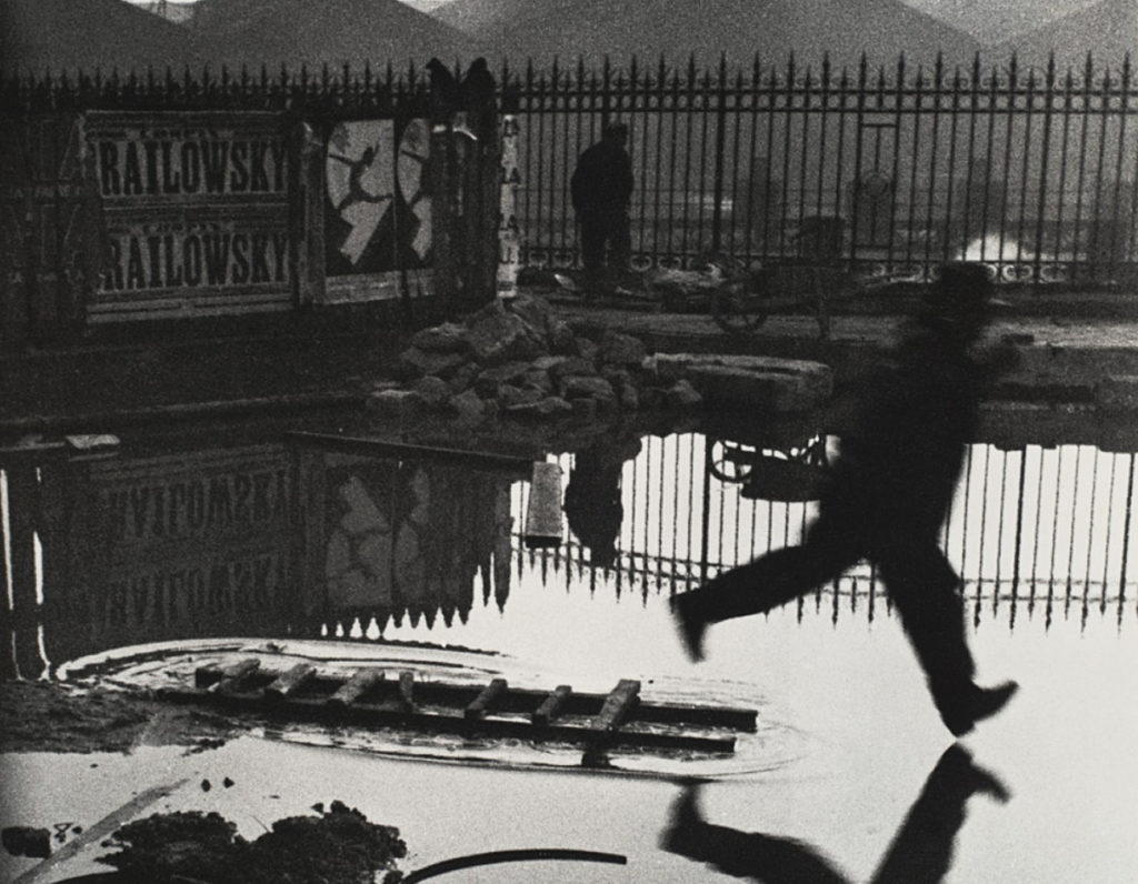
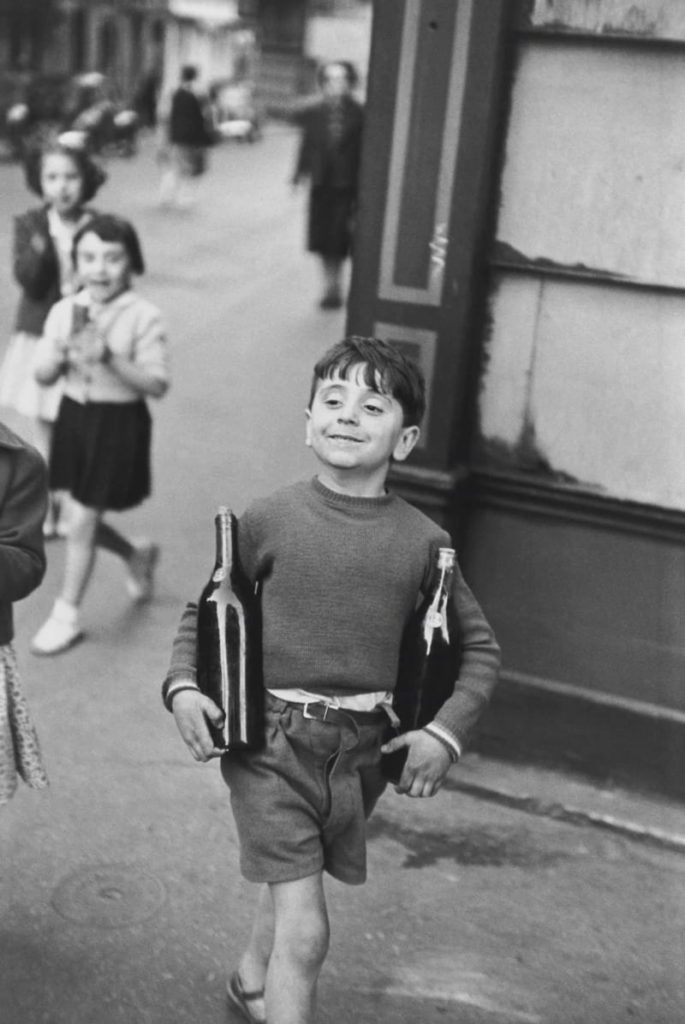
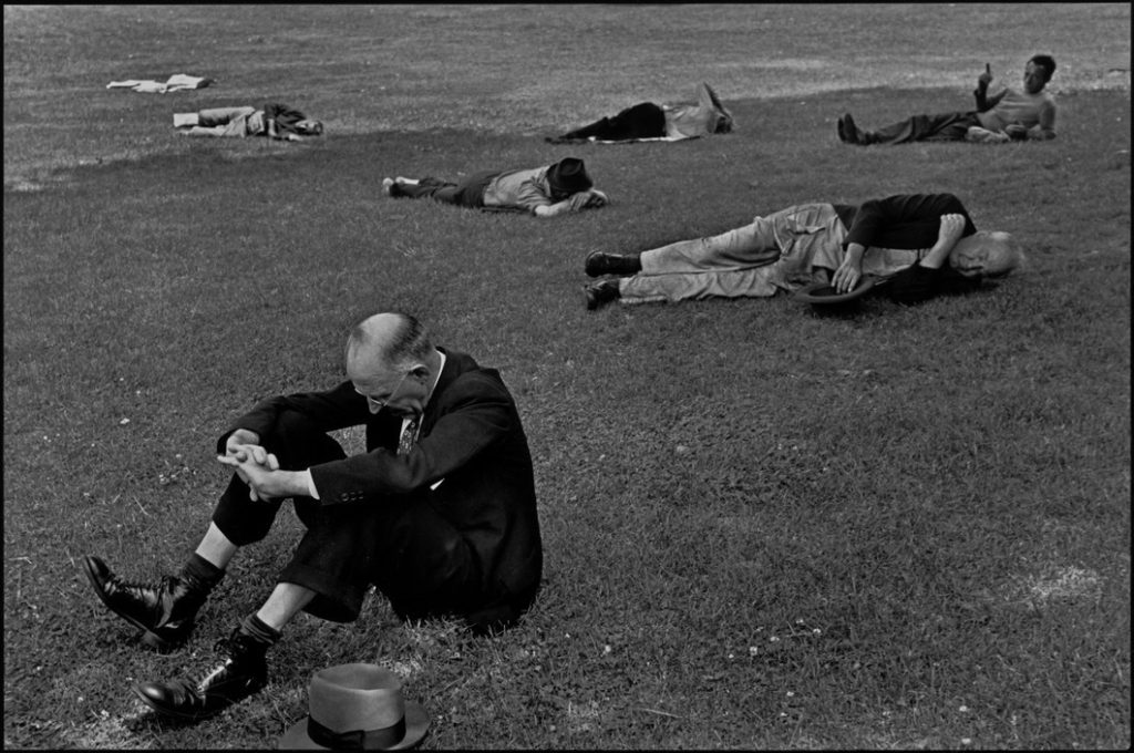
Henri Cartier-Bresson (1908-2004) explores his own ideas of the ‘decisive moment’ and is considered as one of the fathers of photojournalism. “It’s a bit like hunting” – he attempted to capture the ‘everyday’ and was primarily interested in recording humanity.

He worked with the responsibility of rapidly supplying the world with information, be it from the liberation of Paris to Ghandi’s funeral. Cartier-Bresson aided in the development of street photography, a genre still used and highly influential today. He began his work as second assisstant director to Jean Renoir in some of his films, including what is considered to be one of the most influential moving pictures of the 20th Century, La Règle du Jeu (1939).

The Decisive Moment

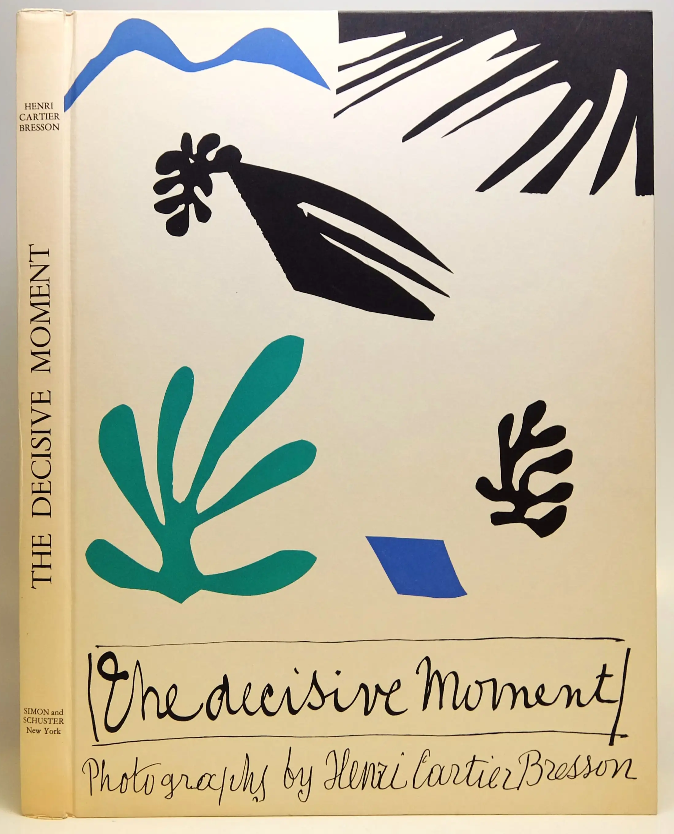
He created his photographic book ‘The Decisive Moment’ which has been described as ‘a Bible for photographers’. This title given to the book when it was published English subsequently imposed the motto that is now used to describe most of Cartier-Bresson’s works.

The cover was designed by French artist, Henri Matisse. He uses his signature style of art from the later years of his life when he lost his sight to create the cover, which is very misleading as to what the book holds inside.

“For me the camera is a sketch book, an instrument of intuition and spontaneity, the master of the instant which, in visual terms, questions and decides simultaneously. In order to ‘give a meaning’ to the world, one has to feel involved in what one frames through the viewfinder. This attitude requires concentration, discipline of mind, sensitivity, and a sense of geometry. It is by economy of means that one arrives at simplicity of expression.”

Essentially Cartier-Bresson’s works were sketchbook pieces, all photographic ideas that happened to work. That is what I find interesting within his photos, no-one will ever be able to recapture his photographs – they will be shown in history as his outcomes for eternity.

Image Analysis

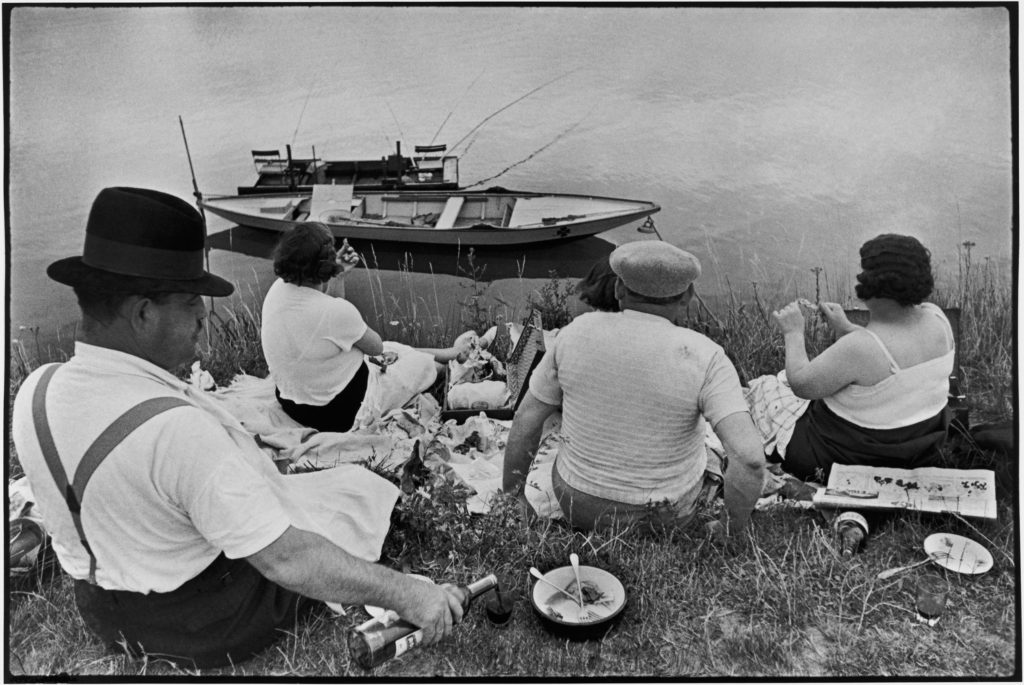
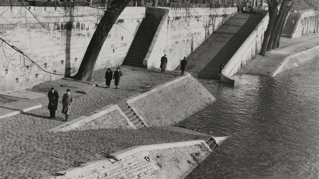
The photograph shown above seems to me like a very nostalgic image. It clearly shows Cartier-Bresson’s use of the ‘decisive moment’ as everyone within the frame seems unaware of the camera or chooses to ignore it. The simple monochromatic scene shows an obvious separation between the river bank and the water with a line of division cutting directly across the centre of the image. The divide is masked by the natural shapes of the people depicted as they are sat firmly on the bank but their heads and torsos cross this central line of the photo. The water has a very uniform look with very similar colours in itself but the boat disturbs the calm of the colouration casting a heavy, black shadow onto the water. It clearly utilises Cartier-Bresson’s concept of the ‘decisive moment’ as the group seem unaware of his presence and completely relaxed; either pouring a glass of wine or tucking in to the food.

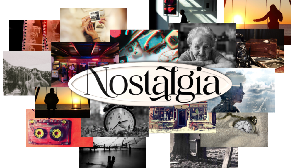
Nostalgia

“Nostalgia is something that is both cosy and comforting but also deceptive and an illusion”

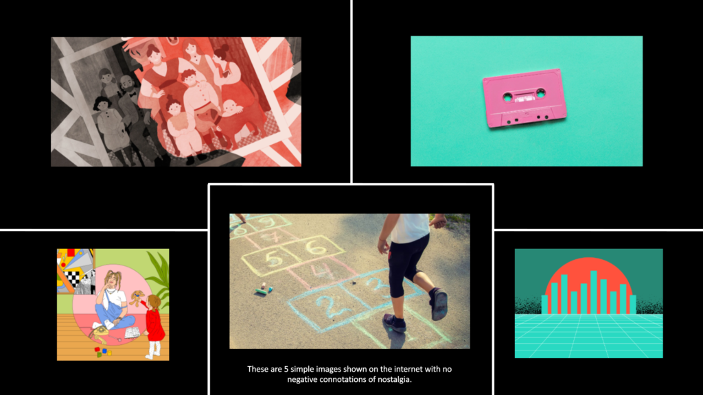
When people hear the word nostalgia, for some reason it seems like it is always a very soothing occurrence. I don’t know if its just how the word sounds when spoken aloud, or if this comforting idea has been drilled into every person from a young age; but something about it relaxes you. Ultimately, it is a memory, a dream of the past where anything could have happened, you could have ridden a bike for the first time, gone on holiday, nailed an exam. It seems like something positive. Simply typing the word “nostalgia” into google with no prompts or filters – these are the first 5 images to be shown.

But is nostalgic thought always this perfect? You often hear adults mention “the good ol’ days” of when they were children and teenagers, going out to party, relaxing without a care in the world. But how good were these “ol’ days”? Even just 20 years ago, there was excessive racism and misogyny and people genuinely feared to be themselves in society. Today, this stuff still exists but everything considered normal then is now the underground opinion, it occasionally shows itself but genuinely people are more free to live the way that they want to.

“Nostalgia is a file that removes the rough edges from the good old days” – Doug Larson

This quote from Doug Larson emphasises how nostalgia truly is. It is a memory and people remember different things in their own completely unique ways. It’s very cynical to think like this, but our own memory lies to us, it attempts to show us the best aspects of an event and almost entirely skips over the bad things; but sometimes a catastrophic event can not be overlooked. Therefore, aren’t bad memories also a form of nostalgia, or do people have a different name specifically for them? Past traumas? Unimportant memories?

Review of “Playtime” – Will Lakeman

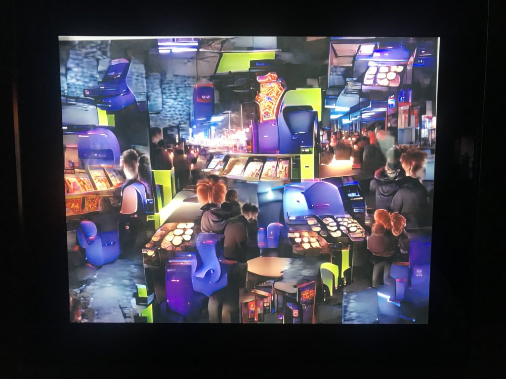
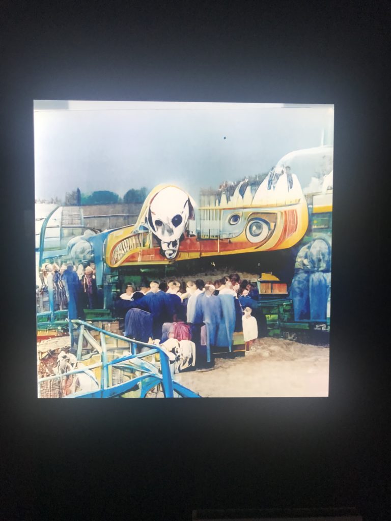
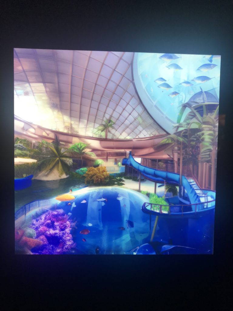
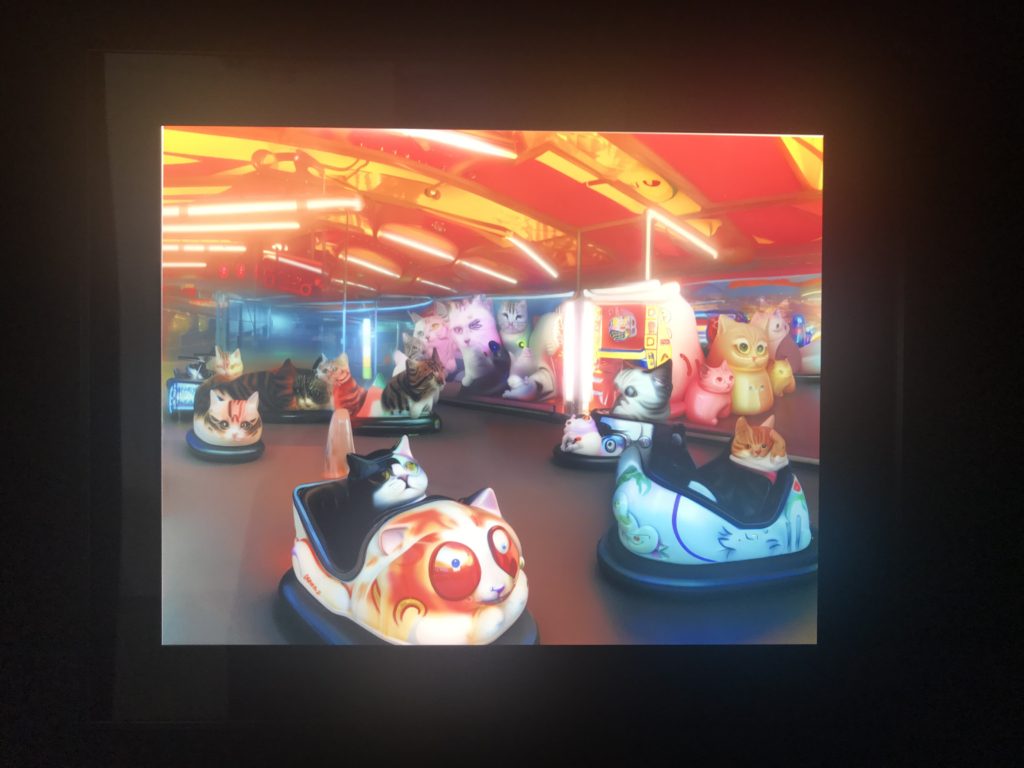
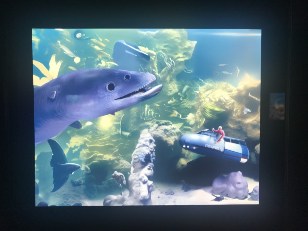
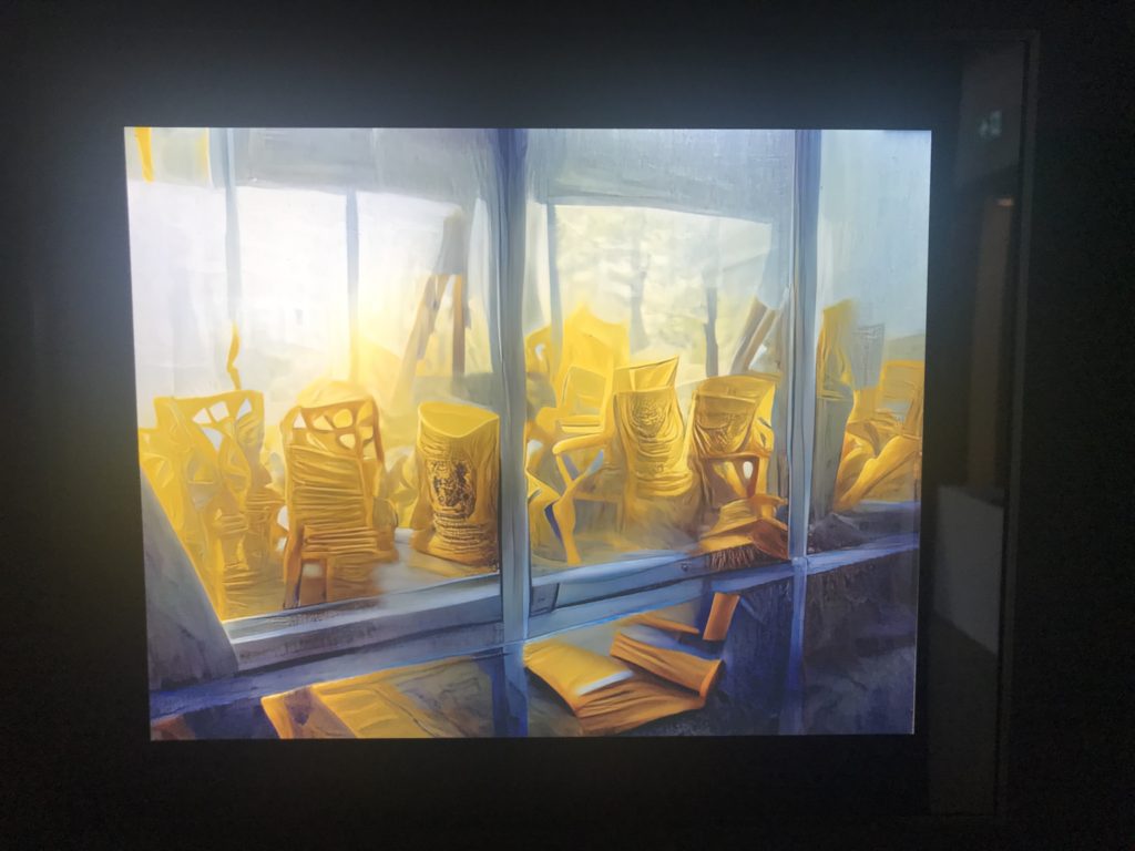
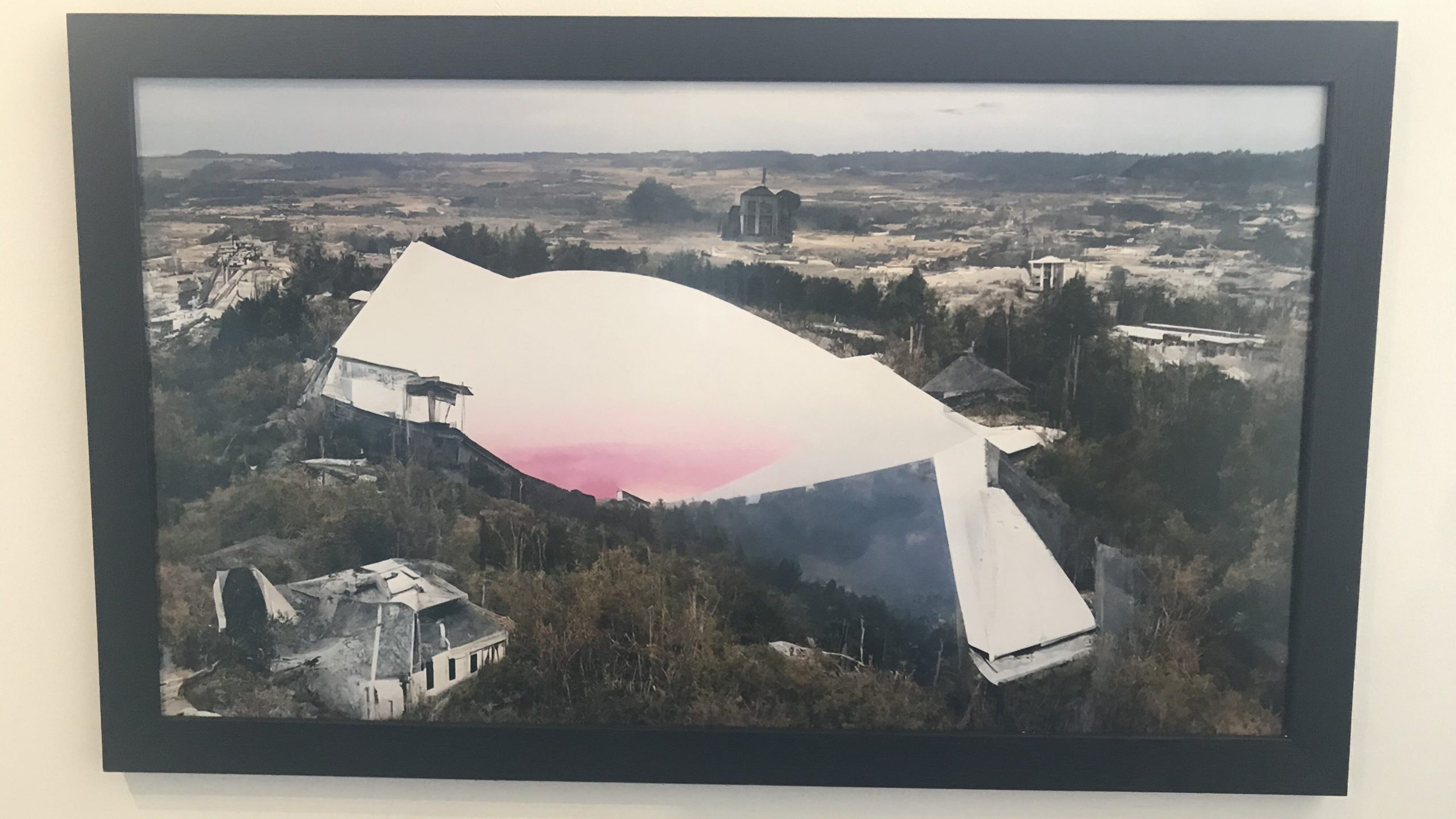
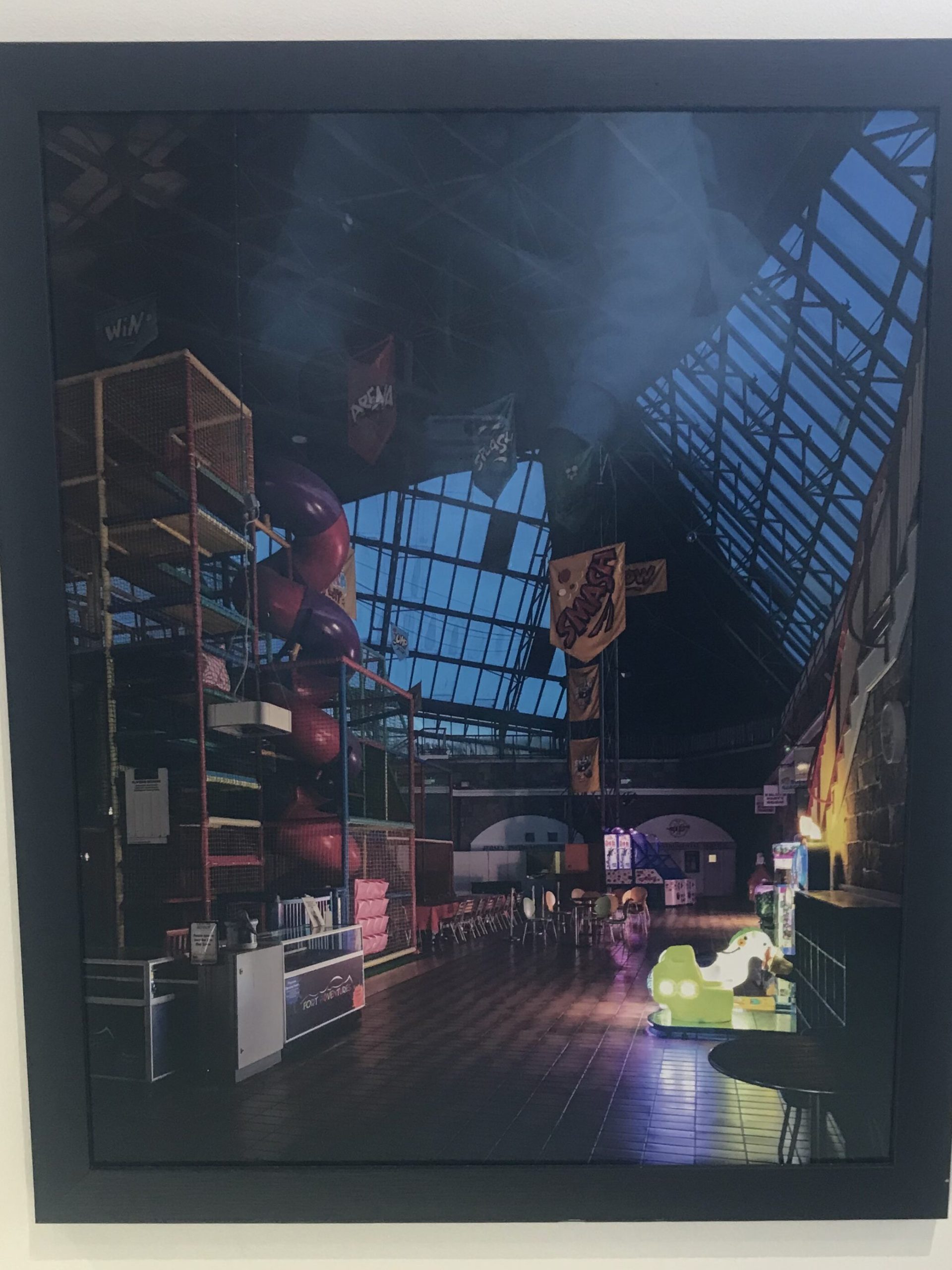
Lakeman’s exhibition aims to show his childhood memories of Fort Regent Leisure Centre. But Lakeman had so few photographic images from his childhood of his time at the Fort and therefore used AI (Artificial Intelligence) technology as an attempt to reconfigure his memories from all those years ago.

How has childhood memories inspired the imagery?

Will’s exhibition presents the theme of nostalgia as this bright colourful and unrealistic view of the past. The definition of nostalgia is “a sentimental longing or wistful affection for a period in the past.” and I feel that this is shown very clearly within the exhibition. However, Lakeman also added that despite these amazing memories of the Fort, he doesn’t necessarily want to go back to that time; partly out of fear that his memory from his childhood would be shattered by something pretty boring and not as amazing as he believes it to be, but also he doesn’t wish to go back to a time where racism and homophobia, and a clear disregard for people’s mental health was around every corner. This revelation raises the question of ‘Is this nostalgia, or just a well loved memory being shown to the world?’

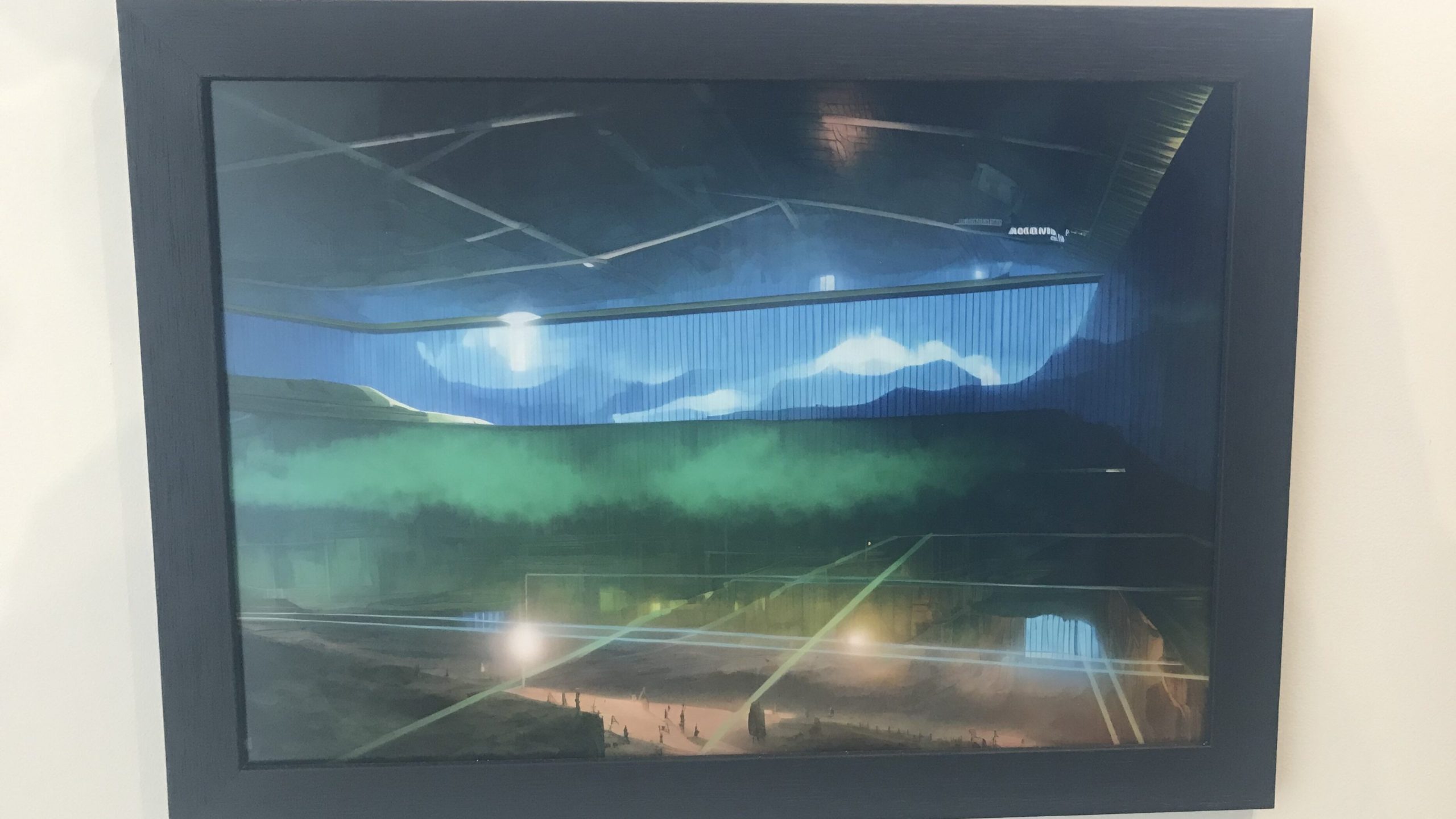
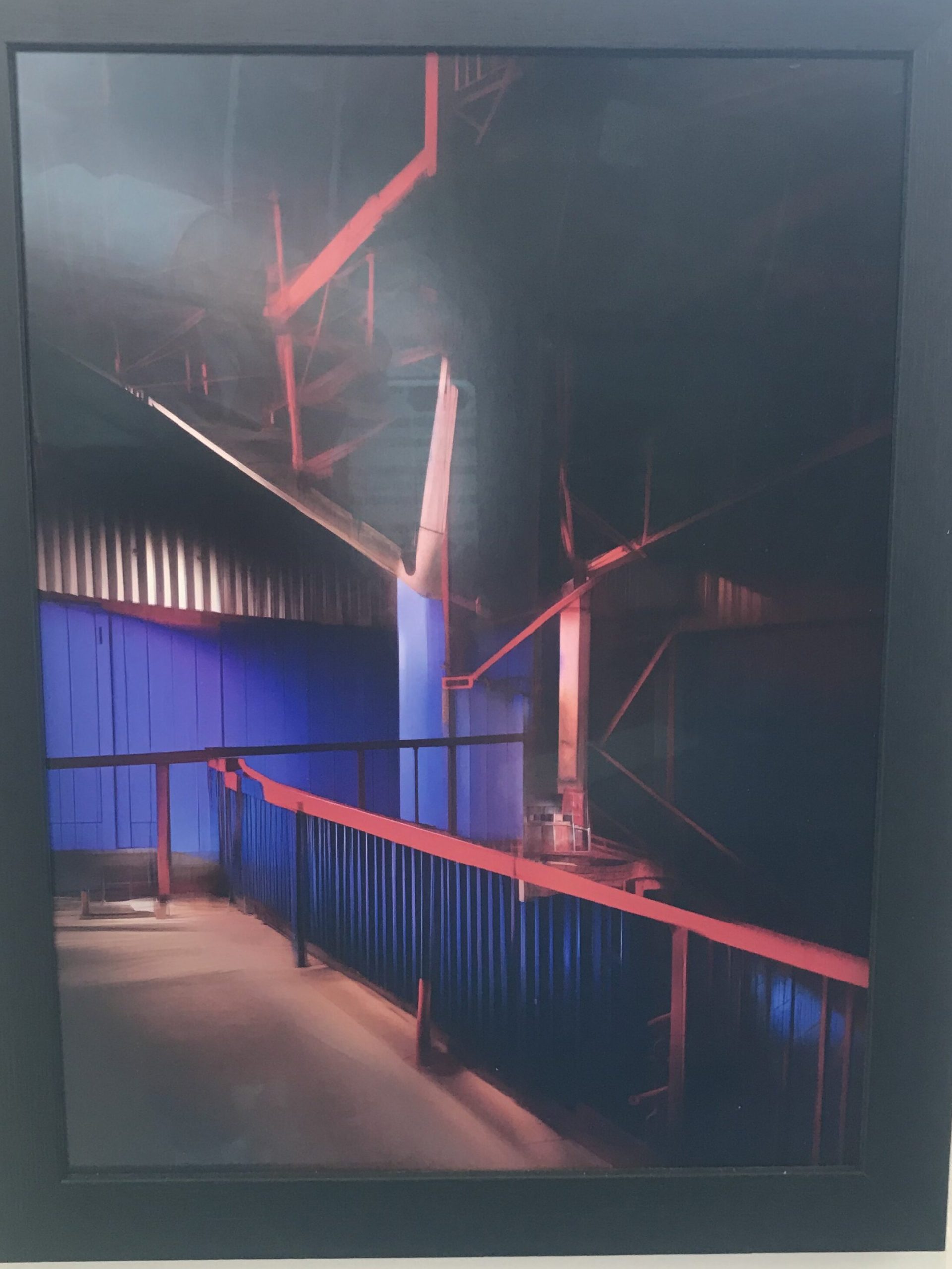
Rails Merge with Curtains, 2023 – Will Lakeman

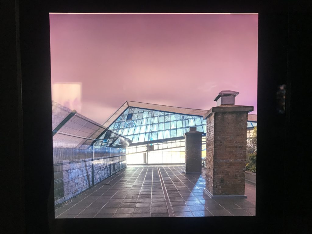
Lakeman’s use of modern AI technology brings alive the vibrancy of his own personal dreams. But I know from personal experience that most dreams are bright and colourful. They occur when your brain isn’t fully asleep but close to it, allowing this sensation that usually makes a person feel better and more relaxed. However, dreams can also become nightmares, dark and sometimes horrifying hallucinations that scare people to wake up. There is this idea that dreams help send you to sleep and nightmares do the opposite, perhaps it is the brains way of telling you whether or not its ready to shut down for the night. It is this concept that I believe to be clearly shown in Lakeman’s exhibition – the simplicity of producing dark vs light images shows the two types of dreams that one gets. The piece shown above titled ‘Rails Merge’ itself shows this separation with the left side of the image lighter and more colourful, and the right fading to complete darkness. One interpretation would suggest that this shows the brightness of a dream fading to the dimly lit, more drab imagery of a nightmare. However, Will’s intention behind this image could also be to show the colour of the dream fading into the deep sleep that follows. This idea presents a more tranquil idea to the image and compliments the bright and colourful imagery throughout the rest of the exhibition. Therefore, that is the more likely intention for Will within this single image.

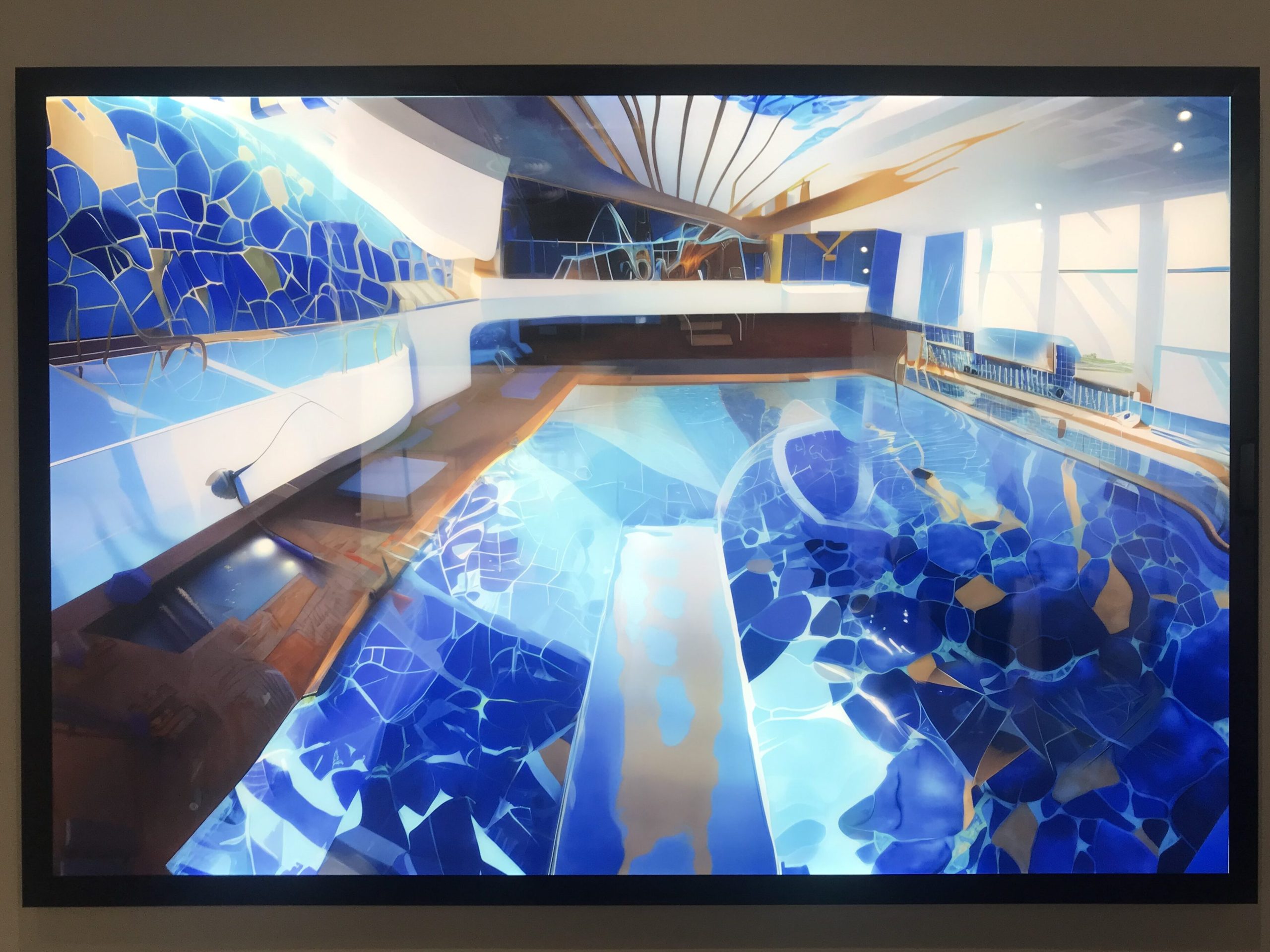
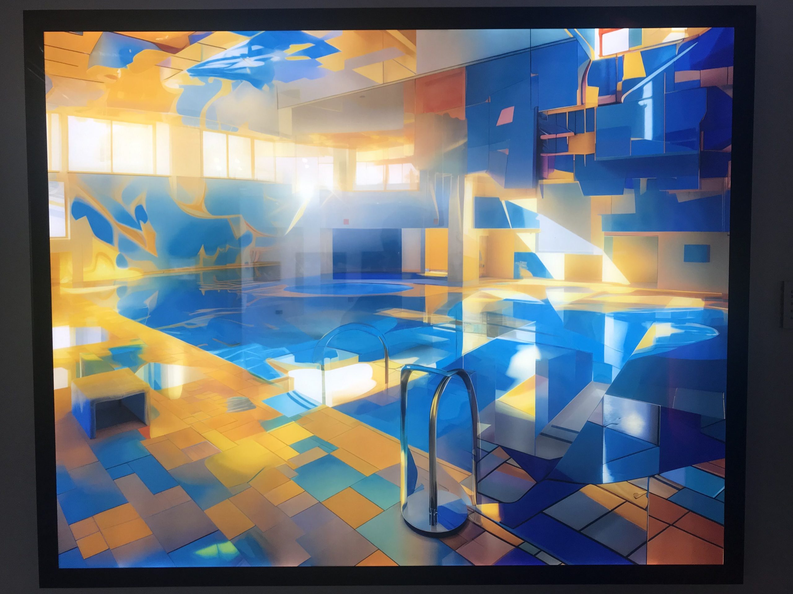
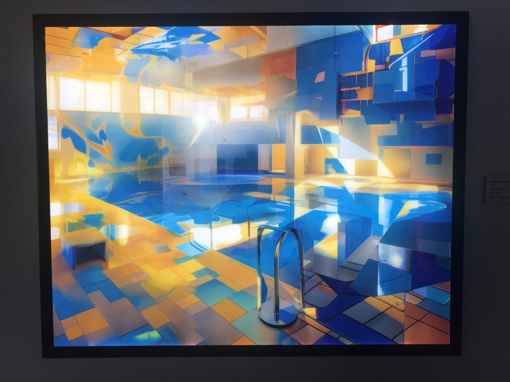
Exploding Hallucinations of Blue and Gold, 2022 – Will Lakeman

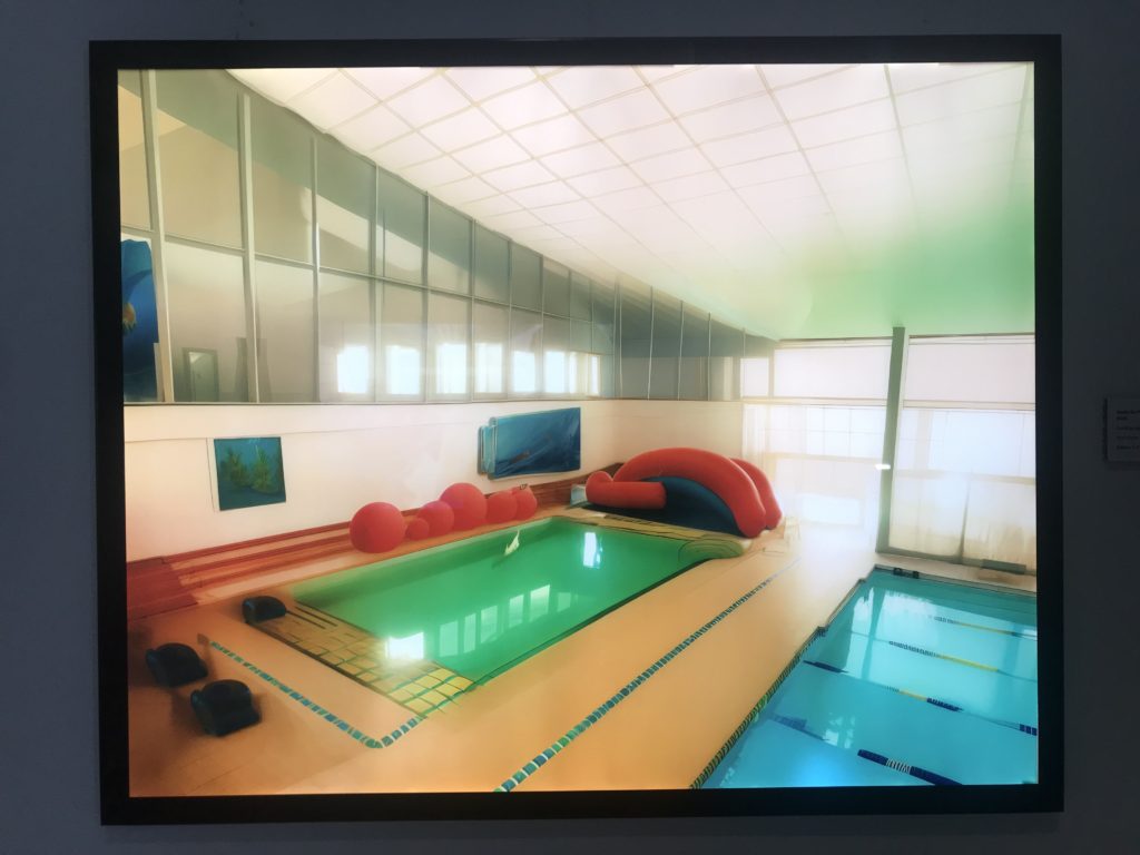
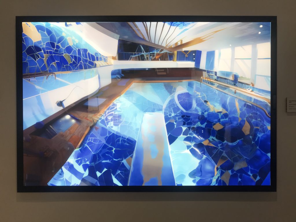
I became very interested in this image, never thinking that a swimming pool could be shown in so many bright and vibrant colours. Lakeman revealed that alongside his autism, he gets synesthetic hallucinations of overly colourful images and this was an outcome after one such occasion. He tells us “Of all the spaces that live on inside my memories, the Fort’s swimming pool is the most powerful.” Will dedicated an entire area of the exhibition to this prominent memory producing a series of images using AI technology to create these eccentric and wonderful memories of something as simple as a swimming pool that many can’t even imagine.

On the whole, I really enjoyed Lakeman’s exhibition and found it as an innovative way of using modern technology to remember and examine the past.