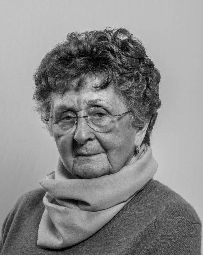
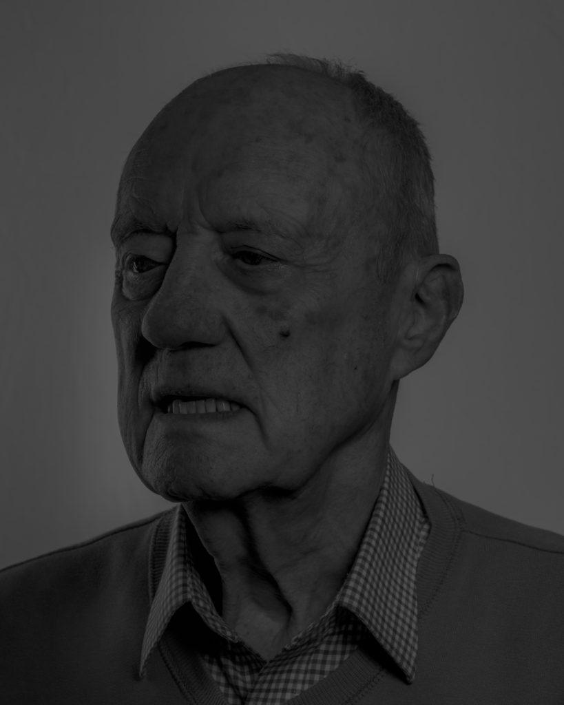
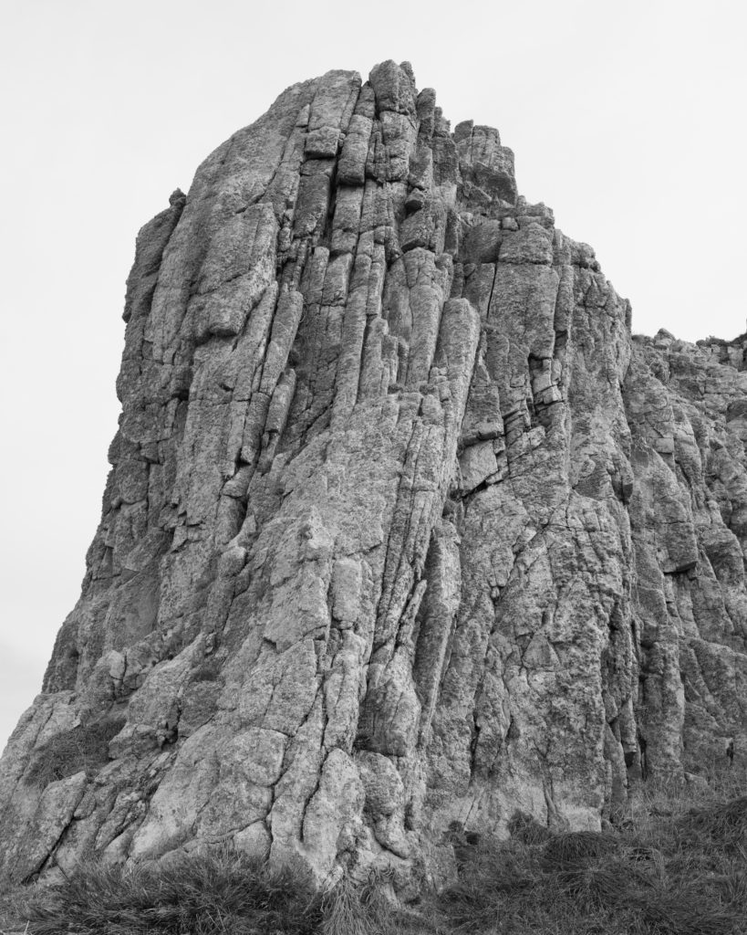
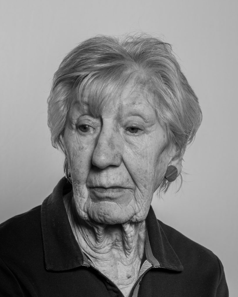
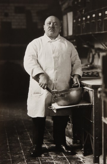
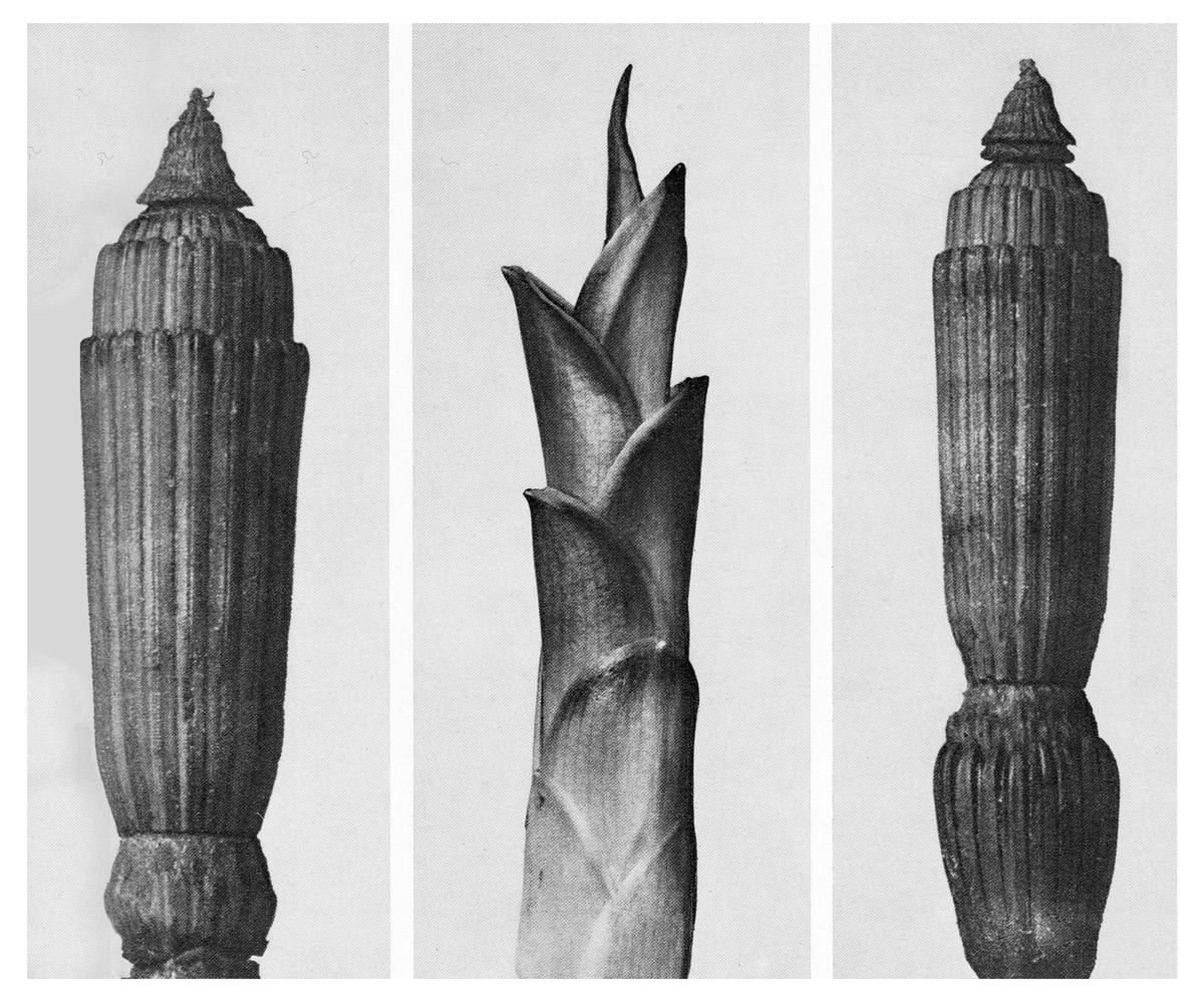
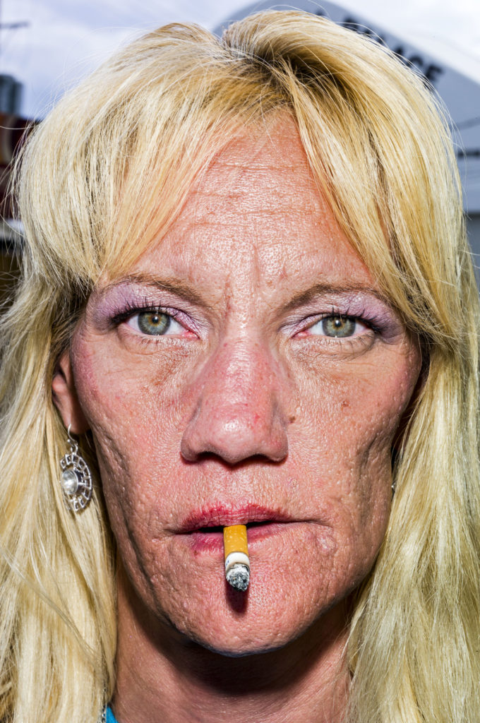
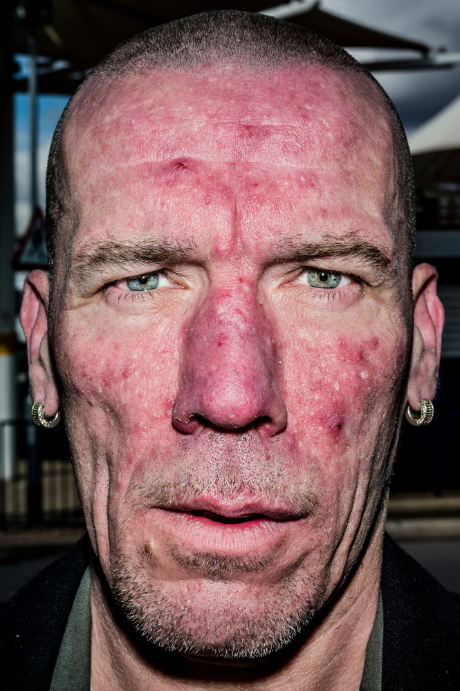
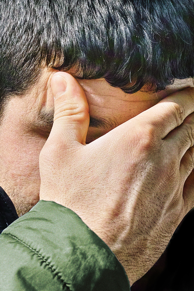
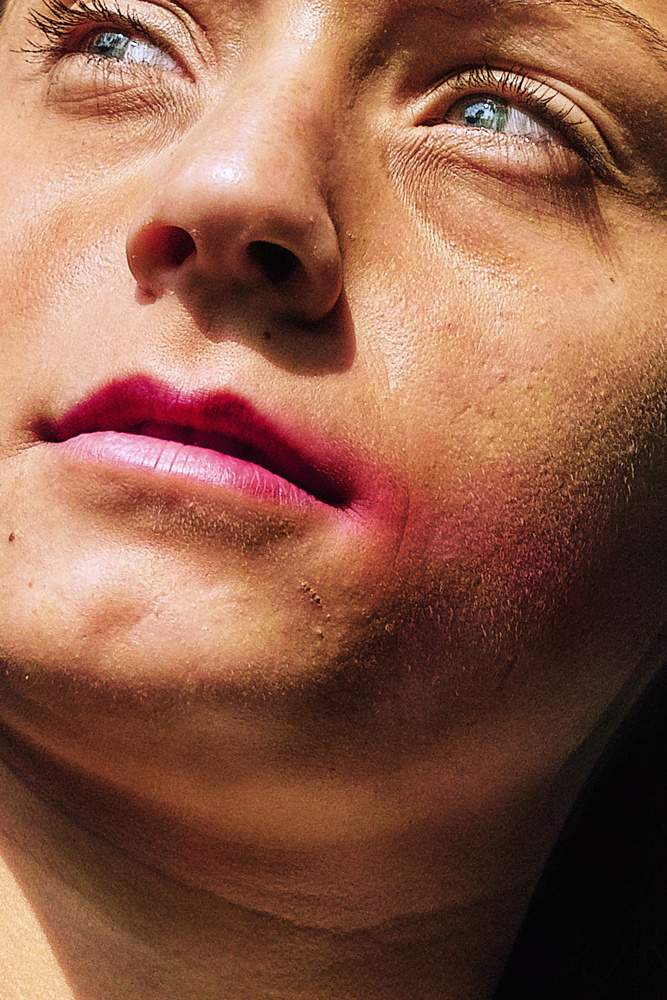
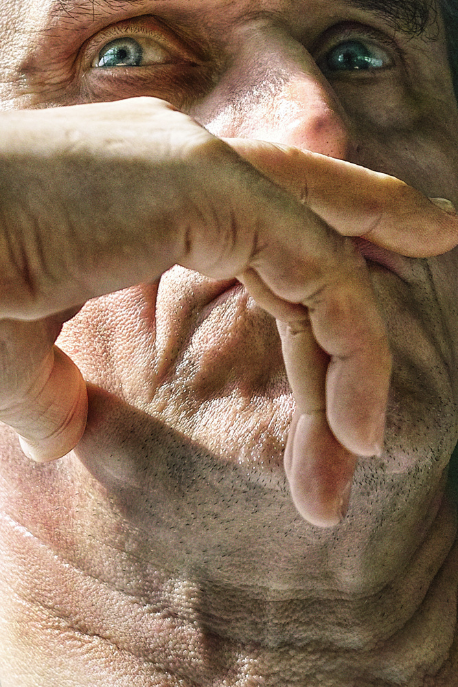
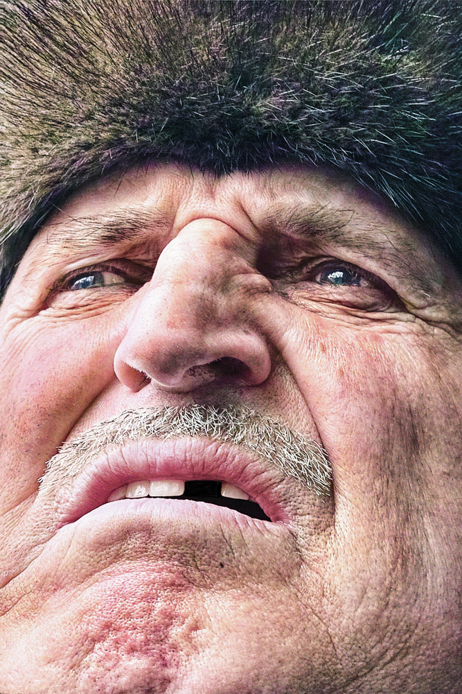
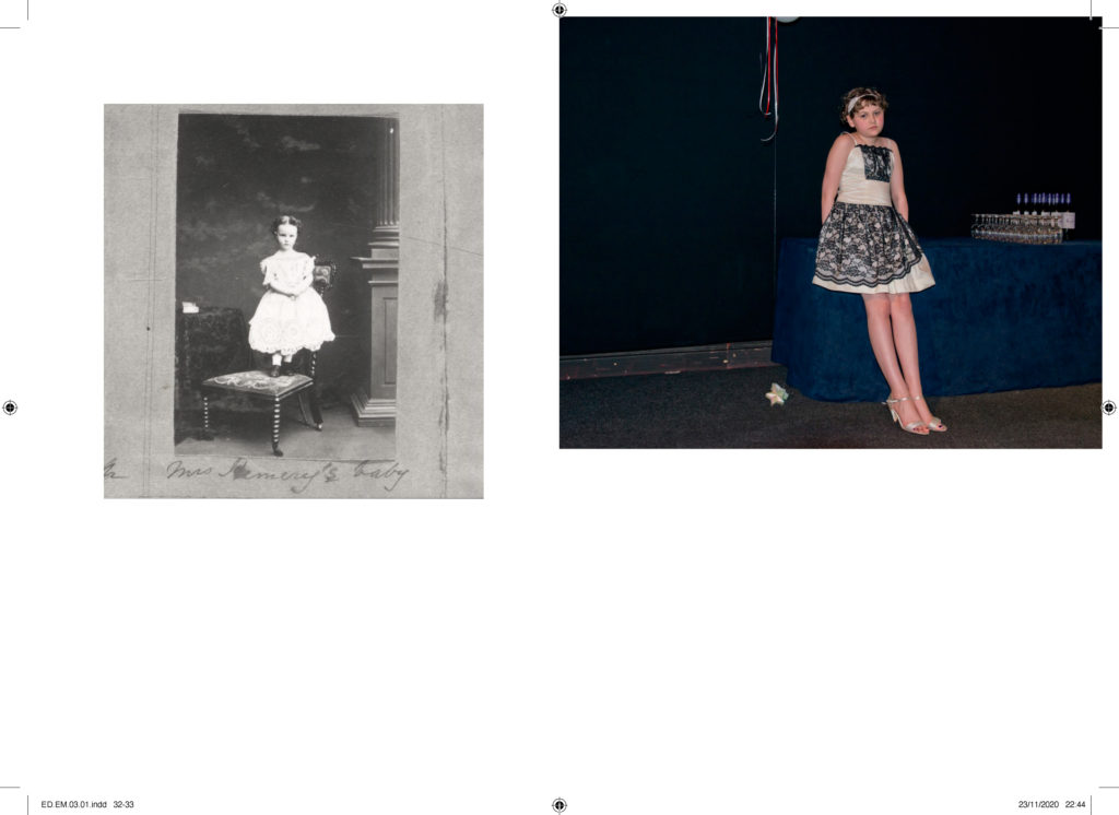
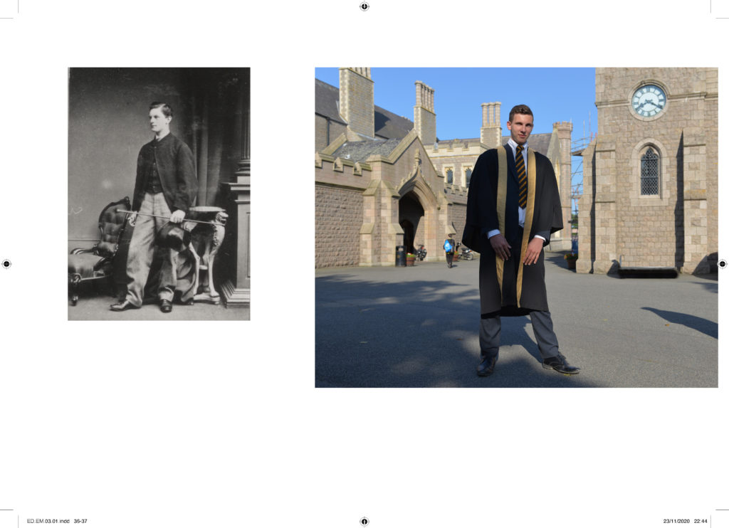
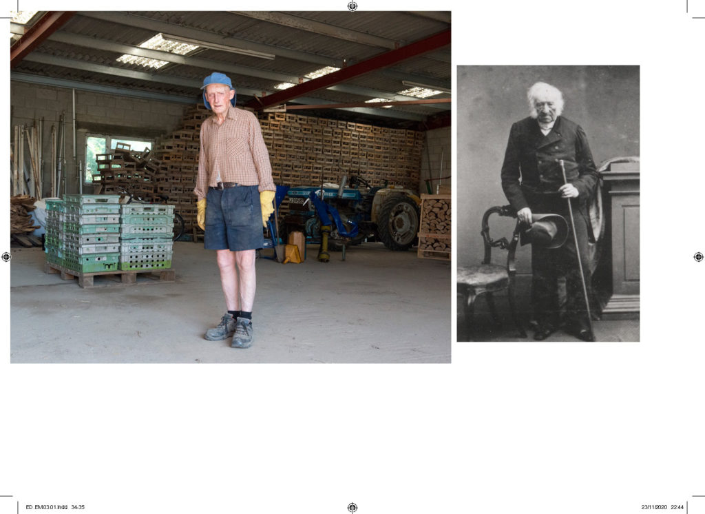
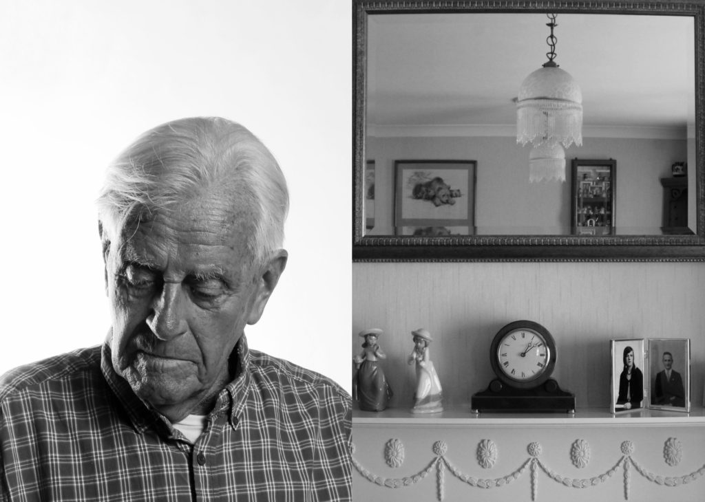
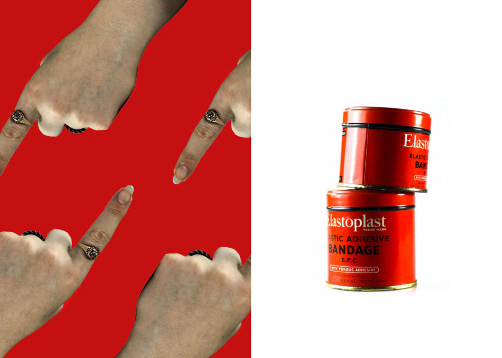
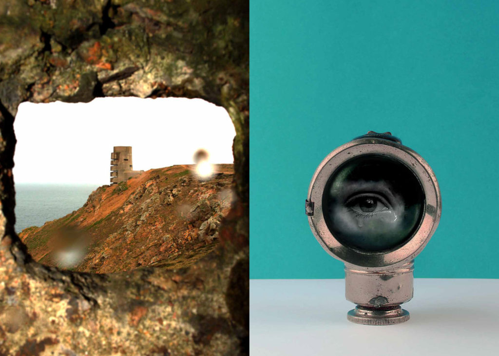
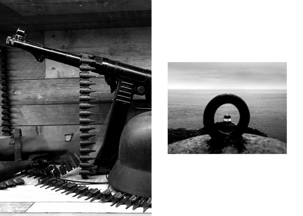
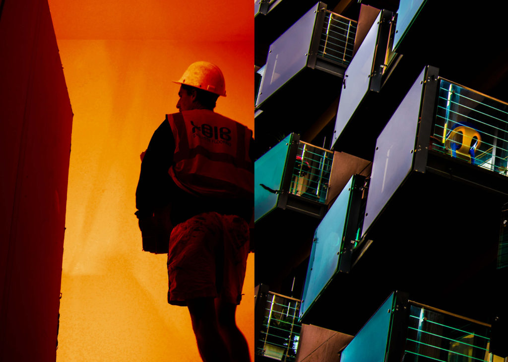
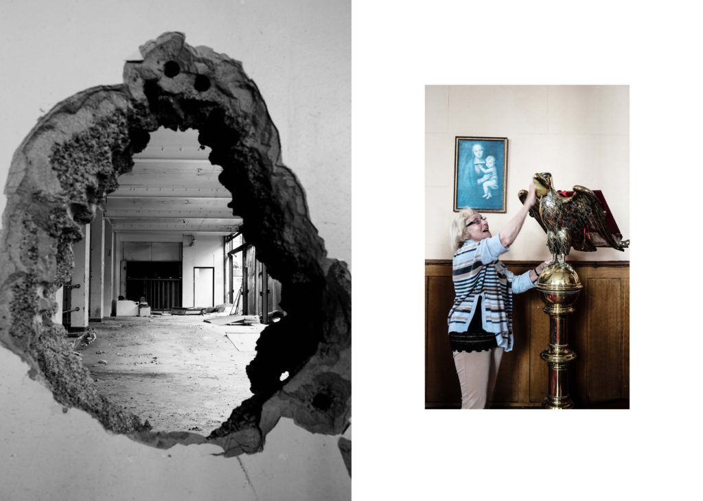
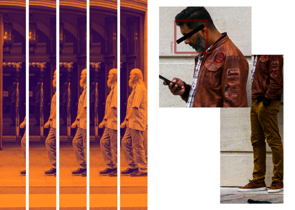
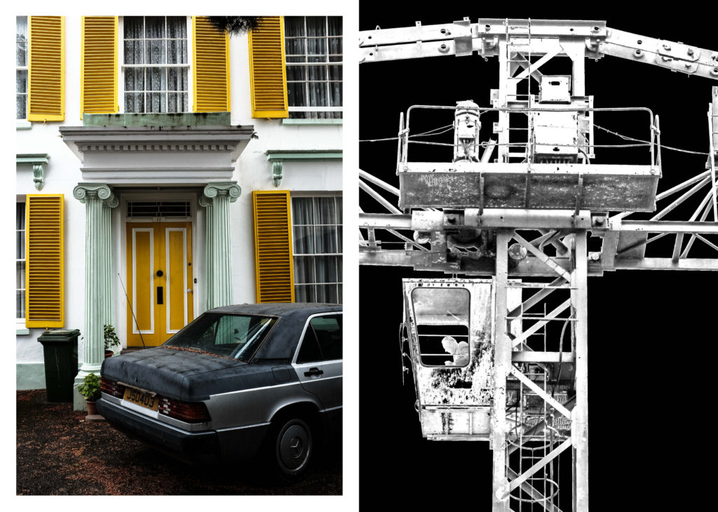
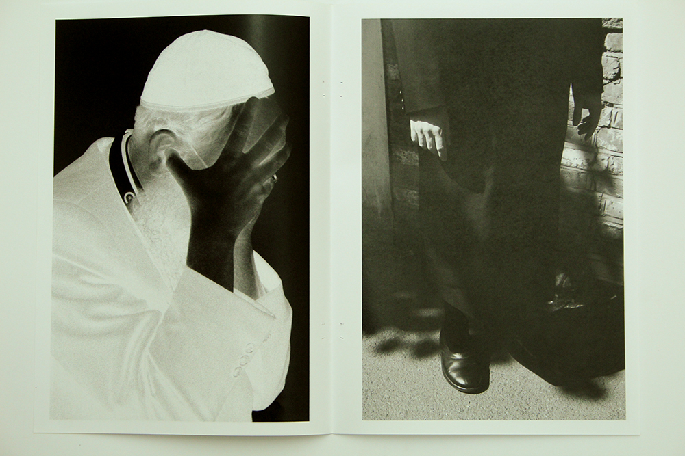
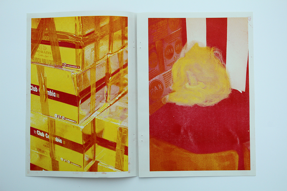
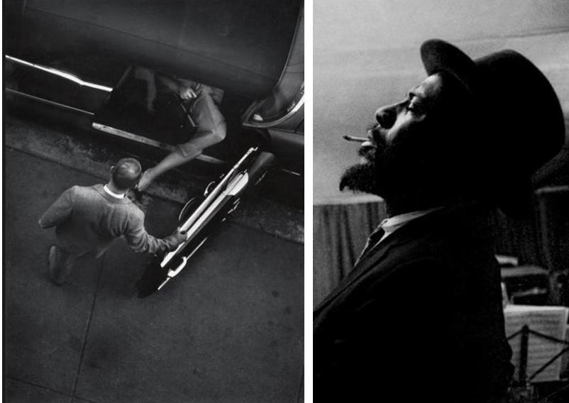
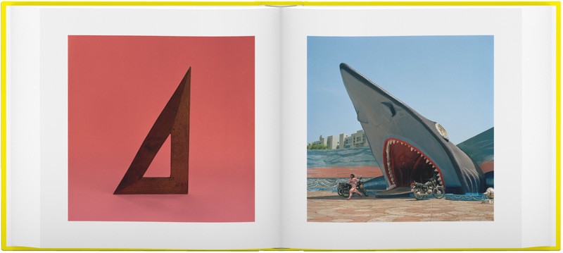
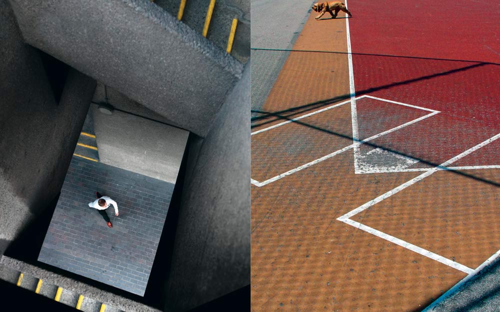
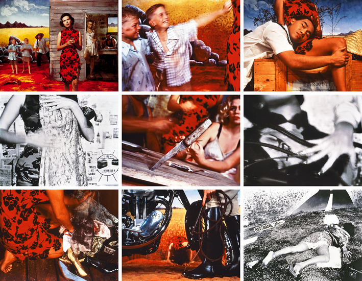
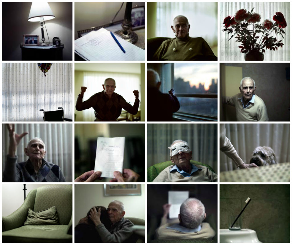
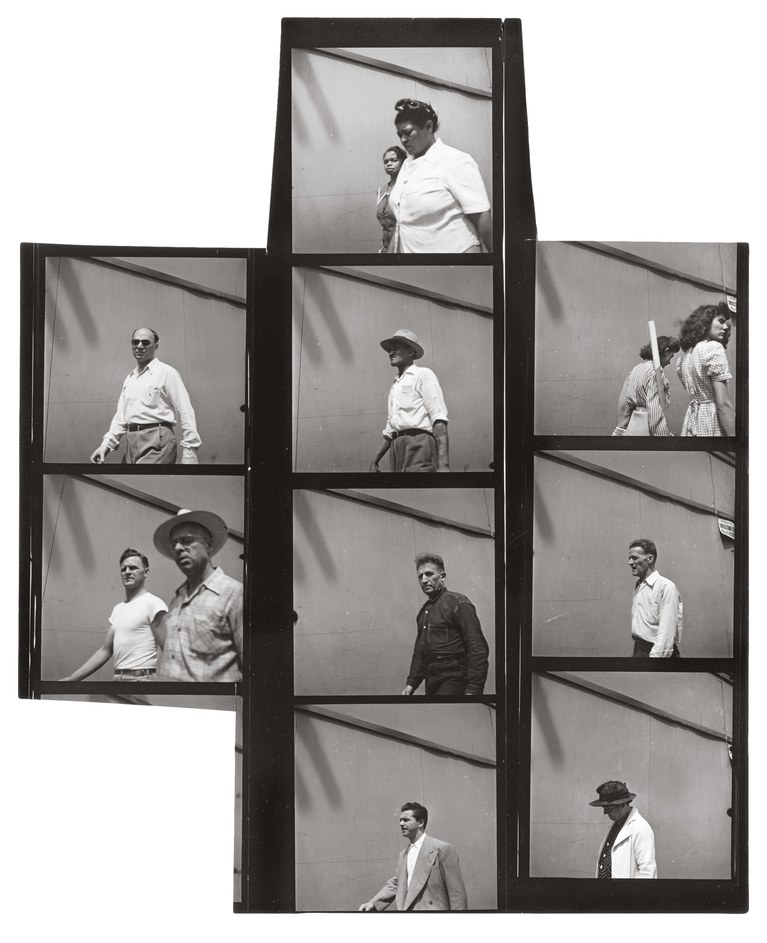
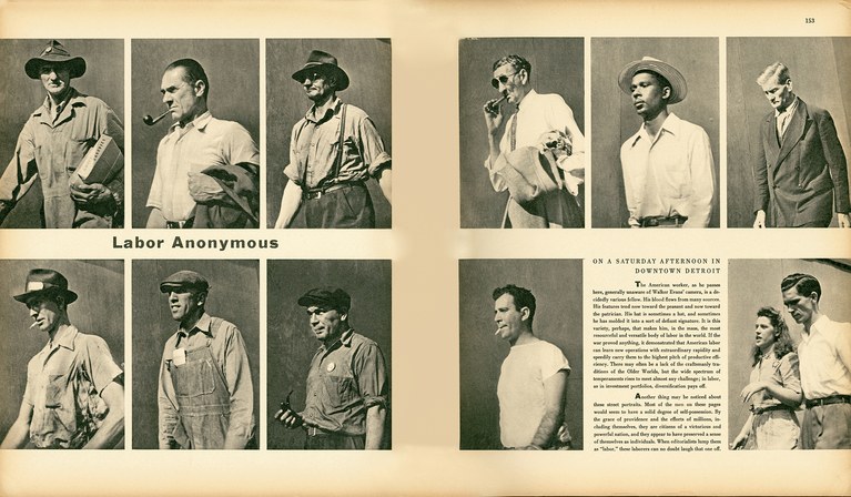
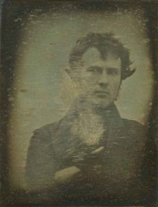
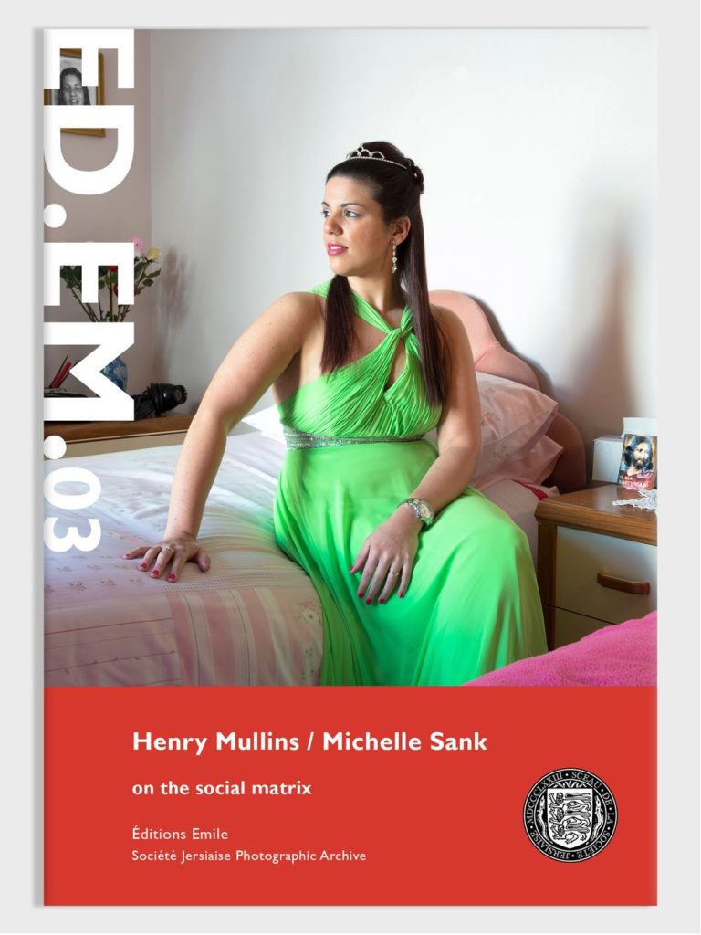
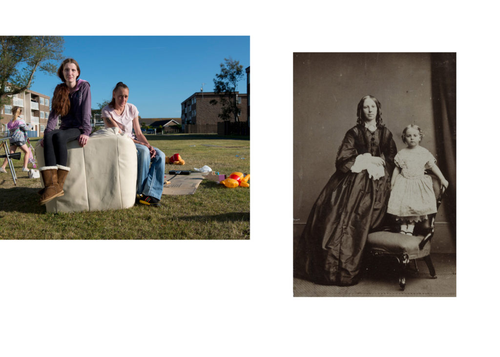
In this project we will explore the theme of NOSTALGIA and respond to a number of different creative tasks, such as classic street photography on a trip to St Malo and produce a set images using AI (Artificial Intelligence) in response to the exhibition, PLAYTIME by Will Lakeman.

Nostalgia is a word that comes from Greek and means a sentimental yearning for the past. It can evoke feelings of pleasure with occasional notes of sadness. Nostalgia can be triggered by many things, such as music, movies, places, or people. Nostalgia can have positive effects on mood, social connectedness, self-esteem, and meaning in life.
Theoretically, the project will explore photography’s fraught relationship with truth looking at seminal images from the history of photography that ‘lied’ and compare with how new technology such as AI generating digital images will potentially alter our perception of reality. This debate will also include discussing the ethics of AI technology, as a force for good that will benefit humanity and its potential dangers, and how it will impact our society as a whole in the future.
Outcomes: a set of classic street photographs and images generated by using AI
Essay: Photography and Truth: Can a photograph lie?
Presentation: A3 double-page magazine spread and 16 page photo-zine with essay
What is artificial intelligence (AI)?
” It is the science and engineering of making intelligent machines, especially intelligent computer programs. It is related to the similar task of using computers to understand human intelligence, but AI does not have to confine itself to methods that are biologically observable.”
John McCarthy’s definition in his 2004 paper, What is Artificial Intelligence?
Artificial intelligence (AI), is the ability of a digital computer or computer-controlled robot to perform tasks commonly associated with intelligent beings. The term is frequently applied to the project of developing systems endowed with the intellectual processes characteristic of humans, such as the ability to reason, discover meaning, generalize, or learn from past experience. Since the development of the digital computer in the 1940s, it has been demonstrated that computers can be programmed to carry out very complex tasks—as, for example, discovering proofs for mathematical theorems or playing chess—with great proficiency. Still, despite continuing advances in computer processing speed and memory capacity, there are as yet no programs that can match human flexibility over wider domains or in tasks requiring much everyday knowledge. On the other hand, some programs have attained the performance levels of human experts and professionals in performing certain specific tasks, so that artificial intelligence in this limited sense is found in applications as diverse as medical diagnosis, computer search engines, voice or handwriting recognition and now generating content by text prompting producing images, music and films.
The birth of the artificial intelligence conversation was denoted by Alan Turing’s seminal work, “Computing Machinery and Intelligence” , which was published in 1950. In this paper, Turing, often referred to as the “father of computer science”, asks the following question, “Can machines think?” From there, he offers a test, now famously known as the “Turing Test”, where a human interrogator would try to distinguish between a computer and human text response. While this test has undergone much scrutiny since its publish, it remains an important part of the history of AI as well as an ongoing concept within philosophy as it utilizes ideas around linguistics.
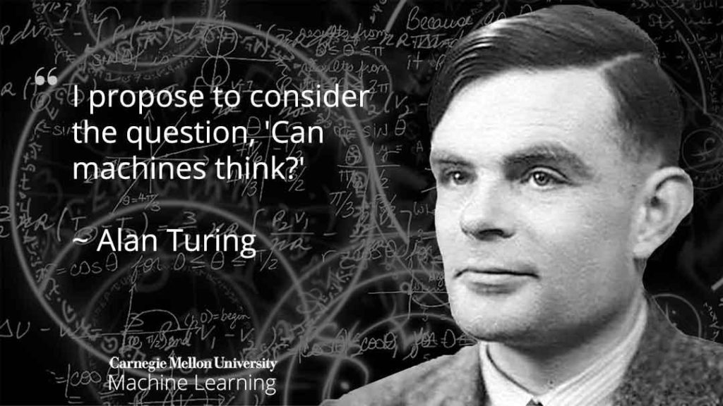
At its simplest form, artificial intelligence is a field, which combines computer science and robust datasets, to enable problem-solving. It also encompasses sub-fields of machine learning and deep learning, which are frequently mentioned in conjunction with artificial intelligence. These disciplines are comprised of AI algorithms which seek to create expert systems which make predictions or classifications based on input data.
Over the years, artificial intelligence has gone through many cycles of hype, but even to skeptics, the release of OpenAI’s ChatGPT seems to mark a turning point. The last time generative AI loomed this large, the breakthroughs were in computer vision, but now the leap forward is in natural language processing. And it’s not just language: Generative models can also learn the grammar of software code, molecules, natural images, and a variety of other data types.
The applications for this technology are growing every day, and we’re just starting to explore the possibilities. But as the hype around the use of AI in business takes off, conversations around ethics become critically important. To read more on where IBM stands within the conversation around AI ethics, read more here.
More information about AI can be found here on IBM or see RESOURCES below.

PLANNER: Blogposts to make
WEEK 1: 5 – 11 June
Visit and review exhibition ‘PLAYTIME’ by Will Lakeman
Mon 5 June: EXHIBITION > group Yr 12B meet at Capital House 14:00.
Tue 6 June: EXHIBITION > group Yr 12A meet at Capital House 14:00.
Wed: ANALYSIS > review the exhibition and write 500 words incorporating knowledge and understanding from talk by Will Lakeman > 1 blogpost
Writing frame: How does the exhibition make you consider the theme of Nostalgia? How has childhood memories inspired the imagery? Describe photographic techniques used, including AI in the image-making process. In what way are AI images a representation of dreams? Choose one image and analyse in more detail, considering form, concept and aesthetics. Make a final value added judgement on the exhibition as a whole, ie. do you like/ dislike it – provide examples for or against. Would you recommend it to others? If so, why? Include illustration such as installation images from the exhibition. Include also at least one quote from Will Lakeman’s talk or associated publicity material and provide a comment.

See RESOURCES below for more context about Will Lakeman and the exhibition ‘Playtime’. Read also interview here in the Bailiwick Express and a previous review/ publicity of an earlier pop-up exhibition at ArtHouse Jersey’s Greve de Lecq Barracks here.
Homework: Deadline 14 June
RESOURCES – PLAYTIME by Will Lakeman

A FORT REGENT INSPIRED ART EXHIBITION RECREATING THE STRANGE HOLD CHILDHOOD SPACES HAVE ON ADULT MEMORIES


The work in this exciting exhibition recreates the strange hold that childhood spaces have on our adult memories, all centred around the Jersey childhood mecca of old Fort Regent.
Lakeman is a photographer who has nurtured an obsessive interest in ‘the Fort’, and has spent his adult life revisiting weird dreams of this iconic building and its heyday in the early 1990s. With the works accompanied by a custom soundscape, smell and touch, Playtime encourages visitors to revisit their own dreams. The exhibition opens with a special preview evening on Wednesday 24 May between 5.30pm and 7pm and runs through until Sunday 2 July 2023.
If you were ever a visitor to Pluto’s Playtime, spun around the roller disco on your Bauers, felt bilious on the pirate ship or slunk around in the shadows of the Exploratorium, this exhibition is without question for you. In a broader sense though, this exhibition is about nostalgia and how it is not always reliable. You can’t photograph a place that has long ceased to exist, so Will Lakeman has responded by using photo manipulation, collage and new technologies of artificial intelligence to recreate the Fort as he remembers it, not as it ever really was. The resulting images try to evoke the odd, fantastical memories we carry of childhoods everywhere.
Artist Will Lakeman said of the upcoming exhibition “I’m really excited for people to see this show, which I now realise I’ve been trying to make for most of my adult life. I have a really intense interest in a specific era of Fort Regent’s history – the funfair and swimming pool – but I have hardly any photos of myself there. I had to try and recreate my memories, and the more I tried the stranger the results became. The show involves photographs, reconstructions made with Artificial Intelligence, a soundscape, found objects and even some smells. Although it’s rooted in “the Fort” I tried to capture something universal in the experience of being a child, beyond excited to go to the leisure centre. I hope it says something to everybody.
Read full press release here

Will Lakeman: ‘Through my work I try and communicate something of the weird, vivid sensations of my dreams and nightmares. I dream inside a world of intense colour and strange symbolism, but I also daydream in my waking hours as I drift around the place. I also experience synaesthetic hallucinations where my sensed become confused.
As a photographer I’m mainly inspired by cinema, especially the work of David Lynch, Alejandro Jodorowsky and Stanley Kubrick. I also love the writing of Philip K Dick and Kazuo Ishiguro. Photographers I enjoy include Todd Hido and Greg Girard.’
Explore Will Lakeman’s website here

Read an interview with Will in Bailiwick Express here – see exerts below.
From ghostly pictures taken at night to eerie images of the Fort recreated by artificial intelligence, Will Lakeman has shared how dream and nostalgia inspire his work.


Pictured: Will says he didn’t take a single good photograph until he was 24.
“I did not take a single good photograph until I was 24,” he said. “I spent 24 years taking pictures that were not very interesting. It was not until I took one where I had an emotional experience that they started getting better. The first photo I took that I was really happy with was one of the Esplanade car park.”
As he started working at night, Will began working with nocturnal images, a series of which went on display at Private & Public Gallery in 2019. Those were partly inspired by his synesthetic hallucinations during which he can “taste colours and feel sounds.”
“I would try and get the sort of sense you get when you see something in a dream, bigger and clearer and more colourful,” Will explained.

Dreams and nostalgia are two big influences in Will’s work and both combine in his latest project. Using artificial intelligence, he has been manipulating images of Fort Regent based on his own dreams of the place.
Will had been wanting to focus on the Fort for a while but couldn’t find a way into it until he stumbled upon AI. His efforts have somewhat been stumped by the lack of pictures of the Fort, an appeal for images has not yielded much results so far, so Will has been creating his own collages and using pictures of the Fort as it is now, as well as the small number of archive images he has been able to find.
“I grew up here and I spent a lot of time there like many people,” Will said. “I am interested a lot about nostalgia, when people talk about what life was, they are not talking about reality but what their memory is.

“I am interested in making those images, but I also understand that it is not reality and that you cannot go back there. I try to make them spooky, very colourful and weird, because even in a nice dream, there’s always something that happens that is a little bit weird. I wanted to try and capture that in an image, to make people remember and think about their own dreams.”
The process to create one image is a lengthy and somewhat fortuitous one. Will has to ‘feed’ the AI source images as well as instructions drawn from his dream diary until he “stumbles” upon something that looks right.
“The AI understands words and sentences but not in the same way as humans do,” he explained. “It’s like a painting where someone is throwing paint at the canvas rather than using a brush.
“Sometimes it’s really frustrating, you just do it over and over again and it looks nothing like you hoped it would, and then suddenly it looks exactly like it did in your dream.”

The image comes out the size of a postage stamp so once Will is happy with it, he then has to make it “bigger and bigger”, adding elements as he goes, which he says can be quite “time consuming”.
While it’s an unusual process that Will says does not resemble any other type of creative process, he believes more artists will turn to AI in the future.
“Everyone has the potential to make art that is meaningful to them. Anyone can be a good photographer, you do not need expensive gear, you just need to care. AI is the next thing that will become democratic. I would love to see other people’s weird dreams.”
This article first appeared in the Dec/Jan edition of Connect magazine 2022, which you can read full version here.
THEME: NOSTALGIA
Thurs-Fri: RESEARCH > explore theme of NOSTALGIA and produce a mindmap and moodboard > 1 blog post.
Nostalgia is something that is both cosy and comforting but also deceptive and an illusion – explain how? Think about your own childhood memories of growing up in Jersey (or elsewhere). Are there specific moments that you treasure, or rather not want to remember? Think about what triggers the feeling of nostalgia, for example music, movies, places, or people. See below for more definition and ideas around theme of nostalgia.

“I am interested a lot about nostalgia, when people talk about what life was, they are not talking about reality but what their memory is.” Will Lakeman
Wikipedia definition of Nostalgia is a sentimentality for the past, typically for a period or place with happy personal associations. The word nostalgia is a learned formation of a Greek compound, consisting of νόστος (nóstos), meaning “homecoming”, a Homeric word, and ἄλγος (álgos), meaning “sorrow” or “despair”, and was coined by a 17th-century medical student to describe the anxieties displayed by Swiss mercenaries fighting away from home. Described as a medical condition—a form of melancholy—in the Early Modern period, it became an important trope in Romanticism.
Nostalgia is associated with a longing for the past, its personalities, possibilities, and events, especially the “good ol’ days” or a “warm childhood”. There is a predisposition, caused by cognitive biases such as rosy retrospection, for people to view the past more favourably and future more negatively. When applied to one’s beliefs about a society or institution, this is called declinism, which has been described as “a trick of the mind” and as “an emotional strategy, something comforting to snuggle up to when the present day seems intolerably bleak.”
The scientific literature on nostalgia usually refers to nostalgia regarding one’s personal life and has mainly studied the effects of nostalgia as induced during these studies. Emotion is a strong evoker of nostalgia due to the processing of these stimuli first passing through the amygdala, the emotional seat of the brain. These recollections of one’s past are usually important events, people one cares about, and places where one has spent time. Cultural phenomena such as music, movies, television shows, and video games, as well as natural phenomena such as weather and environment can also be strong triggers of nostalgia.
WEEK 2: 12 – 18 June
St Malo Trip and Street Photography
Mon: THEORY & CONTEXT > Henri Cartier-Bresson and the ‘decisive moment’ > 1 blog post, publish by Mon 19 June
Tue: RESEARCH & PLANNING > research your trip to St Malo and produce a moodboard of images of street photography exploring ‘the decisive moment’ > 1 blog post
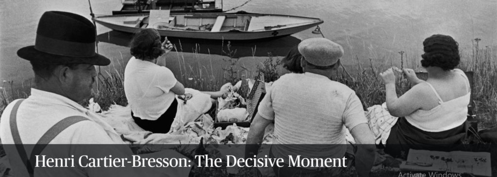
“Your eye must see a composition or an expression that life itself offers you, and you must know with intuition when to click the camera.” – Henri Cartier-Bresson
Henri Cartier-Bresson (1908-2004), a French photographer who is considered to be one of the fathers of photojournalism and masters of candid photography. He sought to capture the ‘everyday’ in his photographs and took great interest in recording human activity. He wrote,
“For me the camera is a sketch book, an instrument of intuition and spontaneity, the master of the instant which, in visual terms, questions and decides simultaneously. In order to ‘give a meaning’ to the world, one has to feel involved in what one frames through the viewfinder. This attitude requires concentration, discipline of mind, sensitivity, and a sense of geometry. It is by economy of means that one arrives at simplicity of expression.”
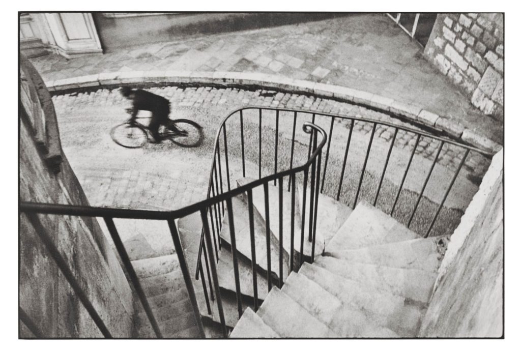
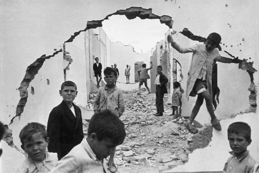
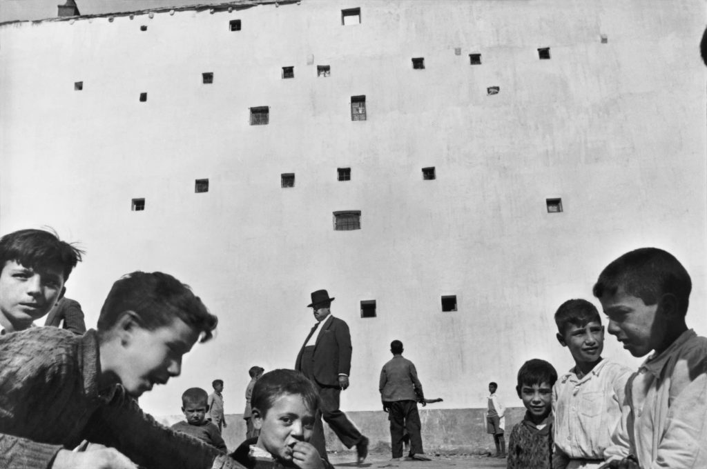
As a reporter and co-founder of the Magnum photography agency, Cartier-Bresson accepted his responsibility to supply information to a world in a hurry. He documented the liberation of Paris, the collapse of the Nationalist regime in China, Gandhi’s funeral and the partitioning of Berlin. Cartier-Bresson helped develop the street photography style that has influenced generations of photographers that followed. He was influenced by Surrealism and began his career in film working with renowned French director, Jean Renoir as second assistant director to films such as La vie est à nous (1936) and Une partie de campagne (1936), and La Règle du Jeu (1939 – considered one of the most influential films in 20th century.
The simultaneous recognition, in a fraction of a second, of the significance of an event as well as the precise organization of forms which gives that event its proper expression
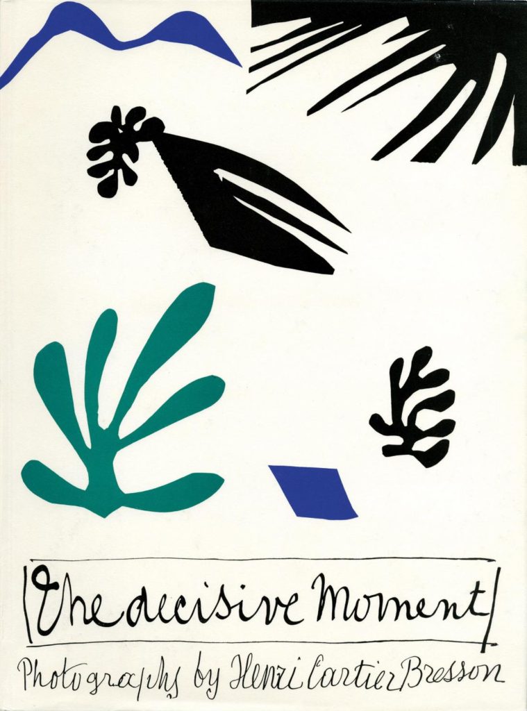
The Decisive Moment, Henri Cartier-Bresson’s influential publication, is widely considered to be one of the most important photobooks of the twentieth century. Pioneering for its emphasis on the photograph itself as a unique narrative form, The Decisive Moment was described by Robert Capa as “a Bible for photographers.” Originally titled Images à la Sauvette (“images on the run”) in the French, the book was published in English with a new title, The Decisive Moment, which unintentionally imposed the motto which would define Cartier-Bresson’s work. The exhibition details how the decisions made by the collaborators in this major project—including Cartier-Bresson, French art publisher Tériade, American publisher Simon & Schuster, and Henri Matisse, who designed the book’s cover—have shaped our understanding of Cartier-Bresson’s photographs.
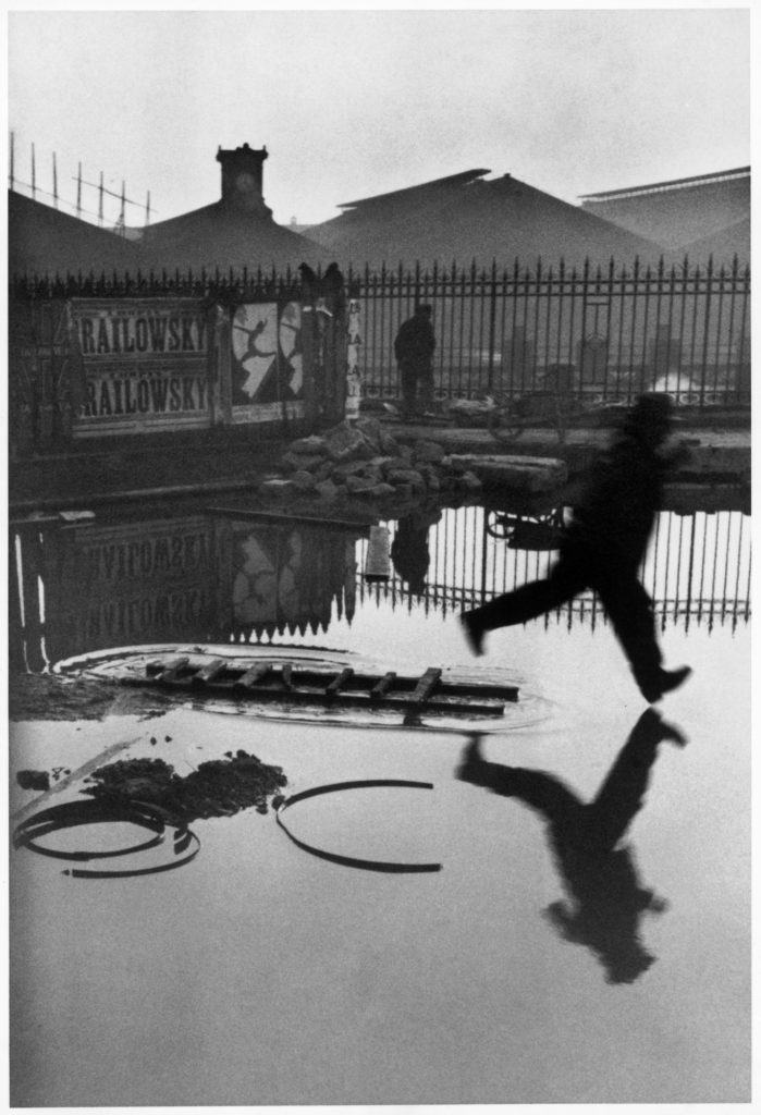
Listen to an audible comment from MOMA (Museum of Modern Art, NYC) here Henri Cartier-Bresson. Behind the Gare St. Lazare. 1932 | MoMA
Read interview here by The Guardian’s photography critic Sean ‘Hagan. Cartier-Bresson’s classic is back – but his Decisive Moment has passed
Task: Describe Henri Cartier-Bresson’s theory of the decisive moment using direct quotes from his own text. Include images of his work that illustrates the theory and choose one for detailed analysis of its form (what it looks like), composition (how it is arranged) and capturing a moment (essence of movement) . The decisive moment is particularly concerned with the overall structure and composition of the photograph, such as shapes, geometry, patterns and movement. Comment on these elements as well as other formal elements such as:
The seven formal elements are commonly known as:
– Line
– Shape & Form
– Pattern
– Tone
– Colour
– Texture
– Space
Also make use of other specialist photography vocabulary such as, rule of third, depth of field – see visual matrix below.

Wed 14 June: PRACTICE & RECORDING > St Malo photoshoot (250-400 images)
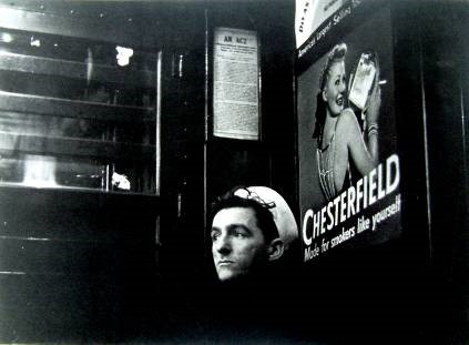
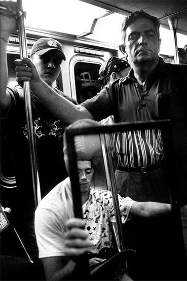
“Stare. It is the way to educate your eye, and more. Stare, pry, listen, eavesdrop. Die knowing something. You are not here long.”
Walker Evans, ca. 1960 from Afterword in Many Are Called, a photobook featuring Evans’ snapshots of subway riders in New York.
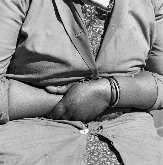
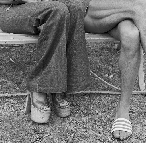
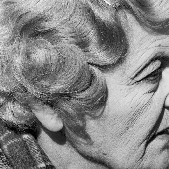
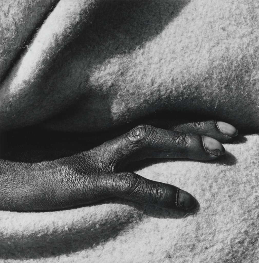
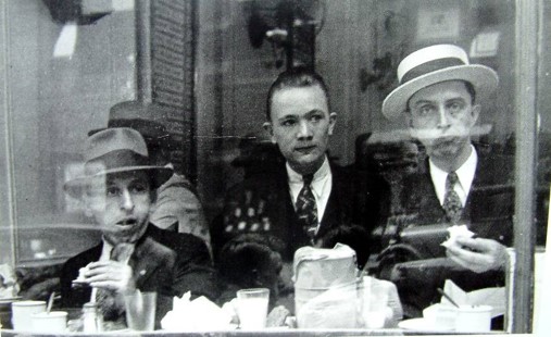
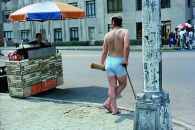
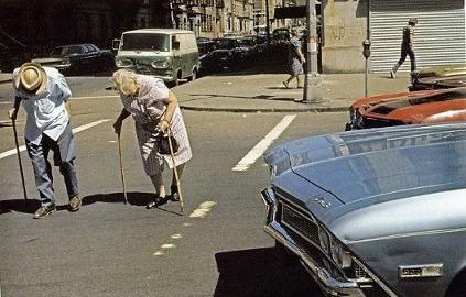
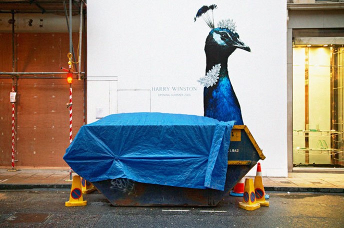
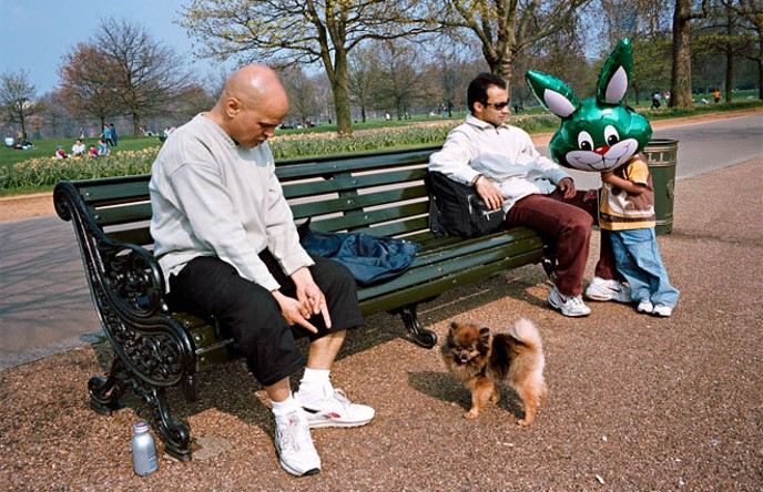
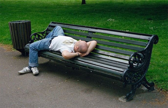
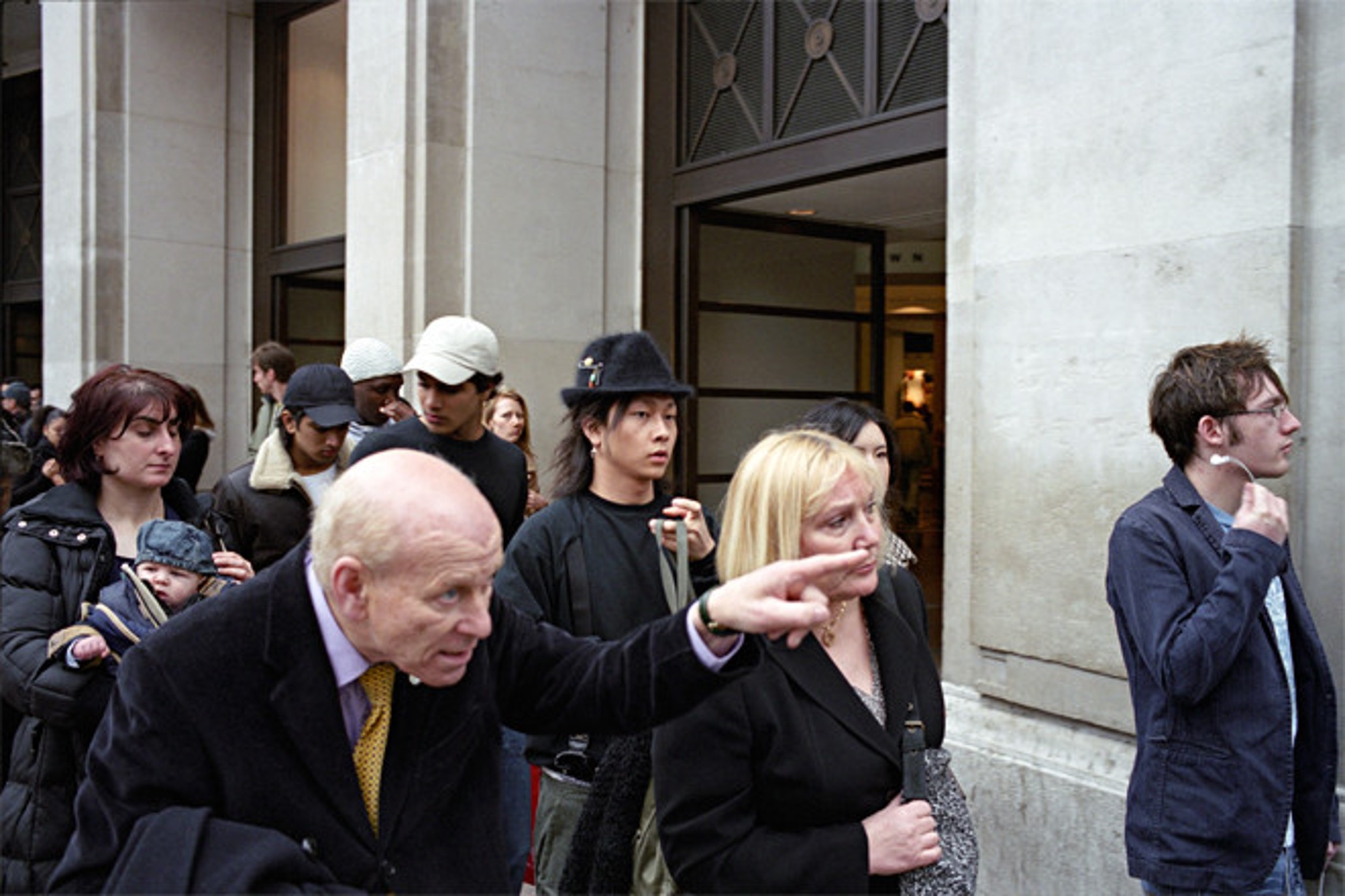
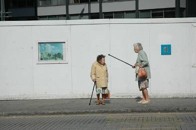
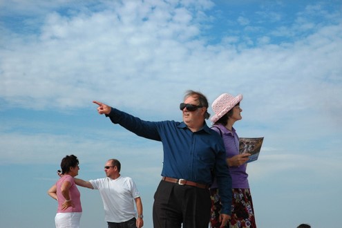
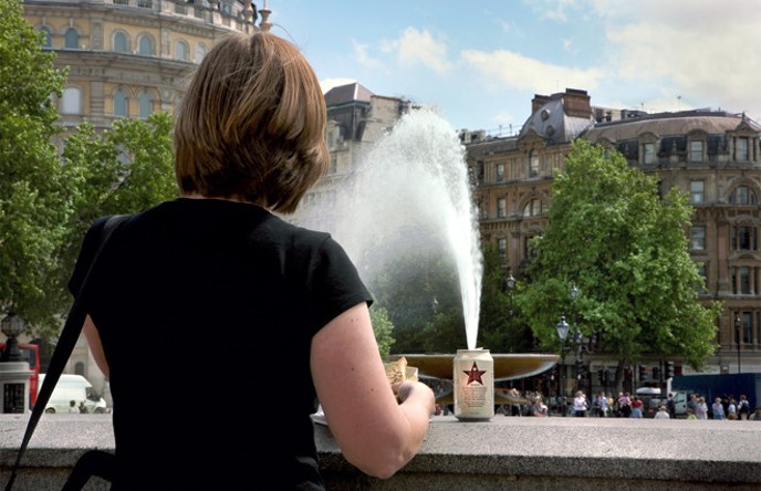
Street Photography: the impulse to take candid pictures in the stream of everyday life. Street photography is a form of documentary but it is decidedly not reportage and rarely simply tells a story. Sometimes a street photographer captures something truly unusual – an extraordinary face, an accident, or a crime in the making. But more often a good street photograph is remarkable because it makes something very ordinary seem extraordinary.
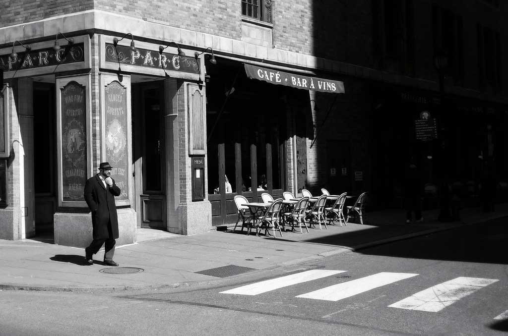
Flaneur: The street photographer is the archetypal flaneur, an urban type popularised by the French poet Charles Baudelaire in the mid-nineteenth century, around the same time that photography itself came into popular circulation. Baudelaire defined the flaneur as ‘a botanist of the sidewalk’ an apt description for most of street photographers. Read more here
Technology: The Leica handheld camera, commercially available as of 1924, was the ticket to allowing a photographer to be on the move, as well as to capturing movement. A 35-mm film camera, the Leica had a wide aperture that required a short exposure time, especially for pictures taken outdoors, and it could advance quickly, which allowed the photographer to take numerous pictures of a subject in quick succession. Read more here on the history of the Leica camera
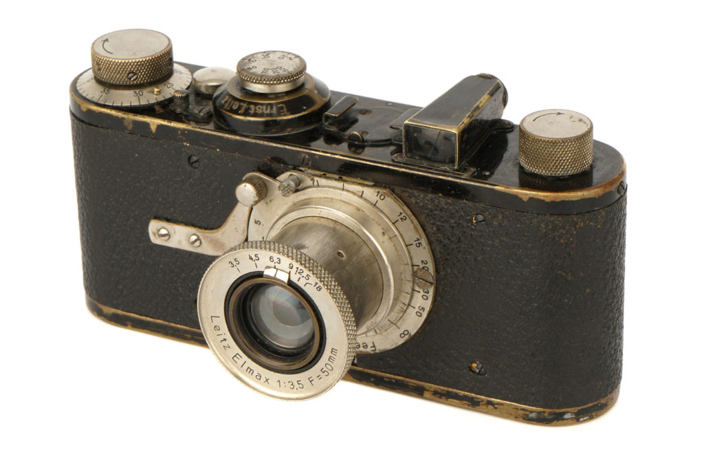
The Leica became the camera of choice in the 1930s for photographers such as André Kertész, Ilse Bing, Henri Cartier-Bresson, and others, all of whom worked primarily in Europe. Those photographers did not call themselves street photographers even if some of their subject matter fit the genre’s current definition, but instead they identified themselves as photojournalists, fashion photographers (many worked for magazines), or simply as experimenters with a new medium. The Leica continued to be the go-to device for photographers after World War II, especially for New York City photographers such as Roy DeCarava, Lisette Model, William Klein, and Helen Levitt. Robert Frank, who is best known for his book The Americans (1959) and was the leading influence on street photographers of the succeeding generation, documented culture throughout the United States and in Europe. Street photography took off in Mexico as well, with Manuel Álvarez Bravo and Graciela Iturbide. Paris had Robert Doisneau, Czechoslovakia had Josef Koudelka, and London had Bill Brandt.
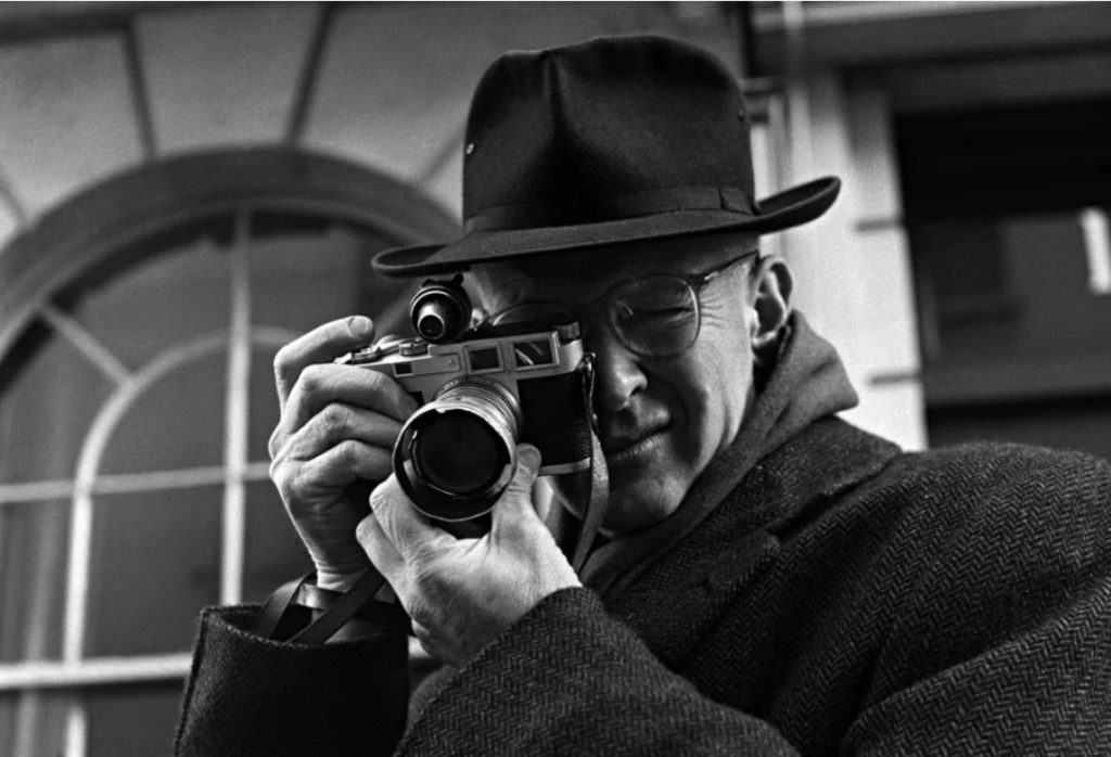
Photo-assignment: St Malo and decisive moments
American street photographer Gary Winogrand famously said that, ‘I photograph things to see what they look like photographed.’
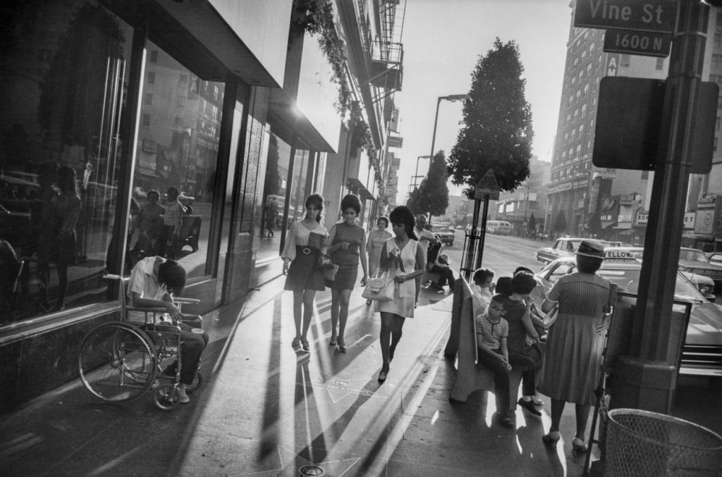
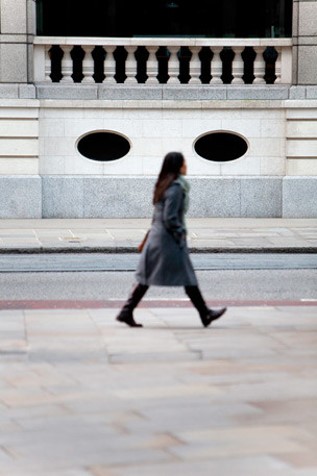
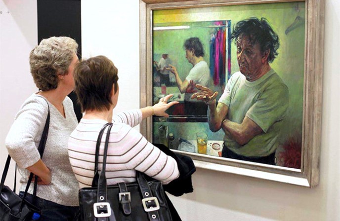
Using Cartier-Bresson’s theory of ‘the decisive moment’ try and capture images where the overall composition and visual elements are combined with an essence of movement. Find a location or spot that works as a compositional structure and anticipate or wait for something to happen within the photographic frame, eg. movement of people, a passer-by, or a dog, or some other fleeting moment of street life. Consider the following:
SUBJECT MATTER/ CAPTURING A MOMENT > people and humanity, theatre of everyday life, poetics of streets, comic absurdities and humour, small acts of kindness, scenes of unexpected beauty, ordinary moments, visual pun and humour, gestures and poses, faces and crowds.
LOCATIONS & PLACES > inside the walls and on the ramparts, back alleys and sidewalks, beaches and coastal promenades, parks and public spaces, cafes and shops, street corners and intersections, signs and advertising, facades and architecture.
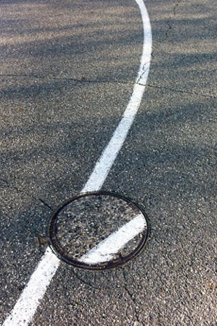
POINTS OF VIEW > low/ high/ canted angles, deadpan approach, light and shadows, intensity of colour, reflections in shop windows, shoot through glass, frame within a frame, focusing and un-focusing, up-close and details, shallow depth of field, artful and funny juxtapositions, geometry and space, lines and form, textures and patterns, signs and shop windows, advertising and graphics, reflections and mirrors.
APPROACH > capturing decisive moments, candid portraits, informal snapshots, inobtrusive observations (Cartier-Bresson style), interactive and confrontational (William Klein approach), spontaneous and subconscious reactions, poetic possibilities, inquisitive mind and roaming eye, looking and prying, shoot from the hip, serendipity and good luck.
CAMERA HANDLING > Lenses (focal length): use wide (18-35mm) to standard lenses (50mm). Focusing: automatic or manual – whatever you prefer. Exposure mode: S or T mode – (shutter-speed priority). Shutter-speeds: experiment with fast (1/125-1/500) and slow shutter-speeds (1/15-1/60). ISO: 100 (sunny weather), 200-400 (overcast ), 800-3200 ISO (inside or evening/ night). White Balance: auto
Download and print prompt sheet here:
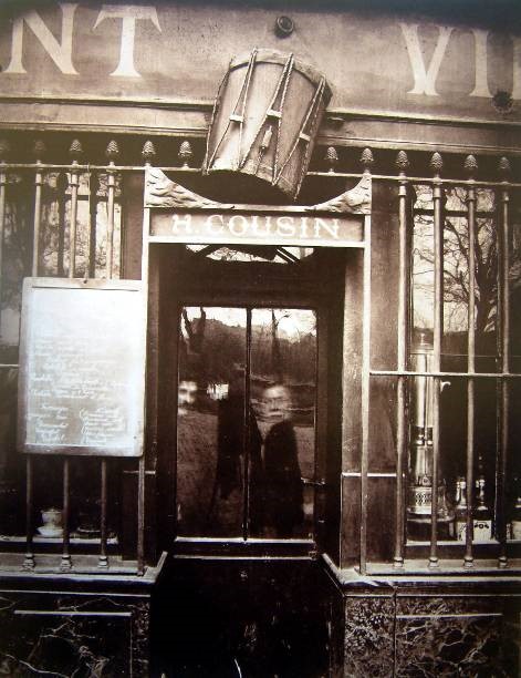
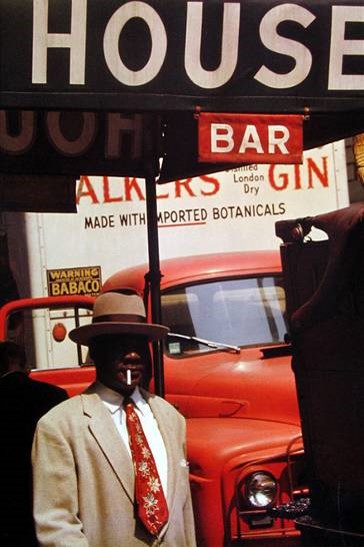
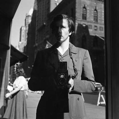
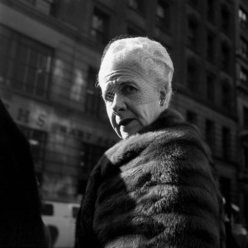
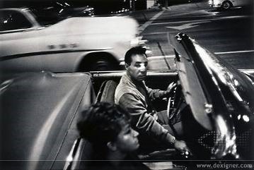
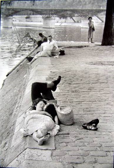
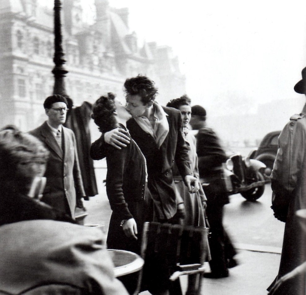
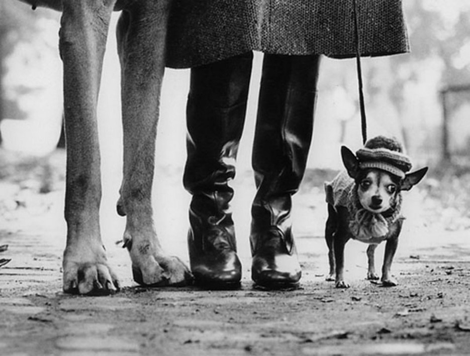
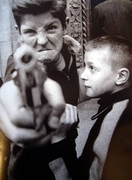
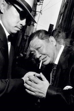
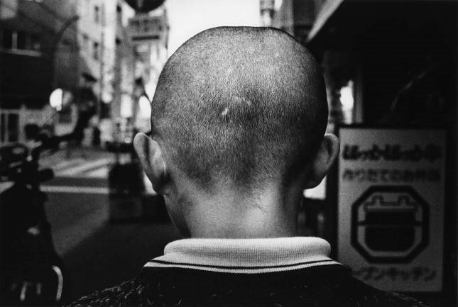
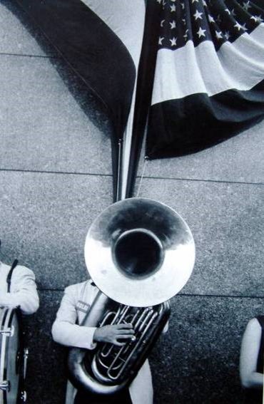
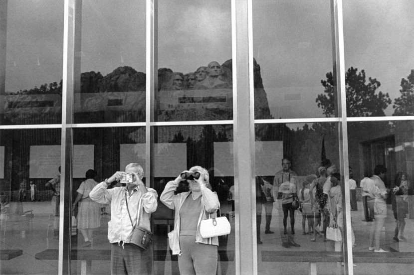
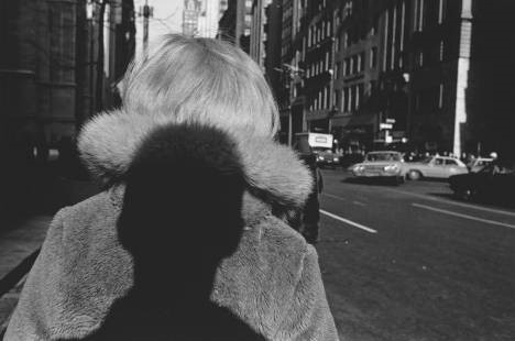
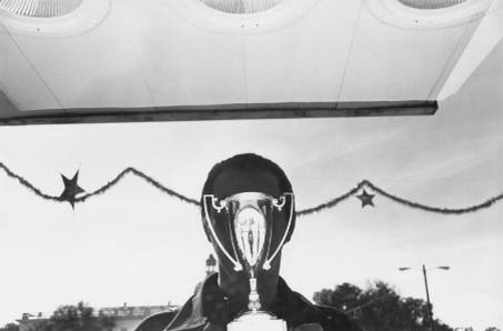
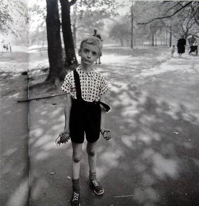
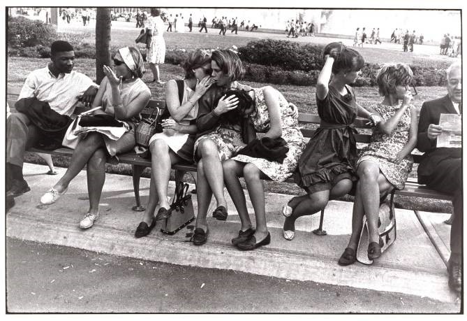
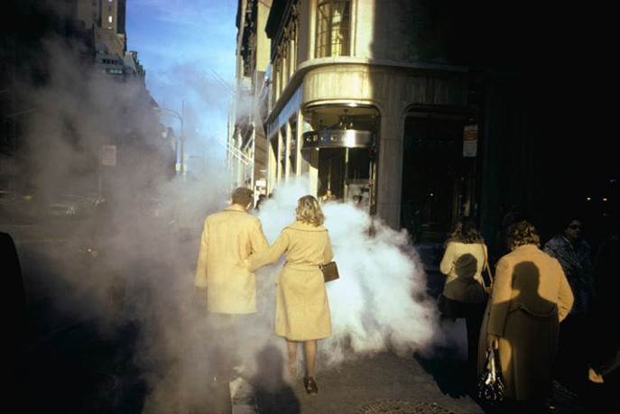
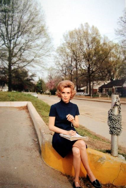
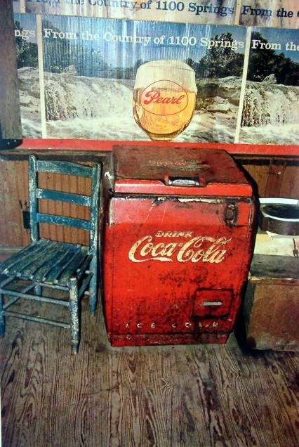
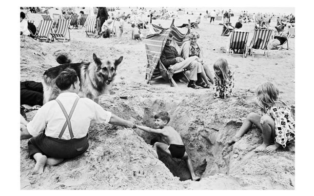
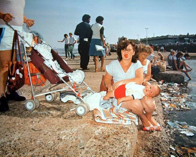
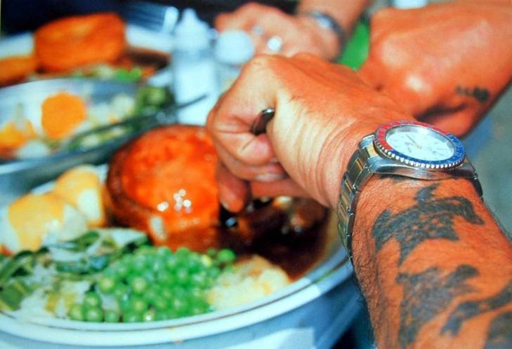
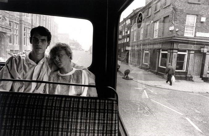
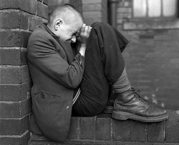
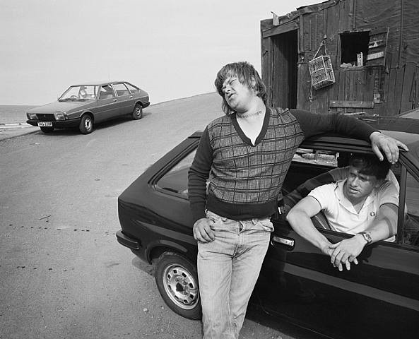
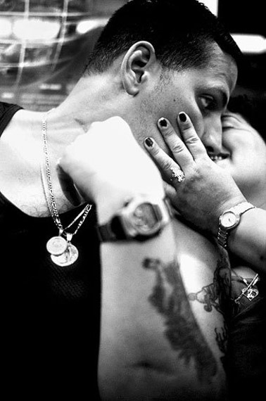
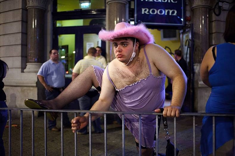
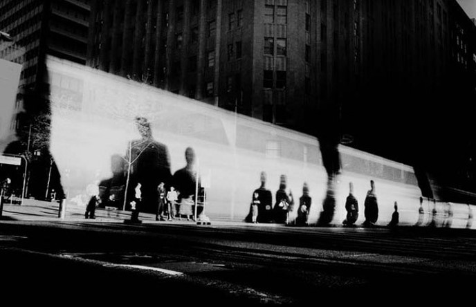
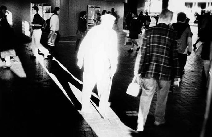
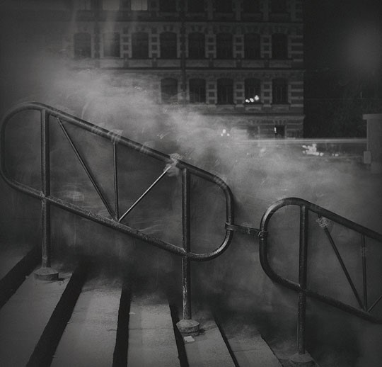
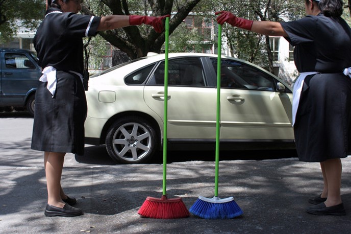
For further inspiration see the work of historical and contemporary street photographers below. Or, for a comprehensive Powerpoint presentation with many examples of street photographers, styles and approaches – go to folder here:
M:\Radio\Departments\Photography\Students\NOSTALGIA\Presentations\Street photography

WEEK 3: 19 – 25 June
AI workshop with Will Lakeman
Mon 19 June: WORKSHOP > Group Yr 12B (2 hours Pd 4 + Pd 5)
Tue 20 June: WORKSHOP > Group Yr 12A (2 hours Pd 4 + Pd 5)
Workshops led by Will Lakeman on use of AI and ethics in generating images and digital content using software, such as Photoshop AI and DreamStudio.
Wed-Fri: EXPERIMENTING > Using your images from St Malo as inspiration produce a variety of AI generated images (at least 10 variants) using Photoshop AI, DreamStudio or Midjourney. Explore your experiences in St Malo and generate AI images inspired by street photography and Cartier-Bresson’s theory around the decisive moment. Either ‘train’ AI on your original images or recreate street photographs using relevant text prompts linked to your photo-assignment last week – see above. Use key terminology, such as specific words and phrases linked to subject matter, capturing moment, locations & places, points of view, approaches, composition and formal analysis, camera handling and techniques.
Show creative process using a combination of screen grabs and annotation > 1 blog post
AI Image generating software: DreamStudio, Midjourney, DALL-E 2, Dream by Wombo, Craiyon and new version of Photoshop with AI
Photoshop AI (beta version)
Introduction from Adobe to Photoshop AI: Nearly three and a half decades since we first brought Photoshop to the world, we’re writing a new chapter in our history with the integration of Generative AI and Adobe Firefly into Photoshop. Today we deliver an incredible new capability into creators’ hands that empowers them to work at the speed of their imagination while fundamentally transforming the experience into something more natural, intuitive and powerful.
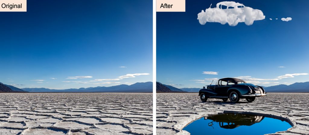
Generative Fill – Adobe Photoshop Quickly create, add to, remove or replace images right in Adobe Photoshop with simple text prompts powered by Adobe Firefly generative AI.
What’s new in Photoshop
The new features introduced to Photoshop are designed to accelerate everyday creative workflows, streamline complex tasks, and reduce clicks.
Adjustment Presets

Adjustment Presets are filters that speed up complex tasks by enabling you to preview and change the appearance of images in just a few steps to achieve a distinctive look and feel, instantly.
There are 32 new presets in the Adjustments panel that you can hover over to see what your image would look like with each preset applied before selecting it. Once a preset is selected, it can be further refined by editing the automatically created adjustment layers in the layers panel.
For more information go here.
Remove Tool

The Remove Tool is an AI-powered feature that enables you to replace an unwanted object by simply brushing over it, preserving the integrity of nearby objects and providing an uninterrupted transition on complex and varied backgrounds.
The Remove Tool is particularly powerful when removing larger objects and matching the smooth focus shift across the image. For example, the tool can remove an entire building or car from an alpine landscape image while seamlessly maintaining the fidelity of the progression from meadow to mountains.
Use the Remove tool for:
- Big objects
- An object near other objects
- An object on a varied-focus background
- An object with structure behind it (think lines, like a fence or horizon)
For more information go here.
Contextual Task Bar
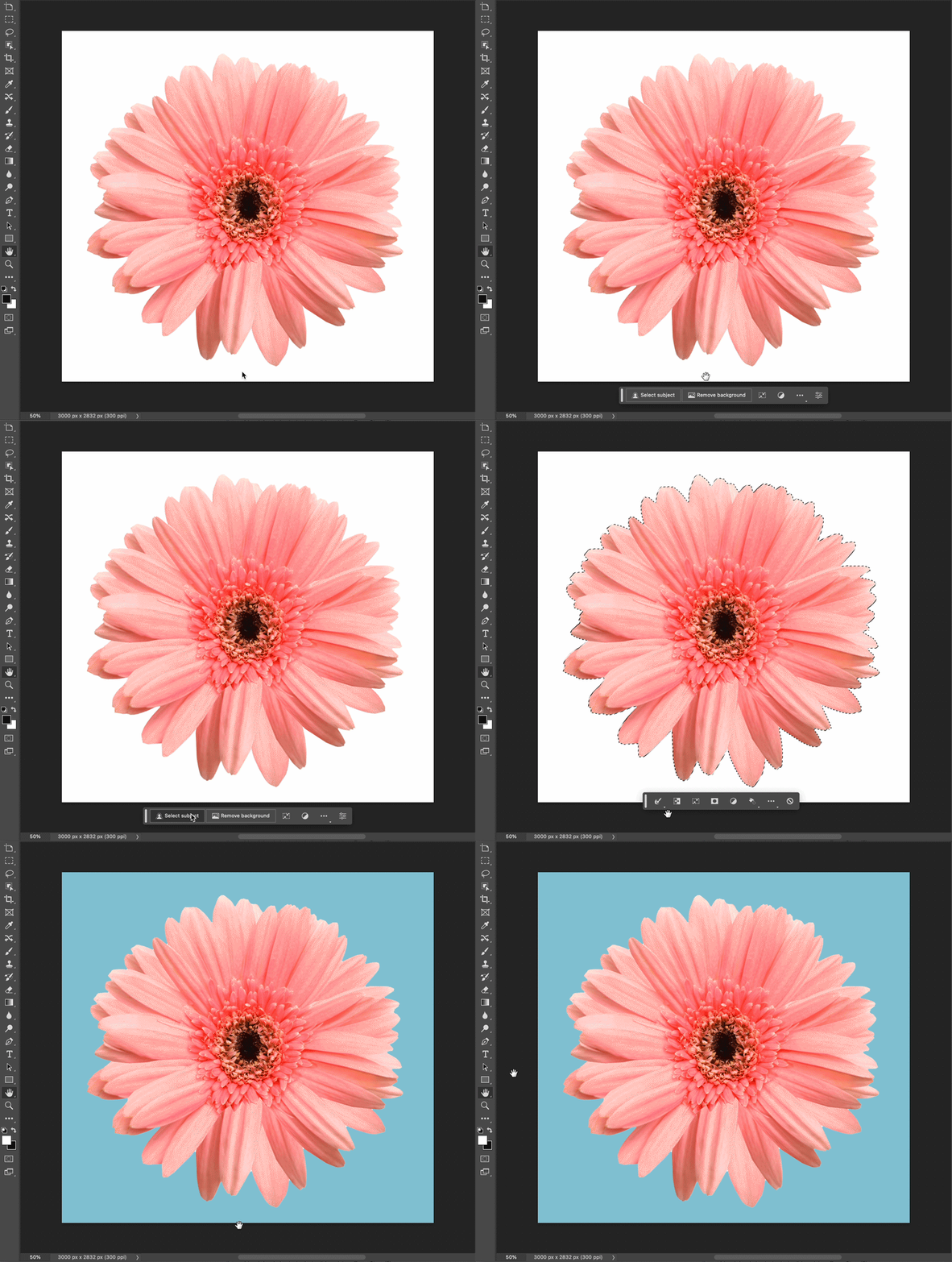
The Contextual Task Bar is an on-screen menu that recommends the most relevant next steps in several key workflows, reducing the number of clicks required to complete a project, and making the most common actions more easily accessible.

For example, when an object is selected, the Contextual Task Bar appears below your selection and suggests actions for selection refinement that you might want to use next, such as Select and Mask, Feather, Invert, Create Adjustment Layer, Fill Selection, or generate something with the new Generative Fill capabilities.
For more information go here.
Generative Fill
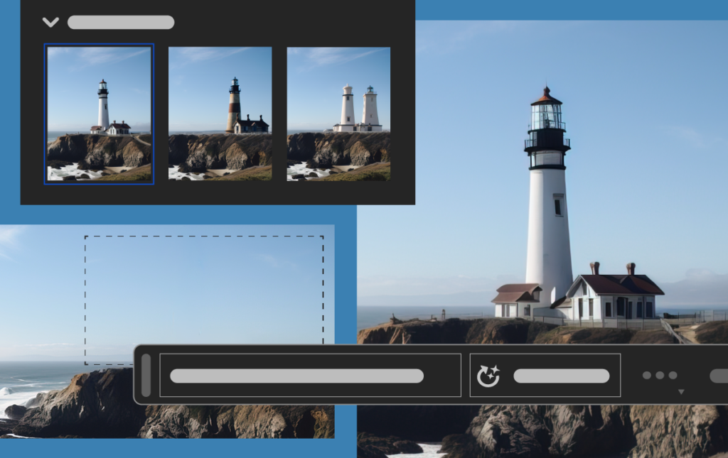
The revolutionary and magical new suite of AI-powered capabilities grounded in your innate creativity, enabling you to add, extend, or remove content from your images non-destructively using simple text prompts. You can achieve realistic results that will surprise, delight, and astound you in seconds.
Click here for a tutorial on how to use Generative Fill
Neural Filter
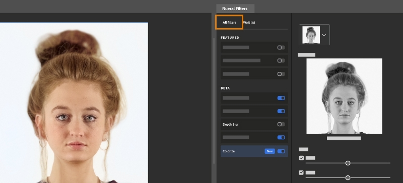
Neural Filters is a new workspace in Photoshop with a library of filters that dramatically reduces difficult workflows to just a few clicks using machine learning powered by Adobe Sensei. Neural Filters is a tool that empowers you to try non-destructive, generative filters and explore creative ideas in seconds. Neural Filters helps you improve your images by generating new contextual pixels that are not actually present in your original image.
Click here for a tutorial on how to use Generative Fill
Gradients update
The Gradients feature has been significantly improved, and the workflow has been expedited.
The feature enables you to create gradients in just a few steps and now includes new on-canvas controls which help you have precise controls over many aspects of the gradient in real-time. A live preview that’s created automatically shows you instantly how the changes you make affect your image.
You can now also make non-destructive edits to your gradients, which means you can go back and make changes to your gradient without permanently altering your original image.
For more information go here.
A general tip from Will Lakeman on Photoshop is just to get familiar with Layers, Selections, Masking, and Groups. Almost every complex task just involves being better at these and most problems proceed from small misunderstandings in them. There are free videos explaining any of these, for people who want targeted learning there is a short video on every tool available on Phlearn. The site will try and get you to pay for Premium Content, but there’s loads of free stuff.
For example, these are all free/quick, the presenter is great, and most contain free sample files to practice on.You can teach yourself a good standard of Photoshop just by following along. Click here for tutorials.
DreamStudio

Midjourney
Explore examples here, Next Steps in Midjourney: Photorealistic Experience with AI Art


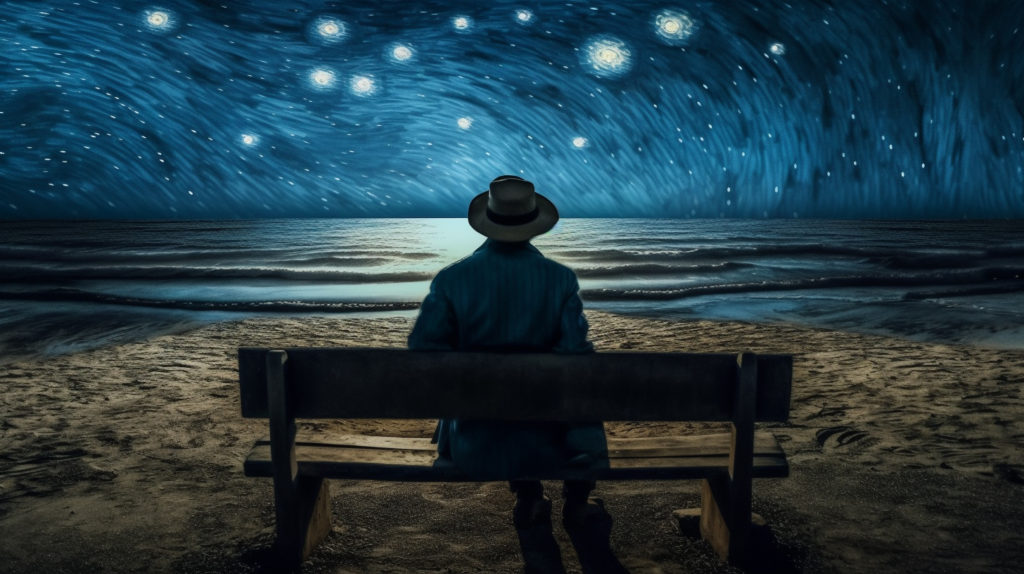

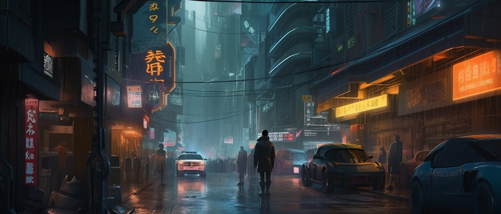
Read article here on: How to get great results with Midjourney learning bout being more precise with your text prompts.
DALL-E 2
DALL-E and DALL-E 2 are deep learning models developed by OpenAI to generate digital images from natural language descriptions, called “prompts”. DALL-E was revealed by OpenAI in a blog post in January 2021, and uses a version of GPT-3 modified to generate images. In April 2022, OpenAI announced DALL-E 2, a successor designed to generate more realistic images at higher resolutions that “can combine concepts, attributes, and styles”.
For inspiration and ideas – see RESOURCES below of artists using AI
Nostalgia and AI
Deep Nostalgia, a new service from the genealogy site MyHeritage that animates old family photos, has gone viral on social media, in another example of how AI-based image manipulation is becoming increasingly mainstream. Read a review here and another article by Gadgetflow
Read article Deep Nostalgia: ‘creepy’ new service uses AI to animate old family photos in the Guardian.

Here is a list of top 10 Best Alternatives to Deep Nostalgia App 2023

Photomyne is a Deep Nostalgia alternative application as it also focuses on the colorization of old family based photos.

Or link to HitPaw Photo Enhancer (AI-Powered): Restore Old Photo, Colorize Black & White Image
Further Inspirations > Experimentation > Development
planet.ai. Artwork created by artificial intelligence. Subscribe here on Youtube to see examples of work or follow here on Instagram. They also sell prompts for Midjourney – see here for more details.
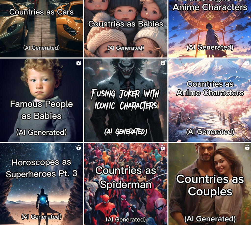
Planet AI: Asking AI to Draw Famous People as Babies!


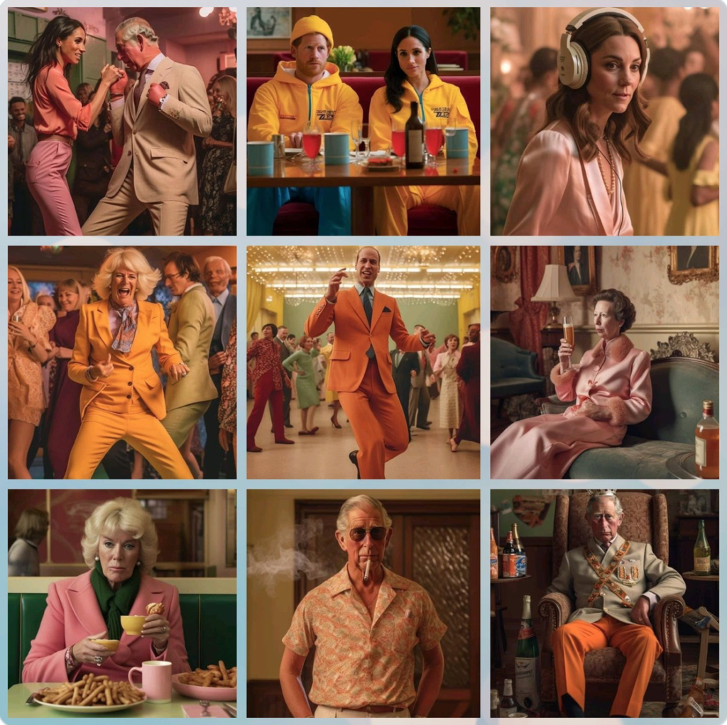
AI generated pictures of Coronation after party. Check out Charles!!!


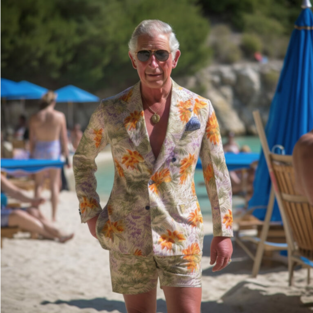
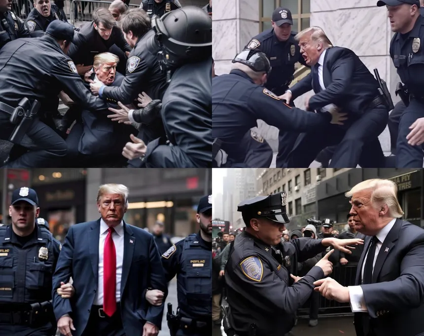
Phillip Toledano believes that a photograph should be like an unfinished sentence. Born in London, he lives and works in New York City, where after a decade as an advertising art director, he returned to his true passion, photography. Below are some recent images he has created using Midjourney that were shared in Instagram.


mrtoledano Political art usually works in two ways -either it points outwards, to support and encourage people to rise up, or it points inwards, at a political figure, to ridicule, to weaken, to enrage-that’s that’s hopefully the point of this particular series. Two of trumps (many) characteristics are his misogyny and his obsession with projecting strength -these images make him become his fears


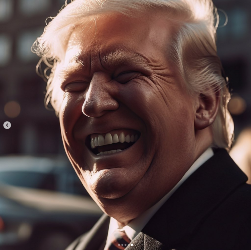
If you look at images of trump, you begin to notice just how many emotions he seems to be missing-there’s plenty of him looking angry, or petulant, or stern, and then there’s what passes for a smile. But real laughter? sadness? Concern ? Joy? Completely and strangely absent – the only option is to create them with ai. Midjourney


Trump is so hyper masculine, so extraordinarily misogynistic, it made me wonder. This is an exploration of what might be his deepest fear-to become what he despises the most


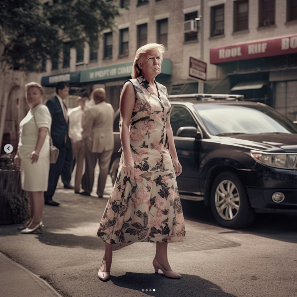

One of the things I find utterly fascinating about Donald Trump is the carefully curated tough guy image he’s crafted over the years -there’s something interesting in piercing that hyper -masculine bubble and showing the world the softer side of Donald


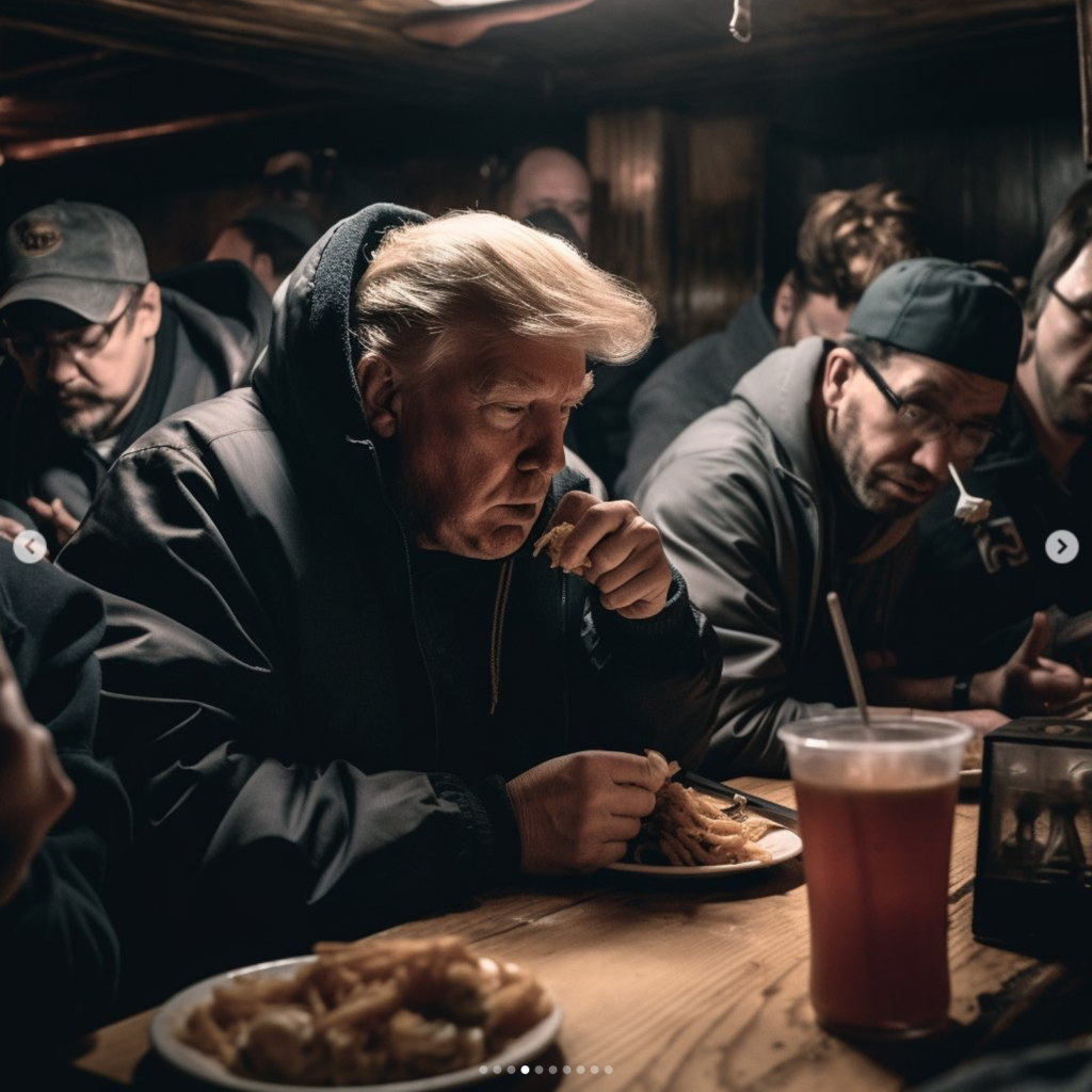


mrtoledano For the final act of the trump series, let’s think about who donald trump would be if he didn’t have his fathers money. If he hadn’t had a gilded life of privilege handed to him. What if he was just Donny from queens ? What would his life look like? What would he be doing ?
Philip Toledano: I’ve noticed a lot of work uses ai to recreate photography as it is now-some sort of reflection of reality -but what’s utterly intriguing is that AI has its own voice. For instance, this image of the two men fighting I would argue is much more interesting than the one I posted yesterday (can you see what’s different ?) because (metaphorically) I allowed ai to have a say -now this image asks more questions (which is ALWAYS a good thing in art)
I’m also surprised to see how it handles the animal images I’ve been doing -especially the monkeys and apes-the images have such emotion in them -and finally, I’m very much enjoying the way in which you can abstract the human form …
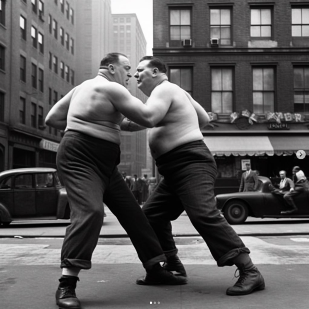
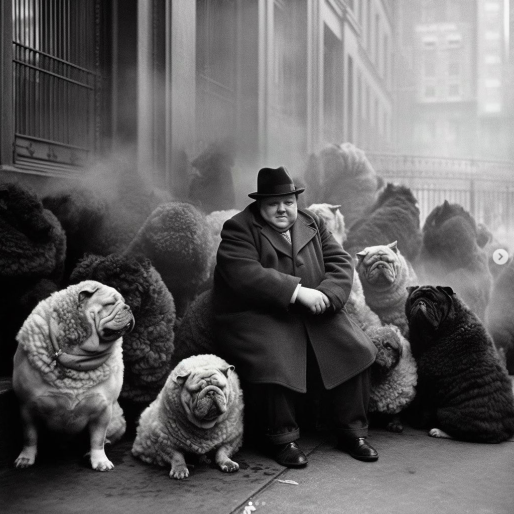
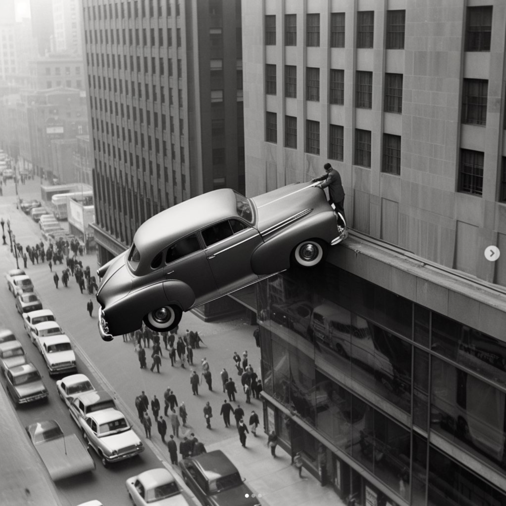
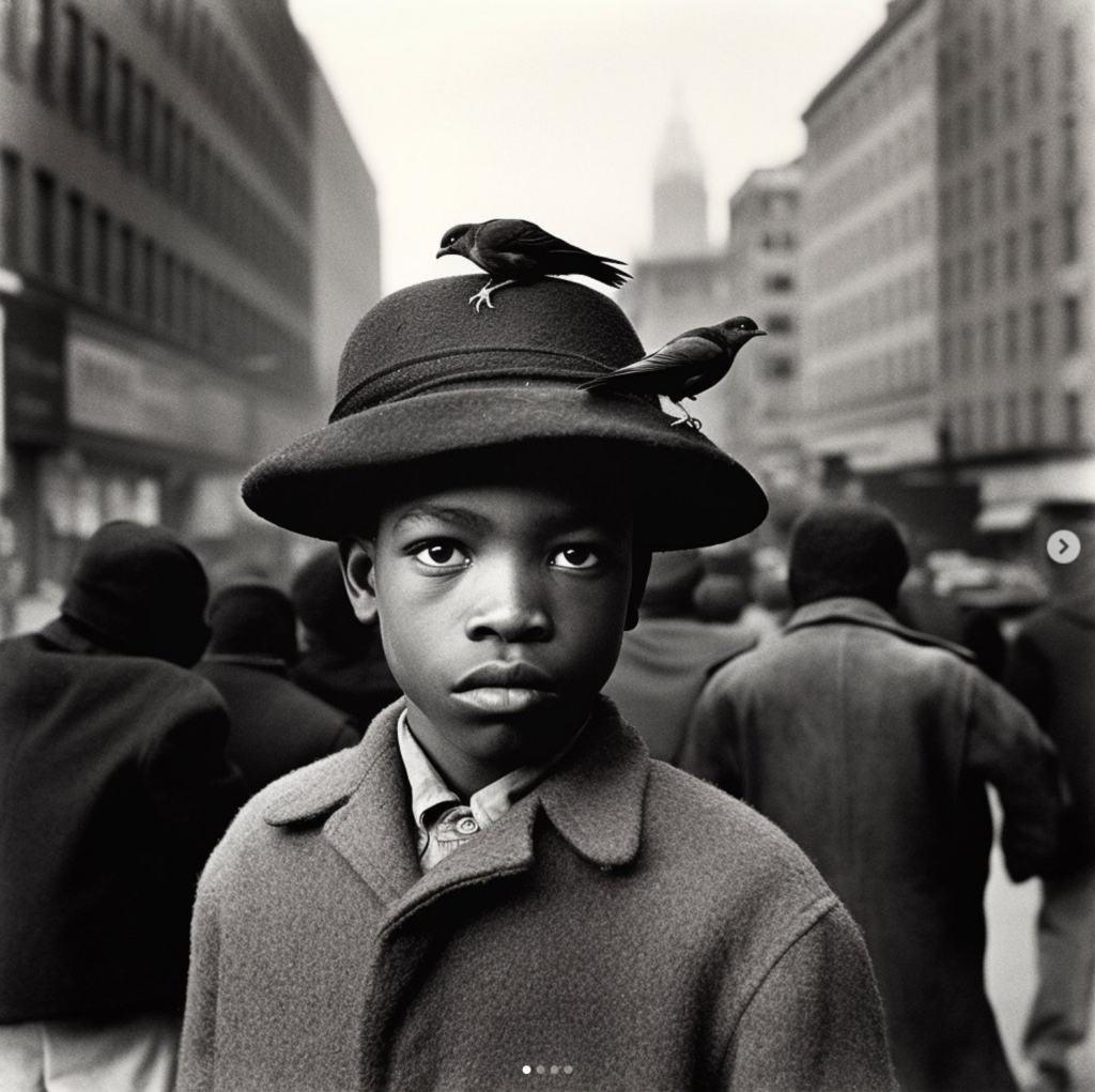
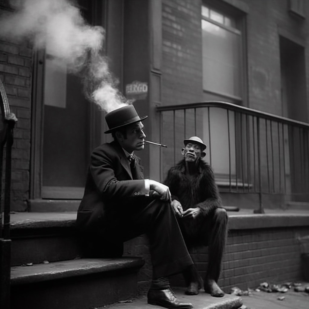
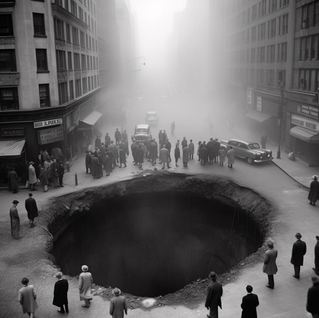
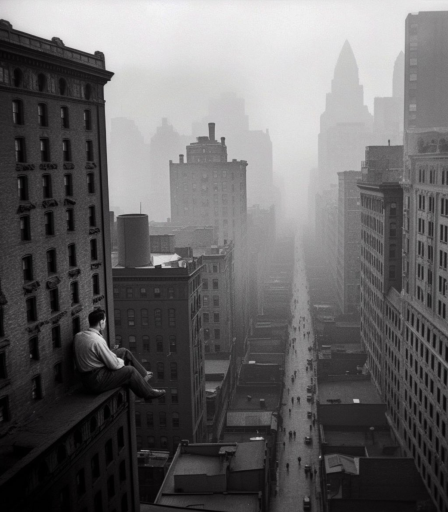
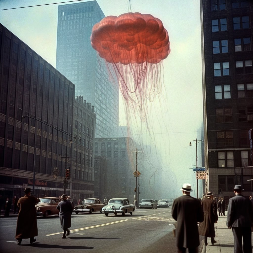
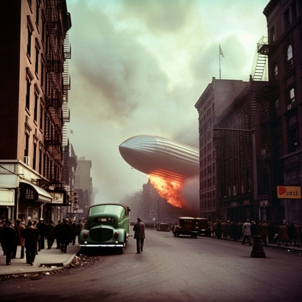
From his series, another America …

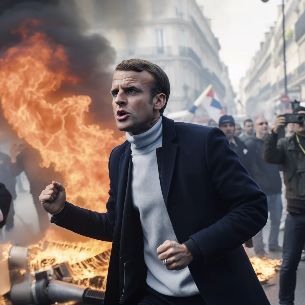
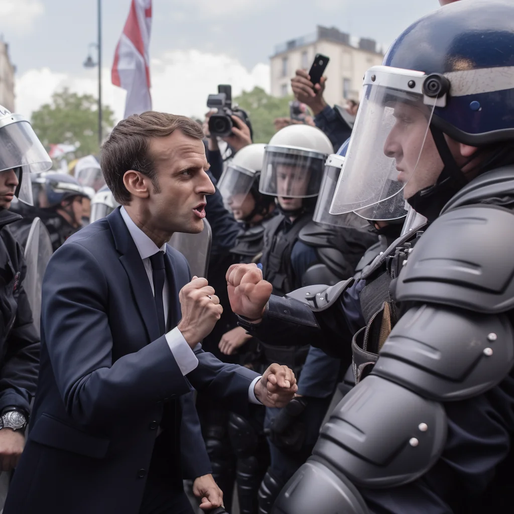
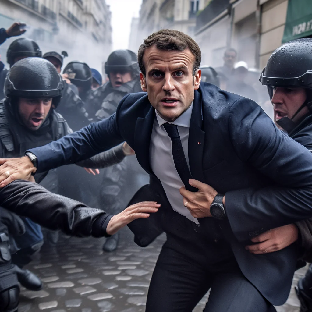
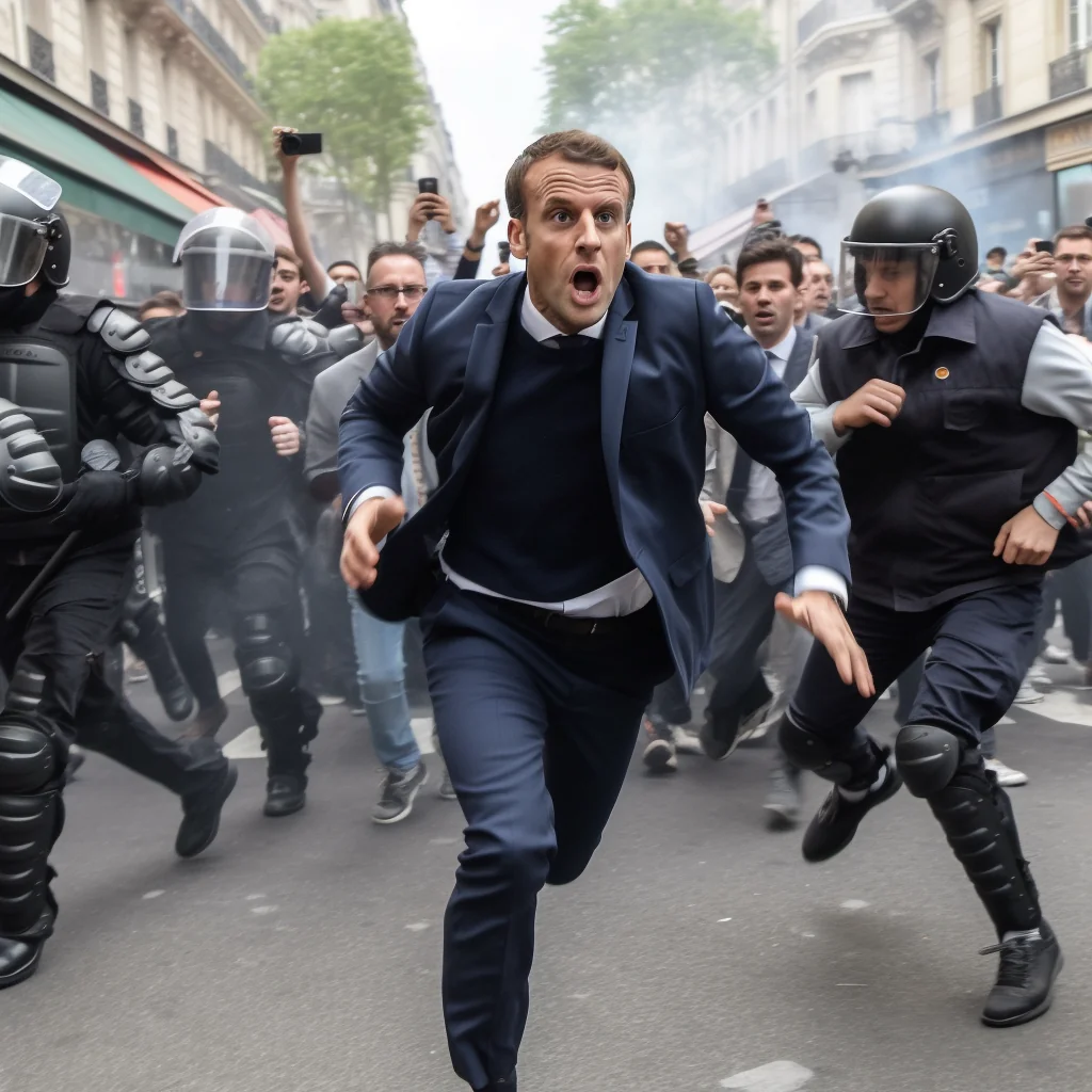
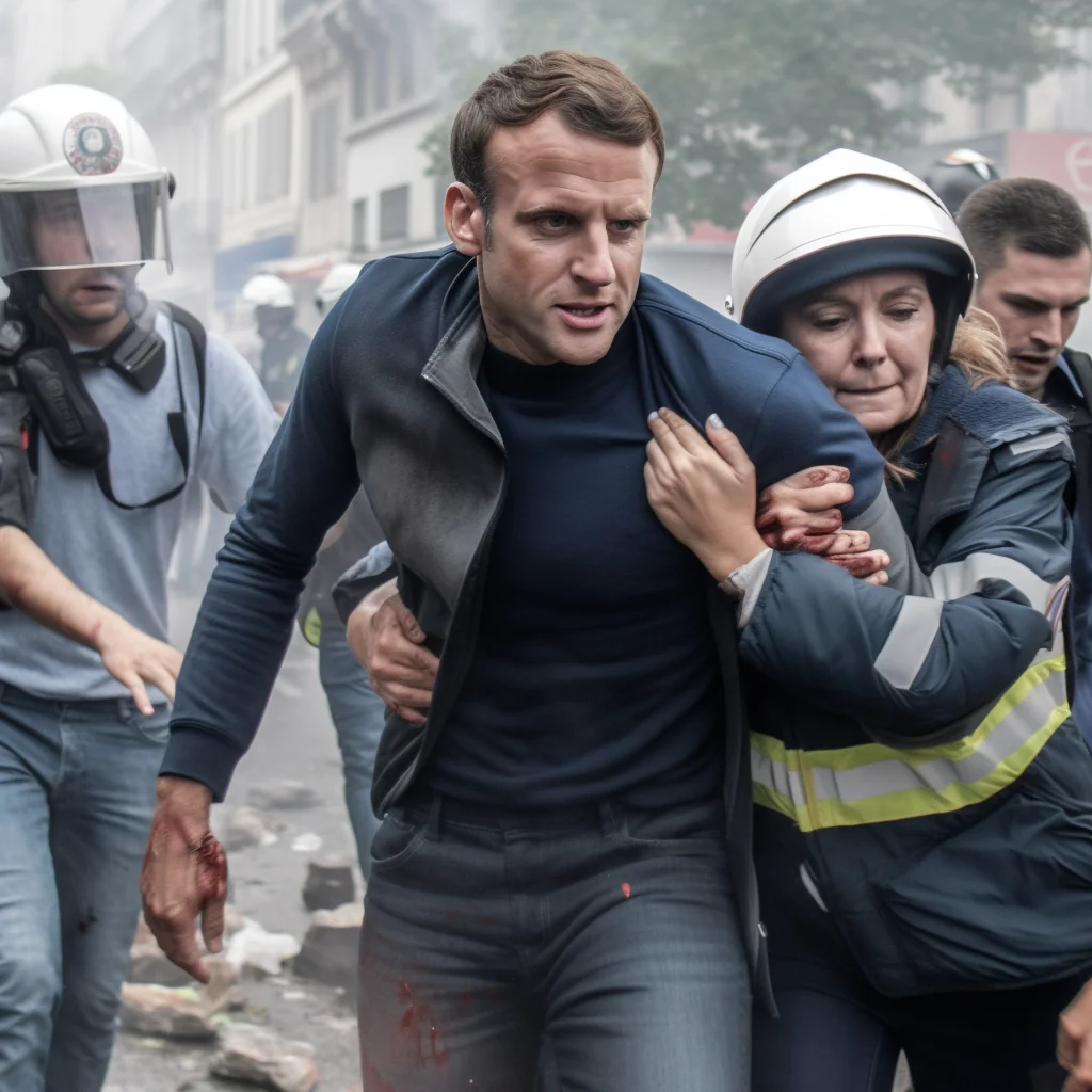
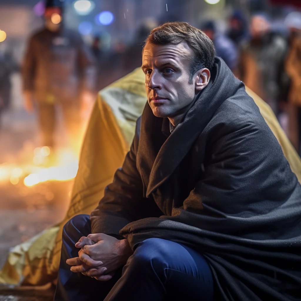
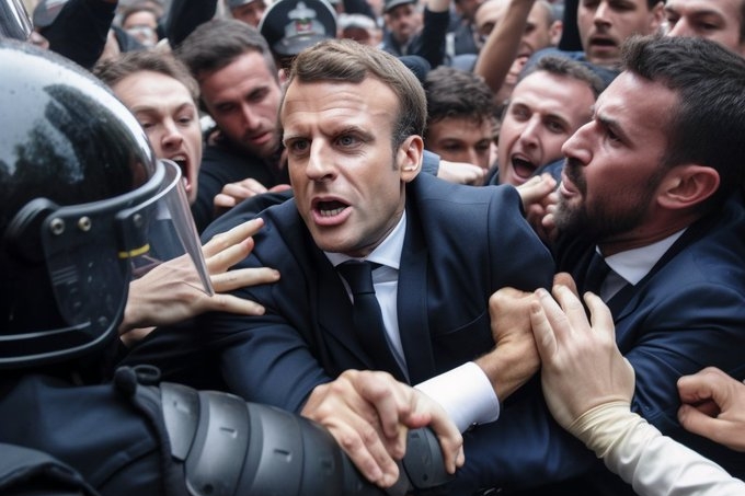
Photos courtesy of the latest version of Midjourney, an AI program which generates realistic deepfakes – Copyright Reddit – Twitter. Read article here

David Fathi: The Machine Seems to Need a Ghost
The Machine Seems to need a Ghost (but the ghost cannot quite make itself at home in the machine) is a work in progress currently composed of three typologies that explore all these questions around the keywords of feedback loop, hauntology, meta, etc., as a neural network of linked ideas and images:


OpenWalls Arles Vol. 4: TRUTH
The prompt for this year’s theme was French photographer Jacques-Henri Lartigue’s line that photography is “catching a moment which is passing, and which is true.” The aim of OpenWalls 2023 is to challenge Lartigue’s notion in a modern context – to not only interrogate the idea of truth in a post-truth age, but to insist upon photographic authority as collaborative, considering multiple truths from across the six continents from which the winning images are taken.
50 single image winners and two series will be shown together at Galerie Huit Arles, all responding to theme of Truth. Read more here BJP (British Journal of Photography)

My goal is not to uncover a single objective truth, but rather to explore the many subjective layers of a truth that are personal and relevant to the persons I am photographing
– Julia Gunther – OpenWalls Arles Single Image Winner


First Bath


Ultimately, the winning image of this edition of OpenWalls projects demonstrate that truth can be wielded to empower an endless range of human impulses, whether preservation, rebellion, remembrance or imagination. Truth’s flexibility might be the most valuable legacy of the supposedly post-truth age.
Explore more of the winners here
WEEK 4: 26 June – 2 July
ESSAY: Photography and Truth: Can a photograph lie?
DEADLINE: Mon 10 July
Can a photograph lie?
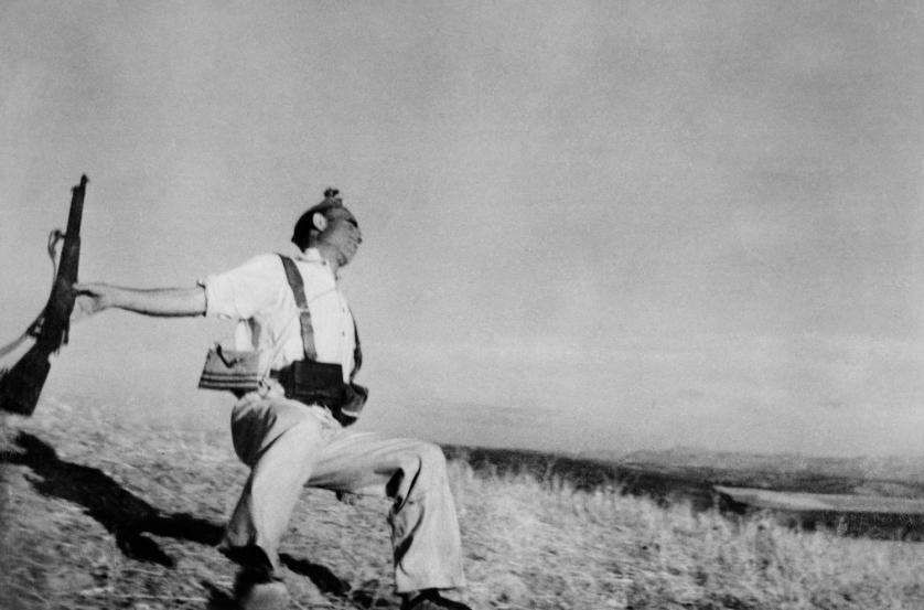
Are all photographs reliable?
A photograph is a certain delivery of facts?
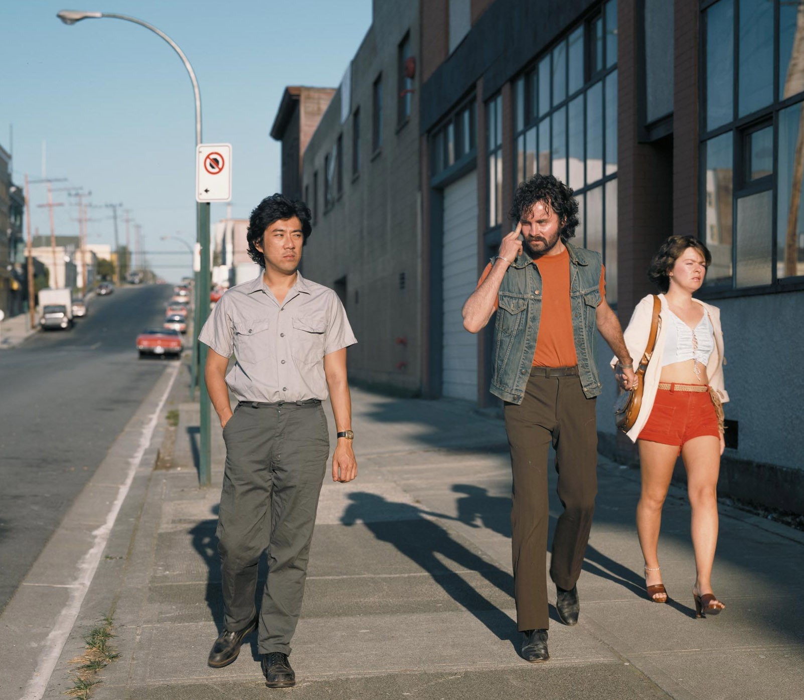
Claims of truth that most people take for granted?

You often hear a photographer saying: ‘the camera was there and recorded what I saw’.
A common phrase is to ‘shed light on a situation’ meaning to find out the truth.
‘A picture tells a 1000 words‘, is another aphorism that imply images are more reliable.

Picasso famously said: ‘We all know that art is not truth. Art is a lie that makes us realise truth.’
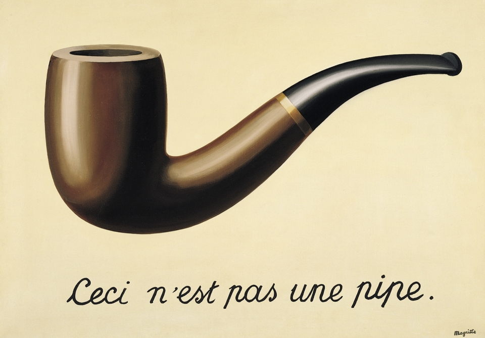
Magritte’s painting La Trahison des Images in which he painted a picture of a pipe with the words ‘Ceci n’est pas une pipe’ (This is not a pipe) goes some way towards an explanation.
Documentary photography’s central moral associations are:
depicting truth
recording life as it is
camera as a witness.
The photograph as evidence
Since its ‘invention’ in the 1830s, photographs have been used as sources of evidence. The direct (indexical) relationship between the sun’s rays and the resulting image makes photographs seem reliable as sources of information. No wonder that photography was enthusiastically embraced by organisations like the police who began to use photographs as sources of legal proof. And yet, from the beginning, artists working with photography began to create images which relied on the manipulation of their photographs using techniques like combination printing, undermining their evidential status. Photographs are very persuasive since they look so much like the things photographed. As Susan Sontag has pointed out, when we hear about something happening but doubt its occurrence, we tend to believe it to be true when shown a photograph of it. However, she also describes the way that photographs are peculiar in the type of evidence they provide:
The photographer was thought to be an acute but non-interfering observer – a scribe, not a poet. But as people quickly discovered that nobody takes the same picture of the same thing, the supposition that cameras furnish an impersonal, objective image yielded to the fact that photographs are evidence not only of what’s there but of what an individual sees, not just a record but an evaluation of the world. It became clear that there was not just a simple activity called seeing (recorded by, aided by cameras) but ‘photographic seeing’, which was both a new way for people to see and a new activity for them to perform.
– Susan Sontag from On Photography
Some initial questions:
- What can photographs be evidence of?
- How many types of photographic evidence can you list?
- Which of your official documents include a photograph of you?
- Why are photographs considered, in some legal circumstances, to be a reliable source of evidence?
- How reliable is your Instagram feed or family photo album as a record of your life?
In 2016, the Michael Hoppen Gallery curated an exhibition of photographs entitled ‘? The image as question: an exhibition of evidential photography‘.
The exhibition featured a wide range of photographs from fields such as medicine, conflict, engineering, astronomy and crime. Originally used as evidence of something, torn from their original context and hung on a gallery wall, the photographs could be appreciated for their aesthetic qualities and artistry.

This was further emphasised by the exhibition hang which drew attention to the formal similarities between some of the photographs:


A limited edition of 200 catalogues were produced to mark the show, again conferring on the photographs the status of art object:
Part of the fascination with all photography is that the medium is firmly grounded in the documentary tradition. It has been used as a record of crime scenes, zoological specimens, lunar and space exploration, phrenology, fashion and importantly, art and science. It has been used as ‘proof’ of simple things such as family holidays and equally of atrocities taking place on the global stage. Any contemporary artist using photography has to accept the evidential language embedded in the medium.
— Michael Hoppen Gallery website
Do you know what London really looks like? Take our quiz and see if AI can fool you
After an image of the Pope fooled the internet, test yourself and see if you’re still one step ahead of artificial intelligence. Click here

TASKS: Produce a number of blog posts that show evidence of the following
Mon-Tue: ESSAY > Write a 1000-1500 word comparative essay on photography’s association with truth using both historical and contemporary images as examples.
The essay question (hypothesis), Photography and Truth: Can a photography lie? is designed to explore the idea of photographs as forms of evidence. Of course this is relevant to all photographs. To what extent can any photograph be relied upon to tell us the truth? With new technology, such as generative AI that produce content from images and texts that already exist on the internet, it also raises questions about originality, appropriation and authorship. These issues are central to contemporary artistic and photographic practice and students should be alert to them. Is the photographer always the one who presses the shutter? Does it matter?
DEADLINE: MON 10 July
Follow these instructions:
- Select two images that have manipulated truth, one historical using camera technology, one contemporary using AI technology as examples to use in your essay
- Research history, theory and context of both images thoroughly and make notes.
- Read several sources (both online and on paper) to acquire sufficient knowledge and understanding
- Provide a critical perspective by referencing different points of view from sources.
- Select at least 2 quotes per image from sources you have read that is relevant to your essay question.
- Use Harvard System of Referencing and provide a bibliography
- Use key terminology specific to art and photography from the matrix/ sheet below.
Essay plan – use as a guideline
Hypothesis: Photography and Truth: Can a photograph lie?
Opening quote: to set the scene choose an appropriate quote from key texts or source that you have read and understood. Or select something Will Lakeman said in class discussion around ethics using AI in photography.
Introduction (250 words): Describe how photography from its invention as a new technology in 1839 was viewed as a threat to traditional artforms such as painting and drawing. Provide an overview of why photography (like all other art forms) is an illusion and a representation of reality (reflect on your essay earlier on the Origin of Photography). Explain what AI is as a new technology, and how it is already part of lives, give examples (Google, speech recognition, generative AI etc). Discuss both human and societal benefits and potential dangers of AI, again use examples such as Geoffrey Linton resigning from Google to bring awareness, or Sam Altman’s (CEO of OpenAI) being questioned by USA congress. Select one quote by either Linton or Altman and comment (either for or against). Introduce the two images that you have chosen as examples of the above.
Paragraph 1 (250-500 words): Describe how photography in the past (before the digital age) could be manipulated, both in-camera and in the darkroom (eg. reflect on Pictorialism’s use of chemicals and scratching surfaces in distorting images and earlier masking/ collaging technique sin the darkroom.) Provide an example of an image (see case studies below) from history of photography where the truth was distorted. Describe circumstances, context, different points of view and new discoveries or theories around the origin or meaning of your chosen image. Use either direct quote, paraphrasing or summary from sources and comment (for or against). Make sure you provide your own interpretation of the image too.
Paragraph 2 (250 -500 words): Describe how photography now since the digital age has been altering the truth from faking images in-camera to using image manipulation software, such as Photoshop. Provide an example of an image (see case studies below) produced using artificial intelligence that looks ‘real’, but are in fact a digital construct. Provide analysis of how generative AI such as DreamStudio, Midjourney or DALL E 2 has increased our ability to create new images that has no relationship with either photography or the truth. Use same formula as above and use either direct quote, paraphrasing or summary from sources and comment (for or against). Make sure you provide your own interpretation of the image too.
Conclusion (250 words): Refer back to the essay question and write a conclusion where you summarise in your own words both similarities and differences between your two image examples. For example, compare and contrast how historical images in the past and digital images made today, using new technology such as AI, have altered reality and distorted truth. Conclude with a statement on how you envisage the future of photography and AI image-making might change our perception of reality, and attitude towards truth.
Bibliography: List all the sources that you have identified in alphabetical order. Apart from listing literature you must also list all other sources e.g. websites/online sources, Youtube/ DVD/TV.
Quotes and referencing: You MUST reference some of the sources that you have used either by incorporating direct quotes, paraphrasing or summarising of an idea, theory or concept, or historical fact.

Use Harvard System of Referencing…see Powerpoint: harvard system of referencing for further details on how to use it.
CASE STUDIES
Explore case studies where images have ‘lied’ and truth has been manipulated, distorted, staged or altered. Choose two images – one historical and one contemporary – for your essay from case studies listed below that questions the notion of truth regarding the photographic image and its relationship with reality and explain why.


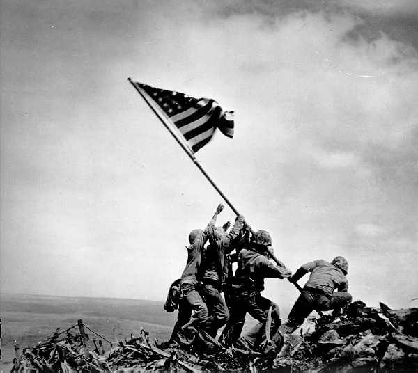
Joe Rosenthal’s original caption: “Atop 550-foot Suribachi Yama, the volcano at the southwest tip of Iwo Jima, Marines of the Second Battalion, 28th Regiment, Fifth Division, hoist the Stars and Stripes, signalling the capture of this key position.”
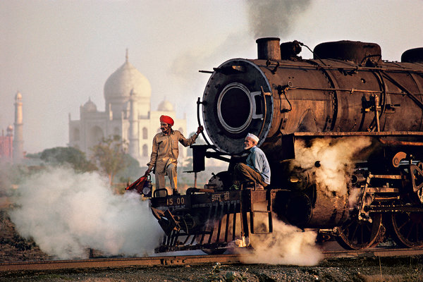
The images of renowned photographer Steve McCurry, who made the famous and iconic image of an Afghan girl for a front cover of National Geography has recently been criticized for making ‘too perfect pictures’ which not only are boring but reinforces a particular idea or stereotype of the exotic other.
Read this article by Teju Cole in the New York Times Magazine which compares McCurry’s representation of India with a native photographer, Raghubir Singh who worked from the late ’60s until his untimely death in 1999, traveling all over India to create a series of powerful books about his homeland.
Read this artcicle on Petapixel in In defense of Steve McCurry’s images
What is your view? Back it up with references to articles read and include quotes for or against.
Reference to Coldplay’s new video also highlight the idea of cultural appropriation that harks back to Britain’s colonial rule and exploitation of the Orient.
Jeff Wall is a Canadian artists known for his large scale tableaux image presented in light-boxes. Today, most of his images resemble reportage and, as such, are likely to incense his detractors, who claim he’s not a “true” photographer. His most contentious new work, called Approach, shows a homeless woman standing by a makeshift cardboard shelter in which we spy the foot of what could be a sleeping vagrant. Wall tells me it was shot under an actual freeway where the homeless congregate and that “it took a month to make, working hands-on” – but he won’t divulge just how staged it is. Is this an actual homeless woman, or an actor? Is the shelter real, or was it built by Wall’s team of assistants to resemble one?
Re-creating images from memory is crucial to Wall’s practice – perhaps because it flies in the face of the tradition of photography as an act of instant witnessing.
“Something lingers in me until I have to remake it from memory to capture why it fascinates me,” he says. “Not photographing gives me imaginative freedom that is crucial to the making of art. That, in fact, is what art is about – the freedom to do what we want.”
Read full interview with Jeff Wall here
In terms of truth or communicating an idea that make references to a real social problem such as homelessness, does it matter if the image is staged or not? Where does authenticity come into the picture?


Berlin-based photographer Boris Eldagsen rejected the recognition from Sony World Photography Awards, saying that artificial intelligence (AI) images and photography should not compete with each other in similar contests. In a statement published on his website, Erdagsen said that he applied to the competition “as a cheeky monkey” to find out if such events are prepared to handle AI-generated content. The photographer also urged for debate on the role of AI in photography. “We, the photo world, need an open discussion. A discussion about what we want to consider photography and what not,” wrote Eldagsen.
Read Boris Eldgasen’s own comments om his website here, where you will also find hyperlinks to many articles and interviews given about the image and his refusal to accept the Sony World Photography Awards 2023.
Seymour, Tom (18 April 2023), The camera never lies? Creator of AI image rejects prestigious photo award. The Art Newspaper. (Accessed 19 June 2023)
Boris Eldagsen has accused the Sony World Photograph Awards of failing to distinguish between a photograph and a DALL-E 2-created image, while the organisers condemn a ‘deliberate attempt at misleading us’
Bush, Lewis (20 April 2023), ‘AI photography is here to stay—here’s why we should be worried’. The Art Newspaper. (Accessed 19 June 2023)
Maybe we should direct our attention less on whether these images count as photographs, and more on the moral right or wrong of how they work
Grierson, J. (17 April, 2023) Photographer admits prize-winning image was AI-generated. The Guardian News & Media Ltd. (accessed 19 June 2023)
German artist Boris Eldagsen says entry to Sony world photography awards was designed to provoke debate.
Williams, Zoe (18 April, 2023), ‘AI isn’t a threat’ – Boris Eldagsen, whose fake photo duped the Sony judges, hits back. The Guardian News & Media Ltd. (accessed 19 June 2023)
The German artist caused uproar this week when he revealed the shot that won a prestigious award wasn’t what it seemed. But, he insists, AI isn’t about sidelining humans – it’s about liberating artists
Parshall, Allison, (April 21, 2023) How This AI Image Won a Major Photography Competition. Scientific American (accessed 19 June 2023)
Boris Eldagsen submitted an artificial-intelligence-generated image to a photography contest as a “cheeky monkey” and sparked a debate about AI’s place in the art world
Bartels, Meghan (March 31, 2023), How to Tell If a Photo Is an AI-Generated Fake. Scientific American (accessed 19 June 2023)
Artificial-intelligence-powered image-generating systems are making fake photographs so hard to detect that we need AI to catch them.

Here is a statement by David Fathi: The Machine Seems to Need a Ghost about his new project and use of AI in his work.
‘Generative artificial intelligence and machine learning are rapidly advancing. Anyone can use image generation tools to create without needing specific technical or artistic skills. The images generated by these tools challenge the notions of work and creator, as if they were algorithmic ready-mades. Like Marcel Duchamp’s urinal, bottle rack or snow shovel, they are products of mechanization and automation (industrial for Duchamp, digital for these new creations) and displayed in an art gallery. The artist does not have to paint, photograph or sculpt; his choices and decisions shape the work. The algorithm draws from a huge database of images that mirror our world without replicating it accurately. The generated images look more and more realistic and close to reality but also act as a distorting mirror, exaggerating all the stereotypes and biases of our visual culture.
We are at a turning point where human production has not yet been contaminated by artificial production. However this will soon change as the tools themselves use their own creations as input. Gradually the feedback loop, an endless cycle where culture ceaselessly refers to itself, will come to dominate the database, risking getting stuck in nostalgia for the past and trapped in a closed , meta-stable, system. Duchamp’s ghost still haunts us, an unavoidable reference in the history of contemporary art, often quoted, copied or parodied by generations of artists that followed. He became an art cliché despite himself. Duchamp himself described his own art as “meta-irony” to describe his art – a form of critical distance holding its own questioning.
Artificial intelligence raises ethical, artistic and social questions that are only an acceleration of the same questions that have followed the inventions of printing, photography, computer or the internet. The growing automation only makes it harder to escape our current system and the “meta” has become a refuge. This constant self-reference, reflexivity, circularity of our art, our technologies, our culture is becoming a trap where the past’s ghosts still haunt our present thinking.’
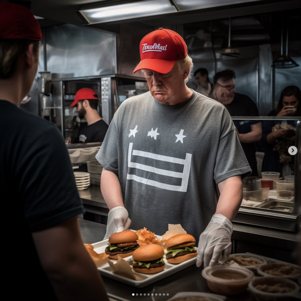
Philip Toledano: (mrtoledano) For the final act of the trump series, let’s think about who donald trump would be if he didn’t have his fathers money. If he hadn’t had a gilded life of privilege handed to him. What if he was just Donny from Queens ? What would his life look like? What would he be doing ?
Philip Toledano: I’ve noticed a lot of work uses ai to recreate photography as it is now-some sort of reflection of reality -but what’s utterly intriguing is that AI has its own voice. For instance, this image of the two men fighting I would argue is much more interesting than the one I posted yesterday (can you see what’s different ?) because (metaphorically) I allowed ai to have a say -now this image asks more questions (which is ALWAYS a good thing in art)
READING > REFERENCES > SOURCES
Below are some background text on some of the topics of discussion, such as truth, ethics, realism, representation and genres of documentary photography and staged photography (tableaux). Reading a couple of these texts would provide you with the background knowledge and understanding that is required for you write a critical essay on the topic around photography and truth. It is your own responsibility to research relevant information and context around the two images that you have chosen from case studies above.
Documentary > Truth > Realism > Ethics > Representation
A short PPT on Documentary Photography
Bright, Susan (2019) Is it Real? in Photography Decoded. London: Octopus Publishing Group Ltd.
Sontag, Susan (1977) ‘In Plato’s cave’, Chapter 1 in On Photography. London: Penguin Books
Here some helpful resources on Sontag: On Photography from PhotoPedagogy
Max Pinckers Interview: On Speculative Documentary
How fact and fiction today in documentary photography is blurred
Here some helpful resources on ethical questions regarding the photographer’s position of being inside or outside from PhotoPedagogy
Tableaux Photography > Pictorialism > Narrative > Cinema
A short PPT on Tableaux Photography
Bate, David (2016) ‘Pictorual Turn’ in Art Photography. London: Tate Galleries.
How Tableaux has been influenced by Pictorialism
Stephen-Bull_Photographs-as-art_Pictorialism_Modernism_Postmodernism
Artificial Intelligence > Ethics > Regulation > Media – current debates
In March, some prominent figures in tech signed a letter calling for artificial intelligence labs to stop the training of the most powerful AI systems for at least six months, citing “profound risks to society and humanity.” The letter, published by the Future of Life Institute, a nonprofit backed by Elon Musk, came just two weeks after OpenAI announced GPT-4, an even more powerful version of the technology that powers ChatGPT. In early tests and a company demo, GPT-4 was used to draft lawsuits, pass standardized exams and build a working website from a hand-drawn sketch.

Lets watch this interview on CNN with Dr Geoffrey Hinton who says ‘AI could kill humans and there might be no way of stopping it.’. The man often touted as the godfather of AI quit Google, citing concerns over the flood of misinformation, the possibility for AI to upend the job market, and the “existential risk” posed by the creation of a true digital intelligence. For more context read articles in The Guardian and NYT (New York Times) too
‘Godfather of AI’ says AI could kill humans and there might be no way to stop it
other clips DeepMind CEO on AI Godfather Hinton’s Google Departure | Watch (msn.com)
AI Principles
The Asilomar AI Principles, coordinated by The Future of Life Institute (FLI) and developed at the Beneficial AI 2017 conference, are one of the earliest and most influential sets of AI governance principles. Read all principles listed, especially those linked with Ethics and Values.
https://www.facebook.com/watch/?v=538404941814298
AI and Ethics Panel (vimeo.com)
AI and Ethics Panel
The University of Florida hosted a panel on ethics in artificial intelligence on Tuesday, May 2, 2023, with faculty members exploring the important role of ethics as scientists race toward increasingly sophisticated AI technologies. UF faculty members Amelia Winger-Bearskin, Duncan Purves, Tina Tallon and Sanethia Thomas participated in the online panel, which explored various topics related to the ethical implications of artificial intelligence, including algorithmic bias, ChatGPT and the social impact of AI on different communities.
Artforum editor in chief David Velasco visits Josh Kline at New York’s Whitney Museum of American Art to discuss “Project for a New American Century,” his first institutional survey in the US. Kline, whose work graces the cover of the April issue, reflects on his world-building art, the unfolding disasters of climate change and AI, and why he still sees the future as a place of hope. In the April issue: Colby Colby Chamberlain on the art of Josh Kline.
https://www.artforum.com/print/202304…
WEEK 5: 3 – 9 July
Developing > experimenting
This week you have some time to catch up with work not completed, such as:
- Editing images from St Malo, select your best 10-12 shots and evaluate > 1 blog post
- Produce a set 10 AI generated images / variations using text prompts > 1 blog post with annotation
- Compare camera-based images with AI generated images > 1 blog post
- Inspirations: Case Study 2 on artist(s) using AI as part of their image-making process > 1 blog post
- Review, improve or complete any outstanding research, analytical/ contextual blog posts on Henri Cartier-Bresson and the decisive moment > 1 blog post
- Complete essay > deadline Mon 10 July
- If all above is completed, begin research task below collecting a variety of picture-stories as inspiration for your page-spread design.
WEEK 6 – 7: 10 – 21 July
Picture story: design a page spread
Make A3 page spreads based on images made in-camera (analogue/ observational) and/or AI generated images (digital/ constructed). Follow the steps below:
1. Research Picture-Stories: Produce a mood board of newspaper layouts and magazine style picture stories. For reference use look at local stories from the JEP as well as international stories from magazine supplements in UK broadsheets newspaper ( e.g. The Sunday Times, The Guardian, The Telegraphs, Financial Times etc). Look at also at digital picture stories from the internet (see photo-agency websites: Lensculture, Magnum Photos, World Press Photo, AgenceVU, Panos Pictures. Alec Soth’s LBM Dispatch
Find picture-stories here in this folder: M:\Radio\Departments\Photography\Students\NOSTALGIA\Picture-stories
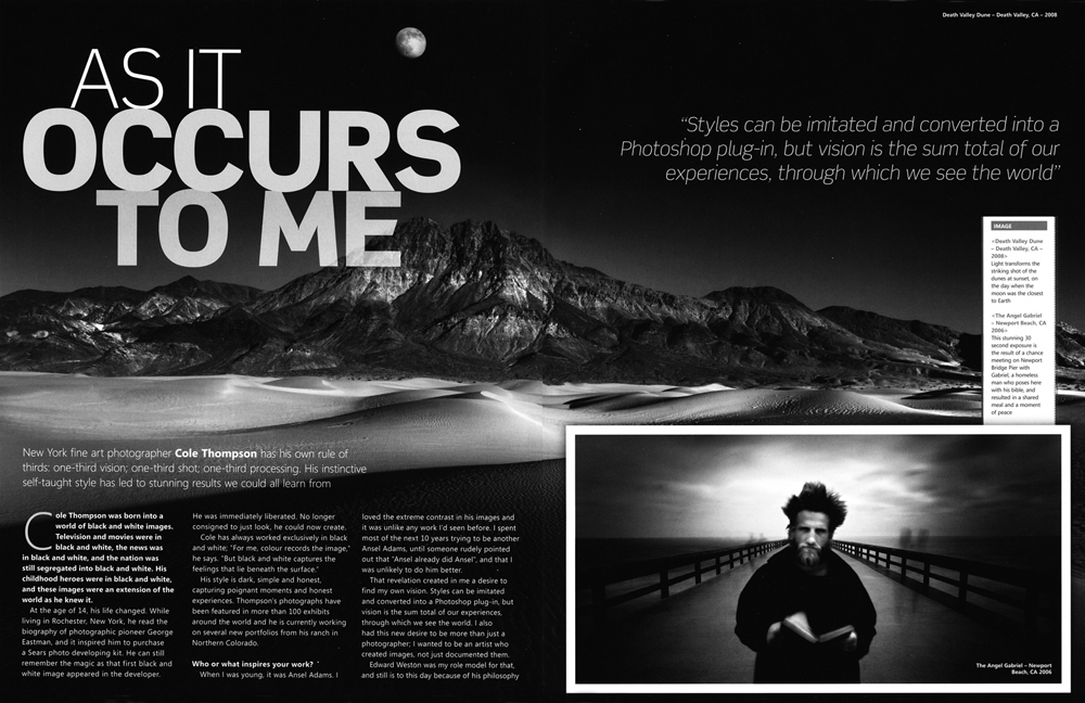
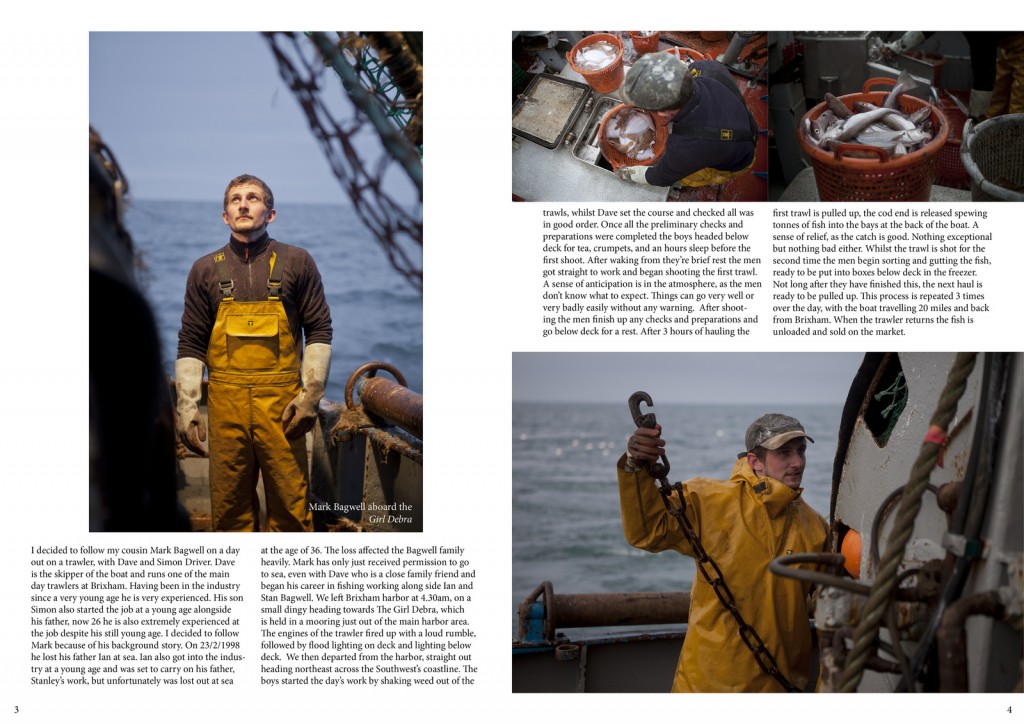
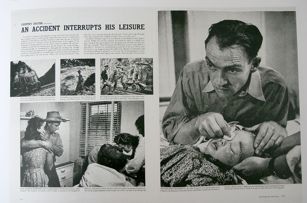
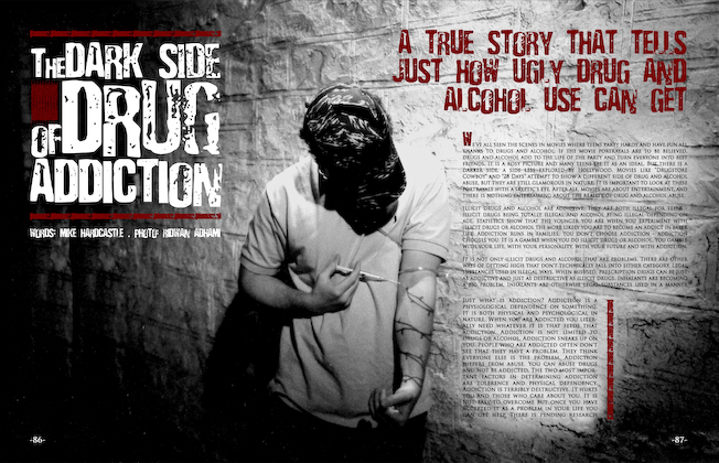
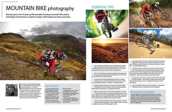
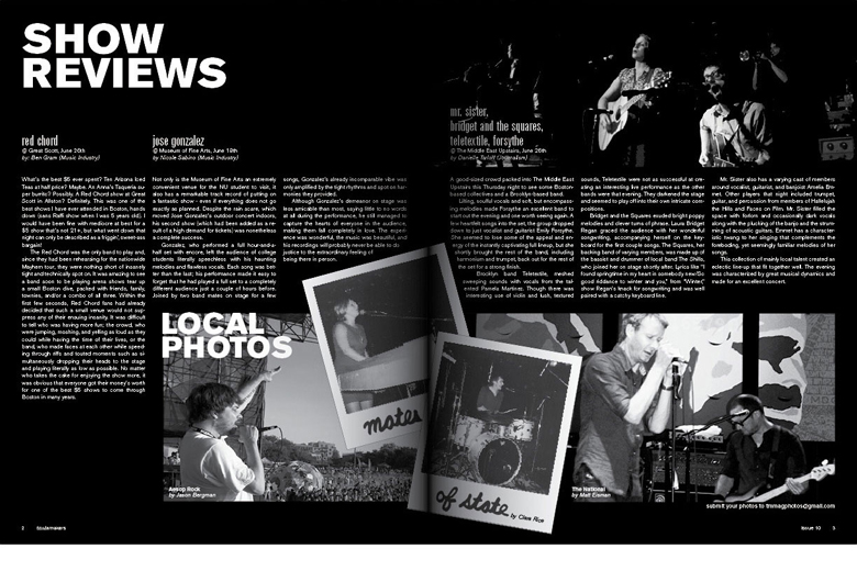
2. Analysis and deconstruction: Look at the layout of pictures and analyse how individual pictures relate and tell a story according to the construction of a traditional picture-story. Identify what types of pictures are more important than others e.g. which are major (establishing shots) or minor pictures (detail, relationship shot), and which types of portraits are used (formal, informal, environmental and person at work) see Powerpoint: A Traditional Picture Story below for further guidance. Analyse also the use of headline, text and captions to convey and construct a particular meaning or point of view.
The Traditional Picture Story_v1
3. Headline, text, captions: Think of a creative title and write a selection of headlines that tell your story. Write also an introduction/ abstract that provide further context for your pictures story. Also write captions for each picture: who, what, where, when and put into a new post
4. A3 Page-Spread Designs: Produce at least two different designs/ picture-stories from your photographs. Class tutorial on page design using InDesign. Be creative in your layout and experiment with different ways to communicate your message by clever cropping, sequencing, juxta-positioning, typography, use of graphics etc. Think of catchy headline and also write a short text (50-100 words) and captions for images. Start with a rough sketch of how the page might work and begin to lay out pictures, major and minors.
a) Design a traditional newspaper layout
b) Design a magazine double-page spread
InDesign
Create new document
width: 420mm
height: 297
pages: 3
orientation: landscape
columns: 4
column gutter: 5mm
margins: top, bottom, inside, outside: 10mm
bleed: top, bottom, inside, outside: 3mm
5. Experimentation: Edit your final layout and designs – make sure you show experimentation in your blog of different design and layout ideas combining images, graphics and typography in a personal and creative manner. Produce at least 3 versions of each design
6. Evaluation: Reflect on your final design ideas and explain in some detail how well you realised your intentions and reflect on what you learned/ What could you improve? How?
7. Presentation: Print, mount and present final designs and any other final outcomes, such your best 3-5 images and present as final print.
PRINT FOLDER: M:\Radio\Departments\Photography\Students\Image Transfer\NOSTALGIA\PRINTS
EXTRA RESOURCES / INSPIRATIONS / CONTEXT
History of artificial intelligence: Key dates and names
The idea of ‘a machine that thinks’ dates back to ancient Greece. But since the advent of electronic computing (and relative to some of the topics discussed in this article) important events and milestones in the evolution of artificial intelligence include the following:
- 1950: Alan Turing publishes Computing Machinery and Intelligence. In the paper, Turing—famous for breaking the Nazi’s ENIGMA code during WWII—proposes to answer the question ‘can machines think?’ and introduces the Turing Test to determine if a computer can demonstrate the same intelligence (or the results of the same intelligence) as a human. The value of the Turing test has been debated ever since.
- 1956: John McCarthy coins the term ‘artificial intelligence’ at the first-ever AI conference at Dartmouth College. (McCarthy would go on to invent the Lisp language.) Later that year, Allen Newell, J.C. Shaw, and Herbert Simon create the Logic Theorist, the first-ever running AI software program.
- 1967: Frank Rosenblatt builds the Mark 1 Perceptron, the first computer based on a neural network that ‘learned’ though trial and error. Just a year later, Marvin Minsky and Seymour Papert publish a book titled Perceptrons, which becomes both the landmark work on neural networks and, at least for a while, an argument against future neural network research projects.
- 1980s: Neural networks which use a backpropagation algorithm to train itself become widely used in AI applications.
- 1997: IBM’s Deep Blue beats then world chess champion Garry Kasparov, in a chess match (and rematch).
- 2011: IBM Watson beats champions Ken Jennings and Brad Rutter at Jeopardy!
- 2015: Baidu’s Minwa supercomputer uses a special kind of deep neural network called a convolutional neural network to identify and categorize images with a higher rate of accuracy than the average human.
- 2016: DeepMind’s AlphaGo program, powered by a deep neural network, beats Lee Sodol, the world champion Go player, in a five-game match. The victory is significant given the huge number of possible moves as the game progresses (over 14.5 trillion after just four moves!). Later, Google purchased DeepMind for a reported USD 400 million.
- 2023: A rise in large language models, or LLMs, such as ChatGPT, and image-generating software, such as DALL-E2 and Midjourney create an enormous change in performance of AI and its potential to drive enterprise value. With these new generative AI practices, deep-learning models can be pre-trained on vast amounts of raw, unlabeled data.
Types of artificial intelligence—weak AI vs. strong AI
More information about AI can be found here on IBM
Weak AI—also called Narrow AI or Artificial Narrow Intelligence (ANI)—is AI trained and focused to perform specific tasks. Weak AI drives most of the AI that surrounds us today. ‘Narrow’ might be a more accurate descriptor for this type of AI as it is anything but weak; it enables some very robust applications, such as Apple’s Siri, Amazon’s Alexa, IBM Watson, and autonomous vehicles.
Strong AI is made up of Artificial General Intelligence (AGI) and Artificial Super Intelligence (ASI). Artificial general intelligence (AGI), or general AI, is a theoretical form of AI where a machine would have an intelligence equaled to humans; it would have a self-aware consciousness that has the ability to solve problems, learn, and plan for the future. Artificial Super Intelligence (ASI)—also known as superintelligence—would surpass the intelligence and ability of the human brain. While strong AI is still entirely theoretical with no practical examples in use today, that doesn’t mean AI researchers aren’t also exploring its development. In the meantime, the best examples of ASI might be from science fiction, such as HAL, the superhuman, rogue computer assistant in 2001: A Space Odyssey.

Deep learning vs. machine learning
Since deep learning and machine learning tend to be used interchangeably, it’s worth noting the nuances between the two. As mentioned above, both deep learning and machine learning are sub-fields of artificial intelligence, and deep learning is actually a sub-field of machine learning.
Deep learning is actually comprised of neural networks. “Deep” in deep learning refers to a neural network comprised of more than three layers—which would be inclusive of the inputs and the output—can be considered a deep learning algorithm. This is generally represented using the diagram below.
The way in which deep learning and machine learning differ is in how each algorithm learns. Deep learning automates much of the feature extraction piece of the process, eliminating some of the manual human intervention required and enabling the use of larger data sets. You can think of deep learning as “scalable machine learning” as Lex Fridman noted in same MIT lecture from above. Classical, or “non-deep”, machine learning is more dependent on human intervention to learn. Human experts determine the hierarchy of features to understand the differences between data inputs, usually requiring more structured data to learn.
“Deep” machine learning can leverage labeled datasets, also known as supervised learning, to inform its algorithm, but it doesn’t necessarily require a labeled dataset. It can ingest unstructured data in its raw form (e.g. text, images), and it can automatically determine the hierarchy of features which distinguish different categories of data from one another. Unlike machine learning, it doesn’t require human intervention to process data, allowing us to scale machine learning in more interesting ways.
There are numerous, real-world applications of AI systems today. Below are some of the most common use cases:
- Speech recognition: It is also known as automatic speech recognition (ASR), computer speech recognition, or speech-to-text, and it is a capability which uses natural language processing (NLP) to process human speech into a written format. Many mobile devices incorporate speech recognition into their systems to conduct voice search—e.g. Siri—or provide more accessibility around texting.
- Customer service: Online virtual agents are replacing human agents along the customer journey. They answer frequently asked questions (FAQs) around topics, like shipping, or provide personalized advice, cross-selling products or suggesting sizes for users, changing the way we think about customer engagement across websites and social media platforms. Examples include messaging bots on e-commerce sites with virtual agents, messaging apps, such as Slack and Facebook Messenger, and tasks usually done by virtual assistants and voice assistants.
- Computer vision: This AI technology enables computers and systems to derive meaningful information from digital images, videos and other visual inputs, and based on those inputs, it can take action. This ability to provide recommendations distinguishes it from image recognition tasks. Powered by convolutional neural networks, computer vision has applications within photo tagging in social media, radiology imaging in healthcare, and self-driving cars within the automotive industry.
- Recommendation engines: Using past consumption behavior data, AI algorithms can help to discover data trends that can be used to develop more effective cross-selling strategies. This is used to make relevant add-on recommendations to customers during the checkout process for online retailers.
- Automated stock trading: Designed to optimize stock portfolios, AI-driven high-frequency trading platforms make thousands or even millions of trades per day without human intervention.
The rise of generative AI models
Generative AI refers to deep-learning models that can take raw data — say, all of Wikipedia or the collected works of Rembrandt — and “learn” to generate statistically probable outputs when prompted. At a high level, generative models encode a simplified representation of their training data and draw from it to create a new work that’s similar, but not identical, to the original data.
Generative models have been used for years in statistics to analyze numerical data. The rise of deep learning, however, made it possible to extend them to images, speech, and other complex data types. Early examples of models, like GPT-3, BERT, or DALL-E 2, have shown what’s possible. The future is models that are trained on a broad set of unlabelled data that can be used for different tasks, with minimal fine-tuning. Systems that execute specific tasks in a single domain are giving way to broad AI that learns more generally and works across domains and problems. Foundation models, trained on large, unlabelled datasets and fine-tuned for an array of applications, are driving this shift.
WEEK 2: STREET PHOTOGRAPHY – further inspirations
‘THE DECISIVE MOMENT’
mood board
For further inspiration see the work of historical and classical street photographers such as, William Klein, Vivian Mayer, André Kertész, Ilse Bing, Henri Cartier-Bresson, Roy DeCarava, Lisette Model, Helen Levitt. Robert Frank, Manuel Álvarez Bravo, Graciela Iturbide, Robert Doisneau, Josef Koudelka, Bill Brandt, Walker Evans and Gary Winogrand.
mood board
Today with the growth of social media and online content street photography is having a renaissance. Explore the work of contemporary street photographers listed below or go to online street photography collective, In-Public, Christophe Agou, Arif Asci, Niels Jorgensen, Peter Funch, Polly Braden, Maciej Dakowicz (Cardiff at Night), George Georgiou, Bruce Gilden, Martin Parr, Joel Meyerowitz, Raghu Rai, Michael Wolf, Thierry Girard, Sigfried Hansen. Richard Kalvar, Osuma Kanemura. Martin Kollar, Jens Olof Lasthein, Frederic Lezmi, Jesse Marlow, Gus Powell,, Ying Tang, Mimi Mollica, Trent Parke, Mark Alor Powell, Bruno Quinquet (Salaryman), Paul Russell, Matt Stuart, Alexey Titarenko, Nick Turpin, Alex Webb, Amani Willett, Wolfgang Zurborn.
Thurs-Fri: DEVELOPING > Edit images in Lightroom and produce blogpost with selection of best images and evaluation.
– Edit images in Lightroom showing selection of best images and write an evaluation > 1 blog post
EXTRA: History of Street Photography and concept of the ‘flaneur’. Guy Debord and psycho-geography.

Henri Cartier-Bresson (1908-2004), a French photographer who is considered to be one of the fathers of photojournalism and masters of candid photography. He sought to capture the ‘everyday’ in his photographs and took great interest in recording human activity. He wrote,
“For me the camera is a sketch book, an instrument of intuition and spontaneity, the master of the instant which, in visual terms, questions and decides simultaneously. In order to ‘give a meaning’ to the world, one has to feel involved in what one frames through the viewfinder. This attitude requires concentration, discipline of mind, sensitivity, and a sense of geometry. It is by economy of means that one arrives at simplicity of expression.”
As a reporter and co-founder of the Magnum photography agency, Cartier-Bresson accepted his responsibility to supply information to a world in a hurry. He documented the liberation of Paris, the collapse of the Nationalist regime in China, Gandhi’s funeral and the partitioning of Berlin. Cartier-Bresson helped develop the street photography style that has influenced generations of photographers that followed. He was influenced by Surrealism and began his career in film working with renowned French director, Jean Renoir as second assistant director to films such as La vie est à nous (1936) and Une partie de campagne (1936), and La Règle du Jeu (1939 – considered one of the most influential films in 20th century.
The simultaneous recognition, in a fraction of a second, of the significance of an event as well as the precise organization of forms which gives that event its proper expression… In photography, the smallest thing can be a great subject. The little human detail can become a leitmotif.
The Decisive Moment, Henri Cartier-Bresson’s influential publication, is widely considered to be one of the most important photobooks of the twentieth century. Pioneering for its emphasis on the photograph itself as a unique narrative form, The Decisive Moment was described by Robert Capa as “a Bible for photographers.” Originally titled Images à la Sauvette (“images on the run”) in the French, the book was published in English with a new title, The Decisive Moment, which unintentionally imposed the motto which would define Cartier-Bresson’s work. The exhibition details how the decisions made by the collaborators in this major project—including Cartier-Bresson, French art publisher Tériade, American publisher Simon & Schuster, and Henri Matisse, who designed the book’s cover—have shaped our understanding of Cartier-Bresson’s photographs.

Listen to an audible comment from MOMA (Museum of Modern Art, NYC) here Henri Cartier-Bresson. Behind the Gare St. Lazare. 1932 | MoMA
Read interview here by The Guardian’s photography critic Sean ‘Hagan. Cartier-Bresson’s classic is back – but his Decisive Moment has passed
The Decisive Moment is Only About Composition
Here the decisive moment is described:
If a photograph is to communicate its subject in all its intensity, the relationship of form must be rigorously established. Photography implies the recognition of a rhythm in the world of real things. What the eye does is to find and focus on the particular subject within the mass of reality… In a photograph, composition is the result of a simultaneous coalition, the organic coordination of elements seen by the eye. One does not add composition as though it were an afterthought superimposed on the basic subject material, since it is impossible to separate content from form. Composition must have its own inevitability about it.
But inside movement there is one moment at which the elements in motion are in balance. Photography must seize upon this moment and hold immobile the equilibrium of it. (my emphasis)
A Dynamic Situation in a Single Image
Early in the book, he articulates his ambition to capture the essence of a dynamic situation in a single image — the source of the misuse of “a decisive moment” —
I prowled the streets all day, feeling very strung-up and ready to pounce, determined to “trap” life — to preserve life in the act of living. Above all, I craved to seize, in the confines of one single photograph, the whole essence of some situation that was in the process of unrolling itself before my eyes.
On Finding Subject Matter
Cartier-Bresson makes the case that many others have made — that there is no end of possible subject matter (and as Elliott Erwitt said years later, that photography is less about the object and more about how you see it.)
Cartier-Bresson says “There is subject in all that takes place in the world…” and “In photography, the smallest thing can be a great subject.” He continues “Subject does not consist of a collection of facts…” which speaks to the distinction between photographing objects vs. moments. “There are thousands of ways to distill the essence of something that captivates us.”
approach – see old ppt + task sheet for ST Helier shoots – David Sheppard book + shoot from the hip book + old picture stories
Snapshot photography vs candid photography
New technology: Leica 35mm camera
-Prep for St Malo trip
Henri Cartier-Bresson and ‘the decisive moment’
Nick Waplington and the indecisive moment https://www.photopedagogy.com/the-indecisive-moment.html
observational vs confrontational
HCB vs William Klein (Bruce Gilden)
Vivian Mayer
list useful quotes
Roland Barthes: punctum/ studium
WEEK 3: AI WORKSHOP with WILL LAKEMAN
AI image generators: Large Language Models (LLM)
Open AI: Dall-E 2
DeepMind: Midjourney
Dreamstudio
EXTRA – for Sept
Mon: Lesson 1
Theory: What is documentary photography vs staged photography – discuss in class – see my old blog post and PPT
Practice/ Photo-assignment: make one image which is documenting reality and one which is staging reality
Use Will Lakeman’s images from Playtime as an example of an artist drawing inspiration from lived experiences and memories to create new images using AI technology
and record two focused photo-shoots in Jersey based on Nostalgia – choose sites/ locations which triggers childhood memories – beaches/ castles/ heritage sites/ bunkers/ home/ gardens/ family
Jersey landmarks, such as Corbiere Lighthouse, Gronez Castle, etc etc. Decide how you are going to make the photograph, ie. a documentary approach or staging it/ an event.
INSPIRATIONS – ARTISTS REFERENCES
AI and truth – other photographers
David Fathi and Emanuel Macron
Philip Toledano and Donald Trump
…King Charles III
- Photo-archive visit? tourism/ nostalgia > Sept?
2. PHOTO-ASSIGNMENT: Make one image which is documenting reality and one which is staging reality. Evaluate and describe differences and similarities.
Photo-assignment: make one image which is documenting reality and one which is staging reality. Evaluate and describe differences and similarities.
1. ANALYSIS: Choose one image from case studies listed below that questions the notion of truth regarding the photographic image and its relationship with reality and explain why.
Follow this method of analysis:
TECHNICAL > VISUAL > CONTEXTUAL > CONCEPTUAL.
Theory: Explore case studies where images have ‘lied’ and truth has been manipulated/ distorted – altering reality / staging photographs
Case Study 1: Roger Fenton and Jim Rosenthal
Case Study 2: Steve McCurry –
Case Study 3: David Fathi (Macron), Philip Toledano (Trump)
Start Digital/ Neil Mason (King Charles – Midjourney)
Wed: Lesson 3 – Truth or Lies: Can a photograph lie?
– use Will’s workshop as starting point for discussion around ethics etc. – set essay at that same time
Photography and Truth | 2024 Photography Blog (hautlieucreative.co.uk)
Standards and Ethics in documentary | 2016 Photo A2 Blog (hautlieucreative.co.uk)
TASKS
1. ANALYSIS: Choose one image from case studies listed above that questions the notion of truth regarding the photographic image and its relationship with reality and explain why.
Follow this method of analysis:
TECHNICAL > VISUAL > CONTEXTUAL > CONCEPTUAL.
Documentary vs Staged Photography
If we examine documentary truth (camera as witness) versus a staged photograph (tableaux photography) all sorts of questions arise that are pertinent to consider as an image maker. Remember our discussion we had at the beginning of September when we began module of Documentary and Narrative. We discussed a set of images submitted at the World Press Photo competition on 2015.
Read my blog post again: Standards and Ethics in Documentary


Link to article about controversial images made by Giovanni Trioli at this years World Press Photo context
Since then the debate surrounding what constitutes ‘documentary’, ‘truth’, ‘veracity’ and how much manipulation is accepted has raged within various bodies representing documentary photography and photojournalism.
Read here the new Code of Ethics, revised rules and detailed guidance to ensure ‘truth’ of entries for the WPP contest 2016 by its Managing Director, Lars Boering. Read further interview with Boering here in an article in the BJP
Mon: CONTEXTUAL STUDY > Documentary vs Tableaux (staged photography) > 1 blog post.
Describe the genres of documentary photography and tableaux photography and highlight the differences/ similarities in the approach of the image-making process. For example: What do we mean by a photograph that is ‘documentary’ in style. How does a staged tableaux image construct a narrative different from documentary photography?
RESOURCES > First, Look through both these PPTs to get a basic understanding documentary photography and tableaux photography.
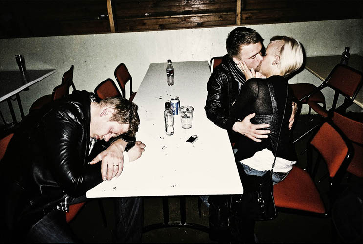
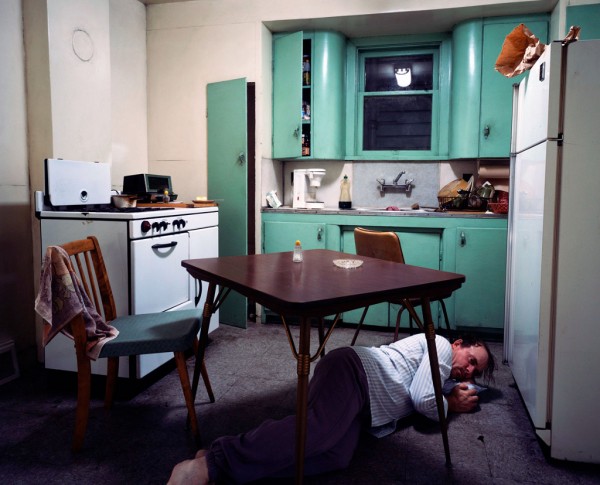
To develop a deeper understanding, read these two texts by David Bate from his book, Art Photography (2016) Tate Publishing. Include images to illustrate both genres of photography and show evidence of reading by including direct quotes from sources and referencing using Harvard system.
New approaches to documentary in contemporary photography David_Bate_The_Art_of_the_Document
On rise of Tableaux in contemporary photographic practice David_Bate_The_Pictorial_Turn
EXTRA READING:
For a contemporary perspective on documentary practice read photographer, Max Pincher’s Interview: On Speculative Documentary To read this interview you must access it online from home as it is blocked the internet filter in school.
Bate D. (2009) ‘Documentary and Storytelling‘ in The Key Concepts: Photography. Oxford: Berg
Bright S. (2005) ‘ Narrative‘ in Art Photography Now. London: Thames & Hudson


