All posts by Megan Hawthornthwaite

Filters

Author:
Category:

ANTHROPOCENE

What is it? a time when the environment is affected by human activities enough to create a distinct geological change.
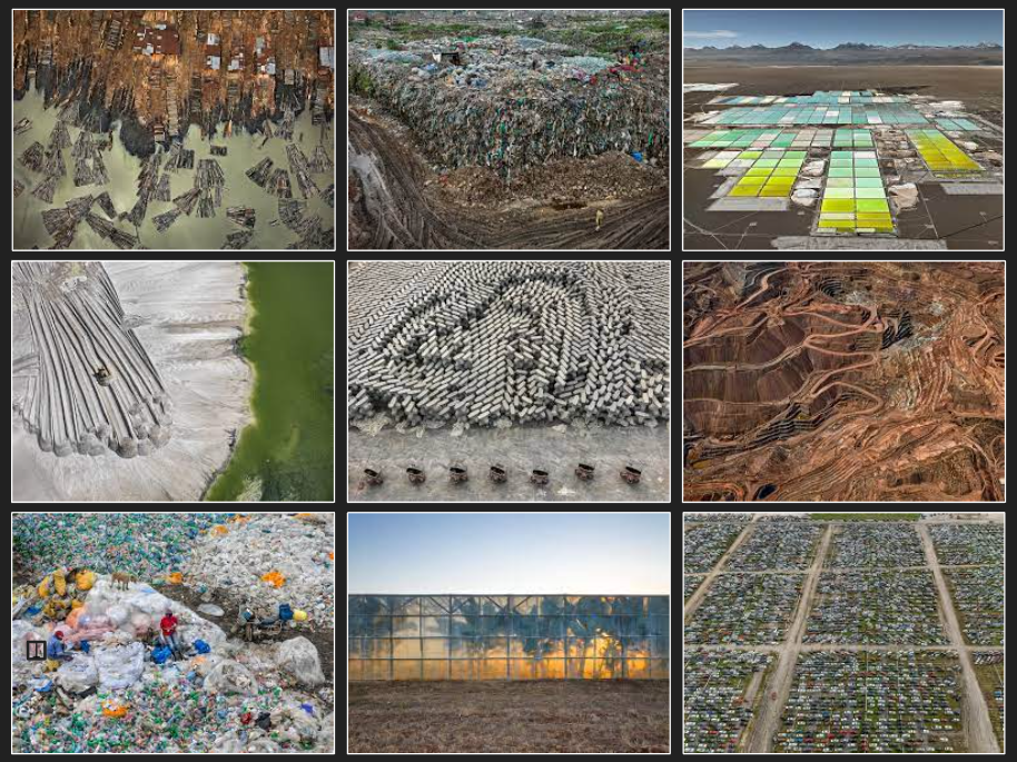
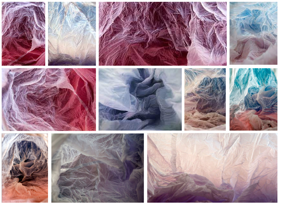
Born in Oslo, Roslfsen graduated from Kingston University with a first degree Bachelor in Fine Art. In her project ‘Plastic Bag Landscapes’ Vilde photographs plastic bags she finds on the streets, by lighting the bag and using different coloured cardboard. She shoots them in a way that creates an imaginary landscape, with a hidden meaning that raises awareness about climate change. This project was to raise awareness of the throw away culture, and Roslfsen hopes to remind viewers to look more closely at their own consumption patterns. Growing up in Norway, her natural thought was to re-create mountainous shapes in this project, reflecting what could be lost/ ruined by the increasing impact of climate change and waste pollution.

“I wanted to do a project to draw attention towards this issue (…) So I landed on creating a body of work where the images are aesthetically pleasing to look at, and the viewer can make up their own minds when they see what the image is.”

I like Rolfsen’s work as it isn’t the typical photography used to raise awareness about climate change. She captures beauty in what is usually seen as an ugly piece of waste. This set of photos also gives the viewer control over what they see, and what impact they feel from it. If I decide to shoot an abstract photoshoot I will try and include this in my work.
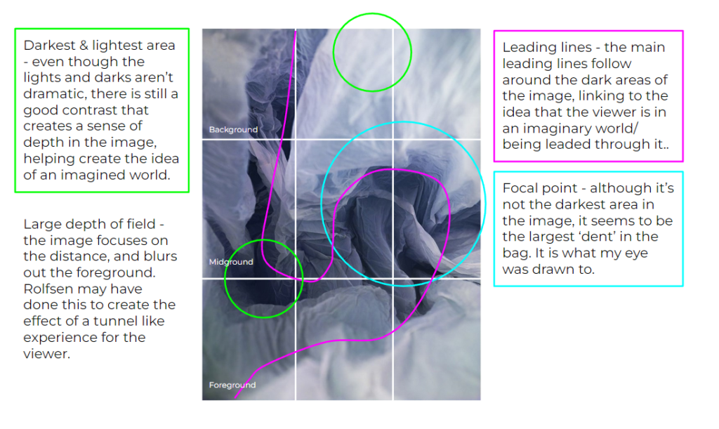
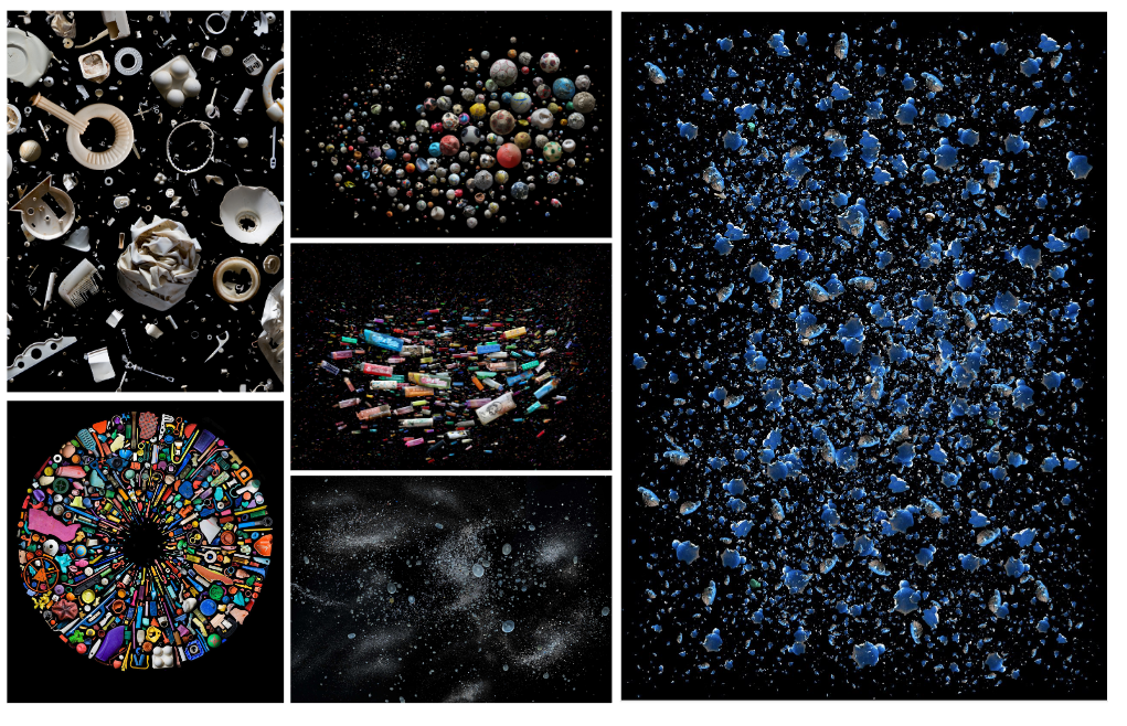
Mandy is a British photographer, who is known ford her international award winning photography. Her work involves marine plastic debris, and she works with scientists trying to raise awareness about the plastic pollution in the world’s oceans. She wants to highlight the harmful effect on marine life and climate change. Published in over 50 different countries, Barkers work has been included in the National Geographic, TIME Magazine, The Guardian and many more. Her work has also been exhibited world-wide, and her book ‘Beyond Drifting: Imperfectly Known Animals’ was selected as one of the Ten best photography books of 2017. She has gone on many expeditions, such as joining scientists on a sail from Japan to Hawaii to examine the accumulation of marine plastic debris from the Tsunami. Barker has spoken internationally about her work, attempting to engage people with plastic issues. She says that engaging the younger generation is key to her practise to inspire change, and Barker has  taught multiple workshops worldwide  with local communities and schools. She states “The aim of my work is to engage with and stimulate an emotional response in the viewer “.
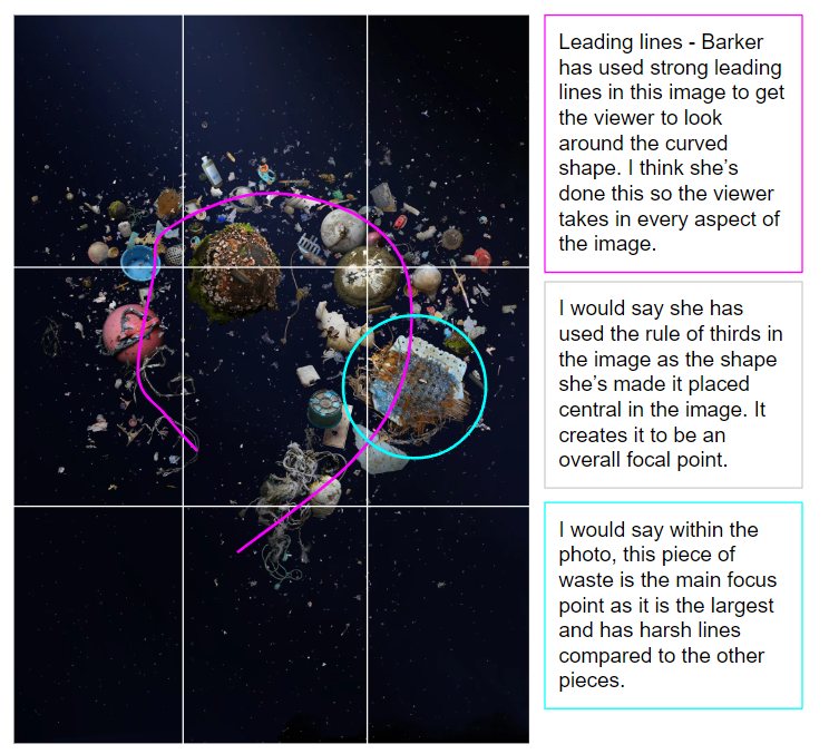
I like the way she photographs the waste and creates a shape/ flow with it. I might attempt to do this if I do a studio shoot.
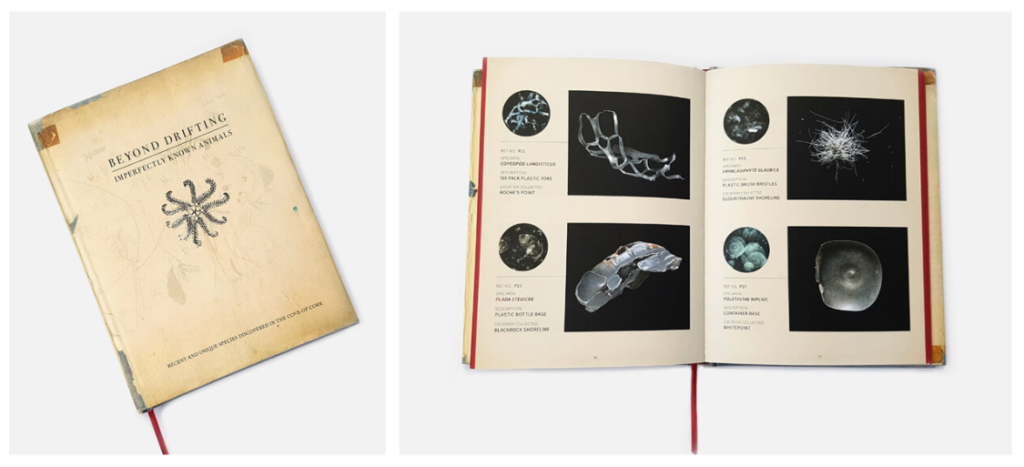
Beyond Drifting: Imperfectly Known Animals

Comparing Rolfsen and Barker

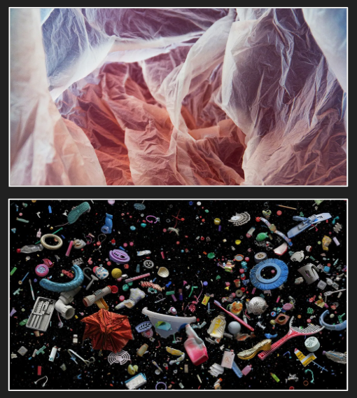
At first glance, it seems that the two photographers contrast in their work. Rolfsen uses bright colours with lots of light, and barker has darker more intense images. However the meaning behind them is the same. Both artists are collecting waste, and attempting to raise awareness about the global issue of waste. They both have quite different formal elements such as texture. Rolfsen has the same texture throughout the image, whereas Barker’s image has hard, soft ridged and more textures in. The lines and repetition also contrast because Rolfsen’s photo has repeated lines throughout creating an overall shape on the image, but Barker’s has repetition in a different form. Here subjects are all unique and there are no lines. The images were taken from different angles, the first is side on, the second is a birds eye. They are similar in the idea that they both have bright colours. Overall the images formal elements are contrary to each other, but the meaning they hold are the same.

Jaromir Funke
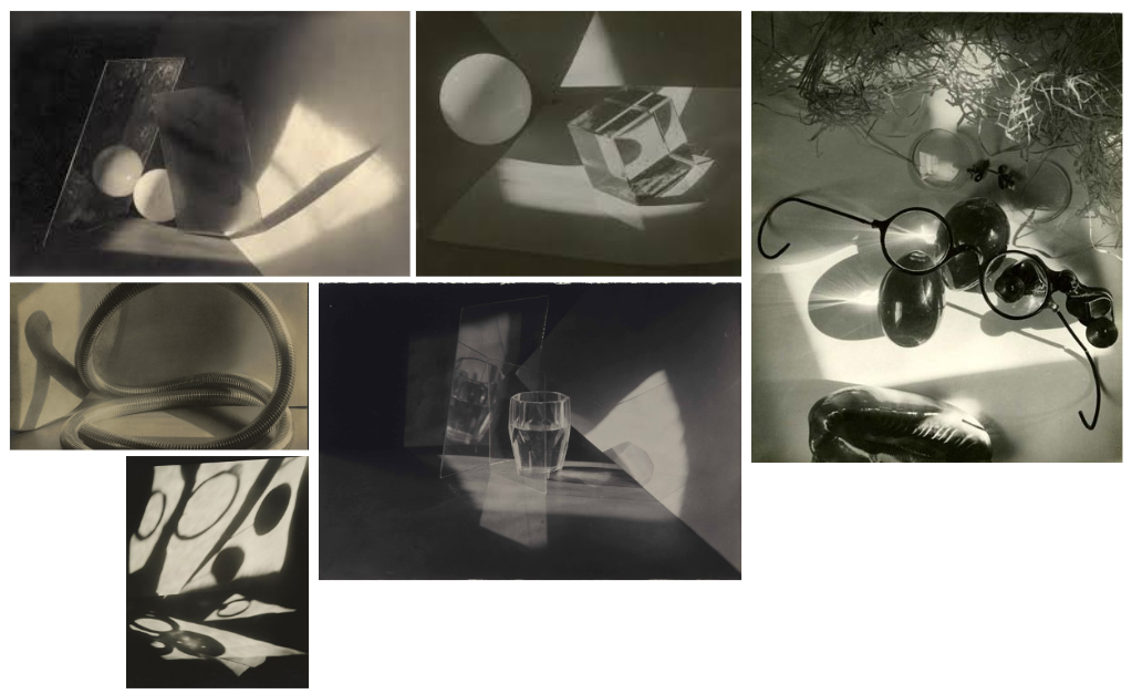
Jaromir was known for creating clearly focused studies of simple objects around the 1930s. He then turned to the production of carefully arranged still life photos, emphasizing abstract form and the play of light and shadow. Although his work was not to do with the environment, I like his style and feel I could possibly use that to photograph waste. I would use the studio to create the right lighting and have a simple backdrop.

Constructed Seascapes

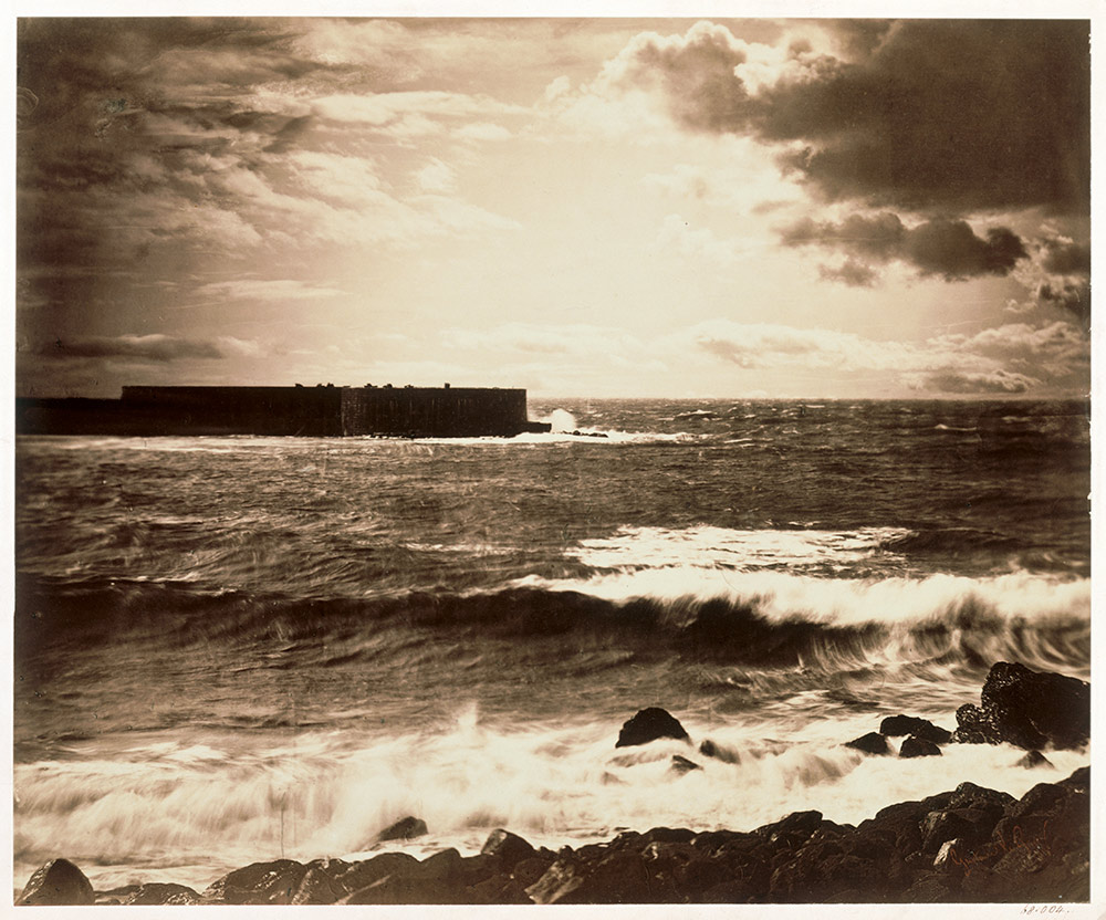
Gustave Le Gray: ‘The Great Wave’ 1857 – a combination of two negatives, split at the horizon.http://www.vam.ac.uk/content/articles/s/gustave-le-grey-exhibition/
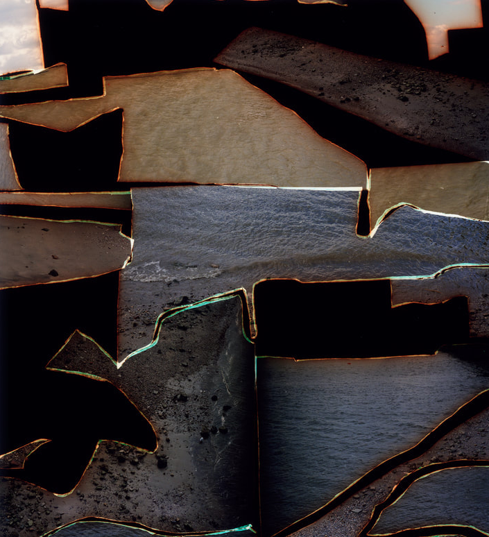
Dafna Talmor – ‘This ongoing body of work consists of staged landscapes made of collaged and montaged colour negatives shot across different locations, merged and transformed through the act of slicing and splicing.’ https://fw-books.nl/product/dafna-talmor-constructed-landscapes/#largeimg

Both could be described as landscape pictures. What kinds of landscapes do they describe?
  • ‘The Great Wave’ describes an idyllic and romanticised landscape. Presenting a scene of the coast in France, Gustave describes what seems to be a stormy day. The thick and dark clouds creates an intense environment, and the choppy waves on the bottom half compliment this. Although they are separate negatives merged together, he creates a overall idealised scene.
  • Talmor’s image describes a more abstract image. Her technique of collaging images give an almost nostalgic sense to her work. The original images were probably similar to Gustave’s – romanticised. However she has leant away from the simple way of presenting work. The image shows splices of the sea, and gives the viewer a chance to see the scene from multiple images and angles.

What similarities do you notice about these two pictures?

They are both based around images of the sea, however the real similarity is the idea of using more than one image. Both artists combined more than one negative to get a final product. They are also both faded. Gustave’s image is faded and has texture due to its age, however Talmor’s photos are recent. She may have created this effect to give the collage life and a story behind it.

What differences do you notice?

The first image is quite simple, and the second clearly makes the viewer take time to understand what’s going on. Gustave’s photo is from one angle and is one image, contrasting to Talmor’s collage.

What words/phrases best describe each of these landscapes?

  • I think the ‘The Great Wave’ is best described as romanticised.
  • For Talmor’s photo I would say its a mixture of words: Abstract, creative and nostalgic. I think this because the faded edges, the tint on the images, the collage and the idea of the beach creates a sentimental though of childhood.

Typology Photoshoot

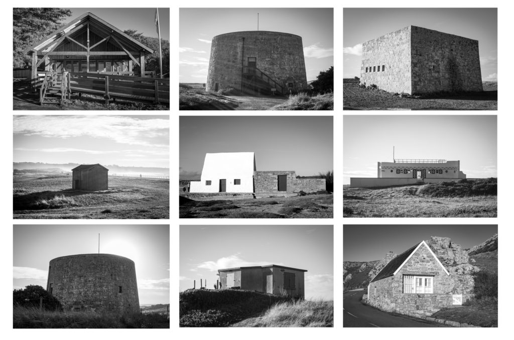
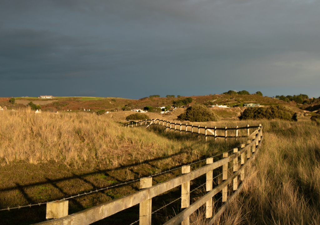
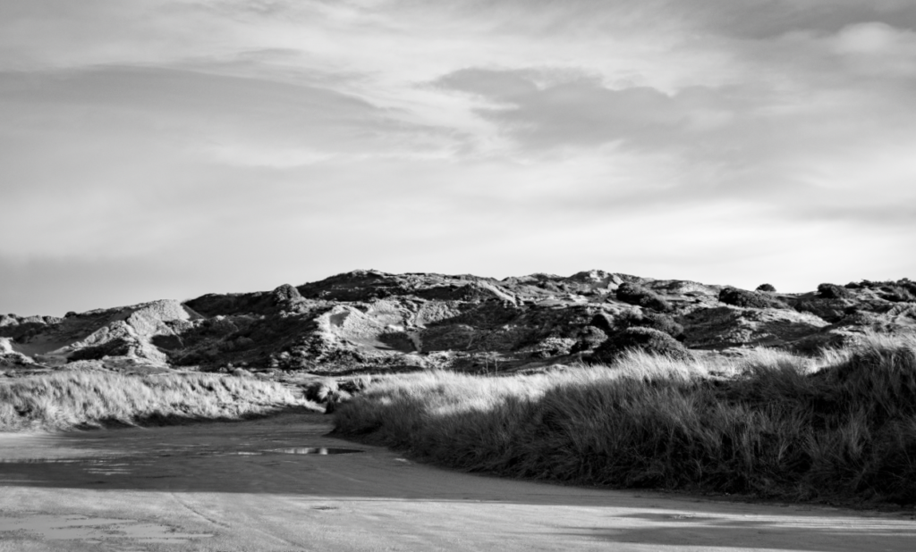
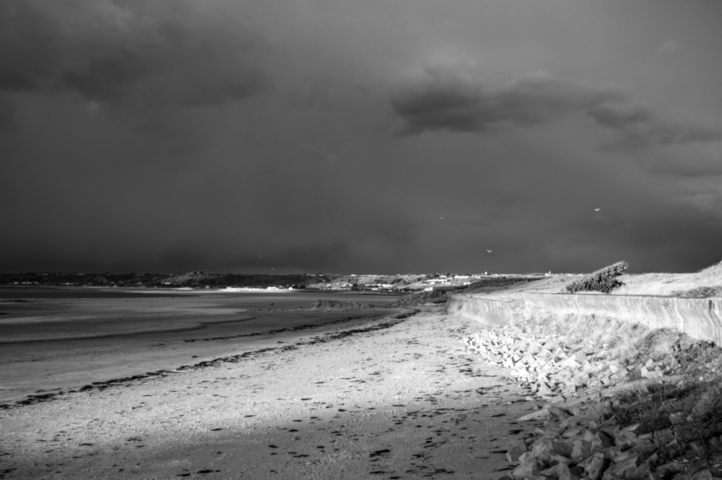
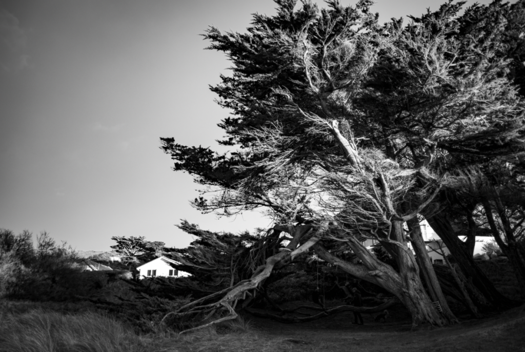
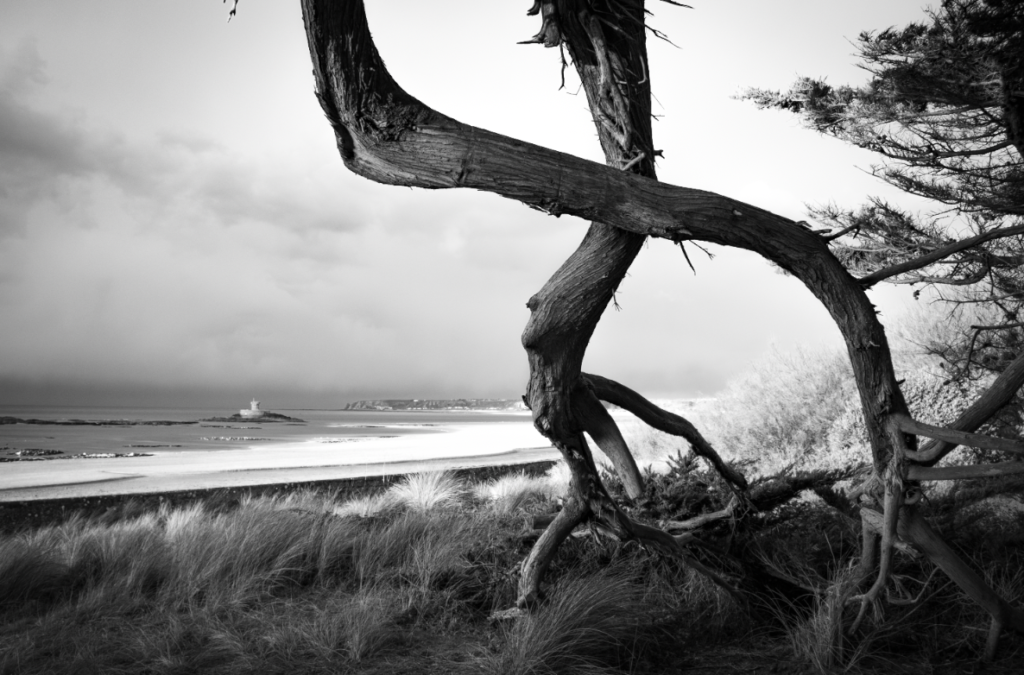
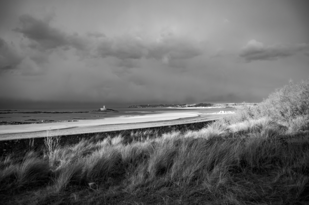
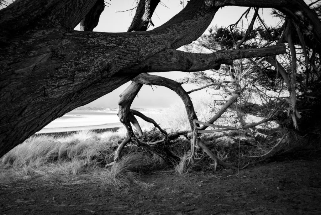
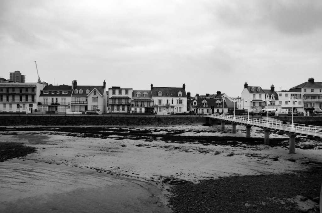
I ended up photographing different buildings along St Ouens Bay that didn’t fit into the ‘ordinary’ design of typical buildings, or were hidden by nature.

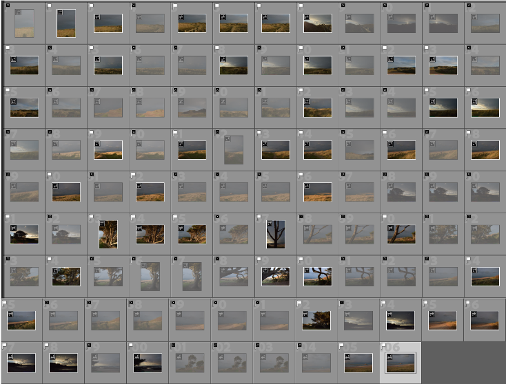
Contact Sheet

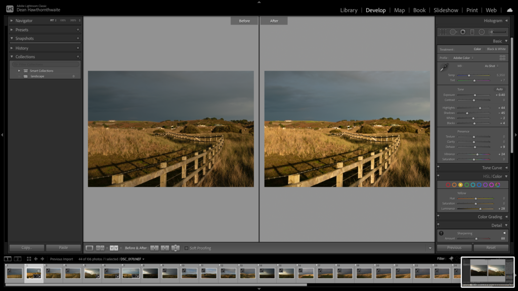
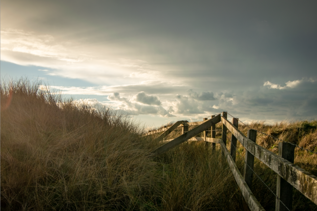
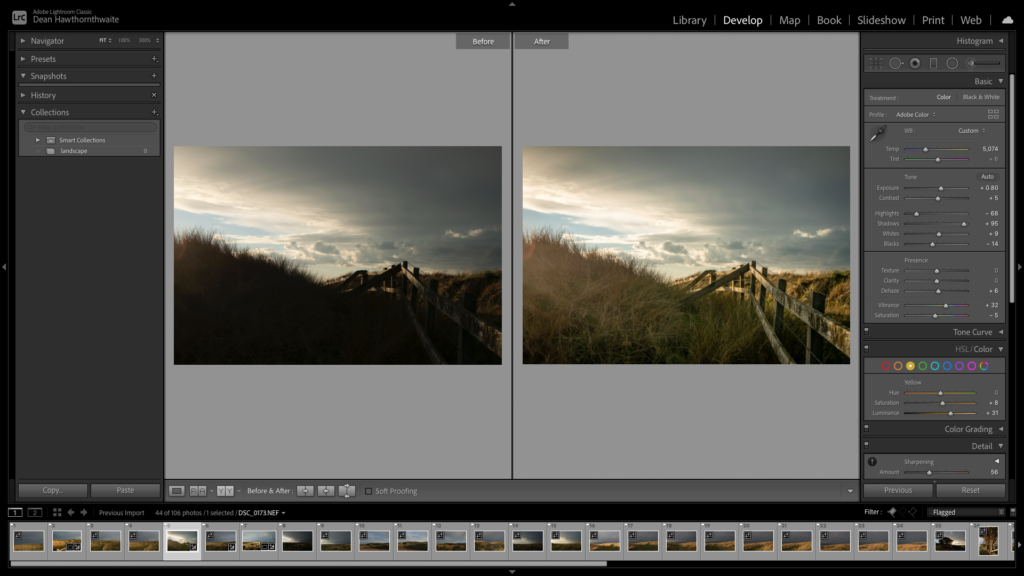
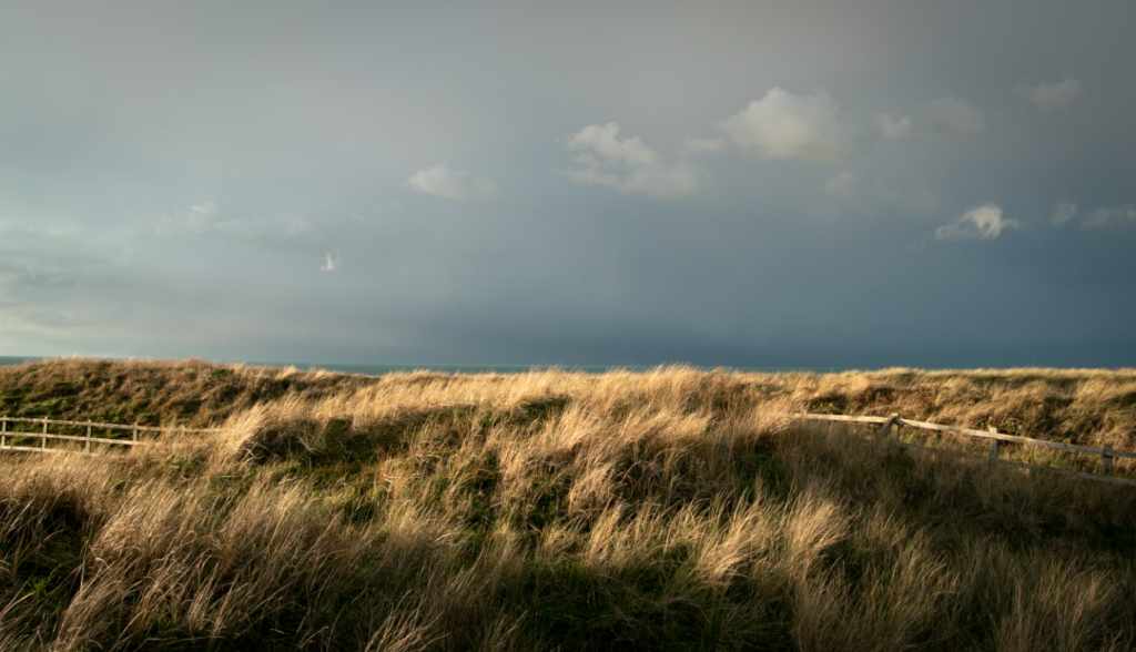
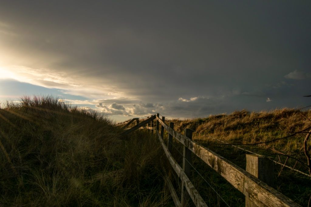
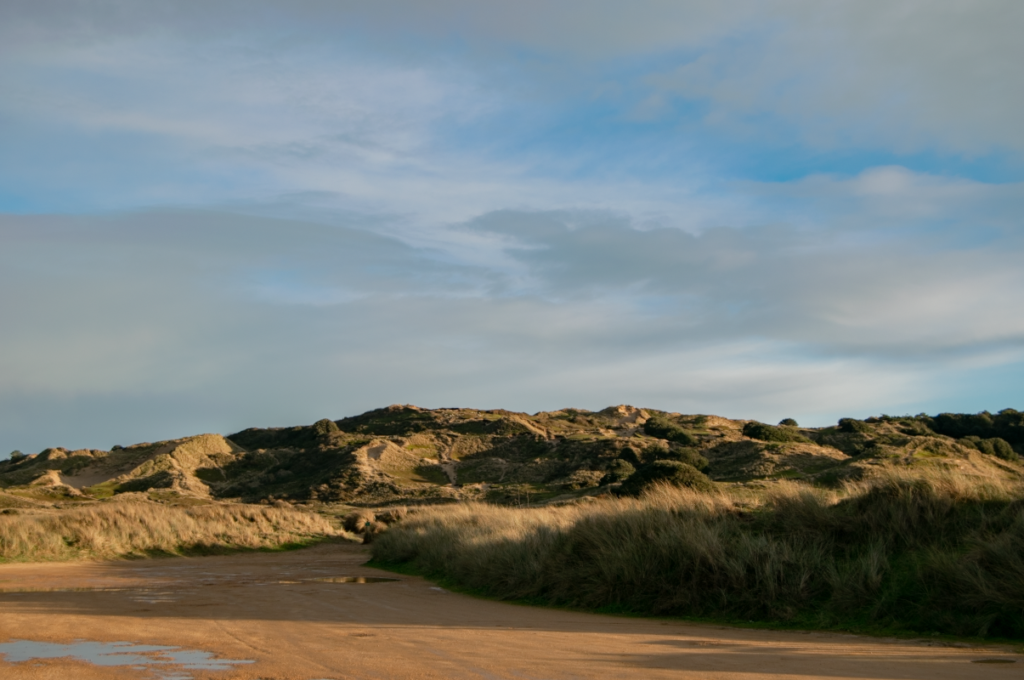
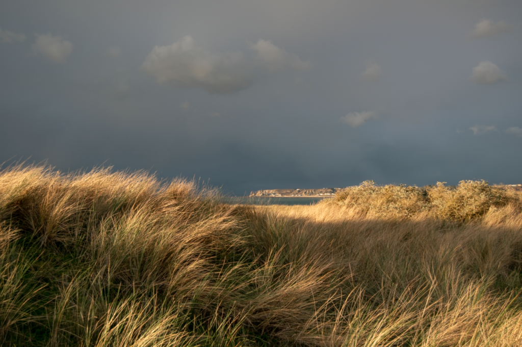
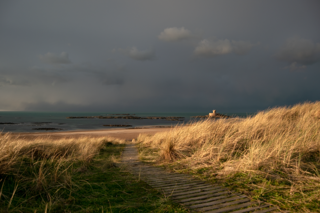
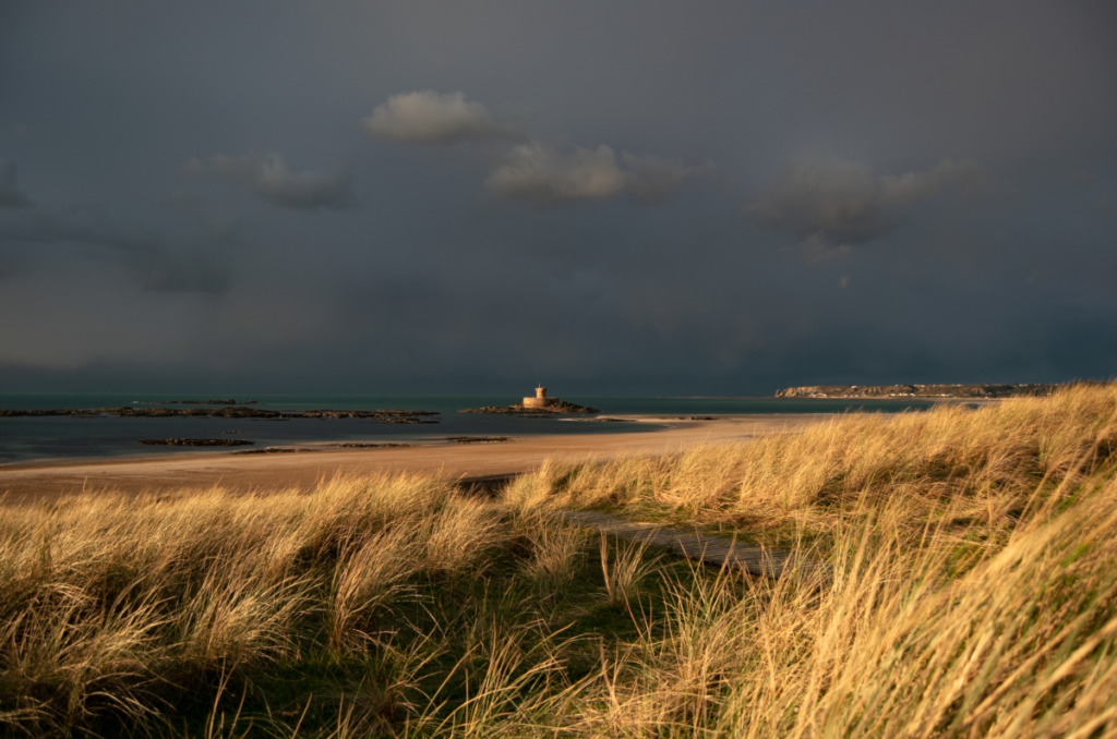
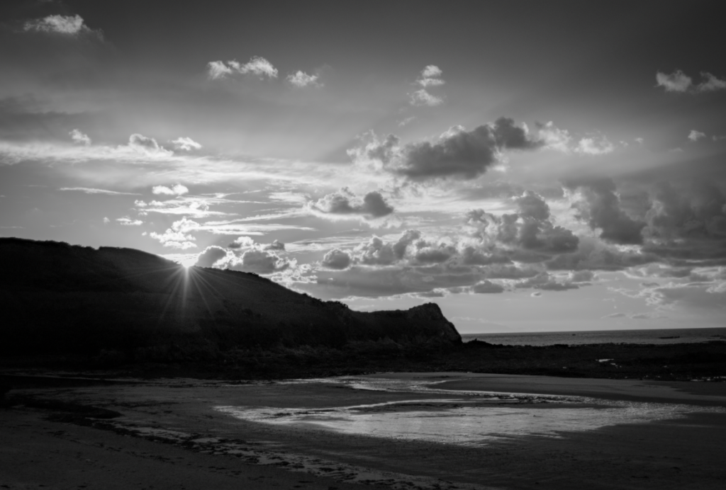
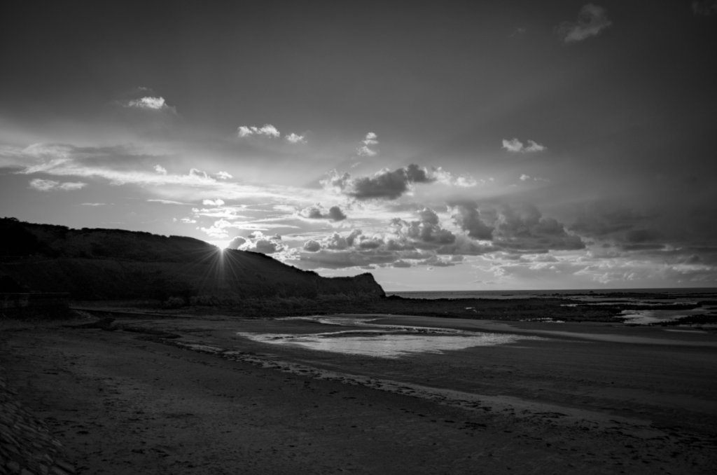
There was natural backlighting so I struggles to create the right exposure. To fix this I did exposure bracketing with some of my photos.


Overall I’m not completely happy with how the shoot turned out because I feel like it doesn’t capture typology in the right way. This is because the buildings are all different shapes so it doesn’t look like an general similar group of photos. However I like that I managed to photograph photos that belong to the same area and holds history.

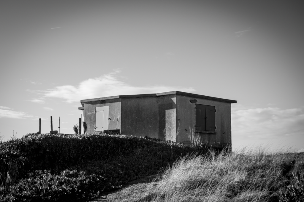
My favourite photo from this shoot is this one because I really like how the building is solitary and the way the sunlight hits the fog creates warm affect. I think the contrast between the background being misty and faded and the building being clear and standing out is also creates a good composition.

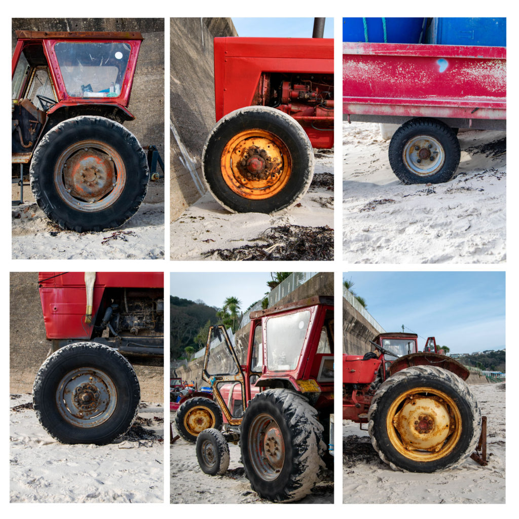
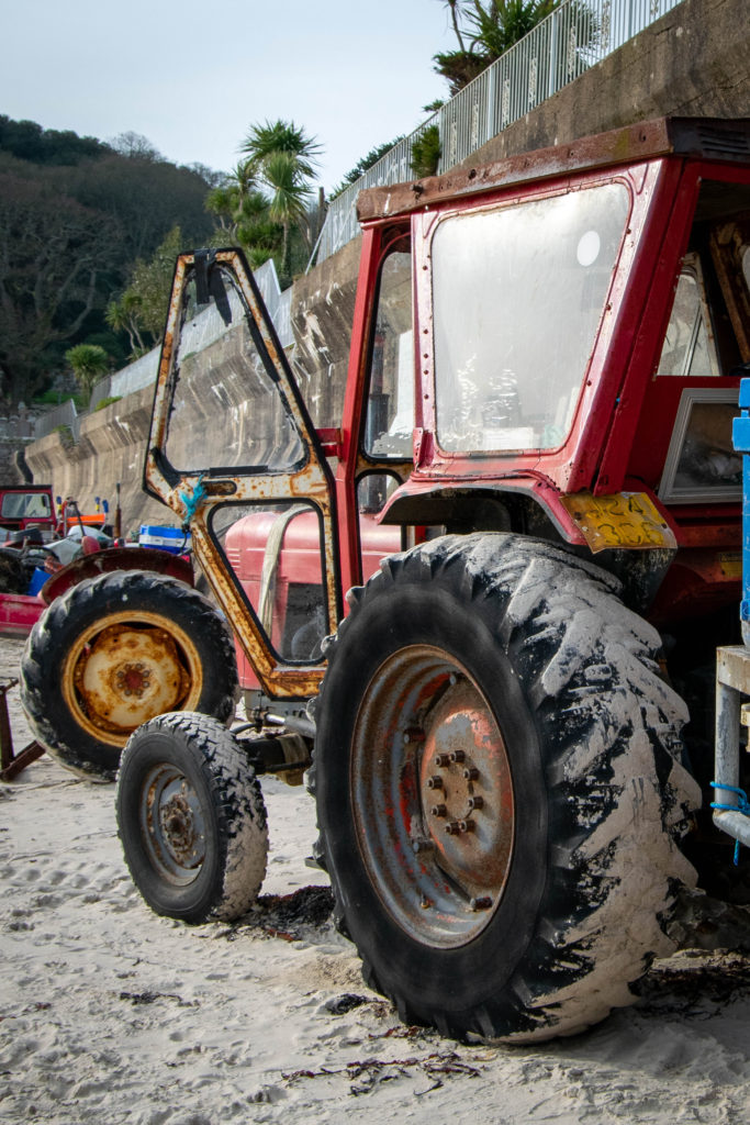
For my second shoot I went to St Brelade Bay and photographed wheels. I liked the variety of texture and size on them and thought it would create a good subject. I really like how the shoot turned out, however I think I could have improved the shoot by finding more wheels as the typology is quite small. I like the running theme of red throughout the images because it links them together and the complete typology has a general rustic feel.

My favourite image from the shoot is this one because of the angle it was taken. It shows a different perspective to all the other photos and includes three of the wheels. I like that the focal point is the first big wheel, then the next two create leading lines to the other side of the image. I also think the fact that it doesn’t particularly follow the rule of thirds and has no central point makes the image more interesting.

Typology Photoshoot Plan

What? – I have a range of ideas that I could photograph:

  • Victorian front doors
  • Historical landmarks/ towers
  • Old/ Victorian houses
  • Road signs
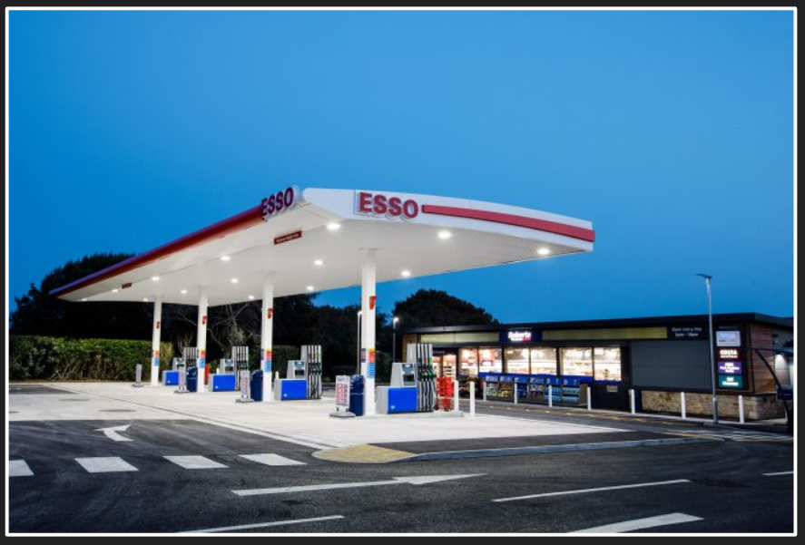
  • Petrol stations
  • Graffiti

When? – for all of them I would photograph in the day, and make sure it is a plain sky/ light so my subject is the main focal point (using Bernd and Hilla Becher’s technique). If I were to photograph petrol stations I would do the shoot at night because I want to photograph the lights and create a dramatic set of images.

Where? – for doors and houses I might choose town as there are a lot of old buildings and houses. If I take the landmarks I will travel around the Island and capture the different towers.

How? – I’ll use my DLSR camera, and probably use the Tv/A setting so I can adjust the light and if necessary do some different exposure bracketing. For a night shoot I would use a tripod so my images are sharp as I would need to use a long shutter to fully capture the light. For this I would use shutter priority.

Typology

What is Typology? Typology is typically a body of work that holds consistency throughout the work, usually in the environment, subjects and presentation.

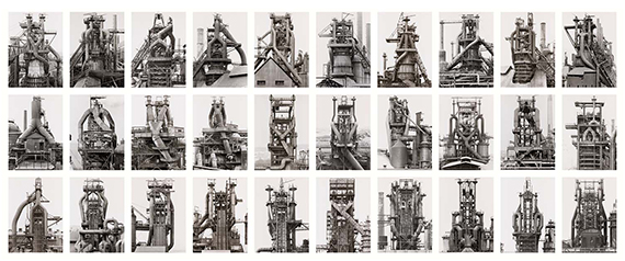
Bernd and Hilla Becher

1934-2015

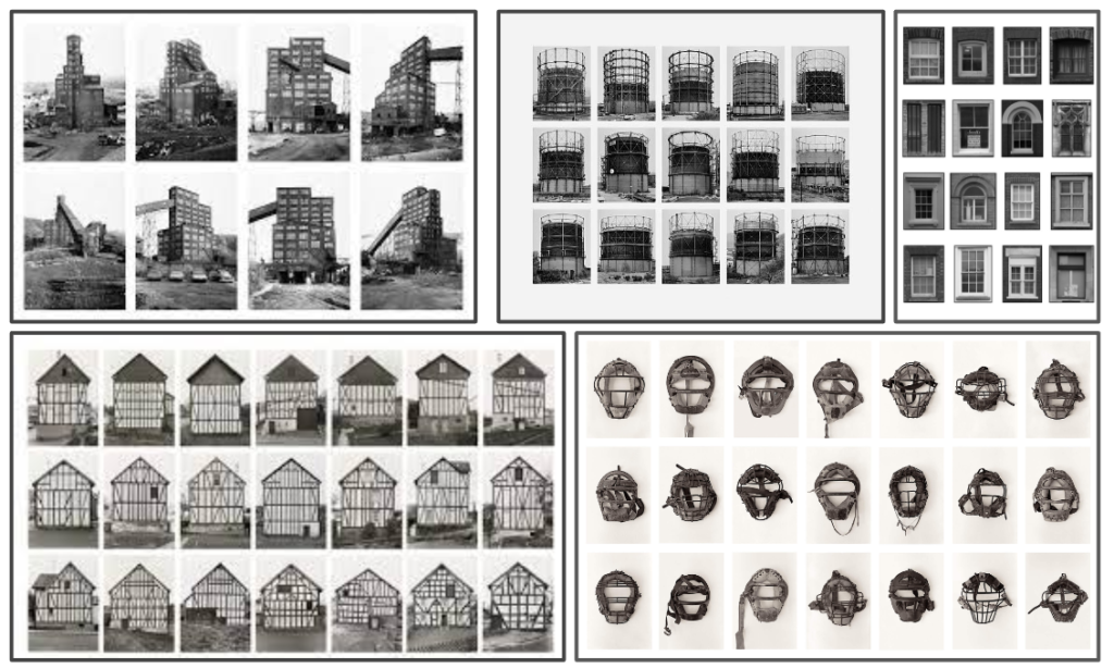
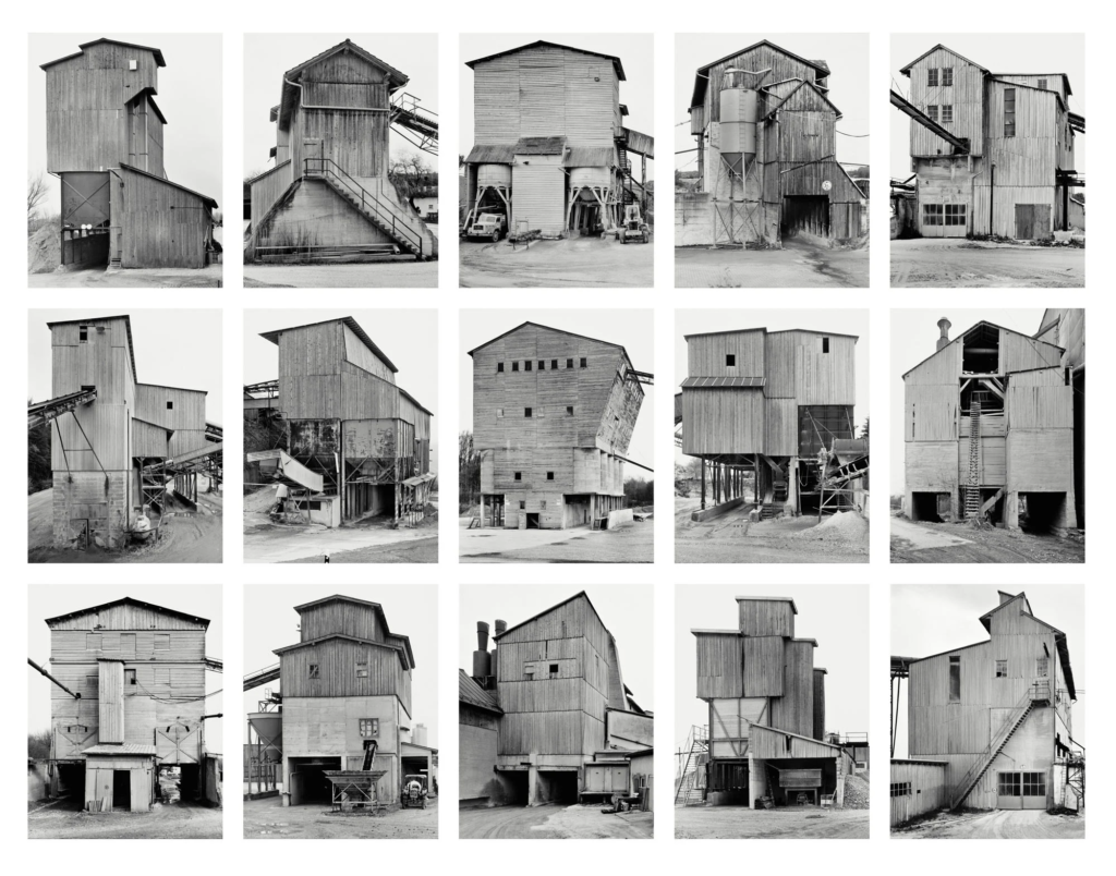
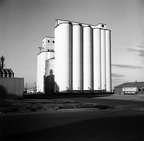
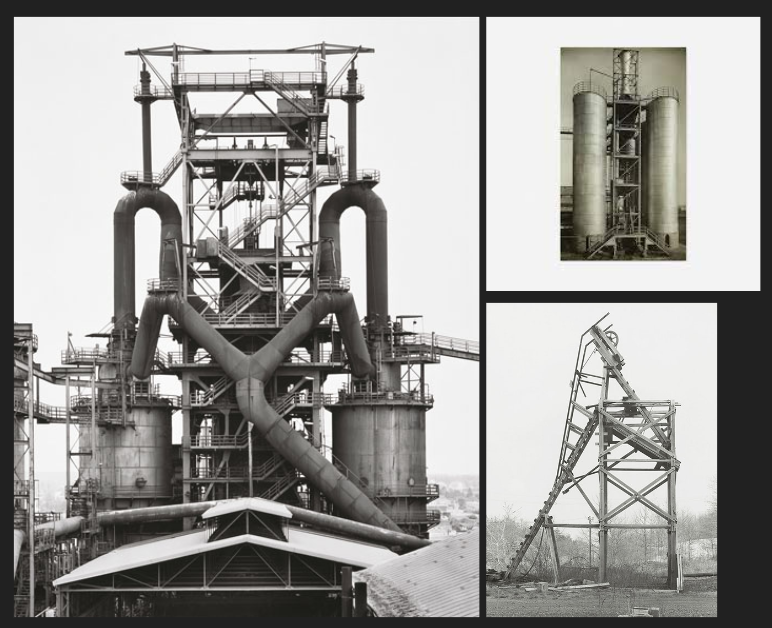
Bernd and Hila’s main aim was to capture disappearing and changing landscapes at the time in Germany. This connects with the New Topographics idea of not only recording the moment in time but prompting the viewer to consider the subject’s place in the world. They were inspired by other photographers and styles such as Karl Blossfeldt, August Sander and The New Objectivity. they would photograph similar buildings from the same angle, and space away from it, then create a grid with all their images. They used the same ideas and rules each time they did a shoot. The main rule was to photograph on a day with simple light, and they would wait for a big cloud, winter or dawn to do this. Hilla said this was because they wanted the buildings to stand out and be the dominant subject. The couple didn’t want the image to distract from the main focus, and needed the main contrast and detail to be in the buildings.

‘buildings where anonymity is accepted to be the style’.

Kevin Bauman

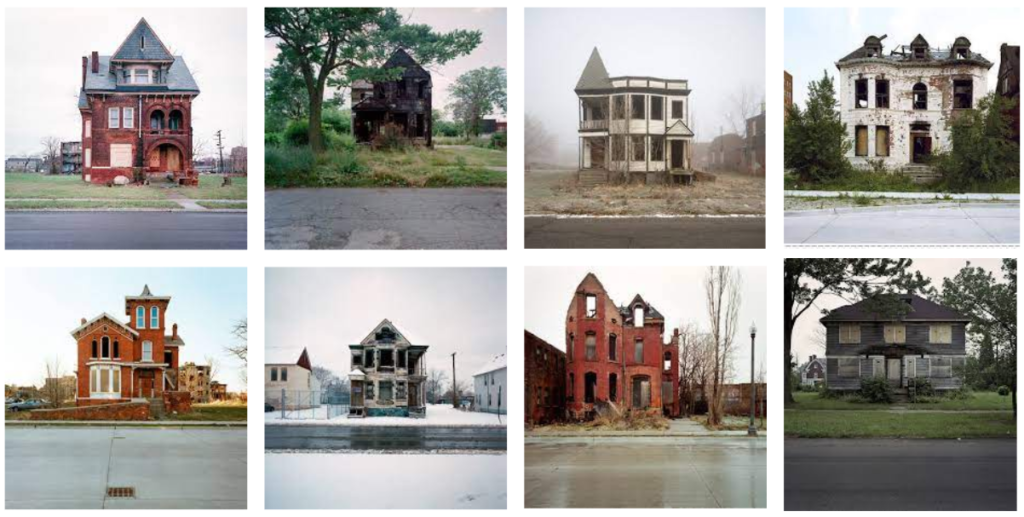
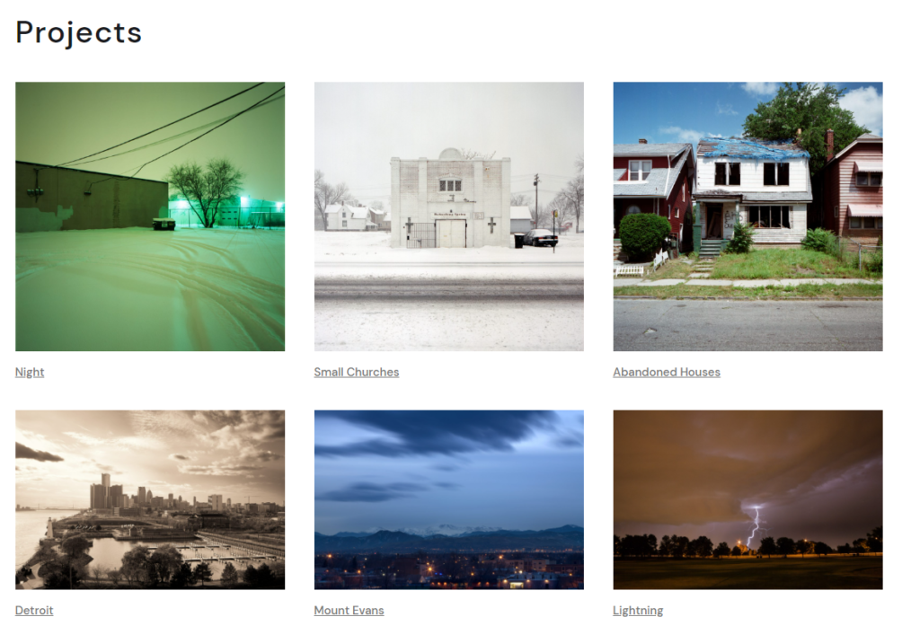
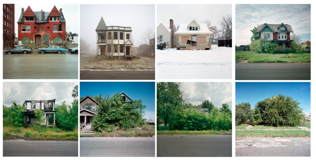
Bauman is a Montana based photographer specializing in architectural, interior, and industrial photography. His work is used in multiple architectural and interior design clients. One of his popular projects is ‘100 Abandoned Houses’. https://www.100abandonedhouses.com/ – I like the way he documents houses that once had a life, and tell a story in the way they are presented. Using typology to present these photos creates an overall story and feeling that can be told. I like the way you can click on an image and zoom in to see the full detail. I think the repetition of typology in his work can first off be seen as boring, and similar between each photo. However it is a piece of work that needs time and attention to be fully appreciated.

I like how his photos from ‘100 Abandoned Houses’ can be organised into a ‘story’ from fully uncovered houses, to completely surrounded and hidden houses. The fact that its almost showing nature taking back it’s habitat is like an opposite of typography. It also displays natural decay and could possibly represent death.

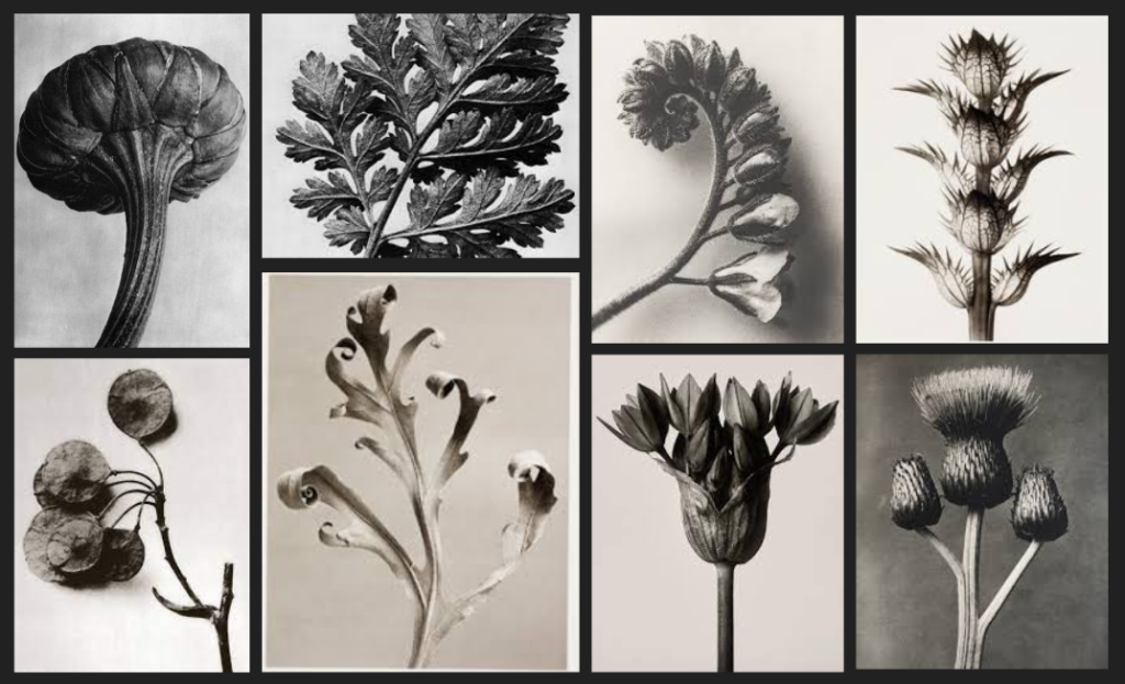
Karl Blossfeldt

1865-1932

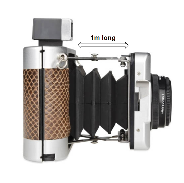
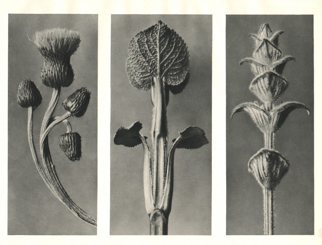
Blossfeldt also used typography in his work, except he photographed natural subjects. He built his own camera out of wood that had lenses capable of magnifying his subjects up to 30 times their natural size, and had 1m long bellows. This meant he got unique images. Although he began his career as a sculptor, Karl later was best known for his precise photographs of plants. His images have high detail considering he built his own camera, and the technology at the time was fairly new.

New Topographics – Modern Development in Jersey

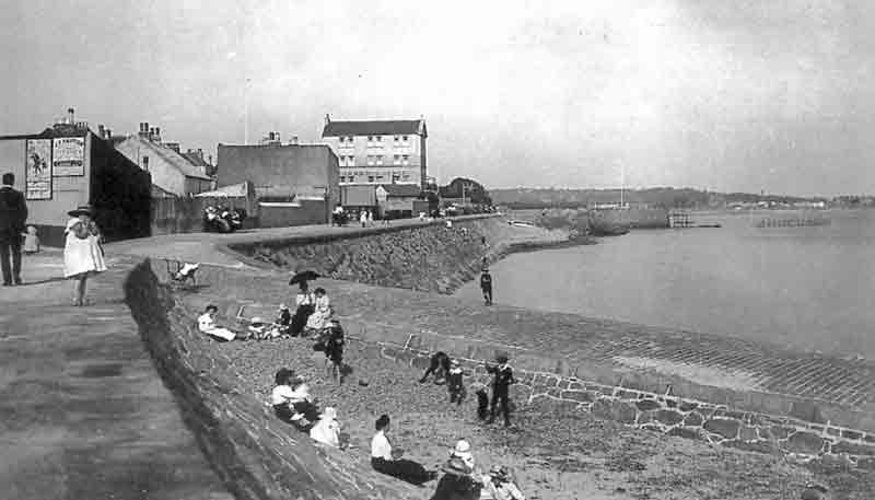
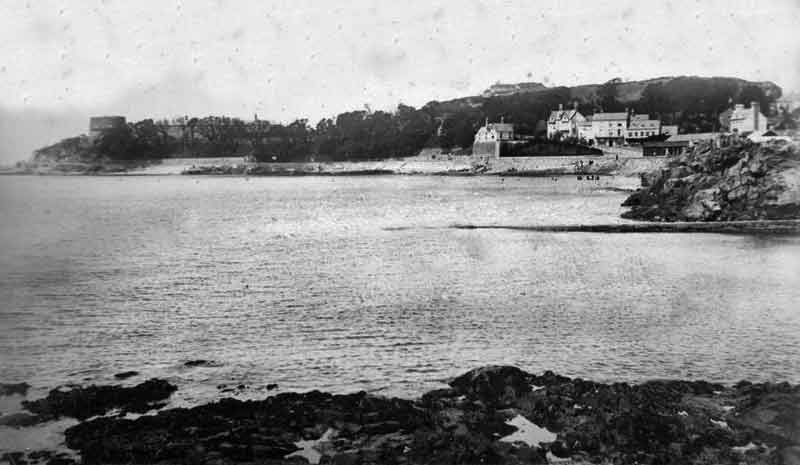
New Topographics is photographing a man-altered landscape that contrasts modern development with natural landscapes. This development can be seen in many places in Jersey, especially La Collet.

La Collette in the 1900s

The evolution of modern development has taken over this area of Jersey over time, which is shown in my photoshoot that I did there. This growth is what photographers such as Robert Adams and Stephen Shore tried to raise awareness about through their photography. This is what I attempted to recreate in my photoshoot to show how the nature and landscape has dramatically changed over a short amount of time due to modern development.

1900s
2022
1900s
2022

New Topographics photoshoot

Photoshoot Plan

Where: Havre De Pas, La Collette

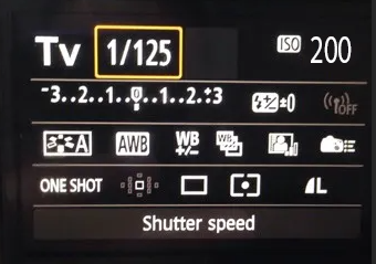
What: DSLR camera, Tv setting (shutter speed 1/125, ISO 200)

When: around 2pm-3pm when there is light

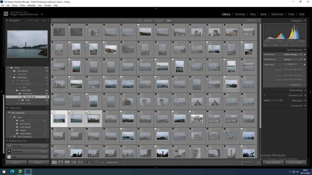
Contact Sheet

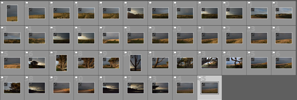
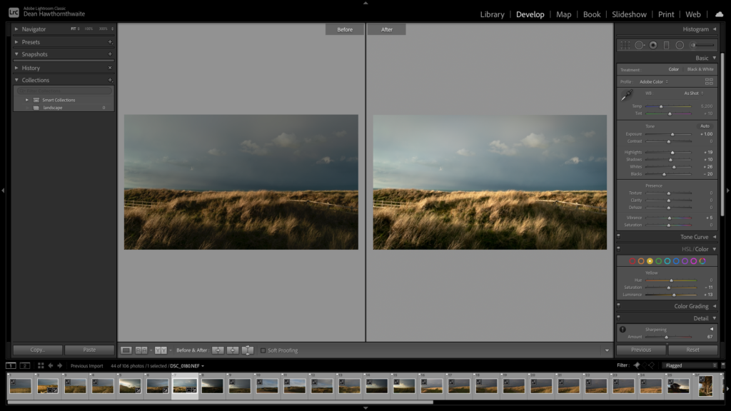
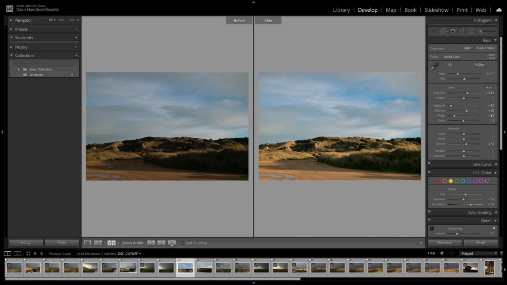
I flagged the images I want to edit
I only has a few photos that I think were good enough to edit as the light was flat
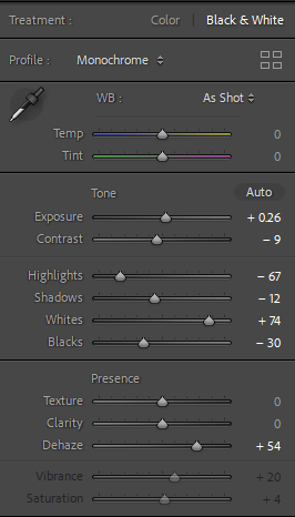
For most of the edits I tired to get as much range of lights and darks as possible, and to add definition I added Dehaze.

Final Edits


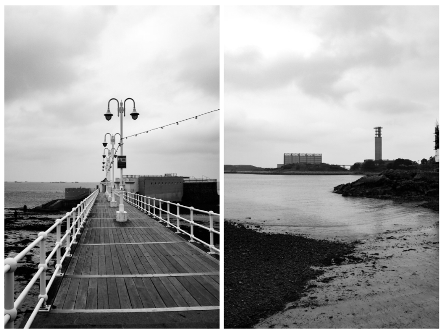
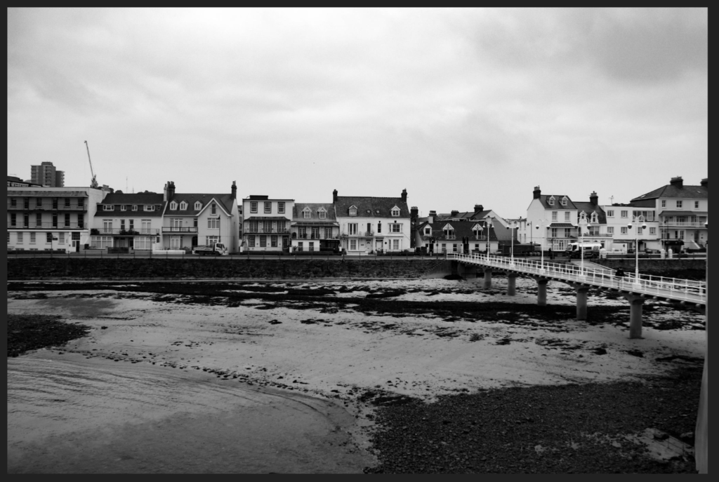
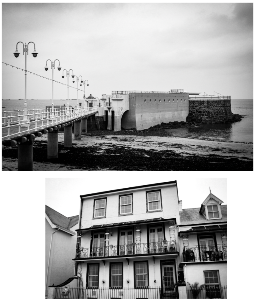
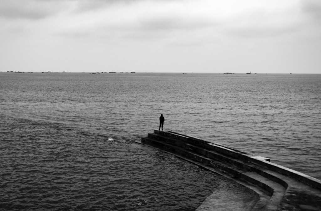
My favourite photo from the shoot is this one because I like the simplicity of the image, and how the person is central to the end of the pier. However I don’t think it fully links with the idea of new Topographics.

This image has an empty alt attribute; its file name is image-137-1024x675.png
My Photo
Robert Adams Landscape Photography used the great Colorado outdoors.
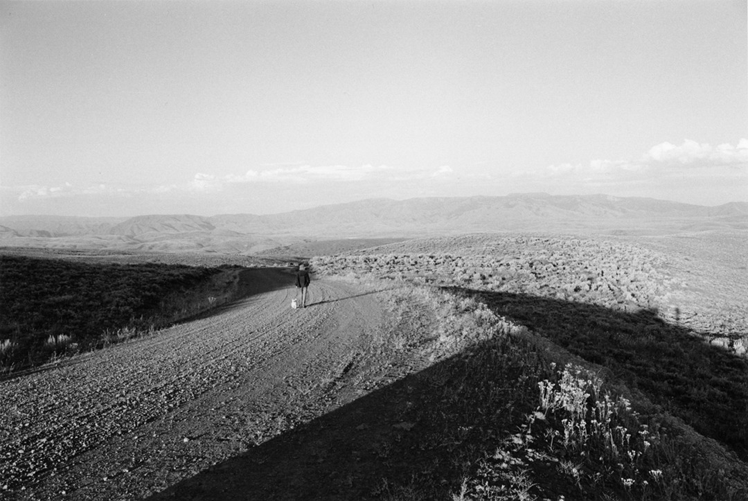
A Roberts Adams photo similar to mine
Robert Adams Takes Photos That Face Facts - WSJ
Robert Adams

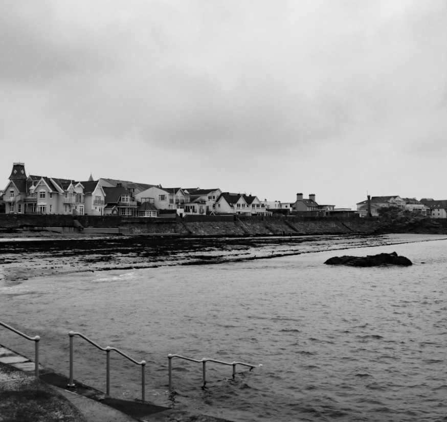
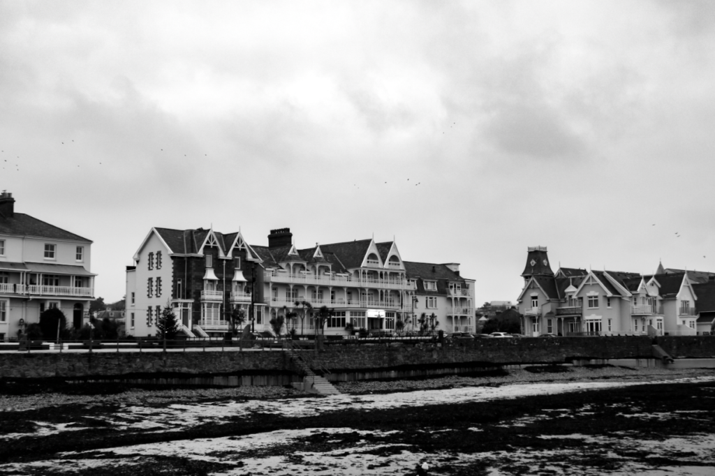
I think this photo is the best image that fully complies with new Topographics as it has man made buildings from the early 1900s, but also captures the beach. It presents the idea of architecture and buildings talking over natural areas.

This image has an empty alt attribute; its file name is image-135-1024x678.png

I feel like my image relates to this image by Adams as it shows the development of homes and life in the middle of a natural environment.

The Place We Live - Photographs by Robert Adams | LensCulture

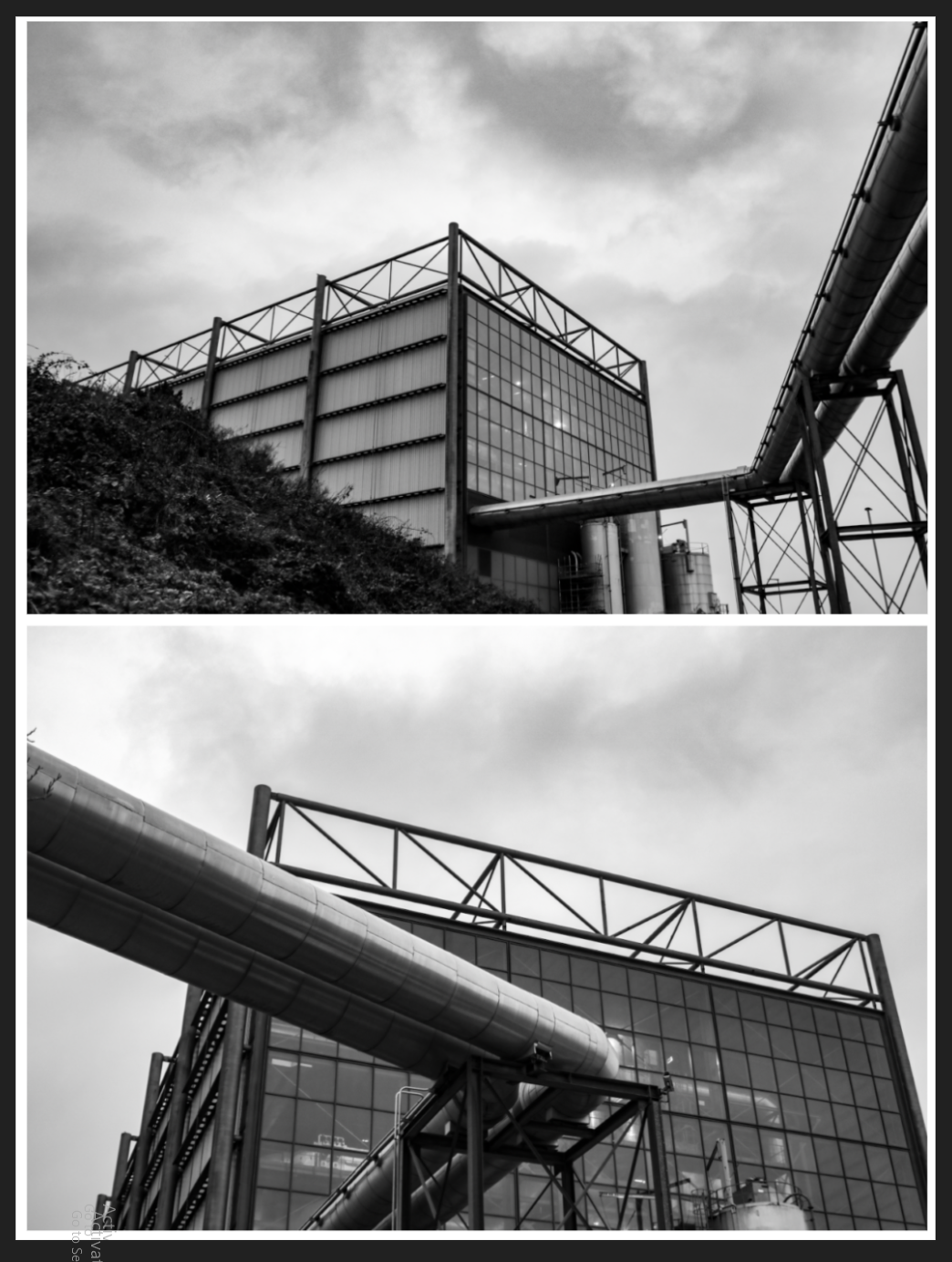
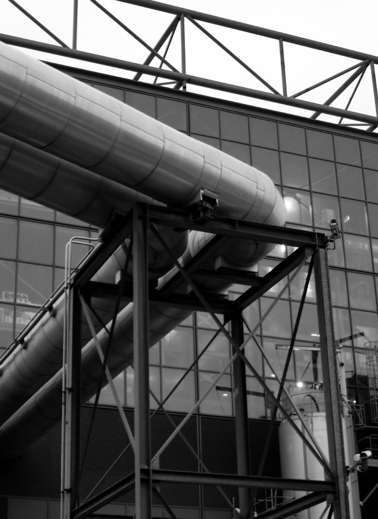
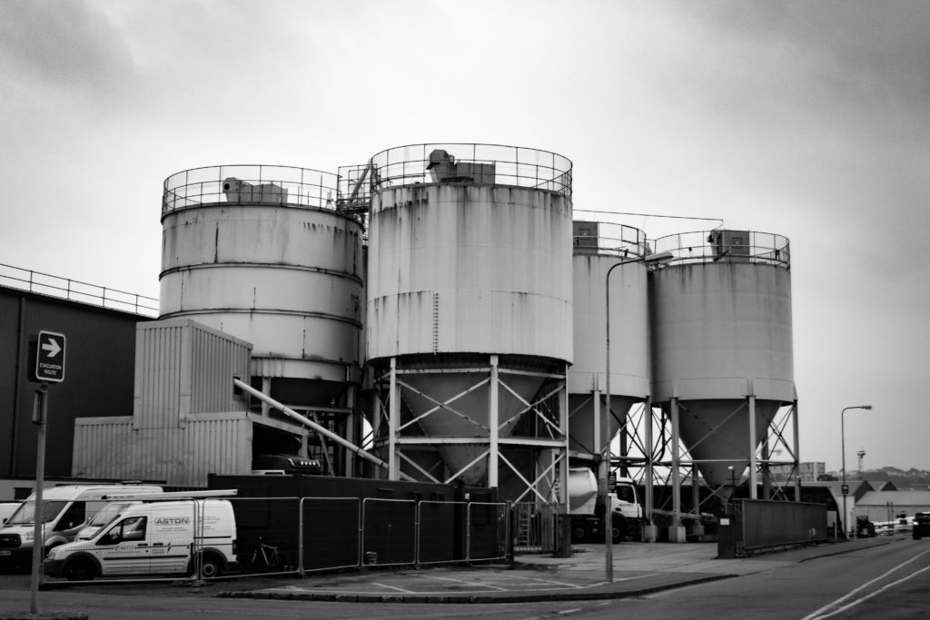
I feel like my images of the power plant relate to Frank Gohlke in the idea that he captures the industrial landscape, possibly in an abstract sense.

This is also similar to Albert Renger-Patzsch when he photographed Gute Hoffnungs Hütte blast furnace.

He also created typology through his work from this shoot.

The New Topographics

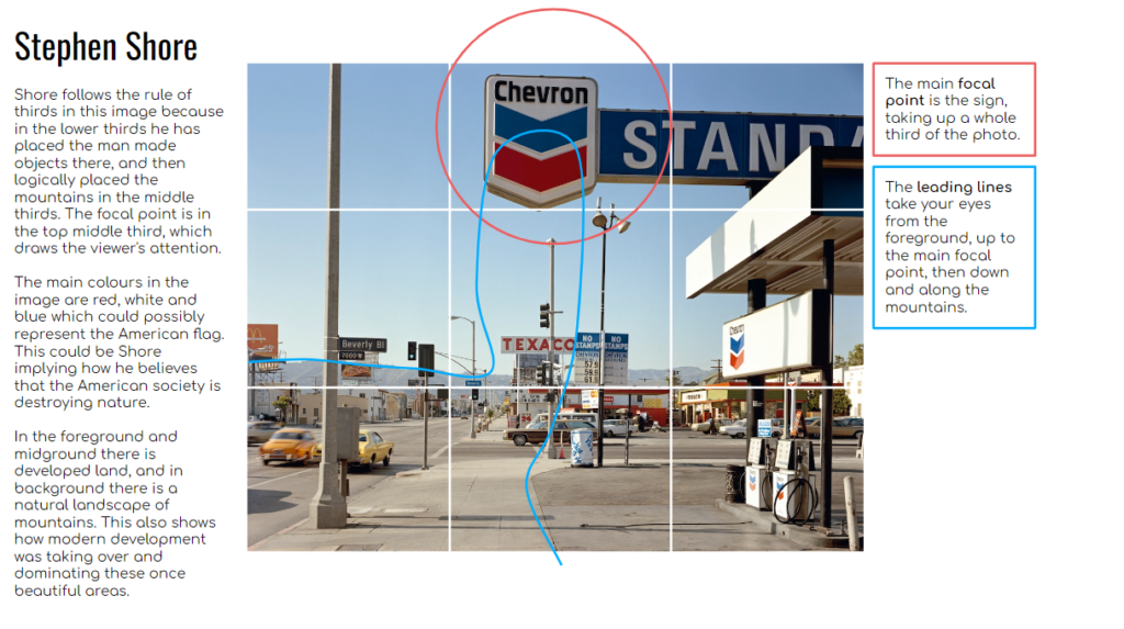
New Topographics is photographing a man-altered landscape that contrasts modern development with natural landscapes. This type of photography gives an insight as to how man-made developments were taking over nature. Unlike Ansel Adams, it shows the truth behind this issue and shows it how it is.

Robert Adams

Robert Adams was known for using the style of New Topographics in the 1970s, after releasing his book The New West and his participation in the exhibition New Topographics. He mainly photographs in California, Colorado and Oregon, where he captured his vision that was created by his joy for natures beauty. However he noticed this was exploited by the urban and industrial growth that had ruined it, and he managed to capture this in a simple yet effective way.

Robert Adams | Photography and Biography

What was the new topographics a reaction to?

It was a reaction to the natural landscape being eroded by industrial development. The photographers at the time wanted to raise awareness and rebel against this development. This caused the idea of new topographics photography to come about, and photographs were taken that are now well known and honoured.

An example of a photographer who did this is

Stephan Shore

Analysis

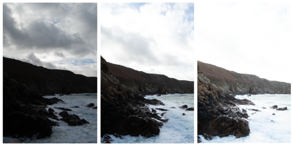
exposure bracketing

Exposure bracketing is a technique used to create a HDR (high dynamic range) photo at the end of a shoot.

It is used in low lighting, and done by taking around three of the same images, but with different exposures in each. One over, one under and one normally exposed.

What is Exposure Bracketing?

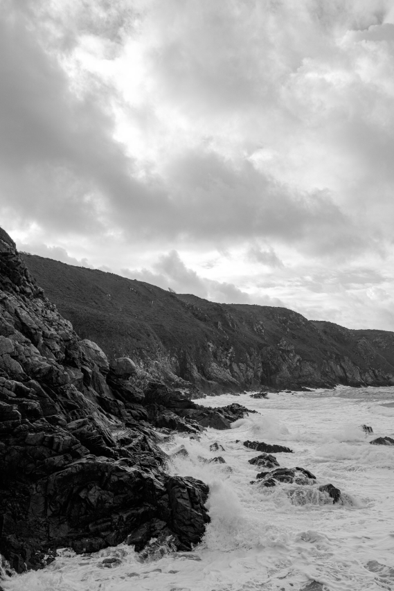
I experimented with this one my shoot as the light was low.

This meant I could use the photo with the best light, and determine how to edit my final image.