All posts by Megan Hawthornthwaite

Filters

Author:
Category:

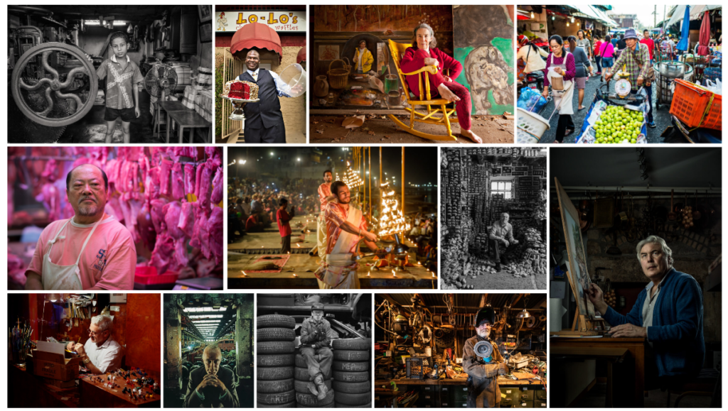
Environmental Portraiture

What is environmental portraiture? It is a planned portrait photoshoot that captures subjects in their natural surroundings instead of in a studio or other artificial setup.

Plan:

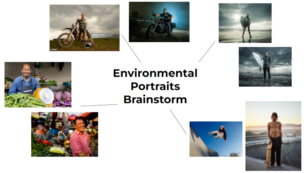
  • My first idea is to photograph a surfer I know at St Ouens Bay. I would take it from a low angle view to portray the subject as powerful and the main focus (like the example). I would probably choose a day with dramatic weather (storm building) or sunset. This is because the lighting would be dramatic and from behind the subject to add to the image.
  • My next idea is to photograph a friend at the skate park. I would take a variety of photos, from basic head to toe images to action shots of them skating. For this I would use a fast shutter so the image is sharp whilst they’re moving.
  • Other ideas I have are to go to the market and ask shop workers if I can take their portraits, or photograph a family member of mine who owns motorbikes.

Evaluation

Why did I choose to focus on the impact of the fishing industry, and re-create Mandy Barker’s work?

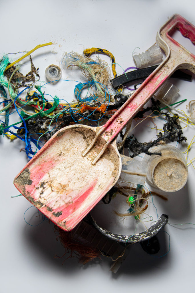
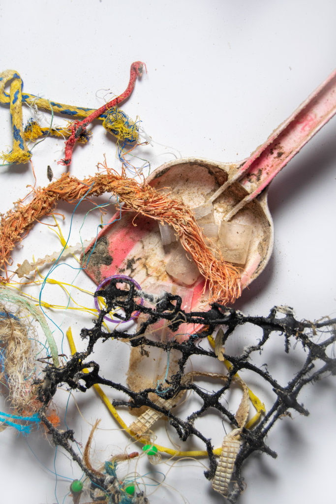
My first thoughts were to shoot the pollution by La Collette as it is a clear example of Anthropocene. However I had already taken photos there and found the final outcomes not very interesting. My next thought was to re-create Mandy Barker’s work. At first I thought it was a boring idea as it could be seen as copying her style, but I decided I really liked her images, and I didn’t have to completely copy them. Photographing fishing waste wasn’t planned, but when I went to collect rubbish for my shoot I saw how much waste there was. I took photos as I collected plastic, and I am happy that I did as the photos add to my project.

How did I do the shoot?

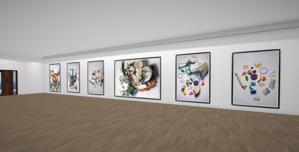
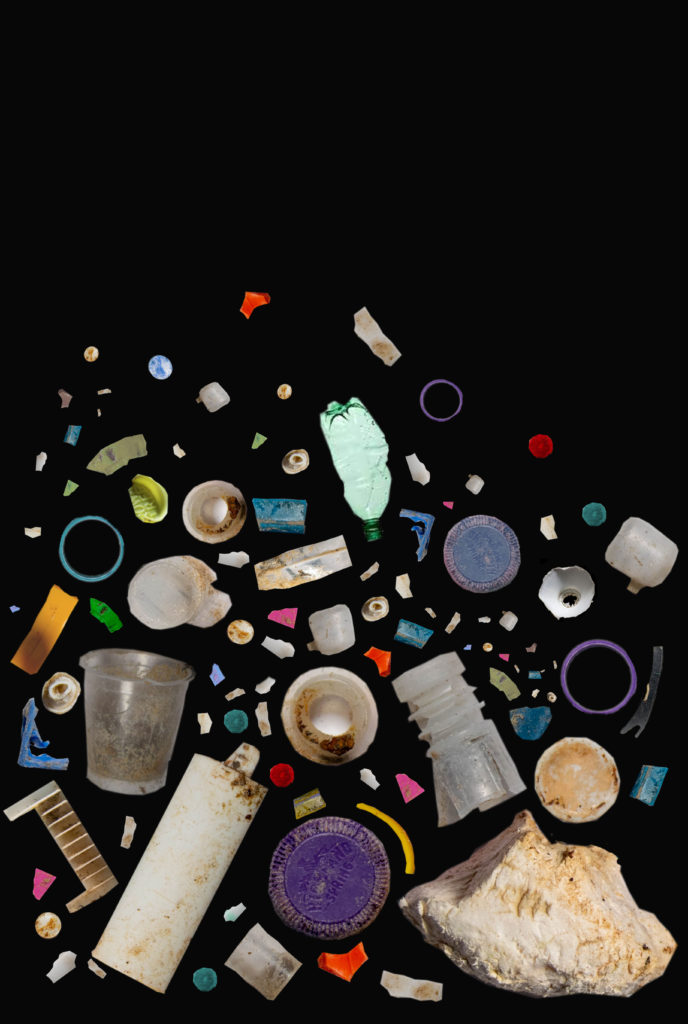
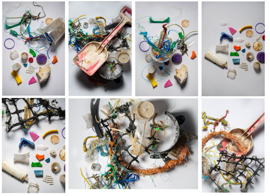
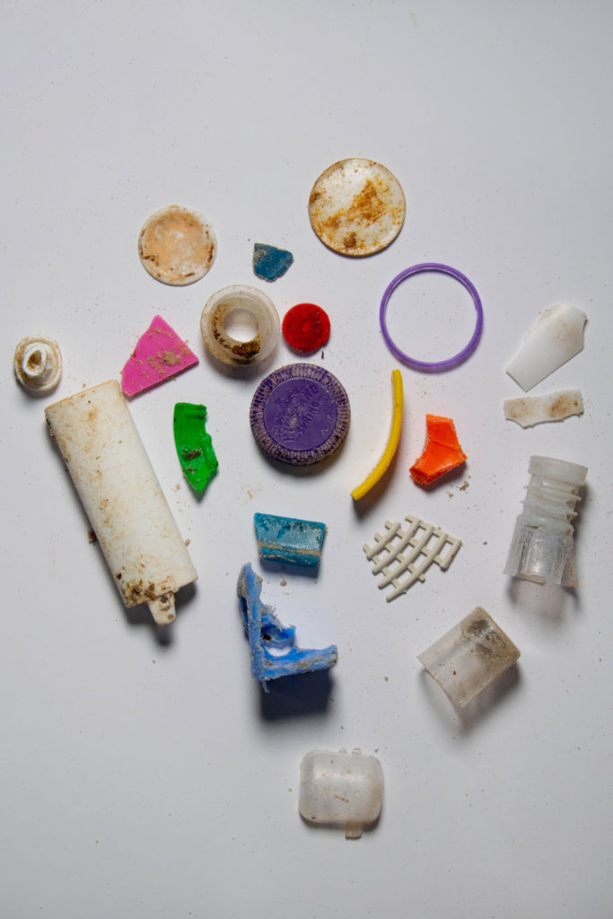
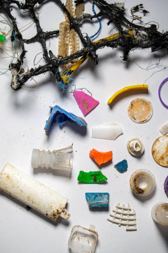
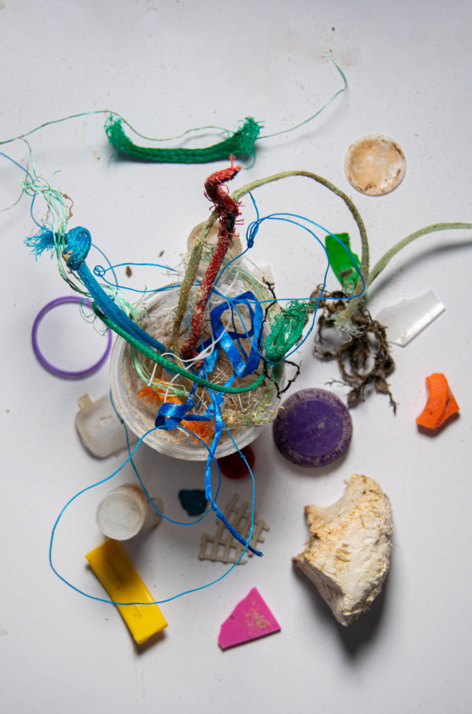
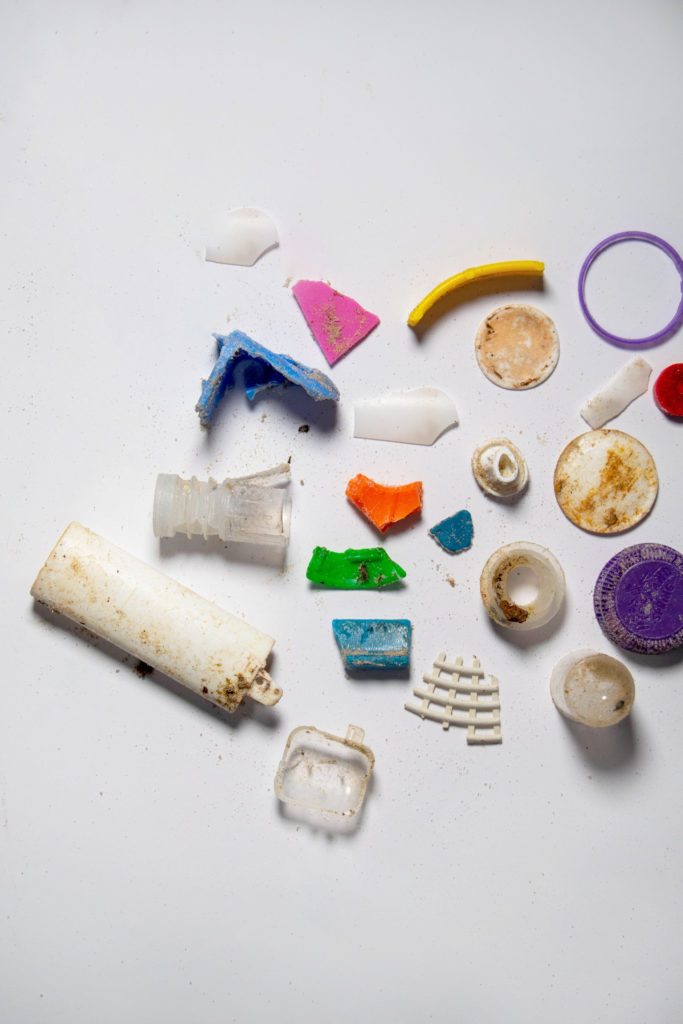
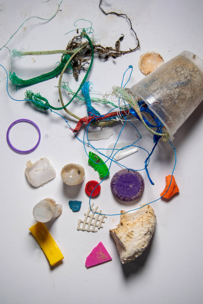
I used my digital camera to photograph both shoots. For my studio shoot, I used a Copy Stand to create the overhead shot angle. I organised the waste quite roughly to begin with, then collected the smaller pieces to put together a group of pieces to look like Barker’s work. I wasn’t completely happy with the results of those images because I didn’t collect enough pieces and the images weren’t as compact as hers.

Overall:

In the end I am happy with my basic edits, but I prefer the edits I did in photoshop because I think they’re more interesting. I think the photos I took on the beach aren’t as well composed as they could have been. I also think I could have improved my studio shoot by using more pieces, and trying a black background to emphasise the vibrancy and tones in the waste.

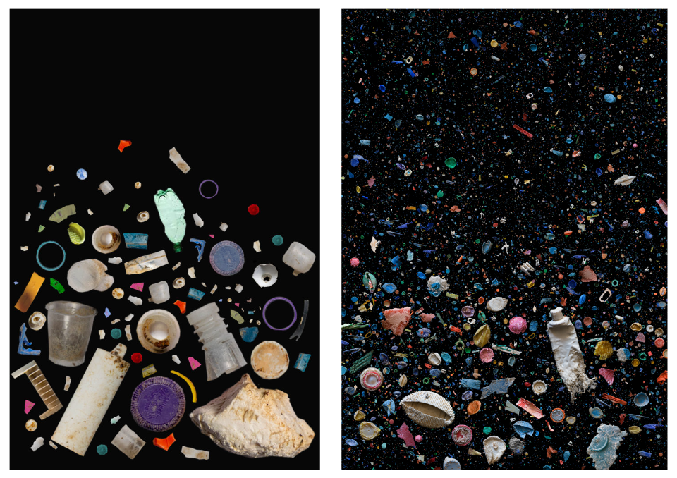
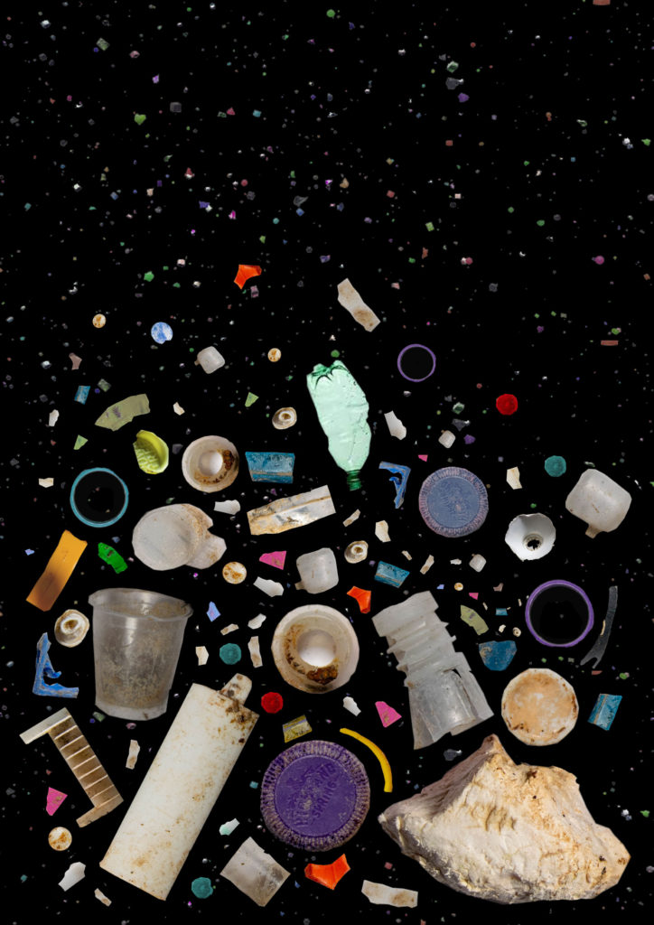
My favourite edit is my re-creation of Barker’s photo in photoshop. What went wrong with this edit? I think I can improve it if I add more to add density like her images. I also don’t have a background that has different light ranges in it. Although her photos have this, I am not worried about not including it.

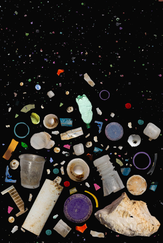
I went back into photoshop and chose an image of micro plastics off the internet. I filled the background in black, and dragged the layer onto my edit. I erased around my parts, and filled in the background. Although the new pieces of plastic aren’t my image, I am happier with the outcome as the overall edit is more compact and interesting.
Mandy Barker Editing

I wanted to experiment and create an image that looked more like Mandy’s because in my shoot I used a white background and I didn’t have enough micro plastics.

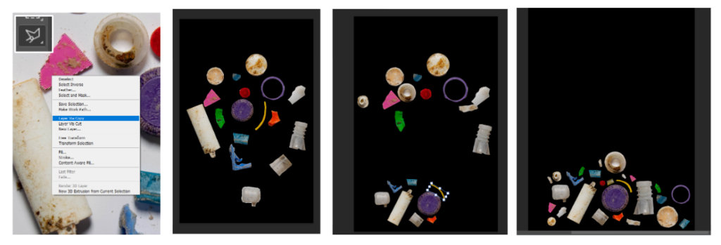
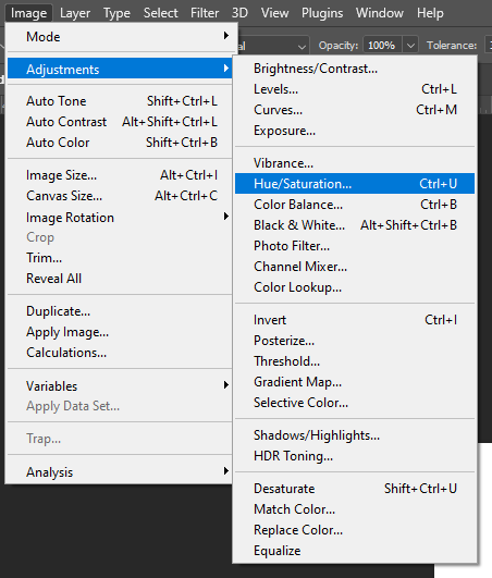
I used the Polygonal Lasso Tool in Photoshop to cut out each piece. After I had selected one, I Feathered them by 2-5 depending on the shape. Next I created a blank black canvas and dragged all the layers across. I worked out where to place them, and duplicated the layers to fill in gaps. I didn’t want the duplicates to be obvious so I changed the Hue/Saturation of some.

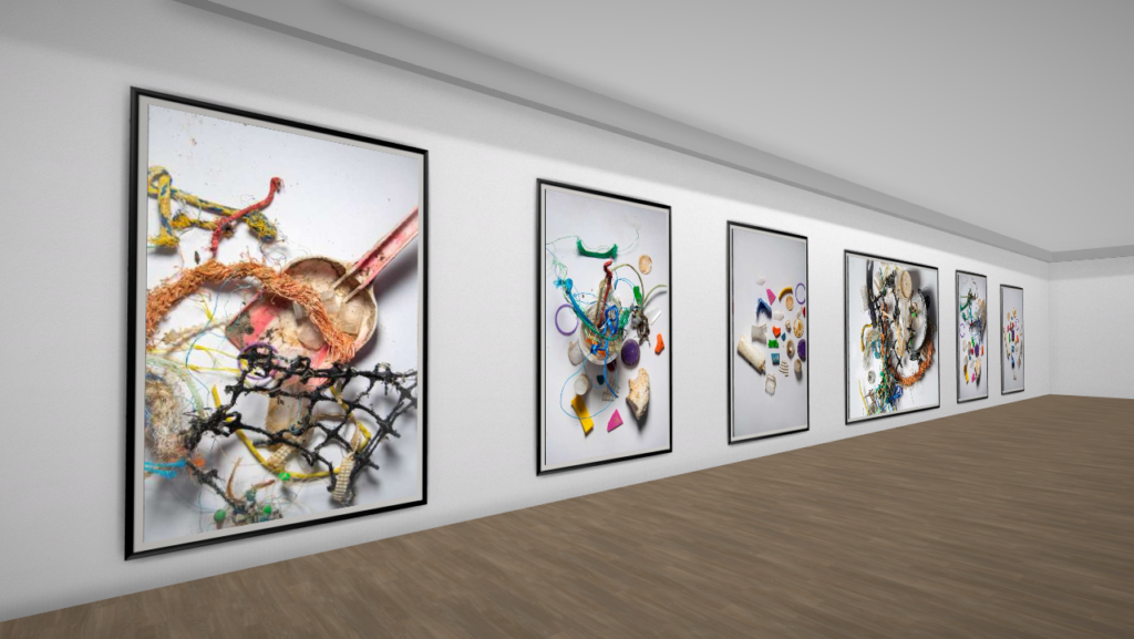
My work compared with Mandy Barker’s

Overall I like how this turned out, I think it looks like Barker’s work even though I used photoshop to create it. I think I used the same variety of colours and shapes as her, using large and small pieces. The only difference is that her work is more compact. I could change this by photographing more different pieces of plastic, or duplicating more (however I didn’t want to use too many duplicates).

Further Experimentation on Photoshop:

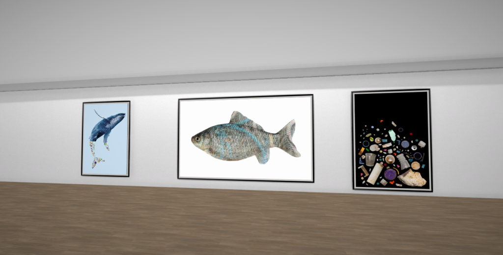
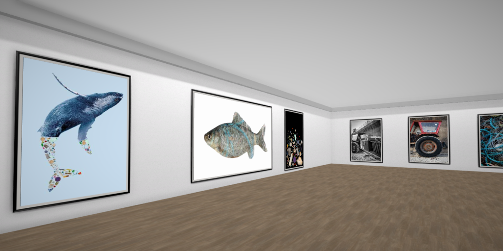
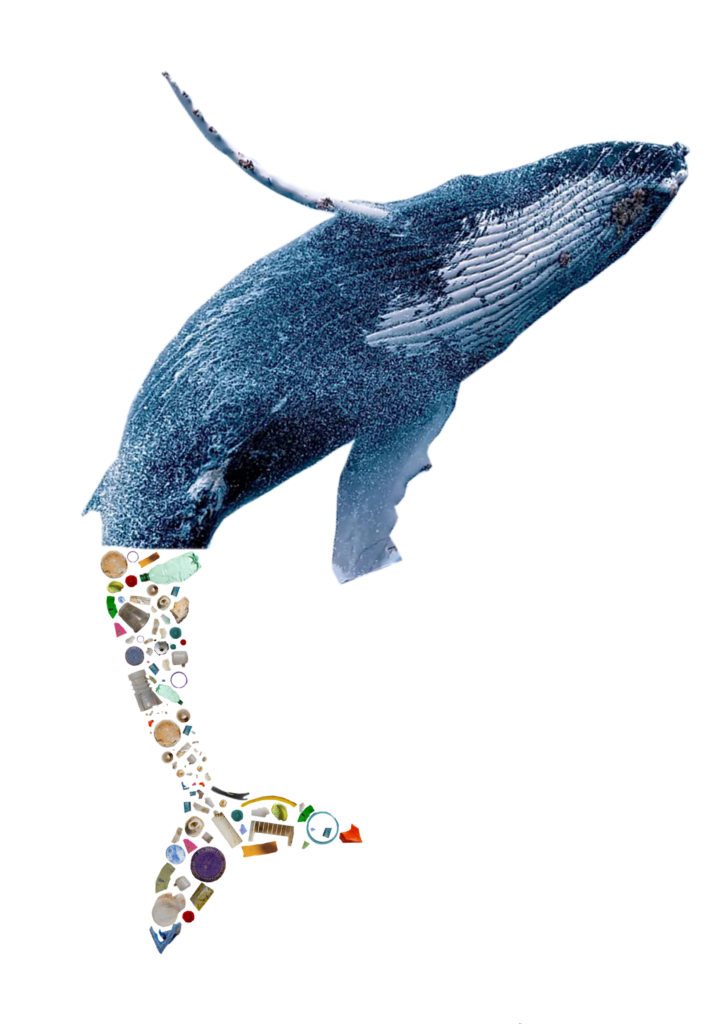
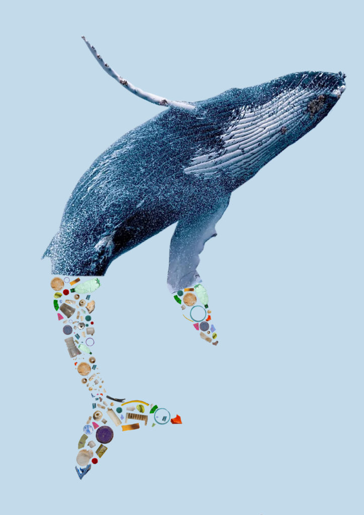
I wanted to edit my images further to create photos that clearly show pollution and waste affecting the marine life and oceans.

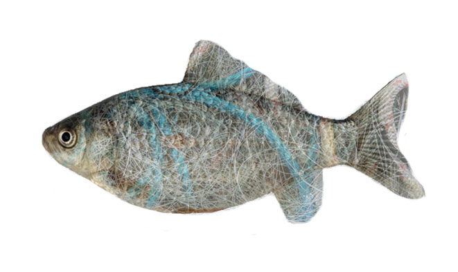
I took an image of a fish from the internet and layered my photo of fishing nets over top. I lowered the opacity and erased around the fish.

For this image I took my cut outs from my Barker edit, and organised them to look like the whales tail.

Anthropocene shoots

SHOOT ONE:

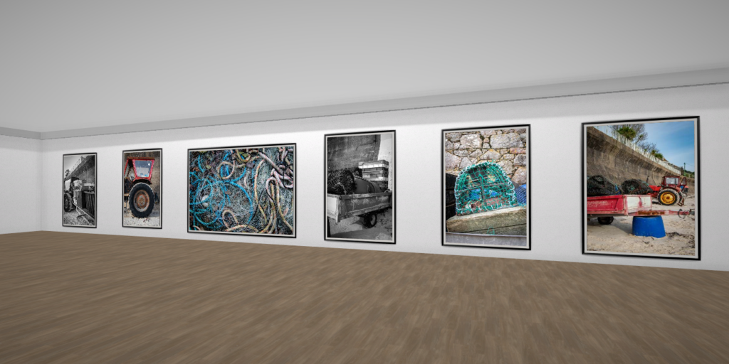
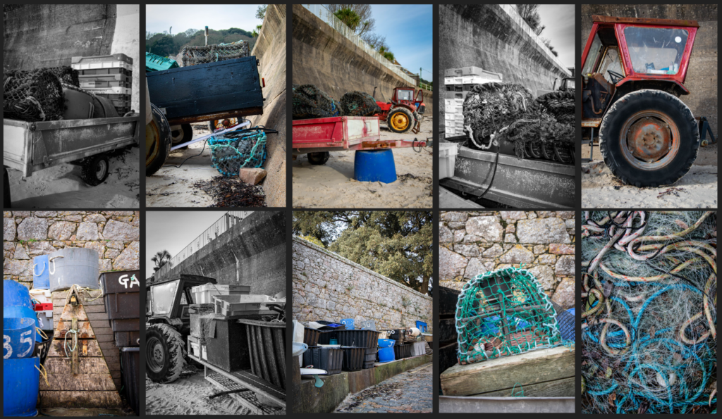
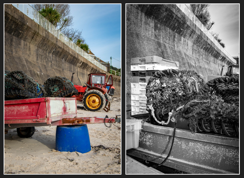
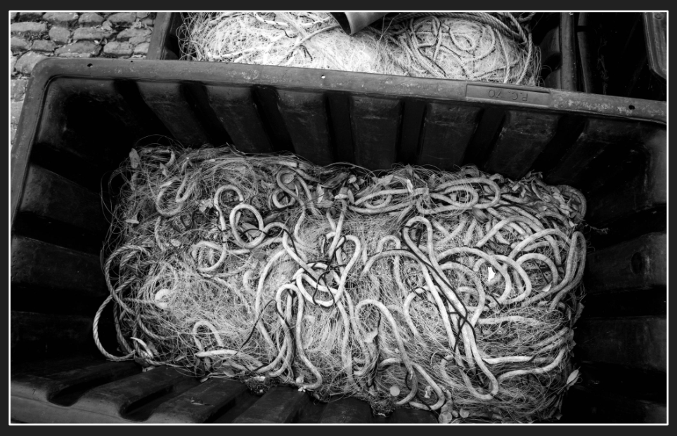
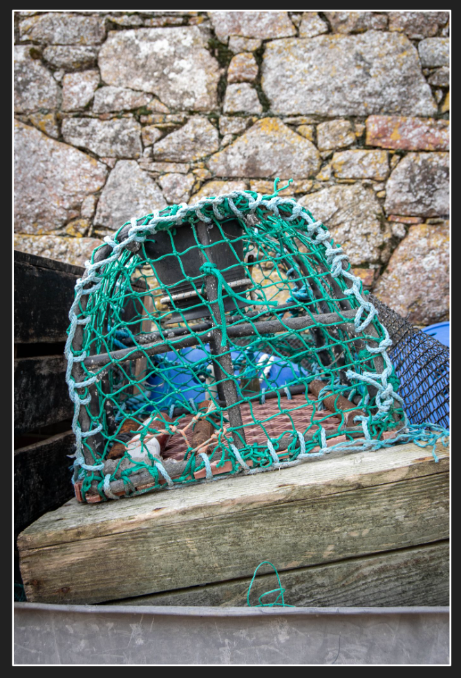
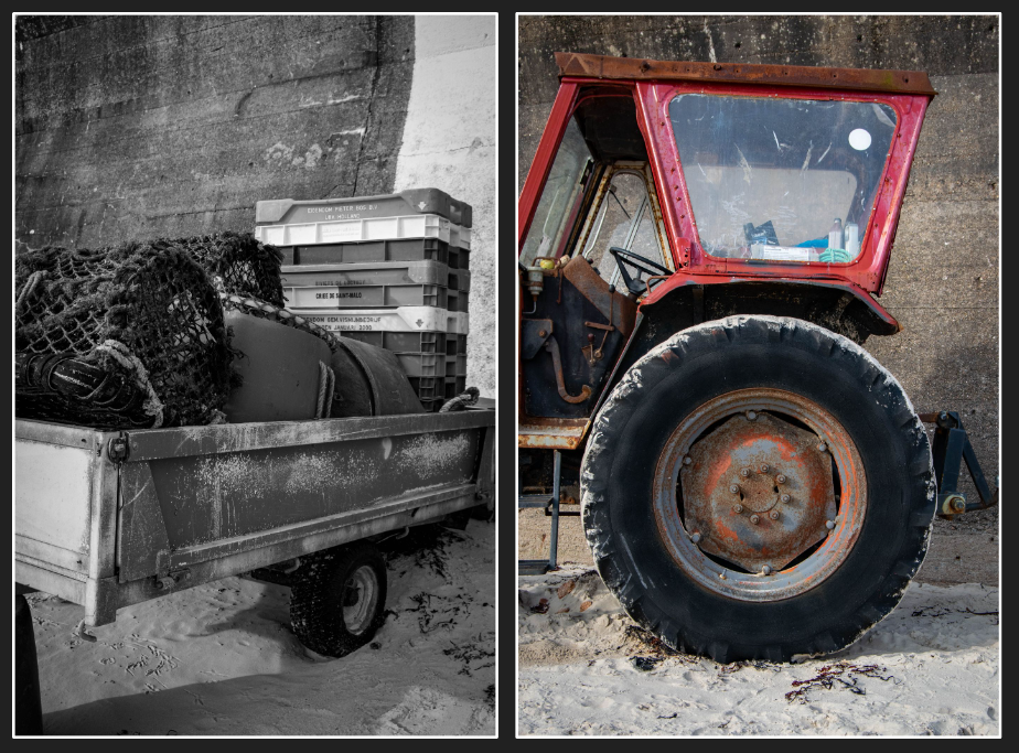
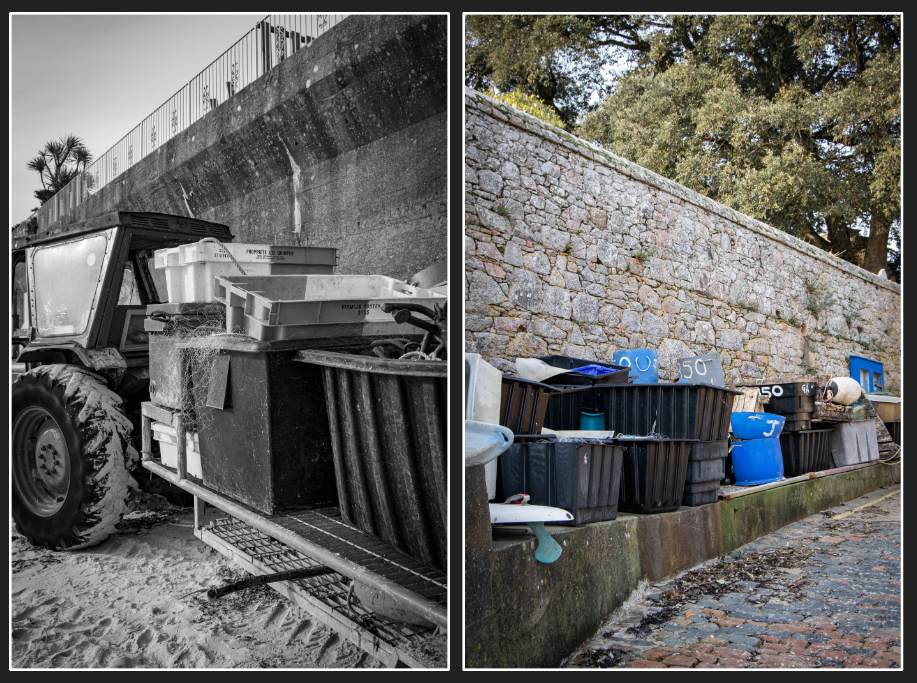
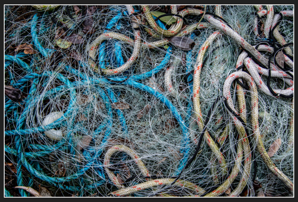
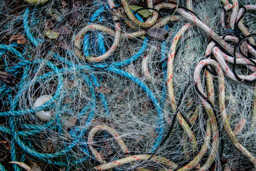
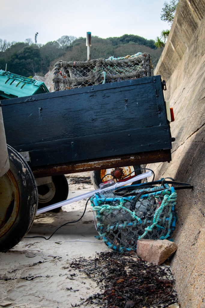
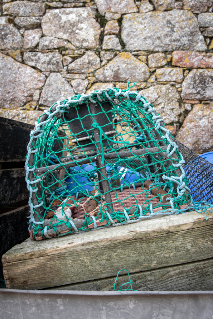
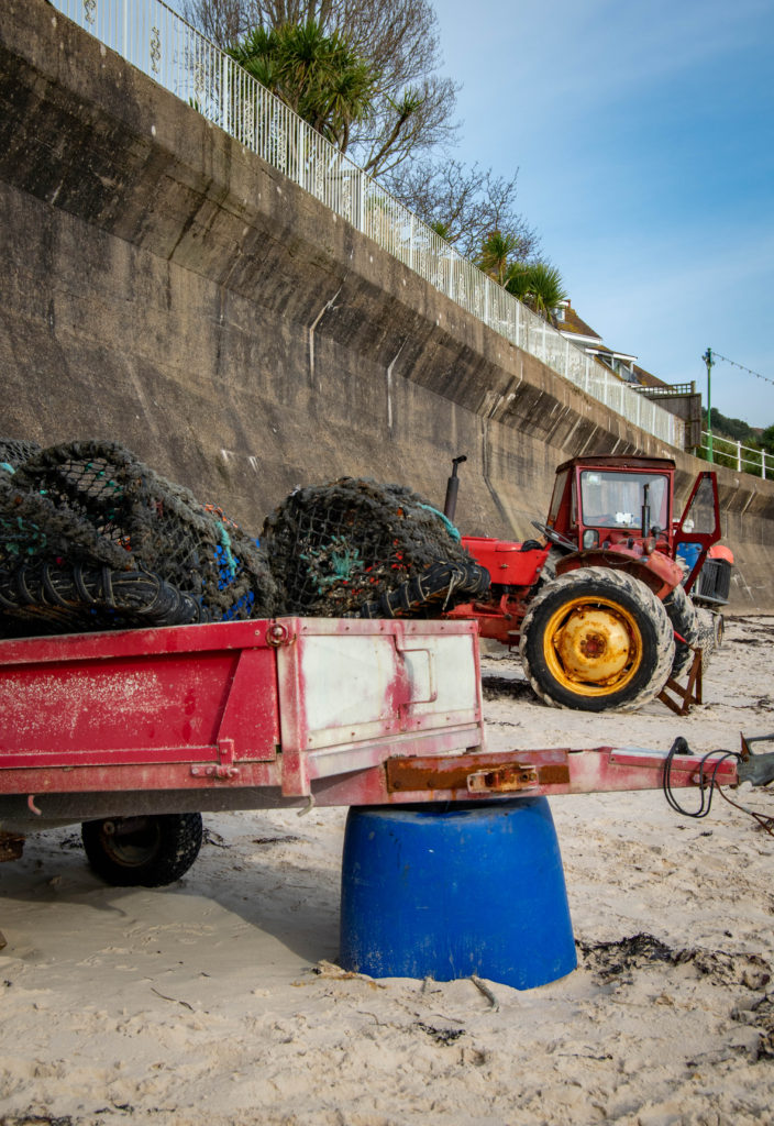
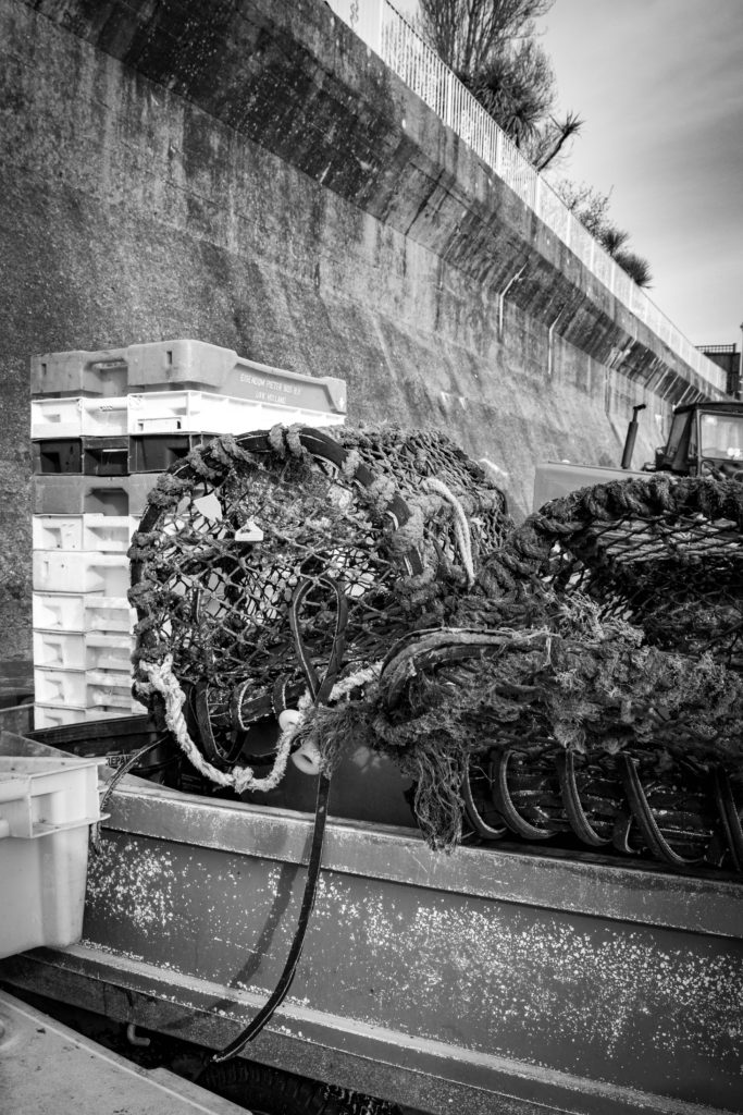
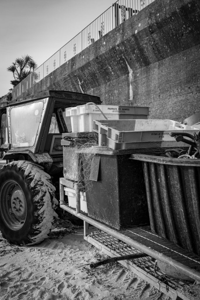
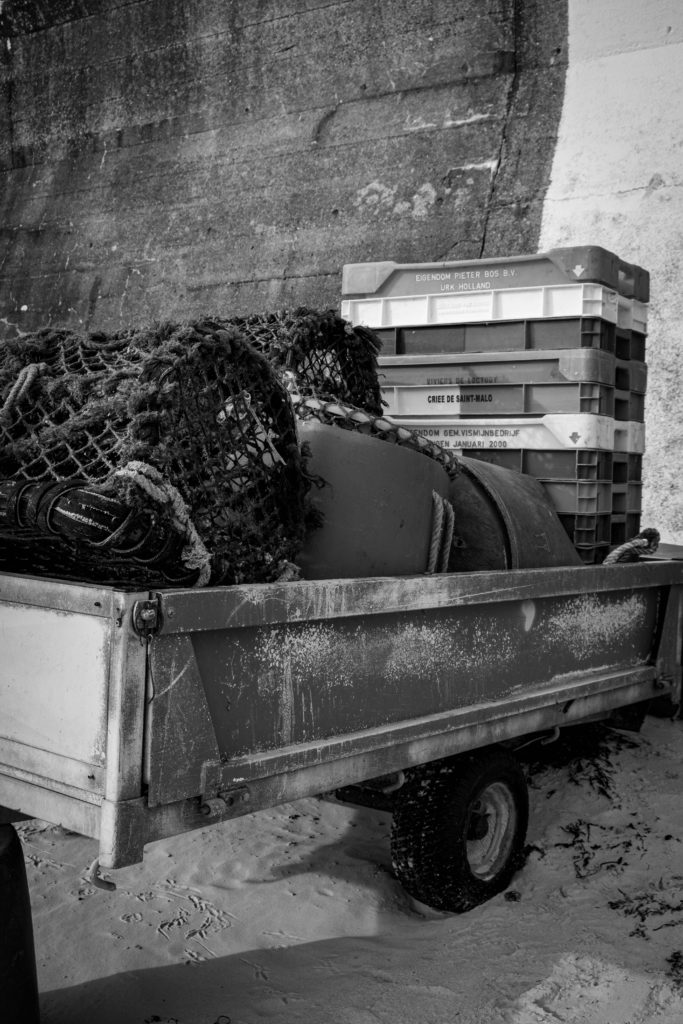
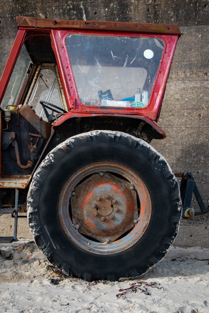
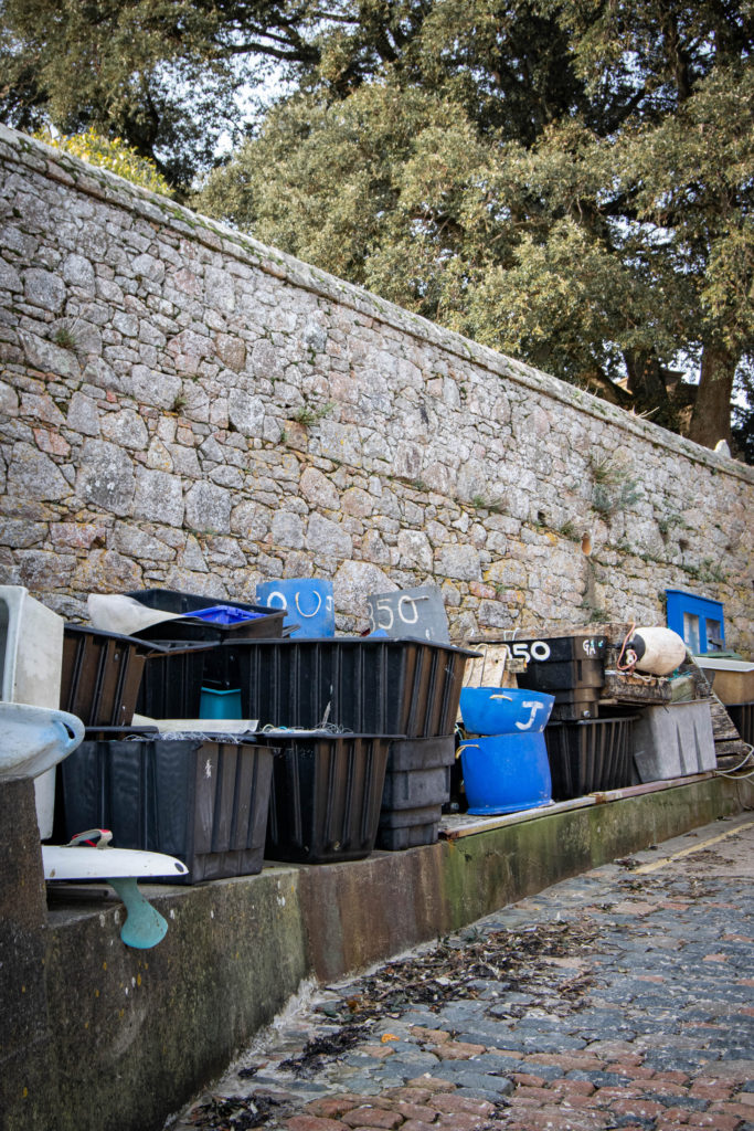
I decided to shoot fishing waste on St Brelade bay to show the impact the fishing industry has on the environment. 20% of the Great Pacific Garbage Patch is offshore debris oil rigs, pacific cargo ships, and boaters dumping trash into the water. 705,000 tons of this is fishing nets, making up the majority of the waste. I wanted to focus on the pollution in the Jersey waters and on beaches for this shoot.

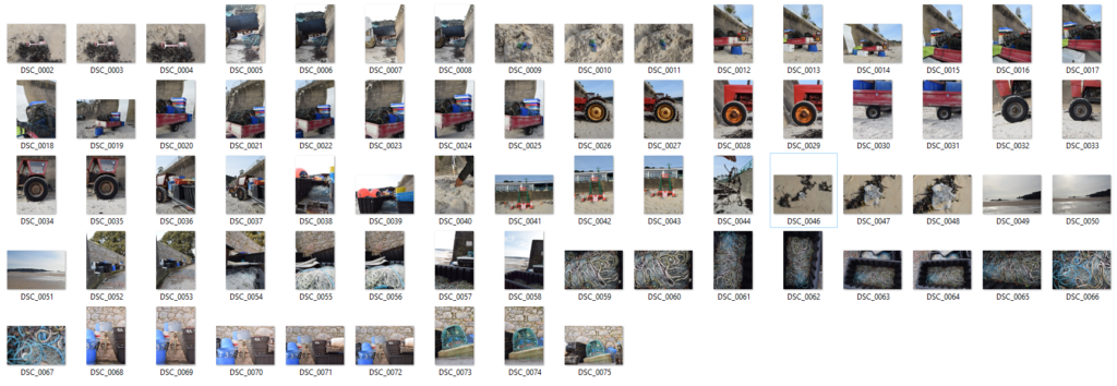
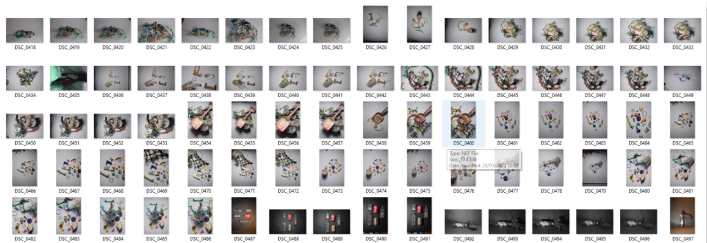
Contact Sheet

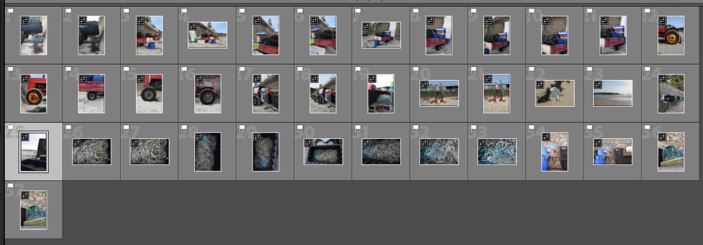
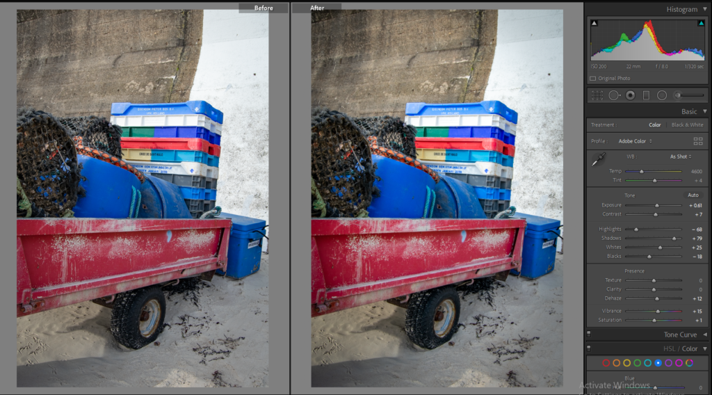
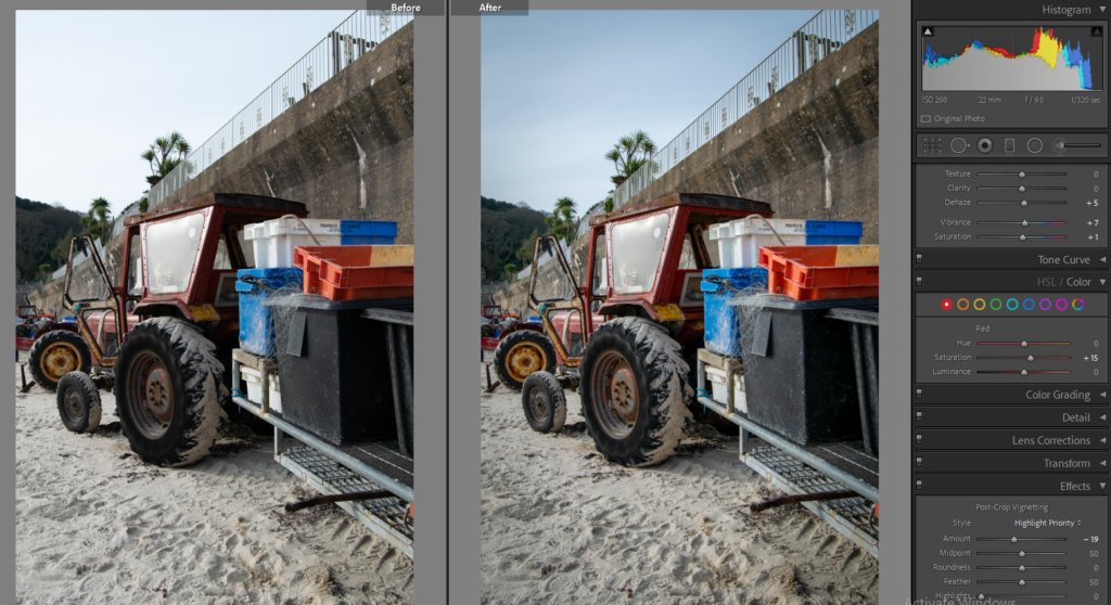
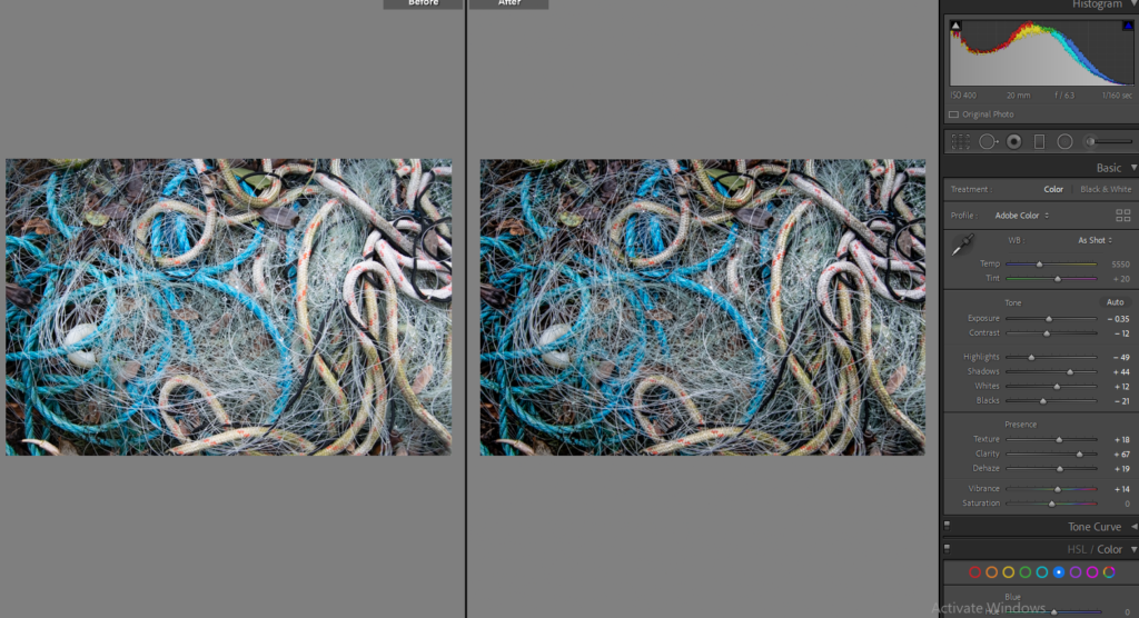
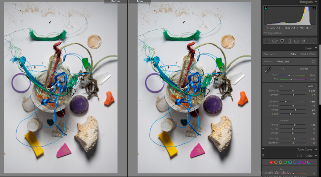
Selecting: I imported the image into LrC and flagged the photos I wanted to edit.

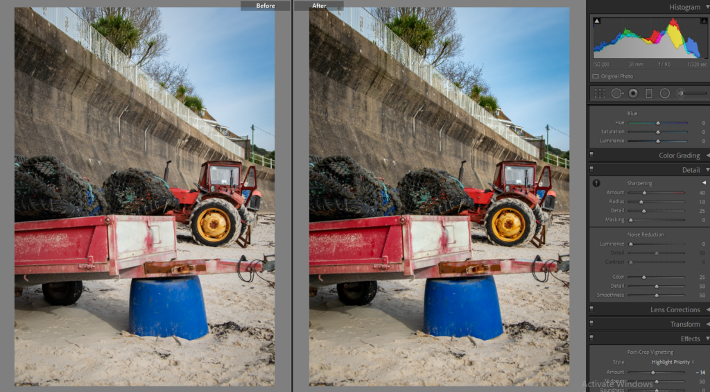
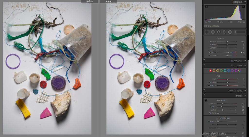
Editing

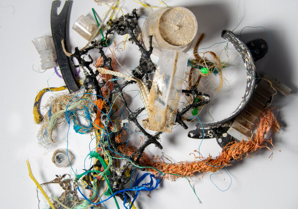
Final Images

Although this shoot doesn’t connect to Mandy Barker’s images, I think the message behind them is the same. However in my next shoot, I collected plastic and fishing waste on the beach and shot it in the studio to replicate her work.

SHOOT TWO:

Contact Sheet

Selecting

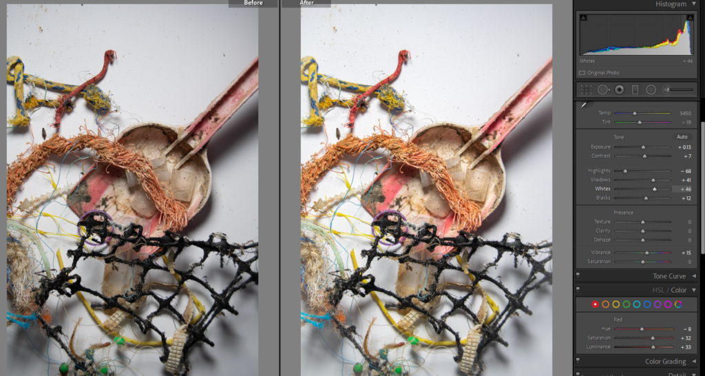
Editing

PHOTOSHOP – I used the Rectangular Marquee Tool to select areas where there was a lot of sand, then deleted them because I found the sand made the images look dirty and it distracted from the main focus. I also went over the white areas with the paint brush in white, with a low opacity (e.g. 20%/30%) to lighten up the areas and shadows.
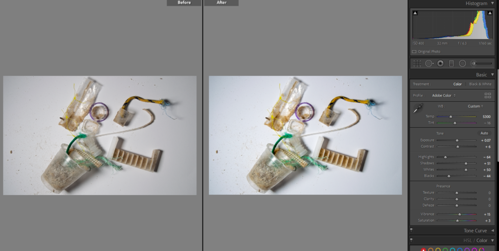
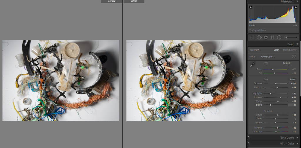
FINAL IMAGES: BASIC EDITS

Joiners

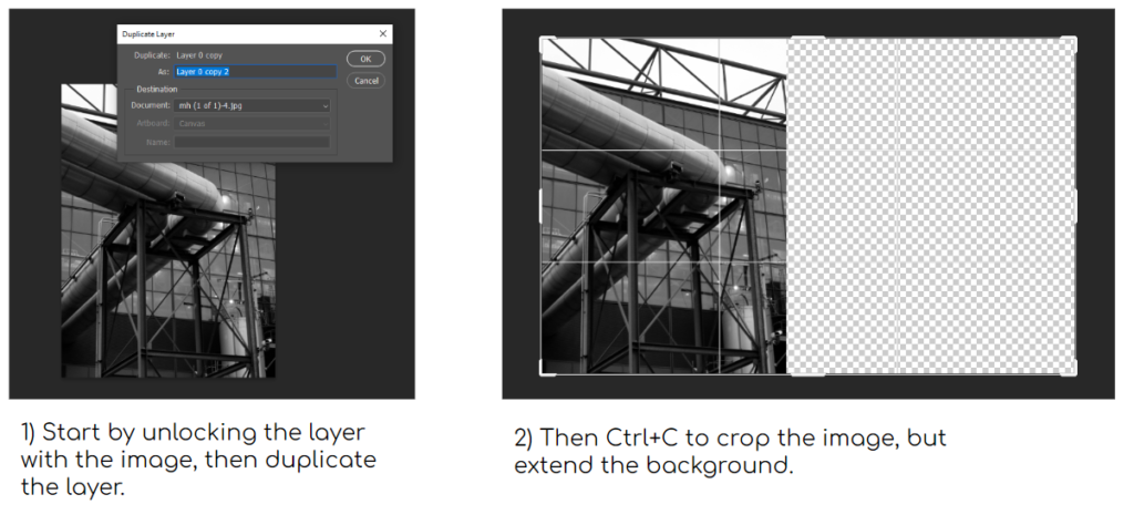
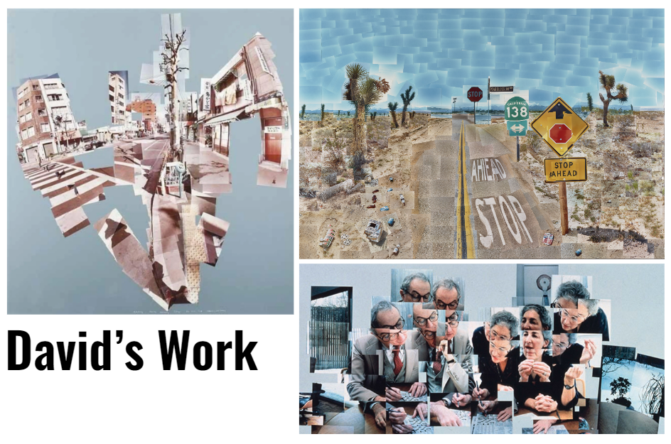
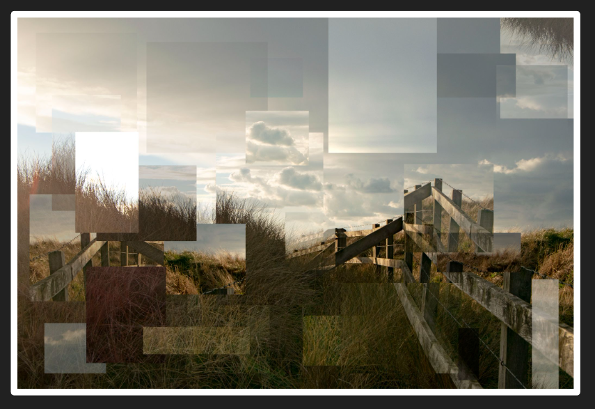
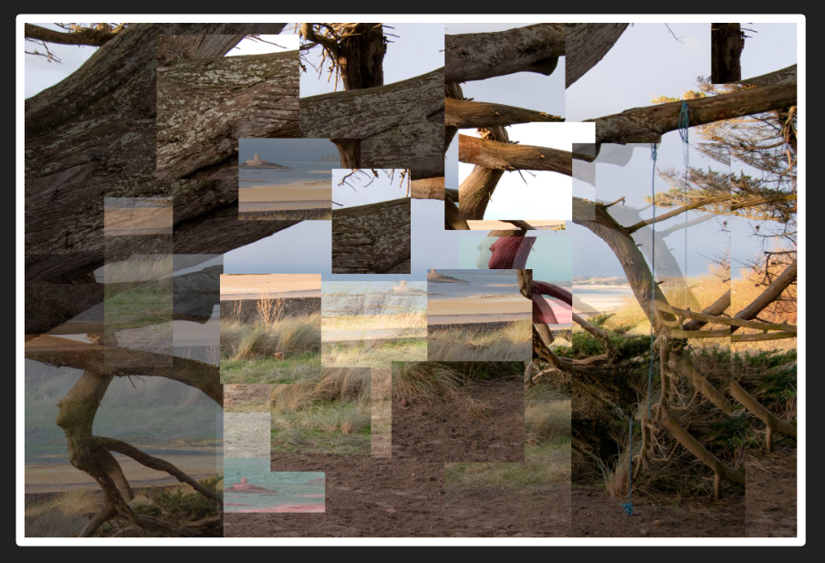
Joiners is typically created by taking multiple photos of one view, and joining them together to give a wider view of the scene. David Hockney did this with his work in the early 1980s.

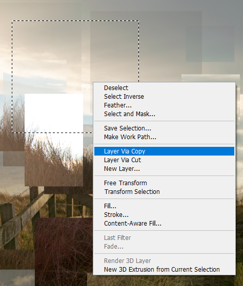
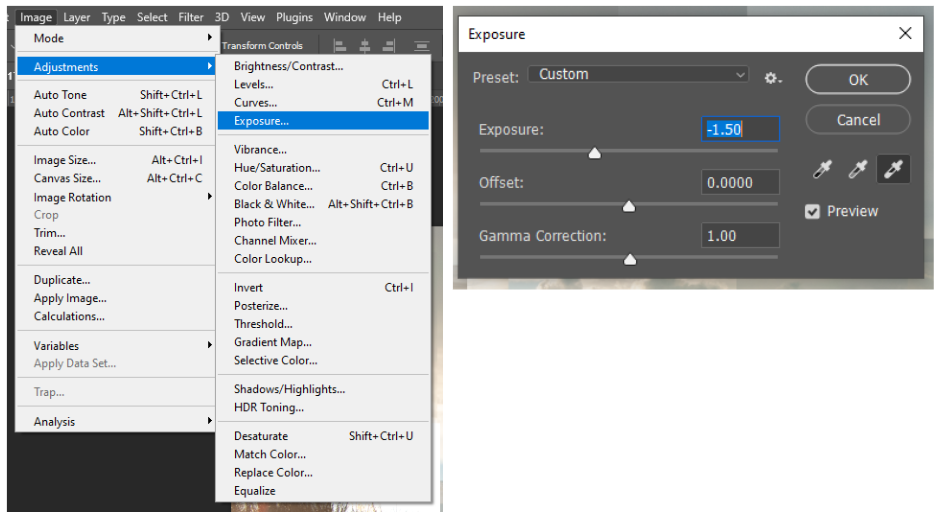
I took a photo from one of my shoots on Romanticism, and edited it to look like a joiner on photoshop. I selected an area and created a copy. Then I would change the opacity, exposure, or hue to make it stand out. I also moved the copies around the image to show a clear difference between them and the original photo.