All posts by Megan Hawthornthwaite

Filters

Author:
Category:

Photoshoot plan – London

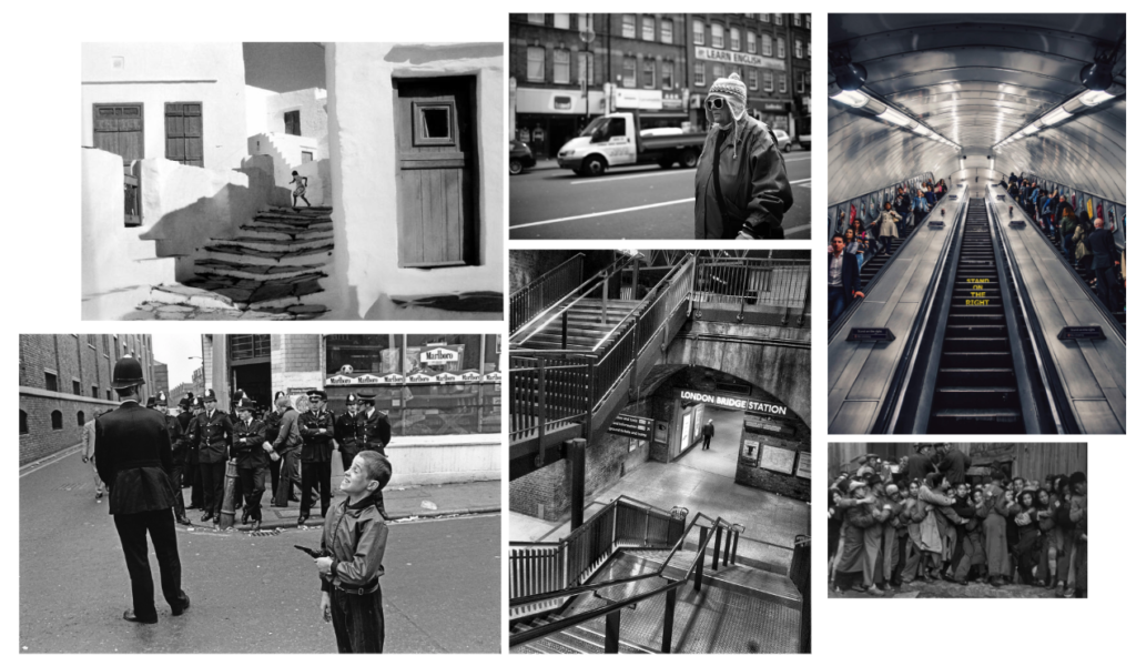
For my street photography shoot I am going to take photos in London. I want to try and capture a modern take on Bresson’s style.

Inspiration/ mood board:

What?

I’m going to carry my camera round with me and take photos of interesting people and moments.

How?

Using my digital camera, I will use aperture priority for places with daylight to get the right exposure of light, and to keep the shutter fast so my images aren’t blurry. If the lighting is dark I might use shutter priority, however I won’t have a tripod so I will experiment. I also might try some long exposure images to capture the movement and chaos in London.

When?

Most of my images will be in the daytime whilst it’s the busiest, however I may try and take some night images to contrast and capture a different side of London.

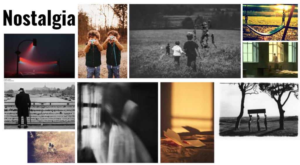
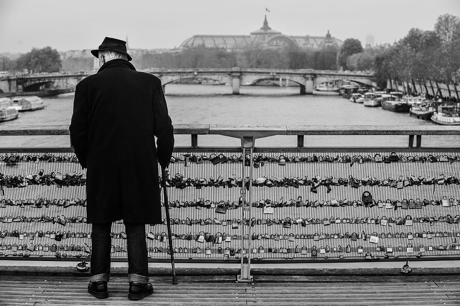
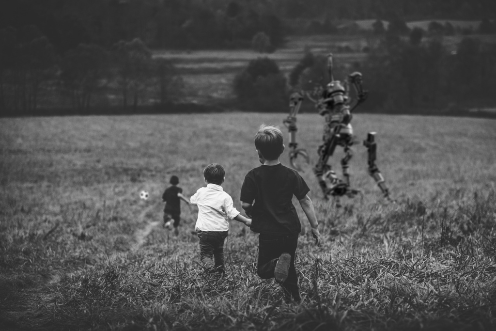
Nostalgia

What is nostalgia?

Nostalgia is having a sentimentality of the past, especially places and people associating with positive experiences. Nostalgia is a learned formation of a a Greek compound: (nóstos) meaning “homecoming”, and a Homeric word (álgos) meaning “sorrow”. It was created by a 17th-century medical student to describe the stress displayed by Swiss Mercenaries fighting away from home; a powerful infantry force constituted by professional soldiers originating from the cantons of the Old Swiss Confederacy. It became a key trope in romanticism, being reported as a medical condition and a form or melancholy in the Early Modern Period.

The personalities, possibilities, and events of the past are seen as a longing when associated with nostalgia, specifically the idea of “good old days”. People typically view the future more negatively , in contrast to the past as a more favourable thought. This is called diclinism when applied to one’s beliefs about society/ institution. It’s been expressed as “a trick of the mind” and as emotional approach to find comfort when the present day is dull.

The scientific literature of nostalgia states that emotion is a strong influencer of nostalgia because of the process of the stimuli passing through the amygdala (a major processing centre for emotions). The memories of the past tend to be important events involving people one cares about, or places that hold comfort and have been visited one or many times. Nostalgia can also be activated by music, TV, video games and weather.

Nostalgia’s affects

Nostalgia can improve your mood because even though it is typically activated by negative feelings, it brings out positive emotions through the happy memoires of the past. It can also improve someone’s social connections. Memories can be of people and can cause someone to get in touch with those people creating the nostalgic feeling.

review of ‘playtime’ by Will Lakeman

“Nostalgia is cosy and comforting but it ultimately an illusion.”

Make a final value added judgement on the exhibition as a whole, ie. do you like/ dislike it – provide examples for or against. Would you recommend it to others? If so, why? Include illustration such as installation images from the exhibition. Include also at least one quote from Will Lakeman’s talk or associated publicity material and provide a comment.

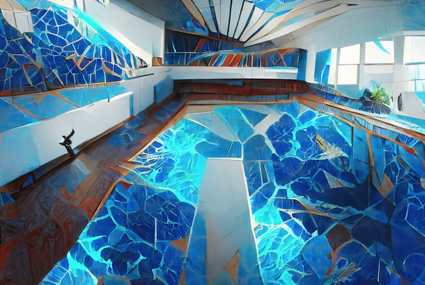
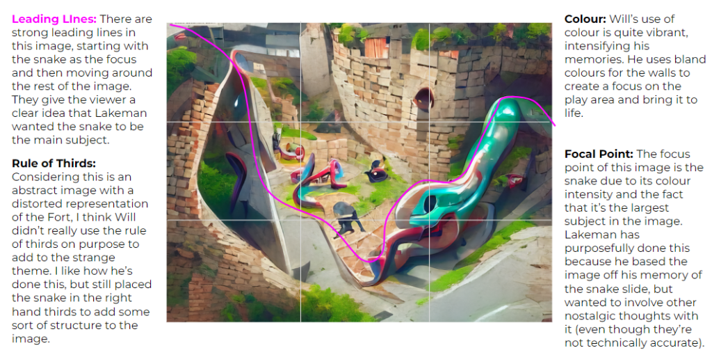
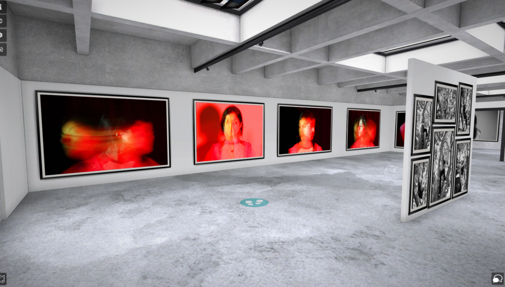
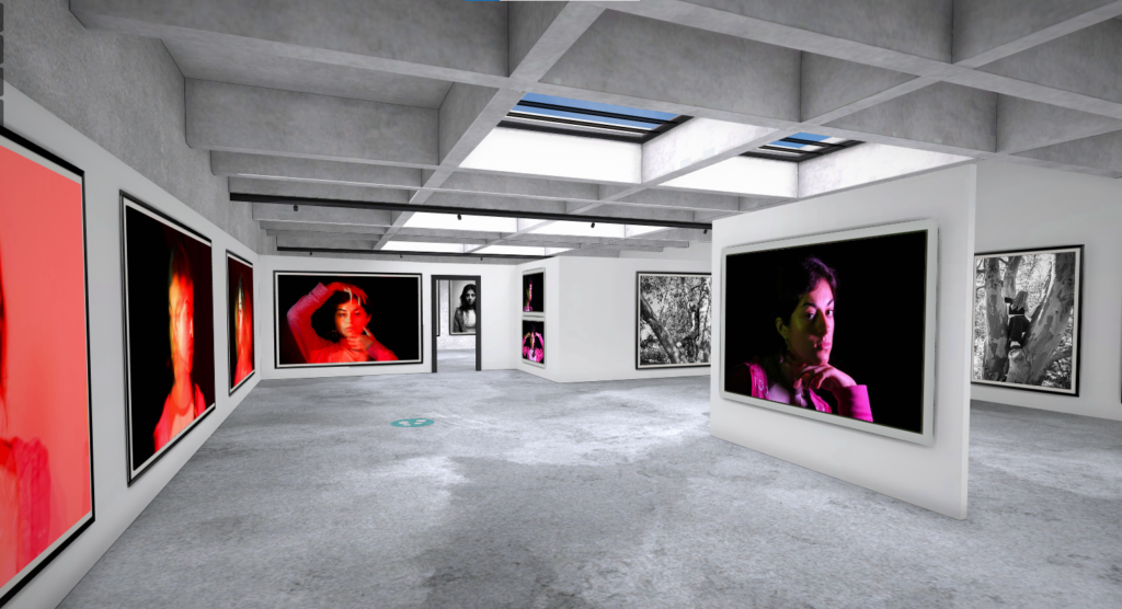
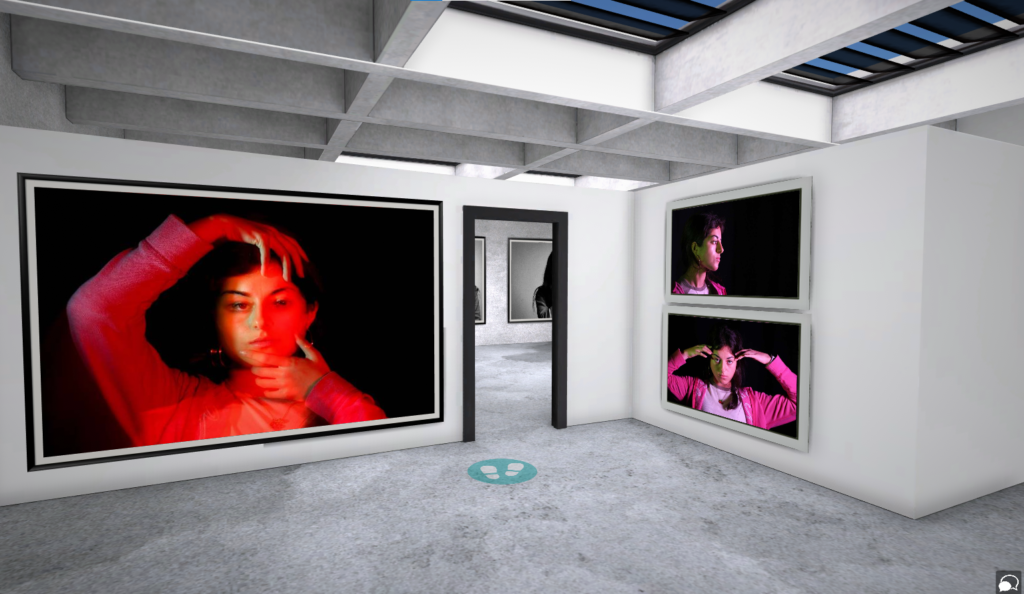
The exhibition made me consider nostalgia differently to how I typically imagine it. For me, nostalgia is based of more realistic memories compared to Lakeman’s colourful recollections. His exhibition gave me an insight into how different people imagine their past memories. He said his childhood memories were quite distorted and when he saw images of what was actually there, his memories were dissimilar. This is due to his autism and synaesthesia creating a more psychedelic, vibrant and distorted idea of what what he experienced and remebers. However, he didn’t want to correct his work because he was presenting his nostalgic memories and wanted to give people an insight into his individual imagination. This inspired his colourful and unique take on Fort Regent through his abstract AI work. Most of his images in ‘Playtime’ are created using AI software. He said that he used images of the Fort when he was a child and put them through the AI software to create it. It takes multiple attempts and lots of hours for the AI to produce what Lakeman envisaged. He then would edit these outcomes and place different part of images together to end up with a presentation of what he imaged. His AI images can be a representation of dreams through the idea that colours are intensified and things are presented differently to how they are really seen. Dreams are an imagined and fictitious representation based off something/ a place experienced in the real world.

“I have tried to picture things not as they were, but in the strange ways they appear in dreams and hallucinations”

Overall, I really likes Will’s exhibition because I had never thought about nostalgia deeply before visiting it and it gave me a new perspective to see how others view their memoires in the past. I think the way he has kept his images inaccurate and in the style of his thoughts shows his personality and thoughts. I also think that his use of AI is quite creative and he didn’t just use digital images is unique to him, especially the style he created through it. The time it takes to put together an AI image is impressive, and when Lakeman explained the process behind completing an image I was shocked because the common idea of AI is that is creates all the work for you.

My favourite image from the exhibition is ‘A Poolside Picnic’ because he has created what was probably a dull and low lit room, into a colourful space from his imagination. The large variety of colours and uncanny things overall makes it an interesting image, also bringing back personal childhood memories of my own. The fact that as a viewer I feel connected to the image shows how he has managed to make his work powerful and for all ages.

I would recommend Lakeman’s exhibition because it was not only interactive with all the senses, but unique compared to other photography exhibits I have visited. Altogether ‘Playtime’ has really inspired to experiment with AI, as well as creating new ideas on how I might take my future images, basing them off the theme of nostalgia.

The ‘Male Gaze’

What is the male gaze?

‘In feminist theory, the male gaze is the act of depicting women and the world in the visual arts and in literature from a masculine, heterosexual perspective that presents and represents women as sexual objects for the pleasure of the heterosexual male viewer.’

Typically, the male gaze has been women presented through art created my men, for men’s use. It invokes the sexual politics of thee gaze, suggesting a sexualised way of looking at women. It empowers men whilst objectifying women. The female is usually positioned as an “object” of heterosexual male desire. Her own feelings are supressed by the male desire.

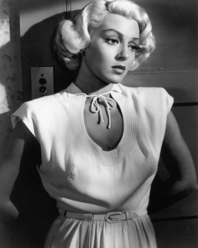
Laura Mulvey created the idea of feminist film theory, the concept of the male gaze in the film industry in her 1975 essay ‘Visual Pleasure and Narrative Cinema’. Mulvey, adopting the language of psychoanalysis, argued that the traditional Hollywood films respond to a drive known as “scopophilia”. Its the sexual pleasure involving looking. Mulvey believed that a lot of the popular movies are filmed to satisfy the masculine scopophilia. Instead of using the common term of the ‘male gaze’. Mulvey calls the concept a heterosexual, masculine gaze. She stated that women are typically characterised by their “to-be-looked-at-ness” in cinema. Woman is “spectacle”, and man is “the bearer of the look”. The Postman Always rings Twice is an example of the male gaze because the films lead female character is viewed through close-up shots of her body.

A shot from ‘The Postman Always rings Twice’

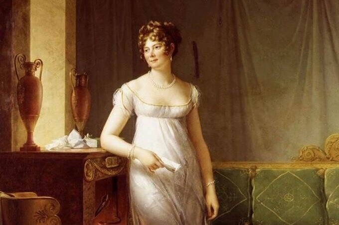
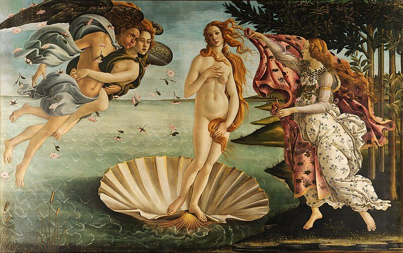
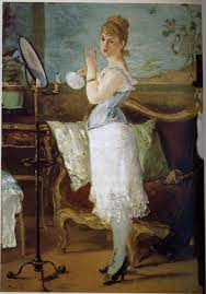
The male gaze in art history is understanding the preferences of a heterosexual male. The relevance of the male gaze in art history became relevant in the. For art history specifically, the idea of the male gaze is referencing the desire of men to create idealized images of women for their enjoyment. Also, this does not mean a strictly sexual enjoyment, the male gaze is the idea that male artists, painted for a male audience. In the early Renaissance the theory proved itself when they realised that art could be something that was bought and sold. During this time the only people who had money were men, making it obvious that artists would paint works that appealed to their target audience.

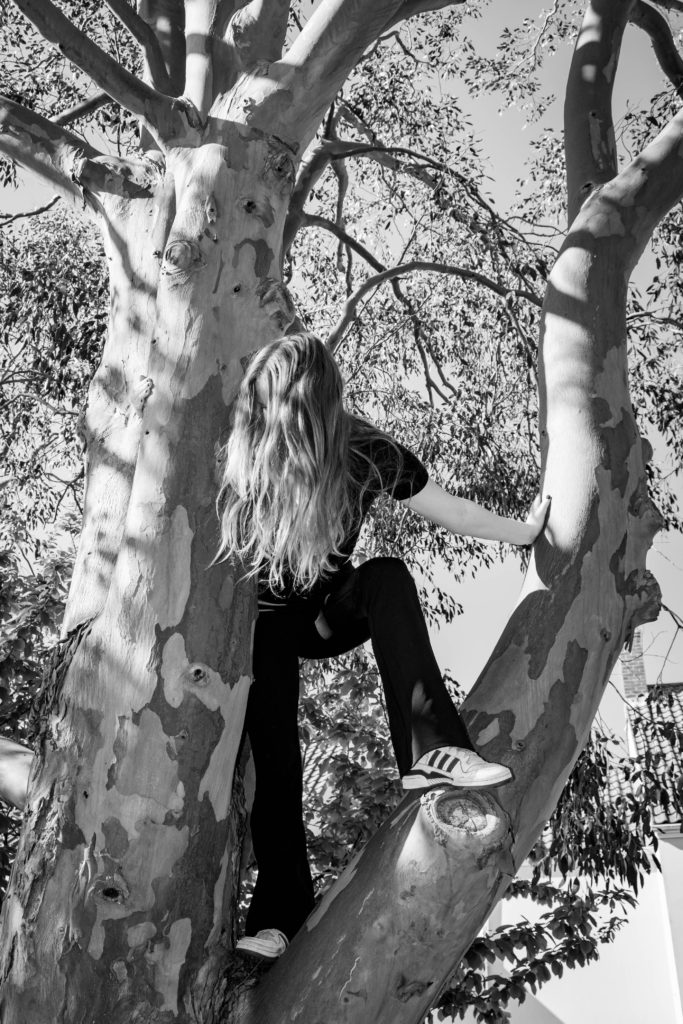
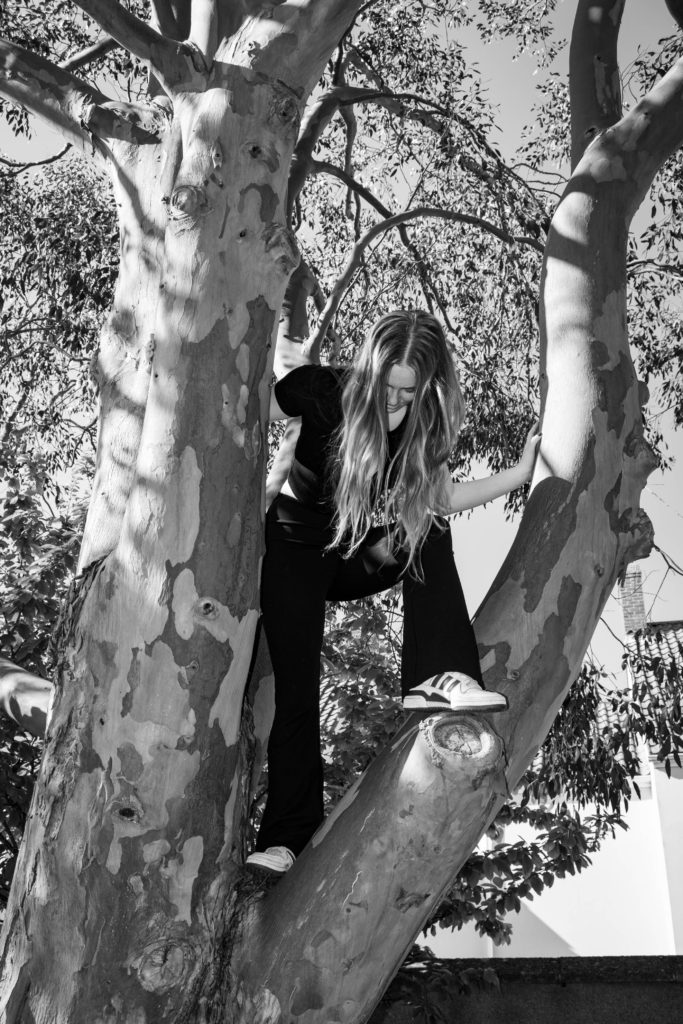
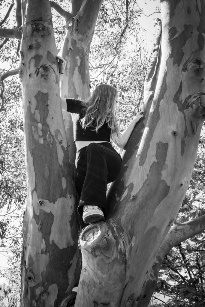
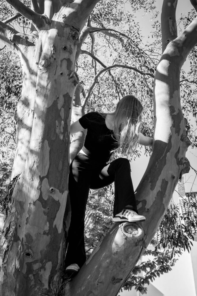
This is seen in todays photography such as magazines and advertisement. My photoshoots contradict the male gaze as my images are taken from a female perspective with the concept of presenting women as strong and independent individuals, lost in todays society and stereotypes.

Performative Photography

What is performative photography?

‘Contrary to this idea of the photograph as a trace of something that has passed, in Performative Photography, the camera instead becomes an instrument of human experience, including the discovery, tracking and recording of a contemporary event.’

Performance was seen as distinctly separate from art that could be collected and shown by art museums in the 1960s. Performance was seen live and it was challenged as a traditional notion of art by more modern styles of art developing. However today performance has evolved to be seen as more a set of strategies accessible to modern artists, one that is not inherently different from other art forms and not beyond what a museum can show.

Performance arts had a fundamental role in the 20th century and consists of five simple elements: time, space, body, and presence of the artist, and the relation between the creator and the public. The main goal of performative art is to create a reaction, occasionally with the assistance of improvisation and a sense of aesthetics. Themes are used in these types of art, life experience is typically a common theme, or the need of denunciation or social criticism with the spirit of change.

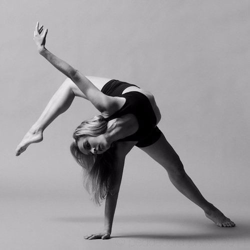
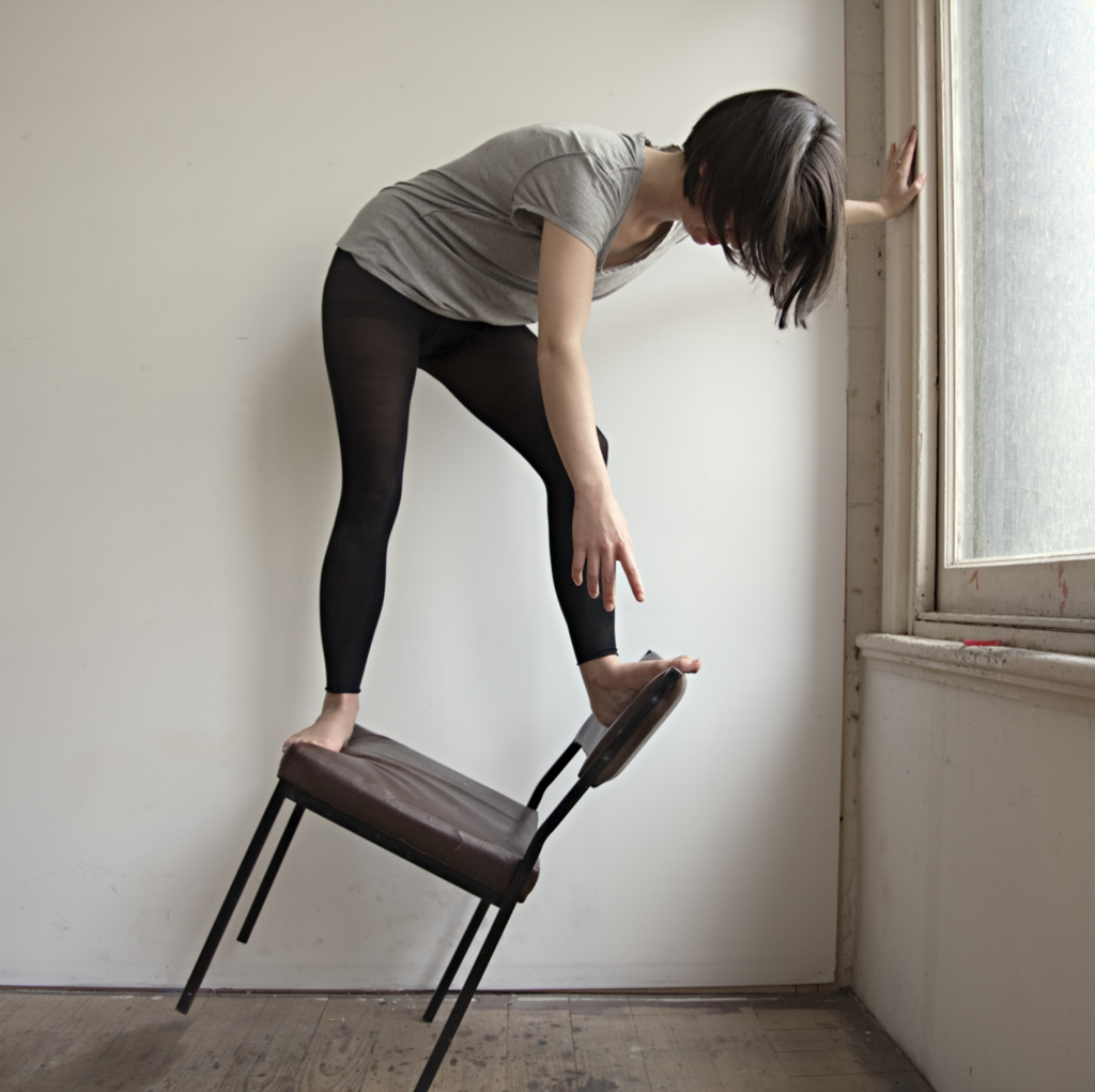
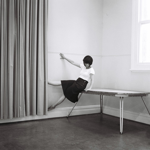
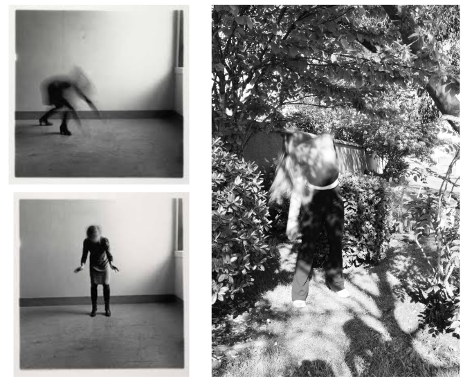
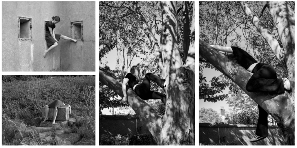
Clare Rae and Francesca Woodman both use performative photography to present themselves and their ideas through photos. They present themselves in a style that matches with preforming arts such as contemporary dance. Woodman especially shows this through the movement and captured time in her long exposure images. The idea of performing for their art to present themselves and their thoughts that strongly represent feminism.

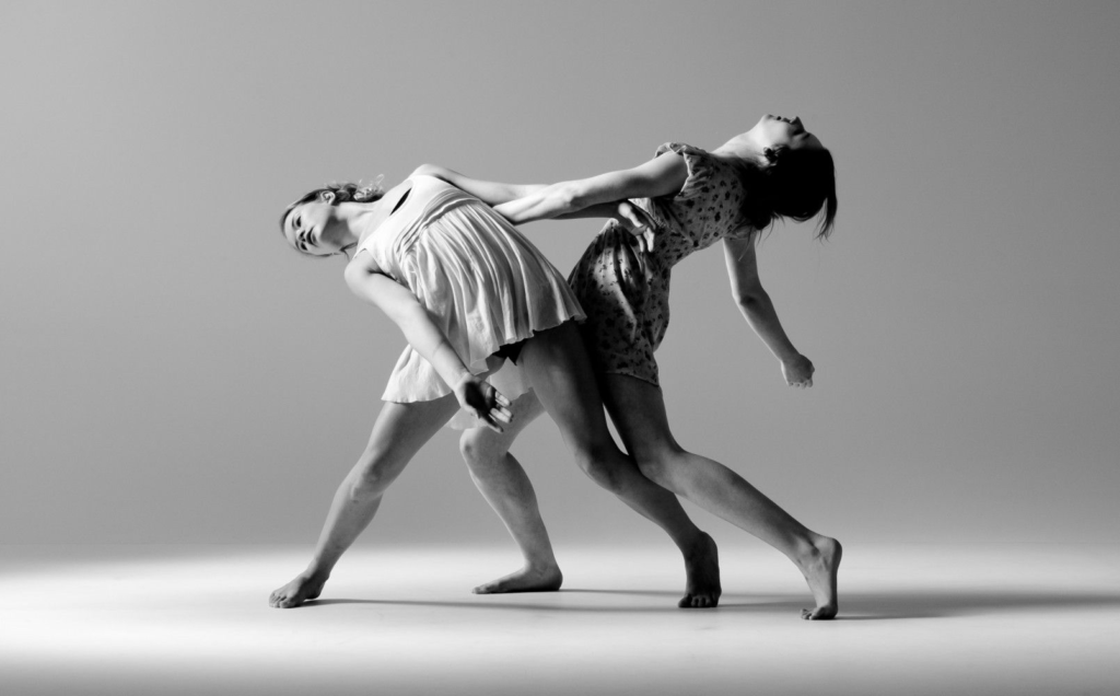
Contemporary dance compared with Rae:


Rae holds a similar style to this, showing how performing arts links with performative photography and that over time the two have joined to present the human experience and record time and beliefs.

Evaluation


How successful were my final outcomes?

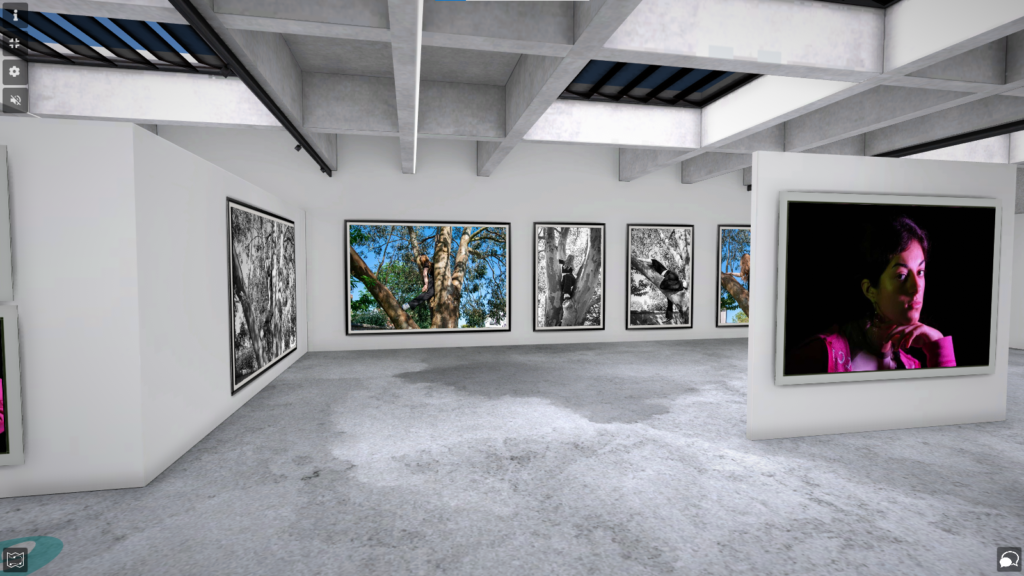
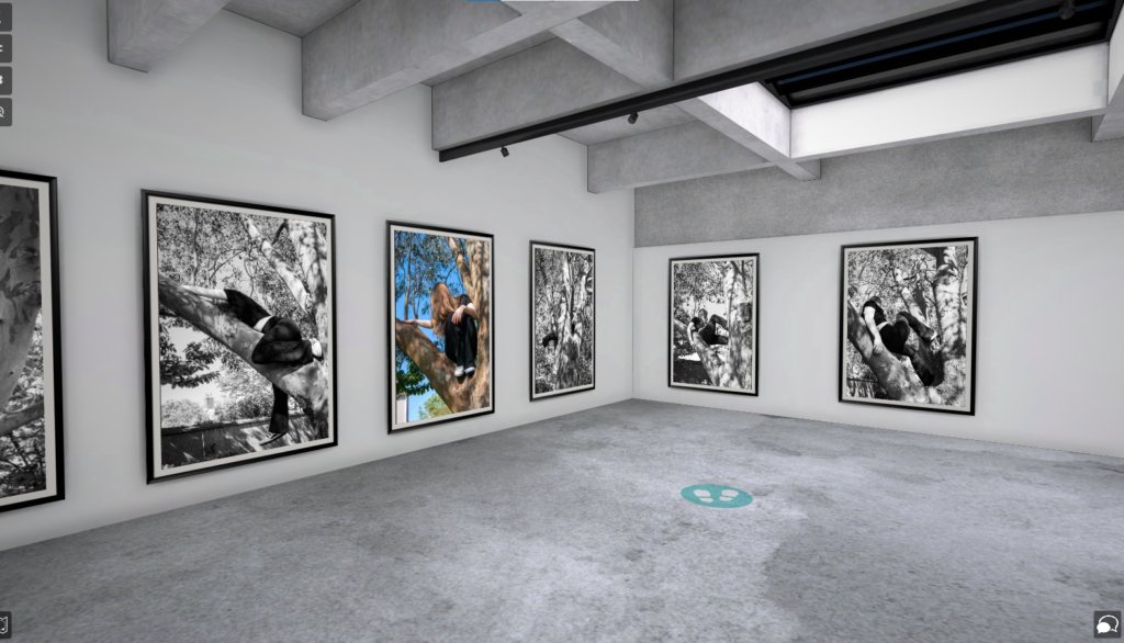
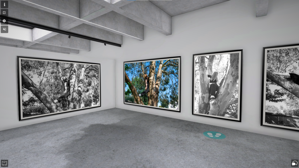
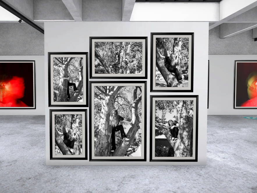
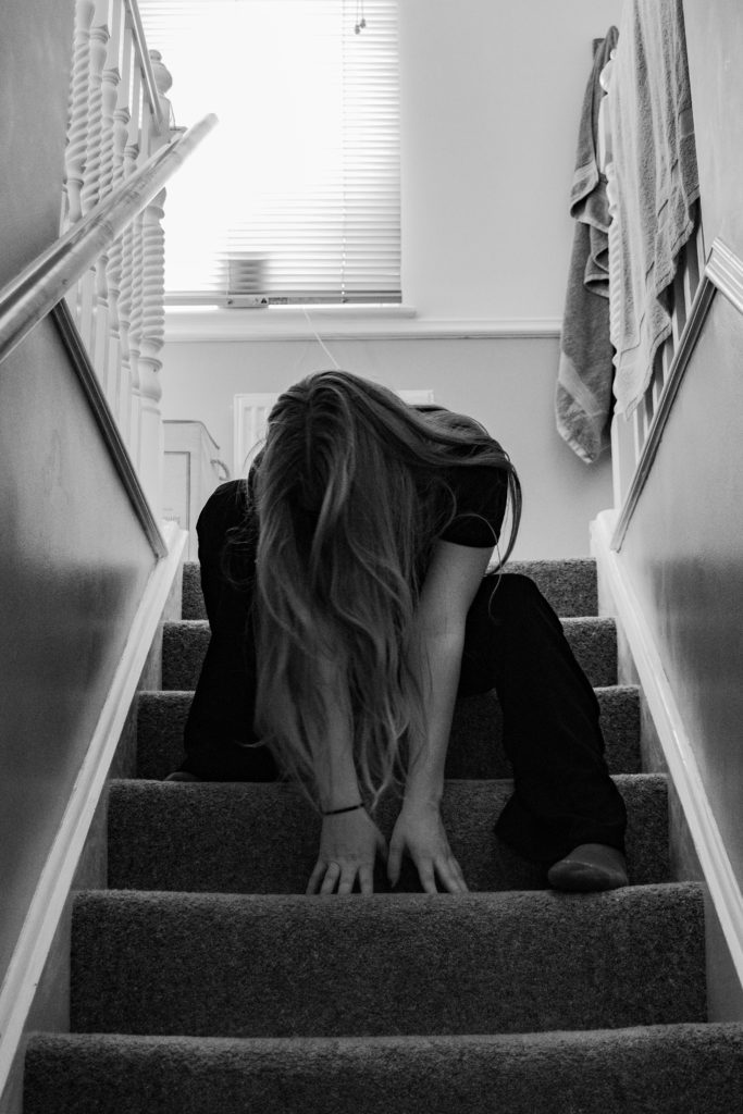
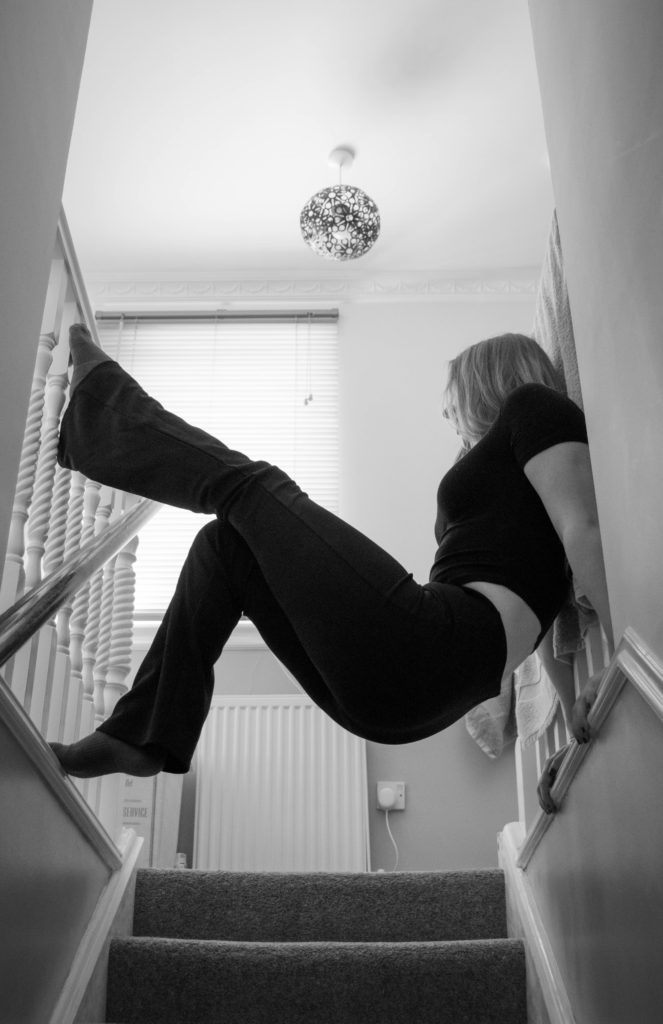
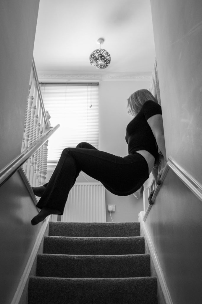
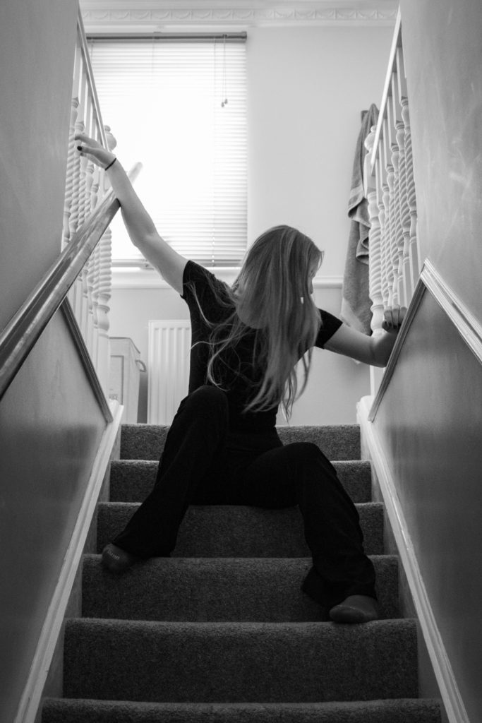
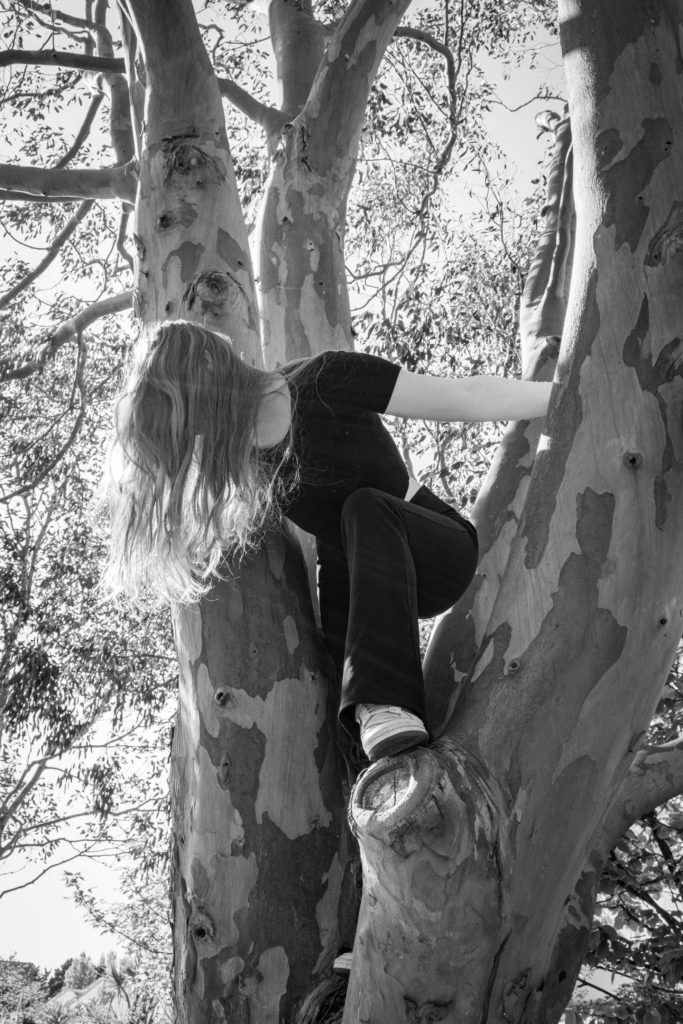
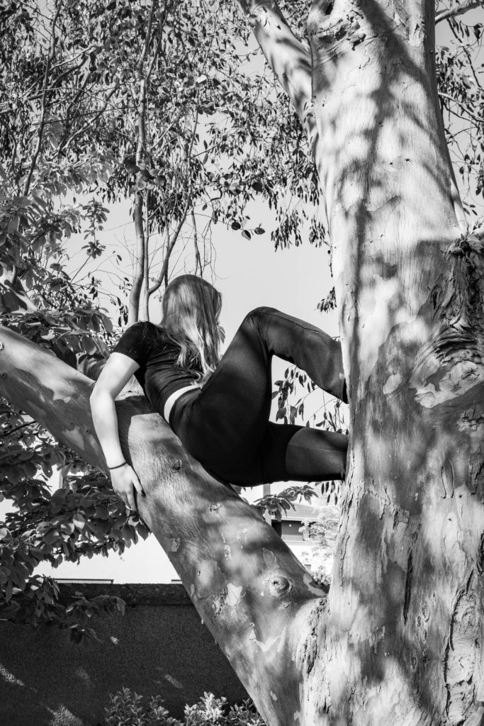
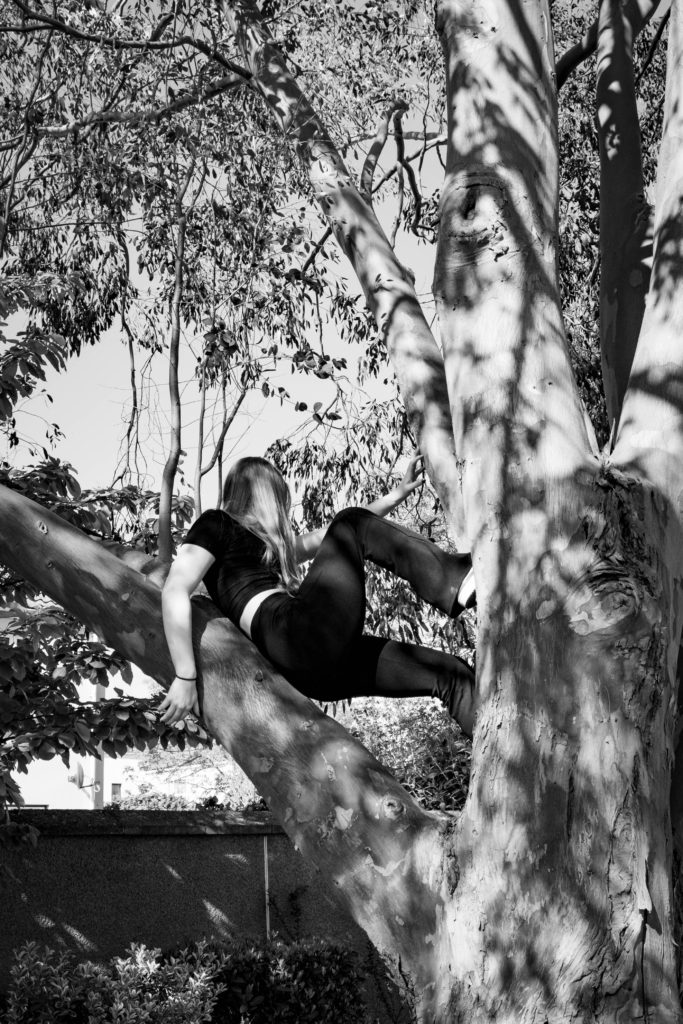
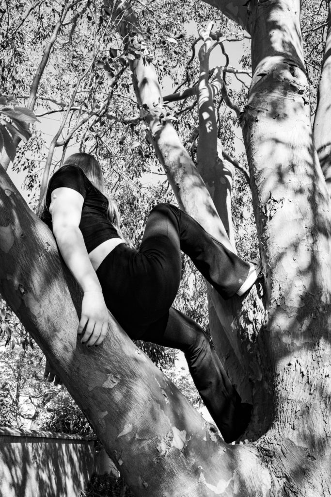
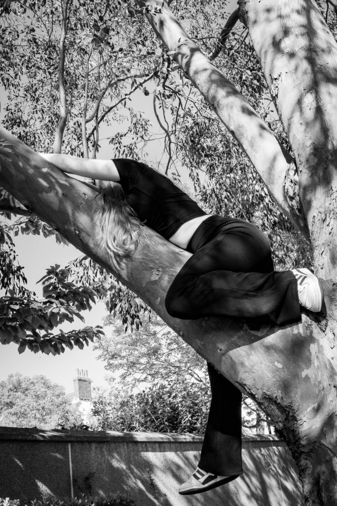
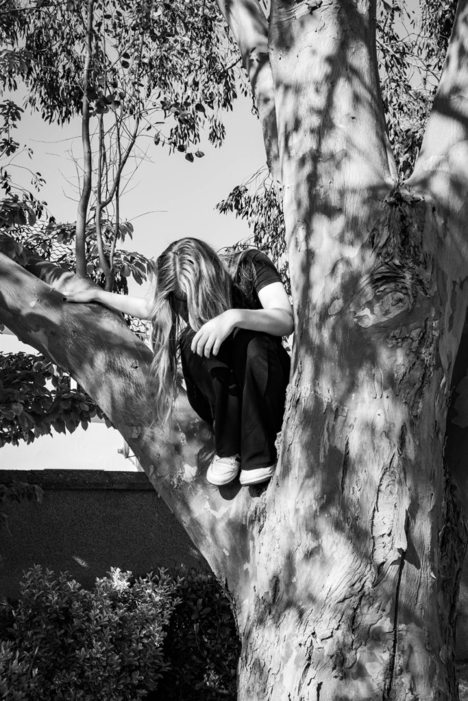
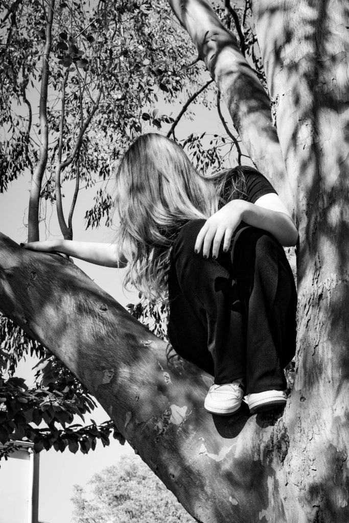
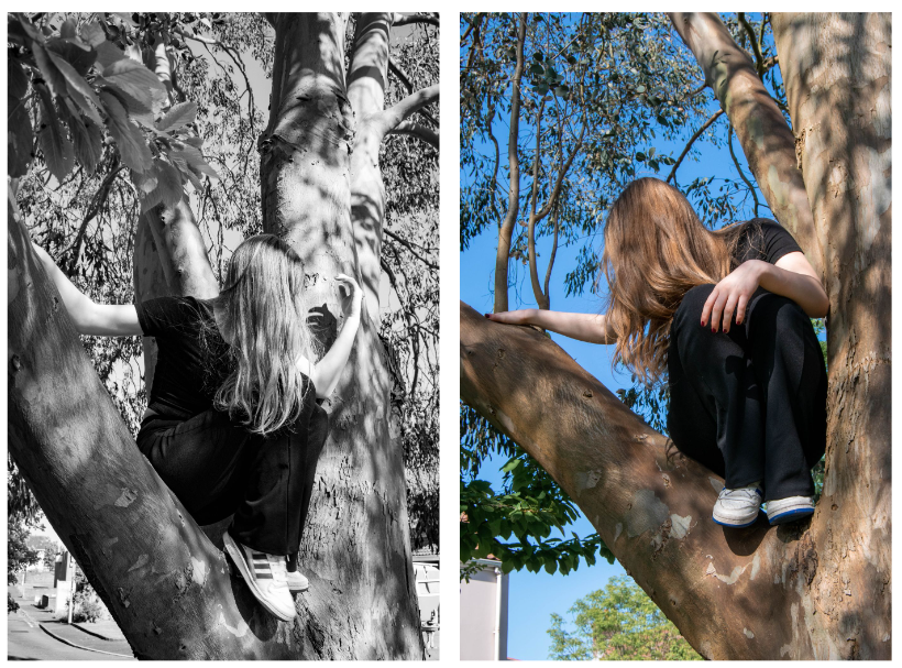
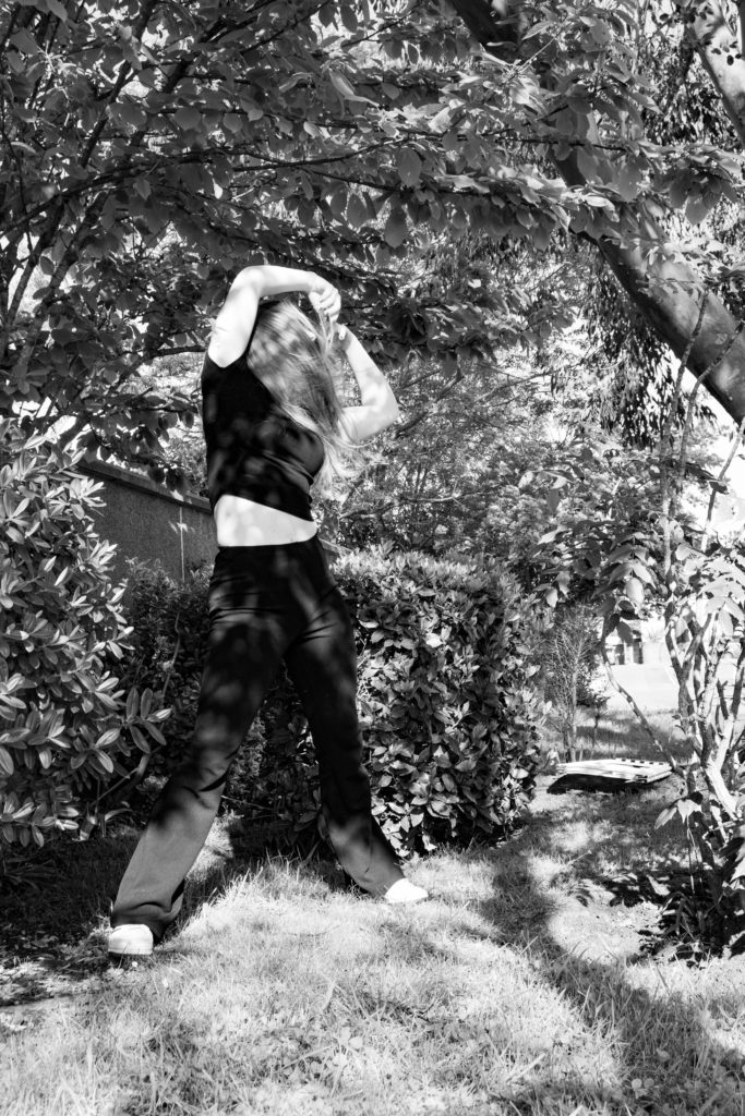
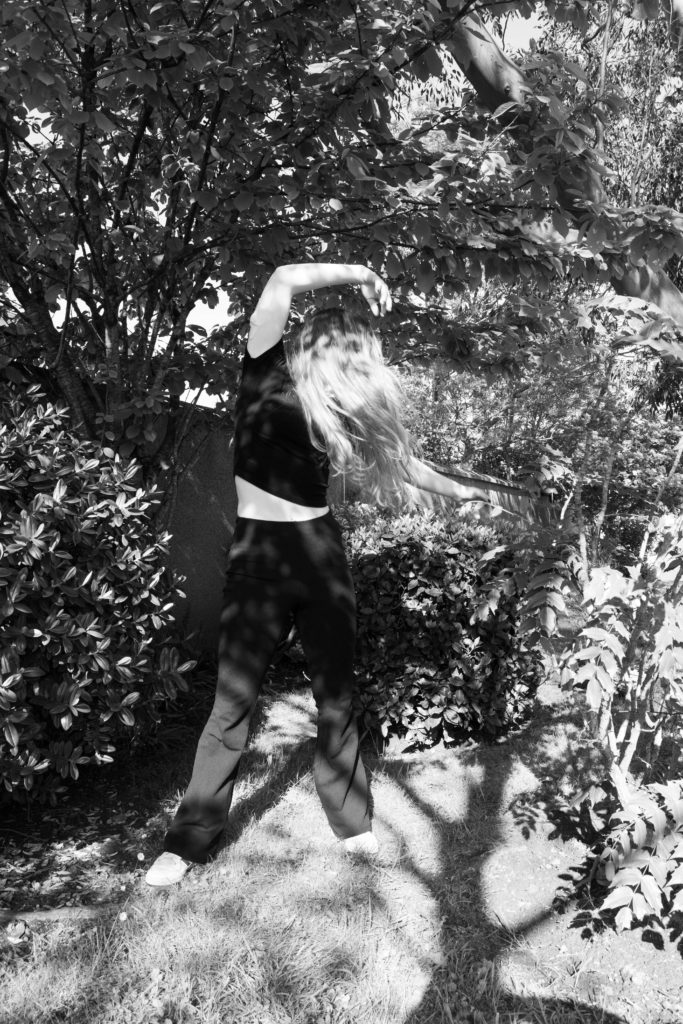
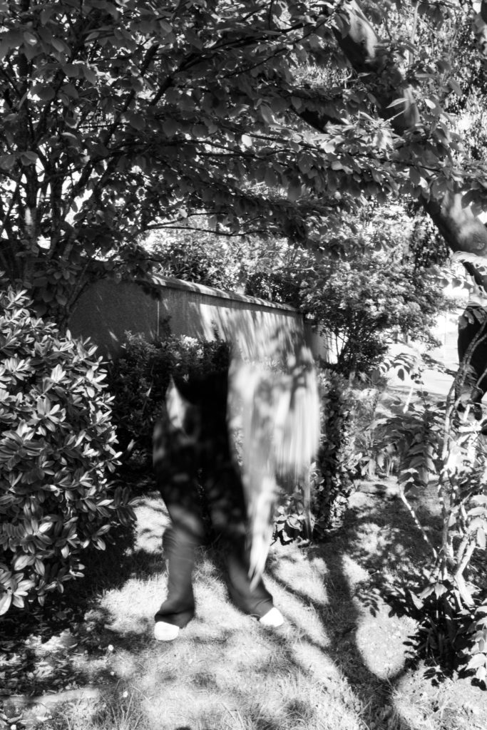
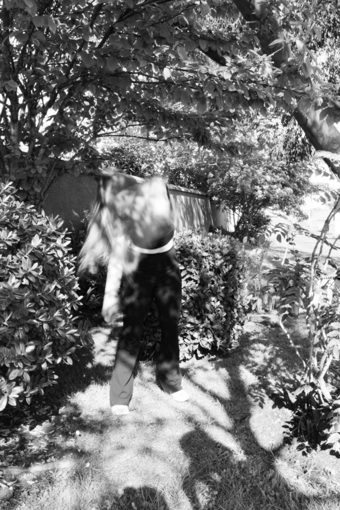
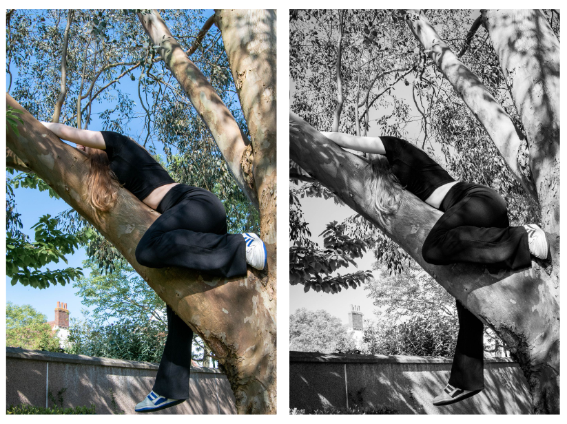
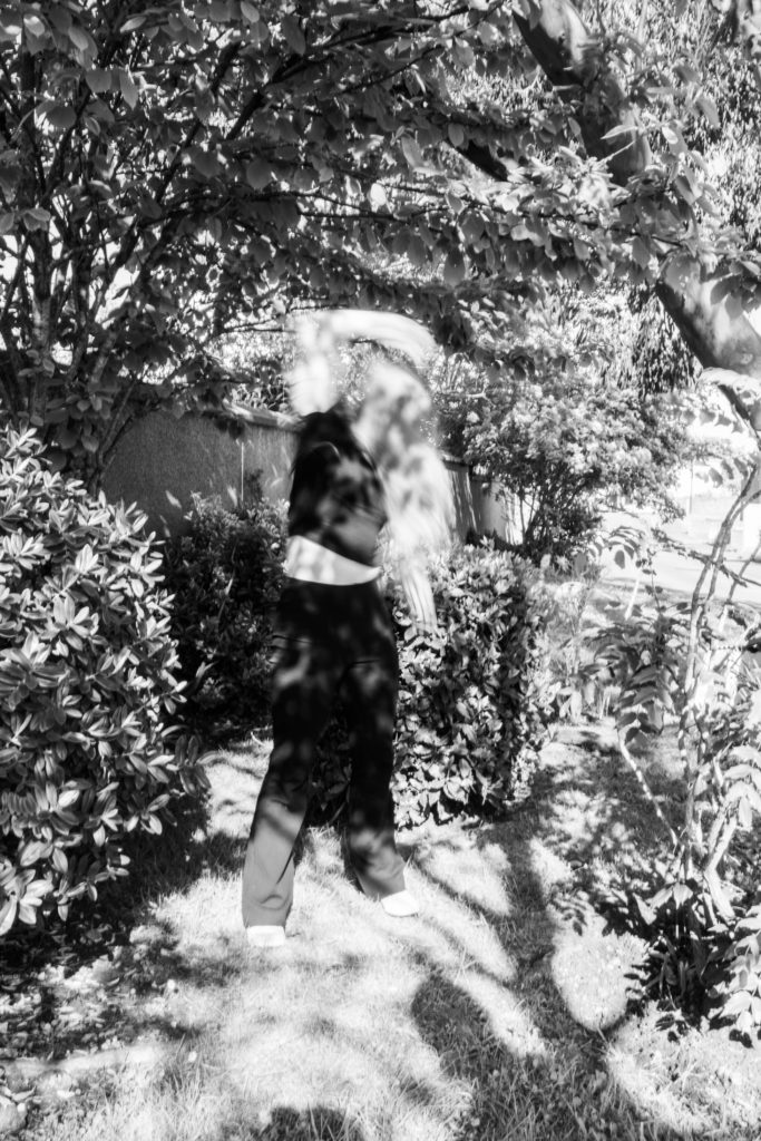
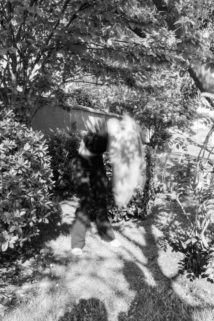
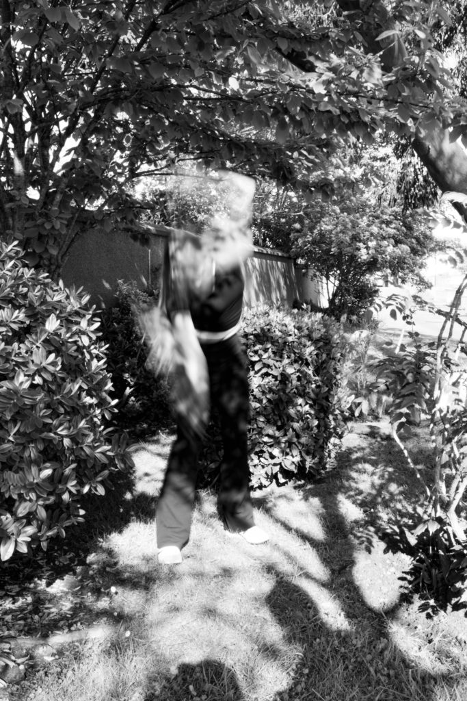
I’m happy with my mounted outcomes, I experimented with window mounts and foam board. On the contrasts, my final images for femininity are not exactly what I wanted as the images ended up being too complicated with the background. However I think the images do link to my artists. The long exposure photos were my least successful, however I do like the Clare Rae images. I might re-take some of the images with the long exposure to add to my collection. I feel like my images present what I wanted to show about femininity and how female identity is lost amidst the societal stereotypes these days.

What references did I make to artists references

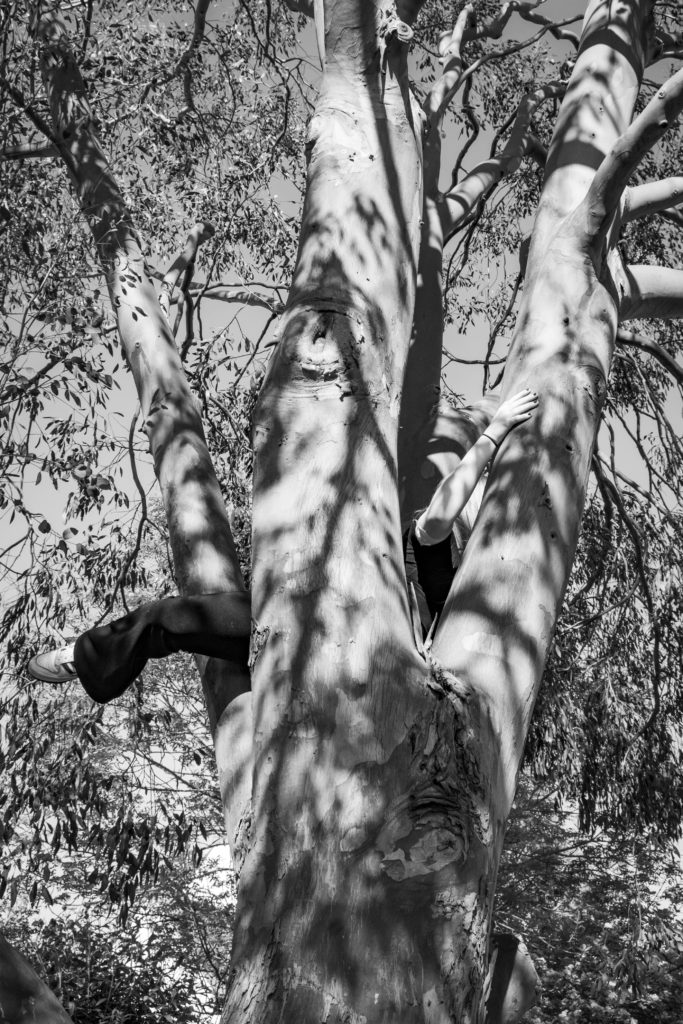
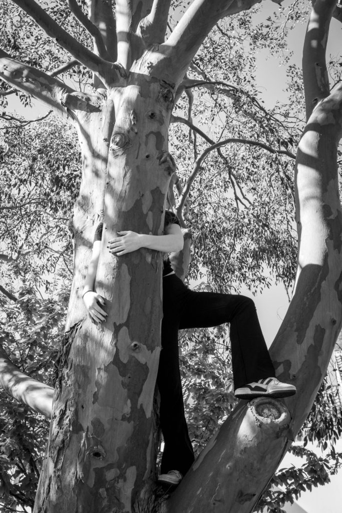
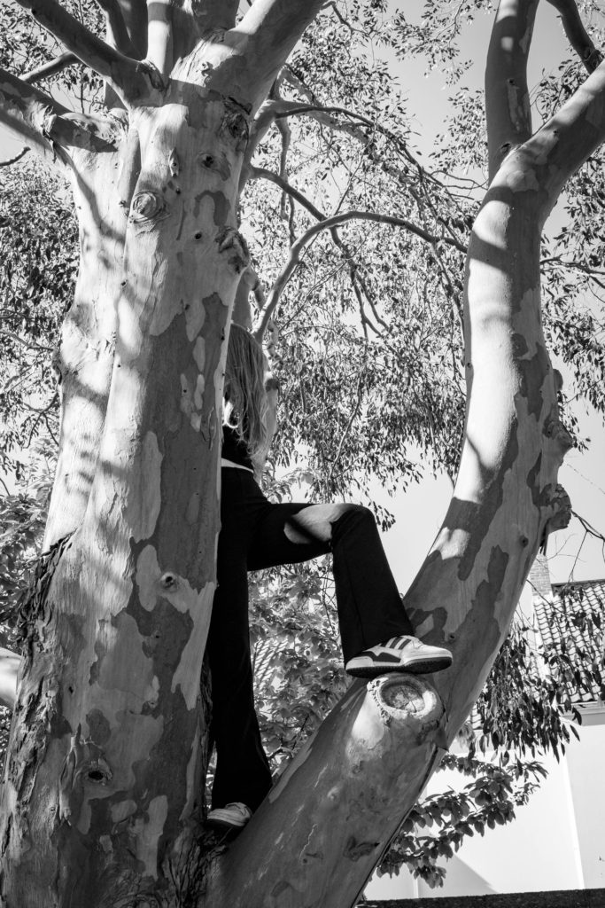
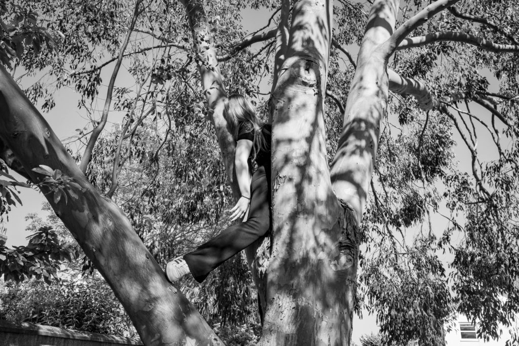
As Clare Rae and Francesca Woodman being my two artist references, I think I managed to link to their work through combining their two styles together. Overall I think I captured their styles through a slightly different view, but still holding the main ideas of identity through feminism. My main idea that I really wanted to show was that through the permanent stereotypes people think about women, identity can be removed, especially considering the past dominance of ‘The Male Gaze’ through art and photography. I showed this through hiding the identity of my subject, but also connecting her to nature to present females as natural, separating them from the constant fake images they hold on social media.

Is there anything I would do differently?

The only thing about my feminism shoot that I would change would be where I shot the images. Even though I really like the outcomes and they linked well with my artist references, I think some of the images were overcompilated to look at due to the background. To change this I could have taken more photos in a more basic setting such as the sand dunes.

Evaluation on the whole project:

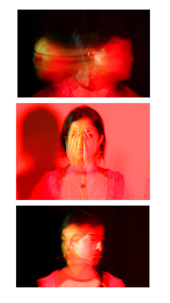
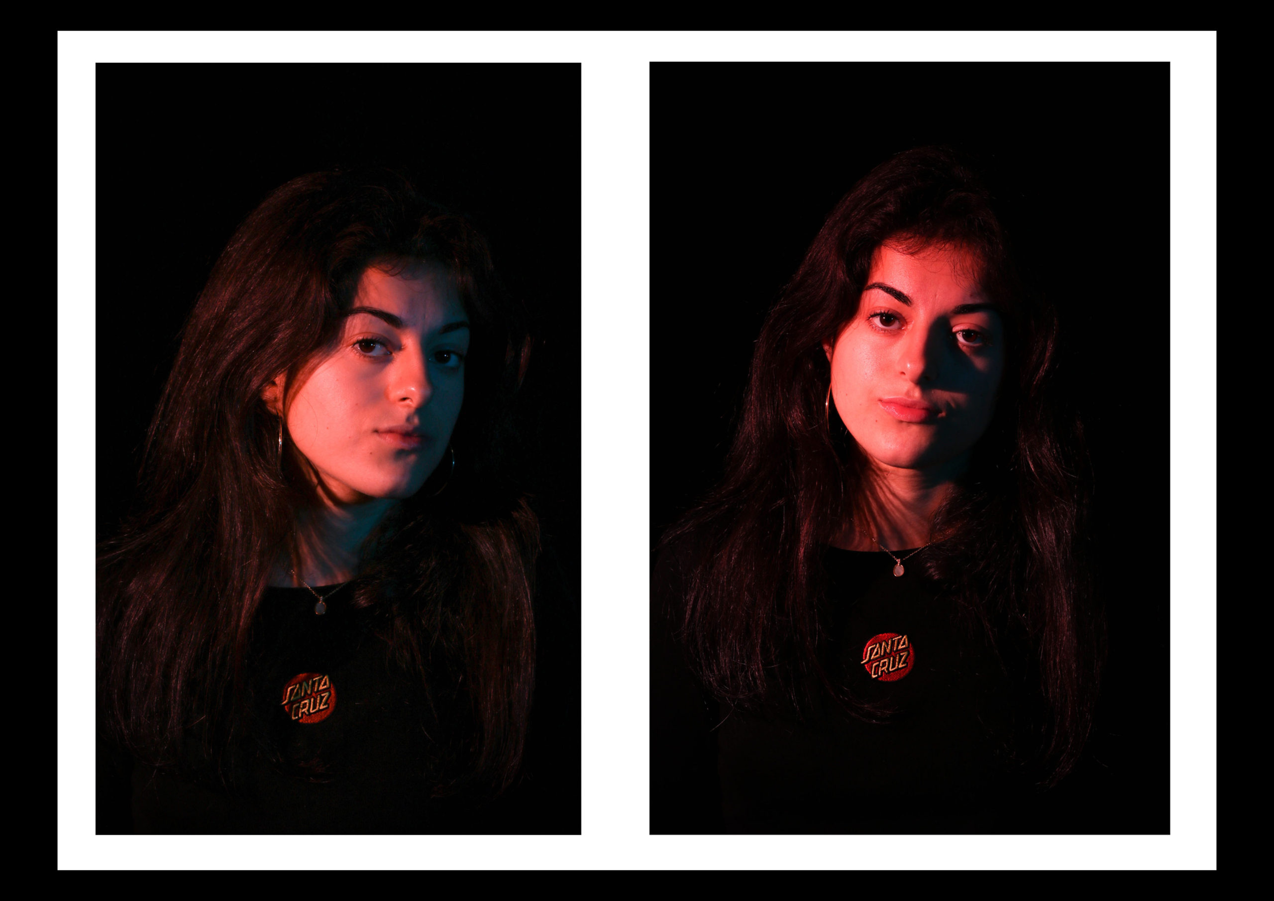
My favourite part was learning about studio lighting and more in depth camera settings. Experimenting with the Rembrandt, butterfly lighting and the colour gels was really interesting as each one created a drastically different effect of the subject. I also really enjoyed experimenting with long exposure in the studio and I think some of my best images were from those shoots.

I struggled more with the environmental portraiture and I feel like I could have pushed myself more and gone into public places to get my images. However I really liked the idea of capturing someone in their working spaces. I wasn’t too happy with my final images from those shoots because I only used people I knew.

I’ve also enjoyed the feminism project because it is a large issue in todays society that isn’t talked about as much as it should be. Presenting the issues through photography meant I could show a creative and more subtle side to the issue, and I think I managed to achieve what I wanted to.
Mounting ideas

I might put my three images on foamboard in a strip. I like having the two darker images on the outside of the lighter one as it creates a contrast and looks good presented together.
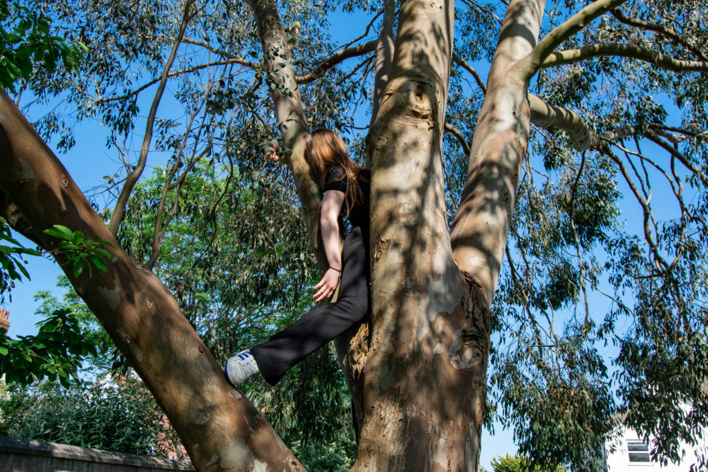
For these A4 images I might put them on white foam board, then back that onto black card to bring out the colour and add to the darkness.

As its A3 I will either do the same for this image by mounting it onto white, then black board, or I will window mount it.

Comparison

My work compared with Francesca Woodman: The images turned out how I thought they would and I am happy with the camera settings and movement. However I think there is too much going on in the image and I should have used a plain background. I might re-take these images in the studio or my house.

My work compared with Clare Rae: I used her style more in the shoot than Woodman’s. I really like the way these images turned out as I think I managed to capture the same poses and movement as Rae. Again, I think the backgrounds I used were too complicated compared to Rae’s work. However I feel like it shows my ideas and individuality through my work as our photos aren’t exactly the same. I think the fact I kept my subjects face out of the images adds to the abstract style, and connects with the idea that as a female today, identity can easily be lost as we are just seen as a body.