This is my final photobook; titles twos a crowd

This is my final photobook; titles twos a crowd
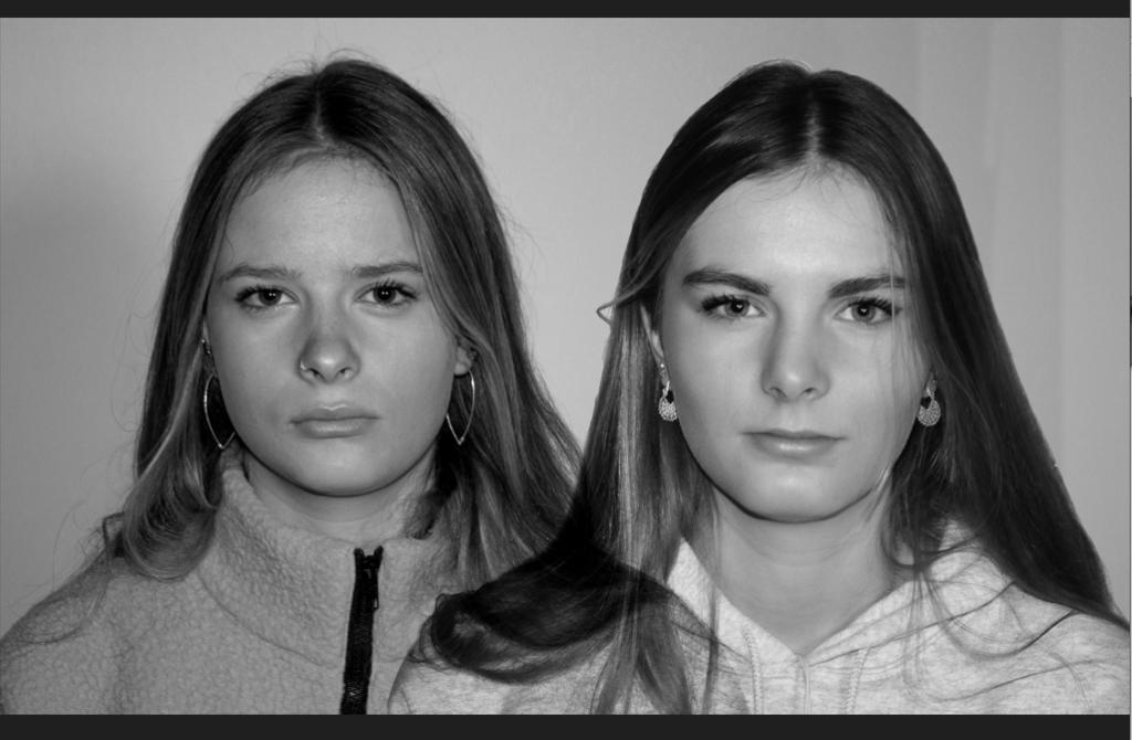
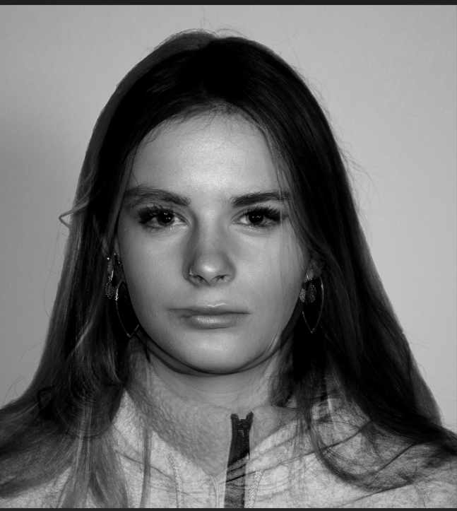
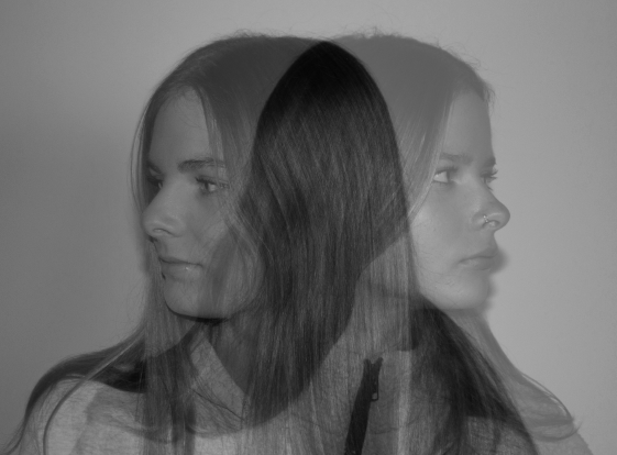
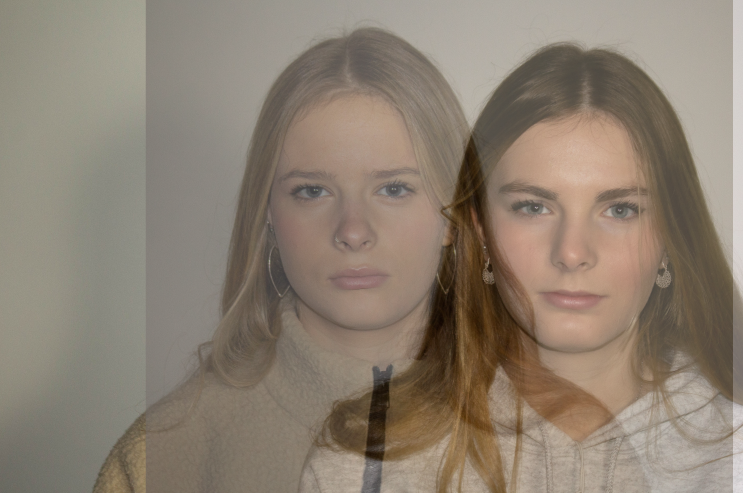
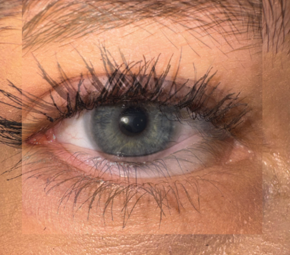
On photoshop I overlaid two separate images on photoshop and played with the opacity so both of out faces appeared visible. I did this with a few of my images until I was happy with the results.

With this image I overlapped my sisters face onto mine to create us as ‘One individual’.
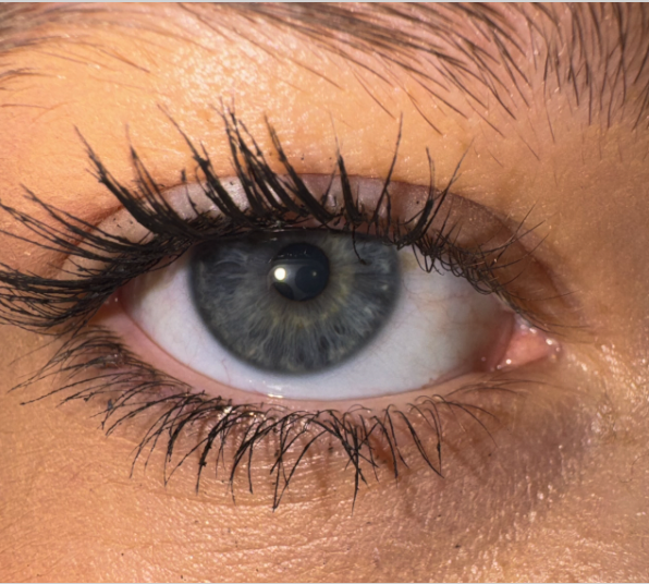
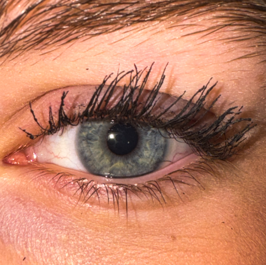
I merged a picture of my eye and my sisters to create it into one image.
1. Research a photo-book
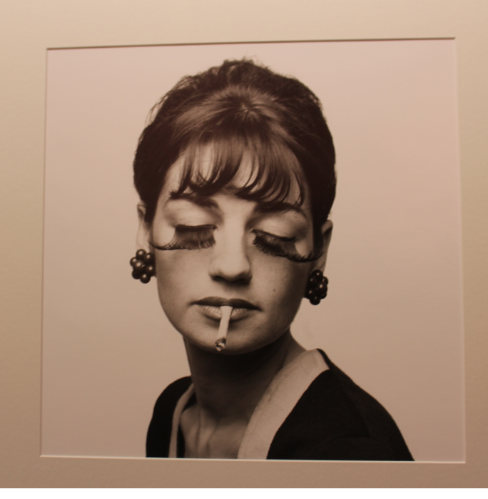
The book is trying to tell the story about a persons mother and their loss of identity by losing her. She deals with her grieving by looking for her mother in a variety of objects and nostalgic things, but yet also gives them new life by photographing the old. She uses multiple different genres such as Still life, landscape and portraits combined into one photobook. For her photobook she uses a wide range of using each page such as one singular picture on a double page spread and sometimes two small images only covering the middle of the page. She also uses staged and natural images such as some being old pictures of people going about their daily lives and some where they are directly posing for the picture.
2. Who is the photographer?
I Feel that she made this photobook to share her experiences with losing her mother and to also help other people see a different side of a persons inevitable death and appreciate the time that they had with that person. I also feel that she wants the world to appreciate her mother and see her inner beauty like the way she saw it, and to also treasure her mothers legacy so her name goes unforgotten.


I didn’t end up doing my 3 photoshoots in order so this last one was a bit rushed, I am happy with some of the results of this photoshoot but if I had more time I would make some changes such as bringing more objects to school rather than taking pictures in my house.

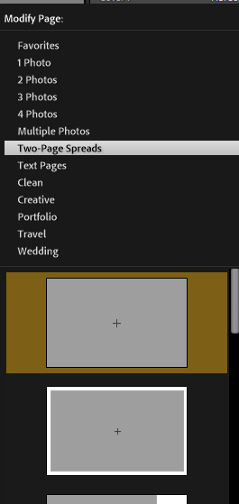

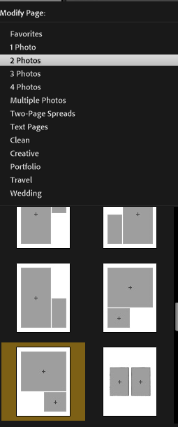

When making my photobook I wanted to tell a story with my layout. I chose the standard portrait layout due to my mixture of still-life and portrait images. I personally feel that the majority of my best images are the portrait ones. I wanted a mixture of formats in my photobook so I did a few on a two page spread.

And I did some with three photos on a page

This is my final photobook before I get it printed
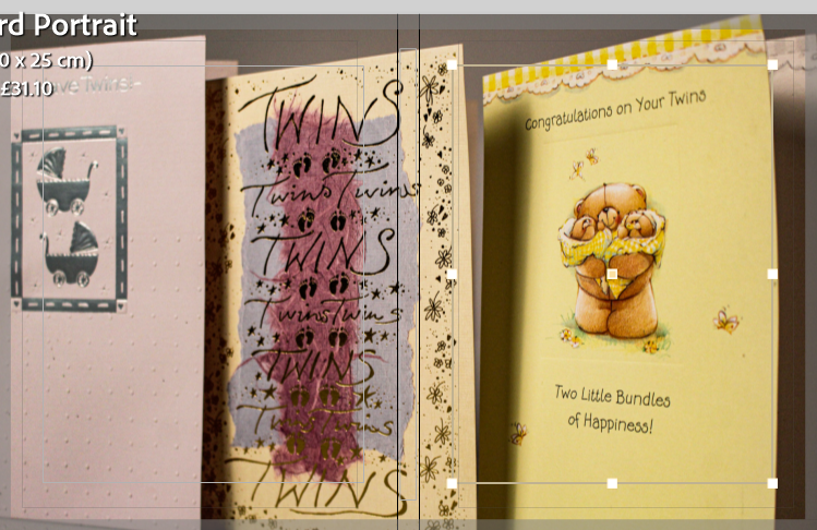
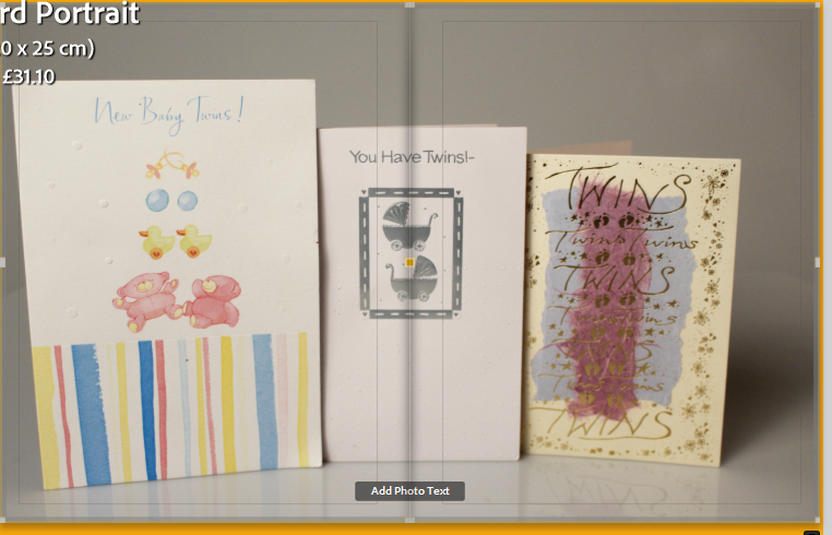


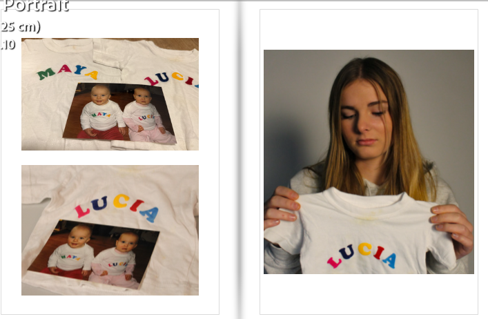


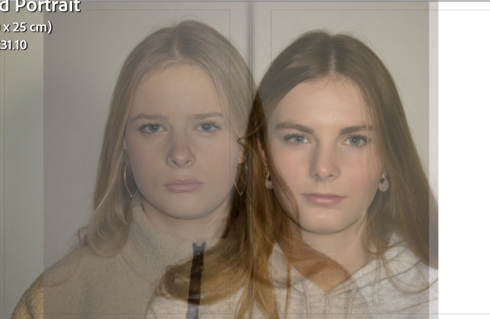


Overall I am happy with my final results, I feel that it tells the story I was trying to portray and replicates part of my childhood. For my next project I have learned that I don’t really want to do still-life images as they are a lot harder to capture the emotion that I am trying to express through my photobook.
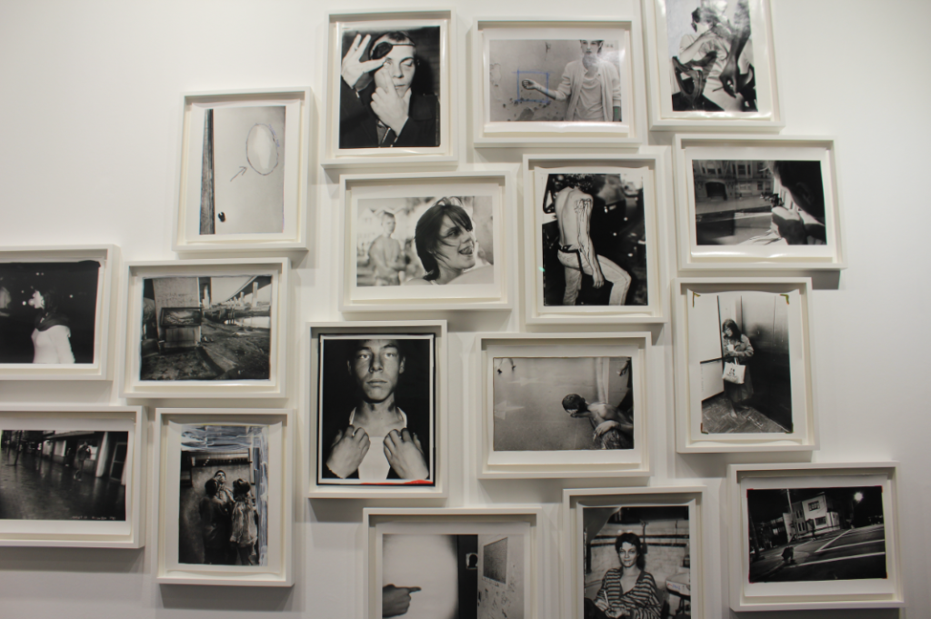
This is my Virtual gallery for my nostalgia mock. I did this by uploading my images onto the website art steps and then positioning them around the gallery.


The aim of this photoshoot was to produce images of how mine and my sisters identity got confused when we where younger. I did this by taking pictures in the studio of her and some old images of us together when we where children and her pointing to herself or looking away when it was a single image of me. I edited these pictures in Lightroom as well while trying to give them a warmer and softer look.
Overall I am not as happy with this photoshoot as I feel that the lighting set up wasn’t ideal. Some of the pictures came out a lot warmer than others and I feel that they don’t represent the story that I wanted to tell. Next time I will spend more time trying to set up the perfect lighting which complements the features of her face.


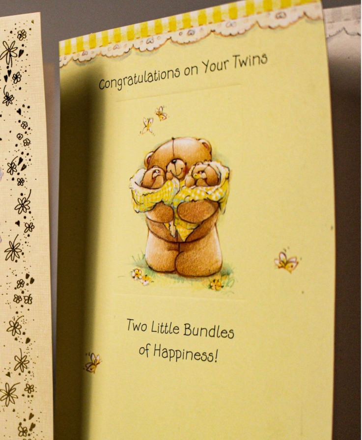
For my first photoshoot I decided to take pictures of still-life objects such as toys, clothes and cards. I choses to do this photoshoot as these objects have sentimental value to me and remind me of my childhood with my sister. I took them in the studio placed on the white infinity curve with a direct studio light above them. When I was editing these pictures I wanted them to have a more yellow temperature to show the oldness of the items and how they have aged and soiled overtime.

Overall I am happy with the way that these images have turned out and I feel like they have a nostalgic feel to them as they capture my youth. One thing that I would change is next time I would take comparison pictures of toy cars and barbies as i was describing in my plan, but due to how long its been since we played with toys, my resources where limited.


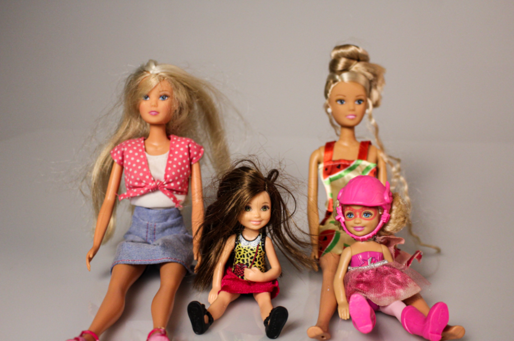
For my first photoshoot I am going to take pictures of old cards that my parents received when we where born along with old outfits of how we where always dressed as individuals and hardly ever wore the same outfits, I am then going to take pictures of some of our childhood toys and the contrast of me liking dolls and her liking cars. I am planning on doing this photoshoot in the studio as I feel that that’s where I am going to get the best lighting and it would be the best setup for this idea. This would be the photoshoot that’s inspired by Gabriele Galimberti.

For my second photoshoot I am going to take portraits of myself and then my sister, this is because I want to edit them on photoshop with my face mirroring hers, and also use old pictures of us and do the same. This is because even though we are fraternal we still have similarities regarding our face as do most siblings. I would probably do this photoshoot at my house against a white wall with a mixture of natural and artificial lighting. and then edit them on photoshop or lightroom. This photoshoot wold be inspired by Irina Werning and Vibeke tandberg.

For my third photoshoot I am going to use old photobook that my parents made for me when I was a child and take pictures of my sister holding the book and also individual images of the pictures inside. I am doing this as these old photobooks hold a lot of memories from my childhood with my sister and show us growing up together.

