All posts by Kaitlyn Cadoret

Filters

Author:
Category:

capital house exhibition ‘no place like home’

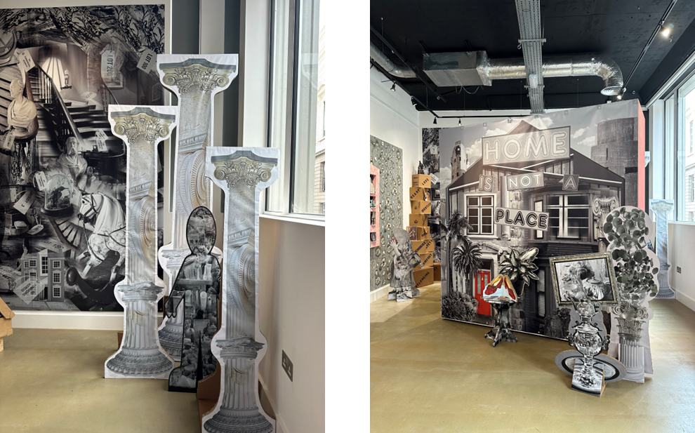
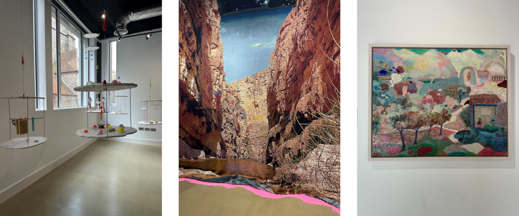
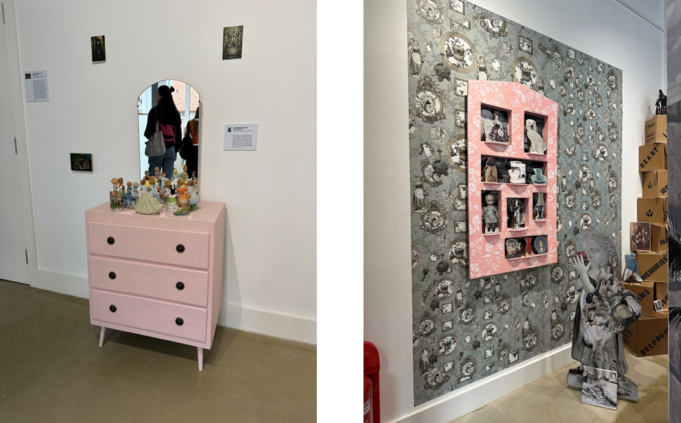
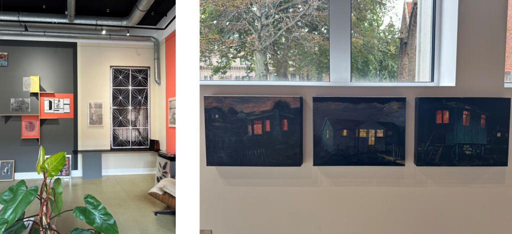
The Art house Jersey are currently holding an art exhibition called ‘no place like home’. There are a few different parts to this exhibition with the gallery at capital house, the dissent module that was placed at Les Platons, and the floating earth that was at Queens valley reservoir.

‘No place like home’ is currently being held at the art gallery with a wide range of art work from many different artists locally and internationally. The whole exhibition is aimed to get people thinking about what home means to them in terms of personally as well as nationally and even globally. We live in a time where housing is currently in crisis with the cost of them as well as the cost of living meaning home isn’t always a happy place for people. It is also aimed to get people to think about the condition of our planet and its health, this is also a very serious topic which many people don’t consider. The gallery has showcased pieces from small canvases to big sculptures and area set ups, this allows for members of the public to walk around analysing the pieces and even interact with some of them.

The creators of ‘No Place like Home’, Rosalind Davis and Laura Hudson said:

“We wanted to create an exhibition where everyone can feel at home. A key aim of ArtHouse Jersey is to make the arts accessible to the wider community, which was why we were drawn to a subject matter that will mean something to everyone. Home is of course a loaded term, and its connotations will be different for all of us. For many it will be a sanctuary, but for some it may have less positive associations. No Place Like Home builds a rich narrative and delves into personal stories, global issues, childhood memories, and speculative worlds as well as the bleak realities of the current housing market. The artists do not shy away from difficult issues, but rather tackle them with inventiveness, pathos, humour and a generosity of spirit. Alongside the gallery works, three installations will be announced in the coming weeks which will take their place in surprising settings around the Island.”
my images

The dissent module was made by the artist Rachel Ara to show her concerns of the idea of home and the assumption that it is always a safe place to be as for some people it isn’t, and if fact it one of the most dangerous place where a high percentage of crime is committed. Ara has designed the interior module to be like a womb to replicate a safe place for someone to be, with the module being a metaphor for returning home safely.
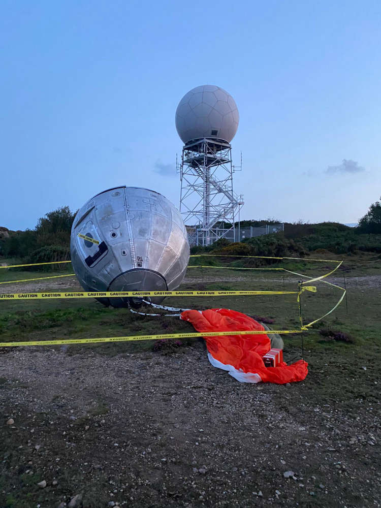
image from Art House Jersey

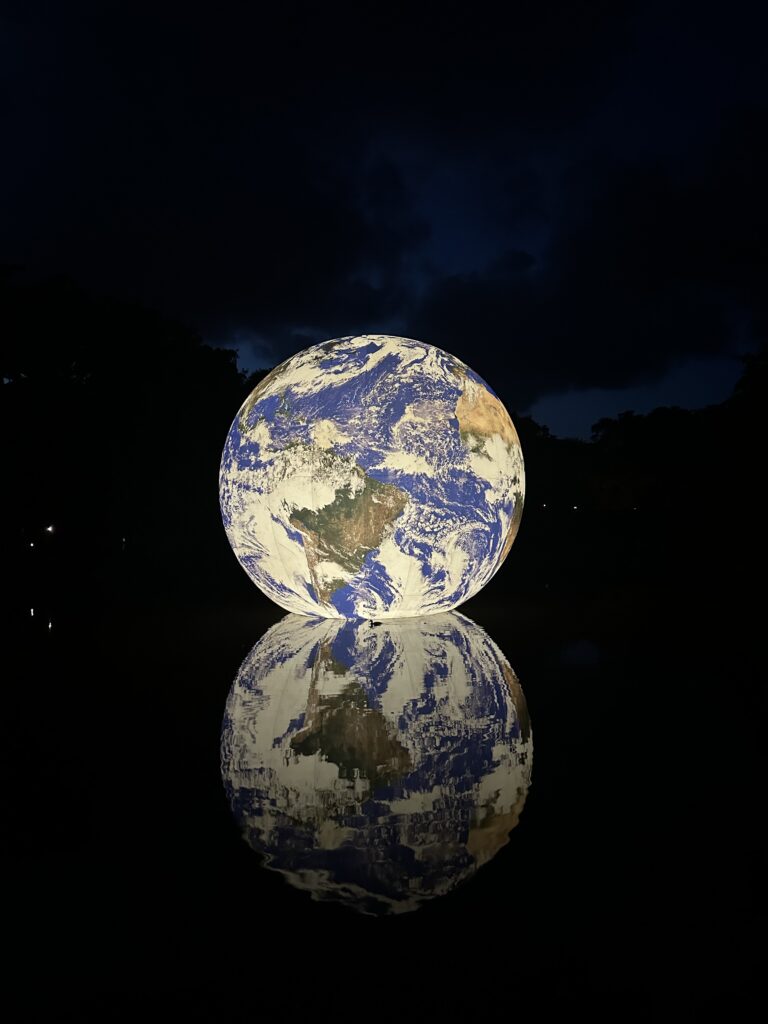
The floating earth, that drew a large amount of the publics attention, was created be the artist Luke Jerram. It was also part of Art House Jersey’s exhibition ‘No Place like Home’ and was also partnered with Jersey water. It was aimed to show people how we all think of home as different places but they are all in the universe/world. The event was already set up previous to it’s arrival in Jersey and after many discussions with Art House Jersey, Jersey Water and Luke Jerram’s team it was able to be places in the reservoir for 12 days where it attracted over 31,000 members of the public. This was a great opportunity for Jersey to experience more exhibitions which as a result beings the community together. Many photographers and regular members of the public shared their images and videos online which only attracted more and more people as well as schools and charity groups. The floating earth was aimed to create the effect of someone in space looking back at the earth with that nostalgic feeling being present.
my image

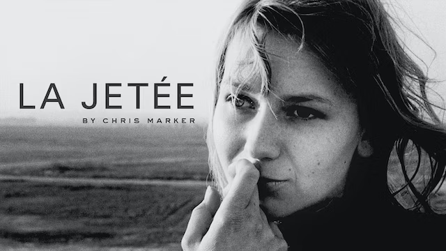
Chris Marker, La Jetée

who is Chris Marker:

Chris Marker was a French filmmaker, poet, novelist, photographer, editor and multi-media artist who has been challenging many different things including philosophers and himself, questioning time, memories and how quickly life changes. Chris Marker is best known for his film Le Jetée.

what is Le Jetée:

La Jetée is a French science fiction and was directed by Chris Marker in 1962 and was made to tell the story or a post nuclear war as well as the after math of the country and all of the damage that it caused. The film is 28 minutes long and is made of mostly still images in black and white with text as well creating a montage.

visit to photography Société Jersiaise photography archives

about the archives/ our trip:

Established in 1873, Société Jersiaise is a group of islanders who set up the Jersey charity with a common passion for the islands history. The group began to grow and they started to share their interests and finds with the public, making Jersey’s history more known. Their aims were also the founding of the museum and the study of Jersey’s history as well as sharing their knowledge. 9 pier road became their permanent home in 1893 which is now looked after by Jersey Heritage along with their archives. They aim to protect Jersey’s historical aspects by buying archaeological sites in order to be able to preserve them and allow the public to visit them. The photography archive is one of their most important ones, with specific employees looking after them.

As part of out Elizabeth Castle film project we visited the Société Jersiaise photography archives in the Jersey Museum and had a talk from Patrick who is the head archivist there. He explained to us about the castle and showed us some of the images and drawing that they hold of the castle which we looked at. He also explained/showed us how to use their website which allows us to look at the archives later on in our project if we need them.

pictures from the archives:

zine evaluation

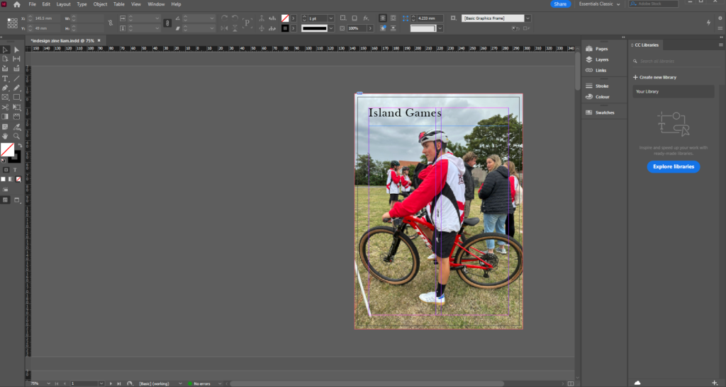
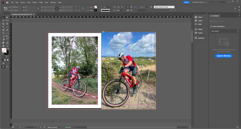
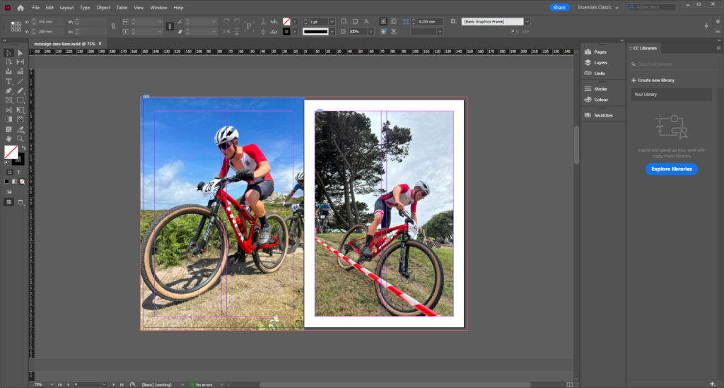
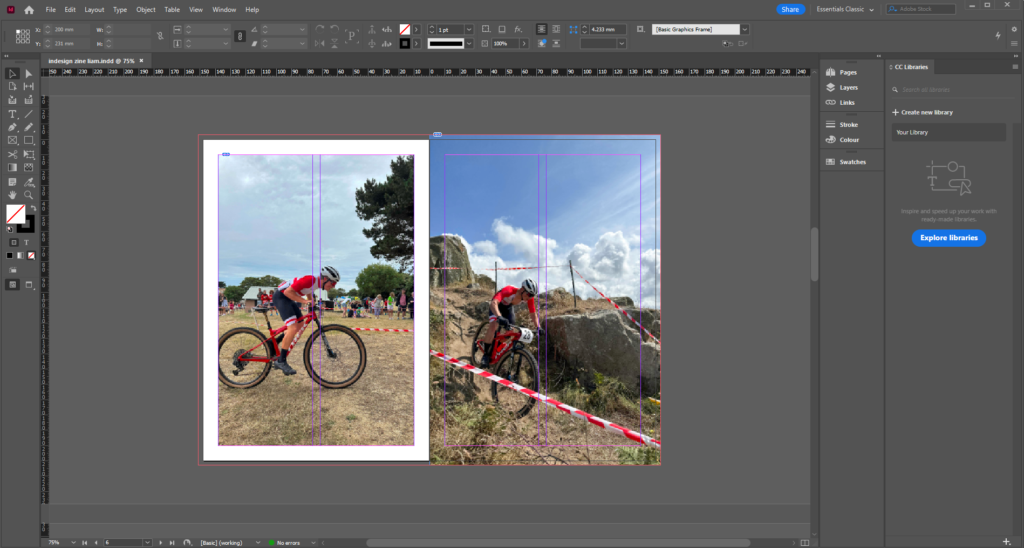
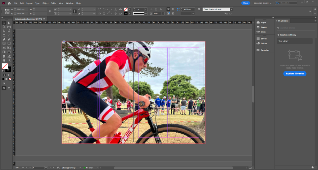
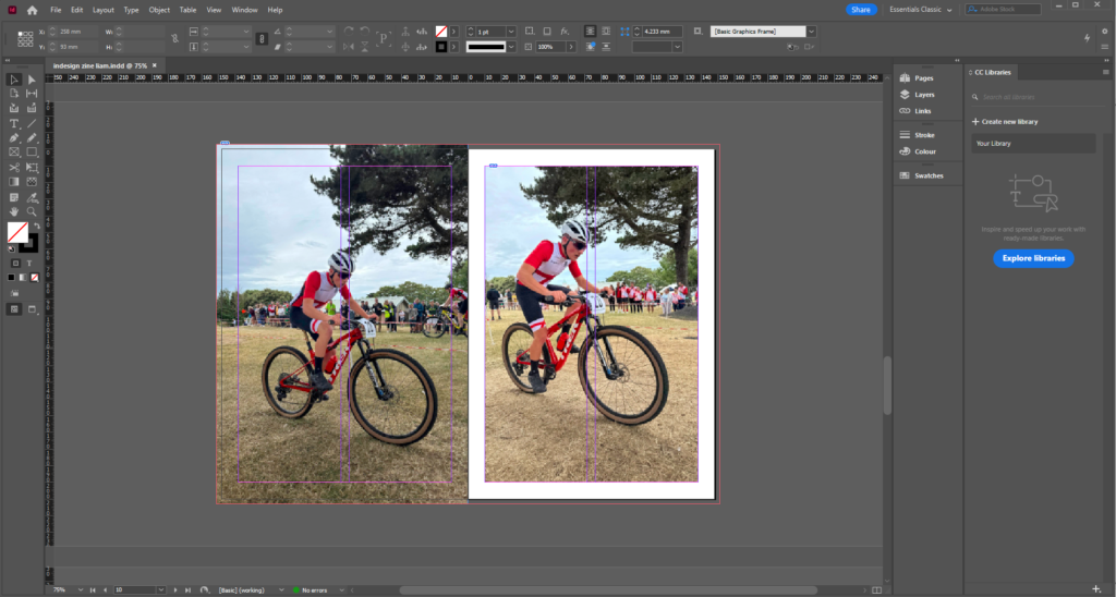
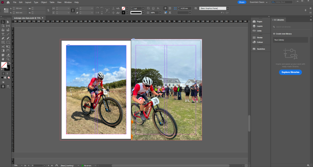
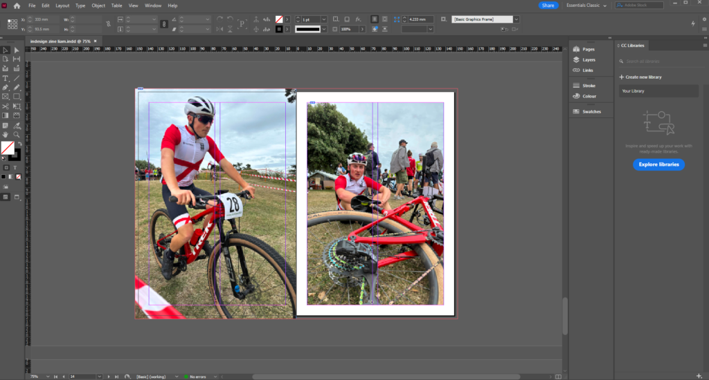
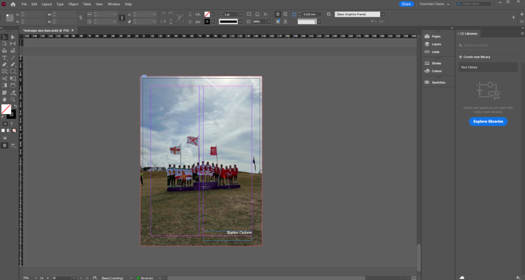
Overall, I am happy with how my zine turned out and think that it shows the viewer a good story timeline. I think that my images work well together and the colours in them contrast nicely making the images bold. I think all of my images are very clear and have a main focus point on the cyclist. This helps the viewer put the story together and understand it.

zine project

As I didn’t go on the St Malo trip, I decided to base my project on my brother who competed at the 2023 Guernsey Island Games. I chose to photography him during his events as well as the preparations he made and after the events to give the viewer a whole story. I used many different angles when shooting to make my images feel more engaging and to fully capture the image that I wanted to achieve. I think that many of my image turned out how I wanted them too which allowed me to create a zine with images that successfully show how his events went and what he achieved. One thing that I like about my images is the lighting. As they were both quite sunny days I think that that helped me to achieve the final results in the images which is what I was hoping for. I also thing that the colours in my images contrast nicely especially the red with the blue sky making for an eye catching image. Overall, I am happy with this project and think that with out context a viewer would be able to understand my project.

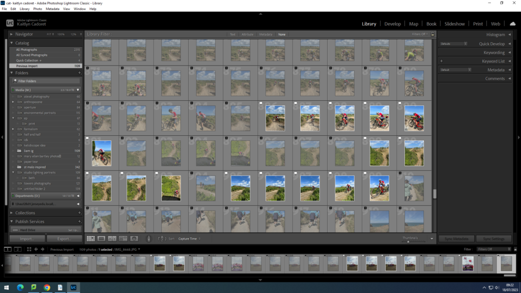
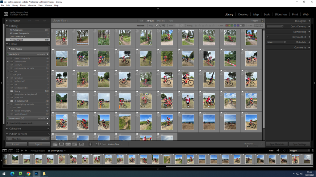
contact sheets:

essay: can a photograph lie?

‘Photographed images do not seem to be statements about the world so much as a piece of it, miniatures of reality that anyone can make or acquire’. Susan Sontag (1971), On Photography

Photography has been around for many years since 1839, and has only developed more and more over the years. Many take photography as a glimpse of life, a small snap shot of someone’s life or their day, however it could tell a completely different story to what the actual scene was like. This is where we begin to wonder whether photographs can lie or not. Many people realised that photography was a very different approach to art as opposed to traditional art forms and captures more realistic moments. Traditional art like paintings and drawing have been around for many many years, with the first painting known having been made over 40,000 years ago. This make the technique very sentimental to some and also historically valuable. With photography being introduced it may feel as if the world if moving on and becoming more influenced by technology which people may not like. I think to some people this may be seen as a less valuable way to produce art than traditional art as it isn’t ourselves who have created it physically as well as it being a newer medium which people will always be sceptical about. Photography is also seen as being an illusion to many people as it is a frozen image of a moment in time that is only a snap shot memory. Many people don’t like the idea of this as it doesn’t show the full story and it only one specific perspective or angle of the actually scenario. For this exact reason many people find it deceiving and hard to comment on. In more modern days, as photography has become very popular and accepted partially, I believe that traditional art work and photography can coexist and even work together to develop further.

AI in photography has become largely used in recent years. It is the use of artificial intelligence technology to generate realistic images from a few words or to adapt original images to enhance specific parts etc. Whilst it can be used simply to help photographers improve the quality of their images or to try out different ways to edit them, it can also be used negatively because of its realistic outcomes. As AI is becoming more and more developed it has also created quite an up roar with many different people for obvious reasons.

Robert Capa, Death of a Loyalist Soldier, 1936 real

Above we can see an image which was taken in 1936 of a loyalist soldier who sadly passed away. To some people this image may seem staged or unrealistic, however, this image is completely real and was just taken at the exact moment the soldier was shot. The photographer had asked some of the soldiers to go out onto the field to ‘fake’ getting shot for some images, when all of a sudden the enemies took advantage and the soldier I the image was actually shot with Capa capturing it at the perfect time. Whilst this image is real it could be easily staged which is why many people doesn’t believe in many images as it is so easy to do or to edit these days to give the viewer one idea when the actually story is completely different. One of the few things that to me makes the image seem more real is the framing and focus of the image. When staging an image we may put the subject in the middle of the frame, however, in this image we can see that the soldier is off the the left hand side. Part of the soldier is also not in focus which is one of the key thing many photographers aim for, focus. As the soldier is moving it would have made it hard for Capa to produce a focused image whether it was staged or not especially back in the time that it was produced, however, I do think this adds to it.

 Philip Toledano > Trump as a poor man

In this second image we can immediately see a difference. It looks much more digital and almost more like a very realistic painting as opposed to a photograph. Whilst this may be because it is a much newer image and photography without AI has deeply developed since, it almost looks too realistic to be true. there are a couple things in this image that I find give it away. I think that the burgers don’t look realists because of the way that they are stacked and they look as if they are plastic or another material rather than food. In the background we can see another employee who appear to have no face/ doesn’t look like a human. Whilst AI is very advanced it doesn’t always go according to plan which to me is a big give away to this image. However that single part of the image could have been edited whilst the rest isn’t etc. Finally, I think that ‘Trumps’ skin on his arms doesn’t look very realistic and again look almost like plastic. With that being said, the image still looks as if it could be real and just edited to improve the quality. This allows us to understand why people mistake Ai generated images for real images creating dispute.

Overall, I think that AI can be very deceiving and misleading causing people to interpret images in the wrong way. I think that images that are staged are a great example of how photography can lie as it is a mind game. They make the viewer think one thing but behind the scenes are completely different At the end of the day, I think it all comes down to how you perceive images differently and what we each take from them. Everyone will always have something else to say about an image or their own opinion to add as photographs are a very open style of art allowing the viewer to add their own thoughts to it. Not only do I think that images generated from AI can lie, but also regular images can too, as ultimately they are only a snap shot of a much bigger movie.

Will Lakeman workshop

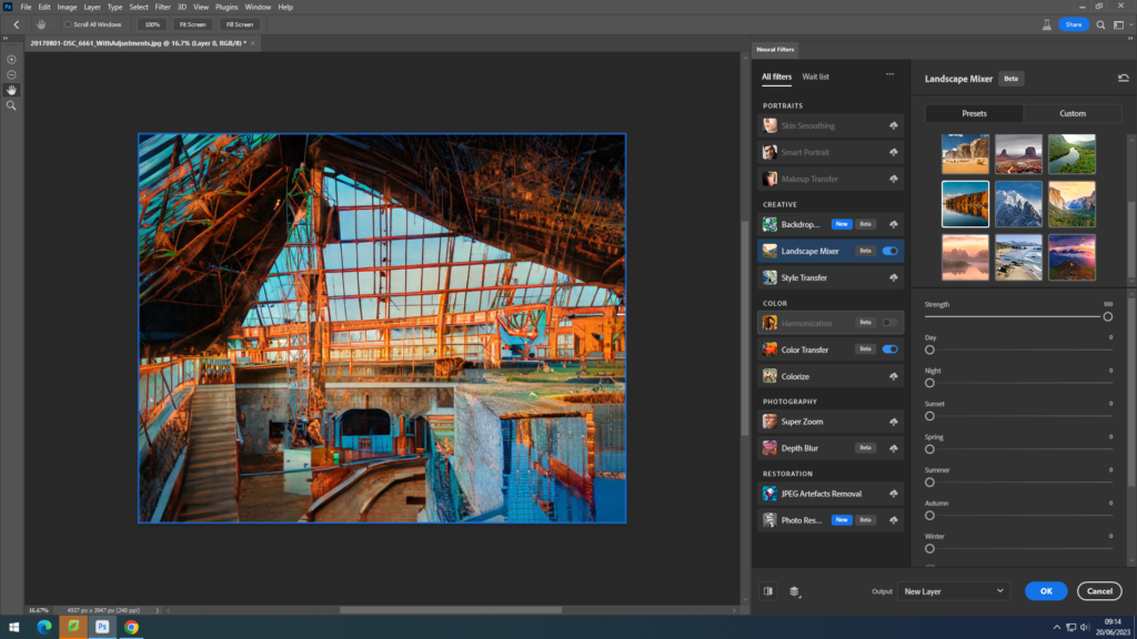
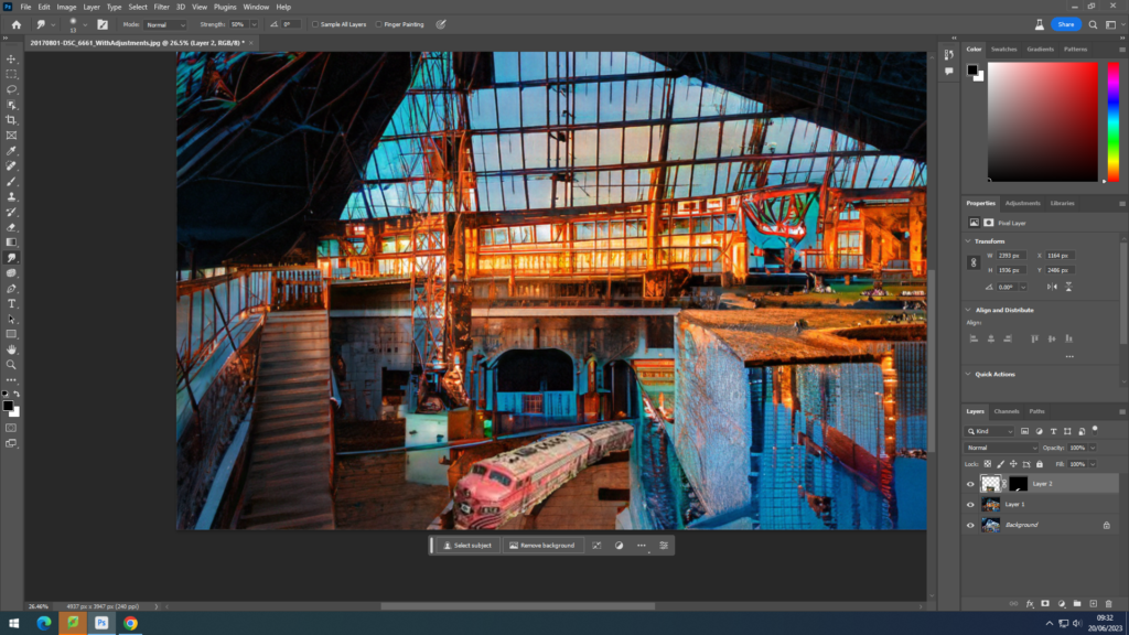
After visiting Will Lakeman’s art exhibition ‘Playtime’, he came into school to give us a workshop on how to use the AI feature in photoshop and some other cool features that we can use to develop our work further. We used an old image of what looked like an abandoned building and were allowed to added to it/ refine it however we liked. For mine I chose to make it look as if it was a late evening in the summer with the sun setting from behind the person taking the image leaving orange tones in the image. As you can see in the second print screen I tried to add a train that looked like it had been left there with the building as if it was an amusement park for children or some sort of activity centre. As we were using AI it didn’t quite come out as I was hoping. I am glad that Will was able to help and show us these tools as it means that I may be able to try an incorporate AI into other parts of my work in the future.

Henri Cartier Bresson and the ‘decisive moment’

who was he:

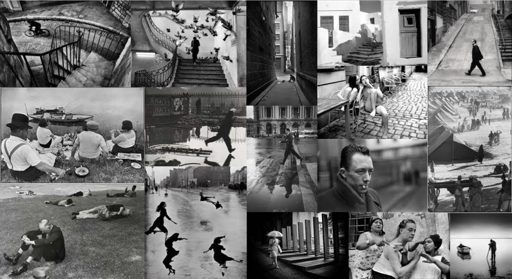
Henri Cartier Bresson was a French artist and photographer who was well know for his candid photography and the use of 35mm film. Cartier Bresson began painting from a very young age being taught from his uncle until he was sadly killed in World War I. He then studied at an art school and from this his love for photography began. He began socialising with surrealists which was a movement founded in the 1924 to challenge notions of normality within photography. It was a 1930’s photograph produced by a Hungarian photo journalist that truly inspired him, Henri said “I suddenly understood that a photograph could fix eternity in an instant.” His first camera was a Leica with a 50mm lens which he had for many years. He photographed in many different countries and they were first exhibited at the Julien Levy Gallery in 1933 in New York. Cartier Bresson published his first photojournalist images in 1937 as he captured the king and queens coronation. He then began to focus on his book ‘The Decisive Moment’. The book was originally published in 1952 and essentially is a monograph of 126 pieces of his best work. He had a motivation in photography that once a moment it gone, it’s gone, and he wanted to capture them to make them last making his book such an impactful item.

some of his work:

bibliography:

https://www.britannica.com/biography/Henri-Cartier-Bresson#:~:text=Henri%20Cartier%2DBresson%2C%20(born,photojournalism%20as%20an%20art%20form.

https://en.wikipedia.org/wiki/Henri_Cartier-Bresson#:~:text=Henri%20Cartier%2DBresson%20(French%3A,as%20capturing%20a%20decisive%20moment.

https://www.vam.ac.uk/articles/surrealist-photography#:~:text=Strange%20shapes%2C%20floating%20body%20parts,perceptions%20of%20sanity%20and%20reality.

virtual gallery

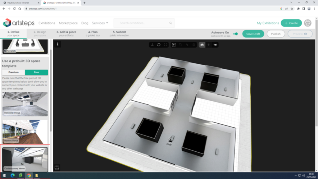
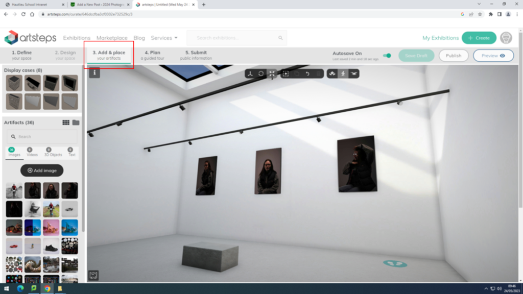
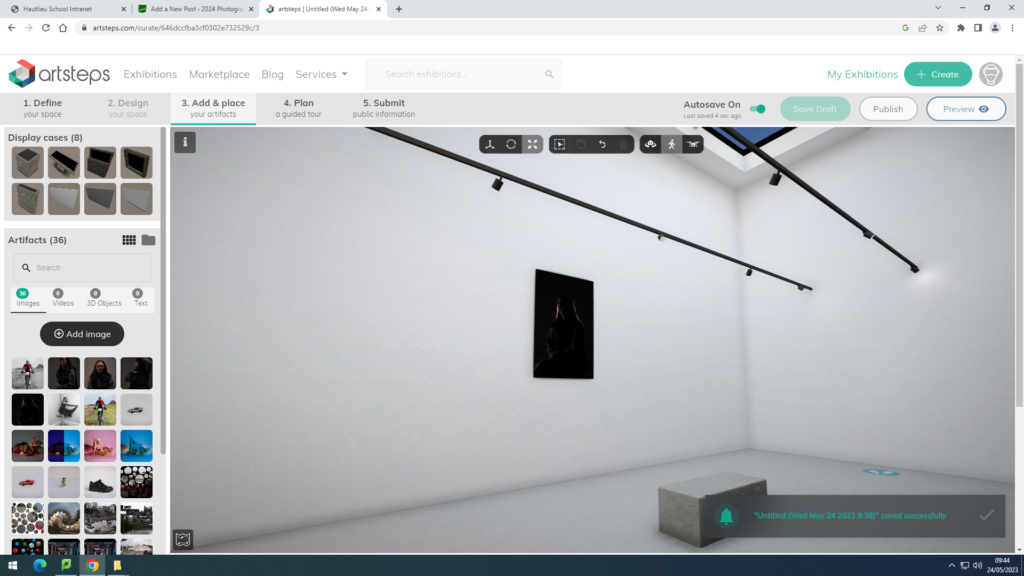
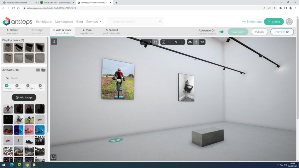
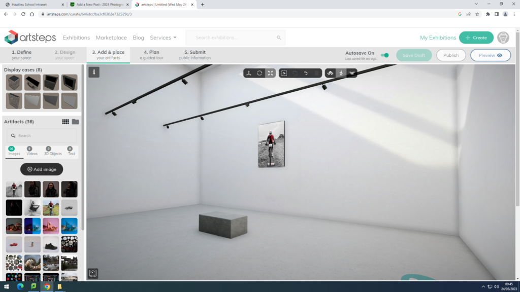
For this virtual gallery I used my images from my environmental portraits project and my studio lighting project. I have edited some of them previously on Lightroom classic and photoshop. I have then opened them up on  www.artsteps.com, and chosen my gallery that I wished to use. For these images I chose to use the contemporary venue as you can see in my first print screen. I then clicked add and place as you can see in the second print screen that I have added in. I began to add my images into the gallery and I paired them with one that went well together, for example[le I put some of the studio lighting ones together and did the same with two of the environmental portrait images. I like how my gallery has turned out as I think that as my images are all quite dark, they contrast with the pure white background very well to make them stand out. However, if I were to redo my gallery I would make sure that my imager were bigger before adding them into the gallery as they are very small and could use the space better if they were larger. I also think they if they were bigger it would mean that the viewers would be able to see the detail more clearly as well as the different tones and depth that they each have. Overall I think that my gallery has worked out well but it could have been better if they images were bigger.