For my first final piece, I printed out one of my images on A3 glossy photo paper. I then used a piece of thick black card and began measuring the size of my images and of he card to be bale to cut out a ‘window’ in the card. Once I had cut the card out, I placed my image facing down on the back of the card and use masking tape to hold it in place. Overall I am very happy with how this piece turned out at it is very monochrome and the window mount makes the image become a final piece.
2:
For my second final piece, I did the exact same process as my first final print. However, this time my image on A3 glossy photo paper, had a white boarder which I decided to keep on as it separates the image from the black window mount. Again, I am very happy with how this piece turned out and this the whit boarder make my piece stand out.
3:
With my third final piece, I decided to do something different. Once I had my image printed out on A4 glossy photo paper, I stuck it to white foam board with spray mount and then trimmed it to the right size. I decided to leave a white boarder on this one as the image is in black and white meaning the boarder breaks it up more. After this, I used double sided tape to mount it onto a piece of black card to complete my final piece. I like how this piece turned out, however I think it is quite simple which it less bold.
4:
For my fourth final piece, I printed out two of my images on A4 glossy photo paper. I mounted these two images with spray mount onto white foam board however, as these images were in colour, when I trimmed them, I did not leave any boarder. After this, I used double sided tape again to mount them onto black card. I am very pleased with how this piece turned out as I think the colours in my two images contrast nicely with the black card, making my images engaging.
5:
For my fifth and final print, I printed out three of my images on A5 glossy photo paper. I then took another piece of black card and measured my images as well as the card to make the cut outs perfectly spaced and even. Once I had the areas to cut out measured I used the knife and ruler to cut the windows out. Finally, I used masking tape to places my images in the windows. Overall, I think this is my favourite final piece. I think the window mount works very will with my images and the colours that the three images contain go well together. As a whole, I am very pleased with all of my final prints and think they turned out well.
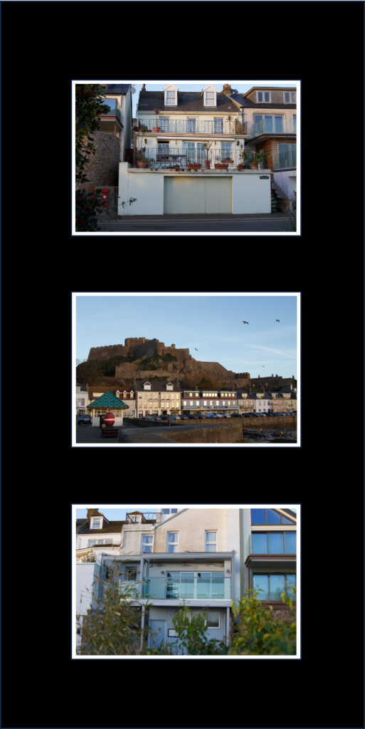
At the beginning of my project I knew that I wanted to base it around architecture some how. As I travelled around Jersey I began to notice the range of architecture pieces that we have and how there is such a contrast in many buildings. I decided to focus on the evolution of architecture in Jersey and how much it has been changing from older historical buildings that were efficient, to newer modern builds that feel are more just there to please the human eye. I did a total of seven photoshoots for my personal study with each trying to capture something new to add to my story. Some of my shoots focused on the modern side and some on the old side, however, some just became random without a plan as I decided to photograph buildings that I liked or thought would add contrast to my project. Within my project I also thought about the environmental changes that follow. Some houses have become more environmentally friendly with things such as solar panels etc. However, some builds create a large amount of waste which is damaging the planet more and more. Throughout my final book, I have shown a large amount of old and modern images. I think that this really allows the viewer to have a new perspective on architecture.
what went well:
Within my personal study, I think that there are a few things that went well. Firstly, I like the way that I have presented my book. I think that because I have mixed the old buildings up with the modern ones it make the contrast of both types much more visible. I also like how some of my old architecture images are in black and white, next to modern ones in colour as it makes both the images’ detail stand out. I also think that my book is clear on what it is about and shows the viewer what hidden architecture Jersey has to offer which many of us don’t see. Secondly, I think that my range of images show how much architecture is changing without us really realising. I think that the old images that I took appear to have more historical value and maybe mean much more than just a home etc, whereas the modern ones feel like there are there to impress others and fit into the more desired architecture style these days. Whilst I think these modern buildings are astounding, I see more value in the older ones as they meant more to people back then and have become almost a competition of who can have the most modern, pleasing home. Lastly, I am happy with how my final prints turned out and think that how I have presented them makes the detail within stand out.
possible improvements:
Overall, I think that there were only a few things that I wish I did differently. Firstly, I think that I could have photographed more older buildings to show viewers what Jersey used to look like compared to now. Saying this, I think this almost adds to my project as it shows how much it is changing at such a fast rate, losing the valuable architecture that we once had. Secondly, I think that whilst I did seven shoots, I think I could have explored the Island more as I didn’t really capture many images from a range of places. Following this, I also think that I could have added in some of the architecture that was damaged after the recent storm Ciarán. I think that this could have added depth to my projects to show that places that we feel safe in can change dramatically from things when we don’t necessarily expect it.
overall:
Overall, I am happy with my project and think that it portrays my theme of the evolution of architecture in Jersey well. I hope that from this project people will see more clearly how fast it is changing and that it is becoming something that some people don’t value as much anymore compared to how people used to.
For my first two final prints I am going to print them on A3 glossy photo paper. I am going to window mount/ back them separately as I think both images are very detailed and are a good representation of my whole project. I haven’t decided whether I am going to frame these two or mount them, however, I think adding a frame out of card may look better as they are very bold images.
planned outcomes:
Secondly, I am going to print these three images bellow on A4 glossy photo paper. I think that the two modern buildings pair nicely together therefore I am going to use foam board to raise them from a piece of black card. I am also going to the same with the old image in black and white however I am going to present it on its own as I think that it hold great detail that wouldn’t be seen as much if but were paired with another image.
planned outcomes:
Finally, I am going to print the three images bellow on A5 glossy photo paper. I like how these image all have an urban feel to them, so I am going to present them in a window mount together either going across or down. Overall I am happy with these images and think that once they are mounted/ framed they will look more finalised.
My photobook is based on the evolution of architecture in Jersey and how it is slowly changing over time.
A paragraph
Within my book I want to achieve educating other about how much architecture has changed over time from different materials and techniques to different styles and demands/trends. I think that in Jersey there is a great variety of architecture from old historical building to more newer modern ones. There are many pieces in Jersey to me that are very hidden whether its the area/location or how they are designed to be deceiving, because of this I wanted to try and find architecture that many haven’t seen or noticed before to show the vast amount that the island contains. I think that whilst much of Jersey’s architecture is astonishing, modernisation is slowly taking over. I believe that architecture is becoming more and more about pleasing the human eye as opposed to it’s practicality and may be losing some of its value it once held. Whilst it may not be at the same rate as some other countries I think that we may slowly be losing architecture that holds great value and even memories for some. I do agree that with time changing architecture has to as well for many reasons, however, I also believe that keeping hold of Jersey’s historical and valuable architecture is also very important. I hope that throughout my book the evolution of architecture is portrayed and people may see what I do in terms of it changing.
Design: Consider the following
How you want your book to look and feel
Paper and ink
Format, size and orientation
Binding and cover
Title
Structure and architecture
Design and layout
Editing and sequencing
Images and text
In terms of my books design, I want it to have a matte finish on the cover not only for how it looks but also how it feels, however, I want to have the pages glossy to add to the overall look of my images and make them very bold. I am going to pick the size ‘standard landscape’ as most of my images were taken in landscape and I want my images to be the main focus. With the book being landscape it means I can make my images a little bit bigger and allow for the detail to be seen. For my tile I have picked ‘Building our future’ as my book shows how much architecture (buildings) have changed over such a short amount of time meaning they will only develop even more in the future and become something to be appealed to as opposed to practical and meaningful. When it comes to my images I haven’t edited them much as I want viewers to focus on the main architecture piece itself in its raw form. I have adjusted them slightly to make the images straight and enhance the detail slightly so that the viewer can take it in fully. I chose to put my images in randomly in terms or old and modern so that viewers can compare them more easily, however I did place them precisely to make them contrast each other. In my book I am not going to have any text with the images as they are the priority, but I am going to add my essay ‘What are the differences between Eugène Atget and Ezra Stoller within architecture photography?’ to the back of the book to show where I got some of my inspiration from.
Once I had picked out my final images that I wanted to use in my book, I placed them on the pages in the order that I wished and thought worked best not only with how the images were presented but also how they worked well for the viewer. Once I was happy with the layout of the photos, I added in my essay to the back of the book to give some context of what I had been looking at in my personal study. I also pick out ‘Building our Future’ as my title of the book as ‘building’ fits in with it being based around architecture and ‘future’ shows how I looked into the evolution of architecture and how it has changed so much over the past couple decades and isn’t slowing down. Seeing what some housed look like now, I can only imagine what some may look like in the future. overall, I am very pleased with my final layout and think it projects my personal study well.
‘To photograph is to appropriate the thing photographed‘ Susan Sontag (1971), On Photography
For my personal study I want to follow the theme of architecture through nostalgia with different buildings from old to modern. Through this I want to show the evolution of architecture and how is has changed from what I used to see when I was younger to what I see now becoming more and more modern. Within this I may photography different houses or buildings that have been damaged due to the storm to develop my study as well as the environmental side of building in Jersey and whether or not our heritage is keeping its legacy or if it is slowly disappearing being a main reason to keep my images untouched. ‘Photographs, which fiddle with the scale of the world, themselves get reduced, blown up, cropped, retouched, doctored, tricked out.‘ Susan Sontag (1971), On Photography. Previously I have studied Anthropocene which I feel may fit into my personal study slightly as I photographed some buildings during that topic as well as used it as a way of awareness about the environment and how the use of plastic has rapidly increased. To develop my project I am going to visit the different parts of the island to find building that have been here for a while to newer builds or ones that have been done up to show modern building that are becoming more and more common. I have chosen to focus on two artists, Eugene Atget and Ezra Stoller. I have picked these two because one of them focused on older pieces of architecture whilst the other focuses on modern pieces. As I want to show the evolution of architecture, I thought they fit in well. In response to their work, I am going to capture images of many different buildings all over Jersey from old historical buildings to new modern ones. I aim for my personal study to represent the theme of nostalgia from how the building have developed from building that have been on the island for a very long time or even listed buildings to buildings that are more for the looks or being very modern which are becoming more popular these days. Whilst photography has been developing architecture has too, almost alongside it and that is what I aim to show.
Within Photography, its relationship with architecture is immense. It is said that they are both on the verge of art and a service. I think that this is very clear in more modern buildings that we see these days as they are almost more about how they look as opposed to how they function, they are there to please the human eye and catch your attention as you drive or walk past. In architecture one of the main isms is functionalism. It focuses on the emphasis of the shape, size, materials and its aesthetic etc. This inspires many architects to this day, from recreating shapes, particular features, materials used, and techniques, etc. Functionalism in architecture is all about what the pieces provided us with whether is it natural light, a cosy, safe place that you live in, or something that provided you with a space to sleep. Whilst it will be different for everyone architecture is a massive part of all of our lives even though we may not all realise it, not only does it effect how we live but also how we act alongside our emotions. Another ism that is very involved in architecture is culturalism. Culturalism has a big effect on architecture and has for a many many years. Lots of places all around the world are well known for pieces of architecture like Big Ben in London, the rock houses in Turkey or the Taj Mahal in India. They are all influenced by the culture of the location and how each style of living is very different to each other. I think that they all ‘fit in’ as such with their country/city etc and if we were to swap them they would become out of place and almost lose their meaning and value as different cultures worship different things following into architecture. ‘Architecture belongs to culture, not to civilization’ Alvar Aalto. I think that this is a very influential part to architecture and is what make the buildings etc so special to some people and makes them gain a deep value that so many of us treasure. Finally, the last ism that I am going to talk about is surrealism. Surrealism wants us to get us to think about what the architecture is representing, and its purpose of being created. Whilst in photography surrealism now means a dreamy like photography containing things that feel unreal or representing unconscious ideas it didn’t always mean that. It is thought to be ordinary sights that sparked the appearance of surrealism. Within architecture it shows that buildings can be much more that bricks layered on top of one another. They have a much deeper meaning that many of us do not perceive, and is often only revealed when we have some sort of relationship with the architecture its self. Overall, I think that architecture has become a very influential aspect to photography. Not only has it made us photograph more but also architecture has gone from a backdrop in images to the main focal point or the protagonist. Visa versa, photography has changed how we perceive buildings etc in images and has adapted how we design future pieces, filling our minds with ideas.
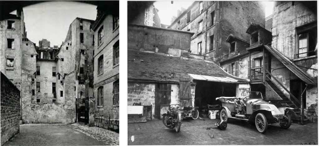
Eugene Atget was a French pioneer in documenting photography. He began making images in the 1880’s and did so to provide artists, painters and architects with studies. Many of his images are based on capturing the streets in Paris before they began to disappear into modernisation which gained admiration from big artists such as Man Ray, Henri Matisse and Pablo Picasso. Similarly, I feel deeply influenced by his motivation for his work as I wish to do the same with Jersey for my study, even thought it is much more modern than Paris was back in 1920. I also feel that Atget photographed to hold memories of living in Paris in his early twenties as he knew change was just over the horizon. ‘A good photograph is like a good hound dog, dumb, but eloquent.’ Eugene Atget. Whilst I don’t think Jersey’s architecture will develop much more rapidly in the next few years, I do believe that it eventually will and capturing it now will produce valuable memories for years to come. Atget was a very influential photographer. He played a large part in the founding of surrealism in photography and his work was inspirational and seen as a forerunner of Surrealism in the 1920’s. Surrealists found his work of empty streets in Paris deeply suggestive leading to the founding of the ism. Eugene’s work made a tremendous and sudden impact on the world of photography and ended up influencing many future photographers including me.
Whilst Ezra Stoller was also a documentary photographer however, he captured completely different buildings. He photographed the newer more modern buildings that had began popping up in developed countries. Stoller was American and had lots of opportunities to capture these developed buildings. As Jersey is not only less developed but also much smaller I have tried my best to capture the newer buildings that are appearing more and more after every building site. I have tried to convey the theme of focusing on the structure of the buildings, and how they please the human eye as well as how influential they are. Stoller has a keen eye for composition meaning that his images turn out to be very pleasing. I think that this means his images are very striking and engage the viewer into the image immediately. In Strollers work I feel that it shows that more developed structures appear more approachable and convey a more inviting effect. I think that I have been able to achieve this effect in my work in my more modern images, however, my more older images provide a more nostalgic feeling as they have been here for longer and are built in a very different way, maybe using older techniques etc.
New Topographics arose in 1975 and is where photographers capture contemporary, urban or suburban landscapes. The movements was a reaction to the increasingly suburbanised world and landscapes around them. People involved were trying to keep the world more natural and used photography to get their message across as opposed to words in the hope that they were more powerful. I think that this also contributes in my personal study as it shows that the world is changing not only in architecture but many other things. As this is one of my aims to show, I think it plays a big part. Another style I aim to show is the Bauhaus style. This style hold the characteristics of simplicity and functionality with the use of authentic materials whilst mass producing. Throughout my personal study I haven’t focused as such on this style but it may show through in some images. A photographer who focused on this style was Gabriele Basilico. Basilico was an Italian photographer who focused on the representation of the city. His photography was later used as a way of documenting the effects of war on the Lebanese capital of Beirut. Within this, he captured many apartment blocks/ complexes either that appear to have been newly built after the war or ones that were damaged and are falling to pieces. I think that his work is very effective in the architecture photography world and they hold great detail that many people may miss at first.
Eugene Atget and Ezra Stoller both created intriguing images within architecture photography leading to inspire me deeply. Whilst they photograph the the same area of photography, their images are very different but both hold great detail. Whilst one is trying to photograph the old street of Paris to produce treasurable memories for many people, the other is providing us with humanly aesthetic images of a world that we are seeing become more apparent everyday. I think that together they show how much the world is developing and what is becoming the new normality. I think that both these artists link to my projects as they show how much architecture has gone from being suitable and efficient to more about pleasing the human eye. In my project I have tried to capture how architecture isn’t just buildings etc but it also effects how we live our lives massively. I think that it influences human activity hugely from how we act and our behaviour, to communication and well-being within the world. It is proven that a well ventilated, greener area can contribute to our mental health and how we feel on a daily basis. Not only can it influence our well-being but also our happiness, being in a gloomy, noisy, dull environment can make us less productive and encouraged. ‘We shape our buildings: thereafter they shape us‘ Sir Winston Churchill (1943) His speech to the meeting in the House of Lords. The way I see it, architecture is much more than just a building. It is more like a frame work for our lives that keep stability and gives us guidance.
For my final phonebook I want it to be showcasing my images and having the viewer be able to focus on them clearly. For this reason I am going to put my images quite big on the pages and only have the photos as well as my essay at the end. I think that it is important in a photobook that the images are the focus and they are a clear representative of what the book is about with little or no writing so that the viewer can also add there own thoughts but are clearly shown the theme.
1. Research a photo-book and describe the story it is communicating with reference to subject-matter, genre and approach to image-making. 9 what it is about, i.e., landscape, how images were made)
The book that I have been researching is based around the night time walks during the summer months in Colorado. All of the images that Adams’ has produced in this book have a very Urban feel to them. Often the settings are very obsolete and open, allowing for our own thoughts. Throughout the book it feels very isolated, peaceful and quiet almost as if the world has gone to sleep. Whilst lots of his images include houses, only an odd few include people which makes it feel almost as if we are looking in on peoples lives but only when they aren’t around. I believe that his images are more documentary than staged as these images were produced purely from an evening walk. I would say that the image look as if Adams had gone out for a walk with his camera and he photographed his surroundings without a main intention of that the images would turn out like. I think that his approach to image-making was almost effort-less as they appear to be quick snap shots of what he saw as opposed to deep meaningful images with lots of information behind them, however, I do think that they could have a hidden meaning. They almost feel as though they are a empty space where you could hear you own thoughts and take a break from the busy lives going on in the day time.
A few of the images from the book:
2. Who is the photographer? Why did he/she make it? (intentions/ reasons) Who is it for? (audience) How was it received? (any press, reviews, awards, legacy etc.)
The photo-book contains a larger number of Robert Adams’ images and is called summer nights. I think his purpose of making the images is to show that at night time the whole world goes quiet. Many of his images, to me, represent that if you were there at the time you can hear your own throughs and it is a space where you can relax as everything is peaceful. Because the images convey this, it means that it allows the viewer to create their own opinion of the images and what they might mean on a personal level.
3. Deconstruct the narrative, concept and design of the book and apply theory above when considering:
Book in hand: how does it feel? Smell, sniff the paper.
I think that the book feels quite grainy, and smells almost like glue or like a stationary store.
Paper and ink: use of different paper/ textures/ colour or B&W or both.
The book has end paper at front and back (paper that is stuck to the back of the front page), it is thick, good quality paper for the images and has a matte look opposed to glossy which I think works really well as the images are in black and white which defines the detail and adds to the tones in the images.
Format, size and orientation: portraiture/ landscape/ square/ A5, A4, A3 / number of pages.
The book by Adams was a standard landscape book containing 50 of his images. The book had around 85 pages as it also included an interview and other various things.
Adams’ book did not have a dust jacket (paper cover over hard back), however, it did have a paper strip around the bottom of the book almost like a mini dust cover, it was also a hard back cover which had a linen type wrap, I think that this really made the book stand out.
As I just mentioned Adams’ book has a linen cover almost like it has been woven. I really like that he has done this as it makes the book feel more sentimental and homey. I also think that the linen cover matches nicely with the matte paper and finish on the images.
Title: literal or poetic / relevant or intriguing.
I think Adams’ title was a literal title and was very self explanatory. However, I do that that it could have deeper meanings if we looked into the detail in the images as well as the title. It almost feels like Adams’ has let us add out own interpretation to the book.
Narrative: what is the story/ subject-matter. How is it told?
I think that Adams’ book is told in a way that makes us feel as if we are going on a walk with him, and it feels like we are there with his as he takes the images. I think the story is about what the world looks like when we aren’t looking at in or are asleep, giving us a new perspective. Adams’ images appear to have just been taken when he sees something he likes the look of as opposed to stage which makes me think that he wants to tell the story in a very pure way that others can add to etc.
Structure and architecture: how design/ repeating motifs/ or specific features develops a concept or construct a narrative.
In Adams’ book the layout of the images are all very similar, they each have their own page and are presented at a good size meaning we can view all of the detail in the images.
Design and layout: image size on pages/ single page, double-spread/ images/ grid, fold- outs/ inserts.
Throughout Adams’ book the images are very big and clear on the page. This make it feel to me that the images are very open as such and very inviting, with lots of detail throughout them. I like that he hasn’t crammed lots of images on to a couple pages but he has let each image have its glory and really showcase what each images contains allowing the viewer to take it all in.
Editing and sequencing: selection of images/ juxtaposition of photographs/ editing process.
In Adams’ book he has provided us with a large number of his images. 25 years after he made the images he re-visited them and adjusted them completely as well as gave it a new title to improve his work. Whilst his images are edited I don’t think this aspect is very obvious and the images still have a sense of pureness.
Images and text: are they linked? Introduction/ essay/ statement by artists or others. Use of captions (if any.)
In the book there is an interview with Robert Adams and Joshua Chuang where they talk about Adams’ purpose for this book and what he wanted people to achieve from it. Adams’s said ‘I like to think of the way people encounter pictures in books—by themselves, in quiet, at length’. I think that this fits with my idea of the viewers having their own thoughts whilst looking at the images and being able to relax and have a peaceful area.
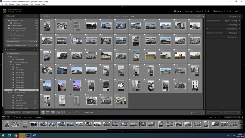
In order to help me with my layout that my images will be in in my final photobook, I decided to print out all of my final images so that I could easily test out moving them around and seeing which images looked best after one another to ensure that I was happy with they way they were all placed. As my personal study is about the evolution of architecture I thought about making my images almost represented a time line, with the older images at the start of the book to the modern images being towards the back and the one in the middle being not particularly old but not modern either. However, when I was in Lightroom Classic designing it I decided that I preferred it when my images weren’t in a specific order. I think that this meant I could finalise my layout and be sure that it was exactly how I want it. As I had a lot of images I didn’t end up using all of them as I didn’t was to have an amount that meant the viewer would become overwhelmed.
Overall I am very happy with my final layout for my photo book, and I think that all of my images are a big contribution to my book. I like how they all stand out and each have a different story.
As part of my personal study, one of my researched artists was Shaun Kardinal. His work with the embroidery really intrigued me, leading me to make one of my own. One I had chosen the image that I wished to use I printed it out on A4 glossy photo paper to give it a nice finish. As all of the colours in the image are very plain tones I chose to use red thread. I also chose to stitch in a circle as the building in question has lost of straight lines and corner meaning there would be a contrast. I placed the circle of stitching in the middle to make it a focal point for the viewer and to draw them in so that they can then look further into it to see the detail in great depth. I am very happy with how this piece turned out and as a part of my final prints I am going to either, back it onto red and black card to tie in the red, or frame it in black to make it more put together.