All posts by Julia Kochan

Filters

Author:
Category:

Portrait Project- Evaluation

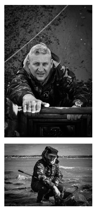
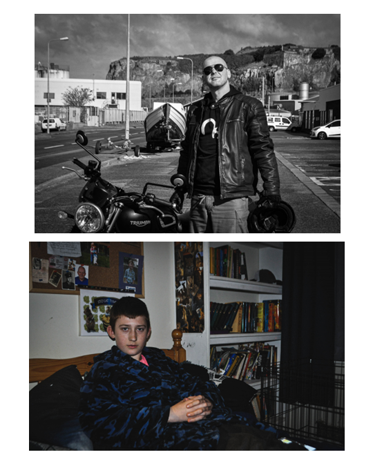
I think my Portrait Project turned out well and I found it very interesting, as they helped me explore different styles of portrait photography, as well as my own specific style. I think an area of my project that went well were my artist references as I became very inspired by them (especially Francesca Woodman) which made me do quite a lot of research on them. I think my photoshoot responses also linked in well with different topics, especially the femininity topic, helping me explore new techniques and and the complexity of taking portraits of others and myself. I think I was also successful in conveying a meaning through my photos, making my work more detailed and deep, especially in the femininity topic. Although finding it challenging, I explore taking photos in very different environments (like in the environmental portrait topic), and this helped my create a wider variety of responses. I believe my final outcomes are successful as they matched with each topic and showed how I can be diverse with the camera. My mounting was also quite successful, the layouts I decided turning out well and enhancing the effectiveness of the photos. Using foamboard was a good idea as it elevated my photos in a simple way.

I think I also developed my plans for parts of the project in a successful manner, as it helped me later on in the project and therefore gave me more time to focus on explaining my thoughts (like for example during the femininity photoshoots). I think this project turned out quite personal, using close friends and family for the environmental and headshots topics, as well as myself for the entire femininity and identity topic. This helped my create meaning within the photos which I believe made my outcomes stronger. I wanted the images to be more than visual pieces of media, but also something that told a piece of a story.

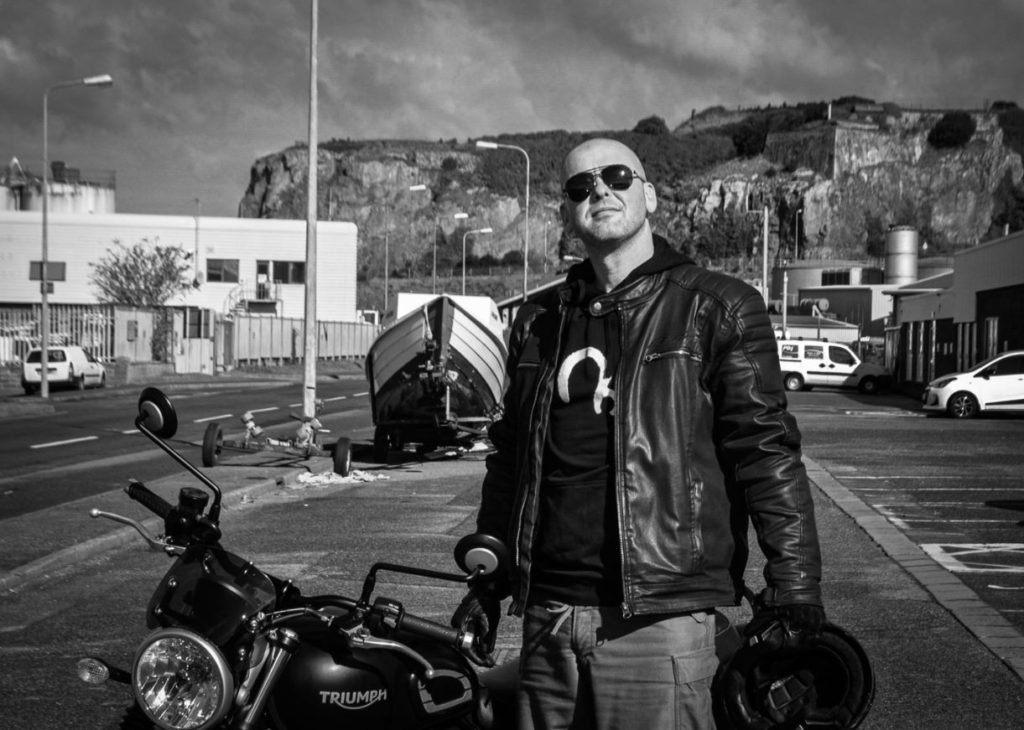
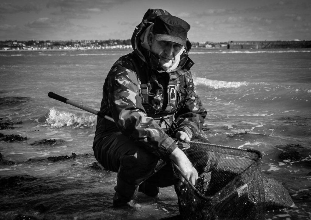
I was very inspired by many of the photographers I studied, especially Francesca Woodman (femininity and identity topic) and Alec Soth (environmental portraiture topic). They taught me very different techniques, but both of them also focussed on context which I found very interesting. Soth focussed on the background of his model, using clothes, accessories and different environments to create a depiction of their life story. Woodman posed nude for many of her pictures, in a range of poses that appeared both unhinged and beautiful. Her pictures portrayed her struggle with mental health, but still proving that was she in control of her body. Both of them are very unique photographers that I believe will continue to inspire me in the future. Moreover, I learned much more about depth of field (a technique Soth uses to put the focus on his models) and slow shutter speed (which helped Woodman create blurred and unique self- portraits). Identity was also a topic that this project helped me explore, as it showed me how photos can twist the truth and also show someone’s true self. Focussing on the femininity, self- portrait topic, I can also say that I analysed the concept of vulnerability, and how it is seen as a common negative stereotype of women, and how pictures can illustrate the idea of it in both a subtle and obvious manner. Moreover, this topic helped me realise how photos that portray vulnerability don’t equal to a representation of weakness, as some of such photos are some of the most powerful pictures I have ever seen.

There are aspects of this project I would wish to change however, and one of the main areas is experimenting more with the headshots topic, which I think would benefit my work. For the femininity vs masculinity project, I wish I had also explored masculinity as well as created photoshoots for this subtopic as I think it would cause my project to be more diverse and link in more with some of the artists I researched (like, for example, Claude Cahun). A technique aspect I would work on is composition and backgrounds, as at times I forgot to change it, and didn’t always end up with a completely black background which I think significantly influenced the effectiveness of my photos in a negative way. For the mounting aspect of the project, I wish my window mount was neater, to create a stronger outcome.
Mounting Final Prints

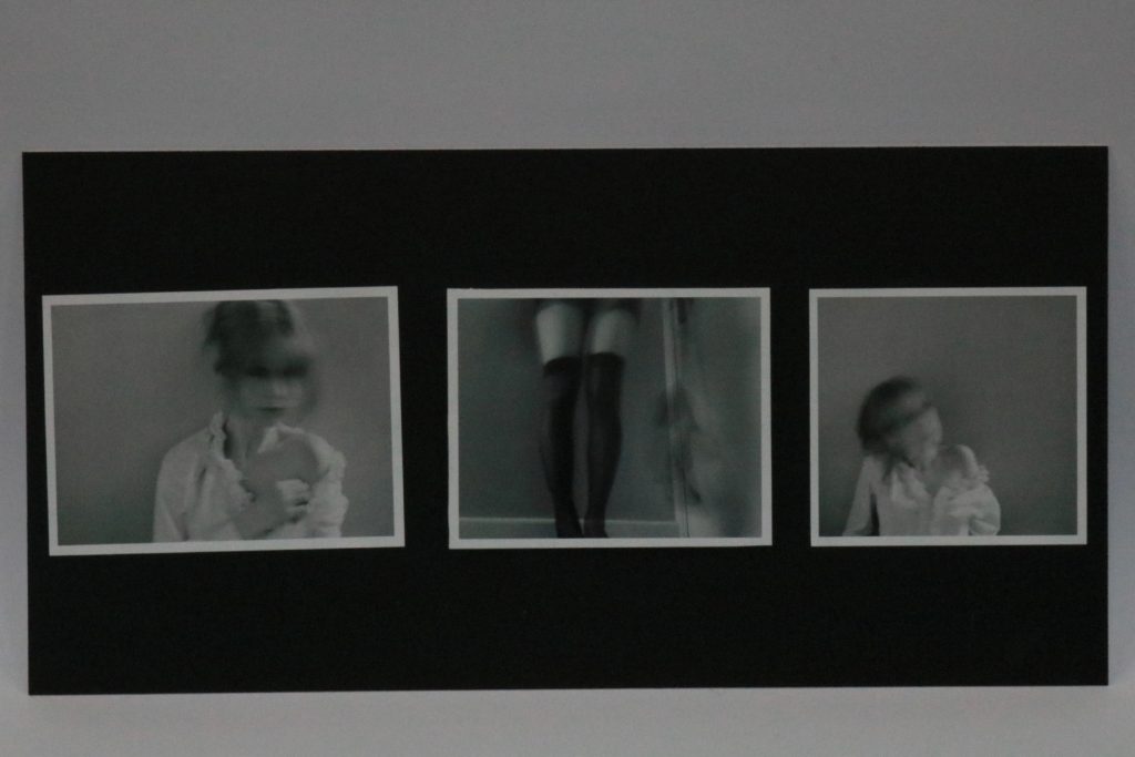
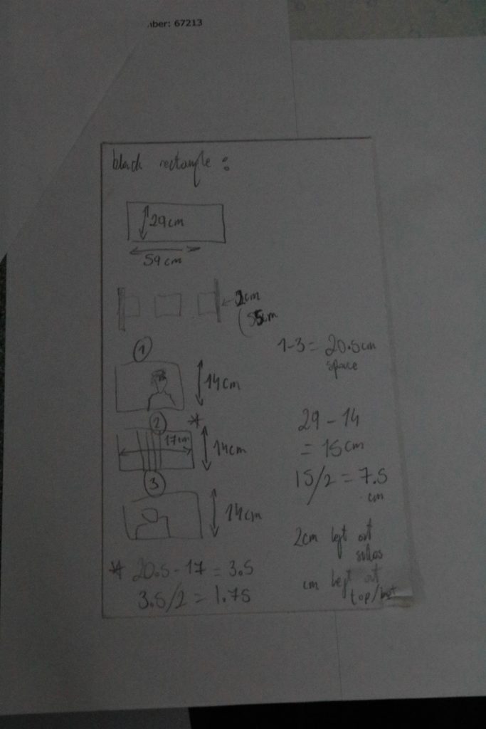
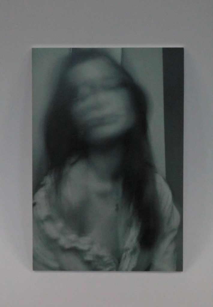
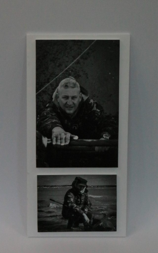
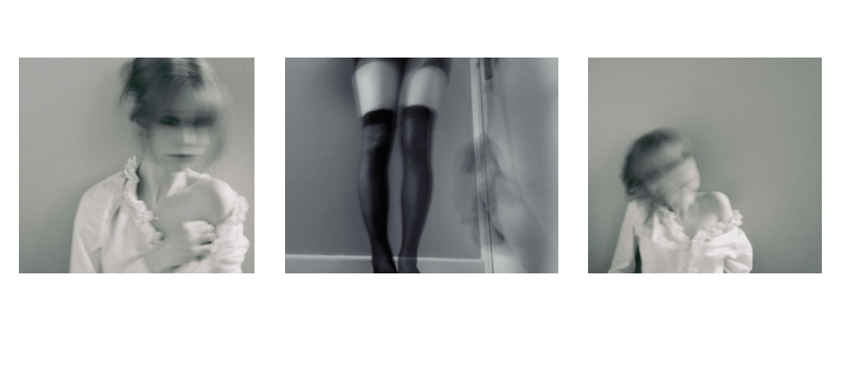
I think they turned out quite good, my plan was definitely helpful in coming out with ideas beforehand. I would want to improve on precision however, since the pictures being even slightly wonky ruins the entire mount. I believe my most successful outcome is set 1, as the middle picture contrast with the more traditional faces as it is only my legs.

Set 1

the measurements I wrote down to create this mount.

Set 2

Set 3

Set 4

Set 5

Set 6

Mounting finals plan

Set 1

I want to make these pictures look like shots from a old movie, so I will put these in this order on a white foam board. Each of these photos is a A5, as this size is more manageable and easier to put together. I think I will put them on a black background, creating contrast. I will elevate the middle photo on a piece of foamboard too, making it stand out and causing the mount to have more depth.

Set 2

This picture will be framed by itself, as it is A4 and I think it will be more effective by itself.

Set 3

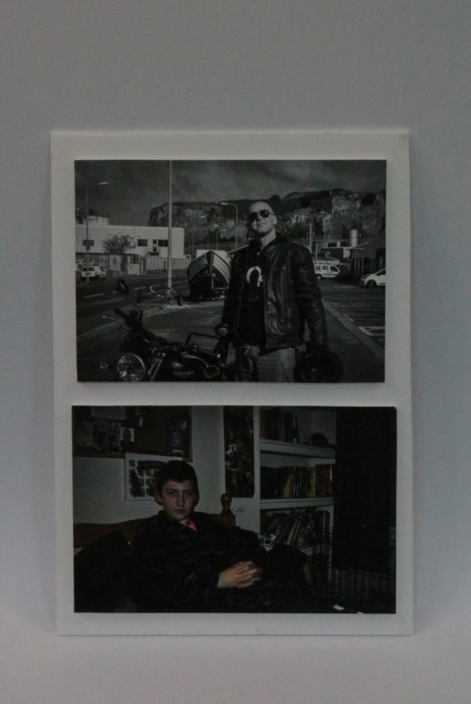
I will frame these two pictures together, and since the top one is A4 and the bottom one is A5, I think they will line up together perfectly. Also they are both based on the same environment, so I think they should be presented together.

Set 4

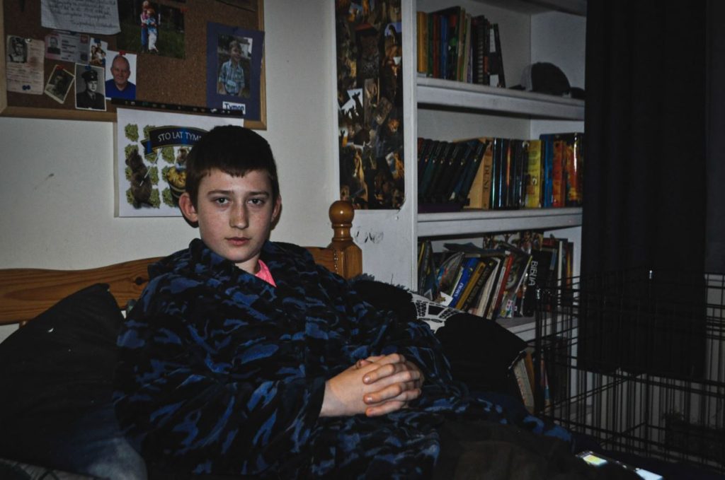
I will frame these two together since I think the contrast between bold colour and black and white is very effective. They are both A4 so they will match up well, but I will mount the bigger one below. The themes (outside/inside, comfortable/dressed up) also another aspect of contrast between these two environmental portraits.

Set 5

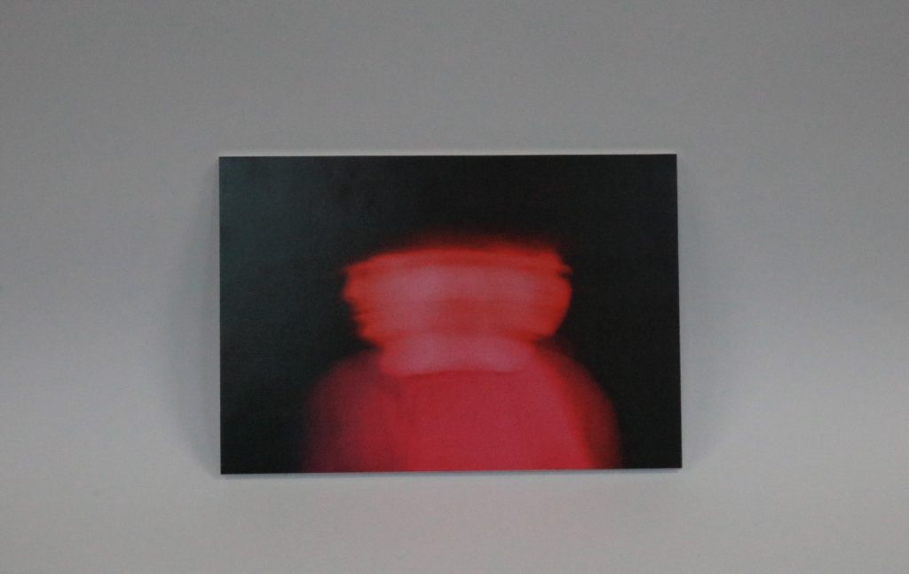
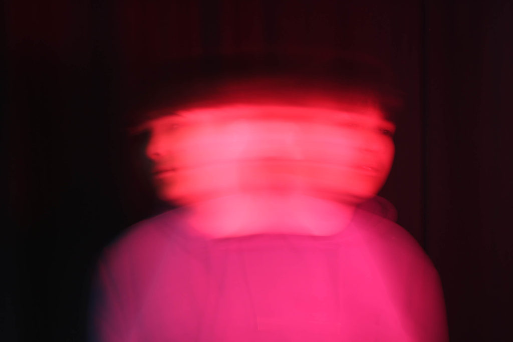
This photo will also be mounted by itself since it is very abstract and I think it would be confusing if it was framed with others. It is A4 so it is big enough to present alone.

Set 6

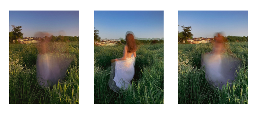
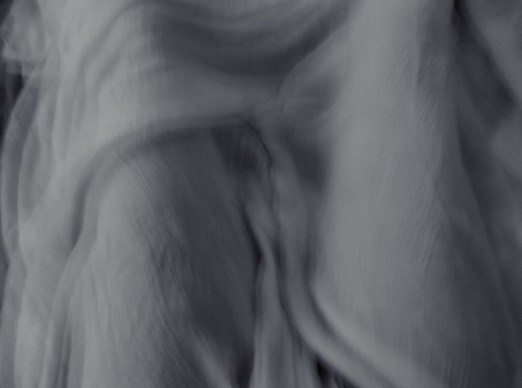
These pictures will be printed as A5, and I will mount them together in a line. The middle is the one with the most defined figure, and I think it will look effectives with two more abstract images on the sides.

Portrait Comparison

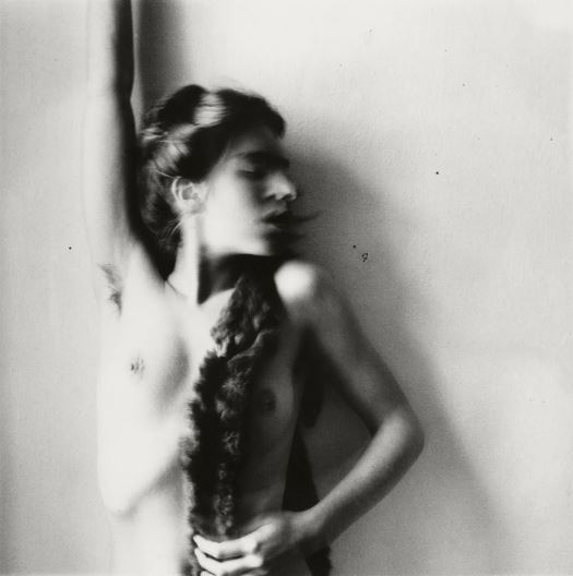
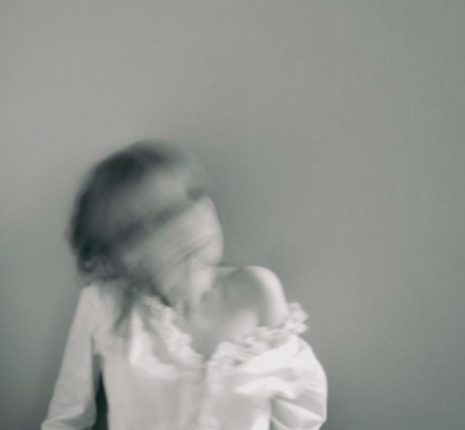
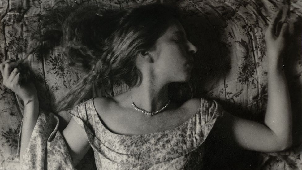
This photo was inspired by Francesca Woodman, who took mostly self- portraits in black and white, using a slow shutter speed to blur specific areas of her body (especially her face). She also took many of her photos while being nude (like the one above), and I think it was a very interesting take on self- portraits. Her portrait consists of her leaning against a wall, her face blurred and she turned it to the side, completely nude. I found this a very inspiring photo as she posed in quite a vulnerable way, however it is obvious that she is in control.

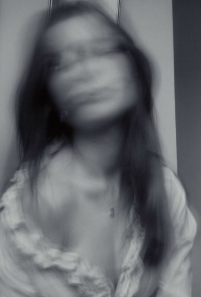
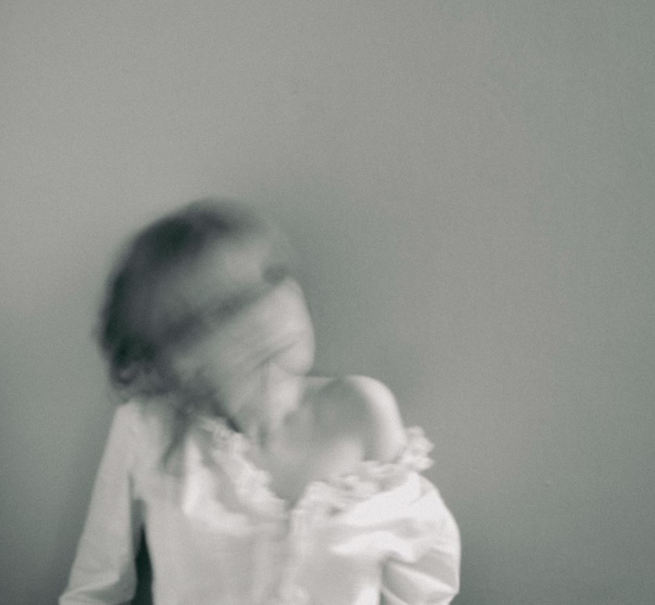
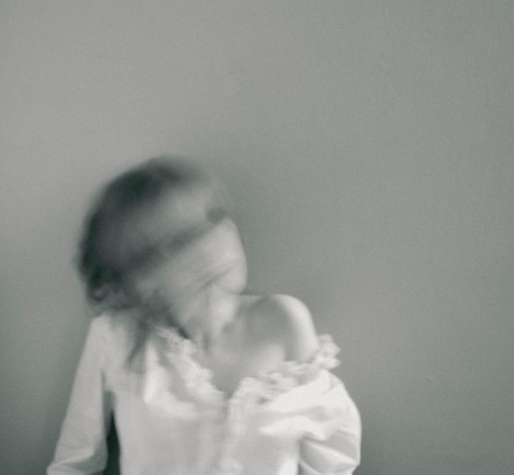
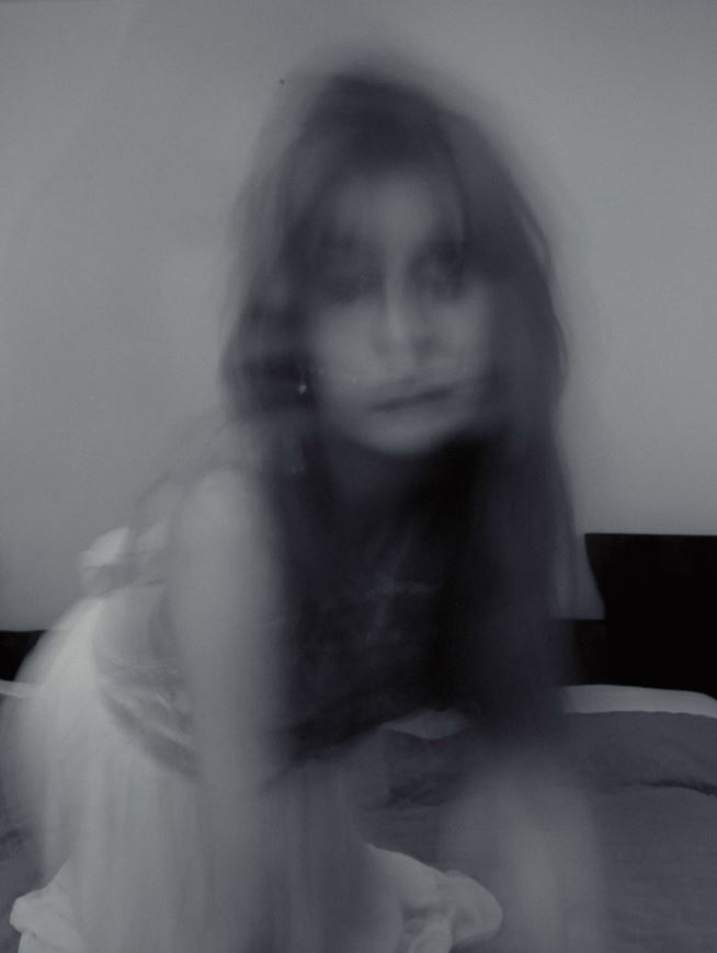
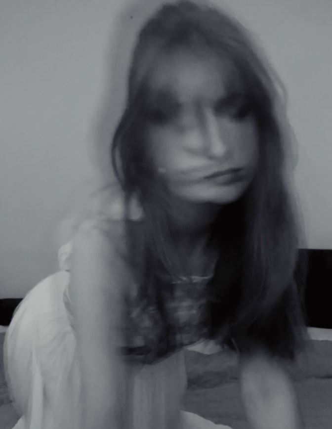
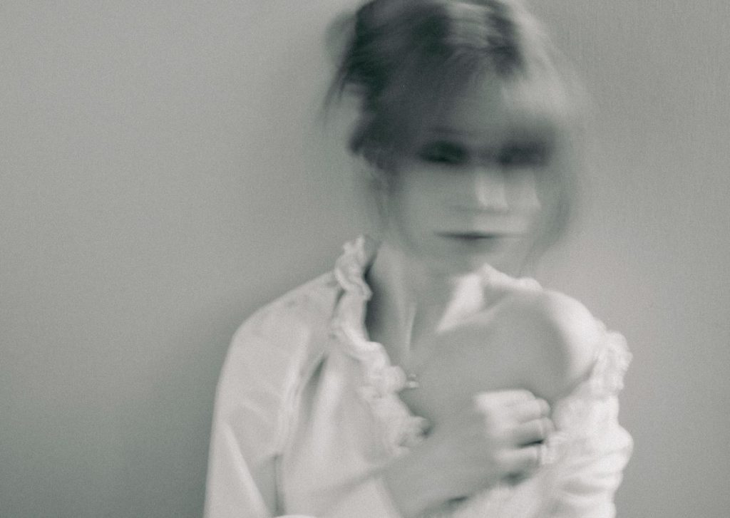
I found her very inspiring and also thought she fit perfectly into the ‘femininity’ and ‘identity’ topics we have been studying, which is why she was my main inspiration. The composition of her photo is very interesting, as she isn’t completely centred in the frame which is unlike most (self) portraits. I recreated this, framing the camera in a way that allowed there to be more space on the right of me. I think this is effective as it creates a much more unique photo due to its composition. However, she has more of her torso in the image, making her a portrait shape whereas mine is a squarish shape. Moreover, her pose was one of the main aspects of the photo, therefore I recreated this by leaning against a plain wall, and propping myself up slight, looking similarly vulnerable (in terms of the pose). I like how this links in with the ‘femininity’ topic, as it presents me in a very stereotypically feminine way, looking weak and almost helpless. I do believe she didn’t try to convey that meaning across however, as I think despite being naked and being in such a position, she is trying to show how she is the one in control of her body and what happens to it. I also think her blurred face represents how society often only focus on a woman’s body, and I think she is attempting to mock this idea by hiding her face in a very exaggerated and obvious manner, incorporating it with her unique style of using a slow shutter speed. I liked the idea of this, and tried to recreate it by setting my camera to a very slow shutter speed (1/30) and slowly moving my head side to side, to create this obscured, smudged look. Furthermore, all of her photos are in black and white, which I think is very interesting since at the time, colour photos were already a technology used by photographers. I recreated this, and edited most of my photos in black and white. I did this not only as it is her style, but because I think colour would distract the viewer from the concept of the photo, which is a reason why Woodman did this herself too. Despite both being in black and white, her photo consists of much stronger white and black tones, having a more varied tonal range as well as having a heavier contrast. My photo is much duller and grey, which I think was successful in the way it made the photo look softer, however lacked the strong appearance and the way the background looked separate from Woodman’s body. I think this is something I could’ve improved on, in terms of editing the photo.
Overall, I think being influenced by Woodman created a successful outcome, creating unique photos that linked in with the idea of stereotypical femininity.

Femininity Photoshoot 2

  • inspired by Francesca Woodman and Milica Marković

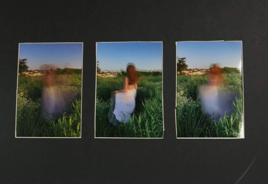
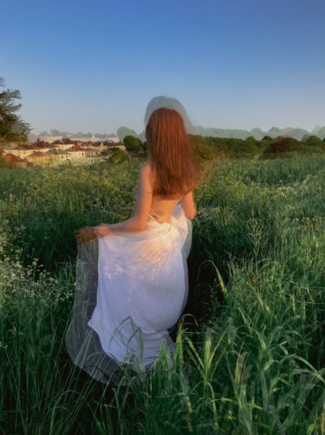
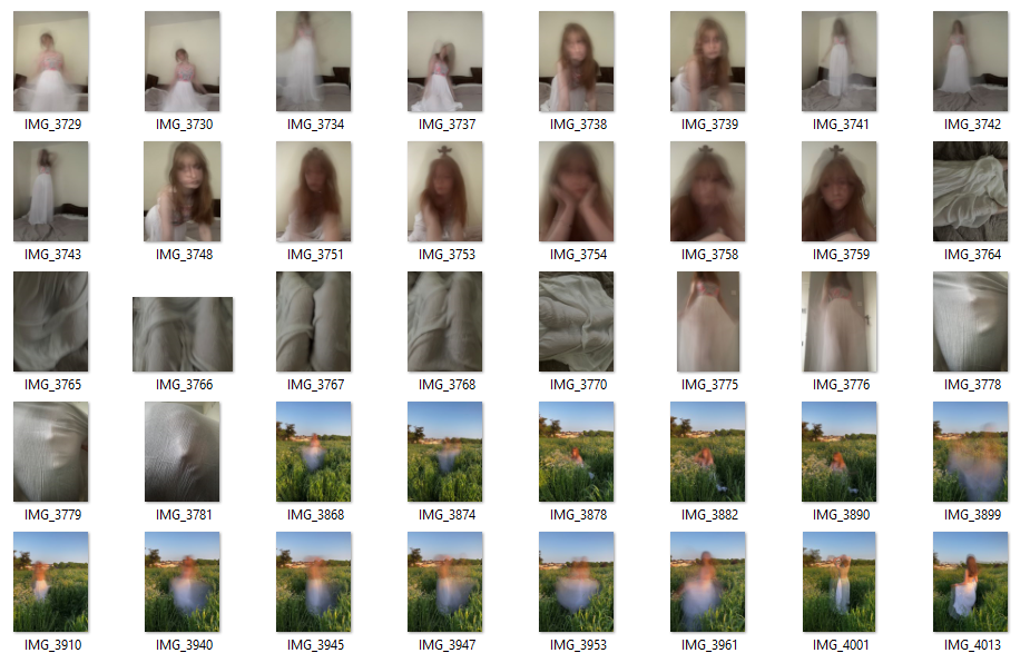
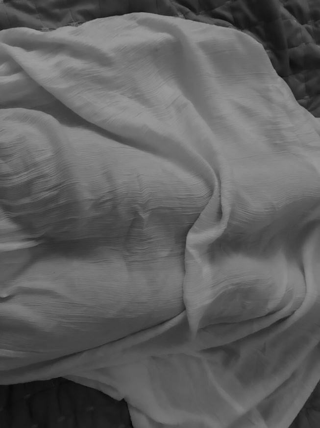
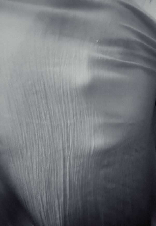
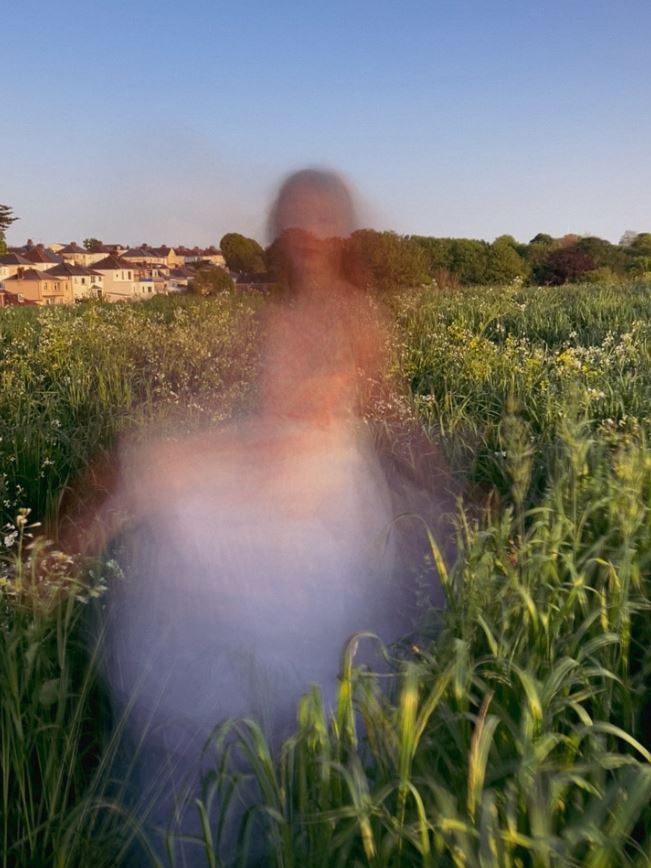
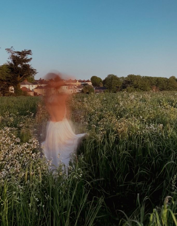
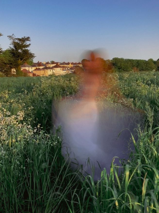
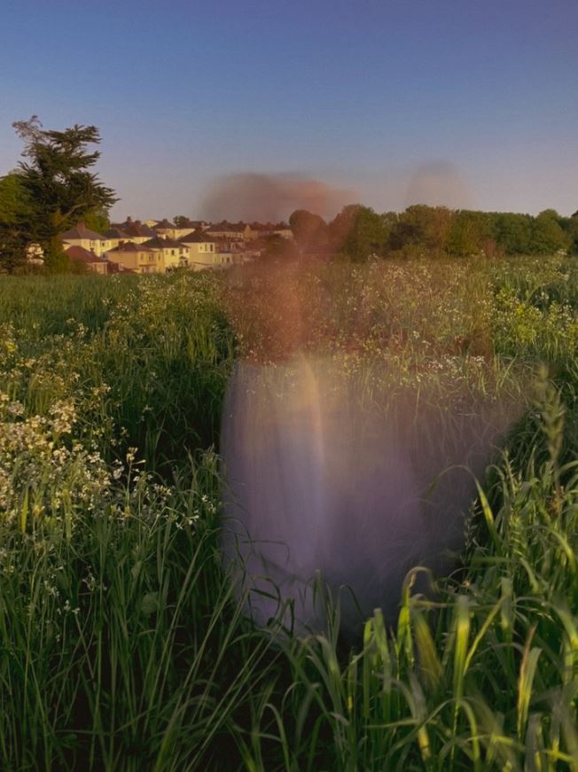
For these photos, I wore a white flowy dress, another very stereotypically feminine attire, but much more gentle and ‘girly’ than my first photoshoot. I mixed this with blending photos together and also a slow shutter speed (my technique once again being inspired by Francesca Woodman) and took them in a field to add to the gentle natural look that some believe a woman should have. I also took some pictures inside my house for a change of environment, posing in a few ‘girly’ poses. I also took some pictures of my legs beneath the dress, looking at self- portraits in a more abstract manner. This photoshoot and my other photoshoot portray the two ways women (or feminine people) are seen/ how they should be, exploring what it means to be feminine. I think these photos are more of a representation of the ‘female gaze’, as they show how women don’t always have to be ‘sexy’ and ‘provocative’ to be beautiful. I also like that some of the pictures (from the photoshoot in the field) are more landscape photos, with myself just being a mist of colour, portraying the idea of ‘natural beauty’ through literal nature.

Edits

I edited some of my images in black and white, relating to my chosen artists, however I also left the field pictures in colour, maybe not linking in as much with my chosen artists but focusing more on the aesthetics of the picture. I did however add grain and other components to make them appear more vintage.

Final Selection

I chose these as they are a mix of portraits and abstract images that convey the message I wanted my photoshoot to show well.

Femininity Photoshoot 1

  • inspired by Francesca Woodman and Milica Marković

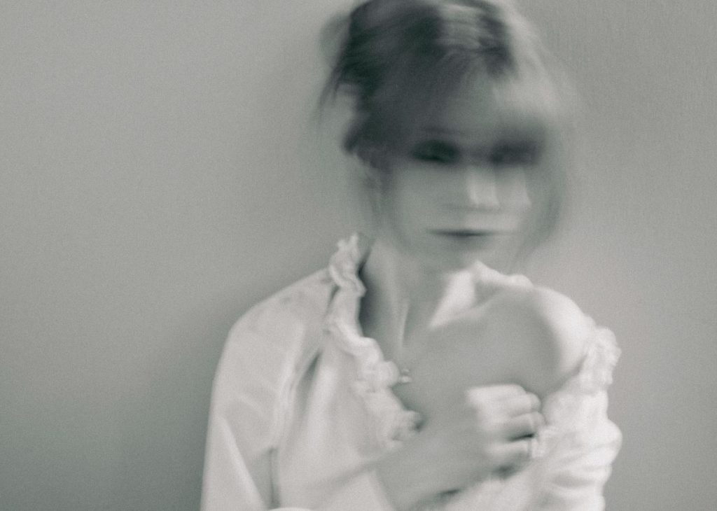
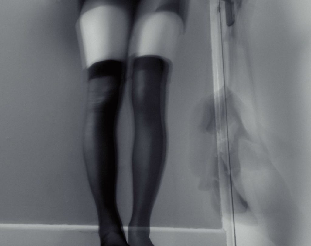
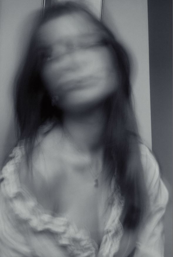
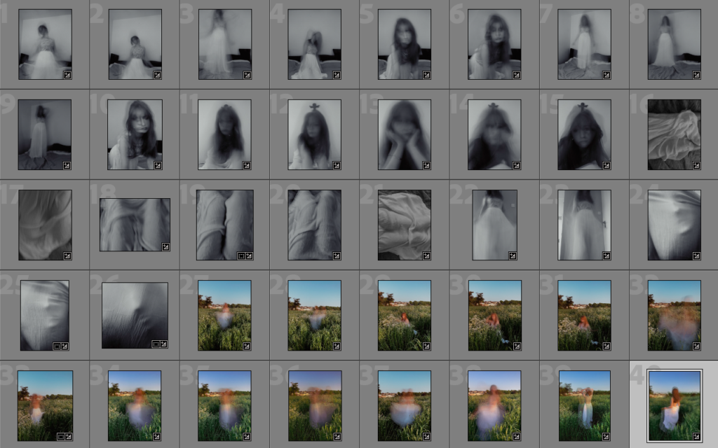
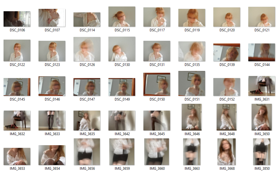
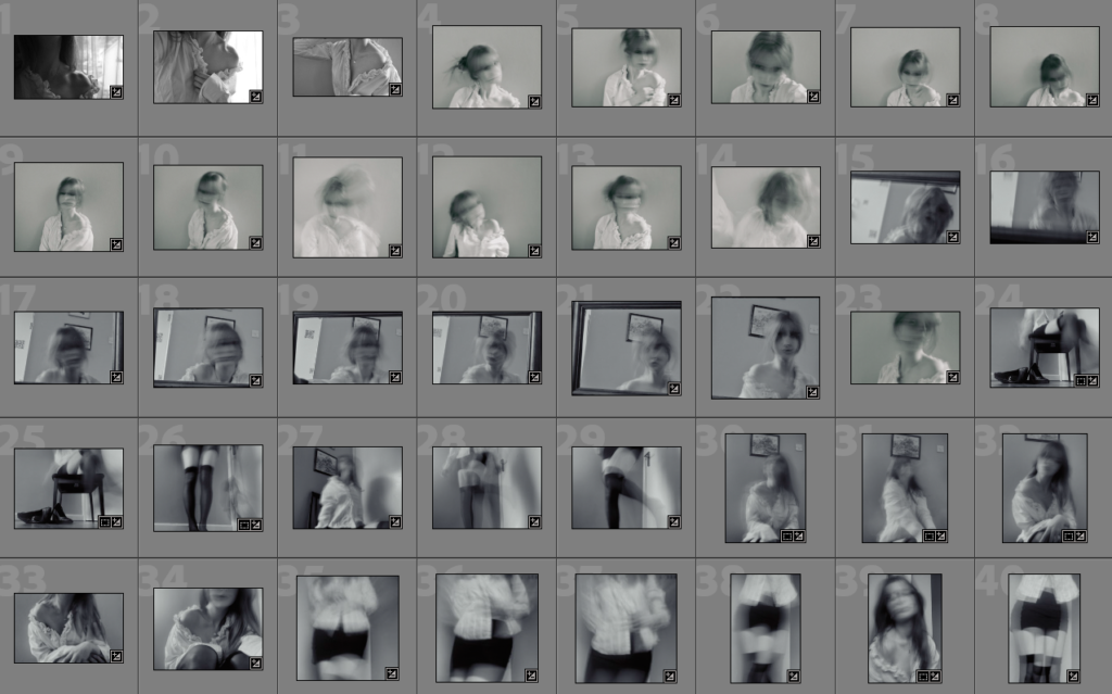
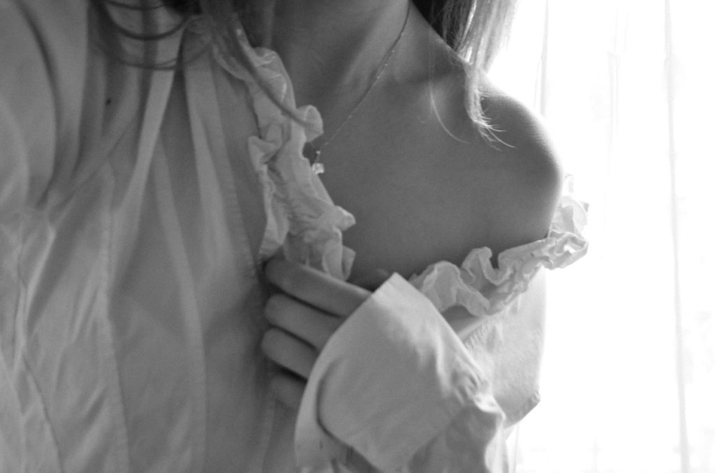
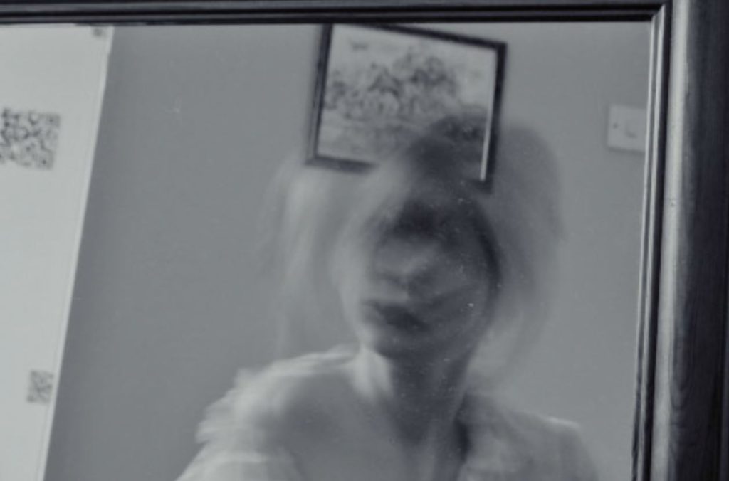
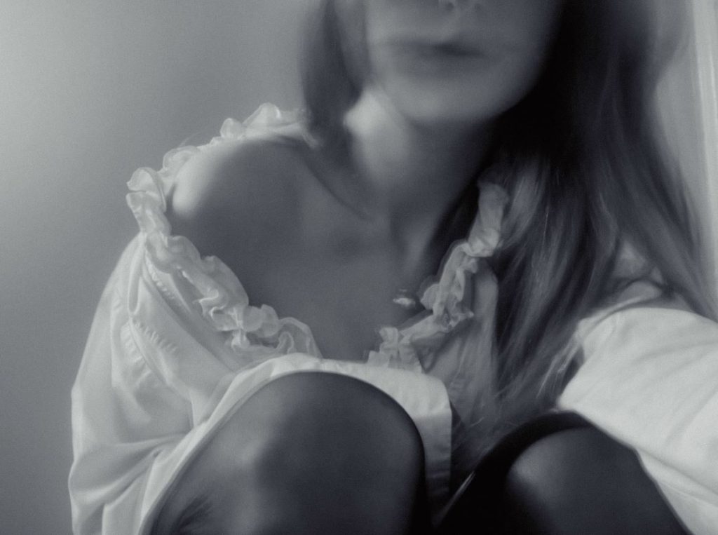
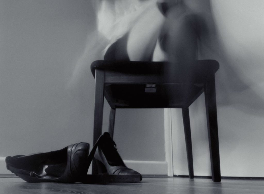
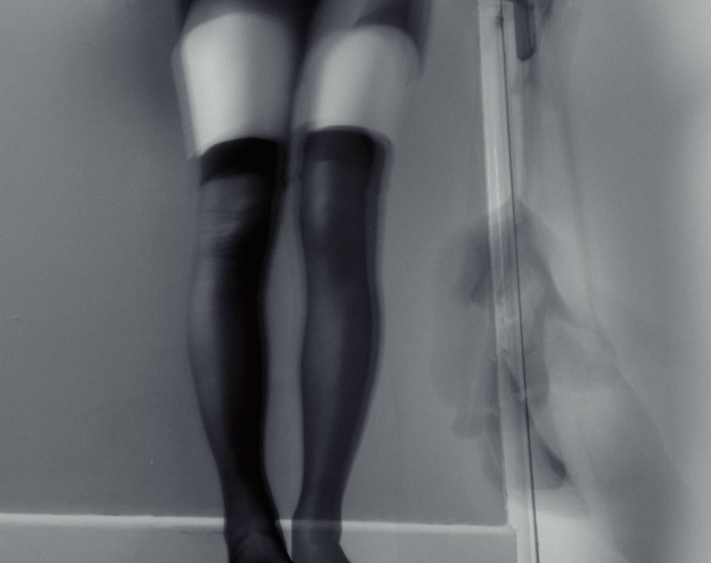
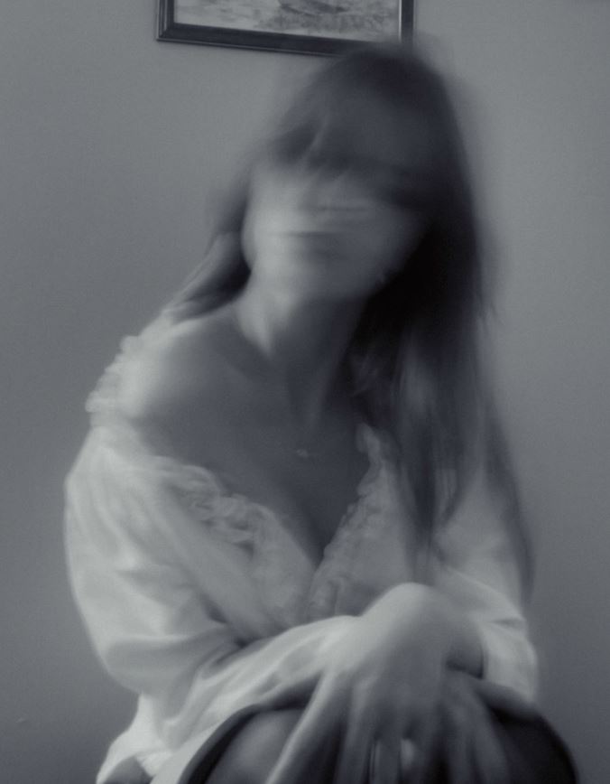
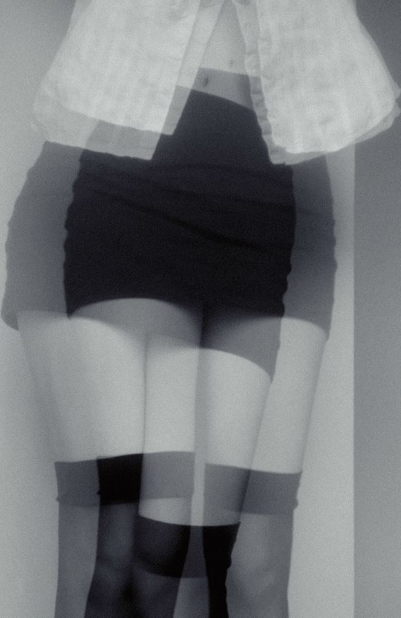
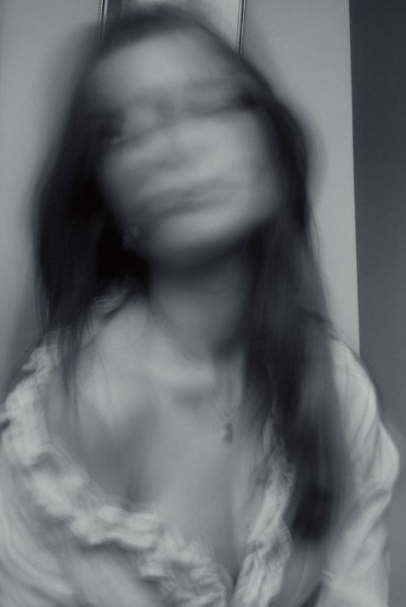
I created these photos by dressing into very stereotypically feminine clothing (tight skirt, stockings, blouse, high heels etc.) and mixed it with a slow shutter speed, creating obscured and almost creepy photos with an unhinged feeling to them. I wore the top off the shoulder to portray the idea of how woman are always expected to look beautiful but also seductive. In some photos I am making direct eye- contact with the camera and in some I’m not, which I think it makes the photoshoot more interesting. The smudged effect makes my face look distorted and causing the photos to appear disturbing, something Woodman commonly included in her photos. I also included some torse/ leg shots to show how a woman’s face or even personality doesn’t always matter to society, how her body is the most important feature. This photoshoot and my other photoshoot portray the two ways women (or feminine people) are seen/ how they should be, exploring what it means to be feminine. I want these photos to be almost a mockery of the ‘male gaze’, showing myself as overly feminine and ‘delicate’ as men tend to portray women as.

Edits

I edited all my pictures into black and white to relate more to my artists and also to take away the focus from the photos, putting the focus more on my outfit and the concept of the photos.

Final Selection

I think these are the best as they have the best poses and also link in the most with the artists. Furthermore, I think they show the most character and are generally effective photos that used the obscured/ blurred effect the best.

photoshoot plan

who, what, where, when, how, why

who: I will be photographing myself, creating a series of self- portraits that portray me in different ways. I will focus more of femininity, portraying it in a vintage and exaggerated manner. I will also want to focus on some aspects of masculinity, pershaps wearing my dads clothes during the photoshoot. I am inspired by the artists Milica Marković, Francesca Woodman and Claude Cahun. Milica Marković and Francesca Woodman are especially inspiring as they portray themselves in eerie and obscured ways while still remaining feminine (or what society sees as feminine).

what: I will focus more on femininity, wearing flowy clothing like Woodman does to emphasise my ‘purity’ or ‘vulnerability’ as a woman. I also want to take photos in a oversized suit, inspired by Cahun. Moreover, I wish to take a mixture of portraits and landscape photos to capture myself in different ways. I will also later put my images into black and white, just like the artists I am inspired by do.

where: Inspired by Francesca Woodman, I will use the environment to add to the overall unhinged appearance of the photo. I will want to photograph myself around my house (in my room to add a sense of identify and a empty corridor) creating a more personal link between my environment and myself. I might also attempt to take pictures outside in a field, creating a natural feeling within my photos. I also want to take some pictures against a blank wall, simply making myself the area of focus without any distractions.

when: I think I will take my pictures on a bright yet dull day, having good lighting without it being too harsh. I think softer lighting would be more effective as it softens the features and creates a more feminine look. I might also take some of the outside pictures in the evening, with the setting sun illuminating the grass.

how: I will utilise a tripod to position the camera at an angle that I like. I will also have a very slow shutter speed to cause the images to appear blurred, adding movement to my picture like Woodman does. I will mostly be moving my head, as that is the area I want to be most obscured.

why: I think these photoshoots are good for both the identify and femininity and masculinity topics. The self- portraits will help me explore myself and my skills further, in a very interesting way.

‘Untitled’
Francesca Woodman- Providence, Rhode Island
(1975–8)

Claude Cahun and Francesca Woodman Comparison

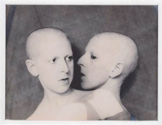
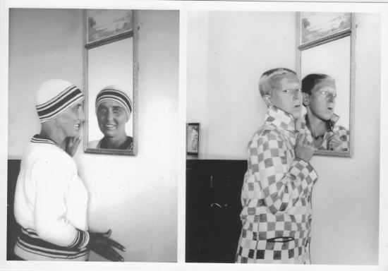
Taken 50 years apart, both photographs portray the artists in two ways, with the use of multiple exposures in Cahun’s picture and a mirror in Woodman’s picture, creating a sense of another dimension. The pictures being black and white causes us to focus more on the person themselves, adding to the mysterious feeling surrounding both photos. Moreover, both include quite simple and plain backgrounds, the dark tones apparent in them contrasting with the light complexion of the artists. Cahun’s image is much more flat, being a more traditional self- portrait, with a one dimensional background that simply frames Cahun and makes them stand out. On the other hand, Woodman’s photo is much more three dimensional, the way her body emerges from the darkness on the left side of the photo adding a sense of depth within the photo. The way Woodman utilises her environment (even by simply propping her mirror up against the wall) to capture herself in these weird yet beautiful ways is very inspirational, the way she moves through the environment around her adding a sense of fluidity to the image. Cahun also captures the idea of movement in her image however in a different way, showing two versions of herself in one image, indicating movement.

I believe both pictures have a similar idea behind them, despite Cahun presenting in an androgynous way and Woodman in a much more feminine manner. Both artists appear to be reacting to themselves, Cahun achieving this by layering multiple exposures to appear as though she is talking to herself. The title of the piece ‘Que me veux-tu?‘ meaning ‘What do you want from me?’ creates the idea that the right portrait of Cahun is a dark alter ego (portrayed by the pure black eyes) which is harassing the ‘real’ Claude Cahun, who’s face is painted with subtle panic and confusion. I think there is a powerful message within this picture since it highlights the idea of every person having some sort evil inside of them, or even intrusive thoughts, which can twist your views and opinions. On the other hand, Woodman’s portrait is taken at a higher and wider angle, allowing to see her bare body as it crawls towards the mirror. Woodman composed the image so that her face was only seen in the reflection, and her ‘real’ face being faced away from the camera. This forces the audience to trust the mirrors reflection as being the real thing which contrasts with the title, ‘Self-deceit‘ which implies the mirror isn’t completely truthful. Furthermore, the artist is alone and naked in the picture which creates a sense of vulnerability and perhaps indicating how she uses the mirror as comfort. Both images have a sense of discomfort within them, portrayed by the artists’ expressions and general appearance. Despite the difference in age gap (Cahun being 34 in the picture and Woodman being 19) they clearly have a deep understanding of themselves which I find very inspiring.

Claude Cahun

About Claude Cahun

Claude Cahun was a French surrealist photographer, sculptor, and writer. Cahun is best known as a writer and self-portraitist, who assumed a variety of performative personae. She was born on the 25th of October, 1894 in Nantes, France and sadly passed away on the 8th of December, 1954 in St. Helier, Jersey.

Claude Cahun’s brith name was Lucy Schwob, however she became Claude Cahun in 1914. In 1937, she moved to Jersey with her partner and stepsister Marcel Moore (aka Suzanne Malherbe) since it was a place they often visited during their childhood.

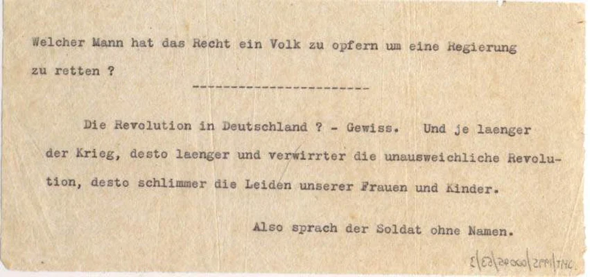
A few years after, she became an activist due to the German Occupation that occurred in Jersey from 1940- 1945, resisting against the Nazis. For example, Cahun and her partner created the persona of ‘Der Soldat Ohne Namen’ (‘The Soldier Without a Name’) cast as a mysterious German soldier intent on inspiring rebellion from within the army by pointing out the idiocy of war and ridiculing the actions of the German commanders. These words of resistance were written onto sheets of tissue paper and either posted through the windows of German staff cars, or left in cigarette packets in the hope that someone would pick them up looking for an increasingly scarce smoke.

Leaflets distributed by Cahun and Moore

They were both imprisoned and sentenced to death for listening to the BBC in 1944, however she managed to survive the prison and die in a much more peaceful way due to health issues in 1954, Moore committing suicide in in 1972.

During her life, she wasn’t known as an artist and it was not until the late 1980s where her work was discovered by the jersey heritage and is kept by the organisation to this day.

“Under this mask, another mask. I will never be finished removing all these faces.”

– Claude Cahun
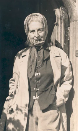
Self-portrait (with Nazi badge between her teeth) by Claude Cahun, 1945.

The Femininity and Masculinity of Claude Cahun

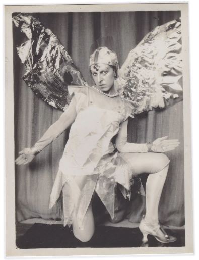
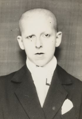
Throughout her life, Cahun challenged the stereotypes surrounding the ideas of masculinity and femininity, shaving her head and dressing in male attire to defy the traditional ideology about femininity and beauty in women. One of the main ways she portrayed her ambiguity was by choosing the name Claude, that in French could refer to either a man or a woman. She took the last name from her grandmother Mathilda Cahun. In some photos she portrayed herself as a woman, in some a man, and in other a bit of both. Even decades after her death she remains a famous artist and influencer that is followed by art historians, feminists and people in the lesbian, gay, bisexual, transgender and queer community.

“It depends on the situation. Neuter is the only gender that always suits me”

– Claude Cahun from her book ‘Aveux non Avenus’ or in English ‘Disavowals’
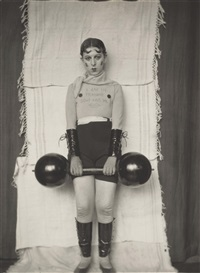
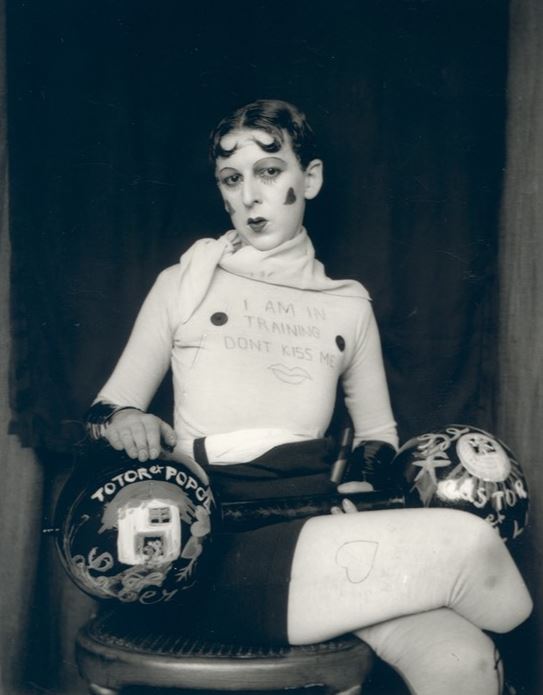
Claude Cahun dressed up as a weight lifter

Her Work

A mixture of presenting herself both as masculine and feminine, breaking gender stereotypes and opposing traditional views of femininity/ masculinity.