All posts by Julia Kochan

Filters

Author:
Category:

TYPOLOGIES

A photographic typology is a single photograph or more commonly a body of photographic work, that shares a high level of consistency. This consistency is usually found within the subjects, environment, photographic process, and presentation or direction of the subject.

The term ‘Typology’ was first used to describe a style of photography when Bernd and Hilla Becher began documenting dilapidated German industrial architecture in 1959. The couple described their subjects as ‘buildings where anonymity is accepted to be the style’.

Stoic and detached, each photograph was taken from the same angle, at approximately the same distance from the buildings. Their aim was to capture a record of a landscape they saw changing and disappearing before their eyes so once again, Typologies not only recorded a moment in time, they prompted the viewer to consider the subject’s place in the world. They made sure to take the photos when the light was soft, showing a clear difference between the sky and building. This meant they waited hours or even days to photograph a single picture, avoiding the weather they didn’t want (especially bright, harsh sunlight).

Typologies in Landscape Photography
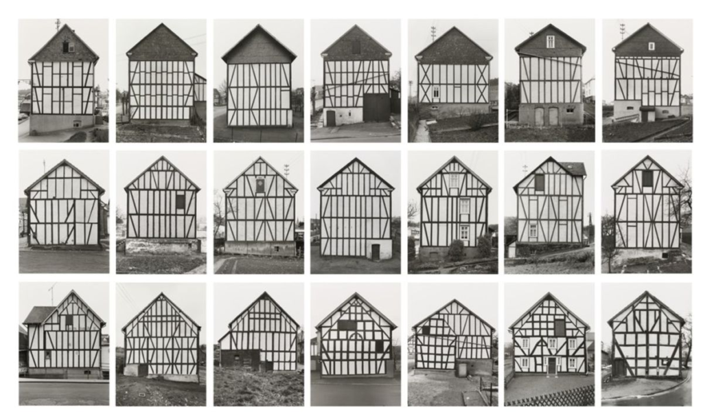
Hilla and Bernd Becher, Framework Houses (1959–1973)

The couple photographed a couple of buildings with a similar structure and design, taking multiple pictures of different sides of each building. They then put the photos into a 3×7 grid, creating an effective look by comparing each image. The colourless, dull sky plays a major role in the photo, allowing the building to be clearly separated from the background.
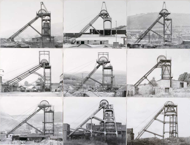
Hilla and Bernd Becher, Pitheads (1974)

The couple photographed the same structure in different places, taking the photos from the same distance and perspective, centreing the structure in the frame and tightly cropping the surrounding buildings to create a pattern of repetition. They put their photos into a 3×3 grid, creating a sense of perfect symmetry. Once again, each photo was taken on a dull, bleak day, allowing us to focus on every aspect of the structure without being distracted by the background/ without the light changing the look of it.
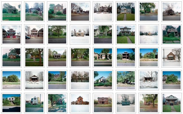
Images from 100 Abandoned Houses, A record of abandonment in Detroit in the mid 90’s by Kevin Bauman

Bauman took 100 photos of 100 different abandoned homes and displayed them all in a 8×14 grid. The grid causes the different tones and shades to contrast and clash, creating an interesting final piece. Each photo is taken at a face on angle, presenting the front of the house in a square image.

Lnadscape photoshoot 4- Response to new topographics

Contact Sheets

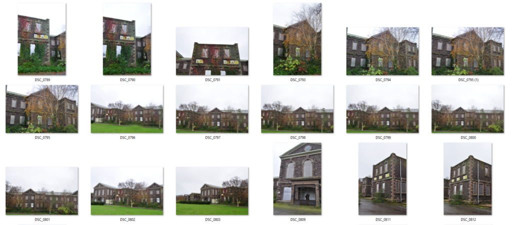
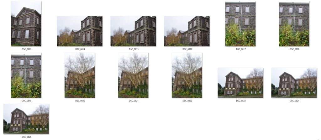
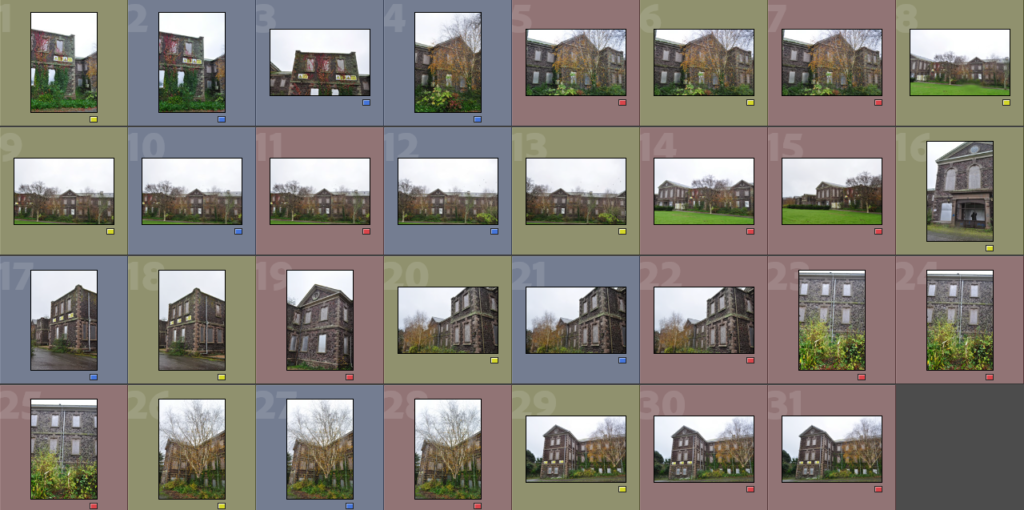
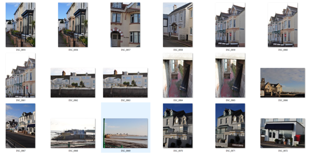
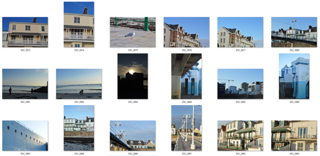
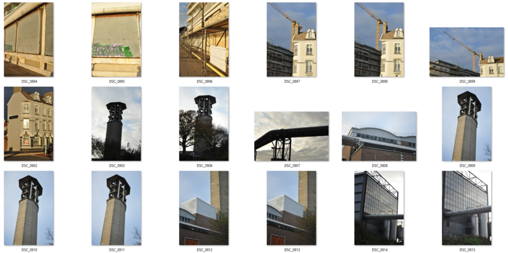
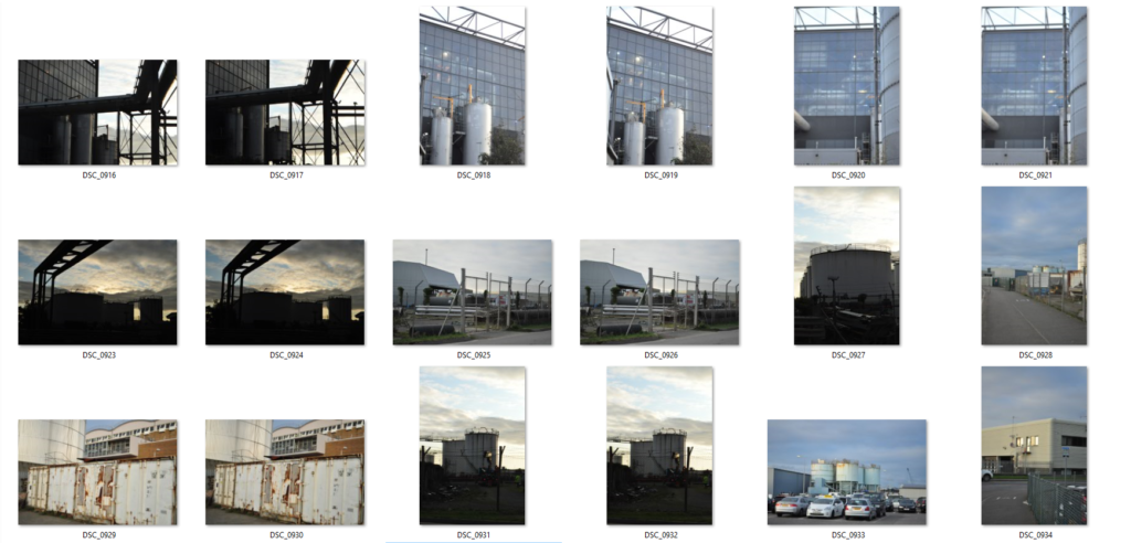
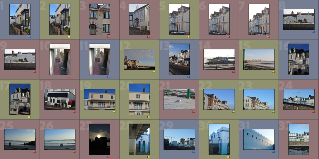
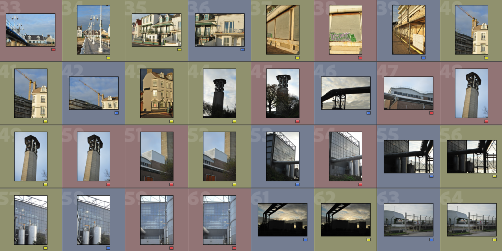
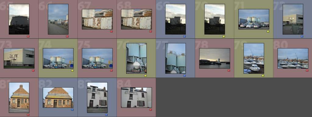
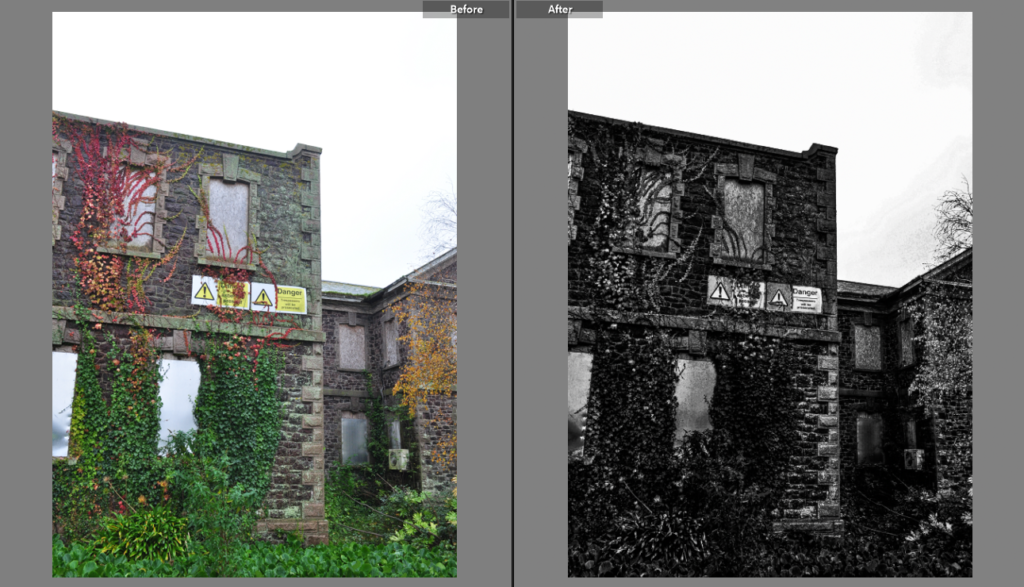
This is the contact sheet I created for this photoshoot in Lightroom Classic. I used colours as a filtering system; red for photos I won’t use/ won’t edit, yellow for photos I might come back to and edit and blue for photos I will definitely edit or have already edited. I also removed some photos from the contact sheet which I didn’t think would be any use at all.

Landscape photoshoot 3- Response to new topographics

Contact Sheets

This is the contact sheet I created for this photoshoot in Lightroom Classic. I used colours as a filtering system; red for photos I won’t use/ won’t edit, yellow for photos I might come back to and edit and blue for photos I will definitely edit or have already edited. I also removed some photos from the contact sheet which I didn’t think would be any use at all.

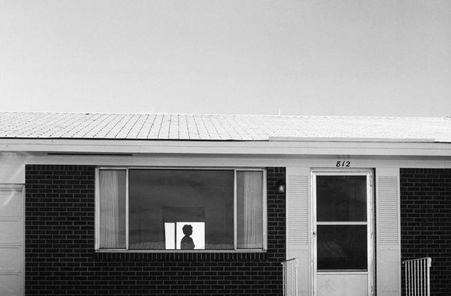
Robert Adams

About Robert Adams

Robert Adams is an American photographer who has focused on the changing landscape of the American West. His work first came to prominence in the mid-1970s through his book The New West and his participation in the exhibition New Topographics: Photographs of a Man-Altered Landscape in 1975. He was born on the 8th of May, 1937 in New Jersey, USA and is currently aged 85 years.

Robert Adams is a photographer who has documented the extent and the limits of our damage to the American West, recording there, in over fifty books of pictures, both reasons to despair and to hope. He uses his photographical skills to capture the impact humans have made on the nature around us.

Adams criticised the idea of romanticism in photography since he believed the impact of human architecture on nature should be presented to the world, instead of being hidden and ignored- in the way romantics do when creating their photographs.

“At our best and most fortunate we make pictures because of what stands in front of the camera, to honor what is greater and more interesting than we are”

– Robert Adams
Robert Adams | Photography and Biography
Robert Adams

Image Analysis

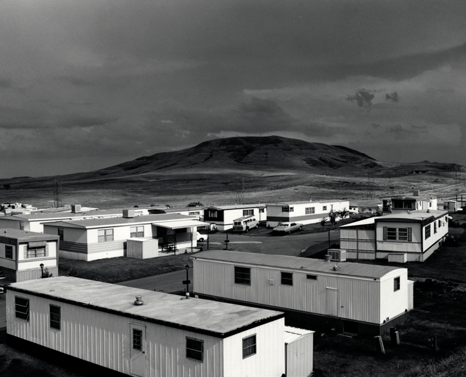
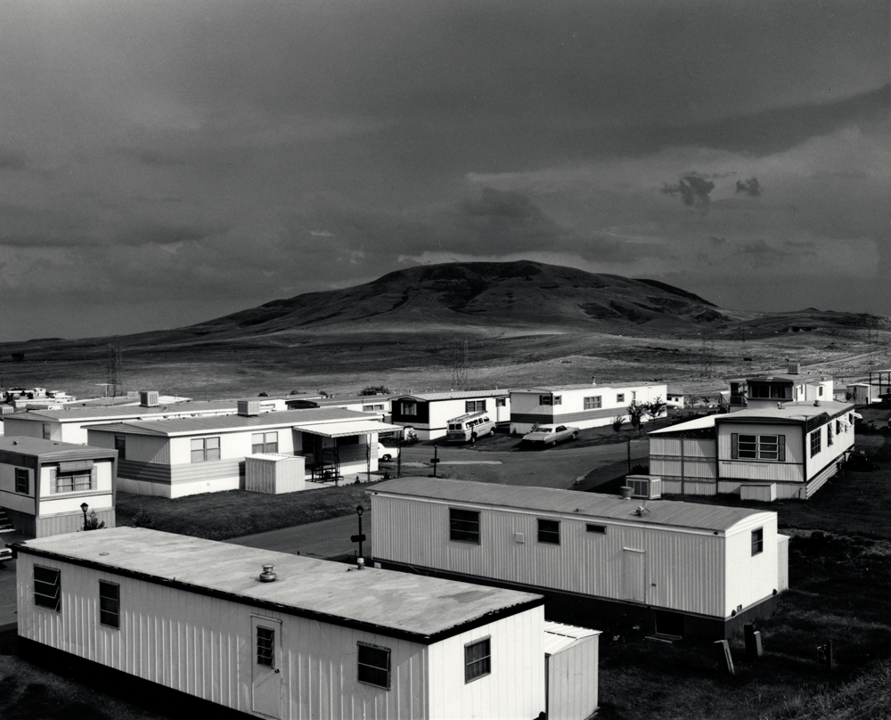
Robert Adams, Mobile Homes, Jefferson County, Colorado, !973

This photograph is a very popular image in the urban landscape photography community to this day. The photo shows a landscape taken from a high face on angle, including an estate of temporary homes at the base of an mountain towering over them. Adams took this photo to show the negative influence humans and their habit of spreading out across natural landscapes has on our world- converting the once beautiful rural landscape into a banal and conventional area. The background consists of the wide, dark toned mountain, which contrasts with the boxy and derivative appearance of the mobile homes in the foreground. This adds a sense of depth to the image, as not only there being a distinct fore and background present in the photo, the heavy contrast between the two distinct factors in the landscapes causes the image to appear more extensive and realistically detailed. The blocky appearances of the houses acts as a dominant feature in the photo, taking our attention away from the nature in the background. Moreover, the divergence between the shapes present in the photo, creates another perception of contrast, the smooth, featureless edge of the mountain contrasting with the harshly shaped structure of the mobile homes below. I think that this photo has quite an isolated mood since their are no visible people in it and the identically boxy mobile homes add to the desolate theme of the photo. The uniform texture of the buildings contrasts with the smooth appearance of the mountain- causing the lined pattern to stand out in the image.
Urban landscape photography

Mood Board, Definition and Introduction

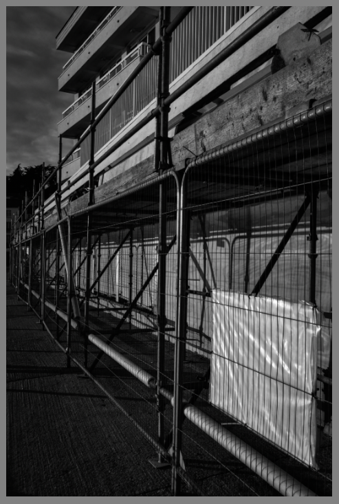
To create urban/ industrial landscape photography you can use buildings and other man-made structures compositionally in the same way other landscape photographers use trees and rolling hills. Wind farms, harbours, cement works, power stations, quarries, pylons and building sites are just a few of the industrial landscapes you can photograph.

 Landscape photographs typically captures the presence of nature but can also focus on man-made features or disturbances of landscapes. Landscape photography is done for a variety of reasons. Perhaps the most common is to recall a personal observation or experience while in the outdoors, especially when traveling. Others pursue it particularly as an outdoor lifestyle, to be involved with nature and the elements, some as an escape from the artificial world.

During this project, I will photograph multiple different industrial landscapes, creating links to some of the famous artists I researched. I will try to create an desolate or isolated mood throughout my photoshoots, to make the photos more interesting.

urban landscape photography-Photoshoot plan

who, what, where, when, how, why

who: since this project is about urban landscape photography and new topographics, I will want to include some people in some of my shots, to add a natural feel to them. However, I will also take some photos without any people to create a deserted look in them. The people present will most likely all be natural, going abut the day and showing the ways they interact with the environment around them.

what: I will attempt to photograph an abandoned building surrounded by some nature to show the effects they have had on each other through the decades. I will also want to photograph different areas around town, such as older roads and buildings.

where: I will go around St. Helier to create some photos of the older and more modern structures around town. I will also find a more remote location including some kind of abandoned structure to photograph.

when: I will take a my photos at a range of different times to capture the effect light has on the environment, especially buildings. I will take some pictures at around noon when the day is brightest to capture detailed pictures of different buildings and some during the night using a slow shutter speed to photograph the dimly lit buildings.

how: I will use a tripod (especially when going out at night) to take the low exposure and slow shutter speed photos. I will also use a range of techniques such as exposure bracketing to create a wide range of photos with different exposures.

why: I think this way will be a good way of taking photos that capture the industrial landscapes we have in Jersey. The dramatic weather and different times will create a interesting selection of images.

Urban/ industrial Landscapes and new topographics

Urban/ Indistrial Landscapes are images that bear witness to major human works, ranging from factories to quarries, or enormous mining complexes and abandoned zones. They carry the reader into inaccessible and little-known areas, between sublime and disarray, to witness the imposing reality of industry that we try now to erase. The result of humans let into nature, has ended up in a physical, social and cultural reality, which is reflected in the landscapes through specific architectures and iconic elements; showing the impact humans have had on nature.

New Topographics was a term thought up by William Jenkins in 1975 to describe a group of American photographers (such as Robert Adams and Lewis Baltz). These were photographers who criticised romantic photography, as they believed human impact on our landscapes shouldn’t be ignored. The photos these artists took mostly consisted of a repeated banal aesthetic, in that they were formal, mostly black and white prints of the urban landscape. They were people who found a sense of beauty in the disruption causes by repetitive and conventional architecture placed in nature.

On the other hand, “New Topographics: Photographs of a Man-Altered Landscape” was a ground-breaking exhibition of contemporary landscape photography held at the George Eastman House’s International Museum of Photography from October 1975 to February 1976.

New Topographics Photography

All of these artists combine nature and architecture/ human impact on the world in their photography, creating a whole new concept of landscape photography.

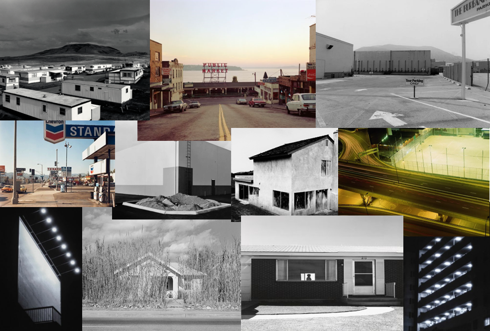
The first picture (top left) is a photo capturing a estate of mobile homes in an empty piece of land. The background consists of a looming mountain over towering the homes, the smooth shape of it contrasting with the blocky appearances of the houses. The nature and industrial landscape, present in the photo, clash- Adams promoting the idea of new topographics by showing us this mixed landscape and the reality of our world.

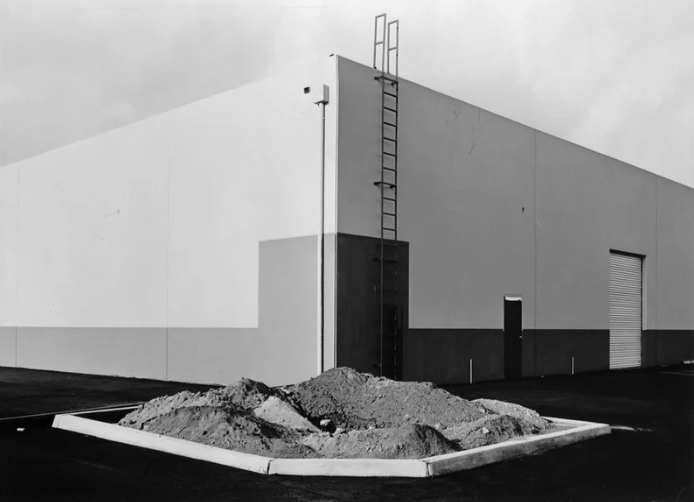
The second picture (top right) consists of a blocky box shaped building- creating an interesting photograph of a usually seen as unappealing location. Baltz included some of the silky sky to contrast with the roughly shaped architecture built on the ground below it. The solid strip of paint across the building further adds to the industrial shape of the building.

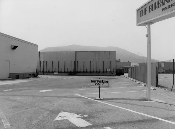
The third picture (bottom left) presents a empty parking lot surrounded by some boxy structures. The background consists of a mountain almost hidden in the fog, contrasting with the industrial foreground. I think Gohlke tried to create an idea of isolation and loneliness in the photo, creating a photo presenting a deserted parking lot contrasting with the soaring mountain peaking over the harsh edges of the buildings.

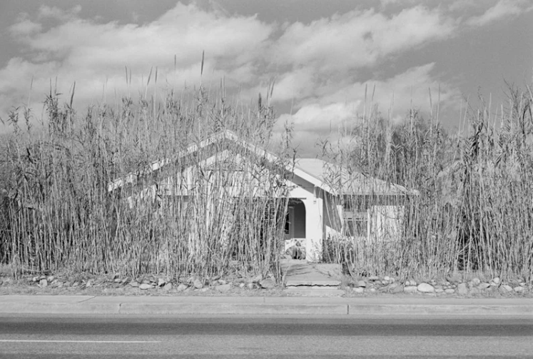
The fourth picture (bottom right) is a photograph of a seemingly abandoned house almost hidden in a thick forest of overgrown plants around it. I think Wessel tried to show that nature is more powerful than any architecture that we create, and is immortal in a sense.

best Romanticism landscape outcomes

Final Edits

Comparison

This photo was inspired by the photographer Fey Godwin, who took many pictures of different forest landscapes, capturing different lighting in her photos. Her photo includes a clearing with sun rays shining through the trees, the light illuminating a patch of grass in the middle of the photo. I found this composition very effective and decided to try something similar when taking my own photos. I ended up with this image, a small stream flowing through a dense forest. I made sure to capture the sun glowing through the trees from the top corner, reaching the water below. I think the composition of both photos are quite similar, as well as the tonal range present throughout the images. Despite Godwin’s photo being in black and white, the same dark tones in the tree are seen in my coloured image. The sun casts a similar effect, brightening the middle area of the image, and creating an area of focus due to the lighter tones, similar to the artist’s photograph. On the other hand, one of the ways I edited the image was by increasing the contrast of the image, this contrasting with the artist photos as her image appears more hazed, the grass not standing out as much. Moreover, her image consists of a clearer foreground and background, the trees further back appearing lighter and adding depth to the image. In contrast, my photograph captures the curved line of water surrounded in lush woodland, creating a curved leading line running through the image, guiding our eyes through to the back of the image and causing there to be depth in the image. The stream disappearing round a corner also creates a sense of mystery and adventure, adding to the mood of the photo. Godwin’s image creates the impression that she wanted to capture the true beauty and wildness of the forest, using the trees in the background to capture the depth of the forest. I tried to recreate this effect and capture the wild yet beautiful side of the forest.
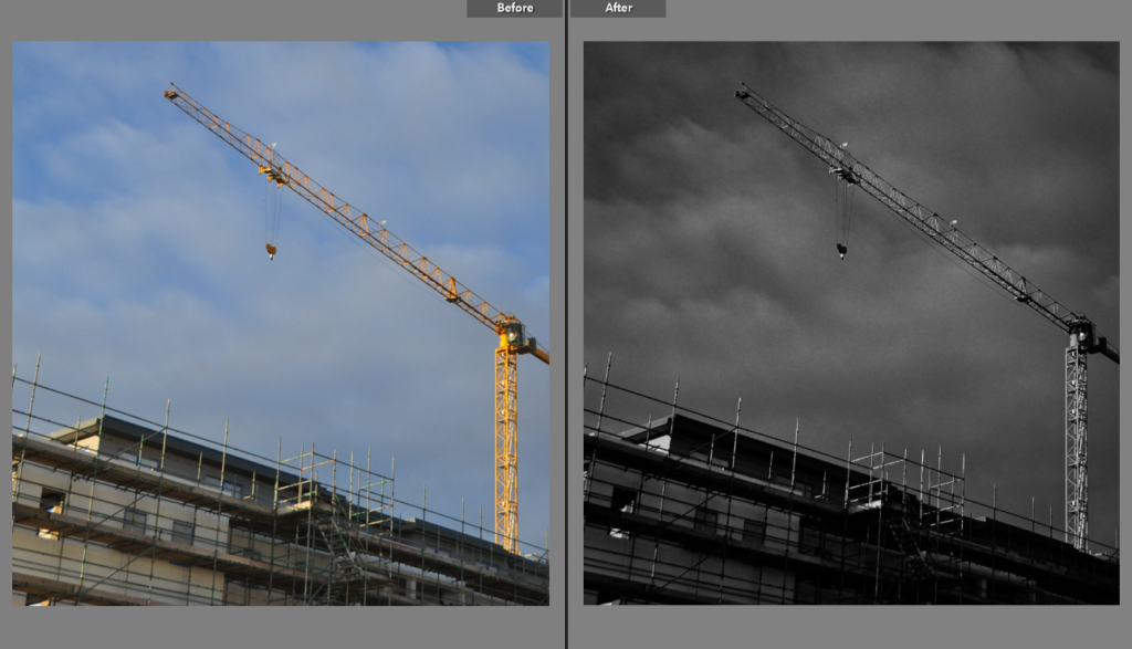
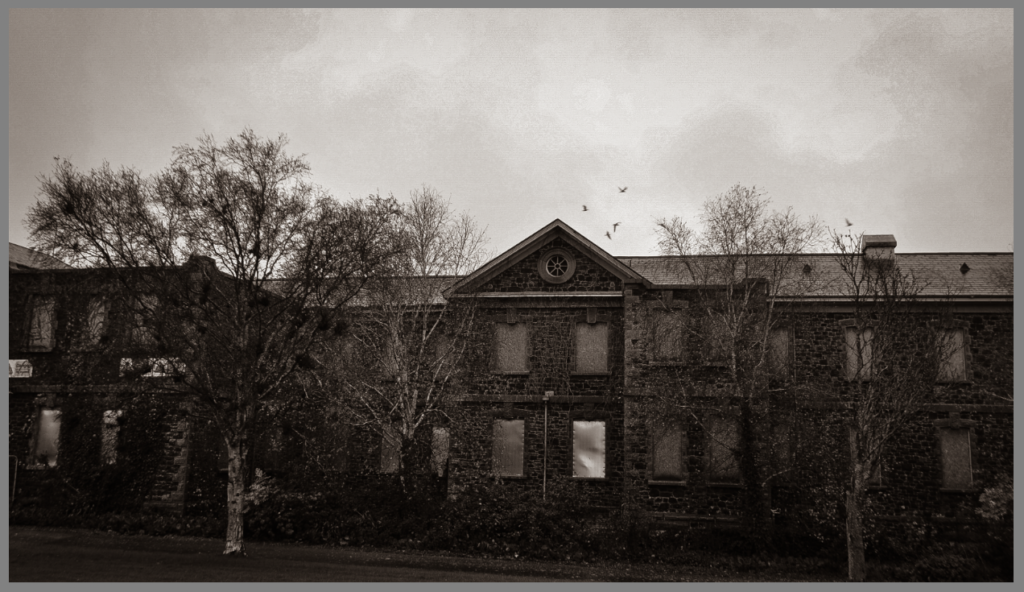
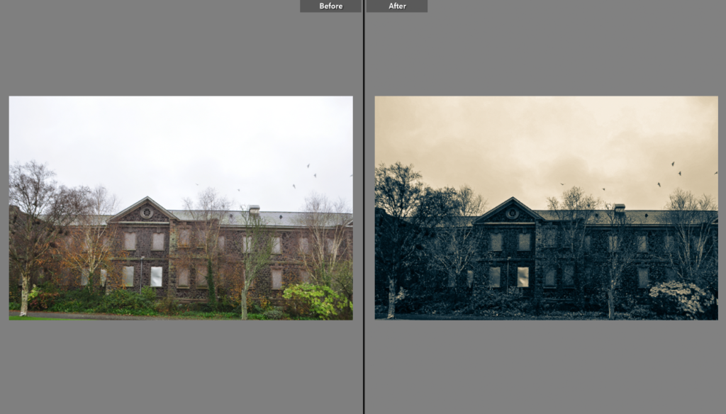
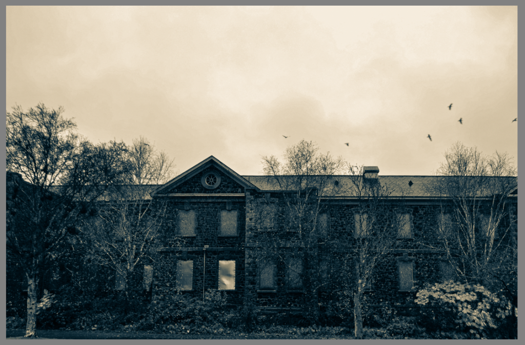
The inspiration for this paragraph was Ansel Adams, a landscape photographer who sometimes includes abandoned architecture in his photographs, comparing them with the rural landscape around them. He creates this idea of the sublime- how man made buildings break down over time but the nature around them is everlasting. His photo includes a broken down structure with a young tree growing in front of it, a contrast being created between the old, destroyed building and the new life of the tree. I found this concept very effective and perfectly capturing the essence of the sublime, so I decided to photograph an abandoned structure in the middle of a wild, rural landscape- the woodland slowly growing onto the architecture itself. Adams’ also photographed the scene in black and white, something I wanted to recreate in Lightroom. However, instead of black and white, I edited the photo so that it was in blue and yellow shades, since I believed it looked more effective and unique this way. Adams also focused on applying a wide tonal range in his work, which was something I considered when photographing and later editing my image. I wanted my image to have lots of contrasting tones, especially in the trees. Furthermore, I applied the rule of thirds in this photo, composing the photo so that the building appear in one of the thirds so that the other two thirds could be simply wildlife- capturing the idea of there being a lot of healthy, green nature around the decaying building.