All posts by Julia Kochan

Filters

Author:
Category:

Mandy Barker

About Mandy Barker

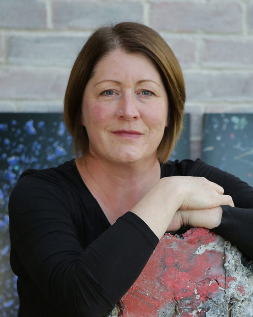
Mandy Barker is an international award-winning photographic artist whose work involving marine plastic debris for more than 13 years, has received global recognition. Working with scientists she aims to raise awareness about plastic pollution in the world’s oceans, highlighting the harmful affect on marine life, climate change and ultimately ourselves – leading the viewer to take action. She was born in 1964 and is currently 59 years old.

At first, she photographed the waste as she found it, but after realising this didn’t attract much of the medias attention she attempted a different approach, this time which turned out to be much more successful. The swirls of colours and patterns draw in the images in the audience’s eye, only to realize that these visually appealing compositions consist of garbage that animals have attempted to chew, plastic pellets, tangles of fishing line, and water-logged soccer balls.

“The aim of my work is to engage with and stimulate an emotional response in the viewer by combining a contradiction between initial aesthetic attraction along with the subsequent message of awareness. The research process is a vital part of my development as the images I make are based on scientific fact which is essential to the integrity of my work”

– Mandy Barker
Mandy Barker

‘Penalty’

The series ‘PENALTY’ aims to create awareness about the issue of marine pollution by focusing attention on the football as a single plastic object and global symbol that could reach an international audience. This project turned out to be very successful and captured the attention of many more viewers, proving to be very effective. The interesting shape the balls are arranged in (the majority being placed from biggest to smallest, with some smaller balls scattered around the main shape) creates an bizarre appearance. The story behind the balls (as described below) was another aspect of this project that made it so popular.
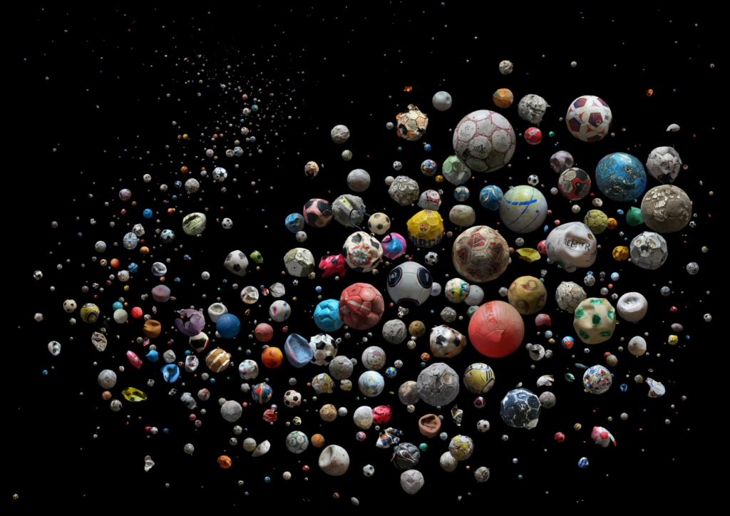
PENALTY – Europe © Mandy Barker. 633 marine plastic debris footballs (and pieces of) recovered from 23 countries and islands within Europe, from 104 different beaches, and by 62 members of the public, in just 4 months.

“I noticed over the last 20 years that the natural objects I used to collect were being replaced by man made ones”

– Mandy Barker in response to the question “How did you start focusing on ocean plastic as a both a message and a medium?” from the Plastic Politics interview.

Image Analysis
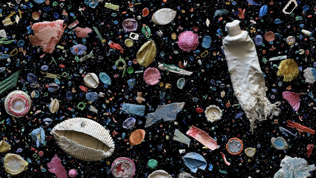
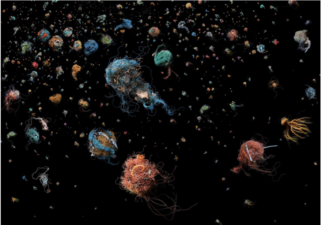
Our Plastic Ocean- Mandy Barker

At first, Barker took her images of plastic pollution in its original residence, the beach, however after realising people weren’t giving her and her work the feedback and reaction she wanted, she came up with the idea of collecting lots of plastic waste and photographing it on a piece of black velvet. In this photo, she wanted to give the illusion of the plastic floating around underwater, therefore she scattered the different bits of collected plastics (except the large pieces which she placed herself) around the material to create a natural look of floating and then later, during her editing process, duplicated some of the pieces and made them tiny to put in the empty spaces in between the bigger plastics. This added depth to the image, enhancing the depth of field by creating the illusion of the blackness going on forever. By photographing the plastics on black velvet, causing it to look like and endless/ timeless void (her interpretation of the ocean), the colours of the waste pop out and make it easier to focus on the details. This is something that always captures the attention of her audience, truely showing how badly our plastic waste effects our environment and the great mass of it in the ocean and beaches. The composition of the largest plastics causes the audience to focus on them, the details of them portraying how hard it is for them to decompose despite being in the ocean for so long.

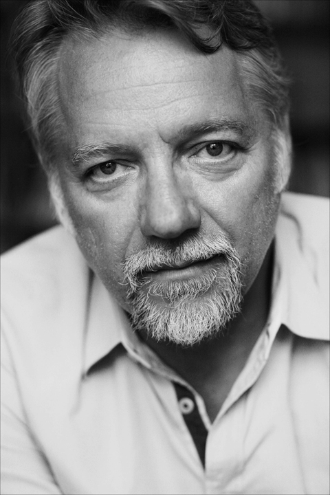
Edward Burtynsky

Edward Burtynsky is a Canadian photographer and artist known for his large format photographs of industrial landscapes. He was born on the 22nd of February, 1955 (and is now aged 67 years), in St. Catharines, Canada. His works depict locations from around the world that represent the increasing development of industrialization and its impacts on nature and the human existence.

He is seen as one of the world’s most accomplished contemporary photographers. His remarkable photographic depictions of global industrial landscapes represent over 40 years of his dedication to bearing witness to the impact of human industry on the planet.

“I can go into the wilderness and not see anyone for days and experience a kind of space that hasn’t changed for tens of thousands of years. Having that experience was necessary to my perception of how photography can look at the changes humanity has brought about in the landscape. My work does become a kind of lament”

– Edward Burtynsky
Edward Burtynsky

The Anthropocene Project

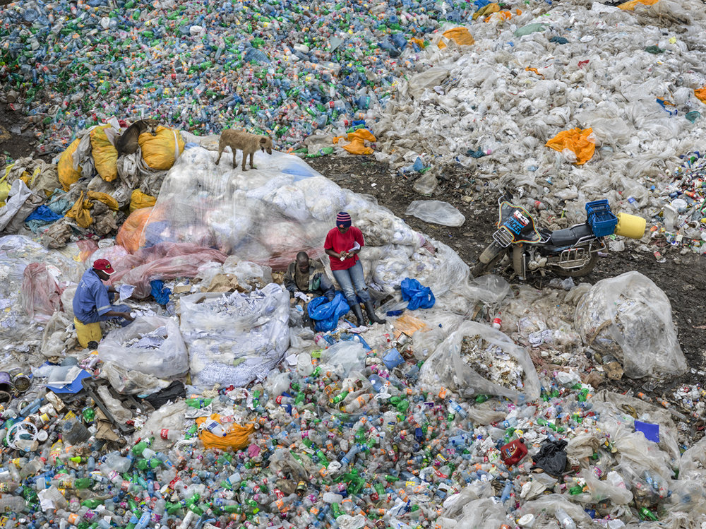
Dandora Landfill #3, Plastics Recycling, Nairobi, Kenya 2016

“We have reached an unprecedented moment in planetary history. Humans now affect the Earth and its processes more than all other natural forces combined. The Anthropocene Project is a multidisciplinary body of work combining fine art photography, film, virtual reality, augmented reality, and scientific research to investigate human influence on the state, dynamic, and future of the Earth”https://www.edwardburtynsky.com/projects/the-anthropocene-project

Along with Nicholas de Pencier and Jennifer Baichwal, Edward Burtynsky set out on an adventure around the world (visiting every continent but Antarctica) to photograph the most compelling and ‘impressive’ sites of human impact on the environment. They also used this journey as a time to review on what these changes caused by us really signify.

Image Analysis

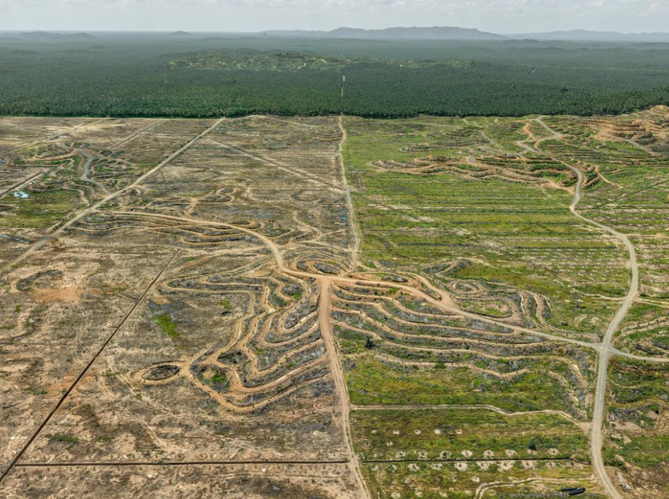
Clearcut #2, Palm Oil Plantation, Borneo, Malaysia, 2016

This one of the photographs that Burtynsky took while on his journey around the world for the Anthropocene Project, capturing a palm oil plantation site in Malaysia. The photo shows two sections of land, a dirt road separating them in the middle, creating a leading line. The left half presents a desolate field, the nature clearly being destroyed by the machines driving around the curved roads, preparing the soil for planting or maybe the photo being taken just after harvest, uncovering the destruction of the land beneath.. The right side shows a field that has a lot more green covering the dirt, perhaps not yet harvested plants. The main leading line running through the image leads us to the top of the photograph, guiding our eyes to the untouched forest at the base of the fields and creating a sense of depth in the photograph. The rural forest in the back creates a straight horizon line across the top half of the image, creating contrast within the picture and portraying the seer destruction humans have caused for their own wants. Furthermore, another area of contrast is the comparison between the bleak, washed out colours of the destroyed land and the lush, dark greenery of the undamaged forest. The composition of this piece is also a very interesting aspect, causing it to appear as though there three very different sections, almost the three stages of deforestation in one photo. Moreover, the symmetry of the picture is very effective, the road splitting the photo down the middle. The area of focus is the middle as that is where all the roads meet.

constructed seascapes

A seascape is a photograph, painting, or other work of art which depicts the sea, in other words an example of marine art. The word originated as a formation from landscape, which was first used of images of land in art. A constructed seascape is a seascape that has been either digitally or manually altered, to suit the artists vision.

Gustave Le Gray

Jean-Baptiste Gustave Le Gray was a French painter, draughtsman, sculptor, print-maker, and photographer. Gustave Le Gray (1820–1884) is known as the most important French photographer of the nineteenth century because of his technical innovations in the still new medium of photography, his role as the teacher of other noted photographers, and the extraordinary imagination he brought to picture making. He developed the idea of taking two pictures with different exposures and putting them together to create one final piece. He was born on the 30th of August, 1820 in Villiers-le-Bel, France and he died on the 30th of July, 1884 in Cairo, Egypt.

Gustave Le Gray

Comparison

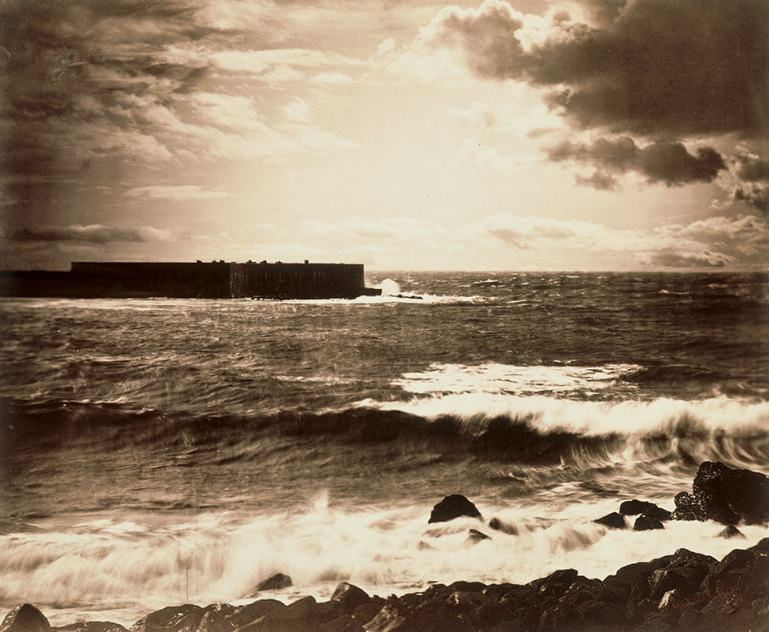
Gustave Le Gray – The Great Wave, 1857

The Great Wave, the most dramatic of his seascapes, combines Le Gray’s technical mastery with expressive grandeur. He took the view on the Mediterranean coast near Montpellier. At the horizon, the clouds are cut off where they meet the sea. This indicates the join between two separate negatives. The combination of two negatives allowed Le Gray to achieve tonal balance between sea and sky on the final print. It gives a more truthful sense of how the eye, rather than the camera, perceives nature.


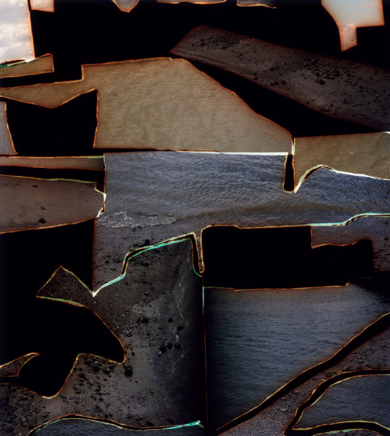
Dafna Talmor
 – from Constructed Landscapes II

Both could be described as landscape pictures. What kinds of landscapes do they describe?

Le Gray’s picture shows us a rural and quite aggressive shot of the ocean, presenting us with a landscape photograph capturing the waves hitting the rocks on the beach. Our eyes are immediately drawn to the gushing waves at the base of the photo, ignoring the seemingly insignificant architecture further up. Moreover, Talmor’s piece includes many different landscapes, showing different textures and tones throughout her work. They describe many different aspects of the wild ocean and beach, portraying the coastline in a completely different way that we would normally view it.

What similarities do you notice about these two pictures?

Both pictures include aspects of the ocean, showing the audience how the artist views the coastline. Both pieces include a lot of tone, capturing both the darkest and lightest tones in their pictures. Both photos also show the reality of the ocean; its carefree nature and aggressive behaviour by capturing it in a specific way.

What differences do you notice?

Le Gray clearly tried to hide the fact that he has created a constructed seascape by perfectly blending the two photos together whereas Talmor embraces her style by creating interesting pieces with cuts that stand out in the image, causing her image to appear as through a weird puzzle. Furthermore, Le Gray focused on the ocean as a whole and Talmor focused on smaller details, adding them to one outcome.

What words/phrases best describe each of these landscapes?

Le Gray’s photo has a very bold appearance, his photo embrasing the beauty of the ocean in its aggressive and wild form. His piece consists of an open landscape with nothing holding the ocean back. On the other hand, Talmor’s consists of a more abstract approach, capturing small and easy to miss details about the coastline. Her pieces are much more modern and different.

Anthropocene Photography

Mood Board, Definition and Introduction

work of Stephanie Jung, Mandy Barker and Edward Burtynsky

To create photos inspired by the Anthropocene an open mind is needed, so that you can capture the environment from a different point of view than normal- seeing just how damaging human impact on the world is.

The Anthropocene, a term coined by biologist Eugene Stoermer in the 1980s and popularized by chemist Paul Crutzen in 2000, emphasizes how human actions shape the environment in all its physical, chemical, and biological characteristics. Photography inspired by the Anthropocene captures both natural and urban landscapes, the natural landscapes typically including human waste or destroyed scenery. The urban landscapes include both abandoned areas as well as busy areas to show how humans interact with what they have created and the ways they changed the environment to do so.

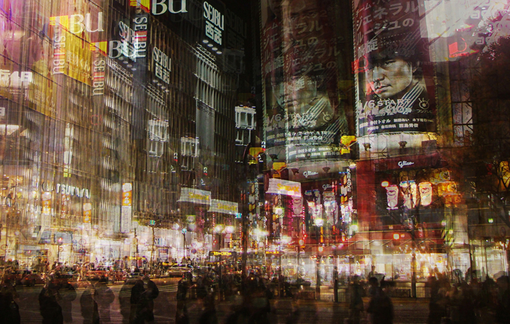
During this project, I will try to show the reality of our world, capturing the Anthropocene in my shots. I want my photos to be very emotive yet also interesting, combining different techniques to do this. I am inspired by several different photographers, some whose work has a deeper meaning and some who plainly show our impact on our surroundings.

photoshoot plan

who, what, where, when, how, why

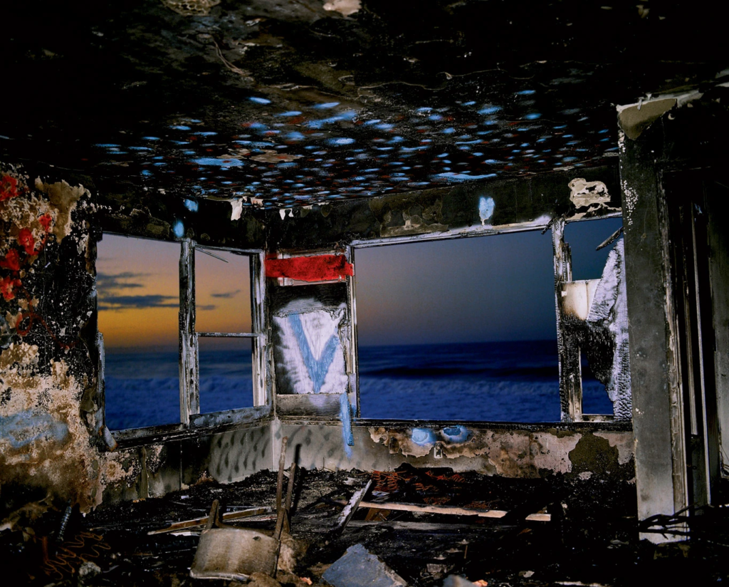
who: I want my photos to include some people, interacting with the environment around them- showing how our impact has effected the scenery I will be photographing. However, I will also take some photos without any people to create a deserted look in them, portraying the idea of abandonment, how they have used the environment for their own gain and now left it to slowly deal with the damage.
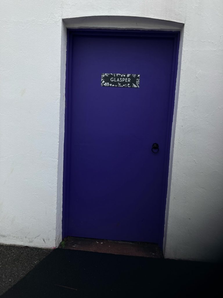
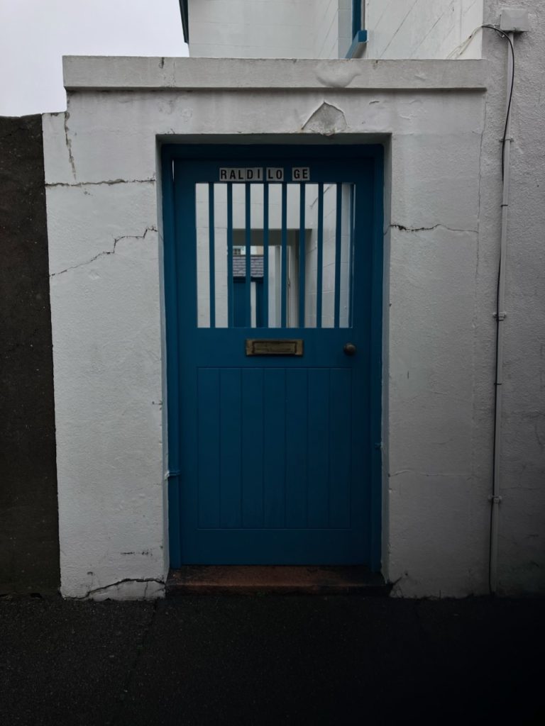
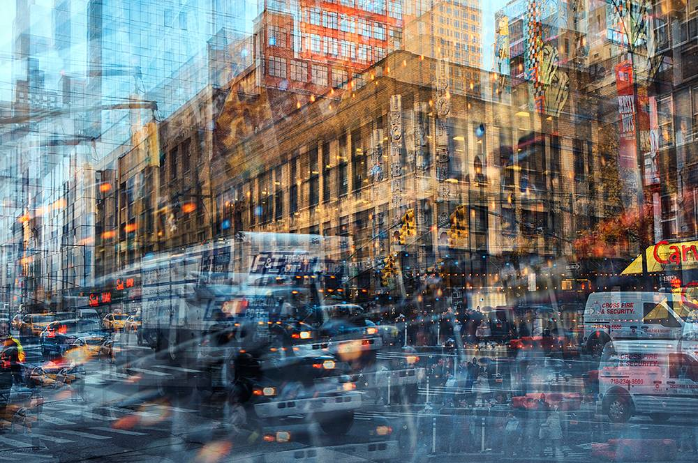
what: I will want to photograph construction sites with people working on it, abandoned buildings, natural places with waste, and also big buildings in town (to create images inspired by Stephanie Yung).

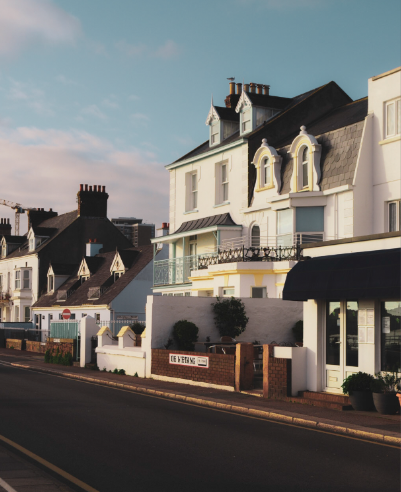
where: I will go around St. Helier to capture the urban landscapes in our town, capturing busy areas in interesting ways. I will also go to more rural places where I can capture the impact of humans on the environment.

when: I will take most of my pictures at the weekend as that is when town will be busiest and I will be able to capture people interacting with the world around them in natural ways. I will take most of my pictures during the day however some pictures could be taken near the end of the day, capturing buildings in a different way that is not so commonly seen as normally.

how: I will use a tripod (especially when going out at night) to take the low exposure and slow shutter speed photos. I will also use techniques like exposure bracketing to create images inspired by the artist Stephanie Yung.

why: I believe all of these destinations will be a good way of presenting the Anthropocene through my work, and the impact humans have on the world.

Stephanie Yung

The Anthropocene

The Anthropocene is a period of time during which human activities have impacted the environment enough to constitute a distinct geological change. It is a proposed geological epoch dating from the commencement of significant human impact on Earth’s geology and ecosystems, including, but not limited to, anthropogenic climate change.

The Anthropocene defines Earth’s most recent geologic time period as being human-influenced, or anthropogenic, based on overwhelming global evidence that atmospheric, geologic, hydrologic, biospheric and other earth system processes are now altered by humans.

The word combines the root “anthropo”, meaning “human” with the root “-cene”, the standard suffix for “epoch” in geologic time.

The Anthropocene Project

The Anthropocene Project is a multidisciplinary body of work combining fine art photography, film, virtual reality, augmented reality, and scientific research to investigate human influence on the state, dynamic, and future of the Earth. The artists Edward Burtynsky, Jennifer Baichwal and Nicholas de Pencier took part in this project, their way of exploring the concept of The Anthropocene.

Embracing and developing innovative techniques, the trio embarked on an epic journey around the world (to every continent save Antarctica) to capture the most spectacular evidence of human influence, while taking time to reflect on the deeper meaning of what these profound transformations signify.

The project, which launched in September 2018, includes:

-a major travelling museum exhibition that premiered simultaneously on September 28, 2018 at the Art Gallery of Ontario and National Gallery of Canada before travelling to its first European venue, Manifattura di Arti, Sperimentazione e Tecnologia (MAST) in Bologna in Spring 2019;

-a new release of Edward Burtynsky photographs

-a feature documentary film

-immersive interactive experiences in augmented and virtual reality

-an art book published by Steidl

-a comprehensive educational program

Dandora Landfill #3, Plastics Recycling, Nairobi, Kenya 2016

https://www.edwardburtynsky.com/projects/photographs/anthropocene

The Anthropocene in Photography

Edward Burtynsky, Oil Bunkering #2, Niger Delta, Nigeria, 2016
A black-footed albatross chick with plastics in its stomach lies dead on Midway Atoll, thousands of kilometers from the nearest continent. Adult albatrosses collect food—and, inadvertently, pieces of plastic—from the ocean’s surface and feed both to their chicks
 John Divola
Mandy Barker
Stephanie Yung

Best urban landscape outcomes

Final Edits

Comparison

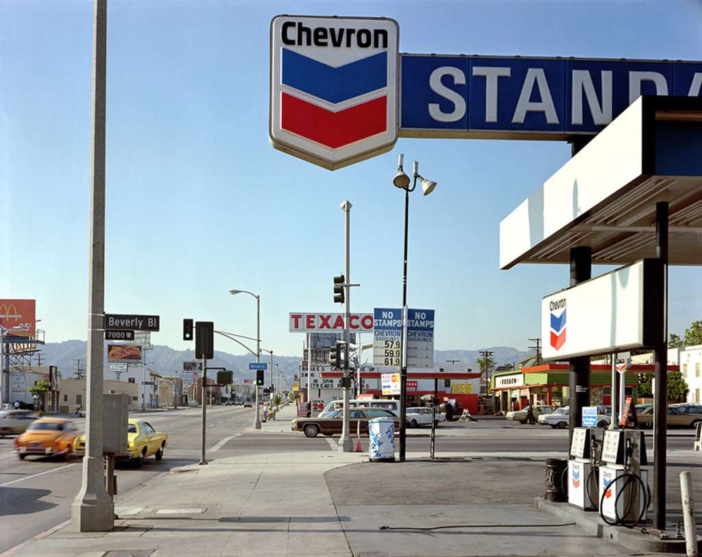
This photo was inspired by the photographer Stephan Shore, who takes vintage style photos of urban American landscapes, focusing on the different colours in his images. His photo includes a photo taken by the side of a long road, acting as a leading line, guiding our eyes to the back of the image where the mountains are located. It was taken in 1972, when Stephen Shore set out from his native New York City to Amarillo, Texas, on the first of what would become a decade’s worth of road trips across America. I found the exaggerated cool shades in this photo very effective, as well as the way the colours portrayed the place the photo was taken (the red and blue at the top of the image having similar composition to the USA flag). Moreover, I was inspired by the lighting in the image and the gritty look of the photo overall. The image I ended up with a similar composition, the photo being taken on the side of the road and presenting the viewer with an urban landscape. The use of empty space Shore’s image (the sky) is another aspect I found very successful in making the photo look intriguing and is something I included in my own work. However, I decided to focus on the warm tones instead of the cool tones like Shore did, editing my photo in a way that enhanced the warm colours. Although this being different, I was clearly inspired by his idea of intensifying the tones in his image. Furthermore, he edited/ took his photo in a way that showed the buildings off in a crisp and clear well- whilst I decided to add to the warm appearance of the photo by lowering the clarity of my photo, blending the details together. Moreover, his photo includes a leading lune, taking us to the background in the picture where the mountains are situated. In contrast, I positioned my camera towards the urban landscape, ignoring the ocean behind me which could’ve been a good addition to the image. The mountains in the back added contrast to his image, the rural aspect of the landscape slowly being taken over by our architecture.

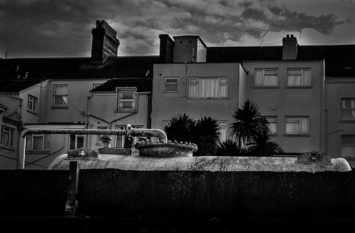
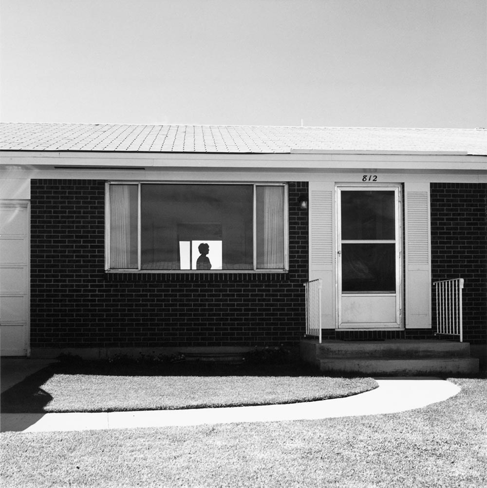
The inspiration for this paragraph was Robert Adams, a well known urban landscape photographer who captures repetition in his pieces, presenting our architecture as a desolate and boring design. His photo includes a flat house, with a lonely figure standing in the middle of a room located behind the large, uncovered window. I was inspired by the simple composition of his image, as it captures the building in a face on manner, the photo not showing the end of either end, hiding the true size of the house. I recreated this by taking a face on photo of building situated behind a rusty tank, not capturing either end of the house- portraying the idea that our architecture is taking over the world and we can’t even see the start or end of it. Our photos contrast in the aspect of nature, my photo including some palm trees being towered over by the buildings, while Adams’ photo doesn’t include any large plants. However, both of our pictures include a version of controlled nature (mine being the garden trees and his the short grass at the base of the image) reprinting the idea that humans are also showing dominance over the nature we leave around us, not letting it grow into its naturally wild state. His photo was also captured in black and white, which I recreated using Lightroom, editing my picture into black and white as I liked the way his photo showed off the different tones by having a very varied tonal zone. However, another aspect of our images that are different are the skies, his being a plain, calm sky with no clouds and mine being a dramatic sky with the clouds adding to the wide variety of texture in our images. This is something I could change since his photo has a much calmer appearance, letting the audience easily take in the shapes in his image (especially the silhouette) while mine is much more dramatic and dark which could distract the viewer.

Hilla and Bernd Becher – Typologies of industrial architecture

Hilla Becher was born on the 2nd of September, 1934 in Potsdam, Germany. She passed away on the 10th of October, 2015 in Düsseldorf, Germany. Bernd Becher was born on the 20th of August, 1931 in Siegen, Germany and he died on the 22nd of June, 2007 in Rostock, Germany. They began collaborating together in 1959 after meeting at the Kunstakademie Düsseldorf in 1957. Bernd originally studied painting and then typography, whereas Hilla had trained as a commercial photographer. After two years collaborating together, they married.

The husband and wife team of Bernd and Hilla Becher began photographing together in 1959. Bernd and Hilla Becher documented architectural forms referred to as “anonymous sculpture” for over thirty years. Their extensive series of water towers, blast furnaces, coal mine tipples, industrial facades, and other vernacular industrial architecture comprise an in-depth study of the intricate relationship between form and function. Many books on their work are in publication, each titled after the industrial structure that they document.

They always made sure their photographs consisted of capturing the building during a grey, soft- lighted day, which resulted in them creating a form of photography arranged by type that, through repetition, encourages viewers to engage deeply with the formal qualities of the subject matter. Bernd and Hilla Becher aspired to direct the audience’s attention away from the photograph, emphasizing the content rather than light, perspective, or other artistic choices, but in doing so created a school of photography that forced reconsideration both of the presentation of images and the preservation of the built environment.

Some people even referred to their work as sculpture, however the couple made it clear that although it was architecture, their work was photography.

“You have to be honest with your object and to make sure you do not destroy it with your subjectivity, and yet remain involved at the same time

– Hilla Becher
Hilla and Bernd Becher

Image Analysis

Hilla and Bernd Becher, Gas Tanks (1983 – 1992)

This is one of the typologies created by the Bechers, a sequence of 15 photographs of spherical gasholders placed into a grid. The grouping of the gas tanks, causes the audience’s attention to be attracted by the piece, the photos focussing on the strained, round appearance of the structures contrasting with the differently positioned skeletal staircases wrapped around the tanks surface. This encourages analysis of the way the staircases differentiate the structures from one another, without interfering with the function they have as well as the look of the images being grouped together, since each picture links in with all the others, creating a sense of a repeated pattern. This is something that Hilla and Bernd Becher focusses on when taking each photo- they wanted each photo to have the same composition and overall appearance, with small details indicating that each shot is different. The way the Bechers intertwined the idea of typology in their work is very clever- presenting the structures as though they are scientific specimens and therefore showing no indication of their own conclusions regarding the gas tanks and their impact on the world. The way they put all of their photos into a grid is very effective, causing the audience’s attention to be evenly distributed between all of the images. Each photo appears to have been taken at the same time, during the same weather, creating a sense of timelessness in the photos. The bleak, dull sky causes each structure to stand out, another aspect that was clearly important to the photographers. Moreover, the individuality of each structure is stripped away as they are presented as a group, causing them to appear as examples of a type rather than individual structures which don’t express the creativity of their designers.