All posts by Jude Gosselin

Filters

Author:
Category:

St Malo Images Edited/Evaluated

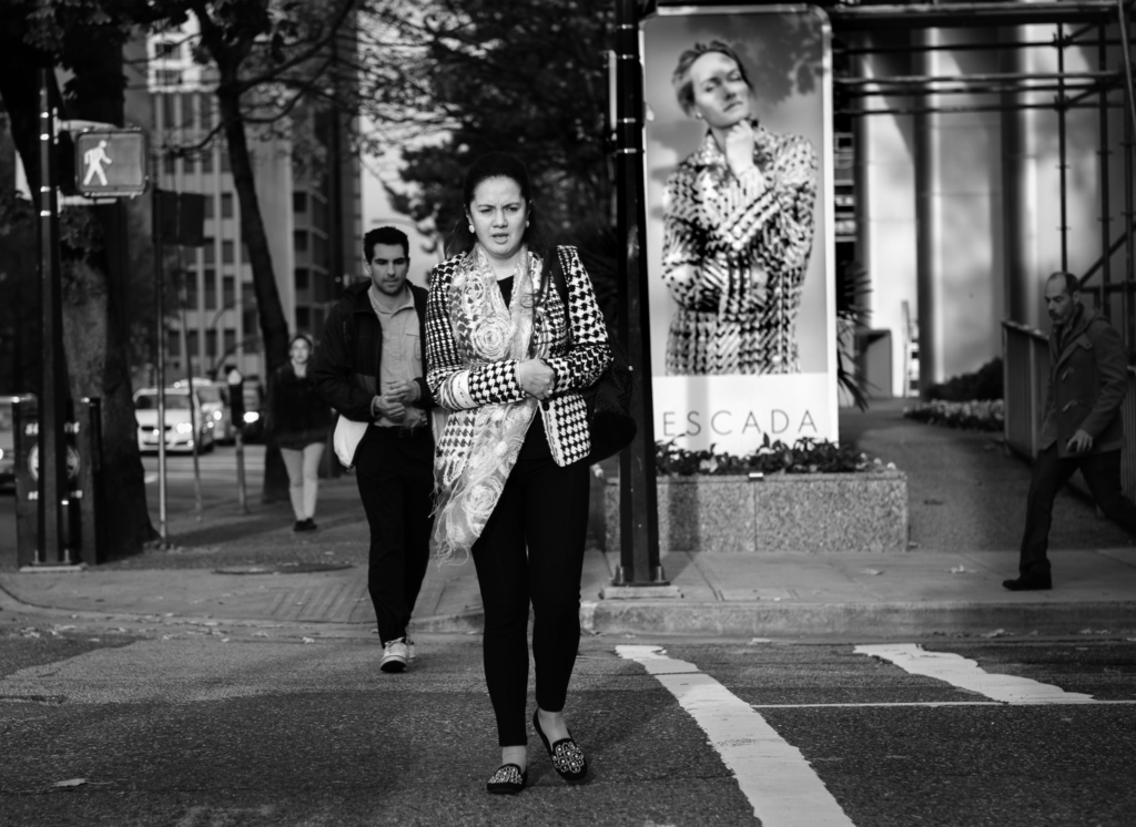
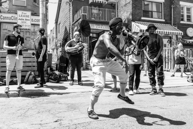
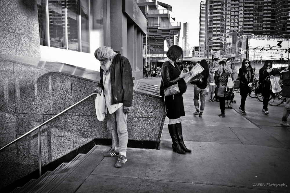
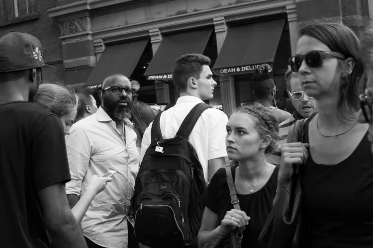
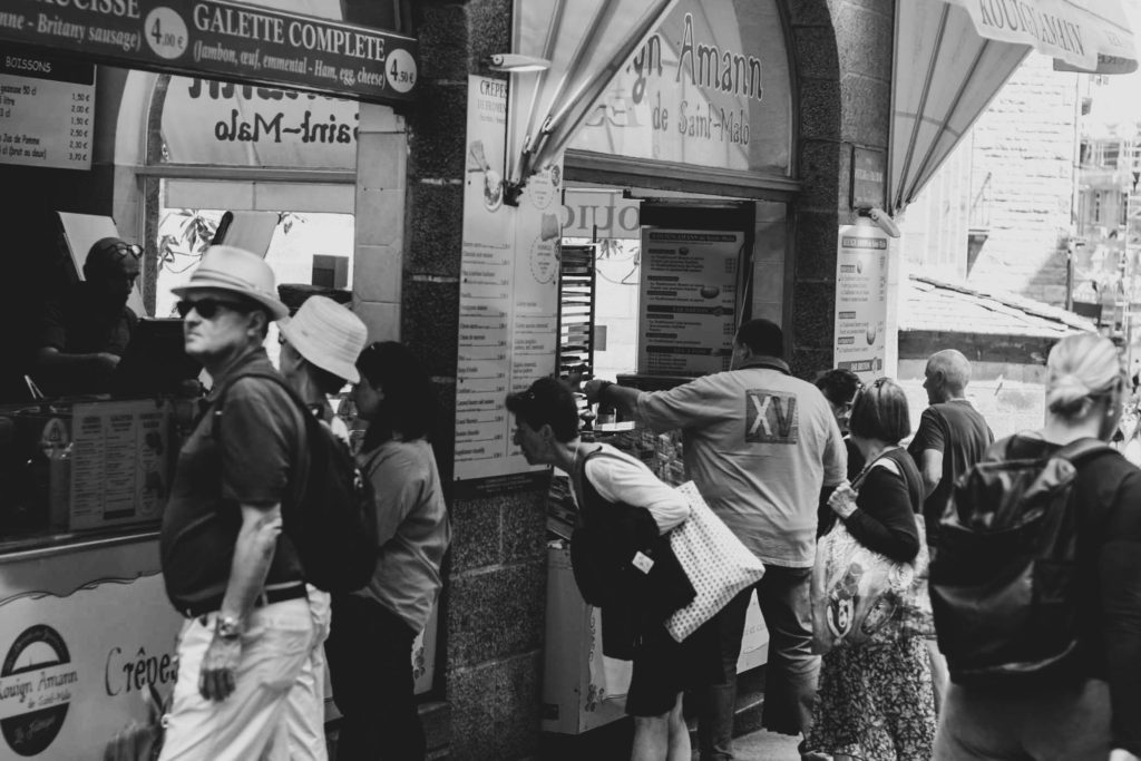
I chose this image to be one of my favourites because I like the smooth contrast between black and whites, but that it also captures life in St.Malo because of the people who just minding their own business enjoying themselves without the knowledge of the camera being there. This image is good because it shows the setting of a local business but also captures a good angle, and shows the variety of people, not just an image of one person.
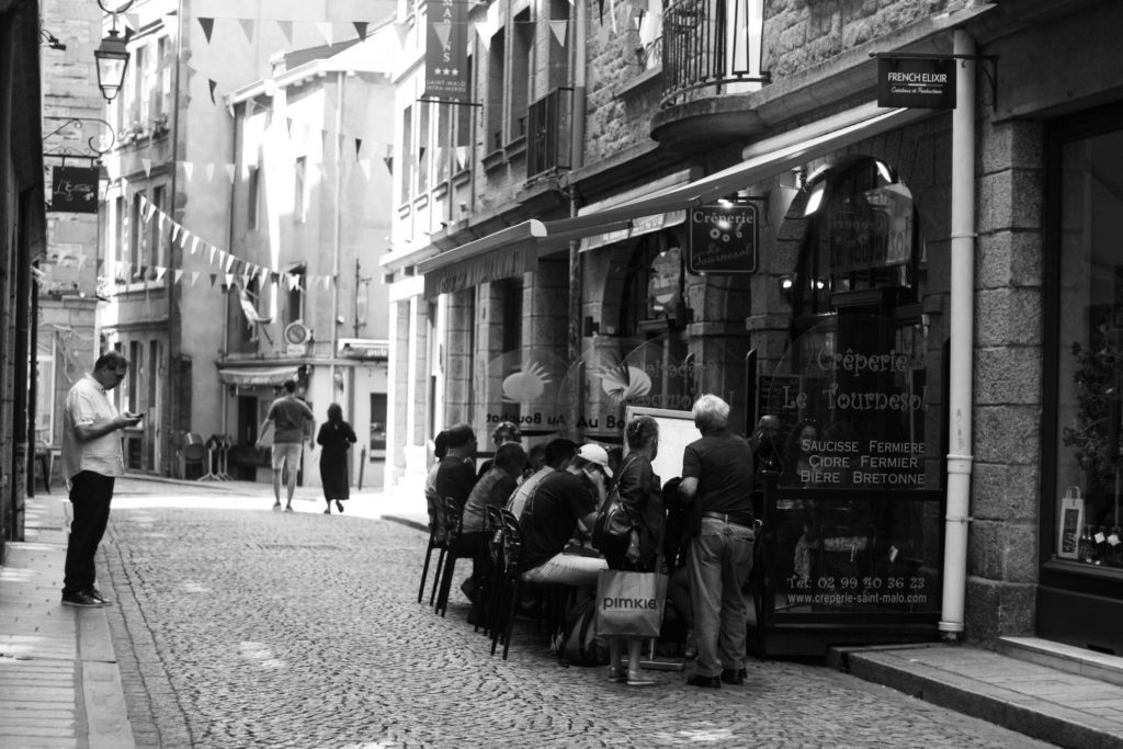
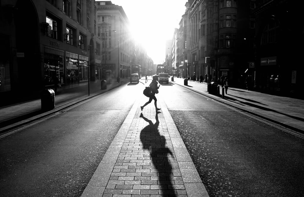
This image was chosen to be one of my favourites because I like the use of the lines and shapes in the image for example the buildings and the restaurant in the middle right of the image. I also like how it shows people practically in the middle of the street which is apart of the restaurant, showing how local these streets are. Even just the fact that there isn’t many people in the shot creates a good effect, it shows casualness.
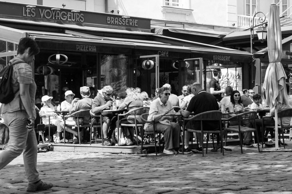
This was chosen to be a favourite because it was in the main entrance of St.Malo and the black and white contrast is especially good, along with the use of positioning of the people eating at a restaurant, and the use of lines I like.
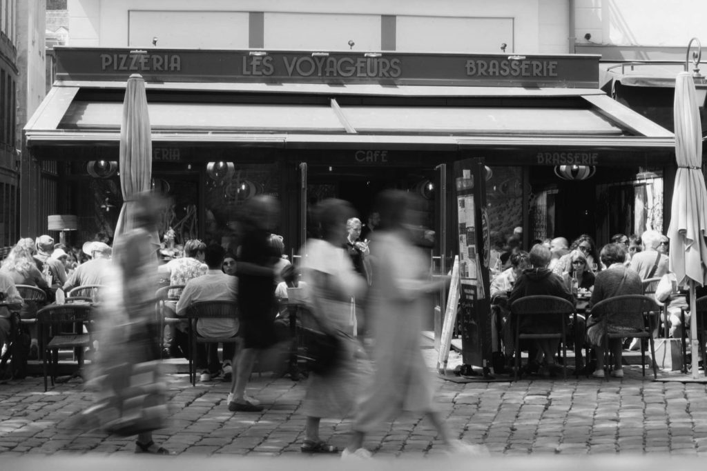
This one was an adaption of the image taken above but using a different angle and a different exposure time. I done this to capture the people walking by to be blurry but the people eating in the restaurant to look pretty much normal, I liked the effect these settings gave the image.

I like this image and chose it because of the high black and white contrast, and how it shows a lot of features, but also creates almost a sad but normal effect to the image of a dog, and what seems to be a homeless persons things, but without the homeless person being there, it creates mystery but also a solid feeling.
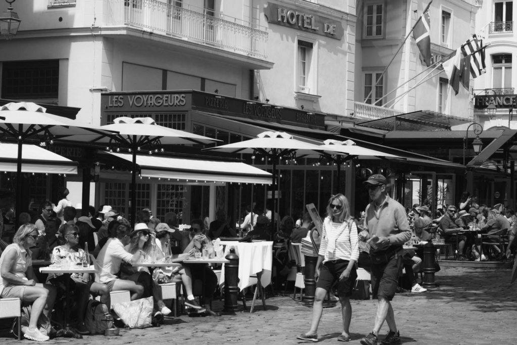
This image was nice because of the use of lines and shapes in the centre of the image, which also shows a restaurant. This image also shows an event of people eating with passing people, showing how busy the areas is, as you can even see another restaurant in the background packed with people.
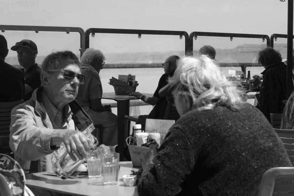
This image was also an adaption to the image above this one, which zoomed into specifically 2 old people dining. This stands out to me because of how close the image was taken and what it shows, for example the horizon and the sea in the background along with others eating. I just like the contrast of things going on, like its part landscape, part event image. The facial expressions show relaxation and calm creates the feeling of the image of calm.
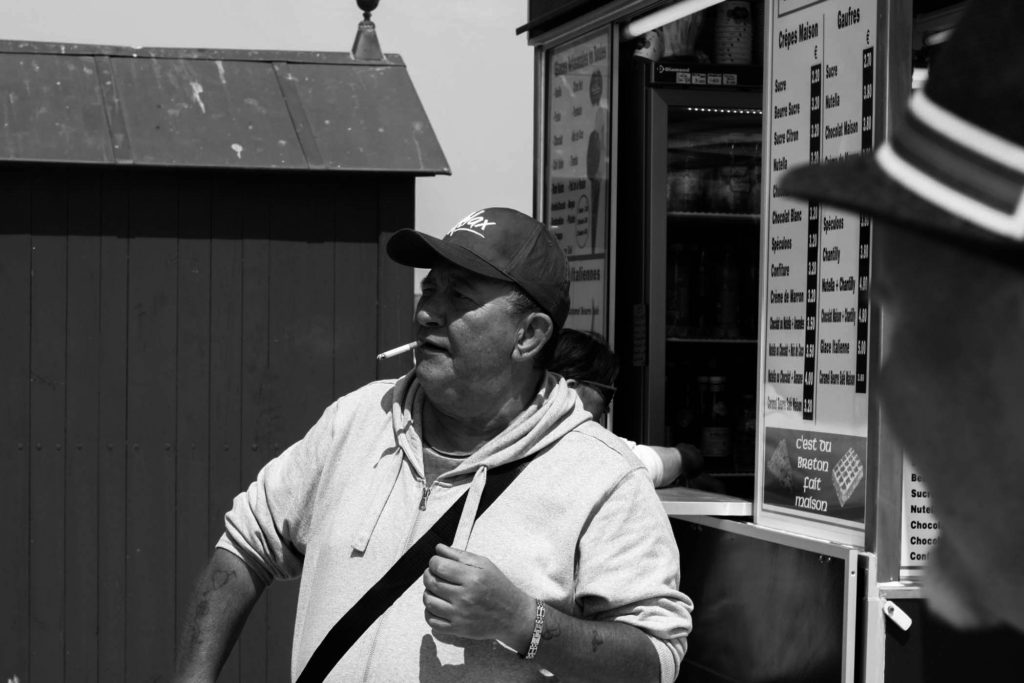
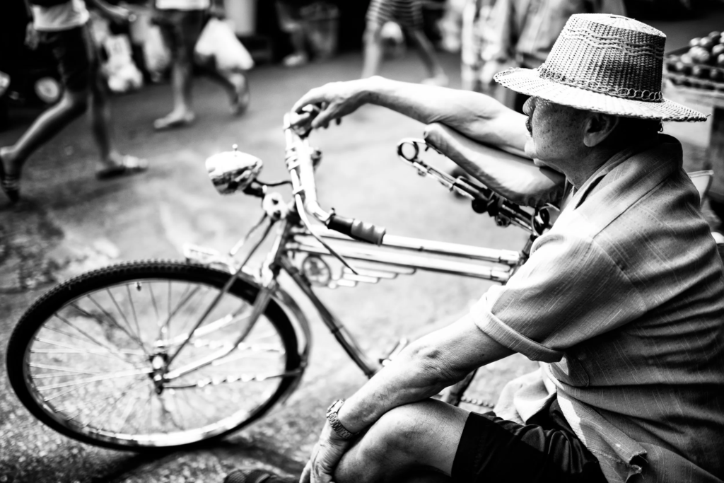
This one was definitely my favourite one. I really like the black and white contrast in this image, and just the fact that this tourist looks like an absolute boss with a cigarette in his mouth, what seems to be a bag going across his body, and I like how the shade of his hat covers his face, giving him a slightly mysterious look, he just looks like a character.
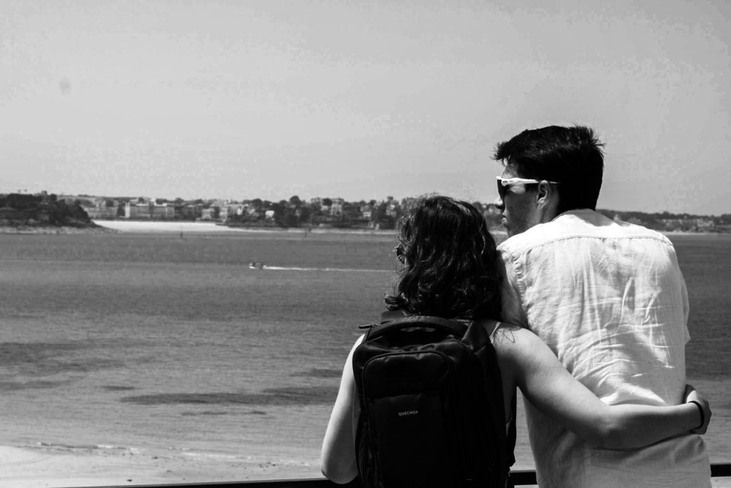
This one I thought was nice it captured a good landscape and also a couple enjoying the view with the woman’s hands around either her husband or boyfriend, capturing a moment. I also like the scenery that it captures.
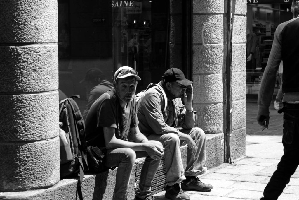
This image I chose because it shows people sitting on the side of a shop, who look like tourists with their bags chilling, the person on the right also fills the image but also drags your eye into the image.

This last one I chose was because it was similar to the image with just the dog but instead it also had the owner with him, it creates a sympathetic effect but also a fulfilling effect in some ways. This image also uses good lines and shapes, it has good depth of field as well.

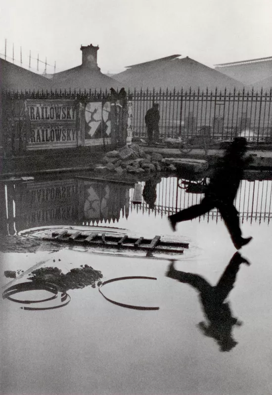
Henri Cartier-Bresson

Carter was renounced for his street photography and his ability to capture a “decisive moment”, this was his ability to create a good photograph which also captured a meaningful event occurring, which varied. He was also a photo journalist where he documented some very famous events, such as Gandhi’s funeral, china and even the liberation of Paris. His influence was through surrealism, and decided to make a photobook called “The Decisive Moment” which would define photography itself and be one of his most famous projects.

Cartier, at a young age studied art with his uncle using oil paint, which grew to be Cartier’s loved interest, whilst his uncle was known for his skills in art across the world and taught Cartier everything he could, it wouldn’t last long when Cartier’s uncle was killed in WWI. Later in his life Cartier attended a private art school and Lhote Academy. He would say that his teacher was someone who “taught photography but without the camera”.

during 1929, Henri was put under house arrest for hunting without a license, but was asked by someone called Henry Cosby for Cartier to be released “under his wing”. Both henry and Cartier where interested in photography and decided to take images and print them. This was Cartier’s first experience in photography.

During his life Cartier was painting and doing photography partially until he was inspired by an image called “three boys at lake tanganyika” where there where 3 African boys running into a lake. Cartier was inspired by how the image captured a moment in which the 3 boys where embraced and happy in life, which convinced Cartier to take up photography full time saying “I finally understood that photography could fix eternity in an instant”. this would be an important reasoning behind his book of “the decisive moment”, which name came from photography being something that in his eyes where to capture an event which expressed emotion and showed the settings of that exact moment.

he was obsessed with an image having the contents of patterns, lines, shapes, tone, texture, and space. Which worked in his favour, and worked especially well on the streets that he would take these images in. he began his career in film working with renowned French director, Jean Renoir as second assistant director to films such as La vie est à nous (1936) and Une partie de campagna (1936). They gave Cartier a deeper understanding of photography, for example, whilst making one of their films, they told Cartier to act himself so he would understand what it was like in front of the camera rather than behind, Things like this helped Cartier to develop his knowledge on image making. One of Henri Cartier’s quotes stated the difference between art, and photography: “There is a creative fraction of a second when you are taking a picture. Your eye must see a composition or an expression that life itself offers you, and you must know with intuition when to click the camera. That is the moment the photographer is creative,”. This quote was referenced to his book of the decisive moment, and showed people that photography has a different style to it, and doesn’t (fully) copy art.

The Theme of Nostalgia

In my own understanding right now of Nostalgia, it is a happy/good sensation that is felt because of memories remembered from in the past, this is sometimes triggered or randomly occur. For example you could be at any beach, and it could remind you of when you went to the same beach or a better beach in the past with all your friends, and you had a really good time there. Most of the time you remembers these nostalgic memories from a very long time ago, years in fact.

Nostalgia relates to, missing something in the past, which could associate with a person, personalities, things, or even how it used to feel. Nostalgia is closely related to how it used to make you feel, and can be seen through a relation of other people feelings, for example watching your or another kid be exited about something, could cause a nostalgic feeling/memory of when you used to do the same thing. People usually phrase it to be a “good time”, or “the good old days”, and can be experienced through everything like music, games, or even places.

Personally if something is nostalgic it is normally a good feeling due to the processing of stimuli, and something that you do want to remember again. Not something that reminds you of a bad experience.

Review Of “Playtime” Exhibition

The Exhibition was unique in its own way through how they had used old and altered images of the Fort by using AI. It reminded me of nostalgia because of how there was old equipment that would of been placed in the fort. They also used images which had been similar to what the fort had used to look like. I enjoyed how they had used bright colour to describe distorted images and to show that these ideas of the fort was through someone’s memories, as if it where like a dream state. The exhibition makes it feel like you are going through a tour of the Fort but through someone else’s dreams, almost giving an LSD type affect. And I like how they had used AI as a way of creating these dream like altered images, as it had created images better than doing it by hand and having to use a lot more thinking to create a decent image.

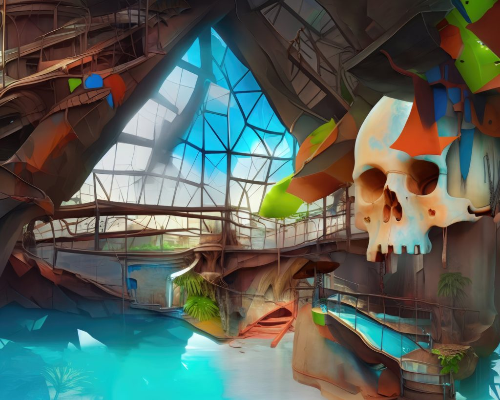
This is one of his images which was more eye catching to me, either because it was the biggest or the fact that they used bright colours. Either way, to me it is an image that creates a good feeling that it is trying to express, although it is not actually real, the use of AI creates a good dream like representation of what the swimming pool in the fort used to look like. I like the use of regular and distorted shapes. For example the water reflecting look on the left of the image, reminds me of water reflecting off of a pool, like a metallic look. The use of light and dark areas gives a good contrast to the image and creates a more eye catching look. It reminds me of what someone would remember as what a pool used to look like when they where 7.

The whole experience in its self was a good representation of what Will was trying to express, a sensation/representation of nostalgia. But to me it reminded me of something like being on acid, as if you where walking through someone else’s mind and memories of what a place used to look like, the majority of the image’s where the use of shapes and distortion and bright colours. Some people find it hard to actualise memories and what things might look like to them, but because of how these images where created it makes it easier for people to understand the images but in a way which is hard to explain. Similarly to LSD.

Images like these remind me of something from the willy Wonka factory but a futuristic version. Also its cartoony look makes a more simpler but accurate image, and reminds me of when I was a kid looking at cartoons. Lastly I like the practical parts of the exhibition, like the old game that was set up, and the small room which had purple lights on the ground and that electric ball, it allowed for people who have small attention spans to keep their attention just that little bit more.

Comparison to Robert Mapplethorpe And Evaluation

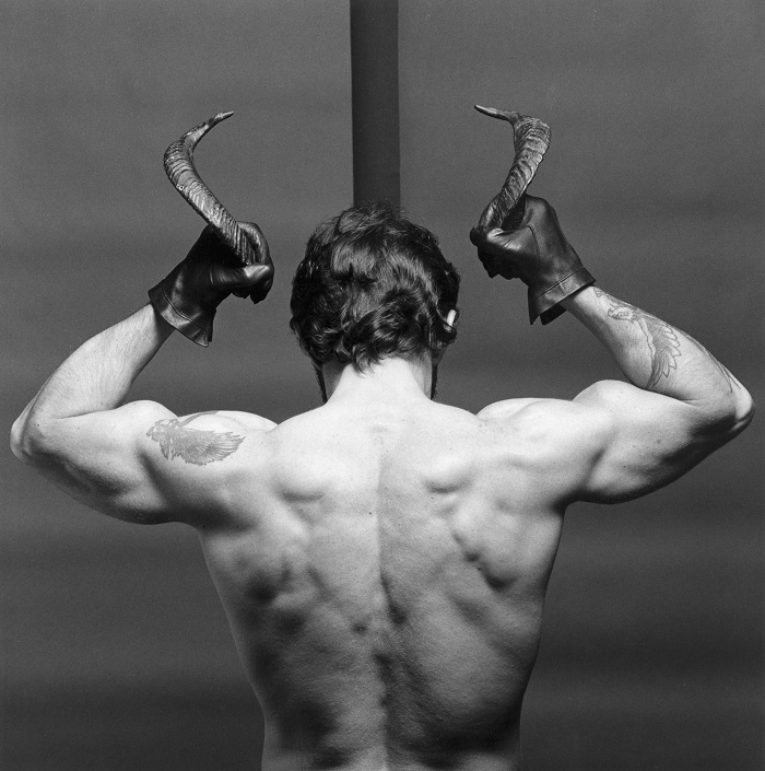
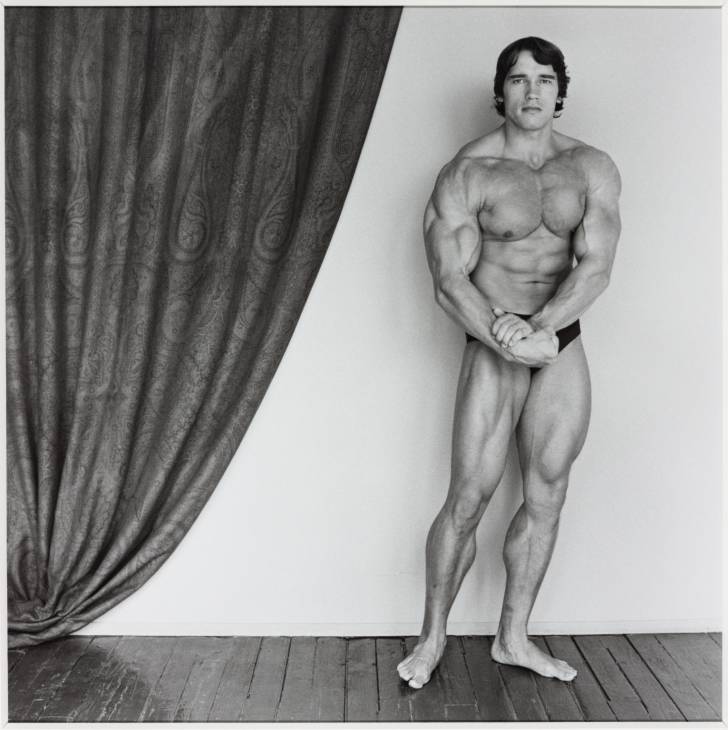
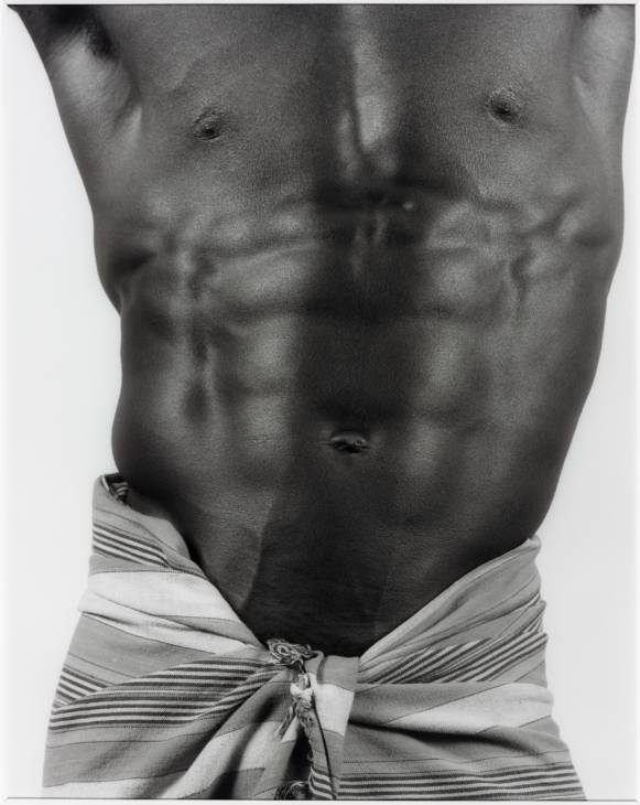
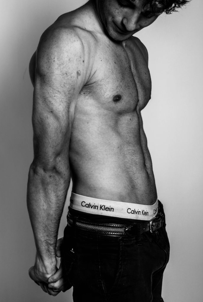
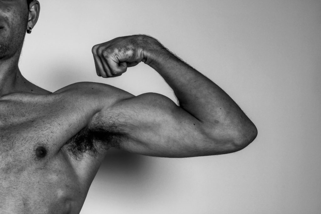
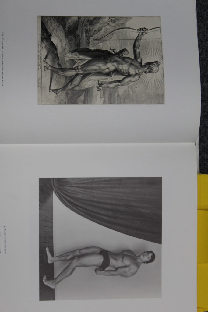
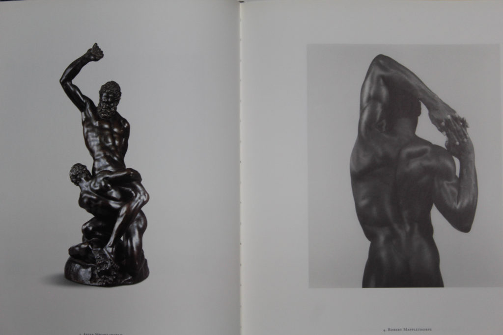
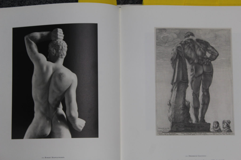
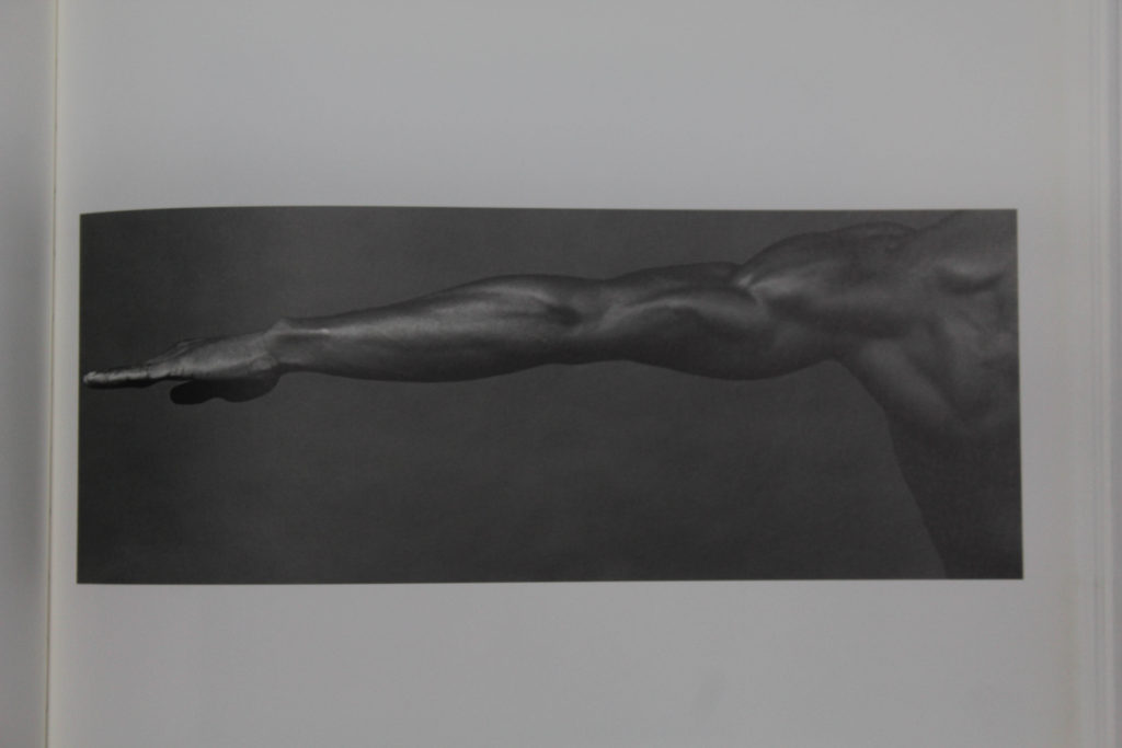
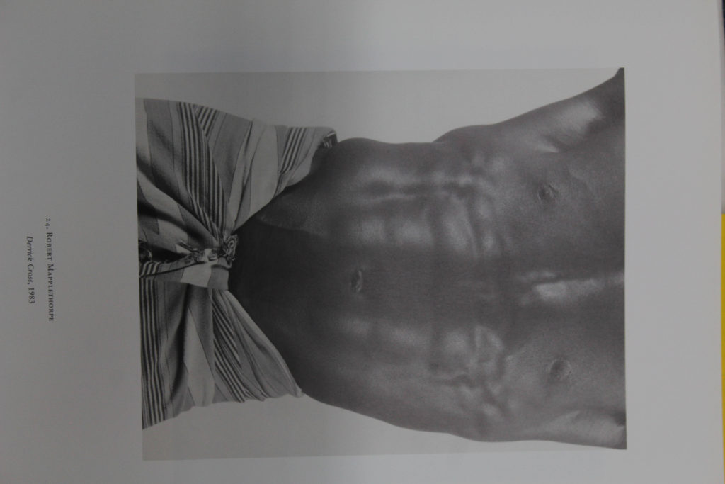
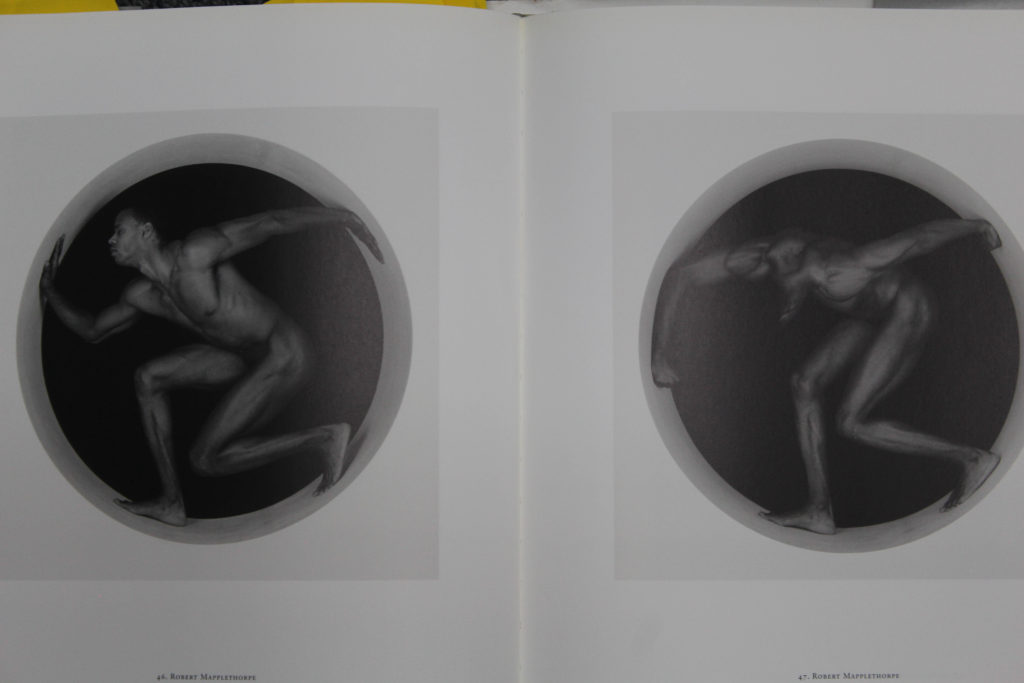
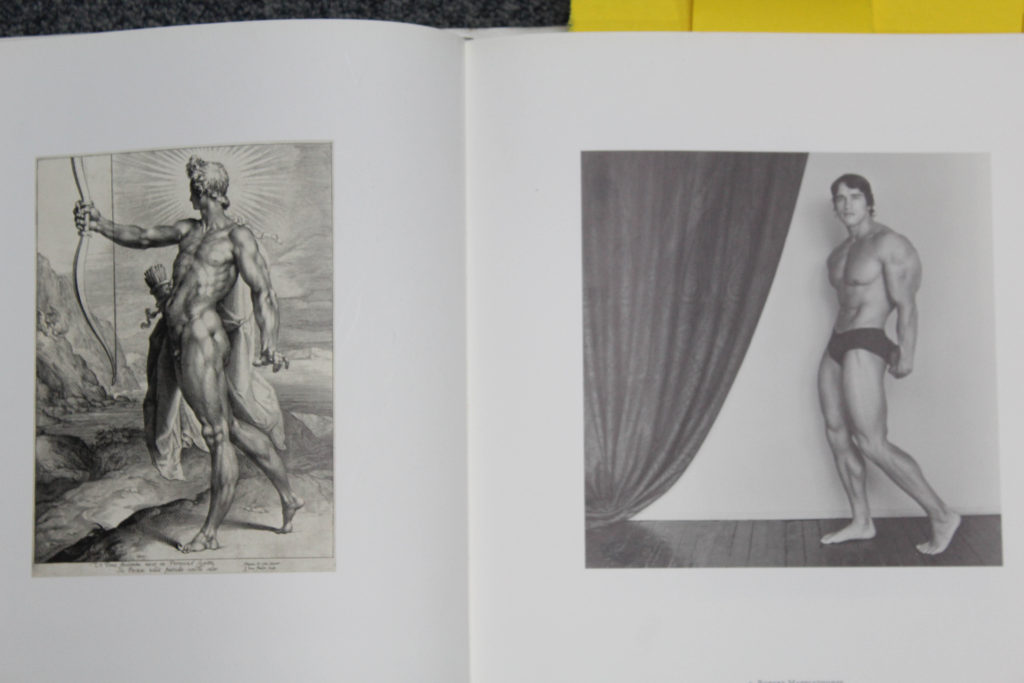
On the left are images that Robert took, and on the right are one I had taken. I’m using some of his images to compare to mine, with similar aspects to them.

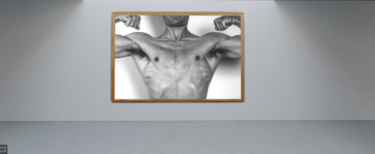
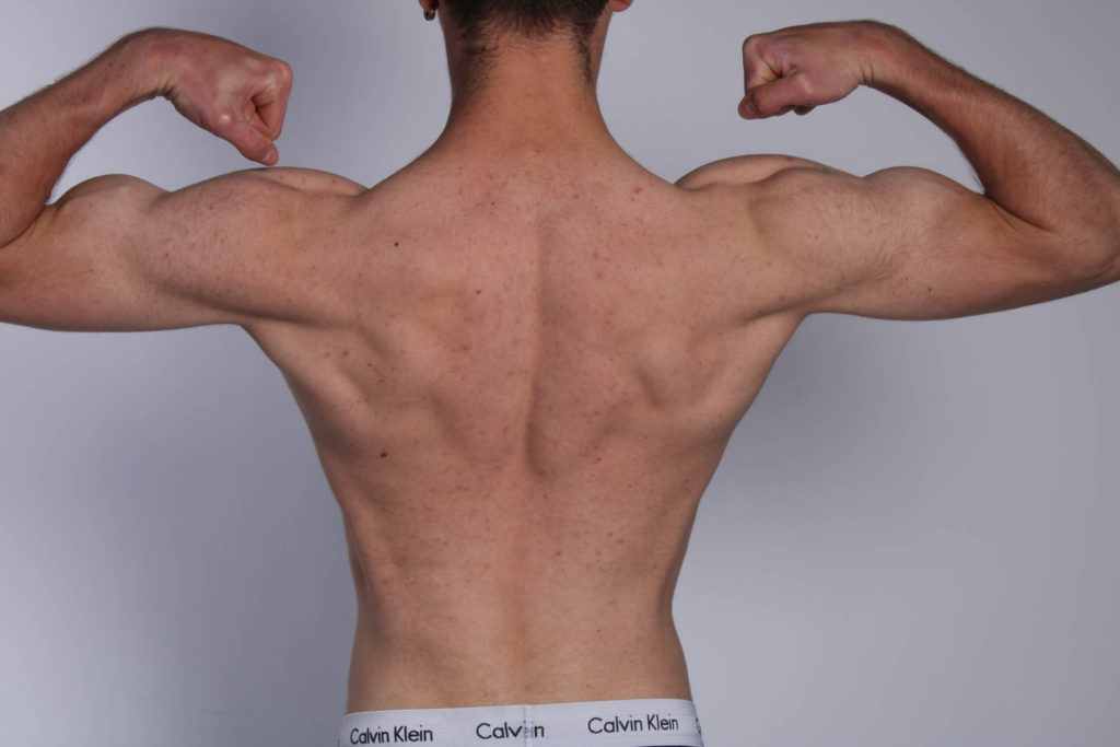
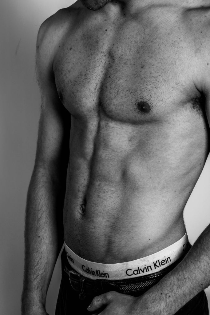
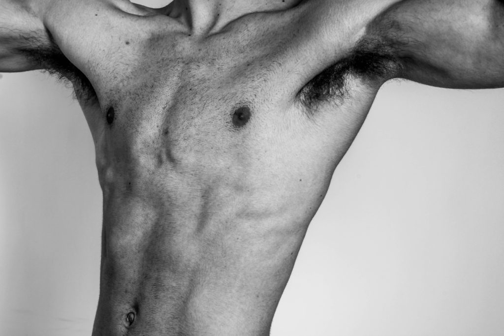
Robert in all of his images used good lighting and positioning, this allowed him to show good definition in specific places he wanted to pop out and show more of. It would also be a good control for how he wanted the image to appear and what he would convey in the images. I used similar techniques by positioning myself in a way where the lighting would work on a specific part of the body id want to appear better, or even as a whole.

Robert also uses a lot of shape in his images, because his images are a majority of the human body, it uses a lot of shape and lines. In this last image comparison we both use shape to convey meaning.

Both our images are used in the context of masculinity, where it shows the male body. However Robert used his images to show people the violence towards homosexuality during this era, and how it should be acceptable to be discriminatory towards them, which does still link to masculinity and choice. Whereas my images are used to convey staying healthy physically and mentally, and how masculinity links into a lot of that now, to stay strong and better than yesterday. Yet both show the beauty of identity.

Evaluation

I should have taken more images in the studio to choose from as I had not done as much as I could have which would allow better outcomes. In that process I should have played around with the lighting more, to determine which would be better for specific parts of the muscles.

Overall they came out good with a bit of editing, I like the use of black and white, as it gives the image good contrast. I used lighting and editing to create good images which related to identity and masculinity.

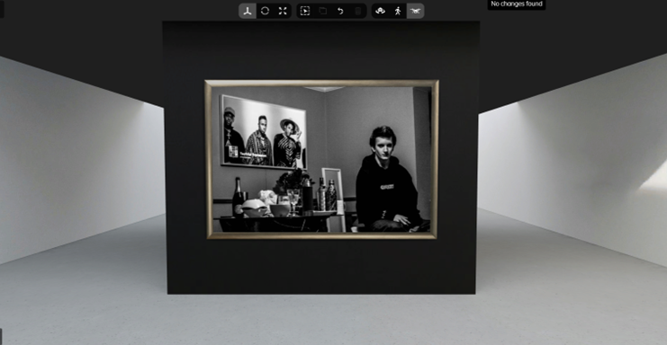
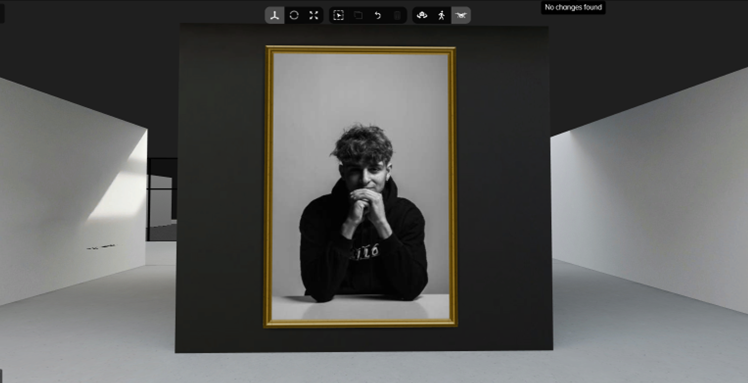
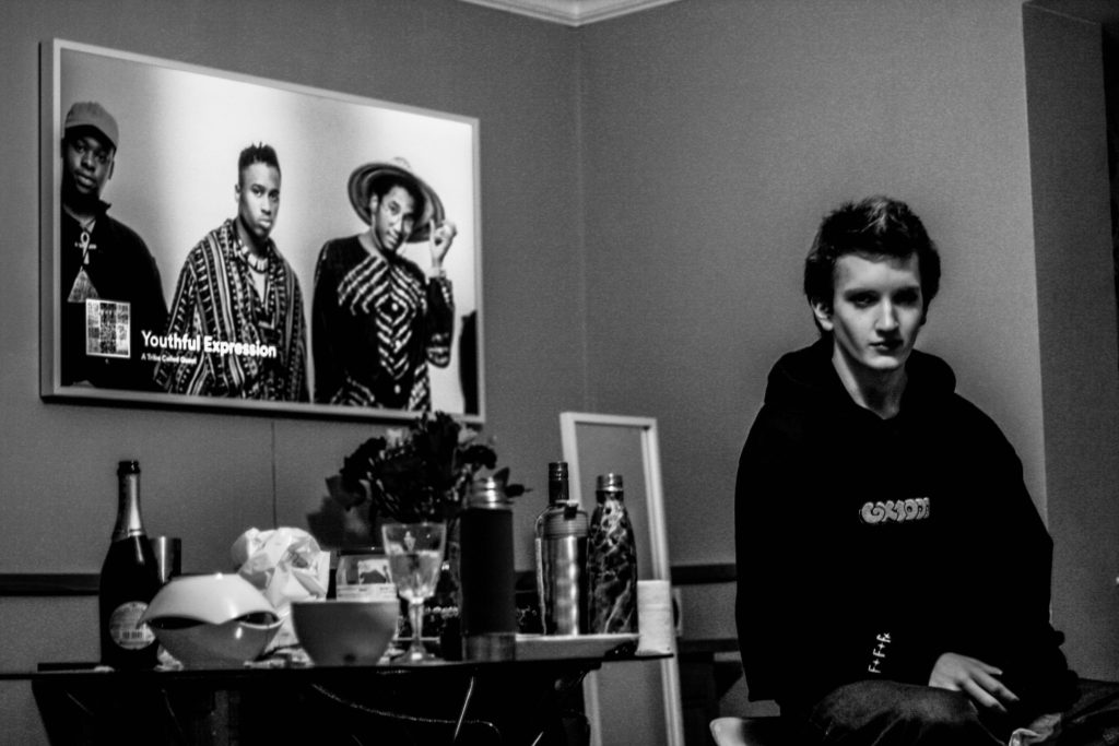
This image was an environmental portrait image that I had taken after a party, where you could say it was the environment of a teenager, in a home, with alcohol left over and food. I like this image because it uses a good contrast between the blacks and whites and is a good balance. I also like the use of shapes and lines, like the TV, the things on the table and everything else, it allows people to easily understand the environment and what is going on. Lastly I like the positioning of the image, how the person is on the right side of the image, and how everything else is on the left. It gives a good balance to the picture.

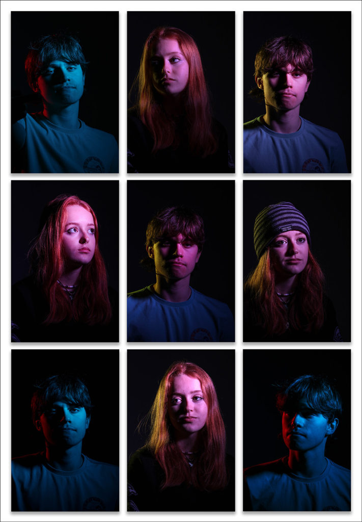
This image was taken for headshots, and I had used 2 people for it. I had done this to create a patterned effect and make it look more eye-catching. I had used a good range of lighting using different colours on different sides of the face and different positionings of their face with different expressions. I had also used some lighting effects like the butterfly effect to give a different look to the person.

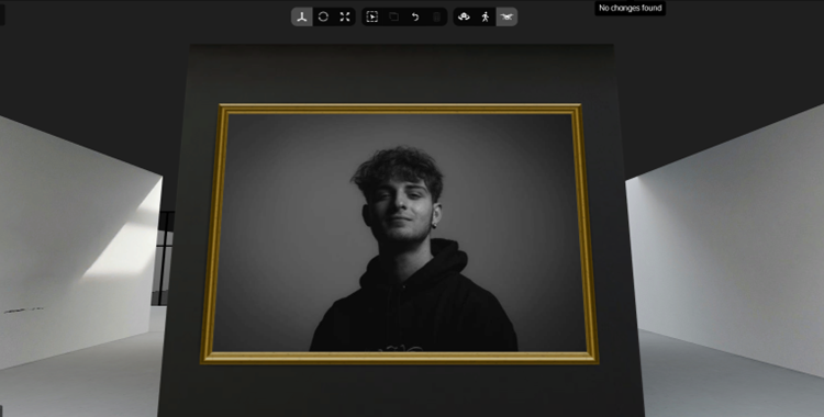
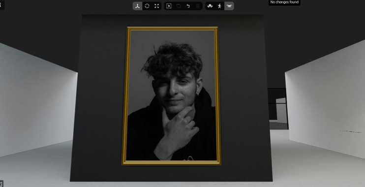
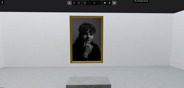
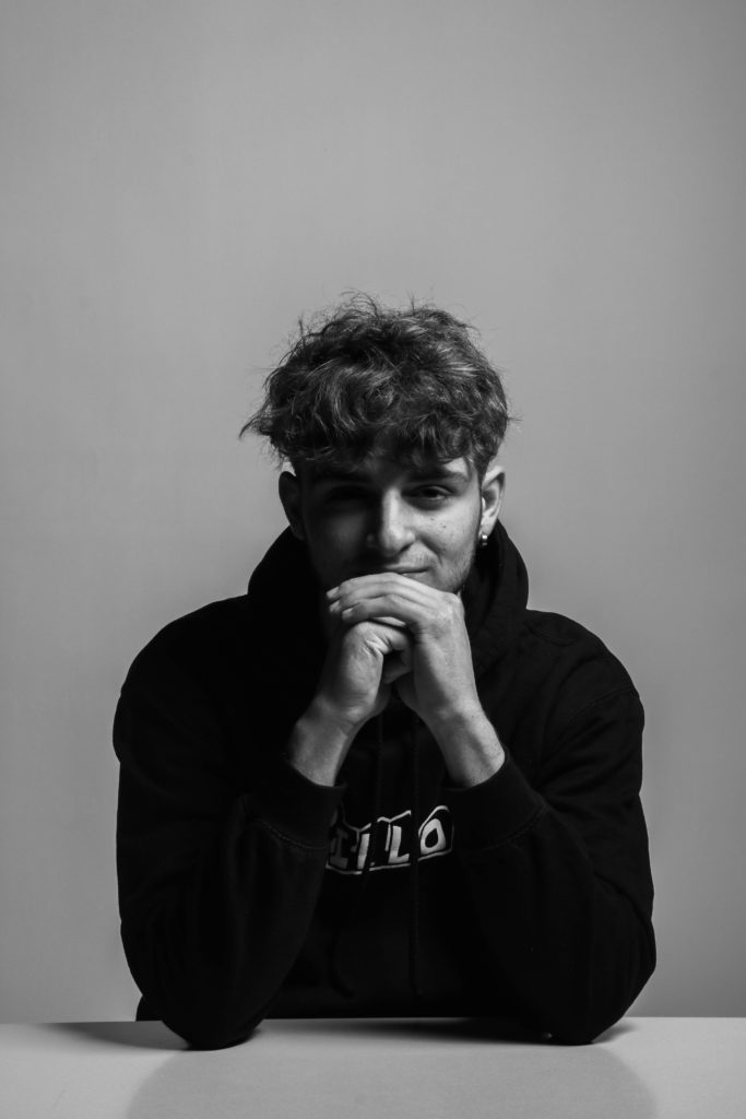
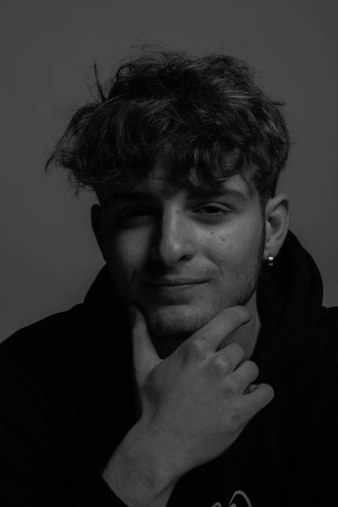
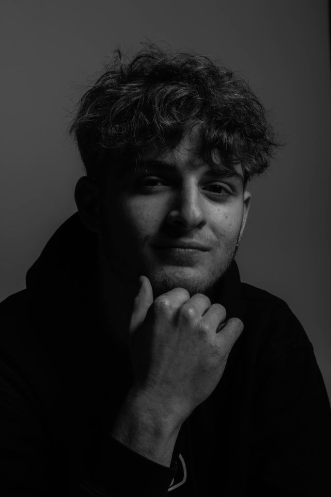
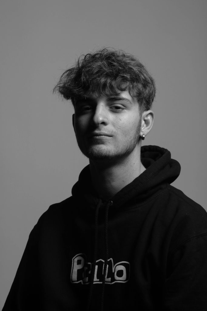
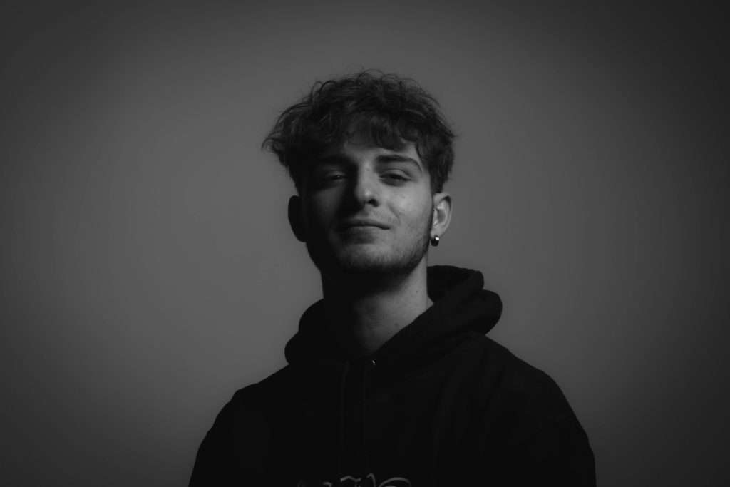
Lastly I used some of my self portraits, experimenting with different lighting effects, and using small adjustments like where to place my hand and what expression I wanted to convey. I liked the use of black and white because it created a better look for the image, and gave a good balance between the blacks and the whites. The use of a black and white filter allowed for different shapes to be formed on the face, like a diamond shape under a eye, whist the rest of the face was brightly shown, creates an ominous effect.

Normal And Edits

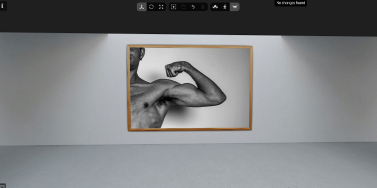
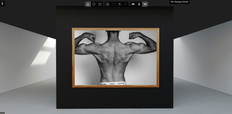
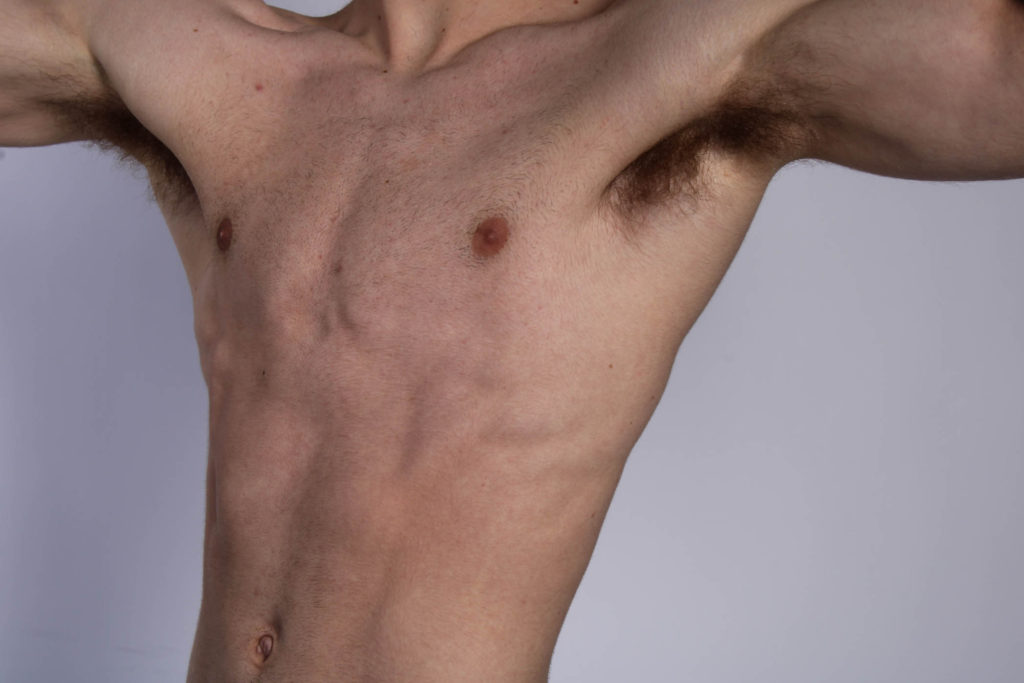
Here are the comparisons of non edited to edited versions of the images I took in the studio. (relating to masculinity).

I used a black and white punch filter on these images to create a more defined affect for the muscle parts of the body. With more shadows and a black and white affect, it shows more of an outline and tones to specific parts of the muscles and in photography terms it shows more shapes and lines in the images. I had also like the use of black and white because of Robert Mapplethorpe, and how his images where in black and white as well.
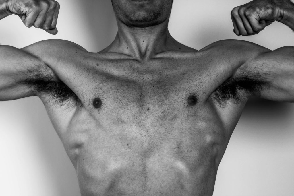
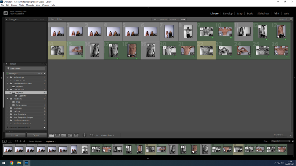
I used Lightroom Classic to edit my images but used colour selection to minimise the images I took to the ones liked best. With my best ones I used “black and white punch” which showed high contrast between the whites and blacks of the image.

Then I had my best one’s printed as a test to decide how I would compose the images.

Artist Reference Masculinity versus Femininity

Plato – ideal beauty

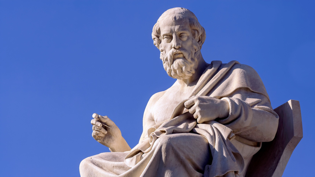
Plato was a philosopher during 428 BC who at the time introduced the importance of good and how people at that time where doing it wrong. He done this through philosophising Beauty, justice, and equality, and introduced books for people to access to show them the reality of things, almost to prevent negative concepts that people may think, and even his ideas and writings apply to reality today.

(Plato)

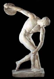
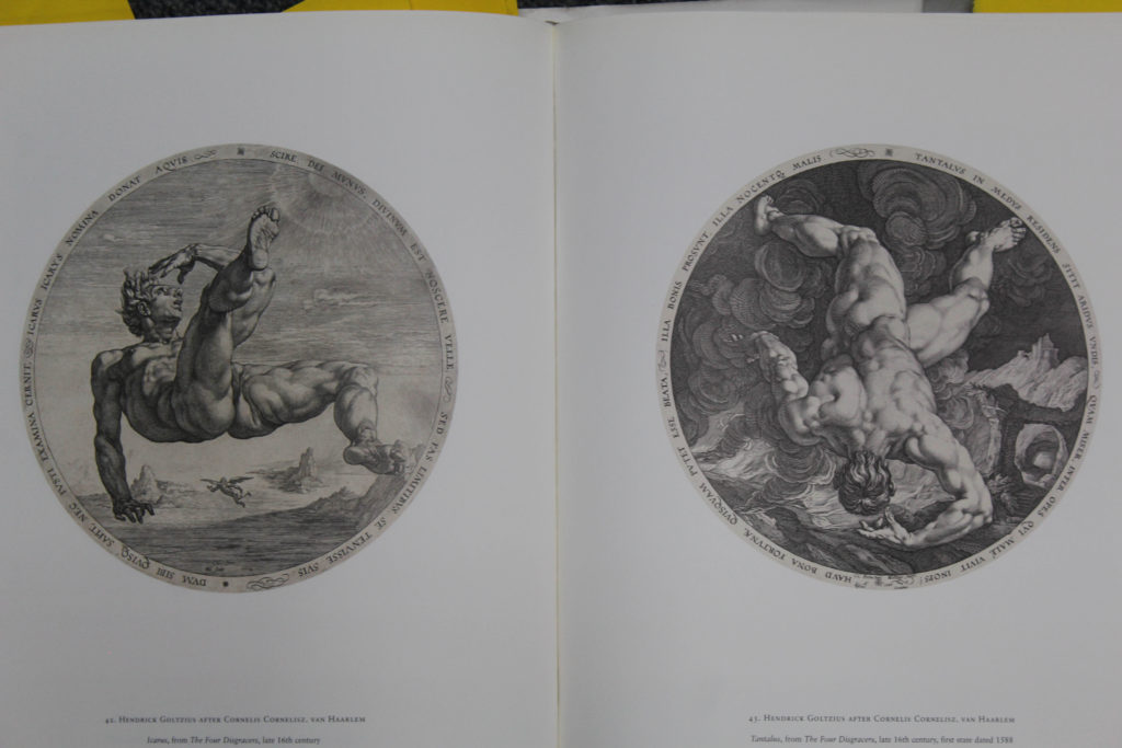
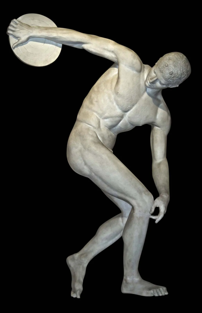
Plato’s theory of beauty had referenced to NOT the beauty of art or with nature, it meant that beauty was the object of love. He explained this though athletes, who where skilled in their sport and loved to do it, which also came along with the physical craft. More importantly he had referred to the Greek Gods, and their Love for people, and their intelligence. They where depicted on statues as having perfect physique with high intelligence and perfect standards for justice. Plato said that they where humans who where like everyone else but had the understanding and intellect of all 3 of these things.

Robert Mapplethorpe

Some of his quotes include: “I don’t understand the way my pictures are … Taking a picture and sexuality are parallels. They’re both unknowns. And that’s what excites me most in life – the unknown.”

Also: “I studied paintings and sculptures. I never really studied photography when i was at school. Photography just kind of crept into me”.
This artists photography uses a lot of the physical appearance with positioning and lighting to show the beauty of the human body and what it is capable of. He references his work with some of the Greek sculptures and paintings that where done hundreds of years, even thousands of years ago. Robert does his own photography with fluent positioning, as if it wasn’t so forced but natural, he shows the images of the body without any identity put towards the person, some of them are anonymise and some aren’t, but both reference to the “beauty” of the human body.

Robert also focuses on specific parts of the human body, female and male, both presented with specific lighting for each muscle or body part, and of course they are in black and white because of the time these images where taken in. But his artistic skills come into play with the persons positioning, even the symmetry all come together to produce art. He presents identity in a natural way with all parts of the body being accepted and shown, as almost a way of showing people the acceptance of themselves.

Modern Day

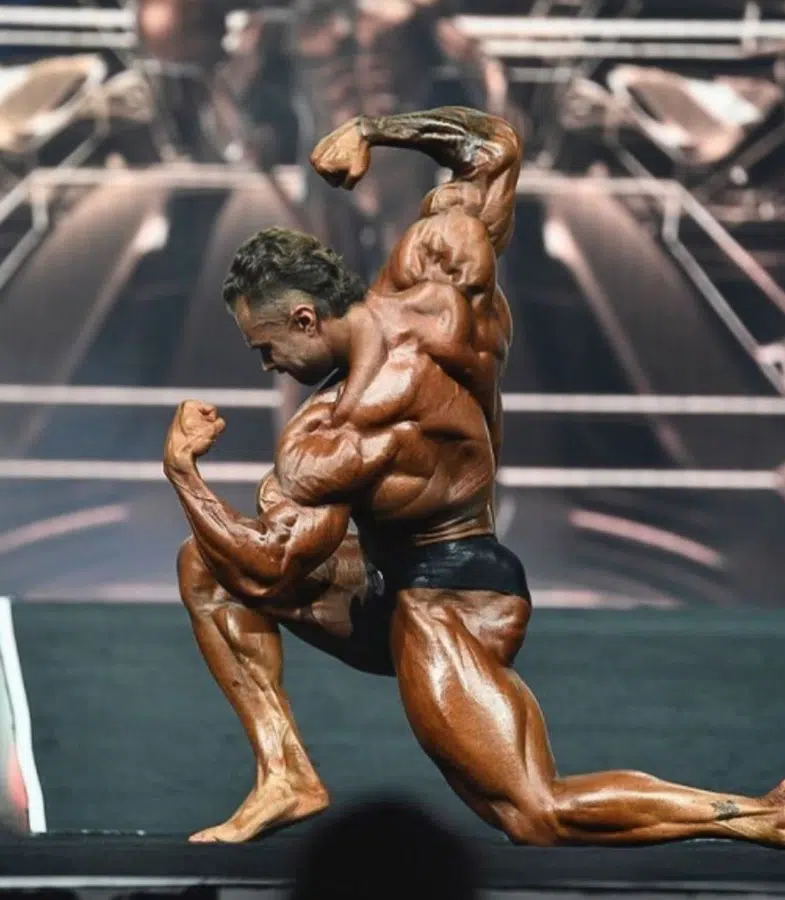
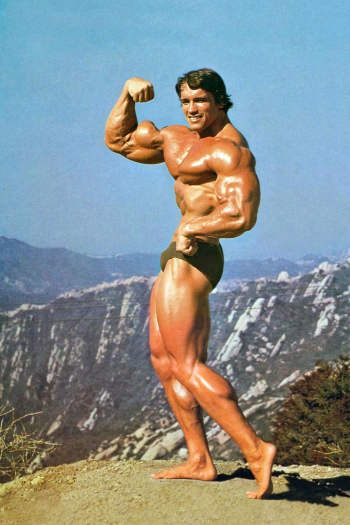
Not all the time but a majority of the time, muscle represents masculinity, and is the most focused on to show masculinity. Competition wise, there is a lot of different sections for presenting muscles.. like different types of looks in what people might aim for and who is the best in that category but each shows different parts of the body.

Chris Bumstead & Arnold Schwarzenegger:

Mood Board

Masculinity vs Femininity

Masculinity vs Femininity

The idea is to get specific parts of the muscles with good lighting to pop out or show, as for a lot of Males and even Females there are a lot of people who go to the gym to grow muscle, for themselves and for other peoples sake.