I created this virtual gallery and grouped my images together in the same area depending on the theme of the image.
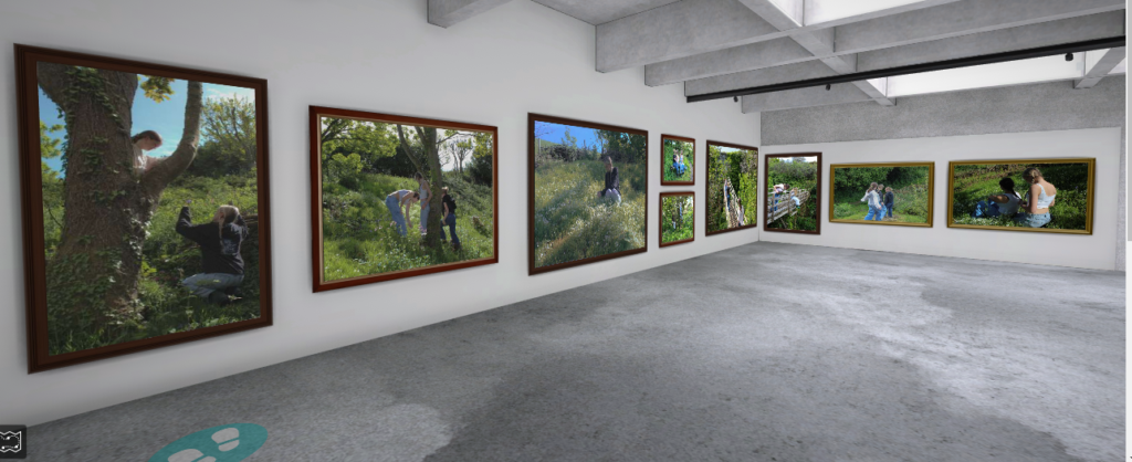


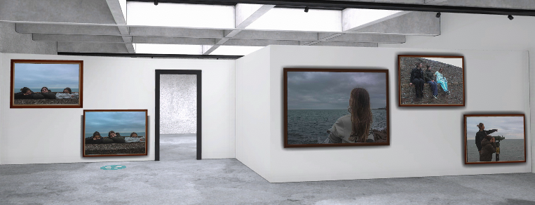

I created this virtual gallery and grouped my images together in the same area depending on the theme of the image.


I added a title to my book on the front cover and put my name on the back, I did this using the text tool.
Photoshoot 1 selected and edited images:

Photoshoot 2 selected and edited images:
Photoshoot 3 selected and edited images:

Photoshoot 4 selected and edited images:


Considering all my past photoshoots, I realised that my project from last year of ‘Girl Pictures’ is very similar, if not the same as my personal study project. I’ve decided to take a few of my images from that project and use them in my photobook as I got a good grade from that past project and believe they will benefit me in this one. The only issue with this is when I carried out the photoshoots for last years project, it was around spring time. It was lot dry and brighter outside and therefore colours in my images were very saturated this contrasts a lot with my current images in this project as it is winter, its dull and gloomy outside and there is not a lot of strong natural light. So creating darker, more greyscale tones in my photos. I plan on re-visiting my photoshoots from my past project and potentially editing them more to fit in with my current images.
CHOSEN IMAGES FROM PAST PHOTOSHOOT:


I went back to refine these images and make sure they fitted in alright with my current photobook images. I decreased the texture, highlights and shadows and increased the haze to create the fairy-tale look on the images. This is because my current images all look like this and the lighting from the past photoshoot is a lot more bright and harsh.


CHOSEN IMAGES FROM THIS SHOOT:


This image originally had many dark shadows in it so I increased the shadows and blacks to make the image a bit brighter.

I like this image as the wall divides the image into a foreground and background and the subjects in the image are very central. I also increased the texture as the wall was quite blurred and I wanted it to be more defined.

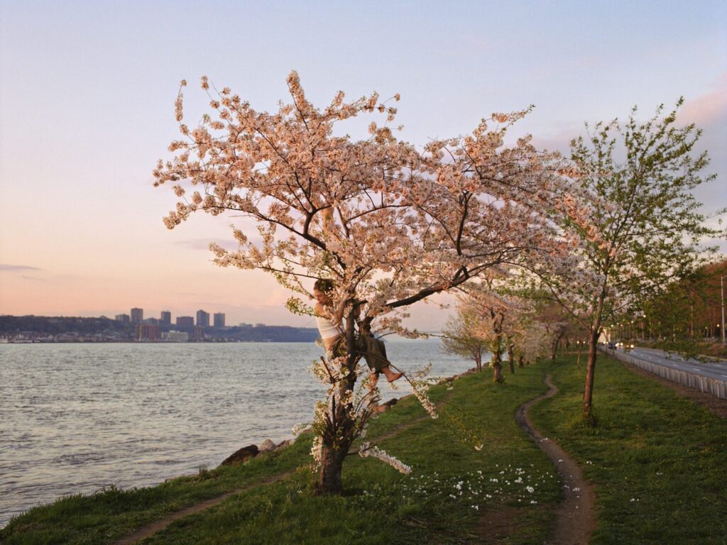
With this image, I decided to decrease the highlights and increase shadows, texture and clarity. I did this because I wanted the hair and the background of the sea to be defined and detailed.

I compared these images as they are very similar but just slightly different. I like the above image as her hair is naturally moving in the wind and it also appears lighter which adds some contrast to the image. However after editing both images and comparing them, I’ve decided I’m going to choose the bottom image as it is subtle, there is too much going on with the above image. Also I think I may use this at the end of my book as the image is of a girl looking out to the sea, this suggests she is thinking of her next location to go, or just thinking about things. It brings all my images together and indicates the end of my photobook.

CHOSEN IMAGES FROM THIS SHOOT:


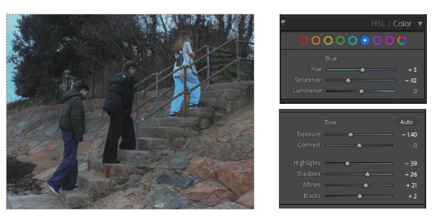
I decreased the exposure and highlights in this image as it was originally very overexposed and the highlights were bright. I also noticed that the blue tones in the image were very overpowering, the blue trousers and sky in the corner were strongly saturated and did not match the rest of my images so I tempered with that.


These three images are very similar, I edited them all but I am going to compare them to find the final image I want to use. I would put them next to each other in my photobook, however they are a bit too similar, if they had slightly obvious differences I’d pair them up. I also like how there is an obvious foreground and background. This is exaggerated by the luminance of the sky in the background but it also correlates with the blue trousers and brings the image together.

This is one of my favourite Images from this shoot. I feel it is one of the strongest as well. I started with straightening the horizon. I then decreased all the shadows and dark tones and increased the grain in the image

These two images I compared as they are also very similar but I feel they will look good next to each other, they display the theme of girlhood in my work well.
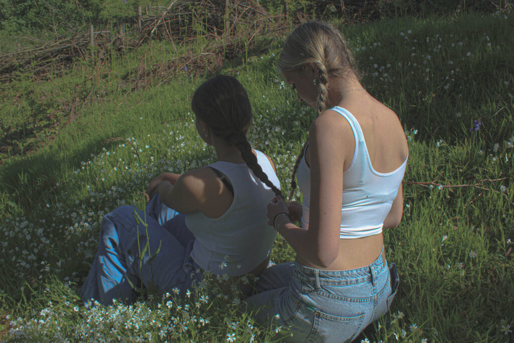
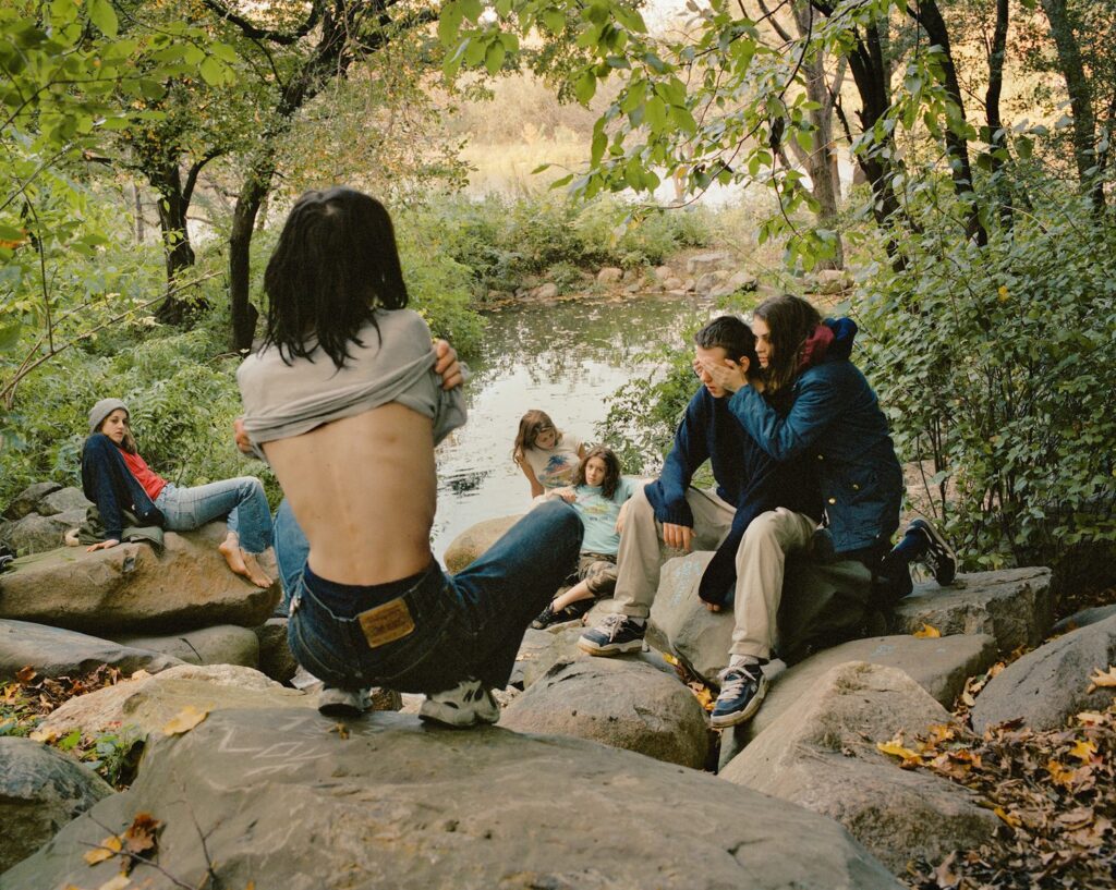
The aim of this photoshoot was to get some staged images and some candid ones, this is because I wanted to capture my friends in a natural state but also stage them to exaggerate the girlhood theme. I wanted images of my friends in trees and looking playful.

CHOSEN IMAGES FROM THIS SHOOT:

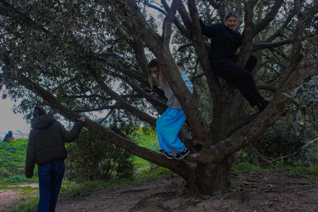
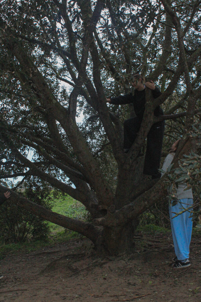


I put these images next to each other to compare them as they are very similar and I want to use only one of them for my final photobook. The top image presents girlhood better as there are three girls in it, all in and around the tree however I prefer the tone and composition of the image on the bottom. The tree is more central and creates a nicer focal point.


These two images are very similar however I like the composition form and space of both of them. Therefore, I plan on maybe putting them next to or above one another in my photobook.

I decreased the exposure in this image but brought the shadows up a bit. This was because the image was very overexposed so I wanted to define the image more. However, with heavy shadows, it caused the seaweed to take over the image a lot as its the darkest component in it. Bringing the shadows up just lightened that a bit.

I started by rotating the image to straighten the horizon, I then cropped the image and this made it all more central. I like this image as it has very clear broken up foreground, midground and background. The foreground of the sand, midground is the two girls and the background is the sea horizon. The focal point of this image is the two girls and they also contrast the image as the tone of the background and surrounding of them are lighter and colourful and they are a darker tone so stand out.
‘Photographed images do not seem to be statements about the world so much as pieces of it, miniatures of reality that anyone can make or acquire.’
-Susan Sontag- On Photography
Girlhood is an idea that has material effects on how childhood is understood and lived, how gender is created and experienced and how identities are constructed. These are all related to the idea of a ‘girl’ which will never fully be achievable as that varies in many ways, more then ever in nowadays society. From the 1640s, “girl” could also mean “sweetheart.” Usually we would relate that word to romance and love; this suggests girls are affectionate. We often think of age as a key determinant of girlhood, immediately relating the word to childhood however, this alone is more complicated. Does girlhood end with adolescence? Defining girlhood is so challenging, it is a social and cultural construct, suggesting that different societies often construct their own unique meaning of girlhood. I think that is what makes it so wholesome.
I have chosen this area of research because I want to project and represent with photographs my childhood and what it was like for myself growing up as a girl. Girlhood is about learning and growth, self-discovery, finding who you are and showing other people that; this is why I want to capture images that express these emotions.
Justine Kurland and Julia Margaret Cameron both present girlhood in their work, however, in very significant ways. Kurland’s being in a soft, fairy-tale- like way of runaways being free through environmental, landscape images; and Cameron’s is presenting original, powerful women through close-up portraits. In this essay I intend to create an understanding of Justine Kurland work from her book ‘Girl pictures’ and Julia Margaret Cameron’s work from her book ‘ Julia Margaret Cameron’s women’ and compare the way they present girlhood.

Justine Kurland’s most successful project, ‘Girl Pictures’ book is an enduring symbol of romance, rebellion escape and freedom. It captures pictures of teenage girls taken between 1997 and 2002 on the road in the American wilderness. Kurland said she “staged the girls as a standing army of teenaged runaways in resistance to patriarchal ideals,”. She portrays the girls as fierce, free fearless and compassionate.
Kurland was born is Warsaw, New York in 1969. Her parents weren’t around so Kurland and her sister lived a somewhat nomadic lifestyle. Only at the age of 15, Kurland ran away to Manhattan to live with her sympathetic Aunt , and decided to focus on becoming an artist. From there, she graduated from The School of Visual Arts in New York with a BFA in 1996. She received her MFA in 1998 from Yale University in Connecticut. Now she has become famous for her landscapes dealing with young, feral unsupervised adolescents in suburban wasteland settings. Often mixing the purity of youth with its unbridled wilderness, Kurland has travelled across the united states to photograph these staged images.
Justine Kurland created ‘Girl pictures’ based on her own childhood experiences, her images almost foreshadow herself; she uses both childhood adventures and current experiences to influence her working style and subject matter. She channelled the angry energy of girl bands into her photographs of teenagers. The first girl Kurland ever photographed was the daughter (age 15) of the guy she was dating at the time. She preferred her company to his. After he left for work in the mornings, they conceived a plan to shoot film stills starring the girl as a teenage runaway. The only surviving picture from the time shows her in a cherry tree by the westside highway:
She hovers pinkly between the river and the highway, two modes of travel that share a single vanishing point; portraying the flowing theme of fleeting moments of adolescence and its fearless protagonists in her work.


Kurland’s surreal images evoke pagan utopias or post-apocalyptic worlds. Her work is fairly modern to nowadays, based in the 2000s. The girls in their baggy jeans and bare feet. The girls in their leather boots and used sweaters. There’s something about them that feels like so many teenage girls. Personally there is an aura in this book of Kurland’s that feels relatable and nostalgic to my own childhood.

The theme of girlhood throughout Kurland’s work is obvious, however, I have decided to choose these two specific images from ‘Girl pictures’ to analyse. As I spoke about a the start of this essay, we often use age to determine the meaning of girlhood, immediately relating it to childhood; although, I personally believe girlhood is an idea that can be with you forever. These two images infer that perfectly. The image on the left displays three young girls, they appear to be playing in what looks like their garden if not then a rural environment. As a young child it is always exciting to be free to adventure wherever you want. You have imaginary tasks and make up games with your friends, no rules jut fun. Kurland has captured this image of them playing in the flowers and nature having no cares. On the other hand, the image on the right shows three older teenage girls also sat in a field, eating ice cream. The image almost foreshadows the one on the left, implying that the younger girls will still be able to have that sense of girlhood in older years of their life. I can analyse this from these images as in the image on the right, there is cars and a petrol station, an environment that you wouldn’t find young children on their own, in the background; I can guess they have stopped off on a road trip ( again, suggesting these girls are runaways). In the image on the left the girls are purely in an open field, a safer setting for younger children. Kurland has taken these images strategically.

Taking themes from the Bible, mythology, literature, and Renaissance painting, Cameron modelled the women around her–friends, servants, relatives–as Ophelia, Juliet, Queen Esther, Rachel, A Bacchante, Guinevere, and Mary, among others.
Julia Margaret Cameron was born in Calcutta in 1815 to a wealthy British family and she was educated in France and England. She is considered one of the most important portraitists of the 19th century and is known for her soft-focus close-ups of famous Victorian women, for illustrative images depicting characters from mythology, Christianity, and literature. Cameron helped prove that portrait photography was indeed a veritable fine art medium in a context where photography was not yet widely accepted as such.
After showing a keen interest in photography for many years, Cameron took up the practise at the relatively late age of 48, after her daughter got her a camera as a present. She quickly produced a large body of work capturing the genius, beauty, and innocence of the women and children who visited her studio at Freshwater. When Julia Margaret Cameron began taking pictures in the 1860s, photography was largely defined by formal commercial studio portraits, elaborate high art narratives, or clinical scientific or documentary renderings. Cameron, on the other hand, forged her own path as a thoughtful and experimental portrait artist who happened to use a camera instead of paint.
As by the time Cameron got her first camera, all her children were grown-up and her husband was often away on business. From that moment on, Cameron dedicated herself to mastering the difficult tasks of processing negatives and focusing on subjects in order to capture beauty.

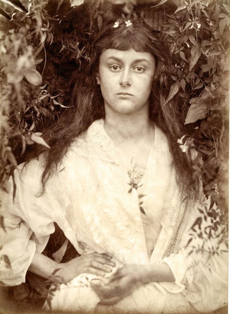
Annie by Julia Margaret Cameron
Cameron considered the portrait displayed above to be her first successful piece of art. This portrait shows Annie Philpot, the daughter of a family staying in the Isle of Wight where Cameron lived.
She wasted no time in marketing, exhibiting, and publishing her artistic photographs, and it wasn’t long before she was successfully exhibiting and selling prints of her photographs in London and abroad.


Cameron presents womanhood and motherhood in her work through her soft, dainty portraits. Her images are original and show a very natural side to the beauty of women. In the 1800s ( the years of which Cameron’s childhood occurred) women were the continual victims of social and economic discrimination. Upper- and middle-class women’s choices were
limited to marriage and motherhood, or spinsterhood. Both choices resulted in domestic dependency. While they could find jobs as shop girls or factory workers, women were discouraged from being wage earners by the belief that women who earned wages were “unnatural.”
Justine Kurland and Julia Margaret Cameron’s work differentiate in very obvious ways. One of the main differences is the composition of their work.

Firstly, the majority of Cameron’s work is taken in portrait shots and Kurland’s work is largely based on landscape images. Kurland’s Girl pictures are all distant, based in the middle ground and background. The perspective changes throughout her images, however they are never in the foreground as portraits or specifically of someone, so, there isn’t always a focal point in Kurland’s work as the whole image is equally as interesting but also vast. Cameron’s compositions in her work consist of portraits of women and girls. They are all straight up in the foreground and eyeline of the viewer. The focal point in her work is pushed onto the subjects in the image and not so much on the background.

Colour, Tone and contrast are all a significant difference in both their work. Cameron’s work is monochromatic. A lot of her ‘Women’ pictures are in a sepia tone. This is because she used the most common process at the time, wet collodion glass negatives, The process required a glass plate (approximately 12 x 10 inch) to be coated with photosensitive chemicals in a darkroom and exposed in the camera when still damp. The process of this causes the images to have a haze over them, this is intentional but also partly because she was taking pictures in the 1800s and the technology was no where near as developed as in the 2000s and they were physically developing their images back then. There is also a light vignette around the edges of her work which exaggerates to the softer tones in her work. On the other hand, Justine Kurland’s work is very modernised, her images are very high quality and not obviously edited. Her images are crisp and the colours are highly saturated making it appealing for the viewer. The light in Kurland’s work is all natural, her images appear to be taken in the morning/midday to capture as much natural daylight as she can.

The last main difference between their work is the significant ways they represent girlhood. Cameron captures images of woman and very young girls presenting motherhood and womanhood which are both big factors of girlhood. Her images show delicate woman close together, lying on each other, gazing into the distance. This could possibly represent what it was like for women in the 1800s, they had to stick together and fight for their rights. Being a ‘True Woman’ at that time was such an important responsibility, the ideal of True Womanhood was early imprinted upon young girls, who
were trained to be obedient and exhibit great self-control. Also, Cameron uses a lot of flowers, bushes and trees for the background and as props in her work; those things are very stereotypical girl objects. However, Kurland’s work presents a more modern day view of young, teenage girls. runaways, being free to roam around. In her images, as a viewer you can sense the feel of having free will. Her images are based in the south/ west of America where a lot of the societies are abandoned. Although the relationship between the girls in her images are artificially created by Kurland, they depict the subjects as fluid and nomadic ( Kurland’s view of girlhood). She taps into a rich heritage of tracking co-operative and engaged subjects, forging a bond and representing them sensitively and intelligently. There is a sense of mutual respect here it seems.
Overall, Justine Kurland and Julia Margaret Cameron portray Girlhood in very different ways. Justine Kurland mirrors her childhood of her own runaway trauma in her work. She uses teenage girl students from the area she’s in with her travels and presents them as her own runaway stories. Julia Margaret Cameron staged her photos. Most of Cameron’s photographs are portraits of members of her family, concentrating on their faces. She wanted to show their natural beauty, and she often asked female sitters to let down their hair so she could show them in a way that they were not accustomed to presenting themselves. Cameron wanted to present the women and girls as they were, showing their natural beauty; as oppose to telling a story like Kurland’s images. Cameron’s images are documentary, she wanted to provide a straight forward representation of the beauty of women and Kurland’s images tell a story of the teenage girl lifestyle. They are made by and for women, with an absence of the male gaze and any sense of objectification, almost as a form of quiet rebellion.
https://www.theslateonline.com/article/2023/12/your-world-today-growing-out-of-girlhood
https://www.artnet.com/artists/justine-kurland/
https://en.wikipedia.org/wiki/Julia_Margaret_Cameron
https://scholarworks.bgsu.edu/cgi/viewcontent.cgi?article=1000&context=gsw_pub
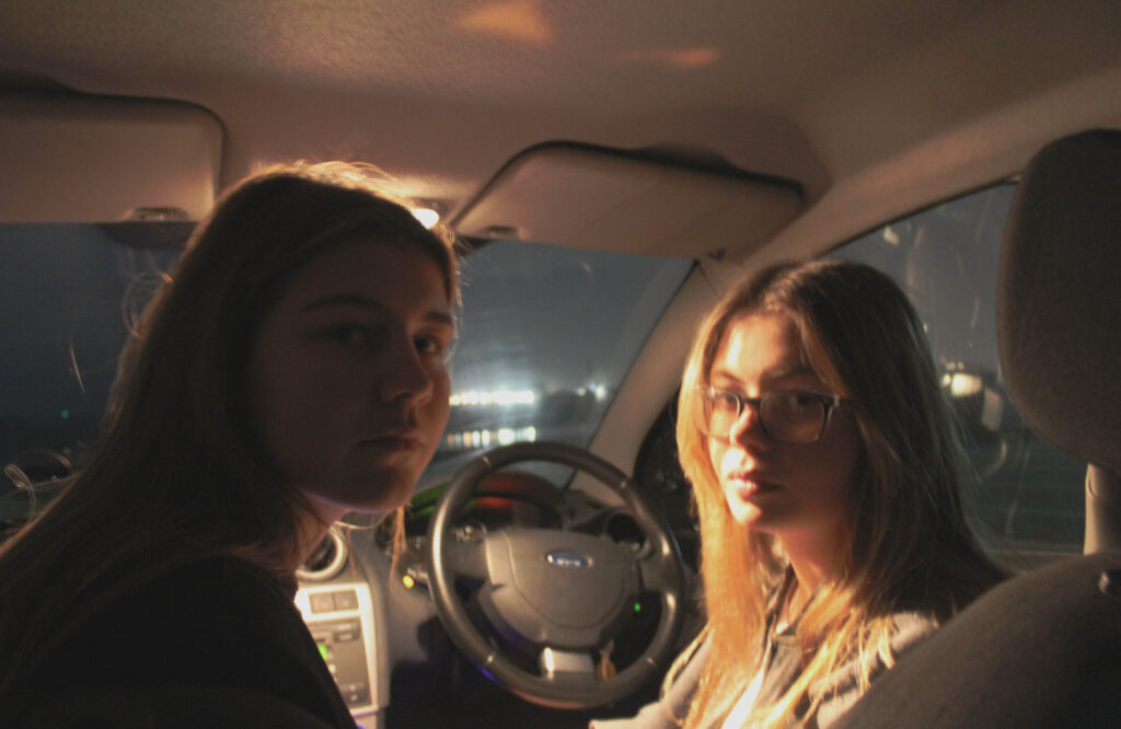
This aim of this photoshoot was to represent the freedom in having our cars.

I took images from different angles, in around the car. The idea was to create some images in dim lighting with subtle lights and long exposure pictures. I didn’t really help myself with this specific photo shoot as it was done in the evening, after daylight. This caused us to have a lack of natural lighting from anywhere, therefore we had to use artificial lighting from our phones, the cars interior lights and street lights. I also tried using the flash on the camera, however, it was way too overexposed and wasn’t the aesthetic I’m going for at all.
Another reason why the lighting was failing this shoot was the fact the camera would not focus, this was difficult to deal with because if I used too much lighting from our phones it appeared too forced, but with not enough light, the camera had nothing to focus on.
CHOSEN IMAGES FROM THIS PHOTOSHOOT:


Although the camera not focusing resulted in me not having a lot of high quality images, the long exposure created these perfectly blurred images (as shown above) which match the vibe of my personal study, the idea of freedom, runaways. It injects a sense of movement. The blur maintains the aesthetic of my images, it de-emphasizes the unnecessary information yet the viewer can still tell what is in the image.
I wasn’t sure on this image at first as the quality is not great on it but I like the composition and the Rembrandt lighting effect on the face.

This is a spontaneous image, I want to capture images that represent girlhood and that is why I like this image and have chosen it as one of my final images. It was taken in a candid way, capturing the eye contact and smiles.


These two images were staged and also a different take from the original plan of my project. However, when thinking about my final photo book, I think it will be interesting to have some staged portraits, in contrast to rural setting candid photos; this will break up the photo book a bit.


‘Theo Gosselin presents a glimpse of a life beyond boundaries’
The photobook is am deconstructing is Sans Limites. The book by Theo Gosselin explores the free world of runaway people in mostly landscape forms.
The result of the photographer´s most recent road trips across the US, Spain, Scotland and native France, Sans Limites presents a significant evolution of Gosselin´s long term project; photography sur le motif (“of the object(s) or what the eye actually sees”) and his attempt to communicate the actual visual conditions seen at the time of the photographing.
Throughout the book we are exposed to images mostly from midday to dusk; this may signify the freedom to adventure anywhere and everywhere. Deliberately cinematic, Gosselin’s photography reveals friends in the act of escaping from their regular lives into newly enticing and perilous modes of existence, ever in search of the persistent though elusive idea of freedom.

As the viewer you can see this from the mixture of staged and candid photos of people in environments like the woods, lakes forests, in nature in general. Images of people being playful in lakes, running around; also images from inside cars. This implies running away, being on a journey. The Genre is documentary, recording real life events with photos. Freedom is a flowing motive throughout the book, as within the runaways in these images, they seem to have a sense of happiness and excitement in them.
Sans Limites is a portrait shaped book with landscape images in it. Some of the images spread across a whole two pages, others just using the one. I like this as it adds some contrast to the book, not all the pages are the same, its creative and more interesting to look at as the viewer.