All posts by Hannah Lynam

Filters

Author:
Category:

Case study:Alec Soth

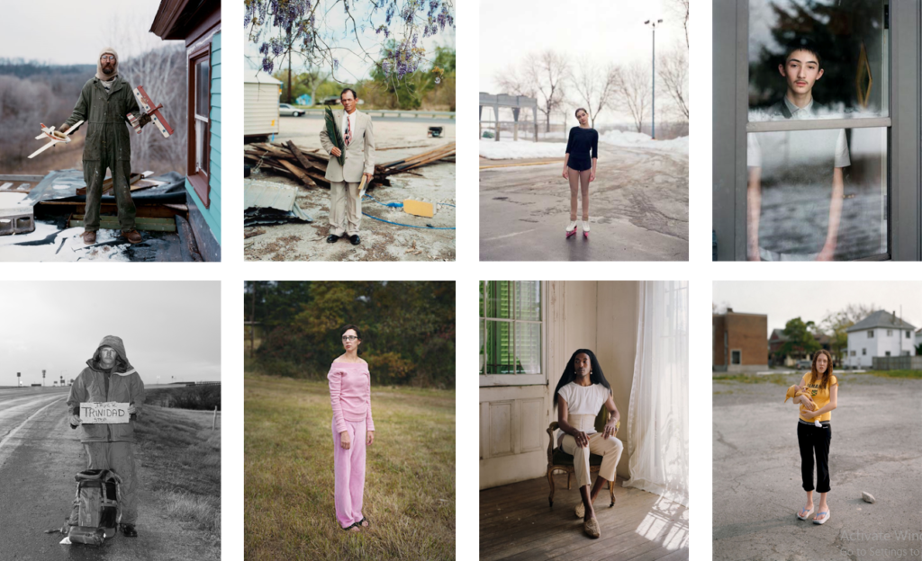
Alec Soth is a photographer based in Minneapolis, Minnesota. Soth has made many books, ‘Sleeping By The Mississippi’ being the most famous, as he likes to make “large scale American projects.” ‘Sleeping By The Mississippi’ was put together by the images Soth took while travelling around the Mississippi river. He likes his images to be ‘of off-beat’, obvious and boring images of modern America. Within his images he likes the subject to be a “loner or dreamer.” Alec Soths work is inspired by Diane Arbus and has had his work compared to Walker Evens and Stephen Shore. When taking his images Soth has admitted that he “feels very nervous at times” but. he finds that his awkwardness comfort people.

Charles, Vasa, Minnesota, 2002, from Sleeping By the Mississippi

This is a digital portrait taken of Charles Vasa by Alec Soth. The mise-en-scene presents Charles in his coveralls standing on a roof holding two model planes, one in each hand, presenting them to the viewer. Charles is stood against a rural winter background in Minnesota, which is out of focus. This tells us that that image has been taken with a narrow depth of field and a large aperture because the subject is in focus and the background isn’t. The photo has been taken from a straight on angle with the subject engaging with the camera, which makes the image feel tense and gives it depth. The use of lighting is natural however, as it is a overcast winter day there isn’t much of a light source which is why there aren’t many shadows present in the image. The colours in the image are quite dull and could be described as ‘army like’ as there are many greens, browns, white and blacks seen in the image. The use of those colours relate to the Air force as the subject is holding two model planes and wearing clothing that makes him look like a pilot. It can be seen that Soth has used the rules of thirds because he has cantered the subject in the middle thirds. Overall the image has a sense of awe and a dreamlike feel to it as the freshly painted house contrasts with the messy, unfinished rooftop.

Case Study: August Sander

August Sander is a German photographer who produced an inclusive photographic document of German people which was inspired after he took photos of local farmers. He produced two of theses photographic documentaries: “Man in the Twentieth Century” and “Face of Our Time“. Sander would categorise his portraits by peoples profession or social class which later influenced the likes of Bernd and Hilla Bechar and Nicholas Nixon. Most of August Sander’s images were clear as to what the subjects occupation was however, some don’t clearly reveal what their occupation is and they leave the audience speculating what they do for a living.

Image analysis:

The Man of the Soil

This is digital image taken on a 35mm Leica camera of a German farmer. The genre of this photograph is environmental portraiture. The mis-en-scene presents the subject sitting on a wall, at a slight angle, holding on to a walking stick between his legs. The photo has been taken from straight on so the subject is looking directly down the lens. The colour of the image is monotone, this brings out many different textures in the image such as the subjects hands, beard (rough), the walking stick (smooth). All of the different textures in the image give the image depth. The use of light is natural which can be seen by the contrast in tones throughout the image. You can see the lighter tones on the subjects face, hands and the walking stick. The darker tones can be seen on the subjects blazer and in the background. The background of the image is out of focus whereas the subject is in focus which suggests that a that image has been taken with a shallow depth of field using an f-stop of around f/2.8. By having the background out of focus it makes the subject stand out to the viewer. August Sander has used the rule of thirds as the subject is centrally framed in the image. It can be argued that the Sander has used leading lines by having the subject hold his stick between his legs, leading the audience up to the focal point of the image.

Image analysis

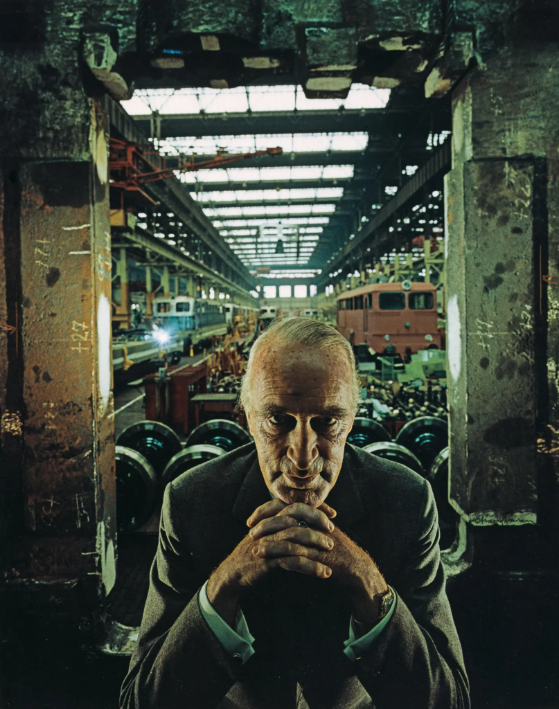
Alfred Krupp, industrialist. Essen, Germany, 1963 by Arnold Newman

How does the image make me feel?

At first look, the image has an intimidating and sinister feel to it. It is portrayed in such a way to suggest that the subject is evil and perhaps in a position of power, reiterated by his glare down the lens and the way in which his hands join together under his chin. The subject gives us the sense that he holds a lot of power and is possibly trying to hide something.

How was the image taken technically?

The image appears to be taken on 35mm film, using a tripod, as Newman usually did with most his images. The composition of the image suggests that it was taken with a wide-angle lens, giving the image its depth and a ‘frame in a frame’ feel. It was taken straight on which makes you feel intimidated as the subject is in the centre of the image. There is a use of natural lighting, coming through the windows at the back and top of the images. There has also, been a use of artificial lighting. By using both natural and artificial lighting it creates shadows on the subject and has illuminated sections of his face.

What can I see in the image?

The image presented is taken in a run down industrial trainyard, which is storing parts for the trains and can be seen in the background, behind the subject who is the main focal point in the image. Within the background you can see many train carriages and metal scaffolding. In the foreground, it presents two pillars, with graffiti on them, behind the subject which creates a second frame within the image giving it a ‘frame in a frame’ feel. The focal point of the image is the subject who can be seen staring down the lens. The subjects body language suggests that he is a powerful figure as he is resting his chin on his hands, which are joined together in a pyramid way. The way the subject is staring down the lens it gives off the sense that he has evil motives as the lighting on his face makes his eyes look sunken into his face.

Why was the photo taken like this?

The photographer chose to take the image like this to portray the subject as an evil, sinister character. The use of the light, angle and framing all give off this sense that the subject is plotting something.

What is the story/background of this image?

The image was taken by Arnold Newman, a Jewish American photographer. The subject of the image is convicted (and later pardoned) war criminal, German industrialist Alfred Krupp. Newman saw Krupp as the devil, as Alfred Krupp’s family was responsible for using 100,000 slaves from the concentration camp system to manufacture arms for the Nazis. Krupp’s cunning stance, came from Newman asking him to lean forward and he collapsed his hands together under his chin. Arnold Newman said “my hair stood on end” suggesting he was overwhelmed with emotion.
Environmental Portraiture

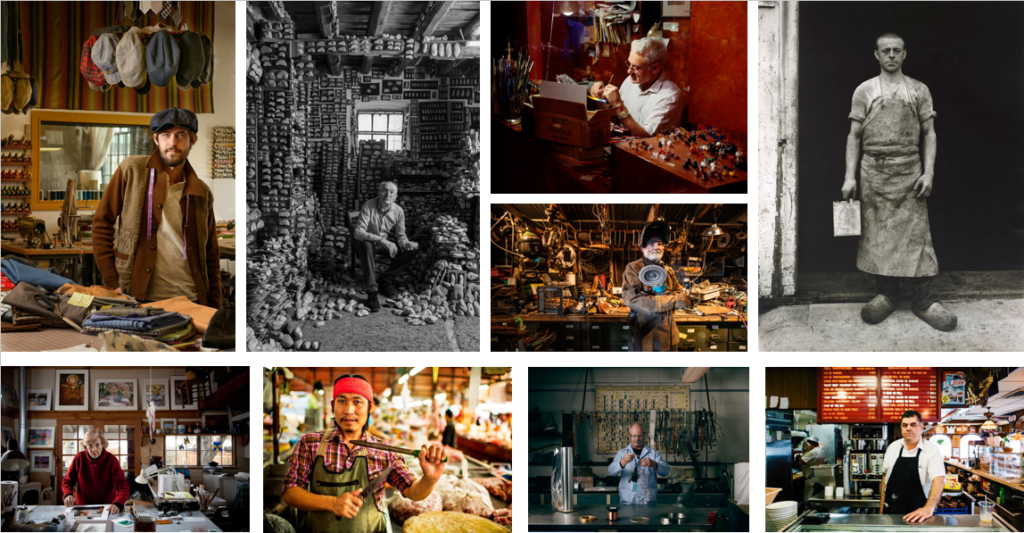
An environmental portrait is portrait of an individual or individuals that captures them in their natural surroundings/ work environment rather than a studio or artificial set up. An environmental portrait can reveal a lot about a person and can equally conceal. I think an environmental portrait can send a message to the audience about the subjects story as they come across quite cinematic and raw.

Anthropocene Evaluation

Why did I choose Ronez quarry?

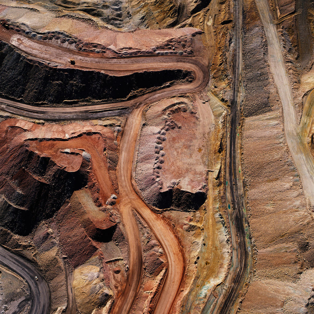
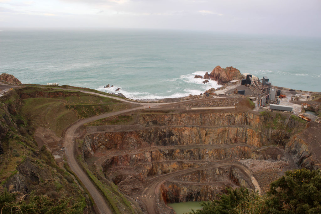
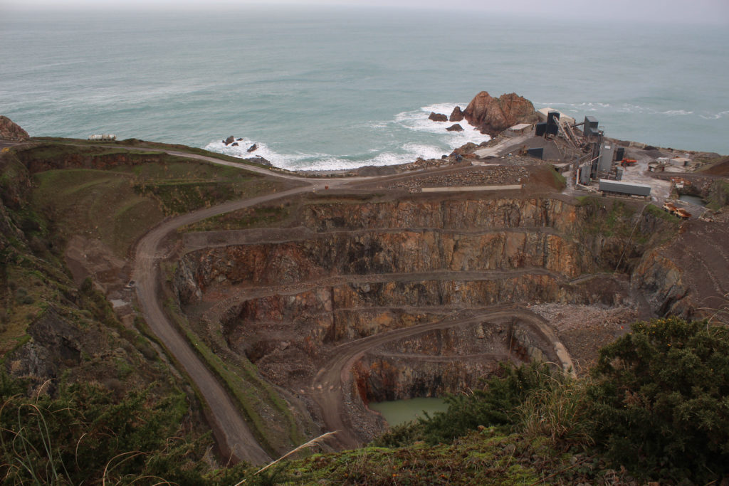
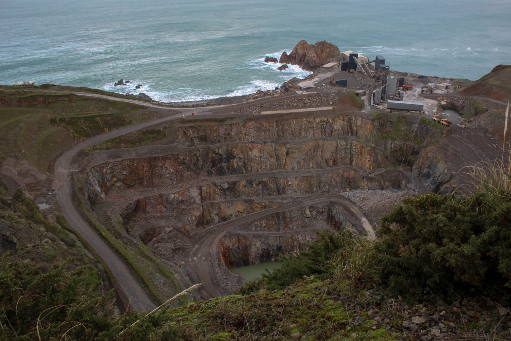
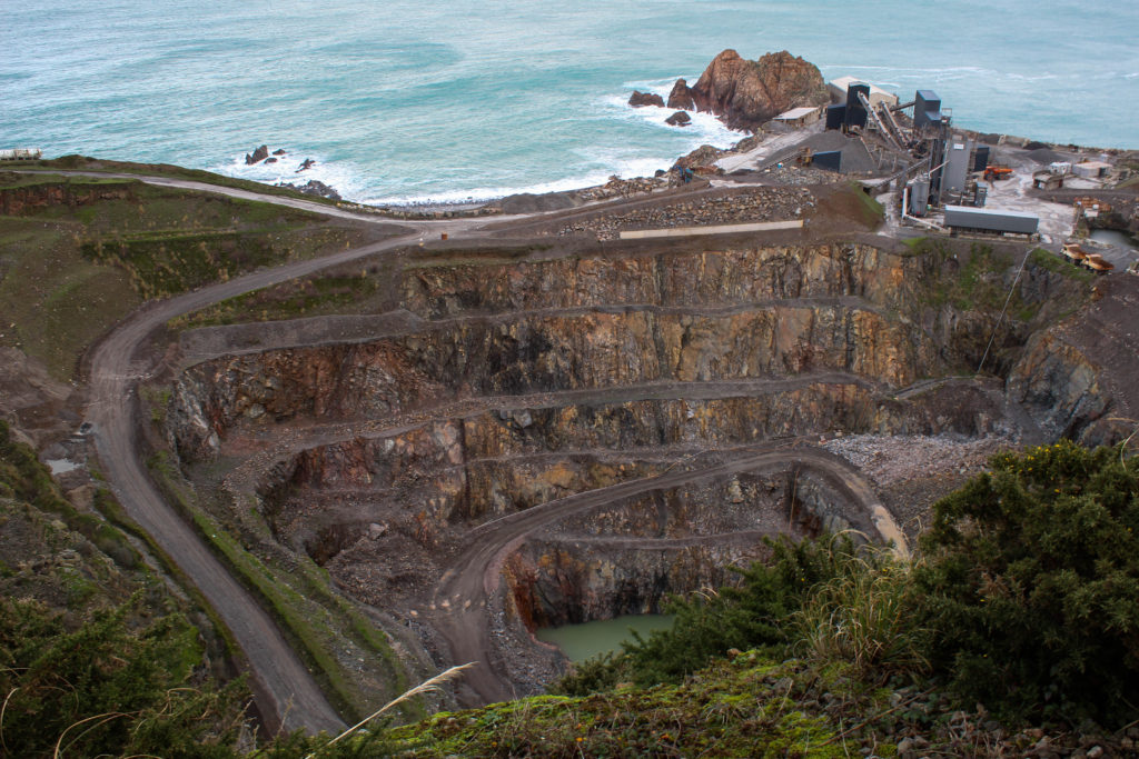
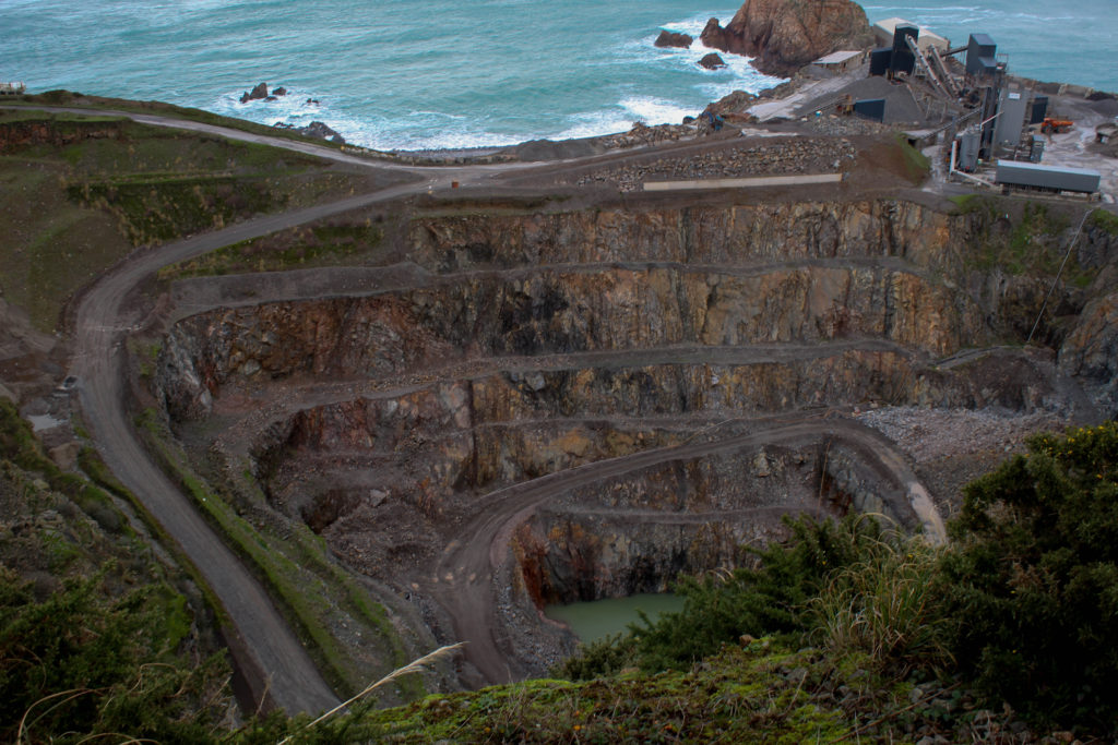
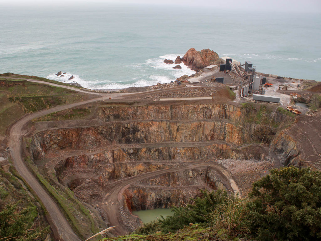
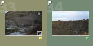
I chose to focus on Ronez quarry because out of the ideas I had, I felt that it linked strongest to the theme of Anthropocene. I was attracted further to the idea once I had seen David Maisel’s images from his mining project, which captivated me, as they had a sense of awe about them. Ronez quarry linked strongly to Anthropocene as the landscape has been drastically changed because of human activity and the demand for raw materials.

How did I plan?

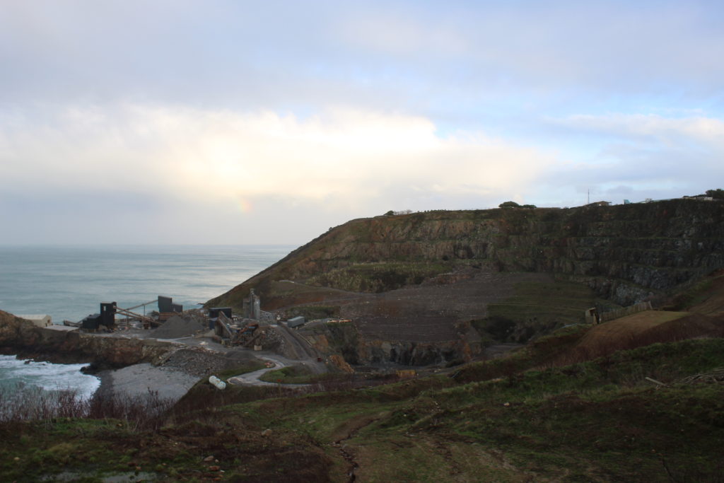
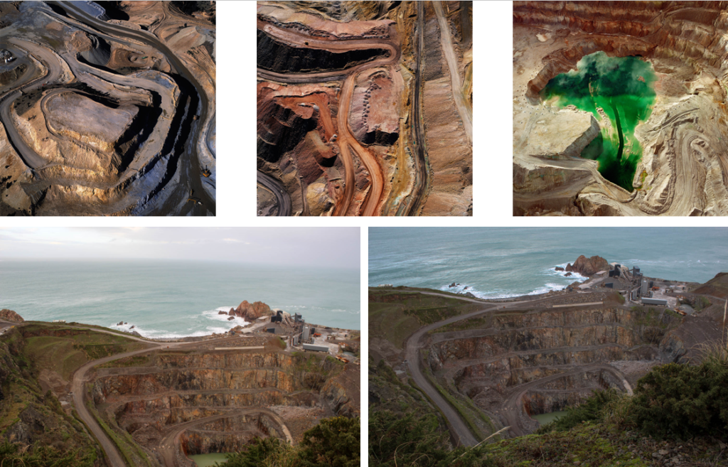
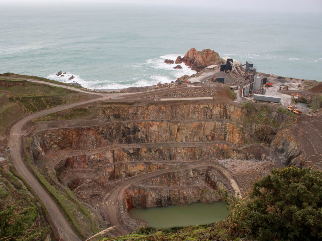
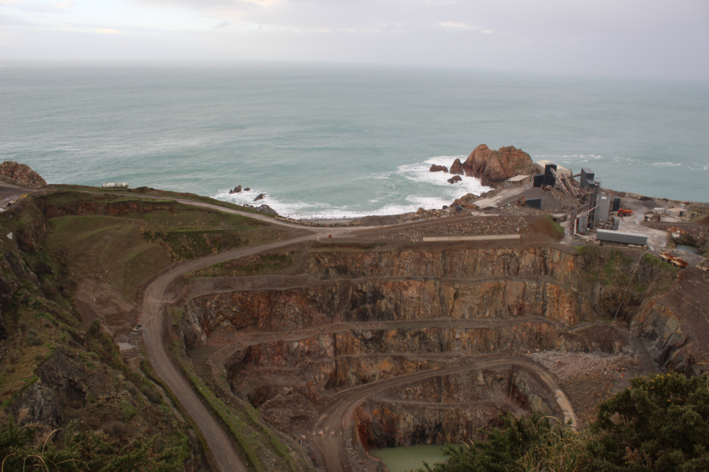
I wanted to show how vast Ronez quarry actually was and how much the landscape around the area is being affected. I went to Ronez and took images from above to replicate the work of David Maisel, who inspired me to take photos of the quarry. I also, wanted to show the depth and width of the quarry. However, I was restricted to the angles and shots I could get because there was a fence, preventing me getting the angle I wanted. I took further images of the quarry from Sorel Point to get a different view. The only limitation when taking the images, at Sorel Point is that I couldn’t get an aerial view of the quarry so the images didn’t really link back to David Maisel’s work.

Overall evaluation on the project:

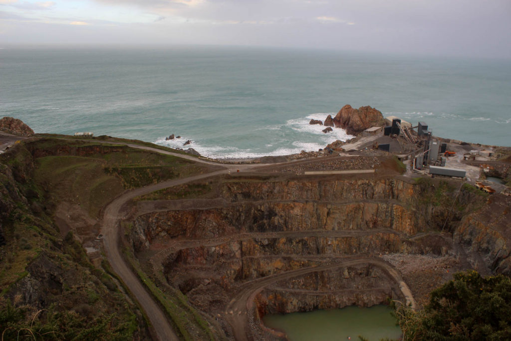
In my opinion the images I took at Ronez, from above, are stronger and came out better, than the ones I took at Sorel Point. This is mainly because the view of the quarry wasn’t what I was looking for however, the images at Ronez weren’t perfect because you can’t see the whole quarry due to restrictions and overgrown bushes blocking the view of the water pool.

It was quite frustrating not being able to get the view of the quarry I wanted to demonstrate what the quarry looks like as not many people will know how vast it is and the effect it is having on the landscape surrounding it.

I feel like I could have portrayed David Maisel’s work better if I had a drone to get a proper aerial view, like his images, which would of given my images more depth and a better composition..

In conclusion, I enjoyed this project and exploring the theme of Anthropocene and how the environment is being drastically changed by humanity. I am happy with my outcomes as I have some strong images even though there were factors, out of my control, restricting me to take the images I wanted.

Artist Comparison

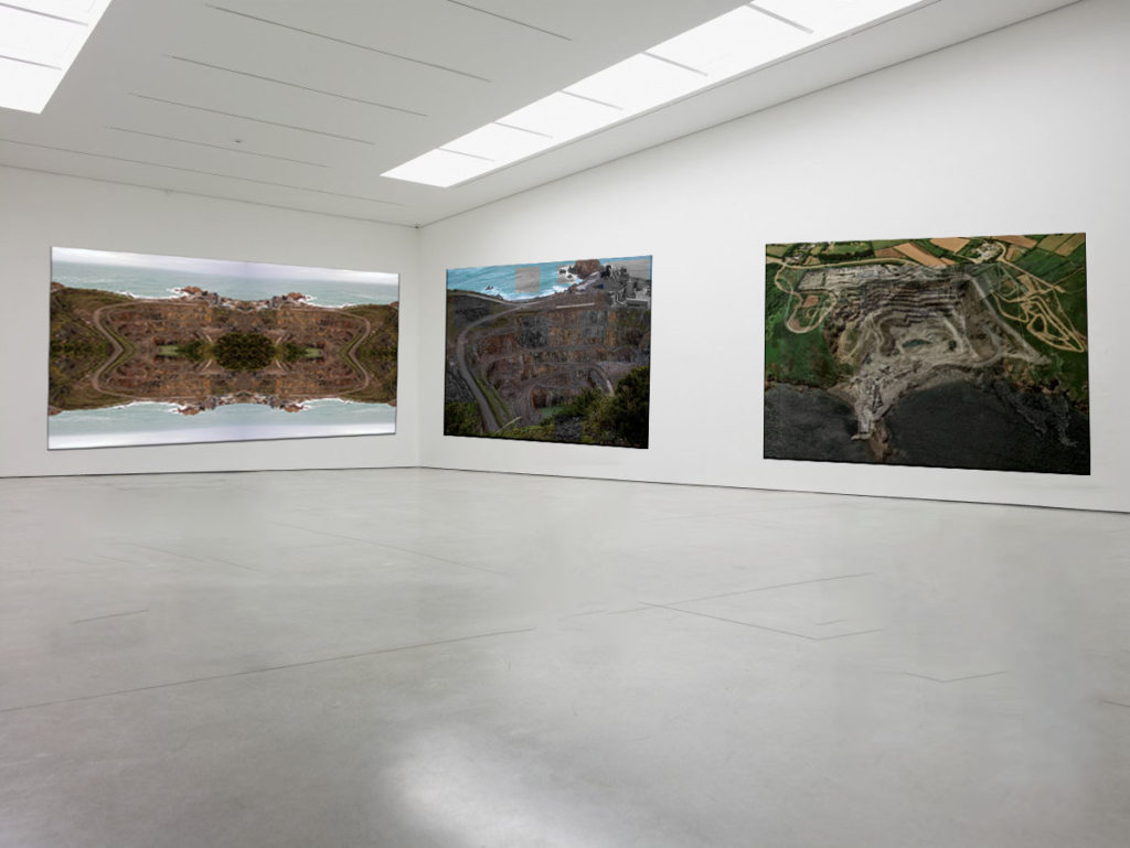
When comparing my images with David Maisel’s you can clearly see a comparison in areas such as the textures in the layers of rocks and the contrast in tone. Maisel took his image with a drone so his images have more of a ‘birds eye view’ feel to them then my images as I had limited access to the quarry.

Final Edits:

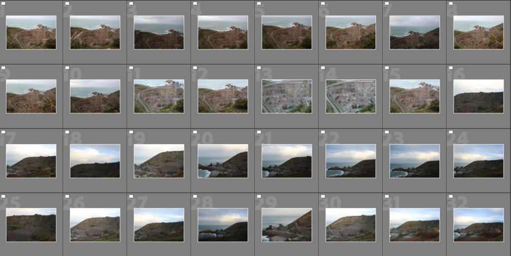
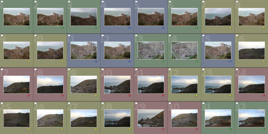
Flagged images:

Final image selection:

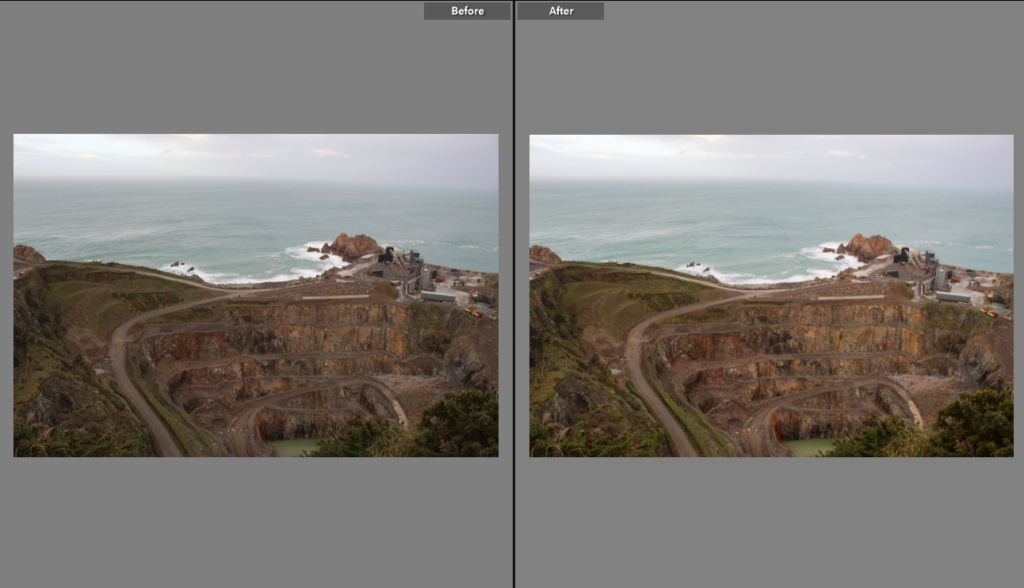
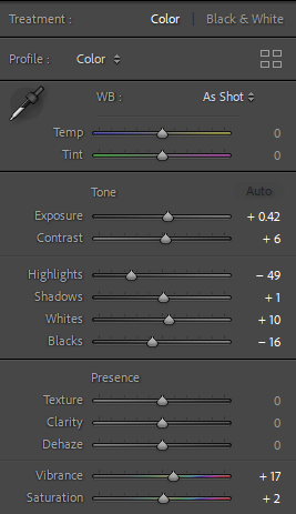
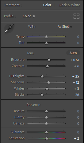
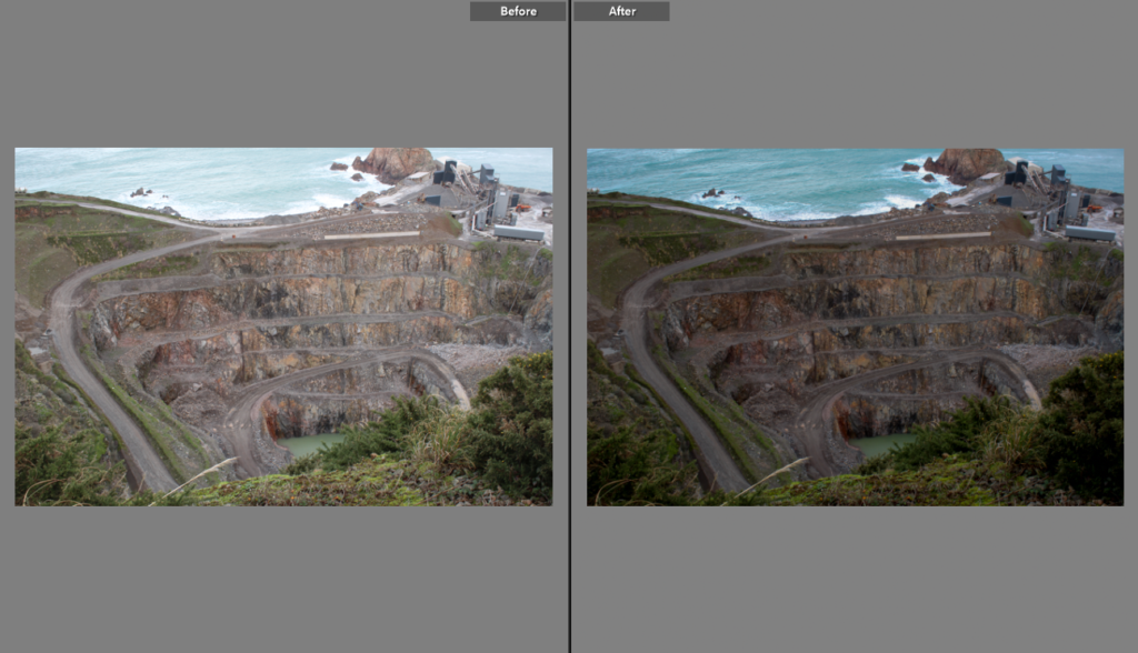
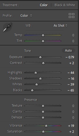
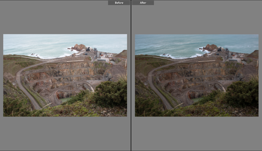
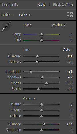
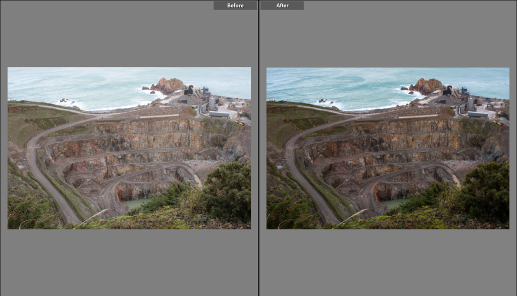
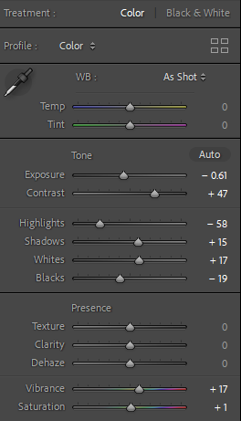
Lightroom editing:

Image 1:

Image 2:

Image 3:

Image 4:

Image 5:

Photoshop editing:

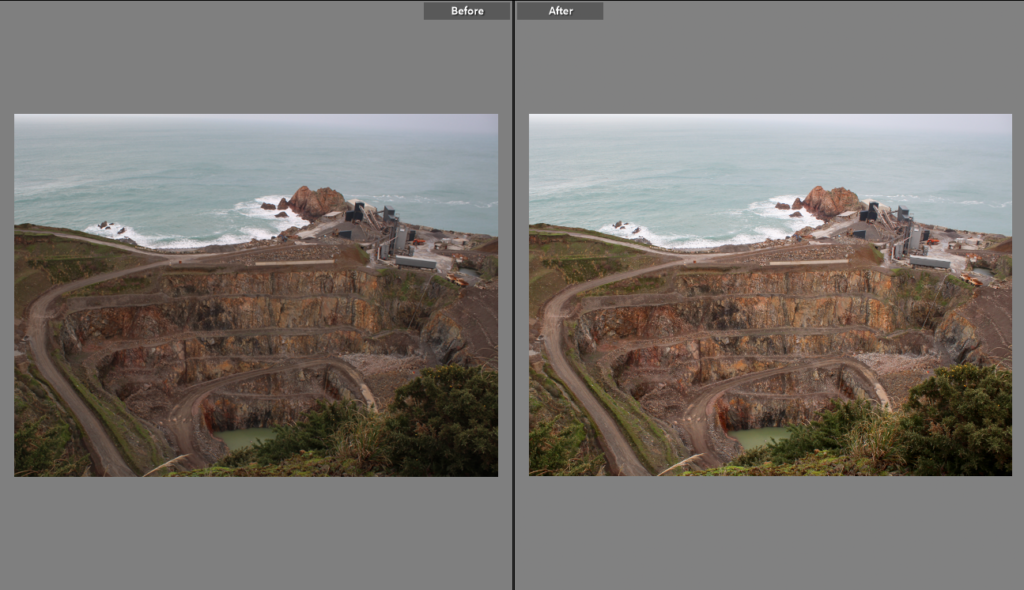
I’ve manipulated 2 of my images so that the pool of water is bigger because the bush was in the way.

Image 1:

Before
After

Image 2:

Before
After

Experimentational Editing:

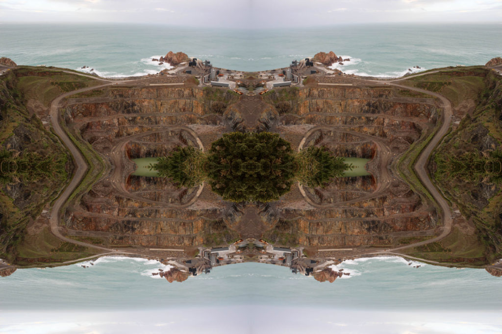
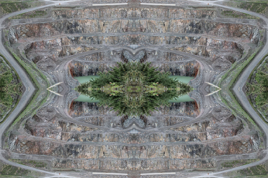
Kaleidoscope
Kaleidoscope
Joiner

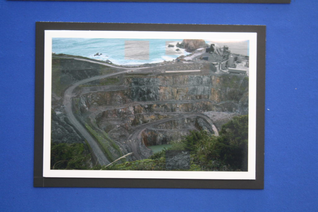
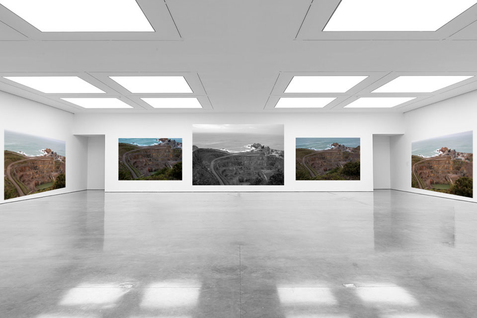
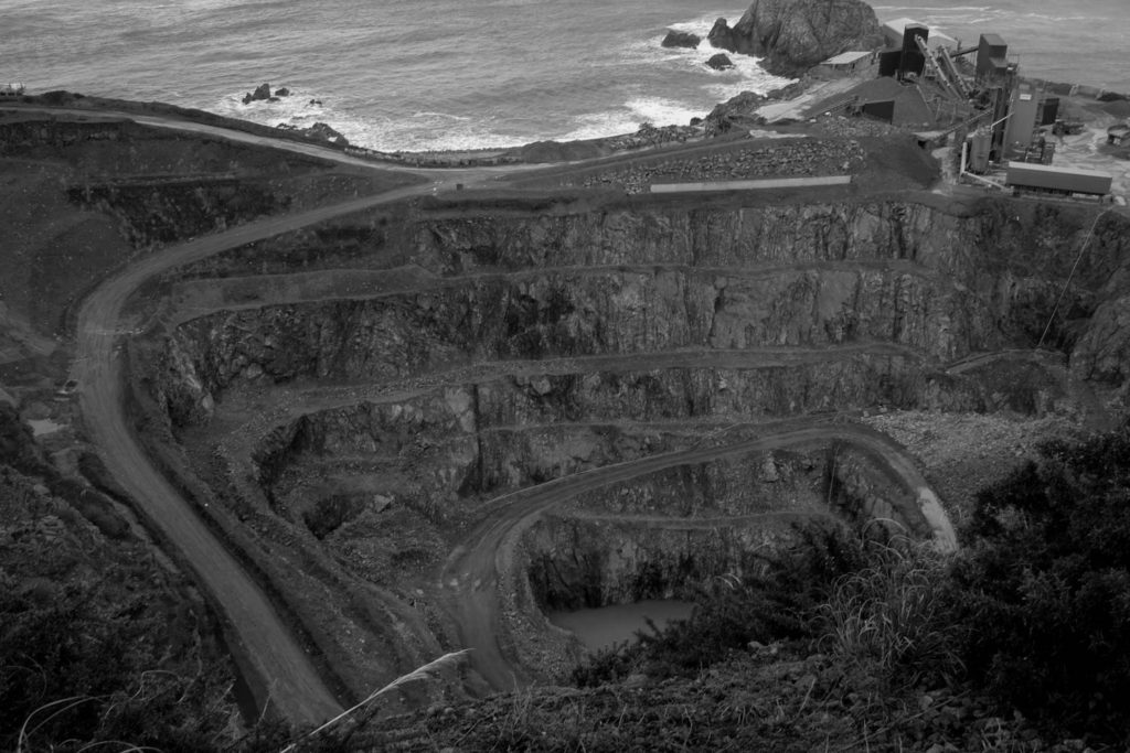
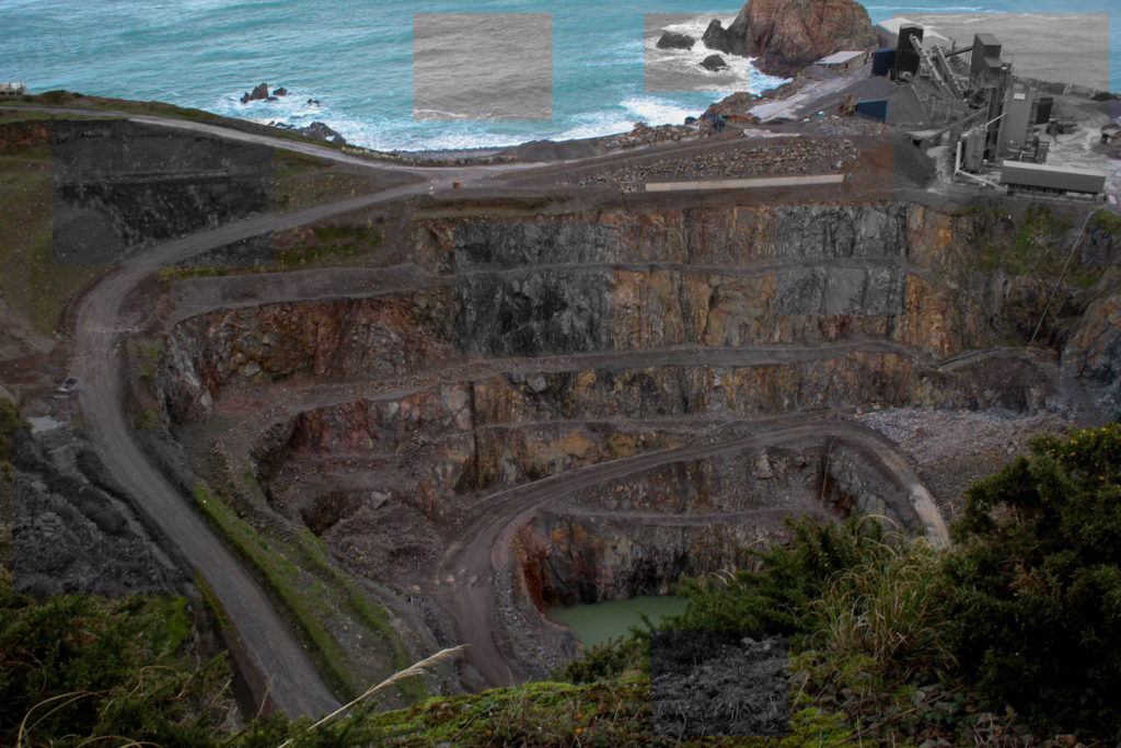
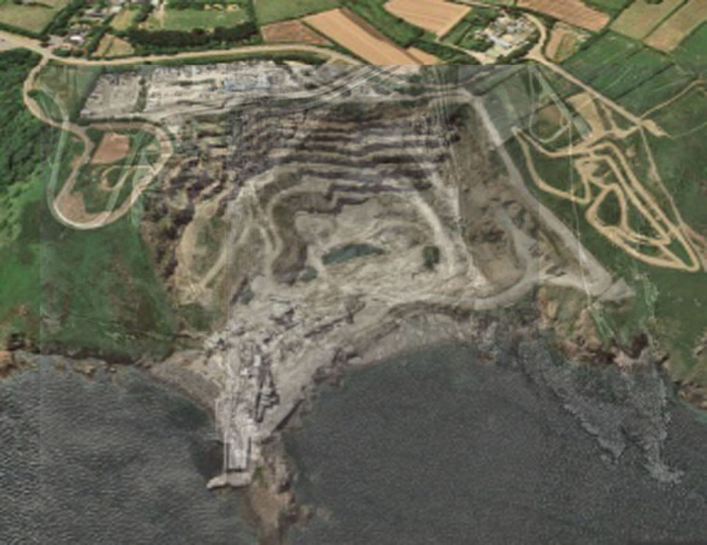
To get the final image seen above I cut out sections of the same image in black and white and layered them on top of the original image to represent what was there from when they started the quarry in the 1930s.

Ronez over the years combined

I combined images of Ronez quarry over the years to show how it has changed and had an effect on the landscape surrounding it.