All posts by George Flavell

Filters

Author:
Category:

Photoshoot – Environmental Portraiture (In School)

We did a small-scale photoshoot around the school for environmental portraiture, walking around and finding different areas where we could find people going about their day that wouldn’t mind having some photos taken. We ended up avoiding study areas so as to not disturb people and went to other common areas such as the canteen and the school car park, where we took some images of the exterior of the school.

I sorted through the images I wanted to keep to edit, gave them a star rating and colour coded them based on whether they would be good to edit or not in lightroom, and started working on them.

I only ended up editing 4 of these photographs, as a lot of them were out of focus or had poor lighting.

These were the 4 I was left with, and I quite like how they turned out.

These two images, taken in the canteen, show Jonah sitting down at a table during a free period, where he was socialising with others sitting with him. He doesn’t make a direct mode of address with the camera, which hints at his focus on other people in a social space, as opposed to an isolated photograph where it would be just him and the photographer. There’s a theme of colder tones in both photos, which works quite well with the more orange hues in the canteen’s furniture and Jonah’s blue clothing.

This image of me was taken at the top of the art block’s stairs, using warmer tones and softer natural lighting to show a more relaxed, quiet setting, juxtaposing the more crowded social areas in the building. The photograph works well as a composition, but I believe more lighting would be necessary on my face to improve the result of the image, as it’s quite low in exposure and isn’t as eye-catching as the red object on the left-hand side of the photo.

This last photograph is also of me, sitting on my motorbike in the school’s car park. The image also contains warmer tones and has an all-around good composition when it comes to contrast, framing, and shadows. However, my main issue with this photo is that the sun is directly behind me, creating a lens flare in the final image and making it harder to adjust the exposure on my face when it comes to editing.

Photoshoot Action Plan – Environmental Portraiture

I plan to shoot various people I see in my daily life over the next week or so, including (but not limited to)

  • Allen, my boxing coach
  • Dave, someone who I work with at Grow Jersey
  • Bren, my boss
  • My brother
  • Friends

Some of these are more easily achievable than others, so I probably won’t end up photographing all of them, but I should end up with some interesting results.

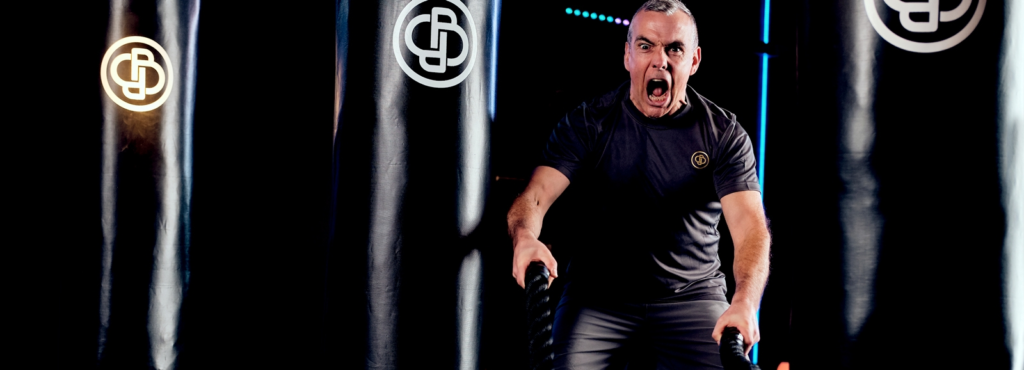
For the photograph of Allen, who coaches me at BoxinBusiness Jersey, I could attempt to take something similar to their promotional material, such as this image above from their website, or a photograph of him standing in front of one of his classes as they train behind him.

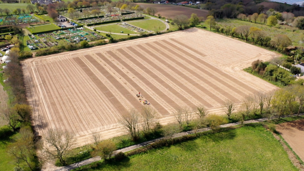
This is the field where Grow Jersey is based, and I could take some images of the other people tending the fields there, but I most likely won’t see many people when I go down on Wednesday, other than Dave, one of the people in charge of the project.

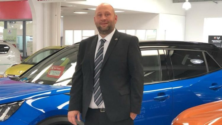
I could photography my brother while he’s at work, at Motor Mall. I think the compositions I could end up with sound pretty interesting, as there’s plenty of colourful cars and it’s a large area of land.

I might be able to photograph friends while we’re out to see what we could come up with, but that would have to be more of a side project, as I don’t often carry my camera.

Photoshoot – Environmental Portraiture

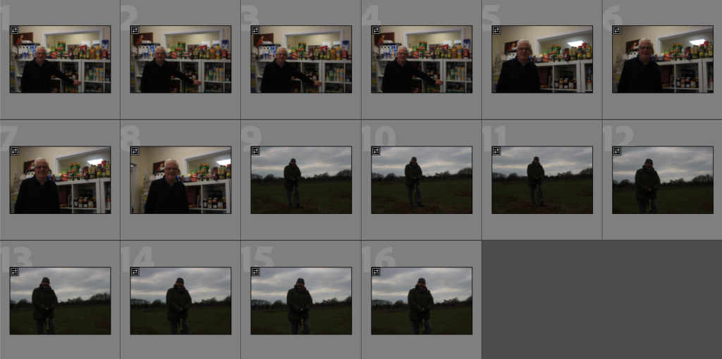
While working through one of the busier days of the week, I found a little time to take some quick photos of the different people that I work with at GROW Jersey and Saint Vincent de Paul Food Bank. I only had the time to do very quick shoots, so I only took about 16 good images, but I think they’re enough for this project.

I filtered out the photos that were blurred, out of focus, or too dark to edit. There was only one image that this was a proper issue with, the rest had very minor motion blurs or something of that sort.

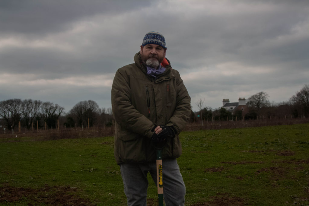
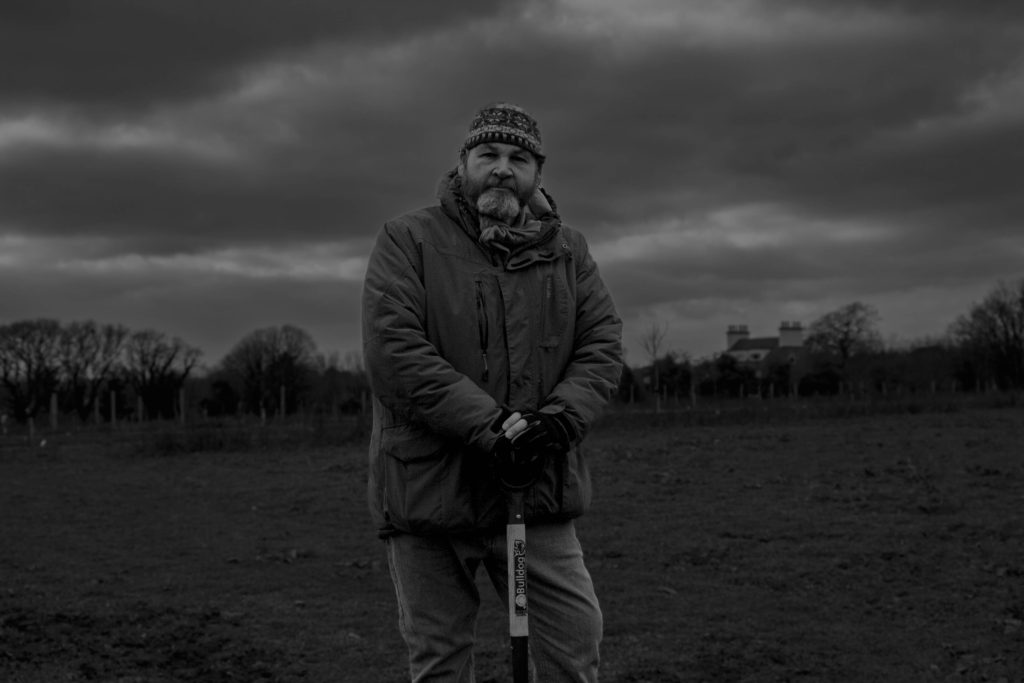
After giving each image a star rating and colour code, I started editing. I wanted to experiment with black and white for images 6 onward, referencing one of Paul Heartfield’s pieces shown to us in class.

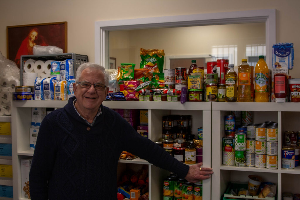
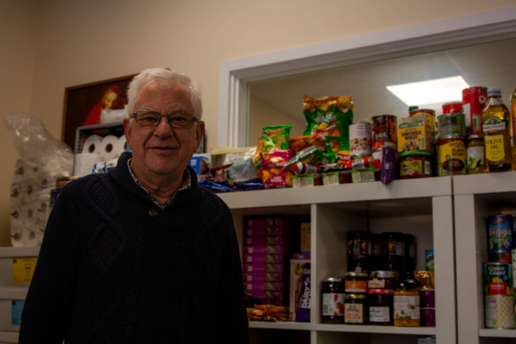
These four were the results of this shoot, editing two from the food bank and two from GROW.

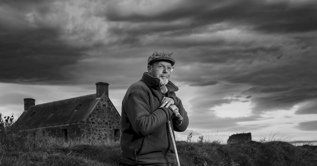
Paul Heartfield

After looking back at the reference, Heartfield’s image contains a lot more lighter tones, which makes the final result more eye-catching to a viewer. Otherwise, the two photos have very similar compositions, on some kind of farmland/grassy field with a relatively elderly man resting his hands on a tool of some kind.

The man from my photograph, Dave, does work up at GROW Jersey, a horticultural project set up by THRIVE, a mental health charity, that aims to get people more involved with nature for their own physical and mental wellness. I’ve been doing work up at GROW for the past month or two, helping rebuild things from recycled materials, maintaining the land, and moving loads.

The man from this image is Peter, from the Saint Vincent de Paul food bank standing in front of some of the supplies they have there. I’ve also been doing volunteer work there since around the start of this year, just organising the shelves and sorting out people’s orders for hygiene and food packs.

Environmental Portraits – Alec Soth

Alec Soth, born in 1969, is an American photographer based in the state of Minnesota, with over 25 published photobooks. Soth seems to focus on both landscape photography and portraiture, often combining them into personalised environmental portraits.

This image is a full-length body shot of a man Soth was curious about on his road trip. The man in the image, Charles, stands in quite a regular position, wearing his lightly paint-splattered overalls, almost dressed like a pilot, which creates connotations to the model planes in his hands. The colour palette in the photograph is very high-key, the biggest contrasts being from the darkest shadows underneath the materials on Charles’ roof and under the gutter on the wall of his house, to the ice-white snowfall on his roof. The exposure in the image is quite high, evident in the lack of detail in the bright grey sky and the snow, which complements the airy colours throughout the rest of the piece. Charles makes a direct mode of address to the viewer with both his body language and his eyeline, looking straight into the camera lens, although the reflection in his glasses makes it rather difficult to see. He bears a neutral expression on his face, which forces a viewer’s opinion to be purely based off of the rest of the environment and his other features. Soth intends to present Charles in a documentary-style image, not reinforcing any sort of authority, gender roles or authority, displaying Charles in as raw a form as he can.

Soth came across Charles during a road trip, when noticing his home and its peculiar glass-domed roof. Soth knocked on his door and requested to speak to the occupants, to learn about these strangers, and took the photograph a few hours later. He learned that Charles was a very aspirational person who’d built the dome to look at the stars, and considered himself a ‘dreamer’.

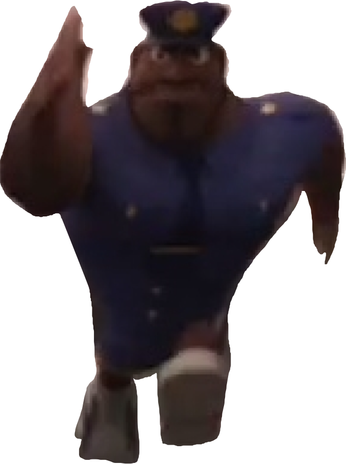
Officer Earl Running by CandyElgatoMagico on DeviantArt

Portraiture Shoot

I took photographs of Jude while we were together at Ikey’s, a cafĂ© we frequently visit in town on Bath Street. I did this to test out different ways of taking portrait images, and the way light works with various facial expressions and poses. It was only a 5 minute shoot that wasn’t supposed to amount to much, but I liked the way of few of these images turned out and wanted to edit them.

In the last 4 photos, I took of a man who noticed us messing around with my camera and questioned us about photography and why we’re doing it. He asked us to take some photographs of him and send them to him later on his email, also asking me to take photos for an event which I wasn’t able to go to due to illness.

These photos of Jude could just be considered regular headshots, as the background has little to no focus throughout each of these images, but I really like the way the colours work in the images to create warmth. I also gained experience with using the flash button, as I’ve always been a bit hesitant to use it because of issues like red eyes and overexposures.

My editing with these images also improved, as I experimented with masking layers to blur out the backgrounds and make the subjects more prominent without making it too obvious in the final image.

This photo is the closest thing I got to actual environmental portraiture in this shoot, as I’m planning to take more images of people around the island. I still think the final result turned out really well, and I like the way the colours in the image compliment each other.

Arnold Newman – Image Analysis

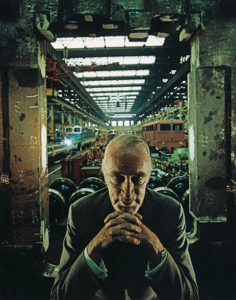
Alfred Krupp, industrialist – Arnold Newman – 1963

At first glance, the photograph appears intimidating, with moody green tones plastered throughout the image and low levels of light within the foreground, implying something potentially sinister or disturbing. The man in the portrait appears to be some sort of powerful businessman, as indicated by his pose and his physical age, which creates a sense of seniority.
The photo seems to have been taken in quite a low-light environment inside an abandoned warehouse of some kind. However, it also can be assumed that Newman used studio lights on both sides of the man to illuminate certain features and portray him as a more menacing villain.

In the image, there is large industrial equipment and machines placed in the background, such as cranes and trains – various other mechanical parts and accessories. It could be assumed that the setting of the photo is a factory for trains, and that the man is the owner or manager. The man is placed in the lower centre of the photo, wearing a suit, with white hair gelled to the back of his head, hunched over, interlacing his fingers and making a direct mode of address with the audience. This suggests that he is a man of business, and combined with the low lighting, implies moral corruption.

This photograph is presented as a protest piece against maybe a corporation/company or even the individual in the photo, as shown in the vilifying of the man within the image using various elements of mise-en-scene. Depending on when it was taken, it could refer to many different things – the environment, wars and conflicts, the economy or inflation.

This photograph was taken in 1963. It portrays German industrialist, Alfred Krupp, as ominous and villainous, his body language suggesting he is scheming or has committed some form of malicious act/plot. This is because Krupp was a large arms manufacturer and industrialist, supplying the German armies with weaponry used particularly during the Second World War, which in turn caused millions of deaths and global suffering.
Environmental Portraits – Introduction

An environmental portrait is taken within the subject’s usual environment, such as their home or workplace, and typically creates a focus on their life and surroundings.

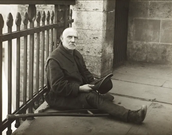
August Sander
Paul Strand
Arnold Newman
Annie Leibovitz

Environmental portraits can tell stories about the lives of the people they capture, but they also conceal certain details about them. These types of photographs also play a pivotal role in showcasing people throughout different eras since the birth of photography, as they showcase clothing fashion, tools and other technology, and improvements in general quality of life.

My chosen artist to research is Alec Soth, as his style when it comes to environmental portraits tends to have quite natural, flowing light throughout the image and large senses of space.

Anthropocene – Best Images

These six images from the Anthropocene project are what I’d consider to be my best, in my opinion, as they all adequately display the destructive impact of humanity on the world and natural environments.

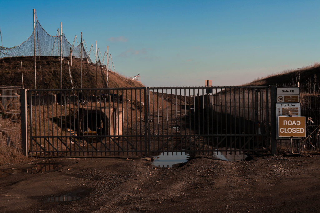
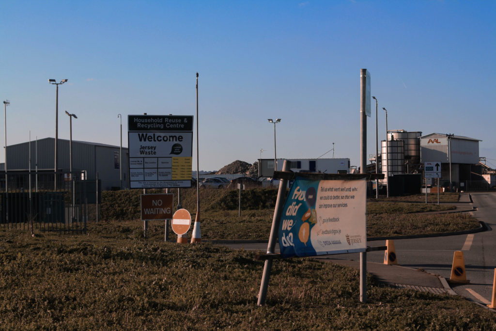
I think that these three images capture an almost apocalyptic feel, with more yellow, dullened tones – particularly on the grass in the dump images – which creates this atmosphere of death and ruin that’s present throughout. The light in these photographs is also quite hard, which makes the image feel warmer, like a desert – connoting the impacts of global warming. There’s also very strong geometric shapes and lines, displaying the regularity and lack of flow in industrial structures, which breaks apart the natural landscape.
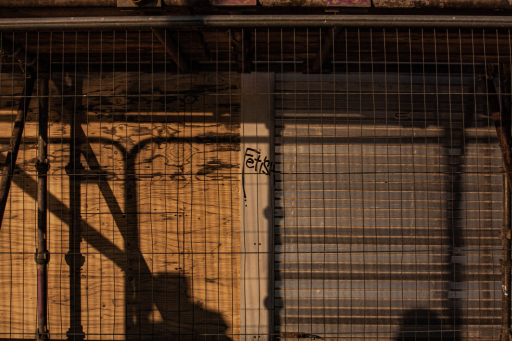
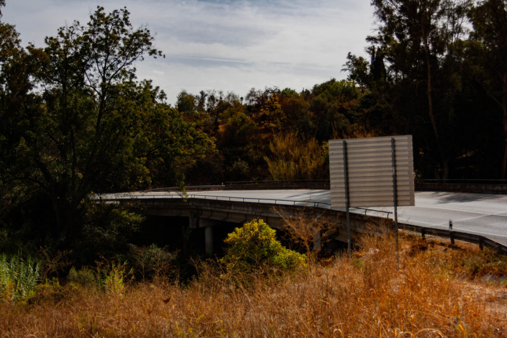
While I think all three of those photos are perfect examples of Anthropocene, this one in particular doesn’t capture it as well as the other two. I think the apocalyptic style of the other two isn’t as present here, although it still contains similar tones and concepts. To improve this, I should probably increase the temperature slightly on Lightroom, to reinforce the style and make the message clearer.

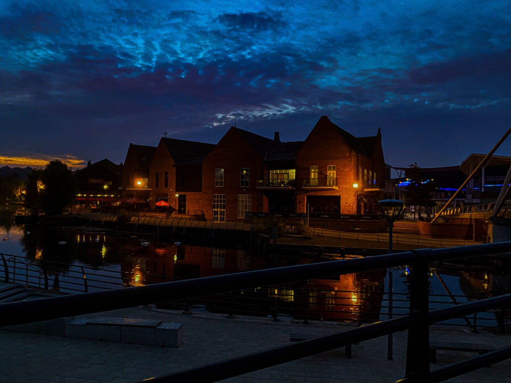
These two images also have very similar concepts – humanity’s adaptation to the natural environment around them and building over it, in turn ruining the area for local wildlife by filling it with plastic debris, sewage and other forms of pollution.

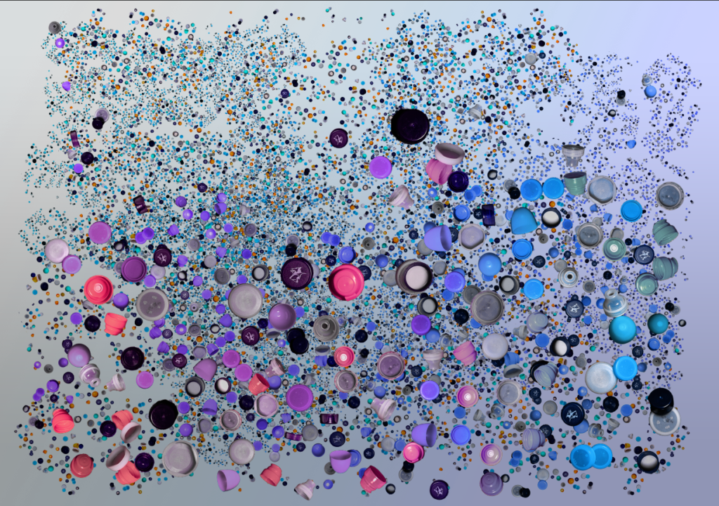
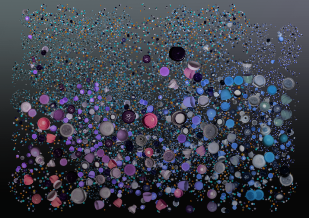
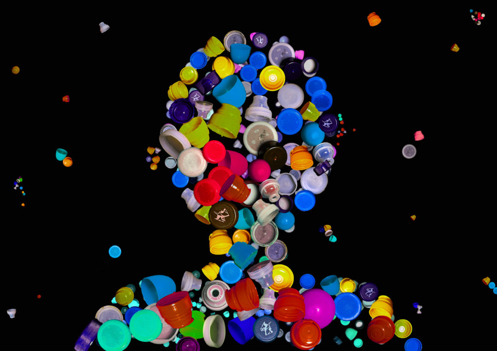
This piece that I created on photoshop from images of bottlecaps represents the overuse of plastic in the modern world. It’s an intriguing photograph that asks question about the morality of plastic and the necessity of finding something more sustainable and environmentally friendly.

Anthropocene – Experimentation – Mandy Barker

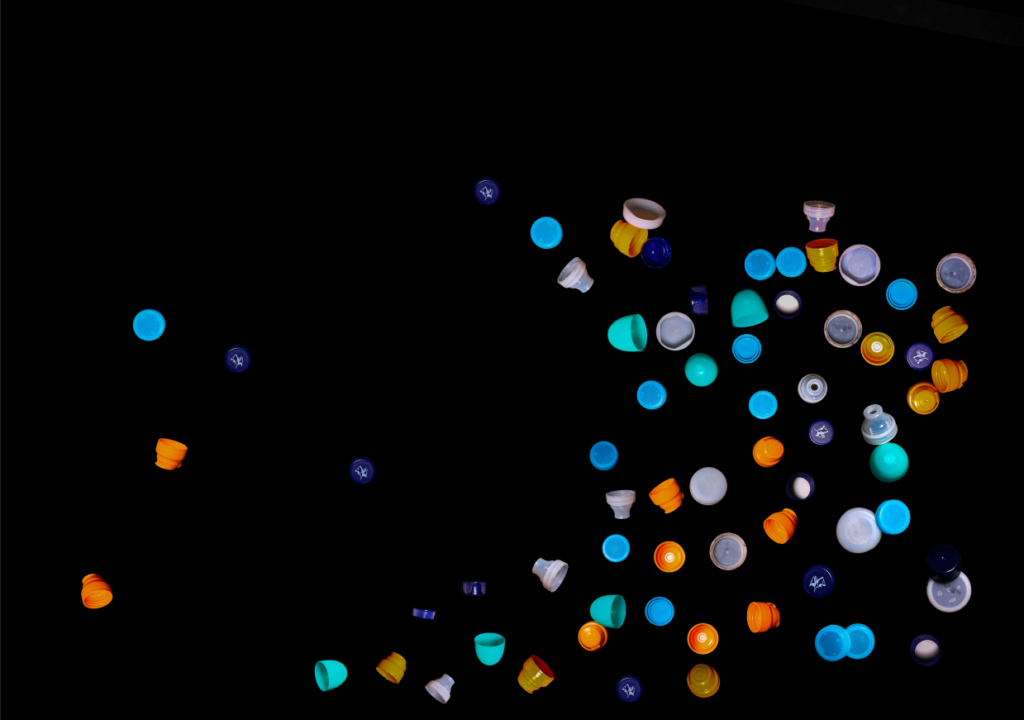
I used the object select tool to select the rough shape of the bottlecaps from the original images from my photoshoot, to help me cut out the background. I did this for each photograph I took from Lightroom and started to put them together.

As I put them together shapes started forming, but I felt that the space behind them was still empty.

I thought that later on I might add on a layer on top of this one with the bottle caps more enlarged, so I added a gradient from black to transparency, and lowered the opacity to get the desired shadow effect.

I then created another layer beneath the original, and downsized the bottlecaps to create more depth in the image when the whole thing is completed.

I started experimenting with adding a gradient and hue blending it with the rest of the image to change the colours of the bottlecaps, as my colour range was quite limited with only 4-5 different coloured caps.

I then created another few layers beneath and decreased the scale of the bottlecaps each time, until it almost resembled litter floating in the ocean.

I decided to try a gradient for the background as well, and found this one very visually pleasing, but I’m not too convinced it supports the ideas of Anthropocene or Barker’s work.

Using the blur tool, I created more of a sense that the bottlecaps were submerged underwater, and changed the background gradient behind to a murky green and dark purple, and then reduced the opacity again to create the effect of polluted water.

I was left with these two pieces that are almost identical composition-wise, but completely opposite in tone. I think I visually prefer the lighter version, however the realism and idea behind the darker image adds more value to it in my opinion.

I wanted to do another piece similar to this, but with a clearer message, and after experimenting with different ideas, I thought that I could position the bottlecaps in the shape of a person.

I built up a lower layer using parts from my first image, and changed the hues of the layer.

I then made a start on an upper layer with larger bottlecaps. I also messed around with the hues slider for each extra layer I put on to add some extra colour.

I was considering adding a background similar to Barker’s, with the dark green/dark blue mist effect, but I couldn’t do it in a way that wouldn’t turn out awful in printing, so I stuck with the plain black background.

To add some more to the rest of the image, I added in some smaller bottlecaps floating around behind the ‘person’ at various smaller sizes.

I’m quite proud of this piece, although I still don’t think it captures the same sort of flow that Barker so effortlessly uses when putting together her work. After some more practice, I could probably create a more accurate version of a Mandy Barker piece. However, I do think that it portrays the message of plastic pollution quite well, as the plastic ‘person’ can easily make you wonder how much plastic we truly use as a whole.

Anthropocene Photoshoot – La Collette

I drove down to La Collette to take more photos for my mock exam, and decided to focus more on the dump and recycling plant instead of the other areas around it. I asked some of the workers for permission to just take some photographs and had a conversation about photography while I shot my images.

I then walked down the road to take some photos of the rest of the site from a distance and of cars passing by.

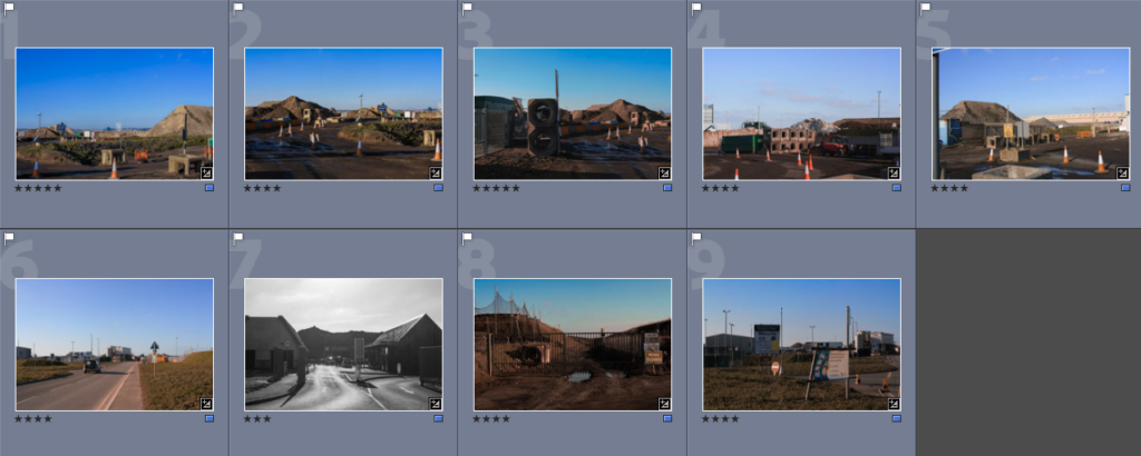
I then sorted through the images and only selected a small range to edit during the exam.

I experimented with changing the colours in the photos to be duller and seem ‘more dead’ – such as the sky, grass, etc. to remove focus on the more natural areas of the photo.

I like all of these images, especially because, in my opinion the tones create an almost apocalyptic feel with the rubbish and dead-looking plant life everywhere.

I could also try to edit more of these in my spare time, and see what I can come up with.