All posts by George Flavell

Filters

Author:
Category:

Zine – Design + Layout

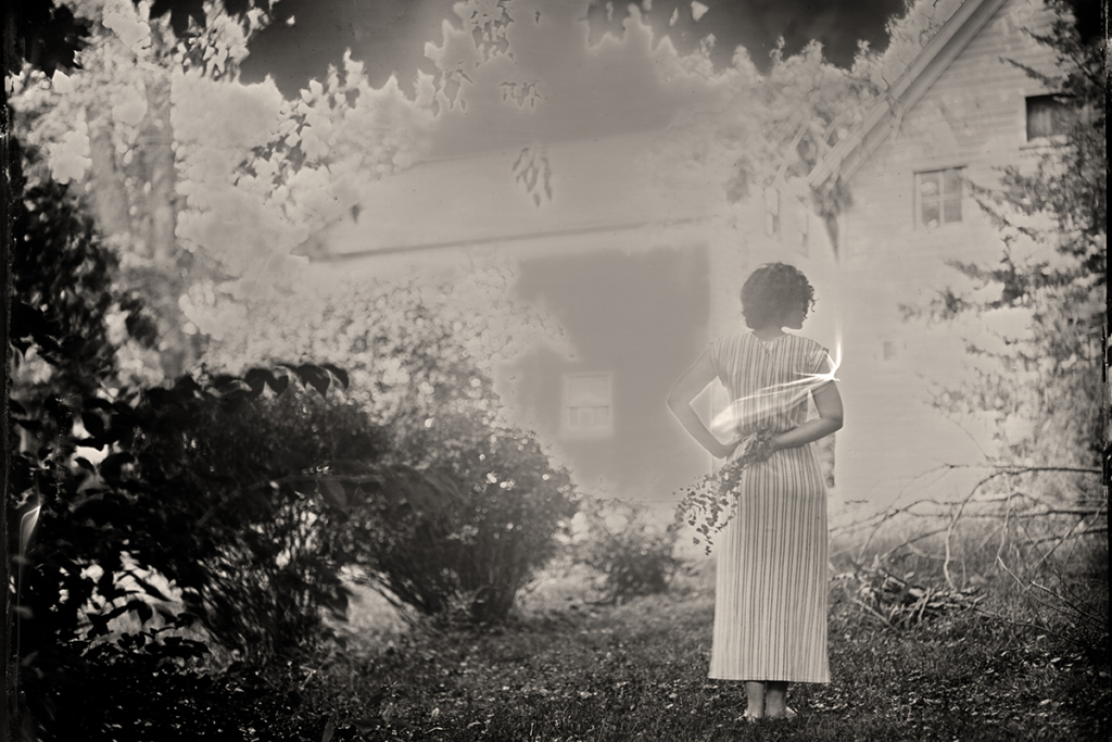
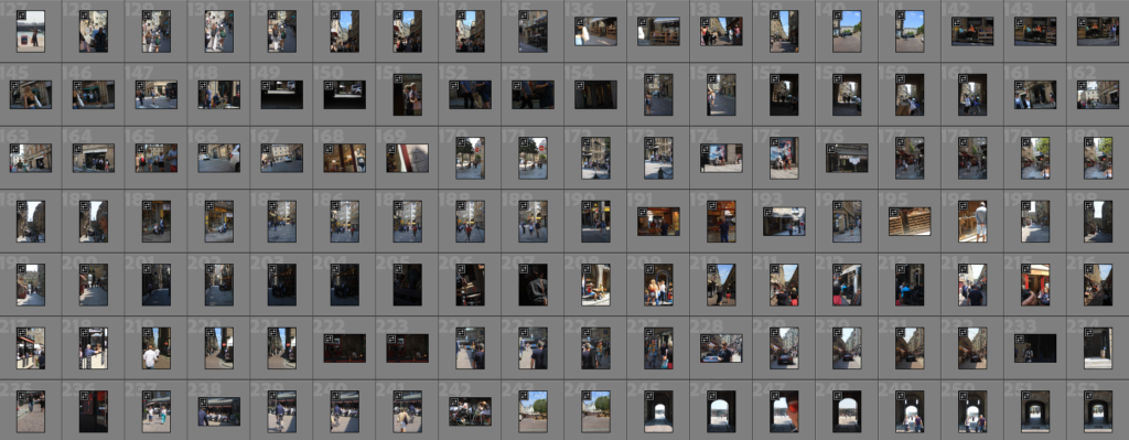
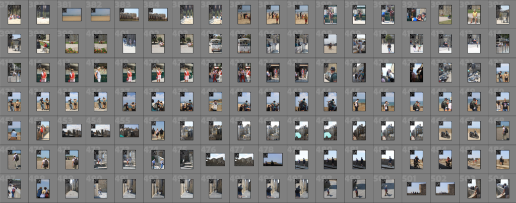
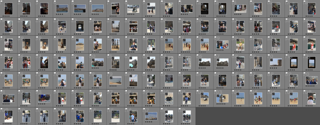
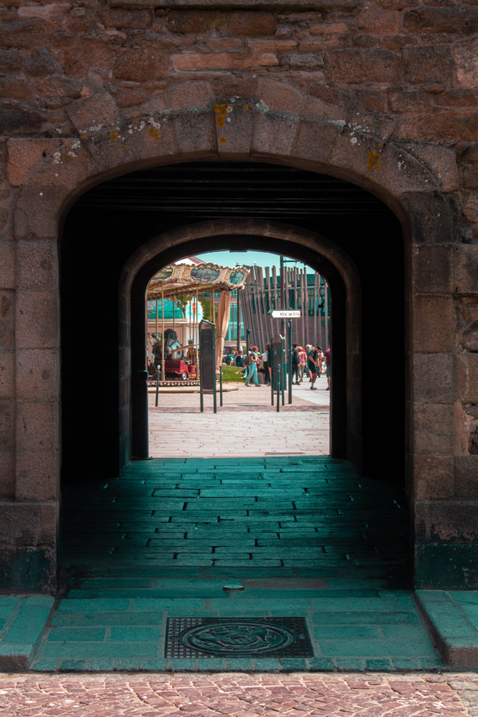
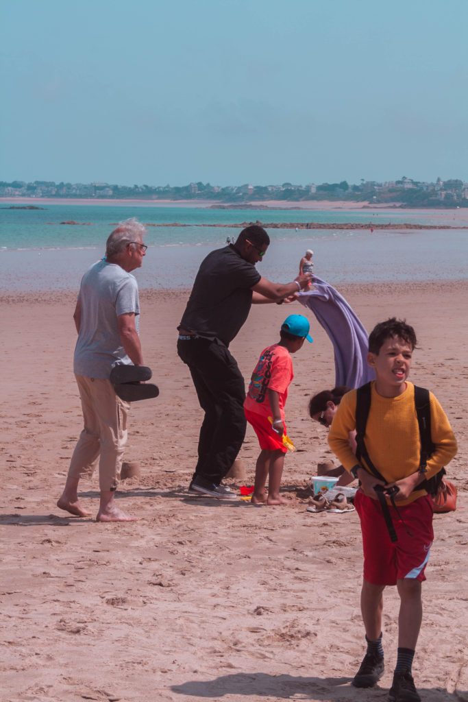
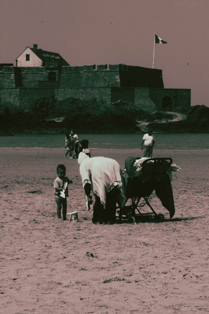
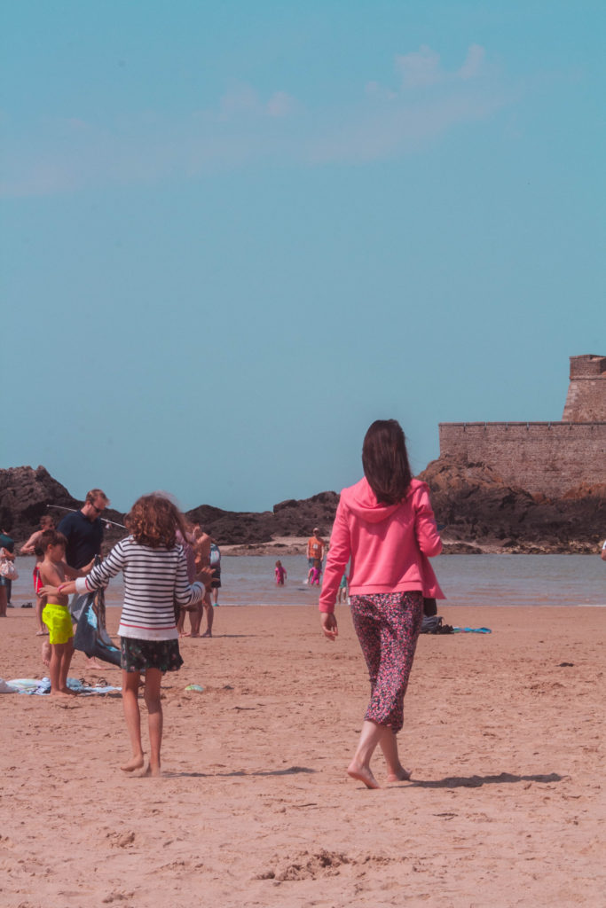
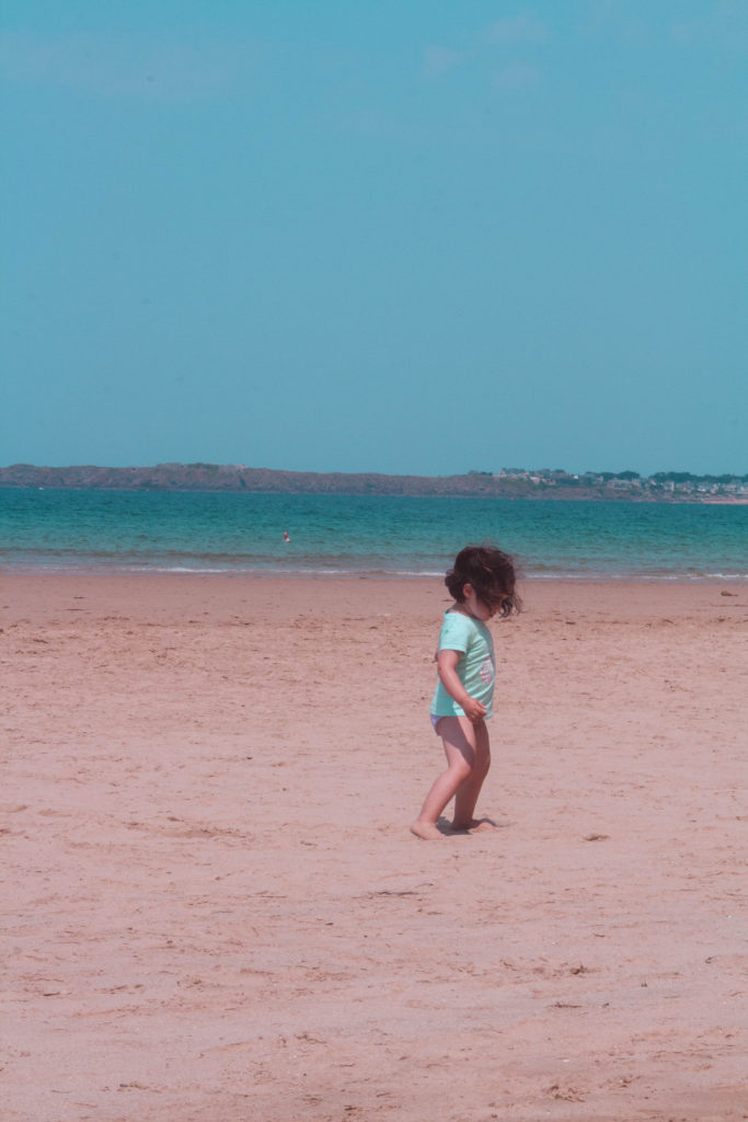
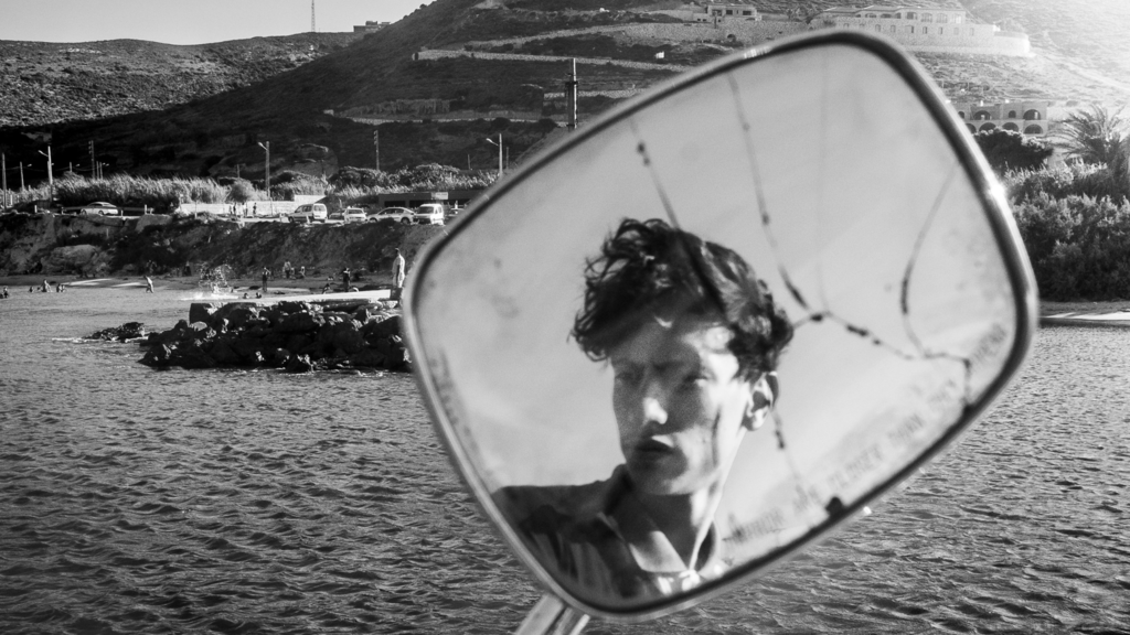
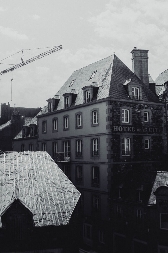
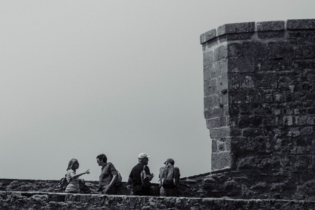
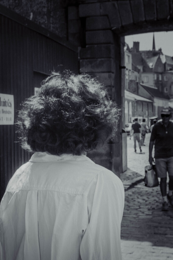
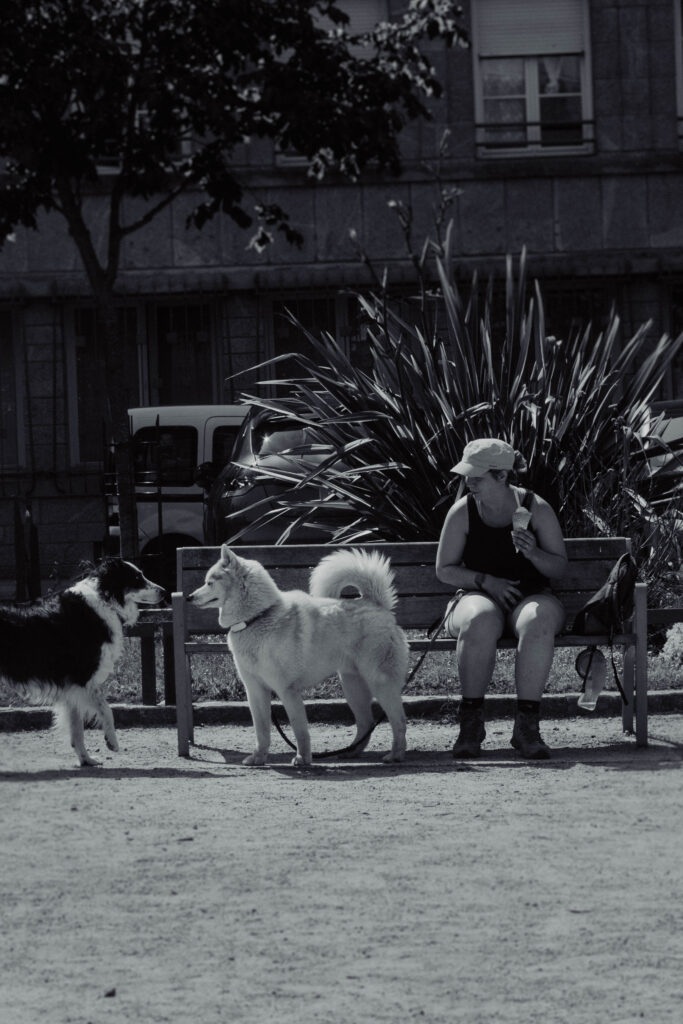
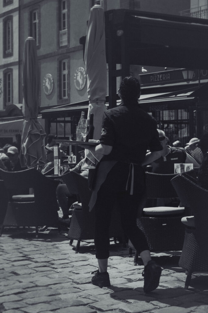
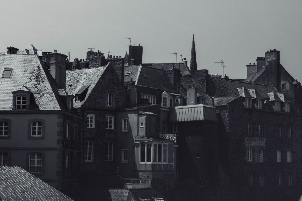
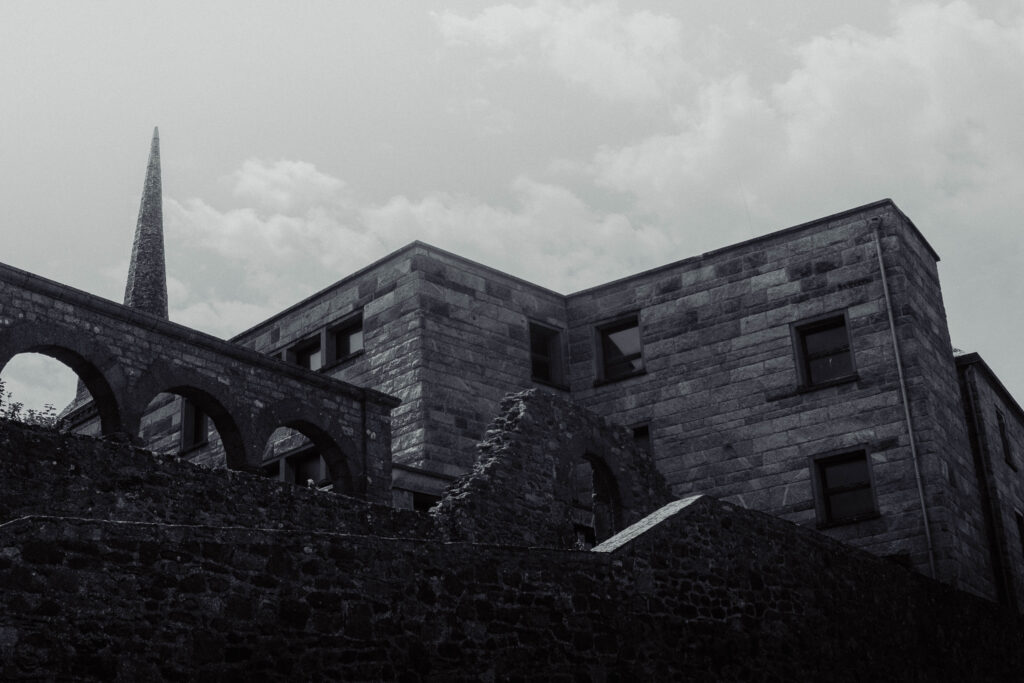
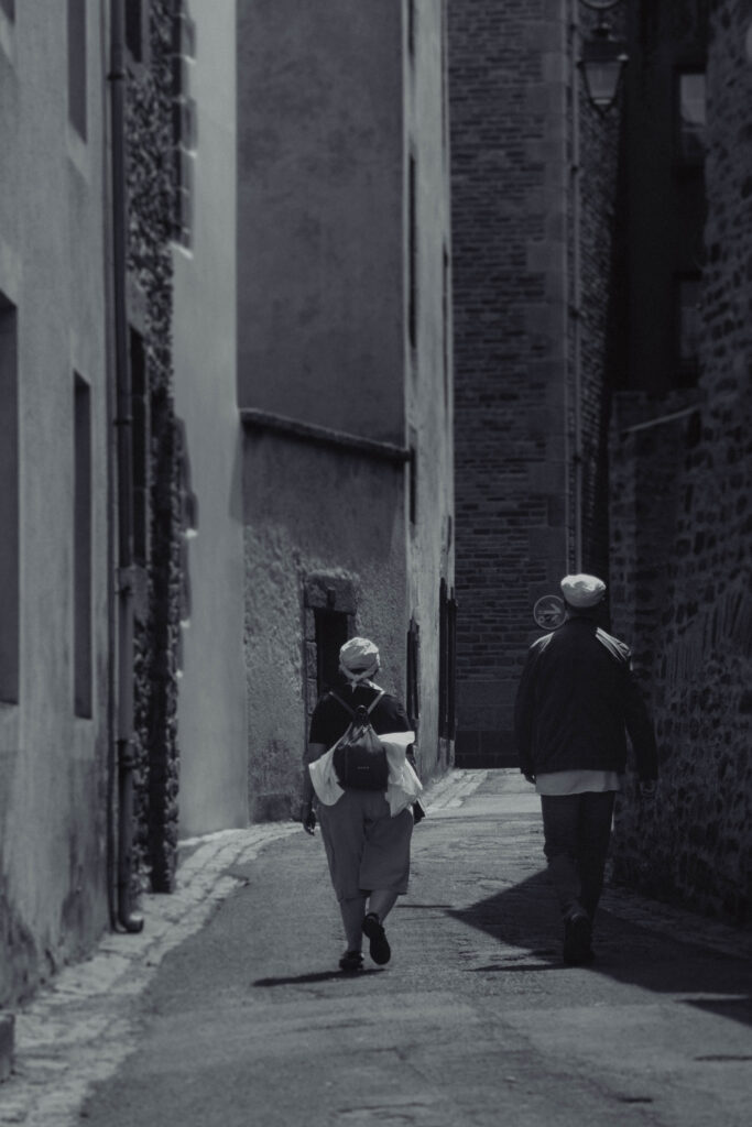
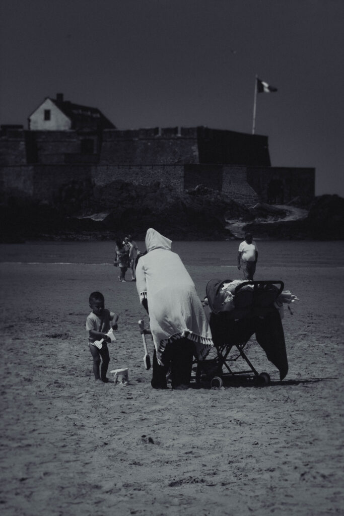
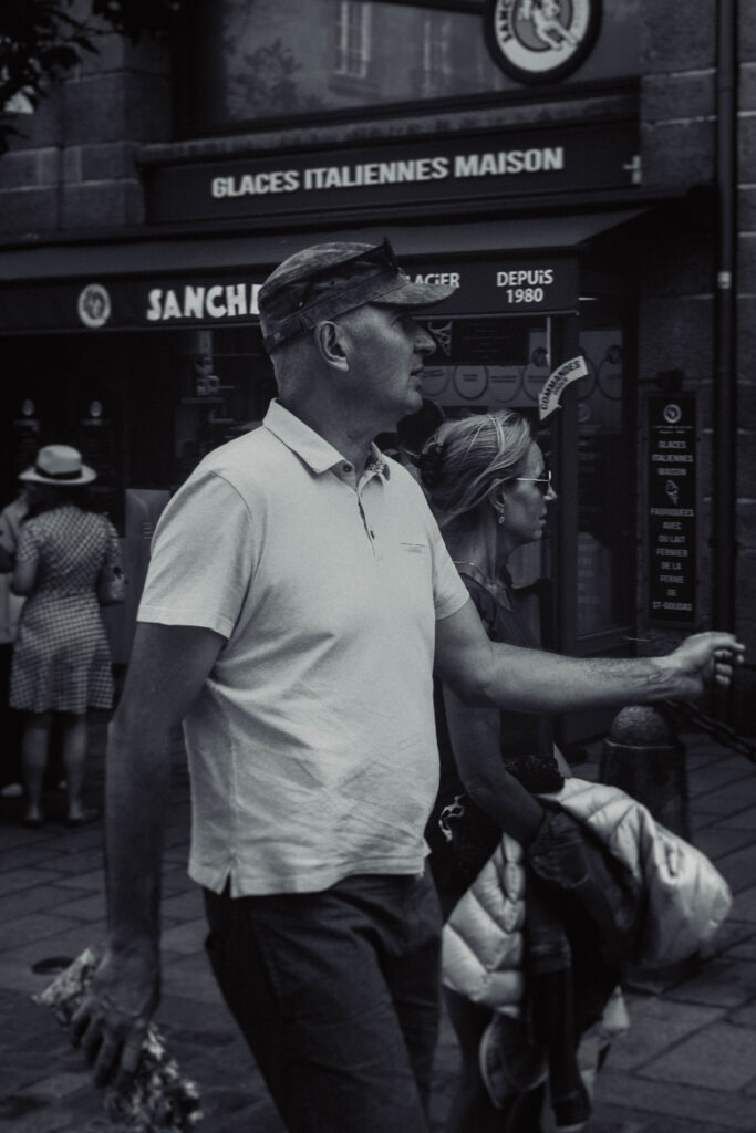
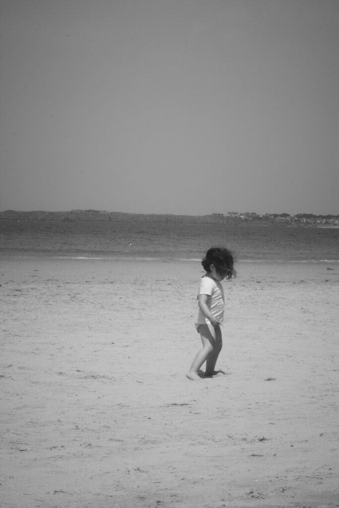
These are the photos from the St. Malo trip that I wish to use for my zine. I want to follow a vintage monochrome aesthetic, and to make the images appear this way using editing techniques in Lightroom Classic.
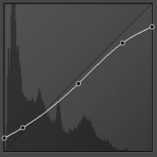
One of these techniques includes using the tone curve, to heighten and lower specific tones, and maintaining this similar curve in all of my final images to achieve the same effect.
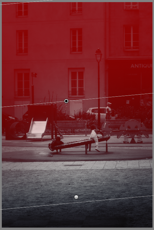
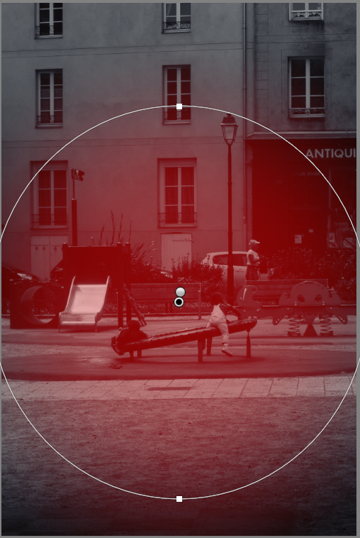
I’ve recently started experimenting with using the radial and gradient editing features to use exposure and sharpness settings to subtly bring more focus to the subjects of my image, and it’s something I practiced heavily with my photos for my zine. I’m impressed with how they look and can barely notice the editing, but I’ve also noticed that I’m significantly more absorbed into these images and I believe this is a fantastic technique.

For my front cover, I wanted to establish the minimalistic style with the placement and font of the title of my zine – ‘malo.’ – in the bottom left corner. I decided to use only lowercase for the title as I thought it would bring more attention to the cover image instead, as I find uppercase to be more attention-grabbing and bold. I also find the photograph that I used to be quite appealing, as there isn’t much going on, but it’s still attractive to the eye and has a mixture of both hard and soft tones.
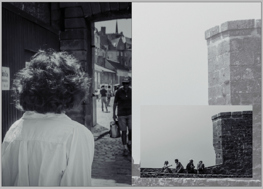
For my first pages, I want to introduce the reader to St. Malo, and to subtly display the town’s rich heritage and it’s popularity, which I plan to expand on in the text I want to add on the right-hand page, discussing the fortifications and the links the place has to WWII.
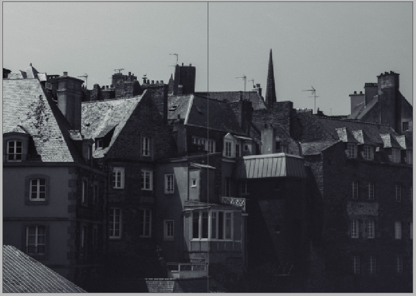
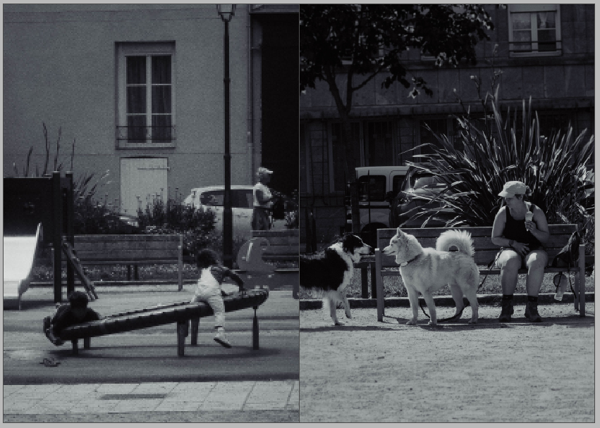
The next four pages are double-page spreads, featuring a landscape of the architecture and two scenes in one of the children’s parks. I think the buildings illustrate the history of St Malo and place it within a specific time period, opposing modern architecture and its placement within bustling cities, meanwhile the shots in the park display activity in the town today, showing St Malo’s adaptation to both the modern world and the rise of tourism; still remaining an interesting and beautiful place.
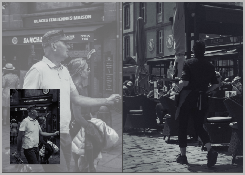
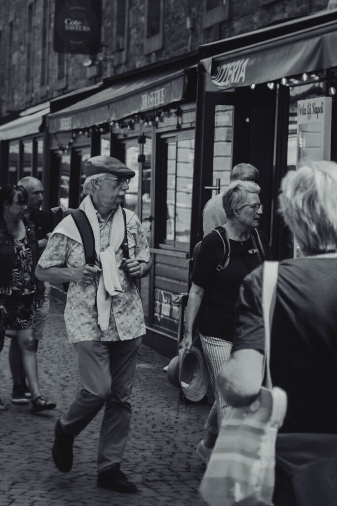
On these pages, I plan to discuss the small resident population within the castle walls and how St Malo is a transitional space for tourists to explore and eat, not really as a space for long stays or to live in, much like it has been throughout its history. I used two photos of a server in a restaurant and a couple looking for somewhere to eat to reinforce this subject into the reader’s mind.

This double-page spread features an image that I think clearly demonstrates Cartier-Bresson’s style – focusing heavily on the sharp angles and geometry featured in his work at St. Malo, which I’m very proud of.
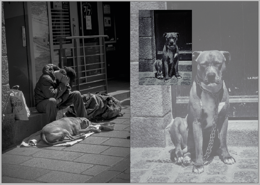
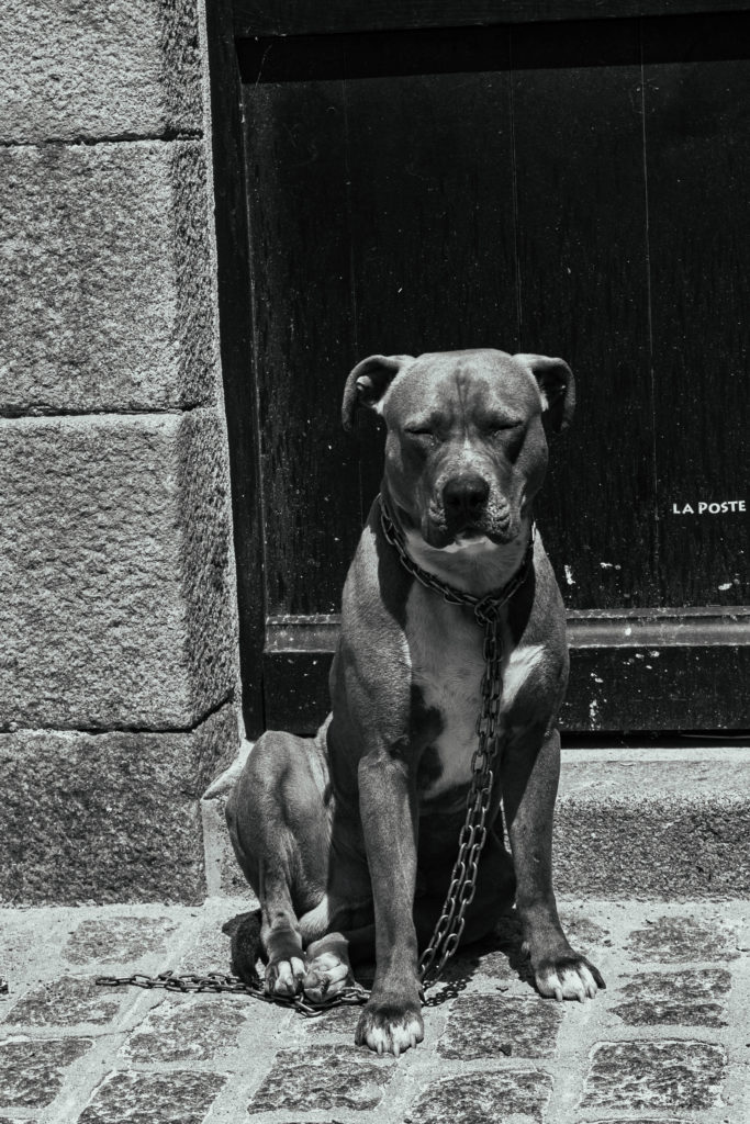
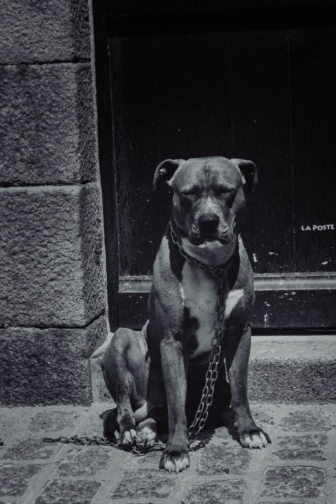
On these pages, I want to discuss St Malo as a “human environment,” by which I mean that despite the town’s idealised reputation as a gorgeous tourist destination, and as a place to ‘escape’ to if you’d like, the residents and tourists still face their own difficulties here, much like anywhere else in the world, such as purse-snatchers, people who have to beg to survive, and witnessing animals tied up with chains and abandoned, similar to the photos on these pages, or how it appeared to me as I walked past.
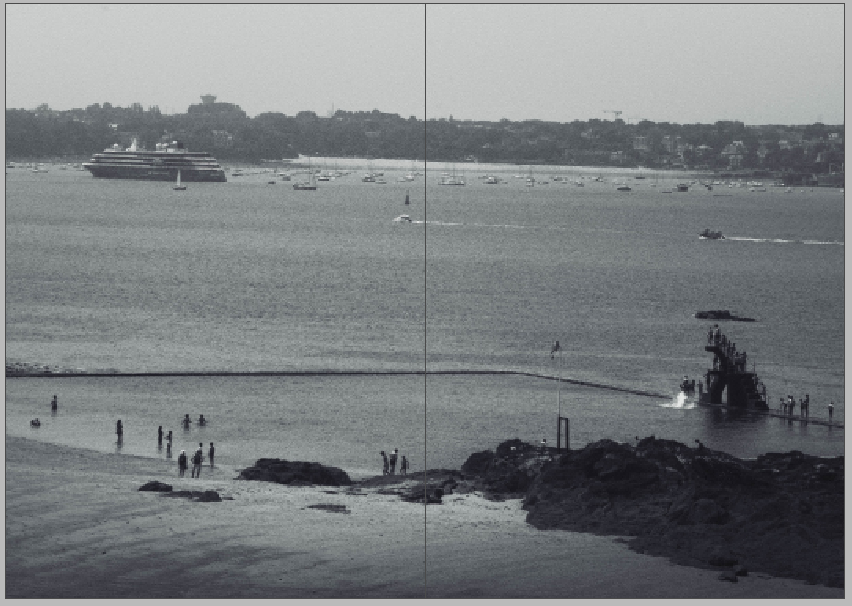
I used another double page spread to end the zine on a more positive note, showing people enjoying their time on one of the pools on the beach queued up to use the diving board.
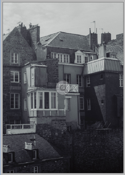
For the back page, I just placed a similar landscape of the town’s architecture to mirror the front cover of the zine.

Zine – Narrative + Story

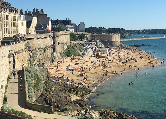
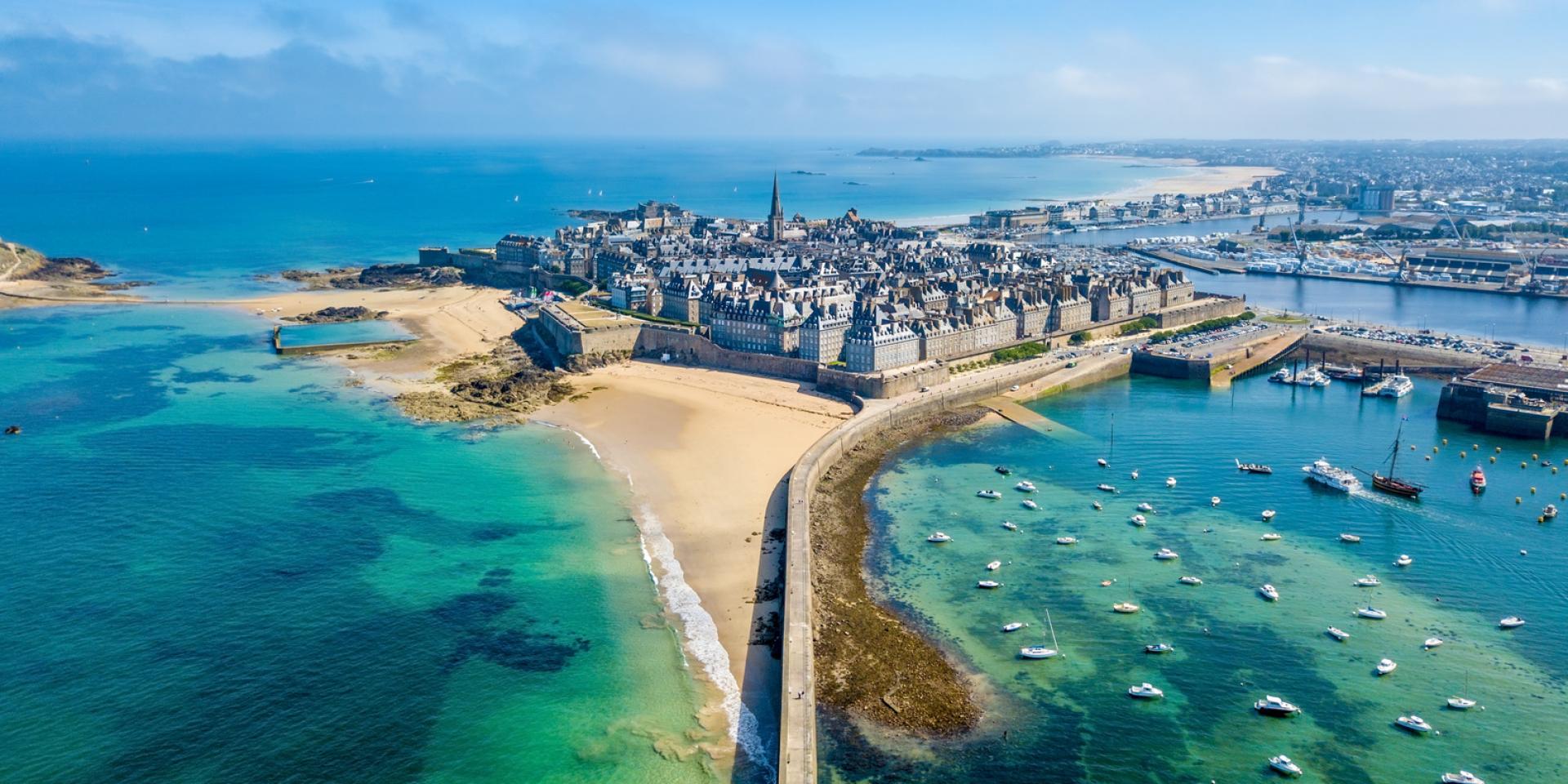
The must-sees of the Corsair City | Saint-Malo – Mont-Saint-Michel Bay –  Tourism
St. Malo Tourism

My zine is about the people, buildings, and history of St. Malo. I noticed after editing this images how the people were behaving, exploring together and learning about the history of the town as we were, peeking into small rooms inside the towers placed around the castle walls, looking over the wall at the vast ocean in front of them, fascinated by the views and exploring the maze of cobbled streets around them. I wanted to present the people as they were, going about their daily lives in the street, sat in a park with their dogs and children. As my inspiration for this trip was Cartier-Bresson’s street photography, I didn’t want to interrupt a single moment by stopping someone to ask for their photo or standing in the middle of the road; I wanted to blend in and catch people in a moment that portrays them naturally and uniquely. One of the subjects from my photographs that I’ve become primarily interested in was the man sat on the side of the street with his dog, a man I assume to be homeless. I feel that those images perfectly represent selfless behaviours that people often have whilst struggling for money or food – something that I relate to on a deeply personal level – these people don’t believe, or want to believe, that they’re suffering enough to not help another person or animal, especially one that they love and care for, much like the dog. I’ve noticed quite a lot that with homeless people or people on lower or no incomes that they truly give their all to support and provide for their loved ones over themselves, like how a parent should for their children, and it’s something that really strikes me when I see it.

TripAdvisor

I also focus on the architecture, both new and old, in the town, as I find the older-fashioned buildings to be something that seems quite reliable, created from stronger, longer-lasting materials that outlives the cheap, mass-produced materials often used in construction today. I captured images of the structures that really took my interest, such as the hotel in one of the photos I plan to use. I felt attracted to the building’s personality, it was something that felt quite homely to me as a welcoming place to stay that had stood the test of time, playing a small part in the lives of every guest that entered, providing them with a place to stay, eat, and recover from their day of travelling and exploration. Among my other images I found myself engrossed in the strong, geometric architecture created from thick stone bricks, encasing St. Malo and protecting it from the outside world. I’ve researched the town and learned about some of it’s history as practically a home base for privateers, government-sanctioned pirates that were permitted to plunder from foreign governments and ships they found on the seas, before sailing back to their safe haven, the small port town. The way the buildings are placed creates a sense of this, that it was a hideout for a lot of criminal activity, with cramped alleyways and large clumps of houses stuck together on every street. St. Malo was known for its incredible defense against attackers with its thick walls and battlements at various vantage points around the walls, which is a key reason for its destruction in WWII, when planes were commonly in use, and an easy bypass over the looming walls to bomb the town, taking a powerful stronghold from the French and allied troops.

I plan to create this narrative by starting with the architecture for a 400~ word segment before moving onto a two separate segments about tourists and the relationships between people and their loved ones.

Zine – Research + Analysis

For my zine, I feel that my photographs from St Malo suit a more old fashioned style of photography, due to the timeless, old-fashioned architecture present throughout the town. I also think this style helps imitate the work of Cartier-Bresson, who was the main inspiration for this trip, which, especially with my images of the old buildings, is prevalent as in influence in my work there.

Henri Cartier-Bresson – 1932

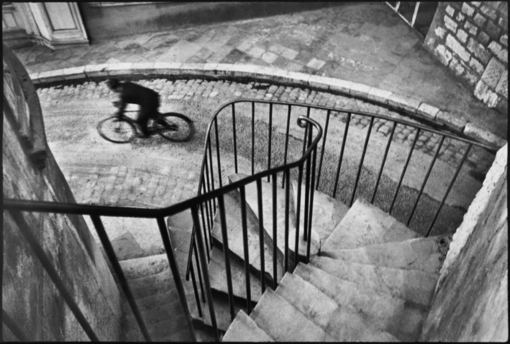
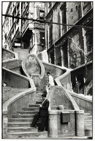
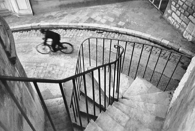
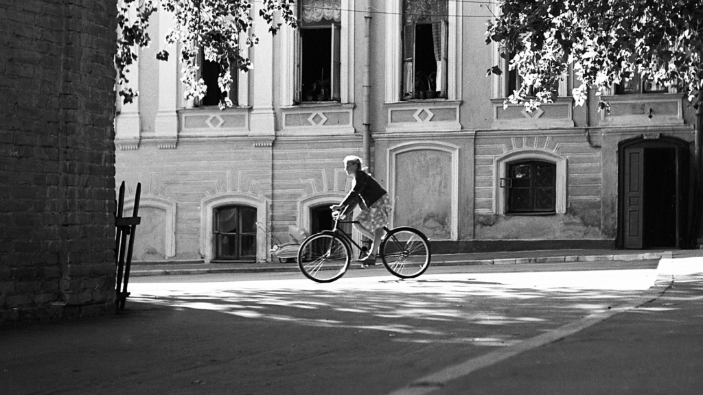
Cartier-Bresson’s work is carefully constructed using leading lines and different focal points to easily guide a viewer’s eyes across his images, such as in this photograph, one of his most iconic pieces, the darkest tones – the handrails at the top of the stairs- smoothly bring your attention to the blur of a cyclist passing through the scene. Cartier-Bresson’s use of strong geometric shapes in this image in particular build onto the composition, the sharpest, most rigid shapes dominating the foreground.

Dmitri Tcherbadji – Monochrome

I’ve also spent time looking through various zines both online and in the classroom, each with their own unique styles and formats, and I plan on utilising the page fully for my images, completely filling each page and using other images at lower opacities as a background for some writing on a few pages. I’m interested in a minimalistic approach to my zine, which I hope to explore in this task. The title that I’ve come up with for my zine is going to be ‘malo.’, which I believe suits the minimalistic style that I want to aim for in my zine.
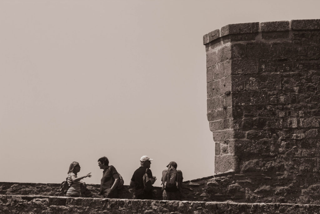
Adobe InDesign – Double Page Spread

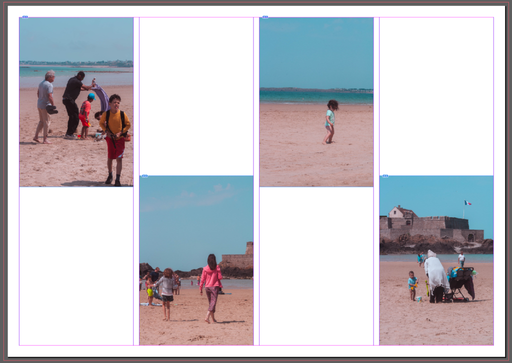
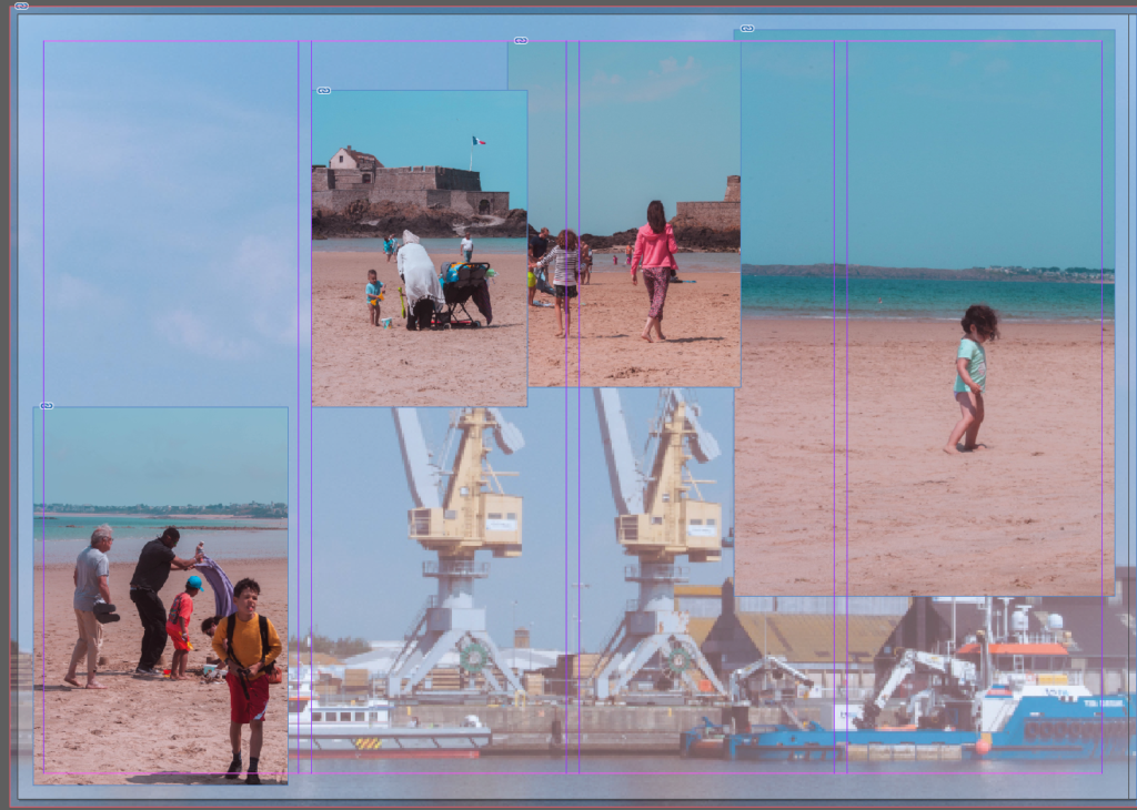
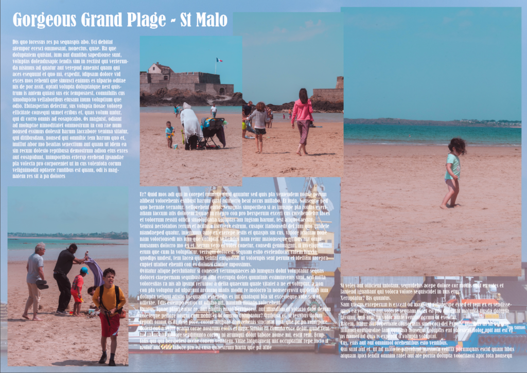
Using Adobe InDesign, we learned how to set up a double-page spread using various tools on the program. With a few of my edited images taken in St. Malo, I attempted to organise them into different layouts to create a composition that I was happy with, and that, with added text, would make for an excellent descriptive piece on the Grand Plage – the beach outside St. Malo.

I played around with the organisation of the photos until I found one I liked, and experimented with using another image of mine as the background – lowering the opacity to bring more focus to other media on the spread.

After coming up with the title Gorgeous Grand Plage for the double-page spread, I added some placeholder text to see how it would look with a description. We then printed our spreads off and peer-assessed each other as a class.

I’m proud of the spread I put together in the short time that I had, but I think I could develop this further using different layouts and experimenting with more tools in InDesign.

St Malo – Field Trip

Visit Saint-Malo | Brittany tourism
– Brittany Tourism

As a group, we travelled to St. Malo to test our abilities using Cartier-Bresson’s “decisive moment” technique, taking part in live street photography throughout the town for the day.

I ended up taking hundreds of images over the 5 or so hours we spent there, covering different areas such as the castle walls, the restaurants, and narrow alleyways, most of which captured the bustling community at St. Malo at its peak.

Once I’d sorted through the larger half of the photos, I gave my best-unedited photographs a star rating on Lightroom Classic, only keeping the highest-rated images for editing.

After editing a small portion of the photographs, I was already left with a wide range of compositions that a few I believe capture the concept of the “decisive moment” perfectly, and imitate Cartier-Bresson’s style. I think this trip was a great opportunity to take a large amount of images that I’m definitely going to be using for projects in the future, and a chance to develop my skills and really focus on my weaknesses in photography.

AI – Photoshop (Beta) Experiments

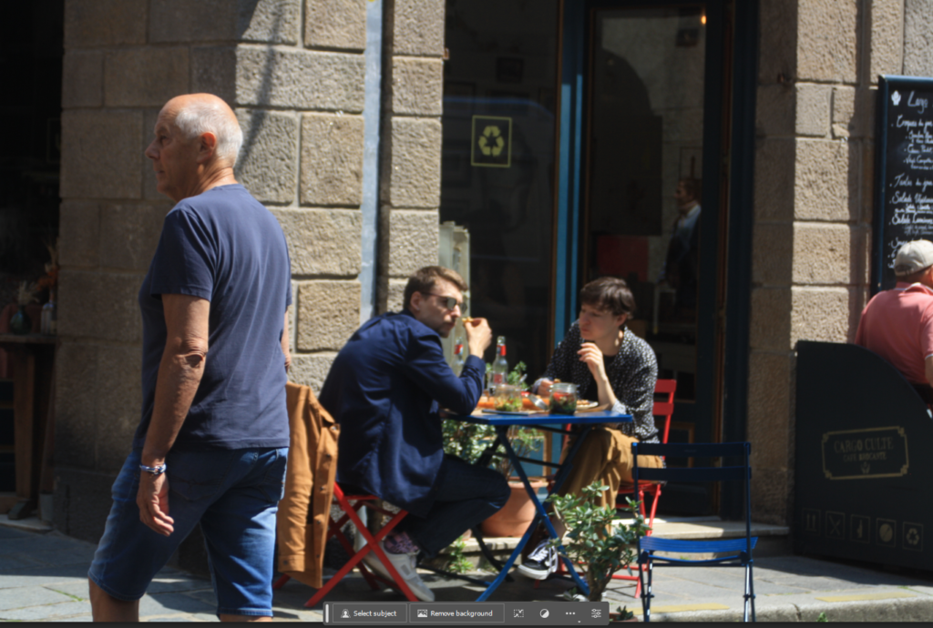
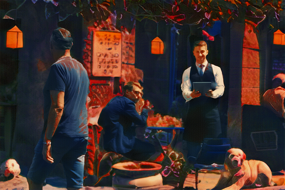
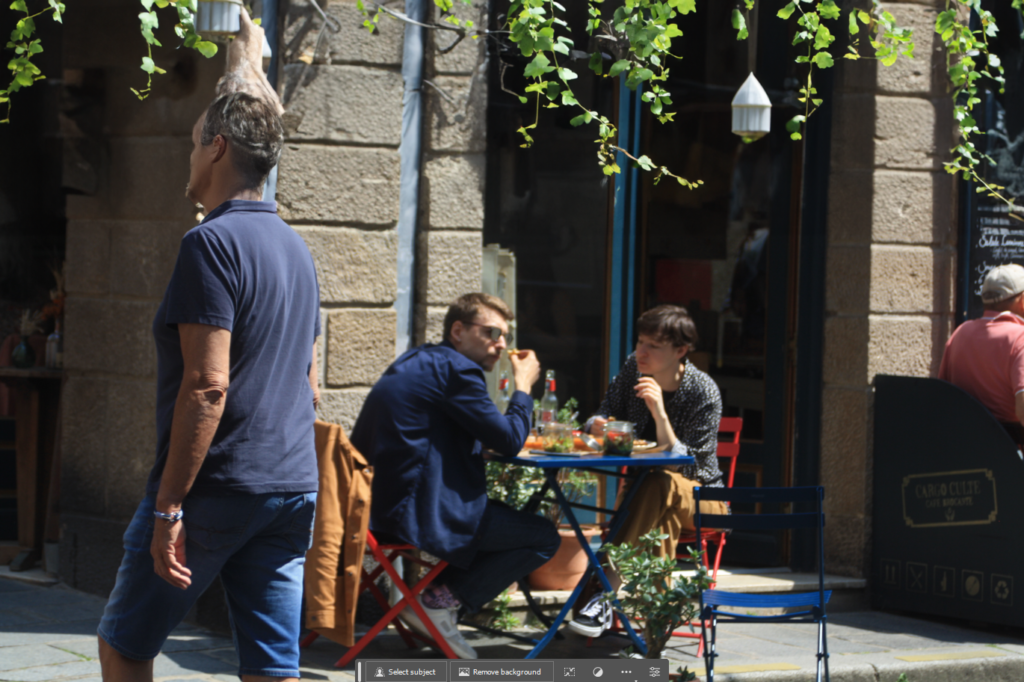
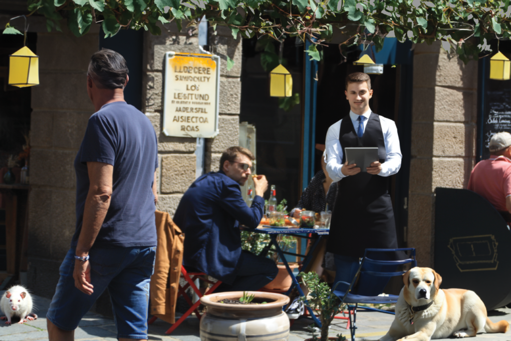
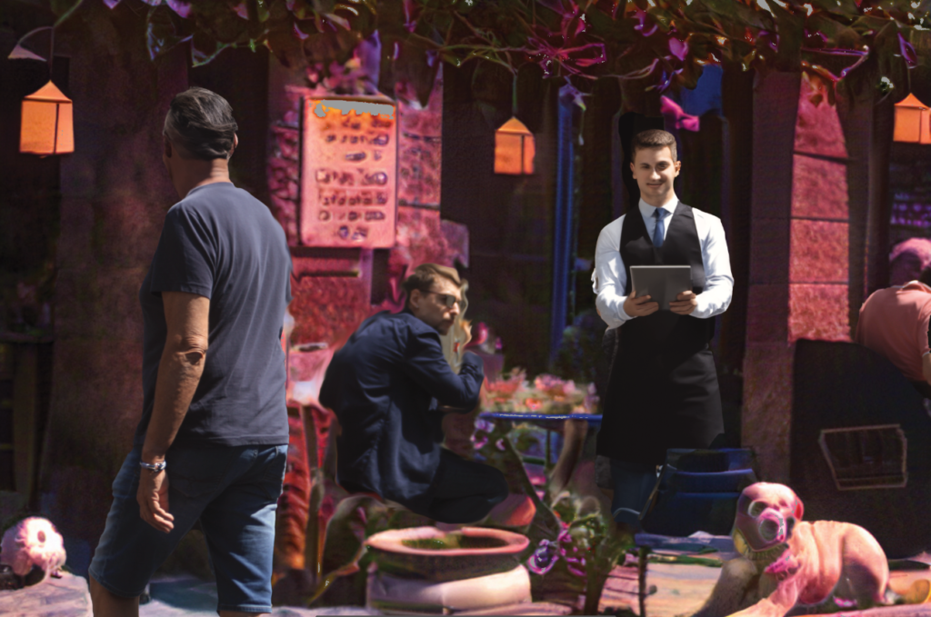
In class, I experimented with Photoshop’s new beta feature – generative fill. To use this, I took an image from the St Malo trip and wanted to see what I could add to it; to distort it whilst still maintaining some of the reality of the original photograph.

prompt – hanging vines and lanterns (preset 1)

First, I went with adding something that would suit the scene, using the prompt hanging vines and lanterns over a selected area at the top of the image. At first glance, I was shocked to see that it actually looked real, and noticed how it was naturally blended into the environment.

prompts – hanging vines and lanterns (preset 3), dog lying down, plant pot, waiter, signpost, rat

I changed the available preset for my first prompt to the third, noticing the vines were a darker, deeper green, and the lanterns were yellower. I implemented a dog lying down in the bottom right, which, after a closer look, didn’t look too believable. I followed this with a plant pot and a waiter to suit the restaurant setting, which suited the scene quite well, until the AI had generated the waiter’s face; a nightmarish, strange looking visage, that I attempted to fix for a good few minutes. After I gave up with that, I placed a signpost on the wall, and selected the preset I wanted, before adding a rat into the bottom left corner, which surprised me by how real it looks.

neural filter

Experimenting with neural filters, another new addition to the beta, I found this one that manipulated most of the image into dream-like hues; purples, reds, and blues.

second neural filter

On top of the first filter, I decided a second could benefit the composition, and leave it smoother overall. I enjoyed the tones it left me with once again and thought it would be best to leave it at that for now, as I wanted to continue doing this with some other photographs.

Overall, I believe that these new features in photoshop are perfect for adding a surreal element to my photos, and it’s definitely something I want to continue using in the future.

AI – Nostalgia (Field Trip)

Playtime by Will Lakeman — ArtHouse Jersey

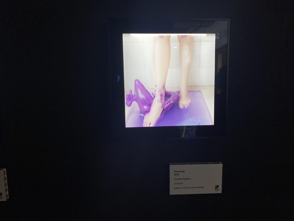
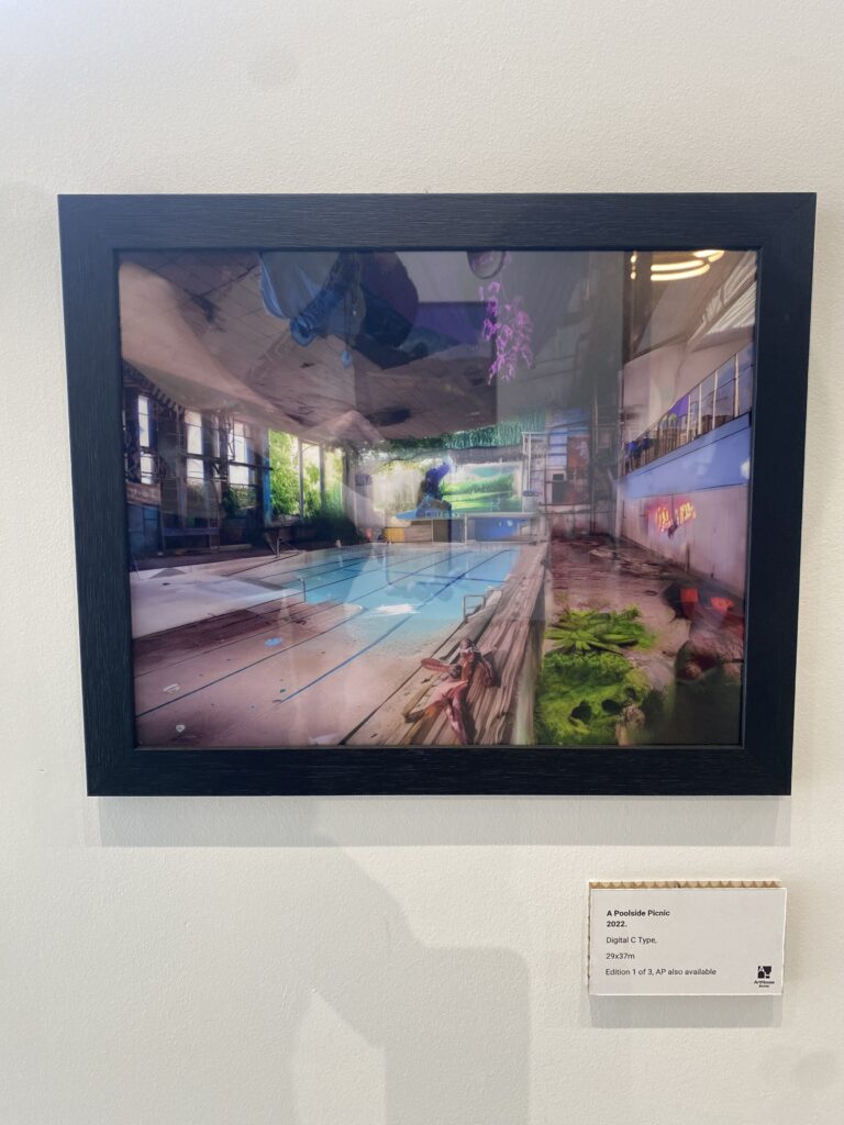
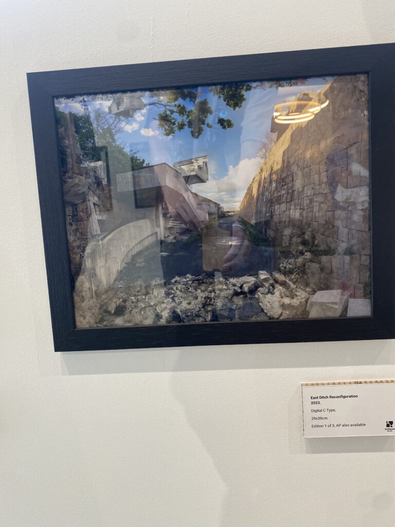
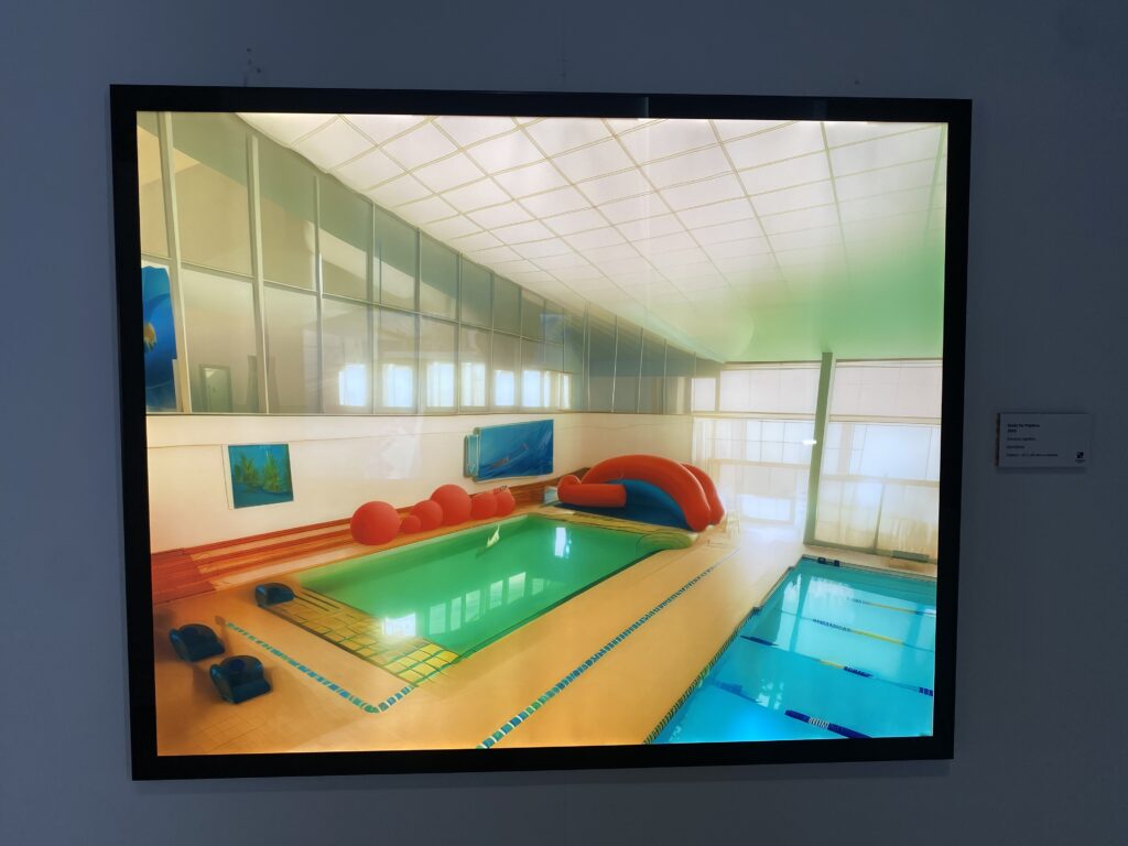
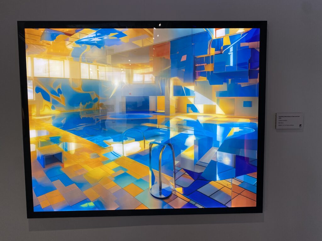
To help us understand the processes behind AI art and how we can use it for this unit, we went down to Will Lakeman’s AI art exhibition at ArtHouse Jersey (Capital House). Lakeman described his intense obsession for Fort Regent in its prime – from when he was a child – and the profound impact that it’s had on him; his goal being to recreate the way he saw the Fort through his memory, stating, “I have tried to picture things not as they were, but in the strange ways they appear in dreams and hallucinations.”

Lakeman had various messages hung in different areas on the wall describing his fascination with Fort Regent in large detail, which described his own memories and his experience with autism, that also gave brief descriptions about each section of the exhibit. I chose to scan through them to gain some extra context to the pieces, but I mainly wanted to interpret his work in my own way, as Fort Regent also played a small part in my own childhood, although not as big a part as he claims it did in his youth.

A collection of pieces were displayed in a dark room in the corner of the exhibition with backlighting behind each image to bring out the vibrancy and details. I found this section to be very dreamlike and it almost took me into a trance-like state and I was engrossed in these works. They all felt quite familiar to me, like distant memories or deja vu. There were around 10 small photographs in this area that were all completely unique in composition, colour palette, and tone.
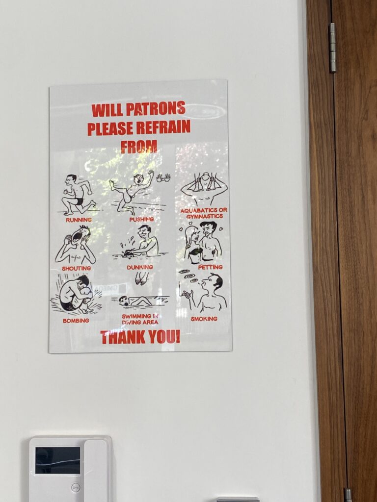
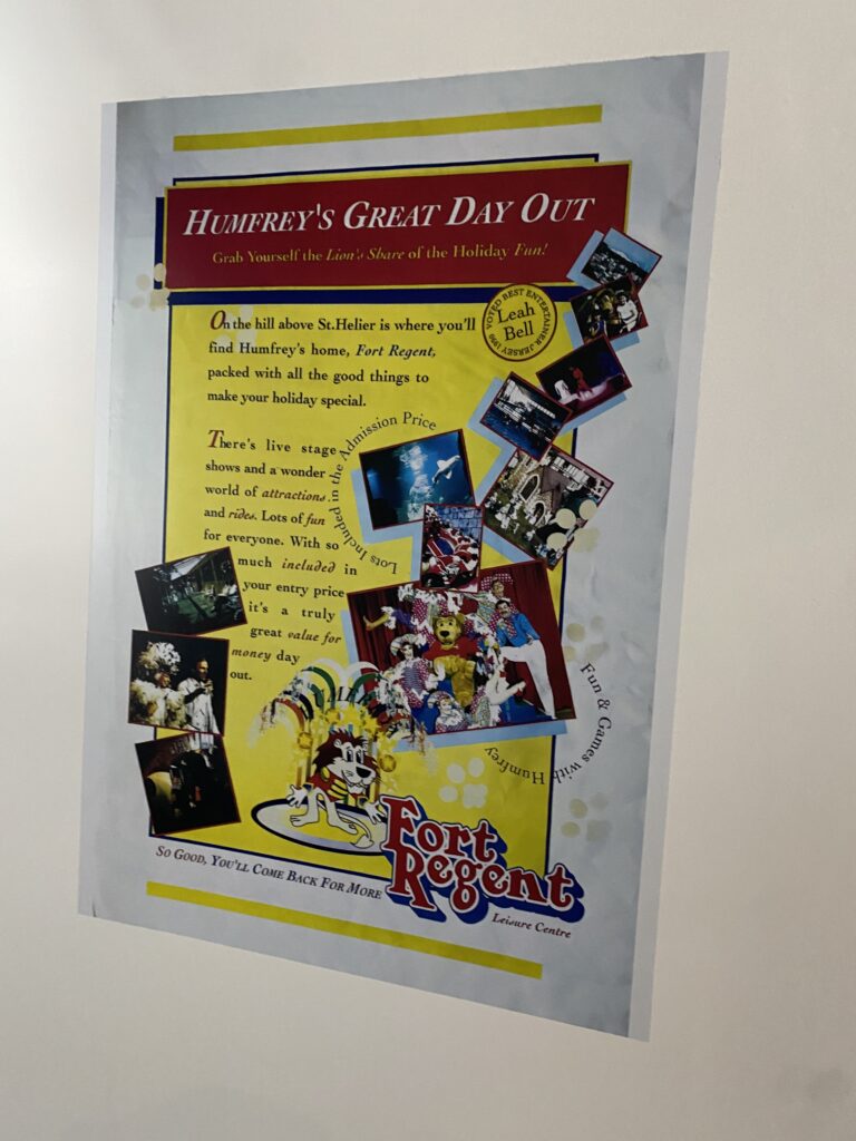
There were a few signs from the different attractions that Fort Regent had during this time period, which I assume are copies that were touched up and reprinted for this exhibition. The characters and styles these posters are presented in invoked a sense of nostalgia from my childhood, from hotel pools on holidays and tourist attraction advertisements I’ve seen around. It wasn’t as strong an attachment as I felt with some other pieces that were in this exhibition, but nonetheless I still found myself associating with it.

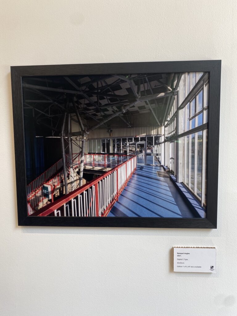
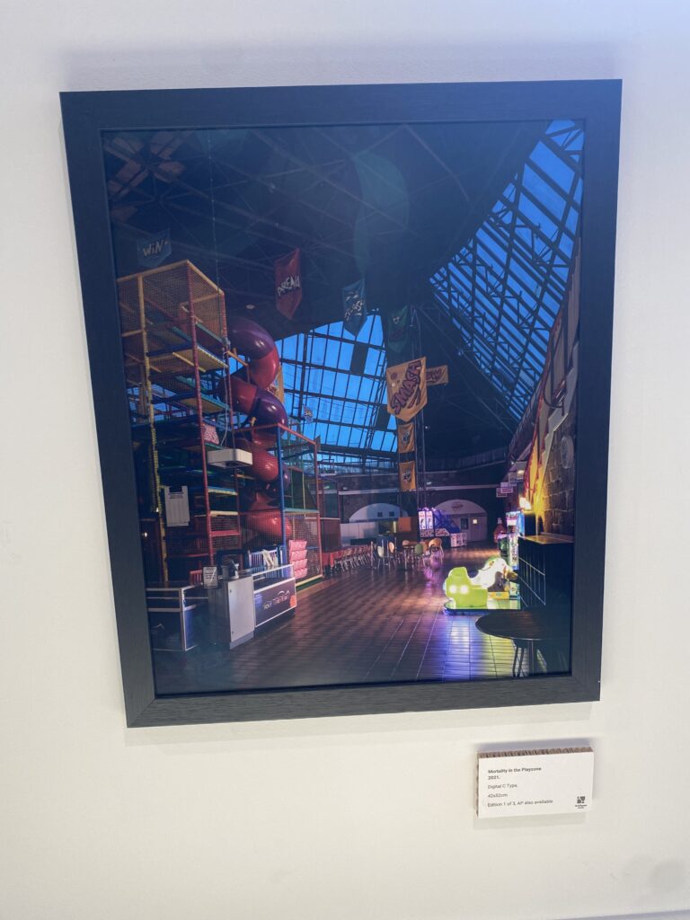
Along a large section of the walls in the exhibition were these pieces varying in sizes of different parts of the fort, such as the old pool, the indoor balcony on the upper levels and what is now (and maybe still was) the play zone for young children. I felt a strong connection with the play zone image in particular, as it was somewhere I spent a lot of my early years playing at, despite how distant and vague these memories now are. I understand the reasoning for Will Lakeman’s use of saturated colour palettes with AI to recreate these scenes because that’s how the world seems when you’re a child; a huge, colourful place to explore and learn about where everything is unique and new to you.
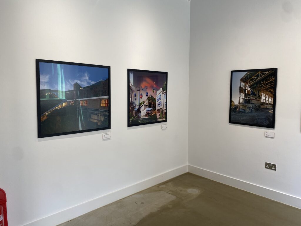
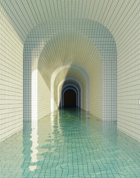
There were a few more pieces displayed with backlighting in one of the final sections of the exhibition, mostly featuring pools and gorgeous blue colour palettes. The image displayed on the left reminds me of the swimming pool at Les Ormes, the place where I first learned to swim when I was around 5 years old, another place on the island that brings back a lot of memories that I probably glamourise myself. The central piece I didn’t really feel too much association with, but like with a lot of the works in this exhibition, I oddly felt like I recognised this fabricated scene, despite the fact that it was loosely based on a real place, I find it interesting considering it’s somewhere that hasn’t been around since long before I was even born. The image on the right is somewhat similar, although I feel more like I’ve visited this place in a dream or somewhere vaguely similar in person, the only thing I can think of that slightly resembles this being the wave pool at Aquasplash.

Lakeman’s exhibit definitely plays on the concept of liminal spaces, which is something I’ve covered before, but I’ve not had as extreme an association with images surrounding the topic I’ve looked at before this. This exhibit has brought about the eerie, but nostalgic feeling of these empty places that should be full of people, but with somewhere that I genuinely feel I’ve visited before. This exhibition presents one of the most relatable experiences I’ve had looking at artwork so far, and I think AI is a perfect tool for creating art about things that are so hard to describe and put onto a canvas.
Henri Cartier-Bresson – The Decisive Moment

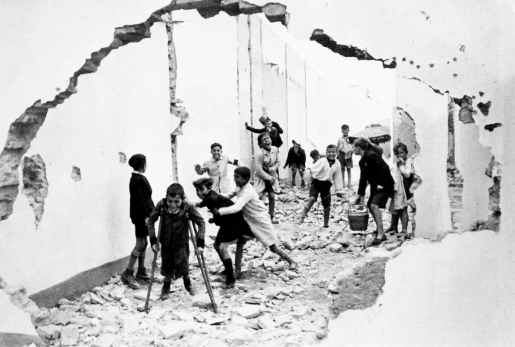
Henri Cartier-Bresson – Seville, 1944

Henri Cartier-Bresson was a French artist and street photographer, known for his heavily popularised concept of “the decisive moment” within photography. It refers to capturing a spontaneous event in a photograph; this event being what gives the image its character as a piece. This ‘event’ could be anything, from a plane flying over a house in an image to cyclists riding through the streets of Hyères, France in one of Bresson’s most famous photographs, aptly titled “Man cycles down street.”

Henri Cartier-Bresson – Man cycles down street. – Hyères, France, 1932

The decisive moment brings an element of action to an image – providing it with a narrative that it wouldn’t have otherwise as a static shot of a staircase on an empty street.

This is reflected in some of my own images, such as this one above. The moving car on the road adds action to the composition and acts as a focal point, further drawing in a viewer’s attention. With this being said, I hope to use Bresson’s style as a key inspiration for when we go to St. Malo.

St. Malo – Moodboard

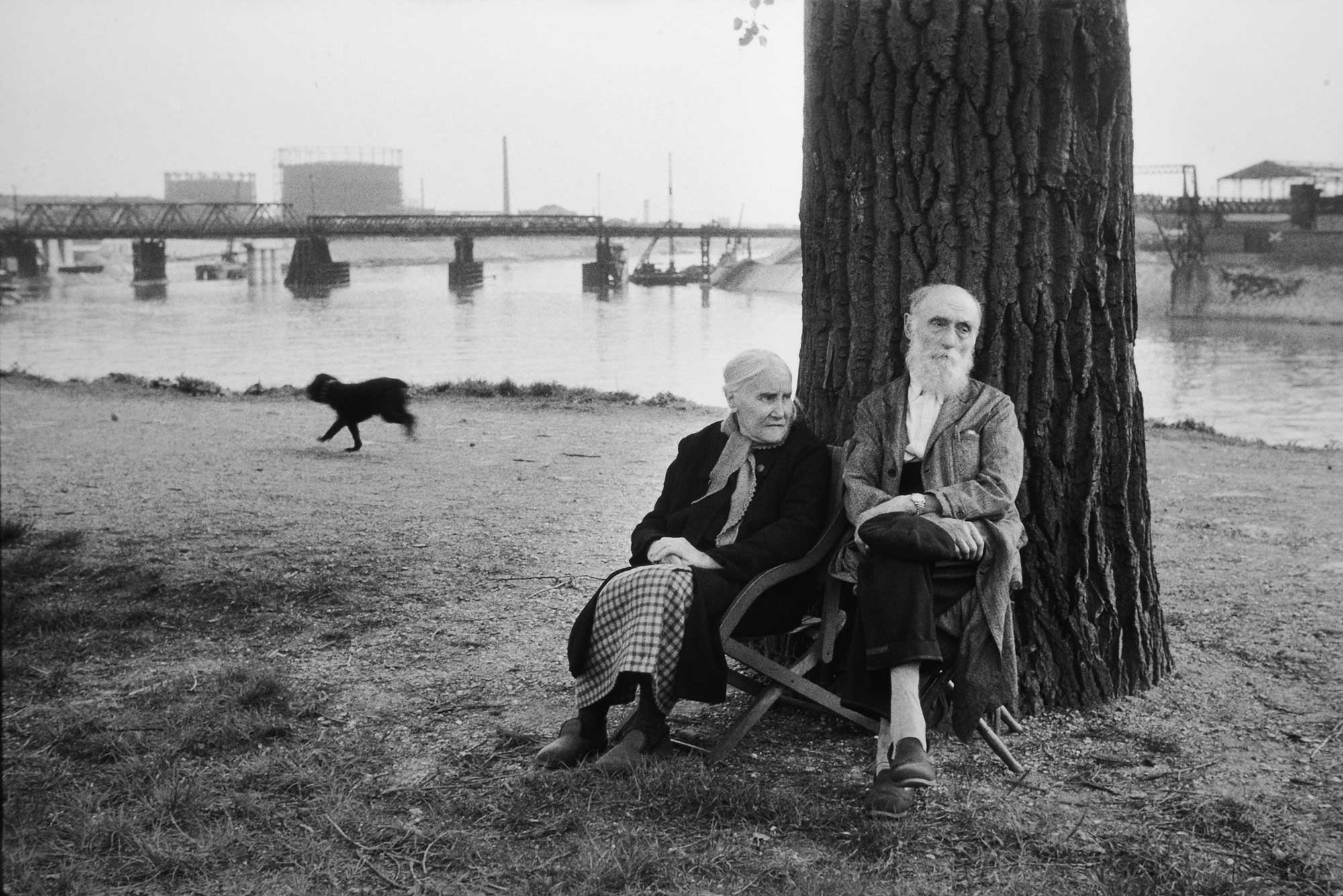
These photographs were taken by Henri Cartier-Bresson, who frequently visited St. Malo for his photography. I plan to take inspiration from his strong compositions of geometric shapes to use in my own images.

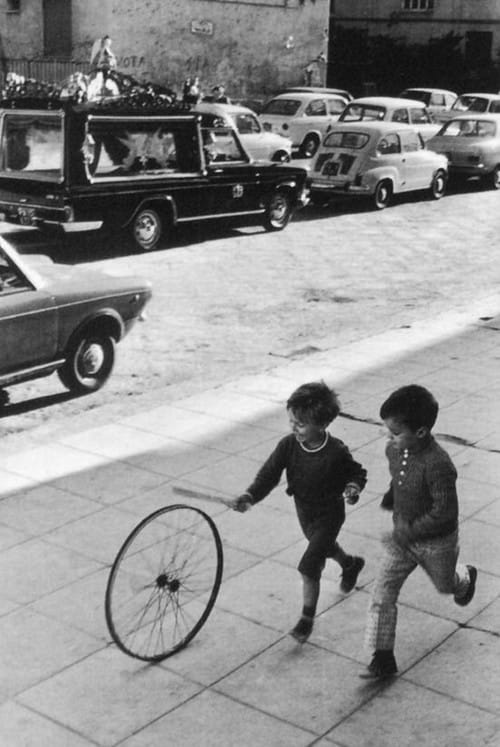
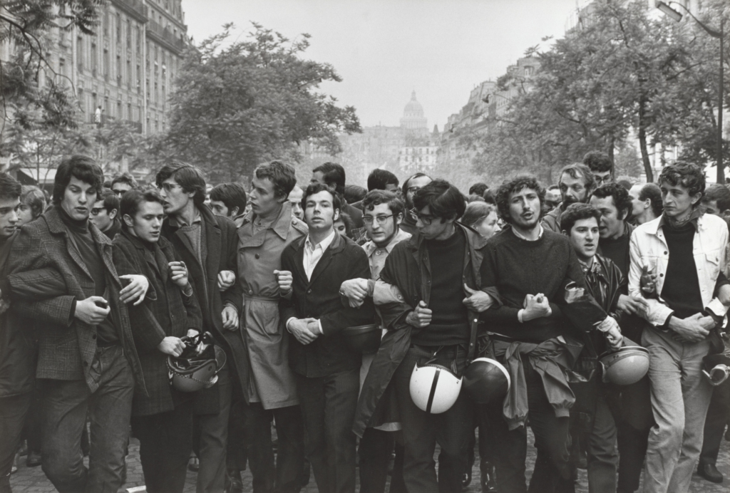
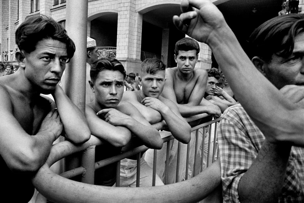
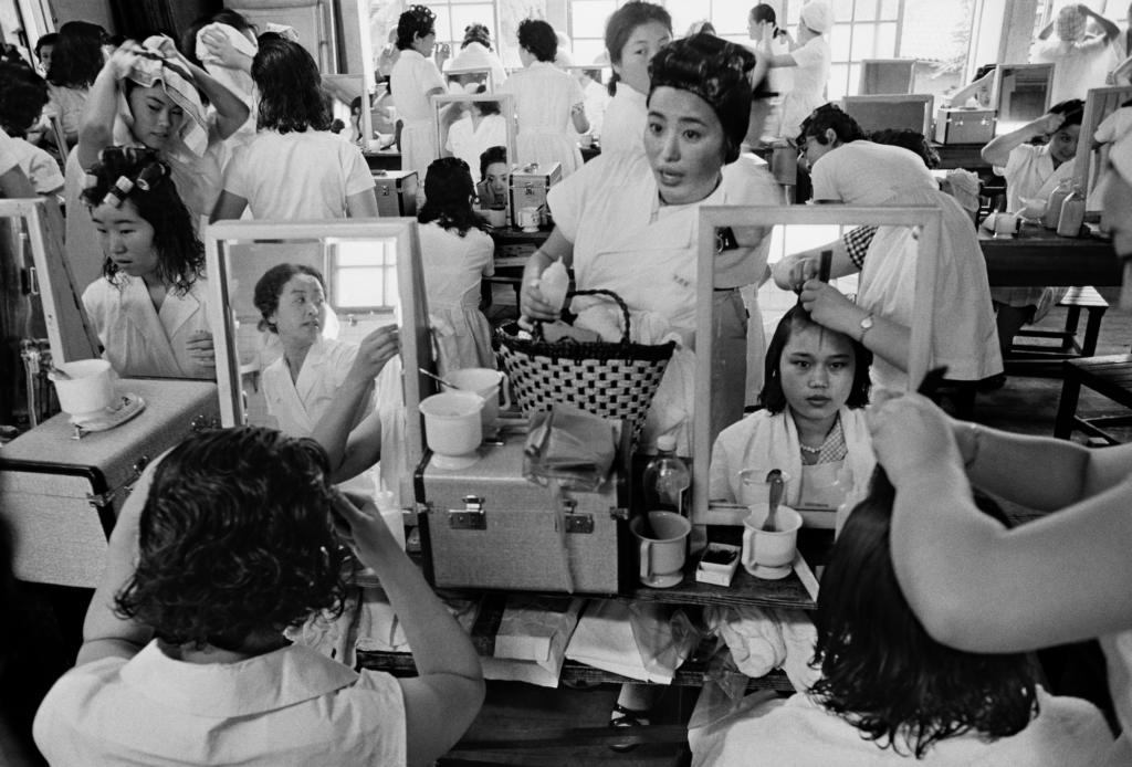
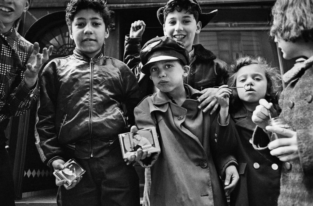
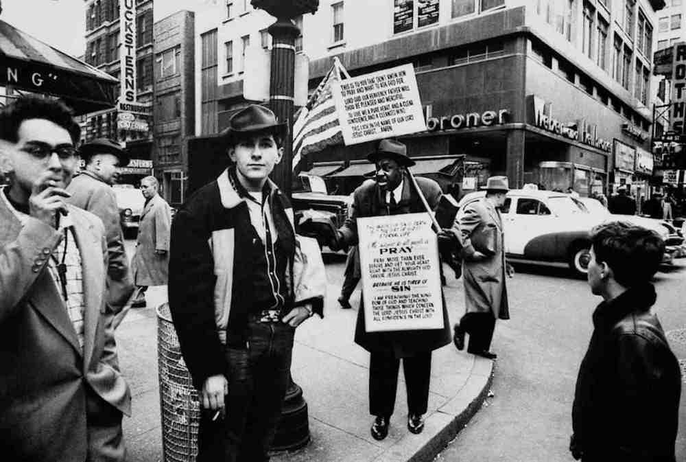
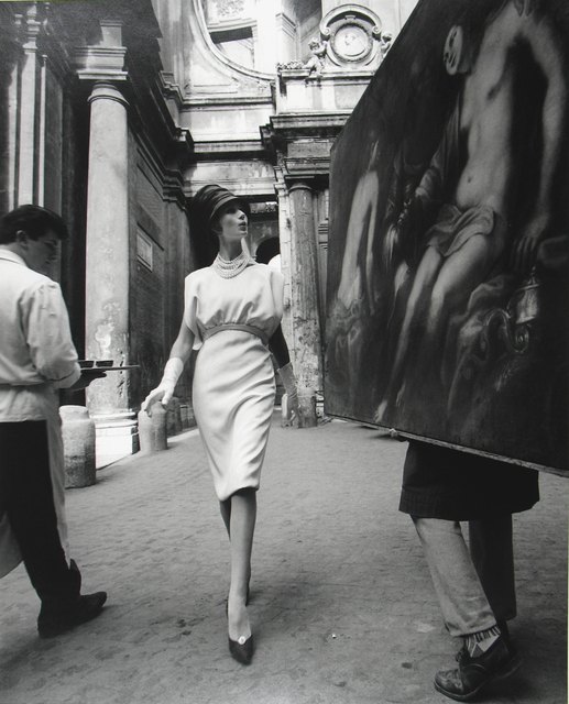
William Klein was a street photographer who preferred to get up close to his subjects, often in crowds in busy streets. I want to play around with monochrome photographs, and imitate the strong contrasts featured in Klein’s work.

I find both of these artists interesting and I plan to use both of their styles in my own images on this trip. The geometric shapes featured across the battlements and archways of St. Malo should make for very unique pieces, and I think that the people around the town could make for some interesting portraits too.

Nostalgia – Moodboard

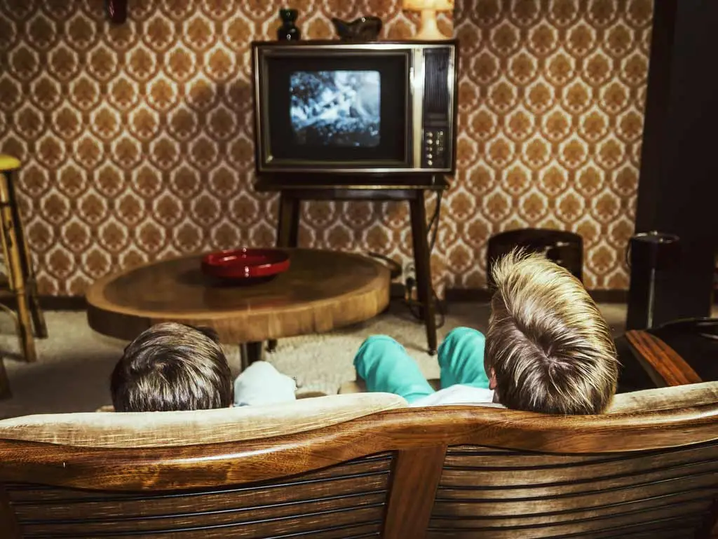
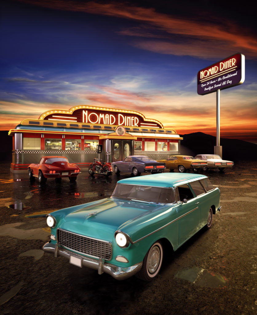
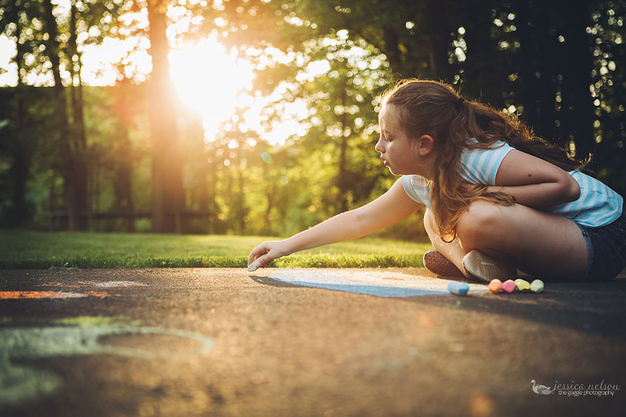
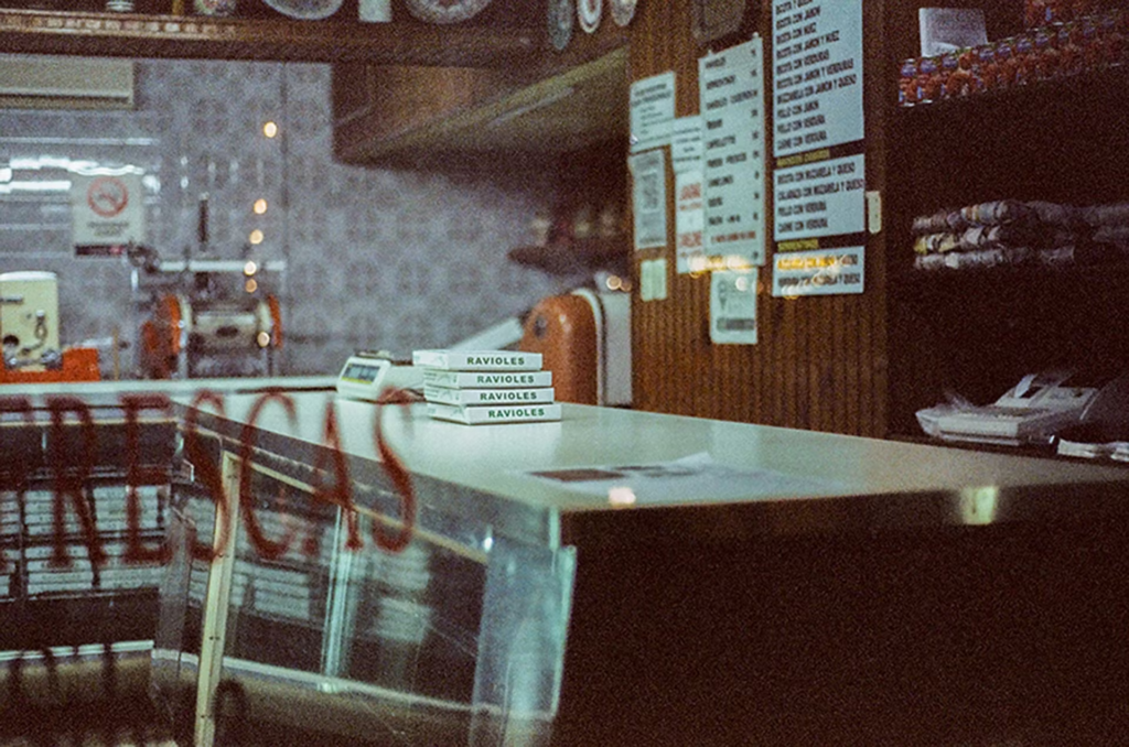
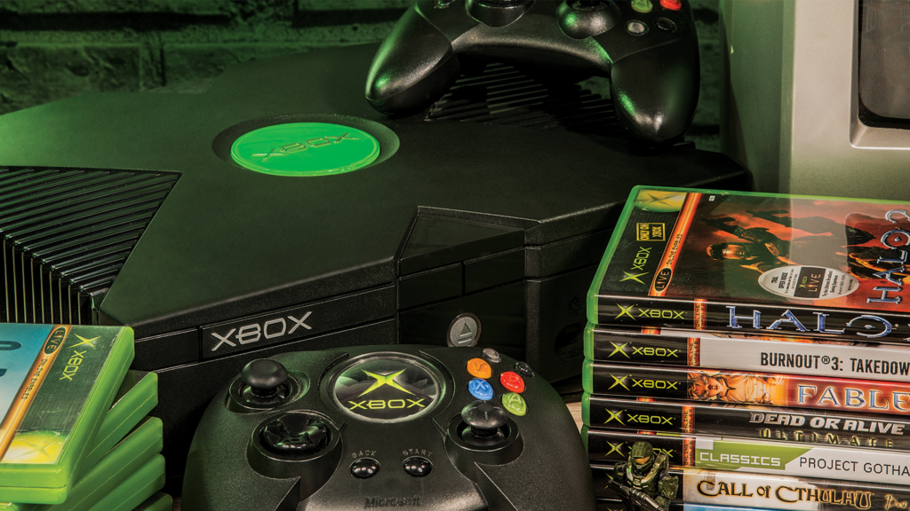
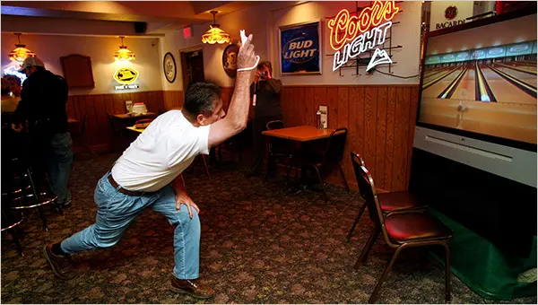
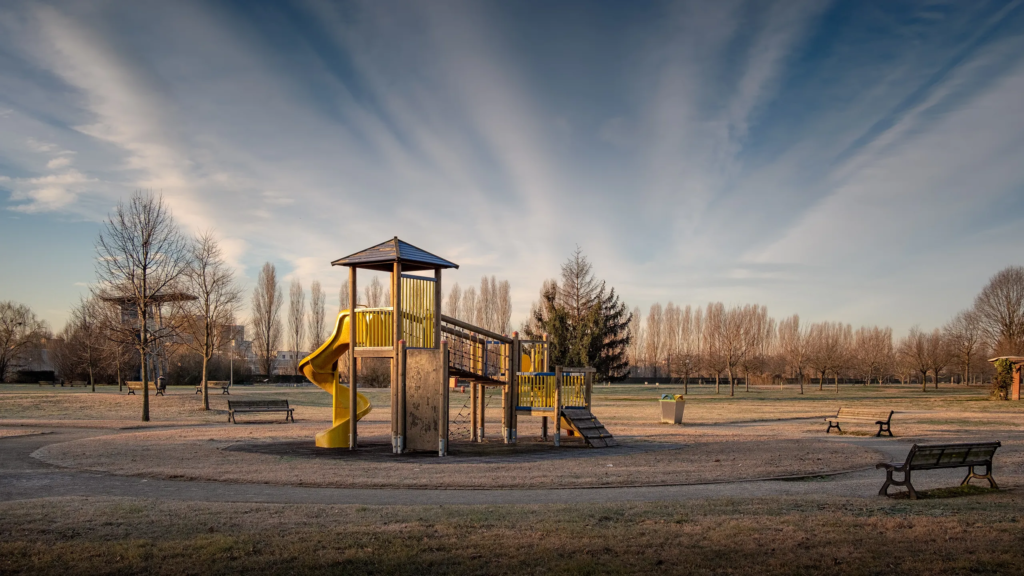
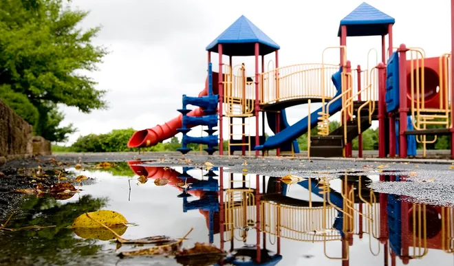
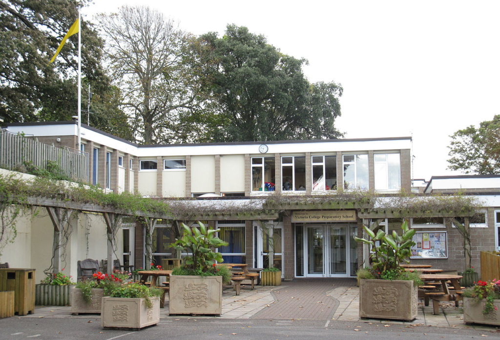
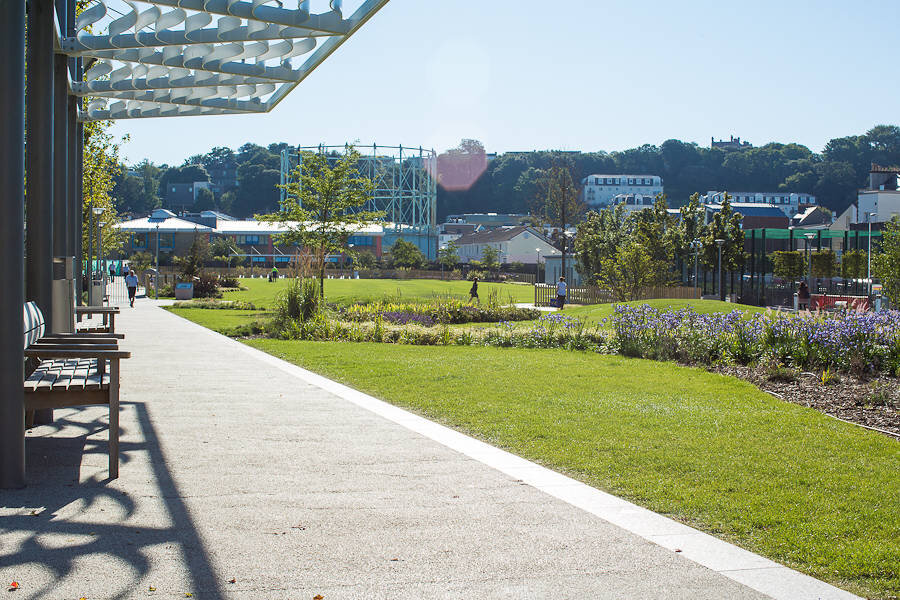
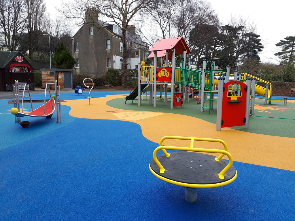
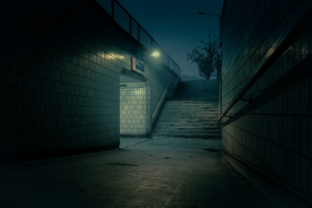
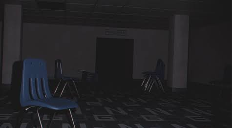
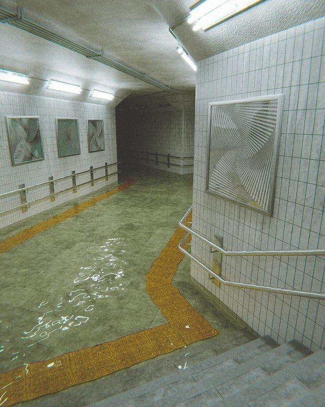
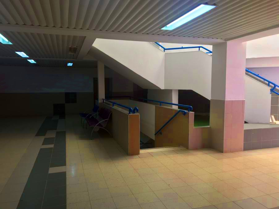
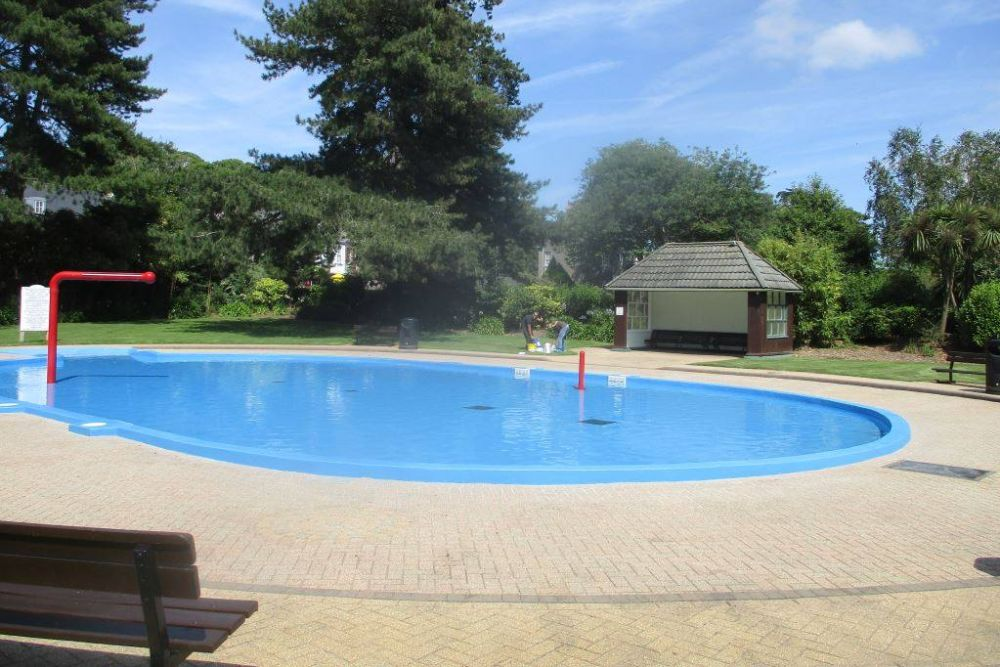
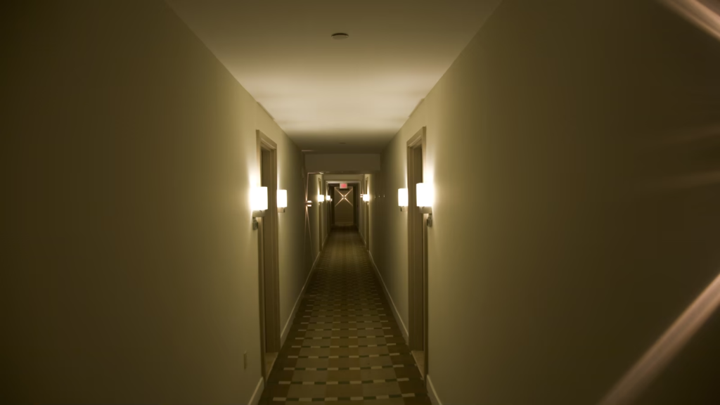
Through Google, I found these images that capture a basic feeling of nostalgia; a yearning for the past. The concept of nostalgia as a whole derives from a person’s youth and a blissful ignorance of the less positive elements of childhood.

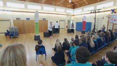
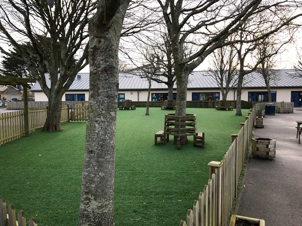
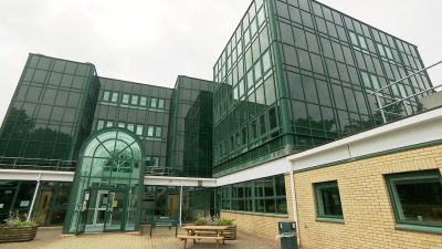
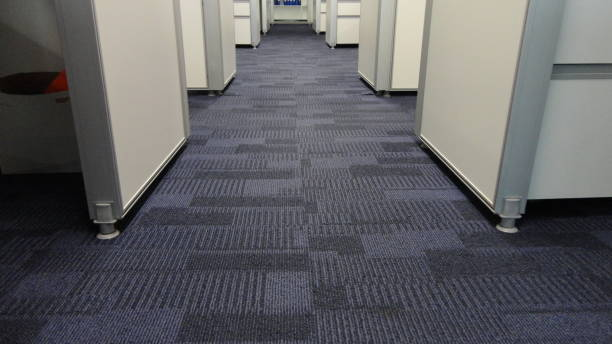
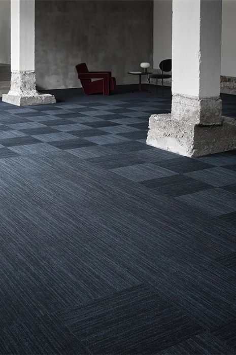
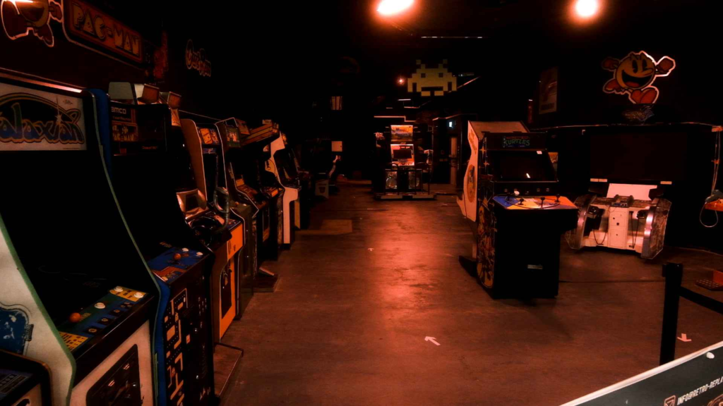
This set of images comes from places and things I spent a lot of time around as a child, from the early 2000’s gaming consoles to the different schools I went to, the strange feeling that comes with commercial carpets often found in offices or larger buildings, and various playgrounds. With this short project, I hope to recreate some of the memories and connections I have with these photographs using Will Lakeman as a key inspiration.

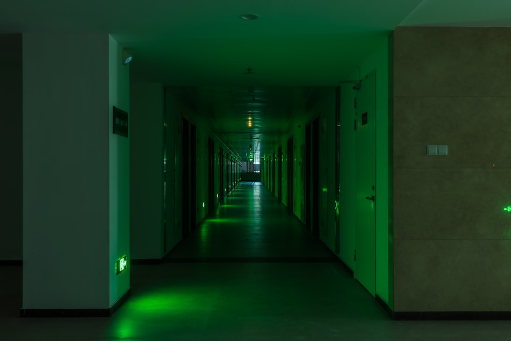
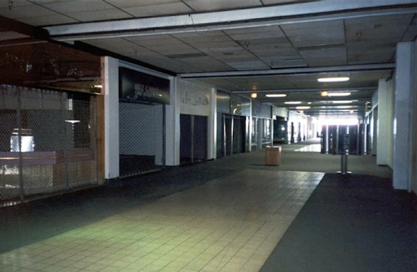
I’m also highly interested in the concept of liminal spaces – transitional areas that are typically full of people, but in this instance, aren’t. I think that it has a profound association with memory and the human mind’s ability to almost tune out the existence of strangers as we walk through populated areas – something I’ve experienced after trying to remember the faces of people that I’ve simply walked past – maybe it’s that we struggle to remember those we have no connection to.