All posts by Emily Stubbs

Filters

Author:
Category:

essay; draft

  • Essay question:

How do Justine Kurland and Jim Goldberg portray childhood differently through their work?

  • Opening quote

Photographs really are the experience captured, and the camera is the ideal arm of consciousness in its acquisitive mood.‘ Susan Sontag (1971), On photography.

  • Introduction (250-500 words): What is your area study? Which artists will you be analysing and why? How will you be responding to their work and essay question?

For my project I am looking at childhood versus teenage life and how differently our lives look now in comparison to then. For my inspiration I looked at the artists Justine Kurland and Jim Goldberg and their contrasting portrayals of child/teenhood.

  • Pg 1 (500 words): Historical/ theoretical context within art, photography and visual culture relevant to your area of study. Make links to art movements/ isms and some of the methods employed by critics and historian. 

For my first paragraph i will research the differences between being a child and being a teenager and speak about how life changes between them stages.

  • Pg 2 (500 words): Analyse first artist/photographer in relation to your essay question. Present and evaluate your own images and responses.

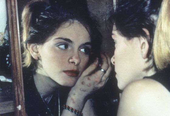
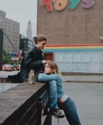
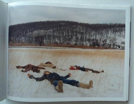
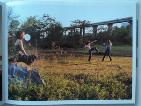
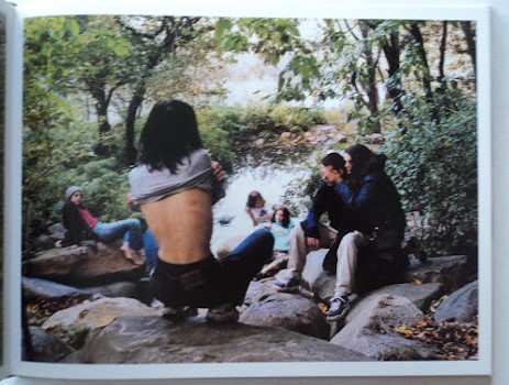
Justine Kurland is an American photographer known for her pictures of people in the American wilderness. This includes her work on runaways and her best selling book Girl Pictures which has a running representation of childhood and particularly girlhood and growing up as a female. She presents childhood as wild and exciting through her various images of runaways portraying their freedom and there is an infectious sense of nostalgia that these images provide. Personally i feel a connection to this book as I see myself and my friends represented through her portrayal of girlhood and the adventures/experiences that follow growing up as a girl.

  • Pg 3 (500 words): Analyse second artist/photographer in relation to your essay question. Present and evaluate your own images and responses.

Jim Goldberg’s work follows youths on the streets of California portraying the more dark and disturbing ways in which people have to live. In comparison to Justine Kurland, his images show the rougher side of life and portrays childhood/growing up as more of a day to day struggle for the subjects in his images.

  • Conclusion (250-500 words): Draw parallels, explore differences/ similarities between artists/photographers and that of your own work that you have produced
  • Bibliography: List all relevant sources used

Jim Goldberg

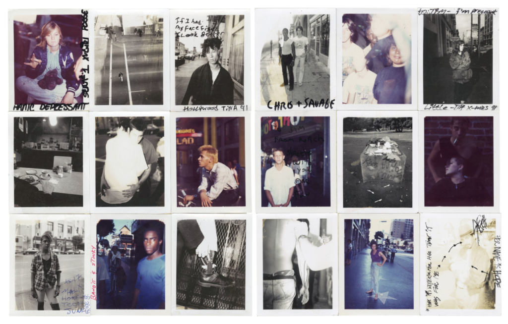
Jim Goldberg is an American artist and photographer, whose work reflects the neglected, ignored, or otherwise outside-the-mainstream populations. He is best known for his photography books, multi-media exhibitions, and video installations, among them: Rich and Poor (1985), Nursing Home, Raised by Wolves (1995), Hospice, and Open See (2009).

Raised by wolves

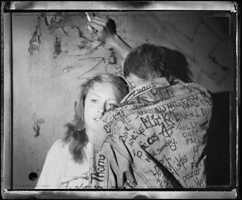
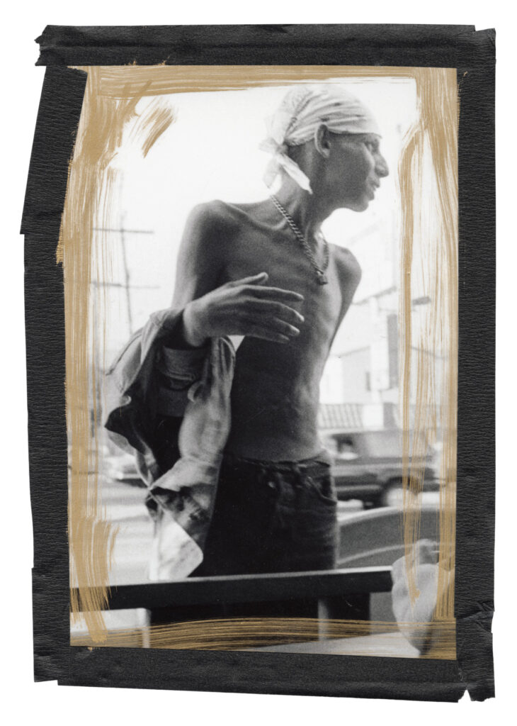
Jim Goldberg’s project, Raised by Wolves, saw him exploring the lives of a community of youths on the streets of California over ten years and follow as they live through addiction, abuse, and violence. He incorporates the subjects’ writings and illustrations alongside his images. Goldberg devoted much of his practice to honouring the people who fall into the latter category. His subjects are often troubled youths, who are otherwise treated as invisible by mainstream society and found inspiration when he bore witness to the chaotic reality of street life.

“I wanted to look at those people who were outsiders, like I was”

“When I thought of youth, I thought of my own teenagehood and childhood, and other people I knew who were often scapegoated, not appreciated, or not given a chance. The end result was trouble for them. I wanted to look at those people who were outsiders, like I felt I was.”

“It was done, mostly, on a Xerox machine. So, I duplicated that aesthetic. I added a few minor things, and decided some things could be in colour that weren’t in colour in the original edition, and sold it for a reasonable price.”

My interpretation:

Jim Goldberg looks at the lives of youths from a dark yet real perspective portraying the reality of these kids lives in a documentary form. The images are a representation of the people who have found themselves in these situations and have an overall grungy look.

This relates to the theme of nostalgia as its an overall reflection of what their lives have become and I’m going to follow a similar style when creating my own images by photographing a more urban lifestyle rather than a romanticized version of being a teenager.

Moodboard:

Photo analysis:

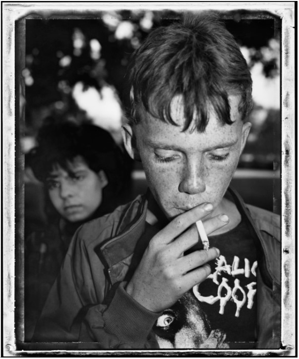
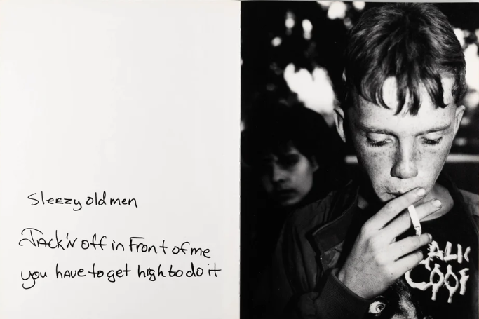
WEST HOLLYWOOD, Calif.—”Early Morning, Plummer Park,” 1989. Jim Goldberg took this image at a park where homeless outreach advocates give out free food, condoms, and services. This image captures a 14-year-old who had just come back from a bad trick with a Hollywood producer and is sore and bruised all over. He is having a smoke break before going out to turn another trick with the cigarette representing his loss of childhood and the sad reality he is facing. This photo is a close up of the subject with the background out of focus. The image is produced in monochrome representing the melancholy reality behind his loss of childhood as he has been forced to grow up too fast and fend for himself in ways no-one should have to resort to.

Justine Kurland

Justine Kurland is an American fine art photographer that first gained public notice with her work in Another Girl, Another Planet (1999). The show included her large c-print staged tableau pictures of neo-romantic landscapes inhabited by young adolescent girls. She also produced a series of images called ‘runaways’ inspired by her past experience with being a runaway when she was young which influenced her to find other young people in a similar situation and recruit them as models. In total, Kurland published 69 pictures of girls in her series “Girl Pictures.” The staged photos take place in urban and wilderness settings, with girls depicted as runaways, and show how they are hopeful and independent. Kurland has acknowledged the parallels she created in her work, specifically her competing desires to both escape and fight back; to document and allegorize; and to capture “vaporous abstractions” like the carefree freedom of her “runaway girls.”

She also published a book titled ‘SPIRIT WEST’ that is described as being neither reportage nor fantasy: rather a kind of disturbed normality. The beauty of the nature is overwhelming, but is regularly disturbed by an ugly viaduct or unsightly building.

“particular appeal of Ms. Kurland’s work is in its deadpan tension between the matter of fact and the mythic.” – Ken Johnson

Image analysis:

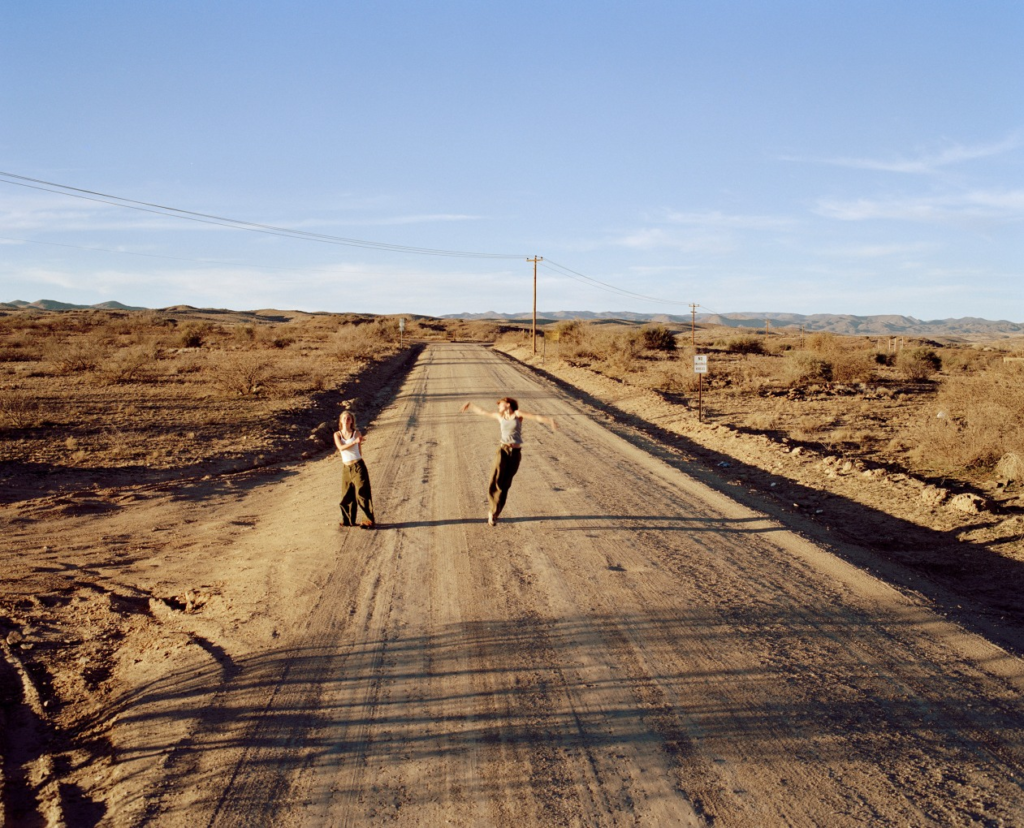
-Broadway (Joy) 2001

In Broadway (Joy) (2001), the camera is angled down on two girls as they dance on a desert road. The surrounding environment seems vast and endless with the only indication of society is the dusty road and the phonelines that stretch across the desolate landscape. Although they are surrounded by a barren and unpopulated area, which in comparison to they seem small, their energy fills the frame. One of the girls, on the right, is in mid air with her arms waving around, her blurred arms becoming like wings representing her found sense freedom. To create this effect, Kurland will have used a slower shutter-speed to capture that sense of that movement and create an accurate response of the emotions they are showing through their dancing. Despite their faces being unclear, we can tell that they are happy as their body language displays this and overall this image perpetuates joy.

Moodboard + Mindmap

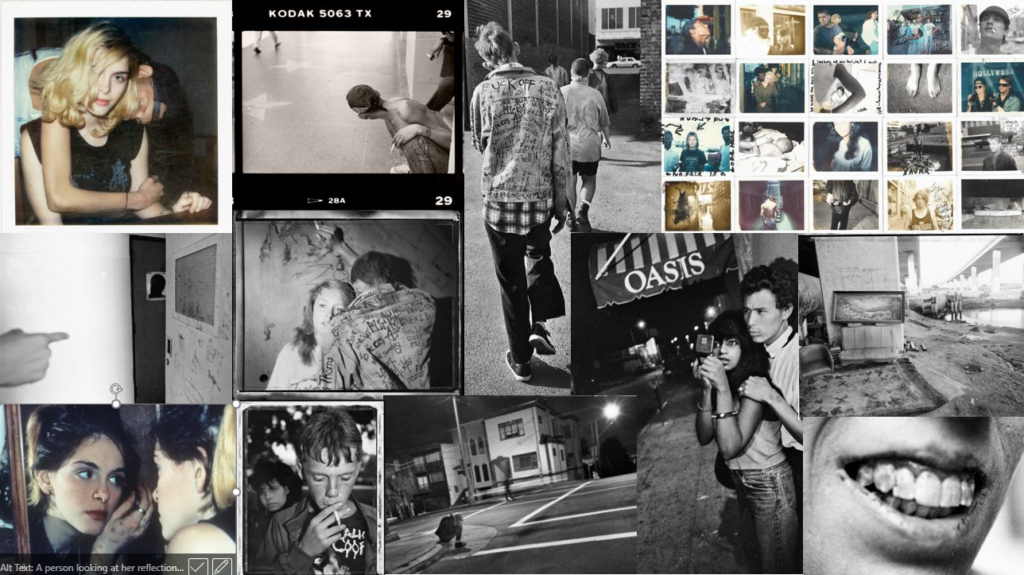
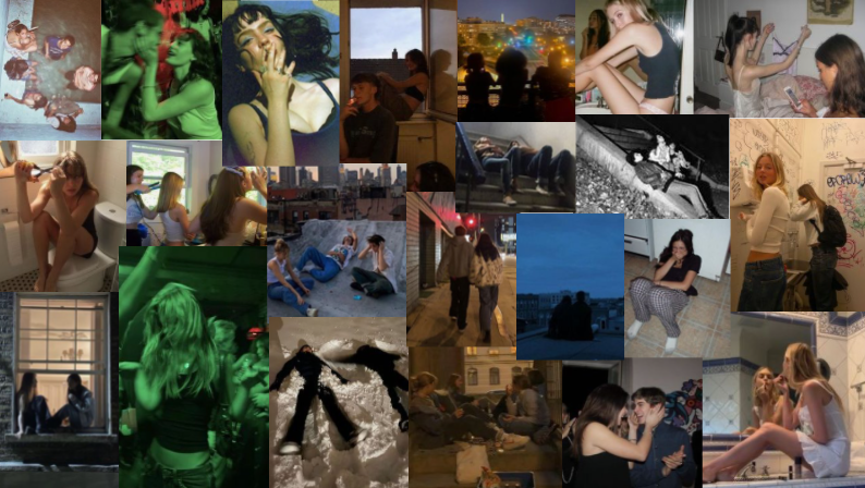
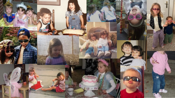
This mood board presents some of my inspiration for what I want my photos for my project to look like:

There is a range of childhood images and images of teenagers as this is what will be shown in my photobook.

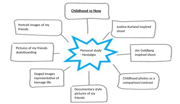
This is my mindmap of my ideas for this project:

Statement of intent

My interpretation of the theme ‘NOSTALGIA’ is heavily based on childhood and memories of growing up. So for my personal study I’m going to explore childhood in comparison to life now as teenagers. To present this I’m going to collect baby/childhood photos and take my own images of my friends now as teenagers, in contrast. I am going to look at the artist Justine Kurland, especially her book ‘GIRL PICTURES’ and follow a similar style to that and also research Jim Goldberg with his book ‘RAISED BY WOLVES’ that looks at teen lifestyle from a more urban and grungy perspective. I have decided to look at this topic in particular as I find it interesting to see how much people have changed and look at what we do differently then vs now. I am planning to present my project in the form of a photobook as turning the pages could be a metaphor for time passing and it enables a wider selection of images. I will be shooting these images in a mixture of documentary style of photography as it is representative of reality and is the same style as most childhood photos, staged documentary as this is what Justine Kurland did and some portraiture. This will involve me bringing my camera around with me when me and my friends go out and capture moments that represent who we are now and what we, as teenagers, do aswell as staging and planning/setting up some shoots.

Moodboard for the teenage images:

Moodboard for the childhood images:

review and reflect; past projects

Over the course we have looked at many different artists and photographic techniques which helped me gain a greater understanding of the camera and my preferred style of photography.

These are some of my favourite projects I have done and work I created:

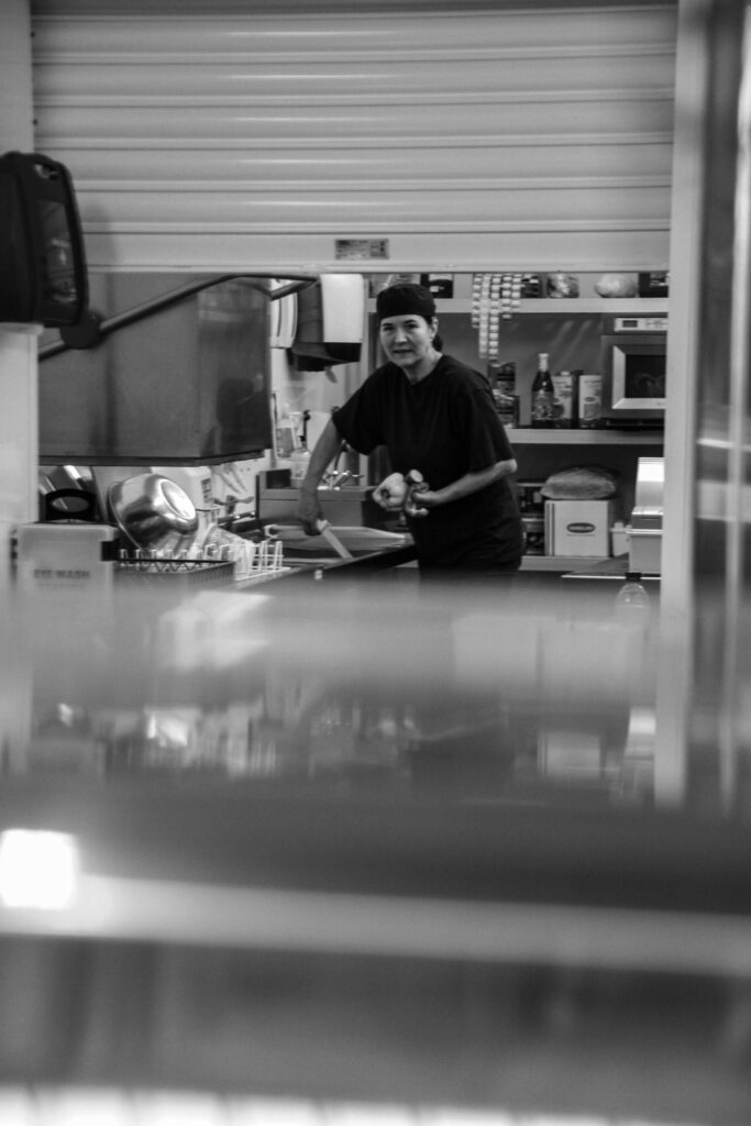
Environmental portraits:

For this project I got to explore people in their natural surroundings and delve into aspects such as their careers and hobbies whilst also photographing people in a casual setting.

This enabled me to capture people in a comfortable setting and using the image to tell a story about the subject.

Clare Rae inspired shoot:

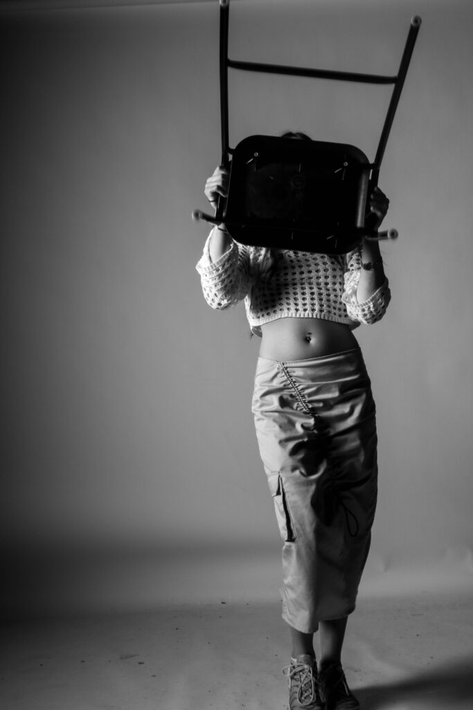
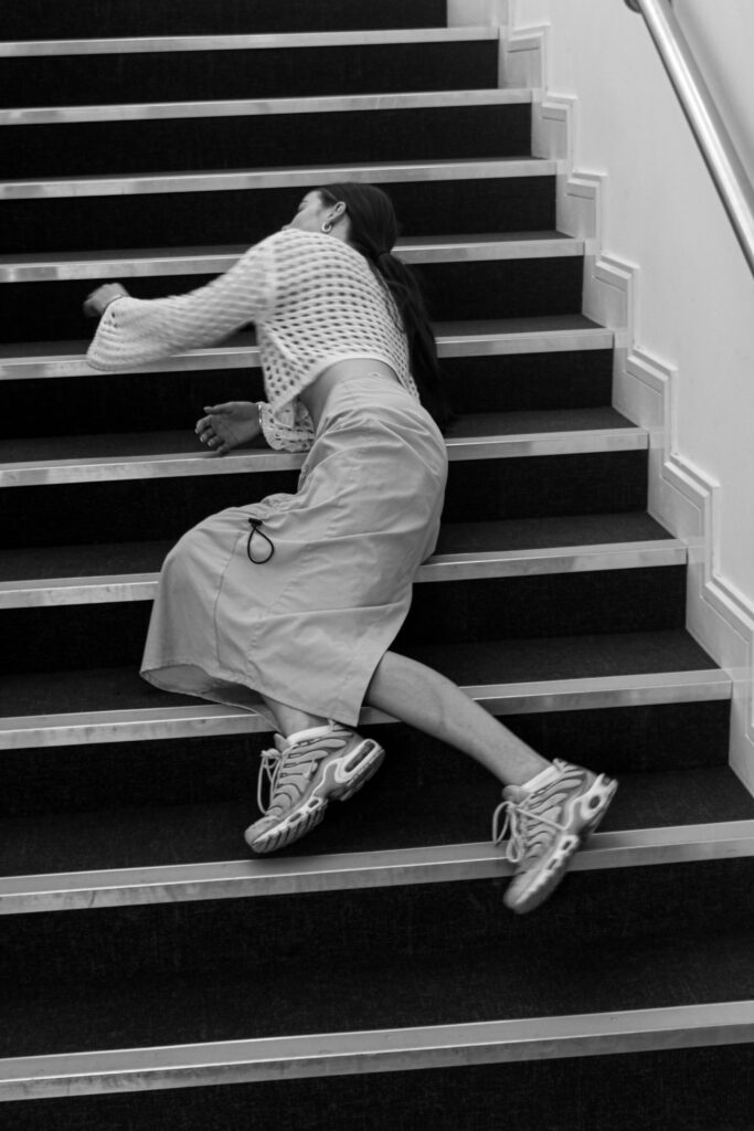
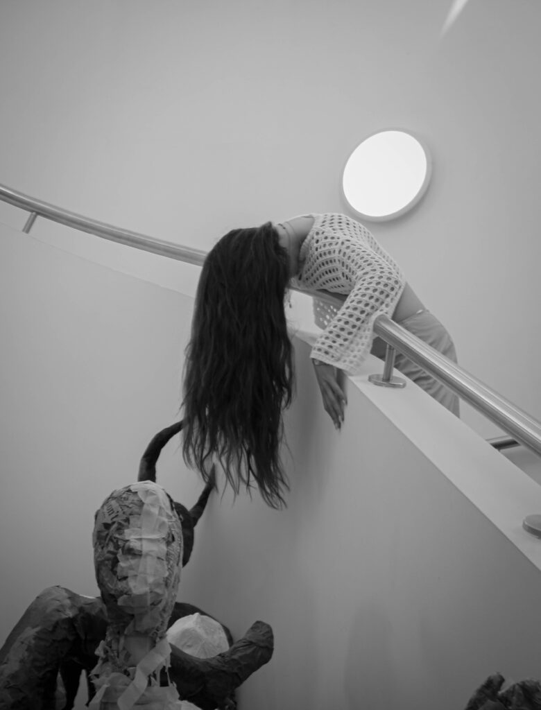
This shoot enabled me to step outside of my comfort zone and experiment with a more quirky and unique aesthetic which in my opinion was worthwhile as I made many successful outcomes.

Girl pictures:

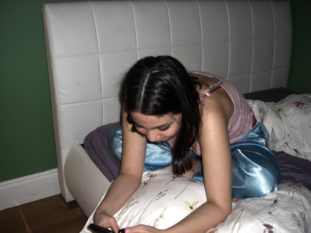
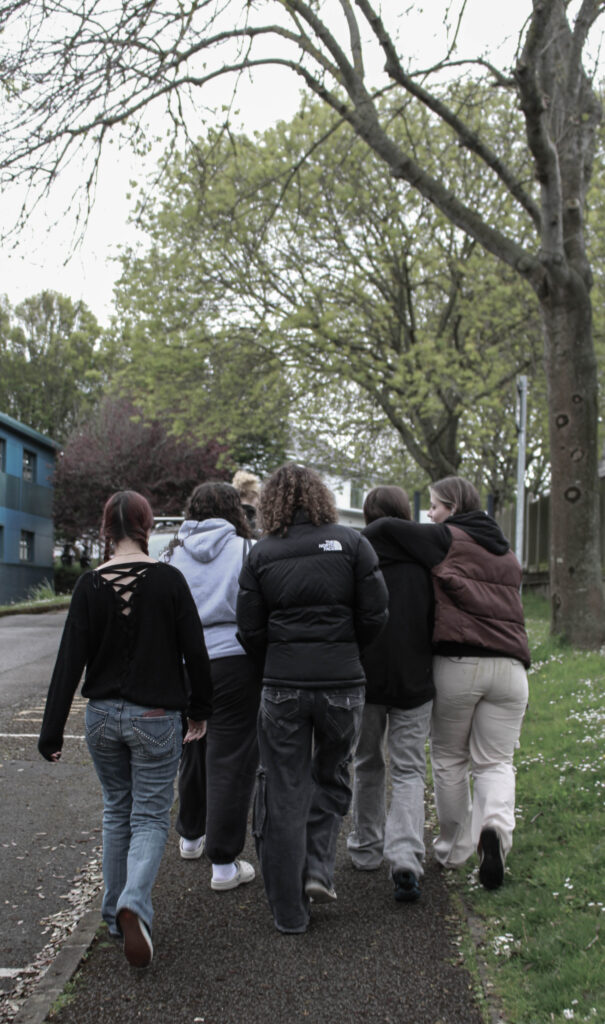
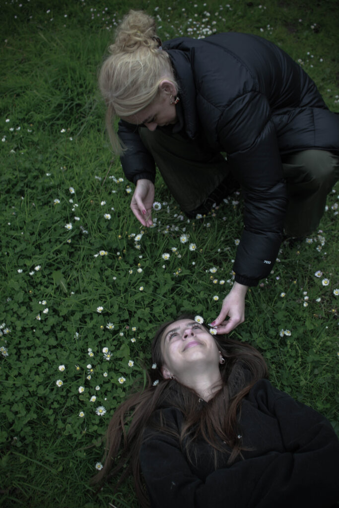
This project was inspired by Justine Kurland’s book ‘Girl Pictures’ and I used a similar style and concept to create my own images. I really enjoyed this project as i found it was quite nostalgic to take pictures of my friends and document their lives and what they get up to. I also think during this project I created lots of successful outcomes and allowed me to experiment in shooting documentary style images which I have now realised is one of my preferred styles of photography.

Paris trip

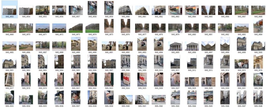
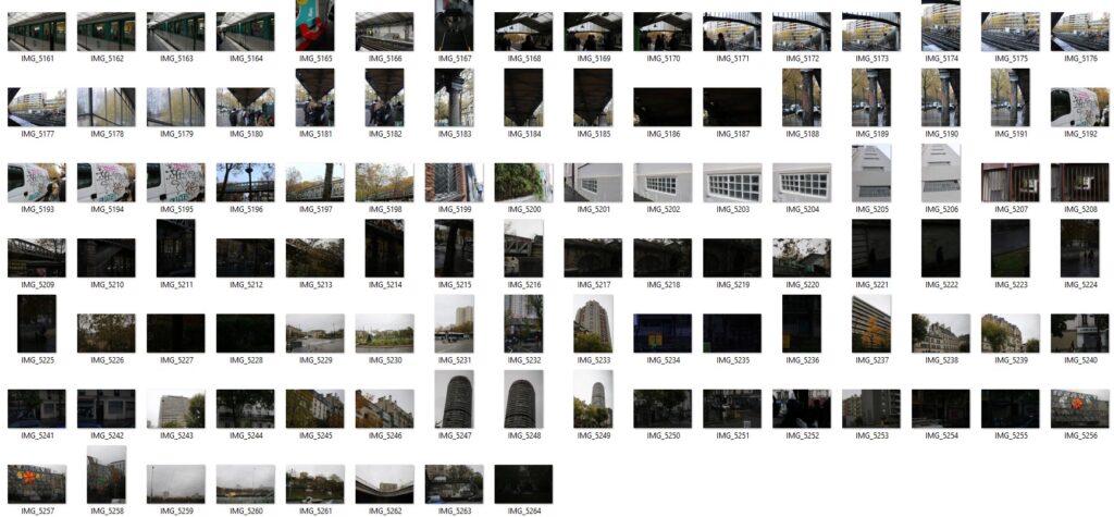
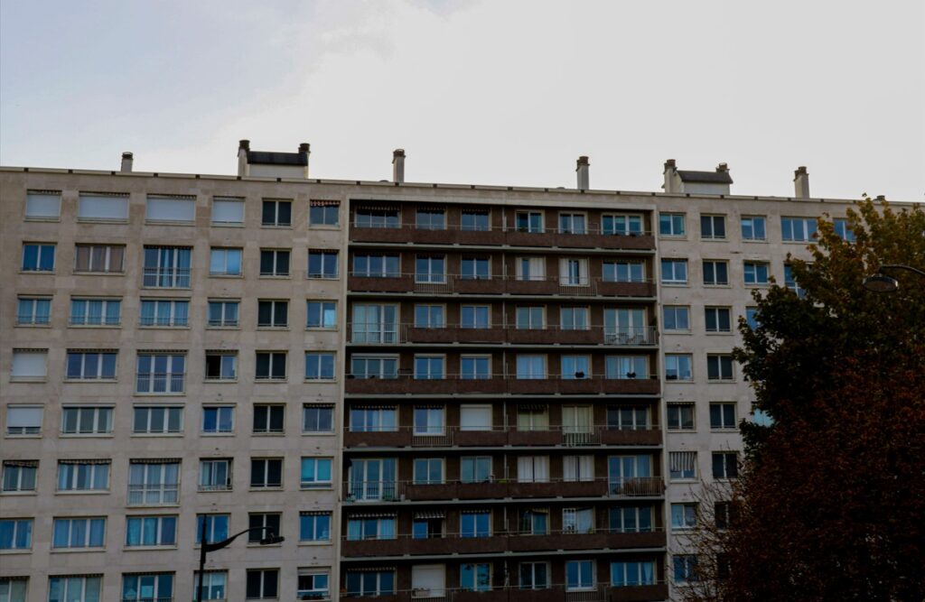
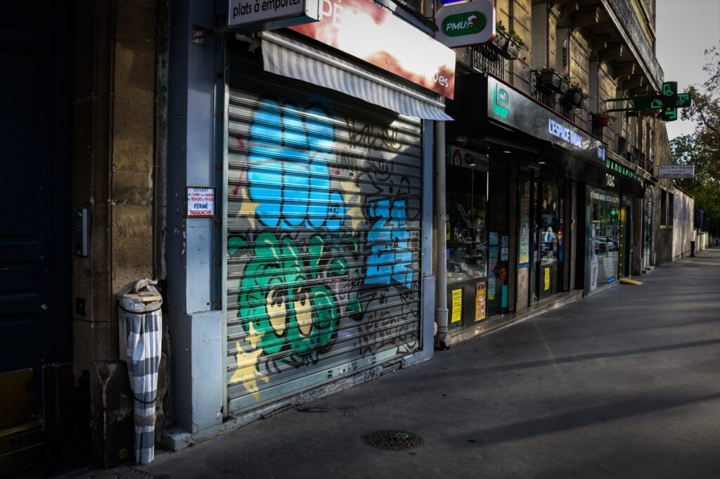
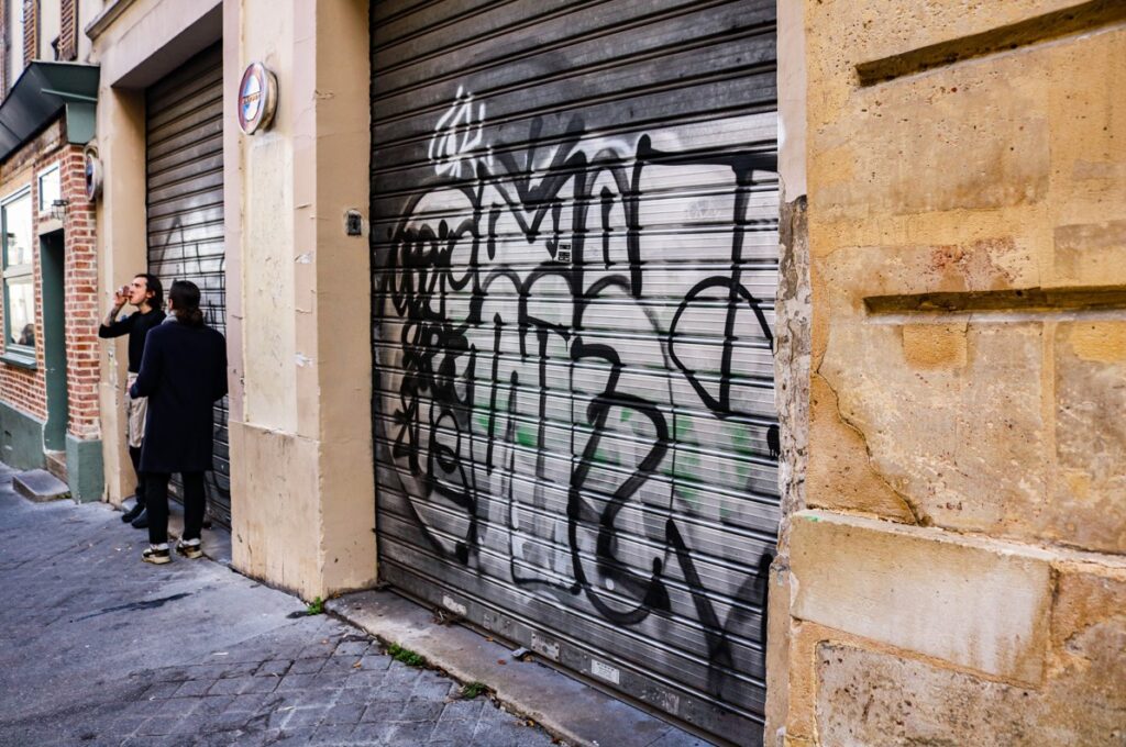
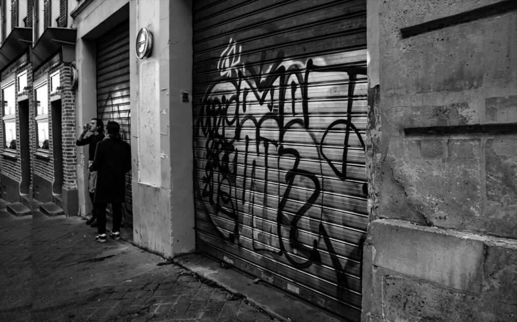
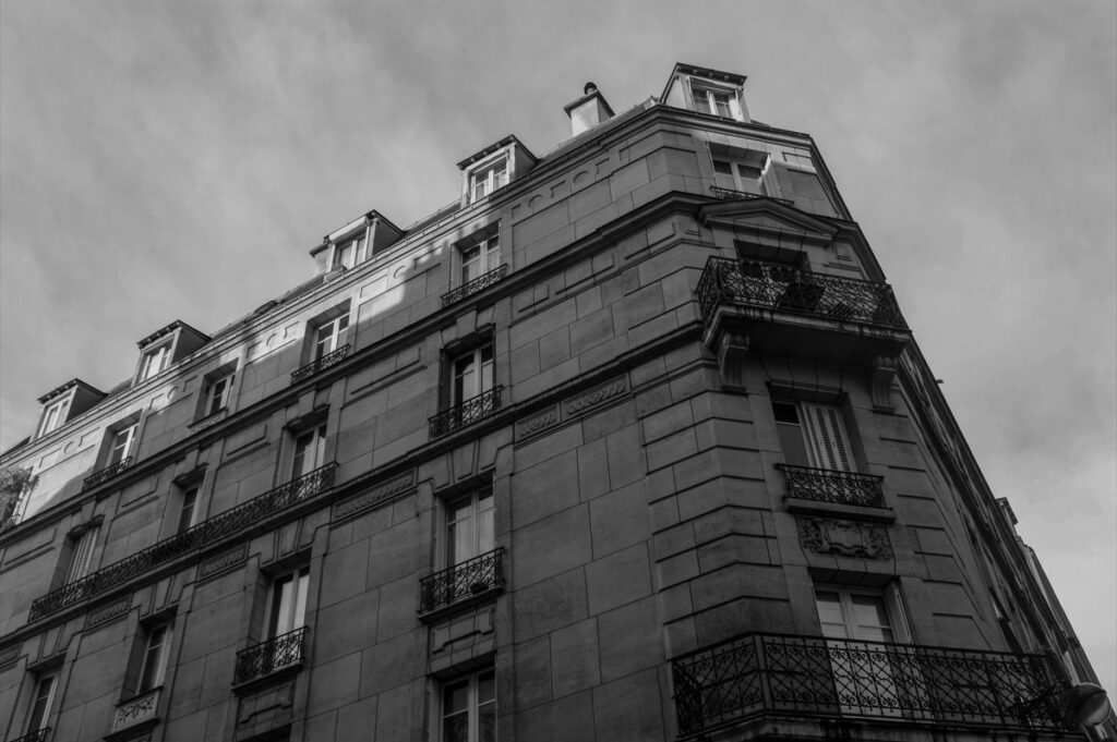
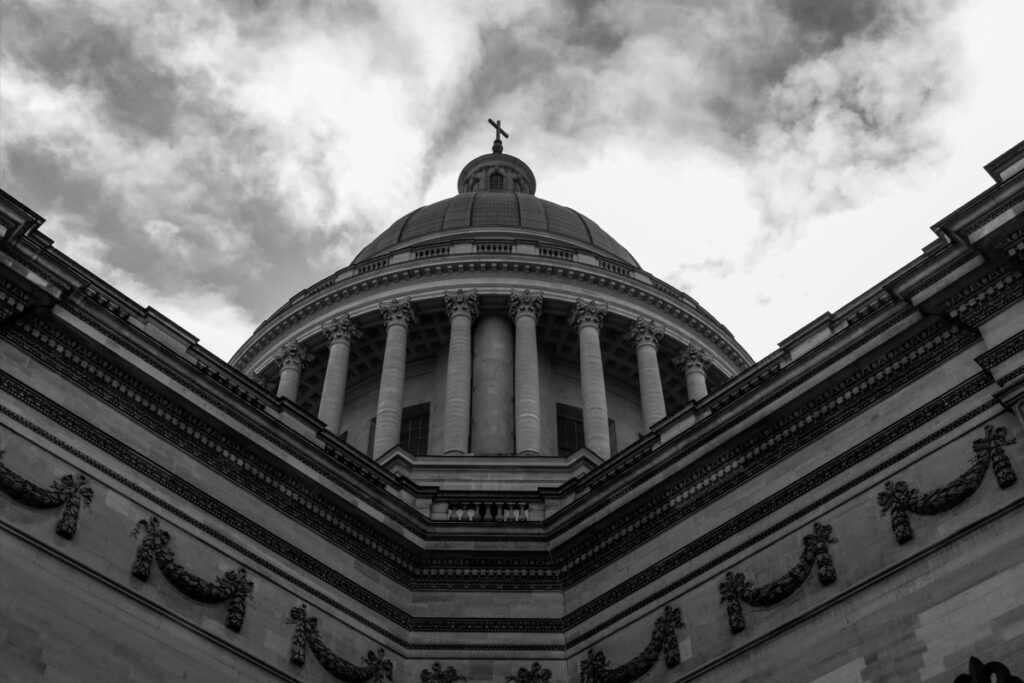
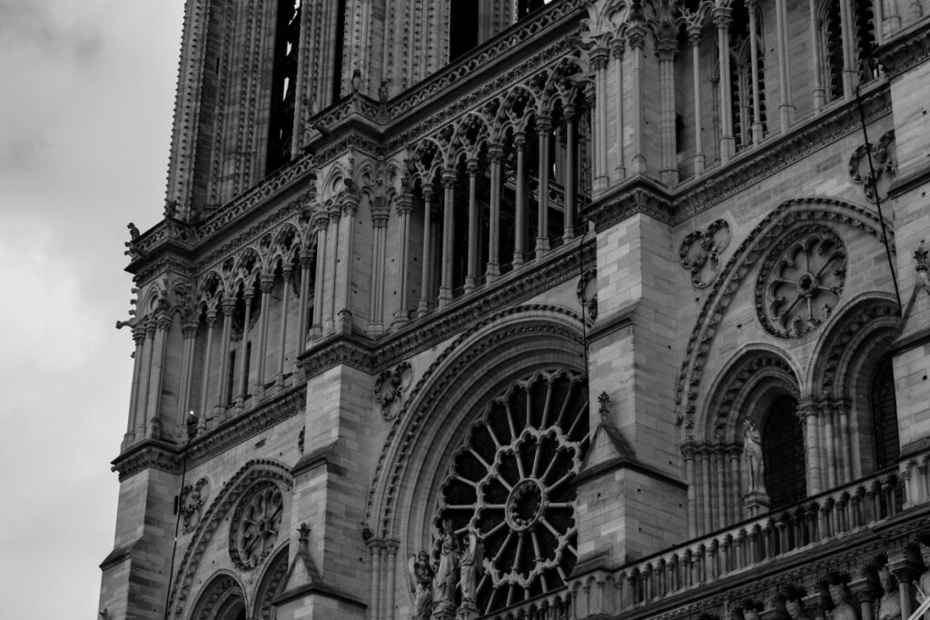
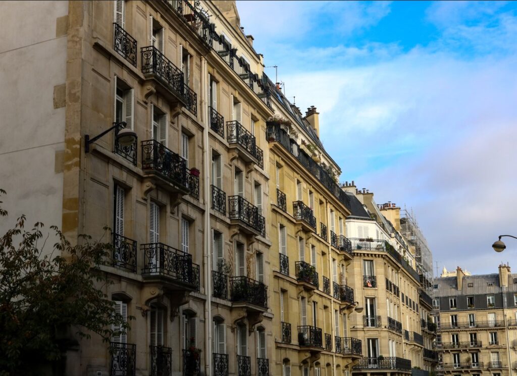
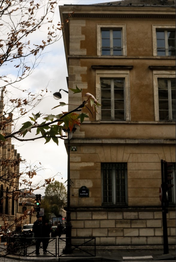
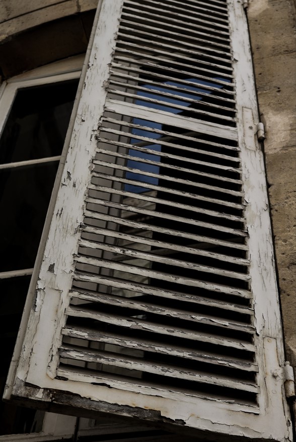
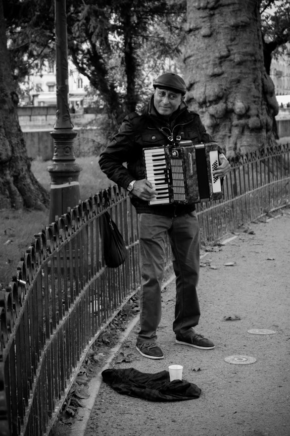
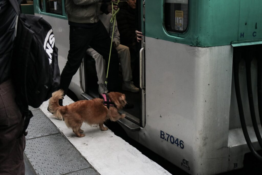
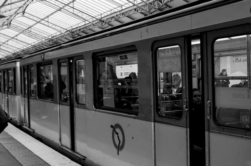
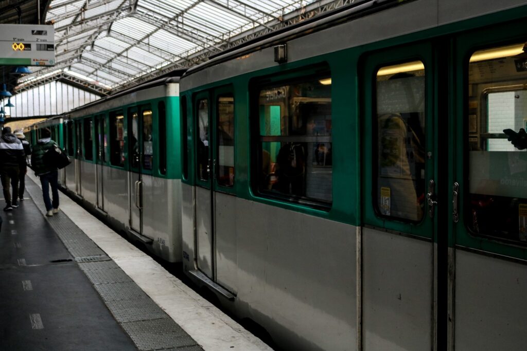
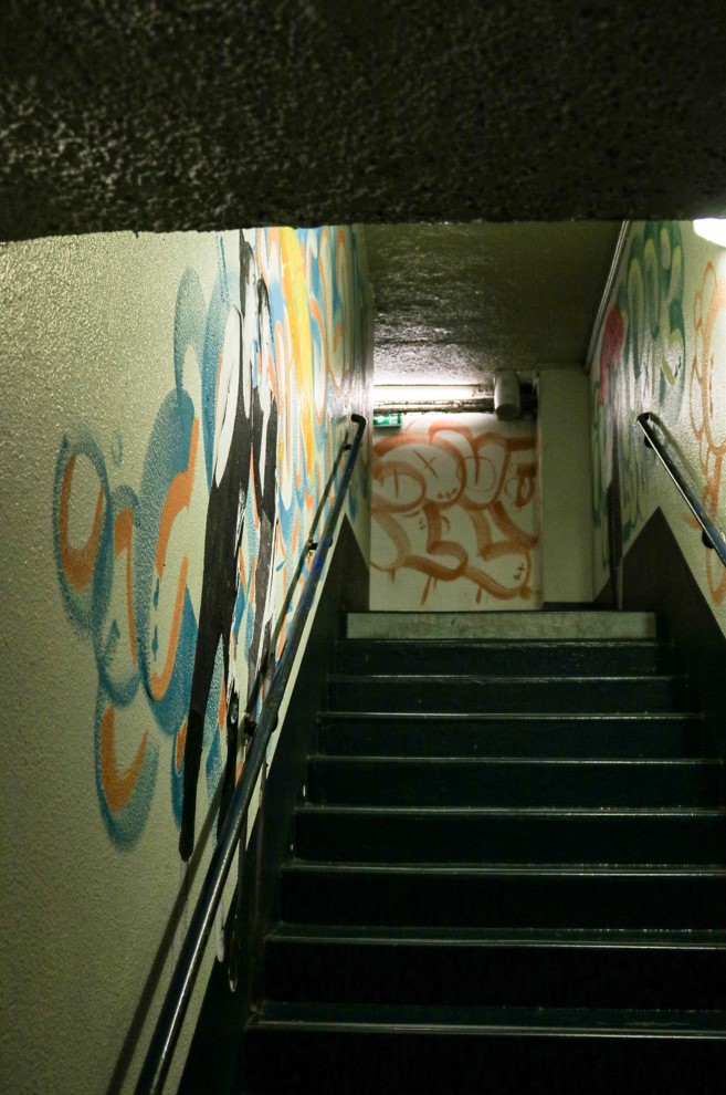
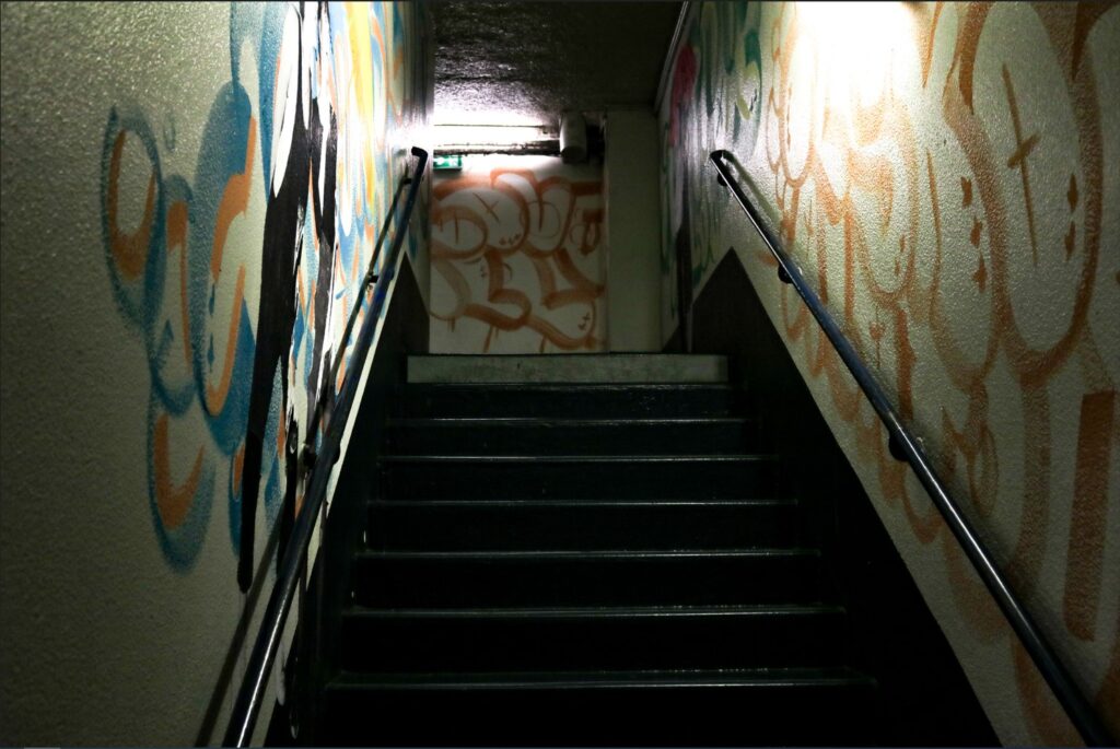
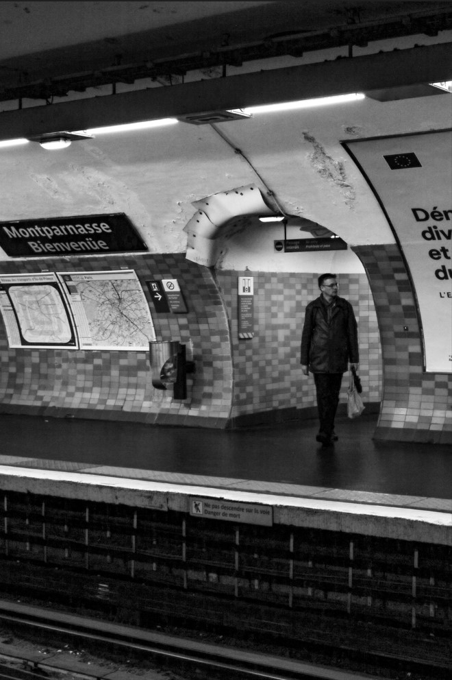
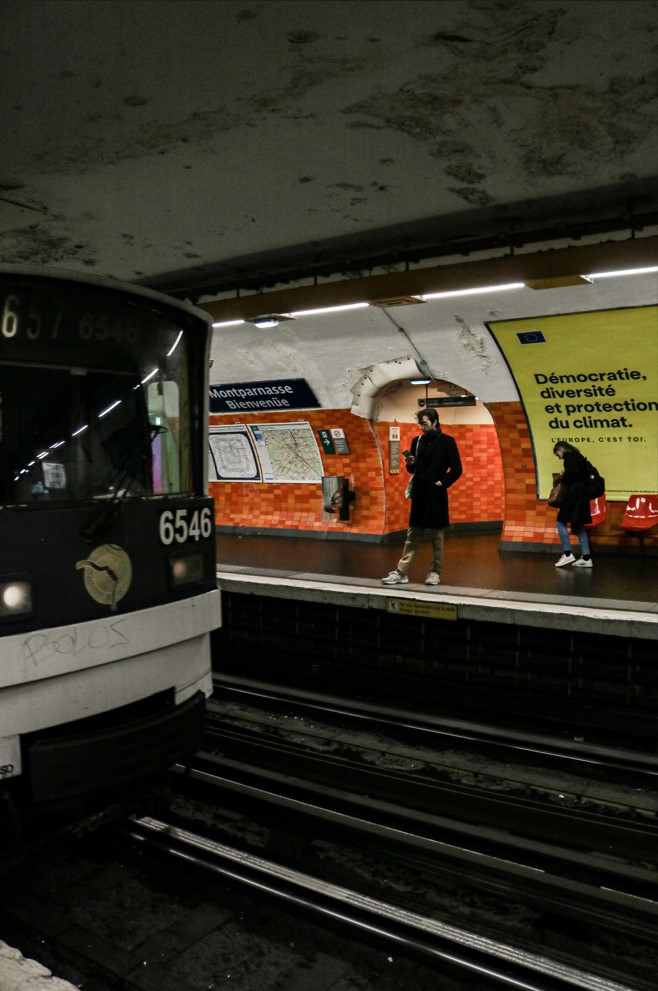
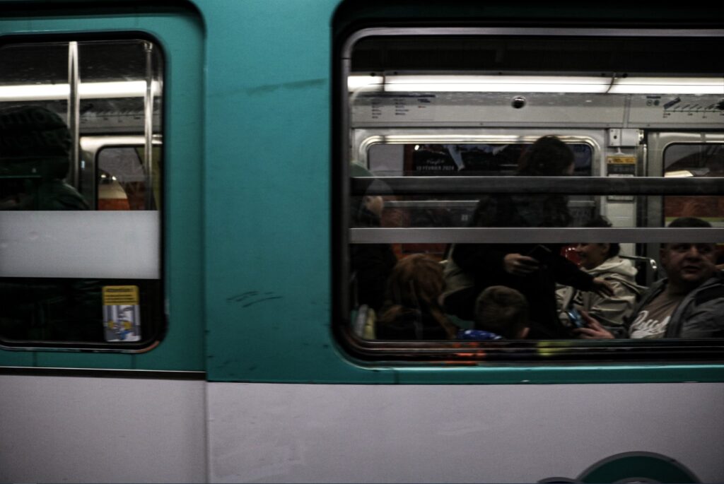
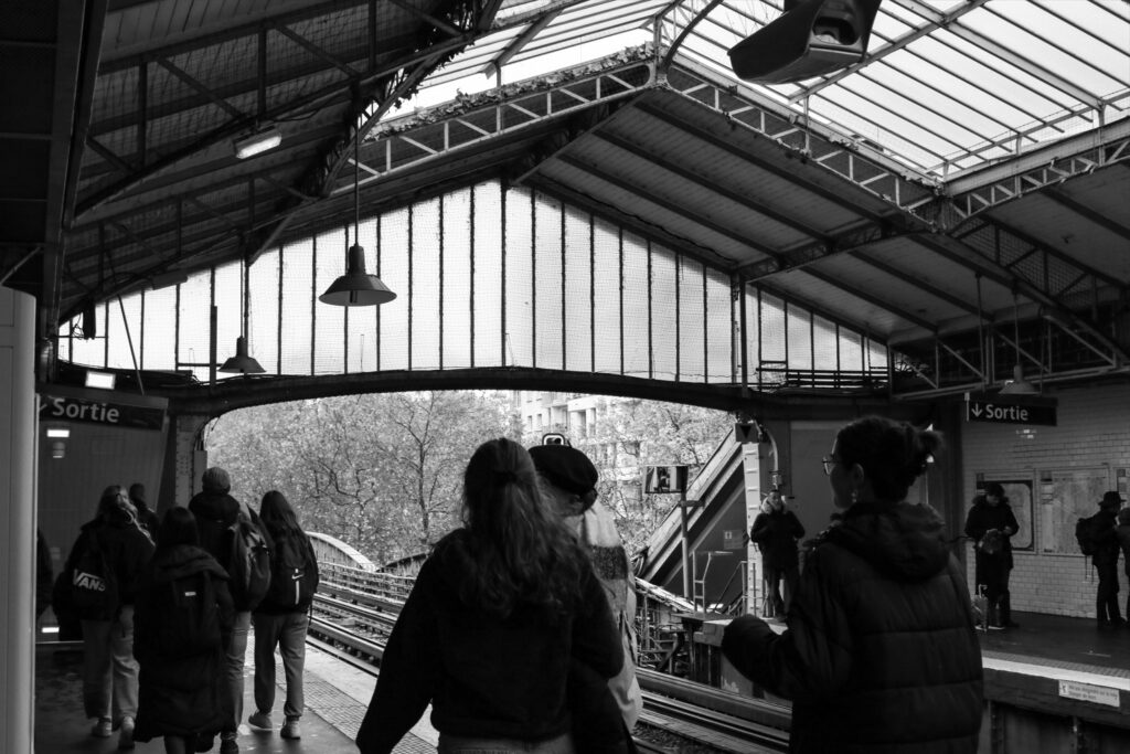
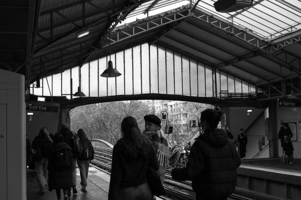
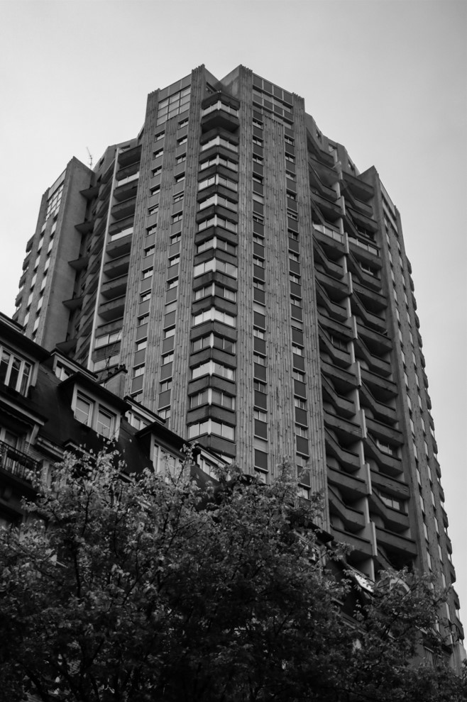
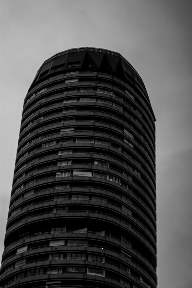
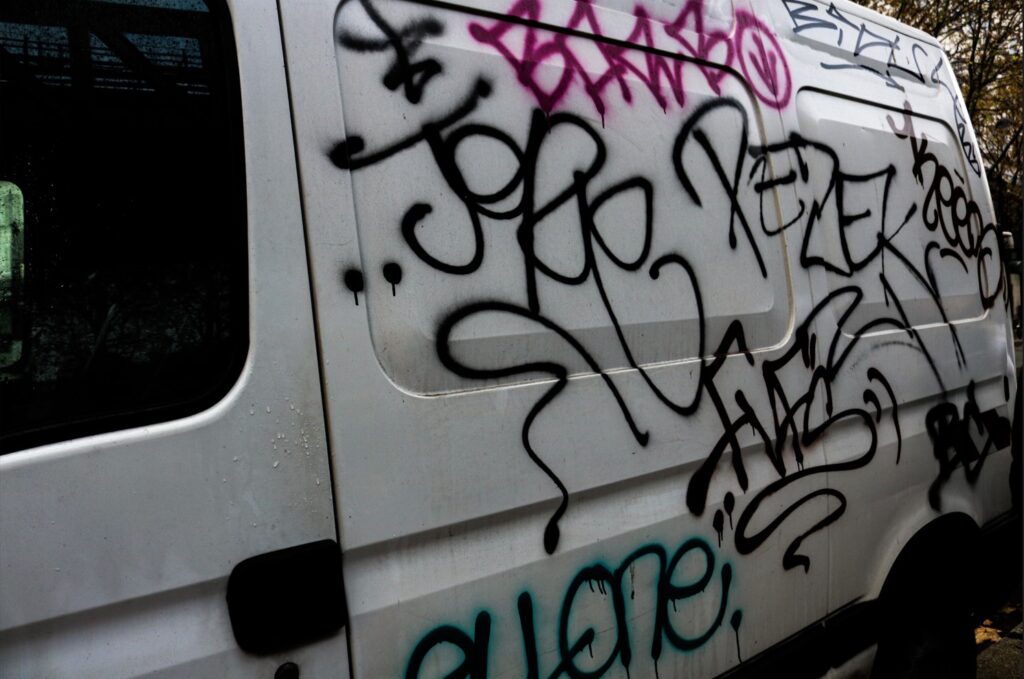
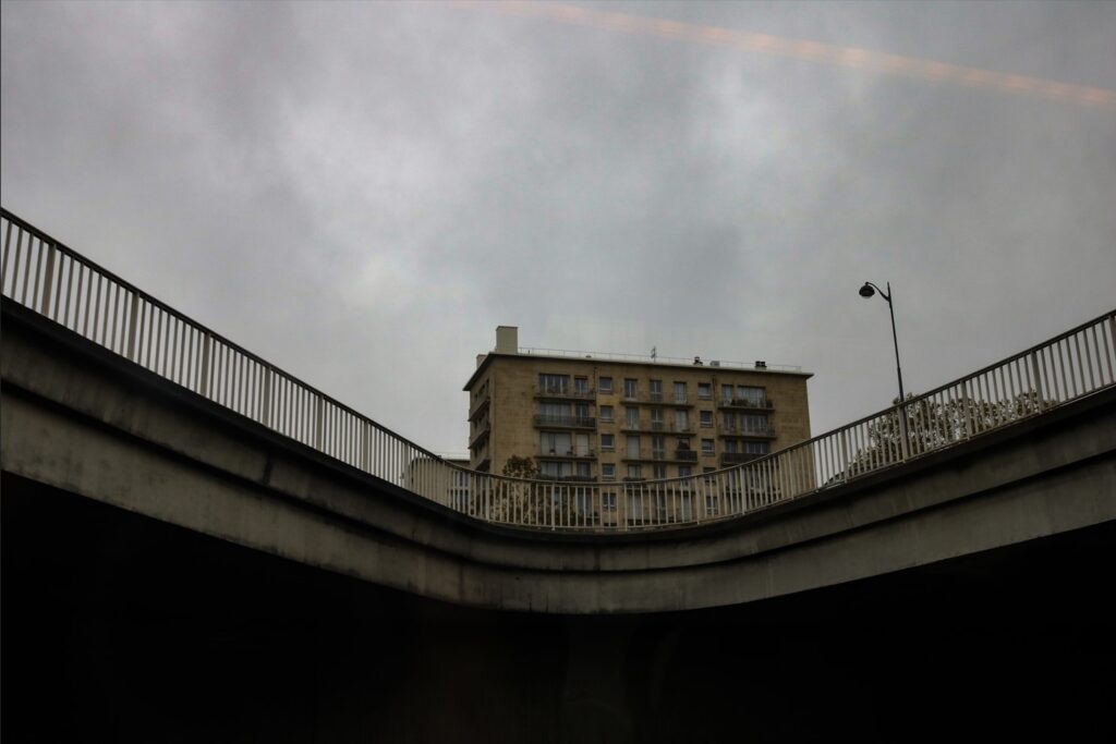
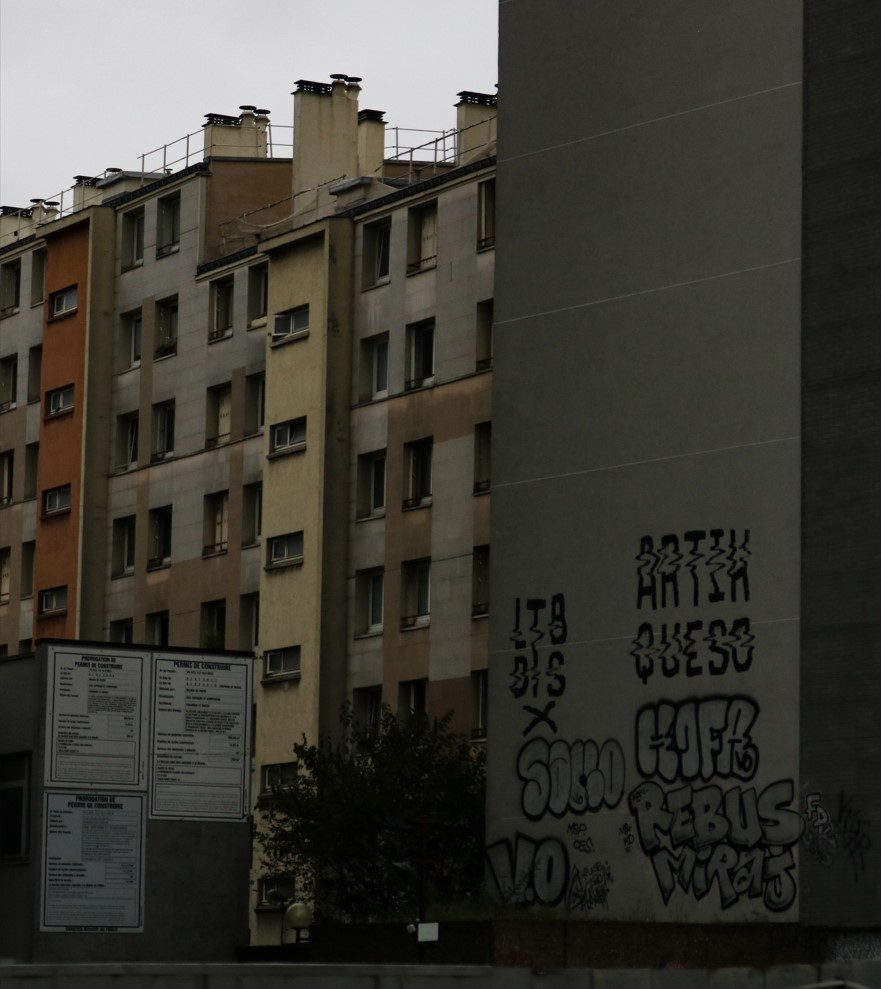
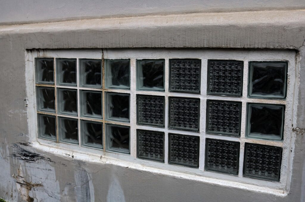
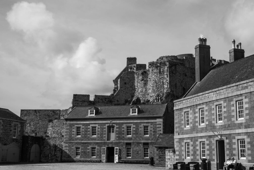
During our trip to Paris I took many different types of images including the surrounding architecture/buildings as well as people/city life and street art etc.

edited images:

Exhibitions:

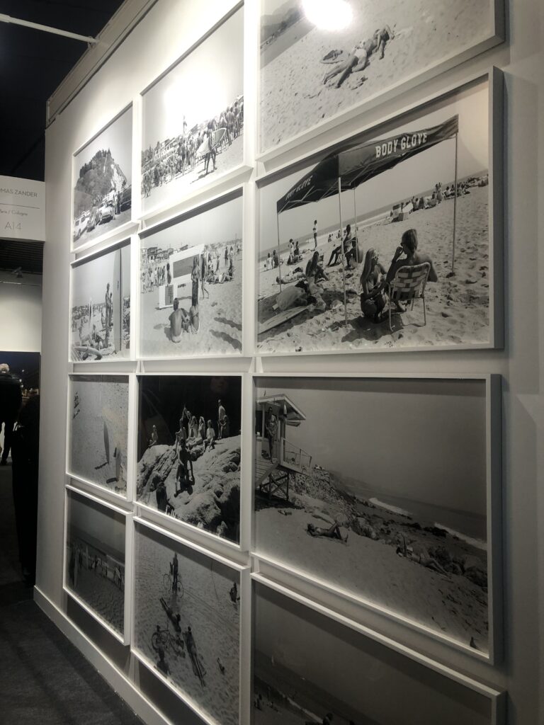
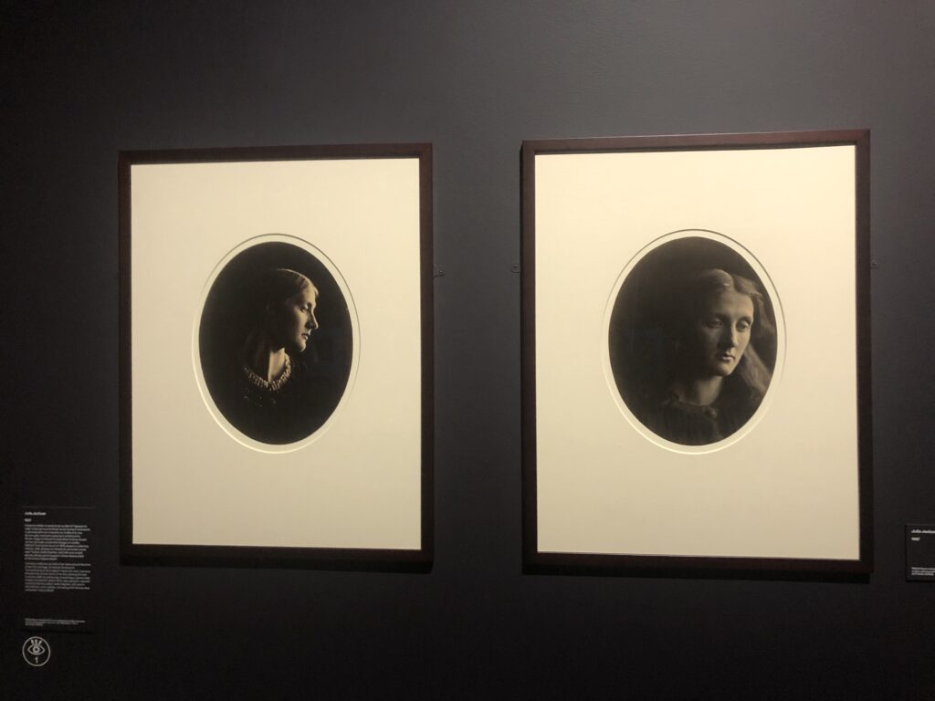
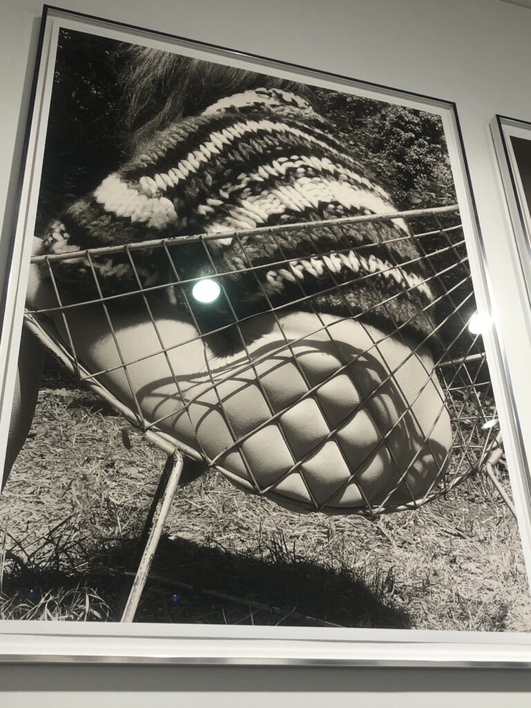
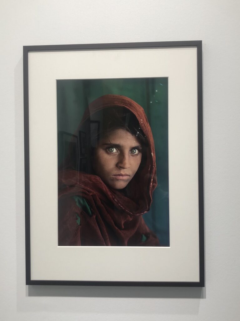
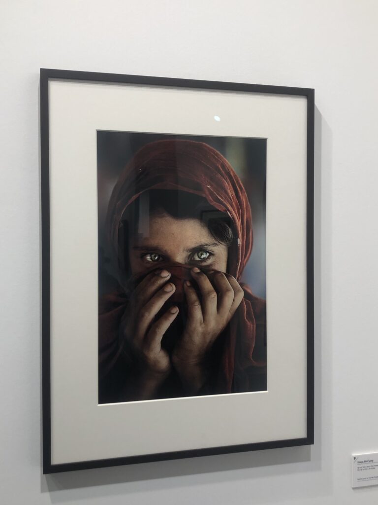
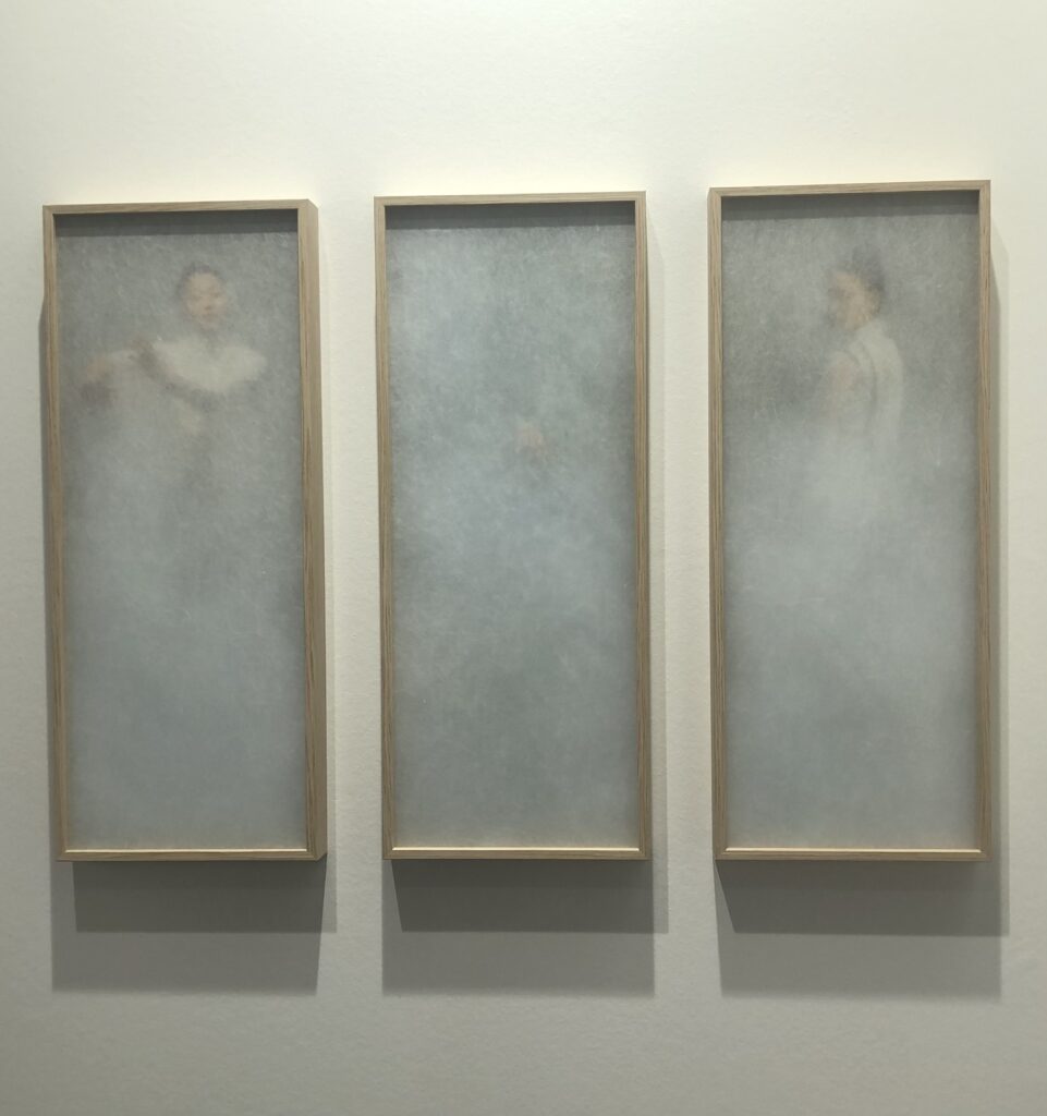
We spent hours looking around galleries and photography exhibitions looking at work from a range of different photographers and their various different styles. Here are some of the images that i felt most inspired by:

Editing process

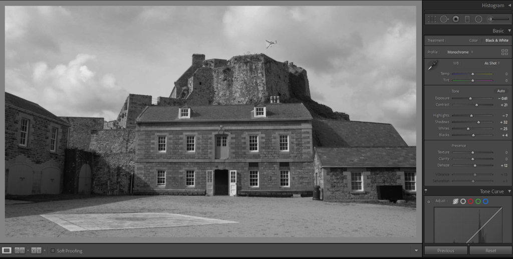
Lightroom:

To edit all of our photos, we used Lightroom where we could enhance all of the features to create a mood within each image. We edited our images and decided that they would be more fitting to our short film in black and white. We also used Lightroom to resize the images for adobe premiere.

Adobe Premiere:

Premiere Pro is designed for a video editor’s post-production workflow. It’s equipped with a suite of powerful editing tools for content creators and filmmakers to organize and edit video files as well as to enhance and fine-tune audio and image quality.

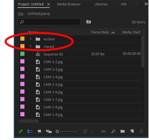
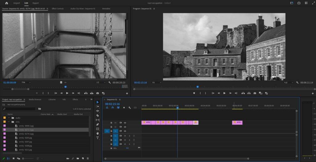
Due to out short film only being still images, I started by importing all of the final edits into Adobe Premiere Pro. II created sub folders for my images so it would be easier to find my images.

When importing all of the images into Adobe Premiere, each image was zoomed in, therefore we had to scale every image to the right size. we could also use the scale to crop out part of the image we do not want in the short film.

I created transitions between each image to allow all the photos to flow together. I did this by adding key frames. I opened up the top bar and on each image a would add four key frames. The first two would be on a inclining angle where as the last two would be on a declining angle, this creates a fade between each frame.

Adobe Audition:

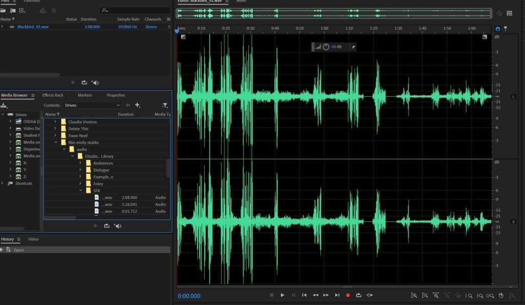
On Adobe Audition we played around with sounds and started creating the audio for our short film.

During the lesson where we were being taught how to use adobe audition, we learnt how to cancel out background noise and add in sound effects. the audio was collected from our visit to Elizabeth castle. My aim is to enhance the audio to make it clear while ensuring it fits in with the Nazi Occupation theme.

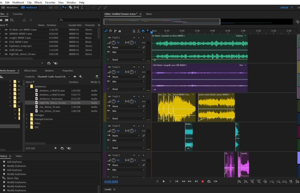
Using the ‘multitrack’ feature I began to layer different sounds including ambiances and SFX to create a suitable audio file for the short film.

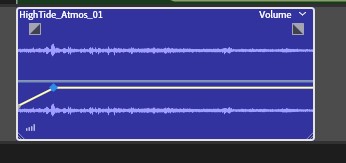
Using the sound bar I was able to adjust the volume of the clip allowing the sound to slowly get louder or quieter and could be faded in/out. This meant that there were no harsh transitions between sounds.

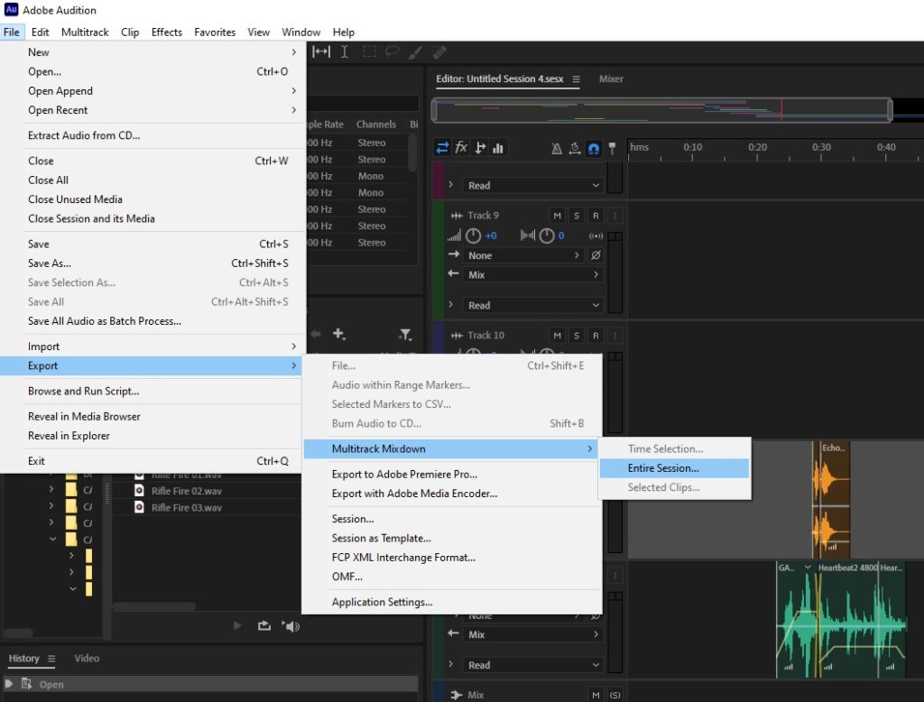
Once i was happy with the audio I had created I needed to import it for the film but first had to comprise all the sounds into one. I did this by going FILE>EXPORT>MULTITRACK MIXDOWN>ENTIRE SESSION and then save it as a file ready to export it onto the film.

Storyboard

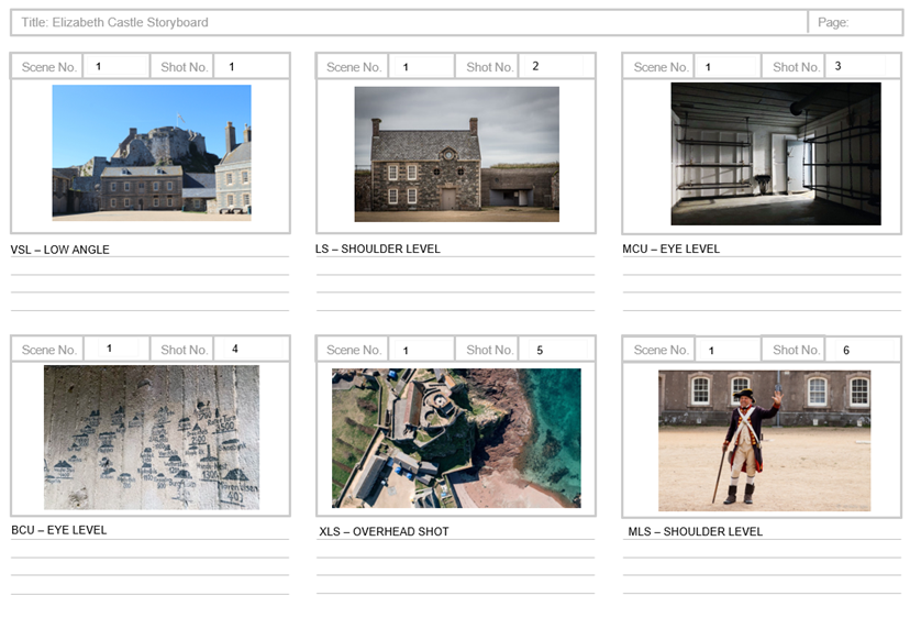
Our short film will be a visual display of Elizabeth castle, showing images from current time and archived pictures. The audio will represent the war times and create the atmosphere of when the castle was used for battle.