All posts by Emily Stubbs

Filters

Author:
Category:

visual elements and formalism

There are 8 visual elements of photographic art: line, shape, form, texture, colour, tone, pattern, space.

line

Lines are either straight, curved, or a combination of the two. They can be solid, dashed or interrupted, implied, or psychological and even go in all different directions.

Straight lines often appear in manmade objects such as buildings and windows. Curved lines can be manmade but are often in nature.

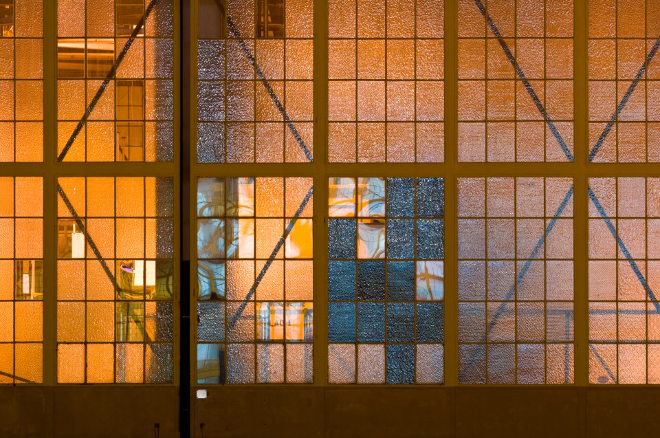
Solid lines are usually seen in scenes and interrupted lines can be easily drawn but are not as common in the real world.

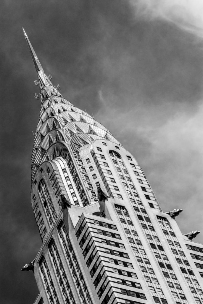
The type of, and general direction of the lines in an image, convey meaning inside the photograph. Vertical or horizontal lines can convey a sense of stability or a static feel to an image. Horizontal lines can indicate distance and vertical lines can indicate/show height, balance, strength. Diagonal lines convey a more dynamic scene.

shape

Shape is the two-dimensional appearance of objects as a camera captures them. For example, if you look at an image of a ball, you’ll find its shape as a circle. Likewise, if you look at a picture of a cube-shaped box, you’ll find its shaped like a square.

When different shapes overlap they can create a new shape as well as surrounding an area to create another shape.

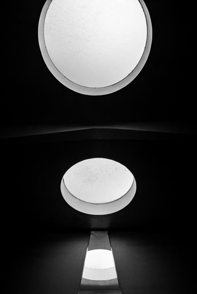
In a photograph, a silhouette is the purest form of a shape as there is no form, texture, or colour. Its stark contrast with its surroundings make a silhouette the most visually obvious.

form

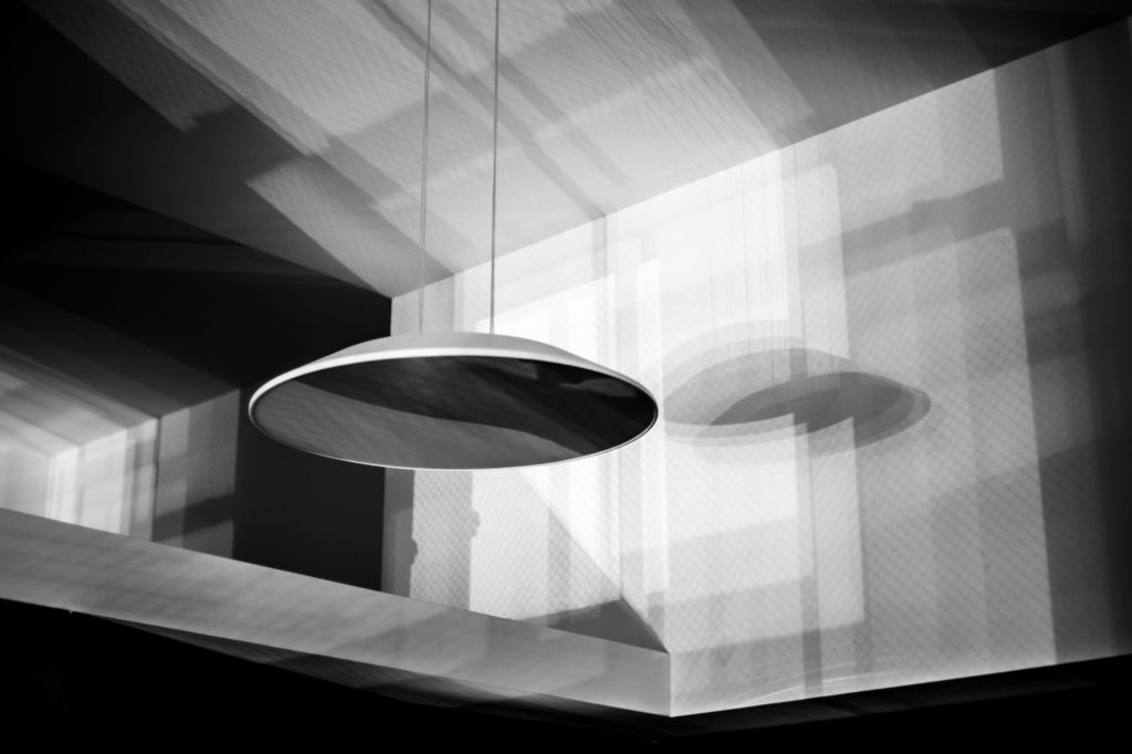
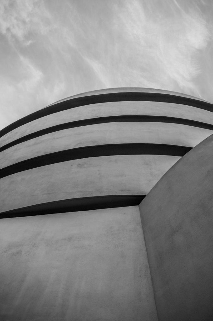
Form is three-dimensional. Overall form is height, width, and depth. There are two types of form:

-geometric/regular

-organic

Geometric forms are familiar for example, a sphere, cube, cone, cylinder etc. Organic forms are the objects that surround us in our three-dimensional world.
texture

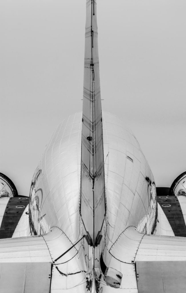
Texture in real life is smooth or rough however there’s other descriptors that include: slimy, wet, hard, soft, bumpy, shiny, etc.

Texture in the photograph is similar to form in that it is revealed by variations in tonality and presented in two dimensions.

In a photograph, smooth objects might have reflections or specular highlights. Rough objects might have aggressive areas of light and shadow without reflections.

Of course, in a photograph, we cannot experience the tactile surface characteristics, but we can “feel” them through the mind’s eye—implied texture; an association with the familiar—assuming that it is familiar. Someone who has never touched sand will not be able to “feel” this texture when looking at a photograph of a beach, but when a beach bum sees a photograph of the beach, they can make the mental connection to the image and “feel” the sand between their toes.

Visually, a pattern might indicate texture—like the scales of a fish or ripples on a pond.

Of course, the physical print has its own texture—glossy versus matte, or even canvas-textured printing papers, for example—which may or may not be aligned with the texture of the objects in the photograph.

colour

We live in a world full of colour. The light from the sun, and artificial sources, gets absorbed and then reflected by different objects, this reflected light is what we see as colours.

Light itself has no perceived color. But, send light through a prism or a drop of water and we can see that it is comprised of a literal rainbow of colors.
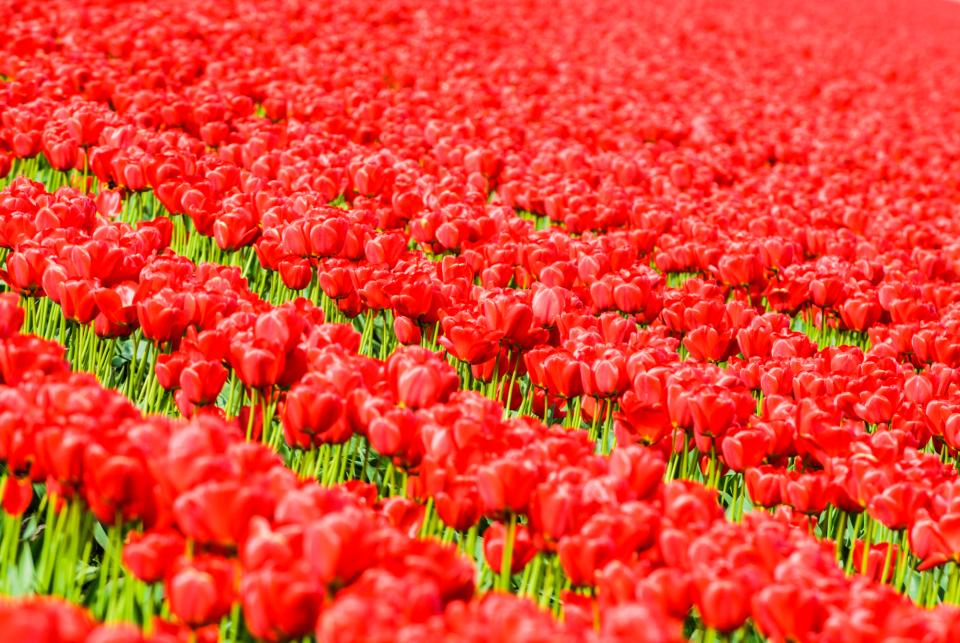
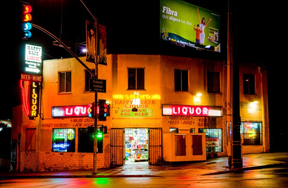
Colour has three properties: hue, value, and saturation;

Hue – is simply the description of the colour

Value – is the relative brightness or darkness of a colour.

Saturation – is the intensity or purity of a colour.

Different colours can cause a different emotional response. Studies show this is sometimes based on peoples individual genetic response or even to do with cultural upbringing.

Common connotations Red can mean danger, blue symbolizes calm or sad, yellow is happy, black is mournful, white is innocent, and purple can symbolize wealth. Bold and bright colours are known for grabbing our eye those bold and bright colours can take the focus from your subject. Muted/dull colours might elicit indifference or even melancholic feelings and these scenes often make for powerful photographs as the photographer has created a similar feeling for the viewer.

tone

Tone refers to the levels of brightness in the photograph, from solid black to pure white. Shadows are dark tones; highlights are bright tones. The majority of photographs of nature show a range of tones.

How to Split-Tone Photos in Lightroom

pattern

Pattern in Photography is a regularity within a scene. It’s elements of the scene that repeat themselves in a predictable way. Pattern can be found everywhere and is commonly seen within shapes, colours or textures. Using patterns is a great way to draw a viewer’s eye into your picture and generally, it will be the pattern within the photograph that will become the most prominent part of it.

Pattern with a palm leaf - @jakobowens1 unsplash.com
Pattern in a collection green leaves - @renran unsplash.com

space

The rule of space in photography is simply the act of adding visual space in front of the direction that an object is moving, looking or pointing to imply motion and direction and to lead the eye of the viewer.

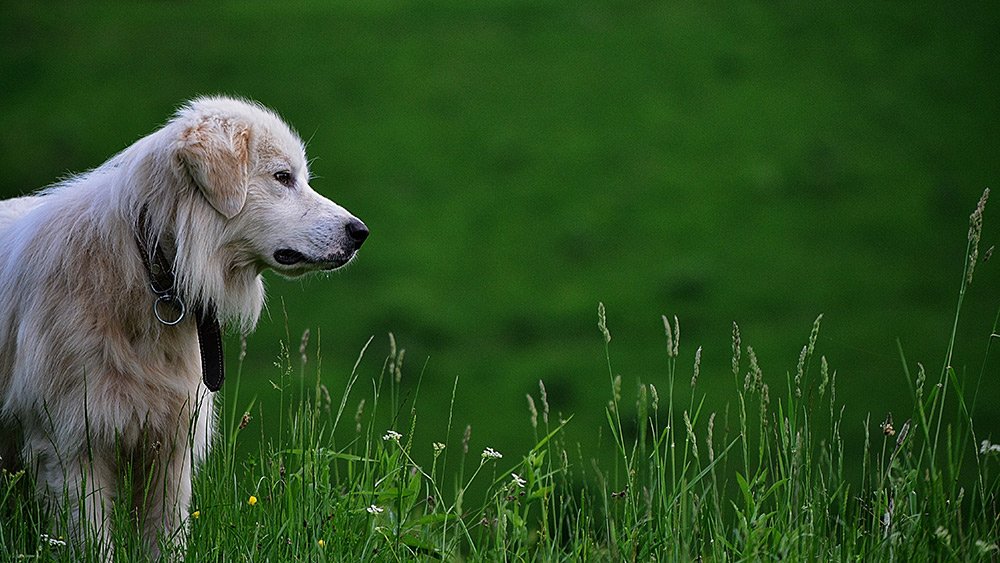
The rule of space is important because it can be used to help portray to the story of a photograph. It also aids a photographer in creating and displaying the energy of a photograph whilst it guides the viewer’s eye by sculpting key visual events and giving the subject more room.

formalism

In formalism, the photographer becomes a visual designer whenever a frame is captured and uses camera cropping to concentrate on the desired subject while eliminating everything else.

Placement in the frame, point of view, selective focus, lighting and perspective area are some of the tools the photographer can use. Formalist photography can contain recognizable subject matter and can also become so abstract that the subject matter is a mystery. The Design, Composition and Lighting are dominant over Subject Matter. 

Formalist Photography

analysing

40 Most Iconic Pictures & Their Deep Insight Analyzed - 121Clicks.com
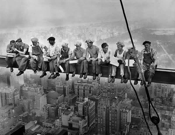
 Lunch Atop a Skyscraper by Charles C.Ebbets

This image contains the 11 men sat on the skyscraper and the photographer has composed them as the focal point creating a widerspan image and creating a sense of family or team between the group rather than singling out one person.

The monochrome intensifies the old fashioned look to the image which works accordingly with the context of the image which is that it was shot during the great depression 1932 illustrating these men’s hardship as this was a terrible economic crisis which will have greatly effected them. The colour choice also adds a sense of sadness and a melancholy tone to the image portraying great depression and the terrible time they were living through.

This image will have been taken to realistically document what the time period is like and preserve a period of history that could otherwise be lost
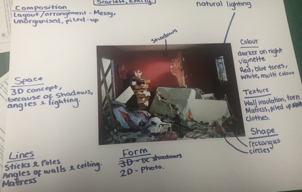
This image shows an analysis (using the photo-matrix)

PHOTO MONTAGE

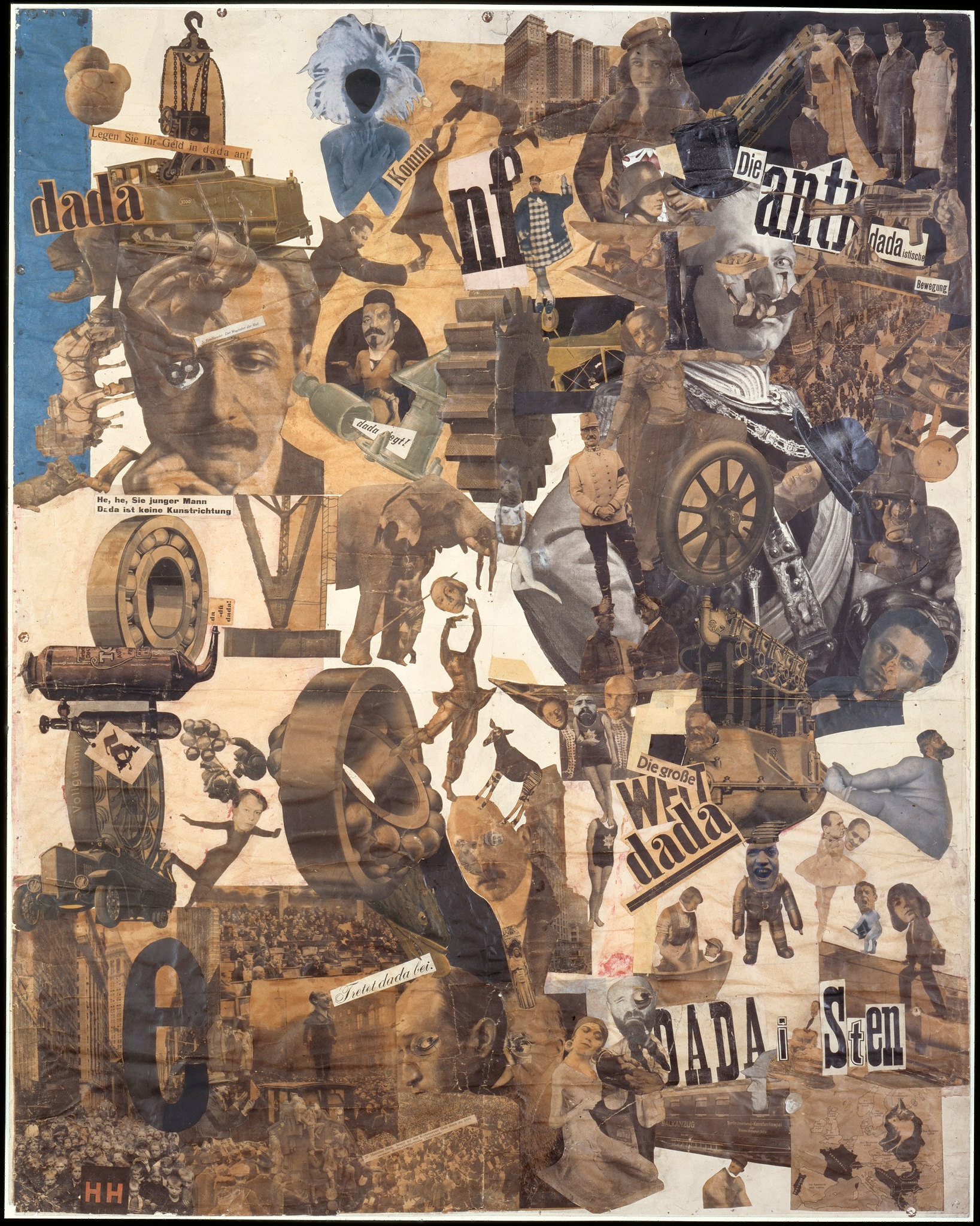
  1. photomontage is a collage constructed from photographs.
  2. Historically, the technique has been used to make political statements and gained popularity in the early 20th century (World War 1-World War 2)
  3. Artists such as Raoul Haussman , Hannah Hoch, John Heartfield employed cut-n-paste techniques as a form of propaganda…as did Soviet artists like Aleksander Rodchenko and El Lissitsky
  4. Photomontage has its roots in Dadaism…which is closely related to Surrrealism
The Right to Copy – Disphotic
Raoul Hausman – Elasticum – 1920
Hannah Höch, Cut with the Kitchen Knife Dada Through the Last Weimar Beer  Belly Cultural Epoch of Germany – Smarthistory
Hannah Hoch – cut with a kitchen knife – 1919
1927 Heartfield Image Rationalization March Predicts Human Workers Replaced  By Robots. Heartfield Posters Knüppel.John Heartfield Exhibition
John Heartfield – Rationalisation is on the march! – 1927

best still life images

so far…

Lightroom

Adobe Lightroom is a creative image organization and image manipulation software developed by Adobe Inc. Lightroom helps you import, organize, manage, and find your images. Lightroom is also a photo management and photo editor, combined into a single tool.

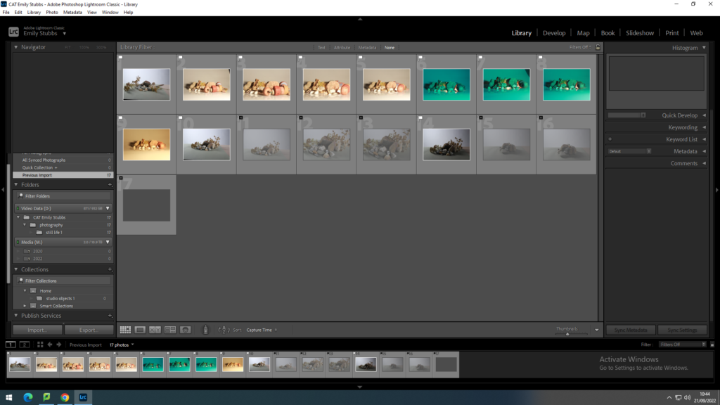
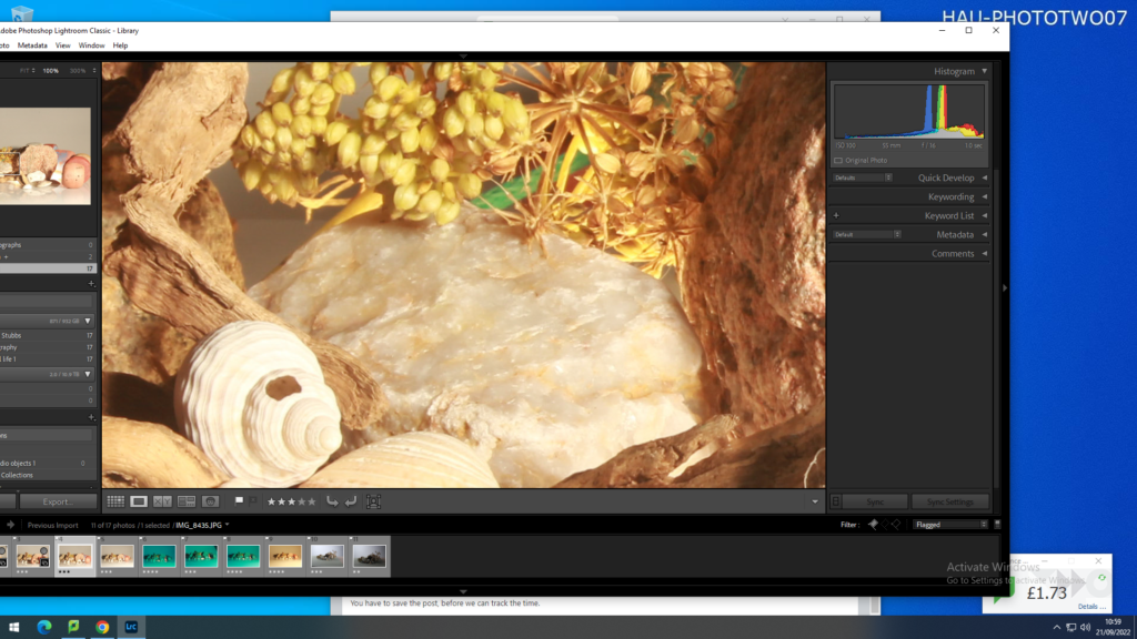
Using the X and P keys – I selected which images I wanted and didn’t want to keep.
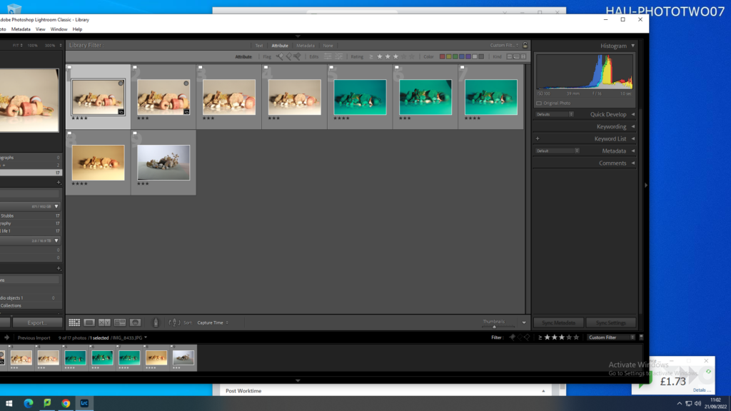
Then filtering the unwanted rejects out to leave me with only the images I want.
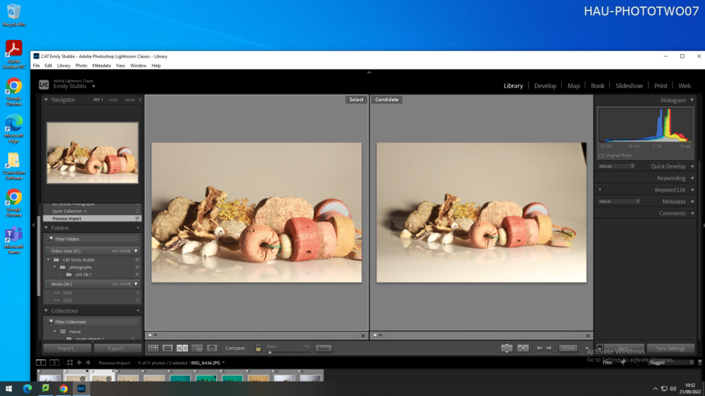
I then put two similar images on a split screen to compare.
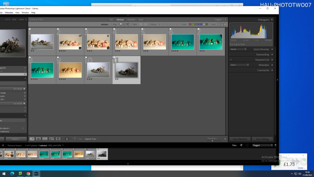
Using a star rating system I decided which images were definitely going to be used (4 star), not sure yet (3 star) and not going to use (2 starts)
To look at the images in more detail i zoomed in (using the magnifying glass) to get a closer look at certain aspects
Again I used the filter to remove the images i had given less than 3 stars
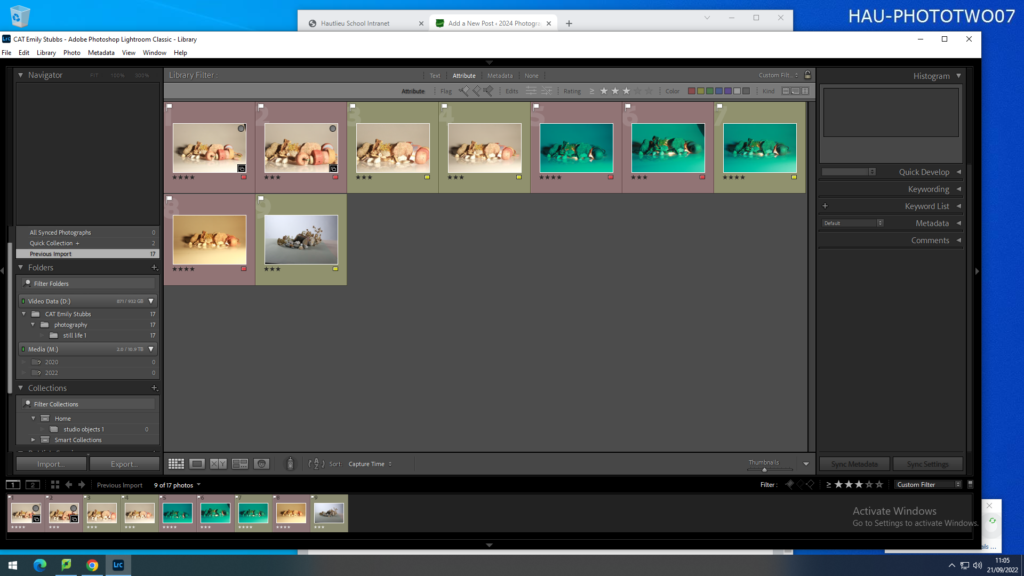
filtering again this time red-keep yellow-reject
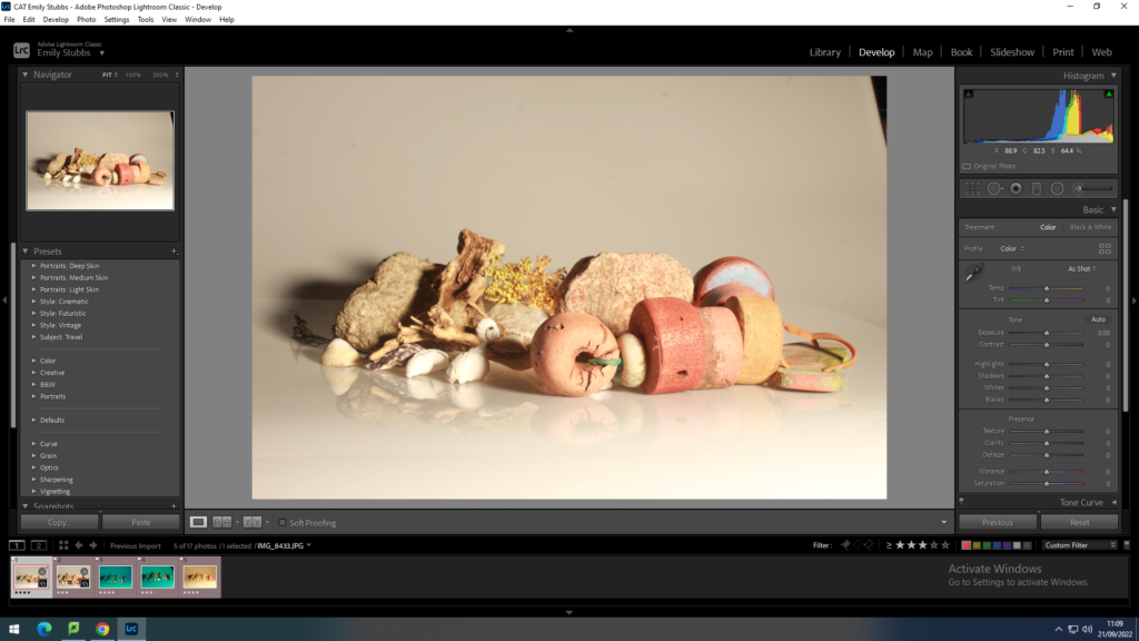
then i put the RED images into develop from library to start editing the images.
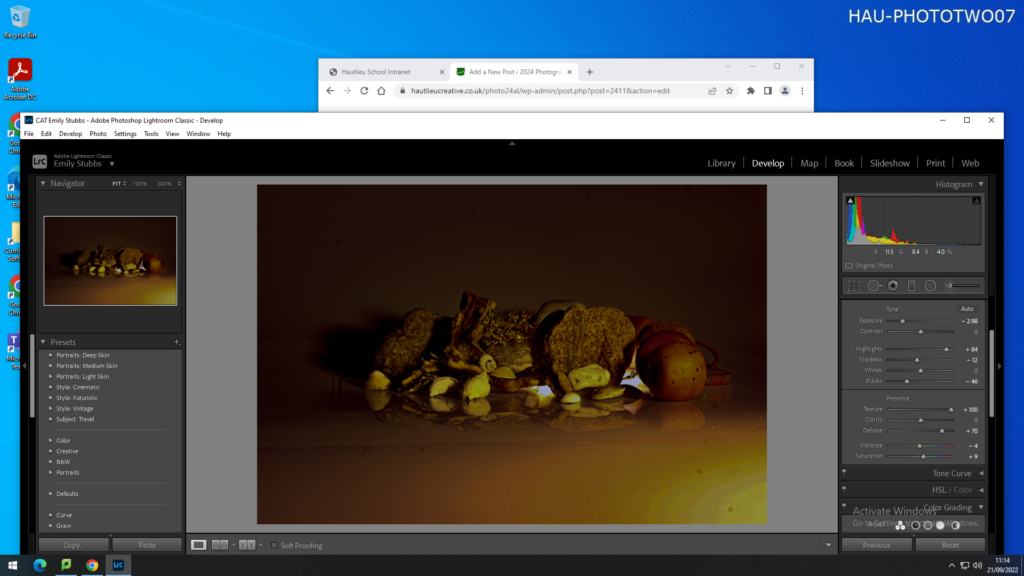
This image shows me adjusting the image and changing aspects such as the exposure, contrast, highlights etc.
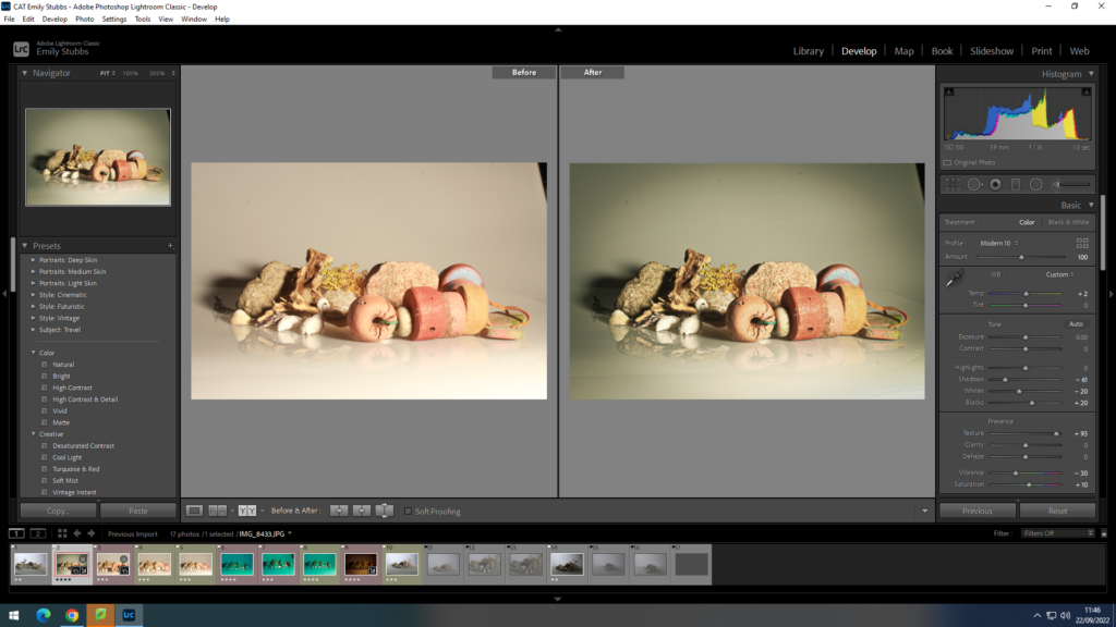
This image shows a snapshot of comparing the before and after of editing one of my images – Showing the progression of the photos.
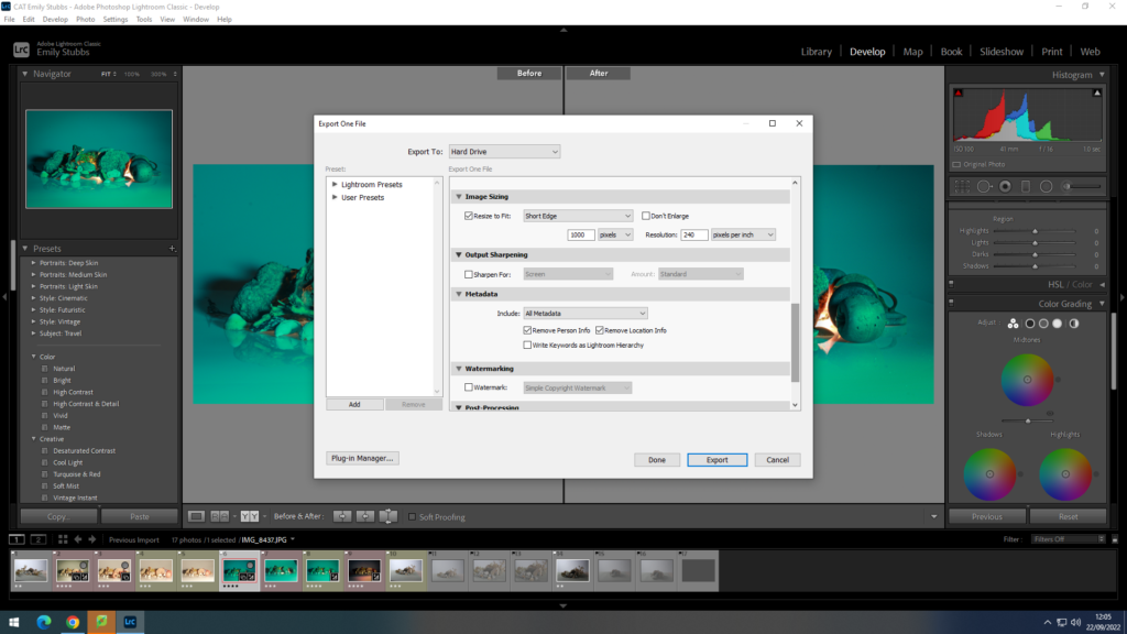
This shows me exporting my edited image and editing the image sizing.

still life

The term still life refers to a work of art that presents inanimate objects from the natural or man-made world, such as fruit, flowers, and/or objects such as baskets or bowls.

TIMELINE

Still life started in the 17th century when paintings of objects became popular throughout Europe. Artists would arrange and paint the objects in a way that was visually appealing

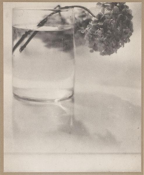
Still-life photography’s started in the early 20th century. Art photographers emerged such as Baron Adolf de Meyer.

VANITAS

DEFINITION: a still-life painting of a 17th-century Dutch genre containing symbols of death or change as a reminder of their inevitability.

A vanitas painting contains objects that are meant to symbolise the inevitability of death to show the ways in which objects, achievements and pleasures are transient and vain. it exhorts the viewer to consider mortality and to repent.

Although some vanitas pictures include figures, the majority are pure still lifes.

How Memento Mori and Vanitas Paintings Symbolized Death | Artsy
Vanitas– An introduction | overview | Easy explanation

MOMENTO MORI

DEFINITION: an object kept as a reminder of the inevitability of death, such as a skull.

The Latin phrase memento mori literally means, “Remember that you must die.”

The vanitas and memento mori picture became popular in the seventeenth century, almost everyone believed that life on earth was merely a preparation for an afterlife. However, modern artists have continued to explore this genre.

What Is Memento Mori?

SYMBOLS AND MEANINGS

still life can be interpretted in many different ways

some of the common symbols are:

fruit- can symbolise religion such as the apple from the story of Adam and Eve.

skulls- symbolise morality

Candles- passing of time

flowers- symbolise life and growth

Studio lighting

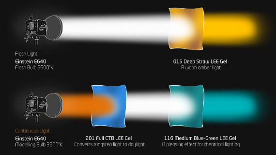
Continuous light is ‘always on,’ as opposed to flash, which delivers a quick burst of light only when triggered.
How to Mix Flash & Continuous Lighting for Dynamic Portraits

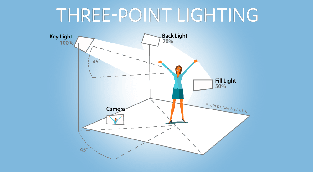
key light –  Key lights highlight the form and dimension of on-screen subjects and allow the photographer to control the atmosphere of a scene.

reflected light – reflected light is light that reflects off the subject. This is most often what the camera records to make a photograph. Regardless of the light source, light is altered by whatever it reflects off.

back light – Backlight involves positioning the main light source for a photograph behind the primary subject.

What Is a Key Light? Our Complete Guide To Key Lights • Filmmaking Lifestyle

APerture

How does it function?

Aperture is like the “pupil” for your camera system. It opens and closes to alter the amount of light that passes through.

Aperture in Photography Defined | B&H eXplora

How does it effect depth of field?

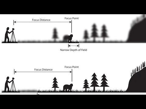
Depth of field determines which parts of your photo are in focus and aperture lets you control that. A wide aperture gives you a shallow depth of field (only the foreground is sharp) A narrow aperture gives you a deeper depth of field (everything is sharp).

Depth of Field: An Easy Overview (2022) - YouTube

Object images

For these images we used a narrow aperture giving it a deep depth of field to ensure the whole image was in focus. If we had widened the aperture the background would be out of focus and the objects would still be clear.

shutter speed

What is it?

A shutter – is a device that allows light to pass for a determined period, exposing photographic film or a photosensitive digital sensor to light in order to capture a permanent image of a scene.

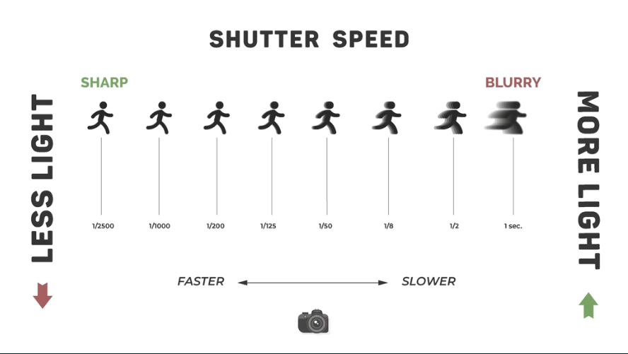
shutter speed – It’s the speed at which the shutter of the camera closes. A fast shutter speed creates a shorter exposure which is the amount of light the camera takes in and a slow shutter speed gives the photographer a longer exposure. 

This image has an empty alt attribute; its file name is image-263-edited.png

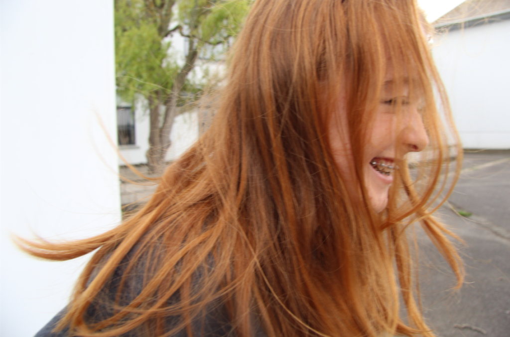
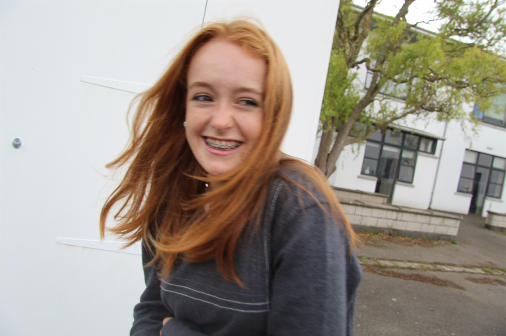
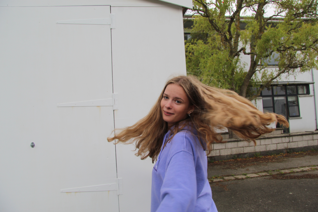
Using different levels of shutterspeed we then did a shoot of our own where one person was taking the photo and the other moved around trying to avoid the camera. This meant the photogropher had to set their shutter speed depending on the model, as they were moving fast, to capture the focussed image.

JOHN BALDESSARI

John Baldessari was an American photographer known for his work featuring found photography and appropriated images. Initially a painter, he began to incorporate texts and photography into his canvases in the mid-1960s. In 1970 he began working in printmaking, film, video, installation, sculpture and photography. 

The three balls

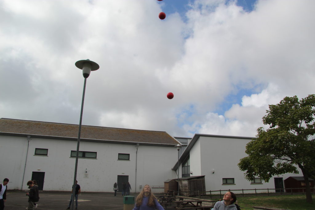
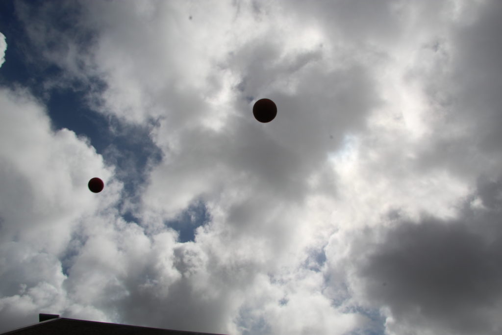
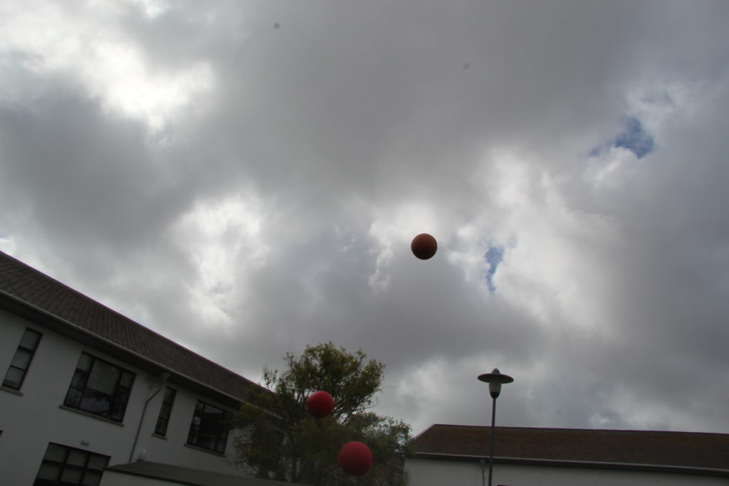
One of his most recognised shoots involved photographing three balls being thrown into the air attempting to capture them in a straight line. In this shoot no two photographs are the same because of variables such as changes in wind speed and the natural lighting. Through this process, he captured a divide between the thought of an idea and its execution.

My attempt

Inspired by his collection called – Throwing Three Balls in the Air to Get a Straight Line – We tried to capture some similar images.

Camera dodge game

To experiment with the effects of changing the shutterspeed we played a game where one person has the camera and the other tries to dodge the camera whilst the photographer attempts to capture them.

The more focused images had a faster shutter speed allowing the image to be captured faster reducing the movement.

What is photography?

The main purpose of photography is to communicate and document moments in time. When a photograph is taken and shared with others, you’re sharing a moment in time that cannot be relived again. However photos give people the closest thing to being able to relive these moments which is why they can have such an emotional impact on people.

‘photographs confuse as much as fascinate, conceal as much as reveal, distract as much as compel. They are unpredictable communicators.’ – David Campany

This statement depicts the way in which every photograph effects everyone differently, we all interpret and view things in different ways. This can be dependent on emotions, upbringing and factors such as gender, ethnicity and race. He states opposites to show how drastically different each interpretation can be and how there is no right or wrong way of seeing an images meaning.

The first line of the quotation reads ‘photographs confuse as much as fascinate‘ referring to the viewers lack of information regarding the images, the photographer can do this intentionally to enable the images to be interpreted differently by each person and allows the picture to gain many different meanings. By being able to interpret images in your own way it can add a personal touch allowing the viewer to become more emotionally connected with the images. However, the context behind an image is also very important as it enlightens the viewer of the photographers intended meaning highlighting key details in the images.

David Campany also stated that photographs ‘conceal as much as reveal’ which also refers to an individuals interpretations of an image. Even when context and background information is included, images can leave lots of unanswered questions allowing the images to be seen as ambiguous and adding a sense of mystery to the photographs.

reveal conceal dark 35mm 35mm film Make Up
Reveal and conceal – Jessica Vogt

I found this image which to me represented David Campany’s quotation. The shadowing through fabric makes the viewer ask questions such as; ‘what is she looking at?’, ‘What is creating the shadow?’, ‘what emotions are she feeling?’. These questions again add to the idea of images being interpretive to the viewer allowing photographs to have an emotional impact to almost everyone as everyone has their own views of the meanings behind photographs.

Finally, the last line reads ‘they are unpredictable communicators’ further demonstrating the way in which the photographer can create unexpected images that, although don’t directly show something, also reveal so much. Overall I think David Campbell was trying to explain the beauty in the complexity of photography and all of its unknowns.

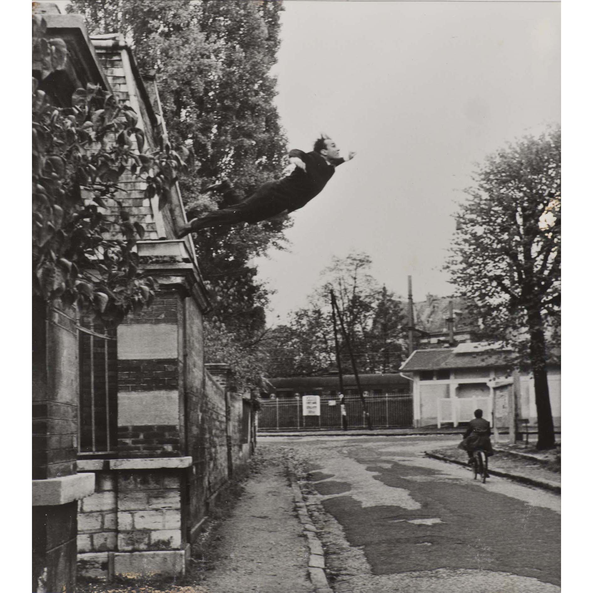
Le saut dans le vide

Yves KLEIN (1928-1962) Le saut dans le vide, 1960

This image collaborates with David Campany’s quotation as it leaves the viewer with a lot of unanswered questioned, such as; why is the man falling? Why is the cyclist not reacting? what happened after the image was taken?