Link to final book – Jilted Generation
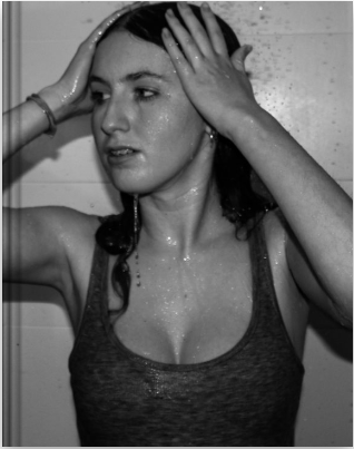
Link to final book – Jilted Generation

To start the process of creating my photobook i had to decide my focus following the theme of nostalgia. Initially, I was going to do Childhood vs Teen life as i wanted to explore the comparison and contrast. However once my teenage images began to form I realised I didnt need to physically include the childhood images to show the contrast as the teen images themselves are dramatic and emotive.
During this project I carried out multiple shoots which included two artist inspired shoots:
Once I was content with the amount of images I had to work with, I started to sift out the less successful outcomes and began work on the successful ones.
On Lightroom, I edited the images to look how I had envisioned them to and selected my favourite outcomes.
I then used my 29 selected outcomes to begin my photobook layout and playing around with the different positions and orders to place them in.
Once I completed the layout and was happy with how the book looked i ordered a physical copy of my book.
My book was successful in many ways such as the overall images are visually appealing and powerful outcomes however after receiving my book i realised that some of my double page spreads were ruined by the fold in the centre of them which caused some portraits to look distorted etc. This was helpful though as in future I know to be more cautious with which images to use for double page spreads. Overall, this project was a success and taught me what to be aware of when creating a photobook.

On Lightroom I began deciding how I wanted my selected images positioned which included order, position and size.
For my landscape images I decided to make them into a double page spread so that the images could be fully impactful
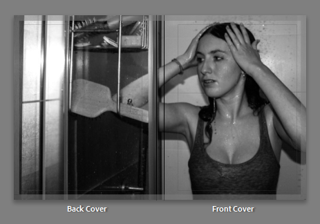
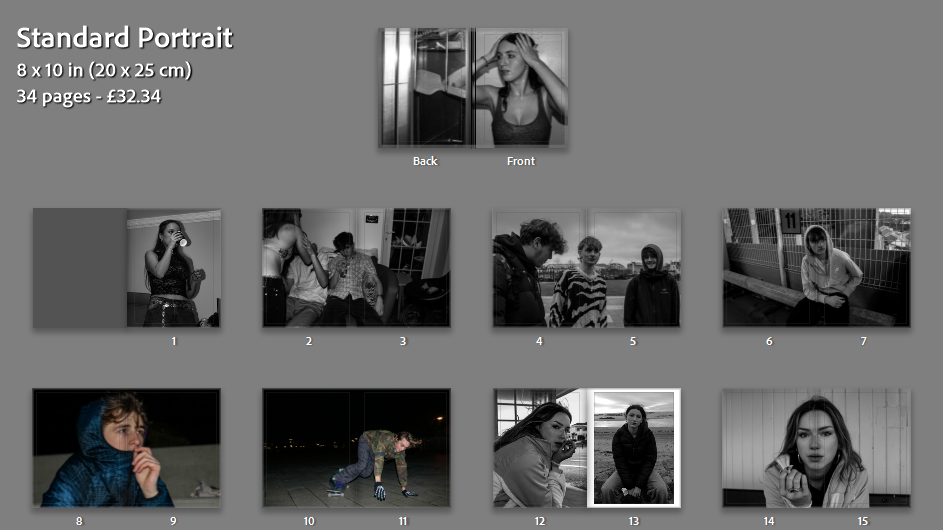
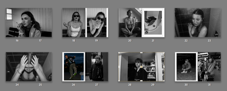

I played around with different layouts:
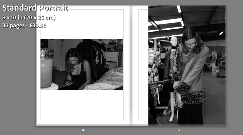
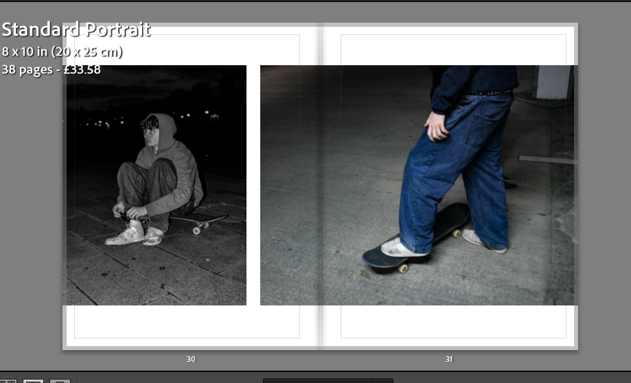
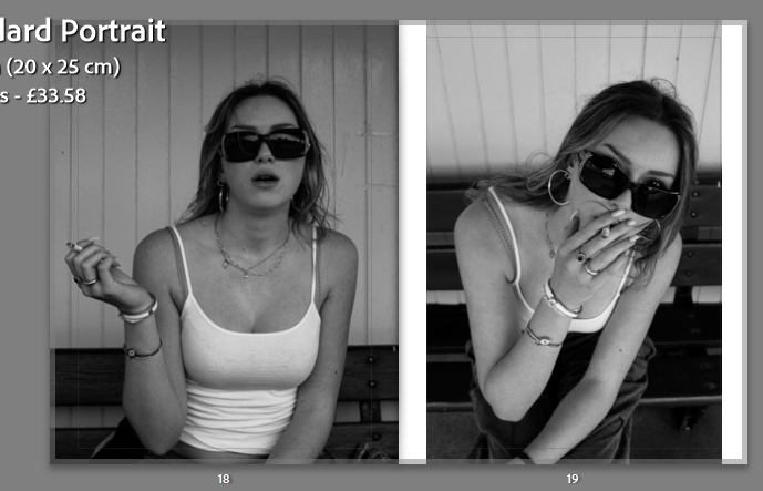
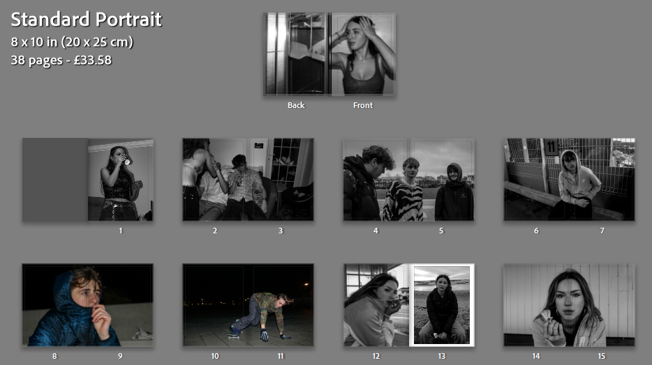
Final photobook layout:
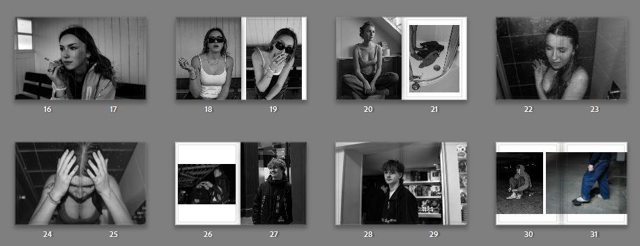

On Lightroom I imported all of my images from my shoots and began the process of sifting through the photos and selecting which images I wanted to continue working on and filtered out the images that were less successful. I did this using the flag system. I then began to edit the images I was left with.
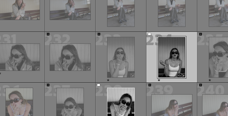
Once all my images were edited I did my final selection and clicked on the ‘BOOK’ label at the top.

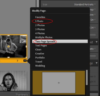
This took me to an area that allowed me to begin the layout of the images in my photobook and enabled me to play around with different styles of pages, compositions and positioning of the images.
Here’s how I made a two page spread:
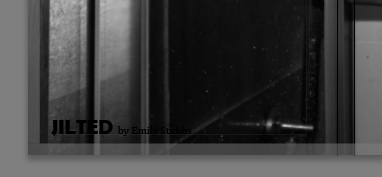
I decided a name for my book and added the text onto the back cover as I didn’t want it to impose on my cover image.
Once i was happy with my final book I exported it to the website Blurb and ordered a physical copy.
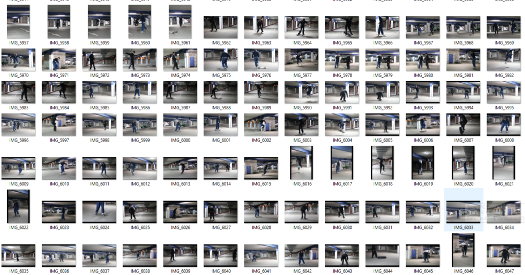
shoot 1

shoot 2

shoot 3


shoot 4 –

shoot 5

shoot 6


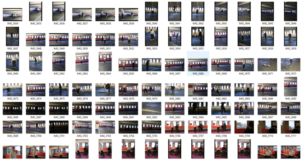

shoot 7

shoot 8


shoot 9



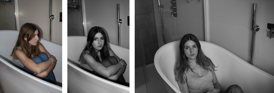


Response:


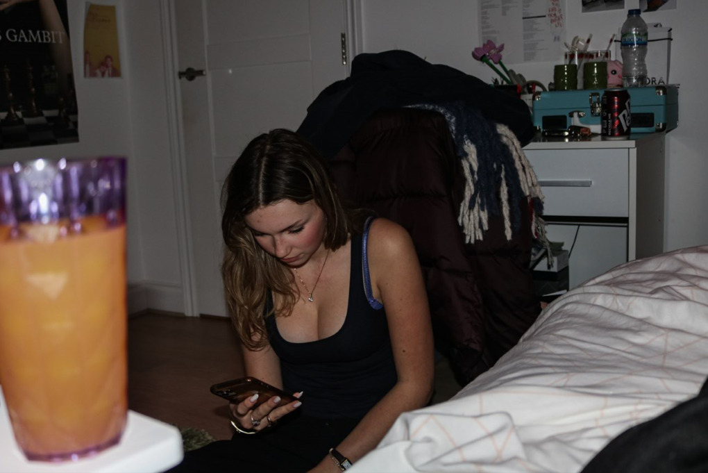


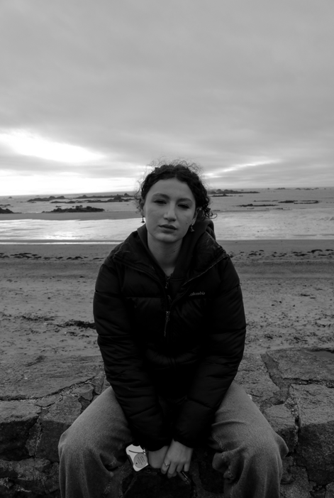


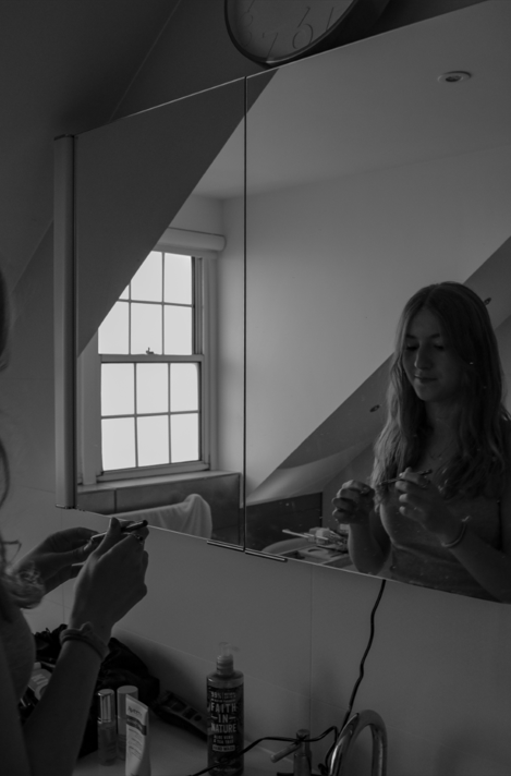


Image comparison:

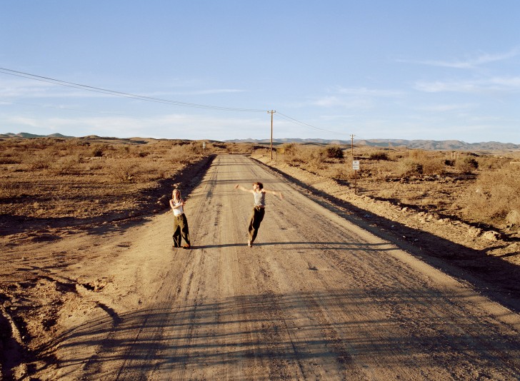
Both images show a long road in an empty and desolate area and show a girl or girls having fun. The image on the right shows two girls dancing and, my image, on the left shows a girl running across the road. They both have the feeling of fun and freedom as the girls are small compared to their surrounding environment which represents their lack of responsibility and how they aren’t tied down. In both images the girls are positioned in the middle so that, although the background is the biggest element, the girls are the focus of the image.
How do Justine Kurland and Jim Goldberg portray childhood differently through their work?
‘Photographs really are the experience captured, and the camera is the ideal arm of consciousness in its acquisitive mood.‘ Susan Sontag (1971), On photography.
The definition of nostalgia, according to the Oxford Dictionary, is ‘a feeling of sadness mixed with pleasure and affection when you think of happy times in the past’. I correlate the feeling of nostalgia with my childhood memories and teenage life/coming of age. My images which, although there’s joy, have a more serious and downcast feel to them which is a representation of the way in which the naivety of childhood, that allows us to live freely and happily, has worn off and as we grow older the reality of life has began to kick in. Two photographers that inspired me are Justine Kurland and Jim Goldberg as I resonate with their portrayals of being a teenager, all though not to the same extremes, the overall aesthetic features of their work somewhat resembles my idea of being a teenager and both artists’ work corresponds with the theme of nostalgia.
Justine Kurland is an American photographer known for her pictures of people in the American wilderness, specifically young girls as she said they had a perpetual state of becoming. This includes her work on Runaways and her best selling book Girl Pictures which has a running representation of childhood and particularly girlhood and growing up as a female.
Kurland would find her girls while touring the US and recruit them as her models for her shoots.
‘I could find girls wherever I stopped, but they went home after we made photographs, while I kept driving’ – Justine Kurland
Kurland further explains how the girls were very cooperative to be in the photos and even helped her stage the images.
‘the girls were enthralled just by being together and making pictures’ – Justine Kurland
Her book presents childhood as wild and exciting through her various images of runaways portraying their freedom, while the images also exhibit an infectious sense of nostalgia. Kurland was inspired by the girl’s stories of adventure and captured their different narratives. Personally, I feel a connection to this book as I see myself and my friends represented through her portrayal of girlhood and the adventures/experiences that follow growing up as a girl.

Her work is a mixture of documentary and staged documentary style images enabling her to portray girlhood accurately and also have to ability to exaggerate it to whatever extent she pleases. In my opinion her images are more of a fantasy portrayal of teenage life/girlhood as she captures the good more than the bad representing the runaways lives as exiting and happy almost as if they were living in a utopian world.
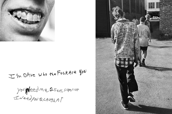
However, Jim Goldberg’s work follows youths on the streets of California portraying the more dark and disturbing ways in which people have to live. As a outsider himself, Goldberg empathised with their situation and searched for an understanding of what he had witnessed during that time. Goldberg witnessed the chaos and carnage of street life which ultimately became the source of inspiration for him to create his book ‘Raised By Wolves’. The book consists of photographs, sections of conversations, drawings and handwritten notes which present the true characters he captured more transparently, giving anyone who looks at his work a sense of familiarity as if they knew them on a personal level.
‘I wanted to look at those people who were outsiders, like I was’ – Jim Goldberg
He delves into topics such as the class system, power and poverty in America but coming from the perspective of the poor and powerless which was a new viewpoint and unusual to see. He showed the side of life that was ignored and gave these teenagers the voice that he lacked during that period of his life. He focused specifically on two main characters, Tweaky Dave and Echo. Although these kids were extremely troubled, their personalities proved too large for Goldberg to ignore. Goldberg created a close relationship to the teens allowing him to follow them whilst documenting their lives and experiences. This meant the book became a mixture of documentary and narrative style fiction that illustrated the close up reality of their situations. His aim was to uncover and discuss issues such as neglect and abuse that lead to these teens living on the streets. Regardless of the negative themes discussed, there is also an ongoing theme of love, friendship and chosen family as these kids care for one another and have joined together to create their own kind of family set up.
Although his approach may seem exploitive, he created genuine relationships with the kids and they offered their assistance with things such as writing the handwritten notes and doing the drawings. He approached this project delicately with sensitivity and a sense of empathy, provided from similar personal experiences, and was careful not to overstep boundaries. However, once the relationships began to form the kids became so comfortable to the point that they would give him advice on what to capture which goes to show they were just as engulfed in the project as him. The project became a collaboration between photographer and subject as they gained respect for each other in the process. He also gave all of his subjects a copy of their pictures allowing them to see what they were helping him with as he was aware they weren’t likely to have any other ways of accessing their work.

Although both projects focus on the subjects of teen runaways and homelessness, the work and stories behind them are completely different. Overall, Justine Kurland’s work is more of a idealistic perspective of being a runaway and she portrays their lives as joyful and exciting by exaggerating the idea and stereotypes of girlhood through her staged images. Whereas Jim Goldberg’s work delves into the dark and disturbing realities and highlights the struggles those teens face as he follows them, documenting their reality. In comparison to Justine Kurland, his images show the rougher side of life and portrays childhood/growing up as more of a day to day conflict for the homeless teenagers. Although both groups of people are runaways, Jim Goldberg’s work shows a much more sinister and emotive depiction of these people. I also discovered that both sets of images have a sense of ‘truth’ but in different ways. Despite the fact that I think Justine Kurland’s images are an exaggerated portrayal of girlhood, they do serve to present the emotions accurate to that time of our lives. She presents the girls as powerful and fearless but also sensitive and fun and there is an overall sense of unity and togetherness which is a feeling I think is very relatable to girlhood. On the other hand, Raised By Wolves shows ‘truth’ through documenting the lives of the kids and including the good and the bad while allowing them to take control over the project to ensure they are accurately depicted. This ensured that the book was an honest and real demonstration of their lives.
Bibliography:
Justine Kurland, Light Work, 2018, https://www.lightwork.org/archive/justine-kurland/#:~:text=Justine%20Kurland%20is%20known%20for,nature%20of%20the%20American%20dream.
Justine Kurland: Girl Pictures, Aperture, https://aperture.org/books/justine-kurland-girl-pictures/
A Completely True Work of Fiction: Jim Goldberg’s Raised By Wolves, Magnum photos, https://www.magnumphotos.com/arts-culture/art/jim-goldberg-raised-by-wolves/
Raised By Wolves, JimGoldberg, https://jimgoldberg.com/about
Another Look at Justine Kurland’s Girl Pictures, Vanity Fair, 2020, https://www.vanityfair.com/style/2020/05/justine-kurland-new-book-girl-pictures
Girl Pictures, Lens Culture, https://www.lensculture.com/articles/justine-kurland-girl-picture
Tracing The Roots Of Jim Golderg’s Epic “Raised By Wolves”, Blind, 2021, https://www.blind-magazine.com/news/tracing-the-roots-of-jim-goldbergs-epic-raised-by-wolves/
Justine Kurland on the Girl Picture Problem, Frieze, 2023, https://www.frieze.com/article/justine-kurland-girl-picture-problem
1. Research a photo-book and describe the story it is communicating with reference to subject-matter, genre and approach to image-making.
The book I am looking at is Raised by wolves by Jim Goldberg which explores the subject of kids living on the streets of California and the lives they live. He shot images in a documentary style as he followed them through their struggles with addiction, mental health issues and the difficult choices they have to make to survive in this environment. The images are grungy and dark to accurately portray their lifestyles and capture their unique personalities through the lense.
2. Who is the photographer? Why did he/she make it? (intentions/ reasons) Who is it for? (audience) How was it received? (any press, reviews, awards, legacy etc.)
Jim Goldberg made this photobook to highlight people that are neglected, ignored and invisible to the mainstream population. He believed these people deserved a voice so decided to not only take their photos but also include their writing and drawings in the book.

He stated that:
“Feeling like an outsider enabled me to evoke stories from the people I worked with because I could relate to them. I always aimed to get to a point where empathy and trust were created… Having people write directly on photos was a way to access their thoughts”
His work was so well received that he collected various awards such as a Guggenheim Fellowship (1985), two National Endowment for the Arts Fellowships (1989, 1990), the Mother Jones Documentary Photography Award (1989), and many more.
3. Deconstruct the narrative, concept and design of the book and apply theory above when considering:
Narrative – Jim Goldberg follows kids living on the streets of California and specifically focuses on two characters, Tweeky Dave and Echo. They are two charismatic but deeply troubled youths whose lives became intertwined as they lived as runaways.
Concept – His subjects are often people existing on the fringes, who are otherwise treated as invisible by mainstream society, or flattened into caricature.
Design – This book has a mixture of images that are mostly documentary style and drawings/writing from the subjects.