All posts by Caitlin O'Malley

Filters

Author:
Category:

Constructed seascapes

Gustave Le Gray

Gustave Le Gray was born on 30 August 1820 in Villiers-le-Bel, Val-d’Oise. He was an only child, and his parents encouraged him to become a solicitor’s clerk, but from a young age, he aspired to be an artist.

He was originally trained as a painter, studying under François-Édouard Picot and Paul Delaroche, and would later exhibited his paintings at the salon in 1848 and 1853. He then crossed over to photography during the early years of its development, making his first daguerreotypes by 1847. His early photographs included portraits and scenes of nature.

In 1851, he became one of the first five photographers hired for the Missions Heliographies to document French monuments and buildings. In that same year, he helped found the Société Heliographies, the “first photographic organization in the world.” Le Gray published a treatise on photography, which went through four editions, in 1850, 1851, 1852, and 1854.

In 1855, Le Gray opened a “lavishly furnished” studio. At that time, becoming progressively the official photographer of Napoleon III. His most famous work dates from this period, 1856 to 1858, especially his seascapes. The studio was a fancy place, but in spite of his artistic success, his business was a financial failure: the business was poorly managed and ran into debts. He therefore “closed his studio, abandoned his wife and children, and fled the country to escape his creditors.”

Le Gray went to Lebanon, then Syria where he covered the movements of the French army for a magazine in 1861. Injured, he remained there before heading to Egypt. In Alexandria he photographed Henri d’Artois and the future Edward VII of the United Kingdom. In 1862, his wife Leonardi returned to Rome, requesting and receiving 150 francs for financial assistance. In 1863, Leonardi asked Le Gray to provide her with a monthly pension of 50 or 60 francs.

In 1868, a collection of photographic seascapes by Gustave Le Gray was donated by millionaire art collector Chauncy Hare Townshend to the Victoria and Albert Museum. (He had kept them in portfolios along with his watercolors, etchings and engravings; they therefore remained in excellent condition, preserved to museum standards almost since they were made.)

On 16 January 1883, he had a son with the nineteen-year-old Anaïs Candounia. Registration of their sons birth was voided due to lack of proof of Leonardi’s death. Le Gray died on 30 July 1884, in Cairo. His only surviving child from his marriage to Leonardi, Alfred, was designated as his heir.
‘​The Great Wave’ was the most dramatic of Gray’s seascapes, combining technical mastery with expressive grandeur. At the horizon, the clouds are cut off where they meet the sea. This indicates the join between two separate negatives.

Most photographers would of found it impossible to achieve proper exposure for both landscape and sky in a single picture during his time. This would usually result in sacrificing the sky, which was then over-exposed. Gray’s innovation was to print some of the seascapes from two separate negatives – one exposed for the sea, the other for the sky – on a single sheet of paper.
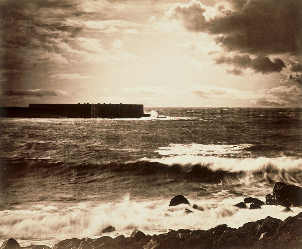
GUSTAVE LE GRAY – THE GREAT WAVE, 1857.

 What kinds of landscape does it describe?

This image describes a coastal landscape, with the sea crashing against the rocks and the harbour in the background acting as a focus point, as well as adding stability to the image.

What words or phrases best describe the landscape?

I think some words that would describe this image would be; wild, collision, structure, contrast, vintage, rural, open.

Dafna Talmor

This ongoing body of work consists of staged landscapes made of collaged and montaged colour negatives shot across different locations, merged and transformed through the act of slicing and splicing. ‘Constructed Landscapes’ references early Pictorialist processes of combination printing as well as Modernist experiments with film. The work also engages with contemporary discourses on manipulation, the analogue/digital divide and the effects these have on photography’s status. 
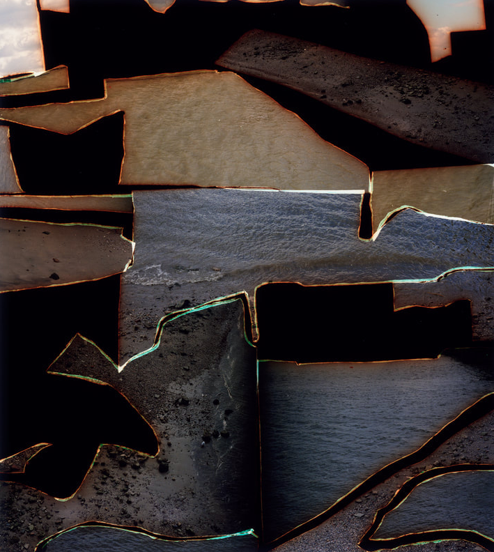
DAFNA TALMOR – FROM THE CONSTRUCTED LANDSCAPES II SERIES.

 What kinds of landscape does it describe?

It describes a beach landscape with images of the sand and sea pieced together.

What words/phrases best describe the landscape?

I think some words that would describe this image are: abstract, puzzle, cold, damp

Comparison

What similarities do you notice about these two pictures?

both images are taken near the ocean, both images include rocks, both images include low exposure.

What differences do you notice?

Only one photo includes the sky, one photo is dismembered, one photo is in black and white

In which of these landscapes would you prefer to live?

I would prefer to live in the great wave image, because its more organised and structured. 

TYPOLOGIES

What is typology?

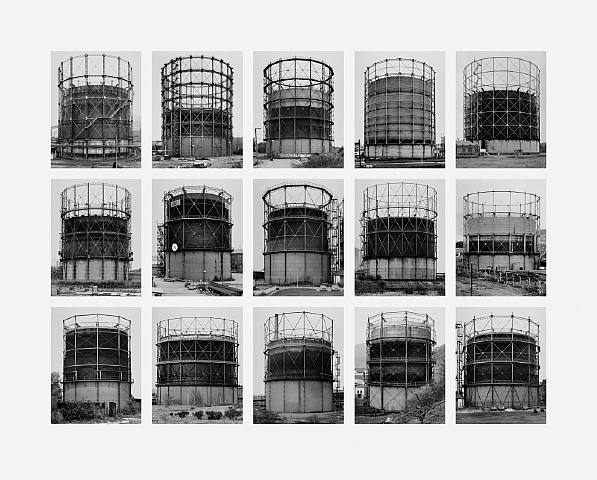
Typology is a single photograph or, more commonly, a body of photographic work that share a high level of consistency. This consistency is usually found within the subjects; environment, photographic process, and presentation or direction of the subject.

You are able to create your own typology work by grouping photographs into different types on the basis of their common features, with consideration of how each unique individual represents a particular pattern of features.

Typology was created by the German artists ‘Bernd and Hilla Becher’, who began working together in 1959 and married in 1961. They are best known for their typologies, often consisting of grids of black-and-white photographs of variant examples of a single type of industrial structure.

Examples of Typology

Robert Adams

About

Robert Hickman Adams was born on May 8,1937 in Orange, New Jersey. Robert contracted polio at the age of 12, in his back, left arm, and hand but was luckily able to recover. Adams would later enrol in the University of Colorado in 1955, and attended it for his first year, but decided to transfer the next year to the University of Redlands in California where he received his B.A. in English. He continued his graduate studies at the University of Southern California and received his PhD in English Literature, in 1965. In 1960, while at Redlands, he met and married Kerstin Mornestam, who shared the same interest in the arts and nature.

In 1963, Adams bought a 35 mm camera and began to take pictures mostly of nature and architecture. He soon read complete sets of Camera WorkAperture and learned photographic techniques from Myron Wood (a professional photographer who lived in Colorado). In 1966, he began to teach only part-time to have more time to photograph and in 1970, he began working as a full-time photographer.

Image Analysis

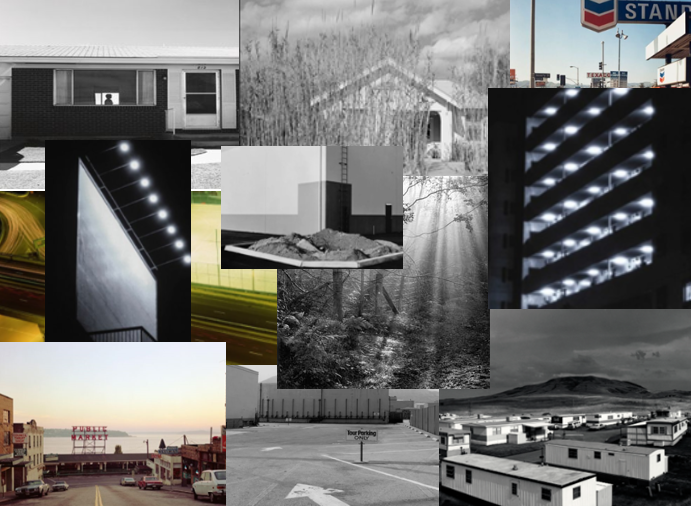
With this image, I like how we are shown nature and manmade structures mixing together, with the tree and landscape in the background mixing against the road and house. I also like how the black and white in the image highlight the different tones used.

I also like how we are able to see the horizon in the background as it helps to level out the image. The road in this picture also acts as a leading line to guide the eyes to the main focus of the image.

For this picture, I really like how you are able to see the silhouette of the person through the window as it gives of a feeling of isolation. I also like the black and white of the image as it creates a contrast.
The path leading up to the house creates a leading line directing the viewers eyes to the figure.

Urban photoshoot plan

Who, What, Where, When, Why, How

Who?- for this photoshoot, I plan to try to photograph some old or industrial looking buildings. This is to make the pictures look more urban to fit with the theme of the photoshoot.

What?- I would like to include overgrown aspects to the image such as vines or trees. This will help to create a different mood to the images.

Where?- I think I’m going to try to find some areas in St. Ouens due to the fact that there are a lot of olden style buildings there.

When?- I think I’m going to take the pictures over the Christmas holiday as the winter weather and scenery will add to the urban look.

Why?- I think that these pictures will open up a new view to Jersey as we are only really shown the up to date side of the island, rather than the urban areas.

How?- I think I will take the pictures using my camera rather than my phone camera as this way I will be able to adjust the settings easier.

Urban, industrial and typographic landscapes

Urban Landscapes

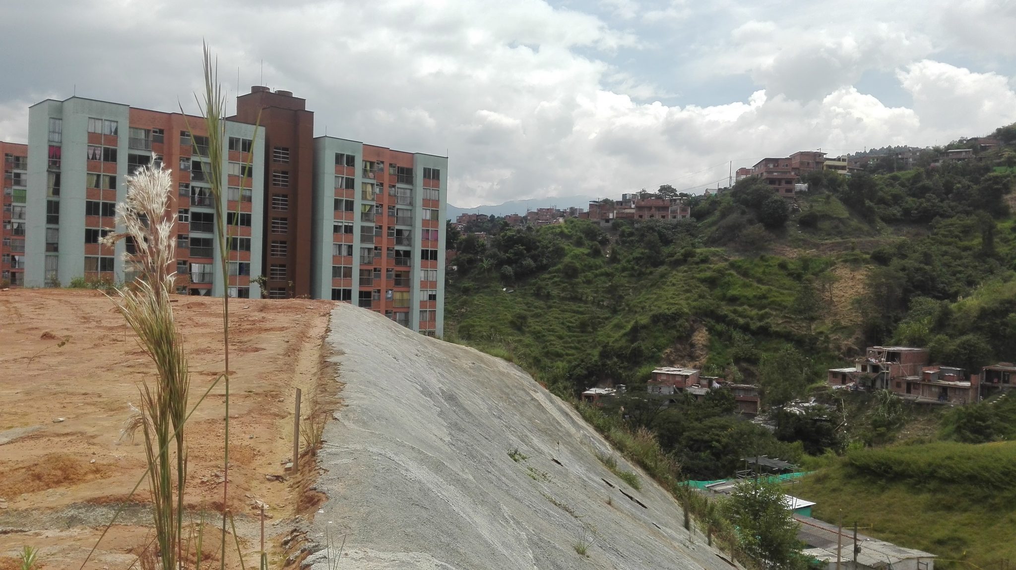
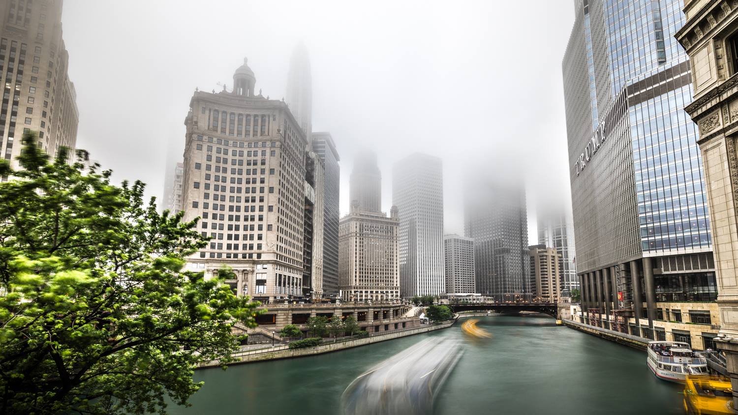
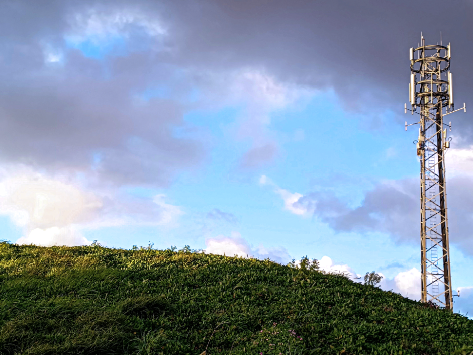
Urban landscapes – complex structures that are the result of the interaction between humans and the environment. It also involves a social, cultural and economic dimensions. Urban landscapes are formed and shaped, mainly under the influence of human activity’s.

Examples of urban landscapes:

Urban Landscape: Reading Nature from Big to Small Scales – The Nature of  Cities
Urban Landscape Photography
6 Tips For Capturing Better Urban Landscapes

Industrial Landscapes

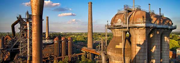
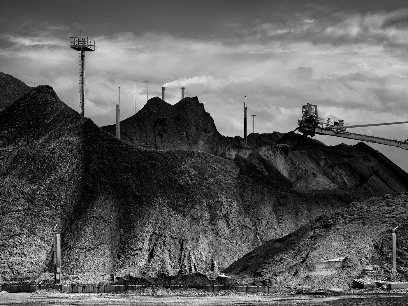
Industrial landscapes – are typical areas where industrial activities are very intense, such as factories.

Examples of industrial landscapes:

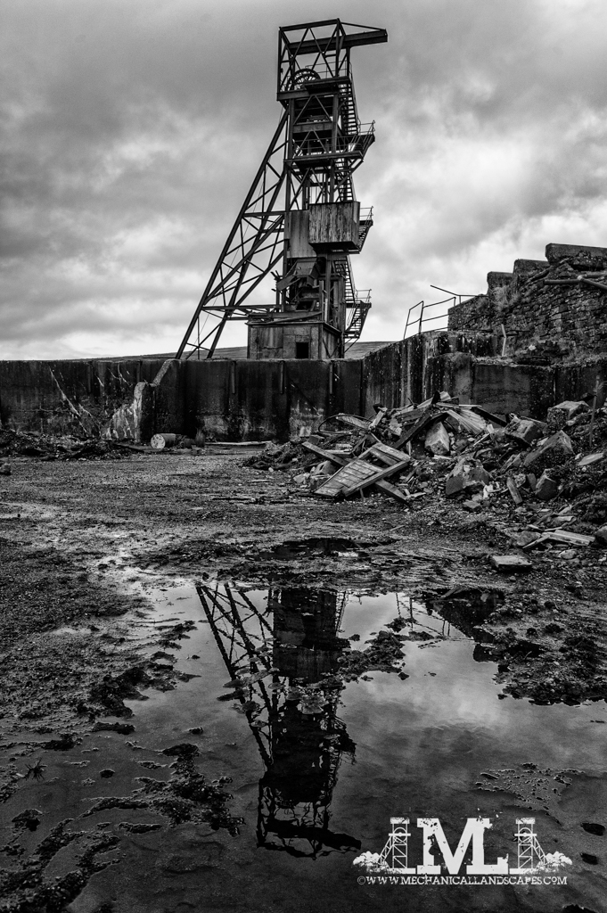
Why the industrial landscape? — Mechanical Landscapes
Why Is the Revitalization of Industrial Landscapes so Popular?
INDUSTRIAL LANDSCAPES 01 on Behance

Topography

Topography – the study of the forms and features of land surfaces. The topography of an area may refer to the land forms and features themselves, or a description or depiction in maps.

Examples of topography:

Is New Topographics still relevant in 2020? — Andy Feltham Photography
New Topographics (Redux) : The Picture Show : NPR
Photographs of a Man-Altered Landscape - Pellicola Magazine

Best image analysis and artist compatison

5 best images

This image has an empty alt attribute; its file name is image-716.png
This image has an empty alt attribute; its file name is image-820.png
This image has an empty alt attribute; its file name is image-625.png
This image has an empty alt attribute; its file name is image-790.png
This image has an empty alt attribute; its file name is image-705.png

Best Image and why

This image has an empty alt attribute; its file name is image-625.png

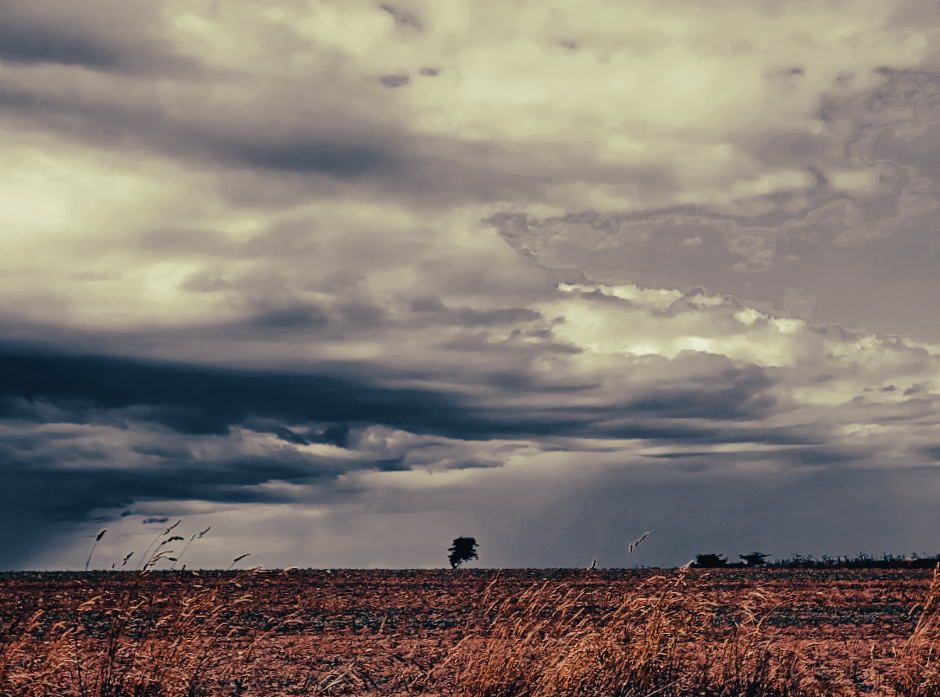
I like this image because of the dramatic clouds and singular tree in the centre. I believe that the low exposure adds depth to the photo and creates a contrast between the two sides. I also like the flat horizon line as well as how you are able to create meanings behind the image such as ‘the calm before the storm’.

If I were to change anything about the image, I would try to make the field at the bottom of the picture less textured and maybe smooth it out a bit as I feel like the current texture makes it look grainy.

Artist Comparison

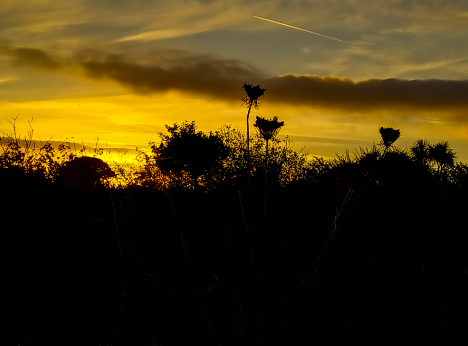
With this image I tried to somewhat style after Ansel Adams. I did this by changing my image to black and white, in order to try to match his style. I also focused in on a flower, however, I thought that a silhouette style would of better suited this photo.

In Ansel’s image he focuses on the flower and has, what seems to be, a mountain in the background. The black and white in the image also helps to bring out the tones, highlights and shadows within it. I also like the angel he chose to use as it allows us to see the whole of the flower and top of the mountain.

I really like the sky in my image as I think it highlights all the tones and vibrancy of the picture. I also like how the silhouette makes the rest of the image stand out. If I were to try this again, I would most likely try to use Ansel’s work as an inspiration more since I followed his idea but still created a very different image to his in the end.

Romanticism Edits

Edits

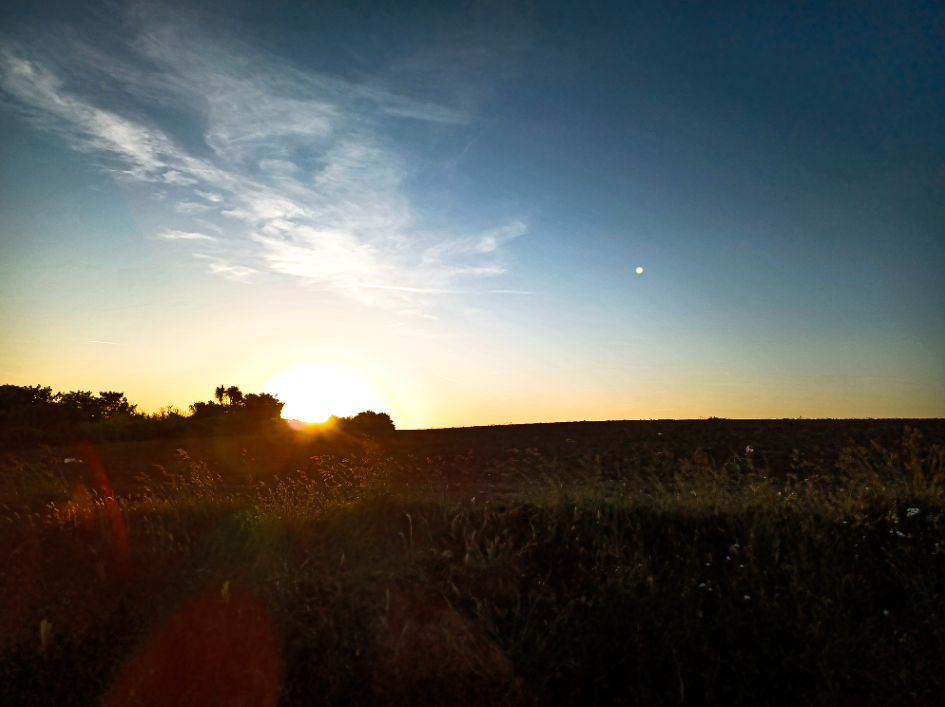
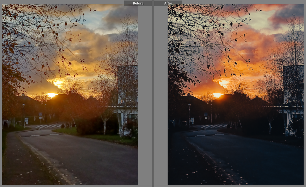
In this image, I lowered the exposure and the shadows, while increasing he saturation, highlights and contrast to make the image more vibrant and lively.

For this picture , I changed the colour to be in black and white by lowering the saturation. This gave the clouds a more dramatic look. I also increased the contrast and lowered the exposure to make the lighter parts of the image stand out.

In this edit, the vibrancy was increased while decreasing the white and black tones of the picture, giving off a more dramatic mood to the image.

Here I aimed to give the photo a lighter and more up beat mood. I did this by increasing the saturation and contrast as well as the white tones and highlights. To make the greenery stand out more I also darkened the shadows and black tones.

In this edit, I liked the original picture but wanted it to stand out more. To do this I improved the clarity and vibrancy of the image while only slightly raising the contrast.

To make this image lighter than the original, I increased the saturation and decreased the white and black tones while also adding some grain to image.

I increased the vibrancy and saturation while decreasing the black tones in the picture to make the sky look brighter and give off a more eye catching effect.

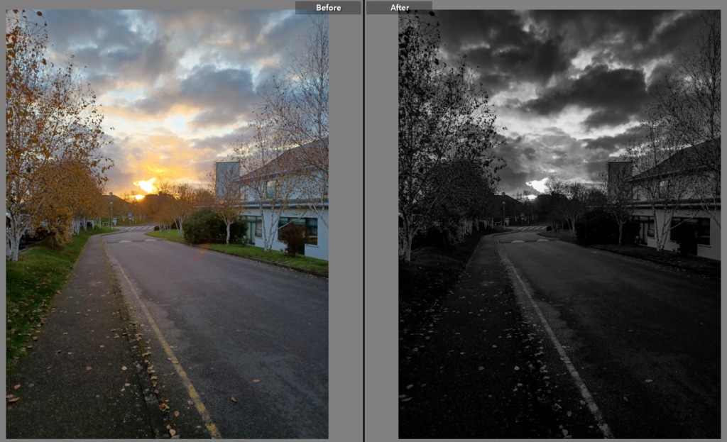
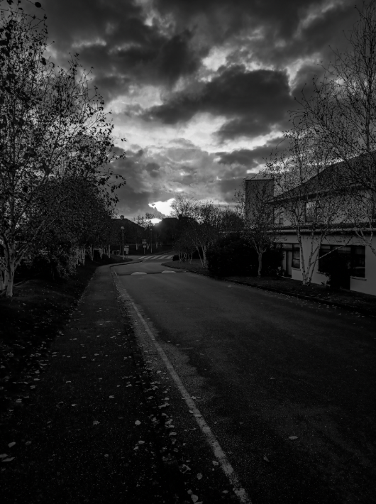
Here, I decreased the saturation to make the image black and white to make the tones more noticeable. While I did like the orange in the original image I preferer the more dramatic appearance of the black and white.

For this photo, I increased the contrast, highlights, white tones, clarity, vibrancy and saturation to make the sky more vibrant and blended, while decreasing exposure, shadows, black tones, texture and dehaze to make the greenery into a silhouette.

In this image, I increased the contrast, highlights, clarity and white tones of the image to make the lighter tones more prominent, all while lowering the exposure, shadows and black tones to give the photo more depth.

This image was turned to black and white and had the exposure lowered. The texture was also decreased making it seem more smooth and blended.

For this edit, I added a purple tint to the picture to make the clouds stand out more against the blue sky. I also decreased the exposure while raising the texture making the grass appear more prominent.

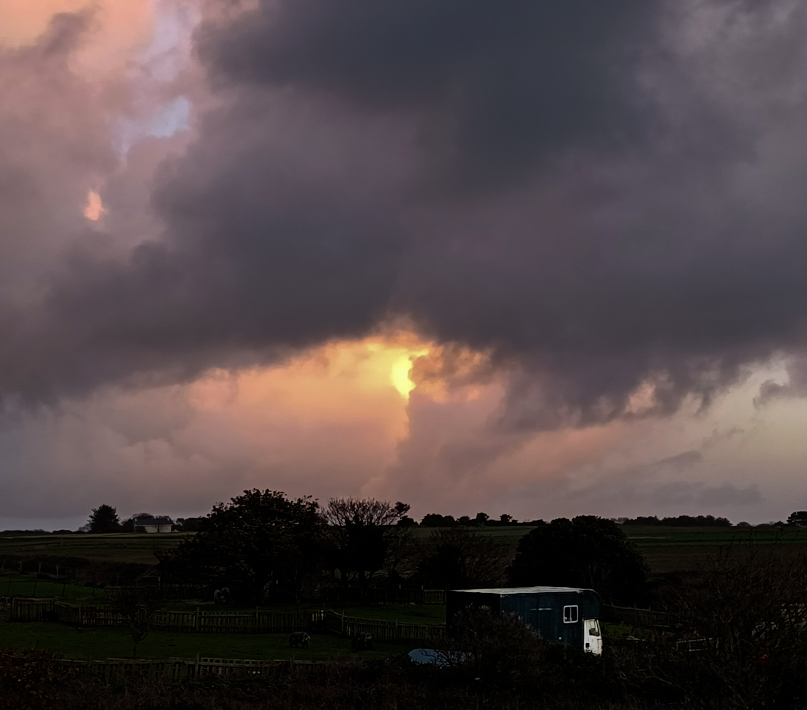
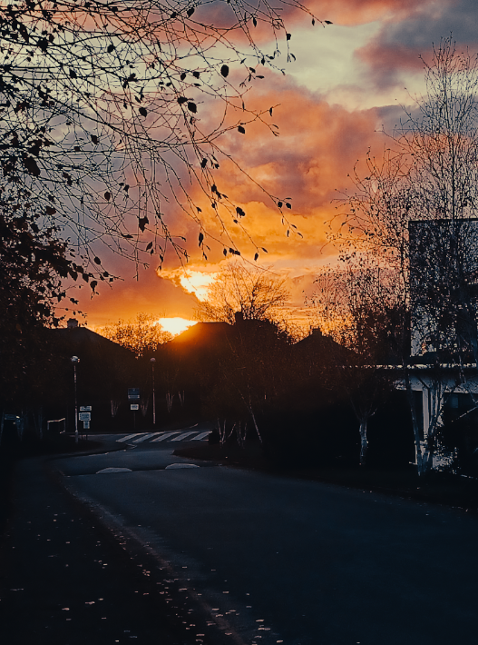
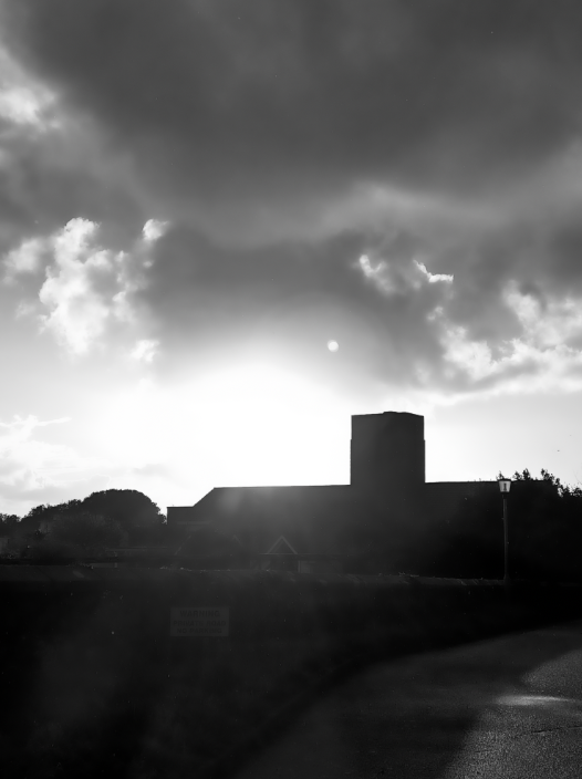
With this image, I wanted to make the sun stand out more, to do this I lowered the exposure and increased the contrast and clarity. This made the building more shadowed and gave the photo more warmth.

To this image I changed it to be black and white to make the shades of the photo stand out. I also cropped the photograph to make it more focused and central. Additionally, I rose the contrast and clarity to make the clouds stand out.

With this image, I lowered the exposure and increase the contrast and vibrancy to make the sun the main focus of the picture. I also made the caravan more exposed to make it stand out against the dark background.

In this picture I decreased the exposure and increased the contrast and clarity to make the light from the sun stand out more.

In this edit, I turned the picture into black and white to make the picture more dramatic while also decreasing the exposure and white tones in it and increased the clarity to make the clouds the main view point of the image.

Here, I lowered the exposure while increasing the contrast to the colour of the orange pop out more. I also increased the vibrancy and saturation of the image to make it a deeper colour than the original.

In this picture I wanted to make the clouds stand out more. To do this I decreased the exposure and white tones of the image and increased the highlights and saturation.

In this photo, I wanted to try and gain a more autumn vibe than the original, to accomplish this I changed the tint of the image to a more orange one and lowered the exposure while increasing the contrast. This made the shade of the photo to be much darker while also increasing the darkness of the shadows.

Ansel Adams

Fact file

Born in 1902 on February 20th in the USA, Adams was a photographer with a preference for a full tonal range in his pictures. He married in 1928 and had two children, Anne and Michael Adams. Unfortunately, Ansel met his untimely end in 1984. ​

In his life, Adams was part of a group called f/64. It was founded by 20th-century San Francisco Bay Area photographers; Ansel Adams, Imogen Cunningham, John Paul Edwards, Preston Holder, Consuelo Kanaga, Alma Lavenson, Sonya Noskowiak, Henry Swift, Willard Van Dyke, Brett Weston, and Edward Weston. These photographers shared a common photographic style characterized by sharply focused and carefully framed images.

10 Facts About Pioneering Photographer Ansel Adams

image analysis

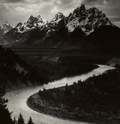
In this image, I thought Ansel Adams had cleverly constructed the photograph since the image directs our view point through the use of leading lines. in this image, it is the lake that acts as a leading line as it creates a path that leads the viewers eyes around the image stopping at the top of the mountain. Having this position of the lake also help to create a feel of depth to the image, also meaning that when taking the photo Adams must have considered where certain shadows and highlights would be.

This photo has been taken at face on angle with the camera aiming towards the mountain​. The picture being in black and white gives an eerie feeling due to the amount of darkness seen in the image along with the cloudy grey sky, however, it could be argued that the picture also has a calming atmosphere by the lake bringing light back into the image. The black and white within the image helps to add a dramatic flair to the image which is a common theme throughout his pictures.

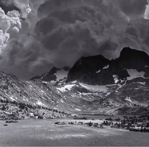
In this image, the big, dramatic clouds shown behind the mountain top give off an anxious feeling to the viewer since the appearance of them resemble a sandstorm about to cover the mountains and trees below.​

The rule of thirds is shown here too, where the mountain and clouds joining in the middle right of the image. Adams used leading lines through the use of the curved mountain edges pointing towards the trees below.​ The viewer would probably feel anxious when observing this image due to the huge clouds raining down on the mountain. ​

This picture was taken from a eye- level view, we can tell this by the fact that the trees are taller than the perspective. This picture uses natural lighting and the focus point of the image is the mountain due to it being the largest thing in the image, naturally drawing our eyes to it. ​

The image might be trying to show the beauty of nature due to the lighting and placement of the image. It also appears to be very detailed form the reflection of the lake to the individual leaves on the trees standing out.

I like how perfectly timed this image was with the wave crashing into the rock making it dramatic. The photo was taken from a hillside at a high angle using a front person perspective to capture the image. He also uses high contrast in this image due to the colour variation. ​

The Zone System

The Zone System is a photographic technique for determining optimal film exposure and development, formulated by Ansel Adams and Fred Archer.

How to Use the Ansel Adams Zone System in the Digital World | Fstoppers

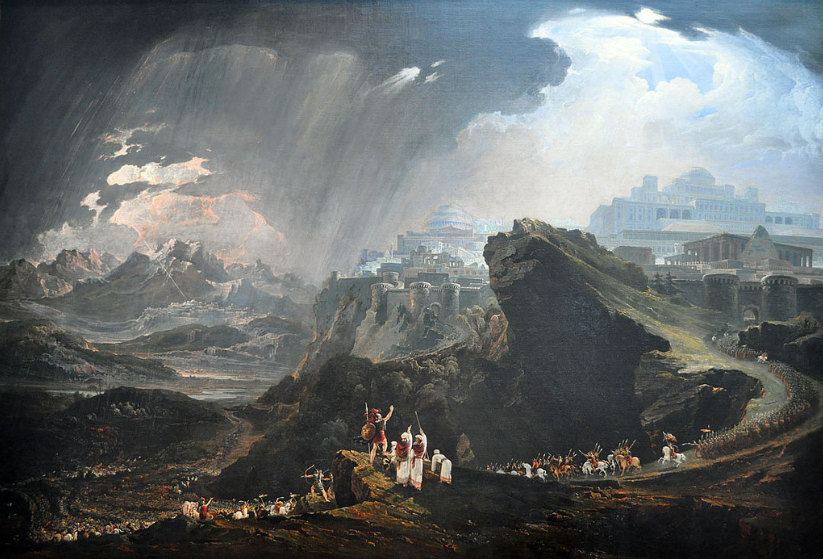
Romanticism and the sublime

What is romanticism?

Romanticism is the artistic movement of the eighteenth and nineteenth centuries which was concerned with the expression of the individual’s feelings and emotions. Romanticism is attitudes, ideals, and feelings which are romantic rather than realistic.

Romanticism was characterized by its emphasis on emotion, individualism, idealization of nature and glorification of the past with a strong preference for the medieval. It was partly a reaction to events such as the Industrial Revolution, the social and political norms of the age of enlightenment, and the scientific rationalization of nature. It was embodied most strongly in the visual arts, music, and literature as well as having a significant effect on politics, with romantic thinkers influencing conservatism, liberalism, radicalism and nationalism.

The movement emphasized intense emotion as an authentic source of experience, placing new emphasis on such emotions as fear, horror, terror and awe. It elevated folk art and ancient custom to something noble, but also spontaneity as a desirable characteristic. Romanticism assigned a high value to the achievements of “heroic” individualists and artists, whose examples would raise the quality of society. It also promoted the individual imagination as a critical authority allowed of freedom from classical notions of form in art. There was a strong recourse to historical and natural inevitability in the representation of its ideas. In the second half of the 19th century, Realism was offered as a polar opposite to Romanticism. The decline of Romanticism during this time was associated with multiple processes, including social and political changes.

examples of romanticism:

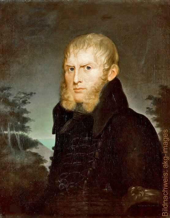
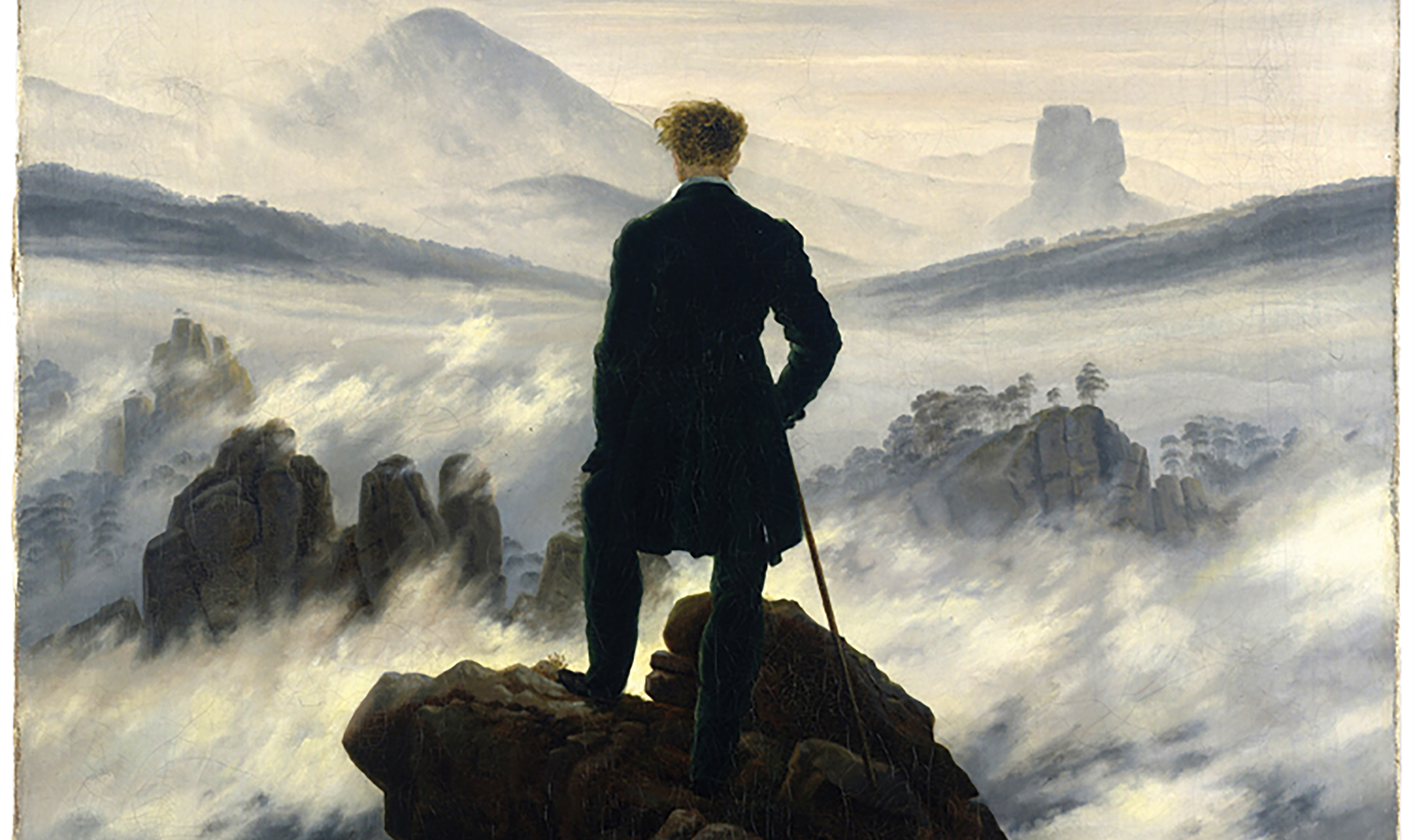
Caspar David Friedrich 1832 Germany
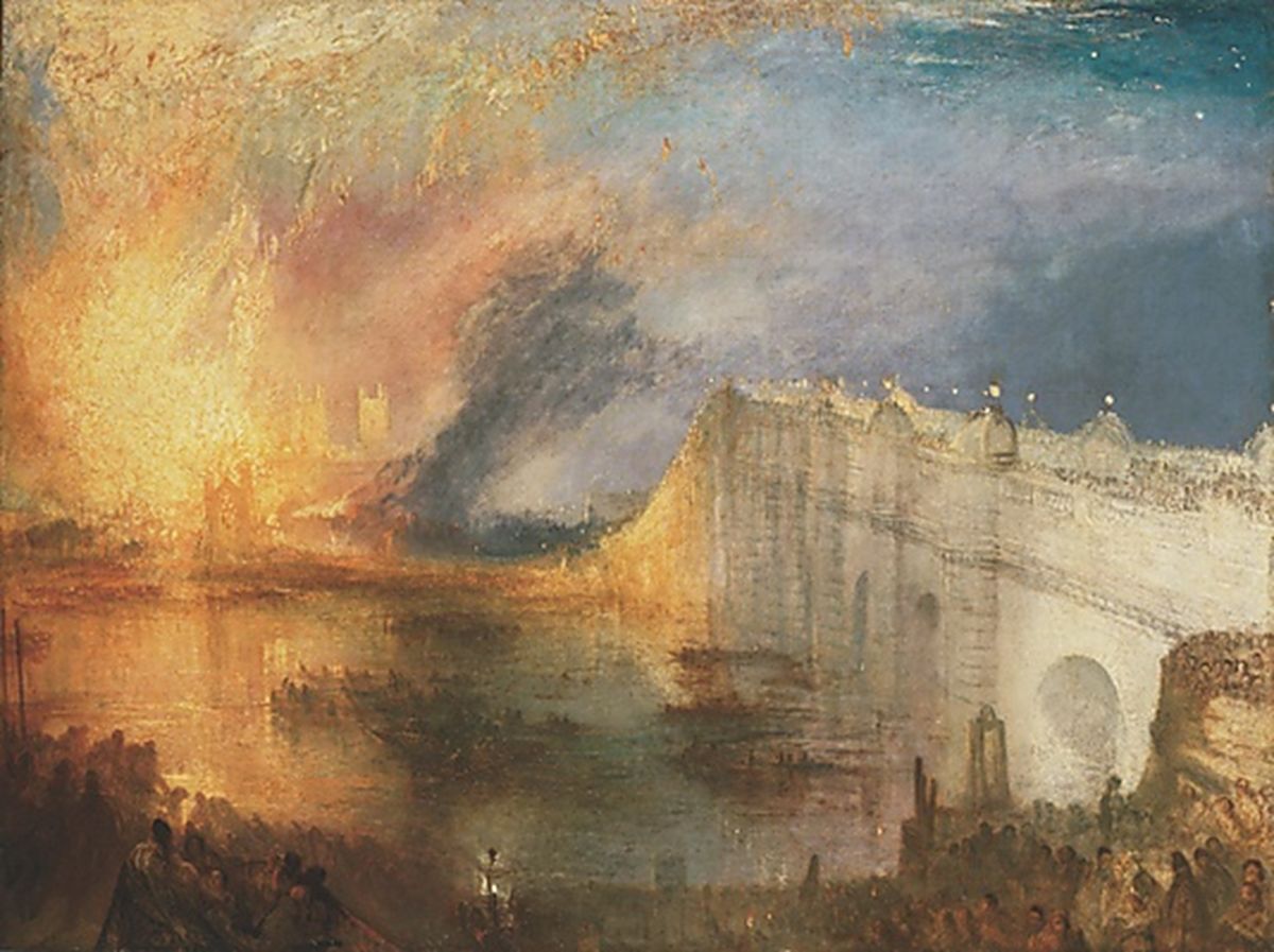
– J.M.W. Turner, Hannibal crossing the alps 1835.

The sublime

The definition of sublime is used to describe anything that is so wonderful, it effects you emotionally. In romanticism the meaning of sublime is a meeting of the emotional and the natural world, where we allow our emotions to overwhelm our rationality as we experience the wonder of creation.

The theory of sublime art was put forward by philosopher Edmund Burke in his book titled ‘A Philosophical Enquiry into the Origin of our Ideas of the Sublime and Beautiful’ which he published in 1757. He defined the sublime as “an artistic effect productive of the strongest emotion the mind is capable of feeling.”

Beyond the Infinite: Robert Rosenblum on the Sublime in Contemporary Art,  in 1961 – ARTnews.com
– Robert Rosenblum, 1961
Edmund Burke and the Sublime - Wordsworth Grasmere
– Edmund Burke

Romanticism artists

J.M.W. Turner – Joseph Mallord William Turner, also known in his time as William Turner, was an English Romantic painter, printmaker and watercolourist. He is known for his expressive colouring, imaginative landscapes and turbulent, often violent, marine paintings. He was born on April 23, 1775, and would later pass on the day of December 19, 1851.

J.M.W. Turner - Freedom From Religion Foundation
– J.M.W. Turner
J. M. W. Turner | The Metropolitan Museum of Art

Casper David Friedrich – Friedrich was a 19th-century German Romantic landscape painter, generally considered the most important German artist of his generation. Born on September 5, 1774 in Greifswald, Germany and dying on  May 7, 1840 in Dresden, Germany he lived a full life of 66 years.

Caspar David Friedrich - Discover Works | ars mundi
Casper David Friedrich
Caspar David Friedrich and Visual Romanticism - The Objective Standard

William Blake – an English poet, painter, and printmaker. Largely unrecognised during his life, Blake is now considered a seminal figure in the history of the poetry and visual art of the Romantic Age.